GeistHaus
log in · sign up

OddBird

Part of OddBird

Scalable, accessible, and performant web applications with a human-centered design.

stories primary
Color Themes with Baseline CSS Features
Web.devLinkCSSColor
Show full content
Baseline Radio the color theme color-mix playlist

So, you have a site that you want to build or redesign. Maybe you have a few core colors in mind, and you’re thinking about how to quickly implement a theme based on those colors. Baseline features can help!

See more at web.dev »

You’ll need your primary color, but also colors for actions, hover states, errors, and colors for other user interface needs. Then what about light and dark mode options? Suddenly there’s lots of colors you’ll need, and it can feel overwhelming.

The good news is that when it comes to building a palette relative to the color tokens that define your site and switching between color modes, Baseline features can do a lot of the heavy lifting for you. You can explore some of these techniques in the featured demo, a color themed playlist on the fictional Baseline Radio site.

Article contents
  • Build a base with relative colors
  • Mix colors with color-mix()
  • Opt in to light and dark modes
  • Give users control with built-in theme switcher
  • Register custom properties with @property
The demo where we put it all together

See the Pen Color theme demo by @web-dot-dev on CodePen.

Read full article »

https://www.oddbird.net/2026/05/14/baseline-in-action-color-theme/
Dos & Don'ts of Anchor Positioning
Winging ItShow NotesVideoCSSAnchor Positioning
Show full content

CSS anchor positioning isn’t baseline yet, and there’s good reason for that. You can use it, but it comes with some caveats. James, Stacy, and Miriam cover new resources to make anchor positioning easier, and work through some demos to help you understand how anchor positioning works. We also look at what new capabilities are in the pipeline.

Check out our Anchor Positioning Playlist to learn how to use and troubleshoot anchor positioning today.

Subscribe to Channel »

What We Cover:
  • Don’t ignore the containing block.
  • Do get excited about future things.
  • Do try it. Many paths work.
  • Don’t be surprised if something doesn’t work, but ask whether it’s baseline.
Links:
https://www.oddbird.net/2026/04/16/winging-it-31/
Baseline Layered UI Patterns: `<dialog>` and `popover`
Web.devLinkCSS
Show full content
Grid of hot air balloon images

Elements and windows that pop up on the screen are one of the most common patterns on the web. With use cases spanning from alerts and brief forms requesting data, to the now ubiquitous cookie settings prompt, these layered UI patterns are used frequently by developers.

See more at web.dev »

Most of these user interface elements are added to web applications using either custom JavaScript or common libraries. With that route there’s a lot to make sure that you or the library you choose gets right.

The <dialog> element and the popover attribute are two Baseline layered UI patterns that developers can reach for instead of custom implementations. To show the advantages of using layered UI patterns built into today’s web browsers – and to give an example of when you might reach for <dialog> or use the popover attribute – this article walks through an example of a modal that appears when the user attempts to save an image to a favorites list without being logged in.

Article contents
  • A modal <dialog>
  • How to close the dialog
  • popover, rising to the top
  • Autofocus
  • Style the ::backdrop
  • Make an entrance (and exit) with @starting-style
The demo where we put it all together

See the Pen Baseline dialog demo by @web-dot-dev on CodePen.

Read full article »

https://www.oddbird.net/2026/04/13/baseline-in-action-dialog-popover/
Is Sass dead yet?
InterviewPodcastPodRocketCSSSassPoetic CSS
Show full content
Grainy art-deco illustration of a rocket launch

I talk with Noel Minchow about the unique problems that CSS has to contend with, the internal complexities that can take us by surprise, how to think about debugging, and when to use higher level tools.

See more at PodRocket »

https://www.oddbird.net/2026/04/09/podrocket-sass/
Quick & Easy UI Wins (for real)
Winging ItShow NotesVideoCSS
Show full content

Join Stacy, James, and Miriam as we explore some hidden gems of UI development – from @starting-style for smoother entry transitions to performance boosts with AVIF images and using the browser’s built-in lazy-loading. We cover a variety of quick wins that you can use to make your life easier and improve the experience for your website visitors.

Based on Stacy’s web.dev article

Subscribe to Channel »

What We Cover:
  • AVIF
    • What makes AVIF a good choice
    • How to convert images
    • Where you can use them
    • Example image sizes after converting
  • Lazy Loading
  • @starting-style
  • Backdrop-filter
  • Relative colors
  • Text-box
  • nth-child of .class CodePen
Links:
https://www.oddbird.net/2026/03/19/winging-it-30/
How to Implement an Image Gallery Using Baseline Features
Web.devLinkCSS
Show full content
Image gallery grid with pictures of dogs and birds.

From image sharing sites to online stores, image galleries are a common pattern on the web. Images can be very data heavy, and loading images can make the page take a long time to load. In addition, users have high expectations around the usability of galleries, so it’s common to add additional libraries that further increase page size.

See more at web.dev »

The web platform has added support for many of the underlying pieces of an image gallery. So, what does it look like to code an image gallery with Baseline features? This demo showcases a variety of techniques that you can use to do just that.

How to deal with large image sizes

Images can be some of the largest assets you ask your users to download, and image galleries by their nature often have many images. This demo uses a couple of Baseline features to help reduce the performance impact on users.

Article contents
  • Lazy loading and AVIF
  • Lightbox effect transitions with @starting-style
  • Using backdrop-filter for better readability
  • Aspect ratio
  • Take it further
The demo where we put it all together

See the Pen Baseline Zoo by @web-dot-dev on CodePen.

Read full article »

https://www.oddbird.net/2026/03/02/baseline-in-action-image-gallery/
Responsive Type Doesn't Have to Be Complicated
Winging ItShow NotesVideoCSSTypography
Show full content

Miriam has spent a lot of time digging into the different approaches, the math involved, the user implications, and the ways modern CSS can help us out. There are equations and graphs! But you don’t need anything that complicated to build a type scale for your next site. With the right units, we can get excellent results from a few lines of (readable) code – without relying on third party tools.

Check out our Typography Playlist today.

Subscribe to Channel »

What We Cover:
  • My base rule is that we want to avoid unit conversions
    • If we’re talking about pixels, use pixels
    • If we’re talking about relative sizes, use relative units
  • How do we work with the user default font size? [12:05]
    • How it’s often been done: a multiple of the user’s size, calculated
    • My approach: Just say the size I want, but clamped by the user
  • How will the font respond to viewport sizes? [19:00]
    • Big ol’ warning about zoom and viewports
      • We don’t know if it’s a small screen or a zoomed screen
      • See how zoom becomes less effective as we add responsiveness [21:53]
    • Rules:
      • Never change the font size more than 2.5x based on the window [31:00]
      • Fluid type always starts with a base size
    • If you know the breakpoints, set the breakpoints, it’s easier
    • For a fluid approach, don’t worry about the exact breakpoints
  • How do we generate a ‘scale’ of relative font-sizes?
    • Using the pow() function!
  • How do our scales scale?! Making the scale itself responsive
    • Using a breakpoint is the easiest option
  • Bonus material:
    • Spacing relative to both the screen and text
Links:
https://www.oddbird.net/2026/02/19/winging-it-29/
Container Queries and Units in Action
Web.devLinkCSSContainer Queries
Show full content
Baseline Bakery: as sweet as Interop. Demo to view donut products as a small grid, large grid, or list with an optional To Go Bag sidebar.

One of the goals when writing CSS is to build component parts that will adapt well to different (and unexpected) contexts. Ideally, a component can be placed inside any “container” element without it feeling broken or out of place. How can you accomplish this in a complex layout like a store where the primary component – the “product” – has to fit into a variety of list layouts, including the sidebar?

See more at web.dev »

Defining containers to measure in context

By default, 1cqi (1/100 container query inline size) is the same as 1svi (1/100 small viewport inline size) because the “small” viewport acts as the initial container for any web page. In order to take full advantage of the cqi unit, you need to define additional “containers” within the page. The primary layout containers on this page are the product-list and shopping-cart – so they are set to expose their inline-size.

product-list,
shopping-cart {
  container-type: inline-size;
}

Container units are powerful, but sometimes it’s useful to make more dramatic changes in a component layout when the available size crosses a threshold. These are often called breakpoints – since the fix is applied at the point when a given layout begins to break. You may already be familiar with using @media to add breakpoints based on the viewport size. The new @container rule works the same way, but measuring container elements instead of the page!

Article contents
  • Defining containers to measure in context
  • Explicit container queries
  • Transition grid templates and visibility
  • Querying media versus containers
The demo where we put it all together

See the Pen Baseline Bakery by @web-dot-dev on CodePen.

https://www.oddbird.net/2026/02/18/queries-units-actions/
CSS Scope & Mixins
Winging ItShow NotesVideoCSSCSS ScopeCSS Mixins & Functions
Show full content

At the end of 2025, Firefox added the CSS @scope rule – making the new feature available across all major browsers! Since Chris Coyier has done a fair amount of writing and speaking on the topic, we wanted to talk with him about what that means. Chris has also been writing about the future of CSS mixins, a new specification Miriam is working on. We answer questions, get feedback, and chat about where CSS is heading.

Check out our CSS Mixins Playlist today.

Subscribe to Channel »

What We Cover:
  • What @scope is and when it is useful
  • How CSS functions differ from mixins
  • Current browser support for mixins
  • When to use a mixin
  • Will @content work for CSS mixins, similar to Sass?
  • @content vs @contents
  • Fun with functions
Links:
https://www.oddbird.net/2026/01/22/winging-it-28/
Responsive and Fluid Typography with Baseline CSS Features
Web.devLinkCSSTypography
Show full content
A graph showing font size and zoom effectiveness versus viewport width. The font size, calculated as calc(17px + 2.5vw), increases linearly with viewport width. The 500% zoom line, representing the maximum possible zoom, shows that zoom becomes less effective as viewport width increases, failing to provide a 200% font size increase beyond a viewport width of 2040px.

As designers, it makes sense to think about what space is available in the browser, and adjust your typography accordingly. It’s also important to remember that different users will have different font-size needs – and the more a font size is responsive to the viewport, the less responsive it will be to user inputs.

See more at web.dev »

I spent much of 2025 on this blog digging into font-sizing and responsive/fluid typography, and it has changed the way I approach sizing text on the web. Feel free to read (and watch the videos) back through my process if you’re interested in the details – but this article on the web.dev blog provides a quick summary of my current approach.

I found that graphing various relationships helped me understand better how all the parts interact. I may do a follow-up post here exploring and explaining this chart in more detail:

The default settings show calc(16px + 2.5vw). You can adjust the values and add clamp() ranges to the graph on Desmos.

This is really two graphs overlaid, using the same horizontal axis (viewport width in pixels) but a different vertical axis. Near the bottom, in px units, the base and zoomed font-size at different viewport widths, and a line showing that font-size grows at a much steeper pace than 200% zoom. Above, in % units, we can see the effectiveness of various zoom values, and the zoom required to achieve a font-size.

Hopefully I got the math right, but let me know if I’ve missed something.

Article Contents
  • Negotiate a base font-size based on user preferences (I prefer the clamp() approach)
  • Add responsiveness
  • Warning: Viewport changes don’t always mean the same thing!
  • Typographic scales with pow()
  • Respond to the size of in-page containers
https://www.oddbird.net/2026/01/08/typography-baseline-css/
CSS IS AWESOME Game 2
Winging ItShow NotesVideoCSS
Show full content

The second annual CSS is Awesome Game was a heated battle between a few of our favorite CSS professionals including Adam Argyle, Cassondra Roberts, Dave Rupert, and Miriam Suzanne. If you love CSS as much as we do, we hope you will play along and enjoy the challenge.

Subscribe to Channel »

The Contestants Adam Argyle

CSS nerd, creator of VisBug, open-props.style, gradient.style, transition.style & more.

Cassondra Roberts

Founder of Allons-Y Consulting and CSS Working Group invited expert specializing in design systems that scale without the chaos. She works remotely from Raleigh, NC as a front-end developer, is a mom of 2, and a neurospicy human who turned her special interests (CSS, web components, design systems) into a career – because hyperfocus is a feature, not a bug.

Dave Rupert

Web developer, blogger, and podcaster based in Austin, TX. He makes web components at Microsoft and talks about the web on Shop Talk Show.

Miriam Suzanne

One of the original OddBirds, building stuff on the web since IE5 mac – especially a fan of HTML and CSS. These days, she’s also making a lot of music and theater and pottery, and working on a course to teach ‘poetic’ CSS.

Games we play:
  • 7-Point Polygon
  • Password Reset
  • Family Feud
  • Jeoparty
Example questions:
  • This is the display value adopted by the CSSWG to make a masonry-like layout
  • This color starting with the letter F is one of the original 16 named colors
  • Name 3 of the 6 keyword values for corner-shape
https://www.oddbird.net/2025/12/18/winging-it-27/
Make It Ugly, for Clients
ArticleDesignProcess
Show full content
Gray box with dashed lines across the corners and handwritten label hero image

Beautiful design mockups can be distracting, giving a false sense of what is complete and what still needs to be done. At OddBird, we find it helpful to remove any ‘premature sheen’ before sharing mockups with clients.

Jeremy Keith (co-founder of Clearleft, and long-time open-web advocate) recently shared a New York Times interview with (musician) Brian Eno. We’re reaching Inception-levels of quotation here, I know – but in that interview, Brian quotes from an architect friend (Rem Koolhaas), talking about the introduction of computers:

You could construct a building in half an hour on the computer, and you’d have this amazing-looking thing, but, he said, “It didn’t help us make good buildings. It helped us make things that looked like they might be good buildings.”

Koolhaas refers to this as a ‘premature sheen’ that software can add, distracting from the real questions at hand early in a project. It’s easy to make something look good, before you’ve confirmed that it works.

Jeremy makes an apt analogy to generative models today, but I think this idea is useful to consider when communicating with clients, no matter what tools are involved.

As designers and developers we are constantly immersed in the creative process. We (hopefully) understand the steps that a new project has to go through from idea to execution. It’s not a straight line, but requires cycles of experimentation and editing, prototyping, sketching, drafting, and polishing.


      Three screenshots,
      the first has a real rough wireframe -
      handwritten text with notes and questions in red,
      and a few lines,
      the second has more text still hand-written
      without additional notes,
      and the final is a fully designed mockup
      with more notes added over top
      to explain the navigation active and hover states being shown.
Sketches from different stages in the process, developing a Material Repricing tool for General Stamping & Metalworks.

When I review a design concept, I know where we are in that process – and it changes the kind of feedback that I give. If we’re early in the process, I’m going to ignore issues like typographic kerning, and focus on overall approach. Does the concept work? If I received a similar mockup later in the process I’d review it differently – is every detail in place?

I don’t mean that designers are actually sending me the same document at the start, and again later in the same process. But that when they send me a mockup, I know from experience how to focus on the currently-relevant aspects of the design, and set aside questions that we’ll get to later.

I also know that as a designer, it can be helpful to work at a higher level of fidelity – even when sketching rough ideas. Design is always contextual, so providing a rough font-and-color palette might tell you something about the layout that you wouldn’t see in a napkin sketch. That ‘premature sheen’ can be useful, if you know what you’re looking at.

But we’re only able to do that because we’re all familiar with the process. Most clients and stakeholders on a new project don’t have that same level of experience. If we show clients a highly designed mockup, they will consistently focus on the details like colors and fonts, even if we’re asking higher level questions about content and layout. And since the web is fundamentally responsive and interactive, no static mockup is ever complete. We know that, but clients often find that hard to understand.

We don’t think that’s a reason to avoid mockups entirely. A mockup of the site in a specific state can be a helpful tool for our internal process. But we know that a mockup with ‘premature sheen’ – a mockup that looks too good – can quickly become distracting or misleading for clients.

Over the years we’ve developed an approach to avoid showing clients any mockup that looks more complete than it is. Sometimes that involves removing the colors with a grayscale filter, or changing all the fonts to something off-brand, or scribbling notes on top of the design to obscure the detail.


      Two screenshots,
      on the left a design labeled
      marketing site client demo
      uses entirely handwritten fonts
      and has notes overlaid describing the parts,
      on the right labeled marketing site internal
      is the same design
      but with cursive headlines and sans-serif body fonts
      including bold and italics.
The design we sent to our client (Bremtown Cabinetry) has the brand fonts replaced by a handwritten font, and additional notes laid over the design – even though we have a more hi-fidelity version for internal use.

We want to help clients focus on the right questions at the right times. And to do that we remove any ‘sheen’ that’s even potentially premature.

Show clients something ugly, so they know what they’re looking at.

https://www.oddbird.net/2025/12/11/make-it-ugly/
Cross-Browser Anchor Positioning
Winging ItShow NotesVideoCSSCSSWGAnchor Positioning
Show full content

It’s finally here! With the release of Firefox 145, CSS anchor positioning is available in all browsers. It’s still behind a flag in Firefox, so it isn’t Baseline Newly available quite yet. Join James Stuckey Weber, Miriam Suzanne, and Eric Meyer of Igalia as they talk about the emerging patterns, the rough edges and changes to the spec, and what the future holds for anchor positioning.

Check out our Anchor Positioning Playlist to learn how to use and troubleshoot Anchor Positioning today.

Subscribe to Channel »

What We Cover: The state of Anchor Positioning now
  • Everywhere but Firefox, and Firefox is behind a flag
    • Go to about:config and enable layout.css.anchor-positioning.enabled
  • Perhaps will be released December 9, with Firefox 146
What rough edges are being ironed out?
  • Position fallback: when should it fallback?
  • Containing block shift overflow difference
  • Popover default margin styles
What are the emerging patterns?
  • Follower pattern by anchoring on a pseudo class
  • Floating focus (but is it accessible, or good UX?)
  • --is, --for pattern
Known issues
  • Anchor containers (like position containers) are not always where you assume they’ll be
  • Scrolling can only respond to default anchor element scrolling
  • Position area not working as expected, and the syntax is complex.
  • Bugs (but they’re being fixed pretty quickly)
Will Anchor Positioning be baseline?
  • What would it mean to be baseline?
  • Could some parts of anchor positioning be baseline?
What is coming next for Anchor Positioning?
  • Container queries for detecting fallback
  • Transforms
Links:
https://www.oddbird.net/2025/11/20/winging-it-26/
Bad UX Design Patterns
Winging ItShow NotesVideoOOUX
Show full content

OddBirds, Stacy and Sondra, along with special guest Clayton Dewey of Dev Collaborative, face off against bad UX design patterns. They get into the weeds trying to address some of the thorniest, perennial UX design questions - managing complex navigation, intuitive user flow, is there such a thing as a good toggle design, and more.

Check out our Winging It conversations about design, frontend, and backend development.

Subscribe to Channel »

What We Cover: Complex Navigation
  • OddBird’s complex navigation and disparate audiences
  • Defining web “objects” with OOUX philosophy
  • How to prioritize the navigation people need most
  • Are mega menus ever a good idea?
  • Mobile navigation that doesn’t bury important content
  • Avoiding nebulous naming
  • OddBird’s current navigation solution
  • “Don’t make me think.”
  • Vitaly’s Idea: Query the user’s intent rather than making assumptions
Intuitive User Flow
  • DevCollab’s user flow and many services
  • Content strategy process
  • Card sorting with clients to get user feedback
UX Design Speed Round
  • Is there ever a case for infinite scroll?
  • Pagination or Load More button?
  • Is there such a thing as a good toggle button design?
  • Click to open or hover?
  • IDs on headers and click to copy
  • Is it a button or a link?
  • Should a link open in the same window or a new window?
  • Down with autoplay!
  • Truncatio…
  • Forms with unclear error messages
  • Bad Apple remote interface design
Links:
https://www.oddbird.net/2025/10/23/winging-it-25/
Anchor Positioning Updates for Fall 2025
ArticleAnchor PositioningCSS
Show full content
A hand holding a coffee mug. Coffee is pouring into the mug and overflowing.

Anchor positioning is close to Baseline. As more people try it out, they are finding areas where it could be improved, and differences between browsers. Let’s take a look at the current state of anchor positioning.

In September, Safari 26 was released with anchor positioning! This means 2 out of 3 major browsers support anchor positioning, with Firefox support on the way. I’ve tested it out on Firefox Nightly, and am impressed with the progress – hopefully it arrives soon.

That said, there are a few things to consider and look forward to.

Shifting into the containing block

See the Pen Shifting content by @jamessw on CodePen.

The CodePen above will be different depending on which browser you use.

In Safari, the orange positioned element is shifted into the dotted containing block, which means the blue anchor is partially covered.

Screenshot in Safari of an orange block partially covering a blue block.

In Chrome, the orange positioned element is shifted on the block axis to be inside the containing block, but is not shifted on the inline axis. This means the blue anchor is fully visible, but the orange positioned element is mostly cut off, outside of the containing block.

Screenshot in Chrome of an orange block with text that gets cut off where it overflows its container.

Which is right? Great question. There are cases where you might want one behavior over the other, and my hope is that CSS makes this configurable. For now, if you’re wanting to align it to the start side, you can use the safe keyword, but there isn’t a way to align it to the end side.

Update October 16, 2025:

There actually is a right answer here. Safari’s behavior is correct, and there is an open Chromium bug.

One suggested workaround for the bug is adding place-self: anchor-center on the positioned element. I’ve found this isn’t always the behavior I want, but it can be useful.

I still think it would be nice to be able to declare which behavior I want.

Position fallback stability

In pre-release versions of Safari, users picked up on a difference in how Chrome and Safari handled position-try-fallback. In Chrome, if a positioned element goes to a fallback position, it stays in that position until that position overflows. In pre-release versions of Safari, it would flip back to the initial position as soon as it could.

Which is right? Again, this is a case where it really depends on the use case. In the meantime, Safari adopted Chrome’s behavior before releasing, and the CSSWG is looking into whether this should be configurable.

Simpler popover positioning

One of my favorite tips has been to remove the user agent’s default margin from a popover if you are using anchor positioning.

[popover]{ margin: unset }

That isn’t all that’s happening. Looking further down the road, there will also not even work on popovers until you add this rule. And good news — you won’t need to do this forever!

The CSSWG is working on a solution that adjusts the UA styles for a popover, replacing the problematic margin: auto with a new dialog value for align-self and justify-self. There are ongoing questions about how to make sure this doesn’t break existing popover styles, but what this means for you is that at some point in the future, you will likely not need to add margin: unset, and popovers will be positioned correctly without extra rules.

Update October 16, 2025:

After some initial work on the dialog value, the CSSWG revisited the topic. Instead of a dialog value, margins: auto will be disabled when a position-area is set. This is effectively adding margin: unset for you.

While I’m fine with any solution that fixes positioned popovers, I do think that this behavior is a bit simpler to understand than a new dialog keyword, so I’m happy this change was made.

Other changes

That isn’t all that’s happening. Looking further down the road, there will also be changes to where the self prefix goes in position-area, and support for transforms. There will be an anchored container query that will match depending on which fallback position is active. These will all be useful in improving the user experiences that are possible with Anchor Positioning.

Polyfill update

We also released v0.7.0 of the CSS Anchor Positioning Polyfill, which adds the ability to polyfill elements inside of the same shadow DOM. We would love to support more shadow DOM use cases, and more use cases in general. Try out the polyfill, and we welcome code or financial contributions to make that happen!

https://www.oddbird.net/2025/10/13/anchor-position-area-update/
The Best CSS Unit Might Be a Combination
ArticleCSSTypography
Show full content
A measuring tape with both imperial and metric, then a ruler with only metric, and another ruler with combined units

There are many articles and established CSS best-practices that rely on determining the correct or best units to use. Now that comparison functions are well supported in CSS, we don’t have to choose.

One thing I want to highlight from the last several posts in this series is that my solutions often involve combining and comparing units.

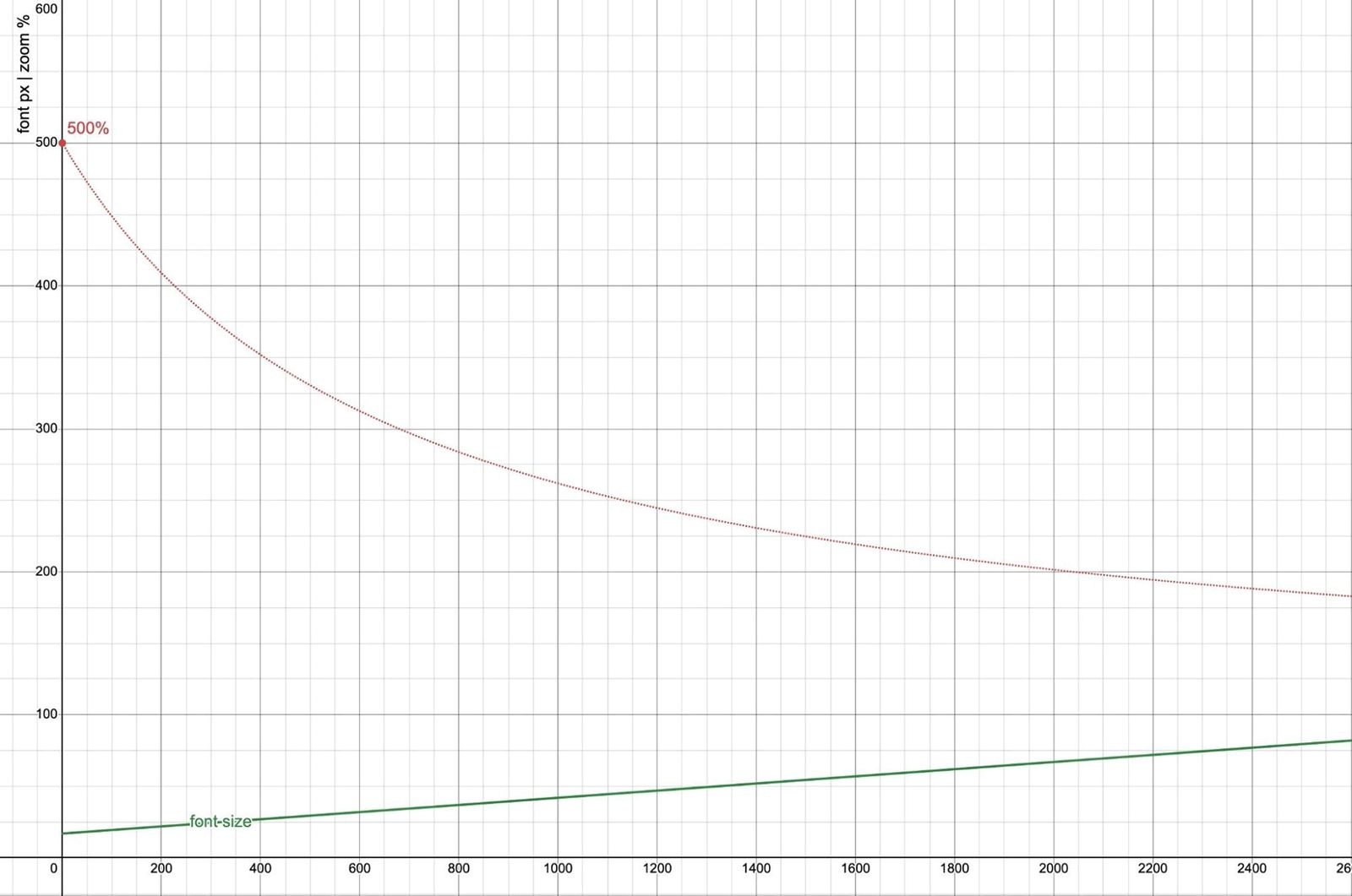
In the post on user font-size preferences, I pointed out that em-based root font-sizes multiply the user setting. If we ask for a 20px font-size by calling it 1.25em, and then the user also asks for a 20px font-size, the result will not be agreement but a combined 25px font. If we switch to a px-only approach, we’re ignoring the user preference entirely – which is even worse. But if we stop doing the math in our heads, and provide the browser with both units, we can do a much more interesting and useful comparison:

html {
  /* use the larger of the two */
  font-size: max(1em, 20px);

  /* clamp within a range near the user setting */
  font-size: clamp(1em, 20px, 1.25em);

  /* calculate the average */
  font-size: calc((1em + 24px) / 2);
}

In all three cases, there’s no conversion required. We state clearly the px font-size we’re aiming for, and then compare it against the user-provided em. The units have different meanings, and those meanings are useful for expressing more clearly the negotiation between site and user font sizes.

I like to think of relative CSS units as browser-provided variables, allowing us to pass in a multiplier. We could write it out long-hand, if we had to:

html {
  font-size: clamp(var(--user-font-size), 20px, 1.25 * var(--user-font-size));
}

Thinking about units that way reminds me to think about the meaning rather than the assumed px value of the unit.

Use the unit that means what you mean

Once I’ve handled that user-preference negotiation on the root element, I can refer to the result of that elsewhere as 1rem. In my mind 1rem is a always a calculation with a variable in it: calc(1 * var(--negotiated-base-font-size)). Similarly 1em can be thought of as calc(1 * var(--current-font-size)).

The difference between 1rem and 1em is like the difference between --brand-pink and currentColor. Both are variables, both are useful, but they describe entirely different relationships. To ask which one is better in general is an absurd question.

If I want to develop fluid type calculations that adapt to local context, I’ll use em and cqi (container inline size) values. If I want my calculations to remain consistent across the entire page, I’ll use rem and vi (viewport inline size) calculations. In either case, I’ll define those values on body or other elements – so that 1rem always refers to the result of our initial negotiation, and doesn’t take on more complex meaning.

How I handle spacing in CSS

It’s taken me a while to get here, but this entire series was set in motion by a great Ashlee Boyer article about using px for spacing. Her point is that users zooming in care mostly about zooming the content – and it can make things less readable if we always zoom the spacing at the same rate as the text (using em or rem). We end up with excessive white-space that pushes our content off-screen.

I think she’s pointing to a worthwhile concern, but I came to a slightly different conclusion. We don’t have to choose between px and em/rem as our only sizing options here! We can again describe for the browser how we think about white space in more detail – accounting for both font-size and available space.

I actually use several different ‘spacing’ units in my work. My favorite is the lh (line height) value. When I’m putting space between paragraphs or list-items in a flow of text, I want to maintain a consistent rhythm – so 1lh is the default, and I can use multiples like 0.5lh or 3lh when I need some variation. If I need this to be consistent across the page, I can use rlh values instead.

But if I want to space things on the inline axis, add gaps in a grid, or put padding around a card, I might also want to account for the available space. So now I’m negotiating two different concerns, and I can represent each with a different unit – using comparison and math functions to get a final value. Maybe one of these:

.card {
  /* use 1lh, unless we run out of space */
  --min: min(1lh, 2vi);

  /* round-up to the nearest half-line */
  --nearest-half: round(up, 2vi, 0.5lh);
}

If we know we want exactly 12px for spacing, then absolutely – just say 12px! There’s no reason for unnecessary conversions. But if we want to be responsive to font-size and available space, we can do that instead. We could even clamp our responsive values within a range of font sizes.

The right units for any situation are the ones that express most clearly what we mean – and sometimes what we mean requires a combination of units.

This is the central premise of the OddBird approach to what we call Poetic CSS Architecture. There’s no best unit, no best layout mode, and no best selector. When we use the entire language, we have more tools for clearly expressing our goals.

If you enjoy Miriam’s writing on modern CSS, we offer consulting and training around Poetic CSS Architecture – to help you eliminate technical debt and build more performant sites & applications.

https://www.oddbird.net/2025/09/23/type-units/