GeistHaus
log in · sign up

jama - Jan Maslov's Personal Website & Portfolio

Part of jama - Jan Maslov's Personal Website & Portfolio

I design and code digital experiences and smart software.

stories primary
jama - DLSS 5: The Shape of Things to Come
Just because we can, doesn't mean we should.
Show full content

Nvidia recently let us have an early look at DLSS 5. The bad publicity made me think about what the future of video games might have in store for us. It made me uneasy, so I want to share my view on it, plus a retrospective on upscaling tech and DLSS.

How the Fake Frames Came to Be

I think everyone who grew up with games before the 2010s had at least one misguided “oh my god this looks like real life, nothing can ever beat this”-moment. My first came rather late, but it informed my uninformedness about the lengths we’d go in pursuit of making games prettier.

Virtual Hydlide (1995), one of the earliest examples of a fully digitized photo-based main character. It’s literally real! (Source)

We came a long way from nearest neighbor scaling. Aside from their shortcomings, mostly as a result of analog image transmission protocols, CRT displays allowed for creative tricks to improve percieved image quality.

This post has image comparisons. Click the next image to cycle! There are more like this below.

Pixel art image of Dracula Pixel art image of Dracula photographed from a CRT monitor document.currentScript.previousElementSibling.dataset.js = '';

One famous example is from Castlevania: Symphony of the Night (1997) for the PlayStation 1. Notice how the smear on Dracula’s pupils expands the red dot to fill his eyes. (Source)

There are also blended dithering transparency effects documented, like in Sonic the Hedgehog (1991). We see the inherent blending properties help with reducing aliasing, smoothing limited color palette content, and making it appear as though there is more detail than there really is.

The Early Years

Since the inception of computer graphics, we’ve been trying to make them prettier and run faster. In offline rendering, early work on RenderMan in the 1980s introduced the concepts of anti-aliasing and supersampling, among many other advancements. The stochastic sampling technique developed for the REYES rendering algorithm (which RenderMan is an implementation of) is the ancestor of what we know as MSAA these days, sampling polygons at subpixel precision.

Since then, rasterized rendering complexity is a function of the amount of triangles, shader complexity and sampling resolution, and we’ve been finding different ways to work around limitations in each category. We decrease the amount of triangles through culling, LOD systems and impostors, or virtualized geometry systems like Nanite. We decrease shader complexity through shader variants and LOD systems, as well as many approximations in comparison to even shaders meant for offline rendering. Traditionally, there have been few substitutes for resolution, with most techniques being on a spectrum of brute-force.

The same desire to make offline 3D renders prettier and run faster also applies to 3D games of course. It’s pretty much the same thing, only in real-time.

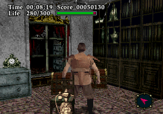
The first instance of something akin to upscaling I found is in DOOM (1993) that offers a low detail mode, which naively doubles every rendered column of pixels, effectively only rendering at half the horizontal resolution.

DOOM (1993), low detail mode disabled DOOM (1993), low detail mode enabled document.currentScript.previousElementSibling.dataset.js = '';

In his awesome Game Engine Black Book: DOOM, Fabien Sanglard demonstrates the low detail mode. (Source)

Ever since then, gamers have been adjusting the output resolution to gain performance. CRT monitors being able to accept almost any resolution natively also made changing resolution easy and a bit less noticeable. Over the years we’ve been naively supersampling games by forcing to render at a higher resolution than our output resolution, commonly referred to as SSAA.

In Modernity

There have also been lots of developments on making games less jagged at the output resolution. I’ll just name-drop these: MSAA, CSAA/EQAA, MLAA, FXAA, TXAA and SMAA. Each technique works with more or less information about the 3D scene to produce an anti-aliased result, with varying visual quality and time complexity.

Not quite sure, but one of the first games with a dynamic render resolution to achieve constant performance was Wipeout HD (2008), which varies the horizontal render resolution between a predefined number of steps Digital Foundry have determined. The first game I came across that offers an internal render resolution scale setting independent of UI resolution in the menu was ArmA 2 (2009). Crysis (2007) has a console setting for it. Those were quite naive upscales though, and that’s what changed over time as shader complexity and triangle density grew quicker than common hardware could keep up with. Middle-earth: Shadow of Mordor (2014) was among the first games to popularize internal render resolution as a setting.

The advent of Temporal Anti-Aliasing (TAA) with Halo: Reach (2010) caused developments around using render resolution to manage render time in games to rapidly accelerate, in time with PBR shaders and more advanced usage of lighting and shadow techniques. While Halo: Reach primarily used its TAA solution to smooth over jagged edges without the cost MSAA or SSAA, it was soon refined and widely in use also to upscale.

Because the clock speeds of the CPU and GPU in the PlayStation 4 and Xbox One were unlocked and dynamically adjusting, dynamic resolution scaling went mainstream on the consoles. While not specifically necessary, the PlayStation 4 Pro brought a hardware implementation for checkerboard rendering, where every second pixel is rendered, and the rest filled in through interpolation - reminiscent in philosophy to DOOM. With Unreal Engine 4, we got TAAU as a mid-step that used a TAA as an upscaling solution, and further refinements to the TAA technique along the way.

In 2018, with the release of the Turing GPU architecture (RTX 2000), Nvidia pioneered upscaling using Machine Learning with Deep Learning Super Sampling, or DLSS. And the first attempt was… underwhelming. Nvidia overpromised and underdelivered, and yet it was a bit of science fiction. In short, a generic image enhancement model ran over the input frame to get rid of aliasing. Then, an upscaler used Nvidia-produced ground-truth frames from all kinds of different situations in a game to receive DLSS support, in order to improve the upscaling result. The more situations the upscaling model has been trained on, the more often you’d see a result that looks better than TAA.

In all other situations, it was markedly worse. Battlefield V (2018) was one of the games that received DLSS support early on, though still months after RTX 2000 graphics cards launched. See for yourself:

Battlefield V Screenshot with TAA Battlefield V Screenshot with DLSS document.currentScript.previousElementSibling.dataset.js = '';

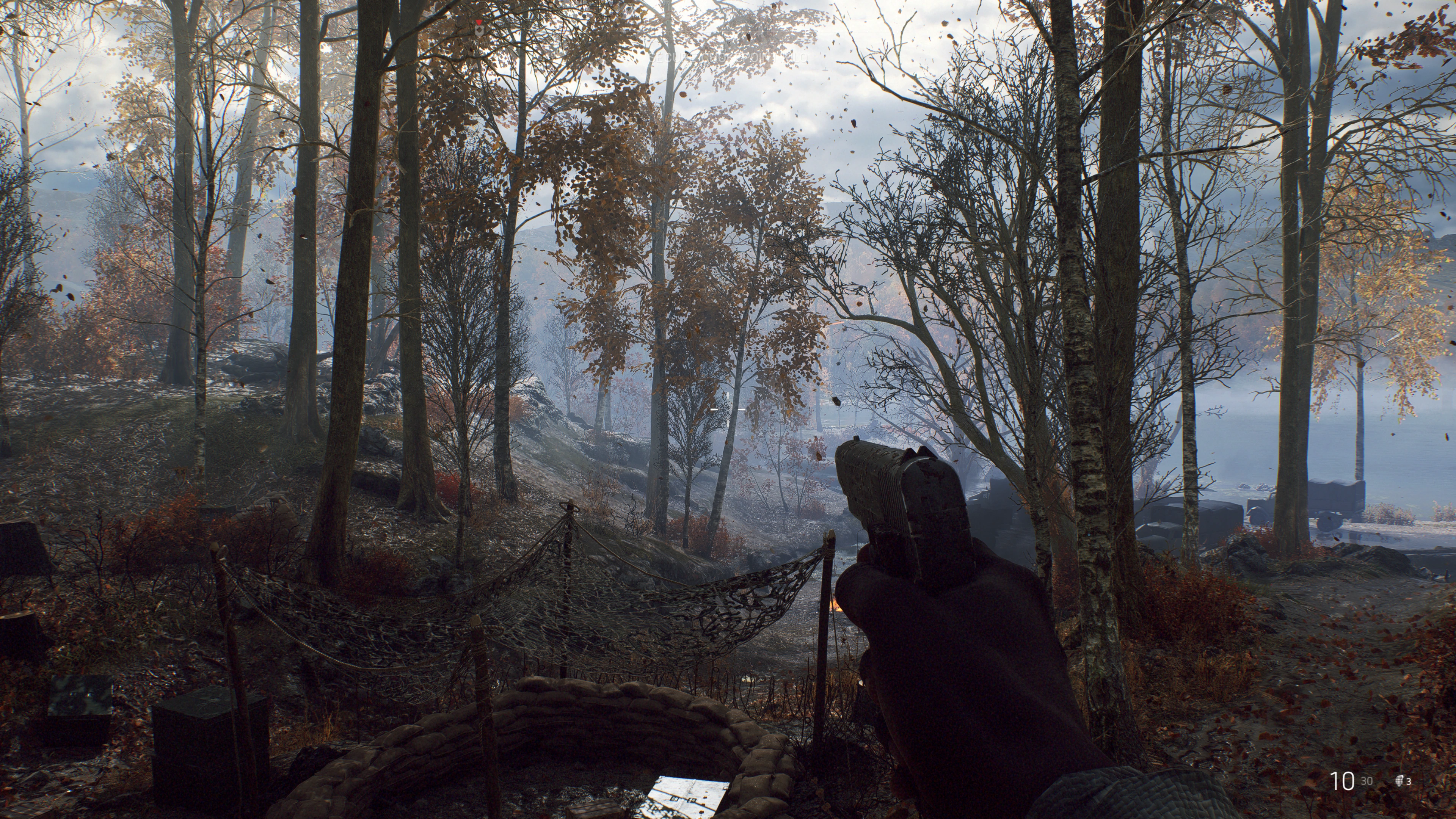
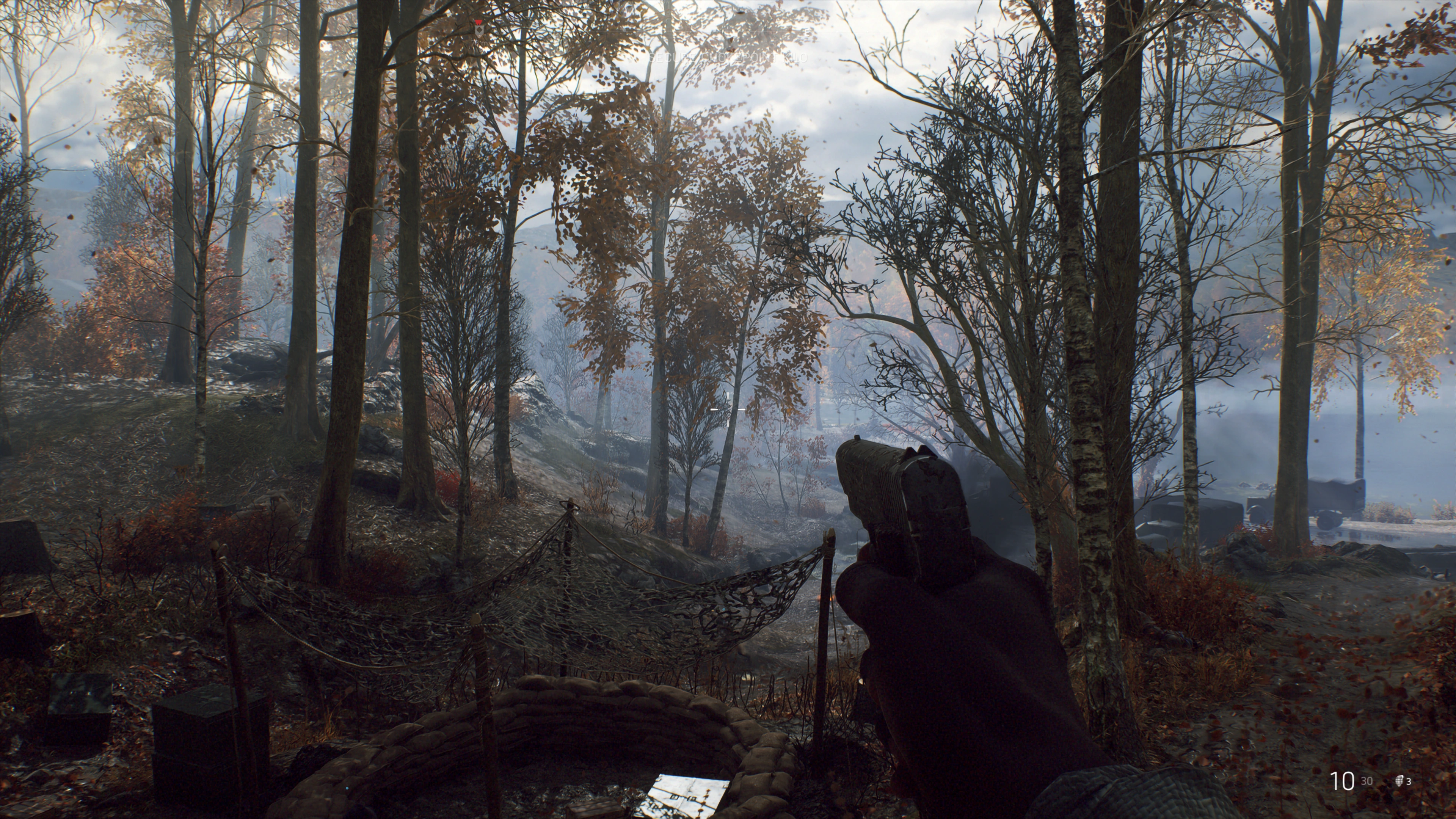
In a broad view we can see the DLSS-upscaled variant exhibits higher contrast in the tree leaves, where fine details are against a high-contrast background. (Source)

Battlefield V Zoomed-in screenshot with TAA Battlefield V Zoomed-in screenshot with DLSS document.currentScript.previousElementSibling.dataset.js = '';

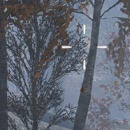
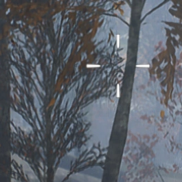
Zooming in we see ML model upscaling artifacts in the form of smearing that looks like anisotropic diffusion. (Source)

TechSpot’s and GamersNexus’ coverage shows some more comparisons and demonstrates that the performance difference is moderate, while the image quality difference is obvious.

What DLSS is and What it Isn’t

The rest is history. I was much more positive on the much-improved DLSS 2, which not only drastically increased in quality by using temporal data in addition to the spatial upscaling, but it also became game-independent. It wasn’t a matter of “will DLSS support this game” anymore - now it was “will this game support DLSS”. And that, paired with the quality improvements, made it viable and sometimes higher quality than TAA.

DLSS 2.0 shows impressive improvements on all accounts in Control (2018).

Then, the technology slowly drifted towards becoming a middleware suite, with an increasing number of features tacked on, much like GameWorks previously. The one most criticized until now must be Frame Generation.

When Frame Generation came onto the scene with DLSS 3, I was interested, but skeptic. My most positive read-between-the-lines on the marketing was that this is a way to prolong the service life of your graphics card. Not that Nvidia really wanted investors to think that way, but I thought that if it worked well enough, it could be a pretty killer feature. You give up some image quality, accept some artifacts and the added latency, and, given the games you want to play support it, you gain another year or two of use. On the other hand, if you have a high-end system and a high refresh rate monitor, you get to experience high quality raytracing earlier than your hardware would otherwise allow. At high refresh rates, the artifacts would presumably be less noticeable.

And, on a technicality, it holds up its end of the bargain. Especially with today’s DLSS versions, where the artifacts around UI elements, and ghosting behind objects that travel in world space, but stay static on screen, became better with time. But Nvidia’s DLSS Frame Generation simply can’t convincingly make a 4090 out of a 5070.

It’s not the technology itself that rubs me the wrong way, but the marketing. The main problem is that systems that would have the most use for Frame Gen can’t really use it. At a low native frame rate the added load on the graphics card and the resulting added latency and image quality degradation just don’t make a good enough experience. The effect is exacerbated by DLSS 4’s Multi Frame Generation, so this is demonstrated time and again, and again. So in reality it’s more of a value-add for high-end buyers and a stopgap for ever longer product generation lifecycles.

Just as I was finishing this post, Hardware Unboxed reported on Lego Batman: Legacy of the Dark Knight (2026) recommending to use Frame Generation across all of its system requirements levels. The minimum requirements call for Frame Gen to get a 30 FPS experience. That means about a 15-20 FPS native frame rate.

Appalling, as they show in their graphs. Frame Generation cannot fix bad performance.

So, as an option, it’s good. I’m all for options! PC gaming is all about options. But its mere existence is a reflection of the price/performance stagnation in the middle and lower product segments.

Can The Frames Get Even More Fake?

DLSS 5 is a whole different beast. This is a video-to-video model that can enhance certain parts of the image it recognizes, in real-time.

Hogwarts Legacy Screenshot, DLSS 5 off Hogwarts Legacy Screenshot, DLSS 5 on document.currentScript.previousElementSibling.dataset.js = '';

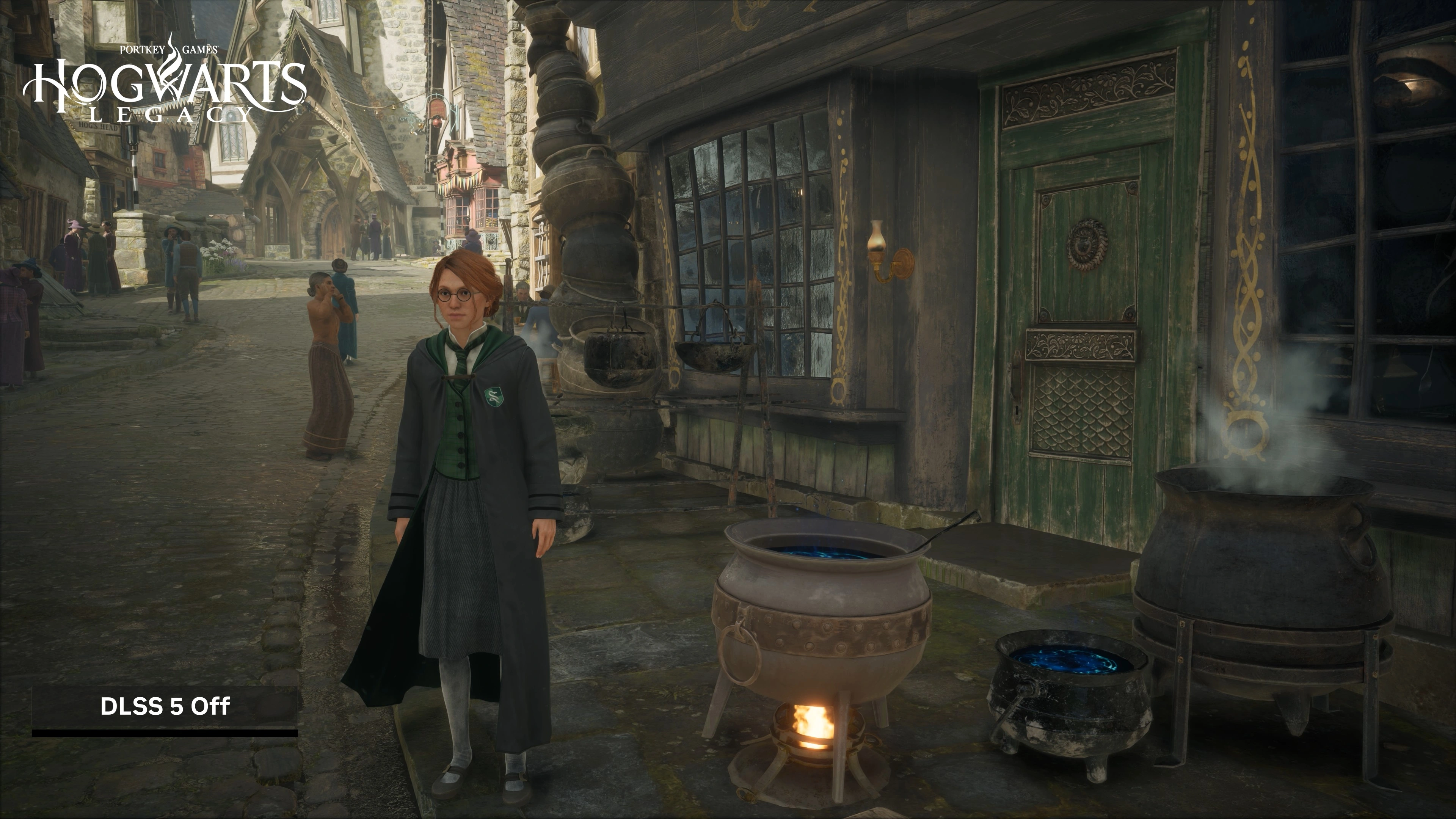
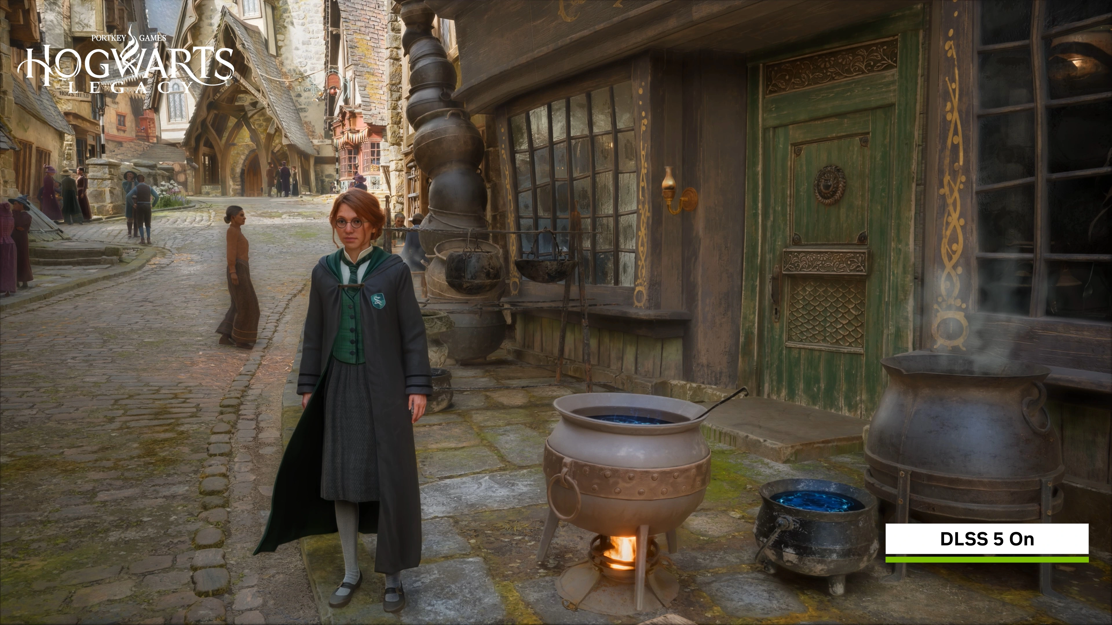
On first glance, environments are treated to much more grounded and realistic looking lighting. Like here in Hogwarts Legacy (2024). Notice how the stack of cauldrons in the middle of the frame now gets a neat diffuse reflection. (Source)

Nvidia Zorah Demo, DLSS 5 off Nvidia Zorah Demo, DLSS 5 on document.currentScript.previousElementSibling.dataset.js = '';

Nvidia’s Zorah Unreal Engine 5 demo is also shown off. It also seems like an upgrade, but the adorned wooden board beneath the awning on the left should be in shade. A limitation of the screen-space technology that doesn’t get depth information about the 3D scene. (Source)

As demonstrated, these enhancements can go very far, like completely relighting a scene, changing character’s faces, and changing the post-processing. It is extremely impressive that it’s even possible to run this in real-time, even if the demos ran on two RTX 5090s. But I’m very uneasy seeing it happen. There’s just so many implications.

What I am absolutely sure about is that it’s overstepping with its infringement on artistic vision and coherency. Take a look at this:

Resident Evil: Requiem Screenshot, DLSS 5 off Resident Evil: Requiem Screenshot, DLSS 5 on document.currentScript.previousElementSibling.dataset.js = '';

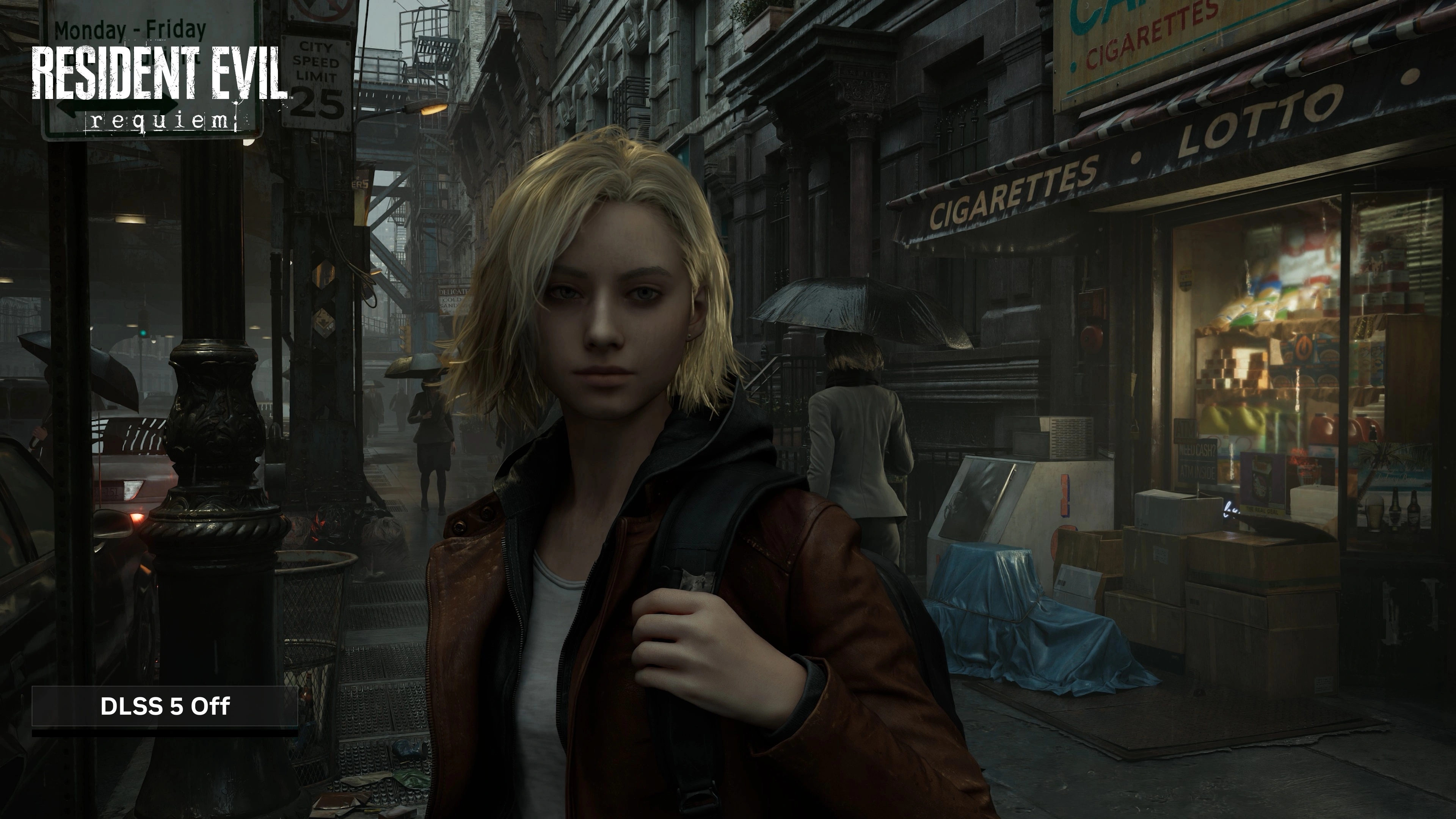
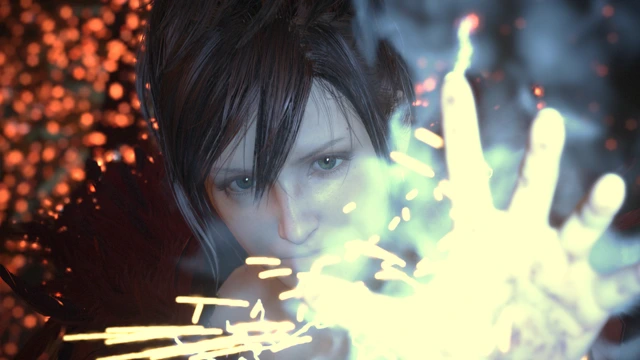
This is the controversial shot of Grace Ashcroft from Resident Evil: Requiem (2026). Ignoring her for a moment, we lose parts of the fog in the background to contrast enhancement. Notice how the fog is still there between the light pole and the column of the subway tracks to the left. (Source)

Resident Evil: Requiem Zoomed-in Screenshot, DLSS 5 off Resident Evil: Requiem Zoomed-in Screenshot, DLSS 5 on document.currentScript.previousElementSibling.dataset.js = '';

Zoomed in, you can notice the reshading of her cheeks, wider eyes and the fuller lips. The reshading on her hair is absolutely amazing though. Also her eyes are slightly different from each other now.

I wonder if Grace’s face would look different from the side than from the front, based on the model’s training data. Or if the model would even recognize the side-profile as a face to apply the beauty filter to.

Anyway, DLSS 5 is also overstepping what the DLSS brand stood for until now - and not in a good way. Even though it already got diluted by the tacked-on supplementary features, the DLSS suite was still squarely in the same business as other anti-aliasing technologies: Get rid of jaggies, make game go faster. It’s about image quality and performance enhancements on a purely technical level. And DLSS 5’s features, as demonstrated, just ain’t that, plain and simple.

And that is completely ignoring the name: Deep Learning Super Sampling. DLSS 5’s new features should be called something else and live under a different middleware package. Like RTX Neural Rendering as part of RTX Kit for example.

But, for the sake of the argument, let’s say we’re super happy with the results and really wanted Neural Rendering to happen. What’s wrong with DLSS 5 on a technical level? In its demonstrated form, it’s just not at all what I made it out to be, and what I wanted out of it.

What I Wanted Out Of It

Now, to my disappointment, as far as I can tell, DLSS 5 has little to do with the RTX Neural Rendering features Nvidia showed off alongside the announcement of its Blackwell GPUs. The only obvious parallels are RTX Neural Faces and RTX Hair, which are really impressive from a technological standpoint in the stability of the output and the grounding to the input image. They just seem wildly misplaced in the gaming space.

And for me it’s not only because of the yassification - I can imagine that may actually be adjustable by developers in some respects. For me, it’s mostly the uncanny valley. And that is because we lack the animation tech to make the photorealistic faces look coherent with the way the bodies they’re attached to are animated. The Starfield (2023) demos look decent enough in still images, but in motion the result suffers from exactly the uncanny valley effect it was supposed to fix.

Starfield Screenshot, DLSS 5 off Starfield Screenshot, DLSS 5 on document.currentScript.previousElementSibling.dataset.js = '';

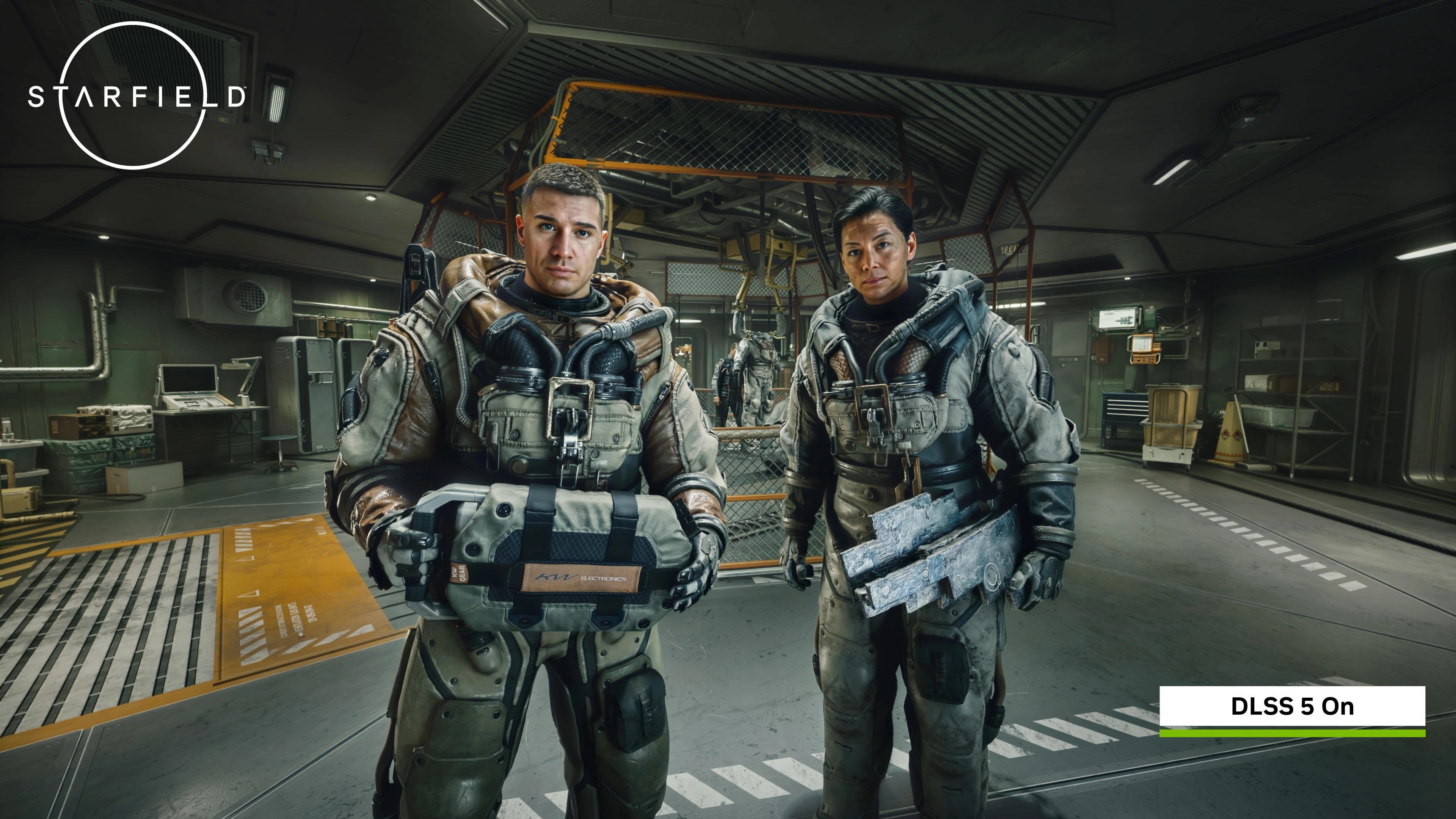
Not only do I find this overprocessed look hard to look at (notice the glow around the two main subjects), but I’d say the local contrast enhancements are a downgrade to the groundedness of the lighting overall. The other demos generally do make Starfield look better in stills though. (Source)

But it breaks down in motion. That’s the uncanny valley effect I mean. Starfield has very optimized animations (i.e. keyframe reduction) for performance reasons and the lipsync isn’t motion captured for every single line of dialogue.

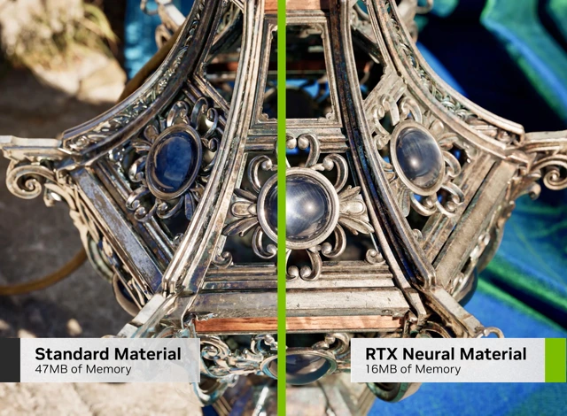
I didn’t really see the other RTX Neural Rendering features represented in DLSS 5’s demonstration. I was especially excited about the prospect of Neural Shaders and Neural Materials. My idealized dream version of it is this:

Half-Life 2 Screenshot of Coastline. Some rocks have a no-texture material.

Basically how I want Neural Shaders and Materials to be handled. (Source)

Developers could define materials as neural-rendered in the engine, then the engine would make two passes on the frame. One with either a plain shader to store information on the material’s properties, or with a traditional shader that approximates the effect, and then one pass where the ML model would take that information to inpaint the pixels precisely where the neural material is on screen, using depth, normals, lighting info, motion vectors, and whatever else it needs. We would basically traditionally render the scene, and use neural rendering to do things that are impossible or very hard to do in real-time. For example materials like silk, or having the power of Substance Designer/Painter in a neural material that auto-adapts to the shape of meshes. I hoped we could get rid of ugly tiled ground textures, and train the ML models on real-world materials and objects. All while using less memory.

Nvidia demonstrate as much in a research paper about it. The team states “we hope this article will stimulate adoption of small neural networks in real-time rendering”, citing Neural Shaders “outperform optimized GPU implementations”.

Making the iridescent cloth material is possible using a multi-layer shader. But it’s no easy feat. Especially if it has to look good from afar and up close.

I imagined Neural Shaders and Neural Materials could become useful enough to define a new open standard on the level of programmable shaders, become integrated into graphics APIs, and drive computer graphics forward for everyone. In the DLSS 5 press release, Jensen is quoted: “Twenty-five years after NVIDIA invented the programmable shader, we are reinventing computer graphics once again”.

But, alas, DLSS 5 is not a reinvention of computer graphics. We got a really nice and proprietary beauty filter instead. A screen-space beauty filter at that. One that makes frames slower to render, not faster.

All in all, I don’t think the gaming space needs this in its demonstrated form. Rather than this, I think we could use more efficient animation technologies, and advancements in character physics. The characters Metahuman produces look convincing enough on a 3D model and material level. We don’t need to superimpose an AI slop filter on top of them. We need more powerful hardware to use such high-poly models with advanced rigs everywhere, and cheap high-quality motion capturing tech to have believable animations produced by anyone run on any hardware.

Only very recently have real-time subcutaneous muscle simulations started to crop up, but not in shipping products yet as far as I know. One example is a short The Witcher 4 demo in a State of Unreal presentation:

Unreal’s Chaos Flesh Muscle Simulation introduced with Unreal Engine 5.5 seems like a pretty brute-force way of doing it, but it’s certainly one way. Currently, I find it hard to imagine to apply that system to face muscles for very precise skin deformations at scale. But I do think there’s lots of untapped potential there with ML-based vertex or fragment shaders trained on producing specific results from certain arrangements of bones and their relations to each other.

Where Does It Go Next?

With DLSS 5, the fake frames have reached new heights of fakery. And as anyone could have predicted, this resulted in another blowback for Nvidia. Jensen’s universally criticized “they’re completely wrong” goes to show that, at least at his level, the reaction was wholly unexpected.

And I kinda get it. The tech is genuinely cool, despite its inaccuracies and all, and it is using the inference hardware to its fullest. Maybe if I was in the thick of things developing it, I also would’ve been blindsided by the reaction.

But from the outside looking in… To me, this is a case of just because we can, doesn’t mean we should. I imagine the tech has much more useful applications than imposing generic beauty standards on the output image.

The internet’s exaggerated reaction was warranted in that it unmistakably demonstrated that the product isn’t where it needs to be. I had my share of fun with DLSS 5 Anything and the memes. But in reality the effect in the demos was likely cranked to 11 make it really apparent. Surely teams with a bit of artistic intent could use it more tactfully.

And that leaves this lingering feeling of irresistibility. An aftertaste so sweet and yet so dangerous.

The implications on the games industry as a whole - it’s a whole different story. With over 94% market share on sales, Nvidia has a monopoly in the consumer space. Unfortunately, it’s even lauded for it. Whatever Nvidia pushes has a high chance of being adopted, simply because of market penetration.

The Shape of Things to Come

So if the beauty filter becomes reality, at one point or another there’s going to be enough cards out there able to run it. Either that, or gaming will transition to cloud subscriptions and real-time streaming to thin clients, and we’ll own nothing and be happy. The GPUs in the cloud will surely be powerful enough to run the thing.

I fear with time we’re going to find ourselves in the same situation as with the Lego Batman: Legacy of the Dark Knight (2026) example above. Today it’s reliance on technical enhancements, and tomorrow it’s going to be cosmetic enhancements.

There’s nothing inherently wrong with that, depending on how purist you want to be about it. But DLSS 5’s critics correctly identified that it tends to make the output look more same-y. And that’s the actually scary part I think. It’s more same-y and more pleasant. Like how camera apps on smartphones heavily post-process the output, mostly to our delight.

In any case, Nvidia allowed us this glimpse into the future, where lacking competition and increasingly expensive advances in chip design and manufacturing result in ever more price/performance stagnation. Where the reliance on such fakery will continue and likely increase. And we’ll slowly grow fond of it.

I don’t believe DLSS 5’s arrival is going to change anything in the short to mid-term - especially for low and mid-range gamers. But long-term I can see small productions gaining in image quality overall, large productions attempting to save a buck using it, and us getting further and further away from the art and craft of making video games. I see a divide happening where “homegrown” AI-less games stand out in a sea of sameness, fans and critics on both sides and all.

And that’s not a future I want to witness for video games. I wish the cosmetic enhancements of DLSS 5 will never grow on us in the way DLSS and Frame Generation did.

https://jama.me/blog/dlss5-outlook/
jama - Own a Domain
A domain is an easy way to future-proof your online identity and has lots of everyday tangible benefits. Even for non-techies.
Show full content

Removed references to Namecheap, because Namecheap is going to be acquired by CVC Capital Partners. I expect service quality to eventually suffer as a result.

Lately I’ve been getting asked about privacy and life online by friends, coworkers, even grandparents.

Planning a wedding without inbox chaos or drowning in group chats, launching a professional side-gig, trying to end the suffering of spam from years of neglecting digital hygiene, looking to de-google.

Things anyone might want to do these days.

If you want a fuller picture on privacy, Privacy Guides is great. But for most people that rabbit hole (which only begins on Privacy Guides) can wait until later.

Start with the basic thing that will keep paying off:

Get Your Own Domain

No hype. It’s cheap, quick, and you don’t need to be a techie. It gets you tangible benefits.

Let’s walk through some of them.

Email

This is probably one of the most boring and one of the most “thank yourself later” things you can do with your own domain. It’s also one of the most impactful.

  • You get lots of spam because your address has been sold to data brokers and leaked in data breaches
  • Your xxxAlucardSoHot2283xxx​@hotmail.com address doesn’t quite cut it for your resumé, or it got too cringy for your taste
  • You get married and sharing an alice_and_joe5124​@gmail.com address with others leads to typos and is inconvenient
  • You don’t like how Gmail does email
  • You don’t want your email provider scraping your emails for data
  • You were algorithmically banned out of the blue and your account is unrecoverable because of nonexistent support

Those are some of the email things you can resolve with your own domain.

If you’ve been using an email address for a long time all over the web, I’d say that’s a growing privacy concern. Over time, your email address is getting linked with more and more services, some of which may be directly connected with your identity. And changing email addresses is such an incredible chore if you’re been using it everywhere. As always, privacy and convenience oppose each other.

Changing from your ancient or cringy address to another really only gets you a new start with the same outcome. So I get that it’s not worth the effort.

Aliases

On the other hand, I’d argue that changing to firstname​@lastname.com (or whatever domain you go with) will probably be the last time you’ll switch emails. Why? Because you won’t be using that address everywhere. And I don’t mean that you’ll keep using your old address alongside the new one. You’ll be using aliases instead.

I found that I get the best of both privacy and convenience using Fastmail, but there’s lots of other options. Fastmail allows me to create masked email addresses, so I can sign up with a different address everywhere. Every service I sign up for gets a different one, like sweet.yard9366​@mydomain.com. Various online stores, social networks, Google, Apple, my internet provider, my cellular provider, my bank, my landlord, some person I’m selling something to, and so on. And they all go into my single mailbox.

If a service leaks my data and I start getting bombarded with spam, I can easily just nuke that one address. Because all the addresses are different from each other, I also get insight into who leaked or sold my data. At the same time, I have stable addresses (like the one in the legals on this site) for handing out to people, and I don’t sign up anywhere with those.

And this isn’t just mumbo-jumbo for techies, there are very practical uses too. Creating a mailbox for yourself and your partner each and having an alias forwarding email to both of you is a nice way of managing finances and the household.

The Infrastructure

Aside from a domain, you should explore where to host your emails, because your Gmail doesn’t allow custom domains for free.

Fastmail delivers mail well and has a good spam filter. The featureset and high service quality just makes it comparatively expensive. If Fastmail is too expensive for your taste, take a look at Forward Mail.

Most domain providers also offer email hosting. Beware though, those services are of varying quality, and you don’t want your email to be bad. Most of them don’t offer a masked email feature like Fastmail, but they usually let you manually create aliases like bank​@yourdomain.com or amazon​@yourdomain.com. Not as convenient, but the result is effectively the same. In any case, if you like the idea of aliases, avoid services that let you create a limited amount of them.

Now, after investing all that work into changing my email provider and setting up all the aliases, what if the provider goes under? In the unlikely event that Google decided to end Gmail, or suddenly banned you for whatever reason, you’d be forced to go through the change completely unprepared.

If your email hoster ended their service or banned you, you’d still have your domain, and could move over to another service without changing any addresses. If your domain provider goes under, you can also just move to another. It’s all independent from one another. I previously changed my email hosting from Google Workspace (one of the paid business plans) to Mailcheap to Fastmail, completely without disruptions.

Professional Benefits

Aside from the obvious fact that your custom email address can look more professional and trustworthy, having a domain lets you host websites on the internet, like the one you’re currently visiting. In your case that might be a blog, but it might also be your CV for example. You’re not limited by yourdomain.com as well. You can also easily set up subdomains like cv.yourdomain.com and host many things.

See it as your little home on the internet - professional and personal. We had Geocities websites and MySpace profiles back in the day (man, I’m dating myself aren’t I), and this is something similar.

You don’t have to build it yourself either. There’s lots of platforms you can use to create a good personal website without having to learn to code. For a personal website, check out Bear, Ghost, micro.blog, or Carrd if you’re looking for something simple that just works. If you want to dig deeper, take a look at Framer, Webflow, and omg.lol, or really do learn a bit of HTML and CSS and build it yourself.

There’s lots of excellent inspiration for what to put on your website.

Self-hosting

I’d say this one’s pretty niche, but interesting nonetheless. Of course, if you can host websites, you can also host other kinds of services.

A common one may be backing up your family’s photo library and letting them access it remotely. Same for wedding photos for example. The easiest way to do that would probably be hosting Immich on PikaPods. Immich has a nice web interface as well as polished apps.

Among others, I host Actual Budget to keep track of my finances and Navidrome as my personal music streaming service.

My setup is more involved, but using PikaPods you get up and running in a matter of minutes. That can get you pretty far, and you’re not locked into any particular service. In any case, should you choose to move the hosting, your domain will stay the same. If you shared the address to your family photos with anyone, they won’t even know the hosting changed.

How to Get a Domain

Now, I’ve dropped a few recommendations here and there throughout this post. But how do you actually set it up? Is it really that easy and cheap?

Choosing a Domain Name

Chances are you’re not the only person in the world who thinks that getting lastname.com is a good idea. Probably that one’s already taken if you look it up. Michael Lynch has some good advice on selecting a domain name for use with your partner, but it’s applicable to any personal domain I’d say. He suggests going for something unrelated to your name that is easily pronounceable and clear.

You’ll likely need to choose not only the domain name, but also the ending. I went for the Montenegran .me to signal that this is my personal website for example.

If you don’t plan to move away from the country you’re in, and if that country is somewhat stable, it may make sense to get the two-letter cTLD (Country Top Level Domain). Otherwise, maybe go for something completely different. Just keep in mind that TLDs have reputations, which can influence how often emails you send will go into spam. If you want to be extra sure, check out Spamhaus’ regular Domain Reputation Report for TLDs to avoid. A .com is, of course, most preferable, as it’s not tied to any country and is well-known.

To quickly find available domains, I like to use TLD-List. It’s also great for comparing prices between domain registrars.

Prices vary wildly between TLDs. A .com should go for around $10-15 USD/year. My jama.me domain currently costs me $17.27 USD/year on Porkbun.

Choosing a Domain Registrar

There are lots of them, and for personal use you should go with one of the cheaper ICANN-accredited ones that maybe people you know trust, or that are generally reputable. I personally had good experiences with Porkbun as well as Netim and Hover (though that one’s quite expensive).

I’d prefer companies whose main business is domains instead of ones that offer a wide range of services, like Ionos, or Cloudflare. These are larger platforms with varying levels of human support, and it really stings to lose critical infrastructure such as domains. You really want to be able to quickly talk to a knowledgeable human in case things go sideways.

Now What?

Once you’ve found an available domain name and the registrar you want to purchase the domain with, let’s go step by step:

  1. Sign up at the domain registrar with your old email address. You’ll change that once you’re done
  2. Purchase your domain
  3. Your domain registrar will let you set DNS records for your domain. Find that list, you’ll need to edit it
  4. Sign up with the email hoster
    • Fastmail lets you immediately sign up with a custom domain. Others may not, so you’ll sign up with your old email address there too.
  5. The email hoster will provide you with instructions on which DNS records to set in your domain. Add the records as instructed
    • Here’s Fastmail’s article on that explaining what the records do. The records are going to be similar for other email hosters as well.
  6. Wait for a little while (usually an hour, can be up to a day)
    • This is because DNS, the phone book of the internet, is a distributed system. When you set records in your domain, the registrar will notify DNS servers around the world about the change. It can take a hot minute for all the providers to have heard about it.
  7. Add your new email address to email apps on your devices, verify it works
    • If you added the SRV type records as well, it should magically auto-configure like Gmail or Outlook.
    • Send yourself an email, send friends and family one, let them write you!
  8. Create an email alias
  9. Change the account email at your domain registrar to the alias you created
    • If you had to sign up with your old email address at your new email hoster, change the address to an alias there as well, or keep the old address as a backup.
  10. Start your journey of changing email addresses at all the relevant services you signed up with over the years
    • If you have been using a password manager, or at least have saved logins in your browser, this might be a lot easier than otherwise.
    • If you plan to abandon the old email address, this might also be the time to decide which services you don’t use anymore.
    • Here’s a list of websites and services to start with:
      1. Shopping websites (Amazon, eBay, Craigslist, etc.)
      2. Financial services (Bank, Trading platform, Crypto exchange, etc.)
      3. Social networks (Facebook, Instagram, TikTok, X, Reddit, Discord, Bluesky, Mastodon, etc.)
      4. Entertainment services (YouTube, Patreon, Netflix, Spotify, Audible, Steam, etc.)
      5. Device platform accounts (Google, iCloud, Microsoft/Xbox, Nintendo, Sony, etc.)
      6. Infrastructure providers (Home internet, cell service, utilities, etc.)
      7. Smart home devices (Eufy, Philips, Nest, Ubiquiti, Sonos, Lutron, etc.)
      8. Software services (Adobe, Microsoft, Backblaze, Notion, 1Password, YNAB, etc.)
      9. Sports and health services (Health insurance, Gym, Peloton, etc.)
      10. Educational services (School/university, Duolingo, Udemy, etc.)
      11. Transportation (Car insurance, public transport card, car infotainment, etc.)
      12. Old-school forums
  11. Make more use of your little place on the web
    • Host your CV, a website, and other stuff!
Conclusion

Whether it’s to de-google your life a bit, to combat chaos in your inbox, to present yourself professionally, or if it’s to set up a side gig - having your own domain is a good way to bring structure and hygiene into your and your close ones’ digital life.

Yes, it’s a pain in the ass to switch email addresses. But with full control over your email address, this time will probably be your last. Do yourself a favor and get on it.

https://jama.me/blog/own-a-domain/
jama - The Deprofessionalization of the Games Industry
While layoffs are rampant under big-budget behemoths, I hope the future might favor teams daring to dream mid-sized again.
Show full content

I found my calling at the tender age of 10 years old when I stumbled upon the then newly released FPS Creator in 2005. “Design your own first person shooter games - No coding required!” read the marketing back then. And from the moment I saw my first little level, made in about a day, render in real-time, I knew this would be something I wanted to do long-term.

I mean, for crying out loud, I have a Bachelor’s in Digital Games focused on Game Design and I’m wrapping up a Master’s in the same. I’m really invested in the industry and I love to see it thrive and innovate.

Mirror's Edge (2008) screenshot. First person view of player walking balancing on a pipe above drop.

Mirror’s Edge (2008) by DICE

AAA Is In a Rut

Back in 2005, I couldn’t have predicted how massive the games industry would become. It’s by far the biggest entertainment sector. Of course, alongside new models of monetization, there was lots of innovation and transformation in the space, but also lots of consolidation. Acquiring Zenimax and ABK, Microsoft absorbed over 60 game studios and powerful multimedia publishing arms. Importantly, they also bought their intellectual properties.

There’s no such thing as infinite growth though. Matthew Ball’s The State of Video Gaming in 2025 paints a picture of the industry reaching some kind of ceiling. And until more innovation brings in more monetization, we’re beginning to see how that ceiling looks like. The massive layoffs across the industry, to me, show that art is one of the first things on the chopping block when the going gets tough. Still, despite it all, we had a couple years of incredible releases and disappointments - the industry is very much alive.

While that’s going on, we see concrete examples pointing out a still rather small, but distinct shift of focus towards indie games. A deprofessionalization one may call it. And it doesn’t appear to be looking good for the big and established publishers and everybody working there.

While I too find the mass layoffs devastating to follow - the livelihoods of so many in the industry at risk - I find that the current panic is bound to become an overcorrection following years of unbelievable growth and naively expecting it to keep going forever. Honestly, call me naive, but it seems fundamentally misaligned for publicly traded companies to be in the business of art. But aside from an overcorrection, I also find this to be a chance to see what’s up ahead and a chance to bring a broad new wave of creativity in.

As in many other spheres, the “middle of the market […] disintegrating” is definitely something I’ve observed for the last decades in gaming. It appears to have been the reason Sony closed Japan Studio. But contrary to that, I think it’s worth asking whether we really need to keep betting the house on massive, multi-hundred-million-dollar projects? Of course, supporting a workforce hundreds (or thousands) strong demands scale, and publishers looking for further growth won’t be lining up for your average artsy sidescroller. But that is not the situation big-name developers find themselves in. They’re increasingly swinging for the fences each project. Concord actually was a great example of putting all eggs in one basket to a devastating flop.

Put bluntly, what I want is the unlikely thing of A and AA games to more broadly make a return.

Pacific Drive (2024) screenshot. Dark and foggy view of a road. Car is shown from behind. A gas station sign in the distance ominously illuminates the fog.

Pacific Drive (2024) by Ironwood Studios

Thanks to democratized dev tools, we’ve seen the value delivered by talented solo developers and small teams, with projects inching closer to filling the bottom part of that void. But they naturally have a hard time reaching the same level of ambition a mid-sized team with a decent budget could afford - quality mid-sized projects that would fit into that middle segment. Teams of less than 100 people with not out-of-this-world budgets, Sandfall Interactive’s Clair Obscur: Expedition 33 being a recent example.

In the last decade I feel a divide in creativity between big budget titles and indies has formed (while the definition of “big budget” definitely also has changed). We’re seeing remakes and remasters one after the other, banking on nostalgia. We’re seeing one Call of Duty and Assassin’s Creed after the other, banking on an established name. That’s not to discredit the skill or creativity of those teams - the production quality is clearly extremely high - but the fatigue with the big franchises is growing to be real, and it’ll be hard to shake off. At the same time, indies can afford to be weird and experimental, and they’re a lot less aggressive about the monetization. But most importantly, they’ve been shaking off their “small project” stigmata in the general zeitgeist.

In short, I think a renewed focus on creativity and smaller projects could spark new franchises to milk for the decade(s) to come. It’s all a cycle anyway. Right now it’s sloping into a rut, but we need to think of the fuel that will propel the rise later. And I have a feeling that it won’t be yet another Call of Duty.

I want to be excited for the next experimental horror series like Silent Hill back in the day, a return to the gimmicky shooter à la Half-Life, tactical espionage and spy games, 3D platformers, immersive sims and life sims, fresh VR concepts, and completely new experiences. But at this rate, they’re not going to come from the big names who in time will be scrambling to buy the interesting developers and franchises and molding them into safe, profitable, gray goo.

So actually I would prefer a little bit of deprofessionalization of the games industry.

Give me that weird movie tie-in game that introduces new rendering tech. A horror experience with a similar level of love and care as Alien: Isolation. A wonderfully cute soft-body physics platformer like LocoRoco. A brand-centric game with an integration that makes sense, like Need for Speed: Porsche Unleashed. That spiritual successor to No One Lives Forever or Splinter Cell. There’s surely more to explore from where The Last Guardian, Alien Swarm or Beat Saber have left off. Or combine turn-based combat with cards like Metal Gear Acid.

The Talos Principle 2 (2023) screenshot. Player is solving a puzzle using lasers and portals. Sunlit delapidated concrete structures in the background.

The Talos Principle 2 (2023) by Croteam

Once in a while there’s something pretty out there coming along, like High on Life. While not praised to high heaven (and I’m also not a fan), it’s at least trying to be very different. And, with a bit of help, it seems to have gotten into quite a few players’ hands.

My thoughts go out to everyone who lost their dream job in this chaos. Even if the longest running studios that suffered closures have changed a lot since their glory days, it still just sucks so bad.

https://jama.me/blog/deprofessionalization-gamedev/
jama - Sanding Early
Realizing that I wasn't polishing things in the way I always said, I think I can put my ruminations to rest.
Show full content

From time to time, I’m confronted with the notions of “technical debt is acceptable this time”, “let’s make the simplest possible version of this” and “no one will notice - we’ll make it good and pretty later”.

Of course, life is complex, and from time to time it makes sense. From time to time. I think users can be more discernable and critical than those sentiments give them credit for.

As probably most software developers, I’m not a huge fan of the appetite to make software cheaper, especially at the cost of quality. It’s a modus operandi in enterprise software and I find it quite mean to give people who don’t love their job more than anything else in the world more reasons for it to be that way, for example by having them use subpar software. It just makes for a more depressing reality.

I definitely appreciate the fact that sometimes rapidly shipping features is impressive and can shift the project into the spotlight, securing future investment for example. Still, my perspective on it is that there are things that are almost equally as impressive, but which at the same time make developing things feel less like work. And being impressive in enterprise software doesn’t always require taking on a massive challenge. Sometimes it’s the little things that count.

Polishing Early?

For a long time I’ve called myself a chronic polisher and a perfectionist, struggling to let go of things until I found them to be presentable. But that doesn’t mean I obsessed over every detail until it was superbly immaculate. It was never about endlessly refining for the sake of it, and not about adding juice. Instead, I wanted the result on the whole to be solid enough to not be embarrassing. That’s what I really meant.

Reflecting on it from time to time, I’ve come to realize that I likely have a strong sensitivity to quality. I take a pragmatic, almost clinical approach to spending money. Before making a purchase, I create a mental checklist of criteria, and thoroughly research before allowing myself to get excited about it. Yet, sometimes even without knowing the brand or the price, I gravitate toward the higher-end options in a given category. It’s both blessing and curse, especially when I’m shopping offline, where I somehow always end up picking the most expensive items before checking the price tag.

On the one hand, I might just be naive and impressionable, not noticing how I’m getting sweet-talked by marketing. On the other, I like to believe it’s also having a keen eye for quality and paying close attention to the subtle details that signal care and craftsmanship.

It’s also what makes working in enterprise software frustrating for me, because not only is it a race to the bottom - achieving the set objectives as cheaply as possible - but, usually, nobody with enough control over the project appreciates it when you polish. Requirements change, polishing happens in places nobody cares about, polish can introduce things that slow down workflows, I’m painfully aware.

But what I realized over time is that, even working on my own projects with full creative control, I don’t polish immediately. What I actually do in the spur of the moment is not polishing, it’s sanding. When I’m forced to let go of things that aren’t sanded, that’s when I feel truly dissatisfied.

Sanding Everything

I really appreciate Jim Nielsen’s blog post on sanding UI (and part the second). In a very simple way it put a word to what I’ve been doing for years and years and made it tangible for me. As the saying goes, words mean things, and it doesn’t have to carry the baggage of polish.

While I think that creating user interfaces is a very good vehicle to exemplify sanding, I see it also taking place in all kinds of different spheres and ways. Because I like making many different things in the digital realm, I find myself confronted with sanding across many disciplines.

To me, sanding is an exercise in getting to know what the low hanging fruits and the acceptable quality bar in a certain discipline are, and interspersing my time working on something to find and implement little improvements - what Nielsen calls “feeling for splinters”. It spans across basically everything I find myself producing - software architecture, hard and soft surface 3D modelling and texturing, printed goods design, web development, level design, shader programming, music and sound mixing, and so on - often right from the conceptualizing phase.

The Last of Us: Part II in-development screenshot, generic colorful blocks standing in for level geometry The Last of Us: Part II screenshot, post-apocalyptic overgrown guitar store, highly detailed

A comparison of a rough block out of a game scene, and how it looks finished, by Michael Barclay from The Last of Us: Part II. (Source)

The block out can be sanded to improve gameplay. The finished product has already been sanded and polished lots to improve visual details for example. The work that happens between the two states is decidedly not sanding itself.

Unsurprisingly, I’m not satisfied with my work when I have to painstakingly unravel the horrors of numerous thoughtless split-second decisions that led to interdependent permanent temporary band-aids. Sanding is no guarantee for that not happening, but it requires taking another look (and maybe a different look) at the thing in development, and that heightens the chance of catching missteps.

Sanding is simultaneously an improvement to the thing we’re creating, and an appreciation for what we have achieved so far. It requires and communicates to others that I truly understand what I’m making, and test-driving it myself while seeing it improve in rapid feedback cycles feels rewarding.

Sanding Is Thoughtful

There are a myriad of takes on why we make software, but for the purposes of this section, I’ll focus on software for the workplace.

Ideally, we make software to make life better - help people achieve something, reduce frustration, but at the very least to make line go up. Best-case scenario, work becomes easier, more fulfilling, and leads to happier people who are happy to be highly productive.

Slightly more realistically, to this end, work should be a little bit of fun. Maybe not so much as to detract from why we’re doing the work in the first place, or to distract us so much that we lose our focus, but enough fun to keep us engaged.

That’s why I never play the pissed off customer. I want good service, so I try to be as helpful and friendly as I possibly can, because I want people to do something for me. Making someone’s day worse rarely nets the best result if I’m depending on them. Their willingness to be engaged in our interaction will sink. Conversely, kindness often leads to fast, excellent service, and smiles all around.

This is one way in which much of enterprise software lacks. It generally treats users badly. I don’t lament that there’s no fun in it. It just completely lacks a sense for what’s engaging, and shows not the least bit of sympathy. Maybe it’s asking too much, because people ought to work more, not enjoy the process.

As a result, often enough, users have to deal with ridiculous situations: Nested remote desktops, torturous performance, confusing UIs that are direct representations of their complicated backing data structures, or that don’t communicate their state clearly (looking at you, Teams), stability issues, glacial maintenance. A cursory selection of the usual state of affairs in the typical workplace.

Sanding on its own can’t fix any of that, but it can make the experience more bearable at least, even if the rest is a flaming hellscape. It implies that at least a modicum of thought was spent on how a thing will be used.

Why I Sand Early

I determine the best time for and amount of sanding by trying to understand how technically experienced the one(s) judging the work is, and how central an individual aspect under consideration is to the whole experience. Let’s take software development for example and throw in game development for good measure.

Working as a freelancer and later for a software dev consultancy, I got the privilege to work with all kinds of different people from different lines of work, and wildly varying experience with software development. Some of these people are completely oblivious to how the sausage is made. The same is true for gamers. Somewhat less so for PC gamers than ones primarily on consoles or mobile platforms. But the fact of the matter is that everyone’s different, and everyone has different interests and priorities.

I like to account for that, so if at all possible, the amount of effort I put into sanding is somewhat inversely proportional to that experience level.

In Software

Project managers often insist that “the minimum working thing is more than enough”. But when it’s implemented precisely to that specification, they will often get caught up on details and be disappointed. Demanding improvements is totally fine, but unfortunately that all-important first impression is now soured. And, in the worst case, it will silently weigh on your reputation.

That’s why, when building UIs, I follow Nielsen’s advice - I constantly play around with what I’m making and I try to break it, finding and fixing small deficiencies. Most of the time, I do that as I’m implementing it. Regularly, the results go unnoticed because it “just works”, but sometimes it’s visible enough that clients are grateful for it.

An example came up recently. A feature to manage project avatar images was deprioritized mid-implementation, and the sidebar where those projects could be switched between looked absolutely dreadful as a result, because it had no avatar fallbacks in place. I avoided showing projects without avatars in demos until we finally tackled the issue.

The fix was planned to display a plain background and a generic icon - the simplest possible version of a fallback. Suspecting it to stick if I let it, I decided to ignore the requirements that time.

I took the extra time to implement an algorithm to generate stable, colorful, and contrasty fore- and background colors based on project names. It would spit out enough different combinations that even having the whole sidebar populated, the avatars were distinct enough for it all to be easily distinguishable. I also made it generate its colors in the oklch notation, so the avatars would pop on wide-gamut displays (in moderation), and ensure enough contrast, making use of its consistent lightness property. The two or three letters derived from the project name would scale to fit inside the avatar with a consistent padding for visual cohesion. It made the rest of the quite enterprisey and boring interface a lot nicer looking.

The PO was stunned by how the austere UI suddenly came to life when I showed him. He didn’t mind the extra time taken at all.

I was later told that users were tempted to have the sidebar chock-full with projects, just to make their workspace more engaging. The avatar fallback took me half a day to implement, and the other half to sand and test. A small detail in the grand scheme of things, but it added just that little bit of playfulness and fun.

It was of course also a case of giving a shit or not. But what isn’t, really.

In Games

I observe the same thing in games.

Game development is a very complex and highly multi-disciplinary thing. To put it in a way that doesn’t do it justice, the complexity mostly comes from cohesion being very important for a gaming experience as a whole to feel well-made, and from designing the thing so it steers emotions in a way that is desirable. There’s just so much stuff that has to intertwine in the right ways (see the Door Problem for a glimpse) for it to not be off-putting.

When working on games, I like to lead with getting the atmosphere dialed in, and letting much of the rest fall into place from there, because getting the atmosphere right requires that cohesion on multiple parts of the production. That’s easier said than done though, because for it to not be a jumbled mess of loosely fitting parts, it requires trying to form an all-encompassing vision of what something will be like to experience. The art direction, a potential story beat, the resolution of the volumetric fog, the ad hoc emotion players should experience, the thoughts they should have if they were to deeply engage with it in that moment, the footstep sound for damp carpet #6, the voice of our silent protagonist, the room tone-like droning music, the shape and color of light sources, the backstory of our goofy comedic relief character. The list goes on.

I really hammer that vision into my brain and do my best to keep the memory fresh for as long as I take to make it happen. It’s like a target clip that I have in mind, enriched with the technicalities that would come up when implementing it.

An early announcement trailer for Metal Gear Solid (1998) from 1996 showing some target footage of the vision for the game. The game itself was of course quite different to that.

Target footage for Assassin’s Creed 3 (2012) from 2010.

Like any other software, games go through stages of development, and the first couple level block outs and gameplay prototypes are usually the point where we try to judge the interplay of it all, to understand whether it’s valuable enough to make in earnest. And usually, neither testers nor stakeholders, or even developers are able to withstand early-stage jank skewing their perception:

They all say they are good at looking past the gray boxes, the bugs, the crashes, the ear flicks. But then they are grateful when a buggy playtest ends, or grateful when the whole playtest is cancelled, because it is a painful experience.

— Greg Street for Polygon (Source)

And it is painful for different reasons. Testers may say they didn’t like the gameplay when in reality they’d have a kick-ass time with the final art assets and lighting in place. Stakeholders and owners might have second thoughts about their investments into this buggy mess, when it’s just the character controller getting stuck on slopes because its maximum climbing angle isn’t configured correctly.

One is vastly, vastly more elaborate to fix, with hundreds of layers of sanding and polish involved - years into the future probably. The other is maybe a couple of hours of sanding if we discount external playtesting.

Developers should have the best chance to see past it all, but I’ve experienced firsthand teams that pushed MVP-thinking in the same way I outlined previously. When we didn’t have time to sand, it made internal playtests disappointing, showing off the thing to others embarrassing, and nobody involved could precisely pinpoint why exactly. Well duh, because it wasn’t quite good enough! But looking at a jumbled mess that’s already happened and determining what tiny improvements will magically open the pearly gates is way more painful than sanding.

While the concept was great as it was in my mind, A Breathtaking Flight was bogged down by its scope because of deadlines that were breathing down our necks the entire way, which made us forego sanding completely. Through sheer will, working ourselves to the bone, and not having a ton of fun, we nevertheless forced it to work, but it was far from refined. It was functioning, and showed the concept’s potential, so it achieved its goal. But as I wrote in the case study, if the whole thing was to be made for real, we would’ve had to throw it all out and start fresh.

For my personal projects before that, and for Fey: Distant Daydream, I’ve embraced more early sanding, where I get closer to the target I set in my mind, work on the little things some more, have it in a more presentable state early, so that everyone has an easier time to grasp the vision and believe in it. It usually yields a lasting boost to morale.

Conclusion

Sanding everything and sanding early isn’t the one and only solution, but it helps if you can somehow squeeze it into the alloted time budget. It makes working on things more fun, doesn’t have to cost a lot of time, but you require experience to judge when and where sanding time is best spent.

While people try to get away with proofs of concept as much as possible, they aren’t oblivious to recognizing quality. They usually notice and appreciate when something is made with care. And that is often enough the sum of all kinds of little thoughtful improvements made along the way.

One of the things I often get flak for is that I love giving new projects a pretty name and making a logo for them. To me, it makes the endeavour feel more official, and not like some kind of grassroots backyard operation. It’s probably one of the more superfluous ways of adding to a project, but it nevertheless motivates me. And later, when it comes to presenting the thing to outsiders, people are excited that we have a catchy name and a logo to make fancy presentations with.

Because of the double-standard that people are hell-bent on making MVPs to go as fast and cheap as possible, but at the same time are openly grateful for things not being subpar, I believe sanding and being smart about it is a good skill to have.

Happier people do better work. And that’s true for everyone.

Thanks again to Jim Nielsen for his blog post!

https://jama.me/blog/sanding-early/
jama - Wishing Game Tech Demos to Come Back
These days, advances in video game tech often happen behind closed doors. I wish they were celebrated more.
Show full content

The GeForce 256 turns 25 years old today, so I figured I’d reminisce a little about the tech driving our beloved games.

Everyone playing video games has their favorite game, and everyone following the games industry probably has a favorite year in video games. For me, it was 2004 - arguably one of the most exciting years in video games. I was a little too young at the time to fully appreciate the most exciting of the releases that year, though I thoroughly enjoyed Need for Speed: Underground, The Sims 2, Pokémon LeafGreen and like a billion amazing demos towards the end of the year.

Seeing the E3 show coverage the year before, where some of the games released in 2004 were announced, is what got me interested in game development. Specifically, this screenshot of S.T.A.L.K.E.R. Shadow of Chernobyl (back then still called S.T.A.L.K.E.R. Oblivion Lost) shown exclusively in the E3 coverage of the German GameStar magazine’s 07/2003 issue (p. 22):

Stalker: Oblivion Lost video game screenshot, first person. Player and soldiers fighting mutant

The screenshot that started my game development journey. Source

Despite the miniscule size it was printed at in the magazine, I was completely spellbound by it. Especially the rifle’s scope (an OTs-03 SVU-A-lookalike) caught my eye, the folds in the rubber and the irregular shape of it, the reflection in the glass, the little embossed writings on it. Not being able to make out much more, I projected this level of realism onto the whole game in my mind. And it got me interested in learning how people achieved this and birthed a new kind of respect for their work. Naturally, S.T.A.L.K.E.R. with its troubled development history at that point still needed a couple more years in the oven and leaks to happen before being released. Since its humble beginnings it was used to demonstrate the capabilities of GSC Game World’s in-house engine Xray, with numerous trailers showing their advanced AI system, physics simulation, rendering tech, gameplay systems like the day/night cycle and more.

But I digress. Of course, not to forget, at E3 2003 there were also Doom 3’s and Far Cry’s new trailers and the legendary Half-Life 2 demonstration, which was highly realistic in a different way:

A clean version of the presentation made from an original recording released by Valve for Half-Life 2’s 20th anniversary and a reconstructed commentary audio track. There’s also the original clean version without the commentary. Alternatively, Valve Archive has original files released back in 2003.

While S.T.A.L.K.E.R. initially impressed me solely with its image quality, Half-Life 2’s demo displayed a skillful stylization of the realistic and added never-before-seen character interactions and physics into the mix. This demo touches on a great many rabbit holes the team at Valve had to deep dive into to make the technological advances they deemed necessary for Half-Life 2 happen. Not understanding even a little bit of the technical details, it was also the first time I was confronted with the idea that games actually go through a process of creation, where each and every detail is meticulously crafted, rather than magically appearing on store shelves when the time is right.

Back then, games were proudly marketed with their technological and technical advancements, whereas today it appears to be more implicit. I feel that putting the hard work that went into games on display got lost or pushed into the background somewhere between our expectations rising over time, the supply of low-hanging fruits drying up, as well as gaming becoming more mainstream. After having been through that much backlash for downgrading games’ graphics between their pre-release material and the actual released product, understandably we also rarely see testing levels and other less polished footage of games.

Hard to say exactly why though. My guess is that, while the craft and art behind video games still holds a very high value, the industry has become split between large productions that are playing it safe trying to appease shareholders, and independent developers who generally lack the funds to push the envelope in the same way as back then. Pushing the envelope simply got very expensive and time-consuming. And despite being on a big budget, a mainstream series like Call of Duty wouldn’t be able to ship some bleeding edge features, because it has different priorities. It needs to run well on a wide range of systems to retain its players, so the studios working on it have to progress in lockstep with their slowest targeted systems. Undoubtedly, graphics is also generally not one of Call of Duty’s main attractions, it was never marketed primarily on that. In my eyes, Call of Duty is more importantly an exercise in storytelling (aside from the very popular multiplayer), where the teams appear to show increasingly impressive animation work.

Just recently, Death Stranding 2: On The Beach was widely covered for its TGS presentation, where its photo mode featuring their impressive character tech was shown off, going above even the first Death Stranding, which was already mindblowing.

Everything about this presentation looks really convincing, and it was one of the main talking points in the coverage of it. Though, officially, discussion of the tech behind it all is of course absent, aside from shots from motion capturing for the game.

The last time I remember there being somewhat deeper technical discussion was around the release of Unreal Engine 5, introducing their new technologies Nanite and Lumen, and later, developer-centric demos that were published by gaming outlets, like a demo of the procedural generation tools in Unreal Engine 5.2. Players were discussing the implications for games in development because of Epic’s promises of a relatively easy upgrade path.

On the other hand, these days you have small studios, and even individual creators who provide lots of insight into their development process. But their strengths lie elsewhere, as they most often innovate in terms of gameplay and storytelling, rather than rendering tech for example.

While I’m happy that the demoscene is still living and outlets like Digital Foundry exist to cover some of the advances made as far as they can with a view from the outside, I would love for the industry to return to boasting their technical achievements more. And to celebrate what’s already there, I made a list of my favorite tech showcases:

Metal Gear Solid 2: Sons of Liberty E3 2000 trailer (2000)
ATI Radeon’s Ark tech demo (2000)
Janky pre-release gameplay footage of Shrek (Xbox), the first commercial game using deferred rendering (2001)
Nvidia Nalu tech demo (2004)
The Toughest Enemy DirectX9 demonstration trailer for S.T.A.L.K.E.R. Shadow of Chernobyl (2005)
Heavy Rain E3 2006 tech demo trailer (2006)
Metro 2033: The Last Refuge E3 2006 tech demo trailer (2006)
Nvidia Froggy tech demo (2006)
Nvidia Box of Smoke tech demo (2006)
Metal Gear Solid 4 TGS 2006 tech demo (2006)
Trailer for CellFactor: Revolution - the first game using the AGEIA PhysX physics accelerator card (2006)
Naturalmotion’s Euphoria tech demo (2008)
Dunia Engine tech demonstration trailer for Far Cry 2 (2008)
From Dust tech demo (2010)
Crysis 3 tech demo trailer (2012)
Nvidia A New Dawn tech demo (2012)
Get Even “What is real” trailer (2014)
Deus Ex: Mankind Divided E3 2015 tech demo trailer (2015)
Agni’s Philosophy - Final Fantasy tech demo (2016)
Teardown announcement (2019)
Nvidia Marbles at Night RTX tech demo (2020)
SuperRT SNES raytracing demo (2020)
Portal with RTX reveal trailer (2022)
Hellblade 2: Senua’s Saga Metahuman demo (2023)
https://jama.me/blog/wishing-back-tech-demos/
jama - A New Home for My Website
I decided to move domains, hosting and tech for my personal website, or: how I discovered I sometimes like my training wheels.
Show full content

Lots of news about this website you’re visiting.

The UK announced that the sovereignty of Chagos Islands will be returned to Mauritius. This puts .io-domains in murky waters. Randomly good timing for my domain move.

Hetzner announced to its users price increases and traffic decreases for US deployments. The comparison table didn’t require an update though.

My previous 2021 website redesign was targeted at making me appear professional and focus on my skills in web development. As such, I went for a very technical and reduced look.

Website screenshot, maslov.io 2021 website

At the same time, it was a departure in terms of the technology behind it. For the first time, I tried static site generators and was immediately enamored with them. They reminded me of my humble beginnings in creating websites and starting out as a freelancer. I love the simplicity behind the jamstack - especially coming from a custom node.js-based server with EJS for templating behind my personal site at the time.

Having checked out multiple static site generators back in 2021, Astro among them, I went with Eleventy. Both still needed some time to mature, but Eleventy appeared to be further along. And both turned out to be venerable alternatives in the space.

Moving to Astro

Since then, I’ve built multiple websites with Astro - the secret industries website among them. And I liked the experience of building and maintaining so much that I decided to rebuild the new website with Astro instead of Eleventy.

Notice the lack of blog posts in the last years? That’s mostly a result of me concocting an Eleventy setup that was too fragile, complicated and suffering from a bad editing experience as a result. The JavaScript ecosystem and Eleventy have come quite a ways since then, making TypeScript and bundling easier and more ubiquitous than ever with tools like Vite and the developer experience has gotten radically better, even if more complex in many respects.

So this definitely isn’t a knock against Eleventy. It’s more of a knock against my poor choice of templating engine to use with Eleventy (EJS), which was made in a different time and with different priorities in mind. And a knock against me not walking the walk and fixing it.

Even though Astro railroads by being pretty opinionated about how you build websites with it, it rewards with quality tooling. And it turned out that that is exactly what I wanted for my website.

I want it to be easy to edit and add new content to, so it takes less of what little free time I have. Astro nudges here and there in certain directions (by that I mean architectural decisions, recommendations for tools that work best with it, and the breakneck speed at which its community formed and produced integrations) that make the experience as a whole feel almost magical.

Moving to Cloudflare

I’m currently hosting several small-scale projects via Netlify, like the secret industries website, a couple of landing pages for previous clients and Russian Doll’s Booking frontend. But my starry-eyes-ness about CDN hosting has been waning ever since Netlify sent out a $104,500 bill to a user on their free Starter plan.

Netlify since then apologized and, after some community pressure, will introduce some spending management features (unreleased yet at the time of writing). While I understand that their policy - to not let anyone hanging through the hardest of times and dutifully serving every last request - can be seen as admirable, this is not something I require for non-commercial or non-crucial websites, like my own personal website. Likewise, I don’t think that the handling of the situation was adequate given how Netlify first reduced that huge bill to 20% and then 5% of the initial sum before the user complained publicly.

My previous website, even though it was also a static site, was hosted on a VPS on Vultr in Frankfurt, because that’s where the one before that one was and I had a couple of other things running on it. But now came the time to move my personal website to one of these hosts as well, and my decision fell on Cloudflare.

The main reason was traffic cost. All providers tout transparent and predictable pricing, but egress cost is by its very nature unpredictable. You can’t know exactly how much traffic there will be. Here’s a comparison of egress traffic costs for some hosting providers I considered:

ProviderFree quotaAfter thatPer TiB Azure Static Web App 100GB1 $0.00 $0.00 Cloudflare "Unlimited"2, 3 $0.00 $0.00 OVH Depends on region, "Unlimited"2 or at least 1TB at full speed5 $0.00 $0.00 surge.sh "Unlimited"2, 4 $0.00 $0.00 UpCloud Pooled between VPS, at least 1TB at full speed5 $0.00 – $0.011/GB $0.00 – $11.26 Hetzner Depends on region, at least 1TB or 20TB $1.12 – $8.26/TB $1.15 – $8.46 Linode Pooled between VPS, at least 1TB $0.005 – $0.015/GB $5.12 – $15.36 DigitalOcean Pooled between VPS, at least 500GB $0.01/GiB $10.00 Vultr Pooled between VPS, at least 500GB $0.01/GB $10.24 Fly.io Depends on region, 30GB - 100GB $0.02 – $0.12/GB $20.48 – $122.88 Vercel Depends on plan, 100GB - 1TB $0.15 – $0.47/GB $153.60 – $481.28 Render Depends on plan, 100GB - 1TB $30.00/100GB $307.20 Netlify Depends on plan, 100GB - 1TB $55.00/100GB $563.20

1 Azure will stop serving when the quota is exceeded with no recourse, other than upgrading to a paid plan for it and paying $0.20 per GB ($204.80/TiB). Also beware, the maximum deployment size for the free plan is only 250MB.

2 “Unlimited” of course still means that there’s some secret limit that may be enforced indiscriminately.

3 Cloudflare has a history of simply blocking access if the traffic gets too much. There’s the risk of randomly getting banned though. Cloudflare Pages has a deployment limit of 20000 files at a maximum of 25MB per file.

4 surge.sh doesn’t mention any limits at all, but as of 2019, they apparently had a limit of 4500 files and 430MB maximum deployment size. I imagine there are higher limits in place with their $30.00/month Professional plan.

5 OVH provides limited high-speed egress traffic of at least 1TB in their Sydney and Singapore regions. They throttle the bandwidth to 10 Mb/s after the quota is exceeded. UpCloud provides limited high-speed egress traffic of at least 1TB for all their offerings. They throttle the bandwidth to 100 Mb/s after the quota is exceeded, except if you’d like to pay as per the table.


Traffic with providers hosting on a CDN is mighty expensive! And Netlify tops that list. There’s a noticeable divide between those providers and the ones providing a VPS - where edge web hosting isn’t baked in as part of the service. These providers hover around $10.00 per TiB, whereas traffic with serverless providers can cost multiple orders of magnitude more.

The three that stand out are Azure, Cloudflare, and surge.sh, which would all provide predictable pricing. As stated in the fine print, Azure will stop serving your website when the 100GB free quota is exceeded, with no way to get more traffic if needed. 100GB should be plenty for me, but the miniscule maximum deployment size of 250MB ruins the offer. It’s designed for enterprise-y SPAs with little content, as the 500MB you get with the step up paid plan are still far too little for a media-heavy website. At the time of writing, this website’s deployment comes in at 244MB, and it’s far from heavy on the media front (though the originals of all images are part of the bundle, which accounts for most of the size). surge.sh also disqualifies itself for the same reason, though in both cases one workaround would be to host the media elsewhere. It’s just not as convenient.

What I lack in this whole comparison is a serverless hosting provider that isn’t free, but that also isn’t expensive. I get that the generous free offerings are likely financially sustainable because of economies of scale, but I don’t see a reason not to pay for a good service - especially if I get the additional benefit of having to move hosting providers less often. The offerings of the usual suspects are either free, or $20.00, which is a little too rich for me. I wonder if that’s really the price necessary for these services to be sustainable.

So I went with Cloudflare. Of course, it’s also not always sunny in Phil Cloudflare city, but I’ll be on the lookout for another solution. At least the infrastructure is some of the most advanced in the world and my personal website has horribly overkill peerings and points of presence all over the globe. Can’t be mad at that, can I?

Fingers crossed I don’t get my Cloudflare account banned out of nowhere.

jama.me - Moving To a New Domain

Honestly, I’m still somewhat conflicted with this decision.

Deliberations

It’s not that I decided on a whim to have a change of scenery, or that it was “just time” to change it up. There hasn’t been character development that would warrant such a change. maslov.io has been my home for a pretty long, but not that long of a time, but I still decided to basically reserve it for family use. For things like email addresses, private services and stuff like that. No idea whether anyone in the family will actually make use of it for something, but it’ll be there when they need it. I’ll probably have this domain for life at this point, or until the registry goes under.

Carving out a little space for myself in the namespace and moving to jan.maslov.io felt awkward, especially because that’s also almost exactly an email address I use professionally, which would’ve made it confusing. I also wanted to emphasize the personal website aspect more with whatever address I ended up with.

And then I got lucky enough to snatch away jama.me just as it wasn’t renewed by the previous owner who just sat on it! Sure, it’s no .com, but the Montenegran .me ain’t shabby for a personal thingy I think.

The Actual Move

Luckily, the previous Vultr VPS didn’t have any important services running anymore, so I could transition very cleanly. I only had to make sure to have good redirects in place.

I don’t plan on using Cloudflare Pages’ build infrastructure, since it’s enough for me to build the page locally and upload it. So the plan was:

  1. Create Cloudflare account
  2. Onboard the new domain into Cloudflare, configure their nameservers to use jama.me’s apex
    • Register the domain in Cloudflare and wait until the nameserver change is recognized
    • Transfer any DNS entries over via Cloudflare’s automatic onboarding. But beware, it missed a couple entries for me
  3. Using wrangler, bring the website online (Cloudflare Docs)
    • Deploying to Cloudflare Pages is buggy with Firefox
    • Create the Cloudflare Pages project
      wrangler pages project create PROJECT_NAME
    • Upload the Astro build output into the project via wrangler
      I added this as a deploy script to my project’s package.json:
      npm run build && npx wrangler pages deploy ./dist --project-name PROJECT_NAME
  4. The new website is online! Yay! Go through all of Cloudflare’s gazillion settings and set everything up
  5. Make Cloudflare’s domain inaccessible (Cloudflare Docs)
  6. Add _redirects file (Cloudflare Docs)
    • I changed a couple URLs for the blog posts and I stopped providing multiple languages (the blog was already English-only, hence no redirects for /de/blog/:title), so this is the current redirects file:
      /de / 301
      /de/ / 301
      /en / 301
      /en/ / 301
      /de/blog /blog 301
      /de/blog/ /blog 301
      /en/blog /blog 301
      /en/blog/ /blog 301
      /en/blog/hello-world-and-this-blogs-rules /blog/hello-world 301
      /en/blog/hello-world-and-this-blogs-rules/ /blog/hello-world 301
      /en/blog/my-hackintosh-part-1-hardware-and-undervolting /blog/hackintosh-undervolting 301
      /en/blog/my-hackintosh-part-1-hardware-and-undervolting/ /blog/hackintosh-undervolting 301
      /en/blog/the-newbie-performance-of-the-razer-blade-15-2018 /blog/razer-blade-comparison 301
      /en/blog/the-newbie-performance-of-the-razer-blade-15-2018/ /blog/razer-blade-comparison 301
      /en/blog/:title /blog/:title 301
      /en/blog/:title/ /blog/:title 301
  7. Disconnect the apex and www DNS records of the old domain from the Vultr VPS
  8. Setup HTTP redirects for apex and www from the old to the new domain via domain registrar
  9. Onboard new domain into Google Search Console and trigger an address change from the old to the new domain

And aside from Google not being cooperative the first couple of days, it worked flawlessly this time! What I didn’t do is redirect files and images. Frankly, a bit too much for me, since Astro outputs images with generated filenames.

Moving on Website screenshot, jama.me 2024 website

Loosely following web simplicity good practices (wouldn’t exactly call them the best practices though), I kept the site really simple in this first iteration. I think it looks good and reads well in both dark and light mode and on desktop and mobile screens. Of course, being a static website, it performs well according to Google:

Website screenshot, PageSpeed Insights overall score 100

I also made a slight adjustment to my logo. Initially, when I just introduced the logo around 2017, I heard that it looks too generic. Lately, I asked again, and overwhelmingly heard that it’s the symbol representing me, it looks cool, and it shouldn’t change under any circumstances. So I kept it simple, only introducing a slant and a little refinement.

I think it looks less bland and more dynamic this way while retaining the shape.

Aside from me being conflicted about the domain change, I’m now finally happy with my website’s setup and am motivated to write more. The hosting will have to prove itself first before I really trust it. And I’ll be on the lookout for a CDN static site hosting provider that fits the bill.

Anyway, here’s to lots more years!

https://jama.me/blog/new-home/
jama - Russian Doll Hair Extensions
A bespoke customer-facing appointment booking system and an online store.
Show full content

Visit the website here: russiandoll.com.au

I’ve been approached by the team at Russian Doll Hair Extensions, a hair extensions studio in Sydney, Australia. They were having troubles with organizing appointments. Since the salon grew from a one-person operation, the processes around it weren’t adjusted in accordance with the team size.

Website screenshot, Russian Doll Hair Extensions booking website My Involvement

The whole process of booking appointments had to be done from scratch, since they were managed via direct private text messages with customers beforehand. I handled the whole project from start to finish, incorporating feedback as I went:

  • Creating an exhaustive list of requirements
  • Solution architecture
  • Application architecture
  • UX design
  • Security engineering
  • Backend engineering
  • Frontend engineering
  • Testing and bringing the solution online

Additionally, I heavily modified a Shopify theme and worked out a concept of presenting the products as required and brought the store to launch. I also created a rudimentary company landing page website that served as a substitute until the Shopify store launched.

Hair Extensions Are Tough!

I knew from the start that time was a major consideration in this project, so I wouldn’t be able to engineer a whole appointment booking system. I assembled a list of potential appointment booking systems that I evaluated based on the given requirements.

Hair extensions turned out to be a pretty difficult thing to book appointments for!

The requirements included handling of payments via Square, being able to ask potential customers a pretty extensive list of questions, so the team knew before the appointment what materials they had to have prepared. But the real kicker was that they required customers getting a cost estimate for their appointment configuration. Usually, that’d be a given. However, as it turned out, appointment times and the material costs can vary a lot.

All the systems I explored offered a questionnaire to fill out in order to book an appointment. None of them allowed answers to those questions to influence the cost estimate.

Acuity Scheduling was the only one that allowed for a list of options, but those also weren’t connected to the questionnaire.

Booking: The Solution

I went with Acuity Scheduling for its API access and Square integration. I expected that would yield the best chances for being a workable choice. Most systems didn’t even offer a publicly available API.

To be able to share types and have a smoother development experience (in the name of time), I decided on using a node.js backend with a React frontend. A very traditional choice for the frontend, but that made getting out a first version easier, which could then be ported to Preact for performance reasons. The whole solution does not require a database. Everything needed simply lives in application memory.

To reduce development time further, the backend API is based on a tinyhttp server. To avoid spending too much time on building components for the frontend, I decided on mui.

The Backend

In the beginning of the project I tried to engineer the backend API on Bun and Elysia to try the framework’s automatic validation feature, but Bun turned out to be unstable at that point. I had to port the project over as a result. The solution was a little too bleeding edge. Thankfully I started testing early, so I noticed when the project wasn’t as far along at that point.

Acute Woes

It was clear that Acuity Scheduling’s integrated booking interface wouldn’t provide all required features, so I had to build a custom booking frontend.

The Estimate

The idea was pretty simple: The custom-built parts of the solution would handle the business logic of deciding on the cost and time estimates. Then, a fitting appointment would be created in Acuity.

Unfortunately, it turned out that Acuity’s API didn’t allow booking appointments that weren’t pre-configured. Additionally, if answers to the questionnaire were to be stored alongside the appointment for the team to see, they had to be created in Acuity beforehand. On top of all this, the API also didn’t allow setting custom appointment lengths and prices. They must consist of data that’s living in Acuity’s system. This threw a wrench into my plans.

Thankfully Acuity offers appointment options. Usually meant for things loosely related to the appointment, like a coffee for your appointment at the barber, options allow prolonging appointments and raising their price. When creating an appointment, the backend will calculate the estimate and then assemble a combination of appointment options previously defined in Acuity that will closely approximate the estimate’s time. That would allow for the rest of the systems at play to work, like letting Acuity finding the best times for the appointment based on working hours and other existing appointments.

But money was another issue. While appointment options offered to also increase the price of an appointment, the configuration options would vary so wildly that I wasn’t able to approximate an appointment’s price using only appointment options created in Acuity. Because Acuity’s API also didn’t allow setting a custom price, I had to drop using Acuity’s Square integration and implement it myself in the backend.

Website screenshot, customer sees the summary of their appointment configuration Complex Appointments

Another requirement that cropped up later on was handling of what I call complex appointments. Doing hair extensions requires a lot of effort. The appointments are not only pretty expensive, but can also take a whole workday (or even more).

Some types of appointments require multiple workers for a single customer. And after re-evaluating all appointment booking systems, none of them support that. So choosing Acuity over some other system made no difference here, but the problem still had to be solved.

The biggest problem was performance. Customers must be able to see at a glance what days in a given month their appointment configuration can be booked. Blocked days should be grayed out.

Website screenshot, customer is selecting a date and time for an appointment

The naive way would have been to query the working hours and appointments of each worker for every day in a given month and find possible time slots that way. But not only does Acuity Scheduling’s API not provide working hour information, but the API is also made in a way that doesn’t allow for bulk querying. This would mean querying days one-by-one. That would’ve been unacceptable, since it would take a pretty long time (on the order of tens of seconds) per employee.

Using Puppeteer I built an automation that would periodically log into Acuity Scheduling using an account created specifically for this purpose and scrape working hours from the website there. This information would be cached and later used when assembling possible time slots for complex appointments.

When requesting possible days for an appointment requiring multiple employees, the per-day working hours data of each employee able to handle this appointment would be used to create all possible time slots for a month. Then, thankfully, Acuity’s API allows for querying an employee’s existing appointments for up to a year in advance. This data is cached periodically as well. In combination, these datasets allow to filter all theoretically possible time slots down to what’s actually possible, per employee.

Finally, we can then determine the best combination of employees for each day in the month the customer requested in the frontend, by prioritizing employees with the most time that day.

Getting to that point was a doozy.

Performance

As mentioned previously, performance was a pretty important consideration of the booking website. While React wasn’t the best choice in that regard, porting to Preact will improve the already pretty acceptable performance, as shown by PageSpeed Insights:

Website screenshot, Russian Doll Hair Extensions booking website's PageSpeed Insights overall score of 86.

Because customers will often come to the booking site with an intent to at least get to the summary to see the price estimate, the booking website has a lesser role in converting customers. But it nevertheless shouldn’t deter them by making the process of booking take a long time. So after the considerations described above, getting available days and times for a complex appointment with two employees takes under a second in most cases.

The website is fully static, so it’s served via a CDN. The backend is hosted on a VPS in Sydney though, because customers can upload photos, and they’re being stored on there for cost reasons.

Russian Doll’s Company Website

Aside from enabling customers to book appointments and generally representing the company online, one of the main goals all along was to sell high quality hair (the same used in the salon) and related accessories via an online store. But taking the pressure off in terms of managing appointments and employees had the highest priority. Figuring out the proper way to segment and display products had to come later.

Knowing that, I prepared parts of the store, like the general design language, and some of the preliminary texts in advance.

But a lightweight landing page had to come before that to represent them on the web, and to steer customers towards the new appointment booking website.

The Landing Page

To give the website more credence, we needed media to show off the place, the equipment and the people. Because I’m operating from Switzerland, I had the team order a photographer and take detailed pictures of the salon. Then, I directed them as to the “glamour” photos they should take, the angles and actions portrayed in them. I think they turned out great!

I incorporated them into the Shopify store. Then I literally saved the store’s partially done homepage via the browser, converted it into an Astro one-pager and polished it up. That would make the eventual transition to the store under the same address less jarring for visitors, as the visuals would remain preserved.

Website screenshot, Russian Doll Hair Extensions landing website

Of course, I paid utmost attention to optimization, so the page loaded quickly and didn’t waste time to show potential customers what they can expect.

Website screenshot, Russian Doll Hair Extensions landing website's PageSpeed Insights overall score of 99

Astro made the transition really easy. The hardest part was stripping stuff that was useless for the one-pager, like all of the store features and related styling, without breaking the general look.

The Shopify Store

It turned out that hair of a quality that people actually want to have on 24/7 is hard to come by, especially in Australia. So Russian Doll decided to start distributing it in an easy way, since they are already sourcing the products they use for appointments anyway.

Knowing how the team used Square as a payment processor (POS and now also digital) extensively because of their mostly painless setup process, I knew that the best path forward would be to use Shopify as the undercarriage. This would not only provide good enough performance and UX (especially Shopify’s checkout is excellent), but also absolve me of many hosting and maintenance-related tasks in the long run.

Website screenshot, Russian Doll Hair Extensions Shopify store

Because I needed to quickly set up the store to then convert parts of it into the one-pager mentioned previously, I chose to go with a theme and modify it. The theme that ticked the most boxes turned out to be Shopify’s own Refresh - a pretty fully-featured theme in terms of the basics in my opinion. It’s not exactly lightweight, but far from heavy as far as store themes go (counting in things like WooCommerce, Shopware, etc.), and it has lots of customization features to boot. I wish Shopify placed a little more emphasis on Hydrogen and Oxygen, their headless backend offering, to build up its legacy like it did over the years with the server-side rendered Liquid-based themes.

For the setup that went online in the end, the theme still required quite a few source code changes. That was in part to accommodate the “Luxe” hair extensions products that are condensed to a single product page, with flexible configuration options and the ability to purchase on a per-gram basis.

But nevertheless, the end product still performs admirably:

Website screenshot, Russian Doll Hair Extensions store's PageSpeed Insights overall score of 92 Verdict

I’m glad I took on this project. I got to try Bun in a real production project (and ended up empty handed), but more importantly it was a great exercise in integrating with not exactly favorable external systems.

The business requirements meant that performance optimizations were very important and appreciated. I’m happy that I was able to find workarounds to make it possible. The custom work done to make questionnaire answers influence the time and cost estimates probably makes this the only booking website capable of providing deeper insights for both customers and employees.

In any case, the team has been using Acuity Scheduling and the new booking website since the beginning of 2024, and has been delighted by it. After they onboarded all customers that were currently still handled via direct messages, and started directing repeat customers to the booking page, word quickly spread about it, and the team is regularly booked out as a result.

https://jama.me/projects/russiandoll/
jama - KateMotive
A brand from scratch, plus a full-stack production management application.
Show full content

In the beginning of the COVID-19 lockdown, a sudden demand for face masks appeared. I’ve been consulted to help out in my family. My stepmother is a studied clothing engineer, and she, together with my father, decided to chime in. She came up with a face mask design that surpassed other available ones in comfort, but they were pretty complex to make.

They organized the production on paper cards though. And as demand started to rise, they could barely keep up between organizing and actually making the masks, working morning until night every day.

My involvement

Throughout my helping them out, I was involved in all aspects of the newly founded business, starting with the business registration and with handling taxes. I handled all digital aspects, like managing the Amazon and Etsy stores, doing convincing product photography, customer support (that there was a lot of), and more. On the non-digital front I was involved in procurement of production materials, logistics, packaging products for shipping, and more.

The most interesting tasks though, were building a brand from zero and the production management software I made.

The brand

We decided that, since the product was high quality, it’d be beneficial to build a brand reputation. But because the business originated literally from a living room, budget was extremely tight. So we decided to start at the touchpoints with customers. That meant standardizing the product photography and product pages in online stores, and introducing a brand with the potential to be recognized. The latter had to happen on the cheap.

The name was already decided upon, so I had to work with it. After some iteration I came up with the right combination of the logo and wordmark:

Of course, one of the main points was to use the branding in a print context, not only digitally. So the main colors were defined in CMYK, since spot colors would have been more expensive to print.

CMYK
5, 62, 2, 0CMYK
10, 20, 30, 0

Pink being my stepmother’s favorite color, this was a non-conditional. She wanted the brand perception to be equally playful and glamorous, with the goal of being an indication of the product quality. Getting the two main colors right, so they looked as intended in both print and digitally, took lots of iteration and almost a dozen rejected samples from multiple print shops.

In the end, we settled on FlyerAlarm for their affordable good quality prints. Their packaging wasn’t quite perfect though, we had some minor rejects here and there.

In any case, this is how most customers received their orders:

Two colorful face masks on top of a pink envelope, and a brown recycled paper envelope beneath

Customers received a brown shipping envelope made from recycled paper with a modest black logo print on the top left of the front, with the shipping address opposite of that at the bottom right. Inside, they would find the so-called pretty envelope: A striking, inside and out custom printed, pink envelope with the logo in white on the front, also made from recycled paper. Inside that, they would find each mask neatly folded inside a white paper bag.

We received lots of unsolicited customer feedback specifically citing how they liked the packaging. Regularly we read that customers used the pretty envelope as gift packaging, even for gifts other than the face masks.

Implementing the branding into the packaging this way turned out to be a significant success on our journey to convince customers. And it was really cheap, too. FlyerAlarm would make 500 pretty envelopes for about €100. 500 of the brown shipping envelopes would run in the neighborhood of €50-80, same for the paper bags. For about €0.50-0.60 per order we had a value-add that didn’t appear to be offered by other sellers, and was actually appreciated by a significant number of customers.

I believe that was part of the magic that made straight 4-5 star reviews on both Amazon and Etsy possible. The average across both platforms and all products was 4.6.

KateMotive Organizer

The main reason I joined my stepmother and father was them organizing the whole production via hand-written cards. Between the two of them, they were able to plan and manufacture about 10-15 masks per day.

As a platform mostly for buying mass-produced things from stock, Amazon quickly imposes penalties for delayed shipments. And over the years, customers learned to expect Amazon orders to be quick. But as new and repeat orders started to really roll in, I noticed the air becoming thicker with stress.

So I started building a piece of software that would help them ease their organizational troubles. They were against it at first, but they didn’t imagine the barrage of orders that would follow soon after.

Thankfully, there was not a lot of automation to do, which simplified my job. Essentially, they needed an interface to track each face mask through a very simplified process. Mostly, just to not forget any of them.

The solution

For each order, a card that would have some basic information about the order, and the face mask designs and sizes contained within, would be pinned to a wall. The inner and outer layer material for the face masks was cut out grouped by size and design (customers had lots of designs to choose from). Then, a diagonal line would be put in the check-box on the card. The four parts per face mask would then be grouped together by order, later to be sewn and ironed into the final product. Lastly, the masks belonging to an order would be hung off the same pin as the corresponding card on the wall. They’d be ready for packaging. In order for my stepmother to retain an overview from her “workstation”, she would draw the second line in the check-box on the card - crossing off masks she had finished for an order.

I assumed that, since face masks were crossed off one-by-one on the physical cards, the application had to support that as well. That means each face mask had three states of completion, pretty simple: Not started, in progress, and done. In actuality, the middle state went mostly unused because it created too much overhead synchronizing that with the state on the physical cards. Instead, after shipping out the orders for the day, the cards were removed from the wall and taken to the computer running the app, to mark all masks in the shipped orders as done.

In any case, I had to create a system that could support and accelerate this already established workflow. That meant the killer feature would be creating card PDFs that supported orders of any size, with all the relevant information, all without wasting too much toner. It took a little iteration on the layout, but soon the program I dubbed the “KateMotive Organizer” spat out well-behaved card PDFs:

Screenshot of PDF document, layout for a card filled with example data with four face masks

The app’s backend is based on a Node.js Express server with a now long-unmaintained NeDB database (maintained forks do exist). Additionally, I implemented live synchronization via socket.io. Mostly just for fun, but it turned out really useful at the end. Since the app was needed only locally, I conceptualized it as a Windows application that would spawn a server that could be connected to from the local network. The computer the server was running on was just another client using the app.

Using PDFMake I could create a table to fill, that would also automatically overflow to multiple pages if the space wasn’t enough.

The frontend

Creating the PDFs was one of the easier problems to solve. Creating an easy to use interface around it was the harder part.

To make iteration on the layouts quick, I used partial server-side rendering for the frontend using EJS, and Bootstrap for the styling. But since I knew that the app would quickly have to manage thousands of entries, server-side rendering wouldn’t be performant at some point. At least not in combination with the socket.io implementation. That’s why I decided to implement the client-side code without a framework, in pure JavaScript.

The frontend would manage content diffs sent by the backend via socket.io to make the interface snappy. They were data-only JSON divided into elements to be added, elements to be edited and elements to be removed. I also later implemented infinite scrolling with a crude virtualization implementation. That wasn’t performant enough on lower end devices, so in the end a simple server-side pagination had to suffice to make the page perform well on an ageing iPad Air 2.

Website screenshot, main webpage of the KateMotive Organizer

The main webpage of the KateMotive Organizer. The main table containing face masks data located centrally, with colorful buttons to the right of each entry. A red pulsating circle indicating a ‘live’ synchronization status is in the navigation bar on the top right.

It’s pretty simple in concept. Once added, face masks would have a red dot to indicate the “not started” status. On the right, three buttons per entry are located: Two to set the other two states and a delete button. The two state set buttons would immediately trigger the state change, while the delete button triggers a multi-function modal that asks whether to delete only that entry, or all entries belonging to that order.

I also implemented complex filtering for the list of face masks. Some filters are added by AND, some by OR logic - depending on feedback from my stepmother.

This is how adding an order looks like:

Website screenshot, an order is being added in KateMotive Organizer

There wasn’t enough time to implement automatic pulling in of new orders from the different online store systems (though technically it would’ve been possible), so I tried to streamline this interface as much as possible. In order to reduce errors, the app has a set of mask designs and sizes configurable via simple JSON configuration files, limiting the selection to the ones currently most relevant.

After pressing enter on the keyboard, or clicking the “Next” button at the bottom of the modal, a second modal opens with a preview of the card about to be printed. Here, the user would have the choice to only print, or print and save the masks they input. This served as a last check before saving. Were that preview modal closed, the other would open back up with the input data retained. Pressing outside the modals to close them was specifically disabled to avoid losing any information.

And here’s the stats page:

Website screenshot, stats view in KateMotive Organizer with example data

It aggregates orders by interesting stats, like international orders, most prolific customers, grouped by platform, and so on. The chart plots orders over time and uses Lightweight Charts for the visualization.

Getting printing to work

Printing the cards was a special challenge. The printer used for cards and printing the logo on the brown shipping envelopes was an HP LaserJet Pro M1132. Unfortunately, its outdated driver didn’t play well with printing from Chromium-based browsers. The browser’s printing function added unexpected margins to the A8-sized prints, while printing a PDF via the Windows print dialog worked perfectly.

After some trials and tribulations, I settled on a slightly unorthodox solution based on Sumatra PDF. It has helpful command line arguments, some of which are specifically meant to configure printing. The command actually used is pretty simple as a result:

sumatrapdf.exe -print-to-default -print-settings 'portrait,monochrome,paper="A8Card"'

A8Card is a paper size previously added to the Windows print dialog. The backend would create the PDF as a physical file, start the print, and optionally delete the file after creating the print job.

Verdict

The project was packaged as a convenient standalone executable using pkg, and rolling out updates was as simple as replacing it and restarting the application.

In short, without the KateMotive Organizer, the influx of orders wouldn’t have been possible to handle. Most customers first ordered a couple face masks at most, and in subsequent orders ordered more and more. The largest order was held by a company who ordered 46 face masks at once, all to be delivered in a short amount of time.

In that frenzy, the KateMotive Organizer held up perfectly and allowed us to focus on other things, like procuring more materials to keep certain designs in stock. And, most importantly, to provide high quality and comfortable face masks to customers. Production could scale from 10-15 face masks a day to 40-50 at the peak.

Three collections of fancy face masks with rhinestones, lined up for product photography

The brand and the decisions made for packaging played a part in putting the name out there, and the face masks appeared convincing enough to build trust. For starting from zero, I believe this is a pretty good result. We’ll explore this brand further in the future.

https://jama.me/projects/katemotive/
jama - No More jQuery
I take a peek at life without jQuery and boost my website's PageSpeed Insight score by a massive 2 points!
Show full content

jQuery is great. It offers handy features like DOM manipulation, AJAX, and animations with bad performance. I’ve used jQuery since my early days of frontend development because it made things easier, and there were always tons of plugins for it to explore.

For many tasks that jQuery handled in a single line, browsers lacked an equivalent. And that’s not even considering cross-browser compatibility — jQuery unified all browsers under one codebase. You didn’t need to write code differently for Safari and Firefox to get the same results.

It also made code more readable and understandable. Take AJAX, for example, which allows asynchronous data exchange between the browser and server. Here’s how to send form data and handle the server’s response:

// Post form data in native JavaScript via XMLHttpRequest
document.getElementById('button-submit').addEventListener('click', function(e){
  var formData = new FormData(document.getElementById('form-signin'));
  var xhr = new XMLHttpRequest();
  xhr.open('POST', 'https://example.com/signin');
  xhr.onreadystatechange = function(){
    if(xhr.readyState === 4 && xhr.status === 200){
      console.log(xhr.responseText); // When all went well
    }
  }
  xhr.send(formData);
});

Now, here’s the jQuery equivalent:

// Post form data via jQuery
$('#button-submit').click(function(e){
  $.post('https://example.com/signin', $('#form-signin').serialize())
    .success(function(data){
      console.log(data); // When all went well
    });
});

The jQuery version is not only shorter but also easier to follow due to its clean API, which clearly shows what happens and when. Plus, jQuery automatically detects XML or JSON responses, giving you a JavaScript object to work with — no manual parsing needed.

In general, jQuery is a win-win: it saves you from reinventing the wheel and offers concise solutions for common tasks. It’s also so widely used that linking to it via a popular CDN, like Google’s, makes caching easy.

However, my website still didn’t score a perfect 100 on Google PageSpeed Insights for mobile. Sure, 98 is nearly perfect, but for a lightweight site like mine, it should be able to hit 100. So, I set out to find a solution.

Searching For a Solution Google Chrome waterfall graph of the loading process of the jQuery library

I quickly realized that jQuery was taking longer to load from Google’s servers than the whole rest of the page. The somewhat outdated version 3.3.1 is about 30KB compressed (85KB uncompressed). 85KB is not a trivial amount of JavaScript for the browser to parse, especially if we’re only using small parts of it! In addition, using jQuery from Google’s CDN adds extra overhead from the DNS request and SSL handshake.

One solution is to host jQuery myself. Or better yet, not use it at all. The latter solves both problems: no jQuery means no overhead downloading it, and no large script to parse.

GitHub famously removed jQuery from its frontend and replaced its functions with native JavaScript. So, I decided to also give life without jQuery a try.

Replacing jQuery

But jQuery has its perks! True, but modern browsers have evolved, and the features I relied on now ship in browsers from the get-go. For the rest, there are smaller libraries and wrappers that are much lighter than jQuery. I’m essentially tree shaking it at this point.

What I appreciated most about jQuery was the ease of event handling, DOM selection, class utilities, and AJAX. So let’s take a look at replacing these features.

Events

jQuery’s API for event handling is excellent, especially for binding multiple events to elements and doing event delegation. For instance, I want to add a red border to empty text input fields using a CSS class.

Here’s the jQuery version:

// Defining multiple events on multiple elements via jQuery
$('#name, #message').on('change input blur', function(e){
  var el = $(e.target);
  if(el.val() === ''){
    el.addClass('form-control-error');
  }else{
    el.removeClass('form-control-error');
  }
});

And in native JavaScript:

// Defining multiple events on multiple elements in native JavaScript
document.querySelectorAll('#name, #message').forEach(function(el){
  ['change', 'input', 'blur'].forEach(function(event){
    el.addEventListener(event, function(){
      if(this.value === ''){
        this.classList.add('form-control-error');
      }else{
        this.classList.remove('form-control-error');
      }
    });
  });
});

For such a simple task, the native solution requires two loops. There’s no real performance difference though, as jQuery hides these loops behind a cleaner API.

jQuery also supports event delegation, which in native JavaScript requires manually distinguishing the clicked element. For an alternative, check out events.js by Chris Ferdinandi. It’s only 1.24KB and simplifies event handling, though I skipped it for my small site.

Class Utilities

This one’s straightforward. The native solution to use now is ClassList, which offers a similar API to jQuery, as seen in the example above. $(element).addClass('example') becomes element.classList.add('example'). ClassList works with some limitations in IE10, but without issues in modern browsers.

AJAX

As shown earlier, AJAX via native XMLHttpRequest isn’t exactly elegant.

On my site’s contact form, a server-side API checks if the email is real and whether it’s from a known disposable email provider. To handle this check, I used ajax.js by Fernando Daciuk, which is only 1.97KB. It works similarly to jQuery’s $.get(), $.post(), and $.ajax() functions. The corresponding AJAX call looks like this:

// AJAX Get via ajax.js
ajax().get('/contact/checkmail', {
  email: email.value
}).then(function(data){
  if(data == true){
    // Email address is allowed
  }else{
    // Email address is not allowed
  }
});

Alternatively, there’s the built-in Fetch API, which requires a bit more manual handling:

// AJAX Get via Fetch API
fetch('/contact/checkmail', {
  cache: 'no-cache',
  body: JSON.stringify({email: email.value})
}).then(function(response){
  response.json().then(function(data){
    if(data.json == true){
      // Email address is allowed
    }else{
      // Email address is not allowed
    }
  });
});

Fetch only accepts plain text, requiring you to serialize the data you want to send if it’s not already a string. It allows more control over the response format, like transforming the response into an object using response.json().then(). I went with ajax.js for broader browser support.

Result

The outcome was clear: by removing jQuery, I reduced data transferred on page load, eliminated a request (including DNS and SSL overhead), and cut out a large, mostly unused script. Now, my homepage hits 100 on the PageSpeed Insights test.

With jQuery:

Google PageSpeed Insights score page for mobile devices with 98% score

Without jQuery:

Google PageSpeed Insights score page for mobile devices with 100% score

Google assumes slower processors on mobile devices take longer to parse the page with jQuery, versus without it. Notably, the First Meaningful Paint (FMP) time dropped by a full second. FMP marks when visible elements and web fonts are fully rendered — important for both user experience and search rankings.

Here’s the load time comparison:

First with jQuery:

Google Chrome waterfall graph of the page loading process with jQuery. Finishes in 292ms

And without jQuery:

Google Chrome waterfall graph of the page loading process without jQuery. Finishes in 228ms

Another small optimization I made was inlining web fonts in the <head> section of each page. Thanks to HTTP/2, the fonts now load in parallel with the rest, without waiting for main.css. Beyond the 30KB saved from removing jQuery, I shaved off about 10% of load time for first-time visitors, where DNS lookup and SSL handshake are needed. On subsequent page loads, the savings are slightly higher.

While these changes weren’t strictly necessary for my site, I’m pleased with the perfect score and the realization that jQuery isn’t really needed anymore.

Thank you jQuery for your much needed service! But I think I’ll avoid using it in future projects — certainly can’t hurt.

https://jama.me/blog/no-more-jquery/
jama - Performance of the Razer Blade 15 (2018)
I compare the newcomer's performance to my previous laptop and a high-end gaming desktop.
Show full content

After my Bachelor’s degree, I decided it was time to replace my old laptop with something more modern and lightweight. The 4.5 kg XMG P704 was becoming a hassle when traveling.

Before diving into the details, let’s take a look at my outgoing XMG. Aside from its hefty weight, it started to feel a bit dated. It barely ran the games I developed during my studies, so there’s definitely room for improvement.

The Old Hardware

XMG P704 PRO (2014)

  • Intel Core i7 4710MQ
  • Nvidia GeForce GTX 870M (6GB)
  • 2x8GB Crucial Ballistix Sport DDR3-1600
  • 2x SATA SSDs (1x 250GB, 1x 120GB)
  • 17.3” Full-HD TN screen (60Hz)
  • 230-watt power supply

Based on the Clevo P177SM-A, the XMG offered solid performance at a reasonable price (~€1670). It featured good I/O and performance comparable to high-end 2011 hardware, with a decent thermal solution. Then Nvidia’s 10-series GPUs shook up the market by bringing laptop GPUs somewhat in line with their desktop counterparts, differing only in memory, clock speeds, and thermals, which resulted in a significant performance boost.

The XMG served me well during my studies, but struggled with projects like And Now and Tea Shop. The 6GB of video memory delayed the aging of the GTX 870M a little. With some overclocking, and later undervolting, I managed to squeeze out 90MHz more clock speed, but Nvidia’s Kepler chips weren’t great for overclocking, especially with air cooling. Laptops also got lesser GPU chips compared to their desktop counterparts due to power constraints.

Unfortunately for me, just a month after I purchased the P704, XMG released the P705, with M.2 NVMe slots and an IPS display. I guess I jumped the gun.

The New Hardware The Candidates

I considered the following new laptops for my upgrade:

All four, except the MacBook, shared similar specs: Intel Core i7 8750H, 16GB RAM, Nvidia GeForce GTX 1070 Max-Q, and a 144Hz Full-HD IPS display with 99% sRGB coverage. The MacBook had an i7 8850H, an AMD Radeon Pro 560X (roughly equivalent to the RX560), and a 60Hz Retina Display. Apple planned to include AMD Vega GPUs later, but I failed to see how they’d match Nvidia’s performance in gaming.

All four were light (2-2.5 kg) and premium-priced, but two were eliminated quickly. The MacBook, due to its high price point and weaker graphics, and the MSI for its reportedly poor build quality.

This left the Gigabyte and the Razer. A friend of mine had bought the Gigabyte Aero 15X based on my recommendation and was generally happy with it. I’d still recommend it for solid performance and great battery life. However, the Razer Blade 15 caught my eye just as it was being released. I preferred its sleek, MacBook-like design with a touch of gaming flair, contrasting the Gigabyte with its tacky gamer-y keyboard font. The initial reviews also highlighted the Razer’s strong build quality.

Razer Blade 15

My configuration for €2449 includes:

  • Intel Core i7 8750H
  • Nvidia GeForce GTX 1070 Max-Q (8GB)
  • 2x8GB Samsung M471A1K43CB1-CTD (DDR4-2666 CL19)
  • 1x 256GB M.2 PCIe SSD
  • 15.6” Full-HD IPS screen (144Hz)
  • 230W power supply
Testing Methodology

My goal here isn’t a neutral comparison, but rather seeing how much performance I gained with the new laptop and how it compares to my desktop PC.

The desktop has an Intel Core i7 7700K, 32GB DDR4-3000 CL15 RAM, and an EVGA GeForce GTX 1080Ti SC2. I also tested my old laptop. All three systems were running stable overclocks/undervolts used in daily scenarios.

I tested them in three benchmarks: 3DMark Fire Strike, 3DMark Time Spy, and Unigine Superposition. Due to the differences between the systems, sensor information isn’t equally available, so the data can’t be as detailed as in previous tests. Unfortunately, I couldn’t log the fan speeds on the laptops. However, I still gathered as much useful data as possible. For framerate comparisons I used the framerate output from the respective benchmarking software.

This time, I also logged room temperature during the tests.

Benchmarks 3DMark Fire Strike 3DMark Fire Strike screenshot

Here are the results (average of three runs):

Obviously there’s a significant performance gap between the three systems. The Razer Blade 15 allows the desktop with its GTX 1080Ti a lead of 1.8 times, while itself being 4.5 times faster than the XMG. Thanks to its two extra CPU cores, the i7 8750H in the Blade 15 even edges out the i7 7700K in my desktop in the CPU stress test, which is impressive!

Now, let’s dive into the rest of the data.

The relation core temperature and power consumption of the GPUs is particularly interesting. We’re comparing a GTX 1080Ti (300W power limit), a GTX 1070 Max-Q (90W), and a GTX 870M (100W, although I couldn’t log exact power usage for the latter). All GPUs stay within their power limits, but the undervolted GTX 1080Ti doesn’t fully utilize its limit.

For the desktop, maximum CPU and GPU temps hit 66°C and 68°C respectively, with an average of 35.6W and 192.1W power consumption respectively. The Blade 15 reaches 96°C (CPU) and 66°C (GPU) at an average of 18.7W and 75.3W. The P704 tops out at 73°C and 84°C, with a CPU average of 11.6W.

Obviously, the graphics tests focus more on GPU stress, and CPU tests don’t stress the GPU as much, which is reflected in the average power values. When gaming, the GPU is usually the limiting factor, and that’s the case with these systems in this benchmark, where GPU usage hovers around 100%, while CPU usage is much lower.

3DMark Time Spy 3DMark Time Spy screenshot

Here are the average results of three runs:

Time Spy, a DirectX 12 benchmark, clearly benefits from modern hardware. The gains are not only from a faster GPU but also from optimizations for this API, supported by Nvidia’s Pascal architecture. The i7 8750H again outperforms the i7 7700K while using less power.

In this test, the GTX 1070 Max-Q delivers 3.7 times the performance of the GTX 870M in the XMG P704, while the GTX 1080Ti in the desktop doubles the performance of the Blade 15. The GTX 1080Ti shows a massive 6.88x performance boost over the GTX 870M — an impressive result.

Here’s the rest of the data:

One issue stands out: while the Blade 15’s GPU temps are manageable, its CPU runs too hot. In the longer Time Spy benchmark, the CPU reaches 99°C, clearly thermal throttling and reducing clock speed. Undervolting the Blade 15 could improve performance stability, though I haven’t had time to try that yet.

Also, note the bouncy usage and temps at the beginning and end of each test. This is due to the 3DMark Launcher, which stresses both the CPU and GPU a bit during menu transitions.

Unigine Superposition Unigine Superposition screenshot

Finally, here are the Unigine Superposition benchmark results using the 1080p Medium preset. The average scores of three runs:

And the remaining data:

It’s clear that the Blade 15 is thermally limited. Even under moderate CPU loads, temperatures rise quickly, though the GPU seems to handle heat better - likely due to its larger chip surface. The CPU’s contact with the vapor chamber cooler or the quality of the thermal paste could be factors for its poor thermal performance.

Still, the Blade 15 holds up well despite this issue. While it doesn’t deliver ultra-high-end performance, it appears to be highly efficient. In the Superposition benchmark, it achieves about 76% of the desktop’s performance while consuming far less power.

Conclusion

The Razer Blade 15 is a powerful device in a compact package. There are some concerns about longevity, particularly because of Razer’s wonky track record with batteries. However, after four months with the Blade, and especially after changing the thermal paste, I’m satisfied with its overall performance.

https://jama.me/blog/razer-blade-comparison/
jama - tempcontrol
A comprehensive company rebranding and website.
Show full content

Visit the website here: tempcontrol.info

tempcontrol partners with Petman, among other companies. After they saw my work for Petman, they also requested a new website for themselves. In addition, they requested a significant rebranding to modernize.

My involvement

And that’s what I did. First up was the logo and the brand colors. The team wanted something fresh and modern looking, but that would also hold up over time. They were coming from this logo and had several problems with it:

temPControl's old logo (pre 2018)

As a company rooted in hardware and software design, they told me that investments into visual design were minimal. In fact, that logo was done by one of the employees. The main problem they had with it was that people were misreading the company name. Because the main product’s software runs on PCs, they decided to stylize the company name to “temPControl”.

And people pronounced it exactly like that: tˈɛm pˈiː sˈiː ˈɑːntɹɑːl, or “tem PC ontrol”. They must’ve really been trying, because that pronunciation is not exactly easy to wrap your head around.

Of course, the intended pronunciation is tˌɛmpkɔntɾˈoːl, as a single word. That was the most important functional change the new logo had to provide.

Additionally, they lacked a negative version of the logo, so they used it exactly like above in print. Prints were coming out less than pretty, with banding issues in color, and unintended differences in contrast in grayscale. Lastly, they didn’t have a vector version, so large prints used for exhibition stands would turn out blurry.

To my surprise, they liked my first attempt so much that it became their new logo. After a couple iterations of polish it was ready to go:

Of course, now dropping the “PC” stylization of the wordmark, I decided to place slightly more focus on the temperature part by turning the o closest to the middle into a thermometer bulb. The logo uses a modified version of ITF’s Poppins font. I changed not only the spacing, but also rounded off the ts corners where the crossbar and ascender meet to give it a more Circular look. I also rounded all corners a bit for a more friendly appearance, while retaining a clean and modern technical aesthetic.

Next up were the brand colors. Here, the team requested something really flashy, but that would still work in the future, with the intent to stand out. I decided to support this decision, so to reinforce the temperature theme, I chose a striking ultraviolet blue and white as the main colors, with an almost black blue color for use on white.

#143cff#0c1928#ffffff

Of course, that would mean a split for print colors, because there’s no way to replicate that blue color with CMYK or spot colors. So we settled on the following colors for print:

Pantone 2388 CPantone 296 CCMYK 0, 0, 0, 0

It’s a compromise in flashyness, but everything still looks alright.

The website

Of course, the team also required a modern website to back up their newly acquired logo. In tight collaboration on the contents the team and I defined what the website had to offer, and I got developing.

Because of the vibrant, but nevertheless limited color scheme, the website had the potential to become bland. I decided to keep the text color on white solely to the dark blue, but interspersed lots of ultraviolet blue icons and put lots of effort into animated illustrations.

For some of the marketing materials I created photorealistic 3D models of tempcontrol’s main product line: tBrix - accurate temperature sensors with extensive monitoring capabilities.

3D render, tempcontrol's tBrix family of products

And because these white-gray-ish boxes also look pretty bland, I thought to spice it up a little with a simple Three.js scene on the homepage:

When visiting the site, an illumination texture flashes the LED on the sender unit. The unit only starts to rotate after a few seconds of suspense. It can also be rotated by input from mouse or touch.

The website also features other hero animations. This one’s for the tBrix product presentation page:

A little simpler, but still eye-catching. All illustrations are animated using only CSS animations for performance reasons, at most switching CSS classes via JavaScript.

In that spirit, the focus was on performance, reflected in the PageSpeed Insights score:

Website screenshot, tempcontrol's PageSpeed Insights overall score of 100

This is from the homepage. It’s afforded by recognizing the requesting device’s resolution, and only loading Three.js and the 3D model when it should be displayed.

Technically, the website has a minimal Node.js backend using a Polka server and EJS-based server-side rendering. But there’s nothing too special about it, other than to be able to send email when contact forms are sent, and to be fast, of course.

Verdict

Because the team had a good grasp on what they wanted in terms of content, we had lots of effective teamwork. What they lacked was a direction for their visuals. As a result, they were extremely happy with the website and the rebranding.

With the rebranding they received significantly more visitors at trade shows and online ads were heaps more effective because of the professional look and salient colors.

Photo, small tempcontrol stand at a trade show

Shortly after the website launched, they have received feedback from multiple potential customers, saying that tempcontrol was selected because they noticed the new website. The rebranding and product presentation on the website were described as confidence-inspiring, and tempcontrol received numerous serious requests in a matter of weeks.

https://jama.me/projects/tempcontrol/
jama - My Hackintosh: Hardware and Undervolting
After six years with my i7 2600K system, I try some undervolting to get the temperatures of my new system under control.
Show full content
Temperatures and hardware

Every Mac I’ve encountered ran hot due to timid fan speed curves and undersized heatsinks. The trade-off, though, is quieter operation. Traditionally, for processor performance, this didn’t matter much. As long as core temperatures stayed below the Thermal Junction Max (TjMax), the CPU maintained its clock speed. If temperatures rose above that, the CPU would throttle its speed or shut down to cool off. High temperatures also slightly increase power consumption (Gamers Nexus noted a 4% rise for every 10°C) and shorten the component’s lifespan. This behavior is seen in modern Intel and AMD CPUs, except for the newer Ryzen 2000 series, which, using Precision Boost 2, behaves more like a GPU.

GPUs, especially modern ones, react differently to heat. Nvidia’s GPU Boost dynamically increases clock speed based on core temperatures, power, and voltage, which reduces manual overclocking headroom compared to older generations (like Fermi) but boosts performance for users not interested in overclocking. When temperatures are low, you get great clock speeds without effort. As temperatures climb, clock speeds gradually drop to manage heat. In games and GPU-heavy tasks, this can visibly affect performance. In comparison, Apple lets CPUs run up to the 100°C TjMax under sustained load, while in my experience, dedicated GPUs in their systems hover around 80°C to 90°C.

Assembling the new hardware

By February 2017, I was still using my old system with these specs:

  • Case: Cooler Master CM 690II Nvidia Edition
  • Motherboard: Asus P8Z68 V-PRO
  • CPU: Intel i7 2600K (overclocked to 4.4GHz)
  • RAM: 2x8GB Corsair Vengeance DDR3-1600
  • Graphics card: EVGA GeForce GTX 680 2GB
  • Hard disks, etc. irrelevant

I was generally happy with its performance (having come from an Intel Core 2 Quad Q6600 and EVGA GeForce 8800GT), but when the system wouldn’t yield playable performance in DOOM (2016), it was time to move on. With the release of Intel’s 7th-gen processors (Kaby Lake) and the upcoming GTX 1080Ti, I figured it was the perfect time to build a new system. By early March 2017, the new build was ready:

Case: Lian Li PC-Q36 Lian Li PC-Q36 computer case on white background

This time, I decided to build a Mini-ITX system to ditch the large tower. There were several cases to consider, like the NCase M1, the DAN Cases A4-SFX, and the Louqe Ghost S1, as well as older options like the Lian Li PC-Q36.

I first saw the Lian Li PC-V359 in der8auer’s Burst-Fire prebuilt systems from Caseking, and I liked the smaller PC-Q36 even more. Its design really appealed to me. Lian Li is known for unique, well-built cases, often made from aluminum rather than cheaper steel. The two-tier construction (PSU and hard disks at the bottom, motherboard on top) also suggested good airflow, ideal for the power-hungry components I planned to use.

When I was buying parts, the case was out of production already. Luckily, I found one from an Amazon Marketplace seller from Spain.

While I love the case, the Slimline optical drive slot bothered me. I don’t need an optical drive, but I also didn’t want the slot sitting empty. A card reader seemed like the perfect solution to avoid a dangling USB one. Just in time, I saw that Silverstone had released the FPS01, a Slimline card reader.

So, the decision was made: I’d go with the PC-Q36, mostly because of the looks. The other cases were too small for larger CPU aircoolers and didn’t accommodate 3.5” hard drives.

Motherboard: ASUS ROG Strix Z270I Gaming

Choosing a motherboard was tough. It came down to the ASRock Fatal1ty Z270 Gaming-ITX or this ASUS board. The decision was between a Thunderbolt 3 port or two M.2 slots for another SSD. I went with the latter. Otherwise, the two boards are very similar, especially since I wasn’t aiming for extreme CPU overclocks.

CPU: Intel Core i7 7700K

Not much to add here. It’s Intel’s overclockable high-end mainstream processor, slightly better than the 6700K. I like the added H.265 decode support.

RAM: 2x16GB Corsair Vengeance LPX DDR4-3000

These 3000MHz CL15 sticks offered the best price/performance. Dual rank limits potential overclocking, but that’s expected.

Graphics card: Nvidia GeForce GTX 1080Ti Founder’s Edition

This was the part I was most excited about. The GTX 1080Ti offers a solid 30% performance bump over the GTX 1080, and coming from a GTX 680, it’s a massive upgrade.

SSD: Samsung 960 EVO M.2 500GB

The case had room for 3.5” and 2.5” drives, but with two M.2 slots on the motherboard, I opted for the 960 EVO for its price/performance ratio—just shy of the PRO model.

CPU cooler: beQuiet! Dark Rock 3

I previously used a Scythe Ninja 3 Rev. B on my i7 2600K, which worked great but was huge. While the case could fit a large aircooler, I chose the Dark Rock 3 based on reviews and its sleek black look. In hindsight, I should’ve picked something else.

Fans: 2x Blacknoise NB-eLoop B12-PS

I stuck with what I knew. After replacing the old case fans in my Cooler Master with eLoops and being satisfied, I got two for this build - one for the CPU cooler and one for the exhaust.

PSU: Corsair RM650i

JonnyGuru (via Web Archive) recommended it, so I figured it was a solid choice. In retrospect, I should have gone for the RM650x or a similarly priced Seasonic unit, as I don’t use the Corsair Link feature, but no big deal.

First Start

Alright!

I got all the components, built the system, and powered it on. In Windows, I didn’t notice much of a difference in general snappiness. Makes sense, as the Windows Desktop Manager (WDM) isn’t that demanding. The M.2 SSD didn’t immediately blow me away either, likely due to software limitations or system latency when loading small files, like during boot. The upgrade wasn’t as dramatic as moving from a spinning hard drive to a SATA SSD.

So I had quite tepid expectations, but then several problems cropped up:

Coil Whine

First, I checked the CPU and GPU temperatures and compared the old and new systems using Unigine’s Heaven Benchmark. I knew from Gamers Nexus’ review that the Founder’s Edition GTX 1080Ti would run warm - similar to the GTX 680 - so I was prepared for the inevitable noise. However, I quickly noticed significant coil whine, even under a light load (even after lowering settings and enabling VSync). With the PC meant to sit on my desk, enduring the whine wasn’t an option, so I reluctantly returned the card.

And I didn’t order another immediately. The reference design was loud and inefficient at cooling, holding 1780MHz at 84°C under load - better than my old card for sure, but I decided to wait for other options. Eventually, more models arrived, but most were too thick (2.5 PCI slots). Luckily, EVGA released 2-slot coolers for the GTX 1080Ti. I settled on the EVGA GTX 1080Ti SC2, as the FTW3 model I wanted had no defined launch date. Thankfully, when the new card arrived, I noticed that it was free of coil whine.

Temperatures

From the start, the system had cooling issues I hadn’t experienced before. Four factors were at play: the case, the graphics card, Intel, and ASUS. And, of course, my ongoing quest for both performance and silence.

Intel

The Core i7 7700K is notorious for poor thermal performance, prompting Intel to advise customers against overclocking their overclockable CPU if they dislike the high temps. The culprit is the thermal paste Intel used between the silicon die and the heatspreader. Older Intel and most AMD processors were soldered, which offered better heat conductivity but at a higher production cost.

Since the 8th generation (Coffee Lake), Intel improved the paste, but temperature spikes persist. I eventually delidded the 7700K and replaced the paste with Thermal Grizzly Conductonaut, which offers much better thermal conductivity at 73 W/(m·K).

A delidded Intel Core i7 7700K

After reapplying the heatspreader with heat-resistant silicone, I saw temps reduced by about 19°C, and eliminated the fan speed spikes that happened by just moving the mouse on the desktop. I also used Thermal Grizzly Kryonaut between the heatspreader and the CPU cooler for good measure.

Graphics Card

This was my third self-built system, but the first where I had a wide choice of aftermarket graphics card coolers. Most modern graphics cards use open coolers with axial fans, which blow air through the fins and exhaust it into the case everywhere around them. But in small cases like mine, this meant hot air from the GPU directly warmed the CPU cooler.

With only two fans — one on the CPU cooler and one for exhaust — cooling was a challenge. I tried replacing the eLoop exhaust fan with three airflow-optimized Noctua NF-S12A fans. After mounting all three as case exhausts, CPU temps dropped significantly, making GPU overclocking feasible.

Using MSI Afterburner, I raised the GPU and memory clock speeds by +70MHz and +550MHz, respectively. This resulted in clock speeds of 2010-2110MHz, depending on temps, giving me a 4-8 FPS boost in games, though temps increased further.

Case

The Lian Li PC-Q36’s cooling design is deceptive. While it appears open, the positioning of the fan mounts in the side panels of the case creates issues. When case is closed, the graphics card would pull in air through the fan mounts right next to it. But, while they are perfectly positioned on the CPU side, on the graphics card side the perforations are too high up, with half of the graphics card’s fans obstructed by solid aluminum. This prevents proper airflow, and combined with dust filters, it’s basically a hotbox.

Removing the side panel on the GPU side significantly reduces impedance, dropping temps from 74°C to 66°C and 30% less fan speed. It’s a massive difference with high power draw components such as these.

Motherboard

In order to combat the graphics card situation, I attempted to rotate the CPU cooler 90° to help exhaust heat from the graphics card, but the Strix Z270I Gaming’s VRM cooler was too tall to fit under the Dark Rock 3. The same issue occurred with Noctua coolers, so I had to leave it as-is.

Interim Conclusion

The system has had its challenges, but it’s improved over time. I played DOOM (2016) shortly after assembly and hit 200FPS consistently, though the graphics card was really loud. Thankfully, I had closed-back headphones.

Recently, I upgraded to Noctua’s NF-A12x25 fans, which have a smaller than normal gap between the blades and housing, improving airflow by being better equipped for pushing against the impedance of the case’s side panels. These fans are incredibly quiet and lowered CPU temps by a few more degrees at the same noise level.

Performance Screenshot of the 3D scene in Unigine Superposition benchmark

Now we get to the interesting part. I’ve compiled a few graphs showing the system’s performance in its current state. I started with Unigine’s Superposition Benchmark on the 1080p Extreme preset and logged data using MSI Afterburner. Superposition has little variation because it’s essentially a single room, which makes it a good benchmark, but it’s not fully comparable to modern games. I’ll use Final Fantasy XV later for a more realistic test.

Baseline

First, the out-of-box performance. Both the CPU and GPU are stock. Every test below shows a 10-minute load with cooling after the test.

The test starts at 00:01:25, visible in the framerate and frametime plot. The GPU temp rises, with voltage and clock speed bouncing around. The clock fluctuates between 1911MHz and 1923MHz, and the temperature peaks at 74°C, hitting a max of 1.043v. Power consumption occasionally exceeds the limit (up to 105%) with fans ramping to 2300rpm.

At this speed, the fans weren’t unbearably loud but still distinct from 1m away, generating a soft vacuum-like drone, albeit much quieter than an actual vacuum cleaner.

On to frametime analysis. Frametime is better than framerate for identifying stutters, because what we know as FPS averages all frametimes in a second. Stutters come from frames taking longer to render than others. MSI Afterburner can log the highest frametime in a second, so we can still spot stutters.

For a smooth 60FPS experience, each frame should take exactly 16.667ms to render. If one takes 20ms (50FPS) for example, you’ll feel a slight stutter. In this run, the average frametime was 12.825ms (78FPS). To assess stutters, we can look at the 99th and 99.9th percentiles, meaning the highest 1% and 0.1% of frametimes. These come out to 13.62ms (73FPS) and 15.784ms (63FPS), which means that every now and then performance dipped closer to 60FPS than 80FPS. Generally, if the slower to render frames are faster than 16.667ms, stutters aren’t noticeable if you’re targeting 60FPS. Watching the test, I would’ve noticed stutters if the slow frames exceeded that time.

With Overclock

Next, I overclocked the GPU by maxing voltage and power limits (+100 and 120%) and boosting the core clock by 66MHz and memory clock by 452MHz. Here’s the result:

The test starts at 00:01:29, with the clock now hovering around 2000MHz. Spikes in voltage hit 1.081v (1.09v is Nvidia’s max for Pascal GPUs). The GPU temperature sits around 79°C with fans at 2700rpm, generating a louder drone. Too loud for comfortable gaming in my book, especially with open-backed headphones.

The frametime analysis shows a slight performance boost: an average frametime of 12.143ms (82FPS), a 1% low of 12.705ms (79FPS), and a 0.1% low of 14.792ms (68FPS). While this only translates to a 4FPS increase, the slower frames render quicker, potentially preventing noticeable stutters in other cases.

Why Do Frametimes Stagnate?

Why the frametime stagnation? The camera stayed in the exact same position, showing the same scene for both tests. However, many factors affect frametime, from how dynamic the scene itself is, to GPU clock speed fluctuations, or even background processes.

For example, steam from the gravity generator consists of particles — two-polygon squares of varying size that spawn and disappear. Even if the particle system is coded in an optimized way, it’s still a process that can influence frametimes. The Superposition Benchmark shows the number of rendered polygons in the top-right corner, which constantly changes due to these dynamics.

Undervolting

You can’t achieve perfectly flat frametimes in a real game, but there’s more to consider. Both test cases were too loud and hot for my taste. The overclocked system pulled 415 watts from the wall, compared to 370 watts at stock. The GTX 1080Ti has a stock power limit of 250 watts, but I set it to 120%, allowing it to pull 300 watts, which it sometimes did.

Although power consumption matters to me, performance (in terms of gaming, acoustics, and thermals) is my priority, which is why I also tried undervolting. MSI Afterburner allows GPU voltage control. By pressing CTRL+F, you can adjust the voltage/frequency curve. After some trial and error, I found a curve that was stable for my card.

Screenshot of voltage frequency curve window in MSI Afterburner with modified curve for undervolt

Even a slight reduction in voltage can cause crashes under varied loads (e.g., 3D Mark Fire Strike Extreme or any game or other load). After months without a crash, I’m confident my curve is stable. My goal wasn’t to squeeze every bit of performance, but to balance high clock speed with low voltage. Keep in mind, my curve won’t work for every GTX 1080Ti, as manufacturing tolerances vary between GPUs.

If your card crashes using my settings, increase the voltage at your desired clock speed. If it runs stable, try lowering the voltage or raising the clock speed. Or simply leave it as-is.

The key point is the highest point on the curve at 1974MHz and 0.931v. Beyond that, I’ve locked all voltage points to the same clock speed. As long as temperature, power and voltage allow, the GPU Boost algorithm will pick the highest possible clock at the lowest possible voltage, and by not providing the card the opportunity to boost the clock speed even higher, I ensure that’s the voltage/frequency point I’ll get in practice. I also set the power limit to 120% and raised the memory clock offset by 452MHz.

With Undervolt

Here are the results:

The test starts at 00:01:06. The voltage quickly stabilizes at 0.931v, and the clock speed starts out at 1974MHz, then settles at 1949MHz as temperatures rise, which was the goal of this voltage/frequency curve. The clock speed stays consistent throughout the test with the GPU temperature peaking at 70°C, while the fans spin at around 1870rpm — audible but without the annoying drone.

Interestingly, the power limit never fully engages, maxing out at 89% (222.5 watts). As temperatures climb, we see reduced power consumption, saving about 70-80 watts under load. Neat!

With the clock speed now stable, frametimes improve. We get an average of 12.506ms (80FPS), a 1% low of 12.954ms (77FPS), and a 0.1% low of 14.553ms (69FPS). Ignoring the first three seconds, the average is 12.5ms (80FPS), with a 1% low of 12.94ms (77FPS) and a 0.1% low of 13.15ms (76FPS). This notable improvement in the slowest frames can help prevent stutters, thanks to the stable clock speed.

To better illustrate the real-world impact, here’s a comparison of all three tests (x-axis starting at 50FPS to better illustrate the differences):

As expected, the undervolt test lands in the middle for average FPS. In comparison, the clock speed was lower in the baseline and higher in the overclock test. However, the minimum FPS improved by 12FPS, from 64FPS to 76FPS, allowing for more of a buffer for slow frames and reducing perceived micro stutters.

Performance in Games Screenshot of Final Fantasy XV Hammerhead gas station

Let’s look at in-game performance beyond benchmarks. I spent 10 minutes standing around Hammerhead in Final Fantasy XV, the game I’m currently playing. To ensure accurate data, I loaded the game beforehand, then tabbed out to let the system cool before starting the test. I also verified that tabbing out and back in didn’t affect performance. The test was conducted at 1920x1080 with the following settings:

Screenshot of Final Fantasy XV settings menu

The framerate cap was set to 120FPS for this test (setting it to 60FPS would underutilize the GPU, keeping it cooler and quieter).

Baseline

First, the baseline performance with stock factory settings. CPU temperature and load percentage are included to show how the GPU impacts the CPU.

The test starts at 00:01:07. The clock speed starts out at 1987MHz and reaches below 1900MHz after about 90 seconds. Voltage fluctuates around 1v before stabilizing slightly below that. The GPU reaches 73°C, with fans spinning at 2100rpm, gradually increasing to 2200rpm by the end. A noticeable “vacuum drone” begins to appear around that point.

The power limit is similar to what I observed in the Unigine Superposition test, consistently above 90%, occasionally spiking past 100%. The CPU starts at 55°C, rising to 71°C due to the open GPU cooler design.

Interestingly, the GPU load fluctuates, which could indicate a CPU bottleneck (unlikely since the CPU load remained around 50%), a power or voltage limit on the GPU, or a game process momentarily stalling the CPU’s rendering thread. Game engines are complex, and this variability might be a result of dynamic factors, or it could simply be run-to-run variance.

For frametime analysis, I excluded the first two seconds to eliminate stutters from tabbing into the game. While the framerate paints a positive picture with an average of 77FPS, the frametime data shows discrepancies. MSI Afterburner logs the highest frametime in a second, not the average, which explains why the game still stutters despite decent FPS. Looking at the frametimes, we see an average of 17.706ms (56FPS), a 1% low of 26.66ms (38FPS), and a 0.1% low of 110.07ms (9FPS), reflecting noticeable stuttering.

At 00:05:14, a framerate increase correlates with the sunset, as disabling the sun’s light source reduces shadow calculations. When the moonlight source activates shortly after, FPS drops again due to resumed shadow processing.

With Overclock

Now, the same scene but with overclocked settings.

This test starts at 00:00:55. The clock speed hits 2050MHz but drops to just below 2000MHz within the first minute. Voltage remains above 1v throughout, and the GPU temperature rapidly rises to 83°C. Fan speeds sharply increase, reaching up to 3100rpm by the end. The vacuum drone disappears at around 2900rpm, but the wind noise was unbearably loud, making the machine uncomfortable to be around.

The CPU temperature is slightly raised compared to the baseline, spiking to 75°C. The GPU’s power limit exceeds 110% throughout the test. Frametime consistency improves over the baseline, but there are still occasional spikes. The average frametime is 16.508ms (61FPS), with a 1% low of 26.274ms (38FPS) and a 0.1% low of 29.614ms (34FPS). The average framerate was 83FPS, but there’s still a significant discrepancy between FPS and frametime data.

With Undervolt

Finally, the test with a custom voltage/frequency curve using MSI Afterburner.

The test starts at 00:00:48. Clock speed starts out at 1974MHz and drops to 1949MHz as temperatures rise. The voltage remains stable at 0.931v. GPU temperature peaks at 72°C, with the fans running at a more tolerable 2050rpm. Power consumption fluctuates early on before stabilizing between 90-96%. Interestingly, the GPU load is more stable here than in the other tests, though this could be due to run-to-run variance or background processes in Windows. The CPU temperature hovers around 68-70°C.

The fluctuating power and GPU load at the start are reflected in the frametime plot. The average frametime is 13.502ms (74FPS), with a 1% low of 21.748ms (46FPS) and a 0.1% low of 24.43ms (41FPS). Cleaning the data of early fluctuations, the average frametime improves to 13.064ms (77FPS), with a 1% low of 15.667ms (64FPS) and a 0.1% low of 16.331ms (61FPS). Once the fluctuations settle, the frametimes become more stable, with slower frames mostly staying above 60FPS.

And with that, this lengthy post comes to an end. I hope this demonstrates the real-world impact of undervolting your GPU, not just in benchmarks but in games too. Reflecting on the months-long journey, I wish I had explored the PC case market more thoroughly to avoid the hassle of cooling high-end components in a Mini-ITX case. Ironically, I now find Lian Li’s PC-Q37 more appealing than I initially did. But the grass always seems greener.

https://jama.me/blog/hackintosh-undervolting/
jama - Hello World and This Blog's Rules
In this first post I'll quickly lay down some rules I'll follow in this blog, so there's no misunderstandings in the future.
Show full content

These rules aren’t anything special. They simply outline what I aim to do with this blog, what I hope to achieve, and what I avoid. I may add to this list in the future.

  1. I write when I have a topic that I feel adds value, helps someone, or teaches something. Occasionally, I may post personal stuff.

    I realize that blogging and writing case studies improves my writing skills, which in turn will make me a better writer for games and a better developer. Being able to structure and communicate thoughts in an understandable way is a very valuable skill to have. I can’t say I like writing a lot, but as the saying goes, appetite comes with eating.

  2. This blog focuses on tech, media, programming, and video games. No shitposts, no politics, religion, or other polarizing subjects.

  3. People say I’m pretty level-headed. I’ll try to approach every topic neutrally and base it strictly on facts.

  4. When I say I like something, I mean it. I don’t get paid for opinions, have no ties to companies, and receive products the same way as you. My opinion is my own and may differ from yours — please don’t be upset.

  5. All text on this website is written by me. No AI.

  6. If you spot a mistake or have a suggestion, feel free to reach out!

https://jama.me/blog/hello-world/
jama - Petman.de
A content management system built from the ground up, plus the company website made with it.
Show full content

Visit the website here: petman.de

In 2016, Petman, a German pet food manufacturer specializing in BARF, did a slight rebranding in order to modernize and approach a younger clientele. They didn’t update their website as part of the rebranding though, because they were looking to move away from their antiquated WordPress deployment that they had since 2011.

The pains to fix

The team maintaining the website were grappling with technical issues related to their WordPress installation running on 1&1 (now Ionos) services that were long superseded. The maintainers had no web development experience, consisting of copywriters and packaging designers. They cited numerous issues they had editing content on the website, breaking it regularly.

The WordPress theme used was customized by the previous developers from a ready-made theme. And that came with several drawbacks and pains. Alleviating them was the main reason for requesting a complete makeover from the ground up, in addition to providing a simpler content editing experience.

Confusing home page

The home page didn’t make it clear what the website is about.

It was dominated by a huge slider that, for a long time, only acted as a hub to visit the different product categories. Below that was also a hub for visiting the product categories. As a result it pushed meaningful content way below the fold. And it wasn’t better on mobile:

Website screenshot, old petman.de website in a desktop browser Website screenshot, old petman.de website in a mobile browser

The new homepage had to make the purpose immediately clear and have a responsive layout in a way that wasn’t broken.

Discoverability

Another of the theme’s major drawbacks was the navigation concept.

Previously meant for a blog/news website, it split the navigation into a main navigation at the top and a sub-navigation in each of the top categories that vertically lived somewhere around the fold. That sub-navigation meant terrible discoverability for visitors coming to the site for the first time, as there was no clear indication of the function or intent. Additionally, that sub-navigation was broken on touch devices:

The sub-navigation could also have submenus (that wasn’t indicated in any way) that were only accessible by hovering. When touched, they would open the webpage designated to the subcategory of that submenu, instead of just opening the submenu.

Performance

The WordPress installation was weighed down by a myriad of installed plugins and legacy hosting services that weren’t upgraded since the initial deployment in 2011. Even using a decent 100 Mbit/s cable internet connection in a bigger city yielded page loading times in the seconds. The Internet Archive links visited to capture the screenshots and videos here are even a little faster.

Unfortunately, no PageSpeed Insights scores exist from the time. But Google Analytics was telling the team that the page suffered from bad visitor retention, partly because of sluggish performance.

My involvement

A complete transformation was required. In collaboration with the whole team at Petman I came up with a long list of requirements that included some new ideas to make the website more useful to customers than a simple infodump. Additionally, we came up with multiple features to make editing content on the website easier, even and especially for non-techies.

I decided to first see if the project could be done using one of the headless Content Management Systems that were taking off at the time. The two I was most interested in were Directus and Strapi. And, unfortunately, both didn’t offer the tools needed at the time to build custom editing interfaces. They were great for creating and filling databases in an easy way, but even still it wasn’t easy enough for non-techies. I believe tools like Airtable pioneered making databases online understandable for everyone without training, and of course Directus and Strapi both came a long way since 2016 when I was working on this project.

In any case, after confirming that headless CMS at the time wouldn’t be able to provide what was needed, I decided to build a custom CMS from the ground up, tailored to the needs and wants of the Petman team. And, of course, WordPress was already not easy enough to work with. Using it again would’ve incurred some of the same problems down the line.

The backend

I needed something that would allow me to develop quickly and still get a performant and stable result. So I decided on a Node.js Express-based server with EJS for server-side rendering and a MongoDB database with Mongoose enforcing schemas. Today maybe I’d have chosen a different database, but it’s a decent enough choice still. And it provided a crucial feature for the new website: Geo-queries.

Admin UI

I started with building out the admin interface first to have something to populate the website with.

The requirements stated that all the content had to be editable by non-techies. That meant building specialized creation and editing UIs for certain types of objects in the database. First up were pages and files. Since there would need to be special kinds of pages that would consume special kinds of data, I defined six types of things in the navigation structure:

  • Category
    • Acts as a container for other items, can link to something.
  • Page
    • A “normal” content page that can be edited using a WYSIWYG HTML editor.
  • Product page
    • A content page specifically to render product categories.
  • Advanced page
    • A straight-up EJS template to be rendered. Used for pages like the home page, the blog page, and others.
  • Link
    • A simple link to any URL.
  • Separator
    • Exactly that.

This is the page editing interface for editing a normal page:

Website screenshot, editing a normal page in the admin UI

Similar to older versions of WordPress, this uses TinyMCE as the editor for website contents, with a highly customized configuration. The output is filtered by the editor and by the server upon saving in a customized way, because it turned out that copywriters really loved to write in Microsoft Word and copy over the text.

There’s also access to the file manager:

Website screenshot, file manager being used to insert an image

Adding files in any TinyMCE content field inserts a shortcode that intelligently decides the rendering based on the media type. The shortcodes are also sent to the server for rendering and the result is inserted as a non-editable element in the TinyMCE editor.

Additionally, there is special editing for product categories and products (scrollable because it’s a long page):

Website screenshot, editing a product in the admin UI The storelocator

The storelocator was another one of the special requirements to make the website more appealing to customers. Petman distribute their products mostly through retail stores (or at least they did at the time of the project). They are represented in lots of points of purchase throughout Germany and the surrounding countries.

Their retail network is represented in the storelocator as an easy to use way for customers to find retail stores near them:

This uses MongoDB’s geo queries to quickly find the nearest stores to the provided coordinates, that are found by geocoding. Geocoding requests are anonymized and sent to Google’s geocoding API by the backend (so no user-identifiable data is shared). The returned coordinates are then used for the geo query and limited to the three closest results.

Pretty simple in essence, but the dataset had to be imported and indexed by the database for it to work. And that had to work for non-techies as well, so the CSV parsing must have been very permissive and/or offer many fallbacks. The origin dataset from Petman’s CRM was somewhat dirty and incomplete, so rules for fallback values were part of this feature’s requirements. The backend uses Papa Parse with a bunch of custom handling.

The map

Previously, the storelocator used Google Maps. When in 2021 extended GDPR-related laws were implemented in Germany, cease-and-desists related to the usage of Google services became numerous. We decided to look elsewhere for the map used in the storelocator. I noticed that map hosting services could be very expensive, and open source tools surprisingly approachable.

I decided that the best combination of quality and price would be to self-host. Using tilemaker to make customized vector tiles from OpenStreetMap data, TileServer GL for hosting and MapLibre GL JS for the visualization allowed for an extemely fast and lightweight solution. I was floored by how easy the whole process was - once I had enough RAM installed in my PC to make the tiles using tilemaker.

Of course, the code for making the map interactive in the context of the storelocator had to be rewritten, but MapLibre GL JS is surprisingly fully featured.

The result is a beautifully detailed map rendering at 60 FPS on most devices:

Website screenshot, detailed map view on Petman.de storelocator page Performance considerations

To avoid walking into the same trap as with the previous WordPress website, I found that caching would play a big role in making the server-side rendering perform well. The website initially launched without caching and simply rendered the HTML on every request. That was fast enough, because the MongoDB queries were decently fast and EJS rendered templates pretty quickly, but I knew that it wouldn’t scale enough.

Over the next releases I fully decoupled the rendering into a separate process that dealt with caching the data needed for rendering as well. The data is stored in a Redis cache, while the pre-rendered templates live in RAM for maximum runtime performance. As soon as an edit happens, the in-memory cache is invalidated and the pages rendered on first request. The render data that lives in Redis is invalidated on a per-object basis, so the EJS renders are still very fast, because they mostly don’t cause MongoDB queries.

Static assets are served via Nginx, the reverse proxy server, directly. So no Node.js-overhead is incurred for them.

Combined with frontend optimizations, this results in amazing performance for a website with a CMS behind it. Could only be better if all pages were fully pre-rendered, like with a static site generator:

Website screenshot, Petman.de's PageSpeed Insights overall score of 97

The backend provides a rich featureset in other respects as well:

  • Image optimization via MozJPEG and pngquant
  • Quality assurance via work-process checkboxes for pages and products
  • Extensive SEO features
  • User management with RBAC
  • Shopify integration (currently disabled)
  • Automatic backup management
The frontend

I designed the frontend with an eye for simplicity and accessibility to older customers, who were still the bigger part of Petman’s clientele at the time. At the same time, I aimed to shift the brand into a friendly and approachable light by opting for Nunito, a rounded font, and pastel colors throughout.

Tackling the confusing home page

I designed the new home page and wrote the copy for the initial version of it (at this point it has seen many further iterations) to be immediately clear about what Petman does, first and foremost.

Around the fold, many visitors would see the beginning of a large headline prompting to pull them in and get further acquainted with the purpose of the website.

(As a sign of respect to Ukraine, the hero colors on the homepage are blue-yellow at the time of writing.)

Website screenshot, new petman.de website in a desktop browser

The hub with the four animal cards has survived the transition. It’s just located towards the bottom of the page and acts as a call to action to lead visitors further once they agreed to scroll down to find out more from the initial copy.

Tackling the discoverability issues

We decided that the website should have slightly less main content than the old one, which allowed to mostly drop multi-level nested navigation. Almost all main categories seen in the website’s header don’t have nested categories. The mostly visited categories don’t have them. This allows for easier discoverability of content for users and makes navigating the site quicker.

Additionally, product pages, that were previously nested in subcategories, or only available via hub pages, are now clearly and easily available.

Products open in dialogs, but can also be visited by URL for SEO reasons. In general, many SEO-related problems have been fixed with the new website, so it ranks way better in all search engines, which also aids customers in finding what they’re looking for.

Tackling the performance

When the website first launched, the frontend was made interactive using jQuery for compatibility reasons, but as soon as support for Internet Explorer went away, that was replaced with lighter weight pure JavaScript plugins and utilities later on. This dramatically cut down on the amount of JavaScript to be loaded and parsed and was instrumental in getting the PageSpeed Insights score as high as mentioned above.

Part of the process of porting to pure JavaScript was replacing the jQuery plugin used for making the navigation responsive. The frontend used StellarNav.js before. I manually ported it to pure JS and simplified it to make it even lighter weight than it was.

Verdict

While I wouldn’t recommend to create a custom CMS from scratch these days, in 2016 the situation was different though. The staying power of this solution (going on for over 7 years since first release at the time of writing), and the lasting happiness of the Petman team with it, demonstrates that it was the right decision at the time.

At release, the new website boasted loading times in the low hundreds of milliseconds, compared to seconds before - even with a fast cabled internet connection. TTFB was reduced by over 35%, leading to a PageSpeed Insights overall score of 100 back in the day. With further improvements, the website is still really fast, with a PageSpeed Insights overall score of 97.

The user experience improvements brought by the new custom content management system dramatically increased visitor retention, in both numbers and in session time, sustainably helping SEO.

https://jama.me/projects/petman/
jama - Tea Shop
A first person mystery horror adventure about unraveling a ghost town's past and coping with the happenings.
Show full content

Tea Shop is the working title for a first-person horror adventure game I worked on during my Bachelor’s degree studies at Cologne Game Lab. Giovanni Tagliamonte and I proposed the concept and had a whole semester to refine it and build a game around it.

Video game screenshot of forest path, thick atmospheric fog

A foggy day in the woods.

How Mundane Can Horror Be?

One critical piece of the concept is an exploration of ways to transition the player from mundane everyday situations into horror scenes and back in an open-world context.

The Design

We saw the biggest challenge to be having players intuitively control the balance between creepy and comfy scenes themselves in a way that would allow the storyline to progress at a pace that felt right to us. The game had to provide enough base mechanics, systems and, importantly, things to do outside of progressing the story, which is where we thought most of the creepy scenes would lie. At the same time, the world had to be designed in a way that allows for rapid transitions between creepy and comfy without being jarring.

The Story Sketch

It is the 1980s. The player slips into the role of a psychologically disturbed misanthrope, living life as peacefully as possible while recovering from their illness in a secluded hut near the Canadian village of Autumn Well. One day, waiting for their groceries and medications to be delivered, they find the entire village turned into a ghost town from one moment to the next. This is where creepy happenings start to haunt the village and its outskirts. It’s on the player to figure out what happened and how the happenings are connected to the village’s sinister past.

We based Autumn Well’s general direction loosely on Bright Falls of Alan Wake. Remedy managed to capture North American forests in a convincing way that resonated with us and we wanted to combine that atmosphere with an even further secluded setting. Another game that also did it for me, though it came after Tea Shop, is parts of We Create Stuff’s In Sound Mind.

Tying it Together

Given the main character’s disposition, we decided for their flawed mental state to be the driving factor for the gameplay and the horror elements. They would be the game’s unreliable narrator.

Throwing a mentally unstable person into creepy situations without acknowledgement would create a huge ludonarrative dissonance. The game required an opposing force to counteract the horror scenes. And this is where the other part of the gameplay elements would take over. The horror setpieces were designed to have little interaction and no combat, meant to be mostly experienced by players simply by walking around and triggering things to happen. The experience predictably would wear down the main character, and they would subsequently need to calm back down and cope with the happenings.

Video game screenshot of wooden hut in the forest, lit by moonlight, atmospheric

The player’s hut at night (brightened for convenience).

To create a comfy atmosphere and accelerate this process, we designed a range of repetitive and mindful tasks the player could do while outside the horror setpieces. One of the more intricate ones implemented is preparing tea, which tied into the interaction system. We also planned stargazing, walking in the woods at daytime, getting groceries from the supermarket, topping up the generator out back to keep the lights on, and more. Additionally, the main character’s mental state would get small bonuses for other comfy-feeling situations and interactions, like locking the hut’s front door at night, being indoors while it’s raining, making the bed in the morning, etc.

For these survival game-esque upkeep tasks, this concept led us to coin the term “Mundane Survival Horror”.

Where the Horror Lives

Of course, all of the mundane elements of the gameplay loop would be useless without some good ol’ horror setpieces!

Video game screenshot of dark creepy mine tunnel with wooden reinforcements, atmospheric

A closed-off mine leading to tunnels connected to the MKUltra R&D site (brightened for convenience).

The village’s backstory is partially tied to operations part of the US’ MKUltra project. In one of the implemented setpieces, the player would visit a long-abandoned R&D site and would uncover the happenings there when the site was still active, and its ties to the public services of Autumn Well.

The main loop behind the horror setpieces is leading the player deep inside and have them chased back out after reaching a conclusion or story beat. In case of the R&D site, the player would explore the way to the site, reading documents and learning about the place they’ve stumbled into. Along the way, they would find dusty offices, bedrooms, a cafeteria and some slight scares and eerie atmosphere.

Here, the unreliable narrator-aspect comes into play. Instead of seeing the place as it is, the main character would substitute a skewed view of reality in an attempt to repress the creepy atmosphere. One example of this would be that the whole site has electricity and some of the lights are on.

Video game screenshot of dark creepy office, old electronics, atmospheric

An office with computers, unreliably reconstructed by the main character (brightened for convenience).

The reality-repressing effect gradually fades as the player eventually finds the site itself, burned down and singed, presumably as part of cleanup operations. The exploration ends in the pristine-looking director’s office and a document explaining the goings on at the site, and tying it to failures of public services that led to the village’s school closing years ago. A surreal chase takes place after the player finds the door to the director’s office suddenly opening to another office near the site’s entrance, with lit candles all over all the way to the exit.

Reflection

Tea Shop was an extremely enlightening project to have worked on. The concept pushed us to innovate on many different fronts. Some of the experiments panned out, and some didn’t. While I’d call the experiment of the concept itself successful, it was limited by the scope we had to confine ourselves to. And even then, the scope was a good bit too big for us, because the concept requires a believable open-world environment and tightly designed horror setpieces at the same time.

In my mind, in terms of systems design, the most difficult aspect to get right was the inventory and two-hand interaction system that allowed us to create intricate multi-step interactions for the aforementioned tea-making process for example. It was partly bogged down by a hasty implementation, making interactions slightly unreliable, and frustrating as a result. To me, conceptually, its clunkiness was a valid representation of the main character’s mental state - depressed and unwilling to do the upkeep tasks. Though we likely would have explored a different mode of interaction if we went further with the project to make it more accessible.

The other part that was extremely challenging was simply making the player leave their house, and balancing inaction and penalties. Being an open-world game, technically the player was free to roam around and ignore whatever the game requests from them. The mundane survival element helped, requiring some upkeep that forced the player to go outside eventually, but the moments where penalties to the main character’s started to kick in, felt contrived and out of left field. This part definitely still needed refinement.

All in all, the juxtaposition of creepy and comfy worked really well though. We were able to implement multiple convincing setpieces that were able to play out their creepy horror vibe to a greater extent precisely because the rest of the game is so focused on calming exercises and routines.

https://jama.me/games/teashop/
jama - Petman BARF Calculator
A web app to calculate the recommended amount of food for pets. The easiest of its kind.
Show full content

Visit the website here: barf-calculator.de

In 2014, German pet food manufacturer specializing in BARF Petman contacted me for some marketing materials. From that, a long-term relationship formed. Looking to promote their products by solving the complexity of mixing the various components that make up a BARF meal, the BARF-Calculator was one of the first bigger projects I did for them.

According to the practice, a balanced diet for a normal healthy dog consists of multiple ingredients, all of which are traditionally sold separately - what Petman among others are known for. They came out with a new product line called BARF-In-One, which sought to provide a ready-made complete solution that was still providing a balanced diet without having to manually mix every meal. And to promote this new product line, and to provide an easier start for beginners trying out BARF raw feeding for the first time, the idea of an easy to use calculator was conceived.

The Status Quo

Existing calculator websites were way too complicated for anyone but the most dedicated pet owners. Some solutions were paid (and quite expensive at that), while others required tedious to acquire data, like the body fat percentage of your dog. Data points that maybe vets would be able to provide, but definitely not the sort users would know or could easily measure at home. Others had easy to determine inputs, but output so much data that the result became hard to take action upon. Of course there were also multiple Excel-based solutions floating about, with similar issues.

So this is an example of what we were up against:

Website screenshot, BARF calculator website with lots of output data

A community-made calculator with many, many outputs (scrollable because it’s long). Note the plethora of results at the bottom. Source

Our Response

We decided that, while it’s likely very useful to experts in BARF raw feeding, it wasn’t clear-cut enough for beginners, and made BARF raw feeding feel like an endless rabbit hole.

Compounded by long articles and books and the aforementioned existing calculators aimed at slightly different target audiences, it was time to offer an easier and more polished alternative. So this was the first version that went online in 2014:

Website screenshot, Petman BARF-Calculator, wooden background

Petman worked closely with experts and vets in the field to nail down a minimum set of criteria to input and we worked together to create formulas that would cover most beginner’s needs. What was condensed down into three simple steps was the result of months of back and forth between everyone involved before the first version went online.

The site launched the same year Germany won a FIFA World Cup, so we featured our mascot with a soccer ball in the background on the results page.

The task force provided me with matrices of expected amounts of ingredients which I turned into formulas used for the calculations. The output was designed in a way that was more actionable by providing users with a list of ingredients or product categories to shop for, instead of a long list of nutrients. That’s essential for owners wanting to go deeper on their pet’s diet, but not so much for someone just starting out and making their first steps.

Immediately after launch, the Petman BARF-Calculator garnered attention in the community. It generated quite a bit of controversy, because it didn’t cover many edge cases - something especially dedicated community members with chronically ill or allergic dogs weren’t happy about. On the other hand, we got tons of positive feedback from people starting out with BARF raw feeding, and even new pet owners, because the calculator provided them with more insight into their dog’s diet in a simple way. After the launch we worked on refining the outputs to cover more edge cases.

One requirement the team at Petman insisted on was enabling purchasing products in stores based on the calculator’s output. Because of Petman’s target audience at the time being older, and because mobile internet coverage in Germany wasn’t as wide in 2014, we suspected people wanting to print out the calculator’s output and take it with them to stores as a sort of shopping list. Or, of course, to stick it to their fridge as a guide. In addition, clerks in pet stores could use the calculator to quickly advise customers.

The feature turned out to be a success with over 30% of users who got a result calculated also generating a PDF from it.

Screenshot of PDF document, Petman BARF-Calculator
The BARF-Calculator’s PDF output (scrollable because it’s long).

One technical differentiating feature was that the BARF-Calculator ran fully client-side, without necessitating round-trips to a server for the calculation or generating PDFs (solved via jsPDF). Once the page was loaded, it didn’t require an active internet connection and ran as quick as devices allowed. User feedback highlighted that they were really thankful for that. For Petman, it meant that hosting was going to be very easy and portable, with no backend server required.

The Redesign

Based on gathered user feedback, at the end of 2015, Petman commissioned a new look for the BARF-Calculator focused on bringing it to mobile devices and incorporating their newly done rebranding. The calculator should provide the same functionality as before in a new, prettier, package and further refine the formulas. Additionally, they wanted to add support for new products that came out in the meantime, enabling calculating food for cats as well.

Given these requirements, we decided that it was best to redevelop the website from the ground up, only keeping the code for the calculations themselves intact.

Website screenshot, Petman BARF-Calculator, recent

The redesigned website is based on fullPage.js and effectively brings the previous experience to mobile devices and small screens. I revamped the design and moved it away from the skeuomorphic-ish previous style, keeping the dog mascot and adding a cat!

Using scroll jacking to cleanly separate the steps from each other meant getting to the results was going to take more time. So I decided to at least make the journey more visually appealing, by having reactive SVGs front and center when inputting the parameters, instead of the PNG graphics with simple swaps based on input in the old calculator.

SVGs Galore!

This was my first foray into getting complex SVGs with multiple moving parts to work cross-browser.

One of the more complex setups was the weight visualization. Increasing the weight input turns a dial on the scale and scales up the pet (we decided against scaling up singular features like their belly), pushing down the little platform they’re sitting on at the same time. All animations seen on the site are achieved with pure CSS transitions and properties applied to groups in the SVG graphics.

Additionally, the codebase was fully reworked, which allowed for full translation support - including loading and swapping in translations without triggering a page reload.

Conclusion

When it first launched, the Petman BARF-Calculator was the first of its kind that was as easy to use. Without knowing the ins and outs of dog diets, users could easily get a starting point on their BARF journey. This brought in a wholly new clientele for Petman to sell their products to.

After a while, the BARF-Calculator became the defacto standard for quickly assessing the dietary needs of dogs and cats when considering BARF raw feeding. This made it one of the most popular BARF raw feeding websites on the web.

Nowadays, there are lots of other calculators on the web following the same blueprint set forth by this one (meaning the three steps of activity, weight and age). But even still the BARF-Calculator stably garners more than half a million hits per year - a stat that reliably ebbs and flows with rising and falling interest in the topic. Petman uses it as one of the metrics for determining plans for their marketing campaigns and product launches.

https://jama.me/projects/barfcalculator/
jama - A Breathtaking Flight
A first person mystery detective game set on a plane in the 1960s Soviet Union.
Show full content

A Breathtaking Flight is a first person mystery detective game I worked on as part of a semester project during my Bachelor studies at Cologne Game Lab. It was done in a group of five in a span of one and a half months. The project’s kickstart topic was airplanes.

The Rundown

Stalin is dead, Khrushchev is gone. What happened on one of the last flights to Moscow in 1965? Slip into the role of new KGB agent Elizaveta Syomina and test your investigative skills and solve a meticulously crafted mystery.

Explore a 3D replication of the Tupolev TU-114, a Soviet passenger plane full of historical artifacts and characters, just waiting to be discovered. Gather clues, talk with the passengers and use the logic system to uncover the hidden truth.

Can you find out what really happened on this breathtaking flight?

My Involvement

To bring this project over the finish line, I filled in multiple roles:

  • Systems design
  • Level design
  • Art direction, creation of all 3D models, textures, animations and effects
  • Sound design
  • UI design

I also helped out in several technical parts of the production:

  • Gameplay systems programming
  • Scripting
  • Putting it all together in Unity

Some of the 2D assets (specifically the beautiful character portraits) were done by Alvaro Quinteros and I got help with programming and scripting from Eddy Gotwig, while Giovanni Tagliamonte and Tim Gleibs handled the design, writing and some of the scripting.

Designing For the Era

Aside from it being a locked-room murder mystery, one of the more interesting aspects of this project was the setting. Being set aboard an airplane during one of the high points of Soviet Russia meant some interesting challenges in terms of the level design, controlling player progression and keeping the environment interesting.

Being ordered to the KGB for her exceptional performance, we decided that Elizaveta, on her way to her first day at the KGB’s Moscow offices, would get a super luxurious flight alongside some other eccentric characters.

I scoured the web for any information I could find about the plane. While the TU-114 originated as a bomber plane, it was later primarily used for economy class-style passenger transport. But I also found sources indicating it was used by government officials, which must have meant that more luxurious versions of the TU-114 were made.

This turned out to be the case:

TU-114 interior with a sofa

A decommissioned TU-114 with a sofa. (Source)

TU-114 interior - sleeping coupe cabin

A more barebones sleeping coupe cabin. Apparently there were also fancier ones. (Source)

TU-114 interior - in-flight restaurant

An in-flight restaurant section where passengers were served freshly cooked food on trays. A dedicated cook was part of the crew on Aeroflot’s upper class flights. (Source)

TU-114 interior - first-class seating

Premium-class group seating. (Source)

We imagined the flight taking a while, so I decided to go with an extended sleeping quarters setup in place of coupe cabins, and of course give the aircraft a premium vibe. I envisioned the plane to have an extended restaurant section as well to support our narrative and provide more variety in the environment. We’re on a plane after all - something we came to see as purely utilitarian. So we decided for the whole interior to be designed around our passengers.

This meant shifting around sections from the original plane’s usual configurations:

TU-114 floor plan

A TU-114’s floor plan, with 8 sleeping cabins and 112 passenger seats. (Source)

Our story progression would have players progress from the plane’s back to the front. So in our case the sleeping quarters shifted to the back of the plane, with the restaurant section at the front and another section with seats in between. The environment was made to scale of the real thing.

Floor plan of virtual TU-114 plane in 3D software

Our final floor plan.

The main differentiator would probably be the cargo area in the back, which would usually be located in the bottom of the fuselage. This was also done to provide more visual variety.

Fusing Reality with the Gamey
Video game screenshot of luxurious airplane interior

A pre-polish pass prototype of the starting section at the back of the plane, with the restrooms off-picture to the right.

We made the conscious decision to opt for a flat and simple art-style. We didn’t want the violence happening on the flight to be perceived as very gruesome as to not detract too much from the puzzles to be solved, so we figured this would be a good way to achieve that and glue our characters into the game’s visuals.

Supporting the environmental art-style, the characters were executed as full-body flat player-facing planes. Portraying their emotions would happen through text and changing character portraits seen throughout dialogues.

Video game screenshot of luxurious airplane interior

Players are able to talk to the other passengers and crew members. Their emotions are conveyed via character portraits.

Combined with a flexible interaction system we only lacked one ingredient for the gameplay loop to be complete: Something where players could combine clues and hints they found by conversing and interacting into ideas they could challenge and verify in further dialogue.

This is where we came up with our deduction screen:

Video game menu screenshot

The logic system is the primary tool for combining clues into ideas to be challenged.

Later we found that it turned out to be surprisingly similar to the one found in Sherlock Holmes: Crimes and Punishments:

Video game menu screenshot

The deduction screen from Sherlock Holmes: Crimes and Punishments (Source)

It functions a little differently though. In the pre-polish stage we were in at the end of the project, players would combine clues into ideas to be used in dialogue. But some of the ideas deduced could be combined with other clues to further deepen the insight into the case, and for even more dialogue options.

Video game screenshot of luxurious airplane interior

A pre-polish pass prototype of the restaurant section at the front of the plane.

Reflection

For the short amount of time we had, this project turned out to be really expansive. Our design documents clocked in at over 80 pages, with the whole mystery and resolution fully planned out.

For me, this project was the first game project where I had to quickly adapt in terms of art-style. Previously, I mostly worked on realistic-looking gritty and dirty environments with lots of texture and detail to them. I had a particular style and way of assembling environments worked out for myself. But because of limitations with character modeling (and our decision to have our characters be flat planes), here, for the first time, I was confronted with making a high-poly flat-textured environment look interesting - all while trying to stay true to the real thing.

I think I managed it well, but the time wasn’t enough to work around all technological limitations. Unity’s Enlighten integration for realtime Global Illumination had just shipped at the time, and it was too low resolution for serious use in an environment that showed all lighting imperfections as well as this.

Bogged down by the ready-made dialogue management and scripting system we used, which turned out to be exceptionally unfit for the task, we unfortunately only got a little past the first of the planned setpieces. The scripting for the implemented parts turned out to be so ridiculously complex already, that we’d have had to switch to a different system in any case.

https://jama.me/games/abf/
jama - Flowers for Her
A Lo-Fi-ish Hip-Hop music album.
Show full content

In my free time (of which I don’t have much lately), I make music. I also make music for the games I make. My latest album is called Flowers for Her and came out self-published on digital streaming services.

Vinyl. - Flowers for Her album cover

You can find it here (among other lesser known services):

🌷 Ever wondered what flowers would sound like in music form? Flowers for Her is a collection of simplistic but wonderfully peaceful beats that attempt to capture an atmosphere of tranquility, carefreeness and innocence.

Each track represents a different flower in a diverse bouquet somebody would give their beloved.

https://jama.me/projects/music/