In October 2021, Ian, a fellow frontend developer at GDS posted a message in our support channel for the GOV.UK Design System on Slack:
“Just wondered if you were aware that the Safari Technology Preview is doing some quite strange things to the header, beta banner and buttons.”
Safari Technology Preview is a version of the Safari browser designed to ‘give an early look at upcoming web technologies in macOS and iOS’. Most browser vendors provide similar versions of their browsers that developers can use to test new features.
Prompted by Ian’s message, we took a look at the Design System using Safari Technology Preview.
We could see the strange things that Ian had mentioned happening in the header, the beta banner, and the buttons. The last word within each of these elements was wrapping on to a new line when it didn’t need to.
Safari’s desktop market share is about 15%. Additionally, every browser on iOS, including Chrome, Edge and Firefox, uses the same browser engine that powers Safari, which is called WebKit.
So if this bug was to make its way out into a public release of iOS, GOV.UK would look like this for anyone using their iPhone or iPad to access the Internet as well as anyone using Safari on their Mac. About a third of all sessions on GOV.UK are from users on an iOS device.
We wanted to report this bug to the WebKit team. To do that, we needed to be able to give a good explanation of what it was we were seeing and the conditions that were required for the bug to occur.
We could have just raised a bug that said ‘Some quite strange things are happening to the header, beta banner and buttons on GOV.UK in Safari Technology Preview’.
However, we knew from our own experience dealing with bug reports that providing a really clear description of the bug would make it easier for the WebKit team to understand the problem, making it more likely that the bug would be fixed quickly.
‘Text wraps unnecessarily’ seemed like a good start – but, strangely, we were only seeing this issue occur on GOV.UK. Other websites, including the NHS website which re-uses quite a lot of our frontend code, looked fine.
Through a trial-and-error approach – disabling individual features one at a time – we found that there was something about the font that we use that was causing this issue to occur. Changing the font to Arial made the problem go away.
But even then, it wasn’t happening everywhere – when we looked at a set of checkboxes the text was wrapping unnecessarily within the legend, the labels for each checkbox and the details element, but not within the hint text.
We realised that it was happening when elements were intrinsically-sized or ‘shrink-wrapped’. This is when the size of an element is dictated by its content. For example, the size of a button changes to fit the text within it.
So, ‘text wraps unnecessarily within intrinsically-sized elements when using certain fonts’?
We thought this was a good description of the problem, but when we tried to create a minimal example we found that there was another thing that needed to be true for the issue to occur.
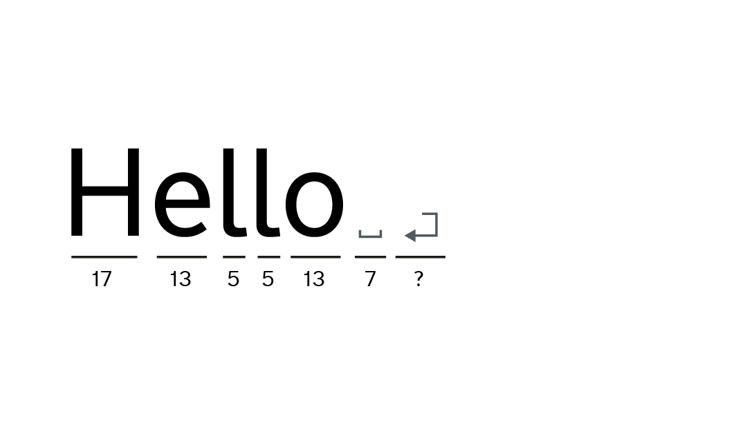
In HTML, any extra whitespace between words is ignored. This means you can add extra spaces, and even new lines, between words without affecting how they are displayed in the browser.
The bug only occurred if there was a new line somewhere in the HTML for that element.
We’d managed to get from ‘some quite strange things are happening to the header, beta banner and buttons’ to ‘text wraps unnecessarily within intrinsically-sized elements when using certain fonts and the inner HTML of the element contains a new line that is not preceded by a space’.
Once we had a good understanding of the conditions required to trigger the bug, we reported it to the WebKit team on November 10th last year.
We included links to pages where the issue was occurring, the version of Safari Technology Preview where we believe the issue had been introduced, and a minimal test case that demonstrated the bug.
A few days later a WebKit engineer responded to our bug report, saying “This is a really bad bug and we should fix it immediately.”
After some investigation, they made a change to WebKit that fixed the bug, and also added a test to prevent the bug from happening again.
By January 6th the change had been approved and merged, and was then included in Safari Technology Preview 139 which was released on 26th January.
You might be wondering what had caused the bug to occur in the first place.
We certainly were, and so we asked the engineer from the Webkit team who fixed the bug if he could come and talk to the frontend community at GDS about it, which he very kindly agreed to do.
He explained that they had been refactoring some of the code responsible for laying out text on the page.
In order for WebKit to lay out the text on the page, it needs to measure the width of the text. To do this, it uses data from the font to find out the width of each character.
This includes the width of whitespace characters, like spaces.
The font also has data about the newline character, including its width. This doesn’t really make sense – new lines don’t (or at least shouldn’t) take up any space, but the font doesn’t treat it differently to any other character. The creator of the font still has to include a width for the new line character in the font’s data.
And in the font we use on GOV.UK, the new line character has a bigger width than a space character – which is apparently unusual.
The code to lay out text for intrinsically-wrapped elements has two steps – first, it measures the size of the text and uses that size to place boxes in the page layout.
Then, as a separate step, it puts the text into those boxes.
It’s important that these two steps both agree on the width of the text.
This bug occurred because the two steps stopped agreeing.
One of them incorrectly used the width of the new line character in its calculations, and so the box that it made was too small.
Then in step 2, when WebKit tried to put the text into the box it had just created, it found that it didn’t fit and so, the last word ended up forced on to a new line.
We don’t routinely test with Safari Technology Preview or other ‘beta’ versions of browsers, so it was pure luck that Ian happened to use it to test something else.
As far as we know, we were the only people to report this bug. If Ian hadn’t taken the time to let us know about this in our support channel, or if we hadn’t taken the time to investigate and report it, there’s a high chance that it could have made its way into public releases of Safari and iOS.
This isn’t the only bug that we’ve reported. We’ve reported over 70 bugs to different browser and assistive tech vendors over the last few years, which we try to keep track of using this GitHub project.
I’m always disappointed at the lack of useful information when Googling for anything to do with theatre lighting – especially from other folks involved with am-dram – so I thought it would be worth writing up what I did, what worked and what I’d want to improve.
At the very least, it’ll be useful for me to come back to when it comes to my next production!
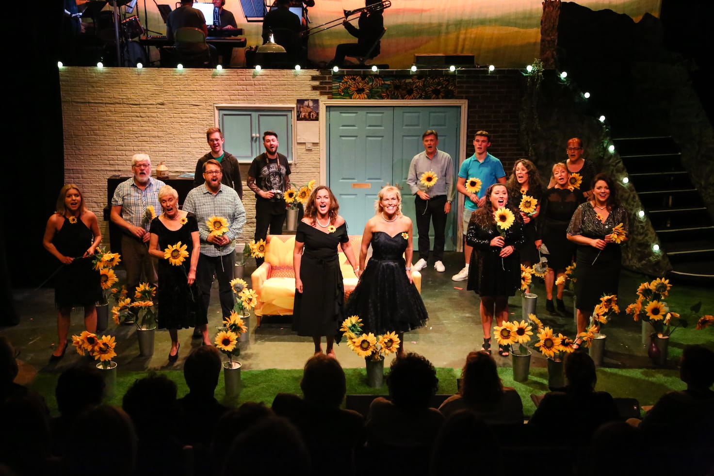
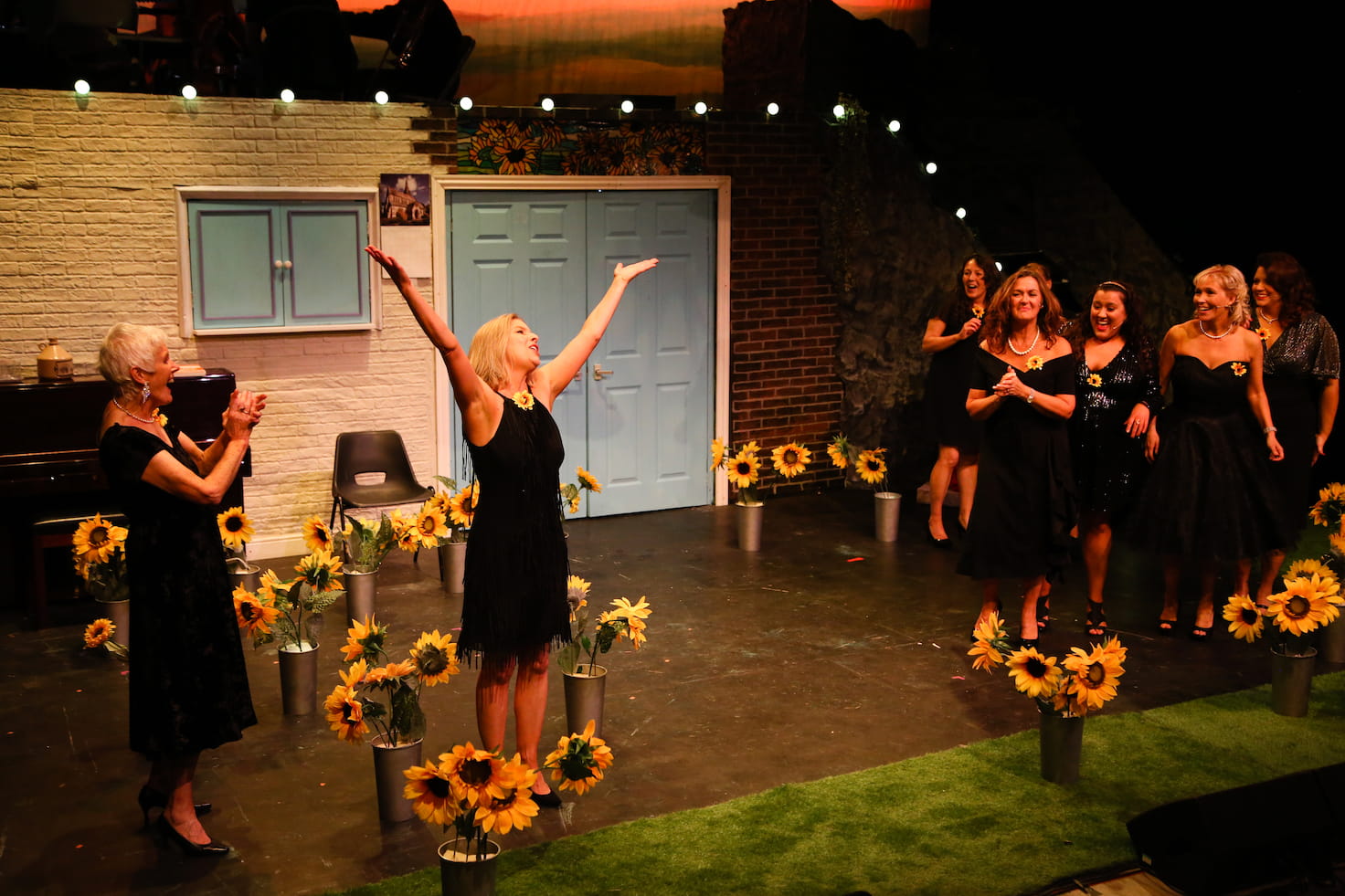
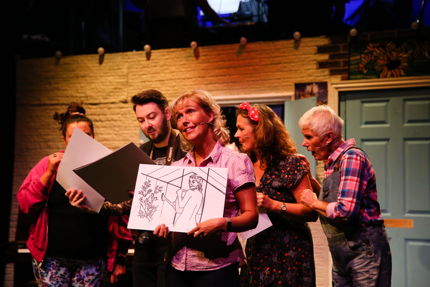
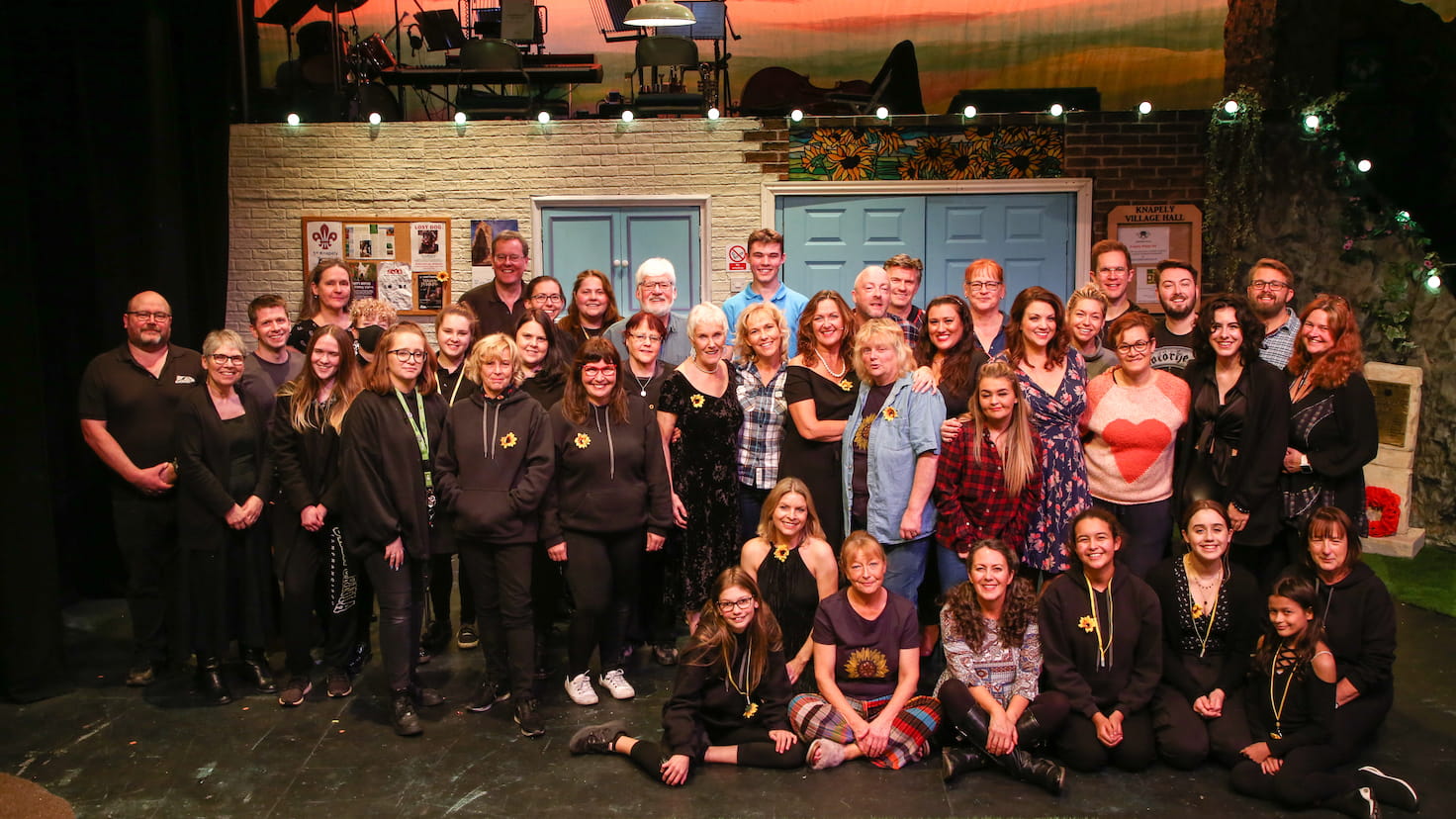
The ShowThe cast on stage surrounded by sunflowers during the final scene, taken during one of the performances. Photo by Aldcroft Photography.
After Annie’s husband John dies from leukaemia, her friend Chris has an idea – the ladies of the Knapeley Women’s Institute should create an ‘alternative’ calendar, to raise money to buy a new sofa for the hospital relative’s room. And by alternative, she means nude!
After a couple of years of lockdown and restrictions, it was a delight to be back in the theatre, especially to be part of such a wonderful show. We pretty much sold out every performance, and the cast and band were both brilliant, receiving well-deserved standing ovations every time.
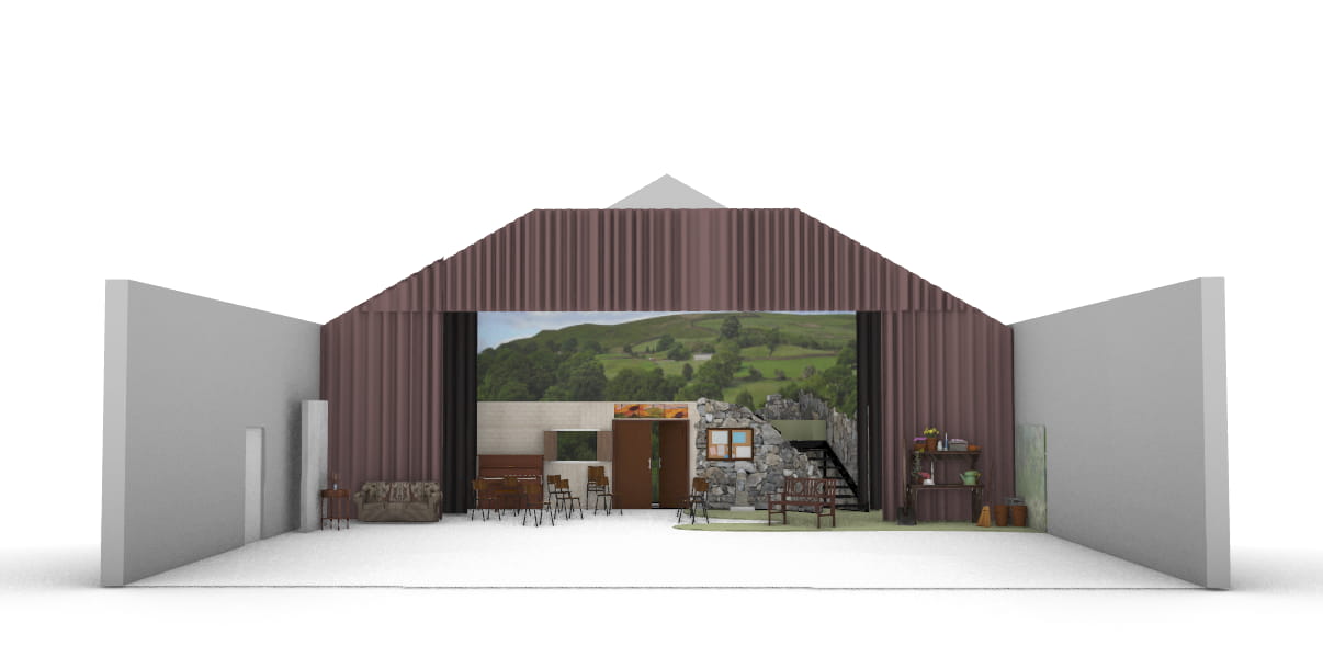
Alice Young came up with a fantastic set design, which was more or less static and let the show flow smoothly without any need for time-consuming set changes.
Front-on view of the set, designed and modelled by Alice Young.
The main stage was used for the village hall and the ‘dales’, with a raised 7 foot deck at the back which was home to the band, and also used for the ‘top of the hill’. Flats across the front represented the interior of the village hall, gradually blending through exterior brickwork to the rocks and greenery of the dales.
The theatre lacks flying facilities and has limited space off-stage, making it hard to bring in additional scenery, so we also created two additional areas downstage of the main tabs.
The stage right area played home to the hospital in act 1, and was re-dressed during the interval to become Ruth’s house. The stage left area was Annie’s garden.
In August I got a message out of the blue from Grizelda, the producer – the group were looking for someone to do the lighting for their production, and my name had come up in discussion.
This was a little later in the process than I’m used to – only a few months from opening night, and with the set design already pretty much firmed up.
I had an initial phone call with Grizelda, talking through their basic requirements. They’d also reached out to another person, Nick, who was interested in getting involved.
We agreed to meet for a chat in the pub, where I met Grizelda, Nick and Naomi, the producer. We talked through set design, identified the key areas of the stage that needed to be lit independently, and went into more detail on some of the effects that they were after.
I went away and came up with an initial design, including working what I wanted to hire. I’m always conscious when looking to hire for an amateur production that I’m spending money that isn’t mine, so as well as being clear on costs I made sure to talk the production team through the extra capabilities any hired kit would bring.
Once they started running entire acts at rehearsals, I went along to watch, as well as capturing the whole show on video.
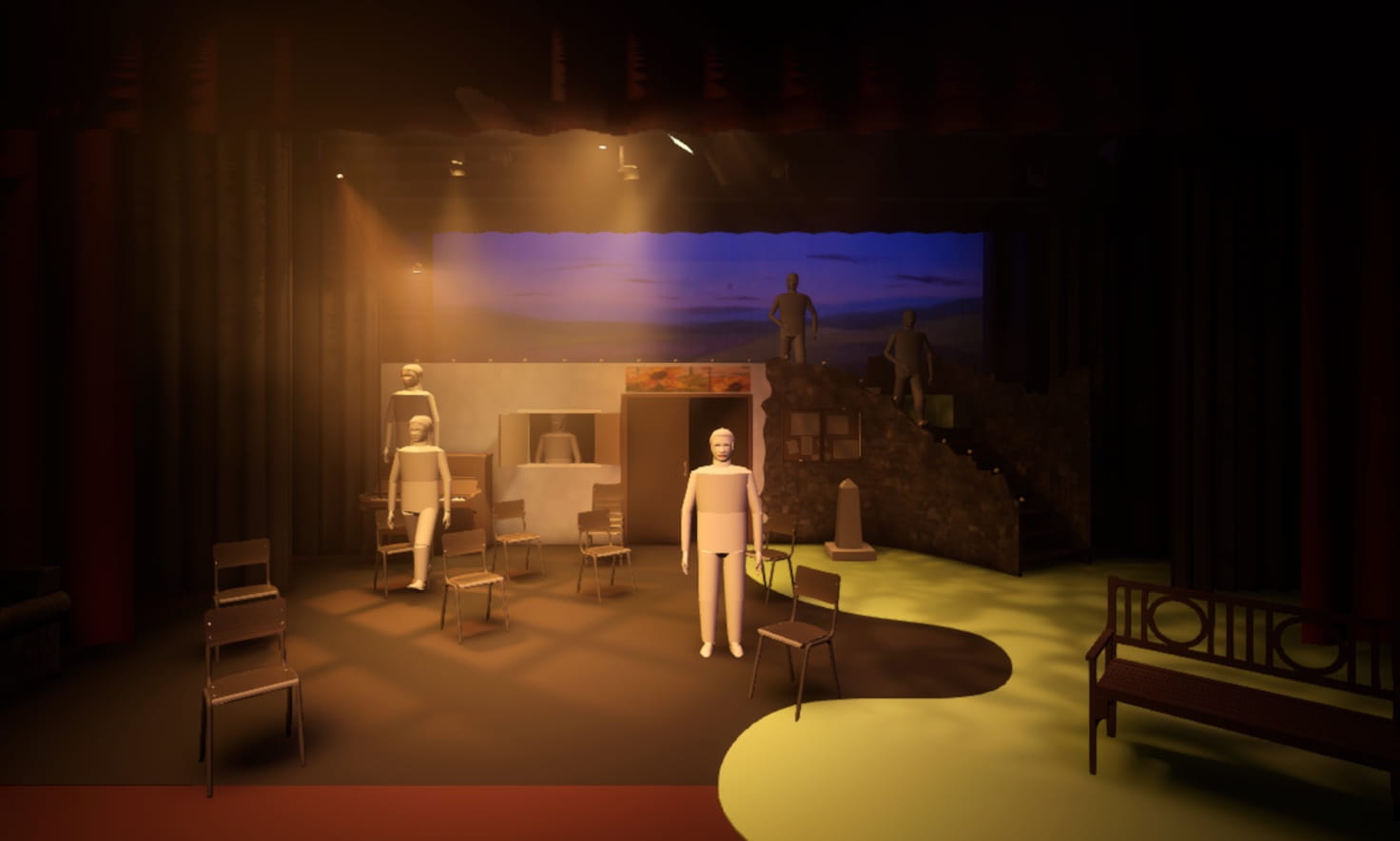
I was able to import Alice’s 3D model of the set into Capture, the lighting design software I was using. This let me check that the key elements of the lighting design would work well with the realities of the set.
The show as seen in the visualiser. The (truly awful tin-men) people dotted around the stage are there to give me an idea of how well lit the different areas are.
As the show approached, I had to start firming up on some decisions so that I could order things like lighting gel and gobos.
I linked another laptop running the control software, Eos, to the visualiser. With the script and the video from rehersals as reference, I was able to use the visualiser to get the basic structure of most of the show in place before we’d even set foot in the theatre.
The original plan was to spend a day going through the show with Nick, finishing bits off and giving him the opportunity to get familiar with the software and the rig, but I caught a nasty chest infection which ended up derailing things somewhat.
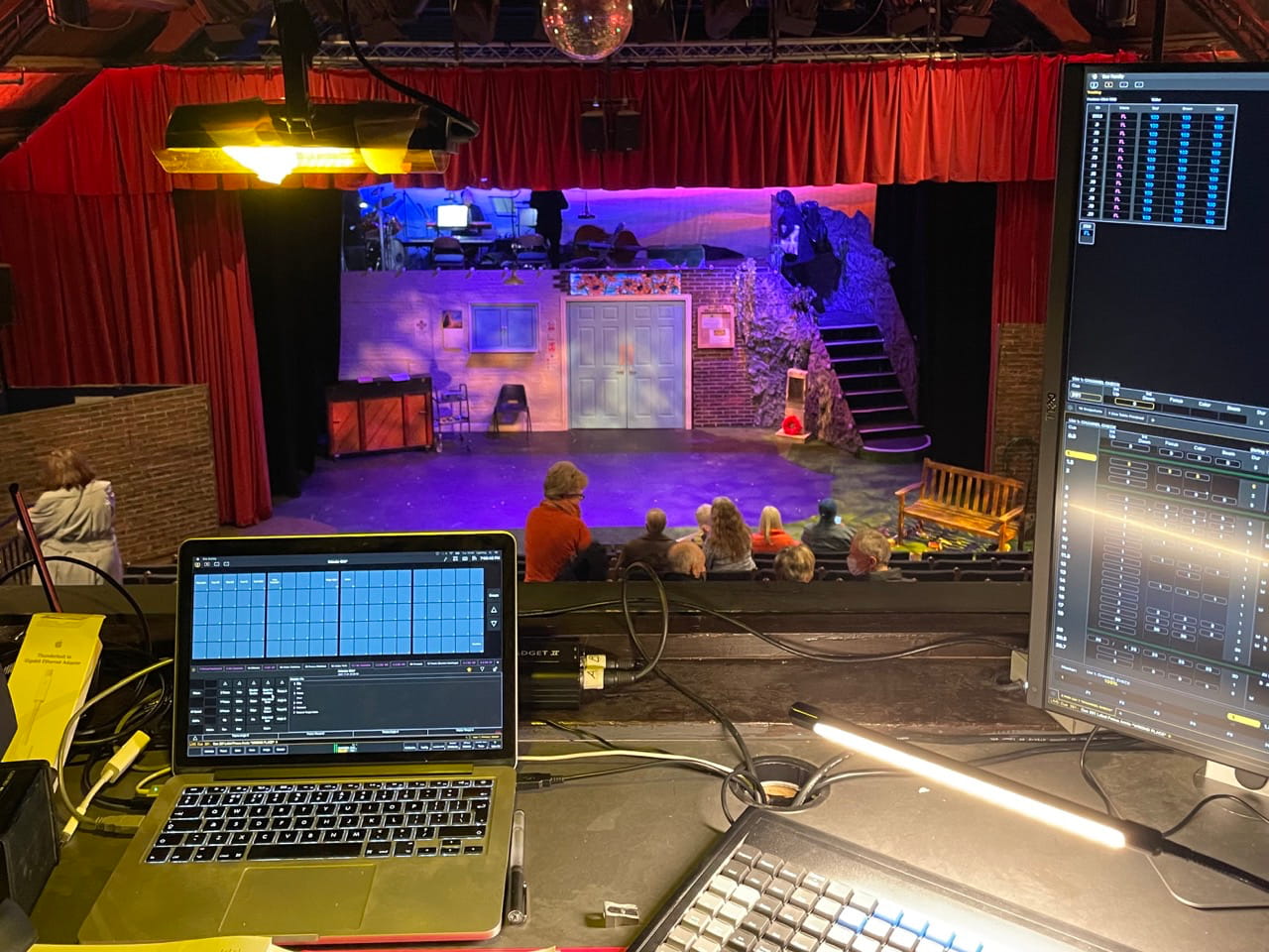
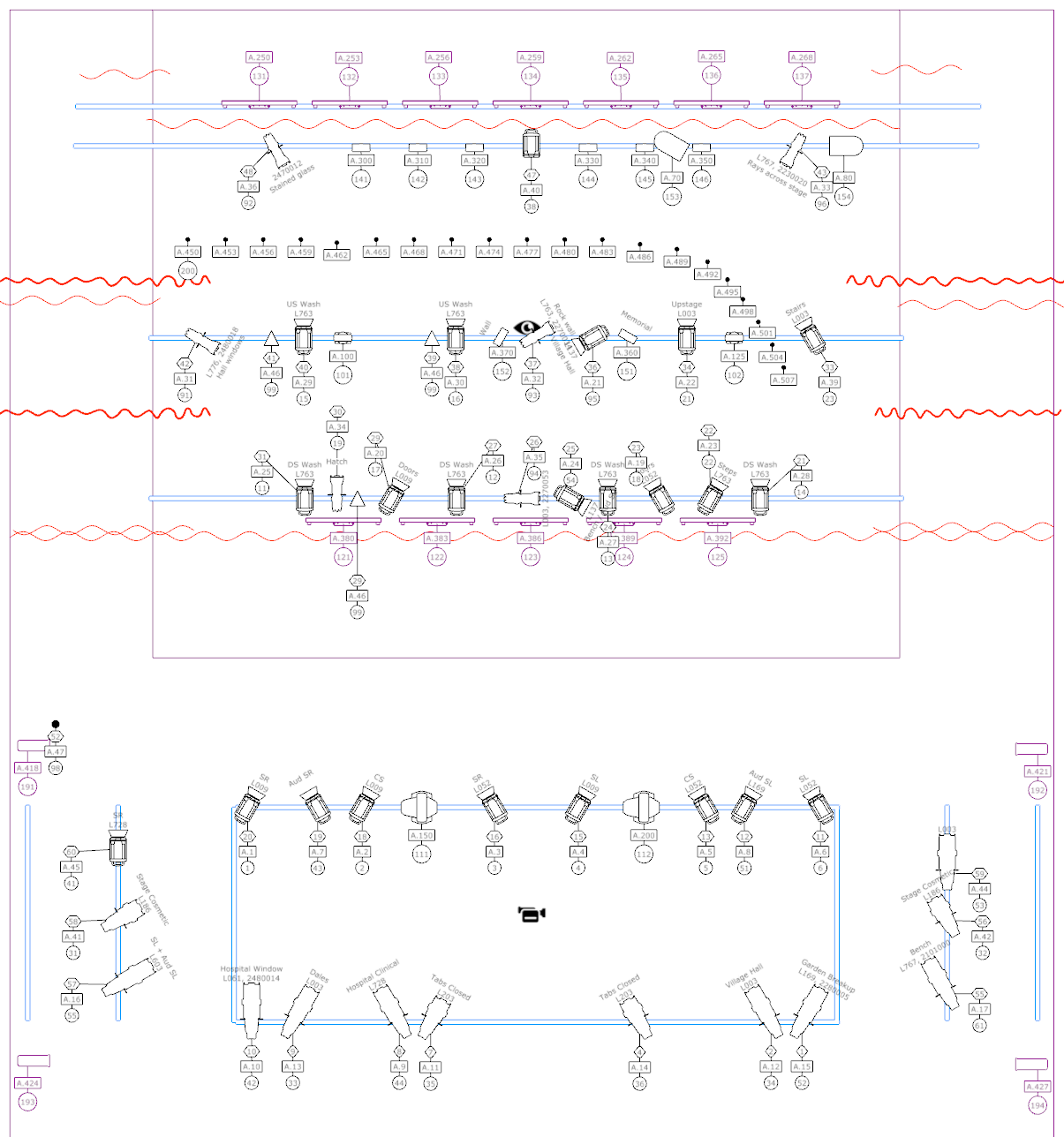
The KitThe view from the lighting box, showing my MacBook Pro running Eos with an lxkey keyboard and external monitor.
I ran the show on Eos using an ETC Nomad, Gadget II and my old MacBook Pro. A friend very kindly lent me their lxkey keyboard, which made programming a bit easier (thanks Jon!)
The lighting plan – which we more or less stuck to!
The theatre have 48 ways of dimming – at least 2 of which seem to be perpetually out of action – which was just enough for what I wanted to do. I made use of the majority of the theatre’s lantern stock, including:
12 × 1m LED Battens (installed along the cyc and as tab warmers)
I was slightly constrained by the fact that we needed to return the theatre to its ‘standing rig’ after the final show – there was a book festival in the theatre early the following day. As such, I tried to avoid moving too many of their fixtures around – and we were still there until nearly 3am.
The show has a lot of warmth and heart to it, and I wanted this to come through in the lighting. The vast majority of the fixtures ended up with some sort of colour in them.
I made liberal use of yellows and golds:
Pale Amber Gold ( L009)
Wheat ( L763)
Oklahoma Yellow ( L767)
Nectarine ( L776)
I also worked in quite a lot of lavender, which wasn’t a colour I’d really worked with much before:
Lavender Tint ( L003)
Light Lavender ( L052)
Special Lavender ( L137)
Lilac Tint ( L169)
The show has a number of scenes that are set at night. I used a few colder colours for these scenes, but usually paired them with some lavender to avoid it feeling too cold:
Mist Blue ( L061)
Quarter C.T. Blue ( L203)
Moonlight white ( L603)
I especially liked how well the lavender worked in the ‘garden’, the area downstage left of the tabs. I usually dislike lighting the sets in these areas as the lighting positions are awkward, but for this show the garden ended up being one of the areas I was happiest with – though I think the beautiful set decoration played a big part.
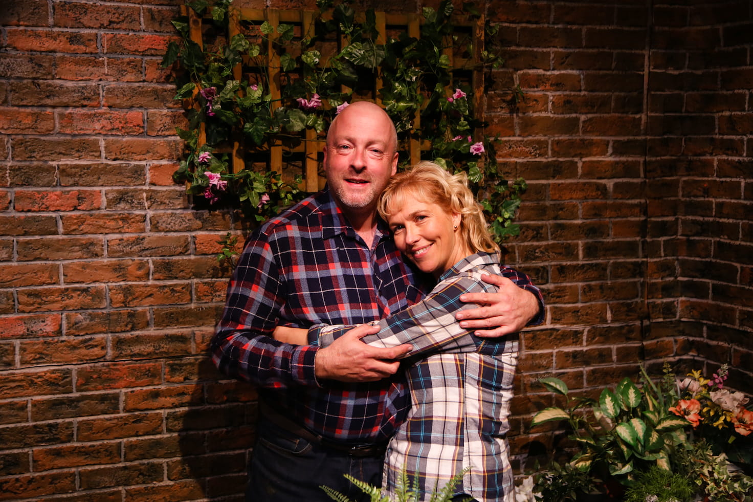
Annie (Jill Neenan) and John (Andrew Faber) in the garden. Photo by Aldcroft Photography.
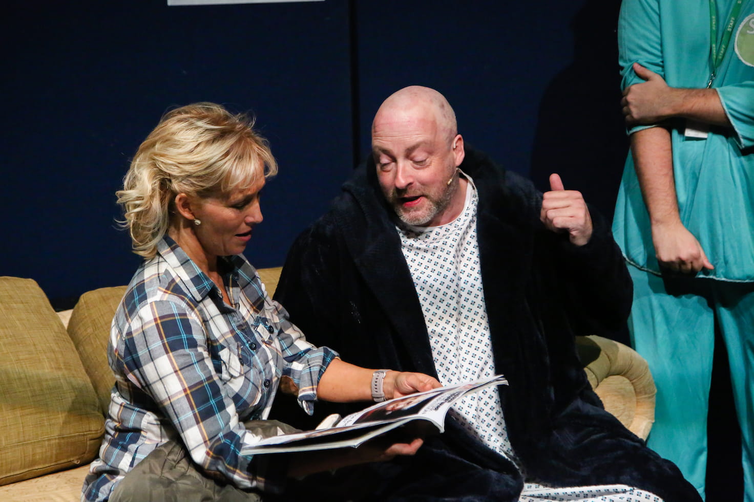
I also included a little Steel Green ( L728) for the scenes set in the hospital, in order to give those scenes a slightly more clinical and cold feel.
Annie and John in the hospital. Photo by Aldcroft Photography.
It definitely felt very different to the other scenes, though I would have liked to have tried a few other colours as well if I’d had the budget and time.
I possibly could have gone stronger with some of the colours. Although the visualiser gives a rough idea, and I have a gel ‘swatch book’, I still struggle to predict what a colour will look like until it’s in a light and you turn it on for the first time.
This is probably the most thought I’ve put into the face light and general wash for a show. I wanted to make sure the cast felt really well lit – as Jessie and Cora discuss in the show, the lighting can make all the difference!
JESSIE
Where’s all the cellulite?
CORA
It’s there. It’s just in shadow
JESSIE
Remind me to spend the rest of my life in shadow.
I crossed 6 of the fresnels from the ‘front’ front of house bar, diving the stage into thirds. Each third was lit in Pale Amber Gold ( L009) from stage right and Light Lavender ( L052) from stage left.
Ruth (Emma Russon) during 'Sunflower of Yorkshire'. Photo by Aldcroft Photography.
This was then reinforced with two Source 4 Zooms in Lavender Tint ( L003) from the rear front of house bar.
Finally, I crossed two Source 4 Zooms from the auditorim stage left / stage right bars with Cosmetic Silver Rose ( L186), which is a ‘cosmetic’ gel that includes a little diffusion. I mostly used this for the last scene – the ‘photo shoot’ – and was generally happy with how it looked, although I’ve no idea if I was using it correctly.
Side elevation of the theatre showing the height of the auditorium lighting positions.
All of the auditorium lighting positions are quite high (6m for the 2 main bars and around 5m for the bars at the sides) and so the lighting angles end up being quite steep. Because of this, there were some harsher shadows appearing under the cast’s eyes and necks than I would have liked.
Annie during 'Kilimajaro', with Cora, Laurence, Chris and Jessie. Photo by Aldcroft Photography.
If budget and time had allowed, I would have liked to have looked at adding either booms or some lower lighting positions front of house – or both! But given the constraints I was working within, I’m pretty happy with how it all looked.
A lot happens in the last scene – it’s a good chunk of the second act, and ended up taking around 80 of the show’s 228 cues.
I used the cyc, festoon and the LED backlight to give each month a different look that suited its theme. For example, pastel colours for Celia’s home baking, a hippy-ish rainbow theme for Jessie’s knitting, and a floral green/yellow mix for Annie’s gardening.
I also used one of the R1 BeamWashes to give the person being ‘photographed’ a tight back light, and one of the DL4Ss to pick them out with a key light.
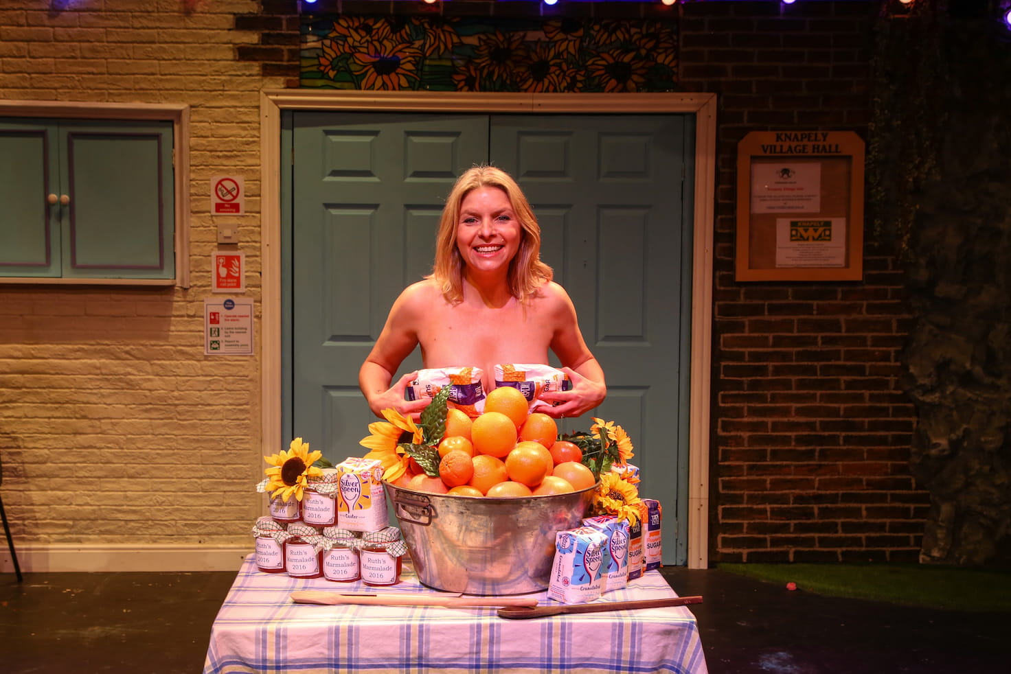
Ruth in a posed 'calendar' shot. Photo by Aldcroft Photography.
This worked more effectively for some shots than others. The actors set a lot of the props and didn’t always hit their mark – possibly because I didn’t make it clear that the placement was important! On reflection, I think the colours that I used for some of the backlighting were too strong, and softer tints would have looked better.
For the camera flash itself, I added a separate cue which bumped the zoom and intensity of both moving heads, and set them to a cold white, with a hang cue after 0.25s to revert them to their previous state.
When it’s Chris’ turn for her photo to be taken she really ‘gets in to it’ and Laurence ends up taking a lot of photos. I ended up chaining 16 cues together for lots of flashes, which sort of worked. However, on some performances it went on longer and so the flashes stopped too soon. Given the time, I’d have liked to look into doing something ‘clever-er’ – perhaps using looping or an effect.
For the group shots, I used both R1 BeamWashes together, and for the flash I also tilted them up and out into the audience to give them just a little extra impact.
There were quite a few places in the show where I took advantage of the framing shutters and the animation wheel in the DL4Ss.
Early on in the show John brings in some ‘liquid refreshment’ – a harvest punch which is topped with sunflower seeds and set alight. The direction in the script says:
(He clicks a lighter on and creates an illuminated group of lit drinks)
Challenge accepted!
I shuttered one DL4S down to the group of drinks, carefully positioned on a trolley. By using an amber colour and a gobo along with the animation wheel we got something like a flickery, flame-like effect. And by moving the stage left shutter we could ‘animate’ the fire spreading across the group of drinks as John lit each one.
I was very happy with how this looked, although it was rather subtle even with the other stage lights dimmed. The DL4S just didn’t have the power to punch through against everything else.
I also used the animation wheel to create the ‘river’ that Chris and Annie settle down by at the end of the same scene, to add a slight ‘dappled’ lighting effect for the funeral at the end of Act 1 Scene 7, and for the preset as the audience came in.
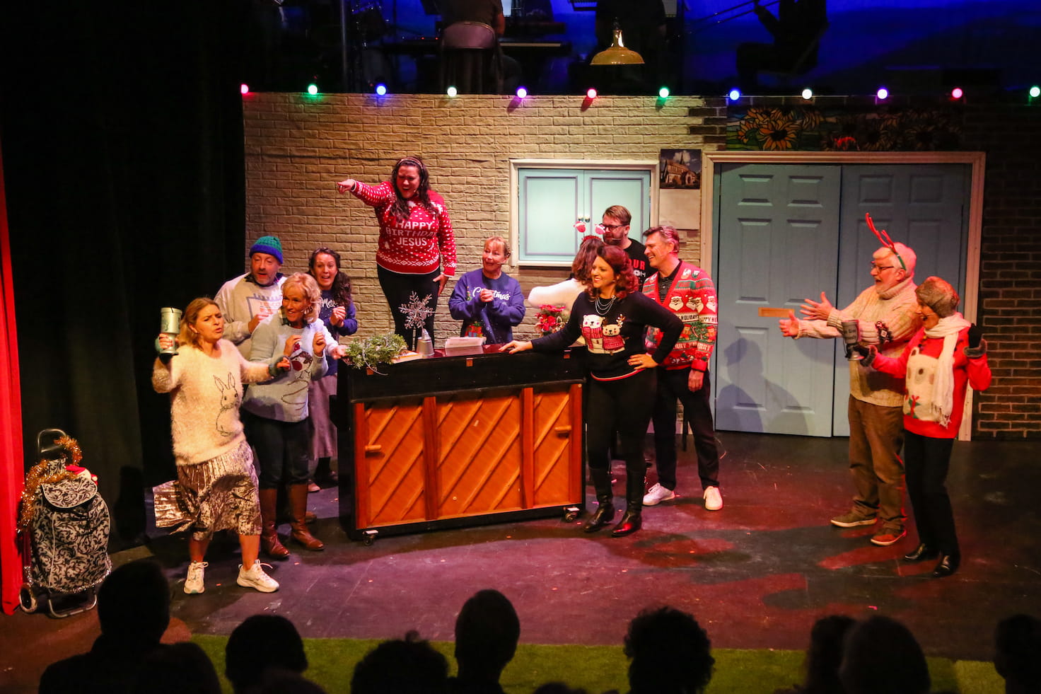
I’ve mentioned the festoon a few time already, but I’m going to mention them again as I was very happy with how this idea played out. During the first meeting I had with the production team they’d mentioned using fairy lights for ‘Christmas’ in Act 1 Scene 5.
I’d already been looking into festoon in the context of the spring fete, and when I spotted festoon that allowed individual RGB control over every individual bulb in a local firm’s hire catalogue I got quite excited about the possibilities.
'Who wants a Silent Night' – featuring Festoon! Photo by Aldcroft Photography.
They ended up being used in quite a few places throughout the show – as christmas lights, as festoon at the fete, and later in the show just to add colour and bring scenes to life.
I used discrete timing and delays throughout the show to try and make the scenes blend smoothly into each other, and it worked really effectively with the festoon - by putting a different delay on each bulb I could stagger their timing. For example, when they were first introduced in Act 1 Scene 5 they twinkled on from left to right.
Some scenes were set in the flower shop, distinguished by being set centre stage with the ‘sunflower’ stained glass window above the double doors lit. For those scenes, the individual control meant we were able to illuminate just the bulbs above and around the door, fading them out at the edges.
I had a number of breakup gobos that were barely visible – a window for the village hall, stained glass for the funeral, and some foliage across the ‘rock face’ for the dales. I was using the Source 4 Juniors for these and they just didn’t have the power to cut through the stage wash.
Somewhat related, I found it difficult to differentiate between the various different locations we were trying to portray on the main stage. Although the set had distinct areas, the action took place across the whole stage, so everything ended up looking a bit sames-ey.
The tech felt rushed but at the same time seemed to take forever. After a couple of years of not doing shows, I was definitely feeling a little rusty and struggling to make effective decisions.
As a result, Act 2 ended up a bit rushed. I hadn’t been able to pre-program a lot of it, and there were quite a few scenes that only had 1 or 2 cues where I’d have liked to have done a lot more. Especially ‘Kilimanjaro’ in Act 2 Scene 4 – one of the most powerful songs in the show, and Jill ended up delivering it from semi-darkness every night.
Bits of the stage just didn’t have the coverage they needed. I spotted just before the final show that one of the fresnels rigged in the auditorium had dropped and was now lighting the back of the front 2 rows of audience, which probably didn’t help.
I spent quite a lot of time listening to the soundtrack on Spotify in preparation for the show, but didn’t realise until quite late on just how much it had been revised when the West End show went on tour.
A notable addition was ‘Mrs Conventional’ which was seeingly split out from ‘Spring Fete’. ‘Who Wants A Silent Night’ – one of my favourites on the soundtrack – which also substantially different.
Nick was a fantastic ‘partner in crime’, but didn’t really know how to involve him effectively. I’m most used to working alone, the main access equipment for the venue is a scissor lift which only I was trained to use, and I was the only person familiar with the software. Add in a dash of just generally feeling rusty, and I found it very difficult to delegate!
I fundamentally do not understand how to make the Eos effects engine do what I want. There were a few places where I’d have liked to have added a chases or effect, but I just did not get on with it.
Continuing with the backstage credits, I must congratulate your lighting designer Oliver Byford who along with Techie Nick Taylor added so much to the smooth running of the show as the lights came and went perfectly on each section of the set as required.
Okay, so that basically just means ‘the lights went up and down at the right time’, but given how picky some NODA reports can be I’ll take it as a win!
This show, along with the most recent shows I’ve lit for Vale Musical Society have challenged me to learn some of the subtler aspects of stage lighting. Historically I’ve been involved with louder, vibrant ‘rock n’ roll’ musicals where you can more or less just throw lots of colour and effects at the stage and get away with it.
For this show the lighting really just needed to get out of the way and let the cast shine – to enhance, but to be more or less invisible. I think I achieved that.
Plus, I got to work with this lovely bunch of folk.
We made two subtle but important changes to links.
We moved underlines further away from the text, and made them consistently 1px thick, regardless of font size. This makes the link text easier to read, as the shape of each word is easier to discern.
We made the hover state clearer, by thickening the underline to 3px when a user hovers over the link.
“The colour change when a user hovers over a link is not clear and this was especially difficult for low vision users to determine.
Ensuring that the state change is distinctive would benefit low vision users in particular, while benefiting all mouse users in general.”
You might not think that moving an underline a few pixels and changing its thickness is particularly cutting-edge or interesting.
However it relies on two CSS properties, text-decoration-thickness and text-underline-offset, which have only recently been introduced to some browsers.
As a result, we had to spend some time understanding exactly how these new properties worked, and whether they were mature enough to use.
Shorthand properties are CSS properties that let you set the values of multiple other CSS properties simultaneously.
For instance, the CSS background property is a shorthand property that’s able to define the values of background-color, background-image, background-repeat, and background-position.
Importantly, there’s a ‘tricky edge case’ which is worth understanding – you’ll see later how it affects text-decoration:
A value which is not specified is set to its initial value. That sounds anecdotal, but it really means that it overrides previously set values. Therefore:
background-color: red;
background: url(images/bg.gif) no-repeat left top;
will not set the color of the background to red but to background-color’s default, transparent, as the second rule has precedence.
Throughout this article I’m also going to use the term ‘longhand’ to refer to properties that are not shorthand properties.
With that out the way, let take a brief trip back in time to see how the text-decoration property has changed.
So, you could use it to add decoration to your text, but you had no control over its appearance – you were constrained to a solid line with its colour and thickness based on the text.
CSS Text Decoration Module Level 4, which is still a working draft, introduces the text-decoration-thickness and text-underline-offset properties, allowing you control over the thickness of the line and the offset of the line from the text baseline respectively:
If you use text-decoration as a shorthand property, Internet Explorer will ignore it completely:
.link {
    /* Has no effect in IE11 or other browsers that do not
       support CSS Text Decoration Module Level 3 */
    text-decoration: navy 4px dotted underline;
}
You can set text-decoration twice, as recommended in the specification:
However, not all browsers that support CSS Text Decoration Module Level 4 support the shorthand property – notably, Safari will ignore the second declaration even though it supports all of the properties individually[2].
To get the best browser support, set text-decoration as a longhand property, then set the various text decoration sub-properties independently:
Remember the ‘tricky edge case’ with shorthand properties that was mentioned earlier? If you set text-decoration after any of the text-decoration-* properties, all of those properties will be reset back to their initial value.
As an example, consider a modifier class that’s designed to remove underlines from links, except when active or hovered over:
As a result, the thickness, colour and style are all reset to their initial user-agent defaults, and when hovering over our link we just get a boring default underline.
The exception to this is, once again, Safari, where text-decoration is not a shorthand property, and instead acts like a sort of alias for text-decoration-line. Unlike other browsers it does not set the other text-decoration-* properties back to initial.
One option is to set the text-decoration-line longhand property directly, like this:
However, this won’t remove the underline in browsers that only support the CSS 2 text-decoration property, like Internet Explorer, as they don’t recognise text-decoration-line.
If that’s something you care about, you could do this instead:
I mentioned in the introduction that we’ve made the link underlines consistently 1px thick, but that was a slight over-simplification.
If a user zooms their browser in, the underlines would scale accordingly. However, if a user has instead changed the font size in their browser, the underlines would remain 1px thick.
We were concerned that users who do this might not see the underline, so we made sure that the underlines scale appropriately by calculating the underline thickness in rem as well as pixels, and taking whichever value is bigger using the max function.
Diving 1px by 16px (the default font size in most browsers) gives us a value of 0.0625rem:
This means that underlines will always be at least 1px thick, but a user who sets the font size in their browser to 32px will see 2px underlines (because 32px × 0.0625 = 2px).
The text-underline-offset is calculated incorrectly.
The spec says that the ‘zero position’ for the offset should be the text baseline, but instead the offset changes with the thickness of the underline – as you increase the thickness, it moves further away from the text:
This means that offset is inconsistent with other browsers, and so we’ve ended up having to compromise on the offset value in order to get something that looks good everywhere.
When this bug is fixed, all browsers should place the underline consistently, at which point we’ll likely revisit the offset value again.
Changes in text decoration within a multi-column layout are ‘mis-painted’ – hovering over one link in the columns causes other links to be (partially?) underlined:
I recommend playing with the CodePen in a Blink browser (or watching the video attached to the bug report), because I have no idea how to fully describe this rather funky bug.
In Chrome 87–88, Edge 87–88 and Opera 73–74 (the first two versions after text-decoration-thickness was introduced), the text-decoration-thickness property does not work unless either:
text-underline-offset is set to something other than auto
text-decoration-color is set to something other than currentColor
Dynamic changes in text-decoration-thickness (for example on hover) have no effect above certain font sizes, unless the link style changes in another way too.
The affected font sizes seem to depend on the underline thickness. In our testing:
a 2px underline had no effect on text bigger than 15px
a 3px underline had no effect on text bigger than 19px
a 5px underline had no effect on text bigger than 27px
It does recognise shorthand when set using the vendor-prefixed -webkit-text-decoration property, so this may be handled for you if you happen to be using autoprefixer or similar. ↩︎
See, I’ve already started using it like it’s a proper term! ↩︎
Next week I’m one of a few people representing the team for the Design System’s live service assessment.
On Wednedsay we had a dry-run of the presentation part of the assessment, and on Friday we had our technical pre-call.
It’s been interesting trying to find the right balance of information to include in the assessment itself, versus the pre-call. Compared to a typical service that might be assessed, the technical choices our team make have a much more fundamental impact on the products we deliver. And so it seems important to set the context effectively, to ensure the right discussions take place.
Equally, we need to make sure we still have time to have a wider discussion and to answer questions. And I need to make sure that the content is accessible to the whole panel, not just the tech assessor.
I joined the weekly cross-government design system chat for the first time since Imran, our community manager, joined the team.
Imran’s managed to bring a lot more structure to the calls, and it was a real pleasure to watch his skillful facilitation of the meeting.
Imposter syndrome does like to rear its head in these chats, and this week was no exception. It’s fair to say that we haven’t made as much progress over the last year or so with some problems as we – or our users – would like, and I found myself a little on the defensive.
On Wednesday Eoin, our technical writer, ran a really great workshop focused on technical writing.
And on Thursday Kelly, our delivery manager, ran an equally excellent session looking at how we build new components and patterns more effectively in the future.
What was interesting about both sessions is that they were only about 45 minutes long, and yet we managed to cover a lot of ground in that time.
At the start of the year I was a little frustrated that we had quite a few ‘big picture’ sessions that felt like they were only really getting started just as we were wrapping up.
My takeaway at the time was that we needed to allow more time for those sorts of sessions, but I’m now realising just how draining meetings can be, and we need to be looking at reducing the scope of our meetings rather than just making everything longer.
I’m looking forward to trying to break some other problems down into smaller chunks and putting this into practise over the next few months.
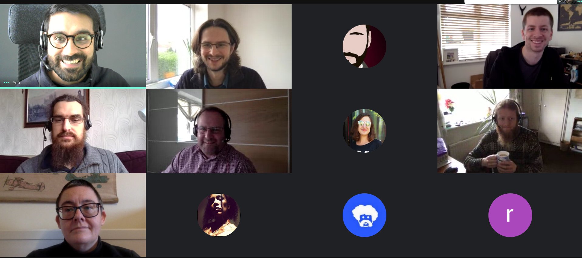
We ended Friday with fika and found ourselves talking about the sorts of ‘away days’ we used to do as a team, and what sorts of things we may or may not be able to do over the coming year.
Our team’s grown a lot in the last few months, and it’s strange to think that I haven’t met about a third of them in person.
It’s hardly surprising – and I know I’m not the only one in this boat – but I can’t wait till we can all get together. Plus, I think I owe a few of them a beer…
Last night as I was heading out to do some grocery shopping, I thought I’d try using the reminders app to keep track of our shopping list. I wanted to use the reminders app on my watch, so that I didn’t have to keep getting my phone out and unlocking it[1].
However, our shopping list was in a note in the Notes app. I expected to be able to copy and paste the list into the Reminders app, but no – it just created a single reminder with the entire shopping list in it.
This is definitely something that should just work, and it seems like a real oversight that it doesn’t, but at least it gave me something to do on my Saturday afternoon…
I decided to try and use Automator to create a Quick Action to easily turn a text list into Reminders.
If you want to use this Quick Action yourself, follow these steps:
In the Automator app on your mac, create a new Quick Action workflow.
In the settings for the quick action at the top of the main pane, set ‘Workflow receives current’ to ‘text’ in ‘any application’.
Add a new ‘Run AppleScript’ action to the workflow, with the following script:
on run {input, parameters}
	tell application "Reminders"
		-- bring to foreground
		activate

		-- ask which list to add to
		set allLists to name of every list
		set chosenList to (choose from list allLists with prompt "Select the list to add reminders to" without empty selection allowed)

		-- if the user presses cancel, abort
		if chosenList is false then return

		set chosenList to chosenList as string

		-- split input to workflow into paragraphs and add to chosen list
		repeat with lineOfText in paragraphs of (item 1 of input)
			set lineOfText to lineOfText as string
			if lineOfText is not equal to "" then
				tell list chosenList
					make new reminder at end ¬
						with properties {name:lineOfText}
				end tell
			end if
		end repeat

	end tell
end run
Save the workflow as ‘Copy to Reminders’
With text selected in another application, you should now be able to right-click and select ‘Copy to Reminders’ from the ‘Services’ sub-menu, as shown in the video above.
If you’ve found this useful, please do let me know!
Last week was a week of two halves – found the first half tough, but the second was better.
End of year means it’s time to ask those around me for feedback, and the first few bits have found their way to my inbox. Not for the first time, delegation appears as a common theme in things to work on. I’ve just never been good at it.
Have bought a few books to read with the intention of trying to turn that around, but I also know the next couple of weeks are going to busy. We’re preparing for our service assessment which is somehow a week next Thursday (how is it already March?).
Ironically, if I was better at delegating it would probably feel less intimidating. But hopefully I can pick this thread up again afterwards.
I’d like to see us doing more things like this going forward, where appropriate. We spend so much time trying to paper over the cracks in the various technologies the web is built on[1]. It’d be good to invest time now to try and improve things for our future selves.
Whilst working on the cookie banner component we found that hiding the cookie banner in our review app would consistently crash the Safari WebKit process if you were using VoiceOver. This didn’t happen in the prototype we’d built.
After a bit of investigation, we tracked it down to the :before pseudo-element on the <body> which shows us the active breakpoint – without the pseudo-element it didn’t happen.
I also noticed that when the WebKit process crashes and the tab is reloaded, the notification that appears is not announced. This means that a VoiceOver user who can’t see the screen would have no idea that the page had been reloaded, so we reported that too.
As end of year performance reviews beckon, I spent most of Friday trying to write feedback for my colleagues, and felt like I got nowhere with it.
Writing good feedback is hard. I think. Or I’m just overthinking everything. Or both.
(Also, we’re living through a pandemic and everyone’s literally locked down at home. My teammates are amazing – is now really the right time to tell them that I think sometimes their commit messages could be better written?)
Chatted to a few people to try and get a feel for whether it’s worth pursuing or not. I’m also thinking that there might be a few of us from GDS who might want to do it together.
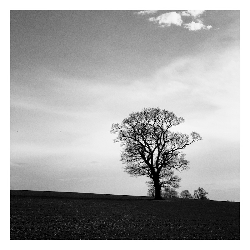
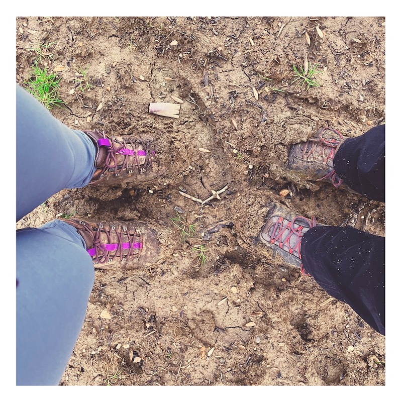
Went for a walk on Saturday – a 5 mile circular from a local village.
Bits of it were exquisite – the fresh air, an invigorating breeze, the sun on your back; a deer bolting across our path. At one point we saw an ostrich.
Other bits involved trudging towards an infinite horizon, with half of the barren, claggy field stuck to your boots; eyes glued to the map on your phone trying to ensure that you pick up the footpath on the other side.
All the while, the voice in your head shouting ‘FUCK THIS FUCKING FIELD IN PARTICULAR’.
So, a mixed success. Still, got some fresh air.
For example, if you want to make an element visible only to screen readers you basically just make it so tiny it’s invisible. It’s a massive hack, and it’s fragile – see issues #1032 and #1096 and #2117 for examples.
The headline feature was a new cookie banner component, which was a challenging component to build. We needed to try and work out how to support both server-side and client-side implementations, and after testing there were some difficult ‘least-worst option’ decisions to make around accessibility. Many of the things we were bumping up against really felt like they should be solved problems by now.
Found some other interesting bugs whilst we were testing, including one which consistently made the WebKit process crash in Safari – something to try and report next week.
Two other interesting things in the release worth calling out:
We recently did a ‘satisfaction survey’ for the Design System and Rosie, our user researcher, played back the results. I know we’re going to play it back to the community soon, but I think the thing that I took away from it was that folks really just want us to do more and do it faster.
I’ve got no idea how to make that happen, and if I think about it for too long I just start feeling waaay out of my depth.
We ran a threat modelling workshop for our team with the help of the cyber security team. It was interesting, but felt a bit too much like a conversation between me and the security team whilst the rest of the team listened. Need to work out how to make the next couple of sessions work better for everyone.
Our team are looking at accessibility issues with conditional reveals. I played back an overview of the issues and then we had an ideation session.
Felt like I got minor whiplash trying to go straight from cookie banner to threat modelling and now this.
A few of us spent an hour playing ‘Welcome To’ on Board Games Arena after work. It was nice to do something a bit different, and by the end of it I reckon I knew at least 25% of the rules… looking forward to a rematch at some point.
Nearly considered un-taking it off, because I feel like I only added to my to-do list this week, and Fridays are usually one of the quieter days and an opportunity to catch up on things. Looking at my calendar, there are a few less busy days next week. I just hope they stay that way.
Glad I did take it off in the end. Had a bit of a lie in, and went for a walk. Our usual walking spots have got so busy at the weekends, it’s nice to get out whilst it’s a bit quieter.
Second takeaway of the week[1], and Captain America: Civil War[2].
Did a couple of workouts on Apple Fitness Plus. Trying to get into some sort of routine and to stay healthy, but it’s just not quite sticking. Mum got an Apple Watch for Christmas and is now doing workouts most days, which puts me to shame but also makes me very happy.
Grocery shop. Even when we go in the evening when it’s quite, I still find it a stressful experience that leaves me feeling physically tense.
Picked up plenty of desserts to try and compensate.
Another game of Pandemic with friends. We won with only a couple of moves to spare, which seems to be the way most of our games go now.
Dinner from the slow cooker. Happy Valentine’s Day, us from this morning. We appreciate you.
Wrote these words. Not sure if this is really a weeknote or not. Feels more like a diary. Does it matter? Probably not. I’ll probably try a few different styles on, see what fits.
Battered sausage and chips. Slight remorse that I didn’t change my order. Their battered halloumi buttie is excellent, but I just felt like I’d had it too much recently…
(Oh, and the first takeaway was Dominos, on Tuesday) ↩︎
We’re making our way through the back catalogue of Marvel films we haven’t seen (which is most of them) after we reached episode 4 of WandaVision and got the feeling we were meant to understand more than we were… ↩︎
Having well-tested code helps you find bugs easily, and gives you the confidence to be able to make and ship changes whilst knowing that you (probably) haven’t broken anything.
In GOV.UK Frontend, a lot of the logic that we care about is in our Sass, so we’ve found some techniques that we can use to test our Sass using Jest. I thought I’d write them up here in case they’re useful to someone else.
You can find a repo with working examples on GitHub at 36degrees/sass-jest-examples. I’ve also provided links to the GOV.UK Frontend repo that show how we’re applying these techniques there.
All of these examples assume that you’re using node-sass.
First, let’s create a helper which wraps up sass.render into a Promise with some sensible default config, in a function which we can include from our tests:
It’s likely that you already compile your Sass to CSS somewhere in your build pipeline, and so checking that it compiles in your tests may not be that useful.
However, if you’re building a Sass library for others to use, you may want to check that your Sass can be imported in different ways.
For example, we can (ab)use glob and it.each to check that each of our components can be compiled individually:
If you’re following a particular architecture like ITCSS, or otherwise structuring your Sass in different layers, you can write tests to enforce good hygiene – for example, you can test that a given file or layer does not output any CSS if it’s compiled by itself:
We can write a small snippet of Sass which imports and calls the function, and then render it, asserting what we expect the resulting CSS to look like:
const { render } = require('./helpers')
it('halves a given even number', async () => { const data = ` @import "functions/half";
Our half function triggers an error if you try and pass it something that’s not a number.
We can test this by calling it with a string, and then expecting the render Promise to be rejected:
const { render } = require('./helpers')

it('errors when trying to half something that is not a number', async () => {
  const data = `
    @import "functions/half";

    .foo {
      width: half("trollolol");
    }
  `

  return expect(render({ data })).rejects.toThrow(
    'Cannot half something which is not a number!'
  )
})
Testing warnings is a little more complicated, as the Sass will compile just fine, and the warnings don’t appear in the compiled CSS.
Instead, we create a mock function which we can use to overload the built-in @warn function, and then assert that it was called with a specific warning message:
const sass = require('node-sass')

const { render } = require('./helpers')

it('warns when result is not a whole number', async () => {
  const data = `
    @import "functions/half";

    .foo {
      width: half(9px);
    }
  `

  // Create a mock warn function that we can use to override the native @warn
  // function, that we can make assertions about post-render.
  const mockWarnFunction = jest.fn()
    .mockReturnValue(sass.NULL)

  return render({
    data,
    functions: {
      '@warn': mockWarnFunction
    }
  }).then(() => {
    // Expect our mocked @warn function to have been called once with a single
    // argument, which should be the deprecation notice
    return expect(mockWarnFunction.mock.calls[0][0].getValue())
      .toEqual('Halving 9px returns a non-whole number')
  })
})
We use tests for functions and mixins for the helpers and tools in GOV.UK Frontend, like our colour helpers.
update your pet’s location, for example if they enter or leave the house via a door or window
These shortcuts were created by me, and use the SurePet API which as far as I can tell is undocumented[1]. I am not associated with SureFlap, other than being a happy customer.
They may well have bugs – at one point whilst creating these shortcuts SureFlap thought one of my cats went outside in the future.
When asked for the SureFlap token, paste the token which should still be on your clipboard from the previous step. It looks like a very long, random mix of letters, numbers and symbols.
You need to keep the ‘SureFlap Token’ shortcut for your shortcuts to work. Even though you won’t run it directly, the other shortcuts rely on it.
You can delete the ‘Log In To SurePet’ shortcut, but you’ll need to re-add it if you ever need to update your token.
(Whenever we tell SurePet where your pets have gone inside or outside, we have to tell them when that happened in UTC. Shortcuts doesn’t have a built-in way to get the current date in UTC, so we have an extra shortcut that we can use to work it out 🤦♂️)
Add and run the ‘Get Pet IDs’ shortcut. You should see an alert that lists each of your pets and an ID, for example:
Hazel: 12345
Willow: 67890
Write this down somewhere.
The ‘Set Pet Location’ shortcut you just added does the work of updating your pet’s location, but you won’t run it directly.
Instead, we’ll create two new shortcuts for each of your pets – one to update their position to indoors, and one to update their position to outside.
For each pet:
Add the ‘Pet Location Template’ shortcut. When prompted, enter the pet’s ID from the previous step, and the location ‘Inside’.
Rename the shortcut to, for example, ‘Hazel Is Inside’.
Add the ‘Pet Location Template’ shortcut again. Enter the pet’s ID from the previous step, but this time use the location ‘Outside’.
Rename the shortcut to, for example, ‘Hazel Is Outside’.
You should now be able to say things like ‘Hey Siri, Hazel is inside’ or ‘Hey Siri, Hazel is outside’, and their location should update.
You need to keep the ‘Current Date UTC’ and ‘Set Pet Location’ shortcuts for these shortcuts to work. Even though you won’t run them directly, the shortcuts that you’ve just created rely on them.
You can delete the ‘Get Pet IDs’ shortcut, but you may need to re-add it to add new pets, or if you accidentally delete a pet’s shortcut and need to re-create it.
You can use Shortcuts with HomePod, but they’re linked to the Shortcuts library of whoever HomePod thinks is speaking.
If you want multiple users to be able to use the shortcuts, you’ll need to make sure that HomePod is configured to identify everyone, and everyone will need to add the Shortcuts separately on their own device.
Thanks to Alex Toft for his research and the example SureFlap code, which was a really valuable reference when creating these shortcuts. ↩︎
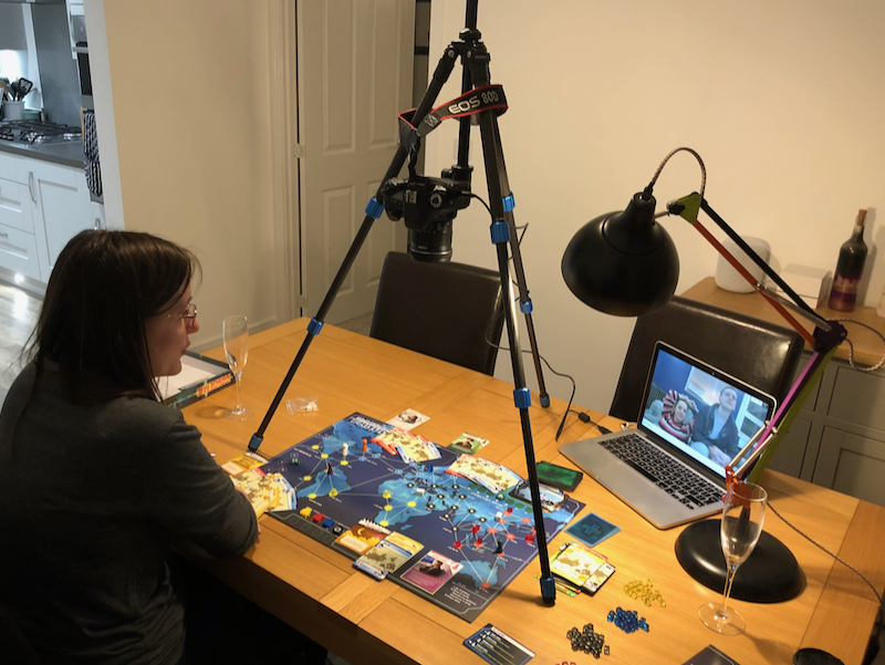
In an effort to stay sane whilst practising social distancing, Emily and I tried using a camera, tripod and Google Meet to play Pandemic with our friends Emma and Chris, remotely.
I thought it was worth sharing how we did it.
It’s very specific to the equipment that we have available to us (a Canon DSLR, and a Mac) but I hope it’s a useful starting point.
We used a Canon 80D with a 10-18mm lens, mounted upside-down on a Benro Slim CF tripod[1], and connected to my MacBook Pro via USB.
We set the tripod up on our dining room table, and laid out Pandemic underneath.
Because we were playing at night, and had the tripod positioned directly under the dining room light, we also used a desk lamp to illuminate the board and get rid of the shadows from the tripod.
I was expecting to have to change the camera battery during the game, but it held up pretty well, with a little under 50% left after a good couple of hours of gameplay. I’d definitely recommend starting with a fully charged battery, or a power adaptor if you’ve got one.
You may be able to achieve similar results using a phone or webcam – you just need a fairly wide angle lens so that you can get the whole board in.
As for the tripod, if now’s not the time to procrastinate with a little creative engineering for the mounting, when is?! I reckon I’d start with a couple of chairs, a broom, and some cable ties.
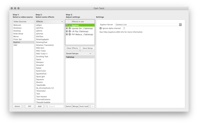
CamTwist Studio, which turns the Syphon video source into something that can be used as a video source within your video chat software. It also provides effects that you can use to flip the video, and the ability to include another video source as ‘picture in picture’ (PIP).
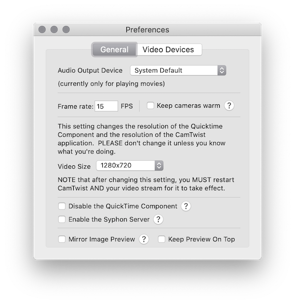
We adjusted the output video size to 1280x720 in CamTwist Studio preferences (which required us to then quit and re-open it).
Otherwise, the configuration that we used for CamTwist Studio was, from top to bottom:
Syphon, with the Camera Live server selected within Settings
Upside Down – depending on how your camera is orientated, you may not need this
LR Flip
PIP Webcam, scaled and positioned out of the way of the important bits of the board
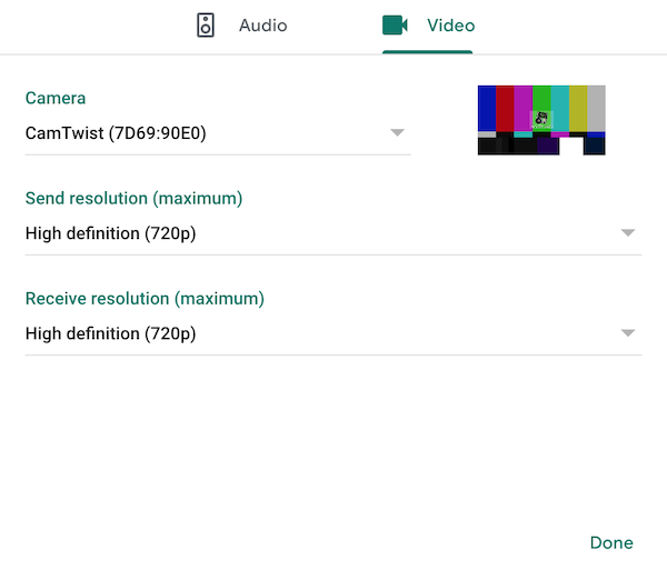
We used Google Meet, setting the video source to CamTwist Studio (there’s two of them for some reason, but they both seem to work) and bumping the resolution to ‘high definition’[3].
As you may notice from the photo, we were drinking champagne, because it was Emily’s 30th birthday on Thursday, and quite frankly if that’s not a good enough reason what is.
Anyway, it definitely added a certain je-ne-sais-quoi to the experience and I would 100% recommend it.
Emma and Chris had some terrible wine that ‘tasted like piss’. They would 100% not recommend it.
We played Pandemic, which may seem distasteful to some but:
I only got it in February, having played Pandemic Legacy whilst away with friends
it’s the only game I have where being able to see everyone’s hand isn’t an issue
perhaps most importantly, it’s a good game!
We moved some of the card piles off of the board, to make space for everyones hands.
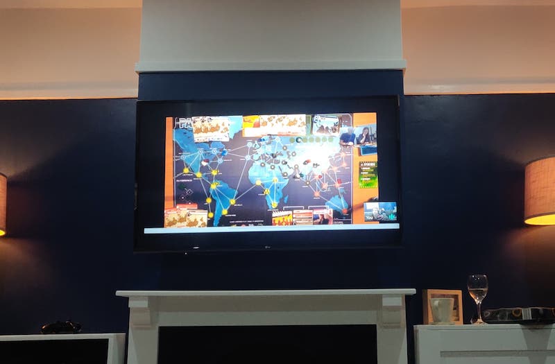
Emma and Chris connected their laptop to their TV, so they got a decent view of the board.
However they couldn’t quite make out all of the city names on the cards, and definitely not the city names on the board. They kept track of everyone’s hands using old-fashioned paper and pen, and had a photo of the board open to refer to.
It also definitely helped that we’d played Pandemic with them before, so they already understood the rules and we didn’t have to try and explain it all.
There’s definitely other games that will work with this setup, as long as players don’t need to be able to draw cards that need to be kept secret. Co-operative games are likely to work best. Probably.
It generally seemed to work well, and Emma and Chris enjoyed it despite being remote (or, at least, they said they did…)
We won, and even managed to eradicate one of the diseases along the way – but with only three cards left to draw. A close one!
If you try this for yourself, do let me know – especially if you find other games that work well!
‘Fun’ fact: we only bought this tripod a few weeks ago, for a trip to Tromsø we were meant to have gone on this week. At least we got some use out of it! ↩︎
When opening Camera Live for the first time, macOS may prevent you from running it as it’s not trusted. You can work around this by right-clicking and choosing ‘Open’, but note that this is macOS trying to protect you from untrusted software, and you’re choosing to bypass that protection. ↩︎
We didn’t actually do this, which may explain why Emma and Chris couldn’t read the cards – I only just spotted this setting whilst re-visiting it for the blog post. Unfortunately Google Meet is limited to 720p – if we try this again, we might try and find another provider that supports 1080p so that it’s even easier to make out the board and the cards ↩︎
In putting it together I found myself pulling together information from loads of different blog posts, previous talks, and from pull requests and issues from GitHub.
This is an attempt to link out to all of those things, for anyone that wants to find out more.
Update: I gave this talk again at MK Geek Night on 5 September 2019, as ‘Government services that work for everyone’. This version of the talk has been updated slightly to include new changes since February, and to adapt it for a more general audience. I’ve tried to document what was changed.
The title of the talk was changed, and some additional introduction content added.
The section on focus states was updated to include information about changes that we’ve made (the previous talk explained the problem, but at that point we did not have a solution)
(Nearly) all of the screenshots were updated to use the new colour palette and focus states
Some of the more technical detail was removed
Details about the WCAG 2.1 1.4.11 ‘Non-text contrast’ criteria were removed – I now just mention that the old focus state meant that we ‘were not meeting new accessibility guidelines’