Show full content
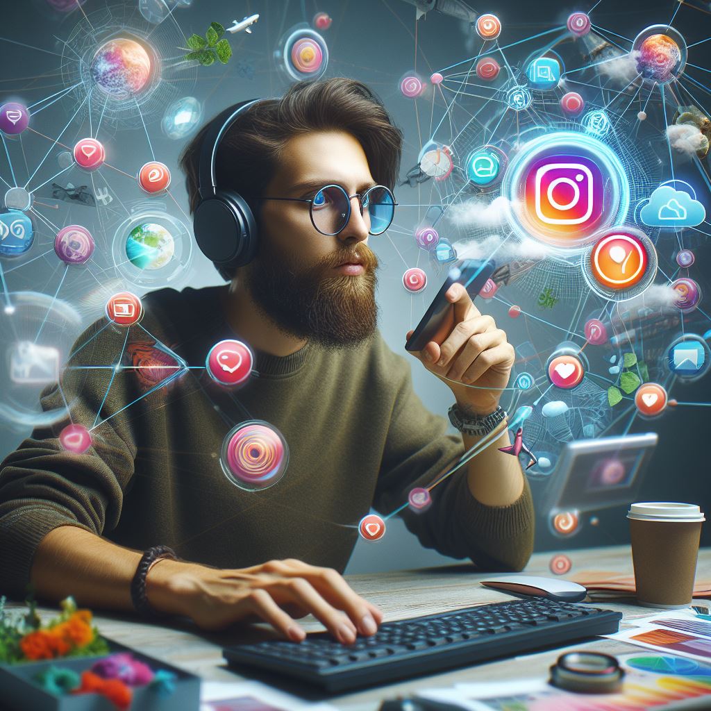
AI is all over the world. The print media uses it to show ads, others uses it to show area-specific ads in digital media, and IT sector uses it all scared  and getting their work done, I find myself on the same list ( using it all scared ).
Recently, one of my clients, for whom I was creating a website, asked if I could create a promotional video for his company. They wanted a general-purpose video to showcase their products. Initially, I told him I had no expertise in creating video ads and offered to connect him with a professional video creator.
Since the client was an early-stage startup and had some budget constraints at his end did not have a deal with a professional video creator. Here’s where I pitched the client to create one as a trial if he likes it we can have a deal.
The idea behind pitching for the video was to gain confidence by experimenting with my current set of skills and also to add new ones by learning in the process of creating the video. Took the client in confidence by allowing him to pay only if he liked the video.
AttemptWith a deadline of 3 days, I started looking for a tool that could help me to create a video.
HB Technology Pvt Ltd, my client was in the manufacturing of LED lights, and street lights with various categories, The requirement was to create a promotional video of 30 sec creatively showcasing his products.
For video, the hardest part was getting a voice-over that could describe the product in easy to understandable way and in Hindi. The cost of hiring a voice-over artist was way too much and had to explore alternatives.
One of the easiest ways to create the video was using the Canva tool and for voice over had to choose AI, Now there are various tools for that as well but my requirement was the video should be in Hindi and should sound human.
Narakeet was the tool that was able to find for voice over, It has some limitations for free users and to achieve my results within those limitations, It had perfect less than min record limitation.
Created the script using ChatGPT, Extracted the voice-over using Narakeet in Hindi, and selected some background music. The client had sent product images, so I enhanced them, made them transparent, and then uploaded them to Canva.
If you are in web development, you already have these skills, but the outcome is a video instead of a website. It was time to explore Canva and create the video back and forth between YouTube and Google exploring tutorials and effects was able to create the video.
After sending the first draft, the client was happy because I delivered what he expected. After making changes, I published the video.
I wrote the script with the help of AI, created the voice-over using AI, and used AI for image creation and enhancement. Now, I have a new skill that I can sell along with web development.
The post Leveraging AI in the Realm of Unknown appeared first on Yadnesh Tiwari.