GeistHaus
log in · sign up

https://theartandscienceofdata.wordpress.com/feed

rss
7 posts
Polling state
Status active
Last polled May 19, 2026 06:10 UTC
Next poll May 20, 2026 07:06 UTC
Poll interval 86400s
Last-Modified Wed, 28 Jan 2026 14:59:57 GMT

Posts

Who Was The Funniest Character on Friends? Analyzing Comedy in All Friends Episodes
Data ScienceRtvfriends
Whether you hate or love it, Friends is one of the most popular sitcoms of all time, with over 50 million viewers at its peak. The cast's characterizations were diverse enough for you to see a little bit of yourself and your friends in each of the characters as they stumbled through life and made bad decisions. One of the biggest debates fans have to this day is: Who was the show's funniest character? Was it Chandler with his self deprecating sarcasm? Ross with his nerdy mannerisms? Phoebe with her hippy-boho vibe? Joey? Rachel? Monica?
Show full content

Hate it or love it, Friends is one of the most popular sitcoms of all time.

The cast’s characterizations were diverse enough for you to see a little bit of yourself and your friends in each of the characters as they stumbled through life and made bad decisions. This makes it no surprise that, at its peak, the TV show had over 50 million viewers.

One of the biggest debates fans have to this day is: Who was the show’s funniest character? Was it Chandler with his self-deprecating sarcasm? Ross with his nerdy mannerisms? Phoebe with her hippy-boho vibe? Joey? Rachel? Monica?

Depending on who you ask, the answer might differ. For one, I thought Ross was hilarious, while others find him (understandably) annoying.

As a data lover and a huge fan of Friends, I took an intermittent two-year-long stab (seriously, I’ve been working on this for two years) at using data to answer this question.

Who was the funniest character? What made them funny? When were they at their funniest?

By analyzing laughter in the audio files of over 200 episodes of Friends and combining that with each episode’s scripts, I’m here to answer the question we’ve all been asking.

The How

This has been, by far, the most challenging project I have worked on. I started working on this in early 2019. The work I needed to do was beyond my technical capabilities at the time, so it took a lot of trial and error, which meant dropping and picking up the project multiple times.

Without going too much into the details, I built a machine learning model that could detect laughter in an audio file. Luckily, most sitcoms from the 90s had laughter either from a live audience or from a pre-recording. The model had about 95% accuracy and 98% precision.

In a nutshell, what I did was, using Python’s librosa library, I transformed the audio file of each episode into a dataset in which each row is a numerical representation of the sound waves for one second of sound. The model then detects what seconds were laughter based on the sound waves. 

The next step was matching the new dataset with the model-detected laughter to the script and subtitle data to identify who caused the laughter and what was said.

The majority of the code was written in R, but I did most of the audio analysis in Python. I suck at Python, so massive shout out to Allen, who saved me by speeding up my Python code. Go check out his data science blog: http://allenkunle.me.

I usually do not share a lot of the technical details of my work. Still, I was particularly proud of this one (and was tempted to overload you guys with nerdy information, but my editors said no). 

If you would like to know more about the technical details of the project, you can check it out here.

The datasets and a sample of the code can be found on my GitHub here

Let’s get straight into it!

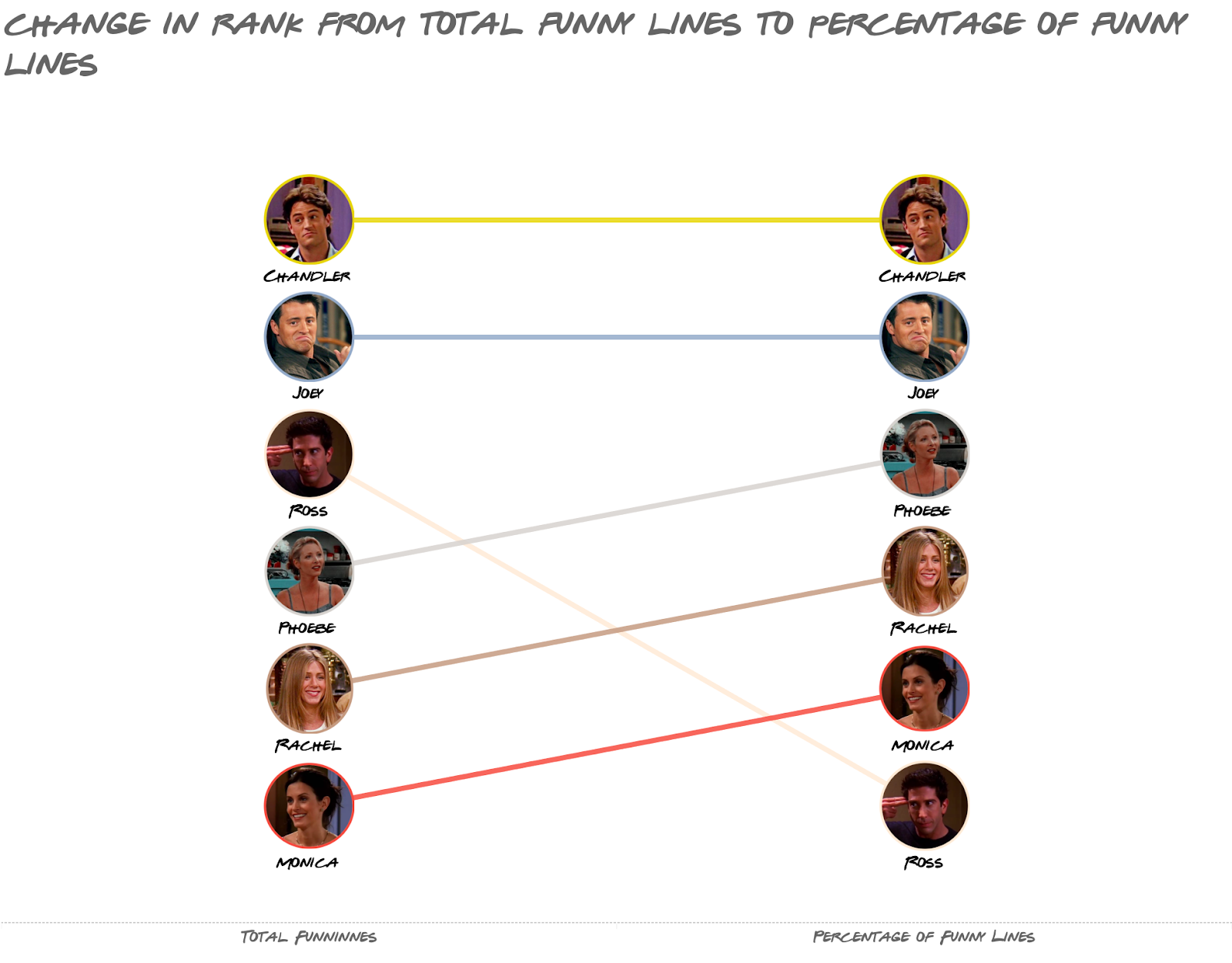
Who Was The Funniest Friends Character? By Total Number Of Laughs, Chandler Is The Funniest Character Of The Show, Followed by The Two Male Leads, Joey and Ross

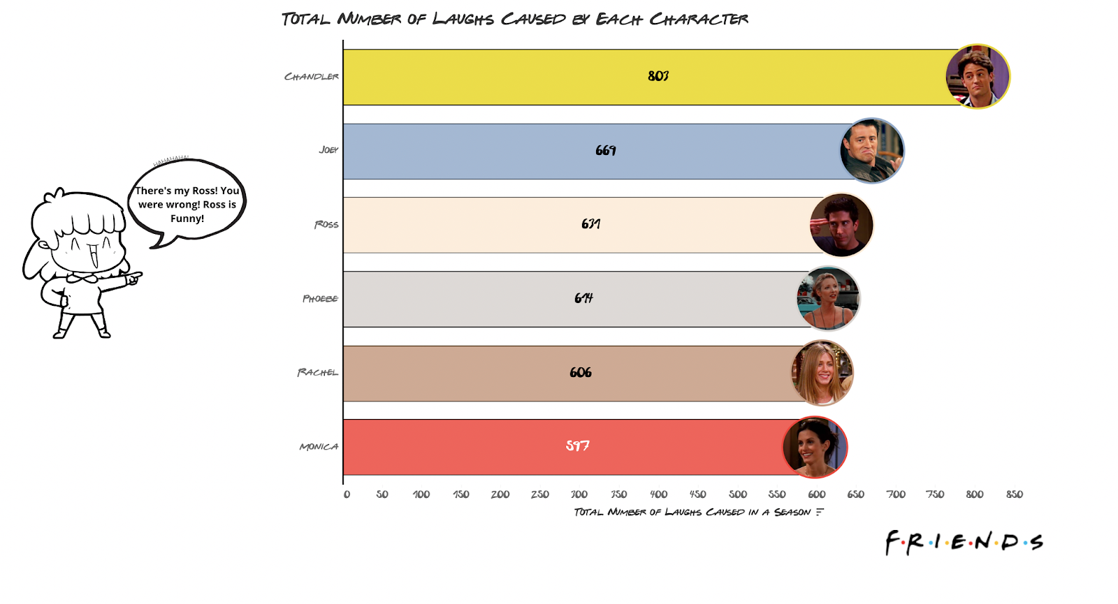
We have the three male leads first, followed by the female leads: Phoebe, Rachel, and Monica in that order.

However, this might be misleading. If a character has more lines, there is a higher chance they will cause more laughs, but that doesn’t necessarily mean they’re funnier than someone with fewer lines, right?

If We Look At What Percentage Of Their Lines Were Funny, Everyone Retains The Same Rank Except For Ross Who Drops To The Bottom

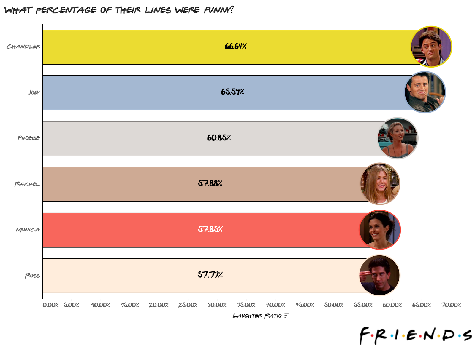
Chandler retains the top spot, with 67% of his lines being funny. Unfortunately, it seems Ross had more funny lines just because he had more lines in general. What’s even more shameful is that everyone else retained their rank. 

I liked Ross a lot, so this kinda bummed me out.

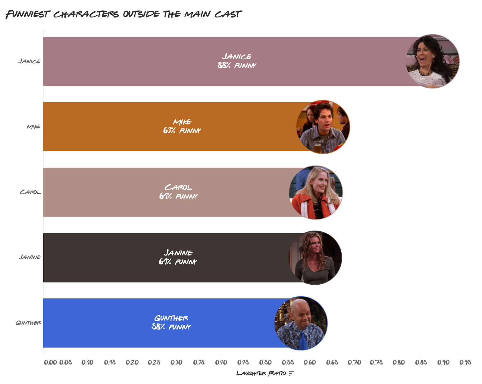
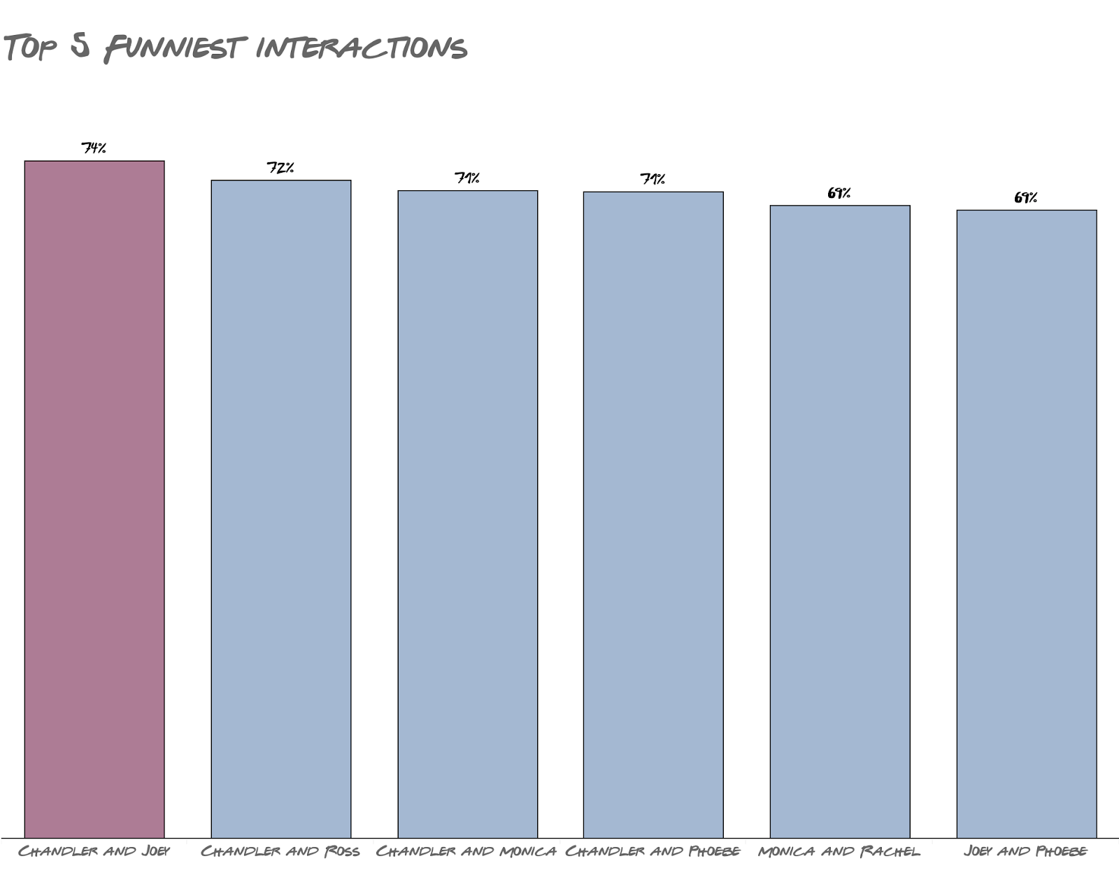
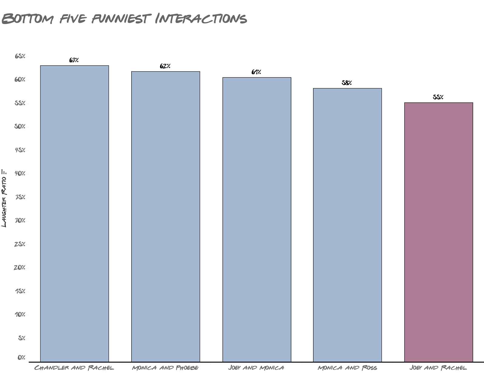
Here’s another way to look at it:

Outside of The Main Cast, Janice Was By Far The Funniest, With The Rest Also Being Love Interests Of The Main Cast

Janice, Chandler’s longtime on-and-off girlfriend, was by far the funniest outside the main cast and the funniest overall. This makes sense given her hilarious voice acting that made everything she said ten times funnier. 

The only character here who was not exactly a love interest was Guenther, although most of his funny moments were because he had a crush on Rachel.

Now, Why Was Ross So “Unfunny”? Compared To The Others, Ross’ Character Revolved Around Love Troubles. Four Out Of The Top Seven Words He Said Were Either ‘Love’ Or A Girlfriend’s Name

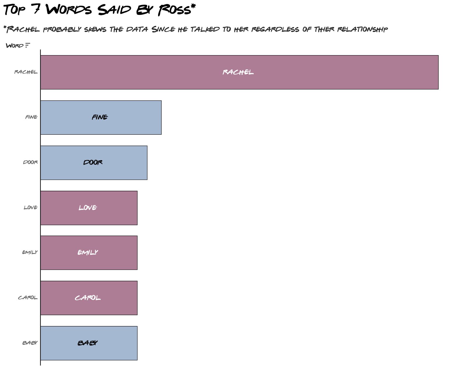
I use the top 7 here because some words are tied in their number of occurrences. 

You can see that most of his discussions revolved around talking about his love life, and this might have affected how funny he was because his love life was the most chaotic and painful thing to watch. 

Some of his biggest love arcs were:

  • His first wife, Carol, turned out to be a lesbian
  • His second marriage with Emily ended because he was still in love with Rachel 
  • His continuous, sometimes painful on-and-off relationship with Rachel

If you compare Ross’s top words to the other characters, the others talked about their love lives a lot less.

How Funny Were Their One-on-One Interactions? The Funniest Interactions Were Between Chandler & Joey, And 4 Out Of The Top 5 Funniest Interactions Involved Chandler
On The Other Hand, Rachel & Joey Had The Least Funny Interactions. With Three Of The Bottom Five Interactions Involving Monica

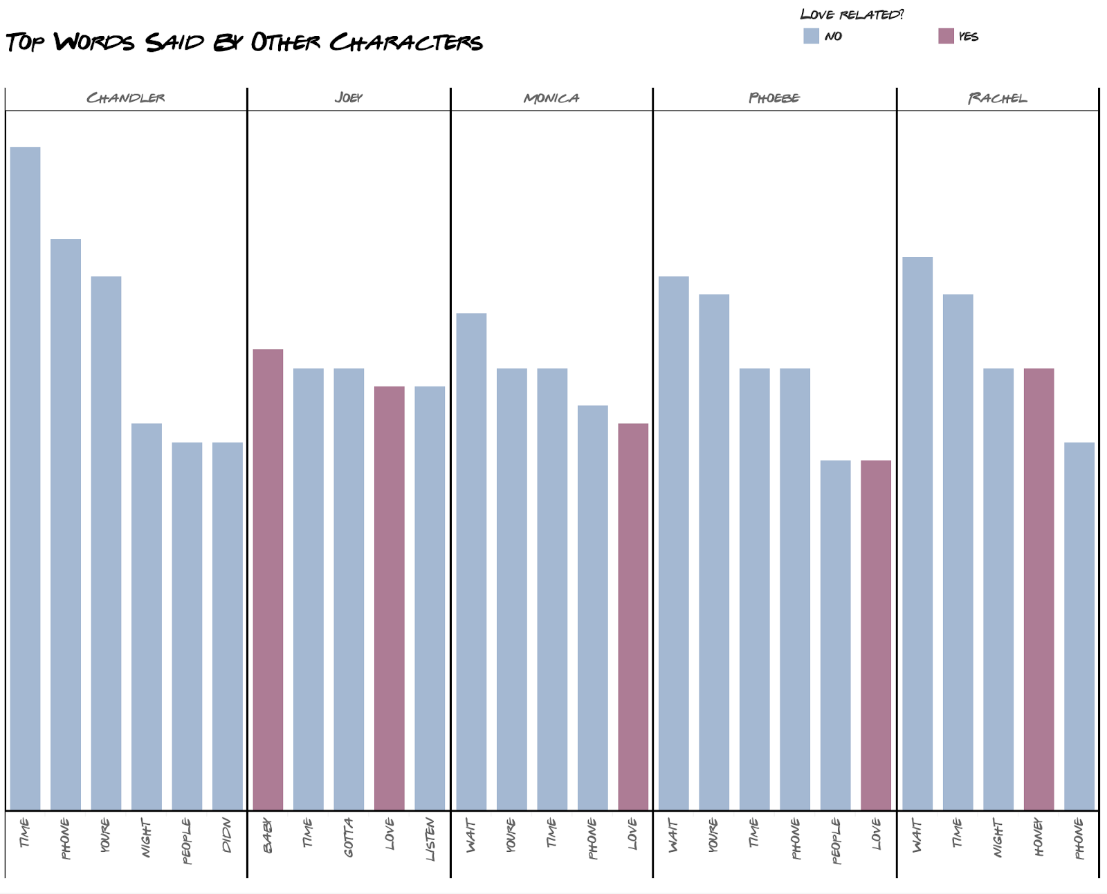
This probably also explains why their short-lived relationship seemed quite awkward. On the other hand, Chandler’s wife Monica was at the very bottom in one-on-one interaction. It makes me wonder if the showrunners put them together deliberately.

Season 10 Was The Least Funny Season For All Characters Except Ross and Rachel Because of Their Breakup In Season 3

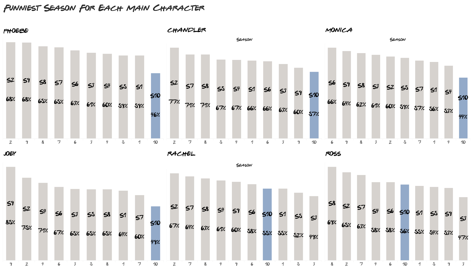
We can all agree that Season 10 focused less on comedy but more on the drama to wrap up the show. It also shows up consistently for all the characters that Season 10 was the least funny.

The only exceptions are Ross and Rachel, and this is probably because the show focused on them finally getting their happy ending that had been teased since season 1.

For both characters, season 3 was their least funny season, and this is where they had a lot of conflict in the relationship, which led to their breakup.

One Thing to Keep in Mind

This entire analysis is a good reminder that: data-driven does not always mean objective. The premise of this analysis is that the pre-recorded laughter is the ground truth for funniness. That simply isn’t true. 

While most people might agree that Chandler was the funniest, not everyone will, and that’s okay because sometimes, the role of data is not to be objective but to be a proxy for the subjective such as how funny a person is. Please feel free to disagree with the rankings.

What’s Next?

I know, I know. It’s been almost three years since my last post. To summarize, moving countries did a number on me. I’m only just recovering two years later.

There’s a 70% chance there will be a new post between March and April, plus I have around 5-6 posts planned for the year, but please don’t hold me to it in case life happens.

I really enjoyed working on this like old times! Thank you for sticking around, and I hope to see you all soon!

friends post
rosebudanwuri
http://theartandscienceofdata.wordpress.com/?p=1212
Extensions
Billboard Hot 100 Analytics: Using Data to Understand The Shift in Popular Music in The Last 60 Years
AnalyticsData ScienceR
What’s the most common thing you hear from “older” people about the popular modern music? The general theme is: “Your music is too loud and lacks content”. They talk about the “old” days with the meaningful songs, the soulful artistes, the deep bass guitars that can move you to tears. When they say that, they … Continue reading Billboard Hot 100 Analytics: Using Data to Understand The Shift in Popular Music in The Last 60 Years
Show full content

What’s the most common thing you hear from “older” people about the popular modern music? The general theme is: “Your music is too loud and lacks content”. They talk about the “old” days with the meaningful songs, the soulful artistes, the deep bass guitars that can move you to tears. When they say that, they are comparing this:

Downtown by Petula Clark, 1965

To this:

Stir Fry by Migos, 2018


There’s a clear difference, obviously. However, this will be taking one data point to make a general conclusion (which humans are very good at). I, being a millennial and a Data Scientist, found this an interesting topic to poke at. Has what makes music “great” really changed that much? Has the sound, the lyrics and the “message” changed? And if they have changed, how exactly have they changed?

Using billboard’s Hot 100 charts from 1950 – 2015 and Spotify’s API, we want to take a closer look at how much popular music has changed in the past six decades and find out what really distinguishes the music of today from the rest.

My Approach

For this post, I define “great music” as making it into the Billboard’s Hot 100. I got the data from a generous GitHub user Keven Schaich. The data contains a lot of interesting features like Sentiment, Gunning fog index (which estimates the number of years of formal education needed to understand a text at first reading), Number of words, Number of repetitive words/phrases etc.

In addition, Spotify has an interesting API endpoint called get_audio_features. The endpoint allows you to get song features like loudness, Instrumentalness (how much instruments are used), energy, liveness (the presence of a live audience), Speechiness, song duration etc. This brings the total song features to about 30 for Billboard’s Hot 100 between 1950 and 2015.

All these features are explained here and here and I will also explain some as we progress in the post.

Initially, I set out to use Python for this project and I did. Kinda. I had my first iteration of data collection all done with Python’s pandas and a python package called spotipy.

Along the line, however, I reviewed my methodology and found a more interesting dataset. For this, I went back to R specifically because of the tidyr::gather() function (it’s so annoying pivoting data in pandas jeez).

Here’s the code in R and Python which are different in most ways except a function called get_audio_features. My final dataset can be found here.

The amount of time I spent on data gathering is in sharp contrast with my other projects because, unlike my other projects, someone took the time to put a ready-to-use dataset together. This is a major reason why I share all the data I gather so hopefully, someone out there won’t spend 6 weeks on trying to gather data.

Let’s begin!

1.   In the past sixty years, we have had only two major changes in music

By using an algorithm called clustering, we can find similarities/clusters of artistes and their music using their song features.

Using this approach, we have two clusters of artistes – The String Lovers and The Poetics. The reason we chose these weird names lies in the two song features that define these clusters best: Instrumentalness and Speechiness.

Instrumentalness predicts whether a track contains no vocals on a scale of 0 to 1. “Ooh” and “aah” sounds are treated as instrumentals as well. The closer the value is to 1, the more likely there is no vocal content (e.g. a soundtrack) and the closer it is to zero, the more vocal it is (e.g. rap or spoken word).

Speechiness detects the presence of spoken words in a track.

  • The String Lovers score high on Instrumentalness but low Speechiness. This means that artistes in this period tend to favor instruments as opposed to speech.
  • The Poetics are the direct opposite. They score pretty high in Speechiness but very low on Instrumentalness.

Figure 1

The other interesting thing about these clusters is when they appear on the Billboards Hot 100.

  • Most String Lovers appeared on Billboard before the 1990s.
  • Most Poetics appeared on Billboard after the 1990s.

Figure 2

  • The 90s itself seemed to be a pivotal time in music as we see with the ~50-50 split between String Lovers and Poetics. This meant that artistes were split between going with this new type of music or sticking to the existing sound.
2.   The use of instruments dropped mostly because rock bands became less popular

Between the late ’60s and the early 2000s, bands were so popular that there were as many bands as solo artistes.

Before the 2000s, the more bands there were in a year, the higher the average Instrumentalness in that year.

Figure 3

However, after the 90s, the number of bands had little or no effect on the use of instruments.

Figure 4

Except the two outliers, the number of bands had virtually no effect on the use of instruments.  This is interesting because, like I mentioned earlier, bands were still popular in the early 2000s.

So, what happened?

I’m sure you guessed it. The TYPE of bands changed.

Figure 5

Before the 90s, about 60% of bands were rock bands – the types typically with one lead singer and a bunch of instrumentalists.

However, from the 2000s to present day, the percentage of rock bands dropped significantly making way for a new brand of bands which were generally made up of ALL singers: Pop bands. Think Destiny’s Child, Pussycat Dolls, Fifth Harmony, One Direction – you name it!

3.   We might also owe the emergence of Poetics to the rise of Hip-Hop

Apart from the increase in Speechiness and use of words, Poetics use two-times more complex words (e.g. Jay-Z saying opulence instead of wealth) than String Lovers and use words with more syllables. One genre immediately pops into everyone’s mind when we think of word-bending artistes: Hip-Hop.

Figure 6

Seeing as Hip-Hop tops all other genres in word-related features, it comes as no surprise that Hip-Hop gained mainstream popularity in the 90s – corresponding to the rise of The Poetics.

Figure 6b.png

4.   While the style of music has changed a lot over time, popular songs for the past sixty years have been mostly about loving women

To arrive at this, I used an algorithm called topic modeling. As the name implies, the algorithm searches for topics in a given text.

In our case, the text are lyrics from billboard songs.

Let’s see how these topics change over the decades:

Figure 7

This is absolutely amazing!

Like the features of songs, song lyrics also fall clearly into two buckets with Topic 1 capturing ’50s to ’80s, Topic 2 capturing the decades after the ’90s and the ’90s as a transition period!

This means that the sound and “message” of songs changed at pretty much the same rate.

So, what are these topics?

Figure 8

The topics are almost the same thing! Top songs have disproportionately been, for the past sixty years, “Yeah, I love my baby”.

There’s also something interesting going on here. A major difference between both topics is that before the 90s, songs might have had a more “direct” approach – you can see that a major topic is “gonna” e.g. “I’m gonna love you”. While after the 90s, it seemed a bit more indirect, like asking for permission hence replacing “gonna” for “wanna”. “Wanna” could also depict a more futuristic, imaginative approach to loving women.

5.   The more “quiet” genres ceased to exist in the Poetic Era

This sort of confirms that we tend to prefer louder music now than before.

Figure 9

The five most “quiet” genres are – Jazz, Swing, Folk, Blues and Disco.

These genres also ceased to exist as popular music in the Poetic Era except Jazz which seemed to survive by one artiste (Norah Jones).

Figure 10

What do these all mean?

In summary:

  • The 90s was an extremely important time in music.
  • The decline of rock bands and the rise of Hip-Hop played a major role in steering music to where it is today.
  • Love is a popular theme across songs for the past six decades but the approach to love might differ across the different eras of music.
  • Yes, modern artistes may be louder but it’s BECAUSE we have content :).
  • Bonus Point: Michael Jackson, despite being most popular in the 80s, is a Poetic! He was ahead of his time!
Fun Stuff and Things to Keep in Mind
  • I took a different (and more fun) approach to showcasing the data for this project. I built a dashboard using HTML, CSS, js and chart.js! The app is not (yet) optimized for mobile so, it’s best to use it on a laptop.

Here’s the link: http://bit.ly/music-dashboard

    • The dashboard has two tabs. The first one “Artist Dashboard”, shows you the average song features for individual artistes.
  1.  Figure 11
    • The second tab “Comparison Dashboard” allows you to compare song features for up to three artistes and looks like the screenshot below.
  2. Figure 12
    • You can share the results on Twitter or Facebook using the icons at the top right.
    • Just in case you forget what the features mean, hover over the title and you’d get a little tool-tip explaining it 🙂
  • The Poetic era (as I like to call it) is an ongoing era so some of these insights may change if we had 2016 to 2018 data (especially with the rise of trap music). However, I don’t expect the effects to be much.
  • It would be interesting to measure how “politically-aware” a song is. I will probably post the outcome of that on Twitter.
  • As usual, I am constrained by data collection methods of the generous GitHub user, Spotify’s algorithm and how Billboard arrives at the Hot 100.

Hope you had as much fun reading this as I had creating this 🙂

Figure 11
rosebudanwuri
Figure 1
Figure 2
Figure 3
Figure 4
Figure 5
Figure 6
Figure 6b.png
Figure 7
http://theartandscienceofdata.wordpress.com/?p=1072
Extensions
My Journey Into Data Science
AnalyticsData ScienceLearningMotivationR
Quite a number of people have asked me about my switch from Chemical Engineering to Data Science. How did I do it? When did I do it? Why did I do it? I felt today (January 6, 2018) was a befitting day to answer these questions as it marks the third year since I enrolled … Continue reading My Journey Into Data Science
Show full content

Quite a number of people have asked me about my switch from Chemical Engineering to Data Science. How did I do it? When did I do it? Why did I do it? I felt today (January 6, 2018) was a befitting day to answer these questions as it marks the third year since I enrolled for my first programming course. I hope sharing my story would give some insight into what I did to become a Data Scientist and encourage budding “anythings” everywhere to pursue their passion fiercely.

My first exposure to Data Science was from a book that had nothing to do with Data Science

In March 2014, I stumbled on a book called The Power of Habit: Why We Do What We Do in Life and Business by Charles Duhigg. In a section of the book called The Habits of Organizations, Charles wrote about a large retail chain that used data on what a female customer bought to predict the likelihood that she was pregnant. To put it lightly, I was mind blown and I had to find out more.

I searched everywhere for what this sorcery was called. After a few months and with the help of my friends, I stumbled on something very similar to what I read in The Power of Habit. It was called was Business Analytics.

This discovery came at a tipping point for me because, at the time, I was in my final year of college and had just finished an internship with an Oil & Gas company. My experience there made me weary of taking up Chemical Engineering as a career because I felt like it just wasn’t for me. This realization also made me open to new challenges and pivoting career wise. Business Analytics seemed to fit right into that.

I created my first Data Science learning path from an answer on Quora

By 2014, I had graduated and began my National Youth Service Corps. During my NYSC, I stumbled on Quora from a Twitter recommendation and I loved it.

In case you are wondering, IDEALLY, NYSC is a one-year mandatory program in Nigeria where you are deployed to a state you aren’t affiliated with to serve in some capacity as either a government worker, teacher or anything else really.

On Quora, I found out that Business Analytics had many names and one was Data Science. I also found a very helpful answer which I recommend to this day for anyone looking to start out as a Data Scientist: How can I become a Data Scientist?

This answer helped shape my first ever learning path for Data Science in January 2015 (Forgive my terrible handwriting).

Written January 2015. Other courses on the left side of the page are The Analytics Edge and Google Analytics

Written January 2015. Other courses on the left side of the page are The Analytics Edge and Google Analytics

I completed 15 MOOCs on Data Science within a year

I primarily learnt Data Science through online courses. I never used a book (I tried). All the courses were free (because I didn’t care for a certificate) and where they were not free like Coursera, I got 100% Financial Aid.

I kissed a lot of frogs when it came to online courses so if you are looking for a loose guide on how to get started in Data Science I’ll save you the stress and focus only on the courses that were worthwhile.

1. Learnt Programming

This was the very first thing on my learning path and the scariest of them all. It was scary because I didn’t have a Computer Science background and the only time I was exposed to programming in College, I absolutely hated it. However, this time I felt I had all the time in the world and nothing to lose so I enrolled for Codecademy’s Learn Python course.

The course was so hard and a lot of it did not make sense to me. I could spend as much as two weeks trying to get a while loop to work and I had no idea what file I/O meant but by sheer brute force, I completed the course.

This was the first time I completed an online course after numerous attempts to do so previously. That gave me some confidence to keep on learning.

2. Learnt core Data Science

A lot of people ask me why I choose to use R over Python. It was by sheer coincidence that my first exposure to Data Science was in R from a course called The Analytics Edge from MIT on edX.

The ten-week course uses a case study approach to teach different parts of Data Science from Machine Learning to Visualization to Optimization using R. It was very demanding and very rewarding. The amazing experience I had on this course is what makes me lean a bit more to R than Python. The course gave me a great foundation and I still refer to my notes from 2015 sometimes.

3. Other helpful courses

Another course I loved, which I took towards the end of 2015, was Data Visualization and Communication with Tableau from Duke University on Coursera. It’s a five-week course that gives a great foundation on the use of Tableau. The instructor is amazing and the best I’ve been exposed to so far.

The next on my list would be Managing Big Data with MySQL from Duke University on Coursera. It’s a four-week course with the same amazing instructor as the Tableau course and teaches both MySQL and Teradata.

Others worth mentioning are: Introduction to BigData with Apache Spark (A four course series) from UCBerkeley on edX and Excel for Data Analysis and Visualization from Microsoft on edX.

How I started my blog — where the real learning started

If you read a lot of Quora answers or articles on how to become a better Software Engineer/Data Scientist/Designer and the likes, you’d see a recurring advice: Do personal projects to deepen your skill set. I had tried to do that a few times in 2015 but I wasn’t able to do anything reasonable because, frankly, I was not ready.

By 2016, I had slowed down on online courses because 90% of the courses had the same content and assumed you’re a beginner so it became a bit repetitive. By this time, I felt I was ready to start doing personal projects using a blog. The writing part was not an issue because I used to write in High School. My issue, however, was around consistency and creativity. Was I creative enough to put together interesting projects and could I do it consistently? You never know until you try, right? And that’s how I started my blog The Art and Science of Data in June 2016. My learning grew exponentially working on the content for my blog.

I wrote my first two posts within a month and then went on a year-long hiatus

My first post was Predicting The English Premier League Standings which I posted in September 2016 and then What Twitter Feels about Network Providers in Nigeria which was posted in October 2016. The amount of positive responses absolutely floored me. I got about 1,500 views and numerous responses on both posts and for the first time, I felt confident in my skills.

This experience taught me that creativity is not some talent that you either have or don’t. Creativity is born by experience and confidence in your skills because the possibilities of what can be done expands with the more you know.

Then I went on a year-long hiatus on my blog. This happened for many reasons.

  1. I had tried to write a blog post in December 2016 that was a hot mess. I cleaned it up later and used it for my Women in Machine Learning and Data Science Workshop called The ABC-XYZ of Data Science.
  2. After that, I had what I’ll call “The Data Scientist’s block”. I literally had no ideas and could not think up anything useful or interesting.
  3. My approach to my blog is a bit different from most data science blogs because mine involves a lot of research and iterations. It also makes my publishing cycle much longer than others.
  4. Work was grueling and adulting was catching up with me so I became a couch potato.

I finally had an idea in June 2017 on billionaires and with the help of my friends, I published A Data Driven Guide to Becoming a Consistent Billionaire in October 2017 (yes, it took me four months to put it together).

Within three days of publishing, it had 30,000 views. It was everywhere. A sizable number of sites plagiarized the post and I didn’t care. My work was good enough to be plagiarized!

My Little Victories So Far

Apart from the 40,000 views I’ve gotten so far on my post A Data Driven Guide to Becoming a Consistent Billionaire, 2017 was an interesting year for me. For the first time, the work I have put in for the past three years was being validated.

  1. I won a United Nations Data Visualization Contest with my Tableau visualization on “Visualizing Malaria: The Killer Disease Killing Africa” which looked something like this.

2. I got invited to speak at Stanford’s Women in Data Science Conference holding in Nigeria on the exact same topic as this post.

3. I have numerous collaborations lined up for 2018 both in Nigeria and abroad.

4. I facilitated a workshop at The Women in Machine Learning and Data Science in November 2017.

Truthfully, I’m a bit surprised that I got this far. I remember writing in my notepad “Rosebud, you will never be good enough for this” but here I am. I still have a lot of learning to do but I am also grateful for where I am today.

My Advice for You

I’m no expert neither am I John Maxwell who gives nuggets of self-help advice but here are a few things that have really helped me.

  1. Don’t be afraid to let go of something that’s not working out. It took me till 2016 to fully let go of my Oil & Gas dreams even though I knew I was not passionate about it.
  2. Don’t be afraid to be called crazy. I cannot count the number of times people subtly and not-so-subtly told me I was crazy for leaving Chemical Engineering especially when Data Science was relatively new in Nigeria. It used to get to me but now I smile and say to myself “When I blow, you’ll understand”.
  3. Read. Read. Read.The books that opened up this field to me had nothing to do with Data Science. Reading expands your realm of possibilities.
  4. Love to learn. Have learning goals every year and stick to a medium (books/audio/video/classroom) that works best for you.
  5. Always, always put your best foot forward. Let the work that you put out there be the very best work it could be. It would speak for you. 99% of the opportunities I have gotten today came, in part, because of my blog.
  6. Most importantly, you are not an island. Have a tight-knit support system that would tell you the truth even when it hurts. You’d be better for it.

Good luck 🙂

I want to especially thank my amazing support system and all the people that got me here. They are too numerous to mention but I love you guys so much. I want to especially thank Tobi, Didun and Miracle for the support, the tough love, the brutal feedback and telling me where exactly to put an apostrophe. You have been there from day 1. You know all my struggles. You saw me at the very beginning and still believed I could do it. Thank you for making a better Data Scientist and a better person. I wouldn’t trade you for the world.

rosebudanwuri
http://theartandscienceofdata.wordpress.com/?p=1061
Extensions
Part Two on Consistent Billionaires: Introducing The Surprise
Data ScienceR
In my last post, I spoke about a certain surprise I had to share so here it is…… *drum rolls* *roll sleeves* *cracks a knuckle or two* It’s a web app called Billion Dollar Questions! It’s a simple and fun web app that anyone can use to predict what sort of billionaire they’ll become. Simply … Continue reading Part Two on Consistent Billionaires: Introducing The Surprise
Show full content

In my last post, I spoke about a certain surprise I had to share so here it is……

*drum rolls*

*roll sleeves*

*cracks a knuckle or two*

It’s a web app called Billion Dollar Questions!

billionaireapp

It’s a simple and fun web app that anyone can use to predict what sort of billionaire they’ll become. Simply tell the app who you are and a model runs its magic and tells you your future billionaire status. You can share your prediction on Twitter and Facebook to rake up cool points (if you are going to be Consistent anyway).

At this point, I think I should say that I can in no way guarantee you’d become a billionaire. My skills border around Data Science not making money rain.

Here’s how to use it

Before you go any further, I highly recommend that you read my last postThat way, a lot of the stuff on the app would be familiar to you.

Using the app is pretty simple, fill the form in a way that best describes you, click “Predict” and in a few seconds, the app would tell you what sort of billionaire you’d become. Here’s a GIF on how it works:

Hustler

You can also use it on your desktop, tablet or mobile device!

Now that you’ve seen how it works, here’s the app: 

theartandscienceofdata.shinyapps.io/billiondollarquestions/

Interested in How I did it?

My work is divided into two parts and can be found on my GitHub repo here:

R’s Shiny

Shiny is an amazing tool from Rstudio that gives you the ability to create R-driven web apps which can be easily deployed for anyone to use without ever having to touch code. A Shiny app usually has three parts:

  1. The UI: This is what you see at the front-end made up of R-wrapped HTML, JS and CSS.
  2. The Server side: This basically your usual R code. All R calculations, functions, scripts are run server side. In my case, this is where the model takes all your inputs, converts it to a dataframe and carries out predictions.
  3. Global: This is optional and it is used to declare variables globally which are to be accessed by multiple objects/functions. It is advisable to only use this when necessary because such variables or objects are loaded at runtime and if they are large or take too much time, it can slow down the loading time of your app. In my case, I read in the original dataframe here as well as the model which I used for the app since both objects would be needed by multiple functions.

My UI, server and global variables are all in the app.R file in the GitHub repo shared above.

Some Custom HTML and CSS

Shiny provides a great way for Data Scientists to code up nice web apps without having to know how to use Front-End tools like HTML, CSS and JavaScript. However, if you want more control over your app, you just might need to know a thing or two on how to use those Front-End tools. The good news is, Shiny lets you create these things pretty easily. I wrote custom code using the HTML() function and within it, I can put in my custom HTML exactly the way I would if I was building a website. I also had a custom stylesheet called style.css to give my app the feel I wanted and make it mobile friendly with a few media queries. I also used the famous animate.css library to make my app look fun (you can see all the buttons jiggling away).

Things to Keep in Mind

A number of people asked me why I used h2o and not R’s famous caret for my machine learning. The answer is: it was the use case. The billionaire data had a significant amount of missing values and had variables with over 50 different categories. These two things are what most machine learning algorithm implementations in R don’t deal well with and h2o handles both gracefully. You can check out h2o’s implementation approach here.

The  code that I used to create the final model used on the app along with some interesting research which did not introduce at this time, can be found here.


rosebudanwuri
billionaireapp
Hustler
http://theartandscienceofdata.wordpress.com/?p=1052
Extensions
A Data Driven Guide to Becoming a Consistent Billionaire
Data ScienceRbillionairesTableau
Did You Really Think All Billionaires Were the Same? Recently, I became a bit obsessed with the one percent of the one percent – Billionaires. I was intrigued when I stumbled on articles telling us who and what billionaires really are. The articles said stuff like: Most entrepreneurs do not have a degree and the average … Continue reading A Data Driven Guide to Becoming a Consistent Billionaire
Show full content
Did You Really Think All Billionaires Were the Same?

Recently, I became a bit obsessed with the one percent of the one percent – Billionaires. I was intrigued when I stumbled on articles telling us who and what billionaires really are. The articles said stuff like: Most entrepreneurs do not have a degree and the average billionaire was in their 30s before starting their business. I felt like this was a bit of a generalization and I’ll explain. Let’s take a look at Bill Gates and Hajime Satomi, the CEO of Sega. Both are billionaires but are they really the same? In the past decade, Bill Gates has been a billionaire every single year while Hajime has dropped off the Forbes’ list three times. Is it fair to put these two individuals in the same box, post nice articles and give nice stats when no one wants to be a Hajime? I think not – especially when, in this decade alone, inconsistent billionaires like Hajime make up over 50% of the total billionaire population. Addressing the differences between billionaires is what this post is about. We are going to highlight interesting facts about the consistent billionaires and ultimately, find out what separates the consistent billionaires from the rest.

Just what do I mean by consistent billionaires? Well, that’s what we’re here for. 🙂

For the Nerds Like Me, Here’s How I did It
  • Data Sources: Most of the data was scraped from 3000 Forbes profiles. Two extra variables were collected from a research paper: The Billionaire Characteristics Database. Billionaires covered are those who are or have been billionaires between 2007 and June, 2017.
  • Data Gathering: Using names of billionaires I created their Forbes profile URLs and collected the data I needed using RSelenium and rvest. I’ll be frank. It was not sexy at all. I did a lot of Excel VLOOKUPS, manual inspections and string manipulation to get a workable data set.
  • Data Cleaning: I created columns from strings using stringr.

The code can be found here.

Just How Many Types of Billionaires Are There?

Here’s what I came up with:

  • The Consistent: These, as the name implies, are individuals who have consistently been billionaires year in and year out. It also includes billionaires that have been away from the list for at most a year (e.g. Mark Zuckerberg in 2008). They should have been billionaires before 2015.
  • The Ghosts: These are billionaires who left the list and have not returned in the past four years. They also should have made their debut before 2015.
  • The Hustlers: This category includes every other billionaire who made their debut before 2015. I.e.
    • Those that left more than once and made a comeback each time.
    • Those who, although made it back to the list, spent more than a year away.
    • Those who are yet to come back but have not spent up to 4 years off the list.
  • The Newbies: These are billionaires that made their debut between 2015 and 2017. They are in a group of their own because I believe it would be unfair to put them in anywhere else as there isn’t enough data to classify them in any other category. Nonetheless, I think it would be interesting to see what they’re up to.

So, let’s get to it!

Did You Know That? The Consistent billionaires are well-educated.

Close to 55% of the Consistent billionaires have at least one degree.

Billionaire education

In fact, the Consistent billionaires have the most people with a Bachelor’s, PhD, Masters and pretty much every other degree.

The average Consistent billionaire started their businesses at an age seven years older than the average Ghost.

This applies to billionaires who are self-made and started a business. The average Consistent billionaire starts their business in their 30s on average which agrees with the article on successful starting their 30s.

Age at Start

Does the Ghost billionaire starting his/her business at least two years earlier than everyone else say something about younger entrepreneurs being less likely to sustain their wealth? Probably. However, if you look at the Newbies, they mostly started out young too. The question is: Will the average Newbie end up a Ghost or has the playing field changed in the past few years?  We can answer that in a few years. 🙂

The top three sectors that produce the highest percentage of Consistent billionaires are Telecoms, Fashion and Diversified portfolios.

Consistent Sectors

Looks extremely mainstream, right? But Fashion? Really?

Note: Fashion and Retail here does not mean Retail. It means businesses retailing Fashion merchandises like Zara, H & M etc.

African billionaires are the most likely to be Consistent billionaires

Close to 70% of African billionaires are Consistent – more than any other region in the world. The region that comes closest is North America with 53%.

Consitent Region

In the Newbie Era, however, Asia seems to be dominating every other region and this number is mostly driven by China. In fact, over 50% of Chinese billionaires joined the list during this period.

On the other hand, Middle Eastern billionaires are the most likely to be Ghosts. I know what you’re thinking. Oil prices, right? Probably. However, most of Middle Eastern billionaires have diversified portfolios.

There are more billionaires with a PhD than there are drop outs.

This is my favorite.

This applies to all other degrees like MBA, MSc etc. Only professional degrees like Law or Medicine have fewer billionaires than drop outs. However, in the Newbie and Hustler categories, there are even more people with a professional degree than there are drop outs.

Billionaire Degree.png

11% of Consistent billionaires are female.

Female Billionaires

The only category with a more encouraging female-to-male ratio is the Newbie category with about 16 percent. However, given that the global male to female ratio is 50:50, the Newbie category is still 34 percent short. The good news is things are getting better. A woman is close to two times more likely to be a billionaire since 2015 than before that.

64% of Consistent billionaires are self-made.

Self Made Billionaires.png

The only category with a lower percentage is The Ghost. The good news (or bad news – depending on where you hope your wealth would come from) is that the Newbie billionaire has a higher percentage than that. This means that in recent times, more “new” wealth is being generated. Also, it seems being self-made isn’t a peculiar thing seeing as each category has over 60% of their billionaires being self-made.

Cool, Now What?

The billionaires we all know and love are well-educated and frankly, generally boring.

How much does this matter if you want to become a Consistent billionaire?”

To answer that, we will do a bit of Machine Learning (bear with me here, it might get a little technical). Using the h2o.ai machine learning package (I love!), we would train models to predict what category a billionaire will fall into. We would do this for all the categories except The Newbie because, unlike the others, all that distinguishes this group is when they joined the list and not their performance while on it. We would also use truly independent variables to train our models. For example, a variable that was used to create the categories like the number of times they left the list won’t be used. It would be like knowing the answer and working backward if we use variables like that, right? We would then check which variables were the best in predicting a billionaire’s category to answer our question. The code is also available in the same script shared above.

I would first use the purrr and h2o package to find the best algorithm between Gradient Boosting Machines, Random Forest, and Deep Learning.

Models

Looks like the accuracy of the GBM algorithm on the test set beats the other machine learning algorithms.

Let’s check what variables GBM considers most important in predicting a billionaire’s category.

Variable importance.png

We see three variables above the 50% relative importance: Country, Sector and the founding year of the company that got them their wealth.

What does this tell us about Consistent billionaires? For one, it says that while the Consistent may be well educated, that’s certainly not what got them there. It’s not shocking that Country and Sector are important variables but “founding_year” is intriguing. It could mean that it may be getting easier or harder to build a sustainable business.

Again, pretty straightforward and boring. Be in an enabling environment at the right time for the sector you play in and BOOM! You make sustainable wealth. At this point, I feel I am obligated to say that 84% of technology billionaires are in North America and Asia. There are currently none from Africa (See sentence above about an enabling environment for your sector) but then again, you can be the pioneer so take my advice with a bag of salt. Good luck!

Things to Keep in Mind
  • The data was gotten from Forbes. This means that I am inherently constrained by their methods, estimates, and errors. For example, the data says there is only one billionaire from Politics. I’d rather diezani than believe that’s true.
  • At the end of the day, I ended up with over 30 variables and I cannot talk about all of them in one post, so here are some visualizations for you to play around and find out for yourself how to become a Consistent billionaire. 😉
  • Want to find out who the Consistent billionaires are? Find out using the full data set here.
  • In my next post, I am going to address what sectors, countries and founding years are the best in becoming a consistent billionaire and;
  • I have a LITTLE surprise. 🙂
rosebudanwuri
Billionaire education
Age at Start
Consistent Sectors
Consitent Region
Billionaire Degree.png
Female Billionaires
Self Made Billionaires.png
Models
Variable importance.png
http://theartandscienceofdata.wordpress.com/?p=647
Extensions
What Twitter feels about Network Providers in Nigeria
Data ScienceSentiment AnalysisTelecommunicationTwitterR
Disclaimer: This post is a personal effort and is not in any way advetorial for any party involved.  It does not reflect the views of my current, past or future employers. You know that amazing feeling when your network provider gives you great call rates, cheap data bundles that last, amazing network quality and awesome … Continue reading What Twitter feels about Network Providers in Nigeria
Show full content

Disclaimer: This post is a personal effort and is not in any way advetorial for any party involved.  It does not reflect the views of my current, past or future employers.

You know that amazing feeling when your network provider gives you great call rates, cheap data bundles that last, amazing network quality and awesome customer service? No? Yeah, me neither. If you are like me and most people I know, you are probably in a love-hate relationship with your network provider. It’s safe to say that all network providers are frustrating. However, some are more frustrating than others.

The question is: Can we determine which network provider is not going to be that frustrating? Based on the sort of phone I use; can I say if I am going to prefer Etisalat to Airtel?

Well, the answer is probably going to be a yes. There are several approaches out there to determine this like Polls, Customer surveys etc. I, on the other hand, decided to analyze customer’s social media. By analyzing what customers are tweeting about; we can infer, with a good amount of confidence, how good the services of a network provider are. This approach is called Sentiment Analysis. It is used to analyze sentiments in sentences (tweets in this case) and provides a negative or positive score based on the words in the tweet. Words like ‘angry’, ‘hate’, ‘annoyed’ appearing in a tweet tend to produce a negative sentiment score while words like ‘love’, ‘like’, ‘amazed’ would do the opposite. With a bit of ambition, I also analyzed emojis for their negative/positive sentiment (I was extremely proud of this!). So next time you are frustrated about your 10 GB data plan being wiped off in three hours and you would like to “port” your number to another service, you have a data-driven way of making that decision!

Using the twitteR package on R, I collected tweets relating to these service providers from Twitter between the 14th to the 25th of September. The sort of attributes gotten were: The tweet, the sort of phone used, how many retweets/favorites the tweet got etc. I then used the stringr package to clean the tweets removing punctuations, trailing and leading spaces, URLs and other stuff that don’t help our analysis. This was where most of my time was spent. Natural Language Processing is pretty challenging. I had up to 200 lines of code and over 90% of it was spent on data cleaning. In this cleaning process, I discovered that people spelt ‘mountain’ as ‘mtn’. I know this because I kept on seeing tweets like ‘mtn dew’ and ‘mtn bike’ which was pretty annoying. However, this paled in comparison to getting Glo-related tweets. You cannot imagine the number of tweets that were not about the network provider but about some guy talking about how their previous breakup upped their ‘glo up’ game. Sigh. After the tweets were squeaky clean, I scored the sentiment of each tweet using the AFINN lexicon which gives a sentiment score between -5 to 5 for several words. Finally, I created wordclouds using the wordcloud package after converting the tweets to a clean corpus using the tm and SnowballC package. The code can be found here.

I think it is important point out that Twitter is a very small sample of any network providers’ customer base. This means that what may be true for this sample might not neccessarily apply to the general population. Facebook would have been a better option but that API has been deprecated.

These are some teasers on the interesting stuff I found on Twitter:

  • There is a service provider who the only guys that say positive things on average about them are guys tweeting from TweetDeck or sharing posts from Facebook.
  • The service provider with the most satisfied customers is going to be a shocker.
  • People are pretty much indifferent to the provider everyone thought was most liked.
  • There is a network provider whose customers complain an average of 75% of the day.
  • One service provider has either weird or ‘old school’ customers who don’t use emojis.
  • iPhone users are generally not positive towards any service provider.
  • One service provider has customers who would rather tweet when they have positive things to say about their service provider rather than slander them (I hope to have customers like this someday).

Let’s break it down to each service provider and talk about the interesting things we found out about them. If you want to have a closer look at the visualizations I’ll be using, that can be found here.

MTN

With close to 40% market share by number of subscribers (based on data published by the NCC), these are the big guys in the Nigerian Telecommunication Industry. The question is, are they living up to the name? Let’s look at a dashboard I created to visualize how well they are doing based on tweets about them.

blog-11

With an average sentiment score of -0.24 on Twitter, well, I don’t think they are doing that great.

  • The first chart is a trend chart. The orange line shows the number of tweets tweeted about MTN every day for this time period while the grey line is the average score over the same time period. Nothing really interesting here except that on the 17th of September, MTN users were more riled up than usual.
  • The second one is a bubble chart and it’s looking interesting. The colors of the bubbles range from red which is the most negative sentiment to green being the most positive. The legend for the color scale are at the top left of the chart. The size of the bubble is determined by the number of tweets from that source. It is immediately clear that almost no one on Twitter likes MTN.
  • Those little green bubbles are not from phones. Those are tweets from TweetDeck and people sharing stuff from Facebook. This might mean they have good data services. Some bubbles are really small and would make the chart look cluttered if we tried to label them all. It might be a good idea to take a look for yourself by clicking the link above.
  • The third chart shows emojis on the horizontal axis and how frequently they are used on the vertical axis. They are mostly negative emojis which again re-emphasizes that customers on Twitter generally do not really like them or their services.
  • The fourth shows the average score for every hour across all the days in this time period. If you look closely, you would see that there only 6 hours on an average day where MTN users say stuff that are positive. This means that MTN users are the guys who spend 75% of the day complaining about their services or saying negative things about them. That’s a lot of time and energy spent by the customers being angry on Twitter.

Let’s look at a wordcloud showing the key words that appear in the same tweet as MTN over this time period.

mtn

The size of the word shows how often they were used when talking about MTN. We can see words like swear, confus(e), explain, cri, loud, free and the rest. These words are mostly negative words. It’s safe to say that this service provider is not very much liked on Twitter.

If you are wondering why some words don’t look complete, you can read about stemming here.

Let’s take a look at the next service provider.

Etisalat

The up and coming fresh guys of the Telecoms’ space. Although they might have the smallest market share in terms of number of subscribers, they have been growing exponentially over the past few years. Have they impressed their customers so far with their amazingness and awesomeness? Let’s see about that.

Blog 12.PNG

I was pretty shocked when I saw this. With an average sentiment score -0.04, it seems that customers are generally indifferent towards them only showing slight negativity. This was a bit shocking because they *seem* to be the guys everyone likes. The number of tweets on Etisalat seems consistent no matter how bad or good the customers feel about their services on a particular day. The Android guys don’t like them. The iPhone guys like them even less. The Blackberry and iPad users seem to like them a lot though. The other green dots are mostly from Twitter for web clients. Of all the popular emojis for Etisalat, only three are positive. Etisalat Customers seem to complain only early in the morning before 8am (UTC+1.00) and then their sentiment dances around the zero line mostly for the rest of the day. This, again, validates that customers are somewhat indifferent to their services.

Let’s take a look at their wordcloud.

Etisalat.png

It seems customers spend a lot of time comparing them to competitors. By eyeballing it, there are no (mostly used) words that stand out as definitely positive or negative.

Glo

Coming in second place in market share and being an indigenous company, they are a company Nigeria should be proud of. Let’s see what their customers on Twitter think about them.

Blog 13.PNG

Either the Glo users are either the older demographic of Twitter who aren’t really into using emojis to express themselves, generally do not use emoji enabled phones or they are pretty weird people. With an average sentiment score -0.19, they are also a Telco that is not well liked. Surprisingly, this is the only Telco that the iPhone guys do not hate (Note I did not say ‘like’, the average sentiment is 0.07 which is pretty apathetic). The rest of the major phone demographics do not seem to like them that much. It also seems that Glo users are the guys who tweet most when they are happy with their services. You can see that some of the spikes in number of tweets in a day also correlate with spikes in the average sentiment score. Over the day, the cycle of the average sentiment on Twitter is fairly consistent after they complain bitterly by 6 am (UTC+1:00).

Let’s look at their wordcloud.

glo

We can see words like bad, smile (which might be referring to the internet services firm), browse, sleep. Not a lot of words really stand out in their sentiment.

AIRTEL

With over 31 million users in Nigeria and a lot of international presence in Asia and other places in Africa, let’s see how well they are liked.

Blog 14.PNG

Well, they look like they are liked quite a lot. In fact, their average sentiment score is 0.63. The highest sentiment score achieved by any Telco and the only guys with a positive sentiment score. This places them as the most liked service provider. There was only one day in this time period where their average sentiment score was negative. The only major phone demographic that is not crazy about them are the iPhone guys. The first negative emoji used for Airtel came in 5th position and interestingly, the most used emoji for tweets with Airtel in them is an Antenna with full bars. Generally, Airtel customers do not complain a lot about their services. In fact, there seems to be no hour of the day that, on average, with a negative sentiment score.

Now let’s take a look at their wordcloud showing the most frequent words used in tweets involving Airtel.

Airtel.png

Nothing particularly stands out as negative (only if you look very closely). We see words like free, unlimit(ed), care, offer, custom(er). These are generally positive words and supports the Airtel love!

Based on all of this, here are my conclusions.

  • If you are an iPhone user, you are doomed. Just kidding, you’d probably do okay with Glo.
  • It seems Etisalat’s BIS plans and service are doing great in the BlackBerry space. Consider getting thier SIMs the next time you want to get a make-shift smartphone. No shade.
  • Pretty much every other phone user is good with Airtel.

A few disclaimers:

  1. This is a very, very short time period of less than two weeks. I would keep on collecting data on this and make inferences at the end of the year (maybe).
  2. I tried my best to control for promotional tweets (I won’t bore you with the details here, the code has lots of comments that can guide you through that process) but some still pass the filter test and there is a very small possibility that these tweets could skew the analysis.
  3. Some of these companies are not just in Nigeria meaning that some tweets are from places like Uganda, South Africa, India etc. This means that this analysis is not confined to the sentiment of Nigerians alone.
  4. This analysis is from twitter and constitutes a relatively small part of the customer base of a network provider. The twitter guys are mostly from the millenial generation. Although this has been the target market, especially for data related services, what may be true for this sample may not necessarily apply to the population/whole customer base.

Going forward, I would like to answer why MTN, though not really well liked, still has a lot of customers (like me). This would mean answering questions like does sentiment necessarily show customer preference? I would probably segment this analysis a bit further to analyze sentiment for call quality, data services etc. It would also be nice to add Smile, Spectranet and the likes to this analysis.

Feel free to add a comment! Thanks for reading!

rosebudanwuri
blog-11
mtn
Blog 12.PNG
Etisalat.png
Blog 13.PNG
glo
Blog 14.PNG
Airtel.png
http://theartandscienceofdata.wordpress.com/?p=442
Extensions
Predicting the English Premier League Standings
Data ScienceFootballUncategorizedR
Before I begin this post, I would like to point out that I am the most disgruntled Arsenal fan you’d ever meet. Whatever subliminal messages or shade I could be throwing to your team, it’s (mostly) not to hurt you. We Arsenal fans have to find joy in other places seeing as there’s a good … Continue reading Predicting the English Premier League Standings
Show full content

Before I begin this post, I would like to point out that I am the most disgruntled Arsenal fan you’d ever meet. Whatever subliminal messages or shade I could be throwing to your team, it’s (mostly) not to hurt you. We Arsenal fans have to find joy in other places seeing as there’s a good chance we might not make Top 4 this season. Take solace knowing that all I say, I say for the love of the game. Happy reading!

Football is a beautiful sport. The adrenaline rush we get from watching our team score in injury time or the embarrassment we feel when our team not only loses the match, but decides to concede 8 goals in the process (Yes, I am looking at you Arsenal) is part of what makes us addicted to the game. What makes football, especially in England, even more interesting is the uncertainty. You can get all the top players from all the top leagues in Europe or even sign a world class manager who almost won his country the World Cup and still not finish Top Four.

So first off, just how uncertain is the Premier League? The answer might be: Not as much as you think. Asides the anomalies once in a few years (like Leicester City winning the league or Chelsea shocking us all by coming 10th a year after lifting the BPL trophy), the Premier League might be fairly consistent. Take for instance, Tottenham. They had a stellar campaign and were favorites to win the league last season but somehow managed to suffer a 5-2 loss to Newcastle on the last day of league, causing them to drop to third on the table and showing that for them consistency means being forever below Arsenal. Did I mention that, at this point, Newcastle was 18th on the table? Heh.

The question we need to answer here is: Can we predict the points/rankings for a club?

Well of course the answer is yes. You can predict pretty much anything. The accuracy, however, is another story. I took a swing at this and found some interesting stuff.

  • The number of Shots a team makes per game is not important as we think in winning games and gaining points. In fact, depending on the overall performance of the team year on year, it could actually hurt a team’s chances of gaining more points.
  • The best predictors of how well a team will do are mostly offensive statistics like Goals Scored, Shots per game, Penalties Scored, Open Play goals and Goal Difference (which is a balance between a team’s Defensive and Offensive ability). These stats can predict your standings with up to 70% accuracy.
  • If these stats are used to predict that a team is going to be in the Top Four, on average that team has a 62.5% chance of being there.
  • If they are used to predict that a team is going to be relegated at the end of season, on average that team has an 83.5% chance of being at the relegation zone. And last but definitely not least;
  • Tottenham *could* win the 2016/2017 English Premier League. *Gasps*

Now, before I am lynched, let me take you through how I arrived at these conclusions.

Without boring you with a lot of details, I’d tell you about the approach I chose. I decided to use a team’s performance and statistics of the previous year to predict their position on the table in the current year. There are many other (and probably better) approaches out there but I think this would be a fun one to explore.

The first step is to get the data. I got the data from whoscored and Skysports. Whoscored is a JavaScript-rendered site (Those really pretty sites) and you know, the pretty ones always play hard to get (Get it? hard to get? it’s hard to get data from pretty/js-rendered sites? ah never mind). I used the RSelenium package in R to deal with this as it lets you get data from js rendered websites. Other major packages I used are rvest and XML used for web scraping (getting data from the web). I then cleaned (and I mean CLEANED) the data, made sure all the columns were in the right format and removed unnecessary columns. I had about 40 different variables like Offsides per game, Interceptions per game, Dribbles per game etc. The code used to get the data is here.

Using the DataCombine package, I created a lead (opposite of lag) variable of the number of points based on the year and the team. This means that for every row of data, we had a new column that told us the points that team had in the next season.

Now we are done with the hard part! The next (and my favorite) thing to do is to understand the variables in the data set. Questions like how does the number of Red Cards a team gets per game relate with the number of points that team would get the next season (note that I said relate and not affect. Correlation is not Causation). What sort of relationship do these variables have? Is it a linear interaction (a straight line relationship), a polynomial interaction (e.g. A quadratic relationship) or any other? Understanding the variables and answering these sort of questions is done by exploratory data analysis (A fancy word for creating charts). I used Tableau for this part because I like a bit of interactivity in my plots (sorry ggplot2 lovers. I’m lazy, I love Tableau). I put up a sample of the sort of stuff I did for data exploration so you can get a feel of what it looks like. You can view the visualization here.

blog-bpl

Just by looking at it, we can see that some variables like Number of Yellow Cards has a weak relationship with leadPoints, some like Goal Difference have a strong relationship with leadPoints and some like Interceptions and Dribbles per game have almost no relationship with the number of points the team would get in the next year (I can’t stop thinking of Coquelin and Sanchez right now. Wonder why). Some pretty amazing things I discovered from visualizing my data:

  1. As a standalone, a team’s Goal Difference at the end of a season, has the highest correlation with how well that team will do in the next season. This was particularly interesting as it outperformed other stats like the number of points the team got in the previous year, the number of goals scored, the number of wins and stuff like that. This means how balanced a team is would be the best determinant of how well a team would do in the long run.
  2. At the beginning of this post, we talked about how Shots per game is not what we think it is. Let’s look at that.

If you take a look at the scatter plot above for Shots per Game vs leadPoints, what do you notice? The number of Shots a team makes per game is INVERSELY correlated with how well they would do in the next year. This means that the more shots a team makes, the less the number of points that team is likely to achieve in the BPL next year. I was so blown away by this that I had to dig further. I checked how shots per game interacts with the number of points a team had at the end of the same year (e.g. Shots per game in 2009 vs. Points in 2009) and it was STILL negatively correlated.

2ff

Again, before I get lynched, let’s take a closer look.

If you look at the chart closer, you would see that at a certain threshold of about 60 points there’s a subtle change in the movement of the trend.

blog-3

You can see that from 60 points and above, the relationship is somewhat positive but mostly random while below that threshold you can see a clear negative correlation.

blog-4

If you think about it, teams with less than 60 points would probably not be very good at converting their shots to goals. I checked this out and found that the highest conversion rate achieved by a team with less than 60 leadpoints was 17.6%. This team was Chelsea in 2014. This means they had above 17% conversion in 2014 (when they were champions) and had only 50 points at the end of the 2015 season (Remember that their position on the table was an anomaly). Asides from them, the average conversion rate for a team that had less than 60 leadpoints was about 10%.

With this in mind, here’s one fact. Every shot attempt made by a team that is not a goal and is not deflected by the other team is invariably handing over possession to the opponent. This means that for the number of minutes (or seconds) the opponent is able to retain that possession; they are probably going to dominate the game. Now back to the gist on conversion rate. Here’s what I think is happening. When a team is not very good at converting shots to goals it means that the more shots they have, the more likely they are to be handing possession back to the opponent and invariably giving their opponents some upper-hand in the game. This is probably why we some negative correlation below 60 points. We could even visualize it differently.

For the Consistent Top Four Teams (Manchester Utd, Man City, Arsenal and Chelsea) …

Looks positive eh? (Remember that is this is for 7 years which is why you are seeing 28 points on the chart)

blog-5

Adding the consistent Up and Coming Teams (Tottenham, Liverpool)

Looks a bit random but not negative at least.

blog-7

Now let’s add just ONE ‘under performing team’ like Sunderland…

WOAH! It becomes negatively correlated!

blog-8

Now, we are done exploring our data and seeing our different variables interact with leadPoints, I split the data I had into four parts. This was split for building models, tuning parameters, testing the models and predicting for the end of 2016/2017 season. I used the Boruta package, which iteratively tests the predictive power of each variable using randomForest and discards unnecessary variables. At the end of this iterative excercise, I ended up with 13 out of the final 37 variables. I tried several modeling techniques from Linear Regression (including Ridge and Lasso Regression) to Support Vector Machines to Tree Modelling and Neural Networks. I found that good ol’ Linear Regression (with some orthogonal polynomials and variable interaction) outperformed all other modelling techniques. On a basic level, Linear regression could be explained simply with x-y graphs where we had points and tried to draw the line of best fit (This is called, in technical terms, Univariate Linear Regression). I then began to experiment the 13 variables I had left to see which combination yielded the best accuracy on the test set. I found that the variables that are the best predictors on how well a team will perform based on last year’s data are: The team’s Goal Difference, Goals scored, Shots per game, number of penalties scored and the number of Open Play goals the team had in the previous season (Don’t worry all ye statistics nerds out there, the variables were checked for collinearity). Let’s test how well the model will do for data it has not seen before. The data we are going to be using to test the model will be for 2013/2014 and 2014/2015 season. We will predict how well each Team will perform based on last year’s data and we would see how well the model does.

For 2014:

2014
And for 2015:

2015

Fairly good predictions, if I do say so myself.

Disclaimer: As we all know; Football is a dynamic sport. It’s hard to say that some years from now, Goal Difference or Penalties scored would be a good predictor of how well a team will do in the next year. The best predictors could become more defensive stats. Until this is tested over a long period of time, we cannot say that these variables would always predict points with this amount of accuracy over the long term.

Some challenges I faced:

  • The teams which were not consistently in The Premier League were a bit of a challenge to model. To tackle this, I updated my approach a teeny bit from using last year’s stats to the last year the team played in the premier league. This tweaked approach was of tremendous help because for the consistent teams, it still meant last year and for the relegated teams, it helped in predicting their standings.
  • It does not completely help though. There are some teams that had never played in the Premier League till the time window of this data like Watford. What I did was scale down their last achievement and use it to predict. What this means was if last year they were in Division One and got 70 points, I scale that number along with other stats down to be no greater than the smallest point and stats achieved in the BPL and then use that to predict. Fishy I know but a man’s gotta do what a man’s gotta do.

Based on this model, the rankings for the 2016/2017 would be:

  1. Tottenham
  2. Manchester City
  3. Arsenal
  4. Leicester
  5. Southampton
  6. Liverpool
  7. Manchester United
  8. West Ham
  9. Chelsea
  10. Everton
  11. Watford
  12. Swansea
  13. Stoke
  14. Middleborough
  15. Crystal Palace
  16. West Bromwich Albion
  17. Hull
  18. Sunderland
  19. Bournemouth
  20. Burnley

Tottenham right up there is why I find solace in the fact that there is about a 37% chance they won’t be at that position. This is the first time I am excited in seeing a model fail.

Going forward, I see two interesting approaches to increase the accuracy of the model:

  • I think it would be interesting to see how manager rankings at the time can improve the accuracy of the model.
  • Another interesting approach would be; instead of using just last year’s data, we could use an average of all (or some of their data, like a moving average model) their past data to predict this year’s data.

I’d probably try the second approach later on. I’m a bit too lazy for the first one and the third one might be infeasibale for irregular teams but there could be a way around it.

Hope you enjoyed this post! If you have any comments or suggestions, feel free to add a comment.

Thank you for reading!

rosebudanwuri
blog-bpl
2ff
blog-3
blog-4
blog-5
blog-7
blog-8
2014
2015
http://theartandscienceofdata.wordpress.com/?p=29
Extensions