GeistHaus
log in · sign up

https://feeds2.feedburner.com/asymptosis

rss
30 posts
Polling state
Status active
Last polled May 18, 2026 21:58 UTC
Next poll May 19, 2026 21:03 UTC
Poll interval 86400s
Last-Modified Sat, 16 May 2026 12:03:53 GMT

Posts

Sectoral Balances: (Mis?)understanding NAFA and Net Lending/Borrowing
Uncategorized
I’ll start with the short version here: if you’re having trouble understanding sectoral “Net Lending/Borrowing” (the stuff of sectoral balances), try renaming it: Net net accumulation of financial assets. Net accumulation of financial assets (accumulation net of disaccumulation, broken out by types of assets)– Net incurrence of liabilities (new borrowing net of loan payoffs [and [...] Related posts:
  1. Bleg: Accounting for the Real Sector
  2. Identity Games: Saving ≠ Saving? Whodathunkit?
  3. The Pernicious Myth of “Patient Savers and Lenders”
  4. Note To Economists: Saving Doesn’t Create Savings
  5. Safe Assets, Collateral, and Portfolio Preferences
Show full content

I’ll start with the short version here: if you’re having trouble understanding sectoral “Net Lending/Borrowing” (the stuff of sectoral balances), try renaming it: Net net accumulation of financial assets.

Net accumulation of financial assets (accumulation net of disaccumulation, broken out by types of assets)
– Net incurrence of liabilities (new borrowing net of loan payoffs [and writeoffs])
= Net net accumulation of financial assets.

Note that this is for each sector’s Financial Account. The Capital Account is a completely different measure and derivation, and has different import. The two accounts’ bottom-line NL/B measures differ by the Statistical Discrepancy. You can see and compare both accounts conveniently for any sector in the Integrated Macroeconomic Accounts, household Table S.3 for example.

Here’s the longer form:

NAFA, or Net acquisition of financial assets, is an important measure, often rather a crux, in Post-Keynesian, MMT, and other economic thinking and writings. It’s central to understanding sectoral balances graphs, for instance. So it’s surprising to find widespread and long-standing confusion about what that label means.

In footnote 28 to a recent paper, I highlighted how Wynne Godley and Marc Lavoie (G&L) in Monetary Economics use a different (and IMO better, clearer) label for the measure. But of far greater issue: “NAFA” there refers to a different measure from the one most economists think of. This post is an attempt to sort that out clearly.

The national accounts measure being graphed in sectoral balances is “Net lending (+) or borrowing (-)” for each sector’s Financial account. Here’s that measure and its subcomponents in the Integrated Macroeconomics Accounts household table S.3.a. (See also the Financial Accounts’ household Transactions table F.101.)

40    Net acquisition of financial assets
67    Net incurrence of liabilities
77  Net lending (+) or borrowing (-), financial account (lines 40-67)

Most people naturally think that NAFA refers to the top line here. But in G&L, it’s actually referring to the bottom line. And the longhand version of NAFA in G&L is net accumulation, not acquisition. Both differences matter.

To begin with, Net lending/borrowing is a problematic and confusing label. Look at the table for any year, and imagine three possible counterfactuals.

  1. Government transfers an extra $1T to households. Nothing else changes. Households’ assets and so net lending/borrowing increase — with no household lending in sight.
  2. The household sector spends an extra $1T buying goods from firms (which households consume). Again, nothing else changes. Households have less assets, so less net lending/borrowing, while no actual borrowing happened.
  3. The household sector borrows more from the financial/government sector(s). No other changes. Households have more assets and more liabilities — an “expanded balance sheet” — with no change to Net lending/borrowing.

A change in net lending/borrowing, with no lending/borrowing? New borrowing, with no change to net lending/borrowing? It’s no surprise if people are confused.

It’s probably best to understand Net lending/borrowing as a stylized label, term, usage, rooted in a particular understanding: “You can only increase your financial asset holdings if some other unit increases their obligations to you, their liabilities. So one unit’s asset increase is effectively ‘lending’ to other units.” (Though of course that’s not the only way you can increase your financial assets. The other unit’s assets can decrease — be transferred to you).

In any case, “effectively” is invisibly carrying a lot of water there. (“We don’t mean ‘lending’ literally!”)

“Acquisition” is another potentially confusing label. To many, it may seem to imply purchases and sales of financial assets. Couple that with another widespread misconception, and confusion is likely. Many think that individuals buying (acquiring) bonds or equities increases the household sector’s stock of “savings” or some such. But really that’s just portfolio rebalancing, dollar-for-dollar asset swaps: fixed-price M2 assets exchanged for different, variable-priced assets (and vice-versa; it’s a swap).

So if households “acquire,” purchase, more equities for example, they’re just rebalancing the sector’s portfolio mix. Units have different proportions of M2 vs equities. There’s no change to total assets. Hence, likewise, Net lending/borrowing is unchanged. 

Godley and Lavoie nicely avoid that confusion; their NAFA means Net accumulation of financial assets. See for instance their Appendix 12.1 (pp. 490-492), which lays out the sectoral balances identity, though not by that name.

But the far larger confusion remains: the NAFA in G&L isn’t our usual NAFA. It’s actually our familiar Net lending/borrowing — the bottom-line measure, not the assets measure. 

Lavoie has acknowledged as much in a recent private email (which he’s given me permission to quote):

Yes, you are right, in the Godley and Lavoie book we used the terminology that Wynne had used, which was not always consistent with that of the national accounts, in particular in the case of NAFA. I used the proper terminology in my 2014 book on post-Keynesian economics. [Post-Keynesian Economics: New Foundations.]

He does indeed address this issue (see eg pages 260 and 515), but not with the succinct clarification I’m hoping to provide here. To that end, here’s a proposed revision to the national-accounts labeling (slightly verbose, for clarity).

40    Net accumulation of financial assets. Gross inflows minus gross outflows. NAFA.
67    Net incurrence of liabilities, Gross new borrowing – loan payoffs and writeoffs. NIL.
77  Net net accumulation(/disaccumulation) of financial assets (line 40- line 67). NNAFA.

The double “net” serves to nicely clarify the whole construction, in my opinion. This is at least worth keeping in one’s head, to metabolize and simplify the web of accounting identities/definitions at play.

Two further items to note here:

These Financial-account measures are all changes in “volume,” versus “valuation” (asset-price-driven capital gains/losses). The latter, which are far larger than the volume changes, and consistently positive with a few drawdowns over more than six decades, are tallied separately, in the IMAs’ Revaluation account.

This whole Financial-account exercise also works with the Capital account, which provides an alternate, parallel approach for deriving the accounting pathway to change in Net Worth. The two accounts’ bottom-line Net Lending/Borrowing measures differ only by the Statistical Discrepancy (they use different measurements and methodologies). That measure has to be included in the sectoral-balances exercise when using the Capital account; the Financial account balances to Net Worth without it. The Capital account also invokes the whole issue of (net) Investment a.k.a. capital formation (which raises the seemingly eternal conceptual mare’s nest exemplified in the self-contradictory term “financial capital”). So sectoral balances taken from the Financial account yield a simpler and more straightforward, purely “money view” understanding.

Related posts:

  1. Bleg: Accounting for the Real Sector
  2. Identity Games: Saving ≠ Saving? Whodathunkit?
  3. The Pernicious Myth of “Patient Savers and Lenders”
  4. Note To Economists: Saving Doesn’t Create Savings
  5. Safe Assets, Collateral, and Portfolio Preferences

https://www.asymptosis.com/?p=10650
Extensions
Your Personal Covid Risk
Uncategorized
I’ve spent like eighteen months trying to figure out how to think about and understand this question, in a way that lets me make what seem like sensible, everyday decisions. I think I’ve gotten there, or close. I’m sharing here in case it’s helpful to my gentle readers. I’m fully vaxxed. Here’s a typical, day-to-day [...] Related posts:
  1. ‘Pubs Love Catastrophic Coverage. Too Bad the Free Market Doesn’t Provide It
  2. Encouraging Deadly Financial Viruses
  3. Risk is Mispriced Because Money Managers Face no Risk
  4. Sullivan’s Surprised??
  5. Alex Tabarrok Does the Arithmetic on CDOs
Show full content

I’ve spent like eighteen months trying to figure out how to think about and understand this question, in a way that lets me make what seem like sensible, everyday decisions. I think I’ve gotten there, or close. I’m sharing here in case it’s helpful to my gentle readers.

I’m fully vaxxed. Here’s a typical, day-to-day question: If I go out to dinner in Seattle with some random friends, indoors, unmasked, how much of a risk is that? This Dave Leonhardt article finally gave me the numbers I needed to figure that.

His (literal) headline takeway: In the U.S., if you’re vaxxed your daily odds of getting infected are about 1 in 5,000. In low-infection, hi-vax areas like Seattle, more like 1 in 10,000. (Per Leonhardt, only three places in the U.S. even collect that data for vaxed vs unvaxed: Utah, Virginia, and King County, WA. Yay us.)

But what in the hell do I do with that number? What does it mean? He tries to help: “It would take more than three months for the combined risk to reach just 1 percent.” That three-month multiplication is well-intentioned, but it’s an odd, arbitrary choice of period.

I realized long ago: when you ask “what are my odds/chances of getting infected?” (and then etc. from that), you have to ask, your odds over what period? Otherwise it’s meaningless.

So now jumping to the best thing I’ve seen, a personal Covid risk calculator that some SF folks built.

It starts with an arbitrarily-chosen personal annual risk “budget”: “I’m willing to accept a 1% annual risk of getting infected.” (This choice is baked into the site, right down to its name: “Microcovid.”) Divide that risk budget by 12 for monthly budget (0.08% risk), 52 for weekly, whatever. They use weekly, which I also find useful.

Now compare: a 1 in 10,000 daily risk, 0.01% (which sounds super low, right?) is 3.65% annual risk. (Just multiply by 365.) So I’m like, “1% annual is kind of a ridiculously low risk budget, given the low ensuing risk of hospitalization much less death.” Especially if you’re vaccinated. Those worst outcomes are very unlikely.

So I’m like, what’s a benchmark annual risk I could compare it to? Try this: An average person’s daily risk of a home accident/injury with a doctor/ER visit is 1 in 5,000. That includes kids and elderly, who are more accident-prone.

That’s 7% annual risk. Once every 14 years. Six times in an 85-year life. Seems a decent ballpark estimate to my anecdotal experience/observations, if you include childhood/old-age injuries. Maybe a bit high. Whatever.

So, say I change my annual covid-infection risk budget to 7%. Then the calculator sez: if I eat out with four friends, indoors, nobody’s masked, restaurant has a HEPA filter running, that only consumes 5% of my weekly risk budget. You can tweak those numbers as you wish; I might do so as well. But it’s not a bad starting ballpark for me.

This doesn’t touch on risk you pose to others, community risk, risk of exponential spread in the population. Or, say, the risk to your restaurant servers (notably including my daughter). Those are things I also definitely consider. But this is a baseline of what you’d need to start with, to consider those subjects.

Related posts:

  1. ‘Pubs Love Catastrophic Coverage. Too Bad the Free Market Doesn’t Provide It
  2. Encouraging Deadly Financial Viruses
  3. Risk is Mispriced Because Money Managers Face no Risk
  4. Sullivan’s Surprised??
  5. Alex Tabarrok Does the Arithmetic on CDOs

https://www.asymptosis.com/?p=10630
Extensions
Microfoundations: The Long Con
Uncategorized
I wrote this as a comment response to Ryan Avent’s great post on his Substack blog. (You should subscribe. I did.) I thought I’d share it with my gentle readers here. Lightly edited, including one additional paragraph at the end. ================= Hi Ryan. Great piece, thanks. A few responses: 1. “authors of published papers are [...] Related posts:
  1. Peggy Noonan’s Right: It’s Over
  2. Government is Not the Problem. Bad Government is the Problem.
  3. Wealth and Redistribution Revisited: Does Enriching the Rich Actually Make Us All Richer?
  4. Does Upward Redistribution Cause Secular Stagnation?
  5. The Most Important Econoblog Post This Year: The Steve Keen/MMT Convergence
Show full content

I wrote this as a comment response to Ryan Avent’s great post on his Substack blog. (You should subscribe. I did.) I thought I’d share it with my gentle readers here. Lightly edited, including one additional paragraph at the end.

=================

Hi Ryan. Great piece, thanks. A few responses:

1. “authors of published papers are not always required to make available the data underlying their work”

Not just the data! They need to provide the actual analytic mechanism, software, that they use for the calculations. A replicator cannot be expected to re-create it perfectly based on verbal explanations or even the algebraic formulas in their papers. Detailed implementation issues always arise, and replicators can look directly at how the originators dealt with them — the precise, coded derivations of different measures. Plus errors, of course, Reinhart/Rogoff being the obvious example. Gimme the spreadsheet. Or stata code *and* the spreadsheets, as in Piketty & Co.’s DINAs, whatever.

2. This all cuts to the demand for “microfoundations.” In most cynical terms, the synonym for that is “post-facto armchair psychological/behavioral justifications for model assumptions about human reaction functions.” Which generally derive their rhetorical weight from the degree to which they seem “obvious.” Making a bit of a leap here, in practice where confused notions of individual vs collective “saving” rule, this means that assumptions which seem obvious to minds steeped in puritanical Calvinism tend to dominate economic theories and models. (Even Marx had a very heavy dose; Minsky even more so. And etc.) Vs models focusing on the observed, emergent behavior of different groups, classes, etc., whatever their microcauses might be.

So (entering the Office of Self-Aggrandizement here), I’d like to bruit the following model as one that completely eschews and refuses to do that post-facto rationalization and justification veiled as microfoundations.

http://www.paecon.net/PAEReview/issue95/Roth95.pdf

Even though what seems to be an ironclad “obvious” explanation is lying on the ground waiting to be picked up: “The bottom 20% turns over its wealth in annual spending six or seven times faster than the top 20% because duh, declining marginal utility.”

Just: that’s what the top/bottom 20% groups *do.*

It’s like modeling the fluid dynamics of water in a whirlpool, or passing through a venturi. Sure, understanding the H20 molecule interactions provides a deep and rich understanding of water’s viscosity. But for the fluid model you just measure the viscosity and Bob’s your uncle.

Fully cynical view: The whole microfoundations business was/is basically a very clever dodge to require puritanical calvinism in all macroeconomic analysis. Blowing smoke and emitting chaff to to distract from and discredit any models in which group norms, cooperation, emergent properties, etc. trump simplistic additive (and “obvious”) steely-eyed self interest.

All of which has resulted in a massive and dominant intellectual infrastructure justifying insanely concentrated wealth, based on the false, moralized labeling and rhetoric of “patient savers.” (I’m looking at you, Paul Krugman.) Not just on the right, either; significant aspects of this leak into left/heterodox economics as well.

Thanks for listening… /rant

Related posts:

  1. Peggy Noonan’s Right: It’s Over
  2. Government is Not the Problem. Bad Government is the Problem.
  3. Wealth and Redistribution Revisited: Does Enriching the Rich Actually Make Us All Richer?
  4. Does Upward Redistribution Cause Secular Stagnation?
  5. The Most Important Econoblog Post This Year: The Steve Keen/MMT Convergence

https://www.asymptosis.com/?p=10622
Extensions
Economic Origin Stories and the State of the World
Uncategorized
Origin stories and creation myths pack a pretty hefty weight of import in human understandings of the world. Examples are too numerous to mention. What I’ve noticed in the field of economics is that such origin stories are often taken (mistakenly) to fully explain the current state of affairs. I’m going to discuss two examples [...] Related posts:
  1. All Currency is “Fiat” Currency
  2. Platinum Currency: What’s The Fed’s End Game?
  3. Matthew Yglesias: Do Low Taxes Cause Inflation?
  4. Currency is Equity, Equity is Currency
  5. The Real Ponzi Scheme: Private Debt
Show full content

Origin stories and creation myths pack a pretty hefty weight of import in human understandings of the world. Examples are too numerous to mention. What I’ve noticed in the field of economics is that such origin stories are often taken (mistakenly) to fully explain the current state of affairs. I’m going to discuss two examples here.

1. Why Money Has Value. The “double coincidence of wants” money-origin story, retailed by Adam Smith among many others, has been quite thoroughly debunked over the past century. But the better stories that have emerged continue to be seen by many economists — problematically in my opinion — as significant explanations of how things work right now.

One of those better stories is the tax-based origin of “fiat”-money value. A sovereign is collecting taxes in kind. They issue coins (necessarily if only implicitly pegged to an associated unit of account, which generally has same name as the coins — “The Shekel”), and declare that taxes must be paid using those coins. People need to accumulate those coins to pay taxes, so a consensus arises: everybody ascribes value to those coins, and they start using them in private exchange.

At that point there is consensus currency, which only achieved consensus value through the fiat imposition of taxes in that currency. That’s a plausible tale.

But once that consensus is achieved, taxes are no longer the only explanation for people’s ascription of value to the currency/coins. They’re valuable to people because of the consensus; it’s self-perpetuating. People in the private sector can exchange those coins with others for real goods/services, and to satisfy obligations from past provision of goods/services. And beyond “can”: sellers start demanding Shekels instead of bushels of corn, so buyers must use the consensus currency.

Now to be sure: That consensus is likewise maintained by another fiat mechanism: government enforcement of private contracts numerated in that currency. There’s a huge pyramid of legislative (or sovereign/autocratic), judicial, and enforcement machinery supporting the private-value consensus. But that’s separate from (and much larger than) the tax obligations, collections, and enforcement that originally bootstrapped and kick-started the consensus.

In the current state of the world, people can, really must, transfer USD-denominated assets to get what they want from, and fulfill their obligations to, other private actors — and also, yes, to pay their taxes. But the magnitude of US private-sector spending and obligations dwarfs tax obligations by a factor of roughly three to one. Given that magnitude, it seems misplaced to suggest that in the current state of the world, tax obligations are the only thing that impart value to the US consensus/fiat currency.

The tax story is a plausible and quite comprehensible (if somewhat stylized) understanding of how consensus currencies emerged and were ascribed value. But those currencies are seen as valuable today because…everyone agrees they have value, and demands them in exchanges and transfers, both private and public.

2. Financial Assets ≠ Liabilities. This supposed “accounting identity” belief is dismayingly widespread, even though a mere glance at the numbers shows it’s completely untrue, vastly incorrect. Just start with corporate equity shares, universally categorized as financial assets: The market asset value of those shares (ultimately in aggregate held on household balance sheets) is tens of trillions of dollars greater than the the related liabilities/shareholders’ equity on corporate balance sheets. The same pertains to bonds, even Treasuries, though the percentage disparity is far smaller.

Where did this notion come from? Another origin story: at the moment of issuance and sale, the issuers’ liability equals the holder’s asset. When a corporation issues $1,000 of new bonds or equity shares and sells them to households, the corporation has a new $1K liability, and households have a new $1K asset; the two are equal. (Yes, there’s also a $1K cash-asset transfer, households -> firms. Assets and liabilities increase, but ∆NW is zero for both parties, either individually or combined.)

But as soon as those bonds/shares start trading in the market, their market asset values change. Every brokerage in the world sees trades at different prices, and marks every holder’s account statement/balance sheet to market. The household assets no longer equal the firms’ liabilities. The origin story no longer explains the current state of the world — not even close.

Related posts:

  1. All Currency is “Fiat” Currency
  2. Platinum Currency: What’s The Fed’s End Game?
  3. Matthew Yglesias: Do Low Taxes Cause Inflation?
  4. Currency is Equity, Equity is Currency
  5. The Real Ponzi Scheme: Private Debt

https://www.asymptosis.com/?p=10601
Extensions
Savings Glut? “Households are Just Saving all that New Money!
Uncategorized
The big coronavirus stimulus programs are helicopter-dropping trillions of dollars in assets into households’ (and firms’) accounts, onto their balance sheets — all those assets created ab nihilo by government deficit spending. But as many are pointing out, households aren’t turning over many of those assets in spending, buying things — transferring the assets to firms in [...] Related posts:
  1. Swimming in the Stream: How Economic Forces Force Household Indebtedness
  2. Why the Government Must Keep Running Deficits. Forever.
  3. Again: Saving Does Not Increase Savings
  4. Oh Yeah: Crowding Out Has Been a Huge Problem
  5. Note To Economists: Saving Doesn’t Create Savings
Show full content

The big coronavirus stimulus programs are helicopter-dropping trillions of dollars in assets into households’ (and firms’) accounts, onto their balance sheets — all those assets created ab nihilo by government deficit spending.

But as many are pointing out, households aren’t turning over many of those assets in spending, buying things — transferring the assets to firms in exchange for newly produced goods and services. The Personal Saving Rate — saving, or holding relative to income, divided by (disposable) income — has skyrocketed.

In simpler terms, spending as a percent of income has plummeted.

A Twitter post by our new Deputy Assistant Secretary for Macroeconomics at Treasury Neil Mehrotra raises exactly the question that comes to my mind:

It would be nice to articulate what exactly is the downside is of making transfers that are saved . . .

The short answer, of course, is that households’ failure to immediately turn over their new assets in spending will fail to stimulate economic activity — producers creating goods and services: giving massages, preparing meals, producing cars and cell phones — and presumably hiring more people to do that production.

But will households start spending those assets when things open up?

That immediately got me thinking about WWII and ensuing, when the same thing happened though in somewhat different form: households were hoarding their income, holding onto their assets, like they are now (saving rates were in the mid-20% range 1942-44). Meanwhile both households and firms were getting a lot of their income/revenue from wartime government deficit spending — paying soldiers and arms producers. The household sector was piling up those magically created new assets, and not turning them over, transferring them to firms in spending.

Which all reminded me of this old post by GMU economist David Henderson: “Does Drawdown of Savings Explain the Postwar Miracle?” He pooh-poohs the idea that postwar households were “spending down their savings,” because while saving rates declined (9.5% in ’46, 4.3% in ’47), they didn’t go negative.

Which highlights the fundamental problem with (especially Right) economists’ quasi-Calvinistic “saving rate” obsession: that measure has both a numerator and a denominator, which both involve income (saving is just a residual: income minus spending). Note that the spending graph above doesn’t have that problem.

And the two are causally connected. When postwar households started spending out of their accumulated stock of assets, causing firms to produce more consumer goods, firms inevitably hired more to produce those goods — increasing households’ aggregate income. (While firms’ revenue sources shifted from government deficit spending to household spending turnover.) So the “saving rate” didn’t go negative because the resulting income increase kept it positive.

In other words, Henderson’s “saving rate” framing is an error of composition (or a partial-equilibrium error); it considers saving as a percent of income, without considering that higher spending causes higher income. Households were spending out of their assets at a higher rate, postwar — the lower saving rates clearly suggest that — even as higher wage bills paid by firms were funneling (a lot of) those assets right back to the household sector as income.

We can perceive that today by looking at the sudden decline in household spending as a percent of assets, spending velocity; the numerator (spending) declined a lot, while the denominator (assets) increased a bit:

Fiscal policy is kinda pushing on a string. But we should probably expect a postwar-style dynamic to play out over the rest of this year, and beyond. Households have more assets; if (when?) velocity returns to pre-crisis levels, they’ll start turning those over in spending.

And we should remember that the big postwar jump in household spending/asset turnover didn’t translate into significant, sustained inflation for another three decades — excluding the war years, the only significant and sustained inflation episode we’ve seen in the last ninety years. (Extra credit: count the recessions over that period.)

Related posts:

  1. Swimming in the Stream: How Economic Forces Force Household Indebtedness
  2. Why the Government Must Keep Running Deficits. Forever.
  3. Again: Saving Does Not Increase Savings
  4. Oh Yeah: Crowding Out Has Been a Huge Problem
  5. Note To Economists: Saving Doesn’t Create Savings

https://www.asymptosis.com/?p=10548
Extensions
Household Wealth by Wealth Percentile (be prepared to scroll)
Uncategorized
The bottom (visible) blue line is the top 10% of households. Source: gabriel-zucman.eu/files/PSZ2017AppendixTablesII(Distrib).xlsx Table TE3 Related posts:
  1. The Poor Get Poorer
  2. Fake News from the CBO? Some Very Dicey Numbers in the New Income Inequality Report
  3. Meritocratic Opportunity: On the Decline
  4. The Global “Capital” Glut
  5. Can Rich People Provide all the Necessary Demand?
Show full content
The bottom (visible) blue line is the top 10% of households.

Source: gabriel-zucman.eu/files/PSZ2017AppendixTablesII(Distrib).xlsx Table TE3

Related posts:

  1. The Poor Get Poorer
  2. Fake News from the CBO? Some Very Dicey Numbers in the New Income Inequality Report
  3. Meritocratic Opportunity: On the Decline
  4. The Global “Capital” Glut
  5. Can Rich People Provide all the Necessary Demand?

https://www.asymptosis.com/?p=10537
Extensions
Buybacks Are Bad. But not for the Reasons You Think.
Uncategorized
The megabillion-dollar corporate bailouts raining down in the coronavirus response are giving new urgency to voices on the left excoriating corporate stock buybacks. How can we pour money into these firms, even as they pump gushers of money out the other end that could be spent on hiring and investment? Much of the pushback against [...] Related posts:
  1. Why Libs and Cons Should All Love Milton Friedman’s Corporate Tax Proposal
  2. We Need to Spur Business Investment. Yeah, Right.
  3. Obama and Small Business Cap Gains: Where’s the Beef?
  4. Another Comprehensive Approach: The Fair Share Tax Reform Proposal
  5. Do Businesses Borrow to Invest in Productive Assets? Does the Business-Interest Tax Deduction Encourage That?
Show full content

The megabillion-dollar corporate bailouts raining down in the coronavirus response are giving new urgency to voices on the left excoriating corporate stock buybacks. How can we pour money into these firms, even as they pump gushers of money out the other end that could be spent on hiring and investment?

Much of the pushback against that view is unabashed hippie-punching, claiming that lefties don’t understand basic finance and business. “Dividend payments drain money just like buybacks do. Why aren’t you complaining about those? And, the money distributed by either method gets reinvested in other companies. Are you saying we should eradicate shareholder corporations? Sheesh.”

Dividends do “drain” funds from firms — that’s their very purpose — so it seems like a telling question. But the finance guys claiming that buybacks are benign or even salutary (really, they’re almost always guys) merit a serious dose of punchback themselves. Because they’re foolishly (or intentionally) blind to the three big ways that buybacks are bad compared to dividend payments.

The first two are about tax avoidance. Buybacks let the top 10% of households (which own 88% of equity shares) extract cash from the firms they own, and pay vastly less in taxes than they would with dividend distributions.

When a firm distributes dividends, the whole disbursement is taxable for households. But with buybacks, households only pay taxes on their “profits,” or capital gains — the cash received for their shares, minus the shares’ original purchase price, or “cost basis.” If the firm buys shares for $25 and the selling shareholders’ average basis is $20, only $5 is taxed, versus $25 for a dividend distribution. (Dividends and capital gains are currently taxed at the same rates, much lower than taxes on earned income from working.)

But that’s just the tip of the iceberg. Even economists and tax experts, even on the left, seem unaware that most capital gains are never, ever reported as “income.” There are myriad ways that households effectively hide capital gains (mostly, legally) and protect them from taxation — too many and too complex to detail here, but the big-picture result is eye-popping:

Combine the “basis” deduction with all those shelter methods, and those buyback disbursements are barely taxed at all — again, compared to dividends, which all count as taxable income for households.

If you think progressive taxes are beneficial, that they’re necessary for widespread prosperity and well-being, society-wide economic security, and (pas possible) even greater economic growth, this is reason enough to think that buybacks are bad. But there’s another big reason that even economic-efficientists have gotta love.

Corporate insiders know about impending buyback programs before they’re publicly announced. So they know not to sell their shares. Call it insider not-trading, something that it’s essentially impossible for regulators to regulate. Then the announcement drives up share prices, and they sell. Insiders make a nice extra buck on the deal at the expense those who sold before the announcement, and of slower or uninformed shareholders — notably buy-and-hold retirement investors and pension funds.

Here’s the the smoking gun, courtesy of Robert J. Jackson, Jr., a commissioner of the Securities and Exchange Commission.

There’s a fivefold increase in insider selling (average) from the day before the announcement, to the day of.

If the finance guys don’t know the basic economic concept of “information asymmetry,” so well explained a half-century ago by George Akerlof in his seminal “The Market for Lemons,” their fingers-twirling-in-cheeks triumphalism might be the thing that merits punching. If they do know it (uh…they do), even more so.

Remember the LIBOR scandal? Traders manipulated global markets on a massive scale with far less information advantage than this.

You’d think that this would be obvious to the finance guys — I mean, it’s what they’d do given the opportunity, right? And in fact it used to be obvious to everyone. Buybacks were illegal until 1982, treated as a violation of anti-fraud provisions of the Securities Exchange Act of 1934 — because it was assumed they’d be used for market manipulation.

But in 1982 the finance guys convinced their (ideologically?) captured regulators to gut that prohibition, with the enactment of Rule 10b-18, providing legal “safe harbor” for buybacks as long as certain conditions are met. As it turns out, the SEC doesn’t even collect the necessary data to enforce those conditions. But even if they did, the rule doesn’t touch on the crux issue: insiders knowing when to sell — and especially, exclusively, when not to sell.

Whether it’s about rules or enforcement or both, Robert Jackson’s (and others’) research makes clear that the current system is completely inadequate to prevent buybacks being used for insider trading, market manipulation, front-running, skimming, and — let’s just call it what it is — institutionalized fraud.

So sure: dividends are just as bad as buybacks when it comes to “draining” cash from firms, money that in theory could be used for hiring and investment. (Though: maybe those disbursements will be invested in other firms, which will hire and invest?) Economic progressives should stop trying to grind that “drainage” ax, first because it’s so hippie-punchable. But more so, because it misses the two giant things that are so pernicious about buybacks: they’re a decades-long, many-trillion-dollar tax dodge, and they’re a vehicle for corporate insiders to enrich themselves while fleecing everyday equity holders.

Both of those mechanisms overwhelmingly benefit the ten-percenters, one-percenters, and those far beyond. And they leave ordinary working people who are trying to build a nest egg and “safe harbor” of their own in this predatory, precarious world, as usual, with the scraps.

Related posts:

  1. Why Libs and Cons Should All Love Milton Friedman’s Corporate Tax Proposal
  2. We Need to Spur Business Investment. Yeah, Right.
  3. Obama and Small Business Cap Gains: Where’s the Beef?
  4. Another Comprehensive Approach: The Fair Share Tax Reform Proposal
  5. Do Businesses Borrow to Invest in Productive Assets? Does the Business-Interest Tax Deduction Encourage That?

https://www.asymptosis.com/?p=10459
Extensions
Is U.S. Productivity Actually Skyrocketing?
Uncategorized
  Our standard measure of production, GDP, doesn’t even come close to explaining the accumulated wealth of nations.   How productive are we? How much stuff do we produce for every hour we work? It’s one of the central questions of economics, and per many economists, productivity growth is the ultimate determinant of our world’s [...] Related posts:
  1. Is GDP Wildly Underestimating GDP?
  2. Wonky: More on Martin Sandbu’s “Pseudo” Income and Saving
  3. Note To Economists: Saving Doesn’t Create Savings
  4. Are Holding Gains “Pseudo” Income? A Response to Martin Sandbu
  5. Eating the Seed Corn? Consumption in the American Economy Since 1929
Show full content
  Our standard measure of production, GDP, doesn’t even come close to explaining the accumulated wealth of nations.  

How productive are we? How much stuff do we produce for every hour we work? It’s one of the central questions of economics, and per many economists, productivity growth is the ultimate determinant of our world’s centuries-long increase in material well-being. If we increase that ratio we can work less, or have more stuff, or some of each. Here’s what that measure looks like post-war.

By this measure (here in 2012 inflation-adjusted dollars), today we produce $73 worth of stuff for every hour we work, compared to $21 in 1948 — a 3.5x improvement.

Economists have been concerned of late because productivity growth has been moribund in the past decade or so (and sluggish since the 70s compared to previous decades). Here’s annual percent growth in productivity.

But the measure of production here poses a conundrum: production minus consumption — our “saving” — doesn’t explain all the increase in our collective wealth. It’s off by about 30 trillion dollars. See below.

So suppose we instead assume that increasing wealth is itself a (superior?) measure of how much stuff we’ve produced and not consumed. We can easily create a different measure of production: stuff we’ve produced and not consumed, plus stuff we’ve produced and consumed. Equals, stuff we’ve produced. (Not coincidentally, this is also the definition of Haig-Simons income — ∆NW + consumption.*)

Net worth in this figure is annual change. Here’s the cumulative sum of those series.

The difference may not look like much (it’s dominated by production of consumption goods, which have been…consumed), but it represents $30 trillion in additional accumulated wealth, net worth. For reference, households’ total net worth end of Q3 2019 was $114 trillion. (No: adjusting these two series for inflation-adjusted dollars barely changes this comparison — just the numbers and scale on the left axis.)

What we have here are two very different measures of production and accumulation, both based on market prices/purchases — one on prices paid for new goods and services over the years, the other on existing-asset markets’ price-estimates of what all our “saved” stuff is worth. 

Here’s what “real,” inflation-adjusted productivity growth looks like using those two different measures of production. (The consumption + ∆NW measure is subject to big swings and volatility based on wealthholders’ “animal spirits,” so it’s smoothed here to give the long view, with a ten-year rolling average.) Source data here.

Which of these market-price-based measures of production is “correct”?

If you think production minus consumption should equal “saving,” which should equal change in wealth/assets/net worth, you have to reject the GDP-based measure, based on purchase-prices in the markets for new goods. It doesn’t explain wealth changes. But that suggests markets have been underpricing new long-lived goods for years — at least according to later years’ asset markets.

But the net-worth based measure is pretty eye-popping and hard to swallow based on previous understandings. (Perhaps: it could be revealing the unpriced value of free internet services, this article for instance?) It’s tempting to reject it.

To be clear: doing so is to say that the new-goods markets/prices were right about what the purchased stuff was worth (and ditto, national accountants’ tallies of all those market purchases, tallies which include large and necessary but sometimes convoluted estimations like imputed rent and profits for owner-occupied housing). And, it’s saying that the asset markets are wrong, have been since the 90s. It’s saying we’re in the mother of all multi-decadal asset bubbles.

The net-worth approach to measuring production is attractive because production minus consumption equals change in wealth — an intuition that fails with the standard measure. And that net worth approach suggests that current productivity growth is very healthy indeed.

I’ll leave it to my gentle readers to consider the implications.

* For those who are fans of Godley and Lavoie’s work, check out their discussions of Haig-Simons income vis-a-vis net worth in the index for Monetary Economics, notably page 140, and importantly the top of page 490, in their appendix on sectoral balances (though they don’t call them by that name).

Related posts:

  1. Is GDP Wildly Underestimating GDP?
  2. Wonky: More on Martin Sandbu’s “Pseudo” Income and Saving
  3. Note To Economists: Saving Doesn’t Create Savings
  4. Are Holding Gains “Pseudo” Income? A Response to Martin Sandbu
  5. Eating the Seed Corn? Consumption in the American Economy Since 1929

https://www.asymptosis.com/?p=10388
Extensions
The Eighth Way to Think Like a 21st-Century Economist
Uncategorized
The teams at Rethinking Economics and Doughnut Economics have launched a contest for entries, asking “What’s the 8th Way to Think Like a 21st Century Economist?” It builds on Kate Raworth’s seven ways, here. Here’s my entry: 8. Widespread prosperity both causes and is greater prosperity: From false tradeoffs to collective well-being. “Okun’s Tradeoff” — [...] Related posts:
  1. Taxes: Equity versus Efficiency? Not so Much
  2. Want to Spread the Power? Spread the Wealth.
  3. Inequality is Necessary for Growth, Right?
  4. Bill Gates Agrees with Me on Piketty
  5. Are Low-Taxing States More Prosperous? No. QTC.
Show full content

The teams at Rethinking Economics and Doughnut Economics have launched a contest for entries, asking “What’s the 8th Way to Think Like a 21st Century Economist?” It builds on Kate Raworth’s seven ways, here.

Here’s my entry:

8. Widespread prosperity both causes and is greater prosperity: From false tradeoffs to collective well-being.

“Okun’s Tradeoff” — the idea that inequality is necessary for economic prosperity and growth — is baked into 20th-century economic thinking. It probably carries some significant truth in a generally egalitarian economy. But in the 21st century, with wealth and income concentrations beyond even what we saw in the 1920s, with that era’s disastrous denouement, it just doesn’t hold water.

Today’s extreme concentrations cause us all, collectively — especially our children — to have less. (Excepting those few who are lucky enough to extract, hoard, and benefit from multigenerational dynastic wealth along the way.)

Broadly dispersed wealth and income offer up opportunity, prosperity, economic security, well-being, and a springboard for success to hundreds of millions, billions of people and families. And it uses less of our earth’s limited resources in distorted production markets delivering low-value, absurdly priced luxury goods and services demanded by those with astronomical wealth and income. With the same amount of wealth, broadly dispersed — and the increased spending that broader prosperity delivers (spending on higher-value goods) — we can enjoy a vastly better life for ourselves. And we can deliver likewise to those who come after us.

At least today, the equality-vs-growth tradeoff is wrong by 180 degrees. The choice is not a difficult one. In fact it’s not even a choice we have to make. Widespread prosperity both causes and is greater prosperity.

Related posts:

  1. Taxes: Equity versus Efficiency? Not so Much
  2. Want to Spread the Power? Spread the Wealth.
  3. Inequality is Necessary for Growth, Right?
  4. Bill Gates Agrees with Me on Piketty
  5. Are Low-Taxing States More Prosperous? No. QTC.

https://www.asymptosis.com/?p=10289
Extensions
Safe Assets, Collateral, and Portfolio Preferences
Uncategorized
Matthew Klein and Mayank Seksaria had an interesting Twitter conversation yesterday in response to a Stephanie Kelton tweet. Read it here. Here’s my understanding of the financial mechanisms they’re talking about. Government deficit spending deposits fixed-price securities (“money,” checking and money-market holdings) ab nihilo onto private sector balance sheets. These are perfectly “safe assets” in the [...] Related posts:
  1. The Market Doesn’t Think the Fed Will Ever Sell Those Bonds Back
  2. Actually, Only Banks Print Money
  3. MMT and the Wealth of Nations, Revisited
  4. The Giant Logical Hole in Monetarist Thinking: So-Called “Spending”
  5. Why Unwinding QE Won’t Matter
Show full content

Matthew Klein and Mayank Seksaria had an interesting Twitter conversation yesterday in response to a Stephanie Kelton tweet. Read it here.

Here’s my understanding of the financial mechanisms they’re talking about.

Government deficit spending deposits fixed-price securities (“money,” checking and money-market holdings) ab nihilo onto private sector balance sheets. These are perfectly “safe assets” in the sense that you always know what they’re worth relative to the unit of account (The Dollar). A $1 checking-account balance is always worth one dollar — if the holding account contains less than the FDIC-insured maximum. But for big finance players with big cash balances, they’re not as safe as…

Treasury bills/bonds. And since Treasury is required to “sop up,” re-absorb, burn those newly-created cash balances by swapping them for bonds (“borrowing”): deficit spending + bond issuance, consolidated, effectively deposits new Treasuries, ab nihilo, onto private-sector balance sheets.

Now to the portfolio effects, which are driven by the market’s portfolio preferences (a broader and IMO more aptly descriptive term than “liquidity preferences”).

If deficit spending delivers cash onto private-sector balance sheets, the market is overweight cash. (Assuming portfolio preferences are unchanged.) It can’t get rid of cash because cash is (by its very definition) fixed-price. There’s a fixed stock, unaffected by capital gains and losses. (Yes, net bank lending changes this stock, but very slowly.)

So to adjust their portfolios, market players bid up variable-priced assets: mainly bonds, equities, and titles to real estate. Voila, cap gains: there are more total assets, and portfolio preferences are achieved.

But wait: deficit spending + bond issuance, consolidated, doesn’t make the market overweight cash. It’s overweight bonds. Portfolio balancing is more complicated here, because bonds have variable prices (though they’re less variable than equities).

The market could just sell bonds, driving down their prices and reducing total assets, to achieve its portfolio preference — less bonds, same amount of cash and equities. Or it could sell less bonds but also bid up equities to hit its portfolio prefs; the first reduces total assets, while the second increases that measure. (As they say, further research is needed.)

But none of this, in my opinion, has a whole lot to do with the value of “safe assets” as “collateral” (except when asset prices are diving and all correlations go to one). That seems peripheral and secondary to me, a hamster-wheel of financial shenanigans, sound and fury signifying…

Another takeaway from this: Government deficit spending & bond issuance delivers new assets (Treasuries) onto private-sector balance sheets. But no new liabilities. So it creates more net worth.

But the portfolio balancing that ensues generally also drives up equity (and real-estate) prices, yielding a deficit-spending multiplier effect on wealth by driving cap gains that wouldn’t happen otherwise. One dollar of deficit spending/bond issuance results in more than one dollar in new private-sector wealth, assets, net worth.

That’s how I see it…

Related posts:

  1. The Market Doesn’t Think the Fed Will Ever Sell Those Bonds Back
  2. Actually, Only Banks Print Money
  3. MMT and the Wealth of Nations, Revisited
  4. The Giant Logical Hole in Monetarist Thinking: So-Called “Spending”
  5. Why Unwinding QE Won’t Matter

https://www.asymptosis.com/?p=10250
Extensions
Why the “Money Supply” Is Conceptually Incoherent
Uncategorized
Economists’/monetarists’ use of the term Money “Supply” reveals multiple levels of deep confusion. 1. Supply implies a flow. But they’re clearly referring to a “stock” of money: what’s tallied in monetary aggregates. 2. Even if you’re think of a stock of money: Supply is not a quantity, an amount, a numeric measure. It’s a psychological/behavioral [...] Related posts:
  1. Lending, Velocity, and Aggregate Demand
  2. Specifying “Demand”: Nick Rowe Meets Steve Keen on His Own Ground
  3. What’s “Scarce” These Days? Borrowers, Spenders, and (Hence) Profitable Investments
  4. Actually, Only Banks Print Money
  5. “Supply” and “Demand” for Financial Assets
Show full content

Economists’/monetarists’ use of the term Money “Supply” reveals multiple levels of deep confusion.

1. Supply implies a flow. But they’re clearly referring to a “stock” of money: what’s tallied in monetary aggregates.

2. Even if you’re think of a stock of money: Supply is not a quantity, an amount, a numeric measure. It’s a psychological/behavioral concept — willingness to produce and sell — commonly depicted in a curve representing that willingness at different price points. (All economics is behavioral economics.)

But “supply” is necessary to validate the incoherent ideas of the “price of” and “demand for” money — a set of financial instruments like checking deposits whose price never changes (relative to the Unit of Account). That price can’t change — by definition, by construction, and by institutional fiat.

Likewise, the aggregate stock or so-called “supply” of fixed-price instruments, money, changes only very slowly via bank net new lending. (That change in lending is determined by myriad economic behaviors and effects.)

If so-called demand for money can’t change the (P)rice of money (it can’t), or the collective (Q)uantity of money outstanding (it can but not much and very slowly), what exactly are we talking about here in our imagined supply-and-demand diagram toy thought-experiment?

Related posts:

  1. Lending, Velocity, and Aggregate Demand
  2. Specifying “Demand”: Nick Rowe Meets Steve Keen on His Own Ground
  3. What’s “Scarce” These Days? Borrowers, Spenders, and (Hence) Profitable Investments
  4. Actually, Only Banks Print Money
  5. “Supply” and “Demand” for Financial Assets

http://www.asymptosis.com/?p=10220
Extensions
Actually, Only Banks Print Money
Uncategorized
I’m thinking this headline will raise some eyebrows in the MMT community. But it’s not really so radical. It’s just using the word money very carefully, as defined here. Starting with the big picture:  You can compare the magnitude of these asset-creation mechanisms here. (Hint: cap gains rule.) The key concept: “money” here just means a [...] Related posts:
  1. Safe Assets, Collateral, and Portfolio Preferences
  2. The Market Doesn’t Think the Fed Will Ever Sell Those Bonds Back
  3. MMT and the Wealth of Nations, Revisited
  4. The Giant Logical Hole in Monetarist Thinking: So-Called “Spending”
  5. Currency is Equity, Equity is Currency
Show full content

I’m thinking this headline will raise some eyebrows in the MMT community. But it’s not really so radical. It’s just using the word money very carefully, as defined here.

Starting with the big picture: 

You can compare the magnitude of these asset-creation mechanisms here. (Hint: cap gains rule.)

The key concept: “money” here just means a particular type of financial instrument, balance-sheet asset: one whose price is institutionally pegged to the unit of account (The Dollar, eg). The price of a dollar bill or a checking/money-market one-dollar balance is always…one dollar. This class of instruments is what’s tallied up in monetary aggregates.

A key tenet of MMT, loosely stated, is that government deficit spending creates money. And that’s true; it delivers assets ab nihilo onto private-sector balance sheets, and those new assets are checking deposits — “money” as defined here.

But. Government, the US Treasury, is constrained by an archaic rule: it has to “borrow” to cover any spending deficits. So Treasury issues bonds and swaps them for that newly-created checking-account money, reabsorbing and disappearing that money from private sector balance sheets.

If you consolidate Treasury’s deficit spending and bond issuance into one accounting event, Treasury is issuing new bonds onto private-sector balance sheets. It’s not printing “money,” not increasing the aggregate “money stock” of fixed-price instruments.

This was something of an Aha for me: If you look at the three mechanisms of asset-creation in the table above, only one increases the monetary aggregates that include demand deposits (M1, M2, M3, and MZM): bank (net new) lending.

Arguably there might be one more row added to the bottom of this table: so-called “money printing” by the Fed. But as with Treasury bond issuance, that doesn’t actually create new assets. The Fed just issues new “reserves” — bank money that banks exchange among themselves — and swaps them for bonds, just changing TheBanks’ portfolio mix. That leaves private-sector assets and net worth unchanged, and only increases one monetary aggregate measure: the “monetary base” (MB). 

I’ll leave it to my gentle readers to consider what economic effects that reserves-for-bonds swap might have. 

Related posts:

  1. Safe Assets, Collateral, and Portfolio Preferences
  2. The Market Doesn’t Think the Fed Will Ever Sell Those Bonds Back
  3. MMT and the Wealth of Nations, Revisited
  4. The Giant Logical Hole in Monetarist Thinking: So-Called “Spending”
  5. Currency is Equity, Equity is Currency

http://www.asymptosis.com/?p=10211
Extensions
Fake News from the CBO? Some Very Dicey Numbers in the New Income Inequality Report
Uncategorized
It didn’t take long to realize that something was very wrong. The Congressional Budget Office just released its new report on The Distribution of Household Income, updated to cover 1979–2015. One thing in particular looked very dicey right off (source xlsx): Household Capital Gains (per household, average) 2007: $8,800 2008: $4,400 2009: $2,200 Wait a [...] Related posts:
  1. Taxes: Equity versus Efficiency? Not so Much
  2. Warren Buffett: Estate Tax Good
  3. Are Progressive States More or Less Prosperous? Not Really
  4. Are Low-Taxing States More Prosperous? No. QTC.
  5. Another Comprehensive Approach: The Fair Share Tax Reform Proposal
Show full content

It didn’t take long to realize that something was very wrong.

The Congressional Budget Office just released its new report on The Distribution of Household Income, updated to cover 1979–2015. One thing in particular looked very dicey right off (source xlsx):

Household Capital Gains (per household, average)
2007: $8,800
2008: $4,400
2009: $2,200

Wait a minute. Households didn’t incur capital losses in any of those years? Like…trillions of dollars in losses, as real-estate and equity prices dove for the zero lower bound? Red flag, something’s wrong here. (And yes: the CBO does include cap gains in this household “income” measure. Below.)

The report gives zero explanation anywhere I can find of how cap gains are measured/estimated/calculated. But for certain, the CBO’s measure is wildly lower, and wildly less volatile, than other (well-documented) measures:

These other two measures move much more closely together. The CBO measure is the huge outlier. And besides being unexplained, it’s just obviously wrong on its face. It’s missing 60–75% of recent decades’ household capital gains.

Since the top 20% of households own 85% of U.S. wealth, cap gains go overwhelmingly to them. So this cap-gains under-estimate makes invisible a huge part of their income (increases) over decades — whether you’re talking before taxes and transfers, or after. #GotInequality?

State and Local Taxes

Next up: smaller but still pretty huge: when calculating its “after-tax/after-transfer” household income numbers, the CBO ignores state and local taxes $1.8T last year. If that measure incorporated those taxes, income would be about 15% lower over recent decades.

State and local taxes are regressive: lower-income households pay a higher tax rate (in some states, wildly higher). So with a complete measure you’d see lower after-tax incomes especially among those with…lower incomes.

The CBO measure does of course include federal taxes (which are progressive, especially in lower tiers), and it does include transfers from the states. It seems very odd to exclude taxes paid to the states.


Related posts:

  1. Taxes: Equity versus Efficiency? Not so Much
  2. Warren Buffett: Estate Tax Good
  3. Are Progressive States More or Less Prosperous? Not Really
  4. Are Low-Taxing States More Prosperous? No. QTC.
  5. Another Comprehensive Approach: The Fair Share Tax Reform Proposal

http://www.asymptosis.com/?p=10202
Extensions
The Real (Real) Wealth Effect: Do Wealth Changes Change Spending and Cause Recessions?
Economics
My gentle readers who have followed me over time will have seen this graph and statement far too many times by now: Since 1970 in the U.S., (almost) every time you saw a year-over-year decline in real household assets or net worth, you were either just into or about to be into a recession.* It’s [...] Related posts:
  1. Do High Marginal Tax Rates Kill Economic Growth? Again: No
  2. Predicting Recessions The Easy Way: Monetarists, MMT, and the Money Stock
  3. Marginal Rates and Economic Growth: They Go Up Together
  4. Noahpinion: What Causes Recessions? Debt Runups or Wealth Declines?
  5. State Taxes and Prosperity, Revisited
Show full content

My gentle readers who have followed me over time will have seen this graph and statement far too many times by now:

Since 1970 in the U.S., (almost) every time you saw a year-over-year decline in real household assets or net worth, you were either just into or about to be into a recession.* It’s seven for seven. Though to be fair: there have been two recent false positives, following the 2000 and 2008 recessions. So nine for seven. But interestingly, David Andolfatto and Neil Irwin have pointed to 2012/13 and 2015/16 as “mini” or “invisible” recessions. Ditto the weak GDP growth in 2002?

In any case, it’s a pretty impressive track record of predicting recessions. The apparent takeaway: when people (suddenly) have less wealth, they spend less. Seems plausible.**

But I’ve long meant to look at this relationship more systematically: what’s the correlation between changes in real household wealth, and spending in the economy? In particular: is the correlation concurrent, or is there a lag? Do you see greater correlations with spending changes one, two, or four quarters after a wealth change? Or: earlier? Do spending changes precede wealth changes? Post hoc ergo propter hoc?

Or: which came first? The chicken or the egg? Looking at wealth and spending changes (for example), which one looks like the dependent variable, which the independent?

I had no real idea what results I’d see. This was pure curiosity.

I’ll start with the results. But one key explanation first: the “spending” measure in these graphs seeks to capture spending that households and firms have the discretion to change over short periods; it excludes housing and health spending — a great deal of which is spending by other parties, imputed to households in the national accounts (see Cynamon and Fazzari, below). It also excludes spending on new structures by firms, which involves long-term decision-making.

For the year-over-year series, bigger bars on the right. Wealth changes correlate (much more) with spending changes in later quarters. You can also read this in reverse: Changes in spending don’t correlate as much with ensuing wealth changes.

It seems especially notable: Changes in spending actually show a negative correlation with changes in wealth a year later. The naive takeaway — higher spending “causes” less wealth increase and lower spending causes more — should probably be eschewed. But…what’s with that?

The quarter-on-quarter changes show much less of a pattern than year-on-year, in both this graph and all the ensuing — perhaps just due to more random variation in the quarterly series. I’ll just show year-on-year in the following graphs, to remove clutter. (This means there’s overlap; in the +1 and -1 lags, for instance, the YOY change-in-wealth measure has a three-quarter overlap with the change-in-spending measure. +4 and -4 have no overlap.)

It would be great to see this graph elaborated, somehow depicting the correlations for wealth/asset-market runups versus downturns. I would expect higher correlations for the downturns, since they generally happen so much faster and so would have fast impact on spending.

The spending measure here includes both consumption and investment spending. Which type of spending seems to respond more to wealth changes?

The overall pattern is the same. But if wealth changes do affect spending, the effect seems to be greater on investment spending. (Though investment spending is of course only about 20% of total spending — 15–20% in this discretionary spending measure.)

Next, just for reference: by this method, consumption and investment spending seem to move together, concurrently. (Note the Y axis change below; perhaps not surprisingly, these are far bigger correlations.)

More curiosity: do we see the same apparent wealth effect on GDP that we do on spending?

Again the pattern’s similar. We even see the same negative correlation between GDP changes and wealth changes a year later. But the correlations are much lower. Not surprising: much of the spending that comprises GDP is not amenable to short-term discretionary changes by households, firms, and government.

For comparison: what kind of correlations do we see between changes in personal income and spending?

The correlations are high (note the Y axis) and strongly positive throughout. But the pattern is opposite to the apparent real wealth effect we saw above. Income changes have a weak(er) correlation with ensuing changes in spending. Put another way, spending changes tend to precede income changes, more than the reverse.

Finally, closing the loop, wealth changes vs income changes. This is a surprising result.

Note that personal income does not include asset-price-driven capital gains and losses, which are the prime movers in short-term wealth changes. So we’re comparing very different measures here.

The correlations are smaller than we’ve seen, but the left-to-right gradient shows big differences. Wealth changes correlate with ensuing income changes, but income changes have a negative correlation with ensuing wealth changes. Do with that what you will.

Knowing you’ll want to collect the whole set, here are all of these graphs combined into one.

The spreadsheet’s here. It’s pretty easy to add your own data series to compare other measures. It would also be great to see longer periods; the almost sixty-year data set might suffice for five-year lags?

Wealth, Consumption, and Spending

I can’t resist adding an overall comment on mainstream economics and economic modeling, which I think is pertinent to all this: it seems crazy to me that Keynes’ consumption function:

1. Isn’t a spending function. The proportion of spending that goes to consumption vs investment is arguably an important thing to look at, but it’s secondary and peripheral to the larger question of aggregate demand, or more aptly, aggregate expenditure. Or just…”spending.” So in addition to the never-ending befuddled saving-investment confusion that Keynes has delivered unto us (oh: “desired” saving and investment), the whole Keynesian “investment-led recovery” construct promulgates and participates in reifying the pervasive and pernicious mythos of noble, job-creating “investors.”

2. There’s no wealth term, or function, in the consumption (spending) function — something that’s SOP in advanced Godley/Lavoie-style stock-flow consistent (SFC) models such as this great one from Michalis Nikiforos, Genarro Zezza, and Marshall Steinbaum. There’s only an income term. Rather, econs bolt the rather gimcracky contraption of “budget constraints” onto the back end of their models. KISS.

Credit Where Due

This correlations approach comparing positive and negative lags is inspired by Arindrajit Dube’s, in his magisterial takedown of Reinhart and Rogoff’s sophomoric “government debt causes slow growth” claptrap. (Though his statistical sophistication vastly surpasses the freshmanic effort you see here.)

Further inspiration came from Roger Farmer’s article, “The Stock Market Crash Really Did Cause the Great Recession.” The work here perhaps generalizes the asset/wealth effect implicitly bruited in that title, and helps demonstrate it over a long period and multiple recessions.

The “discretionary” spending measure used here is inspired by the work of Barry Cynamon and Steven Fazzari (viz), deconstructing personal consumption expenditure measures to exclude imputed spending and etc. Hat tip to J. W. Mason for pointing me their way. I actually have an older spending/consumption series of theirs to hand, but only annual. A more recent and quarterly version could quite easily replace the consumption-spending series here.

The temerity to write this post — including its implicit assertion that in reality the monetary/financial economy (here: asset-price-driven wealth changes) is what drives the real economy (recessions) — owes much to a great tweet by Sri Thiruvadanthai:

Contra neoclassical econ money/finance are not epiphenomena but they are the real deal and the real economy is the epiphenomenon!

Also thanks to Jason Smith for his comments on Twitter. Thread.

To all my other interlocutors: many thanks.

* Interestingly, adding liabilities to assets, to derive net worth, adds no predictive value. This is perhaps not surprising; household liabilities are only about 15% of household assets, and they change slowly or in other words not much, compared to changes from asset-price runups and especially drawdowns.

** It’s also very much in keeping with Kahneman and Tversky’s Prospect Theory: people are especially sensitive and responsive to losses. So it seems plausible that this is a real economic effect driven by real human behavioral reactions. (Microfoundations!)

Related posts:

  1. Do High Marginal Tax Rates Kill Economic Growth? Again: No
  2. Predicting Recessions The Easy Way: Monetarists, MMT, and the Money Stock
  3. Marginal Rates and Economic Growth: They Go Up Together
  4. Noahpinion: What Causes Recessions? Debt Runups or Wealth Declines?
  5. State Taxes and Prosperity, Revisited

http://www.asymptosis.com/?p=10142
Extensions
What Causes Recessions? A Physicists’ Complex Systems Model
Economics
I received some very interesting comments from Yaneer Bar-Yam to my recent Evonomics post — “Capital’s Share of Income is Far Higher than You Think.” He pointed me to his very interesting paper, “Preliminary steps toward a universal economic dynamics for monetary and fiscal policy.” I’m using this space to reply with with some stuff that can’t [...] Related posts:
  1. Yeah, Right, The Recession’s Over
  2. Bernanke (Mis)Explains the Effect of the Tech and Housing Bubbles
  3. The Poor Get Poorer
  4. Wonky: More on Martin Sandbu’s “Pseudo” Income and Saving
  5. Predicting Recessions The Easy Way: Monetarists, MMT, and the Money Stock
Show full content

I received some very interesting comments from Yaneer Bar-Yam to my recent Evonomics post — “Capital’s Share of Income is Far Higher than You Think.” He pointed me to his very interesting paper, “Preliminary steps toward a universal economic dynamics for monetary and fiscal policy.”

I’m using this space to reply with with some stuff that can’t display in that comments space.

I haven’t gotten to the full-boat, multipart reply that I have floating in my head, but wanted to get back on two items for the nonce, a question plus a response on recession prediction:

1. What is the function in this model that “causes” capital gains? This always strikes me as the core problem in a complete SFC model where flows (including holding gain “flows”) balance to and fully explain (change in) net worth: if you can write a reaction function that predicts asset-price changes, you’re a very rich person… 😉

2. The recession-prediction based on investment/consumption ratio misses a bunch of recessions (false negatives). Contrasted here with a personal favorite: every recession since 1970 has been preceded by a year-over-year decline in real household total assets/net worth. (Including liabilities to arrive at net worth instead of just using assets adds no predictive value). Click for FRED.

This predictor is seven for seven. Though: there are two recent false positives — shortly following the 2001 and 2008 recessions.

The investment:consumption ratio bruited as a predictor/cause in the paper is four for seven, and even there: the first year of decline in this ratio seems late in each case (as opposed to the measure’s peak) to suggest it as a cause:

Investment:Consumption ratio peak/first year of decline Year-over-year declines in real household net worth (CPI-adjusted; base year 82–84) Quarters of real YOY net worth decline – YOY % decline in first declining quarter – NW decline peak-to-trough % Beginning of NBER-dated recession Q4 1969 – Q4 1970 4 – 3.9 – 5.6 Q1 1970 Q4 1973 – Q1 1975 6 – 3.8 – 9.9 Q1 1974 Q1 1980 – Q2 1980 2 – 1.5 – 1.4 Q1 1980 1981/1982 Q3 1981 – Q2 1982 4 – 1.8 – 1.0 Q3 1981 1989/1990 Q3 1990 – Q2 1991 4 – 3.2 – 1.9 Q3 1990 2000/2001 Q4 2000 – Q4 2001 5 – 2.0 – 8.1 Q1 2001 Q2 2002 – Q1 2003 4 – 1.8 – 5.2 2007/2008 Q4 2007 – Q3 2009 8 – 3.8 – 19.3 Q1 2008 Q3 2011 – Q4 2011 2 – 0.5 – 2.6

I have various ideas and explanations for all this, but apologies, haven’t found time to write them all up.

Related posts:

  1. Yeah, Right, The Recession’s Over
  2. Bernanke (Mis)Explains the Effect of the Tech and Housing Bubbles
  3. The Poor Get Poorer
  4. Wonky: More on Martin Sandbu’s “Pseudo” Income and Saving
  5. Predicting Recessions The Easy Way: Monetarists, MMT, and the Money Stock

http://www.asymptosis.com/?p=10090
Extensions
Are Holding Gains “Pseudo” Income? A Response to Martin Sandbu
Economics
I just noticed with pleasure that Martin Sandbu, whose work I much admire, has posted a response to a thread of posts between me and Matthew Klein. Here in chronological order: Me: Why Economists Don’t Know How to Think about Wealth (or Profits) Matthew: The virtues and pitfalls of putting capital gains into the national accounts Me: [...] Related posts:
  1. MMT and the Wealth of Nations, Revisited
  2. Safe Assets, Collateral, and Portfolio Preferences
  3. Again: Saving Does Not Increase Savings
  4. The Market Doesn’t Think the Fed Will Ever Sell Those Bonds Back
  5. The Mysterious Stock of “Loanable Funds”
Show full content

I just noticed with pleasure that Martin Sandbu, whose work I much admire, has posted a response to a thread of posts between me and Matthew Klein. Here in chronological order:

Me: Why Economists Don’t Know How to Think about Wealth (or Profits)

Matthew: The virtues and pitfalls of putting capital gains into the national accounts

Me: Wealth and the National Accounts: Response to Matthew Klein

And…

Martin: You’re not as rich as you think
Beware of treating pseudo-wealth as the real thing

I’ll start with Martin’s conclusion (emphasis mine), and reply to some of his particular statements below.

Similarly, we should talk of pseudo-saving and pseudo-income when talking about valuation changes in asset (and liability) values. “Pseudo” does not mean it does not have real effects. It is precisely because stock measures of wealth are perceptions that they have unpredictable effects on real economic activity — and that these effects can be bigger the more unwarranted the perceptions are. But it is still real economic activity — as captured by conventional national income flow measures — that we should ultimately care about.

This is basically a statement about variability. Holding gains/losses are extremely variable. And yes, that variability — at least over the short to medium term — seems to be heavily driven by perceptions, optimism, confidence …  “animal spirits.” So you, we, can’t really “(ac)count on” those holding gains being “real.” They might vanish this year or next as perceptions change.

But variability is a function of time: how much does a measure vary over X period of time, Y period, etc. Holding gains are quite variable across our arbitrary one-year accounting periods. But over decades or a lifetime — or a dynasty’s lifetime, or the lifetime of a social, economic class — they’re very reliable indeed. Over any period greater than five or ten years, at least in the U.S. since 1960, they are consistently and reliably the overwhelmingly dominant method of wealth accumulation.

J.W. Mason makes that point very well in this post commenting on Piketty, from a couple of years ago, recently and appropriately re-upped by Cameron Murray on Twitter. Holding gains are the primary way that people (and we, collectively) get “rich” in balance-sheet terms.

If valuation changes, holding gains, are pseudo income and pseudo saving, then most of our monetary wealth, our balance-sheet assets and net worth — which has accumulated overwhelmingly through holding gains — is also pseudo. Or at least you have to ask: when do those balance-sheet changes, and the accumulated monetary wealth from those changes, become “real”? At what point do you decide that perceptions have become reality?

Amazon is the poster-child example for this. Despite showing essentially zero accounting profits over a quarter of a century, it has delivered half a trillion dollars onto shareholders’ balance sheets via holding gains — notably including Jeff Bezos’ balance sheet. Was that “real” income and saving? Is it now? Is the accumulated wealth “real”? Jeff Bezos owns The Washington Post. He’s throwing rockets into space. That seems pretty darned real.

Is Jeff Bezos “not as rich as he thinks”? Are ETF-fund investors who focus on total returns just foolish mugs?

Another way to illustrate this is to consider the free (advertising-supported) online services that people enjoy. (Recently discussed in a great Twitter thread with Sri Thiruvadanthai and Brad Setser.) How do we account for those? How do they enter into GDP? (The domain of “real” income, as tallied in the NIPAs and the FFAs, with no consideration of holding gains.) Google and Facebook sure seem to be creating and delivering “value” of some kind with those services…

The short answer is, they don’t get counted. Advertising spending isn’t part of GDP; it’s counted as an intermediate input to production, so it gets “backed out” of the GDP measure. This seems like a problem; there’s surely value, consumer surplus, being produced and delivered to the household sector; shouldn’t that show up in GDP? But no accountant is going to feel comfortable posting the imputed dollar value of free cute-kitten surfing as household-sector monetary “income.”

What actually happens: The profits from those advertising revenues are posted to firms’ balance sheets, increasing their book value. (Note that Facebook, Amazon, and Google, like other techs, don’t distribute their profit as dividends; they keep it on their books.) The markets see that increased book value, and bid up the companies’ stock prices. Voila, holding gains: every holder of those companies’ equities has more assets/money.

The household sector, ultimately, owns all the equity in the firms sector, at zero or more removes. The firms sector is a wholly-owned subsidiary of the household sector. (Because households don’t issue equity; firms can’t own households — at least not yet. It’s an asymmetrical ownership relationship. The ownership-accounting buck stops at the household sector.)

So the consumer surplus from “free,” advertising-supported online services is delivered onto household balance sheets (equity-owning households, at least) — via holding gains. The surplus is hidden in those gains. But that very real surplus is invisible in GDP. Should we call those holding gains, derived from real production surplus, “real” income?

My answer: New claims from holding gains, posted to balance sheets to the tune of trillions of dollars a year, variable as they are, are real claims. They can be (are) employed to buy stuff — notably including other people’s labor. (Yes: the asset markets must be liquid, there must be enough people swapping assets for this to work in practice.)

I address this from another, wonky angle — book-value versus mark-to-market, market-cap accounting, here. (Includes empirical data!)

Replying to some particular points in Martin’s post. He characterizes my thinking as follows:

economists miss much of what goes on in the economy by focusing largely on flows of income, spending and saving rather than the stocks of wealth, assets and liabilities.

I think this misses the key question: what do we mean by a “flow”?

There are three proximate financial mechanisms that create new ab novo private-sector balance-sheet assets — monetary wealth: 1. government deficit spending, 2. bank lending, and 3. holding gains. (Plus rest of world.)

Holding gains are special, completely unlike the other two. Because while holding gains is a flow measure (measured over a period), there is no actual flow. The new assets don’t come from anywhere, from any other sector. When there’s a market runup, everybody just marks their balance-sheet assets up to market. Nobody posts any new liabilities that you could identify as a “source” or flow for those increases. This is why holding gains are (must be) invisible in the balance-to-zero circular flow of the NIPAs and the FFA matrix.

And as detailed above, that non-flow “flow” of holding gains can derive pretty explicitly from real production and surplus.

As an aside, personal saving — spending less than your income — is another of these non-flow flows. It’s a residual flow measure of two actual flows in a period — income minus expenditures. (Household expenditures are all or mostly counted as consumption expenditures; it varies across different national account tallies.) It’s a measure of what’s not spent — income that’s not transferred to others’ balance sheets, accounts. It’s “not-spending.”

A focus on “net worth” and capital gains and losses draws our attention to assets — but liabilities, and the composition of each, matter hugely as well.

I addressed this in my reply to Matthew. Short form: This is like saying that a focus on revenues (assume we’ve been ignoring, failing to measure or analyze them) draws our attention away from expenses (which we’ve been tallying and analyzing very thoroughly). No: actually paying attention to balance-sheet assets, and where they come from, doesn’t “distract us” from liabilities (which are tallied well in the FFAs, and deeply analyzed by econs).

Paying attention to assets and their accumulation, monetary wealth, just increases what we’re paying attention to.

And: “net worth,” obviously, doesn’t ignore our well-accounted-for liabilities. They’re what net worth is “net” of. But you can’t get to net worth without a tally of total assets — or change in net worth without a tally of holding gains.

“Saving” in the sense of valuation increases does not correspond to anything on the ground, as it were.

I disagree. Over the long term at least (assuming “animal spirits” ebb and flow), valuation increases are the existing-asset markets saying “Wow, it looks like the markets for newly-produced goods and services got it wrong when they priced these goods. They’re actually worth more than we thought they were. They’ll deliver more value (via consumption or as inputs and services to production of goods) than we thought they would.” That’s them looking at all the “stuff on the ground” and giving their estimate of what it’s worth. (See the accompanying post on these two accounting/estimation methods.)

an economy as a whole cannot spend out of its financial wealth without devoting more of its actual current production to consumption

I think this is a widespread error of economic thinking. “Spend out of” is the problem; it’s an error of composition. When you “spend out of your wealth” — transfer assets from your balance sheet to someone else’s — nothing “comes out of” collective wealth. The assets still exist; they’re just in different accounts, on different balance sheets.

This is another instance of the “real stuff” vs. money confusion, here confusing consumption with consumption spending. When you eat more corn — literally consume — we have less corn. If you spend more to buy corn, we have the same amount of money.

So an economy can quite easily “spend [more] out of its financial wealth,” turn that stock over more rapidly, at higher velocity, with that extra spending going to either consumption spending or investment spending. Whatever.

The consumption spending doesn’t reduce our stock of goods/stuff, because the spending doesn’t happen if equal production doesn’t happen. Produced/sold goods minus consumed/purchased goods = zero (with some inventory/buffer-stock fluctuation period to period). This especially in a 70% service economy, where most goods are produced and consumed simultaneously; in a service business, inventories don’t exist. There’s no stored “stock” of labor hours.

(Net) Investment spending (“capital formation” in the IMAs) does increase our stock of stuff, which is then collectively monetized/assetized (fitfully) via the three financial mechanisms listed above. So okay: a larger proportion of consumption vs. investment pending does forego some wealth creation via capital formation-and-monetization. But it doesn’t destroy or diminish wealth as implied in the statement here.

Quite the contrary: Faster turnover of wealth, higher velocity, causes more production, investment, and consumption (assuming price inflation is in check). There’s no “spend out of” involved.

people chose to save more in the only way they collectively can: by spending less

I think Martin means “in the only way they individually can.” Individual saving has no accounting effect on the collective stock of assets. It only affects which accounts/balance sheet hold those assets. When you don’t-spend out of income, it just means you’re holding the money/assets in your account instead of transferring them to another account (by spending). Full stop. (Household debt repayment does reduce the household sector’s, and the financial sector’s, stocks of assets, shrinking balance sheets on both sides. Liabilities also decline on both sides, though, netting to zero, so it doesn’t change private-sector net worth.)

My main point is, again, political. Income measures that don’t include holding gains, saving measures that don’t sum to changes in assets and net worth, make invisible the primary method whereby owners get rich, stay rich, and get richer (without having to work). Until recently, even the total wealth measures were unavailable or squirreled away in separate tables that are themselves reliant on yet more obscure (“Reconciliation”) tables.

Economists are deeply implicated in that politically pernicious depiction of economic reality — mostly unconsciously. That’s forgivable,  perhaps, because economists receive no formal training in accounting theory or practice. (Is that forgivable?) But the result: even a remarkable student of wealth like Thomas Piketty is unable to perceive that his own second law is accounting-incoherent. It presumes that wealth increases all come from “saving.” Which isn’t even close to true. (Again, see J.W. Mason’s great piece.)

Thanks as always to my gentle readers…

Related posts:

  1. MMT and the Wealth of Nations, Revisited
  2. Safe Assets, Collateral, and Portfolio Preferences
  3. Again: Saving Does Not Increase Savings
  4. The Market Doesn’t Think the Fed Will Ever Sell Those Bonds Back
  5. The Mysterious Stock of “Loanable Funds”

http://www.asymptosis.com/?p=9979
Extensions
Wonky: More on Martin Sandbu’s “Pseudo” Income and Saving
Economics
In my previous post, I replied to Martin Sandbu’s interesting response to my (and Matthew Klein’s) previous posts on holding gains, income, saving, and wealth. Here some more (accounting-dweeby) thinking on the subject, which I post here to avoid clogging the previous and making it even more overlong. Another way to explain this issue: I [...] Related posts:
  1. What’s All Our Stuff Worth? Tobin’s Q for America
  2. Is U.S. Productivity Actually Skyrocketing?
  3. Is GDP Wildly Underestimating GDP?
  4. Bill Gates Agrees with Me on Piketty
  5. Taxing Businesses, Encouraging Investment: Running the Numbers
Show full content

In my previous post, I replied to Martin Sandbu’s interesting response to my (and Matthew Klein’s) previous posts on holding gains, income, saving, and wealth. Here some more (accounting-dweeby) thinking on the subject, which I post here to avoid clogging the previous and making it even more overlong.

Another way to explain this issue: I think Martin is valorizing book-value accounting over mark-to-market, market-cap accounting, as accurately depicting the “real” value of all our stuff (our “capital,” if you must…).

Book-value accounting uses the “perpetual inventory” accounting method: every year you tally up gross investment — spending to purchase long-lived goods — and subtract an estimate of depreciation or “consumption of fixed capital,” to yield net investment — that year’s increase in our “inventory,” or “capital stock.” The cumulative sum of past years’ net investment is today’s book value. It’s the markets’ (and accountants’) estimate of our stuff’s worth, based on the market prices that prevailed when those goods were bought/sold — what the markets for newly produced goods thought those goods were “worth.”

Mark-to-market accounting is also a market estimate of our stuff’s value. But a different market: today’s market for existing assets (with, by the way, much less intervention and estimation by accountants; think: depreciation tables). This estimate, looked at year to year, inevitably requires you to consider holding gains.

Econ 101 would tell you that those two measures, estimates, should move together; why would anyone pay more than a firms’ book value for its equity? And from 1960 to about 1990 (my data from the IMAs starts in 1960), they did move together, with a Tobin’s Q ratio around one. That’s very much not true since 1990.

Sorry, I haven’t assembled an equivalent to the third graph for real estate, the other big category of household holdings. Having seen similar, though, I’m quite confident you’d see the same pattern there, quite possibly far more pronounced.

These two measures of what our stuff is worth have diverged wildly from previous, and from what Econ 101 would predict.

I can think of three explanations:

1. Existing-asset markets think (correctly) that we’ve been wildly underestimating GDP. (What are the implications for measures of productivity — GDP/hours worked?)

2. Existing-asset markets are wrong about that, and the mother of all asset-price crashes is imminent.

3. The asset/wealthholding class has gotten much better at extracting value from nonwealthholders (domestic and international), and the resulting higher returns to that class are NPV-capitalized into the prices of their owned assets. Recent decades’ few percentage points increase in “capital share” would magnify hugely via that long-term discounted capitalization.

#3 suggests something that an unfortunately small number of economists have been saying for a very long time: it’s impossible to even think coherently about economics, and how economies work, if you’re not thinking about the distribution/concentration of wealth and income.

Related posts:

  1. What’s All Our Stuff Worth? Tobin’s Q for America
  2. Is U.S. Productivity Actually Skyrocketing?
  3. Is GDP Wildly Underestimating GDP?
  4. Bill Gates Agrees with Me on Piketty
  5. Taxing Businesses, Encouraging Investment: Running the Numbers

http://www.asymptosis.com/?p=10002
Extensions
MMT and the Wealth of Nations, Revisited
Economics
I just had occasion, in replying to a correspondent, to reiterate much of the thinking in my recent MMT Conference presentation. I thought it might be a useful and apprehensible form for some readers, so I’m reproducing it here. I’ve also explained this at somewhat painful length here. Correct me if I am wrong but [...] Related posts:
  1. The Giant Logical Hole in Monetarist Thinking: So-Called “Spending”
  2. Actually, Only Banks Print Money
  3. No: Money Is Not Debt
  4. The Mysterious Stock of “Loanable Funds”
  5. “In the Beginning…Was the Unit of Account” — Twelve Myths About Money
Show full content

I just had occasion, in replying to a correspondent, to reiterate much of the thinking in my recent MMT Conference presentation. I thought it might be a useful and apprehensible form for some readers, so I’m reproducing it here.

I’ve also explained this at somewhat painful length here.

Correct me if I am wrong but what you are saying extends MMT into the private sector. The govt boosts balance sheets with stimulative fiscal policy. The private sector boosts balance sheets through asset price appreciation. Each creates “money” out of nowhere.

That’s one way of saying it. It adds a mechanism for asset (money) creation beyond “outside” (gov) and “inside” (bank) money issuance.

I’d say: MMT largely and Sectoral Balances exclusively “think inside” the incomplete flow of funds accounting matrix, which ignores cap gains (and nonfinancial assets). So it misses the biggest asset (“money”) creation mechanism there is.

To be precise:

Gov def spending adds assets to PS balance sheets. No new PS liabilities added, so +PS NW.

Bank lending (net, new) adds assets to PS balance sheets. But adds equal new PS liabilities, so no ∆NW.

Market runups (cap gains) add assets to PS balance sheets. Like gov def spending, no new PS liabilities added, so +PS NW.

Key point though: unlike gov def spending, new assets from cap gains don’t “come from” anywhere, aren’t issued by any sector. There are no new liabilities added to any other sectors’ balance sheets. That’s why cap gains aren’t included in the closed-loop, balance-to-zero flow of funds matrix.

The thing is, the economy doesn’t balance to zero. It balances to net worth. (Wealth.) That’s the bottom-line balancing item that makes balance sheets…balance. Since the flow of funds matrix is missing complete balance sheets, total assets, net worth, and cap gains, it can’t represent that.

And what is money?

People use that word in three primary ways:

1. The market-priced value of balance-sheet assets or net worth (representing the value of ownership claims), designated in a unit of account. Wealth. Ask a zillionaire, “how much money do you have?”

2. Financial instruments whose prices are institutionally pegged to the unit of account. Fixed-price instruments. (The price of a dollar bill is always $1.) eg Checking/MM-account balances and physical cash. The instruments that are tallied in monetary aggregates. Finance types often refer to this as “cash.” A subset of (1).

3. Physical currency/coins. A convenient late invention that makes it easy to transfer assets from one (implicit) balance sheet to another. A different meaning for “cash.” A subset of (2).

Note that the stock of #2 can only increase if some sector (financial or gov) issues more. Ditto its subset, #3. And, market pricing can’t affect the total stock of this subclass of money because these instruments’ prices are…fixed! The stock can only increase/decrease, these instruments can only appear/disappear, through issuance and retirement by other sectors, which post equal liabilities to their balance sheets. (That issuance/retirement is tallied in the FFA matrix — inside and outside money.)

If I have money in my pocket, I have a right to claim some portion of of the worlds’ production, be it a cup of coffee or a beach house on a tropical island.

Right. In practice, you can also claim people’s labor. Cause they need money. A balance-sheet asset is a formalized, labeled numeric representation of the value of an ownership claim (generally embodied in a financial instrument, with the claim’s asset value always designated in a unit of account), which can be exchanged for A) goods and services and B) other ownership claims.

So where does this money come from?

Ignoring #3 as a distraction, and focusing just on the two financial mechanisms that increase net worth:

A. Gov def spending. (Creates #2 hence also #1.)

B. Existing-asset market runups. (Creates #1 but not #2.)

As technological progress increases our productive capacity, so does our wealth. We become richer, so we should have more money.

Can definitely look at it that way. Wealth could be:

1. The value of our existing stock of stuff — both tangible and intangible, both consumable and productive. (To the extent that those can be distinguished; productive “capital” is “consumed” through use, decay, obsolescence…)

or

2. The capitalized net present value of what we will be able to produce in the future (thanks in large part to our existing stock of productive stuff).

Either way, I’d say:

We steadily increase our stock of real stuff. Surplus from production, all that. There are three financial mechanisms for creating new $-numerated claims on that new stuff, new balance-sheet assets. In terms of magnitude, cap gains is the dominant mechanism.

Finally, to expound on the implications of fixed-price vs variable-priced instruments/claims/assets:

When government deficit-spends, it delivers new fixed-price assets (checking/MM deposits) onto private-sector balance sheets. Assuming portfolio preferences are unchanged, the private sector is overweight “cash.”

Collectively, wealthholders can’t get rid of that cash by spending; they can only trade/swap that money around. The total stock only changes via issuance/retirement (caveat below). So they do a bunch swapping/trading of existing assets, driving up the prices of variable-priced instruments (mainly bonds, equities, and titles to real estate), with everybody marking their balance-sheet assets to market, until the market achieves its preferred portfolio balance.

The relatively fixed stock of fixed-price “money” is sort of a fulcrum around which portfolio rebalancing pivots.

So there’s some portfolio “multiplier” to government def spending. It immediately adds assets (cash) to private-sector balance sheets, but it also causes price increases in variable-priced instruments through portfolio rebalancing. Voila: even more assets.

This, by the way, is exactly how the portfolio mechanism works in the more advanced Godley-Lavoie-style models (which do encompass complete balance sheets, and include holding gains in “income.” See Haig-Simons.) Though I would suggest that the precise portfolio reaction-functions in these models might be improved.

The caveat: wealthholders can remove cash from their asset portfolios and from the private-sector balance sheet by paying down bank debt — shrinking their balance sheets, and the banks’. Likewise they can create cash by borrowing. (Again: private-sector assets and liabilities change, but net worth doesn’t.) They’re instigating the retirement/issuance of those fixed-price assets and associated bank liabilities. Think: reflux.

I hope folks find all this useful, or at least interesting.

Related posts:

  1. The Giant Logical Hole in Monetarist Thinking: So-Called “Spending”
  2. Actually, Only Banks Print Money
  3. No: Money Is Not Debt
  4. The Mysterious Stock of “Loanable Funds”
  5. “In the Beginning…Was the Unit of Account” — Twelve Myths About Money

http://www.asymptosis.com/?p=9959
Extensions
Wealth and the National Accounts: Response to Matthew Klein
EconomicsPoliticsUncategorized
I’m both abashed and delighted that the truly stand-out econ writer Matthew Klein has offered wonderfully fulsome praise of one of my pieces, Why Economists Don’t Know How to Think about Wealth, and some very interesting discussion as well. Some responses here. Please excuse me if I repeat some of the points from the first article. >His [...] Related posts:
  1. Where MMT Gets Its Accounting Wrong — And Right
  2. Why You Probably Don’t Understand the National Accounts. In Pictures.
  3. Is GDP Wildly Underestimating GDP?
  4. The “Global Savings Glut” Is Conceptually Incoherent. “The Economy” Cannot “Save”
  5. The Mysterious Stock of “Loanable Funds”
Show full content

I’m both abashed and delighted that the truly stand-out econ writer Matthew Klein has offered wonderfully fulsome praise of one of my pieces, Why Economists Don’t Know How to Think about Wealth, and some very interesting discussion as well. Some responses here. Please excuse me if I repeat some of the points from the first article.

>His key point is that changes in net worth caused by asset prices fluctuations are just as important as standard measures of income and saving.

That’s important, but there are really three key points I’d really like to come through:

1. Wealth matters. Net worth and total assets. Those are absent from the Flow of Funds matrix, because it ignores: A. Nonfinancial assets — the (L)evels tables aren’t balance sheets — and B. Holding gains. Yes: changes in wealth measures also matter a lot (see below), and they’re of course also invisible and largely unexplained in the FFA matrix.

2. Accounting statements are economic models, based on deeply-embedded assumptions that are largely invisible except to accounting-theory adepts. The FFAs’ closed-loop construct depicts, promulgates, and validates the whole factors-of-production worldview (each according to its contribution…) which underpins travesties like Greg Mankiw’s “just deserts” claptrap. See in particular national-accounting-sage Robert Hall’s discussion of the accounts’ implicit “zero-rent economy.”

3. The dumpster fire (@noahpinion) of terminology that economists rely on to communicate — and really to think (together) — is (or should be) rigorously defined based on accounting identities. But that requires deeply understanding #2 above: what those measures and identities mean. To repeat: accounting classes don’t even count as electives for econ degrees at Harvard and U Chicago. (Really, the situation is more like the sub-basement of Fukushima Three. One word: “saving.” Many economists vaguely think that more individual saving results in some larger stock of monetary “savings.” Sheesh.)

>Roth’s presentation…is not new. Alan Greenspan wrote about these ideas back in the 1950s

Johnny-come-lately. Haig-Simons, who I refer to repeatedly, bruited their comprehensive accounting definition of income in the 20s and 30s. (Dead-cat bounce. I’m thinking the rich hate this idea. The political implications of fully revealing wealth and wealth accumulation could be…revolutionary?)

Wikipedia informs me that a German legal scholar named Georg von Schanz was on it somewhat earlier. (Modern Money Network, are you listening?)

>Roth ends up downplaying the importance of the liability side of the balance sheet.

Perhaps. At least three reasons:

1.The FFA matrix does an excellent job of accounting for (inevitably “financial”) liabilities. Nothing to complain about there. That’s where the IMAs get most or all of their liability accounting from. And economists have made very good use of that data.

2. Looking at households as the “buck stops here” balance sheet, liabilities are surprisingly (to me) small percentage of assets. Yes, a long secular trend with one big spike (not much for sample size…). Click for Fred.

3. For the economic import of (change in) assets versus liabilites, I’ll just point to one economic factoid which I find darned significant:

Post-1960s (post Bretton-Woods?), every time you see year-over-year decline in real household net worth or assets, you’re just into or about to be in a recession. (There are two bare false positives, just after the ’99 and ’08-’09 market dives; they look to me like blowback, residual turbulence, if that suffices as cogent economic terminology…)

Notice: The two measures are equally predictive; including liabilities (in net worth) adds no predictive power. These two measures move closely together. This especially makes sense for declines; asset markets dive, while liabilities are much more sticky downward. (They tend to climb together over time.)

So yeah, I’m with Roger Farmer about stock-market declines “Granger-causing” recessions, though 1. I cringe at that faux-statistical usage, and 2. at least for the GFC, I’d say the real-estate crash caused the stock-market crash. In any case, overall, it sure looks to me like wealth (asset) declines (proximate?) cause recessions. I’d say high debt levels amplify the effects when that does happen.

So yeah of course, net worth is not some kind of tell-all economic measure. You gotta deconstruct it. But it’s a bloody-well-necessary measure that economists (and national accountants) have largely ignored, like forever.

>defining “saving” as the “change in net worth”, as Roth does, is that this obscures as much as it clarifies

Note that I use a particular term for that, Comprehensive Saving, while leaving what I call Primary Saving (largely) intact. (The IMAs’ measure of primary income hence saving is after “Uses of property income (interest paid)” are deducted, which seems crazy (and politically pernicious) to me. I’ve moved it from it’s sort-of-hidden position in Sources, to appear explicitly in Uses, so my Primary Income and Primary Saving measures are a bit higher than the IMAs’.)

hh-sources-uses

Now it’s true that I relegate Primary Saving to an addendum, favoring Comprehensive Saving as the more important measure. This imparts how deeply rhetorical all accounting presentations are. But I think this privileging makes sense give the relative magnitudes we see. (Net Lending + Capital Formation here is traditional primary “saving”).

This is J.W. Mason’s recent graph, which I was delighted to see, showing the same measures (the IMAs’ ∆NW decomposition) that I’ve also graphed in the past.

>asset price appreciation generally leads to proportionally tiny increases in spending.

The linked study, like others of its kind, in my opinion gives too much weight to marginal propensities, based on one-time changes. So I question how good a guide they are to determining economic reaction functions. This is too much of a subject to address here, so I’ll only suggest that more straightforward, long-term propensity-to-consume measures by wealth/income classes might be more illuminating. Also velocity of wealth. (I’m a monetarist! As long as “money” means “wealth”…)

Whether or not you consider these figures illuminating, they are the kind of figures you can derive from a complete accounting construct that tallies total assets and net worth. Note that both are also dependent on data from Zucman/Saez/Pikkety’s magisterial Distributional National Accounts (DINAs). What I’d really like to see is Distributional IMAs (DIMAs). I corresponded with Gabriel Zucman on this a bit; he’s given me permission to quote him:

You are correct that there can be pure asset valuation effects in the long run (i.e., capital gains in excess of those mechanically caused by retained earnings). These pure valuation effects are not part of national income, hence not included in our measure of income and our distributional series. However, they could be included down the road by computing income as delta wealth + consumption (i.e., Haig-Simon income). We have wealth in our database so we’re not far from being able to do this.

To conclude on a decidedly accounting-dweeby note, here’s the key accounting identity for Haig-Simons (which I call Comprehensive) Income:

∆ Net Worth + Consumption = Primary (traditional) Income + Holding Gains (+ Other Changes in Volume)

Subtract taxes, and you’ve got Comprehensive Disposable Income. Subtract Consumption, and you’ve got Comprehensive Saving. Equals…change in Net Worth.

Accounting identi-tists, have fun!

(For those who prefer this kind of thing in slide-deck form, here’s a PDF of my presentation from the recent Modern Monetary Theory conference.)

Related posts:

  1. Where MMT Gets Its Accounting Wrong — And Right
  2. Why You Probably Don’t Understand the National Accounts. In Pictures.
  3. Is GDP Wildly Underestimating GDP?
  4. The “Global Savings Glut” Is Conceptually Incoherent. “The Economy” Cannot “Save”
  5. The Mysterious Stock of “Loanable Funds”

http://www.asymptosis.com/?p=9936
Extensions
“In the Beginning…Was the Unit of Account” — Twelve Myths About Money
Economics
Jan Kregel presented a great dinner speech at the recent Modern Monetary Theory Conference, touching on some of the fundamental ways we think about money and economics. (Sorry, no recording or transcript available.) I had a brief conversation with him afterwards, and we followed up with a few emails. The quotation in the title of [...] Related posts:
  1. MMT and the Wealth of Nations, Revisited
  2. Actually, Only Banks Print Money
  3. The Giant Logical Hole in Monetarist Thinking: So-Called “Spending”
  4. Safe Assets, Collateral, and Portfolio Preferences
  5. No: Money Is Not Debt
Show full content

Jan Kregel presented a great dinner speech at the recent Modern Monetary Theory Conference, touching on some of the fundamental ways we think about money and economics. (Sorry, no recording or transcript available.) I had a brief conversation with him afterwards, and we followed up with a few emails.

The quotation in the title of this post is condensed from the final line of one of his emails — a line that made me laugh out loud:

“So I guess we start from that — in the beginning was the word, and the word was the unit of account?”

Okay, yes: money-dweeb humor. But the implications are kind of profound.

The Word. LogosIndeed. I’ve written about this before — how writing in its earliest forms emerged from tally sheets, accounting. Even, that its emergence was the first step on the road to outsourcing our memory onto iPhones, maybe even (only somewhat tongue in cheek) causing human brains to shrink over millennia.

Jan’s great line, and our conversations, prompt me to set down some thoughts on this ever-vexed subject. Herewith, twelve widespread usages and conceptions that, in my experience, tie our money discussions in knots. Please assume that anything you don’t like here is mine, not Jan’s, and apologies to those who have heard some of this from me before.

(A proleptic response to an inevitable digression: I’m assuming a closed national or world economy for simplicity. The “rest of world” sector, and the exchange rate with Martian currency, are not considered.)

#1. Money was invented around 700 BCE. No. That’s when coins were invented — handy physical tokens making it easy to transfer assets from one person’s (implicit) balance sheet to another’s. Money existed on something like balance sheets — tallies of who owns what and who owes what — long before that; those tallies go back thousands or tens of thousands of years. Mentions of monetary values in written documents — designated in staters, drachms, whatever — were widespread long before anyone thought of using coins for asset transfers.

The earliest coins, by the way, may well have been badges of honors and offices issued by religious authorities. Somehow people started exchanging them, and voila: physical currency. This had little or nothing to do with butchers and bakers or convenient time-shifting of purchases. That’s a made-up armchair myth (though the convenience benefit is real). Wampum, likewise, wasn’t used for trade exchange until Europeans captured that “money” system and transformed it.

#2. Money is a “medium of account.” (Whatever “medium” means in that phrase…) Money was invented when some clever tally-keeper, totting up cows and horses and bags of grain, invented the arbitrary unit of account — a unit that allows those heterogenous goods to be tallied on a single sheet, in a common unit of value. We find price lists of assorted goods on some of the earliest Sumerian tablets, for instance, and price lists can’t exist without a unit of account. It’s hard to know, but it seems like this clever technology might have been invented multiple times over the millennia.

If this historical tale holds water, the earliest forms of money were just…the value of tallied (balance-sheet) assets, with the value designated, denominated, in a unit of account. In the beginning…

By this thinking, an “asset” is a labeled balance-sheet entry, designating the value of an ownership claim — again, designated in a unit of account. These “asset” things only exist on balance sheets. The claims themselves may be informal — you own the apple on your kitchen counter by norm, convention, and common law. Or they may be formal, inscribed in one or more legal instruments and a supporting body of law and norms. The forms and terms of these ownership-claim instruments are myriad and diverse.

Money in this sense is the UofA-designated value of an ownership claim (perhaps formally recorded in an asset entry).

Ask a real-estate zillionaire, “how much money do you have”? The answer has nothing to do with physical dollars in wallets, or any particular class of ownership claims/assets that are tallied up in “monetary aggregates.” It’s about total assets or net worth — necessarily, designated in a unit of account.

The problem arises when we confute these two common meanings of the word. Start watching: you’ll often see it happen even within a single sentence. This ubiquitous muddle — trying to talk about two different things using the same word — has engendered unending confusion.

Both uses of the word are perfectly valid and useful; they just mean completely different things.

#3. There is such a thing as non-fiat money. Nope. (A better description is “consensus” money. The consensus is usually enforced by the fiat powers of a government, temple authorities, etc.) The consensus exchange or “face” value of precious-metal coins must always be higher than the market value of the metal substrate. If the reverse were true, people would just melt them down. Outside the fiat/consensus purview of the issuer, those coins many only retain their substrate value. So they’re still valuable for far-flung trade, or if authority breaks down, because the commodity may still retain consensus value. (That security in itself can contribute to holding up their consensus face value.)

Ditto cigarettes in POW camps. There are physical things called cigarettes, but there’s also this conceptual thing that emerges when people start using them in general trade: a cigarette.” Or “the cigarette.” It’s a unit that can be used to designate the value of other things.

The consensus value of coins and currency is based on the stability of the unit of account. (See: Brazil.) The coins are just physical tokens representing a unit of exchange — an asset that can be transferred, and that’s designated in the unit of account. In the beginning…

#4. Money “is” debt. Or, “you are paying with liabilities.” Money, by any definition, is always and everywhere an asset of the holder. The $5 bill in your pocket or the five dollars in your checking account are assets on your balance sheet. Paying, spending, is transferring assets to someone else — from the lefthand side of your balance sheet to the lefthand side of theirs.

Now of  course money issuance is often associated with the creation of new balance-sheet liability entries — think government deficit spending — but those liabilities are posted to the money issuer’s balance sheet. The recipient gets an asset: the credit half of the tally stick. That’s what gets passed around in spending and payments. The debt side is generally held on the balance sheet of large, powerful creditors or institutional authorities.

This isn’t just true of “cash”; government bondholders are obviously holding assets. The debt is on the government balance sheet. “Holding debt” is a handy shorthand for finance types, but considered even briefly, it makes no literal sense at all. How could you hold or own something you owe?

Ditto “paying with liabilities.” If you transfer a liability from the righthand side of your balance sheet to the righthand side of another’s, you are unlikely to receive much thanks, or any value in return.

These usages can be useful, stylized ways of referring to particular economic, financial, and accounting relationships. Which is fine as long as users are perfectly clear on how the thinking is stylized. But on their face they don’t make sense, and they engender great confusion. Money is always an asset of the holder.

#5. People “spend out of income.” Spending, payments, always come from asset balances. That’s what payments are — asset transfers. When you write a check, you withdraw from your checking-account balance. When you buy a bag of Doritos at 7-11, the money’s coming out of your wallet. It’s impossible to “spend out of” the instantaneous event of somebody handing you a five-dollar bill. Once it’s in your hand, once it’s an asset you own, you can spend it.

“Spending out of income” is another of those common usages — a useful shorthand way to talk about spending more or less than you receive over a period. It’s an unconsidered commonplace that deeply confuses our conversations about money.

#6. There’s a difference between “inside” and “outside” money. After new money is issued, its origin is immaterial in the particular. Where did the $100 in your checking account “come from,” originally? Say I borrowed it, or got it in a tax refund, or whatever, then paid it to you. It’s impossible to say, and it doesn’t matter, where it came from.

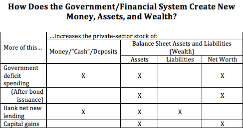
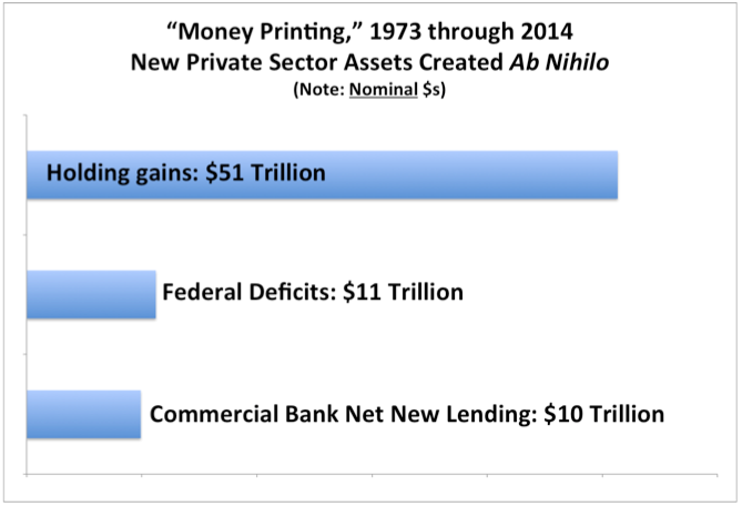
New assets appear in account balances from 1. government deficit spending, 2. bank lending, and 3. holding gains. Then people swap them for other assets, or transfer them to pay for newly produced goods and services. Whether the money came from “inside” or “outside” sources (or holding gains), once it’s circulating among accounts, it’s just…money. As we all know, money is fungible.

Certainly, newly created liability entries associated with money issuance can be economically significant. And some particular financial instruments retain a meaningful and influential financial or economic (ultimately institutional) relationship to particular liability entries. But in the big picture once the money’s out there, it’s disconnected from its “inside” or “outside” origins.

#7. Monetary aggregates tell us how much “money” we have. The various monetary aggregates so beloved of monetarists (M0, M1, MZM…) share a common, unstated definition of “money”: financial instruments whose prices are institutionally pegged to the unit of account — physical coins and currency, checking account and money-market deposits, etc. Remember the 2008 headlines: “Money Market Fund ‘Breaks the Buck.’The institutional powers and practices of pegging are diverse, and institutional pegging can fail.

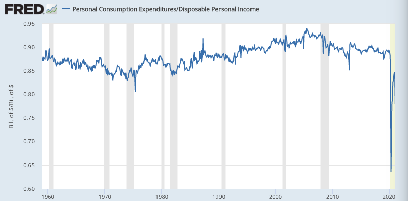
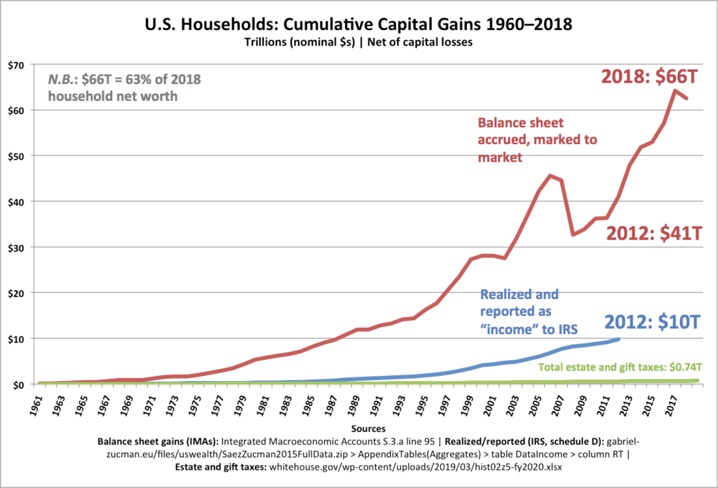
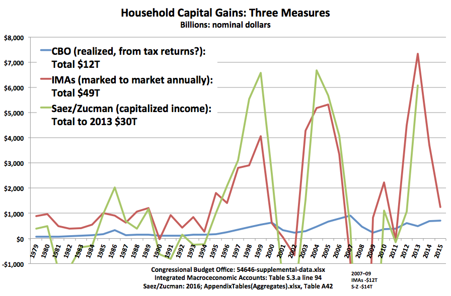
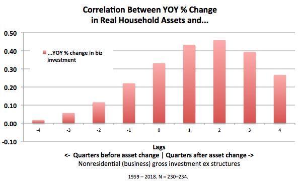
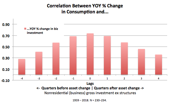
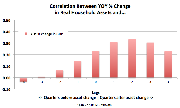
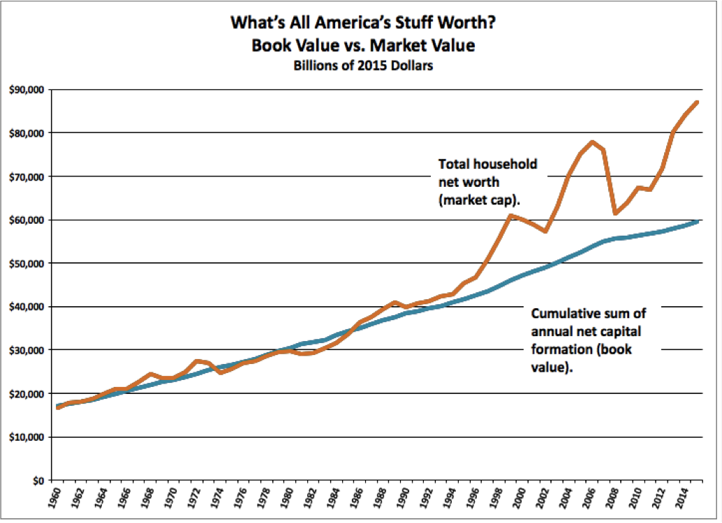
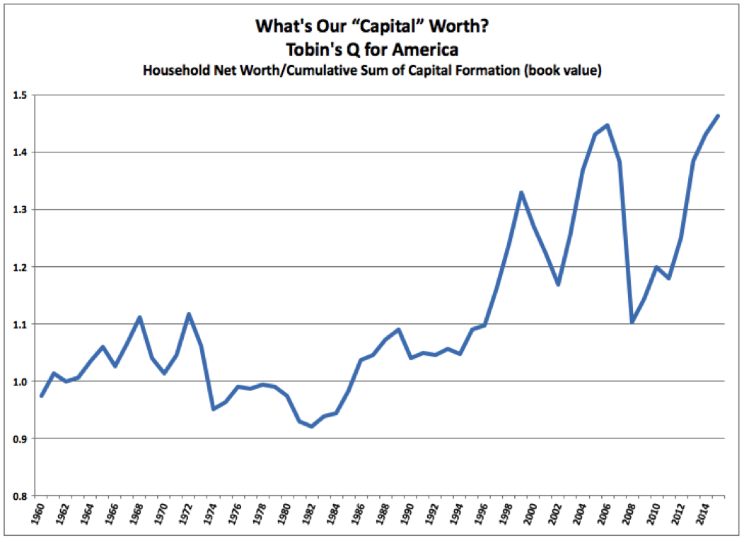
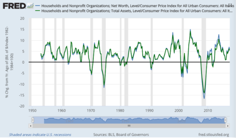
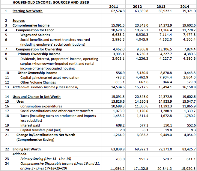
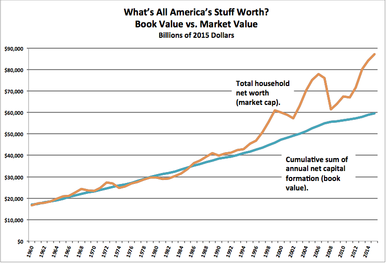
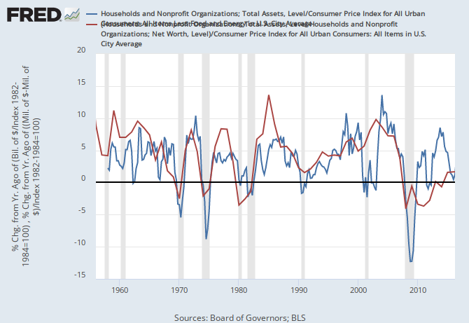
This particular subset of assets — fixed-price, UofA-pegged financial instruments — comprise only about 9% of U. S. households’ $111 trillion in assets. They play a particular role in individual and aggregate portfolio allocation (more below), they’re quite handy for buying new goods, and they’re a necessary intermediate holding for most asset swaps. But their stock quantity is swamped by even the price-driven change in other assets; capital gains on variable-priced instruments added $7 trillion to household balance sheets in 2013 alone. Monetarists’ fetishization of these “currency-like” financial instruments, and their aggregates, is…misplaced.

#8. If people save more money, there is more money (or “savings,” or “loanable funds”). Obviously, if you save (spend less than your income over a period), you have more money. But we don’t. Just, the money’s in your account. If you spent it instead of saving it, it would be in somebody else’s account.

Spending — even spending on consumption goods that you’ll devour within the period — is not consumption. The money isn’t, can’t be, “consumed” by spending. It’s created and destroyed by other, financial, mechanisms. If you eat less corn, we have more corn. If you spend less money, we have no more money.

#9. Saving “funds” investment. Investment spending, like all spending, comes from asset balances. “Funding” from flows is harder to nail down: If a firm this year has $1M in undistributed profits (saving) and borrows $1M, spends $1M on wages and buys $1M in drill presses, which inflow “funded” which outflow? Firms borrow to make payroll all the time. (Don’t even get me started on stock repurchases.)

I can’t resist quoting one of the best financial and economic thinkers out there (read the whole thread):

https://twitter.com/teasri/status/927908158877683712

Individual money-saving isn’t even really a flow; it’s a non-flow — not-spending — just an accounting residual of income minus expenditures. (Though of course it’s a flow measure: tallied over a period of time, not at a moment in time.)

#10. Portfolio allocations — and spending — are determined by “demand for money.” The relatively small stock of monetarists’ “money” — instruments whose prices are pegged to the unit of account — is sort of a fulcrum around which portfolio preferences and total asset value (wealth) adjusts. But the vague gesture toward the unmeasurable and dimensionless notion of “demand” is not illuminating. Here in more concrete terms:

Suppose government deficit-spends $1 trillion into private-sector checking accounts. The market’s portfolio is overweight cash (assuming portfolio allocation preferences are unchanged). But the market can’t get rid of those fixed-price instruments — certainly not by spending, which just transfers them — or change their aggregate value (their price is fixed, pegged to the unit of account).

So people buy variable-priced instruments — stocks, bonds, titles to real estate, etc. — bidding up their values competitively until the desired portfolio allocation is achieved. (This, by the way, is exactly how things work in the more advanced Godley/Lavoie-style, “stock-flow consistent” or SFC models.)

The economic implications of this: A trillion-dollar deficit-spend results in $1T more in private-sector assets (the “cash”), plus any asset-value runups from portfolio adjustments triggered by that cash infusion. (This is before even considering any effects on new-goods spending — the so-called “multiplier” — or the proportion of spending devoted to investment — Keynes’s particular fixation.)

Sure, if wealthholders are feeling nervous — more concerned with return of their wealth than returns on their wealth — they may prefer instruments that by their very nature guarantee stability, non-decline relative to the unit of account. They’ll sell variable-priced instruments, running down their prices until the market reaches its preferred portfolio allocation. “Liquidity preference” is one rather strained way to refer to this straightforward idea of portfolio allocation preferences.

Likewise, “demand for money” is a cute conceptual and verbal jiu-jitsu, flipping straightforward understandings of portfolio preferences on their heads. Demand is supposed to influence price and/or quantity. But it can’t influence the “price of money” or the aggregate stock of fixed-price instruments — only the prices, hence aggregate total, of variable-priced instruments. This notion does far more to confuse than to enlighten.

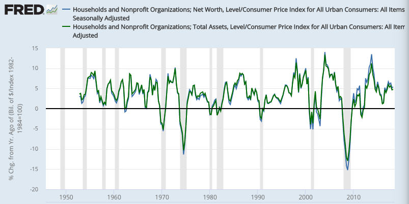
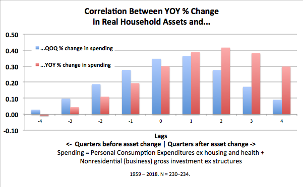
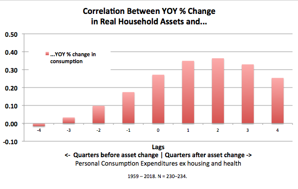
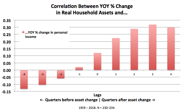
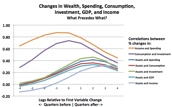
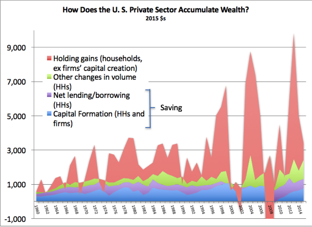
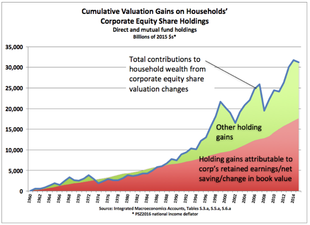
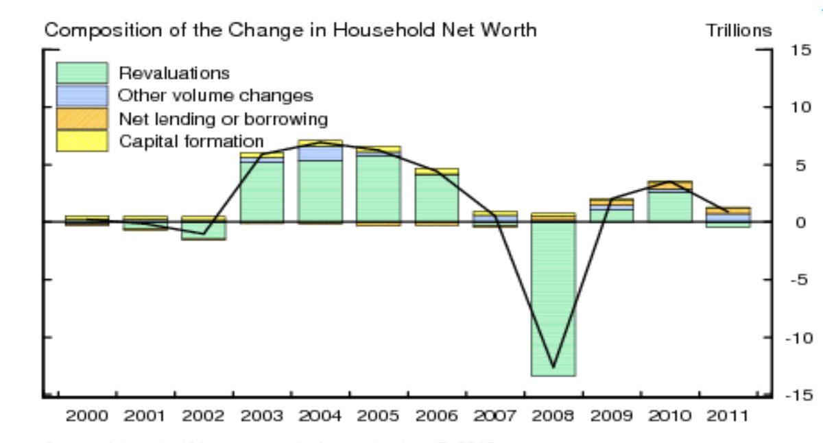
Takeaway: holding gains and losses — which are almost universally ignored in economic theory even though they’re the overwhelmingly dominant means of wealth accumulation — are the very mechanism of aggregate portfolio allocation. If you’re only considering “income”-related measures (which ignore cap gains), there’s no way to think coherently about how economies work.

#11. The interest rate is the “price of money.” This is like saying a car-rental fee is the price of a car. The price of a dollar (a unit of exchange) is always one, as designated in the dollar (the unit of account). The cost of borrowing is something else entirely. Like “demand for money,”  “the price of money” is just verbal and conceptual gymnastics, inverting the very meaning of the word “price,” and trying to shoehorn money-thinking into a somewhat inchoate notion of supply and demand (that’s constantly refuted by evidence). It’s not helping.

#12. Central bank asset purchases are “money printing.” Not. Sure, the Fed magically “prints” a zillion dollars in reserves to purchase bonds. But then it just swaps those reserves for bonds, which are “retired” from the private sector onto the Fed’s balance sheet. Private-sector assets/net worth are unchanged; the private sector just has a different portfolio mix: more reserves, less bonds.

Ditto when the Fed sells the bonds back (as it’s now doing and promising to do, a bit); it re-absorbs the private sector’s reserve holdings and releases bonds in return, disappearing the reserves back into its magic hole in the ground. (As Milton Friedman observed, banks have both printing presses and furnaces.) Again: no accounting effect on private-sector assets or net worth.

QE and LSAPs do have some asset-price, hence balance-sheet, effect, at least while they’re happening; the central bank has to beat market prices by a smidge to play the whale and buy all those bonds. Bond prices go up and yields go down. Which will push investors’ portfolio allocations more into equities and other “risk assets,” driving up their prices some. But the first-order accounting effect is just to change private-sector portfolio allocations.

So there: twelve conceptions about money that have made it difficult or impossible for me, at least, to think coherently about the subject. Here’s hoping these thoughts are useful to others as well.

=============

I’d like to end this post with the same question for my gentle readers that I went to Jan with. Units of account are very odd conceptual constructs indeed. They’re not like other units of measurement — inches, degrees centigrade, etc. — which generally have some physical objective correlative: “length” or “warmth” or suchlike. Units of account tally “value,” which basically means value to humans, a function of human desire. And human desires, of course (“preferences”), vary.

So my question: what’s a good metaphorical or figurative comparison to help us understand and explain this strange conceptual thingamabob? Is money an invention like algebra? Are there other conceptual constructs that are similar to units of account, comparable mental entities that can help us think about what these things are? I can’t think of any good analogies. It’s vexing.

Extra points question: what is “the bitcoin”?

Yes: In the beginning was the word. Words are one of the main things, maybe the main thing, that we use to think together. All thanks to my gentle readers for any help in doing that.

Related posts:

  1. MMT and the Wealth of Nations, Revisited
  2. Actually, Only Banks Print Money
  3. The Giant Logical Hole in Monetarist Thinking: So-Called “Spending”
  4. Safe Assets, Collateral, and Portfolio Preferences
  5. No: Money Is Not Debt

http://www.asymptosis.com/?p=9827
Extensions
The Mysterious Stock of “Loanable Funds”
Uncategorized
This Twitter thread between Ryan Cooper and Joe Wiesenthal prompts me to do full-spectrum explanation of some thinking that I’ve been meaning to get to for a while. (Thanks for the inspiration.) This is good from @ryanlcooper on why taxes are too low. https://t.co/opACPlEX5e — Joe Weisenthal (@TheStalwart) October 25, 2017 Though I'm not sure [...] Related posts:
  1. Safe Assets, Collateral, and Portfolio Preferences
  2. The Giant Logical Hole in Monetarist Thinking: So-Called “Spending”
  3. MMT and the Wealth of Nations, Revisited
  4. Again: Saving Does Not Increase Savings
  5. No: Saving Does Not Increase Savings
Show full content

This Twitter thread between Ryan Cooper and Joe Wiesenthal prompts me to do full-spectrum explanation of some thinking that I’ve been meaning to get to for a while. (Thanks for the inspiration.)

This is good from @ryanlcooper on why taxes are too low. https://t.co/opACPlEX5e

— Joe Weisenthal (@TheStalwart) October 25, 2017

Though I'm not sure about this loanable funds argument. pic.twitter.com/t7p2yuW69d

— Joe Weisenthal (@TheStalwart) October 25, 2017

yeah, @asymptosis has some interesting thoughts on that I haven't been able to process properly

— ryan cooper (@ryanlcooper) October 25, 2017

What follows is very unorthodox thinking even among the heterodox. It’s well beyond and different from MMT’s utterly convincing takedowns of “loanable funds” notions, for instance.

So take it as the ravings of an internet econocrank, if you will. But here it is FWIW.

First off, nobody can ever point to these so-called “loanable funds, or mostly even say if they’re talking about a stock measure or a flow measure. It’s one of those unmeasurable, actually dimensionless, concepts that econs are so fond of, like demand and supply (desire and willingness).

It’s often used synonymously with “savings” with an “s,” at least implying some stock. (The national accounts use the term “saving”; there is no stock measure labeled “savings” therein.)

The only measurable stock of “loanable savings” I can think of is wealth: balance-sheet assets, or net worth. (The national accounts, by the way, only started tallying those comprehensively a decade ago.) Household-sector assets or net worth are probably the best measures of this, because they incorporate the value, telescoped in, of the household sector’s wholly-owned subsidiary, firms.

On the idea that household saving “funds” lending and investment by providing more loanable funds: individual saving increases your assets/net worth. It doesn’t increase our assets/net worth. Your savings are just held in your account instead of — if you spend — someone else’s account. They can be intermediated into investment from either account.

Likewise “saving” by firms — retaining earnings instead of distributing them to shareholders as dividends. In either case those funds are in accounts that are intermediated (and re-re-re-“hypothecated”…) by the financial system. If a firm uses those funds for actual, real investment, that’s…spending! (“Investment spending” as opposed to “consumption spending” — the two sum to GDP.)

Individual saving doesn’t create any extra “loanable funds” — stock or flow. When you eat less corn (save), we have more corn. When you spend less money, we have no more money. Spending — even “consumption spending” — is not consumption. Transferring an asset (spending) doesn’t “consume” that asset, make it disappear. This error of composition pervades economic thinking. Think: Krugman/Eggertsson’s whole “patient savers”/”impatient borrowers” construct. Individual saving doesn’t create collective savings.

Individual saving is actually a non-flow, an accounting residual of two actual transaction flows — income minus expenditures. (Though it is a flow measure as opposed to a stock measure — it’s measured over a period, not at an instant.)

Sectoral saving actually consists of two (or three) things, as revealed by the accounting derivation in the Integrated Macroeconomic Accounts (IMAs): capital formation + net lending/borrowing + capital transfers. For households, capital transfers is mostly estate taxes; it’s a small number. Capital formation is the creation of actual new (long-lived) stuff within a sector, whose value is posted to the asset side of balance sheets. Net lending/borrowing is the accumulation of claims against other sectors’ balance-sheet assets.

These two are utterly distinct and different economic mechanisms, crammed together into a single accounting measure labeled “saving.” It’s no surprise that nobody understands saving. In the grand scheme of wealth accumulation, these two saving mechanisms are pretty small change. Here, the derivation of change in private-sector net worth, again from the IMAs.

Real investment in the creation of newly produced, long-lived (productive) stuff — capital formation, investment spending — is overwhelmingly “funded” by churn within wealthholders’ $100-trillionish portfolio. Sell treasuries, buy into an IPO or a real-estate development deal. A zillion et ceteras. The “flow” of saving is small by comparison.

At the macro-est level, that “investment impulse” is driven by collective portfolio preferences, the markets’ risk/reward/yield calculations. (“Jesse Livermore” delivered the Aha for me on this; his measure of equities as a share of outstanding financial assets on Fred here. Pace market monetarists, it sure doesn’t look the market is crowding into “safe assets.”)

Swapping checking-account deposits for Apple shares is not investment in the economic sense of paying people (spending) to create new long-lived (productive) stuff. Collectively, it’s just portfolio allocation. If people are (confidently) optimistic, they bid up risk assets, expanding the total portfolio (wealth) pie.

Monetarists’ obsession with financial instruments like checking and money-market deposits whose prices are institutionally pegged to the unit of account (“cash” — only about 5% of household assets) blinds them to that collective portfolio adjustment mechanism. If government deficit-spends $100 billion in cash onto household balance sheets, the market is overweight cash (if portfolio preferences are unchanged). It re-allocates by competitively buying variable-priced instruments (bonds, stocks, land titles), driving up their prices. There’s more cash and more other assets.

Market asset pricing doesn’t — can’t — influence the total stock of fixed-price, UofA-pegged instruments. Their prices are fixed! (That’s the thing that makes cash, cash.) They can only be created by bank lending and government deficit spending (see next para). Those instruments are largely just a pool of intermediates in portfolio churn, in any case: sell treasuries, get cash; swap cash for IPO shares. As long as there are enough “cash” instruments for transactions to clear (and the peg holds), you’re cool. The transaction system doesn’t bind up. Collective portfolio reallocation is almost all via price changes in, duh, variable-priced instruments.

There are three economic mechanisms that create new private-sector balance-sheet assets ab nihilo: government deficit spending, bank lending, and asset-market price runups/capital gains. (Bank lending creates simultaneous private-sector liabilities, so it doesn’t create new private-sector net worth; the other two do.) These mechanisms create new “loanable funds” a.k.a. wealth. (Fed asset purchases with newly-“printed” “money” — reserves — create no new private sector assets or net worth — they just swap reserves for bonds, changing the private-sector portfolio mix; the market then adjusts its portfolio allocation in response, as described above.)

Of these three ab novo asset-creation mechanisms, capital gains utterly dominates:

Especially since the 80s/90s, as revealed here in corporate equity performance (this in inflation-adjusted dollars):

Think Amazon: essentially zero profits, saving, change in book value over two decades, while delivering half a trillion dollars onto household balance sheets.

This (plus similar or larger cap gains effects in real-estate valuation) gives rise to some very perplexing trends — perplexing for me at least:

This depicts what Sri Thiruvadanthai calls a “structural break,” some kind of seeming phase shift in how markets are working, or how we perceive and report on those markets, in accounting terms. Or both. Earnings and P/E, for instance, are becoming increasingly problematic as predictors of total return. What’s the capitalized present value of future cash flows from a firm that…will never deliver any cash flows/”profits”?

The asset markets seem to think that all our stuff is worth a lot more than it sold for in the new-goods markets.* One of those markets is getting prices “wrong.” Either this is the mother of all multi-decadal asset bubbles, or we’ve been vastly understating GDP for decades. (Or something else, maybe accounting, measurement-related.)

The creation of real, long-lived goods (“capital”) is the ultimate driver of wealth accumulation. But the economic mechanisms of wealth creation and accumulation — creating new claims on all our goods and future production (claims whose market-priced value is tallied up as balance-sheet assets) — are something else entirely.

In any case I agree with Joe: within what I think is a great article, Ryan’s rather rote recitation of standard-issue “loanable funds” truisms merits some careful rethinking.

===============

* The national accounts don’t even come close to tallying all that “capital,” by the way, or the investment in creating it. Consider the massive, lasting productive value, for instance, of widespread knowledge, skills, and abilities imparted through education and training and deployed over lifetimes, or broadly experienced health and well-being delivered through health-care spending. Those expenditures aren’t tallied as “investment” (spending on long-lived goods), nor are the resulting “assets” depreciated as humans age, sicken, and die.

Related posts:

  1. Safe Assets, Collateral, and Portfolio Preferences
  2. The Giant Logical Hole in Monetarist Thinking: So-Called “Spending”
  3. MMT and the Wealth of Nations, Revisited
  4. Again: Saving Does Not Increase Savings
  5. No: Saving Does Not Increase Savings

http://www.asymptosis.com/?p=9806
Extensions
The Giant Logical Hole in Monetarist Thinking: So-Called “Spending”
Economics
Ralph Musgrave, who knows a thing or two about modern economic thinking, perfectly articulates the giant logical hole in monetarist thinking in a recent comment (emphasis mine): If the private sector’s stock of saving is what it wants at current rates of interest, then additional public spending will push savings above the latter desired level, which [...] Related posts:
  1. MMT and the Wealth of Nations, Revisited
  2. Actually, Only Banks Print Money
  3. The Mysterious Stock of “Loanable Funds”
  4. Note To Economists: Saving Doesn’t Create Savings
  5. An MMT Thought Experiment: The Arithmetic and Political Mechanics of Net Financial Assets
Show full content

Ralph Musgrave, who knows a thing or two about modern economic thinking, perfectly articulates the giant logical hole in monetarist thinking in a recent comment (emphasis mine):

If the private sector’s stock of saving is what it wants at current rates of interest, then additional public spending will push savings above the latter desired level, which will result in the private sector trying to spend the surplus away (hot potato effect).

Really? People/households say to themselves, “Wow, I’ve got too many assets, too much net worth. I’d better spend more to get rid of it.”

Here’s the verbal and logical sleight of hand that monetarists pull to hide this obviously inane assertion, and that Ralph doesn’t seem to have spotted: they game the word “spending.”

When government deficit-spends, it deposits (helicopter-drops) new assets, created ab nihilo, onto private-sector balance sheets. And since that deficit spending doesn’t create new private-sector liabilities, voila: there’s more private-sector net worth.

Those new assets hit balance sheets in the form of “cash”: checking-account deposits, money-market fund balances, etc. So people might end with a higher proportion of cash in their portfolios than they would like.

But they don’t try to “spend it away” to get rid of it. They rebalance their portfolios by buying riskier/higher-return financial instruments — bonds, equities, titles to real estate. This drives up the prices of those instruments.

These market runups create new balance-sheet assets (and net worth) — while leaving the collective stock of fixed-price “cash” unchanged. (That’s pretty much the definition of “cash”: financial instruments whose price is pegged to the unit of account — the instruments that monetary aggregates try to tally up.)

With a larger percentage of bonds, stocks, etc in their portfolios, and the same amount of cash, people have the portfolio mixes they want. Full stop. No hot potato. Likewise this is no game of musical chairs; market runups create more chairs. This is how “liquidity preferences” play out in the markets.

Those purchases of riskier financial instruments are not “spending.” People aren’t “spending down” their balances on newly produced goods and services. They’re just asset swaps — cash for Apple stock (and the reverse), or whatever. Through the magic of market-makers’ bid/offer order books, these asset swaps create new assets, collectively achieving investors’ preferred or “desired” portfolio mixes.

(Note: investors could also adjust their portfolios by paying off debt, simply shrinking their individual, and the collective private sector’s, balance sheets by disappearing both assets and liabilities into a hole in the ground. As Milton Friedman said, banks have both printing presses and furnaces.)

Now you might suggest: when people bid up Apple stock, that “causes” there to be more investment spending, spending to create more long-lived goods. I’m hoping I don’t have to explain all the logical flaws in that thinking, or point out the empirical disproofs. (It’s basically a freshman error: confusing “investment” with investment.)

Sure: when people buy into IPOs and new private bond issues, or buy titles to new (spec-built?) houses, there’s a quite plausible causal link between those asset swaps and actual increased investment spending. An excess proportion of cash in investors’ portfolios could certainly drive this economic effect.

But: 1. These purchases of newly issued financial instruments constitute a tiny proportion of the portfolio rebalancing we’re talking about; the magnitude of holding gains on existing instruments swamps these measures, and 2. It has nothing to do with investors trying to “spend down” and get rid of their balances, cash or otherwise. That notion is individually implausible, and collectively incoherent.


Related posts:

  1. MMT and the Wealth of Nations, Revisited
  2. Actually, Only Banks Print Money
  3. The Mysterious Stock of “Loanable Funds”
  4. Note To Economists: Saving Doesn’t Create Savings
  5. An MMT Thought Experiment: The Arithmetic and Political Mechanics of Net Financial Assets

http://www.asymptosis.com/?p=9696
Extensions
Liberals Getting It Wrong on the Job Guarantee
EconomicsPolitics
I’ve been quite troubled lately by voices I’ve been hearing from my compatriots on the Left discussing the Job Guarantee — especially in relation to an alternative, Universal Basic Income. A new Jacobin article by Mark Paul, William Darity Jr., and Darrick Hamilton displays several of the aspects that make me uncomfortable. Get the Math Right. Right off the bat, [...] Related posts:
  1. Job Satisfaction and Elasticity of Labor Supply
  2. Fiscal Stimulus: $336,000 Per Job. But…
  3. Does the Minimum Wage Increase Productivity?
  4. Does Unemployment Insurance Make People Lazy?
  5. Scott Sumner Goes Marxist, Proposes Targeting Labor’s Share of Income
Show full content

I’ve been quite troubled lately by voices I’ve been hearing from my compatriots on the Left discussing the Job Guarantee — especially in relation to an alternative, Universal Basic Income. A new Jacobin article by  displays several of the aspects that make me uncomfortable.

Get the Math Right. Right off the bat, I’m troubled by the article’s flawed arithmetic — not what I would like to be seeing from left economists who need to be scrupulous in their role as authoritative voices for the left.

…we argue for a FJG that would pay a minimum annual wage of at least $23,000 (the poverty line for a family of four), rising to a mean of $32,500. … In comparison, many of the UBI proposals promise around $10,000 annually to every citizen…half the rate that would be available under the FJG.

$10K per citizen versus $23K per worker is not “half the rate.”

How do the two policies actually compare? I have no idea. This is exactly the kind of difficult calculation that we need economists to do for us (it’s way beyond our abilities), so we can evaluate different policies. Absent analysis with clearly stated parameters (Who counts as a citizen? Children? Etc.) this kind of statement carries no import or information value.

These analyses have been done by economists. I’ve seen them around. But I don’t have them to hand; they’re exactly what I’d like this article to point me to. Are these authors unaware of this work, or did they just not bother to look at it, draw on it, or cite/link to it in this article?

Perhaps most important: this kind of slipshod analysis delivers live and loaded rhetorical ammunition to the enemy. It’s an invitation to (very effective) hippie-punching.

Get outside economists’ fetishistic obsession with short-term business cycles, and with the automation versus globalization debate. We’re facing decades-long campaigns to get any JG or UBI implemented, and decades- or centuries-long technological and job-market trends. If Ray Kurzweil’s exponential productivity growth is even somewhat valid (choose your exponent), we’re facing at a world where Star Trek-style replicators can turn a pile of dirt into a skyscraper or a thousand Thanksgiving dinners — and potentially, where a small handful of people own all those replicators.

In this world, nobody would ever pay a human to produce goods. It would be stupid. Will service work deliver the kind of jobs and wages that let a worker share the fruits of that spectacular prosperity? It doesn’t seem likely. Will the highest-paying service jobs themselves be automated? It seems likely.

That’s an extreme vision, but it embodies the long-term issues these policy discussions need to address. Instead we get from the authors:

The dangers of imminent full automation are overstated…. No doubt, stable and high-paid employment opportunities are dwindling, but we shouldn’t blame the robots. Workers aren’t being replaced by automatons; they are being replaced with other workers — ones lower-paid and more precariously employed.

They’re pooh-poohing the technological future — continuing centuries of Luddite-bashing — because (quoting Dean Baker):

In the last decade, however, productivity growth has risen at a sluggish 1.4 percent annual rate. In the last two years it has limped along at a pace of less than 1 percent annually.

Issues here, in very short form: 1. Productivity and “economic capacity” measures are wildly problematic, both theoretically and empirically. The econ on this is a mess. 2. A decade, much less two years, is not even close to a trend. 3. The automation vs offshoring debate is specious; they’re inextricably intertwined, like nature and nurture. 4. They’re (I think unconsciously) buying into the whole economic worldview and conceptual infrastructure (think: “factors of production”) that delivered us unto these times.

The authors are certainly correct that:

…the balance of forces over the last few decades has been skewed so dramatically in the favor of capital. … It’s time to get the rules right

But this fairly muddled (and hidebound) depiction of the issues at hand does little or nothing to suggest what the new rules should be. We need left economists to unpack these long-term secular forces and trends far more cogently — and radically. They need to be examining the very foundations of their economic thinking and beliefs.

The “Dignity of Work.” It actually makes me squirm in discomfort to hear liberals with very cool, interesting, high-paying jobs going on about the dignity of work. I’m just like, “how dare you?” That kind of supercilious presumption arguably explains why liberals have been losing elections for decades — especially the latest one.

Here’s the full passage on this:

Conventional wisdom holds that people dislike work. Introductory economics classes will explain the disutility of labor, which is a direct trade-off with leisure. Granted, employment isn’t always fun, and many forms of employment are dangerous and exploitative. But the UBI misses the way in which employment structurally empowers workers at the point of production and has by its own merits positive dimensions.

This touches on a heated debate on the Left. But for now, there is no doubt that people want jobs, but they want good jobs that provide flexibility and opportunity. They want to contribute, to have a purpose, to participate in the economy and, most importantly, in society. Nevertheless, the private sector continues to leave millions without work, even during supposed “strong” economic times.

The workplace is social, a place where we spend a great deal of our time interacting with others. In addition to the stress associated with limited resources, the loneliness that plagues many unemployed workers can exacerbate mental health problems. Employment — especially employment that provides added social benefits like communal coffee breaks — adds to workers’ well-being and productivity. A federal job guarantee can provide workers with socially beneficial employment — providing the dignity of a job to all that seek it.

The variations on the “dignity” thing are endless. Our authors here give us:

employment structurally empowers workers at the point of production

This is clearly something that working-class workers and voters are clamoring for.

by its own merits positive dimensions

Sure: in our current system where only wage/salary work provides “dignified” income, you’re gonna see positive second- and third-order effects from employment. Does a program where government provides the income (in most implementations, channeled through private-sector employers) change that pernicious social environment?

But wait: workers get communal coffee breaks!

The whole thing actually, rather remarkably, turns Marx on his head. The alienation that he imputes to working-for-the-man, wage labor is here transformed into the sole, primary, or at least necessary source of human dignity and self-worth. It’s the only way for the working class “to contribute, to have a purpose, to participate in the economy and, most importantly, in society.” Contra David Graeber, if there’s not a money transaction involved, it’s not “valuable” or worthy.

This before even considering the freedom to innovate and thrive that arises when you don’t have to go to work. (Every startup I’ve ever been involved in — many — began with endless hours of hanging out and drinking beer with friends.)

Like so much so-called left thinking over the last half century (think: The Washington Consensus), this thinking unquestioningly, even blindly, unconsciously, adopts and is entrapped by one of conservatism’s core economic mantras: “incentives to work.”

Why in the hell do we want people to work more? We know why conservatives do: because it allows rich people to profit from that labor and grab a bigger piece of a bigger pie. But isn’t the whole point of increasing productivity (or a/the main point) to work less while having a comfortable and secure life?

What the authors dismiss as “conventional wisdom” is in fact largely correct: Most people don’t want to go to work. Or they don’t want to work nearly as much as they do. They can manage their “relationships” and social well-being just fine, thank you. Sure, they enjoy the social interaction at work, to the extent that… But they go to work because they want and need the money. Full stop.

In 1930 Keynes predicted a future of 15-hour work weeks. Sounds idyllic to me. Does anyone think workers would object? Or do we have a better handle on their wants and needs than they do?

We haven’t even come close to that future. Two-earner households are now the necessary norm, and hours worked per worker has been flat since — surprise — 1980, after a very nice decline postwar. Here’s annual hours worked per household, even as households have gotten steadily smaller:

A job guarantee as I understand it does nothing to advance that Keynesian bright future. Given the pro-work rhetoric we hear from JG enthusiasts, it might just further entrench what you see above.

So three takeaways here:

• Get the math right. Do the careful, difficult analysis for us so we can make informed judgments. Or point us to the work that’s already been done.

• Look to your theoretical and empirical fundamentals. They’re often inherited, often unconsciously. They’ve been indoctrinated and inscribed into economists’ invisible System 1 thinking. Many of them are not conceptually coherent, or morally valid.

• Just stop talking about the “dignity of work.” It’s a huge own-goal — both the policy results (more work for workers), and the electoral results of that presumption.

If we want that Keynesian utopia — comfortable, secure lives with not a lot of work required — UBI seems like a far more direct path to getting there. If you want to give people comfort, security, dignity, well-being, power, the opportunity to thrive on their own terms, and economic security…give them money.


Related posts:

  1. Job Satisfaction and Elasticity of Labor Supply
  2. Fiscal Stimulus: $336,000 Per Job. But…
  3. Does the Minimum Wage Increase Productivity?
  4. Does Unemployment Insurance Make People Lazy?
  5. Scott Sumner Goes Marxist, Proposes Targeting Labor’s Share of Income

http://www.asymptosis.com/?p=9682
Extensions
My Letter to the Fed: Stop Misrepresenting the National Debt
EconomicsPolitics
The Fed data portal, Fred, just posted a blog item that I take exception to, “suggested” by Christian Zimmermann, Assistant Vice President of Research Information Services. Here’s my response. Dear Mr. Zimmerman: I’m pleased to see that this post focuses on the interest burden of the federal debt. It’s an important measure that doesn’t get [...] Related posts:
  1. It’s No Wonder People Don’t Understand the “Public” Debt
  2. “Public” Debt and Safe Assets: A View from Space
  3. National Debt: Since When is the Fed “The Public”?
  4. If Interest Rates Rise, We Can Plummet the National Debt!
  5. The Market Doesn’t Think the Fed Will Ever Sell Those Bonds Back
Show full content

The Fed data portal, Fred, just posted a blog item that I take exception to, “suggested” by Christian Zimmermann, Assistant Vice President of Research Information Services. Here’s my response.

Dear Mr. Zimmerman:

I’m pleased to see that this post focuses on the interest burden of the federal debt. It’s an important measure that doesn’t get enough attention in discussions of the subject.

But still I’m shocked by how many things are poorly represented in the post. I have no doubt you know all of this, but:

1. Public Debt (gross) is not Debt Held by the Public. (“The Public” here meaning the private sector including Rest of World.) Gross Public debt includes money owed by government to itself (SS trust fund, etc.).

Almost every economist agrees that Debt Held by the Public, not “Gross Debt,” is the economically significant measure. Highlighting gross debt is not useful in educating the public on this subject. Quite the contrary.

This measure of course paints a very different (and less dire) picture:

2. This of course impacts the interest burden, and also paints a very different picture.

3. Even for Debt Held by the Public: Federal Reserve Banks are included in “the public” for this measure — even though their balance sheets and profits/losses redound to Treasury, IOW government, not “the public.”

Here’s actual Debt Held by The actual Public — only 60% of GDP:

One can discuss whether the Fed will ever shrink its balance sheet, and how it would do so, but this is the current condition.

4. Again, the interest burden: Treasury’s interest payments to Fed banks on their bond holdings cycle directly back to Treasury. So true, total government out-of-pocket interest payments:

Less than 1% of GDP.

5. Circa 50% of those interest payments are to the U.S. domestic private sector, so are in no way a drain on the U.S. domestic sector.

Interest payments to foreign entities come to less than .5% of GDP.

Probably unintentionally, this Fred post contributes to the widespread “scare tactics” that result in such economically destructive fiscal decisions by our legislators.

Thanks for listening,

Steve Roth
Publisher, Evonomics

Related posts:

  1. It’s No Wonder People Don’t Understand the “Public” Debt
  2. “Public” Debt and Safe Assets: A View from Space
  3. National Debt: Since When is the Fed “The Public”?
  4. If Interest Rates Rise, We Can Plummet the National Debt!
  5. The Market Doesn’t Think the Fed Will Ever Sell Those Bonds Back

http://www.asymptosis.com/?p=9654
Extensions
When Did Hillary Lose the Election? In 1964.
Uncategorized
The half-century story of Democrats’ abdication and decline By Steve Roth. Publisher, Evonomics On January 1, 1964, John F. Kennedy posthumously initiated the half-century decline of the Democratic Party, beginning its descent into this moment’s dark and backward abysm of slime. His massive tax cuts for the rich, implemented in ’64 and ’65, were the turning point and [...] Related posts:
  1. Engineering a Permanent Democratic Majority
  2. Republican Strategy: “When you’re playing with house money, it makes sense to go all in on every hand.”
  3. Wow: Cooperation. Should Obama Get Credit?
  4. Pro-Growth Republicans III: Yeah, Right.
  5. Everything Sez: “Obama Landslide.” What Gives?
Show full content

The half-century story of Democrats’ abdication and decline

By Steve Roth. Publisher, Evonomics

On January 1, 1964, John F. Kennedy posthumously initiated the half-century decline of the Democratic Party, beginning its descent into this moment’s dark and backward abysm of slime. His massive tax cuts for the rich, implemented in ’64 and ’65, were the turning point and beginning of Democrats’ five-decade abandonment of its longtime winning formula: full-throated, unabashed, progressive economic populism. It was the signal moment when Democrats began to abandon the working and middle class. The working and middle class, betrayed and feeling betrayed, have now returned the favor.

Unapologetic progressive economic populism — starting really with Teddy Roosevelt’s slash-and-burn trustbusting, and turned up full-throttle in his namesake’s New Deal — had given Democrats three decades of electoral success. FDR lost two states and eight electoral votes in 1936. He got 523 out of 531. Over four campaigns, he never got less that 432. Eisenhower got a couple of terms as a very moderate Republican, really a progressive, but Democrats’ dominance of Congress and state governments seemed eternal.

Because: that economic populism also delivered success for America. The New Deal, combined with the government deficit spending of World War II, resulted in the greatest burst of widespread growth, progress, prosperity, and individual economic freedom in American history — before or since.

James Carville was certainly right: “It’s the economy, stupid.”

Democrats’ remaining progressivism under Johnson — civil-rights legislation, Medicare and Medicaid, and the wholesale movement of liberated women into the workforce — eventually pushed a hot middle-out economy into the demand-driven inflation of the 70s. That torrid growth brought government debt down from 120% of GDP in 1947, to 35% in 1980. (You know what happened after that.)

But even amidst that burst of growth and sustainable government finance, Democrats were abandoning the very source of their economic and electoral success. Kennedy’s top-tier tax cuts were a preemptive, voluntary abdication to trickle-down theory, before “trickle-down” even existed. When Reagan turned that dial to eleven, he was only occupying ideological ground that Democrats had ceded and abandoned to the enemy, long before. It was an epochal own-goal of historic proportions.

Democrats have been kicking the economic ball into their own net ever since. The obvious solution to the 70s inflation was to raise taxes, reducing government deficit spending, to drain off excess demand from a too-hot economy. Instead they acceded to the banker-industrial complex and the diktats of childish monetarism, again conceding the win to an economic belief system that is egregiously self-serving for the rich, and anathema to Democratic progressive economic populism.

That’s when the enthusiastic, progressive Democratic base stopped turning out in force. (Exception: Obama. For other reasons.) Progressive baby boomers have spent their whole lives voting against Republicans and their swingeing, destructive economic policies, not for inspiring Democrats. Think about the Democratic presidential candidates since 1964. McGovern was a true social progressive, but really a one-issue anti-war candidate. Bill Clinton did okay, within the confines of the post-Reagan economic belief system, which he never seriously challenged as FDR did. Obama didn’t either, in rhetoric or practice. His administration’s failure to prosecute a single prominent bankster is arguably the best single explanation for Hillary’s electoral meltdown.

Can you name one full-throated economic progressive Democratic candidate in the past half century? I’m not even asking for fire-eating. Here’s some help: Humphrey. Carter. Mondale. Dukakis. Gore. Kerry. (Are you still awake?) Aside from Obama, no Democratic candidates had the Democratic base flocking to the polls. (Compare: Republicans and their rabid Tea-Party base.) Add Hillary to that rather stultifying list.

Starting in the 60s, Democratic candidates stopped delivering an inspiring economic message. But the real failure was substantive. In their sellout to the enrich-the-rich supply-siders, Democrats abandoned the working and middle class, and the party’s winning legacy of widespread prosperity. The Democratic party elite bought into and helped promulgate an economic belief system (the “Washington Consensus”) in which distribution and concentration of wealth and income not only don’t matter, they can’t matter. The quite predicable results are upon us — decades of working-class wage stagnation, and wealth concentrations that are as high or higher than any period in modern world history.

It’s no wonder the Democratic base feels betrayed. They were betrayed.

Still: despite those decades of weak-kneed collaborationism, Democrats have obviously remained more economically progressive than Republicans. Clinton and Obama managed to raise taxes some, and Obama gave us Obamacare. And the economy has shown the results. Democratic presidents have delivered growth, progress, widespread prosperity, individual economic security, and true personal economic “freedom” that Republicans — the self-proclaimed “party of growth” — can only imagine in their fever dreams.

By almost any economic measure — GDP or income growth, job creation, stock-market runups, deficit reduction, people in poverty…choose your measure — Democrats’ economic performance has unfailingly beggared what Republicans have offered up. That is true for any multi-decade period you choose to look at since World War II, or over the last century for that matter. It’s true at the national, state, and local levels. Republicans constantly promise prosperity and growth. Democrats consistently deliver it (at least compared to Republicans). They’ve kicked Republicans’ economic asses, decade after decade.

Bigger pie? Raise all boats? Talk to the Democrats.

But nobody seems to know that. Did you? And Democrats never even say it — much less repeat it endlessly over decades, shouting it from the rooftops to stir up the base as Republicans would. The old saw is apparently right: “A liberal is someone who won’t take their own side in an argument.”

Perhaps that failure is a result of progressives’ fussy squeamishness about people getting rich. They don’t really like that word. But voters do. A third of Americans’ think they’ll be rich someday. Fifty percent of 18–29-year-olds do. (About 5% of Americans actually are rich, with more than couple of million dollars in net worth.) That squeamishness explains the persistent “anti-capitalist” strain of American liberalism, which is such an electoral disaster at the voting booth.

Democrats have much to atone for in their failure to hold the line on progressive economic principles, their failure to wholeheartedly champion and defend the working and middle classes, their sellout and abdication to the bankster class. But they also have much to crow about. Instead, though, they’ve stood by for decades while Republicans have falsely claimed the “party of growth” moniker, contrary to all historical evidence.

It is the economy, stupid. Voters, Democratic and Republican alike, will tell you in surveys about all the things they care about. But when they walk into the voting booth, they’re going to choose the person who they think will make them, their families, and those around them more prosperous, comfortable, and economically secure. They vote for candidates who they think will deliver better lives — starting with people having enough money to pay the bills. The Republicans realized that forty-plus years ago, and they’ve been winning based on that ever since. “I’ll cut your taxes and deliver economic growth.” Full stop, drop the mic.

Trump showed us that fire-breathing populism wins elections. While his brimstone reeked of many things, economic populism was at the core of his rhetorical fur ball. Even as he prepared to betray the working class at unheard-of levels, he channeled that betrayal straight onto his vote tally. “Audacity”? Obama should grab a stool and go to school.

And Bernie showed us the same thing. His campaign was unprecedented in American political history, funding a full-boat national campaign and outspending Hillary by 25 million dollars, almost completely with small donations. His message of economic populism brought in more than 200 million dollars in donations from 2.5 million people. And he turned out the enthusiastic base, in droves. Presumably he would have done so on election day, as well. Are Democratic political operatives finally beginning to take note?

There is a path out of the wilderness for Democrats. It’s the path they’ve trod before, with huge success. It involves (for once) coalescing around a core message that resonates with all Americans, repeated endlessly over years and decades. “Equality” and “opportunity,” important as they are, are weak beer on the campaign trail. Most Americans change the channel.  Tell them what they want to hear:

“We make America rich.”

The double meaning is fully intended.


Related posts:

  1. Engineering a Permanent Democratic Majority
  2. Republican Strategy: “When you’re playing with house money, it makes sense to go all in on every hand.”
  3. Wow: Cooperation. Should Obama Get Credit?
  4. Pro-Growth Republicans III: Yeah, Right.
  5. Everything Sez: “Obama Landslide.” What Gives?

http://www.asymptosis.com/?p=9400
Extensions
What’s All Our Stuff Worth? Tobin’s Q for America
Economics
In recent posts on the Integrated Macroeconomic Accounts, I’ve highlighted that we have two market estimates of what America’s “capital” is worth — the cumulative sum of net investment (roughly, “book value”), and total household wealth (“market value”). I got curious: how to they compare over the decades? What’s America’s market-to-book ratio, or Tobin’s Q? [...] Related posts:
  1. Wonky: More on Martin Sandbu’s “Pseudo” Income and Saving
  2. Bill Gates Agrees with Me on Piketty
  3. Is GDP Wildly Underestimating GDP?
  4. Real Household Net Worth: Look Out Below?
  5. We Have No Idea What Our Capital is Worth
Show full content

In recent posts on the Integrated Macroeconomic Accounts, I’ve highlighted that we have two market estimates of what America’s “capital” is worth — the cumulative sum of net investment (roughly, “book value”), and total household wealth (“market value”). I got curious: how to they compare over the decades? What’s America’s market-to-book ratio, or Tobin’s Q?

Here are two pictures depicting that:

screen-shot-2016-12-07-at-10-01-07-am

screen-shot-2016-12-07-at-9-59-47-am

And here’s how I calculated them based on the IMA’s table S.2.a, plus BEA inflation measures (spreadsheet here):

Start with the IMA’s estimate of total household net worth in 1960 (expressed in 1960 dollars), as the asset markets’ best estimate of what all America’s stuff (“capital”) was worth at that moment.

Inflation-adjust that value to show it in 2015 dollars. (Choose your deflator; I tried a few, but settled on simple old CPI.)

Add net capital formation (net of capital consumption) for 1960, again expressed in 2015 dollars. This is the value of stuff added to our stock. That gives you book value of our stuff in 1961 (the 1960 stock of stuff, plus new stuff added).

Repeat for each ensuing year, ending in 2015 with a cumulative sum of all those years’ net capital formation. This is the 2015 “book value” of that accumulated stuff, expressed in 2015 dollars. (See: Perpetual Inventory Method.)

Now for comparison, look at the IMAs’ annual estimates of household net worth, with each year converted to 2015 dollars. These are the asset-markets’ year-by-year estimates of the value of all our stuff. (Alternatively you could use “U.S. Net Wealth” from Table B.1, which excludes the value of land and nonproduced nonfinancial assets.)

Is this interesting or significant? Do these pictures tell us anything useful?

The main takeaway, I think: since the mid 90s, the measures of capital formation have been having a lot of trouble capturing the value of…new capital formation. Hard-to-measure intellectual, human, and social capital have increasingly dominated our economy. The existing-asset markets incorporate that new “capital” into their estimate of our total worth, but measures of sales in the new-goods markets have trouble doing so. (This even after the 2013 GDP revisions, which added much “intangible” value to its measures, notably intellectual property and even “brand value.”)

For example, how valuable are the services from Facebook, Twitter, and Google? Nobody pays anything for them. And the advertising spending that supports them (in case you were wondering) is not counted as part of GDP. Advertising is considered an “intermediate good,” an “input to production,” so is excluded from the “value added” that is GDP. (For reference, U.S. advertising spending is about $150 billion a year — 0.8% of GDP.) The stock market knows (thinks) those firms have value, but how much “capital formation” do they do? It’s a pretty dicey question.

Apply the same kind of thinking to even harder-to-measure human intangibles like knowledge and skills, developed through education and training, and you probably have a pretty good explanation of the divergence between the book and market lines over recent decades.


Related posts:

  1. Wonky: More on Martin Sandbu’s “Pseudo” Income and Saving
  2. Bill Gates Agrees with Me on Piketty
  3. Is GDP Wildly Underestimating GDP?
  4. Real Household Net Worth: Look Out Below?
  5. We Have No Idea What Our Capital is Worth

http://www.asymptosis.com/?p=9493
Extensions
David Brooks Tries to Eff the Ineffable Again
FamilyOdditiesReligionScience
A friend and I were discussing Brooks’ recent column about Anthony Kronman’s new book, “Confessions of a Born-Again Pagan.” I thought I’d share my thoughts here. Full disc: I haven’t read Kronman’s book, only Brooks’ column. Some good stuff in there. Love the focus on books and writers. (Though Brooks’ [and Kronman’s?] barely-concealed dog-whistle adulation [...] Related posts:
  1. Are Conservatives Deluded About Their Happiness?
  2. David Brooks on McCain: Who’s Talking, Who’s Doing?
  3. Proofiness!
  4. Choosing a VP For All the Right Reason
  5. The Reserve Requirement Is Just “a Service Charge for Legalized Counterfeiting”
Show full content

A friend and I were discussing Brooks’ recent column about Anthony Kronman’s new book, “Confessions of a Born-Again Pagan.” I thought I’d share my thoughts here. Full disc: I haven’t read Kronman’s book, only Brooks’ column.

Some good stuff in there. Love the focus on books and writers. (Though Brooks’ [and Kronman’s?] barely-concealed dog-whistle adulation for dead white guys’ books is both predictable and predictably infuriating…)

But this really pissed me off —  Kronman, approvingly quoted by Brooks:

“A life without the yearning to reach the everlasting and divine is no longer recognizably human.”

My response to that is: Eff. You. My life is not “recognizably human”?

Obviously: there’s loads of stuff that’s impossible to eff, much less express explicitly using expository language. That’s why we have art! To express that stuff explicitly.

Words like “everlasting,” “divine,” “eternal,” “enchanted,” and “God” do exactly nothing to extricate us from that inescapable human reality.

Those words are just lousy poetry, evading the very explicit expression that makes art spectacular in its expression of the ineffable. Which is better: “God,” or “Ozymandias”? Or the million other names for god(s) that humans have imagined. Words like “god” and “spirit” have some value if they’re used metaphorically, poetically, but only some. Because it’s the universal in the particular that makes art magnificent. They’re trying to bypass the particular, and so as metaphors and poetry they’re just bad art.

I’m only halfway tongue-in-cheek when I say that bad art is the greatest sin. The Barney Show, with its obviously false “I love you, you love me, we’re all one big family,” trains people to wallow in false, facile humanity, rather than wrestling with the deep density of paradoxes that is the collective human experience. Ditto facile words like “enchantment.”

And the aspiration to “conquer death” just seems silly to me. Even my two best efforts in that direction — my wonderful daughters — have virtue and value to me purely in the here and now. I adore them. But once I’m dead, I won’t anymore. Sad.

I do like this and agree with it, but only for me: “if you didn’t throw yourself in some arduous way at the big questions of your moment, you’d live a meager life.”

But:

1. I am again pretty put off by the superciliousness of this assertion. If somebody just lives a simple life, works, raises a family, dies, is that a “meager life”? That’s infuriatingly presumptuous.

2 None of those eff-ing words does anything for me in my efforts to wrestle with those big questions, arduously and rigorously. QTC.

Related posts:

  1. Are Conservatives Deluded About Their Happiness?
  2. David Brooks on McCain: Who’s Talking, Who’s Doing?
  3. Proofiness!
  4. Choosing a VP For All the Right Reason
  5. The Reserve Requirement Is Just “a Service Charge for Legalized Counterfeiting”

http://www.asymptosis.com/?p=9354
Extensions
No: Money Is Not Debt
Economics
A quick note in response to recent twitter thread, and to a widespread usage that I find to be deeply problematic. You constantly hear very smart thinkers about money saying that money is debt. I strongly disagree. It’s not a useful way to think about money. Quite the contrary. Balance-sheet assets designating the value of claims may [...] Related posts:
  1. The “Global Savings Glut” Is Conceptually Incoherent. “The Economy” Cannot “Save”
  2. Thinking About “Assets” and Ownership
  3. MMT and the Wealth of Nations, Revisited
  4. The Giant Logical Hole in Monetarist Thinking: So-Called “Spending”
  5. The Pernicious Myth of “Patient Savers and Lenders”
Show full content

A quick note in response to recent twitter thread, and to a widespread usage that I find to be deeply problematic.

You constantly hear very smart thinkers about money saying that money is debt. I strongly disagree. It’s not a useful way to think about money. Quite the contrary.

Balance-sheet assets designating the value of claims may have offsetting liabilities/debts on other balance sheets. (Not all do; that’s why, for instance, U.S. households have positive net worth — assets minus liabilities, credit minus debt — of $88 trillion.) But in any case, the asset being “held” is credit, not debt. A holder of a Target gift card is holding Target credit, not debt — the “claim” side of the tally stick.

“Holding debt” is handy and ubiquitous (Wall Street) shorthand, but it’s conceptually incoherent. You can’t own an obligation; it’s not an asset. Money is not “debt.” Exactly the opposite.

I think this “money is debt” confution cripples our our conversations, our collective thinking, and our collective understanding.

Semi-aside: a dollar-bill is best thought of as a handy, exchangeable physical token representing a balance-sheet asset. Sure, that asset has an offsetting nominal “liability” on the government balance sheet (which we devoutly hope will never be “paid off”). That’s immaterial; the dollar bill represents credit, an asset. It’s incoherent to suggest that when you have a dollar bill in your pocket, you are holding “debt.”

Even if the asset you’re holding will someday be redeemed by the original issuer, the thing you’re holding holding is an asset, which you can transfer to someone else’s balance sheet in exchange for work, or real stuff or…some other financial instrument, be it a Euro bill a bond, a title to land, or whatever (which is also a credit, or asset). They’re all financial instruments (with various rights designated). Claims. Credits.

Related posts:

  1. The “Global Savings Glut” Is Conceptually Incoherent. “The Economy” Cannot “Save”
  2. Thinking About “Assets” and Ownership
  3. MMT and the Wealth of Nations, Revisited
  4. The Giant Logical Hole in Monetarist Thinking: So-Called “Spending”
  5. The Pernicious Myth of “Patient Savers and Lenders”

http://www.asymptosis.com/?p=9271
Extensions
Economists Agree: Democratic Presidents are Better at Making Us Rich. Eight Reasons Why.
EconomicsPolitics
In 2013, economists Alan Blinder and Mark Watson — no wild-eyed liberals, they — asked a very important question: Why has the U.S. economy performed better under Democratic than Republican presidents, “almost regardless of how one measures performance”? Start with their “performed better” assertion: it’s uncontestable. While you can easily cherry-pick brief periods and economic measures [...] Related posts:
  1. Why Liberals Keep Losing
  2. The Party of Prosperity? The Seven Reasons that Democrats’ Policies are More Economically Efficient
  3. “A liberal is someone who doesn’t know how to take his own side in an argument.”
  4. Pubs and Dems: Brands and Beliefs
  5. “Springboard,” Not Safety Net
Show full content

In 2013, economists Alan Blinder and Mark Watson — no wild-eyed liberals, they — asked a very important question: Why has the U.S. economy performed better under Democratic than Republican presidents, “almost regardless of how one measures performance”?

Start with their “performed better” assertion: it’s uncontestable. While you can easily cherry-pick brief periods and economic measures that show superior economic performance under Republicans, over any lengthy comparison period (say, 25 years or more), by pretty much any economic measure, Democrats have outperformed Republicans for a century. Even Tyler Cowen, director of the Koch-brothers-funded libertarian/conservative Mercatus Center, stipulates to that fact without demur.

Here’s just one bald picture of that relative performance, showing a very basic measure, GDP growth:

CHeQhvLWcAAvfRA

The difference is big. At those rates, over thirty years your $50,000 income compounds up to $105,000 under Republicans, $182,000 under Democrats — 73% higher. (And this is all before even considering distribution — whether the growing prosperity is widely enjoyed, or narrowly concentrated.)

Hundreds of similar pictures are easily assembled — different time periods, different measures, aggregate and per-capita, inflation-adjusted or not — all telling the same general story. No amount of hand-waving, smoke-blowing, and definition-quibbling will alter that reality. (If you feel you must try to debunk Blinder, Watson, and Cowen: be aware that you almost certainly don’t have an original argument. Read the paper, and follow the footnotes. You’ll also find more hereherehereherehere, and here.)

So what explains that superior performance? Blinder and Watson’s regression model basically says, “we dunno.” Their model, for whatever it’s worth, rules out a whole slew of possibilities — only finding a significant correlation with oil price shocks (uh…okay…) and Total Factor Productivity (the black-box residual economic measure that’s left when the other growth factors economists can think of are accounted for in their models).

Standing empty-handed after all their work, Blinder and Watson punt. They attribute Democrats’ consistently superior performance to…luck. Yes, really.

On its face, the bare fact of Democrats’ consistent outperformance suggests a straightforward explanation: Democrat policies and priorities, in their myriad interacting forms, expressions, and implementations, directly cause faster growth, more progress, greater and more widespread prosperity. (Blinder and Watson pooh-pooh this idea, simply because they don’t find short-term correlation with the rather bare measure of government deficit spending.)

So the question remains: what could it be about the Democratic economic policy mix that delivers superior performance? Here are eight possibilities:

1. Wisdom of the Crowds. Democrats’ dispersed government spending — education, health care, infrastructure, social support — puts money (hence power) in the hands of individuals, instead of delivering concentrated streams to big entities like defense, finance, and business. Those individuals’ free choices on where to spend the money allocate resources where they’re most valuable — to truly productive industries that deliver goods that humans actually want.

2. Preventing Government “Capture.” Money that goes to millions of individuals is much harder for powerful players to “capture,” so it is much less likely to be used to then “capture” government via political donations, sweetheart deals, and crony capitalism.

3. Labor Market Flexibility. When people feel confident that they and their families won’t end up on the streets — they know that their children will have health care, a good education, and a decent safety net if the worst happens — they feel free to move to a different job that better fits their talents — better allocating labor resources. “Labor market flexibility” often suggests the employers’ freedom to hire and (especially) fire, but the freedom of hundreds of millions of employees is far more profound, economically.

4. Freedom to Innovate. Individuals who are standing on that social springboard that Democratic policies provide — who have that stable platform of economic security beneath them — can do more than just shift jobs. They have the freedom to strike out on their own and develop the kind of innovative, entrepreneurial ventures that drive long-term growth and prosperity (and personal freedom and satisfaction) — without worrying that their children will suffer if the risk goes wrong. Give ten, twenty, or thirty million more Americans a place to stand, and they’ll move the world.

5. Profitable Investments in Long-Term Growth. From education to infrastructure to scientific research, Democratic priorities deliver money to projects that free market don’t support on their own, and that have been thoroughly demonstrated to pay off many times over in widespread public prosperity.

6. Power to the Producers. The dispersal of income and wealth under Democratic policies provides the widespread demand (read: sales) that producers need to succeed, to expand, and to take risks on innovative new ventures. Rather than assuming that government knows best and giving money directly to businesses (or cutting their taxes), Democratic policies trust the markets to direct that money to the most productive producers.

7. Fiscal Prudence. True conservatives pay their bills. From the 35 years of declining debt after World War II (until 1982), to the years of budget surpluses and declining debt under Bill Clinton, to the radical shrinking of the budget deficit under Obama, Democratic policies demonstrate which party merits the name “fiscal conservatives.”

8. Labor and Trade Efficiencies. The social support programs that Democrats champion — if they truly provide an adequate level of support and income — give policy makers much more freedom to put in place what are otherwise draconian, but arguably efficient, trade and labor policies. If everyone can confidently rely on a decent income, we have less need for the sometimes economically constricting effects of unions and trade protectionism.

To go back to Blinder and Watson’s “luck” explanation: A non-economist might suggest that “to a great extent, you make your own luck.” And: “hire the lucky.”

Cross-posted at Evonomics.

Related posts:

  1. Why Liberals Keep Losing
  2. The Party of Prosperity? The Seven Reasons that Democrats’ Policies are More Economically Efficient
  3. “A liberal is someone who doesn’t know how to take his own side in an argument.”
  4. Pubs and Dems: Brands and Beliefs
  5. “Springboard,” Not Safety Net

http://www.asymptosis.com/?p=9204
Extensions
Noahpinion: What Causes Recessions? Debt Runups or Wealth Declines?
Economics
Noah Smith asks what seems to be an interesting question in a recent post: “what leads to big recessions: wealth or debt”? But I’d like to suggest that it’s actually a confused question. Like: is it the heat or the (relative) humidity that makes you feel so hot? Is it the voltage or the amperage [...] Related posts:
  1. Predicting Recessions The Easy Way: Monetarists, MMT, and the Money Stock
  2. What Causes Recessions? A Physicists’ Complex Systems Model
  3. Real Household Net Worth: Look Out Below?
  4. Bill Gates Agrees with Me on Piketty
  5. Bleg: Accounting for the Real Sector
Show full content

Noah Smith asks what seems to be an interesting question in a recent post: “what leads to big recessions: wealth or debt”?

But I’d like to suggest that it’s actually a confused question. Like: is it the heat or the (relative) humidity that makes you feel so hot? Is it the voltage or the amperage that gives you a shock, or drives an electric motor? The answer in all these cases is obviously “Yes. Both.”

The question’s confused because wealth and debt are inextricably intertwined. “Wealth” is household net worth — household assets (including the market value of all firms’ equity shares) minus household sector debt. Debt is part (the negative part) of wealth.

Still, it’s interesting to look at time series for household-sector assets, debt, and net worth, and see how they behave in the lead-ins to recessions.

I’ve pointed out repeatedly that year-over-year declines in real (inflation-adjusted) household net worth are great predictors of recessions. Over the last 65 years, (almost) every time real household net worth declined, we were just into or about to be into a recession (click for interactive version):

Update 6/8: This was mistakenly showing the assets version (see next image); it’s now correctly showing the net worth version.

This measure is eight-for-seven in predicting recessions since the late sixties. (The exception is Q4 2011 — false positive.) It makes sense: when households have less money, they spend less, and recession ensues.

But now here’s what interesting: YOY change in real household assets is an equally good predictor:

Adding the liability side of the household-sector balance sheet (by using net worth instead of assets) doesn’t seem to improve this predictor one bit. This perhaps shouldn’t be surprising. Household-sector liabilities, at about $14 trillion, are pretty small relative to assets ($101 trillion). Even if levels of household debt make big percentage moves (see the next graph), the actual dollar volume of change isn’t all that great compared to asset-market price runups and drawdowns. Asset levels make much bigger moves than debt levels.

It’s also interesting to look at changes in real household-sector assets (or net worth) compared to changes in real household-sector liabilities:

As we get closer to recessions, the household sector takes on debt progressively more slowly, with that shift happening over multiple years. (2000 is the exception here.) That speaks to a very different dynamic than the sudden plunges in real assets and net worth at the beginning of the last seven recessions. Perhaps: household’s portfolios are growing in these halcyon days between recessions, so they have steadily less need to borrow. And as those days continue, they start to sniff the next recession coming, so they slow down their borrowing.

My impressionistic take, unsupported by the data shown here: Higher levels of debt increase the odds that market drawdowns will go south of the border, driving the economy into recession. And they increase the likely depth of the drawdown, as lots of players (households and others) frantically need to shrink and deleverage their balance sheets, driving a downward spiral.

If the humidity’s high, and it gets hotter, you’re really gonna notice the change.

My obstreperous, categorical take, cadging from the past master of same:

Recession is always and everywhere a financial phenomenon.

Cross-posted at Angry Bear.

Related posts:

  1. Predicting Recessions The Easy Way: Monetarists, MMT, and the Money Stock
  2. What Causes Recessions? A Physicists’ Complex Systems Model
  3. Real Household Net Worth: Look Out Below?
  4. Bill Gates Agrees with Me on Piketty
  5. Bleg: Accounting for the Real Sector

http://www.asymptosis.com/?p=9143
Extensions