Bauhaus & Art Deco & more
I
have been since I was a child fascinated with this minimal style in illustration,
because I watched Mr. Magoo and other cartoons made at that time (50s, 60s, UPA mostly) and japanese anime.
So I invite you to a short trip to Mid Century Modern Illustration (and design).
MCM Definition:
Mid-century modern (MCM) is a movement in interior design, product design, graphic
design, architecture and urban development that was popular in the United States and Europe from roughly
1945 to 1969, during the United States's post–World War II period. [...]
The mid-century modern movement in the U.S. was an American reflection of the
International and Bauhaus movements, including the works of Gropius, Florence Knoll, Le Corbusier, and
Ludwig Mies van der Rohe.(Wikipedia).
MCM Sources:
According to Creativebloq, the direct sources of the MCM are:
“ The striking geometric modes of Russian Constructivists like El Lissitzky and
Alexander Rodchenko
Bauhaus school graphic designers, such as László Moholy-Nagy and
typographer Herbert Bayer
The advertising poster works by Kurt Schwitters, an artist more commonly
associated with the Dada movement.”
Design Trend: Mid-Century Modern Graphic Design and Beyond by
Marc Schenker adds another source:
https://creativemarket.com/blog/mid-century-modern-graphic-design
“We can’t look to this style without understanding what big design trend
immediately came before it. In this case, it was Art Deco, that machine-influenced, geometric style that was
at once simple and excessive.”
I chose the Art Deco style to redesign my own website. So I created illustrations
based in monochrome red or pink on a yellow background, with birds, men and a typeface based on this style
(STF Yunque).
Check this super entertaining video by Pete Beard about Art Deco illustration
featuring: Julius Klinger, Lucian Bernhard, Ludwig Hohlwein, George Barbier, Erté (Romain de
Tirtoff),
John Held, José Carlos, Fortunato Depero, René Magritte, Einar Nerman,
Edward McKnight Kauffer, Joyce Mercer, Dorothy Lathrop, Vladimir Lebedev, Frank Newbould, Tom Purvis, Leo
Marfurt, Roger Broders, A. M. Cassandre.
https://youtu.be/hYOXbzJvesI?si=mVm1YXPt7WaCqHm7
MCM Design
For some context, I am displaying designers and illustrators from the Mid Century
American Illustration.
MCM Designers List:

On the book “The Moderns: Midcentury American Graphic Design” by Steven
Heller and Greg D’Onofrio they lists MCM designers divided in Homegrown versus Émigrés (
https://themodernsbook.com/ ):
Émigrés (18)
Josef Albers, Walter
Allner, Herbert
Bayer, Alexey Brodovitch, Will Burtin, George Giusti,
György Kepes, Leo Lionni, Herbert
Matter, Erik
Nitsche, M. Peter
Piening, Cipe
Pineles, Ladislav Sutnar, Fred Troller, George Tscherny,
Massimo Vignelli, Dietmar R. Winkler, Rudi Wolff
Homegrown (45)
Saul Bass, Lillian Bassman, Lester
Beall, Peter Bradford, Robert Brownjohn, Jacqueline S.
Casey, Chermayeff & Geismar, John and Mary Condon, Donald
and Ann Crews, Richard Danne, Louis Danziger, Rudolph de
Harak, Louis Dorfsman, Ray Eames, Gene Federico, S. Neil
Fujita, William Golden, Morton Goldsholl, Charles Goslin,
Irving Harper, E. McKnight Kauffer, Ray Komai, Burton Kramer,
Roy Kuhlman, Matthew Leibowitz, George Lois, Herb Lubalin, Alvin
Lustig, Elaine Lustig
Cohen, John
Massey, Tomoko
Miho, Reid
Miles, Charles E.
Murphy, Georg Olden, Tony
Palladino, Paul Rand, Alexander Ross, Arnold Saks, Arnold
Shaw, Louis Silverstein, Barbara Stauffacher Solomon, Alex
Steinweiss, Deborah Sussman, Bradbury Thompson, Lance
Wyman
Example: Saul Bass’s Title Sequences
https://www.artofthetitle.com/designer/saul-bass/titles/

Early-Mid 20th Century American Illustrators
A list of illustrators intersecting the period: Early-Mid 20th Century American
Illustrators at Art Cyclopedia. There were different styles in illustration in those years, so keep in mind
that this is a list of illustrators working in that period, rather than technically MCM style illustrators.
https://www.artcyclopedia.com/artists/American-artists-20th.html
Douglas Allen [American Illustrator, born in 1935]
Frank Kelly Freas [American Illustrator, 1922-2005]
Frank McCarthy [American Painter and Illustrator, 1924-2002]
Harrison Fisher [American Golden Age Illustrator, 1877-1934]
James Montgomery Flagg [American Golden Age Illustrator, 1877-1960]
Frank E. Schoonover [American Golden Age Illustrator, 1877-1972]
William Henry Dethlef Koerner [American Painter and Illustrator, 1878-1938]
C. Coles Phillips [American Golden Age Illustrator, 1880-1927]
Joseph Clement Coll [American Golden Age Illustrator, 1881-1921]
Willy Pogány [Hungarian-born American Illustrator, 1882-1955]
N.C. Wyeth [American Golden Age Illustrator, 1882-1945]
Rube Goldberg [American Illustrator and Inventor, 1883-1970]
Frank R. Paul [Austrian-born American Illustrator, 1884-1963]
Kay Nielsen [Danish-born American Golden Age Illustrator, 1886-1957]
James Chapin [American Painter and Illustrator, 1887-1975]
Chesley Bonestell [American Painter and Illustrator, 1888-1986]
Kerr Eby [American Illustrator, 1889-1946]
Norman Rockwell [American Illustrator, 1894-1978]
Alberto Vargas [Peruvian-born American Illustrator, 1896-1982]
Boris Artzybasheff [Ukrainian-born American Painter and Illustrator, 1899-1965]
Fritz Eichenberg [German-born American Illustrator, 1901-1990]
Martha Sawyers [American Illustrator, 1902-1988]
Al Hirschfeld [American Illustrator, 1903-2003]
Terence Duren [American Illustrator, 1904-1968]
Dr. Seuss [American Writer and Illustrator, 1904-1991]
Lee Brown Coye [American Illustrator, 1907-1981]
Stevan Dohanos [American Illustrator, 1907-1994]
John Phillip Falter [American Illustrator, 1910-1982]
Arthur Sarnoff [American Illustrator, 1912-2000]
Arthur Getz [American Illustrator, 1913-1996]
Hannes Bok [American Illustrator, 1914-1964]
Gil Elvgren [American Illustrator, 1914-1980]
Virgil Finlay [American Illustrator, 1914-1971]
Saul Steinberg [Romanian-born American Illustrator, 1914-1999]
Will Eisner [American Writer and Illustrator, 1917-2005]
Jack Kirby [American Illustrator, 1917-1994]
Robert T. McCall [American Painter and Illustrator, born in 1919]
Douglas Allen [American Illustrator, born in 1935]
MCM and Music

Jazz Influence:
When I was a kid and watched cartoons, the MCM styles were always accompanied by jazz
music. As it tell us the paper Tom Perchard’s Mid-century Modern Jazz: Music and Design in the
Postwar Home
https://www.academia.edu/30347818/Mid_Century_Modern_Jazz_Music_and_Design_in_the_Postwar_Home
“The music’s sonic characteristics were frequently called upon to
complement the newly sleek visual and tactile experiences of furniture, fabrics, plastics, the light and
space of modern domestic architecture then coming to define the aspirational bourgeois home; an
international modern visual aesthetic was reflected back in jazz album cover art.”
“Yet turn the page of this magazine and the diagrams of a new (and ratherwhite)
America cede to a reminiscence of old Europe, and one made by way of a provocatively debonair blackness;
this was the cultural amalgam that gave mid-century modernism its soundtrack.” (jazz).
“Yet at the same time they articulate a thoroughly contemporary modern visual
patterning that was centred on the organic and biomorphic. Especially popu-lar in American graphic design
– these forms appear in the work of designers like Paul Rand and Alvin Lustig, and also on
the mid-decade jazz album cover work of Paul Bacon and Reid Miles – organic designs spread
across materials in the early-to-mid 1950s…”
Characteristics of the MCM:
From the article, Design Trend: Mid-Century Modern Graphic Design and Beyond by Marc
Schenker on the Creative Market website, a list of characteristics:
https://creativemarket.com/blog/mid-century-modern-graphic-design
“ Minimalism
A rejection of ornamentation for the sake of ornamentation
Conservative
Classic
Clean lines and angles
Fluid movement
Usability (“form follows function”)
Experimentation with materials (the use of traditional,
non-traditional, and even contrasting materials)
Geometric influences (curves, angles)
Multi-purpose use
Colors: neutral, bold and vibrant”
MCM Color Palettes

MCM Color Palettes (at Youworkforthem)
https://www.youworkforthem.com/blog/2020/07/01/exploring-the-elements-of-midcentury-graphic-design/
Color Palettes: “... the 1950s embraced a lot of vibrant palettes while the
1960s gravitated to more earth-toned hues…”...”If you’re looking to evoke the 50s,
you might try pairing combinations of lemon yellow, sky blue, fuchsia, mint green, or poppy red. For more
60s-inspired designs, you’ll probably lean toward more earthen combinations like muted red and sunset
orange, jade or olive green, tans and browns, rich mustard yellow, and yes… even the
“dreaded” avocado.”
MCM Color Palettes (Creativebloq)
https://www.creativebloq.com/features/mid-century-modern-graphic-design-a-designers-guide
“Colour palettes from the era aren’t uniform. They vary from
in-your-face, nursery schoolish primary and secondary tones (reflecting the fine art around the era, such as
the work of Piet Mondrian); to more earthy combinations of olive, paprika, and gold; to more chintzy
patterning of mint green, fuchsia and turquoise.”
MCM Typography

Typefaces: Anzeigen-Grotesk / Neue Aurora IX - Alternate Gothic
https://fontsinuse.com/uses/33008/a-millionth-anniversary-mailing-card-for-meri
MCM Typography (at You work for Them)
https://www.youworkforthem.com/blog/2020/07/01/exploring-the-elements-of-midcentury-graphic-design/
Typography: “Bauhaus and Swiss Style are two hallmarks of midcentury type.
Utilitarian sans serifs reigned in the mid-1900s, bringing classic type designs like Futura, Helvetica,
Univers, Frutiger, and Akzidenz Grotesk…” …Garamond, Century Expanded and Clarendon
certainly had their roles to play…”
MCM Typography (at Font In Use)
https://fontsinuse.com/tags/189/mid-century-modern
Some of the typefaces mentioned are:
Antique Olive Nord, Cactus, Studio Feixen Sans, Futura, Monotype Baskerville, ITC
Avant Garde Gothic, Basic Commercial, Interstate, Bodoni, Clarendon, Akzidenz-Grotesk et altro.
Check the website for specimens and more typefaces.
MCM Illustration Style (at You work for Them)
https://www.youworkforthem.com/blog/2020/07/01/exploring-the-elements-of-midcentury-graphic-design/
Illustration Style: “... they favored simple lines and brush strokes with a
typically limited color palette. Advertisements in particular often captured the idyllic American life with
a side of humor, featuring happy people using happy products to enrich their happy lives. This level of
optimism and joy was likely an after-effect of post-war America. The economy was booming and people just
wanted to move past those dark days and live their lives, looking toward a comfortable and stable future.
And they did. Even now, when we watch syndicated reruns of old television shows like Donna Reed or Leave It
To Beaver, we’re struck by how simple and wonderful life was… at least on the
screen.”
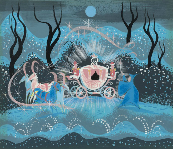
MCM Cartoons:

https://cartoonresearch.com/index.php/what-is-your-favorite-mid-century-modern-designed-cartoon-short-or-series/
1) Rooty Toot Toot (1951)
Black comedy musical animated short film, directed by John Hubley. It was
released by Columbia Pictures and produced by UPA. In 1994 it was voted #41 of the 50 Greatest
Cartoons of all time by members of the animation field.
https://youtu.be/ejLWX1Dwn00?si=-3dK14RpEWDSszRa
2) Rocky And His Friends (or the retitled “The Bullwinkle Show”from
1959:
The Rocky and Bullwinkle Show is an American animated television series that
originally aired from November 19, 1959, to June 27, 1964, on the ABC and NBC television networks.
https://youtu.be/LYNVCm48w6g?si=H5YfOomYtEZxSpdZ
3) Destination Earth (1956)
Destination Earth is a 1956 promotional cartoon created by John Sutherland and funded
by the American Petroleum Institute. The short explains the fundamentals of the petroleum industry and how
petroleum products enrich everyday life in the United States, as well as the benefits of a free market
economy. Designed by Tom Oreb for John Sutherland Productions.
https://youtu.be/E2qpjLyr-FY?si=yoWxbSHYS7zki2W0
4) FLEBUS - Terrytoon filmed in CinemaScope, 1957
Filmed at Terrytoons, directed by Ernest Pintoff. Gene Deitch was the supervising
director.
© 1957
https://vimeo.com/485068762
5) "Mars and Beyond"
"Mars and Beyond" is an episode of Disneyland which aired on December 4,
1957. It was directed by Ward Kimball and narrated by Paul Frees. This episode discusses the possibility of
life on other planets, especially Mars.
https://youtu.be/dk7lf2D848I?si=Q9Egqjmll8efIteK
6) "The Ragtime Bear" (1949)
J. Quincy Magoo, better known as Mr. Magoo, is a fictional cartoon character created
at the UPA animation studio in 1949. Voiced by Jim Backus. Mr. Magoo's first appearance was in the
theatrical short cartoon "The Ragtime Bear" (1949), scripted by Millard Kaufman. His creation was
a collaborative effort; animation director John Hubley is said to have partly based the character on his
uncle Harry Woodruff, and W. C. Fields was another source of inspiration.(Wikipedia)
https://youtu.be/0y33r9bilw8?si=36HtfeOn0XoVazli
Please, check the article for more references.
On the blog Animation Obsessive you can download a free copy of Cartoon Modern
— a rare, out-of-print artbook on mid-century animation.
“Released in 2006, Cartoon Modern is the guide to the so-called “UPA
style.” It’s full of art and production insights you can’t find anywhere else. The whole
mid-century cartoon movement is here, from UPA to Mary Blair to Sleeping Beauty and beyond.”
https://animationobsessive.substack.com/p/our-treat-to-you
Cartoon Modern: Style and Design in Fifties Animation (2006)
https://archive.org/details/cartoon-modern-uncompressed/mode/2up
Illustrators in the 50s and 60s on video (Pete Beard channel):
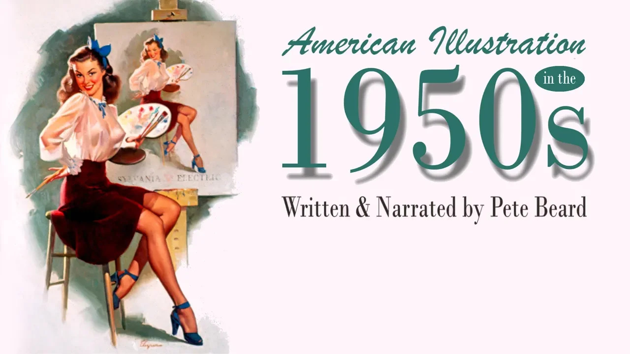
Illustrators in 1950s USA and their impact on the twenty first century
https://youtu.be/iP1Xr1hQ1uY?si=zxtsbWRbRWGtEcM2
Citing: Jim Flora (jazz covers), Cliff Roberts (monochrome illustrations), Alice
& Martin Provensen (children books), Mary Blair (concept art films, advertising), Eyvind Earle
(background art), Abner Graboff (children books).
Illustrators in 1950s Britain
https://youtu.be/F6gQBNcv78c?si=6q77mnwR8CZRX2Z3
Citing: Bill Morden and John Critchlow (Bull Magazine), Archie Dickens & MB
Tompkins (pinup artists), Charles Tunnicliffe (Wild life illustrator), Francis Marshall (advertising -
gestual), Tom Eckersley (posters) inspired by A.M. Cassandre (Art Deco - typography), Abram Games (poster
design), Hans Unger (poster design), Ronald Searle (cartoonist), Rowland Emett (cartoonist and kinetic
sculptor), Karl Giles(cartoonist Daily Express), Norman Thelwell (cartoonist), Robert Stewart Sherriffs
(Caricaturist and cartoonist), Edward Heinz (caricaturist), Frank Hampson (comics), Ken Reid and Leo
Baxendale (cartoonist), Donnell McGill (postcards), Arnold Taylor (cartoonist), Sydney Jordan (cartoonist),
Arthur Ferrier (cartoons), Andy Capp (cartoonist, The Mirror), Harmsen van der Beek (children books), Peggy
Fortnum (children book, Paddington bear), Edward Ardizzone (children books), Eric Fraser (monochrome,
engraving like), Edward Bawden (pposters), Barbara Jones (children books),
Please check Pete Beard channel for more references on illustration about every
historic period!
Children books & MCM:
On the article, at Milly Burroughs’s Aiga on Design https://eyeondesign.aiga.org/why-did-so-many-mid-century-designers-make-childrens-books/
“Here [on children books], they were free to explore many of the themes already prominent
in the mid-century graphic design world. These included Modernist ideals for living — largely shaped
by the Bauhaus school of thinking, and prominent in architecture and design for the home. Nature, bold
colors, smooth-lined curving shapes, and the kind of nuclear familial bliss touted throughout the western
world as aspirational all defined the aesthetics of an era of peace-time domesticity.”
MCM on Advertising:
“Advertising was, arguably, the definitive place that mid-century modern
cartoons took hold. UPA, Storyboard, Playhouse and other studios all worked in TV commercials, spreading
their design ideas far and wide.”
(Animation Obssesive, https://animationobsessive.substack.com/p/our-treat-to-you
Also check the blog:
https://theadvertisingarchives.blogspot.com/
More inspiration and illustration:
The website Grain Edit, with no posts since January 2019.
http://grainedit.com/2008/09/29/grain-edit-the-year-in-review/
Tumblr blog about mid-century modern illustration:
https://midcenturymoderndesign.tumblr.com/
Mid-Century Modern Graphic Design on @mcm_graphics
Tweets from Theo Inglis @theo_inglis
Why is MCM still trending?
But, why do we still find this style trending and being in use?
On the article Rachele Dini’s “Things of Beauty: The
Politics of Postmillennial Nostalgia for Mid-century Design”:
https://ancillaryreviewofbooks.org/2021/06/21/things-of-beauty-the-politics-of-postmillennial-nostalgia-for-mid-century-design/comment-page-1/
“For Freud, the “compulsion to repeat” signified an effort to
revisit a traumatic event. It’s not difficult to deduce what traumas we are re-enacting in our endless
rebooting of the period 1940-1975—or in our endless rebooting of reboots…”
“A second, related fantasy to which the mid-century drama plays is the lure of
the myth of historical progress as a seamless process defined by changing fashions, interior designs, and
colour palettes, rather than by conflict, violence, trauma, and death.”
“In 1982, in a talk that would become Postmodernism: The Logic of Late
Capitalism (1991), Fredric Jameson diagnosed this “nostalgia mode” as indicating that “for
Americans at least the fifties remain the privileged lost object of desire.”
“One of the things I wonder about is the press’s tendency to reduce the
popularity of period dramas and mid-century-inspired packaging to a story about people looking for comfort
in times of socioeconomic upheaval (9/11; the 2008-2010 global financial crisis; the 2020-2021 lockdown),
rather than a tactic straight out of a marketing strategist’s playbook.”
And last, but not least, the
Modern Illustration Archive:
An archive of illustration from c.1950-1975, shining a spotlight on pioneering illustrators and their work.
Modern Illustration is a project by illustrator Zara Picken.
https://www.modernillustration.org/
Finally,
MCM Illustrators and Illustrations examples:
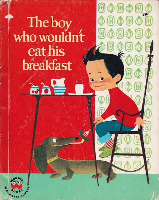
Elizabeth Browzowska from "The Boy Who Wouldn't Eat His Breakfast",
Wonder Books, 1963.
https://melaniebiehle.com/2011/12/20111215the-boy-who-wouldnt-eat-his-breakfast-by-elizabeth-brozowska-html/
The Animal Fair Written & Illustrated by Alice Provensen & Martin
Provensen
https://www.themarginalian.org/2012/04/25/the-animal-fair-provensen/
Bernice Myers’s Children Books
https://fishinkblog.com/2012/12/21/bernice-myers-talented-mid-century-illustrator-of-childrens-books/

The Indoor Noisy Book – January 1, 1994 by Margaret Wise Brown (Author),
Leonard Weisgard (Illustrator)
https://leonardweisgard.com/
,%20Leonard%20Weisgard-w600.jpg)
Dahlov Ipcar, 1961- The Little Fisherman
https://societyillustrators.org/award-winners/dahlovipcar/

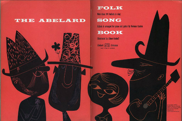
1958 Abelard Folk Song Book, by Norman Cazden, pictures by Abner Graboff.
Abelard-Schuman.
https://wardomatic.blogspot.com/2009/06/art-life-of-abner-graboff.html
Illustrations by Einar Nerman for his Kom Ska Vi Leka (Sweden, 1950)
https://illustratorslounge.com/cartoon/einar-nerman-1888-1983/
-w600.jpg)
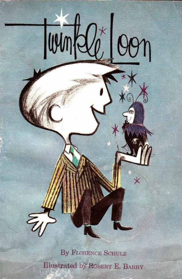
Twinkle Loon illustrated story by Robert E. Berry
https://andeverythingelsetoo.blogspot.com/2014/03/twinkle-loon.html
French illustrator and author Alain Grée
https://alaingree.com/freebies/

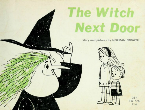
The Witch next door Norman Bridwell
https://en.wikipedia.org/wiki/Norman_Bridwell
General Foods Kitchens | All About Home Baking 1963
illustrations by Mary Ronin
http://stickersandstuff.blogspot.com/

Mary Blair
https://www.dailyartmagazine.com/mary-blair/
"The Joke Book" compiled by Oscar Weigle, illustrated by Bill & Bonnie
Rutherford (1963)
http://www.myretroreads.com/2020/02/the-joke-book-compiled-by-oscar-weigle.html
-w600.jpg)
"The Romper Room Do Bee Book of Manners" by Nancy Claster, illustrated by
Art Seiden (1960)
http://modernkiddo.com/vintage-book-shelf-romper-room-book-of-manners/
-w600.jpg)
Cover for The Wing on a Flea: A Book about Shapes (Ammo). Collection of the artist.
© 1961 Ed Emberley.
https://www.carlemuseum.org/explore-art/story-board/keeping-ed-emberley

The Witch Of Hissing Hill illustrated by Janet McCaffery, 1964
http://www.myvintageavenue.com/2012/10/the-witch-of-hissing-hill-illustrated.html

Karel en mienet written by Mariejte Witteveen and illustrated by Eddy Dukkers, circa
1950.
https://geheugen.delpher.nl/nl/geheugen/view?coll=ngvn&identifier=PRB01%3A036866792&pres%5Bimageindex%5D=6

Ryohei Yanagihara (1931–2015)
https://illustratorslounge.com/animation/ryohei-yanagihara-1931-2015/
-w600.jpg)
The happy little handsaw, illustrated by Milli Eaton in 1955
https://10engines.blogspot.com/2010/04/bookshelf-happy-little-handsaw.html

Le Manege Vivant (c. 1950), which is the French edition of The Marvelous
Merry-Go-Round, written by Jane Werner and illustrated by J.P. Miller.
http://grainedit.com/2011/07/08/book-gems-from-the-south-of-france/
,%20which%20is%20the%20French%20edition%20of%20The%20Marvelous%20Merry-Go-Round,%20written%20by%20Jane%20Werner%20and%20illustrated%20by%20J.P.%20Miller.-w600.jpg)
I hope you get inspired!
Behind the Scenes
Font in use:
SeasideResort by
Nick's Fonts .
Website
Pablo Lara H
Email
hello@pablolarah.cl
Linkedin
Linkedin
Get a Quote
Get a quote