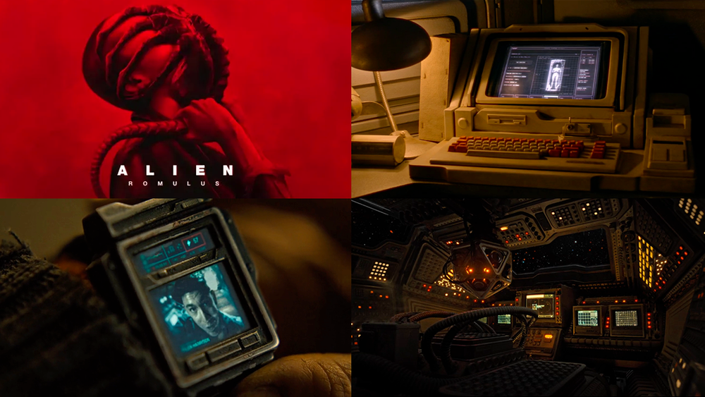
The Alien franchise has always been a rich resource for fans of FUI, and Alien: Romulus is no exception. This latest entry has loads of examples that stay true to the signature retro sci-fi aesthetic that we’ve come to know and love from this universe. From cockpit displays and control panels to handheld scanners, CRT video feeds, and even an auto-aiming rifle scope, Alien: Romulus has lots to unpack.
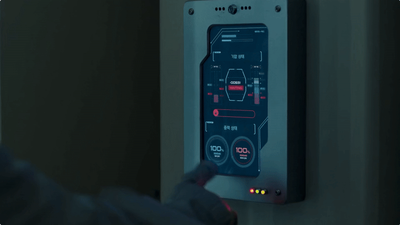
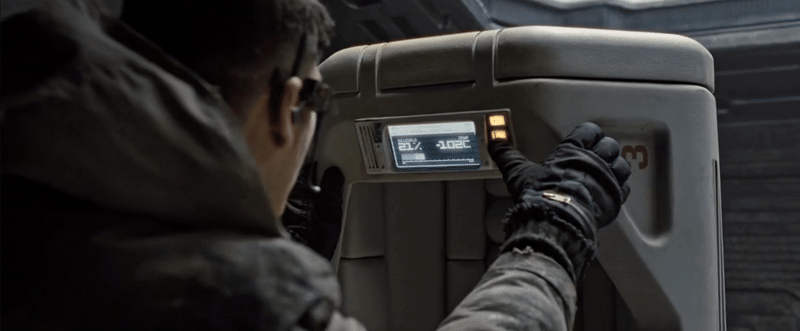
Cryo Station UI
This no-nonsense interface has an industrial feel, with bold icons, thick line work, and minimal animation. I also appreciate the use of a stylus over a touchscreen as it offers greater precision, especially when dealing with cold hands or wearing gloves.
View fullsize

View fullsize
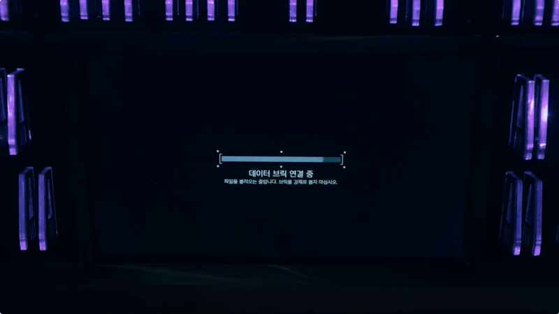
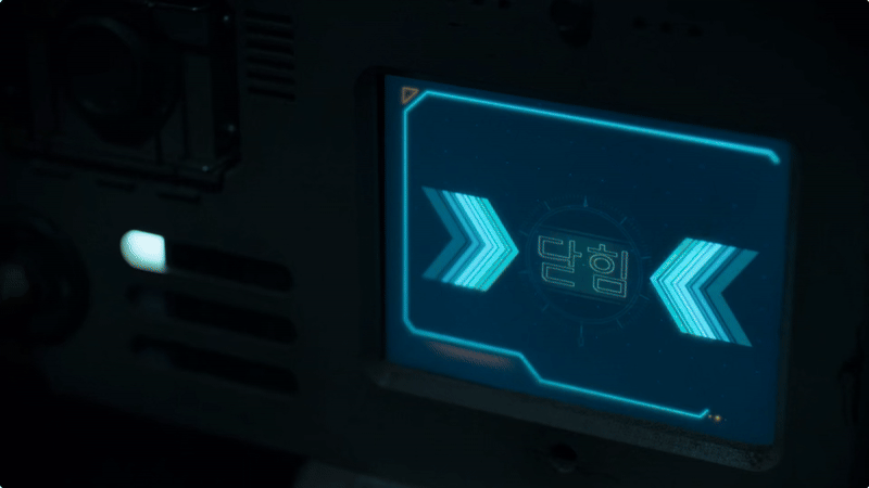
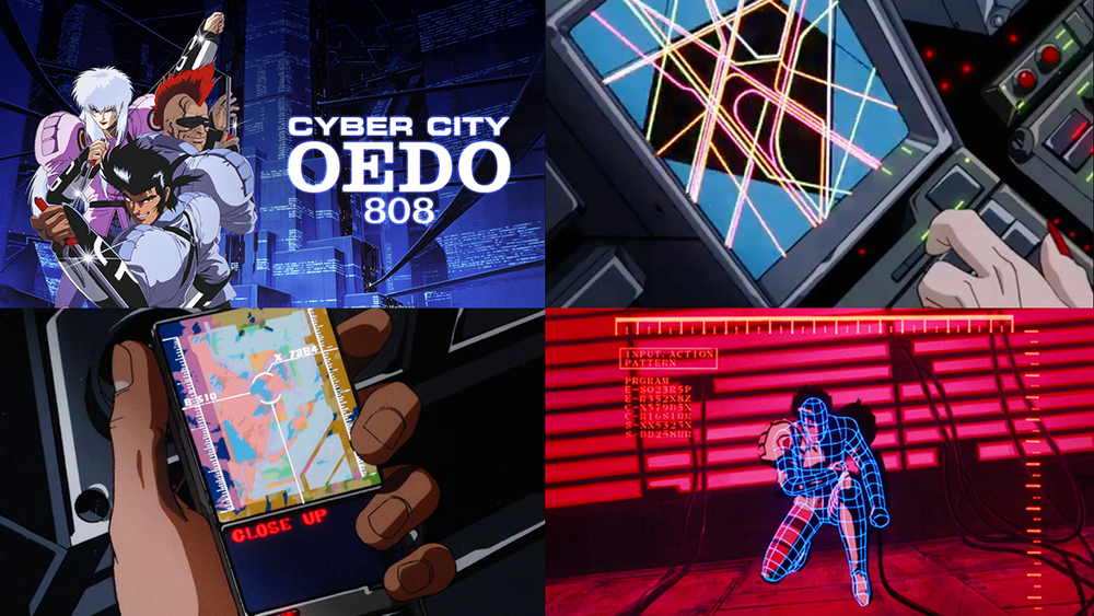
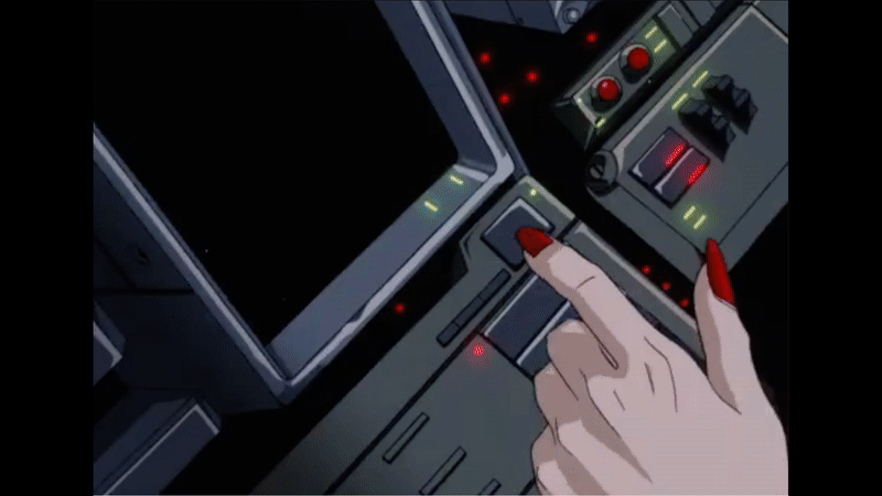
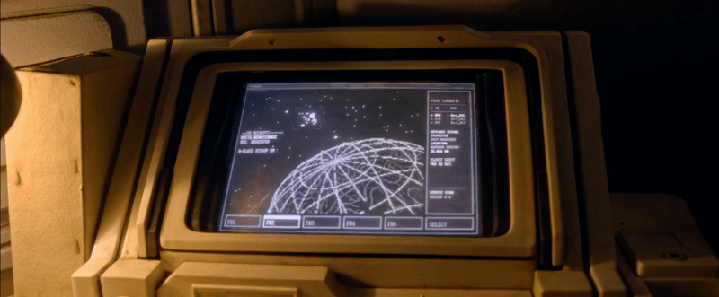
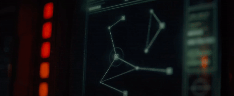
Mining Ship UI
These screens look like they’ve been ripped straight from a Commodore 64—everything about this setup screams 1980s, from the materials and colors to the chunky keyboard and floppy disk drive. The pixelated graphics and monochrome displays add to the retro charm. Imagine navigating space with computers this basic, now that would be truly terrifying!
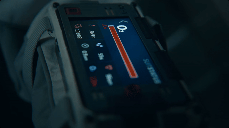
Video watch
I grew up expecting gadgets to look like this in the future. The chunky, boxy design of the watch, paired with its low-resolution screen and desaturated colors, perfectly captures that retro sci-fi aesthetic. There’s something nostalgic about the mix of on-screen UI and tactile buttons—so much so that part of me prefers this over a modern smartwatch.
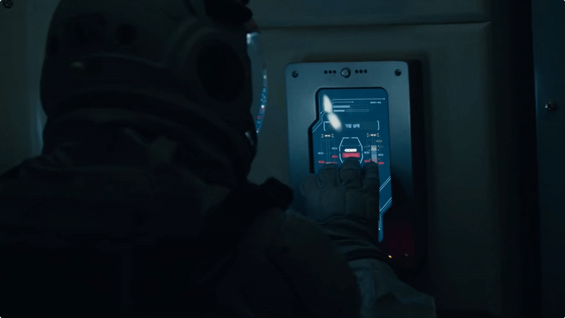
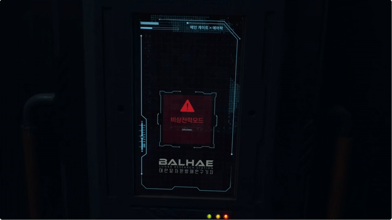
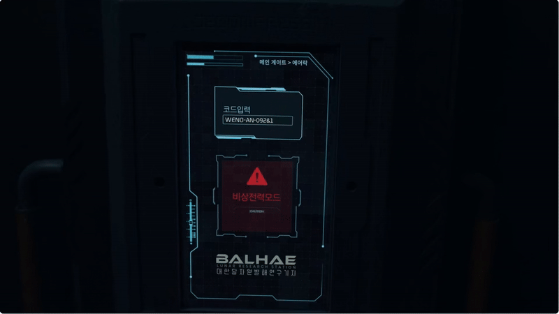
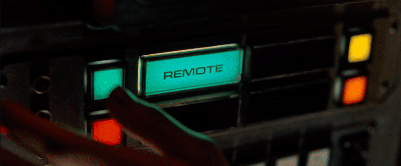
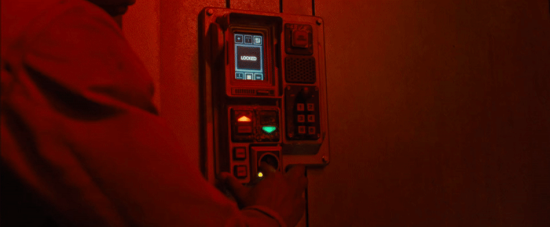
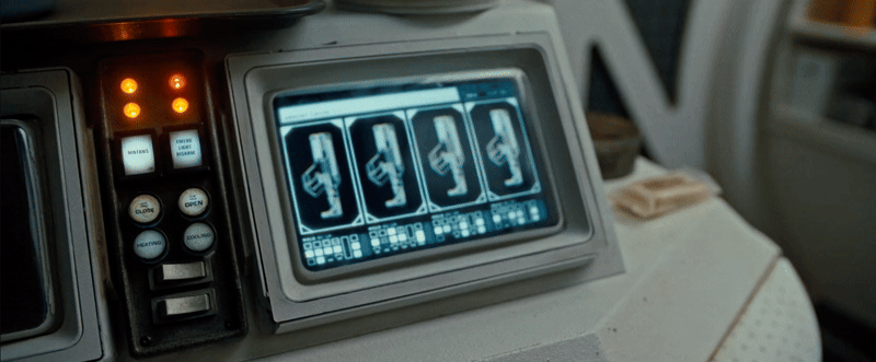
Panel Screens
These share the same no-nonsense UI design as the Cryo UI, maintaining a cohesive aesthetic throughout the ship. They’re often shown with a compact screen, tactile buttons, and an array of jacks, reinforcing the utilitarian feel.

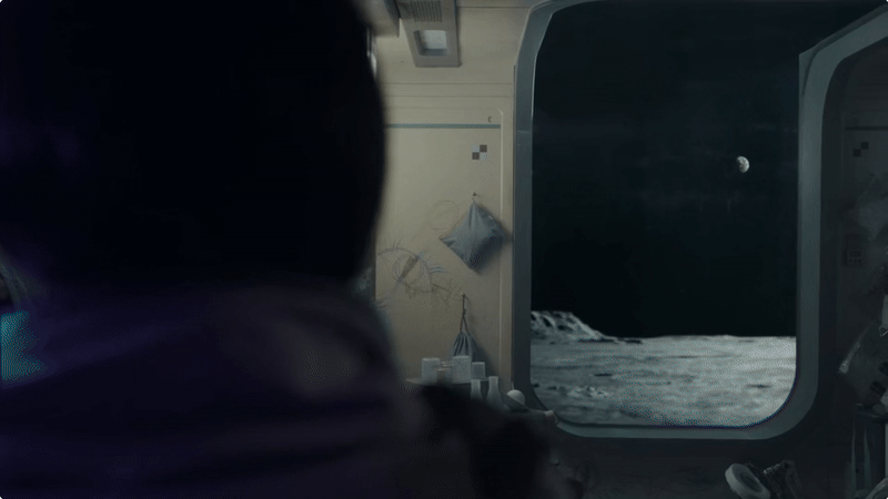
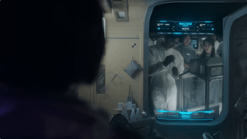
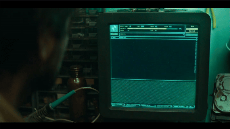
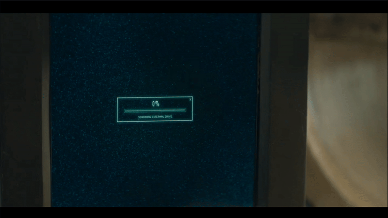
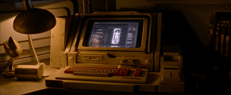
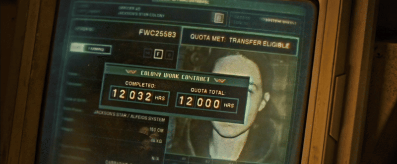
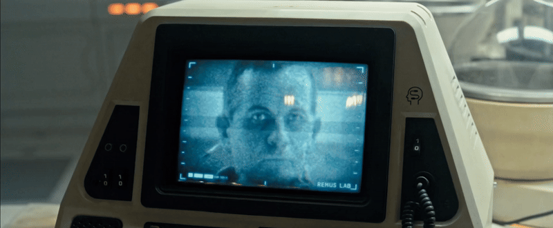
Weyland-Yutani Admin Office
This showcases the computer system used by Weyland-Yutani admin officers—a glitchy, low-resolution screen encased in a grimy shell. While it offers more colours and slightly better image quality than the mining ship's system, it’s still heavily pixelated. The way the photograph loads in with increasing clarity is a nice touch, subtly hinting at the technology’s limitations.

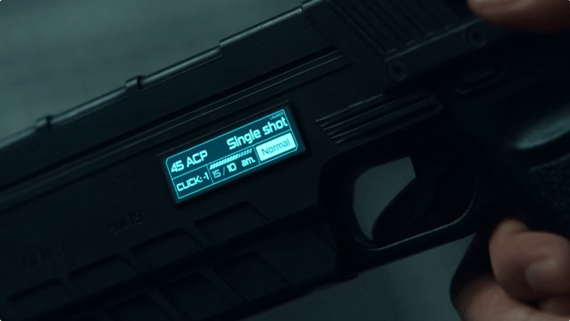
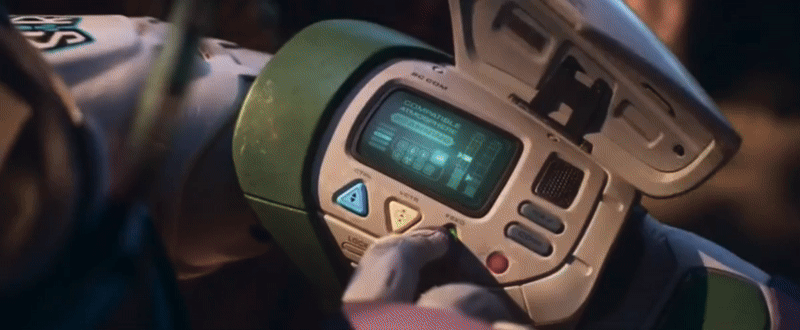
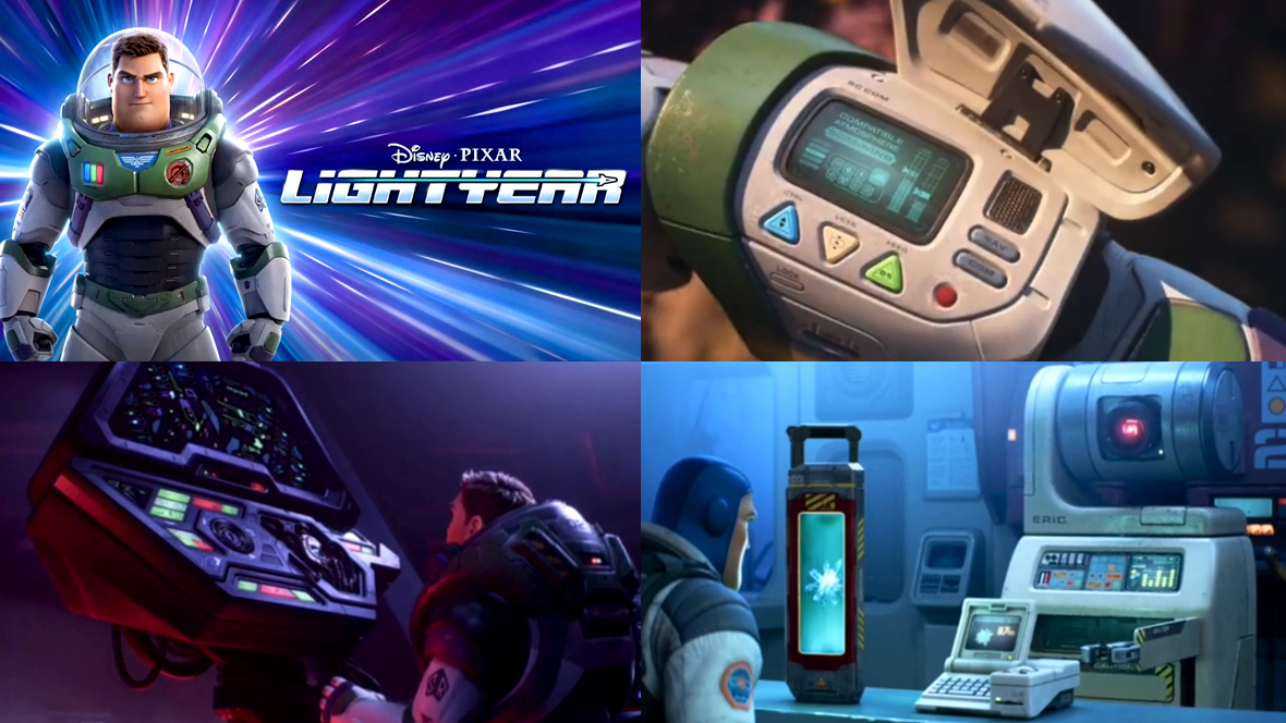
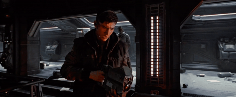
Pulse Rifle - Auto-Assistance UI
I love the boot-up animation when the display flips open—it’s such an unexpected touch for something as utilitarian as a weapon. A gun with a video display instantly screams future to me. The design language of the interface feels ripped straight from the ‘80s, and when paired with the low-resolution screen, it seamlessly fits into the film’s cohesive retro-futuristic UI style.
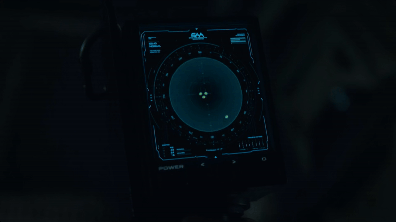
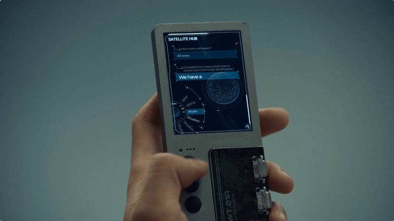
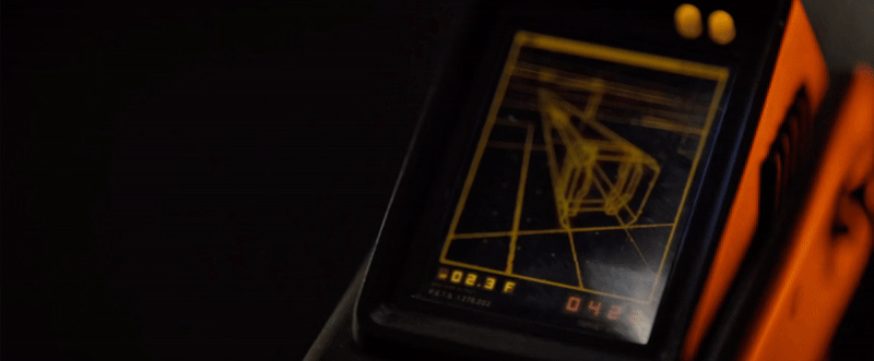
Handheld Scanner
What’s an Alien movie without a handheld scanner? This time, the scanner presents a 3D perspective. Despite the 3D image being a simple wireframe, it still feels advanced in a world dominated by basic pixel art.
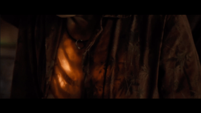
Android Chip Port
Not exactly UI, but I just love how the Android’s chip port is portrayed. I love the mechanical nature of it, it reminds me of loading a Discman and has all the satisfying clickiness of inserting a sim card into a phone. The spring-loaded action is a hallmark of devices from this era, making it feel instantly nostalgic.
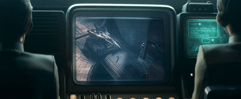
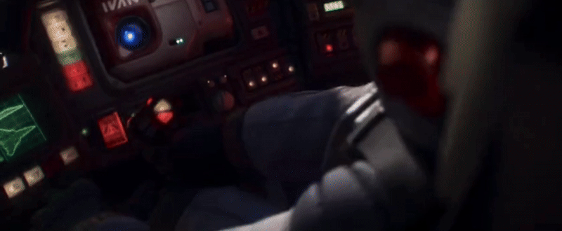
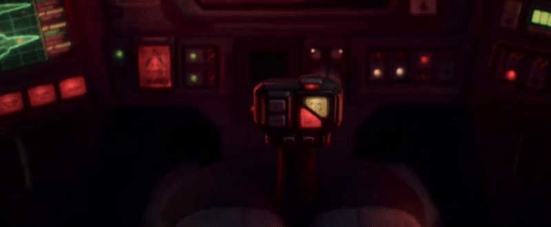
Cockpit UI
The cockpit UI design is quite beautiful. Whether intentional or not, the use of duotone monitors creates a cohesive color palette that feels more deliberate compared to full-color displays. The boxy, chunky forms add a lot of character to the overall design. It resembles a pared-down version of an '80s space shuttle cockpit—less complex, slightly more minimalist, but still rich in tactile detail.
Video Screens
The video screens vary in fidelity, ranging from monochrome to full color. There’s even a brief glimpse of a video game console, showcasing a game reminiscent of Atari-era graphics but slightly more advanced, thanks to a subtle 3D perspective. Once again, the small screens are framed by tactile switches and buttons, seamlessly blending into the overall aesthetic.


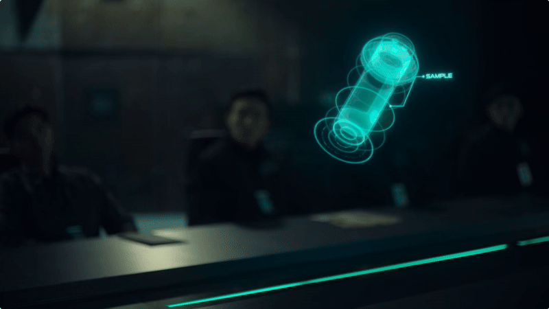
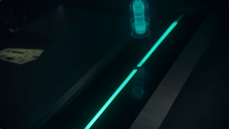
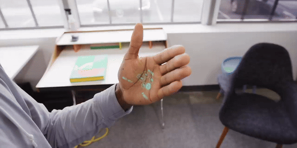
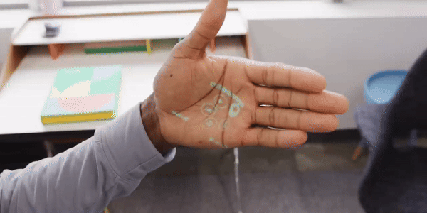
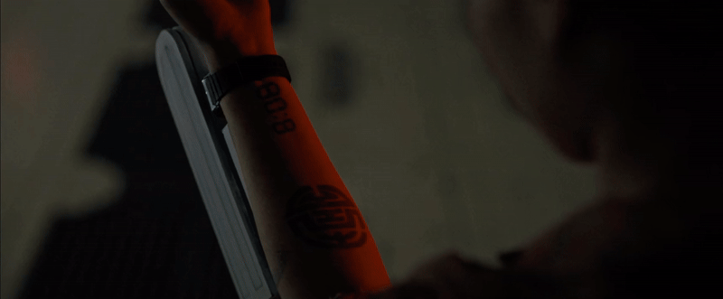
X-Ray Scanner
It’s not exactly UI, but it’s a futuristic device nonetheless. This scanner lets you peer beneath your skin, revealing the inner workings of your body in real time. The way this effect is visualized is brilliantly executed, making it feel both tactile and eerily believable.
The production team clearly had a strong grasp of the era in which this technology would have been developed, ensuring that the UI design authentically reflected its time period. Make sure to check out Alien: Romulus if you haven’t already!