The National Health Service (NHS) has delivered universal healthcare to an entire nation for over 75 years. With 1.5 million staff providing care to approximately 57 million patients across hundreds of hospital trusts — using decades old legacy infrastructure — the NHS is one of the most operationally complex organisations on earth.
For most of its history, the NHS has run on data that couldn’t talk to itself. Patient records, waiting lists, operating theatre schedules, discharge plans: all this critical information was stored in separate systems that NHS staff couldn’t see, couldn’t share, and couldn’t act on together, as one system. Together with the NHS, Palantir built the NHS Federated Data Platform (NHS FDP) to address this challenge.
Built to Connect Data, Safely and Securely
The NHS FDP is an NHS England programme delivered through a consortium led by Palantir. It provides a data infrastructure layer that connects the NHS to itself, bringing together operational data scattered across disconnected systems. The platform is giving clinicians, analysts, and operational staff access to the information they need, when they need it, in a secure and safe environment.
Built on Palantir Foundry, the NHS FDP operates with a federated architecture, meaning that each NHS organisation operates its own separate ‘tenant’ of the FDP, for which they are the data controller. All data therefore stays under control of the local organization while still benefiting from nationally developed digital tools and a shared ontology, called the Canonical Data Model — a single, standardised representation of the NHS ecosystem that unifies not just data, but the logic, actions, and security policies that together power how applications built atop the platform interoperate at scale. Privacy by design is at the heart of the platform: all data is encrypted, access is purpose-based, and Privacy Enhancing Technology (PET) is used to de-identify personal information whenever data flows nationally.
On the foundation provided by the platform, hospital trusts gain access to a suite of nationally developed core products — purpose-built tools for managing waiting lists, coordinating discharges, and validating patient pathways — while also gaining the ability to build their own solutions to the challenges most specific to them.
The result is a platform designed not just to process data, but to enable action, safely and securely.
Impact at Scale
The results are already visible. Hospital trusts using the platform have delivered measurable improvements across the system:
110,078 additional patients have undergone procedures in hospital theatres since the FDP product has been implemented — supporting more people to receive the treatment they need to stay healthy.
797,728 patients have been safely removed from NHS waiting lists using the FDP tools, helping ensure the right people are waiting for the right treatment.
297,943 patients have been safely discharged from hospital using the software, with around a 15% reduction in discharge delays for patients observed since trusts started using FDP — freeing up beds for those who need them most.
6.8% more patients with referrals for suspected cancer are now receiving answers within 28 days compared to the 12 months before FDP.
These numbers represent real reductions in waiting times, discharge delays, and administrative burden — and real differences in the lives of patients across England.
*Data as of end of December 2025 (updated quarterly).
Local Solutions, System-wide Impact
The core products enabled by the NHS FDP are just the beginning. What sets the platform apart is that the same infrastructure powering nationally developed tools is available to every trust to build on. The Canonical Data Model that sits at the platform’s foundation means that locally built applications can interoperate, be validated, and ultimately be scaled across the system.
A solution built by a nurse at one Trust to solve a problem on her ward can become a tool used by nurses across England. This principle — that local challenges are best solved by the people closest to them on a platform powerful enough to carry those solutions system-wide — is what the NHS FDP is built for.
From Principle to Practice
Build with FDP was created to put that vision to the test. This flagship developer event is a 48-hour hackathon bringing together engineers, analysts, clinicians, and operational staff from NHS organisations across England to explore the platform capabilities and build solutions to real problems on the NHS Federated Data Platform.
In the weeks before the inaugural event, NHS staff submitted operational challenges they wanted solved. Those problems became the foundation of the day: participants were grouped into multidisciplinary teams, each tackling a challenge nominated from the frontline, with access to the full NHS FDP toolset and support from Palantir engineers throughout.
As Ines Pinto, Product Manager at Chelsea and Westminster Hospital NHS Foundation Trust, put it: “The FDP, being so simple to use and intuitive, has actually created a really interesting blend between the non-technical and the technical world…you can actually integrate both in a way that’s going to make things work, because you can’t have one without the other.”
48 Hours of NHS FDP
At the inaugural event, over 120 NHS developers and analysts built 25 working prototypes on a notional version of the CDM — functional applications built from frontline expertise. A selection of the hackathon projects includes:
Early Warning System — For overstretched ward teams, the ability to act earlier — rather than react to deterioration once it has happened — is the difference between prevention and crisis. The prototype tool would help nurses identify patients at risk of clinical deterioration before it occurs. Leveraging models trained on vitals, interventions, and outcomes from across the NHS and be able to suggest proactive interventions and connect learnings system-wide.
Bed Demand Prediction — When Emergency Departments surge, reactive bed management costs time that patients don’t have. This prototype tool would enable live predictions of which ED patients are likely to require admission, enabling teams to get ahead of demand before it becomes a crisis. Trained on 300,000 rows of notional data and integrated with AI-generated recommendations based on real-time ward availability, hospitals could use the foresight to manage surge rather than just respond to it.
CAMHS Workflow Demand Balancer — In Child and Adolescent Mental Health Services, planning for demand has historically meant working from incomplete pictures and outdated data. This prototype tool demonstrated clinicians, managers, and executives could be given a live view of future demand and capacity to identify bottlenecks and surface where additional staff might be needed before problems escalate. Able to generate multiple business cases in minutes the prototype turned what was once a multi-week planning process into something operational staff could run themselves.
Genomic-Optimised Waitlist Recommendations — This prototype tool automatically flags patients on the waitlist eligible for genomic tests and determine their optimal treatment. By surfacing the right candidates at the right time, it helps ensures operational efficiency in the use of precision medicine and faster paths to effective care.
These four projects are a snapshot of what was built. Across the full 25 solutions, teams tackled everything from workforce planning and discharge risk to automated appointment booking and AI-driven clinical coding — each one a direct response to a challenge nominated by NHS staff.
Building What’s next
Each team was given the opportunity to present their project to a panel of senior NHS leaders and government representatives — including chief executives, chief information officers, and heads of data and analytics — to demonstrate what 48 hours on the NHS FDP makes possible and prove that the next chapter of digital transformation is already underway.
The NHS FDP was designed as a builder’s platform, and what the NHS developers built at the first Build with FDP event proved that they were just getting started.
Palantir’s software powers real-time, human-agent decision-making in many of the most critical commercial and government contexts around the world. From disaster response to nuclear energy production, our customers depend on Palantir AIP to safely, securely, and effectively leverage AI in their enterprises — and drive operational transformation.
While many factors contribute to achieving and scaling operational impact, including our AIP AgentCamps — where customers are hands-on-keyboards and achieving outcomes with AI in a matter of hours — the key differentiator is a software architecture which revolves around the Palantir Ontology.
The Ontology is a system designed to represent the decisions in an enterprise, not simply the data. The prime directive of every organization in the world is to execute the best possible decisions, often in real-time, while contending with internal and external conditions that are constantly in flux. Traditional data architectures do not capture the reasoning that goes into decision-making or the action that results, and therefore limit learning and the incorporation of AI. Conventional analytics architectures do not contextualize computation within lived reality, and therefore remain disconnected from operations. To navigate and win in today’s world, the modern enterprise needs a decision-centric software architecture.
To understand the value of the Ontology, let’s start by considering the four components of any operational decision:
Data: the information leveraged to make the decision
Logic: the heuristics and computational processes that evaluate a decision
Action: the orchestration and execution of the chosen decision
Security: the assurance that the decision complies with operational policies
At a fundamental level, every decision is comprised of data (the information used to make a decision), logic (the process of evaluating a decision), and action (the execution of the decision) — all of which must be governed by security to ensure decisions are made safely and consistently.
The Ontology integrates these four constituent elements of decision-making into a scalable, dynamic, collaborative foundation which reflects the ever-changing conditions and ambitions of the organization as they evolve in real time.
Data
Today’s organizations are inundated with unprecedented amounts of data. The volume, variety, and velocity of data sources is not only increasing, but accelerating over time. While plenty of ink has been spilled on the virtues of cleaning and unifying data, in the age of AI the principal problem is relevance. Relevant data of course includes the full range of enterprise data sources — structured data, streaming and edge sources, unstructured repositories, imagery data, and more — but it also includes the data that is generated by end users and agents as decisions are being made. This “decision data” contains the context surrounding a given decision, the different options evaluated, and the downstream implications of the committed choice. Generative AI provides a breakthrough ability to synthesize learnings from the full scale of decision data, and continuously enrich both human- and agent-driven workflows. Naturally, integrating the full range of enterprise data with the fluid landscape of decision data requires a very different architecture than a classical database management solution that is optimized for reporting and analytics.
The Ontology integrates all modalities of data into a full-scale, full-fidelity semantic representation of the enterprise. The wide range of operational data sources (ERPs, MES, WMS, et al.) can be synchronized and contextualized alongside data streams from IoT and edge systems, the relevant sections of unstructured data repositories, geospatial data stores, and more. The Ontology unites and activates these fragmented pools of data, and surfaces them in the language of the enterprise. Instead of dealing with golden tables that flatten the richness of operations into narrow schemas, the full expanse of the enterprise comes to life in the form of objects, properties, and links which evolve in real-time, and are designed to be embedded directly into decision-making workflows. Critically, the Ontology is designed to safely capture the decision data that is produced by operational users as they carry out daily work (e.g., within supply chains, hospital systems, customer service centers). This includes decisions made at the edge, captured through the lightweight Embedded Ontology. The end-to-end “decision lineage” of when a given decision was made, atop which version of enterprise data, and through which application, is automatically captured and securely accessible to both human developers and agents. This provides the comprehensive foundation that is required to power AI-driven learning at scale, and continuously refine all forms of agentic memory (working memory, episodic memory, semantic memory, procedural memory, et al.)
The Ontology integrates all modalities of data into a full-scale, full-fidelity semantic representation that captures the constantly evolving reality of the enterprise and serves as the foundation for human-agent workflows.Logic
While data is foundational, it is only one dimension of the decision-making process; it must be complemented by the reasoning, or logic, that determines when and how to make a given decision. The logic that underpins a decision can be a simple piece of business logic within a core business system, a forecast model that is maintained using a cloud data science workbench, an optimization model that uses several data sources to produce an operational plan — among myriad possibilities. In real-world contexts, human reasoning is often what orchestrates which logical assets are utilized at different points in a given workflow, and how they are potentially chained together in more complex processes. With the advent of agentic orchestration, it is now critical that AI-driven reasoning can leverage all of these logical assets in the same way that humans have historically. Deterministic functions, algorithms, and conventional statistical processes must be surfaced as operational tools which complement the non-deterministic reasoning of LLMs and multi-modal models. Moreover, as workflows are conducted by humans and agents, the tribal knowledge accumulated can be incorporated into different pieces of logic, and can feed a continuous process of generating new functional encapsulations that are leveraged throughout workflows.
The Ontology enables the full set of logic assets — the calculations and processes that dictate how decisions are made — to be connected and contextualized for both human and agents. This includes business logic pertaining to customer interactions often found in CRMs and ERPs; the modeling logic that drives conventional machine learning, which is spread across data science environments; and the planning, optimization, and simulation algorithms that are typically intertwined with domain-specific tools. The Ontology’s flexible “logic binding” paradigm provides a consistent interface for constructing workflows that seamlessly incorporate and combine heterogeneous logic assets — which may all live in very different environments (e.g., on-premises data centers, enterprise cloud environments, SaaS environments, the Palantir platform). Ultimately, this means that agent-driven reasoning can be smoothly introduced into decision-making contexts which leverage diverse sets of logic, and which have been traditionally steered exclusively by human users.
The Ontology enables users to construct workflows that incorporate tribal knowledge and combine heterogeneous logic assets. Ultimately, this means that agents can be securely introduced into increasingly complex decision-making contexts.Action
With both information (the data) and reasoning (the logic) incorporated into a shared representation, the next piece to model is the execution and orchestration of the decision itself (the action). Closing the action loop as decisions are made in real-time is what distinguishes an operational system from an analytical system. Since Palantir’s inception, the execution of decisions has been as critical a consideration as the synthesis of data, or the incorporation of analytics. This has required the design and implementation of a broad set of functionality which includes how to safely capture decisions which might be happening simultaneously and are potentially in conflict; a collaborative model that segments those who can explore possible decisions, those who can stage decisions for review, and those who can commit those decisions; and an extensive framework for synchronizing decisions to existing databases, edge platforms, and rugged assets.
The Ontology natively models actions within a cohesive, decision-centric model of the enterprise. If the data elements in the Ontology are “the nouns” of the enterprise (the semantic, real-world objects and links), then the actions can be considered “the verbs” (the kinetic, real-world execution). With every Ontology-driven workflow, the nouns and the verbs are brought together into complete sentences through human- and/or AI-driven reasoning, which incorporates various pieces of logic. While uniting data within a semantic model is itself valuable, and while it is imperative to stitch together the logic required to holistically evaluate possible decisions — it is all ultimately of limited value unless the executed decisions are synchronized with operational systems, with the full decision lineage captured within a compounding substrate that can better inform the next decision. The Ontology enables human and agent actions to be safely staged as scenarios, governed with the same granular access controls as data and logic primitives, and securely written back to every enterprise substrate — transactional systems, edge devices, custom applications, et al.
The Ontology natively models actions within a cohesive, decision-centric model of the enterprise, enabling human and AI-driven actions to be safely staged as scenarios, governed with the same access controls as data and logic primitives, and securely written back to every enterprise substrate.Security
In any operational setting, human-agent interaction requires rigorous security and governance capabilities that stretch far beyond conventional role-driven policies on buckets of data. Palantir AIP provides a security architecture that can blend marking-, purpose-, and role-based policies; dynamic lineage that flows across data, logic, action, and application artifacts; and a full suite of integrated change and release management tools that apply across both human-driven and agentic workflows. Granular policies can be affixed across the Ontology to constrain both agentic and human access to sensitive or context-dependent information. These policies are dynamically computed at runtime for every interaction, and can combine row- and column-level restrictions that have been applied to underlying datasets, attributes of particular user groups (including those that flow via SSO), security markings that propagate across underlying data pipelines, and more.
Tool usage is dynamically enforced through the same security architecture that governs data access and all forms of memory. This ensures, at minimum, that any tool invocations are dependent on access to the underlying objects, properties, and links in the Ontology. Moreover, tools can contain runtime validations that are dependent on granular submission criteria. Every agentic or human action depends on precise authorization grants that explicitly dictate the set of allowable operations, safeguarding against unexpected invocations (e.g., querying data that exists across organizational boundaries, or tools that connect to unspecified external systems) and other forms of privilege escalation. As detailed telemetry is generated by agents, the security and transmission of the logs is a critical last-mile concern. AIP enables administrators to control how logging is accessible across specific projects, workflows, and agents. Data markings and other active security primitives govern log access, in the same manner that they govern access to the underlying data, logic, and action primitives.
In short, the Ontology brings together data, logic, action, and security into a decision-centric model of the enterprise, which can be jointly leveraged by both humans and agents. Everything from data integration, to application building, to end user workflows is driven through a battle-tested, modular architecture — enabling human users and agents to query, reason, and act across a shared operational foundation.
Let’s step through a notional example to unpack how the Ontology is enabling organizations across 50+ sectors to activate human-agent workflows in days.
The Ontology cohesively governs human-agent activity in a decision-centric model of the enterprise, enabling role-, marking-, and purpose-based policies to be dynamically computed at runtime, applied consistently across every human and agent interaction with data, logic, and action primitives, and extended seamlessly to tool invocations, agent memory, and telemetry logs.An Operational Example
Onyx Incorporated, a fictional manufacturer of medical equipment, produces a range of finished goods, from syringes to surgical masks, each of which requires moving a precise set of materials through an associated manufacturing process. A diverse set of teams is managing everything from supplier relations, to warehouse operations, to production of the finished goods, to distribution to end customers; decisions are interdependent, and constantly adapting to changing circumstances. In short, every day brings unique challenges when operating the business.
In this example, Onyx is faced with an unexpected disruption with one of their major suppliers, who provides the key raw materials needed to produce surgical masks. Given the tight production schedules across Onyx’s manufacturing plants and the escalating demand from customers for surgical masks, this disruption is poised to create serious issues with fulfilling outstanding customer orders. Fortunately, Onyx’s operational teams have leveraged AI FDE to connect a wide array of data sources, logic assets, and systems of action into their enterprise ontology — and have the ability to swiftly respond.
Onyx’s ontology brings together all decision-making elements necessary to navigate this raw materials disruption: It provides full visibility into revenue impact for each shortage to inform prioritization, allows for agentic recommendations and resolutions which account for the enterprise’s operational reality, and drives writeback and continuous learning to not only keep systems current, but also optimize future decisions.
Onyx will start by assessing the immediate impact of the supplier shortage, and will then employ AI to assess possible reallocation strategies across production lines, before finally translating their decisions into a set of connected actions that will simultaneously update warehouse processes, production schedules, and fulfillment routes.
Onyx’s ontology provides real-time, end-to-end visibility into the operations happening across each interdependent part of the business — enabling both leadership and on-the-ground teams to quickly understand the supplier disruption. The vital data systems pertaining to supplier management, warehouse operations, production activity within plants, distribution center processing, and customer fulfillment are all synthesized into semantic objects and links, which reflect the language of the business. In a few clicks, an operations leader is able to pinpoint the surgical mask production that is at risk due to the raw material shortage, and through the connections in their ontology, navigate to every outstanding customer order that is now also at risk. The Ontology’s granular security model ensures that more sensitive data elements (e.g., financial metrics) are automatically hidden by default, as the response widens to include more teams across the enterprise.
While it is seamless for operational users to navigate the Ontology through intuitive Workshop- and SDK-driven applications, the inclusion of agentic capabilities is a force multiplier for Onyx Incorporated. Agents, which leverage both open-source and proprietary LLMs, are able to fluidly navigate across supplier information, stock levels, real-time production metrics, shipping manifests, and customer feedback all contained within the organization’s ontology. Critically, all agentic activity is controlled with the same security policies that govern human usage — ensuring that Onyx engineers always have precise control over what the LLMs can query, recommend, and act upon. Each constructed and deployed agent can be considered a new team member, who is gradually granted a wider purview as Onyx team members gain confidence in its performance.
Onyx’s ontology integrates data from the organization’s vital systems, synthesizing it into semantic objects and links which provide real-time, end-to-end visibility into operations and allow both leadership and on-the-ground users to rapidly assess the full impact of the disruption.
Situational awareness is only the tip of the ontological iceberg; Onyx Incorporated needs to rapidly identify solutions to deal with the supplier disruption, and explore the tradeoffs inherent with each possible decision. Fortunately, the diverse set of forecast models, allocation models, production optimizers, and other logic assets have been connected into Onyx’s ontology, alongside the aforementioned data sources. This enables supply chain analysts to quickly run a battery of simulations that detail the consequences of the different possible material substitutions. The connected, real-time nature of the Ontology is key at this stage, since substituting raw materials will potentially have downstream implications for the other products (e.g., syringes, gloves) being produced from the same materials. As the simulations are run, the simulated outputs are staged as ontology scenarios, which safely package the proposed changes into a sandboxed subset of the Ontology — enabling teams to safely explore and analyze the implications of the decision before committing to it.
The true game-changer for the Onyx team is that fleets of agents can securely leverage the full range of logic assets, and the same scenarios framework. The Ontology enables agents to go beyond the data-centric limitations of retrieval-augmented generation, and instead interface with the interconnected data, logic, and action primitives in the Ontology through an extensible tools paradigm. This means that as Onyx’s analytics and data science teams are creating new machine learning models in their cloud workbenches, tuning optimization algorithms within enterprise systems, and fine-tuning LLMs using Palantir’s open model building framework, the Ontology securely surfaces all of these logic assets as AI-ready tools. In this case, Onyx has created a tuned agent, “Disruption Bot,” that is able to use a set of Ontology-driven tools to scan across the full range of enterprise data sources, the after-action reports on prior courses of action taken in similar situations, and the potentially applicable material reallocation models. Because of the rich, dense context provided through the Ontology, Disruption Bot is able to surface a novel reallocation plan, which uses a newer model that the supply chain analysts had not yet considered. With the consequences of the plan safely staged in a scenario, the agent’s proposed decision is handed off to a human analyst for final review.
The Ontology securely surfaces Onyx’s logic assets — from machine learning to optimization models — as AI-ready tools, providing rich, dense context for human-agent teaming.
With a viable plan to address the material shortage identified, Onyx Incorporated needs to rapidly and safely push the decision to the operational systems that run the constituent processes. Given that the enterprise has grown through acquisition, and contains a diverse and delicate mix of critical operational systems, the Onyx IT team is vigilant about which processes can write back to these systems, and under which conditions. Fortunately, the Ontology applies the same rigorous control and validation to actions as it does to data and logic; enabling fine-grain control over who can invoke a given action, test-driven frameworks for publishing changes, the ability to stage and review changes in batch, and detailed logging for every event. In this case, the execution of the material reallocation plan automatically orchestrates a set of writeback routines, each tuned for the receiving system: the warehouse management system receives an API-driven update; the three ERP systems each receive updates via native Ontology-driven connectors, which abide by the safeguards in each system; and the production planning system receives a consolidated flat file, which it ingests asynchronously. As actions are executed, the Onyx IT team can monitor system responses, and always has the ability to audit past activity.
The Ontology provides the guardrails needed for AI to safely take action within permitted boundaries. Alongside data and logic, actions can be automatically surfaced as tools for all types of agents. The scope of an action can be limited to simply reflecting a given change (e.g., an edit to an object, or the creation of a new object) in the Ontology itself; or can write back to single, or multiple systems. In Onyx’s context, they have granted Disruption Bot and the handful of other production AI agents access to a handful of actions. In the default case, these actions (e.g., changing the status of a work order, or pushing a reallocation plan) can only be staged by the AI, and are then handed off to a human for final review. However, with the granular logging and operational instrumentation provided by the Ontology (and the wider Palantir platform), Onyx is able to surgically choose which trusted, well-worn AI processes can automatically close the action loop without human review. As conditions evolve, the latitude given to AI can be expanded or contracted — and instantly reflected across all Ontology-driven workflows.
The Ontology allows Onyx to automatically surface actions as tools for AI-driven agents and automations while providing the necessary guardrails for AI to safely take action within predetermined boundaries.
What comes after the crisis? With data, logic, action, and security all connected into Onyx’s ontology, the organization has the ability to conduct powerful decision-centric learning. The human-agent teaming that produced a specific solution to the material shortage also revealed generalizable workflows, which the organization will want to memorialize and surface in the future. Every data element, logic asset, and action assessed is captured in end-to-end decision lineage — which serves as rich, contextual fuel for optimizing the performance of AI. The aggregate decisions made by thousands of users and agents throughout Ontology can be securely leveraged as training data when fine-tuning models, and can be distilled into targeted principles that are called upon during agent prompting. The tribal knowledge that has been traditionally trapped in the seams of workflows can be illuminated by AI, in order to improve the application of AI.
The Ontology captures updates to every data element, logic asset, and action as decisions are securely made — which serves as rich, contextual fuel for optimizing the performance of humans and agents over time.Onward with the Ontology
Ultimately, the Ontology allows each organization to implement and scale human-agent operations, and precisely control how and when agent-driven recommendations, augmentations, and automations can be utilized in frontline contexts. This is uniquely possible because the Ontology is decision-centric, not simply data-centric; it brings together the constituent elements of decision-making — data, logic, action, and security — within a single software system. New data can be rapidly integrated into a full-fidelity semantic representation; new algorithms and business logic can be seamlessly surfaced for both human and AI users; and robust action integration is achieved through real-time connections with the full range of operational systems. Each organization’s ontology is a real-time pulse on the changing conditions, ambitions, and decisions being made across teams — ensuring that AI is always anchored in the reality of the enterprise.
This post has only scratched the surface on the Ontology’s underlying decision-centric architecture; the system’s native simulation and scenario-building capabilities; the extensibility provided through the Ontology SDK; the Global Branching framework that allows for safe and zero-downtime evolution of the Ontology; and the tradecraft for scaling human-agent teaming across the entire enterprise.
Real-World Examples
See how American Airlines is using their ontology to power AI-enabled network planning
See how Novartis is transforming drug discovery with agentic R&D
See how Andretti Global is turbocharging IndyCar operations with human-agent teaming
Connecting Agents to Decisions was originally published in Palantir Blog on Medium, where people are continuing the conversation by highlighting and responding to this story.
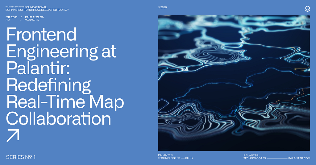
Frontend Engineering at Palantir: Building Multilingual Collaboration
About this Series Frontend engineering at Palantir goes far beyond building standard web apps. Our engineers design interfaces for mission-critical decision-making, build operational applications that translate insight to action, and create systems that handle massive datasets — thinking not just about what the user needs, but what they need when the network is unreliable, the stakes are high, and the margin for error is zero.
This series pulls back the curtain on what that work really looks like: the technical problems we solve, the impact we have, and the approaches we take. Whether you’re just curious or exploring opportunities to join us, these posts offer an authentic look at life on our Frontend teams. Find all Frontend Engineering blog posts here.
In this blog post, Rahma, a frontend engineer based in CA, shares how building Dossier’s translation mode — a recent project she tackled at Palantir — deepened her appreciation for frontend engineering, while tackling challenges of secure, multilingual collaboration for global teams.
When people think about Palantir, they often imagine impressive data pipelines, backend wizardry, and compelling ontologies — but there is a lot more to the story, especially if you care about frontend engineering.
Recently, I worked on a project to bring read-only translation mode to Dossier, one of our collaborative text editor applications. This feature is particularly important for our defense and intelligence customers, who often operate in multilingual and highly restrictive environments. We’ve also implemented translation in our presentation tool, our messaging tool, and our commenting library, creating an ecosystem of multilingual collaboration across all our communication apps.
In this post, I’ll share how we built Dossier’s translation mode, the technical challenges we faced, and why it’s a great example of the kind of end-to-end, high-impact frontend that keeps me excited and motivated at work.
Why Translation? Why Now?
In almost any important news headline you see today, you’ll see how most operations require deep, multi-national collaboration. These different partner nations often speak different languages, but we can’t let that be a barrier to high-signal collaboration and teamwork. Users, analysts, planners, and operators are working with global teammates more than ever. But many of them are on closed or classified networks, where standard, public, consumer translation tools simply aren’t available or allowed.
To make our productivity suite truly collaborative, we needed to bring translation into Dossier, our rich-text document editor, and make it as seamless as possible. We already had rolled out translation features in Chat and Slides, but Dossier posed a new set of challenges. Unlike chat messages or slide decks, Dossier documents can be hundreds of pages long, full of complex formatting, tables, and live collaborative edits. Our goal was to let users toggle into a translation mode, see the entire document in their chosen language, and still interact with the content (copying text and adding comments) without losing context or performance.
Designing Translation
Our vision was simple: with one click, users could view any Dossier in a translated, read-only mode. Under the hood, this required:
Consistent UX: The translation experience needed to match what users already knew from Chat and Slides.
Security: All translations had to run through our in-house Language Model Service (LMS), never leaving the secure network.
Performance: Even massive documents should translate quickly, without freezing the browser or overloading the backend.
Collaboration: Translation mode had to play nicely with real-time editing, comments, and live user presence.
Technical Implementation
1. Shared components
We’d already built translation UI components for Slides and Chat, so we extracted these into a shared library to ensure a consistent experience across apps. But Dossier’s document model is significantly more complex — we had to extend these components to handle deeply nested rich-text structures, tables, and custom widgets.
2. Redux state for translation
Translation isn’t a feature you can bolt on — it touches the entire application. A user’s language preference, the loading state of every translated block, caching, toggling on and off without losing your place in the document — all of this needs to be coordinated globally. So we were intentional about how we modeled state, adding a dedicated slice to Dossier’s Redux store to manage it cleanly.
This state is also responsible for tracking which blocks are loading, succeeded, or failed, so we can shown detailed feedback to the user.
3. Chunking: balancing translation quality and speed
Translation has to feel fast and seamless, even for large multi-page Dossiers. Sending the entire document at once would leave users staring at a loading screen; translating word-by-word or sentence-by-sentence would be faster but degrade quality, since most translation models rely on broader context to produce natural results.
We settled on chunking at the block level — paragraphs, list items, table cells — which strikes the right balance. Users see incremental progress as blocks appear in their translated form as soon as they’re ready, rather than waiting for the whole document.
For the next version of chunking, we’d like to tackle a few interesting edge cases:
Giga-long paragraphs: If the user writes a single paragraph that is pages long
Multi-language blocks: If a paragraph contains multiple languages, the model may fail to detect the correct language
Non-grammatical fragments: Users can create blocks that are just bullet points, acronyms, or fragments that can be hard for the model to interpret without surrounding context
For now, we rolled out our block-level chunking, but there is plenty of of room for future improvement as we get more usage data and feedback.
4. Lazy, incremental translation
In addition to our strategy of chunking, we also had to think about which chunks to prioritize for 100+ page documents. We used the Intersection Observer API to “lazy load” translations. Only the blocks currently visible in the user’s viewport are sent to LMS for translation. As users scroll, new blocks are translation on demand.
// IntersectionObserver API hook for "has entered screen" detection function useHasEnteredScreen(ref) { const [hasEntered, setHasEntered] = React.useState(false);
useEffect(() => { if (hasEntered || ref.current == null) return;
const el = ref.current; const observer = new IntersectionObserver(([entry]) => { if (entry.isIntersecting) { setHasEntered(true); observer.disconnect(); } });
This keeps the UI responsive and avoids hammering the backend with huge requests. We often have many users accessing the same document at the same time, so we implemented batching, debouncing, and caching to avoid re-translating the same block multiple times.
Each paragraph or block shows a status indicator: loading, failed, or translated. If translations fail due to translation resource constraints or model limitations, users can retry failed translations with a click.
5. Handling collaboration & live edits
Dossier is a collaborative editor, multiple users can edit the same document in real time. If someone edits a paragraph while you’re viewing the translation, we detect the change, invalidate the cached translation, and reloads the updated text for translation.
We use a per-block cache (keyed by element ID) to track translation status. When a block is edited, the cache entry is invalidated and translation is re-triggered as long as the block is still on the user’s screen. This ensures that the translated view is always up to date, even as the document evolves.
6. Stripping formatting for translation quality
One of the hard tradeoffs: to get the best translation results, we strip all inline formatting (bold, italics, hyperlinks, mentions) before sending text to LMS. This is because translation models work best when given the full, unbroken sentence context.
If we were to split text around formatting, say translating “I love frontend engineering” by sending “I” and “frontend engineering” separately, and “love” as a bolded chunk, the translation model loses the sentence structure. This can produce incorrect or nonsensical results, especially in languages where word order or agreement depends on the whole sentence.
Example:
Consider the English sentence:
I love frontend engineering
Suppose we tried to preserve formatting by splitting:
“I”
“love”
“frontend engineering”
If we translate these fragments separately into French:
“I” → “Je”
“love” → “amour” (noun, not verb)
“frontend engineering” → “ingénierie frontend”
If we stitch it back together:
Je amour ingénierie frontend
This is not correct and doesn’t make sense, but if we send the full sentence to the translation model:
“I love frontend engineering.” → “J’adore l’ingénierie frontend.”
Here, “J’adore” is the correct verb form and the sentence flows naturally. This is why preserving sentence context is critical for translation quality, and why we currently strip formatting before translation, otherwise users could end up with confusing or misleading results.
That is why, for now, the translated view is plain text, but we’re exploring more ways to preserve more formatting as model and API support improves. For example, future support for HTML or Markdown-aware translations.
What makes this work interesting?
The project covered many aspects of frontend development:
Component design: Preparing the next text-based app in our ecosystem for success by enabling seamless adoption of the component work completed for Dossier.
State management: Orchestrating translation status across hundreds of blocks, with real-time-updates.
Performance engineering: Using browser APIs (like intersection Observer and LRU caches) to keep things fast for users and being kind to our backend servers.
Security & deployment: Making sure everything works on air-gapped, classified, or otherwise restricted networks.
The Result: Translation for Every Dossier
Today, users can toggle translation mode in any Dossier, select source and target languages, and instantly see a translated, read-only version of their document. All text content is “lazy” translated as you scroll, and any incoming edits are re-translated in real time.
Why this Matters for Frontend Engineers
As a frontend engineer who loves building real products that solve real problems, especially under constraints like security, performance and collaboration, projects like Dossier translation keep me motivated and excited to work. I really enjoyed balancing the technical and performance constraints with a delightful experience for users and leveraging modern web APIs to deliver Dossier translation.
Frontend engineering at Palantir goes far beyond building standard web apps. Our engineers design interfaces for mission-critical decision-making, build operational applications that translate insight to action, and create systems that handle massive datasets — thinking not just about what the user needs, but what they need when the network is unreliable, the stakes are high, and the margin for error is zero.
This series pulls back the curtain on what that work really looks like: the technical problems we solve, the impact we have, and the approaches we take. Whether you’re just curious or exploring opportunities to join us, these posts offer an authentic look at life on our Frontend teams. Find all Frontend Engineering blog posts here.
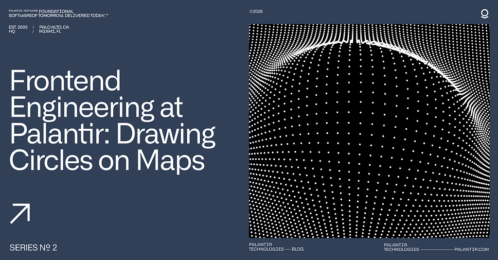
In this blog post, Raj, a frontend engineer based in CA, shares shares how rendering accurate circles on maps led him through map projections, spherical trigonometry, and the surprising complexity of visualizing ranges in polar regions. Stay tuned for Part 6.
Recently, we wrote about plotlines in Three.js — the lines, connections, and orbits we render on top of our 3D globe. But before we can actually draw anything, we need the globe itself to perform well, regardless of what area of the world you’re viewing.
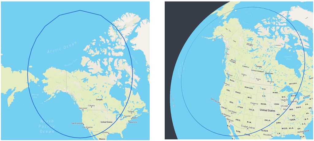
Zodiac is our custom-built 3D globe library on top of Three.js. While building this, we kept running into the same pattern: the equator was smooth, mid-latitudes were fine, but pan toward the Arctic and everything slowed to a crawl. The poles were absolutely killing performance, and there was no obvious fix.
How Tiling Works
To first understand why this problem was happening, we need to start with how map tiles work.
When you pan around any interactive map on the internet, you’re not actually loading one giant image of the Earth. Instead, the map is divided into a grid of small square images called “tiles.” As you zoom in, each tile splits into four higher-resolution children. The standard approach divides the world into equal-sized rectangles in latitude/longitude space. At zoom level 0, you can have 1 tile covering the whole planet. At zoom 1, each tile splits into 4. At zoom 7, you have thousands.
The benefits of this are for both visual clarity and performance. When fully zoomed out and trying to understand the broader context of a map, the street level data is just noise. However when we zoom in, we can load in these more detailed tiles once they become more relevant. This is also great for performance — we will only need to ever load in a couple dozen tiles based on the current viewport, and not the entire data of the map at all times.
The Poles Problem
The problem is that this tiling system was designed for flat maps. On a 2D Web Mercator projection, the polar regions get stretched horizontally, which conveniently means you always see roughly the same number of tiles no matter where you pan. Although Greenland may look as big as Africa on these maps, the tile count stays manageable.
On a 3D sphere? No such luck. The poles become convergence points where all lines of longitude meet. Those equal-angular tiles become tiny slivers that all fight for the same few pixels, and require lots of geometries to be made to account for them.
Zooming into the Arctic, our original implementation created a massive number of geometries and triangles — enough to tank the frame rate on most high end machines, and render it completely unusable on lighter weight ones.
The Fix: Think in Surface Area
A 5.625° × 5.625° tile at the equator covers ~394,000 km². The same angular tile at 84°N? Only ~24,000 km² — about 6% the area. We’re creating 16× more geometry than we need. Instead of thinking in angular extent, we need Zodiac to think in surface area.
To do this, we decided on creating a new internal tiling format for Zodiac: polar scaled tiles. This will double the width of polar tiles until they’re roughly comparable in area to equatorial tiles. The key calculation uses the spherical surface area formula:
A = R² (sin φ₁ − sin φ₂) (θ₁ − θ₂)
Where R is Earth’s radius, φ represents latitude bounds in radians, and θ represents longitude bounds. This formula directly accounts for how surface area shrinks as you approach the poles.
This core function then determines how many standard tiles to merge:
function getSpanForZoomAndY(zoom: number, y: number): number { if (zoom === 0) { return 1; }
This function compares the area of a standard tile at a given latitude to the maximum tile area for that zoom level, which occurs at the equator. The ratio essentially tells us how many tiles to merge. By using Math.pow(2, roundedLog2), we ensure the span is always a power of 2, which keeps the math clean for applying textures to the 3D globe and smoothly transitioning between different levels of detail.
At zoom level 5, this means:
North pole row (y=0): 4 tiles around the entire circumference (span of 16 standard tiles each)
Mid-latitude (y=4): 32 tiles (span of 2 each)
Near equator (y=15): 64 tiles (span of 1 — no merging needed)
Interestingly, no matter the zoom level, this guarantees exactly 4 tiles at the top and bottom rows near the poles. This is an example of what this tiling looks like at zoom level 4.
Breaking the Quadtree
Here’s where it gets interesting. The standard tile quadtree assumes every tile splits into exactly 4 children — it’s baked into basically every tiling implementation. Polar-scaled tiles break that assumption.
Because tiles at different latitudes have different widths, a parent tile near the pole might expand into 5 children instead of 4:
One child stays narrow near the pole, while four children appear in the row further south where more tiles are needed. The actual implementation calculates child counts dynamically:
export function zoomTile(tile: Tile, out: Tile[] = []): Tile[] { const { zoom, x, y } = tile; const topY = y * 2; const bottomY = topY + 1;
for (let i = 0; i < topCount; i++) { out.push({ zoom: zoom + 1, x: x * topCount + i, y: topY }); } for (let i = 0; i < bottomCount; i++) { out.push({ zoom: zoom + 1, x: x * bottomCount + i, y: bottomY }); } return out; }
Each latitude row can have a different number of children. Looking at the northern hemisphere, the top row, closer to the pole, might split into fewer tiles than the bottom row, which is closer to the equator. This meant reworking our tile traversal, parent lookups, and level of detail selection.
Texture Stitching
Here’s the catch: tile servers don’t know about our polar scaling scheme — this is something very unique to Zodiac. They serve standard geodetic or Mercator tiles, and we can’t exactly ask them to change. So we have to do the compositing client-side.
For a polar tile spanning 4 standard tiles, the texture loader:
Calculates which source tiles intersect the polar tile’s bounds
Fetches them all in parallel
Creates a 512×512 canvas
Draws each source image at its mapped pixel position
For geodetic source tiles, the coordinate mapping is just linear interpolation. But we also support Web Mercator source tiles, which requires more work: Mercator’s latitude scaling is nonlinear, so we divide each source tile into horizontal strips and map each strip separately. The strips account for how Mercator pixels near the top of a tile represent less latitude than pixels near the bottom.
Heightmaps
Zodiac supports terrain elevation visualization via “heightmaps,” which is a grid of elevation samples per tile that updates fixed points in a tile’s mesh. For polar-scaled tiles, we face the same stitching problem as above but with an additional twist: we need to resample the combined data back into a square grid that our tile geometry can use.
When a polar tile is wider horizontally, we load all the standard heightmap tiles that cover our wider bounds, combine them horizontally into a wide grid, and then resample back to square using bilinear interpolation:
private resampleToSquare( sourceData: Float32Array, sourceWidth: number, sourceHeight: number, targetSize: number ): Float32Array { const targetData = new Float32Array(targetSize * targetSize);
There’s also the question of what to do at the actual poles. Web Mercator (and lots of elevation datasets) only extends to about 85°N/S. Beyond that, we blend smoothly to fixed heights over a 5-degree transition zone: 0m at the North Pole, 2835m at the South Pole, which is roughly Antarctica’s average ice sheet elevation.
With polar-scaled tiles, the geometry count at the poles drops dramatically — over 90% fewer triangles, draw calls, and textures. More importantly, frame time is now a lot more consistent across the entire globe. The Arctic no longer completely tanks your frame rate once the tiles load in.
What’s Next
This doesn’t fully solve polar rendering, with the new bottleneck being texture loading. A single polar tile at zoom level 5 requires fetching 16 source tiles before it can display anything. A more complete solution would have the tile server generate polar-scaled tiles natively, eliminating client-side stitching entirely. That requires coordination between Zodiac and the tile provider on a shared tiling scheme.
Regardless, the client-side approach delivers major GPU wins. The architecture refactoring also makes it easier to support additional tiling schemes in the future, since our texture loaders now work with arbitrary tile bounds rather than assuming a fixed grid. That flexibility will matter as we tackle other spherical rendering problems down the line.
About this Series Frontend engineering at Palantir goes far beyond building standard web apps. Our engineers design interfaces for mission-critical decision-making, build operational applications that translate insight to action, and create systems that handle massive datasets — thinking not just about what the user needs, but what they need when the network is unreliable, the stakes are high, and the margin for error is zero.
This series pulls back the curtain on what that work really looks like: the technical problems we solve, the impact we have, and the approaches we take. Whether you’re just curious or exploring opportunities to join us, these posts offer an authentic look at life on our Frontend teams. Find all Frontend Engineering blog posts here.
In this blog post, Lasse, a frontend engineer based in NY, shares an overview of various 3D workflows engineers at Palantir work on and some unique challenges to handle performance. Stay tuned for Part 5.
Last September marked five years since Stripe started a cinematic universe of globes to render live purchase orders on their platform. GitHub threw its hat in the ring three and a half months later with their own, where they showed connection lines between the location a PR was opened and the place it merged.
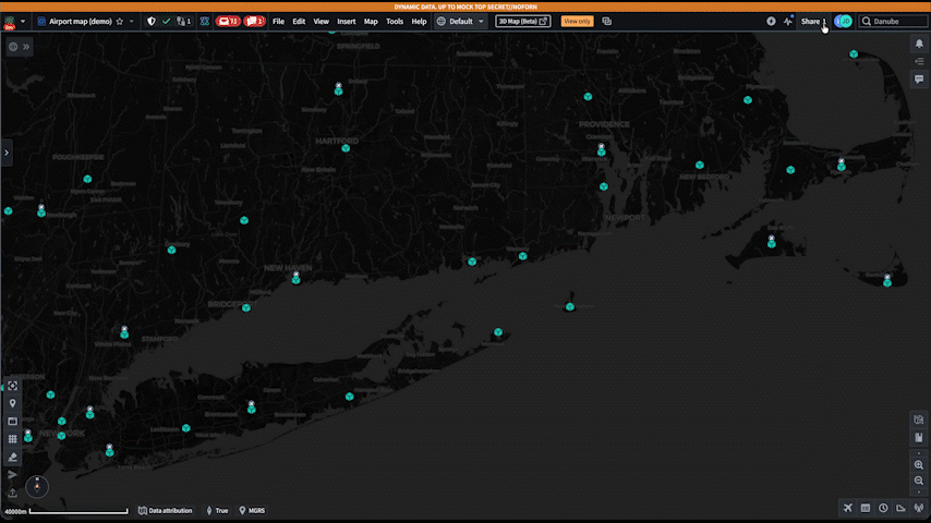
As it turns out, plenty of companies have geospatial data flying around in realtime. It’s often a very compelling way to show how far data is traveling over a network or how a company operates in a wider space than it’s hosted. In the case of Palantir, Gotham lands in the same neighborhood. A huge focus for frontend engineers here is rendering Ontology objects with geospatial properties on an app called Gaia to visualize defense and intelligence operations. Or to put more simply, “render anything and everything”.
Recently, our team has been developing a 3D implementation of Gaia. It’s powered by Zodiac, a library we built using Three.js, along with a set of Foundry-based APIs that generalize rendering. In short, any “object” that exists in a Foundry Ontology with a piece of location data (point, shape, or styles) gets served up in an map rendering API in Gotham.
When I first started at Palantir last year, it was hard to gauge what 3D challenges we would face for our customers. This blog post details some workflows and performance challenges we encountered, and our approach to solving them in a browser accessible to anyone in the DOD. The examples include some over-simplifications for illustrative purposes.
3D Gaia
3D introduces a new dimension for users to experience geospatial data. It allows users to gain a conceptual understanding of spaces as the real world will see it. Rendering objects at altitude, resolving issues with polar distortion, and objects in space all require a visualization of space that a mercator projection can’t provide.
For example, Starlink contributes to hundreds of satellite launches a year. Near misses, orbit projections, and space debris are all things in the bucket of tracking that various Gaia users would need to visualize. Often these 3D workflows require the same tooling as 2D for briefs and visualizations.
Zodiac and Our Big Sphere
The architecture splits cleanly: the backend handles data storage, filtering, and heavier computation, while the frontend focuses on rendering. Our backend sends down simplified geometry and style information — the client doesn’t need to know how the data was computed, just where to draw it and what it should look like.
With that serving layer in place (and skipping over the work to get there), we have a suite of components to place something in a location and see it. We grab generalized renderables from our API and render them on the map across every frame.
These create a building blocks by which we can explore very complex projects. High density sets of lines can be aggregated by grouped geometries, custom colors and styling can change the style of the lines, and visibility can be toggled based on time or other filters without rebuilding geometry.
The EarthLineGroup batches lines by style into single draw calls. 10,000 lines with the same styling become one GPU operation.
Under the hood of Zodiac, objects above are built via classes that implement a ZodiacObject, which abstracts managing the position on the globe with rotation, coordinates, and changes per frame. Using that, object implementation can focus entirely on properties that are relevant to the rendered object like visuals and positioning.
interface ZodiacObject { // Called on initialization of the object into the scene. onAdd(context: ZodiacContext): void;
// Called each frame, to allow for changes on the object. onRender?(context: ZodiacContext): void; }
constructor(points: LatLngHeight[], color: string) { this.geometry = new LineGeometry(); this.material = new LineMaterial({ color }); this.mesh = new Line(this.geometry, this.material);
onAdd(context: ZodiacContext): void { // Add to Earth-fixed scene — stays pinned to geography. context.ecefScene.add(this.mesh); }
onRender(context: ZodiacContext): void { // Update visibility, animate, respond to time changes, etc. } }
Zooming out to Space
High density visualizations of satellite positions push the performance capabilities of graphics on the browser. With tens of thousands of objects circling around the globe, we used an instanced mesh to update objects on and off the map, and recompute the positions of the nearest Satellites the fastest. This instanced mesh exists under a singular Zodiac Object, but renders thousands of satellites (or any object of the same geometry) in the same draw call frame.
// Later code blocks leverage our satellite mesh to "attach" to // the current position and corresponding TLE used on the map. public getPosition(satellite: string, out: Vector3): void { this.mesh.getPositionAt(satellite, out); } }
Positioning work is different in space as well. Earth-bound orbits can be propagated using Two-Line Elements (TLEs), a format dating back to the 1960s that encodes orbital parameters in two 69-character lines. The client handles basic propagation for rendering, but heavier orbital math like collision analysis, long-term predictions, maneuver planning runs server-side on Foundry compute modules.
Lines as an Orbit Path
When you’re looking at objects that have positioning as a function of time, it’s often helpful to see where the object will be in T units of time. For our visualizations, we allow selected satellites to show their positioning around and on the Earth's surface to estimate their pathing. However, this ends up being expensive.
We started off calculating the path for ~2 days on selection, but every frame would cause an entirely new propagation moving forward. This worked for single use cases, but buckled with weaker hardware or multiple selected objects.
Because we're looking at a function of time, most of the propagation can be re-used. With some abstractions, we can share the orbit position across any object that needs it, and calculate new sections as time passes.
The queue slides forward through time. When a point falls off the front, we recalculate it for the next block at the back. With the old approach, our map would need to perform thousands of SGP4 propagations per second. With the queue, we can drop 95% of calculations made for each selected object.
This ends up allowing many more orbit paths to render at once. Seated next to our satellite mesh, we can listen for TLE updates as users scrub through time to ensure we’re using the correctly propagated element.
Lines of Sight
It’s also helpful to show a line of sight between sets of satellites and terrestrial objects. Often satellites work in systems, and visualizing “links” between them is useful. Certain configurations of satellites will only render pairing lines when they don’t have the Earth between them.
With the same Satellite helper objects from before, it is now easier to translate a similar connection line.
class SatelliteConnectionLine extends ZodiacObject { private.geometry: LineGeometry; private material: LineMaterial;
Each frame, we grab the current positions from a shared context and check line of sight. It’s a ray-ellipsoid intersection test: If the ray between two satellites intersects Earth, we hide the line.
Sensor Visualizations, with Angles
The last lines we drew for satellite work involved sensor visualizations. Visualizing satellite capabilities involved a more complex set of lines. We created a 3D polygon that matches the movement of the satellite, and has various specs to match the orientation, sizing, and capabilities. Often more “complex” shapes are an aggregation of multiple primitive shapes. In the case of sensors, we constructed a frame of lines and some opaque planes to show that coverage area.
Since the satellite orbits the earth, our earth swath should match where the sensor could scan across its entire orbit. The correct path for this is an aggregation of the satellites position, earths rotation, aim at the earth, and any properties of sensor rotation. After combining that into a single object, the result was a track more aligned with the sensor “capability” rather than an approximate flyover.
Above is an image I attached to my PR to explain the math behind swath rotation. Often, the fastest workflow for this was brainstorming steps in a notebook, and then passing off the math to an LLM with some tests.
After calculating the max width, building polygons between the raycasted points, and propagating, you’re left with a relatively accurate representation of what a satellite could see. The satellite would then match closer to the path as the timestamps changed.
Visualizations above are based on completely notational sensor specs.
Back on Earth
Gotham as a platform builds many abstractions for common patterns and data shapes. As our 3D library increases in complexity, it needs to pick up APIs that match Foundry data sources and already render in our 2D scenes.
This can involve a suite of temporal and property-based data, but the cost of render changes is heavier due to rendering large sets of lines in parent collections. This led to a few different implementation approaches to ensure our globe felt fast.
Time Filterable Lines
Lines often have temporal data attached. A flight path has departure and arrival times, a ship track has observation windows, and sensor coverage has visibility periods. When users scrub through time, lines need to appear and disappear accordingly.
An initial approach could involve culling and rebuilding the geometry every frame. With thousands of lines at 60fps, the client would have a lot of churn reallocating arrays. Instead, we opted to attach a simple filter function, some time-filterable middleware, and a shader to manage the visibility states more efficiently. For Foundry data that natively has temporal interfaces applied, the client can automatically configure these per line.
// Most commonly a range function coming from Foundry. type TimeFilter = (time: number) => boolean;
const flightPath: TimeFilterableLine = { points: waypoints, isVisibleAt: (time) => departureTime < time && time < arrivalTime, };
The geometry gets built once. When time changes, we evaluate each filter and update visibility without touching the vertex data. The filters can run every frame, but we only touch the GPU buffer when visibility actually changes:
class TimeFilterableLineCollection { private geometry: TimeFilterableGeometry; private material: TimeFilterableMaterial; // Includes opacity shader. private filters: Map<number, TimeFilter> = new Map(); private visibility: Map<number, boolean> = new Map();
// A custom shader reads opacity and discards invisible fragments. const fragmentShader = ` if (opacity < 0.01) discard; // Gone, not rendered gl_FragColor.a *= opacity; `;
When visibility does change, we update a per-segment opacity buffer on the GPU. Each line maps to a range of segments, and we can flip their opacity between 0 and 1:
// The geometry stores an opacity value per line in a GPU buffer. class TimeFilterableGeometry { private opacities: Float32Array;
My favorite iteration cycles across the last year involved exposing APIs to the underlying Gaia map to manipulate the Three.JS objects. We ran across a similar suite of problems with animations. Similar to the lines of sight in space, there are lots of scenarios where users could see different visual variations in their workflow.
In one of our use cases, realtime animations to provide transition states were important for customers keeping a top-level domain awareness of a situation. When managing a high number of units on their map, traditional visualizations using the map became more effective than cards, tables, and toasts.
The API we landed on passes a callback that receives the current time and time since animation start. You return whatever style properties should change:
The callback runs on every frame via an onPrerender hook synced to the 3D render loop. Only material properties update, no geometry rebuilds.
For state-driven animations, the callback can derive its behavior from React state. A line representing a tasking might pulse while awaiting confirmation, then ease to a solid color once confirmed:
This keeps the 3D rendering decoupled from UI state while still letting state changes drive visual transitions. Users can take advantage of color changes, flashing, opacity updates, and directional dash changes. Focusing these animations on the underlying visual change, and allowing the platform to leverage property mapping to states keeps the 3D team focused on the underlying implementation without needing to decipher specific workflows.
Down The Line
Ultimately 3D has many challenges to work through, and we’re always iterating on the APIs to hit the right mix of user-friendliness, integration with the broader platform, and performance. These types of features often require monitoring and multiple passes to get right, which is more fun as we onboard new datasources and workflows from our customers.
Looking forward, we’re excited about Foundry’s support for rendering properties in 3D. Historical visuals of a sensor range in 2D can now land as a volume or point-cloud, and workflows in projected areas like the poles are more readily available. We’ll continue on support across all types of data sources the platform has with the goal of users choosing the most effective visualization for their needs. This could be anywhere from object models on the ground to maps spanning the solar system.
Looking back, I’m considering what education has impacted me the most across my work. Given the geospatial focus work that Palantir has, it’s unsurprising my middle-school geometry class returns the most dividends week to week.
About this Series Frontend engineering at Palantir goes far beyond building standard web apps. Our engineers design interfaces for mission-critical decision-making, build operational applications that translate insight to action, and create systems that handle massive datasets — thinking not just about what the user needs, but what they need when the network is unreliable, the stakes are high, and the margin for error is zero.
This series pulls back the curtain on what that work really looks like: the technical problems we solve, the impact we have, and the approaches we take. Whether you’re just curious or exploring opportunities to join us, these posts offer an authentic look at life on our Frontend teams. Find all Frontend Engineering blog posts here.
In this blog post, a frontend engineer based in CA shares an overview of several frameworks that Palantir apps use to communicate with each other in real-time. Stay tuned for Part 4.
When I graduated college and joined Palantir as a frontend developer, I expected a familiar form of app-building work: design an interface, build it out, iterate with users. When I joined a team called “Application Frameworks,” the work turned out to be slightly different. Instead of developing an individual app, the team focuses on how different apps talk to each other — what my teammates describe as, “the backend of the frontend.” This brings into question whether we were a product team focused on user experience or an infrastructure team maintaining services across applications. The answer to this question required learning how Palantir apps are actually used in the field.
It’s true that for most app teams, UX challenges are limited to the scope of a single application and focused primarily on how its interface and information flow can be optimally designed. But, in practice, this understanding of UX is not a complete picture of how users interact with Palantir software. Many of our users’ most impactful workflows actually involve multiple applications working together simultaneously. My team’s job was building the frameworks that made that communication possible.
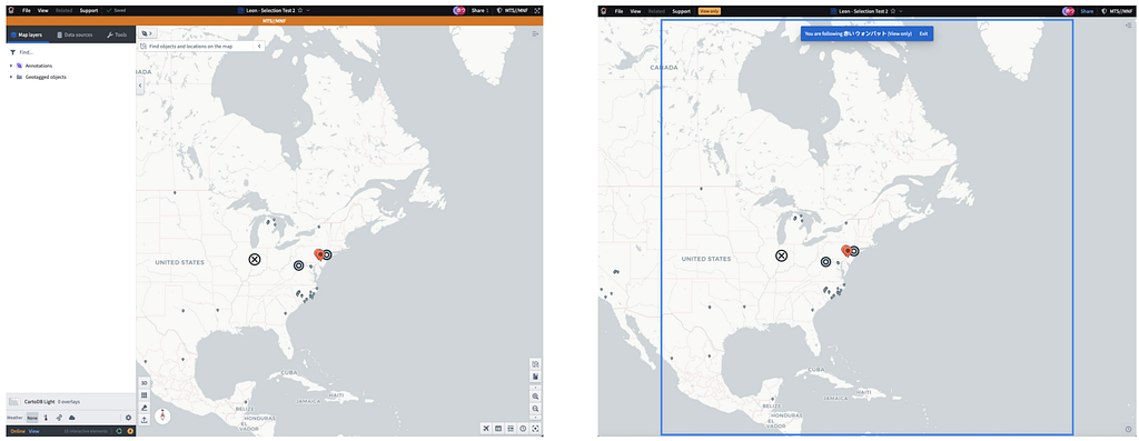
Two such applications frequently used together are Gaia and Workshop. Gaia is a tool that specializes in geospatial data, allowing users to visualize and interact with data on maps. Workshop is quite different — it’s a WYSIWYG editor for building specialized, interactive data interfaces. Workshop allows users to explore data, understand their decisions, and trigger actions with custom-built buttons.
These applications are useful on their own, but they become even more effective when paired together. Now, users can interact with map-based data in Gaia while simultaneously accessing tailored interfaces in Workshop built for their exact workflow. When used this way, although each app has its own UX, the true frontend experience that users care about is one that connects both interfaces seamlessly across both apps.
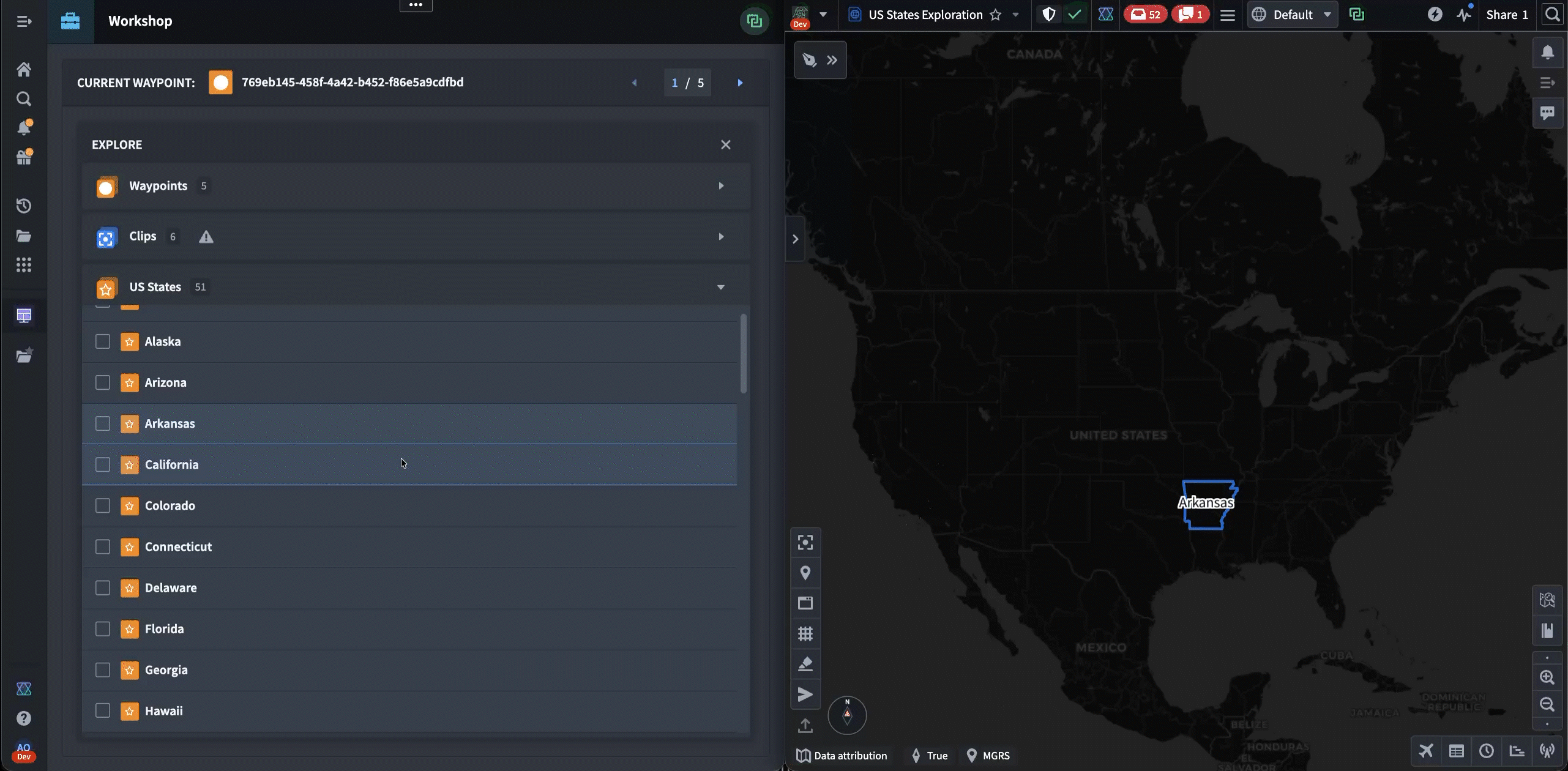
The following is a notional example of a user workflow that involves selecting a US state from Workshop (on the left) and exploring it inside of Gaia (on the right). Our users frequently work in side-by-side layouts that allow them to work with two apps simultaneously.
Typically, this multi-application workflow would be handled by relying heavily on backend services. However, because Palantir’s products are often deployed in denied, disrupted, intermittent, or limited (DDIL) connectivity environments, there are no guarantees about the latency of reaching backend services. To solve for this, we’ve had to build these cross-application frameworks using frontend-only browser APIs, thereby eliminating the risk of disruption from unstable network conditions.
The First Prototype
Cross-app interactivity at Palantir pre-dates our git history. From the early days of our Java Swing workspace, customers have needed to share data between our applications. The first iteration of this was accomplished using Drag-and-Drop.
In the past couple of years, there has been increased user demand for more complicated types of app interactions. Seeing this need, one Palantirian designed a system for communication between Gaia and Workshop called “Gaia Controller.” This took form as a Workshop widget — a plug-in that extends Workshop’s functionality.
To use Gaia Controller, the builder first has to configure it to target a specific map. Then, when the workshop is published and viewed, the controller locates the specific map by listening for messages sent through a browser BroadcastChannel, which is an API that allows different tabs to communicate. When the map is opened, the controller establishes a link, and the user is able to interact with various buttons in the workshop that update the state of the map.
Although the widget was a proof-of-concept, it grew in popularity among different users and deployments that wanted more seamless cross-app UX. However, this approach was limiting: since all code lived in Workshop, it was impossible to extend its capability to work with other apps and workflows.
Our team was tasked with finding a way to recreate the logic of Gaia Controller as a first-class Palantir framework.
Building Cross-App Communication APIs
To achieve this, the team isolated two separate behaviors implemented by Gaia Controller, and made a framework for each of them.
The first behavior was sharing state between multiple tabs. Gaia Controller let Workshop builders define variables tied to a map’s state and sync changes between the two automatically. To codify this, we developed a framework called “Shared State.” Shared State enables any application to define a data model and name for a piece of state. It then provides an API for receiving and sending updates to that state. State is organized by Media Type, giving any app access to the data it needs via the corresponding Media Type string.
The second behavior was triggering one-off imperative actions. Gaia Controller allowed users to create buttons that instantly changed the map viewport, such as with the “Zoom to” buttons in the demo above. When generalizing this, we created a framework called “Commands” that allows any application to expose arbitrary logic as an API that can be invoked by other applications. To invoke this API, an application provides a command ID and a request object, and Commands transmits the invocation and returns the response.
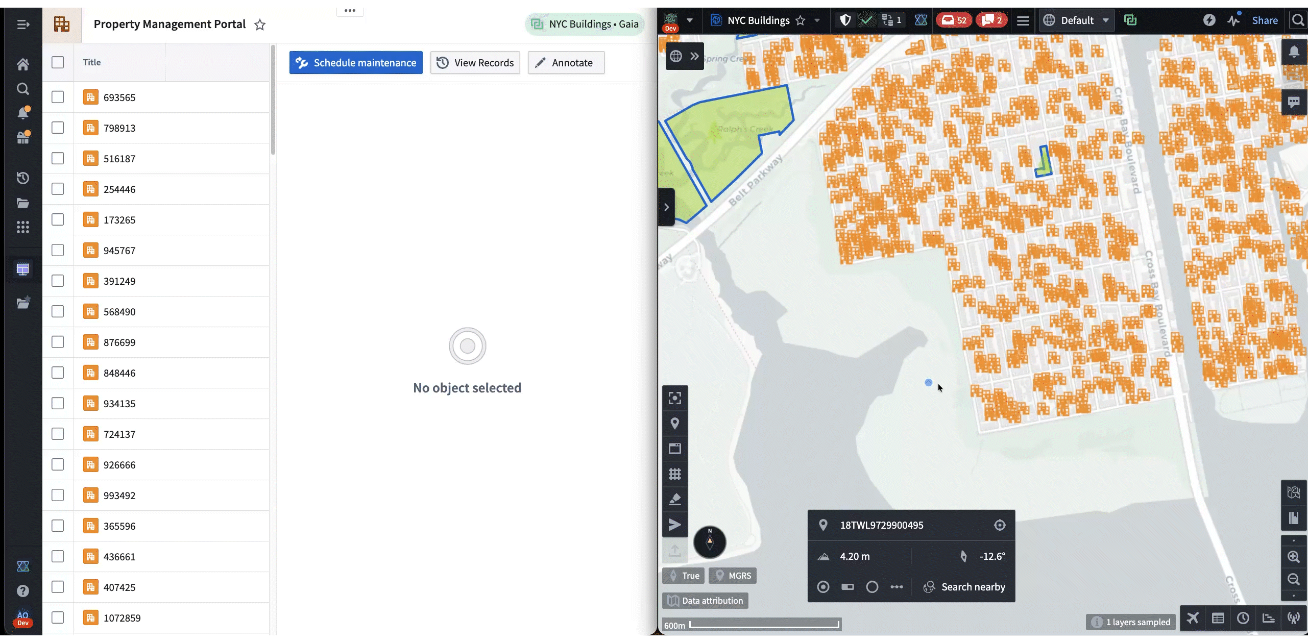
The following is a demo that showcases both frameworks in action. First, Shared State is used to synchronize the selected NYC building from Gaia to Workshop. Then, the “Draw Circle” command is used to trigger a Gaia annotation workflow from Workshop.
Both frameworks are being rapidly adopted across Palantir. A common configuration is a Workshop dashboard paired side-by-side with a different app, but new workflows are emerging, such as apps interacting with existing AIP agents.
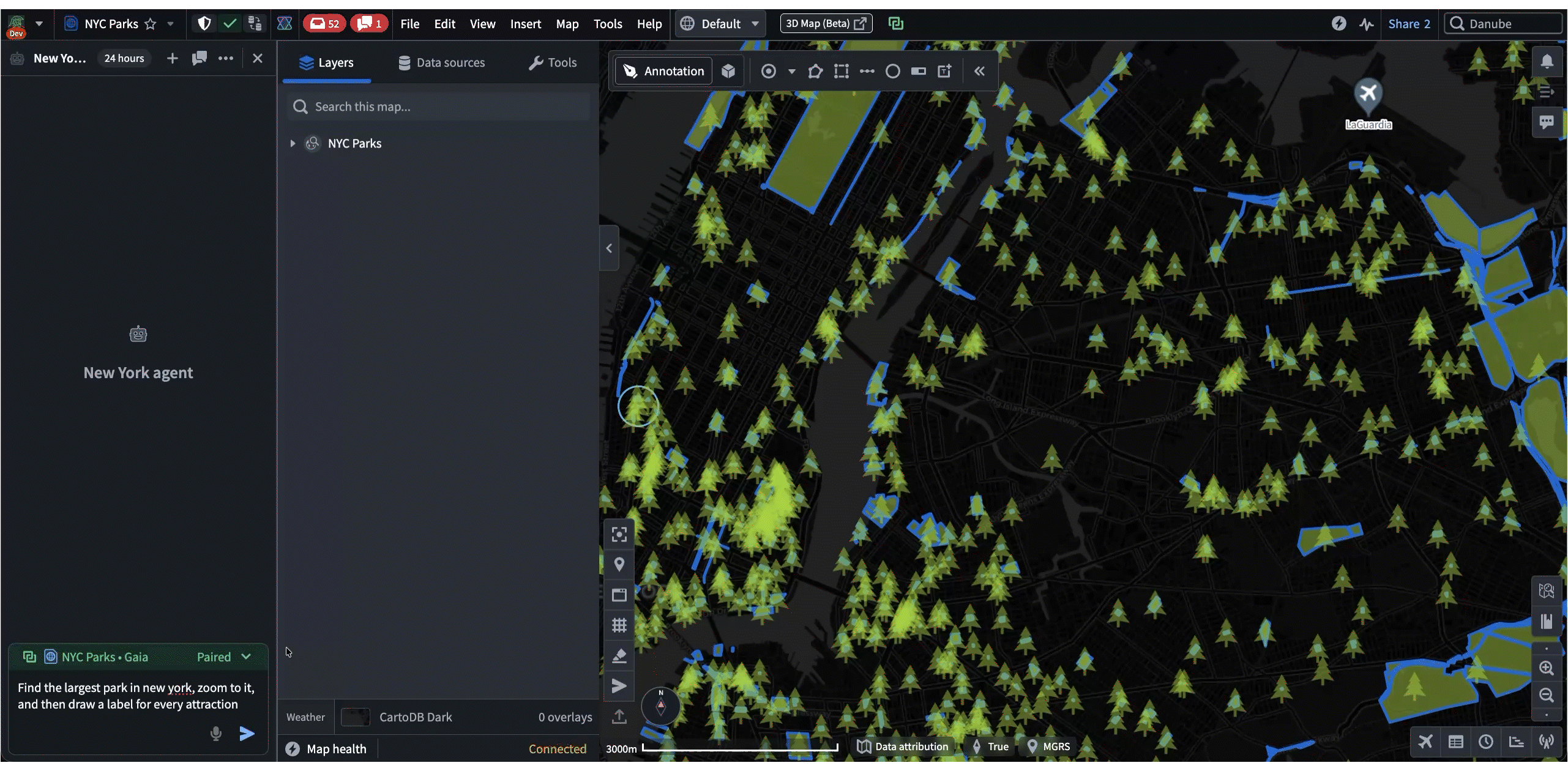
In these cases, the agent uses Commands and Shared State as “tools” when responding to a prompt. These tools enable agents to lead the user by modifying applications on their machine while allowing user contribution throughout. Most importantly, all of these interactions happen client-side, which makes it a highly effective workflow for austere environments where backend latency is unreliable. For example, in the following demo, an agent helps the user navigate and annotate a map of New York, all based on a single prompt:
Frontend at Palantir is ever-evolving. It spans from traditional single-app focused teams to “backend of the frontend” teams like mine. If you embrace difficult frontend challenges, come join us. Check out our open roles today: https://www.palantir.com/careers/open-positions/
Read more about Cross Application Interactivity and Commands in our Palantir docs:
The Embedded Ontology lets you build powerful enterprise applications for teams that operate at the edge. Run the full, context-rich Ontology locally on the device. The power of Palantir, at the point of action.
Traditional enterprise platforms are powerful. They aggregate data, enforce governance, orchestrate workflows, and provide a single pane of glass for an organization to run their business. But that glass is mounted in a climate-controlled office, connected to reliable Wi-Fi, and viewed on a large monitor.
Now ride along with a field service technician. They’re driving between sites, inspecting equipment in mechanical rooms with no cell signal, documenting findings on a tablet while standing next to a roaring HVAC unit, among myriad other tasks. The reality at the edge is fundamentally different: connectivity is intermittent at best, latency is the enemy, and the person holding the device needs to make decisions right now, not after a loading spinner resolves.
Traditional mobile architectures — the ones solely built on REST calls and API-first patterns — break down in these environments. Every user action becomes a network request. Every network request becomes a potential failure. Every failure becomes a degraded experience, a workaround, or worse, a missed decision. You can bolt on caching layers and retry queues, but you’re still building on an assumption that the server is reachable. When it isn’t, the app is a shell.
The Embedded Ontology flips this model entirely. Instead of treating the mobile device as a thin client that peers into a remote platform, the Embedded Ontology treats the device as a node in a distributed data system. A scoped, context-rich projection of your Ontology lives on the device itself, complete with the object types, relationships, and actions that the user actually needs. Reads are local. Writes are local. Sync happens when connectivity allows, and conflict resolution is handled automatically on reconnect.
In this post, we’ll quickly walk through the architecture behind the Embedded Ontology, the mental model that makes it work, and the practical steps to build a Progressive Web App (PWA) powered by OSDK that operates seamlessly whether the device is connected or not. We’ll ground it in a simple working example, a field service technician application — but the pattern applies at the edges of any operational organization: warehouses, vehicles, remote sites, and beyond.
Local & Global Context Through the Ontology
Data is only useful in context. A scanned equipment tag is just a string. But a scanned tag matched against a local asset registry, validated against today’s work orders, and logged as an inspection event tied to a specific site and service contract… that’s actionable intelligence.
The difference between the two is context, and context requires data from multiple sources at multiple scopes. This is the core design principle behind the Embedded Ontology: local data drives real-time decisions; global data provides the operational picture. From a logical perspective, think of the data on a device as existing in two layers:
Local objects are the device’s working set. They’re created, updated, and queried with millisecond latency, fully independent of connectivity. When a technician logs an inspection finding, the write happens against the local store. No round trip, no spinner, no degraded fallback.
Global context objects are the organizational backdrop. They don’t change frequently, and the device doesn’t write to them, but they’re essential for making local actions meaningful. An AssetRegistry tells the technician what equipment is at this site. A WorkOrder tells them what they're here to do. A ServiceContract tells them what's covered.
Sync when connected; operate autonomously when not.
The sync model is straightforward:
On first connection, the device bootstraps its local store, pulling down the scoped set of objects it needs.
While connected, changes sync bidirectionally in the background.
When disconnected, the device continues operating normally. Read operations hit the local store. Write operations (actions, mutations) are captured locally as intents.
On reconnect, queued writes are reconciled upstream. Conflict resolution & state reconciliation occurs automatically.
The critical insight is that step 3 is not a degraded mode. The app doesn’t show a banner that says “You’re offline, some features may be unavailable.” The app just works. The technician may not even know whether they’re connected or not, and that’s the point. Resiliency is the baseline assumption, not a feature.
Concepts: The Embedded Ontology
Before we build, let’s establish the mental model. If you’re new to Palantir’s ecosystem, the Ontology is the semantic system that brings together data, logic, action, and security primitives. It defines:
Object Types: the nouns in your domain (Asset, Technician, WorkOrder, InspectionEvent)
Properties: attributes of those objects (assetId, status, scheduledDate, severity)
Link Types: relationships between objects (InspectionEvent → Asset, WorkOrder → Site)
Actions: the verbs that mutate state (logInspection, flagDefect, completeWorkOrder)
In a typical Foundry deployment, the Ontology runs within the AIP + Foundry service mesh and is queried by a given client. Your application calls the Ontology API, gets back objects, and renders them. This works well when you have reliable connectivity and can tolerate network latency. The Embedded Ontology takes a different approach: instead of querying the Ontology remotely, you define a scoped projection, a subset of the full ontology that is materialized on the device itself.
This projection includes:
An object set: only the object types and instances that this device, user, or role actually requires to operate. A field technician’s tablet doesn’t need the procurement team’s vendor objects.
Local actions and mutations: write intents that are captured and executed locally, then reconciled upstream when connectivity is available.
How This Differs from Caching
You might be thinking: “This sounds like a cache with extra steps.” It’s not, and the distinction matters.
A cache is a performance optimization. The Embedded Ontology is a distributed data architecture. The device has its own local store, its own query engine, and its own action execution layer. It participates in the broader Ontology through sync, and when useful real-time API calls.
Basic Setup & Development
Let’s build. We’ll walk through the full setup: application setup in Developer Console, scaffolding the PWA, configuring the Embedded Ontology, and implementing the application. We’ll use the scenario where a technician drives to customer sites to inspect, maintain, and repair equipment. They work in environments where connectivity is unreliable. The app needs to surface today’s work orders, let them look up asset details, log inspection findings, flag defects, and sync everything back when they’re on the road or back at the office.
Prerequisites
A Foundry environment with Developer Console access
An ontology with the object types (e.g., WorkOrder) you want to sync locally (or the willingness to create them)
Node.js and npm installed locally (or use Code Workspaces in Foundry)
Step 1: Create Your Application
In Developer Console, create a new Client-facing application:
Select your Ontology and the object types your app needs
Generate your TypeScript SDK, which gives you typed bindings for your object types and actions
Configure website hosting with a subdomain (you’ll need this for deployment)
The Vite plugin configured for WebAssembly support
Example sync patterns ready to customize
Step 3: Configure Which Objects Sync Locally
This is where you define yourobject set, the scoped projection of the Ontology (i.e., specific Embedded Ontology) that lives on the device. Open src/client.ts and specify your sync targets:
import { createClient } from "@palantir/lohi-ts"; import { InspectionEvent, ServiceNote, DefectReport, WorkOrder, AssetRegistry, ServiceContract, SiteLayout, } from "@your-app/sdk";
const client = createClient( import.meta.env.VITE_FOUNDRY_URL, import.meta.env.VITE_ONTOLOGY_RID, tokenProvider, "field-service-ontology", [ // Reference data — snapshot sync all AssetRegistry, ServiceContract, SiteLayout,
// Filtered snapshot — only open work orders { objectType: WorkOrder, objectSet: (c) => c(WorkOrder).where({ status: "Open" }), },
if (syncError) return <div className="sync-error">{syncError}</div>; if (!ready) return <div className="sync-loading">Syncing field service data...</div>;
return <FieldServiceWorkflow />; }
Here’s what’s happening:
client.syncState() checks whether the local store has been bootstrapped. On first launch, it hasn't.
client.sync() pulls down the configured object types and populates the local store. This is the initial "hydration" of the Embedded Ontology on the device.
Once ready is true, all subsequent reads and writes hit the local store. Queries execute with millisecond latency. Actions are captured locally. The device is fully autonomous.
Background sync handles ongoing reconciliation, pushing local writes upstream and pulling down updates, whenever connectivity is available.
Step 5: Build the Offline Workflow
With the Embedded Ontology bootstrapped, your application code looks identical whether the device is online or offline. Here’s a greatly simplified inspection workflow:
import { InspectionEvent, LogInspection, AssetRegistry, WorkOrder } from "@your-app/sdk"; import type { Client } from "@palantir/lohi-ts";
async function handleInspection( assetTag: string, workOrderId: string, client: Client ) { // 1. Look up the asset from the local registry (millisecond latency) const asset = await client(AssetRegistry) .where({ assetTag }) .fetchOne();
if (!asset) { return { status: "UNKNOWN_ASSET" as const, assetTag }; }
// 2. Validate against today's work order const workOrder = await client(WorkOrder) .where({ workOrderId }) .fetchOne();
// 4. Return result to the UI immediately return { status: "OK" as const, asset, workOrder }; }
Notice what’s not here: no network checks, no try/catch around API calls, no fallback logic for offline mode. The code doesn’t know or care about connectivity. It queries the local ontology, executes a local action, and returns. The sync layer handles the rest.
Step 6: Deploy and Install as a PWA
Tag a release in your repository to trigger deployment either through the UI or by running a few git commands. For example:
git tag 1.0.0
git push origin 1.0.0 - tags
Foundry’s CI builds your application and deploys it to your configured subdomain. Users can then install the PWA directly from their browser:
Desktop: Look for the install icon in the address bar
Mobile: Use “Add to Home Screen” from the browser menu
Once installed, the app launches like a native application, full-screen, with its own icon, and fully functional offline using the Embedded Ontology.
Wrapping Up
The Embedded Ontology represents a fundamental shift in how we think about enterprise applications at the edge. The device isn’t a window into the platform. It is the platform at the point of action.
When a technician inspects equipment in a basement with no signal, they shouldn’t be waiting on a server. When they’re documenting a defect on a rooftop, they shouldn’t be scribbling on paper to enter later. When they’re reviewing an asset’s service history between sites, the lookup shouldn’t depend on a cell signal.
Resilience, speed, and contextual intelligence belong at the edge, and the Embedded Ontology makes this practical, not theoretical. The same typed Ontology that powers dashboards and workflows in Foundry now runs locally on the device, with the same object types, the same actions, and the same relationships. The developer experience is nearly identical. The user experience is dramatically better than conventional approaches.
And this is just the beginning. The trajectory points toward smarter sync (adaptive policies based on connectivity patterns and data priority), AI-augmented local actions (on-device models that leverage the local ontology for context-aware decisions), and mesh ontologies (devices that sync not just with the platform, but with each other). Moving beyond PWAs, the embedded ontology can be augmented with time-series, relational, and object storage, along with local LLM and vector search capabilities for AI workloads. Data flows from ingestion to ontology and ultimately to ROI-generating applications and services are possible.
The edge is getting smarter, and the Ontology is the engine.
Editor’s Note: This is the second in a series of posts about the Embedded Ontology. See the first post here.
To get started with the Embedded Ontology, visit the Foundry documentation or explore the Embedded Ontology React template in the Developer Console.
How we built lightweight, real-time map collaboration for teams operating at the edge.About This Series
Frontend engineering at Palantir goes far beyond building standard web apps. Our engineers design interfaces for mission-critical decision-making, build operational applications that translate insight to action, and create systems that handle massive datasets — thinking not just about what the user needs, but what they need when the network is unreliable, the stakes are high, and the margin for error is zero.
This series pulls back the curtain on what that work really looks like: the technical problems we solve, the impact we have, and the approaches we take. Whether you’re just curious or exploring opportunities to join us, these posts offer an authentic look at life on our Frontend teams. Find all Frontend Engineering blog posts here.
In this blog post, Leon, a Full Stack engineer based in NY, shares how building Gaia’s Follow Along mode — his first frontend project at Palantir — shifted his perspective on frontend engineering, while diving into the unique challenges of enabling real-time collaboration at scale.
Before joining Palantir, I thought frontend engineering was mostly about adding pixels, pushing them around, and making things look nice. While that’s certainly a component of frontend development, it’s nowhere close to the complete picture of what frontend engineering looks like here. At Palantir, frontend engineers are deeply involved in solving complex, novel problems that demand creativity, technical rigor, and close collaboration across teams.
My perspective didn’t change overnight — it changed through first-hand experience. Gaia Follow Along Mode was one of my first projects at Palantir, and it perfectly captured just how different frontend engineering is here.
Gaia Follow Along Mode
Palantir Gotham is Palantir’s platform for integrating, analyzing, and operationalizing complex data in mission-critical defense and intelligence environments. Used by American and allied forces worldwide, Gotham enables teams to collaborate seamlessly, share situational awareness, and make informed decisions — even in challenging operational contexts.
At the heart of Gotham’s geospatial capabilities is Gaia, our collaborative map application. Gaia enables teams to analyze and share geospatial data in real time, providing a common operating picture across distributed environments. The Follow Along feature in Gaia allows users to “follow” another user’s actions — tracking their cursor, zooming, panning, and selection activity as it happens.
This feature is particularly valuable in defense and other mission-critical environments, where teams are often distributed across remote bases and must operate under severe bandwidth constraints and high network latency. Traditional screen sharing is often impractical or even impossible in these settings; even when video teleconferencing is available, the resulting screen shares are low resolution or laggy. Operational users need a lightweight, reliable way to share situational context — one that doesn’t consume precious bandwidth, is resilient to latency, and doesn’t require high-end connectivity.
Follow Along is a feature that addresses the shortcomings of traditional screen sharing by transmitting only essential state (such as map position, cursor location, and other select information), and sending updates only as changes occur, rather than continuously streaming every frame of the screen. This approach enables real-time collaboration without the heavy network load of true screen sharing.
On the surface, it might look like a simple feature, but building it required thoughtful engineering across multiple dimensions:
Real-time collaboration: Developing a real-time collaborative feature introduced several unique challenges.
Shared state: We needed to reliably synchronize user actions across multiple clients, ensuring that every interaction was reflected almost instantly for all participants. To achieve this, Follow Along leverages an internal shared-state streaming framework, along with libraries such as Redux, to track and update specific map and selection properties in real time. Each client subscribes to updates for the relevant artifact, and only users with the appropriate permissions can participate.
Ordered updates: To guarantee consistency, we introduced a monotonically increasing update index for cursor events, ensuring updates are processed in order and preventing jumpy or inconsistent cursor movement for followers.
Follower chaining and control: We had to handle follower chaining and prevent circular follows (where users could end up following each other in a loop), and ensure seamless hand-offs when a follower wanted to take control.
Disconnection handling: We had to gracefully handle disconnections. For example, if the leader disconnected, the Follow Along session would automatically end for all followers. However, to account for poor network connectivity and intermittent disconnections, we implemented a timeout that waits 15 seconds after the leader disconnects before ending the session for the follower.
Performance: Our users are often deployed in austere environments, where bandwidth is low, latency is high, and compute and hardware resources are limited. To maintain a smooth and responsive experience, we made careful optimizations to minimize resource usage and maximize reliability.
Selective data streaming: Given the restrictive network bandwidth, we had to carefully scrutinize the data included in our updates. While our maps can support large-scale data, we intentionally designed the API to transmit only essential, lightweight information — such as user info, viewport, cursor location, and selection state — across the network.
Event throttling: We were selective not only about what data we sent, but also how frequently we sent it. For example, we processed only every third cursor event, reducing update frequency by two-thirds. This optimization helped maintain smooth cursor movement and minimized frequent re-renders that could degrade performance on devices with limited hardware, while also reducing the impact of network latency on the user experience.
Selective state synchronization: Updates are only stored and synced across clients when a user is actively being followed, to prevent unnecessary work and synchronization overhead — especially important in low-bandwidth environments.
Domains: Building for maps presented unique challenges that required domain-specific solutions.
Consistent cursor positioning: For example, we can’t rely on pixel coordinates to share cursor location because clients may have different screen sizes and aspect ratios. Instead, we use geo-coordinates (latitude and longitude) as the source of truth for the cursor position to ensure everyone saw the cursor in the correct location.
Contextual UI hiding: When in Follow Along mode, many map controls and accessory side panels are hidden for the follower. These are disabled to avoid distraction and to prevent accidental interaction by followers.
Viewport synchronization: We had to ensure that each follower was able to see the entire viewport of the leader. The leader’s viewport of the map can vary based on various factors, such as open panels, screen size, and aspect ratios. To achieve this, we introduced a bounding box that tracks the top-left and bottom-right geo-coordinates visible on the leader’s screen. For each follower, we would then scale and center their viewport to fit this bounding box, ensuring that the entire area visible to the leader was also visible to every follower, regardless of differences in device or screen size.
Example of viewport synchronization: the blue box on the right represents the leader’s visible map area. Both the leader’s (left) and follower’s (right) views are centered on the same geo-coordinate. Even though the follower’s visible view of the map differs from the leader, the follower’s viewport is scaled and adjusted to ensure the entire area visible to the leader is also visible to the follower.
In short, doing this kind of work meant building a deep understanding of both the tech stack — from React and Redux to internal frameworks for distributed state management — and domain-specific areas like geospatial rendering and real-time data streaming.
It also required developing a strong empathy for user pain points and the reality of how and where our products are used. We worked closely with designers and product managers to ensure the features built truly addressed real-world collaboration challenges.
An Unexpected Success Story
We built Gaia Follow Along mode as a bit of a bet — it wasn’t a feature users explicitly requested, instead, we engineered a solution based on the real pain points and feedback from operational users in the field. Initially, we enabled it at the request of a single user during a recent military exercise — almost as an experiment. To our surprise, it quickly became the #1 “tech win” of the event. Users found it incredibly impactful for secure, real-time collaboration on maps, and adoption spread rapidly as more teams discovered its value. The overwhelmingly positive feedback prompted us to share it across the company, and soon, other teams began to request demos and training.
Since then, Gaia Follow Along has evolved significantly, shaped by continuous user feedback from the field. We’ve added features like seamless hand-offs, allowing presenters to transfer their followers to another user, and customization options such as hiding usernames alongside the shared cursor. In subsequent projects, we made further optimizations. For example, some critical state is now passively streamed before a user starts following, ensuring that followers are immediately up-to-date when they join. Other state is only streamed once clients begin following, further reducing unnecessary data transmission. We have also scaled the system to support hundreds of concurrent users following the same leader, enabling large teams to collaborate in real time without sacrificing performance or reliability. Each new iteration was driven by feedback from people actually using the tool in high-stakes, collaborative environments. Each iteration required thoughtful engineering to meet evolving needs.
Example of a mock from a subsequent project to improve leader-follower hand-off and follow interactions. A great level of detail goes into each change and each small part of an overall feature.
Even though I no longer work directly on this feature, seeing it win the hearts of users and continue to evolve remains incredibly rewarding. It’s a testament to how frontend engineering at Palantir isn’t just about building user interfaces — it’s about delivering transformative experiences that truly matter to our users.
Gaia Follow Along mode is just one small glimpse into the vast landscape of frontend projects happening at scale across the company. If you’re passionate about building innovative and complex solutions from the ground up — solutions that have real-world impact — you’ll find no shortage of fascinating problems to tackle here at Palantir.
On building geospatial tools precise enough for polar operations and missile defense ranges.
About This Series Frontend engineering at Palantir goes far beyond building standard web apps. Our engineers design interfaces for mission-critical decision-making, build operational applications that translate insight to action, and create systems that handle massive datasets — thinking not just about what the user needs, but what they need when the network is unreliable, the stakes are high, and the margin for error is zero.
This series pulls back the curtain on what that work really looks like: the technical problems we solve, the impact we have, and the approaches we take. Whether you’re just curious or exploring opportunities to join us, these posts offer an authentic look at life on our Frontend teams. Find all Frontend Engineering blog posts here.
In this blog post, Nikita, a Frontend engineer based in DC, shares how rendering accurate circles on maps led him through map projections, spherical trigonometry, and the surprising complexity of visualizing ranges in polar regions.
A few months ago, a customer asked us to visualize the strike range of naval vessels operating in polar regions. Simple enough, right? Draw some circles on a map. Except when we tried the obvious approach, the circles looked like ellipses, cut off at weird angles, and sometimes wrapped around the world entirely. What should have been a simple feature turned into one of the more interesting frontend problems I’ve worked on at Palantir as a Frontend Engineer.
Why Circles Matter
Before we dive into the technical challenge, it’s worth understanding why this matters. At Palantir, we build software for people working on critical defense and intelligence problems with Palantir Gotham, our platform for integrating, analyzing and operationalizing the complex data their missions depend on. When these teams visualize geospatial data, accuracy is essential.
A circle on a map might represent:
The range of a missile defense system.
The coverage area of a cell tower network.
The blast radius of an explosive threat.
The operational range of a naval vessel.
If these visualizations are wrong, decisions get made with incorrect information. That’s not acceptable.
Map Visuals
In many development contexts, we leverage MapLibre, an open-source mapping library, to visualize geospatial data. To draw shapes — lines, polygons, points — we feed MapLibre geometries in GeoJSON format.
GeoJSON is perfect for web applications: it’s just JSON, so it works natively in JavaScript without conversion. It’s human-readable, lightweight, and the de facto standard for web mapping. MapLibre’s APIs are built around it. But the catch is, GeoJSON spec doesn’t include circles. The spec supports LineStrings, Polygons, Points, and various collections of these — but no circles.
This isn’t an oversight. Unlike polygons, which are defined purely by their coordinate vertices, circles require a radius — and that means choosing a unit. Should the radius be in meters? Miles? Degrees of latitude? Each choice leads to different results, and GeoJSON deliberately avoids encoding these kinds of measurement decisions into its geometry types. The spec sticks to coordinate-based shapes that work universally, leaving distance calculations and units to the application layer.
But there’s a deeper problem with circles on web maps, one that only becomes apparent when you try to implement them: map projections fundamentally distort what a “circle” even means.
Let’s Try Implementing
The naive solution is obvious: a circle is just a polygon with lots of points. Sample points around the circumference, connect them, and you’ve got yourself a circle.
Perfect! Well, almost — a sharp eye can see the individual sampled points and the straight lines connecting them. We can increase the sample rate to combat that. But for most purposes, this works great. Now let’s try the same technique with a radius of a few thousand miles.
Wait, what happened? The resulting shape looks like an ellipse on the flat map. But when we render the same points on a 3D globe, they form a perfect circle. This is where things get interesting. It is time we talk about map projections.
Map Projections
In cartography, a map projection attempts to represent the curved surface of a globe on a two-dimensional plane of a map. Here’s the fundamental issue: you cannot flatten a sphere onto a plane without distortion. All projections of a sphere on a plane necessarily distort the surface in some way. Every map you’ve ever seen is a compromise. All projections distort something — area, shape, distance, or direction.
Different projections make different trade-offs: Lambert Conformal Conic preserves angles for aeronautical charts but distorts areas; Albers Equal Area preserves area for thematic maps but warps shapes; Robinson splits the difference aesthetically but sacrifices accuracy entirely.
The most common projection is the Mercator projection. It’s the projection used by Google Maps, most GPS systems and many classroom maps. The Mercator projection became the dominant world map after its creation in 1569, because it’s exceptionally useful for navigation — any straight line on the map represents a constant compass bearing, making it simple for sailors to plot and follow courses. This practical advantage meant it remained the standard for centuries. As with other projections, the Mercator projection also distorts the true layout of Earth’s surface. It exaggerates areas far from the equator; the closer to Earth’s poles, the greater the distortion. One common example is that Greenland and Africa appear to be the same size, when in reality Africa is actually 14 times the size of Greenland.
There’s also an online tool that lets you see the real sizes of different countries: https://thetruesize.com/
Today, most online mapping services (including MapLibre) use Web Mercator, a modern variant optimized for digital maps. It’s computationally efficient and preserves local shapes well, which is why your neighborhood looks correct on Google Maps. But it still massively distorts areas near the poles. This is exactly the reason why our circle looks like an ellipse. At large scales, the projection’s distortion warps the visualization. The circle is correct on the sphere of Earth, but looks distorted on the flat map we’re rendering.
We’re Going to the Poles
This gets even worse for our Arctic naval operations customers. Some of their circles need to cross the North Pole itself. Let’s try to use our strategy of sampling and connecting points on the circumference to build a circle that includes the North pole (let’s also color the circle for visibility):
Oh no. The North Pole isn’t included in the resulting shape, the top is cut off, and the circle is repeating itself on the left and right edges of the map. Here’s what’s happening: the leftmost and rightmost points of our sampled circle shouldn’t be connected directly, rather they need to wrap around the world and connect with the copies of the circle on the copies of the map. This means that a circle crossing the North Pole in Mercator projection isn’t a closed polygon at all. It’s a sinusoidal line that wraps around the world. Let’s fix the geometries and see the result:
To verify that our approach is correct, let’s also visualize the same points on the globe.
Much better! The colored area now correctly represents the region within the circle’s radius, even though it looks nothing like a circle on the flat projection.
Exploring the Implementation
The real implementation is more complex than the high-level solution I described above. Let’s break it down into the key pieces: sampling points around the circumference, creating the circle outline and generating the colored fill.
Sampling Points Around the Circumference
First, we need a way to find a point given a center of a circle, radius, and bearing. This involves some spherical trigonometry (using haversine formula) that I will spare you the details of, but you can use open-source solutions like Turf.js’s destination function:
/**
 * Get the destination point from a given point, distance, and bearing.
 * Uses the haversine formula for calculations on a sphere.
 */
function destination(point, distance, bearing) {
  // Spherical trigonometry math goes here
}
Now, getting points around the circumference is straightforward: split 360 degrees into numPoints equal angles, and calculate the destination point at each bearing:
function getSampledCirclePoints(center, radius, numPoints) {
  const coordinates = [];

  for (let i = 0; i < numPoints; i++) {
    // It is -360 because we go in counterclockwise order
    // as per geojson polygon spec!
    const bearing = (i * -360) / numPoints;
    coordinates.push(
      destination(center, radius, bearing)
    );
  }

  return coordinates;
}
Handling the Circle Outline
Remember how circles crossing the poles aren’t closed polygons, but rather sinusoidal lines? This means we need to use GeoJSON’s LineString type instead of Polygon for the outline. The tricky part is finding the two coordinates that cut off the circle. This is when the line should cross the antimeridian (the International Date Line at 180 degrees longitude, which divides the planet into Eastern and Western hemispheres) instead. Here's the core logic:
function createPolarAwareCircleOutline(sampledPoints) { const lineCoordinates = [sampledPoints[0]];
for (let i = 1; i < sampledPoints.length; i++) { const point = sampledPoints[i]; const prevPoint = sampledPoints[i - 1];
if (shouldCrossAntimeridian(point.lon, prevPoint.lon)) { // Adjust longitude to render on the next world copy const adjustedLon = point.lon + (point.lon < 0 ? 360 : -360); lineCoordinates.push([adjustedLon, point.lat]); } else { lineCoordinates.push([point.lon, point.lat]); } }
// If 2 points are more than half the world apart, we should cross the antimeridian!
function shouldCrossAntimeridian(lon1, lon2) {
  return Math.abs(lon1 - lon2) > 180;
}
The clever trick here is that MapLibre allows longitudes beyond the standard -180 to 180 degrees range. For example, a longitude of 200 degrees tells MapLibre to render the point on the next world copy to the east. This is how we make the circle wrap around correctly.
Handling the Colored Fill
The colored fill is trickier because it must be a closed polygon. If the circle includes a pole, we need to explicitly extend the polygon to that pole to ensure the fill covers the entire area. Depending on the way you sample the points, it will always be points at the same indexes which cross antimeridian. I will abstract finding these points in pseudocode because we also covered it above. Here’s how we handle pole-crossing circles:
function createPolarAwareCircleFill(sampledPoints) {
  let coordinates = [...sampledPoints];

  if (includesNorthPole) {
    // Get the point that should be across antimeridian
    const point = ...

    coordinates = [
      ...coordinates.slice(0, point_index),
      // Extend the polygon to the north pole
      [point.lon + 360, point.lat],
      [point.lon, 90],
      [point.lon + 360, 90],
      ...coordinates.slice(point_index),
    ];
  }

  if (includesSouthPole) {
    // Get the point that should be across antimeridian
    const point = ...

    coordinates = [
      ...coordinates.slice(0, point_index),
      // Extend the polygon to the north pole
      [point.lon, -90],
      [point.lon + 360, -90],
      [point.lon + 360, point.lat],
      ...coordinates.slice(point_index),
    ];
  }

  return {
    type: "Polygon",
    coordinates
  };
}
This gives us properly rendered circles at any latitude, any radius, even when they cross a pole or even multiple poles!
Why This Matters
What made this project particularly rewarding wasn’t just solving an interesting geometry problem — it was understanding the real-world stakes behind it. Our customers need accuracy at both the meter and the thousand-mile scale. They need it to work at the equator and around the poles. Understanding these requirements pushed me to solve the complete version of this problem, not just the simple “draw a circle on a map” version.
When we shipped this feature, analysts could finally visualize accurate threat ranges and operational areas in polar regions. They could overlay multiple circles, see intersections, and make confident assessments about coverage and vulnerability. This kind of precision matters when you’re supporting missions where getting things wrong isn’t an option.
Editor’s Note: This is the third post in the Palantir Foundations series exploring how we customize infrastructure software for reliable operation at scale.
Palantir maintains approximately 6,000 repositories that touch production, spanning microservices, configuration-as-code, infrastructure-as-code, and other combinations. Each service owns its own repository, which teams independently operate. We refer to this layout as the “polyrepo.”
This architecture enables team autonomy, but it introduces a coordination problem when a developer needs to apply a cross-cutting change across thousands of repositories: a widely used dependency upgrade; a CI configuration change; or a wide migration. The cost scales linearly with the number of repos. The same class of problem appears in monorepos as they grow, though the failure modes differ.
The Developer Tools team and its parent Foundations organization are responsible for solving these cross-cutting problems. This post describes the GitHub applications we’ve built to do so.
Our Solution
Our approach is not a single tool or a platform rewrite. It is a set of focused GitHub applications, built incrementally over several years, that compose through GitHub’s native primitives of webhooks, status, checks, labels and pull requests.
Each application is independent and follows a Unix-like design philosophy: do one thing well. GitHub is the connective tissue between the workflows as bots subscribe to webhook events, evaluate conditions, and take action. Workflows are a side effect of these applications interacting through GitHub’s event system. Standardized build tasks and release processes across all repositories reduces overall frictions.
Core Applications
Policy-Bot (open-source) — GitHub’s native branch protection rules support basic approval requirements, but lack the expressiveness needed for conditional policies at scale. Policy-bot enables complex, conditional PR approval rules beyond GitHub’s native options and supports path-based, author-based, and team-based predicates. Policies are defined declaratively in each repository or loaded from a shared remote configuration. Internally, policy-bot has evaluated 270k PRs across 4.5k repos in the last 30 days.
Bulldozer (open-source) — Merging pull requests manually after all checks pass is a small but persistent source of latency and context-switching. Bulldozer subscribes to status and review webhook events and automatically merges pull requests once all required status checks pass and the configured merge criteria (typically the presence of a merge-when-ready label) are met. Bulldozer is stateless and evaluates merge eligibility on every event, taking no action until all conditions are satisfied. Bulldozer merged 250k PRs across 4.2k repos in 30 days.
Excavator (internal) - A distributed system for applying changes across the polyrepo at scale. Authors define a program that runs in a sandboxed context against each target repository; Excavator executes it, computes the resulting diff, and opens a pull request. Use cases include dependency upgrades, CI configuration rollouts, and large-scale code refactoring. In the last 30 days, Excavator created or updated 300k pull requests across 5k repositories, running approximately 900 unique checks.
Label Maker (internal) - Label Maker automatically adds labels to pull requests based on configurable predicates: changed file paths, PR author, base branch, and other conditions. Labels are triggers for other bots (like Bulldozer, Nit, and Autorelease), so automation can enable additional behavior on PRs rather than requiring a human to context switch between tasks. Label Maker added labels 235k times across 160k pull requests in the last 30 days.
Octo-Correct (internal) - GitHub organization and repository settings are configurable through the UI, but manual changes are difficult to audit and easy to drift. Octo-Correct enforces repository and organization settings from a centralized declarative configuration stored in a single GitHub repository. It continuously reconciles actual state against desired state, reverting manual UI changes that fall outside the defined configuration. This provides a single point of visibility into all managed settings across the fleet. Octo-correct continuously managed 6200 repos in the last 30 days.
Nit (internal) - CI failures caused by trivial issues such as lockfile inconsistencies and formatting violations create unnecessary review cycles. Nit subscribes to CI status events and, when it detects a class of failure it knows how to resolve, pushes a fix commit directly to the pull request branch. This keeps automated and human-authored PRs moving through the pipeline without requiring manual intervention for mechanical fixes. Nit has fixed 14k issues across 1k repos in the last 30 days.
Backport (internal) - When a fix needs to land on older release branches, manually cherry-picking and resolving conflicts is error-prone. Backport automates this by replaying pull requests onto target branches in GitHub. Backport also integrates with Apollo release channels (https://www.palantir.com/docs/apollo/core/release-channels)to allow users to automatically select versions based on what is deployed to the field. Backport has created 3k backports across 200 repos in the last 30 days.
Autorelease (internal) - Releasing software is often a chore and should not usually require human coordination. Autorelease monitors merged pull requests for the presence of a configured label (typically autorelease) and, when detected, creates a versioned release following our internal version schema. It supports multiple language ecosystems: Java, Go, Rust, Python, PNPM, and produces releases in a consistent, structured pattern. By supporting regular and non-toil releases, Autorelease promotes continuous release and deployment flows through Apollo (https://www.palantir.com/docs/apollo/core/products-releases-versions/). Autorelease has created 28k releases across 2k repos in the last 30 days.
Highline (internal) - New repositories should start with current best practices by default, not accumulate them over time. Highline is a self-service application that provisions repositories from maintained templates, applying standard CI configuration, bot enrollment, and toolchain setup at creation time. Highline has created 100 repos in the last 30 days.
Go-Githubapp (open-source) A Go library for building production-quality GitHub applications. It encapsulates common operational concerns: GitHub App authentication, installation token management, rate limit handling, and multi-organization operation. All of the above applications are built on go-githubapp.
Standardization
The applications described above are only useful at scale if repositories don't need to be configured individually. A system that requires each team to hand-author configuration for every bot in every repository would reintroduce the coordination overhead we set out to eliminate.
To solve this, all of our GitHub applications support remote configuration loading. Rather than reading configuration exclusively from the repository they're operating on, each bot can resolve its configuration from a shared source. We maintain a shared github org called standards that contains canonical, reusable configuration files for each application. When a bot evaluates a repository, it first checks for local overrides, then falls back to the appropriate configuration in standards.
Excavator then helps close the loop on application rollout. When a new bot or configuration is introduced, Excavator opens pull requests across target repositories to add the necessary local configuration or to migrate repositories to the standard remote configuration. Each new application benefits from the enrollment infrastructure that already exists, and each addition to standards increases the value of that shared configuration layer.
Composing Workflows — End to End Examples
Each application solves a discrete problem and they compound together. Consider the following change that resolves a CVE by upgrading a library and modifying code.
PR Creation: Excavator runs continuously in the background and detects that new library version is available and opens a pull request on each affected repository. As part of PR creation, Excavator runs repository-local tooling to regenerate lockfiles (e.g., GCV for Gradle, go mod tidy for Go modules) so that the dependency graph is consistent at the point the PR is opened. When the pull request is opened, Label Maker evaluates the PR against its configured predicates and applies labels. Typically, merge-when-ready , autorelease, and fix nits. These labels will be used later on to trigger additional behavior.
CI and Automated Remediation: GitHub triggers CI, which runs the repository’s test suite and reports back via status checks. If CI fails due to a mechanically fixable issue, such as a formatting issue or a lockfile inconsistency, then Nit detects the failure class from the CI provider and pushes a fix commit directly to the PR branch. This new commit triggers a new CI run. If CI fails for reasons Nit cannot resolve, the PR stalls and surfaces for human attention.
Policy Evaluation: Policy-Bot evaluates the PR on each relevant event. For bot-authored PRs, policies are typically configured to approve without human review, conditional on predicates such as: the modified files fall within an expected set, the commit author matches the bot’s identity, and the commit is signed with a known key. If all predicates are satisfied, Policy-Bot sets its status check to success. Octo-Correct has already configured the required status checks for the repository from the centralized settings definition, ensuring that Policy-Bot’s check is among those required for merge.
Merge: Bulldozer evaluates merge eligibility on every status event. Its conditions are: all required status checks passing, and the merge-when-ready label present. When both conditions are met, Bulldozer merges the PR. Bulldozer is stateless, so its evaluation is idempotent and it can safely process duplicate or redelivered webhooks without side effects.
Release and Deployment: On merge, Autorelease detects the autorelease label and creates a versioned release following the internal version schema. The release is adjudicated through Apollo onto pre-stable development stacks. Vulnerability scanning then validates the product's CVEs and whether it can land on production stacks (see our previous blog post for details).
No human is required once the flow is set up. The dependency or change gets automatically updated, tested, checked for compliance, and deployed to the fleet.
Human-Authored Pull Requests
The event chain is identical with one key difference: Policy-Bot requires a human review.
When a developer opens a PR, Label Maker applies the same labels and CI runs the same checks. Nit will remediate mechanical failures, which are made by AI agents and humans more often than deterministic processes like Excavator. However, Policy-Bot’s predicates for human-authored PRs require at least one approving review from a teammate before setting its status to success. This is the gate that prevents auto-merge until a human has reviewed the change.
Once approved, the remainder of the flow is unchanged. Bulldozer merges, Autorelease cuts a release, and Apollo adjudicates deployment. If the change fixes a critical bug, the developer can invoke Backport to replay the PR onto older release branches, selecting target versions based on what Apollo reports as currently deployed to the fleet.
The bots handle the tedious work so developers can focus on what is interesting and hard.
Other applications can replace some of the above workflow, but the key principle is that each application can operate independently and do one thing right. For example, both dependabot and renovate are possible open source replacements for Excavator to open Pull Requests.
Automation Enables Failure At Scale
These workflows aren’t always perfect, and it is prudent to be thoughtful of the potential failure modes. For example, while backporting might seem like a simple operation against supported release branches, a developer once invoked backport on a monorepo across every version in the last year. The resulting load from CI saturation temporarily blocked other developers from testing their changes on different repos. The volume of large, uncached monorepo CI builds then saturated our artifact hosting, which further slowed builds and local development.
We added upper bounds on the number of PRs Backport can create in a single invocation. PR Rate limits are something we think about for other systems as well. Excavator applies similar constraints by default as it rate-limits PR creation to bound the load it places on GitHub’s webhook infrastructure.
Lessons Learned
We did not set out to build a developer platform. Each tool filled a specific gap, and the system grew incrementally around them.
Where possible, we’ve built stateless apps. Policy-Bot and Bulldozer are stateless, responding to GitHub webhooks. Excavator is smarter and needs state, but we accept that complexity for the value it provides.
We have learned the importance of measuring friction: Developer productivity is difficult to quantify reliably, even with frameworks such as SPACE<https://queue.acm.org/detail.cfm?id=3454124> and DORA<https://dl.acm.org/doi/10.5555/3235404>. Friction is more observable: where do developers file workaround scripts? Where do manual steps accumulate? Where do teams diverge from standard configuration?
We did not build these bots overnight, and no single bot was a massive step change on its own. We built Policy-Bot to improve GitHub reviews, Excavator to manage repos at scale, and Octo-correct to handle repo settings. The impact comes from sustained investment and the tools composing together. Over time, they’ve shifted the baseline so that developers spend less time on operational overhead.
Getting Started
PolicyBot and Bulldozer are open source. You can deploy them today:
Both run as stateless containers, respond to webhooks, and have no external dependencies. Start with one and see how it changes your workflow. Then consider what other gaps you could fill.