If you’re building a Shopify app powered by Remix and you want to update the access scopes on your app there are a few specific steps to take that I haven’t found documentation for. Maybe I suck at looking but just in case, here’s the steps if you need them:
Update your shopify.app.toml file to include the proper scopes. You can find a list of all access scopes here.
In your project terminal run the following:
# Tell your app to use updated file
shopify app config use

# Deploy a new version which updates the app scope in your partner dashboard
shopify app deploy
Open the app in the dev store you’re running it on and accept the scope change.
Once you do this your scopes should be updated and usable. I hope someone finds this helpful!
Lately I’ve really been drawn to the idea of enforced constraints. This isn’t a new concept (to me or anyone else who writes software for a living) but I’ve found it to be especially relevant both in my work and personal life. You see constant posts about something-fatigue: framework fatigue, marvel fatique, etc. There’s too many choices, too many things to keep up with, too many things to store in our already overly packed brains.
It used to be easier
I recall having a much easier time doing things like picking which movie to watch as a child. I think a big reason why is because the closet that had the movies in it only had so many choices. If going to a Blockbuster was off the table and I didn’t have someone to borrow a movie from, I had what I had. That’s it. These days I have a veritable mountain of content I can stream and yet I constantly am plagued with indecision. All these choices and yet I’m no closer to actually taking action and making an actual decision.
With endless possibilities comes a propensity for maximalism where every decision should be the “best possible decision”. When you’re a busy person who only gets small pockets of free time, it can be tempting to focus on the “best” way to spend that time. Perfect really can be the enemy of good and I’ve found that out after debating what to watch for 30 minutes or more and then losing the window to watch anything at all.
Be free to choose constraints
When I’m trying to think of a side project to hack on, this maximalist tendency immediately shows up to sandbag any real progress. Think about all of those memes that show a person bike-shedding over which authentication provider to use for their app that has 0 active users.
Which framework should I try this time? I could use Remix, I could try Laravel, but wait what if I just used WordPress, etc.
This type of question is just a distraction if you’re trying to actually build something. If you’re wondering what to use to bulk something quickly and efficiently, the answer is almost always something you already know how to use. If you think about this up from this becomes a chosen constraint: it has to be something I already know. This automatically limits your choices and makes the decision simpler.
Lengthy decision making kills momentum
The more time you spend on making decisions about actions, the less time you spend taking any actual action at all. It’s misleading though, because you spend time thinking about something that should move the project forward. So you “spent time on it” but in reality, you didn’t actually do anything until you made the decision.
Sometimes you have to make a decision to realize it’s the right (or wrong one). So if you’re constantly stressing over making the right choice up front, you may find yourself spending time but going nowhere.
Don’t let perfect be the enemy of good. Gather enough information to make an informed bet and then spend a bit of time to see if it plays out like you think.
Be willing to change course
After you’ve taken action, think about the results you’re getting. If those results are not in line with your goals, you need to change what you’re doing accordingly. This is especially important if you’re the kind of person who loves to go heads down on complex problems (like me) and is determined to solve a tough problem. Sometimes you have to take a step back, take stock of the situation, and confirm the results you’re actually getting.
Once you’re able to make a reasonably good decision quickly, it’s much easier to pivot on your original plan or strategy. You can stay flexible while still making meaningful progress towards your goal: building the damn thing.
Here’s a list of a few things I’m looking forward to learning this year or otherwise becoming more familiar with:
AI Development
If there’s one thing I want to educate myself on this year it’s AI programming. I’m not trying to transition into the AI space, but I think it’s imperative to gain some level of familiarity with how to leverage AI in an app I’m building.
I do have a specific idea or two for an app that I’d love to try and build as a side project. I think it may be a cool product idea, but I need to learn more about developing an app with AI features before I can validate the idea further.
The incomparable Matt Pocock is working on a new AI course that looks pretty interesting (no ETA on release though).
Astro
Astro seems super interesting on a number of levels, but I’m drawn to it for a few keys reasons:
It’s fundamentally designed to work with CMS and display content
A ton of really smart people I respect keep telling me to try it out
It reminds me of the Travis Scott song
It also helps that you can use just about any JS framework you’d care to use with it, which is conducive to my other learning goals (see below).
E2E Testing in the block editor
My testing experience in the block editor has been largely confined to unit tests. I’d love to have some interactive UI tests to help validate extensions to the block editor from my own code or a third party plugin.
Rust
Why? Because it’s blazing fast. Duh.
Rust seems appealing to me because it’s different from the languages I usually write and you can build just about anything with it (even an eCommerce experience in a terminal). For me, I’d love to build some cool CLI based tool and possibly write a Rust backend that I can use with React.
Python
I’ve been messing around with Python a little bit while building a Shopify App for a client. Most of the code is prompt driven (thanks Claude) because I don’t know Python. Python is a very handy language and used for all kinds of AI/ML applications and even Raspberry Pi’s.
Plus I’m planning on getting my daughter a Raspberry Pi computer for her birthday, so that doesn’t hurt .
React Alternatives
I want to make it a point to build some things with Vue, Svelte, or Solid just so I can get some more experience with the recent versions of each. I’ve been working almost exclusively in React when I choose a JS framework for years now and I think it would be fun to explore a few other options.
Preact is also very intriguing, mainly because it’s way smaller than React. But I haven’t really built anything significant yet.
I was invited to the Within WordPress podcast to talk about the block editor, WP CLI, and a whole lot more. It was a really great conversation and I'm looking forward to doing another episode soon!
I was invited to the Within WordPress podcast to talk about the block editor, WP CLI, and a whole lot more. It was a really great conversation and I’m looking forward to doing another episode soon!
Flexbox is a fantastic tool in every developer's toolkit. It has many features that make it uniquely suited to dealing with certain problems. The specification has some interesting features that may seem confusing at first glance. Over the years I've picked up a few techniques that using Flexbox simple and effective and in this post, I want to share some of those with you.
Flexbox is a fantastic tool in every developer’s toolkit. It has many features that make it uniquely suited to dealing with certain problems. The specification has some interesting features that may seem confusing at first glance. Over the years I’ve picked up a few techniques that using Flexbox simple and effective and in this post, I want to share some of those with you.
Let’s start by reviewing a couple of things about the way Flexbox works, then we can talk about some handy ways you can write CSS to get Flexbox to do cool things (and obey your commands!). It is important to note that this article assumes you have at least some understanding of Flexbox already. If the entire concept is completely new to you, I suggest you read this intro article on MDN before continuing this one.
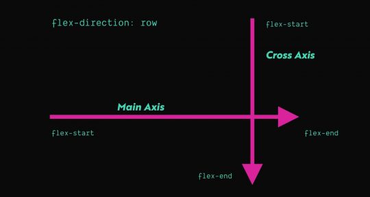
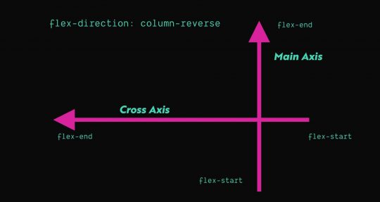
Axis
Flexbox has a concept of Axis which deals with the way items are laid out inside a flex layout. A flex layout has 2 axes: the main axis and cross axis. The flex-direction property determines which axis is the main access and the cross axis is just the opposite of the main axis. By default, flex elements will have a flex-direction of row, which means the main axis will run horizontally from left to right. You can see this visualized in the graphics below.
The first two, align-self and align-items, align flex-items based on the cross axis. So, by default, these will influence the vertical alignment of a single item (align-self) or all flex-items (align-items). The last one justify-content aligns flex-items based on the main axis, so by default, this will deal with horizontal alignment. There are additional options for alignment on the main axis that aren’t available on the cross access, so justify-content has a few other values available than align-items or align-self.
You can use one of these three properties to influence the way the flex-items are aligned on a given axis, which is one of the most common things you’ll end up using Flexbox for. Its great for taking things with different heights and aligning them vertically, or spacing things out evenly inside a container.
Growing and Shrinking
One handy thing that Flexbox can do is help flex-items grow or shrink automatically. This is great for situations when you want an item to take up X amount of space and then another item to take up the remaining space. Essentially, you need to tell the browser which items need to shrink or grow, respectively.
If you want an item to grow or shrink, you need to use the flex-grow or flex-shrink property respectively:
I’ve always found these properties a little confusing because the value you pass to flex-shrink or flex-grow is a number. That number represents the factor by switch the flex-item grows or shrinks. In my experience, you really only need to use a value of 1 in almost all cases. Anything zero or greater is a valid number and by default, a flex-item will have a value of 0 for both flex-grow and flex-shrink.
Using Margin and Width
In Flexbox, the only property that truly can override the width of an item is flex-basis, which represents the starting width of any item. Any shrinking or growing happens after the width of an item is calculated. So if an item has an assigned width and a flex-basis property, flex-basis will take priority.
In all of my research and experience, I have yet to find a scenario where using flex-basis was necessary. If you’re not using both width and flex-basis together, there’s basically no difference between the two. So in short, you don’t need to use it. Just set the width and keep things simple.
Margin is an interesting property in Flexbox. You can use margin not just to create defined amounts of space between elements, but also to do various types of simple alignments, in a way that is easily cross-browser compatible.
One common pattern these days is having a menu where you have one or two buttons that are all the way on the right side, while the rest of the links are left aligned. Say we had some code like this:
We could use the following CSS to ensure that .cta is pushed as far right as possible by using the following CSS:
.c-header_menu {
  display: flex;
}

/* Target any list item with the class .cta
that follows an li that does NOT have the .cta class
*/
.c-header_menu li:not(.cta) + .cta {
 margin-left: auto;
}
You can of course use things like align-self (which applies to a single flex-item) to do an alignment on the cross axis…but what about the main axis? There is a property called justify-self, but interestingly enough it has no effect in a Flexbox layout. So you can use CSS like the above example to effectively achieve the same result, using our old and trusted friend margin.
There are many different ways to approach writing CSS. Let’s consider the example from a few sections above, where we see the different ways you can center an element inside of another one. In the CodePen, we see 4 different ways to vertically center an element inside of a parent. However, the top 2 examples that use absolute positioning are clearly inferior choices to Flexbox in this situation.
Why? The main reason is because Flexbox can do alignment things will still acknowledging the flex-items in the DOM. When you use position: absolute or position: fixed the element is taken out of the document flow, so no other elements will be aware of that positioned element and will handle their layout as if it is not there.
The moral of the story is that some situations warrant using specific approaches to achieve the best result. Flexbox can often be used as a superior alternative to things like floats and absolute positioning. That said, make sure you’re always looking to use the right tool for the job.
Centering Elements
So, one common way to leverage Flexbox is to use it to vertically center things and still allow the parent element to know how tall to be. You can assign an element to have a min-height but then it expand if the content-height exceeds the min-height:
In the above code snippet, the hero content (i.e. the flex-item) will be centered vertically and horizontally. In the event the content height of the hero content exceeds 100vh, the hero section will grow to be as tall as necessary to show all of the hero content.
Consistent Vertical Alignment
Flexbox can also be great for doing vertical alignments. For instance, imagine you have a row of three cards and each one has a different amount of text. You want each card to be the same height and always have the call-to-action (CTA) button in the bottom right. You can use Flexbox and the margin tricks mentioned in the previous section to achieve this effect with zero JavaScript required. Check out the example CodePen to see the effect in action.
Aligning Checkboxes with Labels
Recently I came across a fantastic tweet from Adam Wathan that bemoaned the struggles of aligning text next to a checkbox:
Perfectly aligning checkboxes with text is super annoying, especially when the text wraps on to multiple lines.
Historically this type of thing has always been difficult to get right without a bunch of minute adjustments and tons of patience. But using Flexbox, you can consistently and easily achieve this holy grail of checkbox alignment by leveraging Flexbox and something called a “zero-width space character” (​ – read more). This is accomplished by the following:
Wrapping the checkbox input in a flex container and setting align-items to center.
Adding the zero-width space character next to the checkbox input.
Giving the flex container the same line-height and font-size as the adjacent label.
Wrapping both the checkbox flex container and the label inside another flex container with align-items set to flex-start
<div class="example">
<div class="flex-container items-start">
<div class="flex-container items-center">
​ <!-- Zero width space character -->
<input id="option4" type="checkbox">
</div>
<label for="option4">Longer checkbox item that unfortunately wraps on to two separate lines</label>
</div>
</div>
<style>
.flex-container {
display: flex;
}
.items-start {
align-items: flex-start
}
.items-center {
align-items: center;
}
</style>
Adam’s technique is a fantastic and reliable way to solve a very common layout problem. You can view a complete example of this in Adam’s CodePen.
Keeping the footer at the bottom of the viewport
Imagine you have a page that has a small-ish amount of content. You pull it up on a 27″ 2k resolution monitor. The content height is only about 30% of the monitor’s height, so now the footer is awkwardly high up on the page.
If you’re using HTML5 sectioning elements already, you may not need to change your markup at all. Consider the following code:
Using a few lines of CSS, you can force the footer to the bottom by using flex-grow and flex-direction: column; to allow the main element to expand to fill the extra space. See example CodePen: https://codepen.io/iansvo/pen/jOWOVNX
Equalizing Content Sections
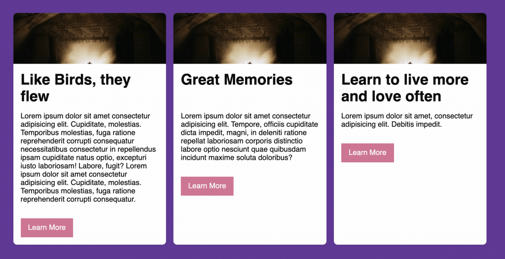
Consider a 3 up card layout, where each card has an image, a title, some text, and a button:
When making cards, it’s often desirable to have things like CTA buttons in a consistent position so they’re easily found by users. Flexbox is automatically helping the columns be the same height so the cards are all uniform in that sense. Next, we need a way to overcome the height differences in the card content.
Your first instinct might be to set the content area to have the same height. In days of yore, if you wanted to force elements to have the same dynamic height, you’d have to use JavaScript. This is still largely true today, but that seems a little heavy-handed for our case here. We don’t really care about the height of that content area, we really just care about the position of the button.
Similar to the nav example provided earlier, we can use align-self or margin to allow the button to display in the desired position. We can do this using simple HTML structures and CSS. Consider the card markup below:
<div class="card">
  <img class="card_image" src="//picsum.photos/300/100" alt="placeholder image" width="300" height="100">
  <div class="card_content">
    <h1>Like Birds, they flew</h1>
    <p>Lorem ipsum ...</p>
    <a class="card_button" href="#">
      Learn More
    </a>
  </div>
</div>
Right now, card element is a flex container and the card_content element is set to flex-grow: 1, so it is already taking up the remaining space below the headline. From here, we set card_content to also be a flex container with a flex direction of column, since the child elements are all supposed to be stacked. Now we can use margin to force the card_button element to the bottom right corner:
What other things can you do with Flexbox? The answer is as much as your imagination can think of! The Flexbox algorithm can be quite powerful and do things that in the past would’ve required JavaScript. Flexbox can allow you to do things much faster than you could’ve in the past, however, it has some quirks and certain properties have less browser support than others.
I would recommend using only the parts of Flexbox you actually need to use and carefully consider if it’s the best thing to solve your current layout problem. If you use the best tool for the job, you’ll find that you spend way less time fighting the layout and more time actually making things how you like them.
I was honored to be allowed to speak at WordCamp Jacksonville for now the third year in a row! Its great to be able to meet and talk to so many great folks in the local WordPress community.
I was honored to be allowed to speak at WordCamp Jacksonville for now the third year in a row! Its great to be able to meet and talk to so many great folks in the local WordPress community.
This year, I was honored to be selected as a speaker for WordCamp Jacksonville 2018. My talk discusses the basics of creating a dynamic custom WordPress theme using a modern workflow and Advanced Custom fields. The talk is suited for designers and developers who would like to get started with making custom themes, or who would like a refresher on best practices.
This year, I was honored to be selected as a speaker for WordCamp Jacksonville 2018. My talk discusses the basics of creating a dynamic custom WordPress theme using a modern workflow and Advanced Custom fields. The talk is suited for designers and developers who would like to get started with making custom themes, or who would like a refresher on best practices.
I recently encountered an issue that was driving me completely nuts, so I thought I’d do a short write up on it to see if it helps anyone else.
The Problem
Every time I would visit the Edit Post page in the WordPress Dashboard and tried to do things like adding a category (or some other thing that uses JavaScript/AJAX) I’d get a console error that referenced load-scripts.php. This is a core WordPress file that I naturally had not edited in any way and I didn’t even have any sort of customizations in place that affect the dashboard. I only had two clues:
The site I was working on had recently been cleaned of a virus
The issue was only caused by my theme (i.e. activating Twenty-Seventeen cleared up the console error)
What I tried
The first thing I thought of was to double-check the remote theme files to be sure there wasn’t still some malicious code or a new file present that may be causing the conflict. I checked this and found none of the theme files contained any malicious code and no new files had been added. Beyond that, I tried disabling some plugins and experimenting with some active, some disabled. Unfortunately, none of these things yielded any results.
The Solution
Ultimately the issue came down to extra white-space in the top of a functions.php include. If your WordPress theme’s functions.php file (or any files included/required inside of it) has extra white-space before the first opening PHP tag, WordPress may not function correctly. The exact issue(s) caused by the white-space varies depending on your setup and in this case, it took the form of a console error.
The moral of the story is: if you have some inexplicable error that’s related to your specific theme and you can confirm you don’t have a virus, double-check for the presence of extra white-space in your theme’s files. It is also worth noting that white-space in plugin files can also be problematic. However, if you’re using paid plugins or plugins from the WordPress theme repository, the likelihood you’ll encounter this is relatively low, especially if you’re using popular, battle-tested plugins.
I had the pleasure of speaking at WordCamp 2017 this year about WordPress Theme Development with GulpJS. I'm really grateful for the opportunity to talk about a topic that I personally enjoy and use in my work.
I had the pleasure of speaking at WordCamp 2017 this year about WordPress Theme Development with GulpJS. I’m really grateful for the opportunity to talk about a topic that I personally enjoy and use in my work.
 .
.


 Perfectly aligning checkboxes with text is super annoying, especially when the text wraps on to multiple lines.