Graphite is a free, open source vector editor built on a procedural node graph: every design operation stays nondestructive and fully re-editable always.
Graphite Labs built this open source vector ed...
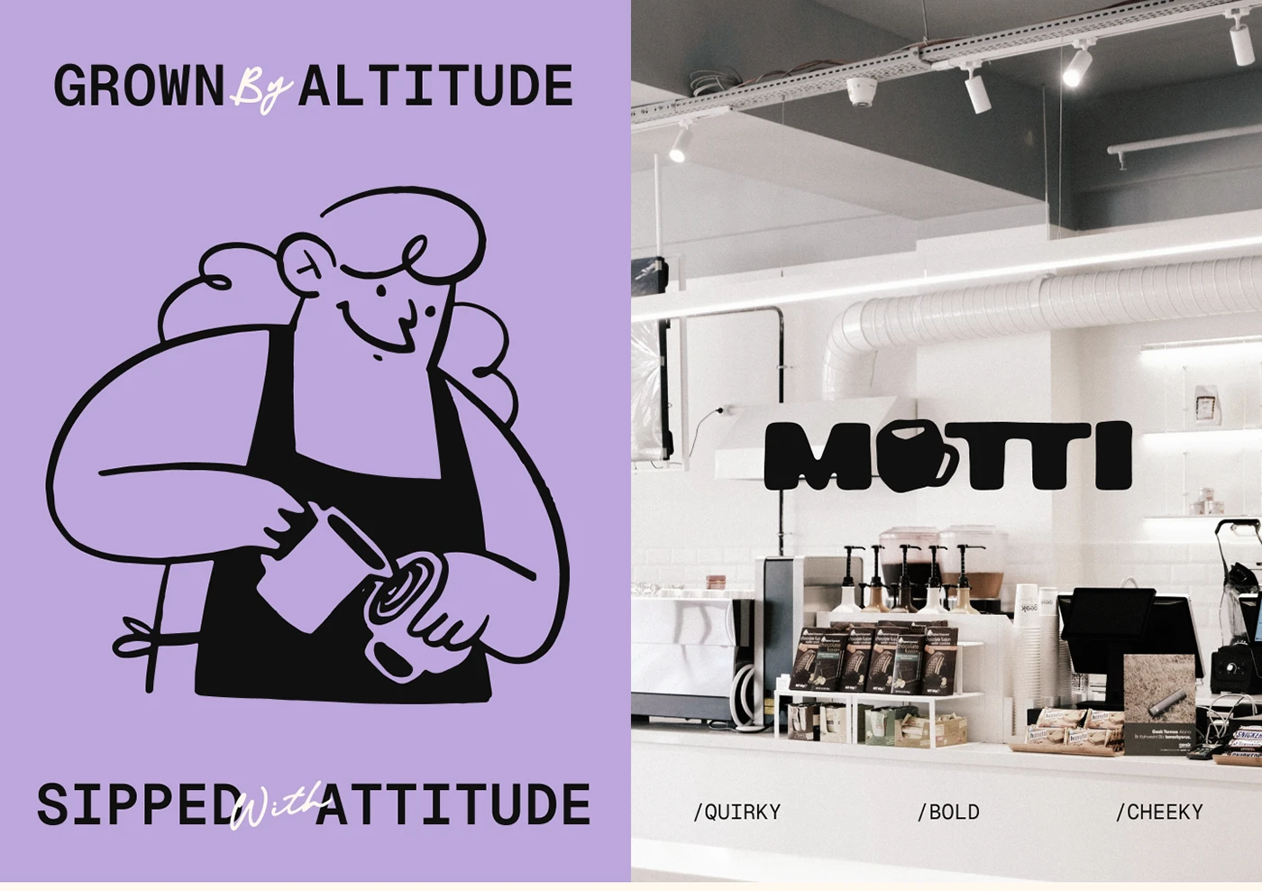
GRID is a coffee shop brand identity design where the city grid is the brand. One orange accent, hand-rendered type, bags that read like city blueprints.
Elizaveta Kharchenko started with a premise: t...
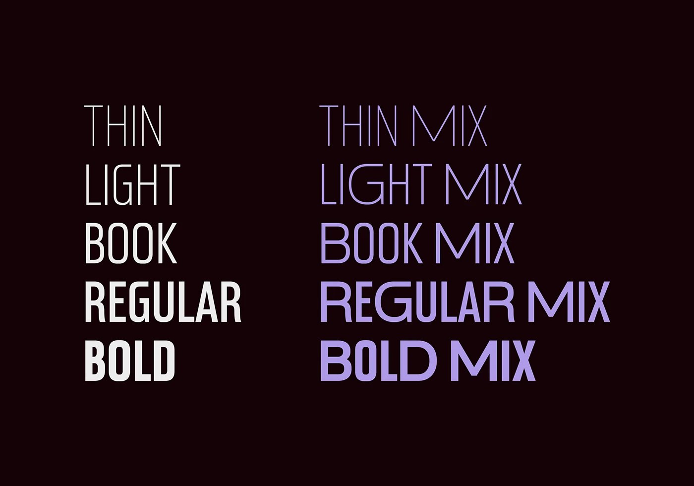
Rajesh Rajput's Dominique is a condensed display variable typeface with 9 weights and matching italics, delivering 18 distinct styles from one font file.
The specimen opens with DOMINIQUE. set in cond...
Argea brand identity design by Camila Polinelli is a strict black-and-white geometric system with cobalt and orange-red accents, built in Cancún, Mexico.
The mark is the engine of this brand identity ...
The editorial throughline for 2026-W20 was craft that announces its own logic. Every project that resonated this week — whether a museum mark, a stadium motion system, or an abandoned olive oil brief ...
Pixelatura is a pixel font display typeface from Jakarta. Retro digital 1990s MS Paint memory grafted onto classic serif architecture. Both stay visible.
The alphabet specimen makes the construction l...
Yai Salinas turned an abandoned client brief into Ruda — a self-directed AI brand identity design where every Midjourney campaign image was art-directed.
The brand system Yai Salinas built for Ruda ru...
Drop Light by Teixeira Design Studio is a 3D printed desk lamp made from recycled PLA, merging desk storage with soft diffused light in one clean object.
The lamp splits into two surface treatments th...
lifeOS app design by h3ylab turns personal AI agents into a minimal mobile interface where multi-agent orchestration reads as an assistant, not software.
The lifeOS app design starts from a real probl...
TMN Studios built a real estate brand identity for Tout Moi — a TM monogram that moves from business card to 2m glazing, five earthy tones, and no black.
This real estate brand identity is anchored by...
Ester Gonçalves Dias at Studio Amorá Lima crafted a branding system for Calliandra Cerrado, a hospitality network in Brazil's Chapada dos Veadeiros region. The identity translates the geometry of the ...
Brandtown Studio built the Momo & Co restaurant brand identity around Moji — a round dumpling mascot who earns every inch of his place across the system.
Brandtown Studio, based in Santiago, Chile...
JW Renders’ 2026 portfolio makes the case for 3D architectural visualization and interior CGI as spatial communication — not photorealistic output alone.
JW Renders — the Buenos Aires studio of Javier...
Linhares, Matosinhos & Fadul built a music artist brand identity design for Clara Maya: bold custom type, five-color palette, vinyl sleeves to tooth gem.
Clara Maya is a Brazilian DJ and music pro...
Sefa Can Kıvılcım designed the bridal boutique branding for Zeyn — a calligraphic wordmark and near-monochrome identity built for Istanbul's atelier market.
The Zeyn wordmark earns its keep. The 'Z' c...
Guardbase brand identity by PixelOrb Studio rejects fear-based AI security visual language in favor of trust, precision, and electric periwinkle contrast
Eugene Riabov and Arnold Aron built the Guardb...
Stuttgart illustrator Sua Balac earned Best of Behance recognition for a 2024–25 body of editorial illustration, commercial campaigns, and personal work.
The collection spans roughly 20 pieces, and th...
Andrew Footit layers halftone, patterns, and grid systems into custom typeface experiments. Typography gains depth through texture, perspective. The work starts with a problem: how do you add texture ...
Casa Macui is a Mexican knife brand identity shaped by pre-Columbian symbols, terracotta, and gold foil on heavy dark stock by Bogotá-based Fugitiva .co.
The name comes from the macuahuitl — the obsid...
LJ Studio built a sports motion design system for the French Football Federation — one visual language that spans giant stadium screens and LED displays.
The brief for this sports motion design system...
Natalia Balabash’s coffee packaging design for Foundation Coffee Roasters treats the sample box as a layout problem: every panel composed, no weak sides.
The rigid metallic slide-open box carries a si...
CAPS Design Studio built a logo brand identity for Eggstasy on restraint — brush script, kraft cards, and an off-white charcoal palette that earns quiet.
The logotype does the heavy lifting. CAPS Desi...
Emma Vallon's 2026 freelance branding portfolio design covers six projects — food brands, cultural institutions, each built on mascots and a type system.
The cover sets the logic early. Burnt orange —...
Brandigno® redesigns Genevitta with a living brand identity system where the letterform "g" becomes a continuous visual link. The new brand identity system evolved beyond simple nutrition into a full ...
Nova Root is a skincare brand identity by Hammad Ali Shah built on a geometric monogram in hunter green and antique gold across packaging and stationery.
The mark anchoring this skincare brand identit...
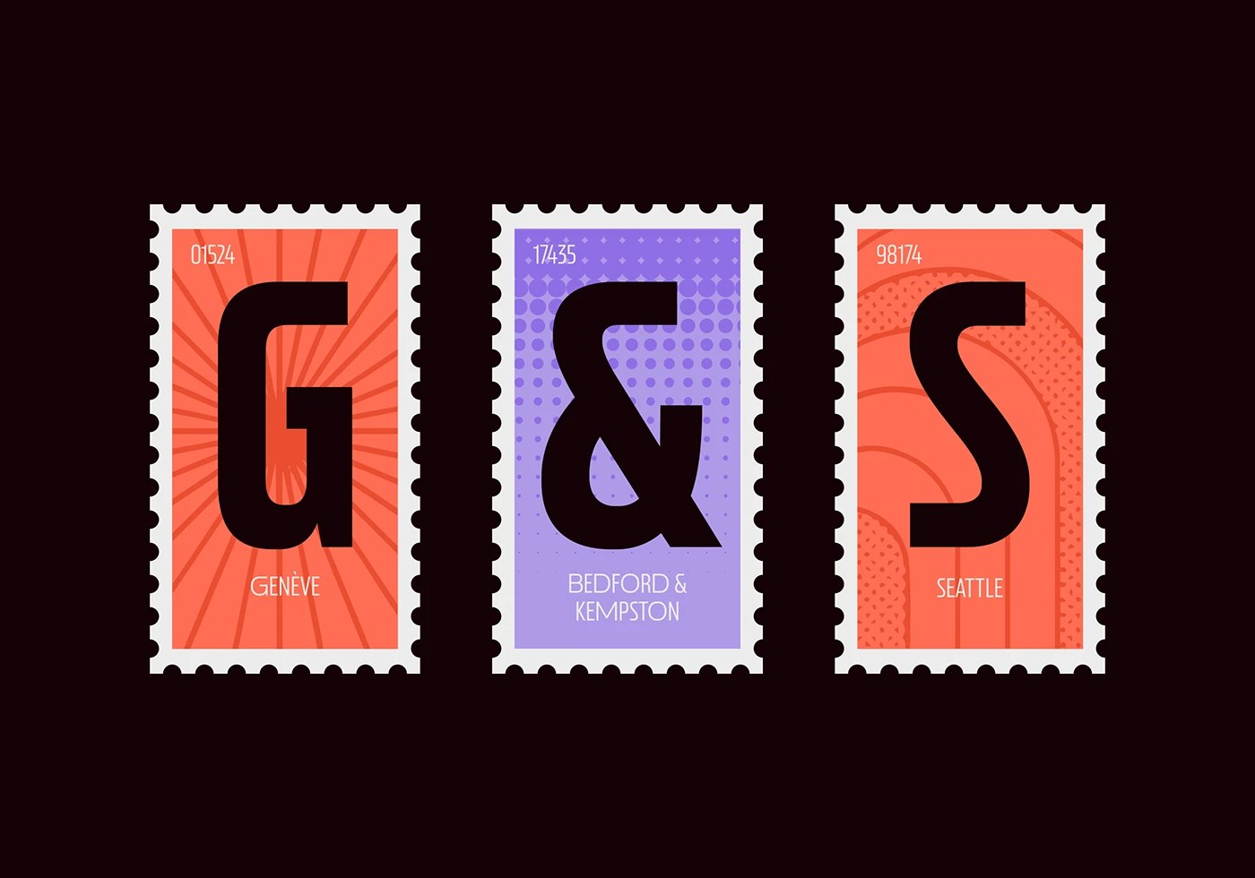
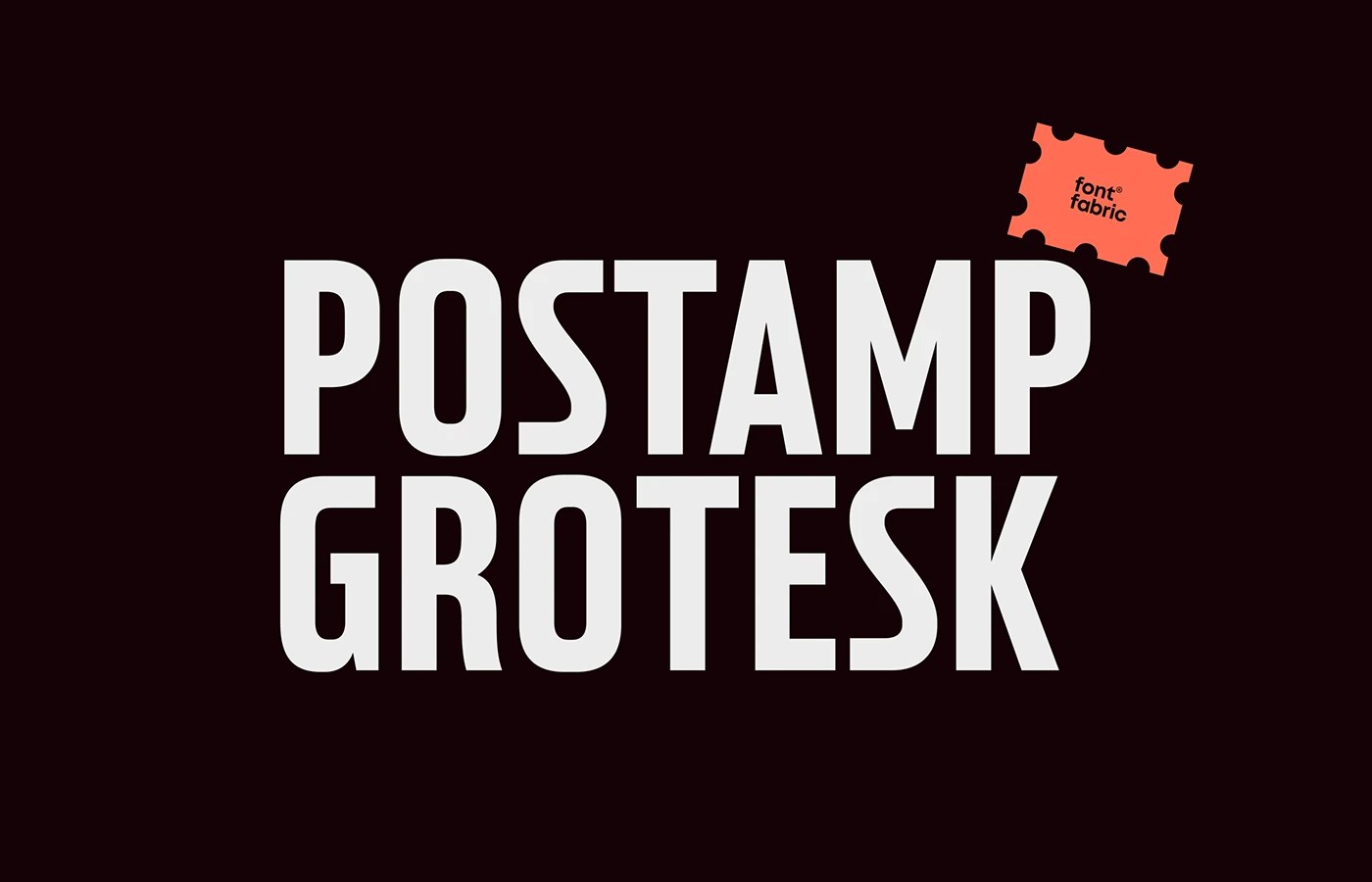
Postamp Grotesk is a condensed sans serif typeface by Fontfabric, derived from U.S. postage stamp letterforms across five weights with Cyrillic supports.
The starting point was a James Buchanan postag...
Postamp Grotesk: A Condensed Sans Serif Typeface by Fontfabric
abduzeedo
May 11, 2026
Postamp Grotesk is a condensed sans serif typeface by Fontfabric, derived from U.S. postage stamp letterforms across five weights with Cyrillic supports.
The starting point was a James Buchanan postage stamp — one of the stranger places to mine for type forms. Fontfabric's five-person team, led by Ivelina Martinova, spent time with late 19th-century American specimens before settling on what makes this condensed sans serif typeface distinctive: open apertures, smooth geometric curves, and a low-contrast stroke that reads at display scale without the fussiness of historical revival work. The weight staircase runs Thin through Bold, each presented in stamp-frame compositions on near-black — single letters at scale, coral and lavender fills on outer and center frames respectively, perforations intact on all four edges. The specimen is the argument: the forms hold even when isolated at that kind of size.
Condensed Sans Serif Typeface Built From Historical Stamp Typography
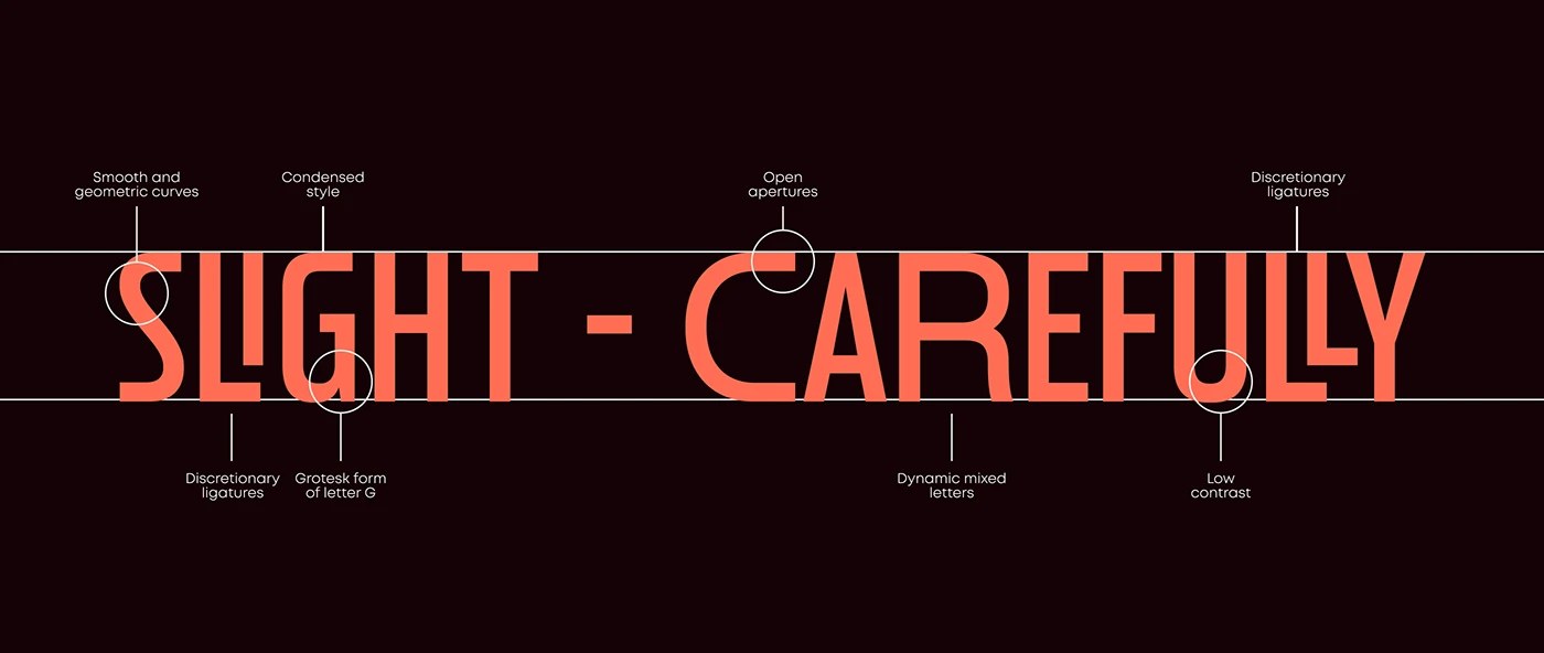
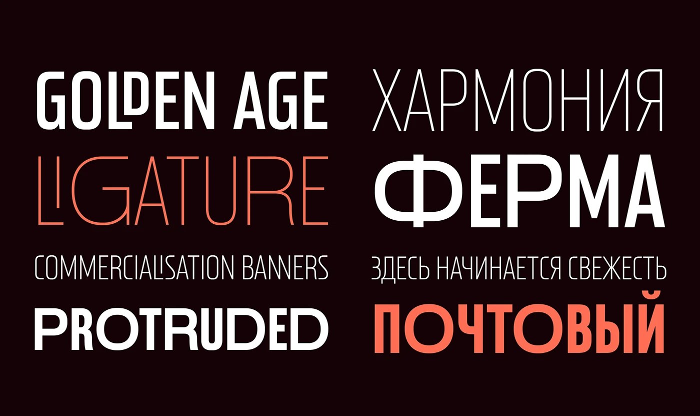
The Mix variant adds Cyrillic alongside the Latin set, and the annotated structural diagrams make explicit what the design is doing — six callout circles label the grotesk G form, the discretionary ligatures, the dynamic mixed letters. Fontfabric does not leave the rationale implicit. For this condensed sans serif typeface, the five-weight range gives it genuine range across editorial, branding, and signage contexts. The Mix variant does not feel like an afterthought — Cyrillic and Latin share the same proportional logic. That consistency is what makes a condensed sans serif typeface built from archival letterforms still feel like a contemporary tool.
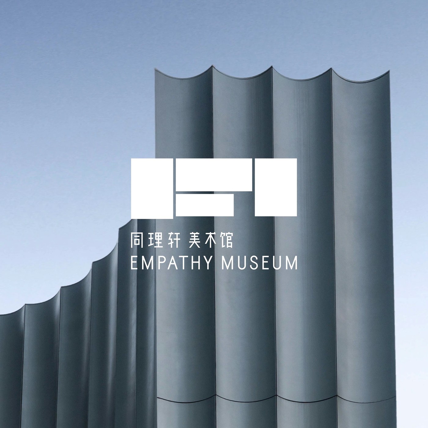
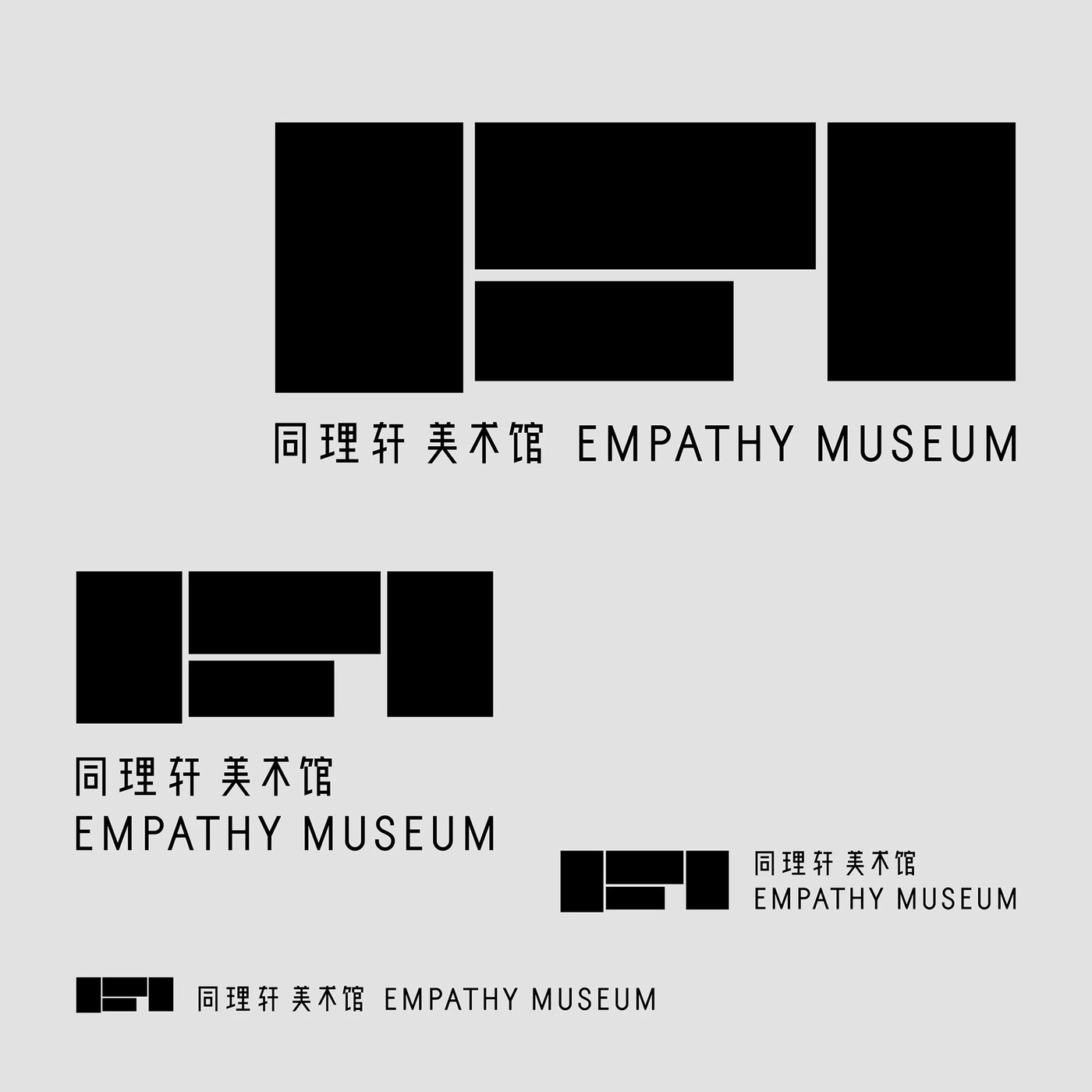
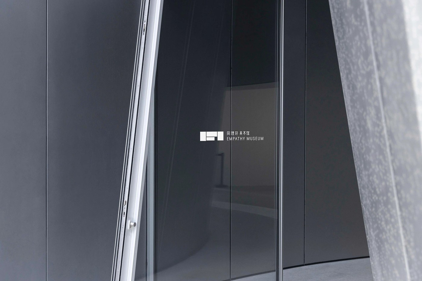
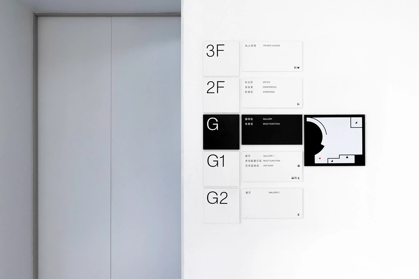
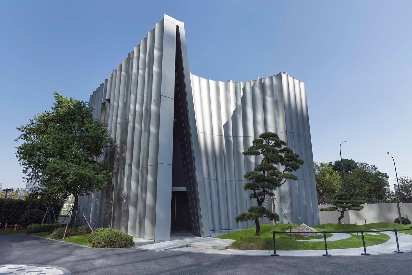
Han Gao’s Empathy Museum branding derives its logomark from the Chinese character 同, resolving the character’s skeleton into a geometric, bilingual mark.
The mark is five white rectangles — two tall v...
Empathy Museum Branding by Han Gao
abduzeedo
May 11, 2026
Han Gao’s Empathy Museum branding derives its logomark from the Chinese character 同, resolving the character’s skeleton into a geometric, bilingual mark.
The mark is five white rectangles — two tall verticals flanking a stepped central cluster — set on a cool grey field. At full display size it reads as a confident geometric logo. At 80mm on a dark glass entry door, silk-screened white, it holds just as cleanly. The same Empathy Museum branding structure appears reversed white on the museum’s corrugated silver-grey metal facade, where the building’s fluted surface texture rhymes with the mark’s rectangular rhythm. Three scales, one reference sheet, no decoration: the identity system is essentially a proof.
Empathy Museum Branding: One Character, Two Scripts
Han Gao’s wayfinding extends the same logic — modular white acrylic panels, large geometric sans at floor designator scale, one black inversion panel for the ground gallery. The bilingual wordmark pairs Chinese characters and Latin caps at two distinct sizes, never competing. Most bilingual identities run two parallel systems and call it done. The Empathy Museum branding finds the geometry both scripts already share instead. That geometry is 同 — and it was there all along.
See the full Empathy Museum branding project by Han Gao on Behance.
Ten design projects from W19 2026 where the system itself was the creative act — from a generative orchestral identity that encodes its audience into pattern, to packaging where material constraint is...
Best of Week 19 2026: Systems Built to Hold
abduzeedo
May 10, 2026
Ten design projects from W19 2026 where the system itself was the creative act — from a generative orchestral identity that encodes its audience into pattern, to packaging where material constraint is the only argument, to display type calibrated for the way editorial actually works today.
This week's work had a consistent argument beneath the surface variety: the most convincing design doesn't announce its logic — it structures it. From generative brand identities encoding their own rules into pattern, to packaging systems where material constraint becomes the visual story, to editorial illustration that takes a position rather than decorates a page, W19 landed a cluster of projects where the system itself was the creative act. Precision and weight — not as stylistic choices, but as structural commitments.
Ten picks this week. Eight from Abduzeedo's own coverage, two from outside. All of them earned their place by having a specific reason to exist.
Budapest Festival Orchestra — DE_FORM
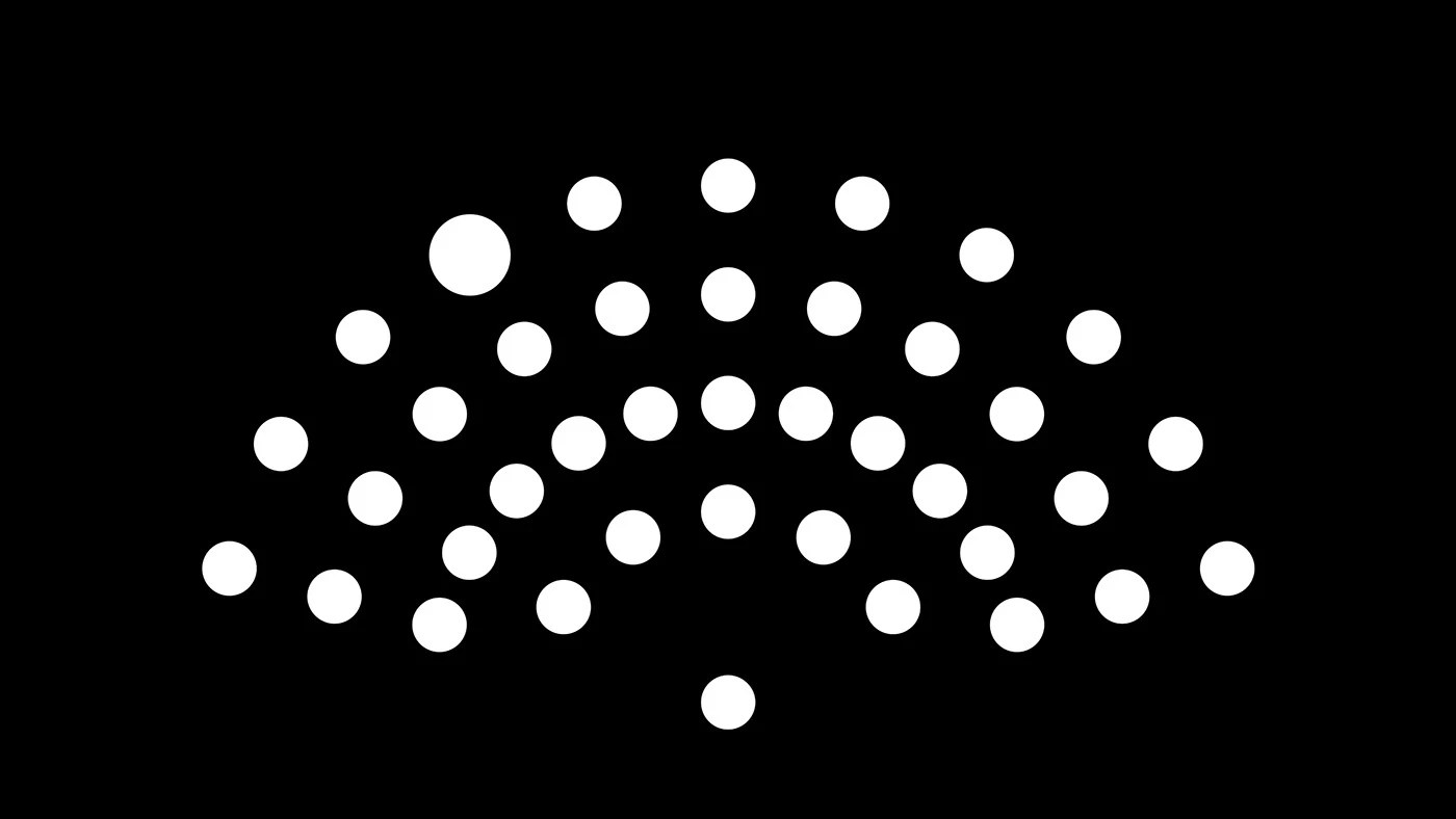
The central tension for any established orchestra: how do you signal contemporary relevance without abandoning the historical authority that makes the institution worth attending? DE_FORM's answer for the Budapest Festival Orchestra doesn't split the difference — it encodes the audience into the visual identity itself. The generative pattern system derives its motif from the relationship between ensemble and listener, producing dynamic compositions from a single rule. Best of Behance recognition for cultural identity work at this level is genuinely hard to argue with.
QUENTO™ Display Typeface — Kimmy Lee & Petros Afshar
The Didone revival has been running for three years; QUENTO is one of the few entries that earns the comparison to its source material. Hairline serifs and maximum stroke contrast calibrated for high-resolution screens rather than letterpress — the type performs at 200px the way the tradition intended, without the brittleness that kills most digital revivals. Five hundred-plus glyphs and a free demo make the argument immediately testable.
Venture capital branding almost always fails in one of two directions: illegibly abstract or embarrassingly literal. Lundgren+Lindqvist found a third path — a logomark built from a rectangular form interrupted by two elliptical cuts that reads simultaneously as the Roman god Janus's two-faced gaze and a precision-engineered aperture. Studio Pro typeface and a three-part color system (black, white, transitional grey, accent green) complete a system that is serious without being cold.
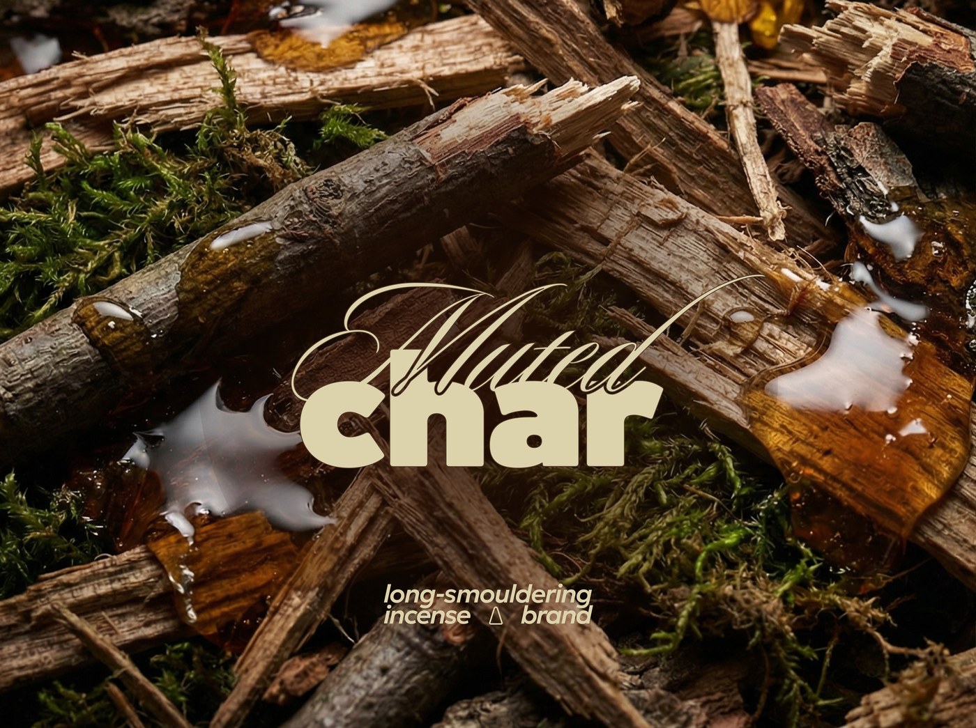
The incense category defaults to either spiritual cliché or lifestyle photography. Muted Char does neither. Alex O'Connor built the identity from material contrast and atmospheric restraint — muted tones that read as found rather than designed, texture treated as information, zero decorative spiritualism anywhere. The system extends across stick and cone variations without announcing the range; coherence comes from weight and atmosphere, not from repetition.
The naming tension is the whole brief: fairy tale meets electronic music. Sharapova's resolution is a motion-first identity where kinetic typography is the primary brand carrier — not decoration, not support element, but the thing itself. Music visualization elements are structural components of how the brand moves, not after-the-fact graphics layered on top. The logo doesn't fully exist without the animation to anchor it, and that commitment is exactly what makes the system hold.
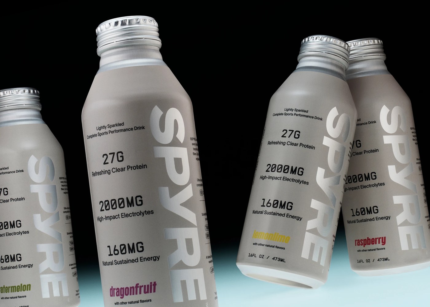
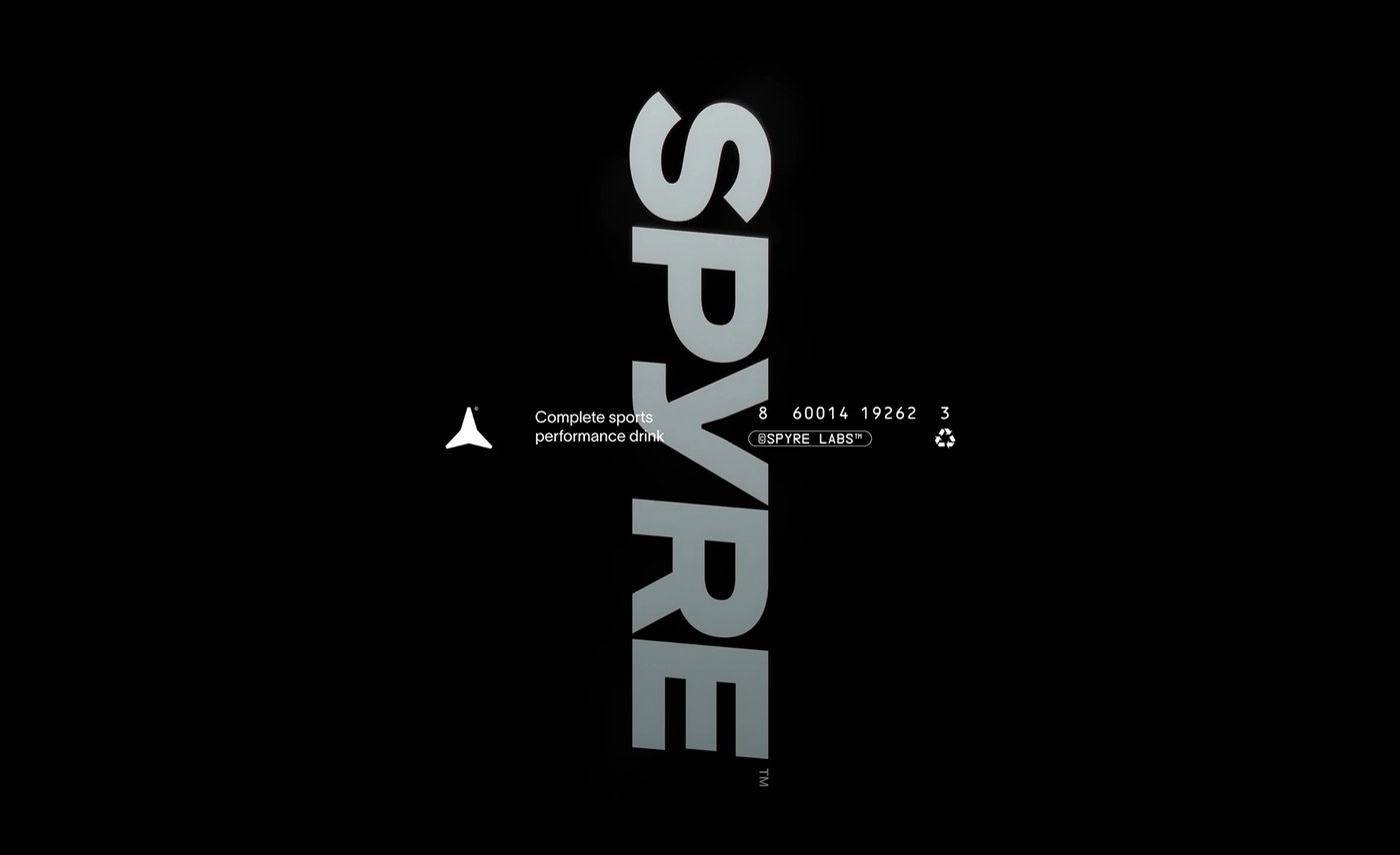
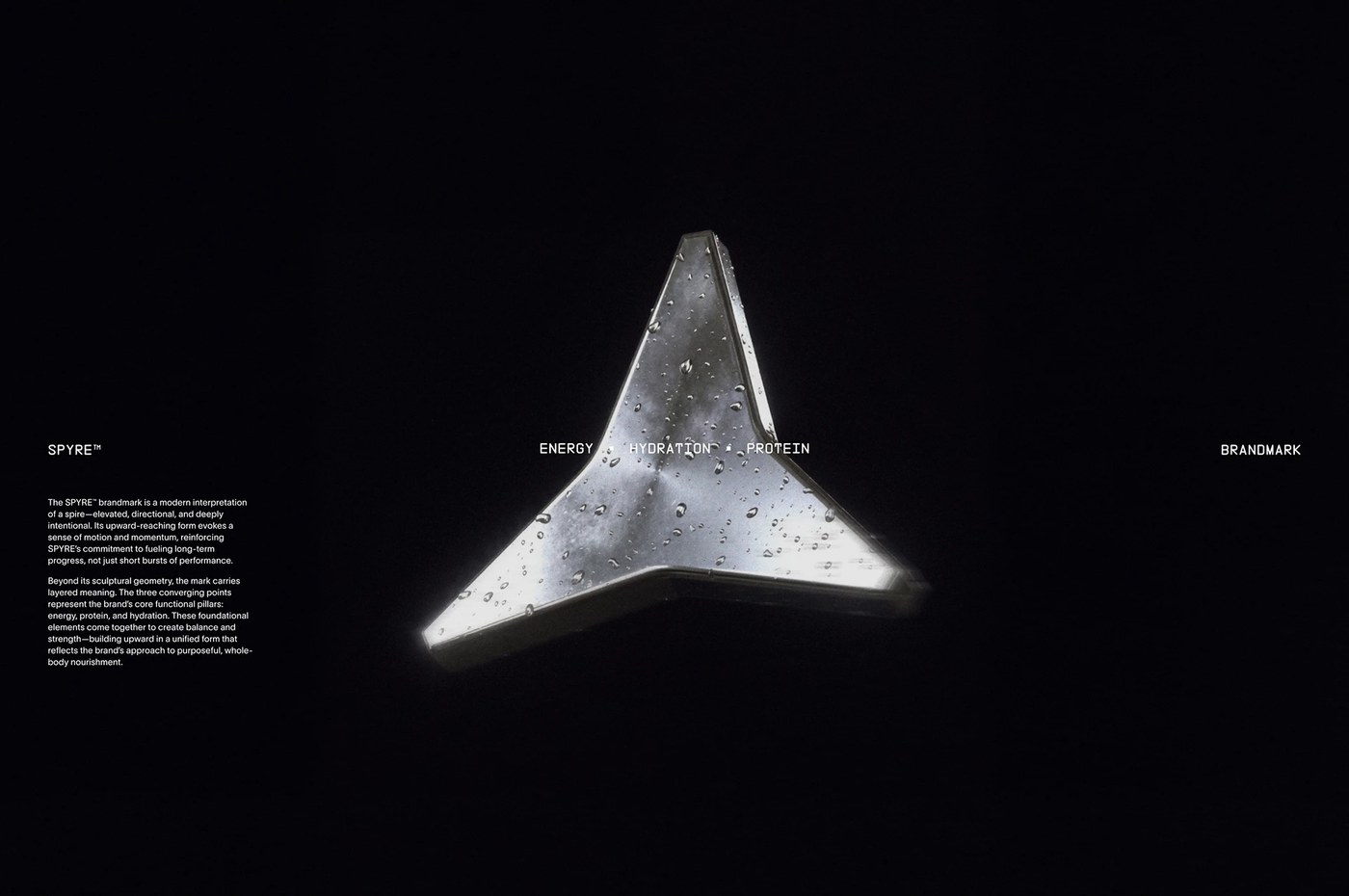
Most performance drink packaging communicates energy through aggression: jagged type, dark colors, peak-state photography. Hello Comrade in Amsterdam flipped the logic for SPYRE — the beverage's transparency is the visual event. The packaging system makes the product's clarity into the brand argument for purity and precision. The art direction is rigorous enough that product photography functions as composition, not as showcase.
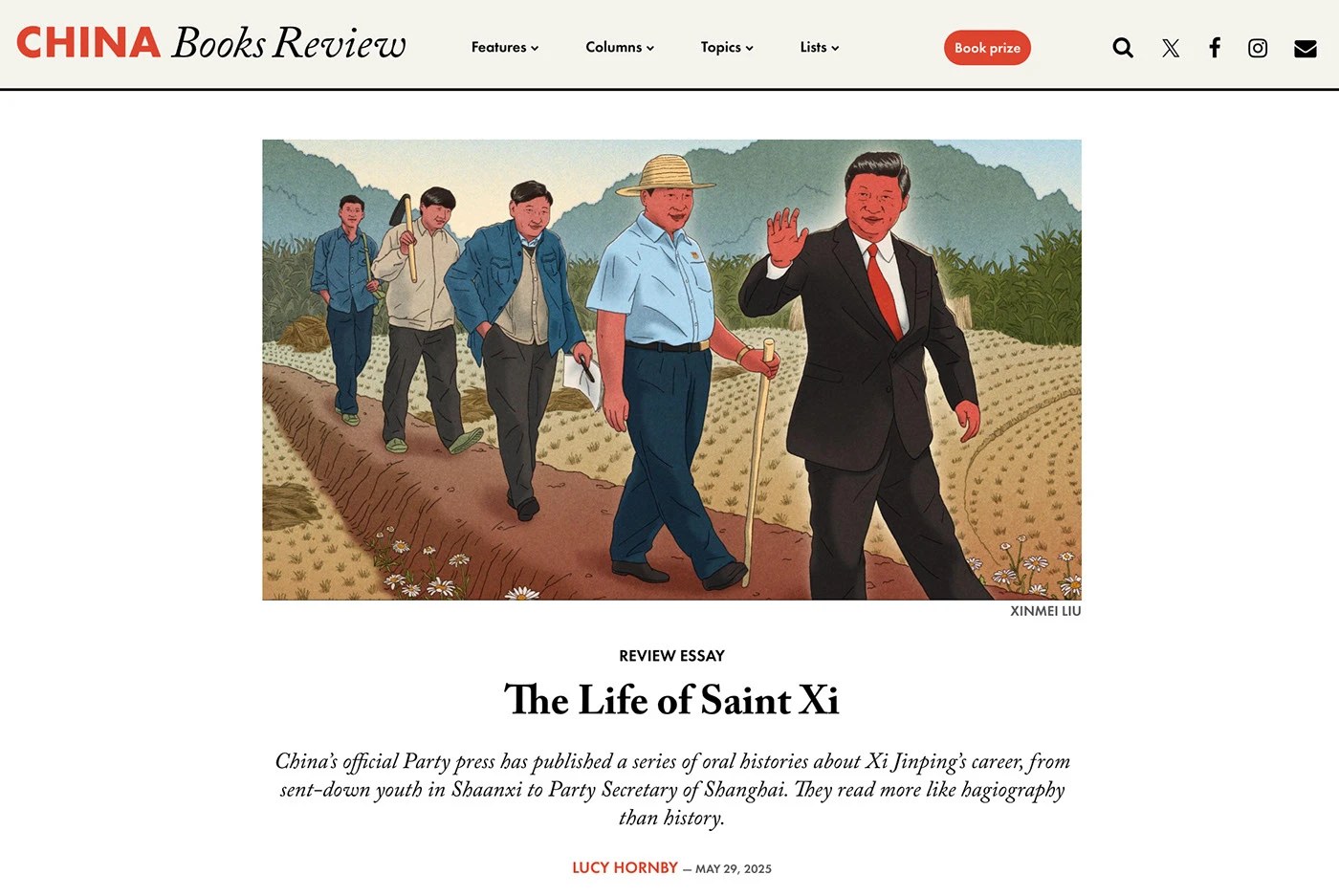
Editorial illustration at its best doesn't illustrate the article — it makes an argument the article can't. Xinmei Liu's 2025 collection, drawn for The Economist, The Atlantic, Bloomberg, Monocle, and Vox, works consistently in that mode. The pen-and-ink foundation keeps marks legible at column width; the digital color overlays handle register: these are images you read as positions, not as decoration. The geopolitical subject matter is handled with specificity, not cliché.
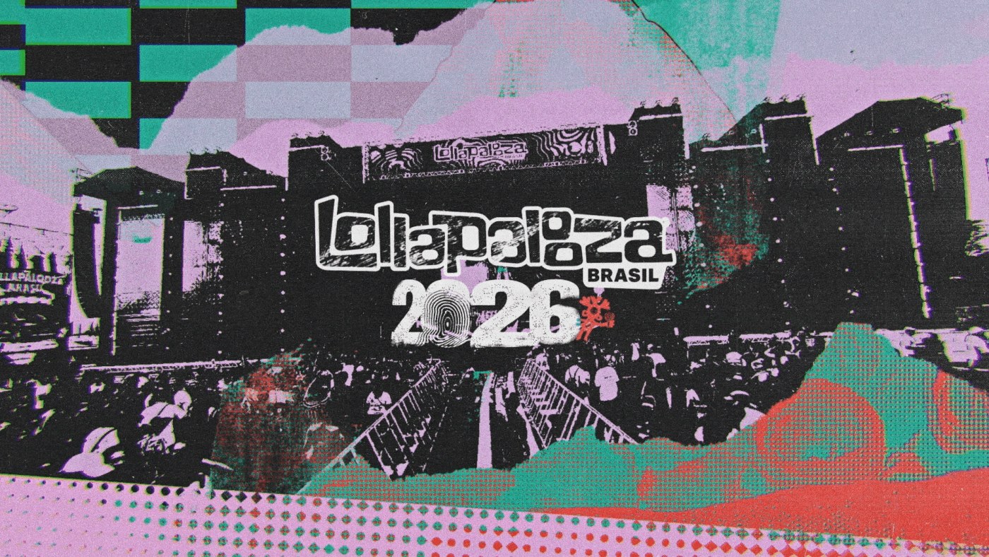
Lollapalooza Brazil 2026 — LUKTHIS (Lucas Ribeiro)
A festival lineup reveal video has ten seconds to make the audience feel like they're already there. LUKTHIS solved it with a visual language built from the festival's own ingredients — halftones, collages, overlays — treated as dynamic composition material rather than static assets. The hybrid digital/analog approach reinforces the cultural argument of the 2026 edition: classics and avant-garde in collision. Motion by Ricki Mendes gives the animation a rhythm that mirrors what the festival promises.
Varus 775 — Olssøn Barbieri ★ DIELINE Best in Show 2026
The Oslo studio designed a three-part system for German distillery Varus 775: a glass bottle, an aluminum refill vessel, and a ceremonial porcelain piece — each material chosen to carry the historical narrative without decoration. Ceramic craft and systematic refill logic are the only visual argument. No heritage serifs, no borrowed luxury conventions — just the weight of the materials and the precision of the system. First spirits brand to take DIELINE Best in Show since 2019.
Refillable body care where the design story is behavioral, not aesthetic. Beta Design Office built Fussy around a tinted PET forever-container with recyclable aluminum refills — a two-tone gradient system in magenta, lavender, burnt orange, and sage green. The visible refill inside the transparent exterior turns sustainability into visual logic rather than messaging: you see the behavior, you don't read about it. When structural constraint is the creative act, the system earns its claims through engineering rather than brand language.
Next week: code-native identity where the process is the product — a Paris studio that built a brand from particle systems tuned to the logic of algorithmic trading, and work that treats constraint as its only creative resource. The systems get more explicit.
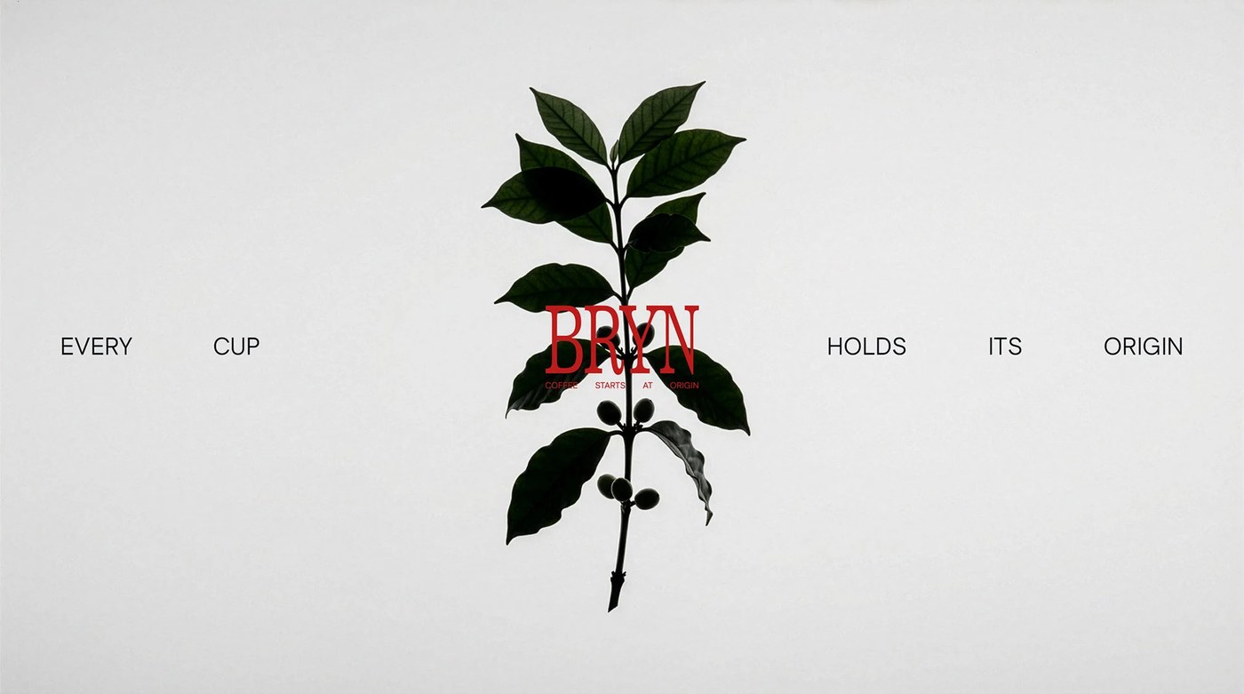
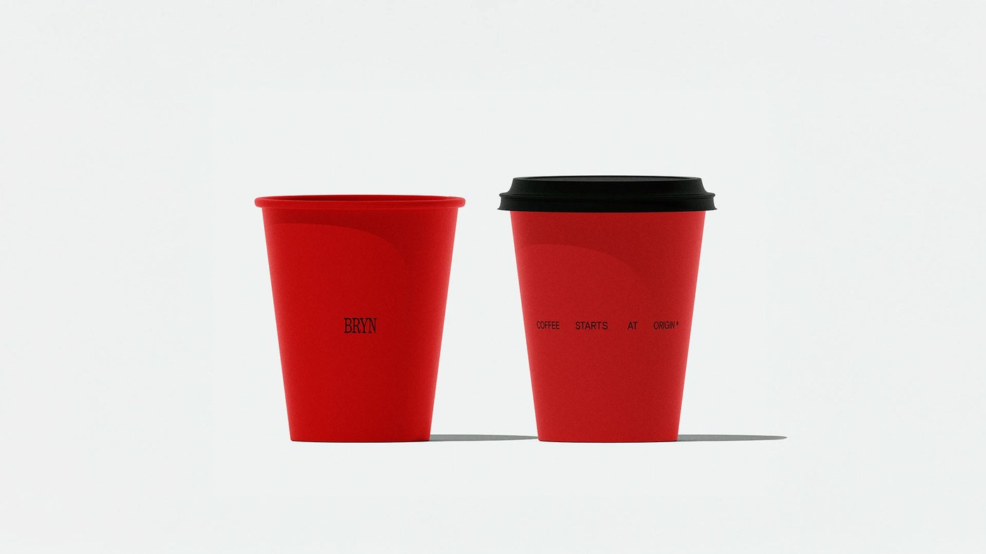
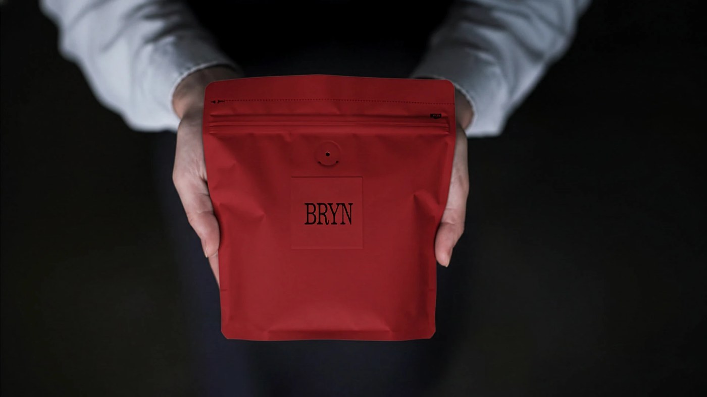
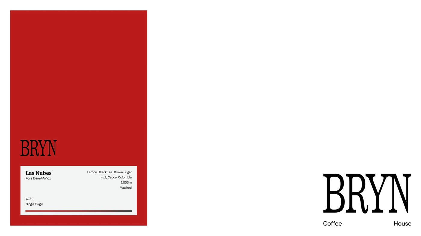
BRYN coffee house brand identity by OHDUDI: deep red and slab serif at extreme scale anchor a complete naming and visual system built from the ground up.
Red is a calculated bet in a coffee house bran...
BRYN: A Complete Coffee House Brand Identity
abduzeedo
May 10, 2026
BRYN coffee house brand identity by OHDUDI: deep red and slab serif at extreme scale anchor a complete naming and visual system built from the ground up.
Red is a calculated bet in a coffee house brand identity. In a café category dominated by beige, oat, and fog, OHDUDI chose #C41010 — not as accent but as field. The BRYN wordmark sits at roughly 200pt in a high-contrast slab serif, with the tagline "COFFEE STARTS AT ORIGIN" threading through the counter space of the letters. On the label system, that same wordmark runs to 400pt, pure black on white — so large it stops reading as text and becomes a structural element. A coffee house brand identity built on this kind of typographic confidence is rare. Packaging carries origin coordinates down to the farm: "Las Nubes / Rosa Elena Muñoz / C.08 / Single Origin." Red cups on neutral grey, typography restrained and low on the vessel, nothing competing.
The Brand Identity Logic Behind BRYN Coffee House
What OHDUDI built is a complete coffee house brand identity — one that refuses a single neutral. The red is deliberate all the way down — symbolic in the Middle Eastern context, perceptually loud in the café landscape, and consistent from poster to packaging to cup. Naming, strategy, and visual direction came from the same studio. The coffee house brand identity holds because the logic was set before the type was chosen.
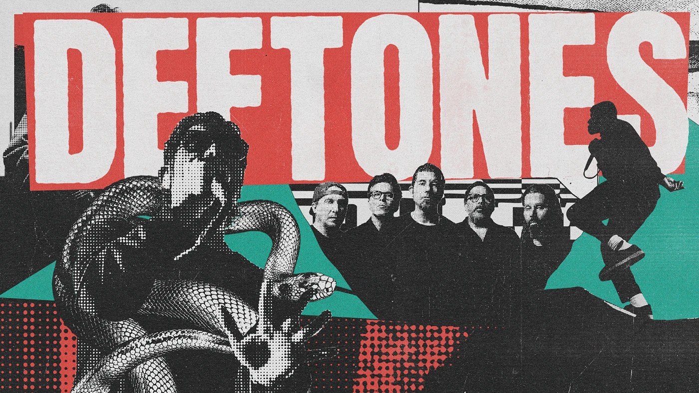
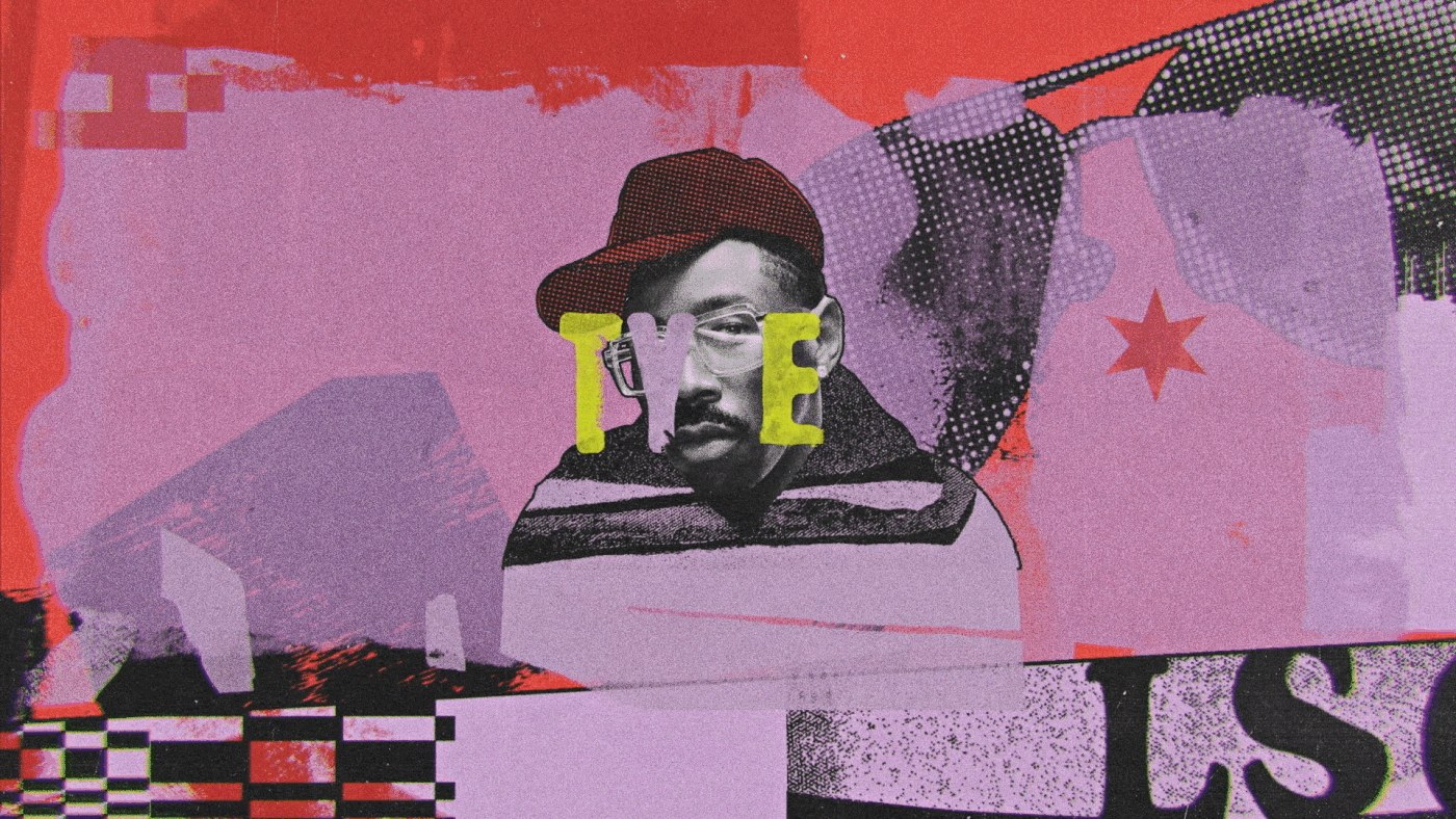
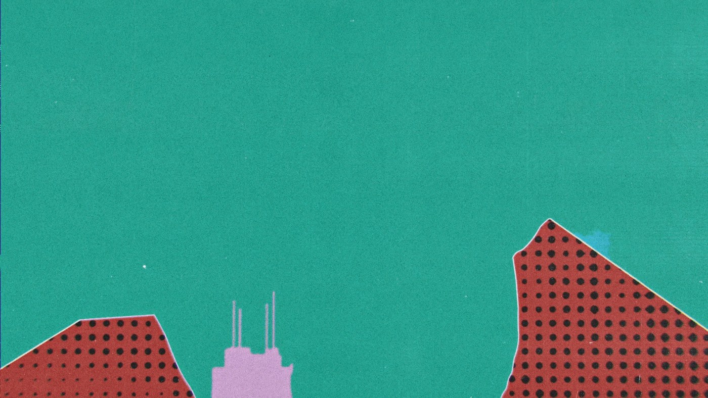
LUKTHIS (São Paulo) built Lollapalooza Brazil 2026 lineup motion as music festival motion design — halftones, collage, and analog texture doing the work.
The brief for a lineup reveal is specific: ten...
LUKTHIS: Lollapalooza Brazil 2026 Festival Motion Design
abduzeedo
May 09, 2026
LUKTHIS (São Paulo) built Lollapalooza Brazil 2026 lineup motion as music festival motion design — halftones, collage, and analog texture doing the work.
The brief for a lineup reveal is specific: ten seconds to make the audience feel like they’re already there. LUKTHIS (Lucas Ribeiro) answered it through layered collision. Each frame in this music festival motion design campaign operates as a simultaneous cultural archive — the opener title card runs teal paint-splash shapes against lavender halftone dot fields and a red halftone strip, all over a dark stage photograph. A condensed white slab-serif ‘DEFTONES’ at roughly 200pt fills the top third of one frame against a halftone-textured black ground, with an engraving-style snake coiling at lower left and a band photo at right. Three registers — type, illustration, photography — occupy the same frame without fighting each other. Motion design by Ricki Mendes builds the rhythm that holds this music festival motion design together.
Music Festival Motion Design: How LUKTHIS Built Lollapalooza Brazil 2026
The male artist portrait frame pushes further: yellow disc-halo behind the subject, high-saturation teal background, deep red halftone shapes at left, a Marilyn Monroe screen-print composite in the lower right — five cultural reference layers in one composition. The guitar silhouette frame reduces it differently: three overlapping figures, halftone-rendered face, teal Fender as the sole saturated object cutting through grunge texture. The music festival motion design logic holds across both — density as argument, not decoration. The festival’s hybrid identity (classics and avant-garde in collision) is encoded in the visual method, not stated in a title card. That’s what separates this music festival motion design work from a standard lineup announcement: the form is the argument.
Studio Moara's cafe branding system delivers complete identity—logo, mascot, packaging and signage unified by warm tones and hand-drawn illustration. The identity centers on a hand-drawn mascot across...
Cafe Branding: Complete Visual Identity System
alex
May 08, 2026
Studio Moara's cafe branding system delivers complete identity—logo, mascot, packaging and signage unified by warm tones and hand-drawn illustration. The identity centers on a hand-drawn mascot across every touchpoint—menu, packaging, storefront. Rather than decoration, Studio Moara made it structural. The palette moves between warm terracotta and cream, with an accent that holds weight without heaviness.
Cafe Branding System by Studio Moara
The packaging reveals the depth. Instead of treating the box as a container, Studio Moara built a complete visual language—dielines reveal illustration, typography guides the eye, negative space lets each element breathe. Stationery and menus follow: one typeface, the mascot applied consistently, color held back. Studio Moara's portfolio shows how strong cafe branding holds across all touchpoints.
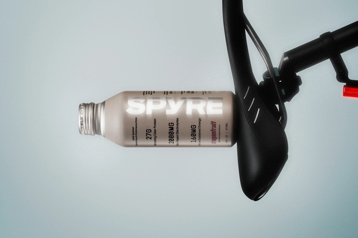
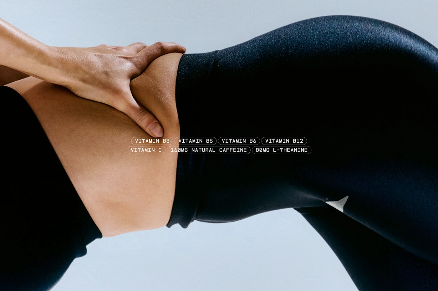
Hello Comrade's sports drink packaging brand identity design makes SPYRE's product clarity the visual argument — transparency as feature, not a footnote.
Most performance drink packaging communicates ...
SPYRE: Sports Drink Packaging Brand Identity by Hello Comrade
abduzeedo
May 08, 2026
Hello Comrade's sports drink packaging brand identity design makes SPYRE's product clarity the visual argument — transparency as feature, not a footnote.
Most performance drink packaging communicates energy through aggression. Hello Comrade, Amsterdam, went the other direction. SPYRE is a clear, lightly sparkling beverage — protein, electrolytes, clean caffeine — and the sports drink packaging brand identity design makes that clarity do the work. The bottle itself is the visual argument. Near-colorless liquid in a transparent container, nothing masking what's inside. The label doesn't fight the product; it frames it. Compressed geometric sans, heavy weight, all-caps SPYRE set large enough to read at arm's length on a cylindrical surface. A near-white ground with cool gray and a restrained slate-blue accent. No aggression, no peak-state photography, no dark field.
Sports Drink Packaging Brand Identity Design Built Around What You Can See
Photographer Yuhsing Lin's product shots function as graphic design. Bottles arranged on clean surfaces with precise shadow control — not lifestyle warm-up. The sports drink packaging brand identity design spans 15 images: label, cap detail, multi-bottle lineup, and athletic-context placement, all consistent without repetition. Hello Comrade held three pillars — hydration, energy, fuel — in a single word: clarity. When the product is proof, the sports drink packaging brand identity design doesn't need to perform. See the full project by Hello Comrade on Behance.
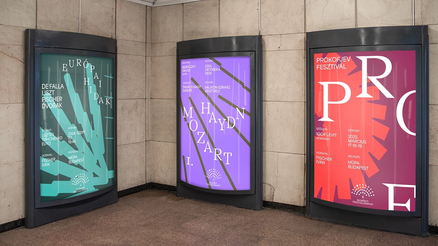
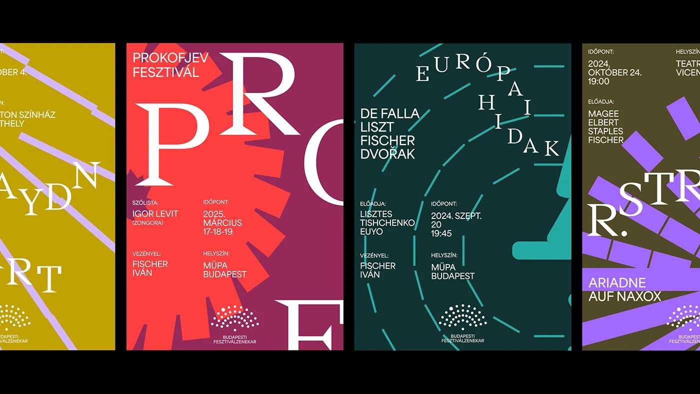
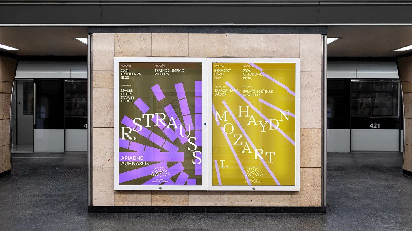
DE_FORM built a generative design system for the Budapest Festival Orchestra brand identity where the audience relationship is encoded as the core motif.
The problem with cultural institution branding...
DE_FORM Encodes the Audience in BFO's Orchestra Brand Identity
abduzeedo
May 07, 2026
DE_FORM built a generative design system for the Budapest Festival Orchestra brand identity where the audience relationship is encoded as the core motif.
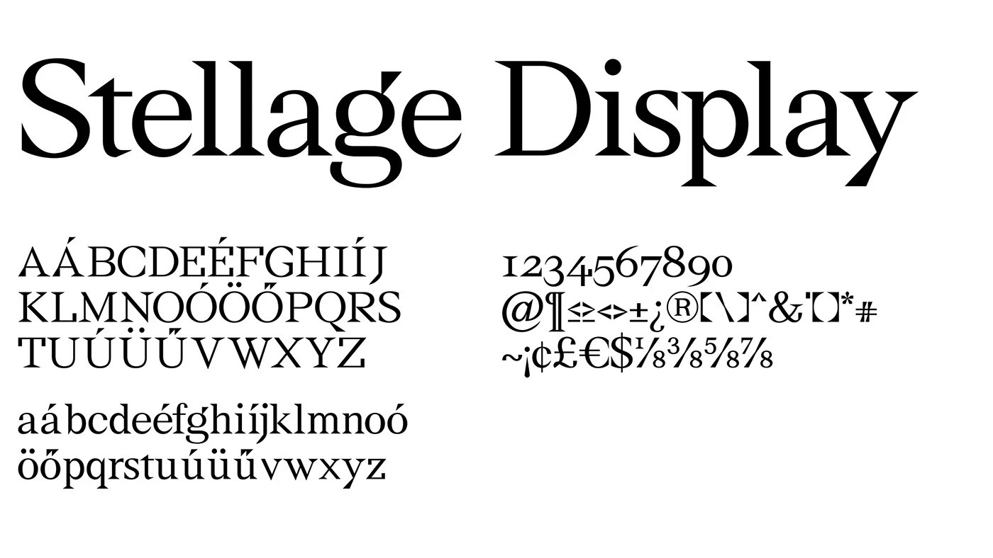
The problem with cultural institution branding is usually one of two failures: reverence that reads as stagnation, or modernization that loses the authority the institution spent decades earning. DE_FORM’s concept for the Budapest Festival Orchestra sidesteps both. The studio built a generative pattern from a single rule — the relationship between orchestra and audience — and let that rule produce the identity. Dense fields of dots and circles shift from sparse scatter to close-packed mass depending on application, all from the same generator. The warm cream background and deep charcoal type hold the classical restraint while the pattern does the contemporary work. Stellage Display at large scale drives the typographic voice: a high-contrast serif with sharp terminals, operating as an independent system element rather than decoration applied over the motif.
Why This Generative Orchestra Brand Identity System Works
The pattern generator is the key structural decision. It produces full-bleed field compositions and contained motif blocks from the same underlying logic, which means the system scales from A4 collateral to environmental signage without the identity breaking. The Area typeface handles secondary type, keeping the typographic hierarchy clean. For a performing arts organization navigating tradition versus contemporary relevance, the generative approach is the right answer — it encodes change as a property of the system, not as a style choice that dates. The Budapest Festival Orchestra brand identity earned Best of Behance recognition, which in the cultural sector is a hard category. See the full project by DE_FORM on Behance.
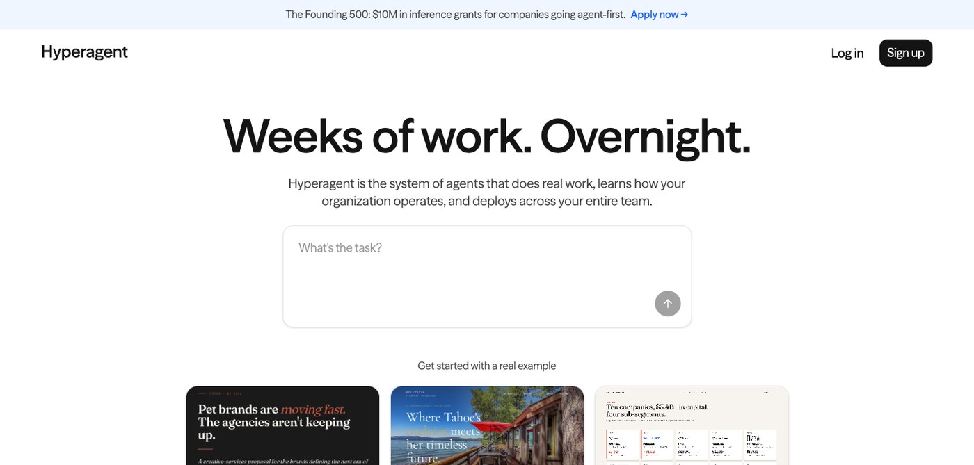
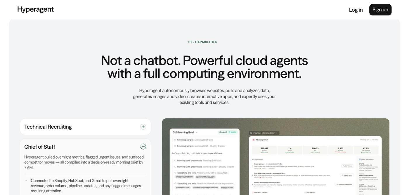
Hyperagent by Airtable is an AI agent platform that runs on stark type, a single input bar, and real work output — no diagrams, the product speaks first.
The homepage opens with a black serif headline...
Hyperagent: An AI Agent Platform Built by Airtable
prya
May 06, 2026
Hyperagent by Airtable is an AI agent platform that runs on stark type, a single input bar, and real work output — no diagrams, the product speaks first.
The homepage opens with a black serif headline set at maximum scale, white field, nothing else visible. Below it, a centered text input reads "What's the task?" — the same pattern as a search bar, reframed for agent invocation. Hyperagent by Airtable doesn't explain what an AI agent can do; it shows the finished work. Example cards in the hero carry real output thumbnails — ad copy mockups, real estate visuals, spreadsheet tables — alongside cost and duration metadata printed inline: 23 minutes, $8.82. That number does more than any feature list.
How the Hyperagent AI Agent Platform Uses Output as Interface
Further down, split-panel sections show the agent-built apps themselves: a Talent Scout dashboard, a Morning Brief map, a Campaign Planner. Each panel is polished enough to read as finished product UI. The brand voice section shows an OOH billboard mockup; the data intelligence section shows a schema context card. Hyperagent's design team understood that an AI agent platform is only as credible as the work it produces, so they made the work the decoration. The result is a site that functions like a portfolio for the product itself.
Xinmei Liu's 2025 editorial illustrations for The Economist, Atlantic, and Bloomberg make sharp, geopolitical arguments in pen-and-ink at magazine scale.
The pen-and-ink foundation is what keeps the w...
Xinmei Liu: Editorial Illustration With Ink and Argument
sofia
May 06, 2026
Xinmei Liu's 2025 editorial illustrations for The Economist, Atlantic, and Bloomberg make sharp, geopolitical arguments in pen-and-ink at magazine scale.
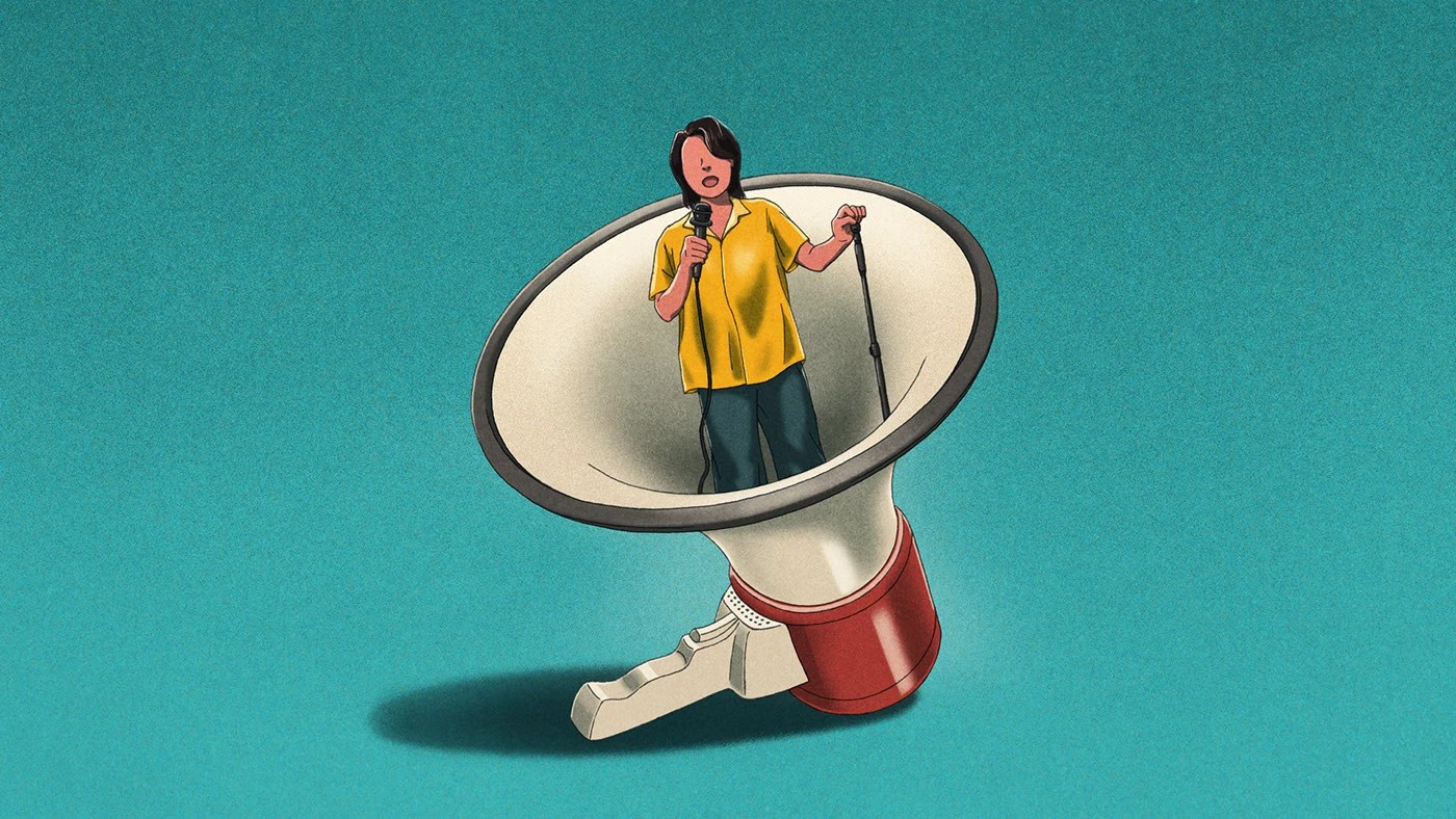
The pen-and-ink foundation is what keeps the work honest. Marks remain visible at column width — not as texture, but as evidence of a hand making a decision. Over that, flat digital color fields handle register and politics simultaneously: a blood-orange sky scattered with Chinese yellow stars situates power shift without a single word; a grey-and-crimson surveillance image uses the palette as argument, not atmosphere. The Economist stand-up comedy piece takes this further — one figure in a yellow dress, a spotlight circle, a flat teal field. No environment, no props. Everything is compositional economy.
Editorial Illustration for Magazine Clients in 2025: The Argument in the Line
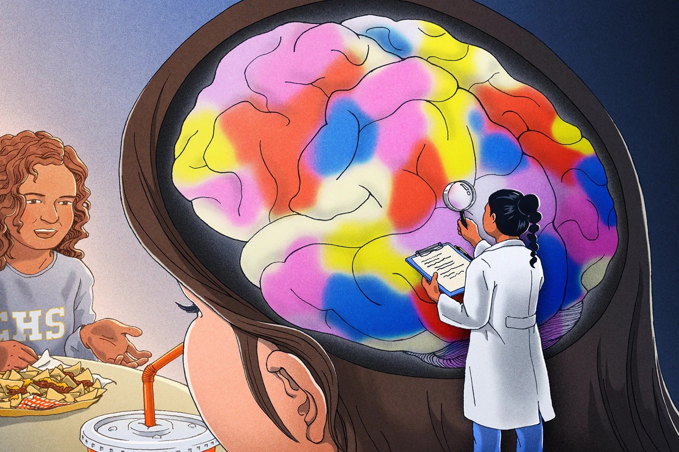
Liu's Bloomberg piece — a police officer's cap from behind, a scanning device at a doorway hung with New Year couplets — works through cinematic framing that doesn't editorialize. The viewer is positioned inside the implication. That discipline runs through all five editorial illustrations in the 2025 magazine cycle: specificity over cliché, position over decoration. The Vox teenage brain cross-section makes a metaphor literal without explaining it. These are images built for editors who need a visual that does the arguing when the headline can't.
See the full editorial illustration project by Xinmei Liu on Behance.
kidz studio built a hair salon brand identity for KOEP on one rule: the 45-degree cut. Every mark, card, and print motif in the system traces back to it.
The KÖP logotype sits oversized on full-bleed ...
Studio Five brand identity by The Negra pairs electric lime and tangerine with a hand-drawn ‘5’ logomark — built for a creative studio fluent in culture.
The Studio Five brand identity centers on a lo...
LUE is a modern supplement branding project by Yuliia Hrabynska that captures a bold, Gen Z-focused aesthetic through vibrant color palettes and striking typography.
The visual identity for LUE depart...
Plant Atelier is an e-commerce design for indoor plants. Clean layouts, natural greens, and a cozy digital storefront by Moscow designer Ayna Kravetskaya
The interface relies on a restrained palette o...
Muted Char is a minimal incense brand packaging design where off-white paper, dark matte tin, and a weight-contrast logotype do every bit of the talking.
Alex O'Connor set two typefaces against each o...
Forner Studio's Soto branding turns home improvement into a creative act — square-to-circle wordmark, sage green packaging, and pure modernist restraint.
The wordmark is the argument. In the Soto bran...
QUENTO is a Didone display typeface by Kimmy Lee and Petros Afshar. Extreme stroke contrast, true vertical axis, and 550+ glyphs for editorial headlines.
QUENTO is a Didone display typeface built on o...
Bloodhound is a cafe branding project by Johanna Szpetun for a Darlinghurst venue built around the concept of human fuel.
The identity uses a lightning bolt symbol over warm amber and dark brown tones...
Anvila is an architecture brand identity design. Wordmark A and V letterforms are drawn from sectional geometry — built like a floor plan, not styled up.
Style Craft built this architecture brand iden...
This week's strongest work shared a structural quality: every piece has something physically legible about it. A typeface built for dominance at frame-filling scale. A packaging system where every vis...
Sleeko Studio and DewApples Studio built CRAVEA's coffee brand identity and packaging design as one total system — cobalt blue, custom wordmark, line art
The wordmark drives everything. Sleeko Studio ...
The Ruff Lamp is a 3D printed lamp by Mina Wright — ten stacked recycled PLA rings translating a 16th-century ruff collar into precise, layered geometry.
At 35cm tall, the 3D printed lamp builds its s...
Plus X rebuilt KT’s corporate identity around a curvilinear Flow motif, a bespoke typeface, and a coral gradient that scales from app icon to lobby wall.
Plus X built the identity renewal for KT—South...
ATF Manarola font is a bold display typeface by Arkitype Foundry, built in vintage Italian signage tradition with three styles and Mediterranean palette.
Arkitype Foundry built the ATF Manarola font a...
Clay shaped Eden branding for an AI home design app — Martina Plantijn serif headlines, ABC Diatype body, terracotta palette, botanical photography.
The challenge behind the Eden branding was simple: ...
TRUE AGENCY's Mamico kids store branding covers 1,700 m² — isometric zoning maps, coral-orange play structures, and a double-heart M mark at every scale.
The palette is three values: deep navy (#3B4A7...
Lumenist explores 3D color rendering where light bleeds across simple forms. Alex Maltsev focuses on chromatic transitions and rendering without geometry.
The project sidesteps heavy 3D modeling...
Will bank identity by Renan Benvenuti combines acid yellow with a geometric wordmark system applied across signage, stationery, and campaign photography. A Brazilian identity design with clear scale c...
SEEQ Agency designed Reusable, an eco-focused brand identity and minimalist website for a sustainable cutlery and tableware company serving the event industry.
The project created a cohesive visual sy...
Irfan Khatri crafts Vessilux luxury real estate branding with deep khaki, geometric marks, and restrained typography that signals permanence over excess. The logo—a split square that reads as a hexago...
Rajesh Rajput's Million is a condensed display typeface variable font design 2026. 18 styles, 9 weights, inktraps — specimen layouts at full-frame scale.
Rajesh Rajput built Million around a single pr...
Dott is a low code testing platform with a clean dashboard interface. Designed by Berriel Brands in Brazil, it lets teams run performance and API tests without deep programming knowledge.
The interfac...
Bortoletto Studio developed a brand identity for Casagrande Design Mobiliario — warm gold tones, serif logotype, restrained systems for custom furniture.
Casagrande is a custom furniture company based...
CodeWisp is an AI-powered game creation platform that lets you build playable 2D and 3D games by describing them in plain language. No coding required.
The platform handles the heavy lifting: you desc...
Dex's typographic maps of London use hand-crafted type to plot novels, films, and songs at real London locations — a ten-year project, one map at a time.
The series began in 2012 with the Literary Lon...
Unspoken Agreement built SanDisk's packaging design system to scale across SD cards, USB drives, and SSDs — one visual language, no dilution at any size.
The packaging design system runs on two decisi...
Bond merges skincare and makeup through ingredient-driven color. The BB monogram, wordmark, and packaging create a cohesive beauty branding system built for real consumers.
Renan Benvenuti built this ...
OGV Studio's flyer design collection uses type at bleed scale, two-tone fields, and reversal systems to turn event print into graphic objects.
Ognjen Gligorijevic runs OGV Studio out of Amsterdam, and...
Chasing the tail of the digital revolution? Discover "The Campfire Cure"—a journey of unplugging, recharging in the wild, and finding inspiration where the signal fades.
Another model was released. It...
Fhome is a brand identity for indoor skateboarding that trades wellness clichés for a hero yellow and raw black. Built by Nicolas Mores on a single insight — the home is the world's most underrated sk...
MakeMake's motion design title sequence for Netflix 2026 hides dinosaurs inside geology. The mountain crags are spines. Valley floors are creature backs.
Duncan Elms and the MakeMake team built this m...
ONY Agency rebuilt Think Agency's digital agency branding identity in 2026 around one metaphor: liquid that shifts, flows, and never locks into place.
The core mark is a capsule form — three versions ...
London studio Templo designed the CASI brand identity around hobo hieroglyphics and Matisse cut-outs: a climate brand built to inspire rather than alarm.
CASI (Climate Action Service International) is...
The Asanoha Kumiko pen holder 3D print by designer Meyui is a desk organizer that translates centuries-old Japanese woodworking into something any FDM printer can produce. With 6,907 downloads and 18,...
Studio Yellowdot Tattile 3D printed furniture translates Barilla ARTISIA pasta shapes into a daybed, rocking chair, and chaise at Milan Design Week 2026.
For Salone del Mobile 2026, Barilla's luxury d...
A SaaS logo branding project merging architecture and digital-age minimalism. Nilima Islam designs the SPHERO cloud identity with the precision of craft.
The brand rests on a geometric wordmark—block ...
Soulz brand identity from Uncave Studio anchors a high-contrast dark serif wordmark low on bubblegum pink and periwinkle lavender across all touchpoints.
Uncave Studio, based in Esteio, Brazil, design...
Kettal and Eames Office finally bring the Eames Pavilion System to market, turning Charles and Ray's 1949 modular steel-frame design into livable spaces.
The Eames Pavilion System is one of the most c...
BOND is a Brazilian beauty branding system by Renan Benvenuti that bridges skincare and makeup through vibrant color, modular packaging, and co-creation.
The Brazilian beauty market sits at an interes...