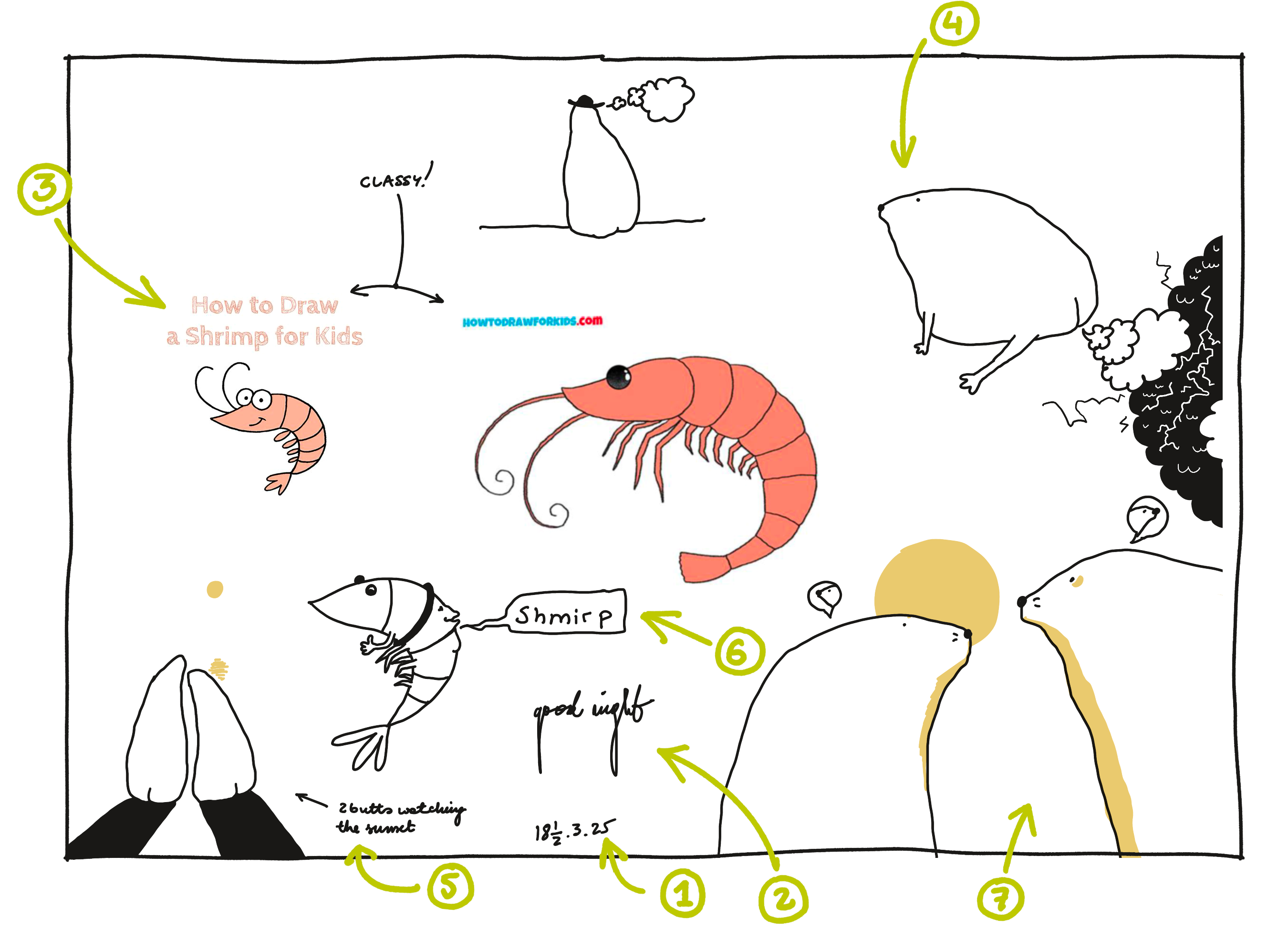
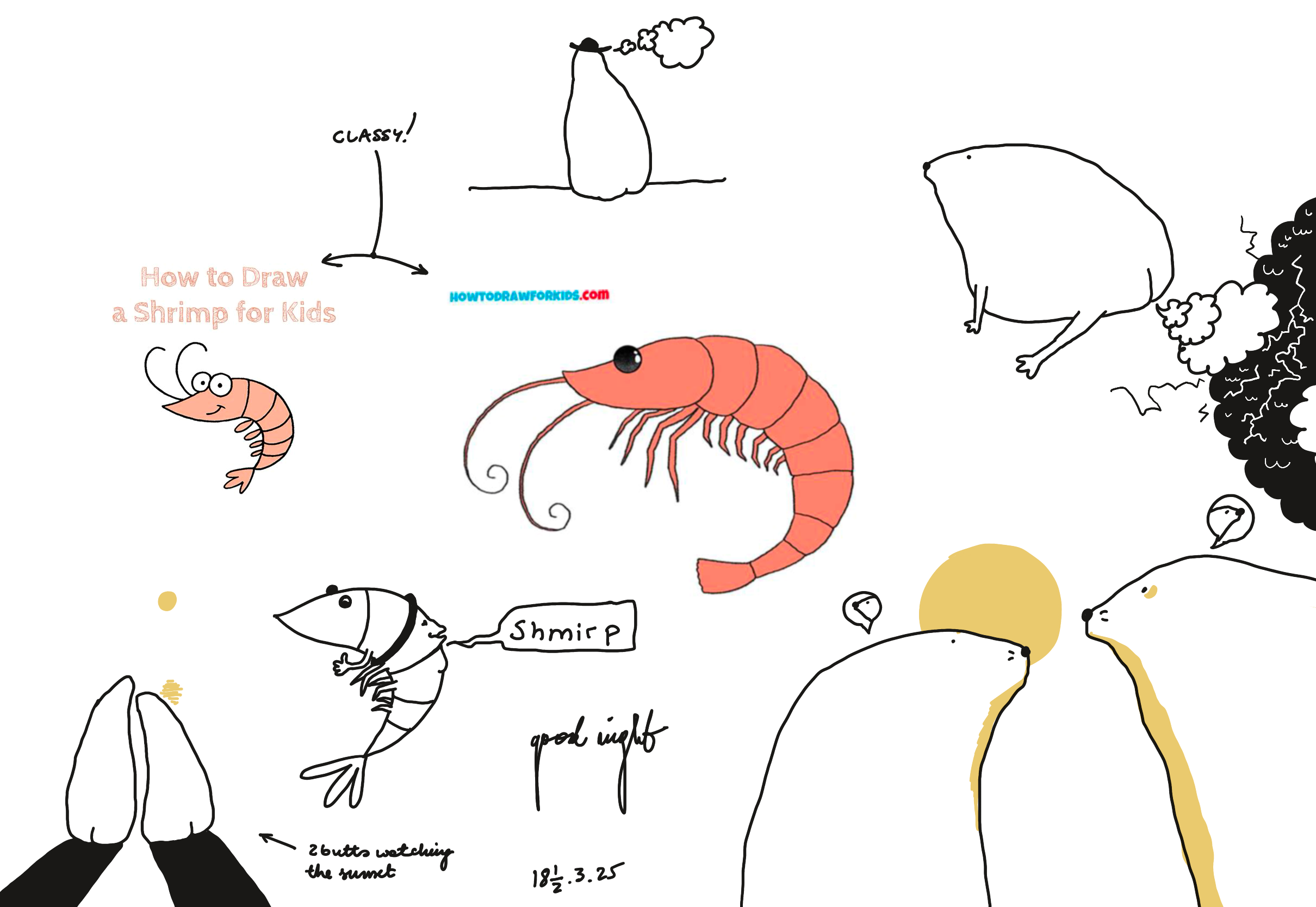
Show full content
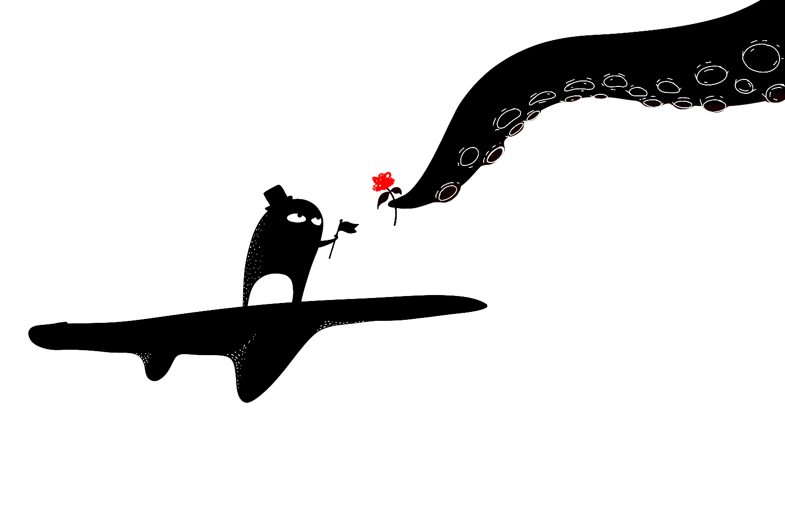
Friend, I looooove cigarettes!
.post-obey__love-animation { font-size: 24px; display: inline-block; } .post-obey__love-animation span { display: inline-block; animation: post-obey__bubble 2s ease-in-out infinite, post-obey__rainbow 3s linear infinite; background: linear-gradient(45deg, #ff0000, #ff8000, #ffff00, #80ff00, #00ff00, #00ff80, #00ffff, #0080ff, #0000ff, #8000ff, #ff00ff, #ff0080); background-size: 400% 400%; -webkit-background-clip: text; background-clip: text; -webkit-text-fill-color: transparent; font-family: 'Comic Sans MS', 'Comic Sans', inherit; margin: 0 .1em; } p:has(.post-obey__love-animation) { font-weight: bolder; } .post-obey__love-animation span:nth-child(1) { animation-delay: 0s; } .post-obey__love-animation span:nth-child(2) { animation-delay: 0.1s; } .post-obey__love-animation span:nth-child(3) { animation-delay: 0.2s; } .post-obey__love-animation span:nth-child(4) { animation-delay: 0.3s; } .post-obey__love-animation span:nth-child(5) { animation-delay: 0.4s; } .post-obey__love-animation span:nth-child(6) { animation-delay: 0.5s; } .post-obey__love-animation span:nth-child(7) { animation-delay: 0.6s; } .post-obey__love-animation span:nth-child(8) { animation-delay: 0.7s; } @keyframes post-obey__bubble { 0%, 100% { transform: scale(1) translateY(0); } 50% { transform: scale(1.2) translateY(-5px); } } @keyframes post-obey__rainbow { 0% { background-position: 0% 50%; } 100% { background-position: 100% 50%; } }
🎶 I love nicotine,
the Tammy to my Ron,
the Shams to my Rumi,
the fire of my lungs. 🎶
I also love having a healthy body and generally not feeling like I've rented an Airbnb in Serge Gainsbourg's mouth. And, I've gotten pretty good at quitting, I quit all the time, sometimes for a day, sometimes for a year or two.
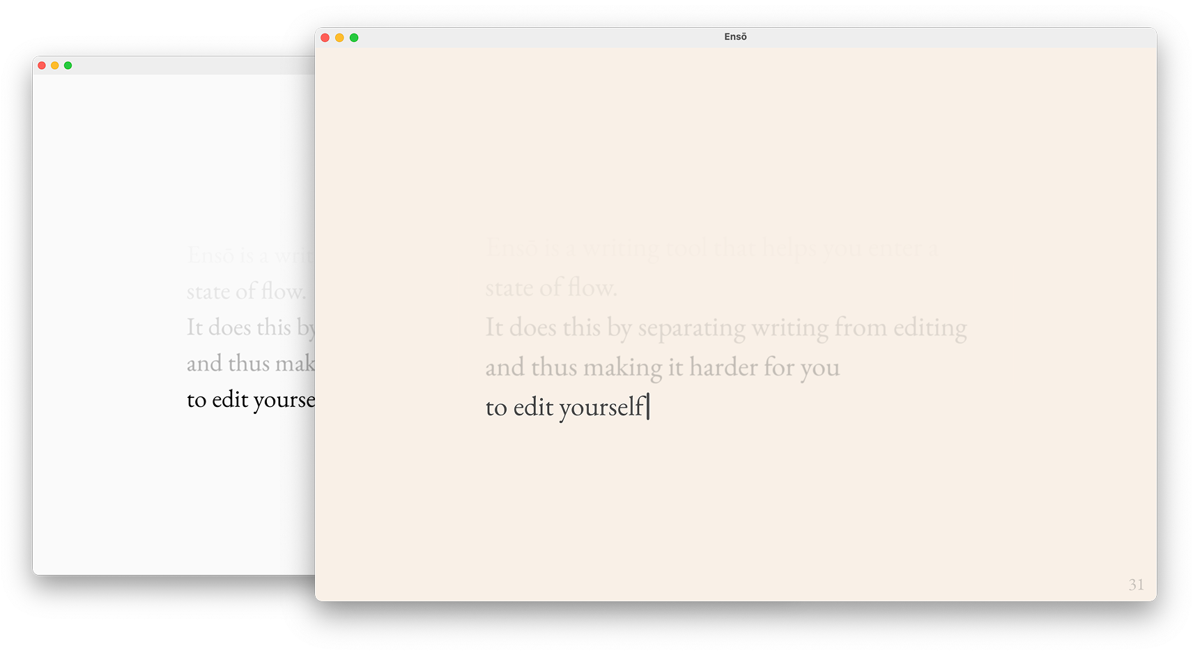
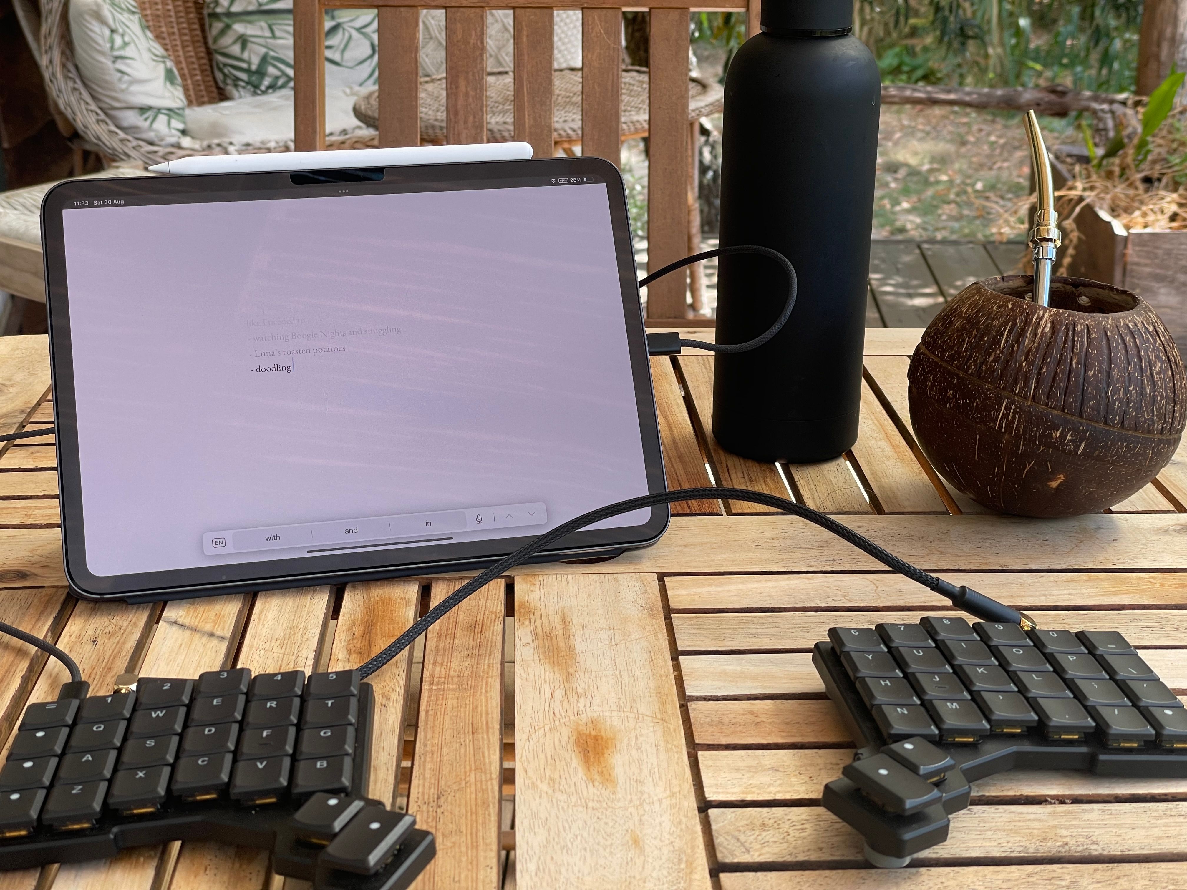
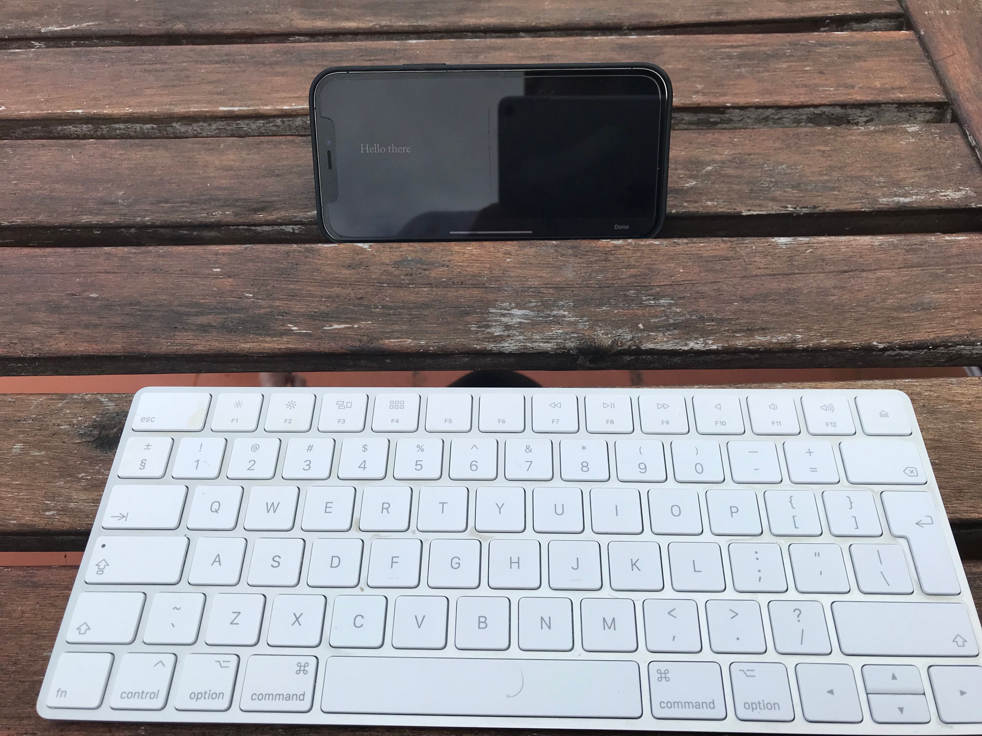
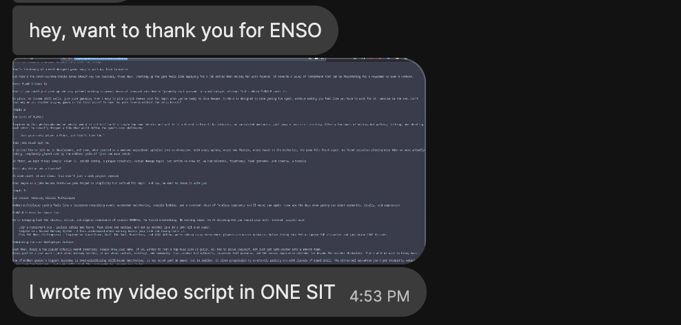
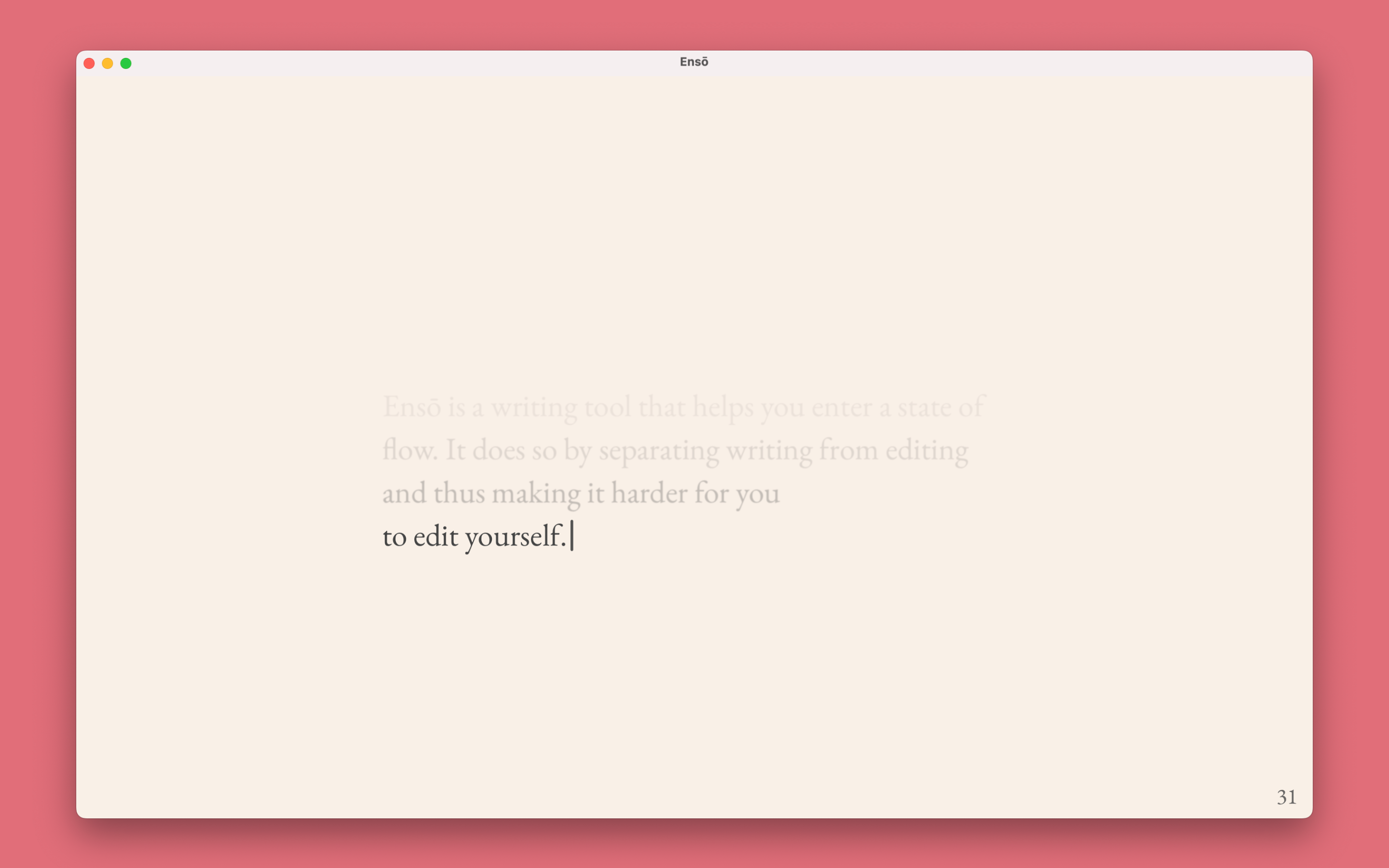
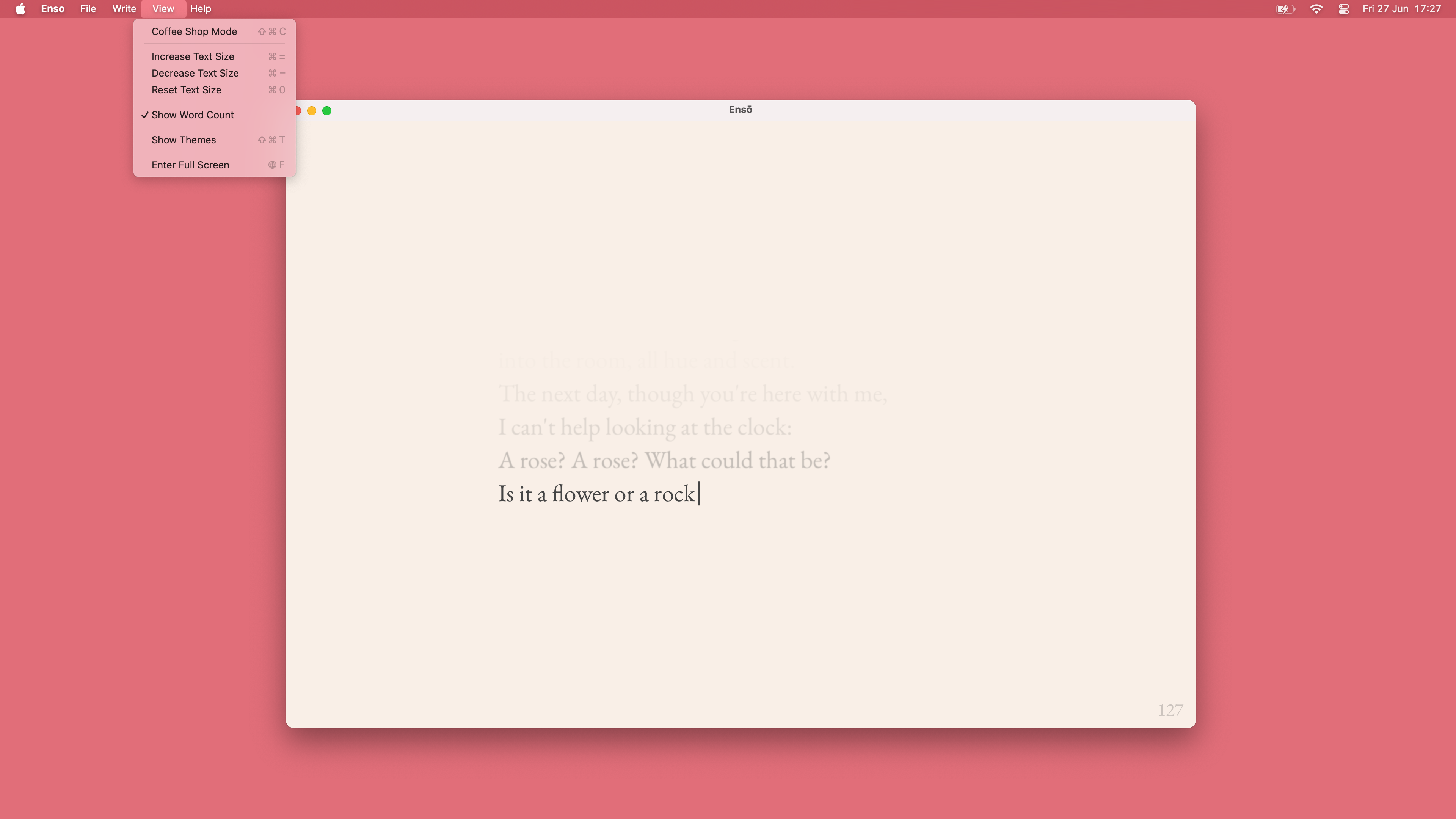
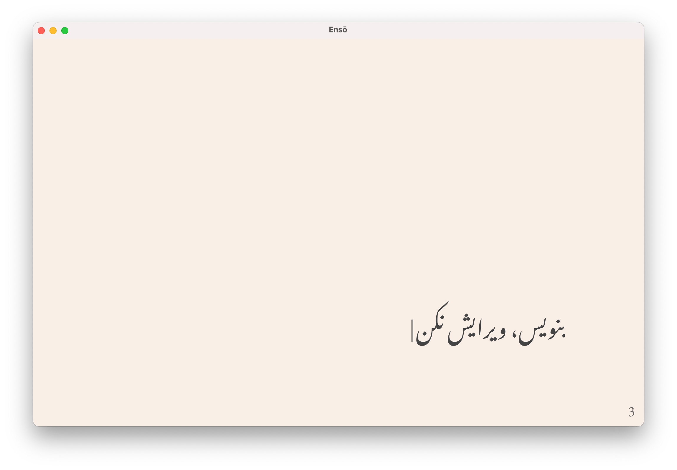
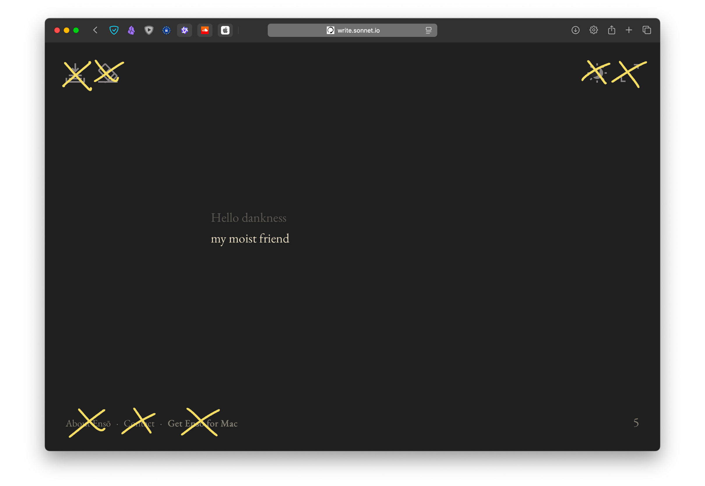
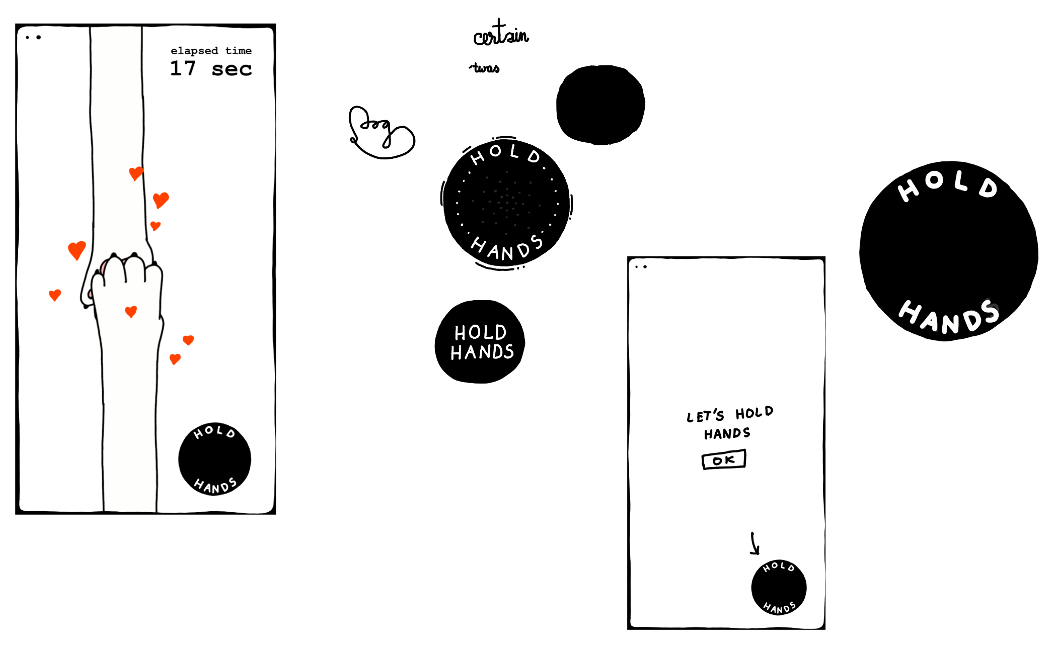
So, I made myself a little web app I open when I feel like grabbing a cigarette. It's called OBEY and can be found here: obey.potato.horse
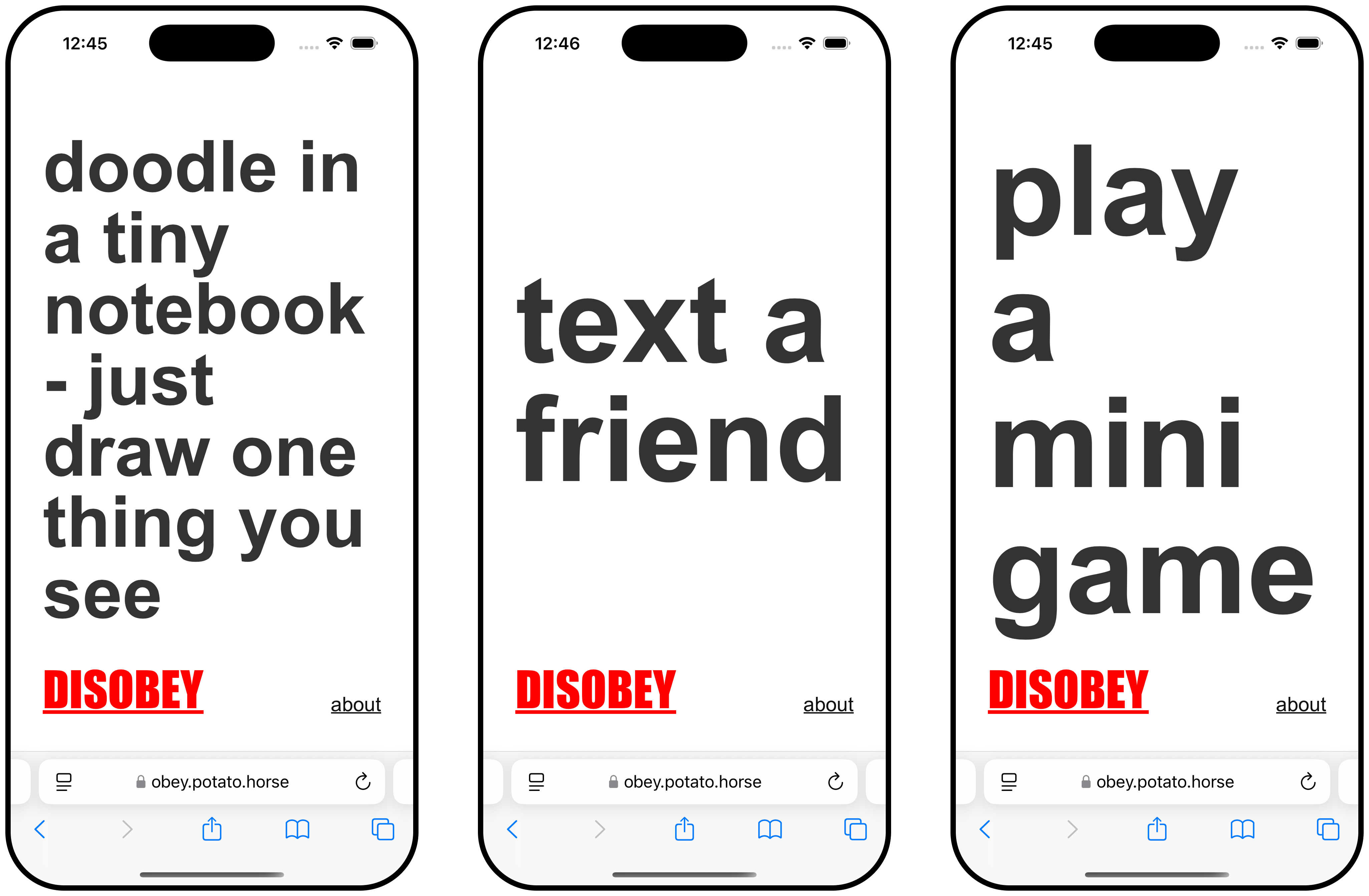
- go to obey.potato.horse
- do what it says
- feeling rebellious? hit disobey
- rinse and repeat
You can find the source here. Feel free to fork it and make it yours!
This isn't a new idea, of course. I've also talked about something similar (Mental Health Toolbox (working title)), and one of my Say Hi friends is working on a more sophisticated approach to the subject.
Why I made itRelated: Projects and apps I built for my own well-being, Things to support my own well-being – a wishlist
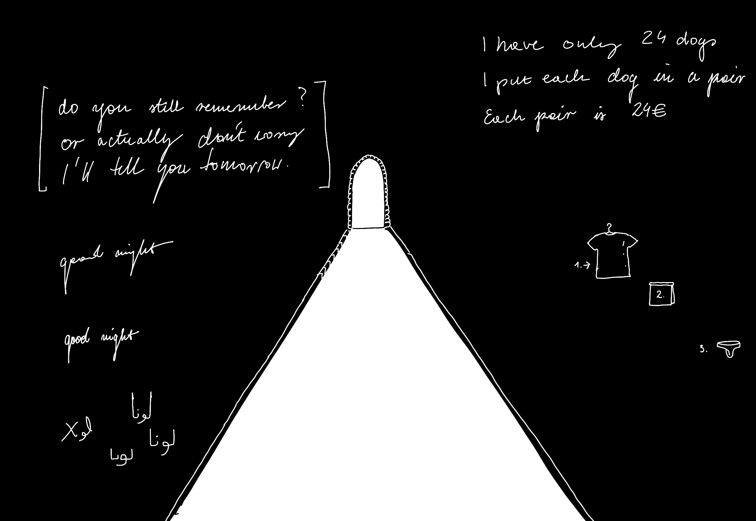
My younger brother quit smoking several years ago, but he still keeps a pack of Marlboros in his drawer. He felt that having this little splinter in his eye every time he thinks about nicotine would help him built up more willpower, more resilience. I'm happy it worked out for him in the end, but he's in the minority.
The general consensus is that yolo-ing it and quitting cold turkey usually yields poor results (some research suggests 3% success rate within 6-12 months for raw dogging it vs. 30% for therapy + NRT). I'm one of the 97%. Over the years of quitting and embracing the sweet dark taste of cancer sticks I've learned that there is no point in making my life harder when I quit.
What works for me:
- preparation, setting a date,
- understanding the nicotine half life and withdrawal symptoms,
- understanding my triggers and not downplaying their effect on me,
- trying not to over focus on shame/guilt,
- NRT,
- understanding the reasons I chose to self-medicate with, well, insecticides, and
- patiently, methodically going through the steps.
First things first: this app could've been a piece of paper. The app doesn't solve the problem. The process, having an excuse to think about something deeply was the important part. 99% of my work was therapy and planning, which includes spending a couple of afternoons thinking about the triggers.
(come to think of it, this is the 2-2-2 Project Scoping Technique applied in reverse: 2 days of pondering, 2 hours of coding)
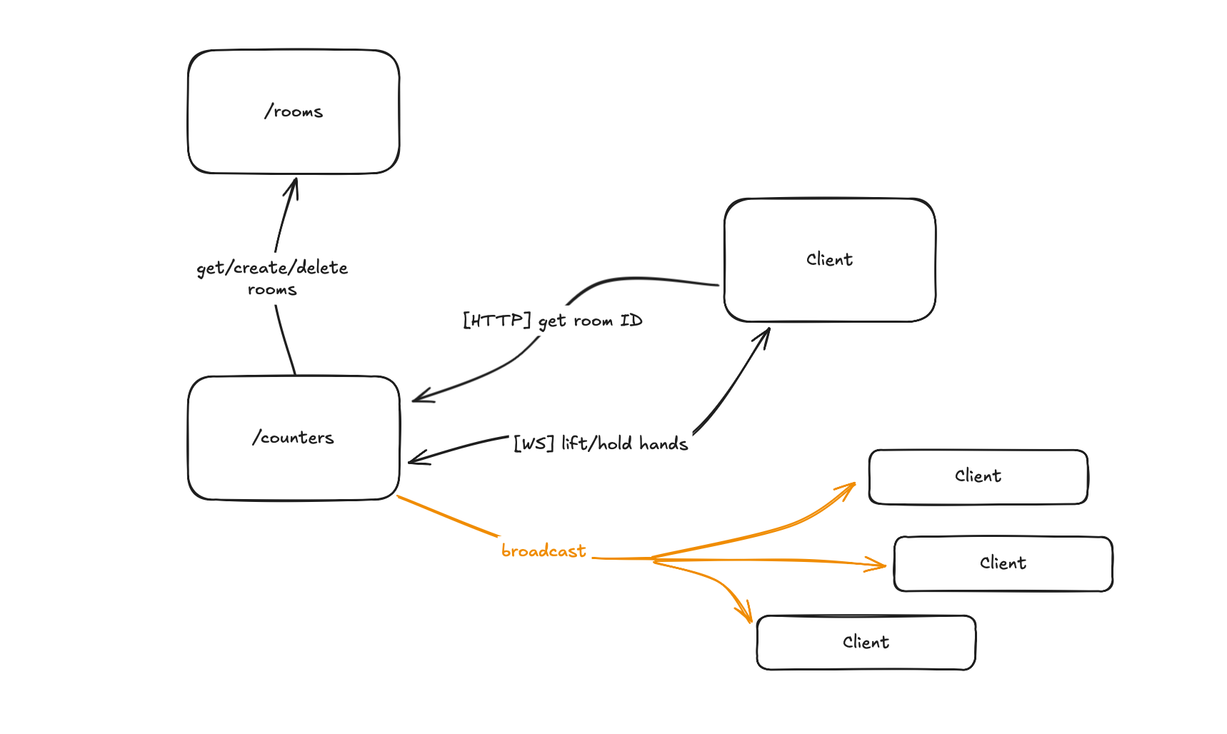
Now, the technical part:
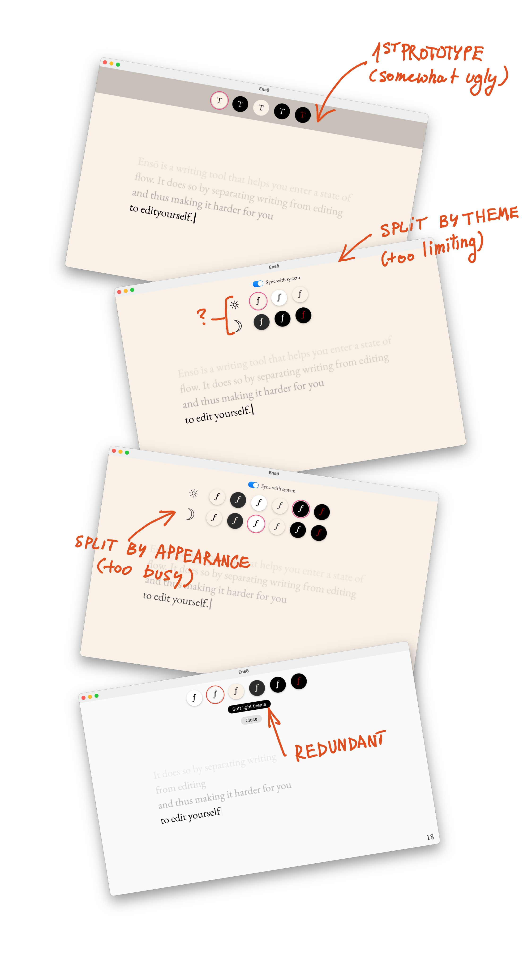
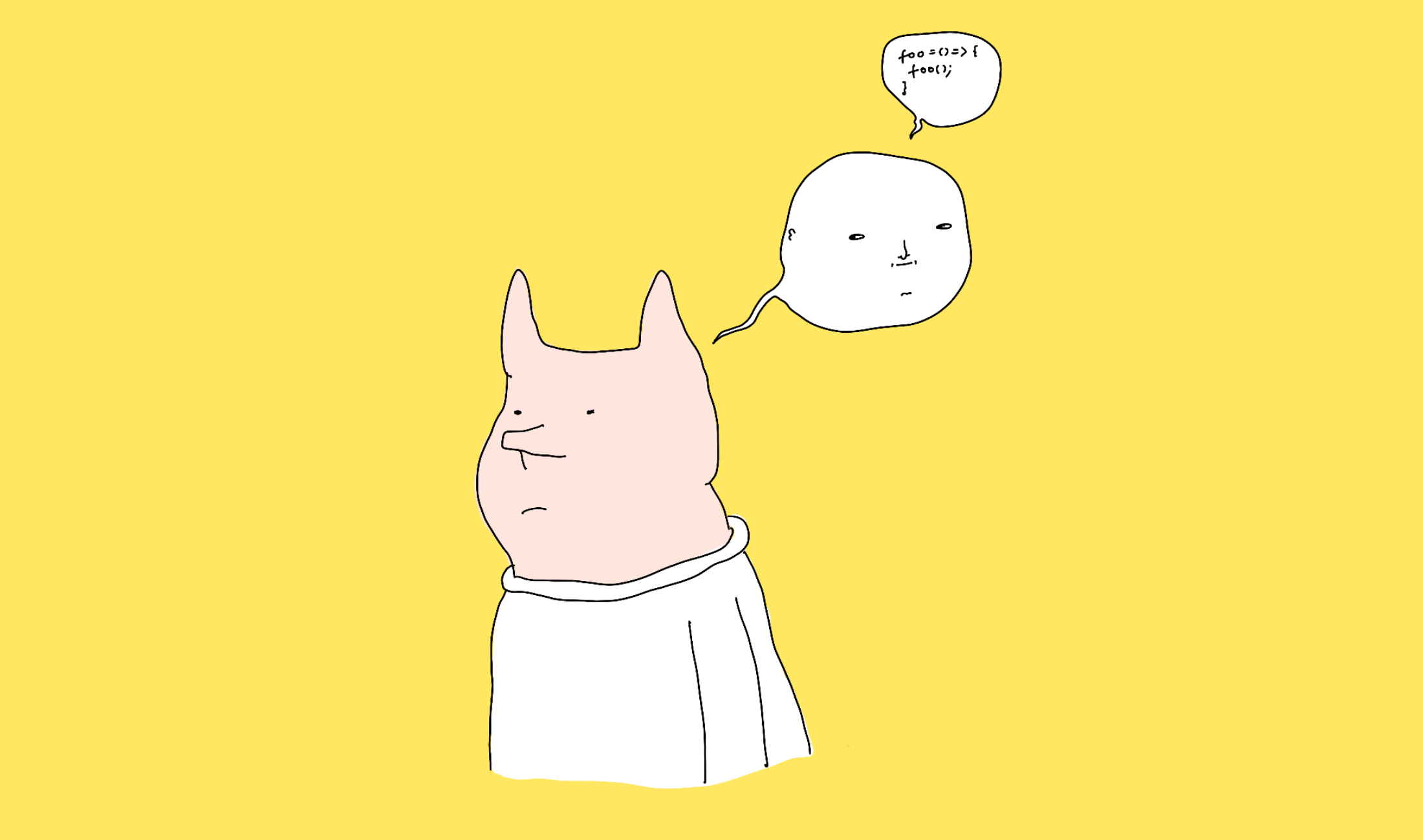
- I coded the app shell using Claude over 20 or so minutes
- I added the more custom parts (such as better font-sizing) manually
- I pushed to Vercel using yolo (related: Web and Feedback Loops, Short: WiP)
Problem: How to make a piece of text fill the available space, vertically and horizontally, and respect word breaks?
In short, there's no native, one line CSS or HTML solution to that problem and the classic approach goes like this:
- start with the biggest possible font
- scale it down by X
- check if the element is larger than its container
- if that's true, go back to 2.
The main difference from my approach vs. what Claude or SO will tell you is using a multiplier for size instead of a fixed value. Doing so should reduce the number of calculations required to fit within the existing container.
This part was purely for fun. OK, jumping straight into typography is a perfect way to distract myself. That said, it was still helpful to keep this step as a little reward for myself when I felt stuck.
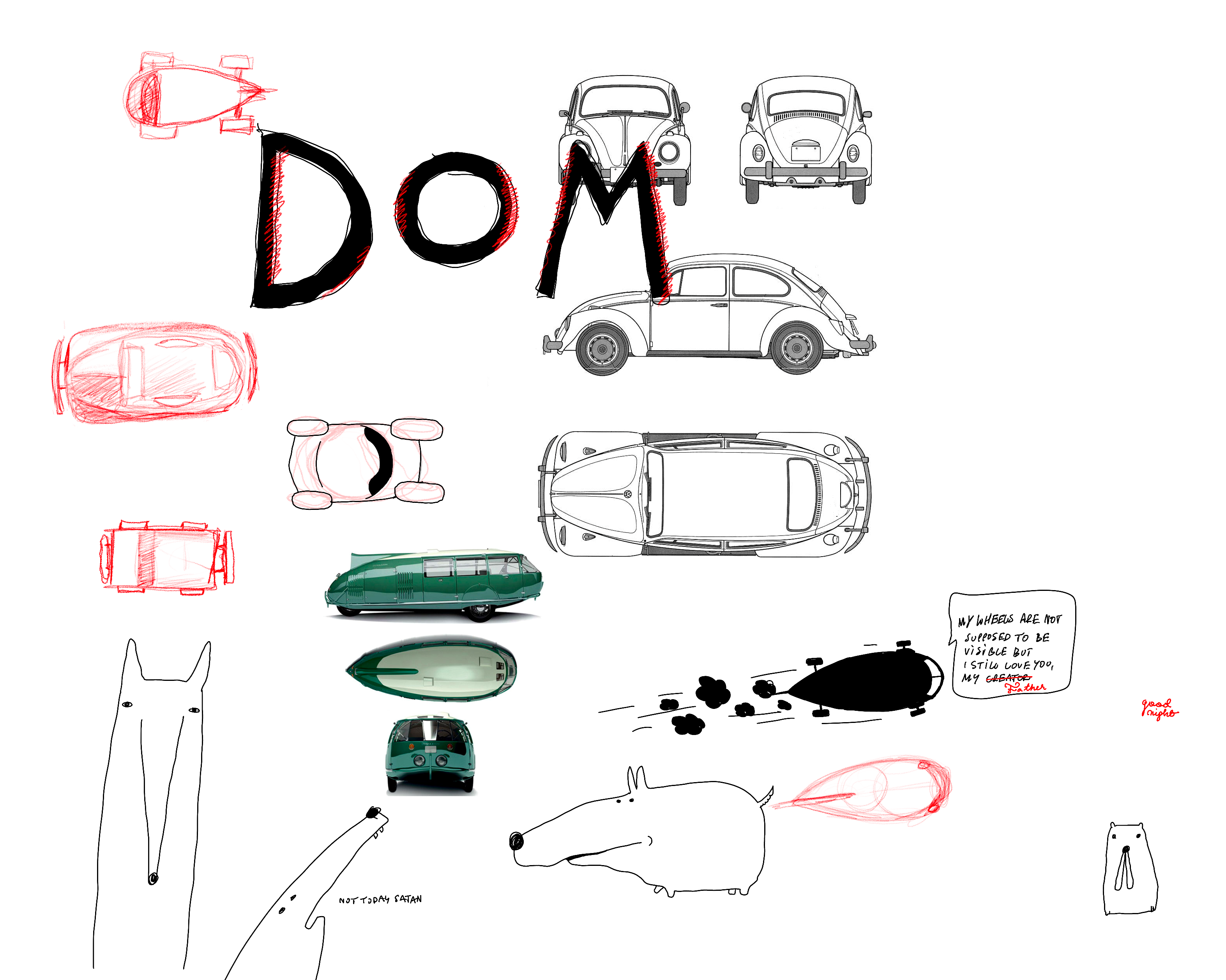
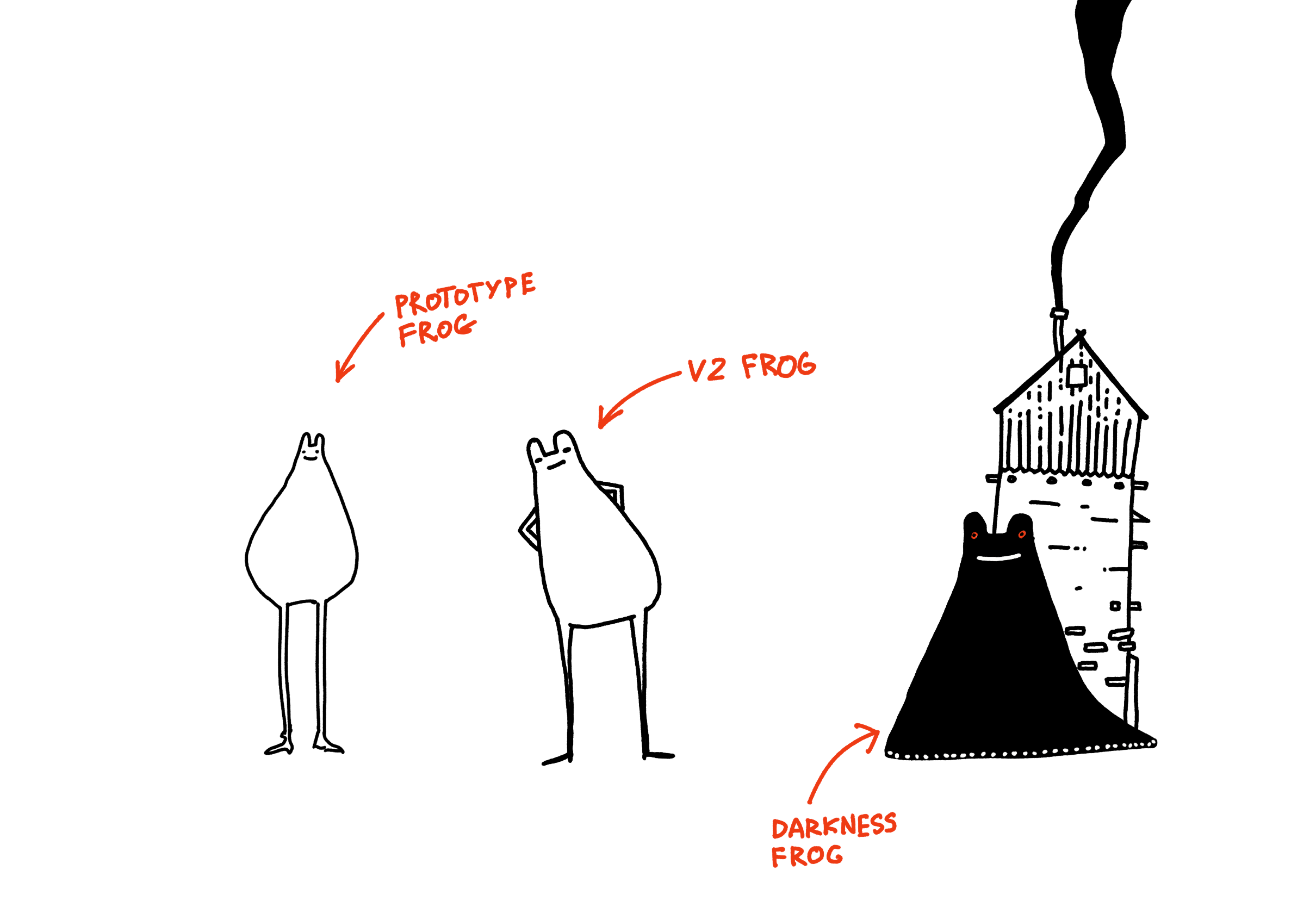
I love making my own tools. I grew up above a carpentry workshop and almost everything that could've been made of wood in my house, well, was made of wood. We weren't an isolated case either. Even the rays of light adorning the paintings in the church in my hometown were made of physics-defying stained oak. I'm similar to other Pastuszaks in that regard, I love surrounding myself with things/toys/tools that are mine (Reactive Hole · sonnet.io, Bird-knife, My Bootleg T-shirts, The Janusz I Live In, Projects and apps I built for my own well-being). Web is my medium. I doodle in HTML/CSS almost as often as with my pens or Procreate and have been doing it since I was ten. I had six personal sites before we had internet.
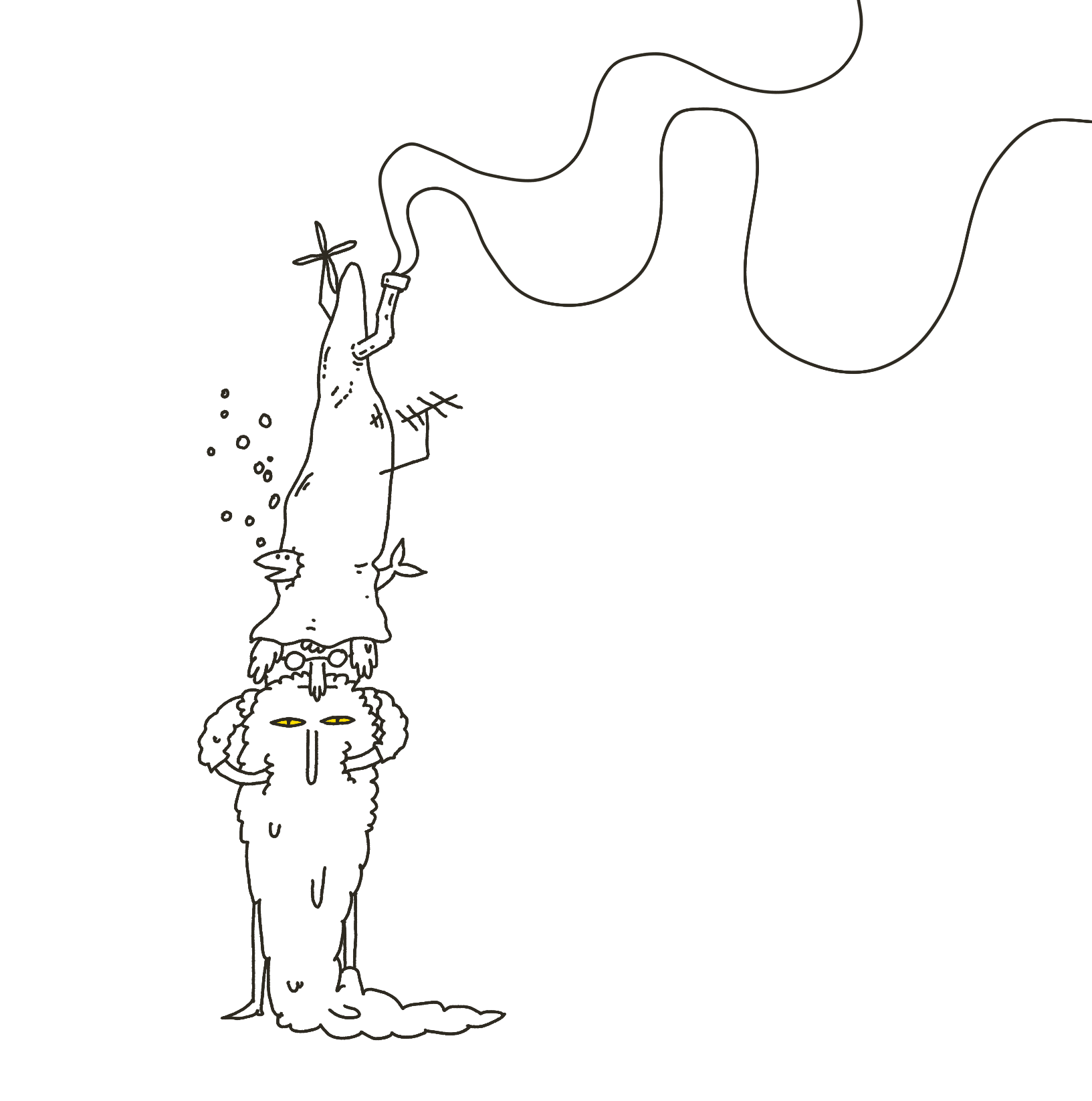
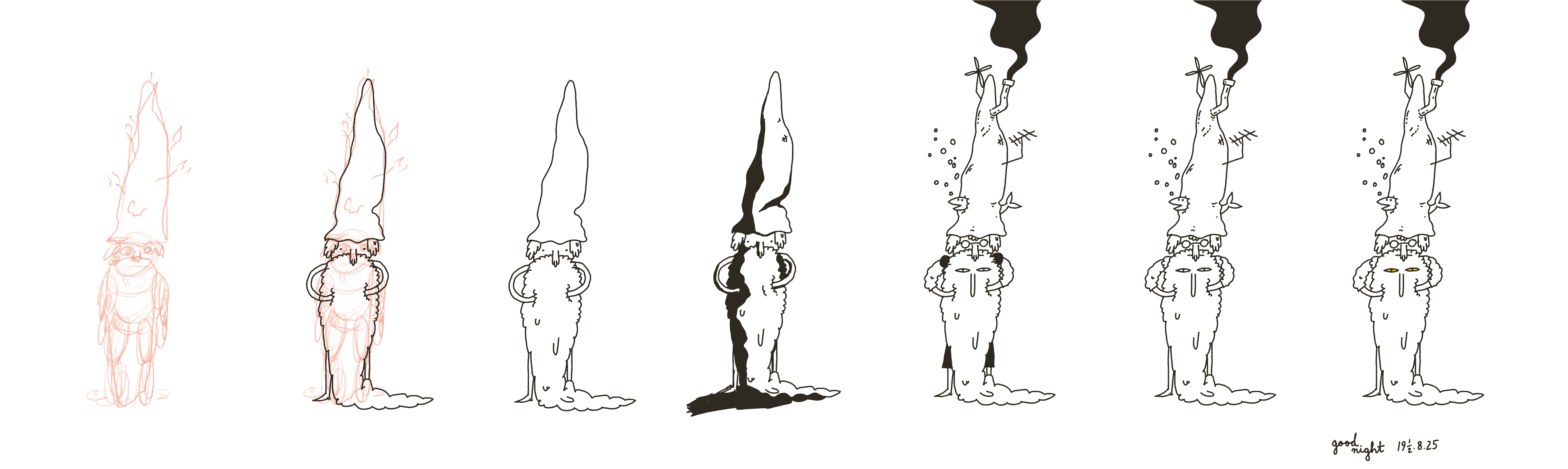
Why "OBEY"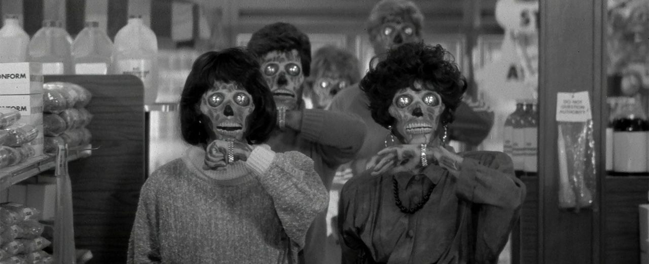
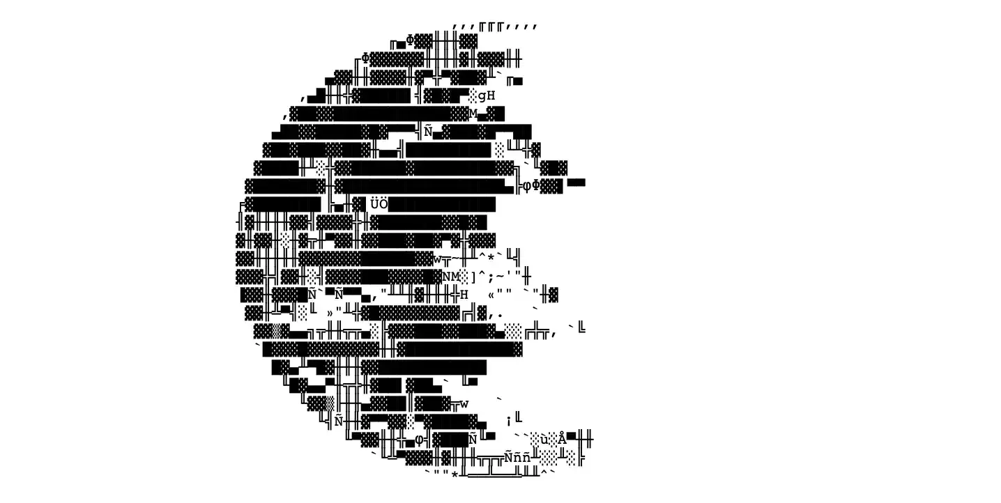
- As I was sketching it the typography reminded me of They Live
- Luna found it funny
I quit roughly a month ago and over the past three weeks I used OBEY around a dozen times, perhaps a bit more. I noticed that instead of opening my phone, I just pick one a thing to do from the list committed to my Thought Sponge Memory Storage™. I don't think there's anything that surprising about this observation.
Again, writing, coding, and testing/playing forced me to think and plan. The time spent on it was the biggest value. This little web app could've been a piece of paper, but that doesn't diminish its value.
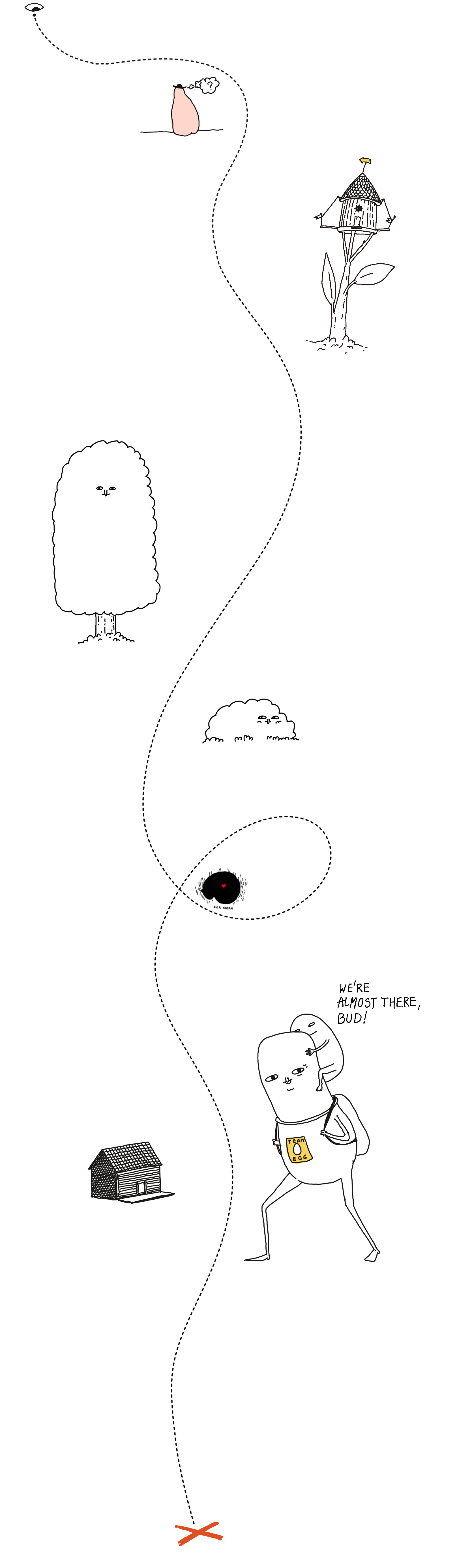
The risk with DIY projects like this is that they can be a huge distraction. After all, instead of doing the scary thing, you can always choose the difficult but familiar thing and thus fulfil the immediate emotional need. It keeps you busy for a few hours, but the next morning you might wake up and realise you're still in the same place, with the path now somehow being even longer and more winding.
The other side of the coin: is it fun? Does it also help me improve something that's been bothering me for such a long time? Now, I feel mostly happy that:
- I had an excuse to play with my toys, and
- I have the skills that allow me to do something good/wholesome and improve my well-being, and
- I could apply them with ease, aaaaand
- I could write and think about this here!
In other words, I don't feel that I wasted my time, this time.
Take mainstream self help literature as an example. Most of it is cringeworthy pseudoscience or two A4 pages of CBT worksheets, diluted into two hundred pages of pep talk. Survivorship bias aside, I think the reason it helps some people is this: it forces them to sit on their asses for a few hours and actually go through the process of thinking about it deeply. Instead of memorising a checklist, they're forced to go through the process of thinking, feeling, introspecting.

Perfectionism is fight or flight. With practice (and luck), sometimes we can learn to distinguish between using work to avoid thinking about/feeling something vs. using creative work and play as a tool.
Letting curiosity speak louder than guilt helped me this time.
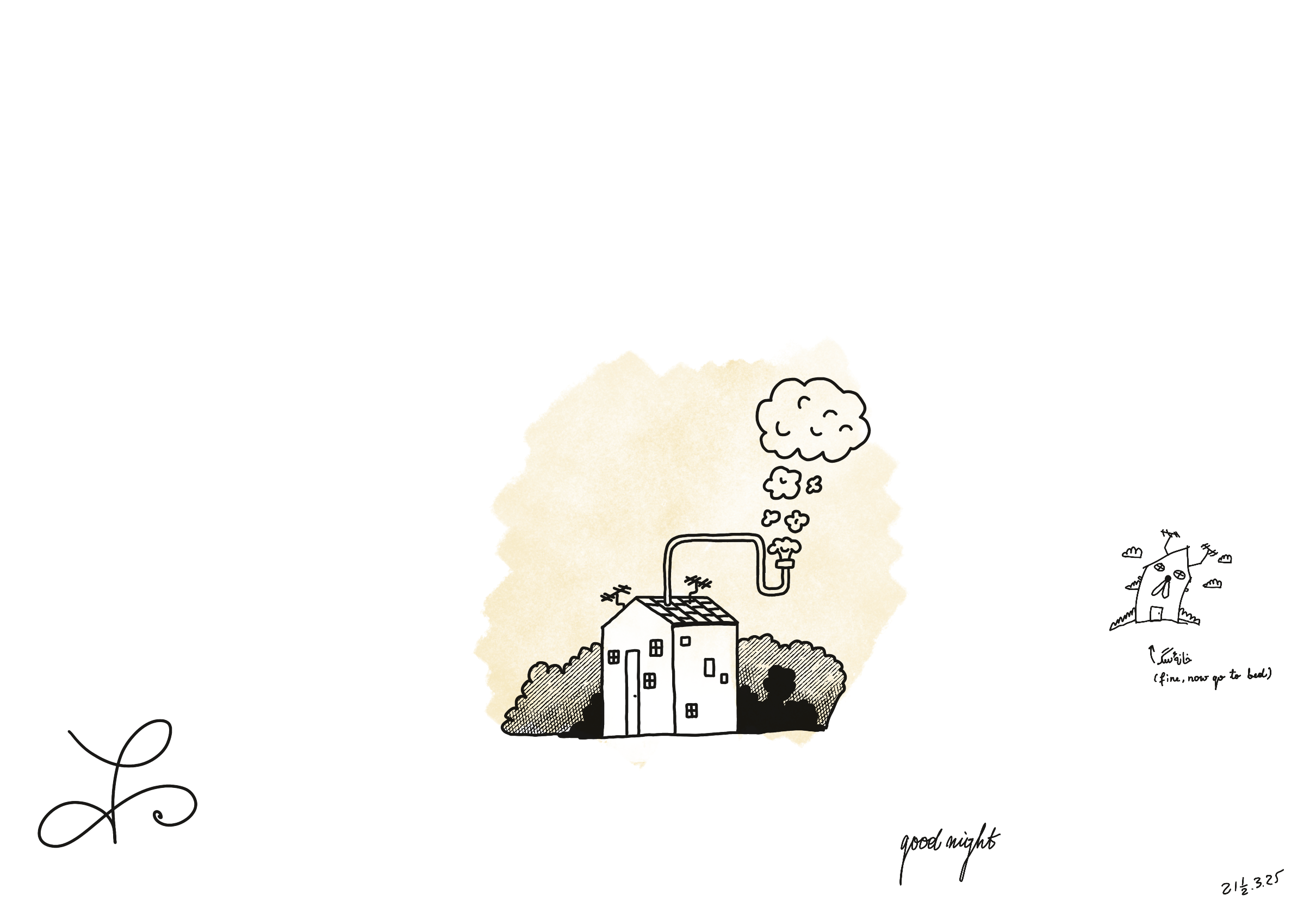
That's all for today, thanks for reading!