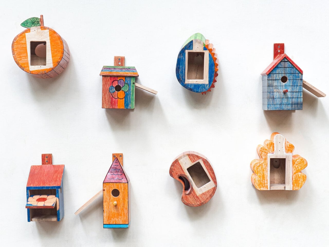
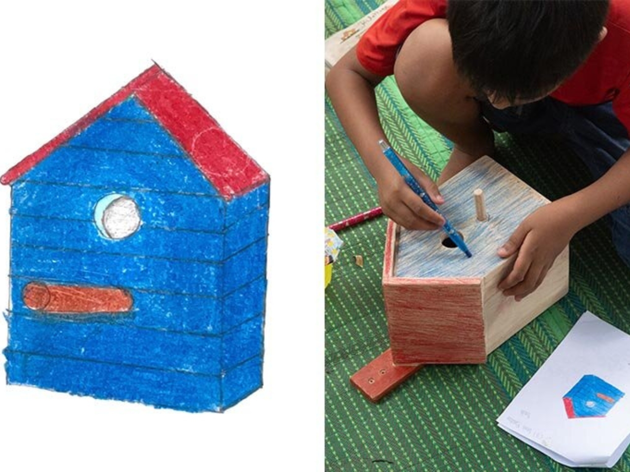
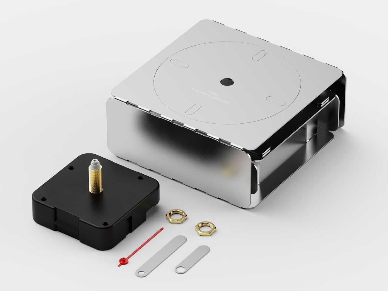
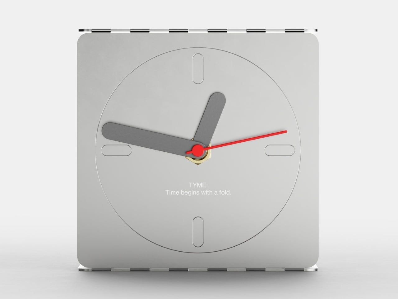
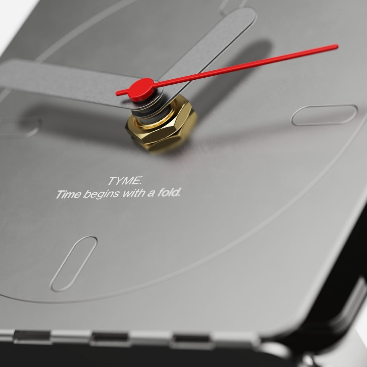
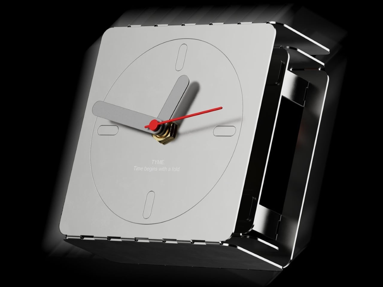
TablewarechopsticksConcept Designsglow in the dark
These Chopsticks Glow at Dinner Without a Battery or Power SourceChopsticks have been around for thousands of years, and their form has barely changed. The material varies, from wood and bamboo to polished metal and...
Show full content
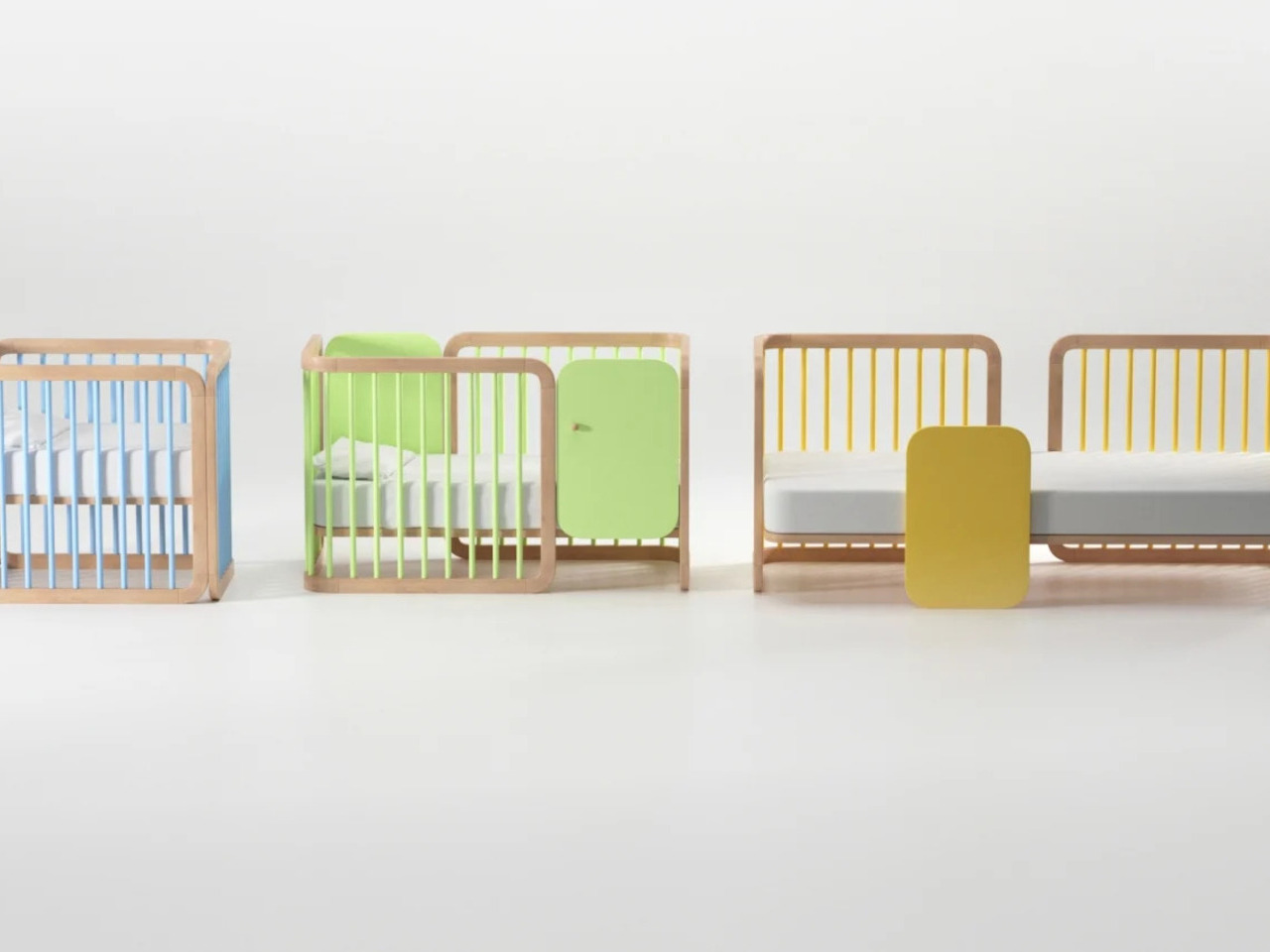
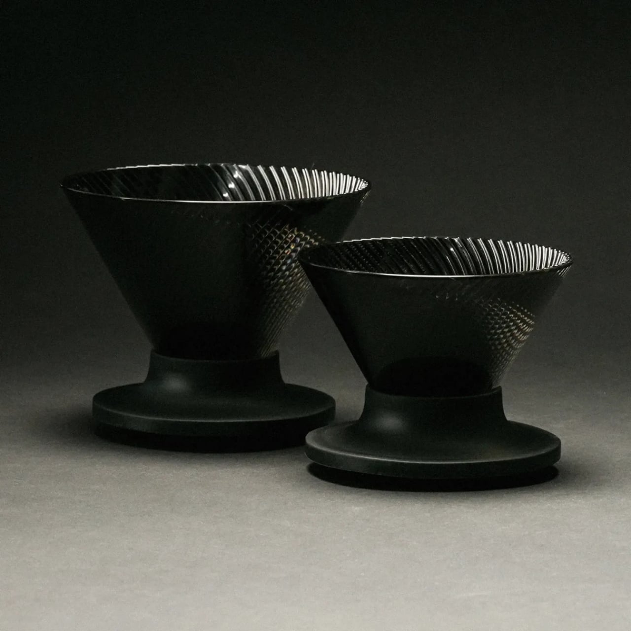
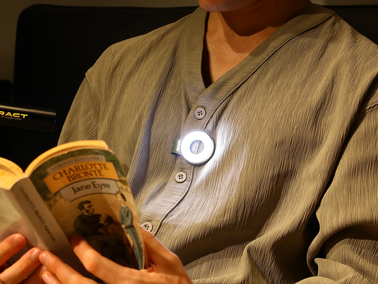
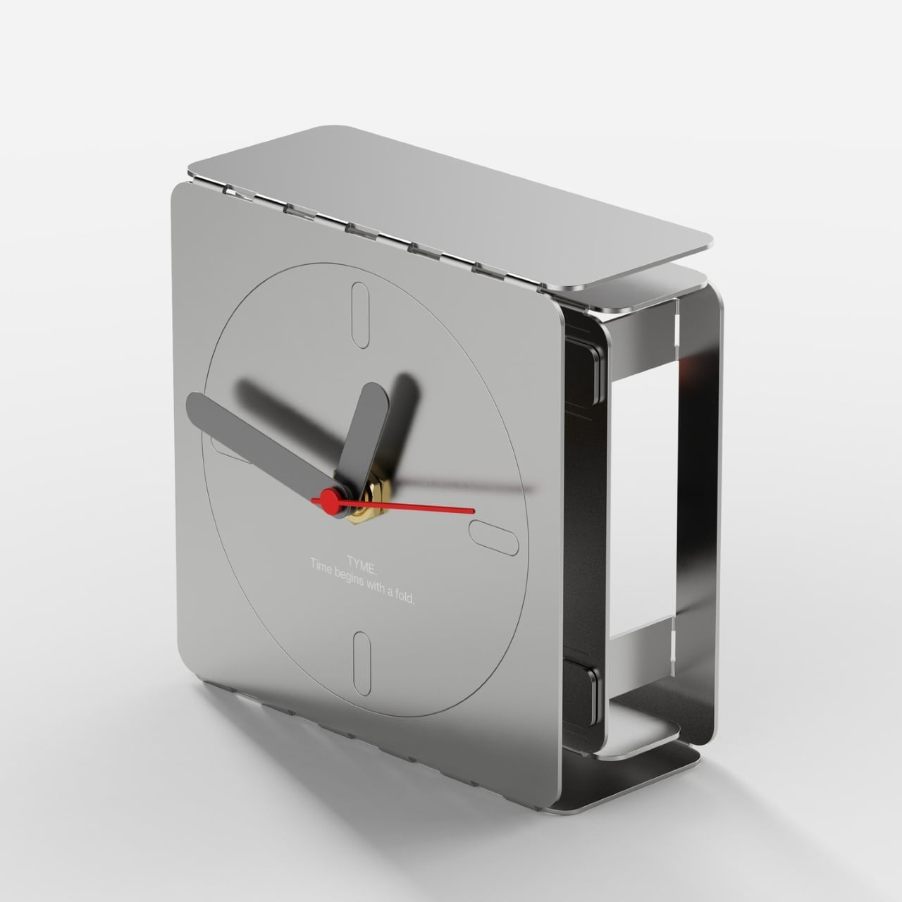
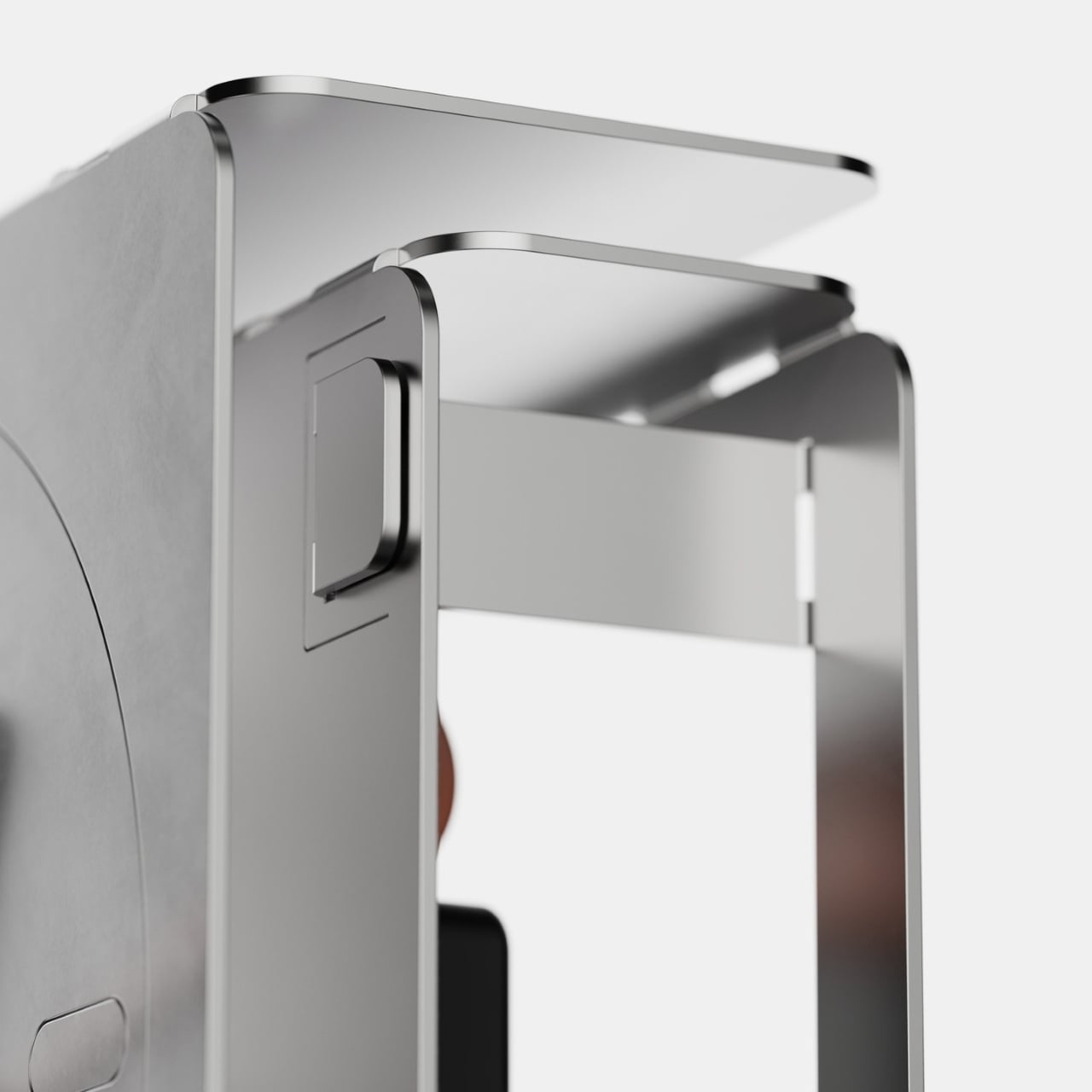
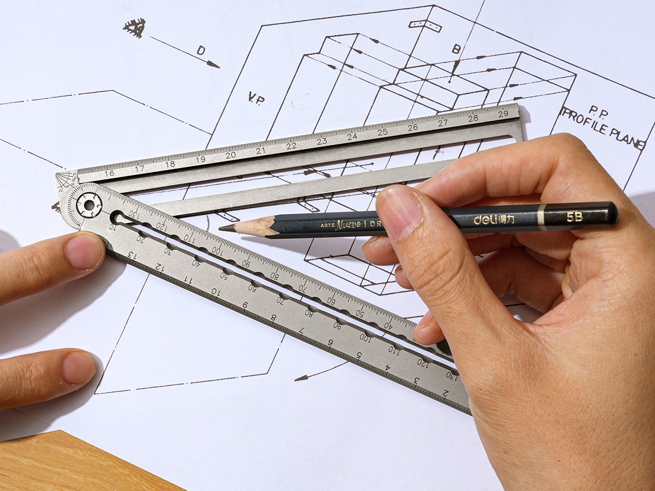
Chopsticks have been around for thousands of years, and their form has barely changed. The material varies, from wood and bamboo to polished metal and lacquered resin, but the design conversation rarely goes beyond surface decoration. They exist to serve a function, and that’s mostly where the thinking stops, quiet tools that have settled into the background of the dining table.
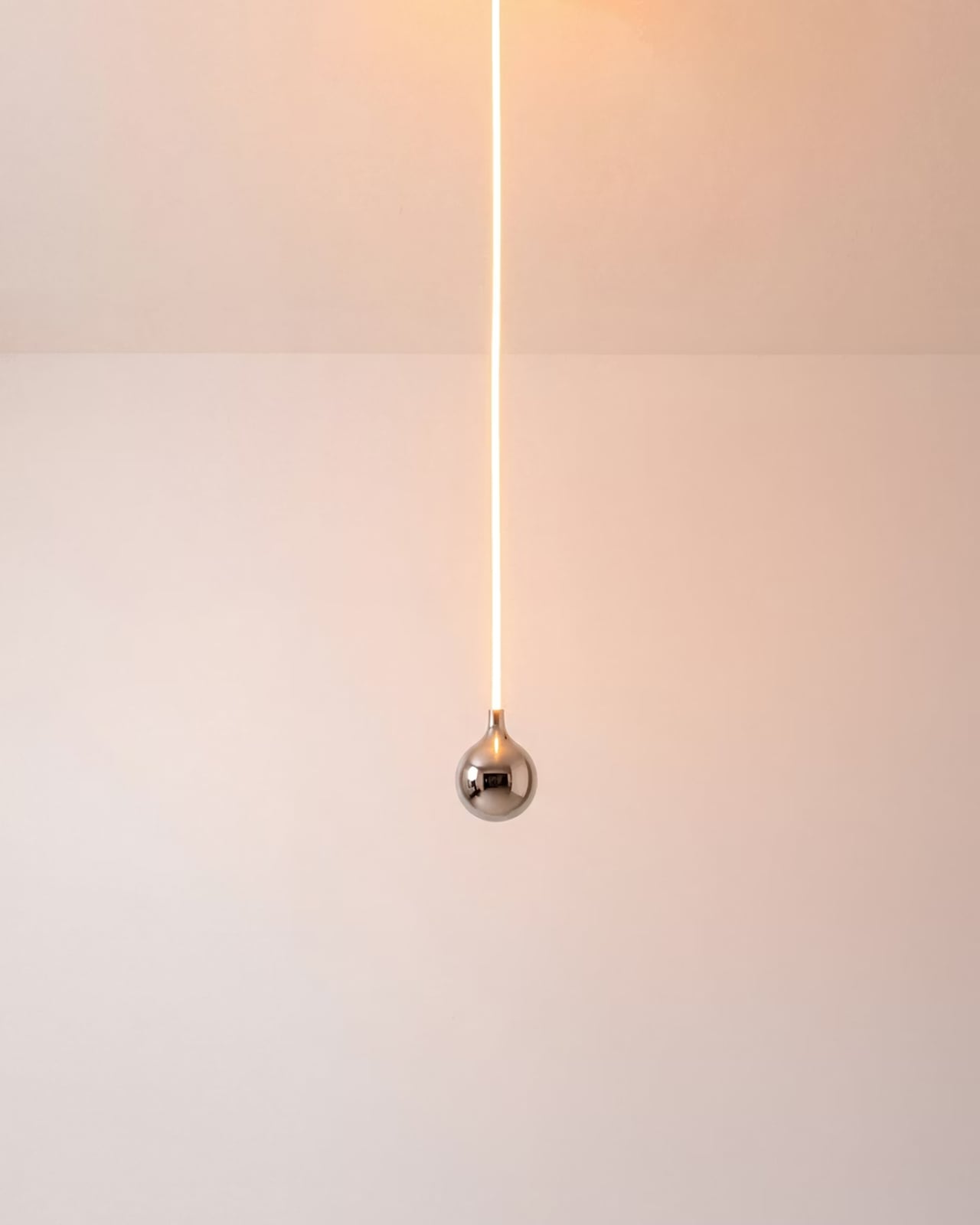
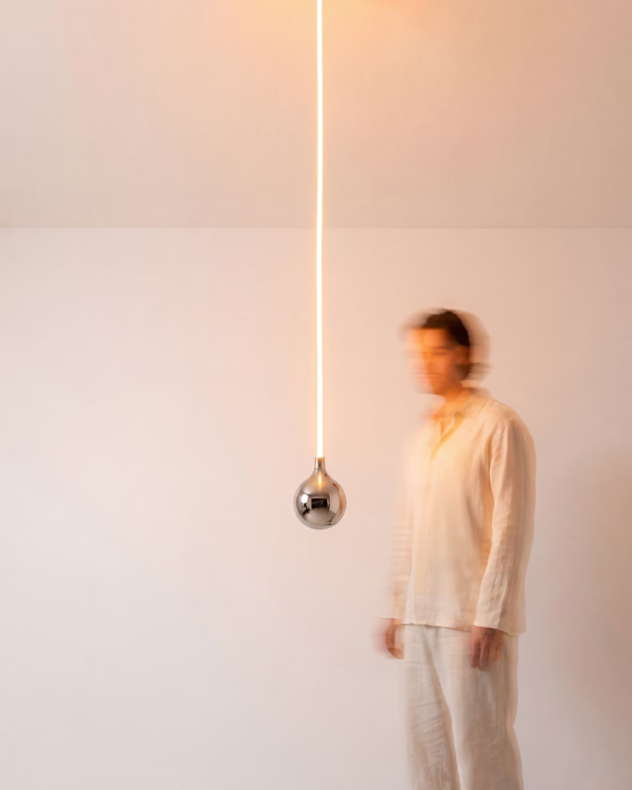
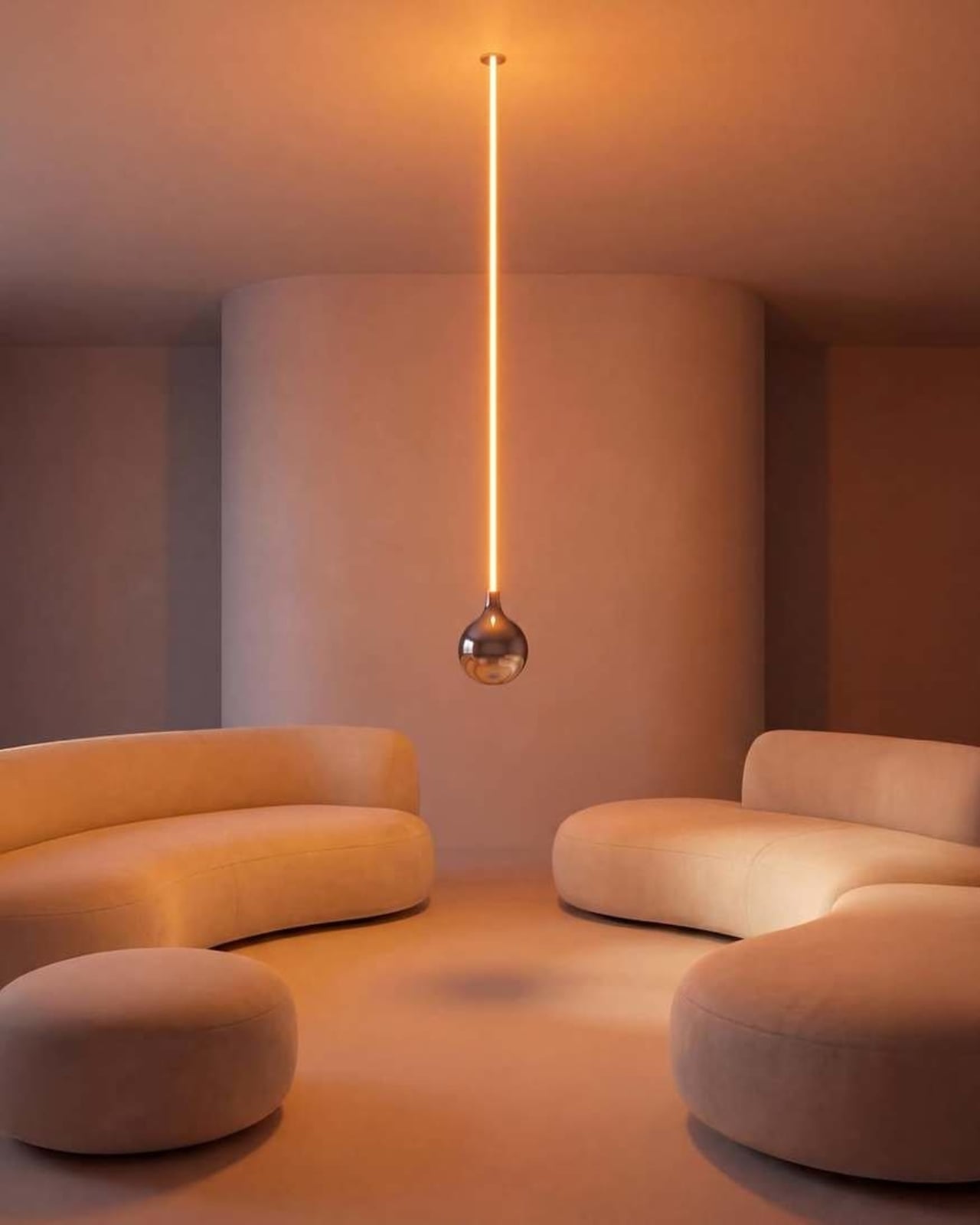
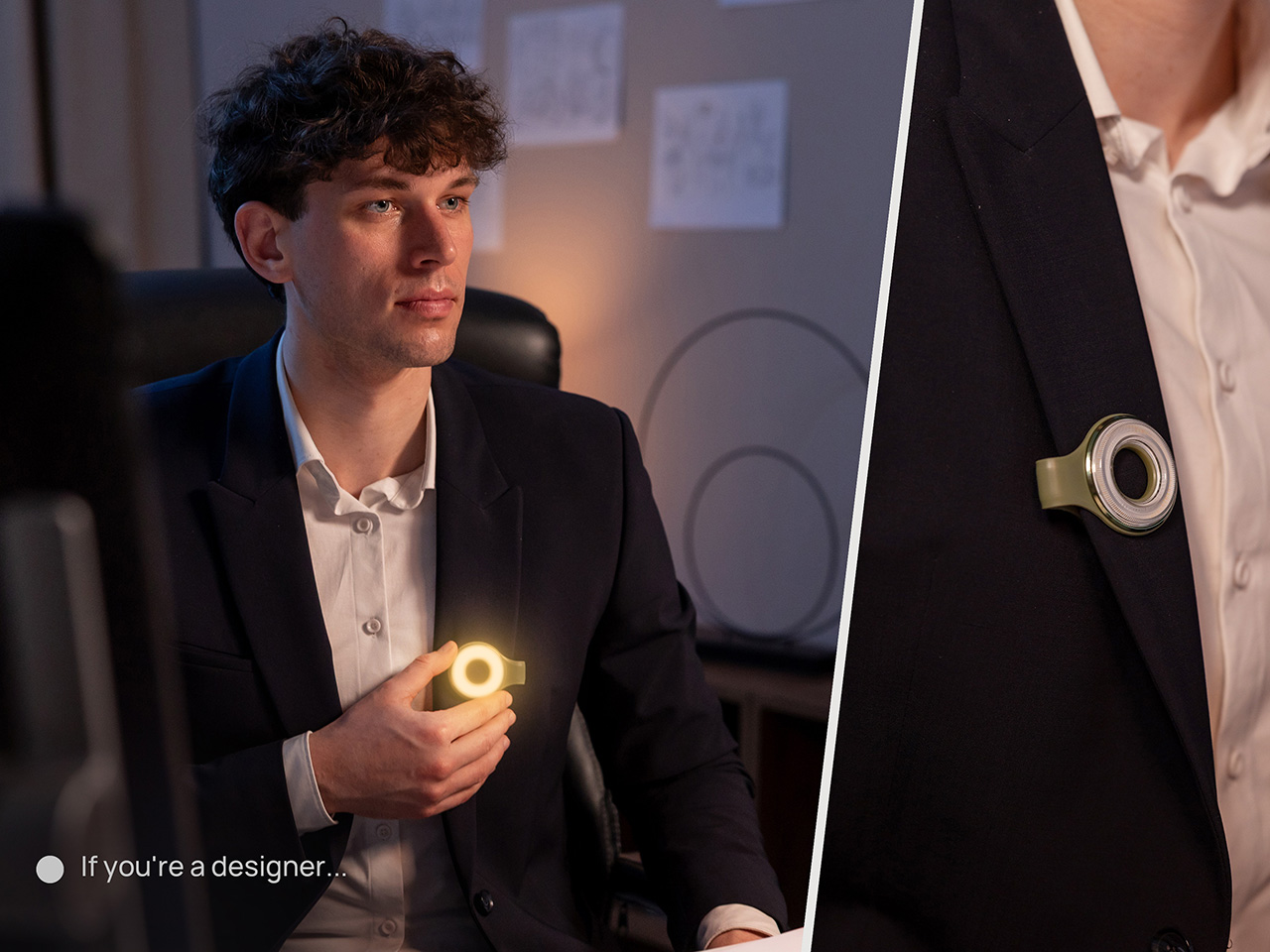
LUNARIS takes that very stillness as its starting point. A conceptual chopstick design, it reinterprets the traditional form as a collectible dining object built around the relationship between material, atmosphere, and light. It doesn’t try to reinvent how chopsticks work, but asks a quieter question: what if the object you pick up for dinner could change the feeling of the room around you?
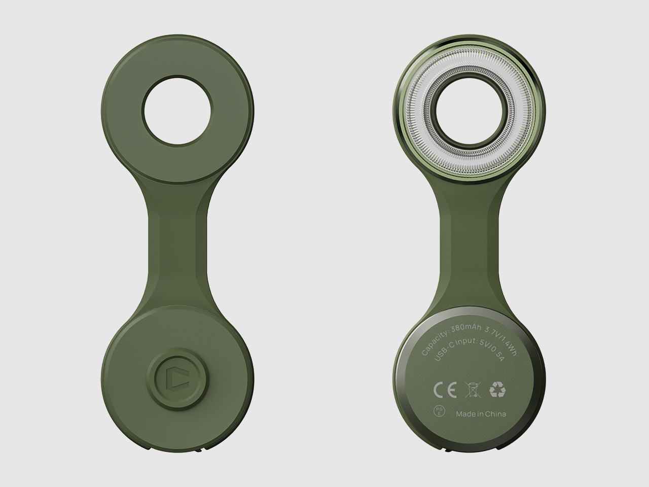
Each pair is made up of two materials that meet at a deliberately fluid transition. The lower section is polished stainless steel, shaped so the metal flows naturally into the upper element rather than meeting it with a hard edge. The result is a form that reads as unified rather than assembled, closer to a sculpted object than a utensil with two components joined together.
The upper section is where the concept lives. It’s a transparent epoxy resin body housing delicate curved tubes filled with a photoluminescent material. During the day, the object reads as clean and minimal, the resin catching light in ways that feel closer to decorative crystal than a dining tool. Nothing about it immediately gives away what happens once the lights go low.
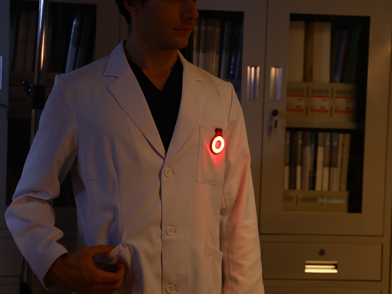
When the room dims, the photoluminescent tubes begin to release the light they’ve been quietly storing all day. Glowing lines emerge from within the resin, creating the impression of light trapped inside the form itself. The effect isn’t electric or sudden; it’s gradual and soft, more like something waking up than switching on. The glow comes in amber, white, and blue variants.
The point of LUNARIS isn’t to glow for the sake of glowing. The object is designed to create a different kind of interaction between person and object, one where atmosphere becomes part of the experience. Dinner at a dimly lit table takes on a different quality when the utensil in your hand starts contributing to the mood rather than simply doing its job.
Collectible design rarely makes it to the dining table in such a literal sense. LUNARIS is positioned as an object worth keeping and displaying, not just reaching for at mealtimes. The stainless steel chopstick rest included with each pair functions as a small display stand as much as a holder, a quiet suggestion that the object still earns attention long after the meal is done.
What LUNARIS proposes isn’t technically complex. There’s no power source, no battery, and no mechanism hidden inside the resin. The photoluminescent material works passively, absorbing ambient light through the day and releasing it slowly once the room darkens. The restraint is the point, and it’s a reminder that even the smallest objects on a table carry considerably more potential than they’re usually given credit for.
Jae Tips x Skullcandy Crusher ANC 2 headphones relieve classic gel and acrylic Nintendo aestheticsSkullcandy Crusher ANC 2 headphones are the brand’s flagship pair of cans that have good sound quality and some scope for improvement in the ANC....
Show full content
Skullcandy Crusher ANC 2 headphones are the brand’s flagship pair of cans that have good sound quality and some scope for improvement in the ANC. So what could get overhauled in the headphones market to make them stand out in a highly competitive, punishing space that rewards great design?
For that reason, Bronx-based designer Jae Tips has collaborated with the American audio equipment giant to create a stunning pair of headphones that go well with your 90s-inspired gadgets. Jae is no stranger to the unhinged use of colorful design elements, and this exploration is a bliss for audio fans. For this collab, the theme is highly translucent tech in nostalgic colors for a retro-modern touch and feel.
In the past, the award-winning footwear designer has demonstrated what’s possible if you let your creativity loose. This time around, he brings the signature influence of his customary style to the audio gear industry, and I seriously love the look of it. Given that music lovers hold their audio gear very dear, this pair brings their second love into the mix. Yes, I’m talking about gaming, as this limited edition Crusher ANC 2 headphones adapts the color scheme of the classic Nintendo 64 controllers, and the Super Mario Bros packaging, and fuses it with Jae’s floral motif design style to render a pair of cans.
It’s one thing to go translucent and completely another to fuse it into a form that evokes good old memories. That’s what is special about the see-through emerald shell of the headphones. The ethos bleeds into the custom packaging as well, as the box is heavily inspired by the classic Super Mario Bros title. On the inside, the cans retain their technical superiority with adaptable ANC and Skullcandy’s signature rumbling bass. According to Jae, for this collaboration, he was “inspired by gel and acrylic Nintendo’s and the early Mac computers. My goal was to create something that I wasn’t seeing anywhere else in the marketplace.”
For starters, the Jae Tips x Skullcandy Crusher ANC 2 headphones will be available for $260, starting tomorrow in the designer’s hometown. They will eventually float out to other markets in the coming weeks. As we speak, the limited-edition headphones are launching at the exclusive pop-up event at the Chelsea Best Buy in Manhattan. While they don’t come in a sturdy carrying case, the designer floral bag in a matching theme is the perfect way to show off your headphones.
RIMOWA’s 2026 Prize Went to a Bracelet That Speaks Sign LanguageThe RIMOWA Design Prize doesn’t always produce furniture, and that’s precisely why I pay attention to it every year. The luggage brand’s annual student design...
Show full content
The RIMOWA Design Prize doesn’t always produce furniture, and that’s precisely why I pay attention to it every year. The luggage brand’s annual student design competition has a way of surfacing ideas that sit at the uncomfortable, exciting edge of what design can actually do for people, and the 2026 winner is probably the best example of that yet.
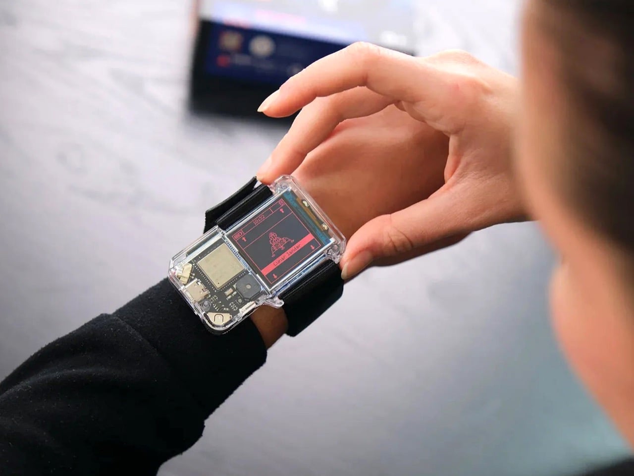
Samuel Nagel and Paul Feiler, two students from Hochschule für Gestaltung Schwäbisch Gmünd, took home the fourth edition of the prize with NURA: a bracelet that uses EMG (electromyography) sensors to capture muscle signals in the forearm and translate sign language into audible speech in real time. It works the other way around too, converting spoken language into visible text for deaf users. The whole thing sits on your wrist, shaped by the silhouette of a manta ray, and it looks less like a medical device and more like the kind of accessory you’d spot on someone at a gallery opening.
That last detail is actually the point, and I think it’s worth dwelling on. Assistive technology has a long and unfortunate history of making the people who need it feel conspicuous. Hearing aids, for decades, were designed to be invisible precisely because visibility carried stigma. The unspoken message was that needing help was something to hide. NURA takes a completely different position. It’s designed to be seen, worn with pride, styled rather than concealed. The gesture feels radical even though, rationally, it shouldn’t have to be.
The technology behind it is genuinely clever. EMG sensors are nothing new as a concept, but applying them to sign language translation in a form this compact and wearable is a meaningful design leap. The bracelet reads the electrical signals produced by muscle contractions in the forearm as the wearer signs, processes them, and produces speech output. The reverse channel picks up spoken language and renders it as text. Two-way, seamless, real-time. For anyone who has ever watched a deaf person navigate a conversation without an interpreter present, or felt the awkward pause that comes from communication breaking down mid-exchange, the implications of that are enormous.
I keep thinking about how many interactions become effortless with something like this on your wrist. Ordering at a counter. Talking to a doctor. A spontaneous conversation with a stranger on the street. These are moments that require logistics for deaf users in a way most hearing people never have to consider, and NURA collapses that distance without asking anyone to compromise.
The manta ray inspiration is a quiet masterstroke, too. It gives the object a reference point that feels alive and organic rather than mechanical or clinical. The form has been rendered in clean, sculptural white, with the kind of restraint you’d expect from a German design school sensibility. It doesn’t scream technology. It just sits there looking elegant, doing something extraordinary underneath.
Will NURA make it into production? That’s the question that always hovers over student prize winners, and it’s an honest one. The gap between a beautifully executed concept and a market-ready product is wide, and the challenges of real-world EMG accuracy across different body types and signing styles are not trivial. But I don’t think that’s entirely the point. The RIMOWA Prize exists, among other things, to expand the imagination of what design is for, to signal to the industry what problems are worth solving and what solving them beautifully might look like.
On that count, Nagel and Feiler have done something genuinely important. They’ve argued, through the language of form, that accessibility and desirability don’t have to be in opposition. That a wearable designed for a deaf person can be something a hearing person might be jealous of. That the most human design isn’t the kind that fixes a flaw and hides it, but the kind that celebrates capability and brings people closer together. The bracelet is beautiful. The idea behind it is even more so.
Vollebak’s New Sonic Jacket Fires 180 Speakers Into Your BodyIf you’ve ever stood too close to a speaker at a concert and felt the bass move through your chest, you already understand the basic...
Show full content
If you’ve ever stood too close to a speaker at a concert and felt the bass move through your chest, you already understand the basic premise of Vollebak’s latest creation, even if just barely. The Sonic Jacket doesn’t pump sound into a room. It pumps it directly into you.
Vollebak, the experimental clothing brand founded in 2015 by twin brothers Nick and Steve Tidball, has built a jacket lined with 180 inward-facing speakers. Each one is 32mm in diameter and 10mm deep, laser-cut into the fabric across the body, arms, and hood. The speakers fire frequencies ranging from 4 Hz to 20,000 Hz straight into the wearer’s body. Not at your ears. Through your skin, your bones, your tissue. The brand’s own description puts it plainly: “You don’t listen to this jacket. You feel it.”
I’ll be honest. My first instinct was skepticism. Frequency therapy and sound healing have a way of sitting at the awkward intersection of legitimate science and wellness marketing, and it can be hard to tell which side of that line you’re on at any given moment. But the more I dug into what Vollebak actually built here, the harder it became to dismiss.
The jacket was engineered by FBFX, a London-based special effects studio with 30 years behind them and credits that include Gladiator, Dune, The Martian, and Project Hail Mary. These are people who build functional spacesuits worn by real actors in demanding production environments. They brought that same precision to the problem of turning a jacket into a distributed speaker system. The wiring is intentionally left visible, all yellow and exposed, because FBFX co-founder Grant Pearmain’s position is straightforward: it looks like a science experiment because that’s exactly what it is.
Control is handled through a unit fitted with an MP3 player preloaded with 10 frequencies, a physical dial for fine-tuning, and a Micro SD card slot that can hold up to 1,000 personalized frequencies. A Bluetooth app is in development. For lower frequencies, where speakers risk overheating, the jacket works around the problem by playing two slightly different tones simultaneously. The body registers the gap between them rather than the tones themselves, and that gap is where the lowest frequencies live.
Nick Tidball’s language around the whole project is part visionary, part slightly unhinged, which is exactly what makes Vollebak so compelling as a brand to follow. He talks about the earth resonating at a frequency, about his cat’s purr, about the fact that we are not solid beings but collections of particles with space between them where sound can travel. “Maybe you’ll orgasm. Maybe you’ll shit yourself. Maybe you’ll find God,” the brand writes on its site. Bold copy, sure. But it’s genuinely hard to argue that sound and frequency don’t do something to us. Every religious tradition figured that out thousands of years ago, from drumming around fires to chanting in stone chambers.
The Sonic Jacket is currently a prototype, tested on only a handful of people. Tidball himself did a 30-minute session and described the initial effects as “kind of astonishing.” That’s a small sample size and a subjective account, so I’d take the results with appropriate caution. But the ambition here isn’t really in question.
What Vollebak is doing, jacket by jacket, is expanding the definition of what clothing is for. They’ve done it with graphene that behaves like a radiator, with near-indestructible Dyneema, and with a jacket made from 250,000 pieces of laser-cut American walnut. The Sonic Jacket feels like the most speculative thing they’ve attempted so far, and that’s saying something. It’s not a wellness gadget in a tech form factor. It’s a wearable environment designed to shift your nervous system.
Whether the science catches up to the ambition remains to be seen. But that’s always been part of Vollebak’s proposition. They make things that probably shouldn’t exist yet, and then figure out if they should. The Sonic Jacket is the most interesting thing I’ve seen come out of the wearable tech space in a long time, and I’m not even sure it counts as wearable tech. It might just be the future of how we think about clothing altogether.
Forget Cheap Grilling Tools — These 8 BBQ Gadgets Are Actually Designed to Last a DecadeMost grilling gear is built for one season. The spatulas bend, the tongs lose tension, the finish chips by August, and you’re back at the...
Show full content
Most grilling gear is built for one season. The spatulas bend, the tongs lose tension, the finish chips by August, and you’re back at the store before the next summer. There’s a different category of BBQ tool, though: one designed by people who think about material science and ergonomics before they think about price. These eight picks share a common thread. They’re made to outlive the grill they came with.
Nothing here was sourced for novelty alone. Each piece earns its place through material quality, design thinking, or a real rethink of what a grilling tool should do. Whether you’re upgrading a backyard setup or building one from scratch, these are the tools worth spending real money on.
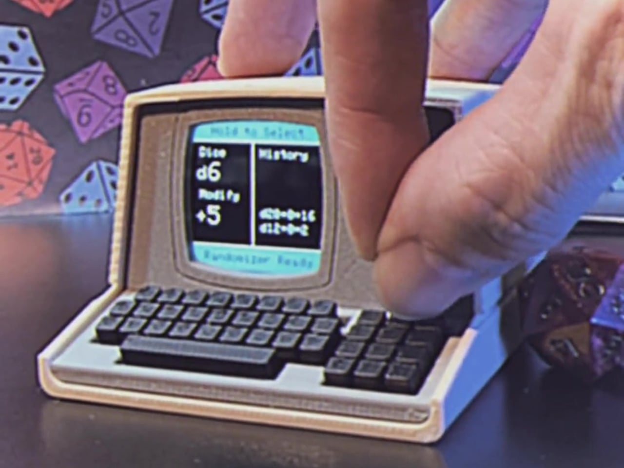
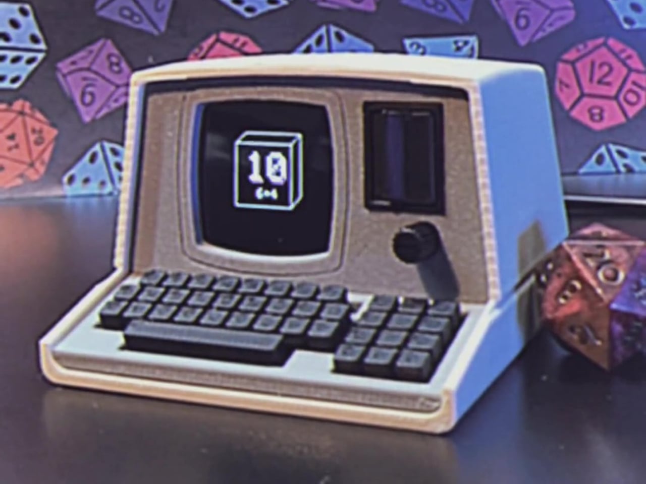
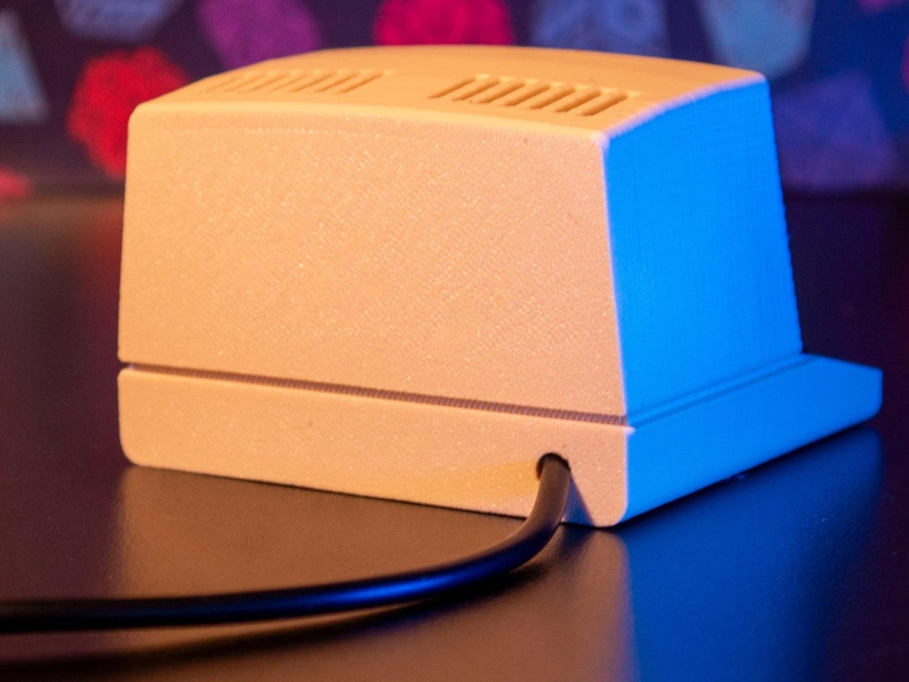
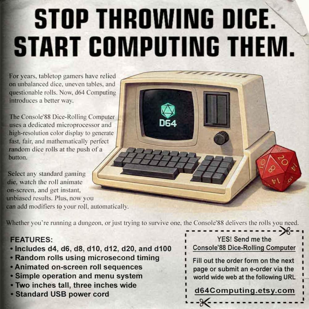
1. All-in-One Grill
The All-in-One Grill was made in Japan, and it shows. Modular parts allow for six different cooking methods from a single compact unit, the kind of flexibility that makes sense whether you’re cooking on a balcony, a campsite table, or a backyard deck. The design is clean enough to sit on a countertop without looking out of place, and the compact footprint means it doesn’t demand the real estate that a full outdoor grill requires during and between sessions.
Where most outdoor grills ask you to commit to one cooking style, this one adapts. The modular system disassembles for cleaning, which matters more than most people expect. Tools that are hard to clean don’t stay clean, and tools that don’t stay clean don’t last. There’s also a dedicated module for warming bottles, a small detail that signals the kind of thorough product thinking that separates considered design from commodity manufacturing.
Modular design supports six different cooking methods from one compact unit
Made in Japan with a table-ready footprint that suits indoor and outdoor use equally
What we dislike
Modular assembly takes more time to set up than a conventional fixed grill
2. Nomad Grill and Smoker
The Nomad Grill and Smoker earns its place through sheer design intelligence. Built from anodized aluminum with a honeycomb interior pattern, it folds down to a 2×2-foot briefcase form and opens into 212 square inches of cooking space, doubling that in open-grill mode. Magnetic clutches lock the whole unit shut for transport. There are no smart buttons, no app. Just physics doing the work of keeping heat in and the exterior cool to the touch while it cooks.
What makes the Nomad particularly useful is how it handles both smoking and grilling without asking you to choose between portability and performance. The closed position circulates smoke and heat consistently for low-and-slow cooking. Open it up, and it performs like a conventional charcoal grill. At $599, it sits at the premium end of portable setups, but the anodized aluminum construction and industrial design mean you are not replacing this in five years. You are passing it on.
What we like
Folds to briefcase size without sacrificing 212 sq in of cooking surface
Anodized aluminum construction keeps the exterior cool to the touch during use
What we dislike
$599 is a significant upfront investment for a portable grill
Charcoal only, with no gas option for those who prefer quick heat-up times
3. Compact Modular Grill Plate
The Compact Modular Grill Plate is the kind of tool that belongs in the same kit as the All-in-One Grill but works just as well on its own. The adaptable metal plate cooks food evenly while locking in juiciness, making it the right surface for steaks and fish that need consistent heat contact across the entire cut. It works across different heat sources, which means it moves between cooking setups without requiring its own dedicated station or stand.
Priced between $100 and $139, depending on configuration, this is the category of tool that looks deceptively simple until you use a lesser version. The difference between a well-engineered grill plate and a cheap one is the difference between a proper seared crust and a steamed, stuck mess. The modular nature also means it doesn’t take up a fixed position in a drawer or cabinet. It slots into a kit, disappears when not in use, and performs exactly when it counts most.
Works across multiple heat sources without requiring a dedicated cooking station
Engineered for even heat distribution and moisture retention across the cooking surface
What we dislike
Narrower in scope than a full grill accessory set for varied cooking needs
Priced higher than mass-market grill plates of similar dimensions
4. Zwilling BBQ+ 5-Piece Stainless Steel Grill Tool Set
Zwilling has been making blades since 1731, which gives the BBQ+ set a particular kind of credibility. The five-piece set is built from 18/10 stainless steel, the same grade used in surgical instruments, with triple-riveted handles and heat-resistant grips. It carries a 4.9-star rating across major retailers, including Crate and Barrel and Wayfair, and reviewers consistently note the build quality as something that feels immediately different from standard grill sets the moment you pick a piece up.
The spatula comes with a serrated edge for checking doneness without reaching for a separate tool. The tongs carry the satisfying mechanical resistance of something properly engineered rather than assembled for a price point. At $149.99, this set sits where you’re paying for materials and manufacturing heritage rather than branding. These tools don’t rust, don’t bend, and don’t require seasonal replacement. For anyone who has cycled through two or three cheaper sets in as many years, this is where that pattern stops.
What we like
18/10 stainless steel with triple-riveted handles built for decades of consistent use
4.9-star rating across multiple major retailers signals real-world durability across users
What we dislike
The set includes gloves and a silicone mat, which some buyers may find unnecessary additions
Premium pricing relative to mid-range grill tool sets with similar piece counts
5. Joseph Joseph GrillOut 4-Piece BBQ Tool Set with Storage Case
Joseph Joseph built its reputation on solving storage problems as cleverly as it solves cooking ones, and the GrillOut set is that philosophy applied to outdoor equipment. The four-piece set includes tongs, a spatula, a fork, and a basting brush, all integrated into a foldable carry case that functions as both a storage unit and a transport caddy. Utensil heads retract for compact packing, every tool is fully stainless with slip-resistant silicone grips, and the whole set dismantles for easy cleaning after each session.
Priced between $78 and $98, depending on the retailer, the GrillOut set is the most accessible on this list without feeling like a step down. The retractable utensil heads are the kind of detail that rewards you every time you pack up: no loose pieces, no separate bag, no searching for the brush before you can leave. For anyone who grills away from home as often as in it, this is the set that travels with real intention rather than just tolerance of inconvenience.
What we like
Retractable utensil heads and an integrated foldable case make packing genuinely effortless
Full stainless construction with silicone grips at the most accessible price point on this list
What we dislike
Four pieces may feel limited for larger or more varied grilling sessions
The retraction mechanism benefits from occasional maintenance to keep functioning smoothly over time
6. Obsidian Black All-Around Tongs
The Obsidian Black All-Around Tongs are made from SUS821L1 stainless steel, a grade selected for its exceptional strength and corrosion resistance rather than cost efficiency. The 9.45-inch length handles most cooking and plating tasks without putting your hand close to the heat. The all-black finish signals a material choice rather than a style decision: this is a kitchen tool that takes the visual language of professional equipment and applies it to backyard cooking without compromise or apology.
What makes these tongs worth including in a list about longevity is the material specification. SUS821L1 is not the steel found in budget tong sets. It holds its finish, resists the corrosive effects of marinades and high-heat cleaning, and maintains its mechanical tension over time. The Obsidian Black range also includes chopstick tongs, mini grip tongs, and salad tongs, making the collection genuinely expandable. These are tools you build a kitchen setup around rather than ones you phase out at the end of a season.
SUS821L1 stainless steel delivers superior corrosion resistance and long-term tension retention
Part of an expandable collection with multiple tong formats for different tasks
What we dislike
The matte black finish requires careful hand-washing to maintain its appearance long-term
Limited to tong formats, with no spatula or fork included in the Obsidian Black range
7. Roxon MBT3 Multi BBQ Tool
The Roxon MBT3 is a six-in-one BBQ multi-tool built from food-grade 430 stainless steel. Three base elements, a fork, spatula, and knife, connect via a 1.2mm liner lock and reconfigure depending on what you need at the moment. The fork and spatula join to form tongs. The knife folds to become a bottle opener and corkscrew. It packs into a nylon pouch small enough to slip into a jacket pocket, making it the only tool on this list that genuinely disappears when it isn’t needed.
What the Roxon MBT3 gets right is that it doesn’t ask you to carry more to do more. The EDC thinking behind it translates to the grill better than most multi-tools manage. The liner lock mechanism is secure enough that reconfiguring parts doesn’t feel like a compromise in the field. For a camper, a tailgater, or anyone who grills away from a fixed setup regularly, this is the one piece of kit that handles everything without filling a bag or requiring a dedicated case to transport.
What we like
Six functions in a single pocket-sized tool secured by a reliable 1.2mm liner lock
Food-grade 430 stainless steel construction with a dedicated nylon carry pouch included
What we dislike
Better suited to solo or small-group grilling than high-volume or simultaneous cooking
Requires some familiarity with the reconfiguration system before it feels fully intuitive
8. MEATER Plus Wireless Smart Meat Thermometer
The MEATER Plus is the first truly 100% wire-free meat thermometer on the market. A single probe monitors both internal meat temperature and ambient grill temperature simultaneously, then relays that data to your phone via Bluetooth at a range of up to 165 feet. The bamboo charging dock doubles as a Bluetooth repeater, extending that range without additional hardware. The companion app guides you through the cooking process in real time and estimates exactly when to pull the meat off the grill.
The design case for the MEATER Plus is as strong as the technical one. The probe is minimal enough to sit in a bamboo dock on a kitchen counter without looking like a gadget. No wires, no clunky receivers, no analog dials. At $99.95, it’s the kind of tool that changes how you interact with a grill rather than just what you can do with it. Once you’ve cooked with one, the idea of cutting into meat to check doneness feels genuinely outdated rather than just inconvenient.
What we like
100% wire-free with simultaneous dual-temperature monitoring up to 165 feet via Bluetooth
Companion app delivers real-time cook guidance and precise pull-time estimates
What we dislike
Requires a charged smartphone and an active Bluetooth connection to access full functionality
Ambient probe placement near the meat surface can affect temperature accuracy in certain setups
Buy Once, Grill Better for Years
The common thread across all eight of these picks is intention. Each one was designed with a specific problem in mind, whether that’s portability, material longevity, storage efficiency, or the kind of precision that removes guesswork from the cooking process entirely. None of them is an impulse purchase, and none of them is meant to be. Good tools earn their place over time, and every one of these has the construction quality to do exactly that.
If there’s a place to start, the Obsidian Black Tongs and the MEATER Plus represent two ends of the spectrum: one purely mechanical, one quietly smart, both worth having before anything else on the list. The Nomad and the All-in-One Grill offer different answers to what a portable grill can be. Any combination of these eight will outlast the average grilling season by years. That’s the entire point of buying well once.
GameSir Made a Cotton Candy Xbox Controller That Kills Stick DriftGaming controllers have long leaned into one of two visual languages: aggressive, angular designs aimed at the competitive crowd, or the familiar, conservative look of...
Show full content
Gaming controllers have long leaned into one of two visual languages: aggressive, angular designs aimed at the competitive crowd, or the familiar, conservative look of first-party hardware that blends quietly into any living room setup. The color palette rarely strays far from matte black, carbon gray, or safe-for-everyone white, as if bold design choices were somehow at odds with serious performance.
GameSir’s T7 Pro Sugar Whirl challenges that assumption with a translucent shell that blends soft pinks, blues, and lavenders, described by GameSir as a swirl of cotton candy and morning skies. It’s part of the brand’s Pastel Collection, and it’s officially licensed by Xbox, which means wireless connectivity to Xbox Series X|S and Xbox One isn’t an afterthought. The looks are deliberate, but so is the hardware underneath.
At the core of the control experience are GameSir’s Mag-Res TMR (Tunneling Magnetoresistance) sticks, a non-contact magnetic technology that eliminates the stick drift that tends to plague conventional analog sticks over time. The Hall Effect analog triggers come with two-stage trigger stops, giving you a shorter pull when faster, more precise inputs matter most. For competitive play, both features represent a meaningful step up from standard controllers.
The controller also has two remappable back buttons, which can take on any function you assign through the GameSir Nexus software. Four rumble motors handle feedback, with a level of fine-tuning that most first-party controllers don’t offer. On PC, there’s also a six-axis gyroscope for motion control, making the T7 Pro Sugar Whirl versatile enough to keep up with platform-specific demands.
Connectivity follows a tri-mode approach. The controller pairs wirelessly to Xbox Series X|S and Xbox One via 2.4GHz, switches to Bluetooth for Android, and also works wired through USB-C. The polling rate reaches up to 1,000 Hz on PC and 250 Hz on Xbox, numbers that matter more when you’re playing anything that rewards split-second timing. A 3.5mm audio jack is included for headset use.
The 1,050 mAh battery charges via the included charging dock or through the USB-C port at the top of the controller. GameSir Nexus software handles all the customization, from button remapping and stick sensitivity to vibration intensity and RGB lighting effects. Multiple profiles can be saved and swapped between games, which saves the hassle of reconfiguring everything when switching between titles with very different control demands.
The RGB lighting adds another layer of visual personality, though it’s the translucent shell that does most of the aesthetic work. The pastel color blend is something the controller market doesn’t often attempt at this tier, and it comes off as genuinely considered rather than gimmicky. It’s the kind of design that sits on a desk and invites a second look from anyone who happens to walk into the room.
XPPen’s $210 Pilot Pro Finally Ends the Left-Hand Keyboard ScrambleVideo and photo editing has always been demanding on keyboard shortcuts. The typical workflow splits attention between tools, timelines, and modifier keys, with the left...
Show full content
Video and photo editing has always been demanding on keyboard shortcuts. The typical workflow splits attention between tools, timelines, and modifier keys, with the left hand constantly crossing the keyboard while the right stays on the mouse. Professionals spending long hours in DaVinci Resolve or Premiere Pro know the frustration well, and a more deliberate way to manage those commands has long been missing.
XPPen’s Pilot Pro is the brand’s first dedicated editing console, and it makes a confident debut. It packs 16 customizable buttons, three dials, and an all-way joystick into a compact controller built for one-handed, eyes-free operation. The premise is straightforward: let the left hand manage the shortcuts so the right stays on the mouse and your eyes stay on the screen.
The console’s layout borrows from game controllers but reads more like a precision instrument. An 8-way joystick at the center handles footage scrubbing, color wheel navigation, and clip selection depending on the software. Two rotary dials surround the joystick at different heights, and a third sits just in front. All three deliver haptic feedback through a linear motor that can be tuned or disabled.
What makes the eyes-free claim convincing is the sculpted 3D key layout. Every button and dial has a distinct shape and position, so your fingers learn the device without looking away from the screen. XPPen also added a hypothenar support beneath the controller to keep the outer edge of the palm anchored. That ergonomic attention earned the Pilot Pro a Good Design Award 2025.
The haptic motor makes each interaction feel intentional rather than accidental, which matters more than it sounds when you’re deep in a cut. Up to seven customizable themes let you organize shortcuts your way, and profiles can be shared within the community. XPPen also offers presets from professional editors, so jumping into new software doesn’t require rebuilding your control scheme from scratch.
Tasks like scrubbing through a long timeline, grading a batch of shots, or retouching a portrait session become much less disruptive to the flow. The joystick handles navigation without lifting the hand, the dials adjust values with fine precision, and the 16 buttons absorb the commands that would otherwise mean a trip across the keyboard. It’s a setup that rewards muscle memory fairly quickly.
For connectivity, the Pilot Pro supports wired USB-C, Dual-Channel Bluetooth 5.4 Low Energy, and a USB dongle for machines without Bluetooth. The built-in 1,900 mAh battery lasts over 15 days at four hours of daily use. It works with Windows 10 and macOS 11 or later, and is compatible with Premiere Pro, DaVinci Resolve, Photoshop, Lightroom Classic, and Final Cut Pro.
Weighing 251g with dimensions of roughly 130mm x 93mm, the Pilot Pro fits on the desk without crowding it. XPPen has priced it at $209.99, in line with other professional left-hand controllers. For editors who spend serious hours locked into a timeline, a device that keeps the hands comfortable and a hundred commands within reach can meaningfully change the pace of a workday.
This Game-Changing Bench Vise Tilts, Rotates, Locks in Three Modes, and Costs $239Bench vises have long been built around one assumption: the work stays put, and the maker adapts. AxiGlide inverts that. With full 360-degree rotation paired...
Show full content
Bench vises have long been built around one assumption: the work stays put, and the maker adapts. AxiGlide inverts that. With full 360-degree rotation paired with a tilt base that moves from horizontal toward vertical, it creates a workspace where the object turns, angles, and aligns with far less interruption. The rhythm of making changes the moment you stop compensating for the tool.
AxiGlide offers free-spin motion for fluid handling, a 60-position indexed system for repeatable 6-degree steps, and a full-lock mode for rigid support during demanding tasks. The modular jaw system adds another layer of versatility, with options for flat, irregular, hard, and delicate surfaces. Starting at $398 for the Standard version and $449 for the Precision model, it positions itself as a serious upgrade for detail-heavy bench work where angle, access, and control define the outcome.
Mode selection is controlled by a three-position switch with spring-loaded detents, and a light flick is all it takes to move between behaviors. Free-spin mode lets the vise flow with your touch, the tilt base housing a precision-machined spindle that allows rotation without directional limits or angular constraints. This makes the AxiGlide a responsive rotary platform, ideal for drawing smooth curves, wrapping, winding, or any continuous motion that benefits from fluid rotation. Set it to a comfortable working incline, secure your workpiece, then rotate it freely back and forth to explore any angle. Whether you’re painting, carving, assembling, or simply inspecting details from different perspectives, the free mode gives uninterrupted access to every orientation.
When fully locked, AxiGlide transforms into a fixed vise system, creating a solid, single-position hold that delivers rock-solid stability for demanding tasks. The system can be oriented freely before locking, so you get a way to freeze any chosen angle. Whether it’s angled drilling, off-axis assembly, or precise carving, AxiGlide enables you to secure the workpiece at the position that best matches the task at hand, with uncompromising strength and confidence. VogueMech positions this as the mode for maximum rigidity when force or precision drilling comes into play. Lock the angle you need, apply force, and the vise holds without creep or shift.
Beneath the turntable sits a 60-position indexed disc, dividing the full rotation into precise 6-degree increments and engaging with a spring-loaded column. When the switch is set to the half-locked state, AxiGlide creates consistent tactile detents as you turn it. Each click corresponds to an exact angular step, delivering mechanical precision through touch rather than visual alignment. Precision becomes something you feel, especially in tasks that require repeating orientations, segmentation, symmetry, or mirrored alignment. The half-lock can also serve as a damping support for the turntable, making every adjustment feel controlled with no sudden drops, no jerky motion, and no repeating need to loosen or tighten locks the way ball joints demand.
The tilt axis is equipped with a preloaded brake that applies consistent pressure to the tilt shaft, providing smooth, controlled resistance throughout the tilt motion range. Together, the damping support on both axes makes AxiGlide a reliable third hand to hold something top-heavy while maintaining flexibility, positioned exactly where you need it so it stays there when your hand is off. No loosening, adjusting, and relocking; no interruptions in workflow. Just focus on the minutest details of your workpiece at any critical angle, especially when your hands are occupied with other tools. The tool becomes an extension of your movement rather than a step in the process.
The jaw system is modular and designed to expand the vise’s range across materials and project types. Standard equipment includes pin jaws that can be adjusted and reconfigured to better match the shape and needs of your workpiece. Pins come in three heights (10mm, 15mm, 20mm), each available in sets of eight, and you can place them where you need them for irregular or custom profiles. Add-on jaws are available separately and adapt to different materials and shapes: parallel jaws for flat surfaces, fractal jaws for irregular objects (a nod to MetMo’s influence in the space), aluminum material for hard metal parts, and PEEK panels for delicate parts. With a modular jaw system and possible future expandability, AxiGlide evolves with your projects, giving you one system that can serve jewelry work, hand engraving, circuit assembly, cloisonné painting, filing, model photography, and fine-detail finishing tasks.
The AxiGlide body is made from 6061 aluminum alloy, while key load-bearing and motion-critical components are made from 410 stainless steel. This combination balances structural strength, functional performance, weight, and manufacturing cost, ensuring the design is practical to manufacture and faithfully deliver in its intended form. The unit weighs 2,200g (4.9 lbs) and measures 150mm wide by 100mm deep at its base, rising to 135mm in height. AxiGlide is available in two versions: Standard and Precision. Both versions share the same material types, use scenarios, jaw options, core machining processes, and overall build quality. The differences come down to several specific upgrades according to VogueMech. The Standard comes in five color options: Gray, Blue, Red, Green, and Metal. The Precision edition is offered in DLC black and matte olive-gray, with additional mechanical refinements that enhance smoothness and tolerances.
The Standard edition starts at a discounted $239 for earlybird backers and includes the vise body, tilt turntable base, pin jaws with sets of 10mm, 15mm, and 20mm pins (eight of each). The Precision edition is priced at a discounted $279 and includes the same package plus a screw rod driver and upgraded internal components. Add-on accessories are available separately, including a screw rod driver for $12, parallel jaws in PEEK material for $24, parallel jaws in aluminum for $24, fractal jaws for $58, and PEEK teeth for fractal jaws at $36. Shipping costs vary by region: $28 for Japan, United States, European Union, United Kingdom, China, South Korea, Canada, and Australia; $45 for other countries and regions. Buyers only pay shipping when the AxiGlide vise is ready, allowing VogueMech to provide accurate rates based on location and selected package. Production begins in July 2026, with all orders expected to ship by September 2026.
Linkin Park’s Hybrid Theory Turns 26 and this LEGO Brickset Pays the Perfect TributeThere is a generation of people for whom Hybrid Theory was the first album that felt like it was speaking directly to them. Released in...
Show full content
There is a generation of people for whom Hybrid Theory was the first album that felt like it was speaking directly to them. Released in October 2000, it arrived at that particular moment in adolescence when you needed music to be loud and honest and a little bit angry, and Linkin Park delivered all three in a single package. “Crawling,” “Papercut,” “One Step Closer,” “In the End,” four of the twelve tracks became radio staples, which is a hit rate almost nobody achieves on a debut record. The album went Diamond in the US and sold 27 million copies globally, which means a lot of people apparently had that same feeling.
LEGO builder Zihnisinir_61 is clearly among them. His LEGO Ideas submission recreates the album’s cover art as a freestanding 3D display piece, with the Winged Herald soldier front and center, wings spread, flag held high, backed by a grey paneled wall with the Linkin Park name raised in chunky extruded lettering. With the 26th anniversary of the album approaching, the timing feels right, and the build feels personal in the way the best fan-made creations always do.
Designer: Zihnisinir_61
Here’s something a lot of LP fans don’t know. Mike Shinoda designed the artwork himself, and the Winged Herald was a deliberate visual metaphor: the armored, battle-worn body representing the album’s hard edges, and the fragile dragonfly wings representing its softer, more vulnerable core. Chester Bennington described the soldier as the visual equivalent of what Linkin Park was doing sonically, blending aggression and tenderness into something genuinely new. That the band had to fight their own label president to even release the record, with Chester recalling they were “literally the last item on the priority list, below even getting the toilets cleaned,” makes the Herald’s defiant stance feel even more apt in retrospect.
Zihnisinir_61 captures all of that in brick form with real conviction. The Herald figure is built in dark red with articulated white wings that fan out from the torso using layered plates and angled elements, and the flag atop the staff is constructed from a latticed cluster of red bricks that actually reads as a tattered, wind-caught banner rather than a flat rectangular tile. My favorite detail, though, is the lettering. The “Linkin Park” text is built in 3D-extruded dark grey bricks, standing proud off the backing panel using SNOT (Studs Not On Top) techniques that give each letter genuine depth and shadow. It nails the stencil-graffiti aesthetic of the original without resorting to stickers or printed tiles. The “Hybrid Theory” text along the lower section is handled with the same care, rendered in clean printed-style lettering that anchors the composition.
The overall color palette, cool greys for the backdrop, dark red for the Herald, white for the wings, sticks faithfully to the source material while translating naturally into LEGO’s parts library. The build reads immediately from across a room, which is exactly what good album art does.
The MOC is currently gathering votes on the LEGO Ideas platform, where fan submissions need 10,000 supporters to trigger an official review by LEGO’s internal team and a shot at becoming a real retail set. You can head to the LEGO Ideas page here to cast your vote.
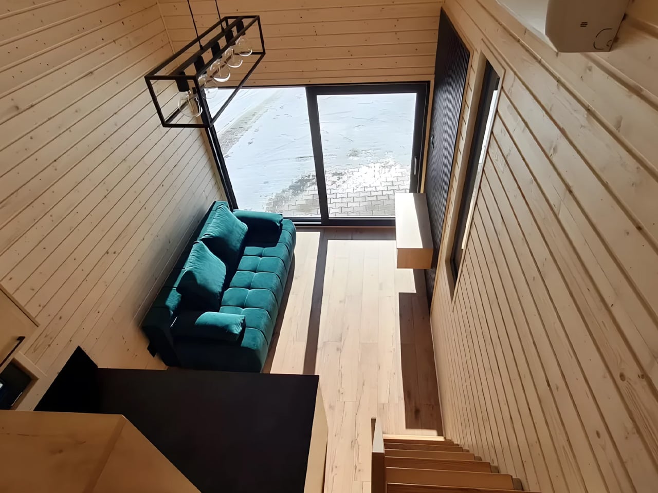
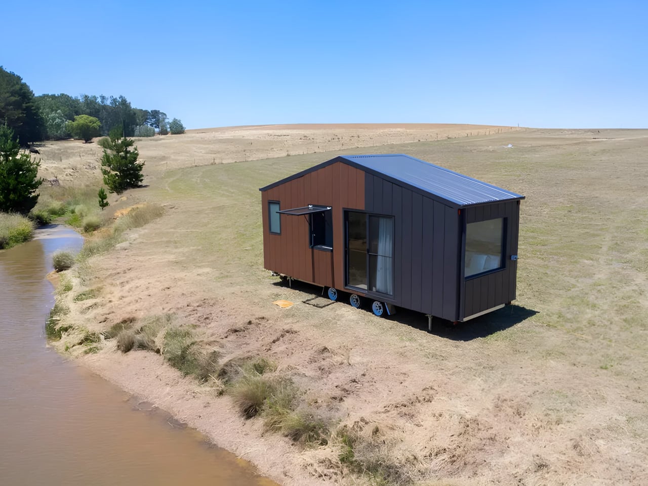
This Australian Tiny Home Has Two Bedrooms, a Picture Window, and Zero CompromisesThe Byron Bay by Removed Tiny Homes is not that version. Built by the Brisbane-based builder that has quietly become one of Australia’s most talked...
Show full content
The Byron Bay by Removed Tiny Homes is not that version. Built by the Brisbane-based builder that has quietly become one of Australia’s most talked about names in the tiny home space, this model is as generous as the coastal town it’s named after. It arrives with two loft bedrooms, a full galley kitchen, and a layout that manages to feel more like a considered home than a scaled-down one.
At 8.4 metres long, 2.5 metres wide, and 4.3 metres tall, the Byron Bay sits at the larger end of what road-legal tiny homes can offer. That scale is put to work immediately. The two upstairs lofts are connected by a full standing height walkway, which sounds like a small detail until you realise how much it changes the experience of moving through the space. There is no crawling, no hunching, no reminder that you made a trade-off. The lofts feel like actual bedrooms, not storage shelves with pillows on them.
Downstairs, the open-plan living area is anchored by a large kitchen fitted with a picture window. Light moves through the interior in a way that makes the 33 square metres read closer to double that. The design team at Removed has clearly thought hard about storage, building it into nearly every surface without letting it dominate the aesthetic. The result is a home that feels edited rather than cluttered.
What makes Byron Bay particularly compelling right now is its off-grid capability. Recent builds leaving the Removed factory have been fully off-grid spec, designed for families planting themselves on rural land or lifestyle blocks far from the grid. For a generation priced out of the traditional housing market, that combination of mobility and self-sufficiency is not a novelty. It is a strategy.
Removed Tiny Homes describes Byron Bay as ideal for families, and you can see why it has become one of their most requested models. Two sleeping spaces, serious kitchen infrastructure, and a layout that prioritises flow rather than function alone. Starting from US$104,000, it positions itself as a genuine alternative to a first home, not a weekend experiment.
Byron Bay does not try to convince you that less is more. It just builds the space well enough that you stop counting square metres and start thinking about where to put it.
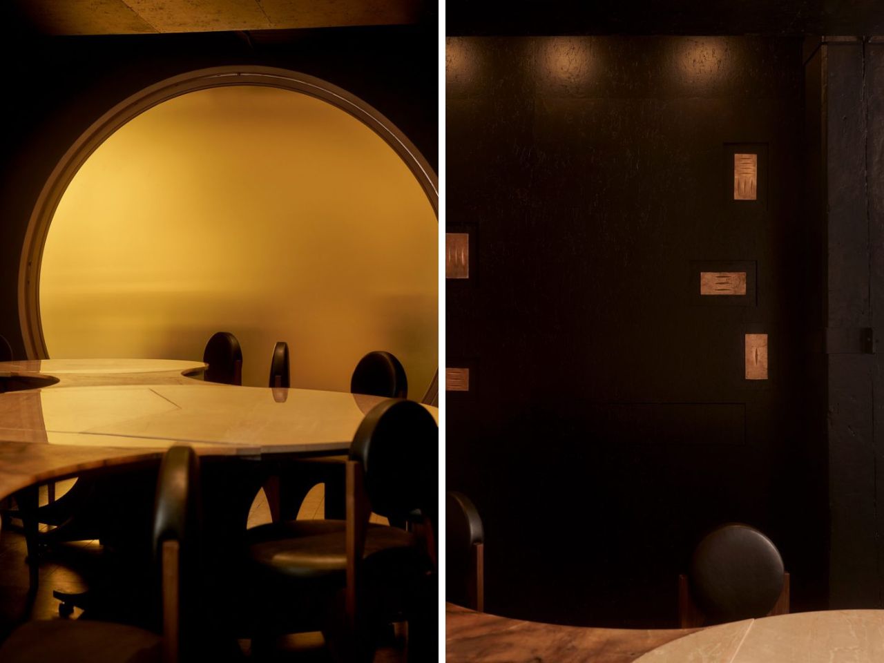
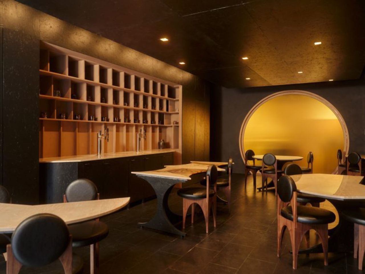
A Pour-Over Dripper Inspired One of Beijing’s Best Pop-UpsPop-ups have become one of the more interesting testing grounds for design ambition. They exist long enough to make a statement but not so long...
Show full content
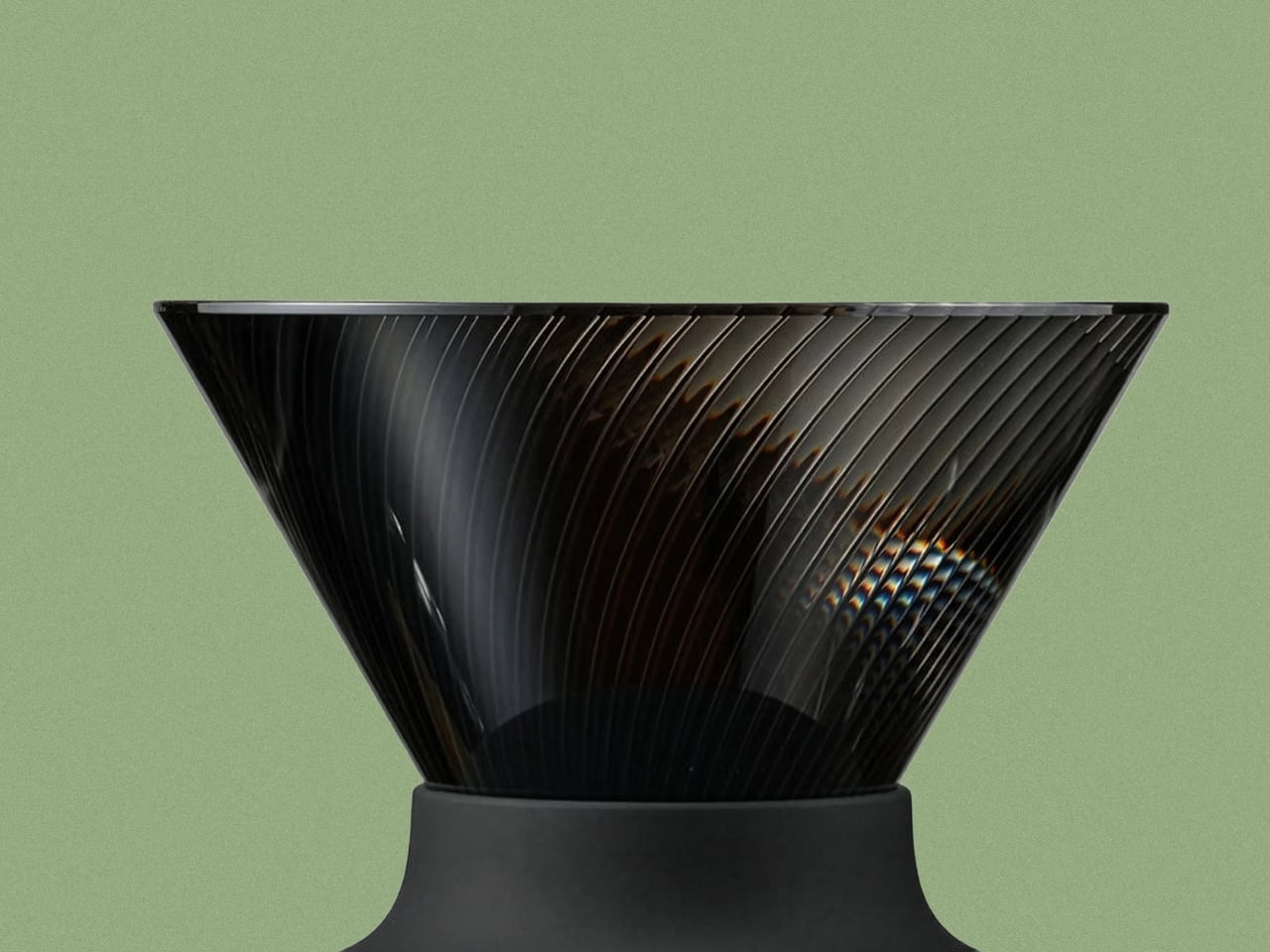
Pop-ups have become one of the more interesting testing grounds for design ambition. They exist long enough to make a statement but not so long that they have to compromise on boldness. And Atelier L seems to understand that assignment completely.
The studio’s latest project is a temporary coffee pavilion for Kurasu, the Kyoto-based specialty coffee brand, installed at Taikoo Li Sanlitun, one of Beijing’s most high-traffic outdoor retail districts. On the surface, it’s a pop-up kiosk. But spend a few seconds looking at it, and you realize it’s a fully considered piece of architecture that draws its entire form from a pour-over coffee dripper.
That’s the concept at the core of it: the geometry of a pour-over dripper, translated directly into architectural form. Atelier L scaled up the familiar conical vessel into two interconnected volumes, each clad in reflective stainless steel that mirrors the movement and light of the city around it. The inspiration nods to origami, which tracks visually. The structure reads as almost folded into place, light and precise rather than heavy or monolithic.
What makes the design smart rather than just clever is how the two volumes work separately but together. The larger one faces inward, creating a contained environment for the coffee ritual itself. A central linear bar clearly divides the space between barista and customer, and the wall inclinations, subtle as they are, actually serve a functional purpose: they create more movement space behind the counter while making the customer-facing side feel more expansive than its actual square footage. That kind of spatial sleight of hand is hard to achieve in a compact footprint, and Atelier L manages it without making you feel like you’ve noticed it.
The smaller volume does something entirely different. It cantilevers outward toward the street and functions as a display structure and micro gallery, which is an elegant answer to the challenge every pop-up faces: how do you engage passers-by without resorting to signage? Here, the architecture itself becomes the invitation.
Materials are where my personal preferences become part of the read. The stainless steel exterior is striking without trying too hard. It catches the light, reflects the surrounding winter trees, and at dusk, the entire pavilion takes on the quality of a glowing lantern. But the interior feels more considered to me. Wood-grain aluminum brings warmth into what could easily have been a cold, overly minimal space, and the curved surfaces soften light across the small interior rather than bouncing it. The contrast between the pavilion’s cool, almost industrial exterior and its warmer interior is a deliberate design choice, and it works. The outside sets an expectation; the inside quietly revises it.
A steel base anchors both volumes, with its corners slightly lifted to maintain the illusion of paper-thin lightness. Dark gravel and natural stone slabs compose the ground plane. An operable glass roof keeps the interior connected to the sky, allowing the space to shift with the light and the movement of trees above. Those details matter. They’re what separate a thoughtful installation from a kiosk.
For a brand like Kurasu, whose identity has always been rooted in the quiet rituals of specialty coffee, a pavilion that architecturally embodies the act of brewing makes complete sense. The pour-over method is slow, precise, and intentional. The pavilion mirrors all of that. Whether the alignment between concept and experience was always the plan or sharpened through the process, it reads as completely resolved.
Pop-ups tend to get treated as design’s sketchpad, too temporary to be taken seriously. The Kurasu pavilion in Beijing is a case against that assumption. When the brief is specific and the constraints are real, a temporary structure can be as fully realized as anything permanent. Sometimes more so, because there’s no room to defer decisions or soften edges. You build it, it lands, and people either feel it or they don’t. This one lands.
Xiaomi’s $80 Air Fryer Can Steam, Sous Vide, and Air Fry, Giving You A Crisp Outside and Juicy InsideThere is a reason professional bakers spray water into their ovens right before a loaf goes in. Steam in the early stages of baking keeps...
Show full content
There is a reason professional bakers spray water into their ovens right before a loaf goes in. Steam in the early stages of baking keeps the crust elastic long enough for the bread to fully rise before it sets, and then as the moisture burns off, the outside crisps up hard and crackly while the inside stays open and soft. Xiaomi applied that same principle to an air fryer, which sounds obvious in hindsight but somehow took the entire appliance industry a decade to get around to trying. The result is the Mijia Smart Air Fryer Pro Steam and Bake Edition, a 6.5-liter machine that launched on Youpin in March for around $80.
We covered Smeg’s steam-equipped air fryer concept out of Milan Design Week back in April, and the reaction told us something useful: people are genuinely ready for this idea. The hardware behind Xiaomi’s take is straightforward but well thought out. A 1.5-liter water tank sits on top of the unit and feeds a 900W steam generator capable of reaching 130 degrees Celsius, with enough output to run seven continuous dishes before needing a refill. Combined with a conventional 1,850W heating element and a 360-degree hot air circulation system, you get a machine that can switch between dry heat and humid heat within the same cooking cycle. The 304 stainless steel interior handles the moisture without corroding, and the fluorine-free non-stick basket makes cleanup considerably less painful than you might expect from something that gets regularly steamed.
Designer: Xiaomi
Steam-fry and sous vide are the two modes that actually push past what any conventional air fryer can do, rather than just relabeling the same hot-air cycle with a fancier name. Steam-fry layers humid and dry heat in sequence, holding just enough moisture in the chamber to slow surface dehydration while the heat pushes deeper into the food, which is exactly how you get chicken wings that crack rather than just brown. The sous vide mode holds a low, stable temperature over a long period using the water tank as its medium, something a dry-heat machine physically cannot fake its way through. The full temperature range runs from 30 to 230 degrees Celsius with NTC precise control, which in practice means the same machine handles yogurt fermentation at the low end and a proper sear at the high end, a spread that no single-mode appliance on its own can match.
A 234mm horizontal interior sounds like a spec sheet abstraction until you realize it fits a whole chicken, 24 wings, or nine steamed buns in a single load, and the dual-layer rack splits that cavity between two dishes cooking simultaneously at different heights without either one stealing heat from the other. The 1,850W heating element drives the hot air side of things hard enough to cut sausage cooking time to eight minutes versus the twenty-odd you’d wait in a conventional oven, and the 360-degree circulation keeps that heat moving evenly rather than pooling at one side of the basket. Scheduling a cook 24 hours out through Mi Home, or pulling from a library of over 100 cloud recipes, means dinner can be running before you’ve even thought about what you want to eat. The OLED interactive knob handles everything manually for anyone who’d rather just twist a dial than pull out a phone, which is the kind of small considered detail that keeps a smart appliance from feeling like a chore.
The Mijia Pro is crowdfunding in China at 559 yuan, around $81, with a planned retail price of 749 yuan, roughly $109. Smeg’s steam air fryer, by contrast, is a concept with no confirmed price and a launch window no earlier than late 2026. Dreame’s Feast DS50, which takes a different approach to the same problem through dual-zone independent airflow rather than steam, is priced at $229 for its North American launch. Xiaomi is delivering a technically comparable answer to the same cooking challenge at a fraction of that price, in a machine that is already shipping in China and building toward a global rollout. The steam air fryer category is real, it has momentum, and the most affordable entry point currently has a Xiaomi logo on it
Ferrari Made One Last Non-Hybrid V8 Spider Before The Brand Hands Its Future To Jony IveTwo Ferraris arrived within months of each other in early 2026, and they could not be more different in what they represent. The Luce, Ferrari’s...
Show full content
Two Ferraris arrived within months of each other in early 2026, and they could not be more different in what they represent. The Luce, Ferrari’s first EV, debuted its interior in February, designed by Jony Ive and Marc Newson’s LoveFrom studio, all Gorilla Glass panels, pivoting OLED displays, and a key fob that docks into the center console like a miniature iPhone. CEO Benedetto Vigna defended the outside collaboration by saying Ferrari needed people with the experience to prove that electric does not have to mean screen-dominated, which is a reasonable argument until you consider that Ferrari’s own designers have been doing exactly that, beautifully, for decades. The HC25 is what those designers produced at the same moment, for a single client, using the last non-hybrid V8 spider platform the brand will ever build.
Unveiled at the Circuit of the Americas by Flavio Manzoni’s Ferrari Design Studio, the HC25 is formally part of the Special Projects One-Off programme, a two-year collaboration between Maranello and one unnamed client who wanted the F8 Spider’s 710-hp twin-turbo V8 reimagined in a body that spoke the brand’s new formal language. The result is 4,758mm of matte Moonlight Grey bodywork, a three-dimensional glossy black central band housing the cooling intakes, bespoke headlamps using LED modules never before fitted to any Ferrari, and an interior that Manzoni’s team designed themselves: grey technical fabric, yellow-stitched leather, physical paddle shifters, analogue warmth. Put the HC25 and the Luce side by side and you are looking at a brand mid-transition, one foot in the cockpit of everything it has always been, one foot somewhere Jony Ive is leading it.
Designer: Flavio Manzoni (Ferrari Design Studio)
The organizing idea of the HC25’s exterior is that black band, and once you see what it does structurally you cannot unsee it. It begins at the base of the rear wheels, sweeps forward with an arrow-like momentum, curves up and over the door, where it conceals a handle milled from a single block of aluminum, then dissolves into the dramatically raked engine screen at the rear. The band houses the radiator air intakes and routes powertrain heat extraction, so every millimeter of it is functional, thermal management rendered as pure form. It divides the matte grey body into two distinct sculptural volumes, front and rear, that read as separate masses held in tension by this single binding element. The car appears to be moving at standstill, which is either a cliché or a genuine design achievement depending on whether the surfacing actually earns it. Here, it does.
The bespoke headlamps feature one-of-a-kind lighting modules that have never appeared on any other car wearing the Prancing Horse badge. The lens profile is exceptionally slim with a central indentation that mirrors the split geometry of the rear lights, reinforcing the car’s dual-volume logic end to end. The DRLs adopt a vertical boomerang arrangement along the leading edge of the front wings, a first for Ferrari, and when lit the front of the car carries the focused, sharp-edged expression of the F80 rather than the softer face of the F8 it replaced. The five-spoke wheels complete the picture with a diamond-cut outer rim and a double-recessed groove that optically enlarges the diameter without adding physical size, a compositional trick borrowed directly from product design.
Inside, the cabin is a lightly evolved F8 Spider, and that is entirely the point. Grey technical fabric meets black leather across deeply bolstered sports seats, yellow graphics trace a boomerang shape across the upholstery that directly echoes the DRL signature outside, and the stitching matches the brake calipers and Prancing Horse badges in the same acid yellow. Physical paddle shifters. Analogue gauges. An HC25 badge on the passenger side of the dash that will mean nothing to anyone who does not already know what they are looking at, which is how bespoke Ferraris have always announced themselves. The yellow is the one chromatic frequency that detonates against the controlled grey and black palette, and it connects exterior to interior with the kind of material consistency that makes a car feel designed rather than assembled.
What the HC25 ultimately represents in Ferrari’s 2026 timeline is the clearest possible articulation of what Manzoni’s studio produces when it works entirely on its own terms. The Luce will be the car everyone talks about when Ferrari’s electric era is discussed, and Jony Ive’s name will be attached to that conversation for years. The HC25 exists for one person, carries no electrification, and will never be replicated. For a brand standing at the edge of its own reinvention, that kind of commission has a particular kind of gravity.
$95 Lambertus strap will turn the Audemars Piguet × Swatch Royal POP pocket watch into a wristwatchHigh-end collaborations, at times, give us meaningful outcomes that no matter how hard you try, you cannot sidestep. In my recent memory, Audemars Piguet x...
Show full content
High-end collaborations, at times, give us meaningful outcomes that no matter how hard you try, you cannot sidestep. In my recent memory, Audemars Piguet x Swatch Royal Pop – a mindboggling amalgamation of the Royal Oak and the Swatch Pop – is definitely one such example. While everything is a Pop of color and high-end horology, what remains missing is the fact that this collaborative model is not meant to be worn on the wrist; it’s designed as a pocket watch, but one you’d definitely fall for even in 2026.
However, there is a school of thought comprising watch enthusiasts that believes the Royal Pop deserves to rest on the wrist. While the creators themselves don’t believe it, Lambertus, an independent maison, is a firm advocate that it should, and is therefore creating case-straps for the Audemars Piguet x Swatch Royal Pop, now going on pre-order, in whole, for $95 through the Royal Pop Wrist Bands website.
That amount will reserve a case-strap for you, but there’s a caveat. The creation of these straps has not kicked off the blocks at the time of writing. For the reservation price of $95, therefore, you are banking on Lambertus to carry out all the phases of development i.e., the roadmap from R&D, prototyping, final design, to manufacturing, with no clear deadline for assurance.
The Lambertus creation is called Chapter I. It’s now in the R&D, and should present, on development, as an excellent accessory to the AP × Swatch Royal Pop. The cult timepiece comes in eight different colorways and two design iterations: the Lépine and the Savonnette. The Lépine pocket watch is designed with hour and minute hands and a crown at 12 o’clock. It comes in six color options. Available in two colorways, the Savonnette Royal Pop, features a crown at 3 o’clock and along with the hour and minutes, also has a small second hand at 6 o’clock.
Since Lambertus has a vision to match everything in the Royal Pop portfolio to the T. It will also tailor the straps to match the eight colors of your pocket watch. Even commendable – or you may say requisite – is that the case-straps will be split in two models, like the AP x Swatch collaborative pocket watch itself. The Strap I of the Chapter I will come in six Lépine-style models and the Strap II in two options for the Savonnette-style watches.
Of course, from how it appears as of now, the machined, octagonal watch holder straps from Lambertus will let you snap in the AP x Swatch Royal Pop and flaunt it with passion. But how well the strap material (which remains unclear as I write), of the eight luxury designs in two crown orientations, complements the Bioceramic case of the actual watch is anybody’s guess. And if that’s not as premium as you would like to trust with your AP, we know where the $95 you put in is headed. To ensure the backers have little legal ground to confront, the Royal Pop Wrist Bands website puts out “Our Royal POP compatible straps and wristbands are not affiliated with, endorsed by, or sponsored by Audemars Piguet or Swatch Group,” in fine print.
Huawei MatePad Pro Max PaperMatte Edition Review: Thinnest 13-inch Tablet Nails Portability and CreativityMatePad Pro Max PaperMatte Edition is the company’s largest tablet yet, and it arrives with a design that feels almost implausible in person. It is...
Show full content
PROS:
Impressively thin and lightweight
Excellent PaperMatte OLED display with ultra-thin bezels
M-Pencil feels highly responsive and natural for writing and drawing
Glide Keyboard adds useful productivity features, including secure stylus storage
CONS:
Wi-Fi only, with no cellular option
Glide Keyboard has no backlight
RATINGS:
AESTHETICSERGONOMICSPERFORMANCESUSTAINABILITY / REPAIRABILITYVALUE FOR MONEYEDITOR'S QUOTE:
The Huawei MatePad Pro Max pairs an ultra-thin and lightweight design with a refined PaperMatte display and excellent stylus experience, making it one of Huawei’s most compelling tablets for creativity and everyday use.
MatePad Pro Max PaperMatte Edition is the company’s largest tablet yet, and it arrives with a design that feels almost implausible in person. It is remarkably thin, unusually light for its size, and still positioned as a serious performance tablet rather than a pure showpiece. On paper, the appeal is immediate. You get a full-metal body, a 13.2-inch flexible OLED display, a 94 percent screen-to-body ratio, and a chassis that measures just 4.7mm thin.
Huawei is also aiming for a premium experience that extends well beyond the tablet itself. The ultra-thin bezel, the optional matte display treatment, the large battery, and the refined metal construction all work together to make the MatePad Pro Max feel elevated before the screen even turns on. Add in optional accessories like the Glide Keyboard and M-Pencil Pro, and it is clearly designed to stretch beyond entertainment into productivity and creative work. The real question is whether all of that sleek hardware leads to a meaningfully better everyday experience, or if it is simply a beautiful piece of industrial design wrapped around the usual tablet compromises.
Designer: Huawei
Aesthetics
The MatePad Pro Max is a sleek, premium-looking slate that relies on clean proportions and refined finishes rather than flashy details. It comes in Blue and Space Gray, and the blue version I received is especially striking. Its fine glitter finish catches the light beautifully and gives the back panel a more expressive look.
The full-metal body keeps the design simple and clean, while the round camera bump on the upper right adds a bit of visual weight to one corner, and the centered Huawei branding keeps the back from feeling too plain. Around the sides, the glossy frame adds a bit of contrast, with the power button and fingerprint scanner on the left side from the display view, and the volume rocker along the top. Huawei’s optional accessories also fit the design well, with the keyboard offered in white or black and the folio cover available in black.
Ergonomics
The MatePad Pro Max PaperMatte Edition is surprisingly manageable for a tablet this large. A 13.2-inch display usually suggests a device that is best left on a desk or propped on a stand, but here the physical experience feels far more inviting. At just 4.7mm thin and 509g, it feels notably easy to carry and hold for longer stretches.
Huawei calls it the world’s thinnest 13-inch-plus tablet, and that slimness is immediately noticeable in use. Even so, it does not feel flimsy or overly delicate in hand. The build still feels solid, though I would still handle it with some care, given just how thin the body is.
The Glide Keyboard adds 439g, but the full setup still feels very manageable for its size. What I like most is the integrated pen slot, which stores the M-Pencil more securely than a simple magnetic attachment on the side of the tablet. That small detail makes a real difference if you tend to toss your tablet into a bag and go, since the stylus feels less likely to come loose.
The keyboard itself is pleasant to type on, and the hinge feels sturdy in use. It gives the MatePad Pro Max a more laptop-like feel when you need to get work done. The main limitation is that the viewing angle is fixed to two positions, so it is less flexible than some other tablet keyboard setups. It also lacks a backlight, which makes it less convenient to use in darker environments.
Performance
Performance starts with the display, because it shapes nearly every interaction you have with the MatePad Pro Max. The 13.2-inch flexible OLED panel is large, sharp, and visually immersive, with a 3000 x 2000 resolution, 144Hz refresh rate, and up to 1,600 nits peak brightness. It is the kind of screen that makes reading, streaming, and multitasking feel immediately premium, especially with the PaperMatte finish, which helps cut glare and makes the display more comfortable to use in bright environments.
A big part of that immersive feel comes from the tablet’s extremely thin bezel. At just 3.55mm, the border around the display is slim enough to make the front feel almost all screen, helping the MatePad Pro Max reach a 94 percent screen-to-body ratio. Even more impressive is how Huawei has tucked the front camera into that narrow bezel so discreetly that it nearly disappears from view. The result is a front design that feels remarkably clean and uninterrupted, making the display look even more expansive and giving the tablet a more refined, almost futuristic presence in everyday use.
The display quality also lives up to the tablet’s premium design. OLED gives the MatePad Pro Max the deep contrast and rich color you want from a flagship tablet, while the 144Hz refresh rate keeps motion looking fluid and responsive. Whether you are scrolling through documents, flipping between apps, or watching high-quality video, the screen carries a polished sense of smoothness that fits the hardware well. Huawei also gets the basics right when it comes to unlocking the device. Both face recognition and the side-mounted fingerprint scanner worked reliably in my testing. Face unlock was even able to recognize me in the dark, which made the tablet feel quicker and more seamless to use throughout the day.
The MatePad Pro Max runs HarmonyOS 4 out of the box. Huawei does not specify the chipset, but in day-to-day use, performance feels strong and responsive. Apps open quickly, multitasking feels smooth, and the tablet has no trouble keeping up with entertainment, browsing, note-taking, and general productivity. It feels like a flagship tablet in everyday use, even without Huawei sharing much detail about the chip inside.
HarmonyOS also makes decent use of the large display. You can keep up to three apps active and move between them easily, though only one is fully visible at a time in that setup. For more direct multitasking, split-screen lets you run two apps simultaneously, either side by side in landscape or stacked vertically in portrait. On top of that, you can open up to two floating windows, which appear as smaller, resizable panels for quick access to other tasks without fully leaving your main app.
The M-Pencil is also a big part of the experience. It feels very responsive, with no noticeable latency in writing or drawing, and pressure sensitivity works very well. Combined with the PaperMatte display, the writing and sketching experience feels closer to paper than on many other tablets, which makes the MatePad Pro Max especially appealing for note-taking, annotation, and creative work.
Huawei also has one genuinely compelling creative advantage in GoPaint. It is a surprisingly sophisticated painting app that feels much more advanced than a basic bundled sketch tool. You get a wide range of features, including more than 100 brush options, color picking tools, and effects like a splatter brush, which makes it feel like a serious canvas for illustration rather than a simple note-taking extra. Paired with the M-Pencil, it gives the MatePad Pro Max a stronger identity as a creative tablet, not just a productivity device with stylus support.
The bigger consideration is software rather than speed. Because of ongoing U.S. trade restrictions affecting Huawei, the MatePad Pro Max does not come with Google Services, so users who rely heavily on Google’s apps and services will need to find workarounds.
Audio also helps sell the experience. Huawei includes a 6-speaker crossover system with a quad-driver bass unit, and the sound has enough scale to match the size of the display. It gives movies, music, and games more presence than you would expect from something this thin, which makes the tablet feel like a stronger all-around entertainment device rather than just a beautiful screen.
Battery life is also a strong point, given the 10,400mAh battery. Huawei also includes 40W reverse charging, which adds some practical versatility if you want to top up another device in a pinch. The MatePad Pro Max is clearly designed to deliver a premium media and productivity experience, with the display doing most of the heavy lifting and the rest of the hardware supporting it well.
Sustainability
Huawei’s sustainability story here feels understated, which is often the case with premium tablets that prefer to lead with design and experience. The full-metal body should help the MatePad Pro Max feel durable over time, and there is something inherently longevity-friendly about hardware that feels physically refined. A device that remains pleasant to touch, carry, and look at tends to stay in use longer, and that matters even if it is not framed as a sustainability feature.
At the same time, there is not much information that speaks directly to repairability, recycled materials, or long-term software commitments. That absence is worth mentioning because sustainability is no longer just about whether a product looks durable. It is also about whether it can remain relevant, supported, and serviceable over the years. Without stronger messaging around those areas, the MatePad Pro Max feels more premium than progressive on this front. The tablet feels built to last physically, but the broader ownership story remains less defined.
Value
The MatePad Pro Max is priced like a premium tablet. The 12GB + 512GB model with the Folio Cover costs EUR 1,399, or roughly $1,520 USD. The 12GB + 256GB version with the Smart Keyboard is EUR 1,499, about $1,630 USD, while the 16GB + 512GB model with the Smart Keyboard goes up to EUR 1,649, or around $1,790 USD.
At those prices, the MatePad Pro Max is really selling its hardware. The thin and light design, matte OLED display option, slim bezels, and strong stylus experience help it stand out from other large tablets. That said, it is worth noting that this is a Wi-Fi-only tablet with no LTE or cellular option, and there is no microSD card expansion. Storage tops out at 512GB, which should be more than enough for most users, but heavier users who install a lot of AAA games, edit high-resolution video, or keep large media libraries may want to factor that in.
Verdict
The Huawei MatePad Pro Max gets a lot right where it matters most. It is impressively thin and light for a tablet of this size, and that alone changes how approachable it feels in daily use. The 13.2-inch OLED display is the star of the experience, not just because it is large and vibrant, but because the ultra-thin bezel and discreet front camera integration make the whole front feel unusually clean and immersive. The matte screen is also a real treat, giving the display a more comfortable, paper-like quality that makes watching, reading, writing, and drawing feel more enjoyable over longer stretches.
What makes it stand out is how well the hardware and creative experience come together. The writing and drawing feel is excellent, GoPaint is more capable than expected, and the Glide Keyboard adds real utility without making the setup feel cumbersome. There are still a few tradeoffs, including the keyboard’s limited angle adjustment, lack of backlight, and the Wi-Fi-only setup with no microSD expansion, but for many users, those will be secondary to the overall experience. Huawei’s software situation also still requires some adjustment depending on your workflow.
Even with those caveats, the MatePad Pro Max is a thoughtfully designed tablet that feels distinct in a crowded category. It is not simply trying to be a bigger screen with flagship specs. It is trying to offer a more refined, paper-like, design-conscious experience, and for the right user, it succeeds very well. If your priorities are portability, display quality, and creative work, this is one of the most compelling large tablets Huawei has made.
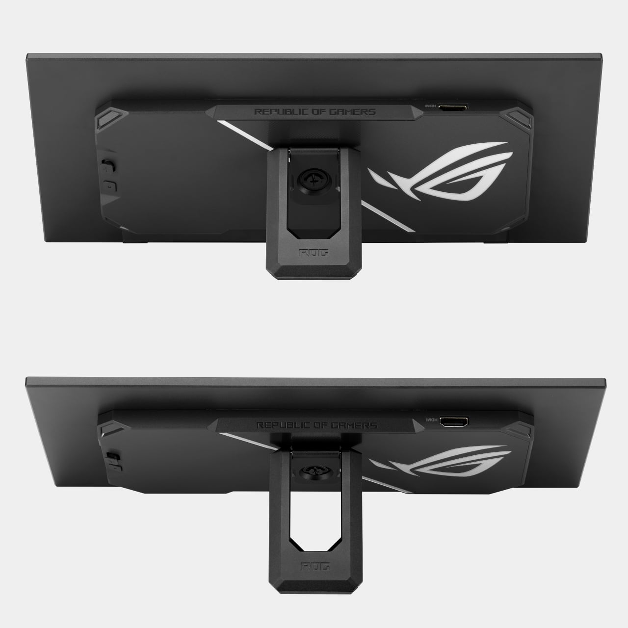
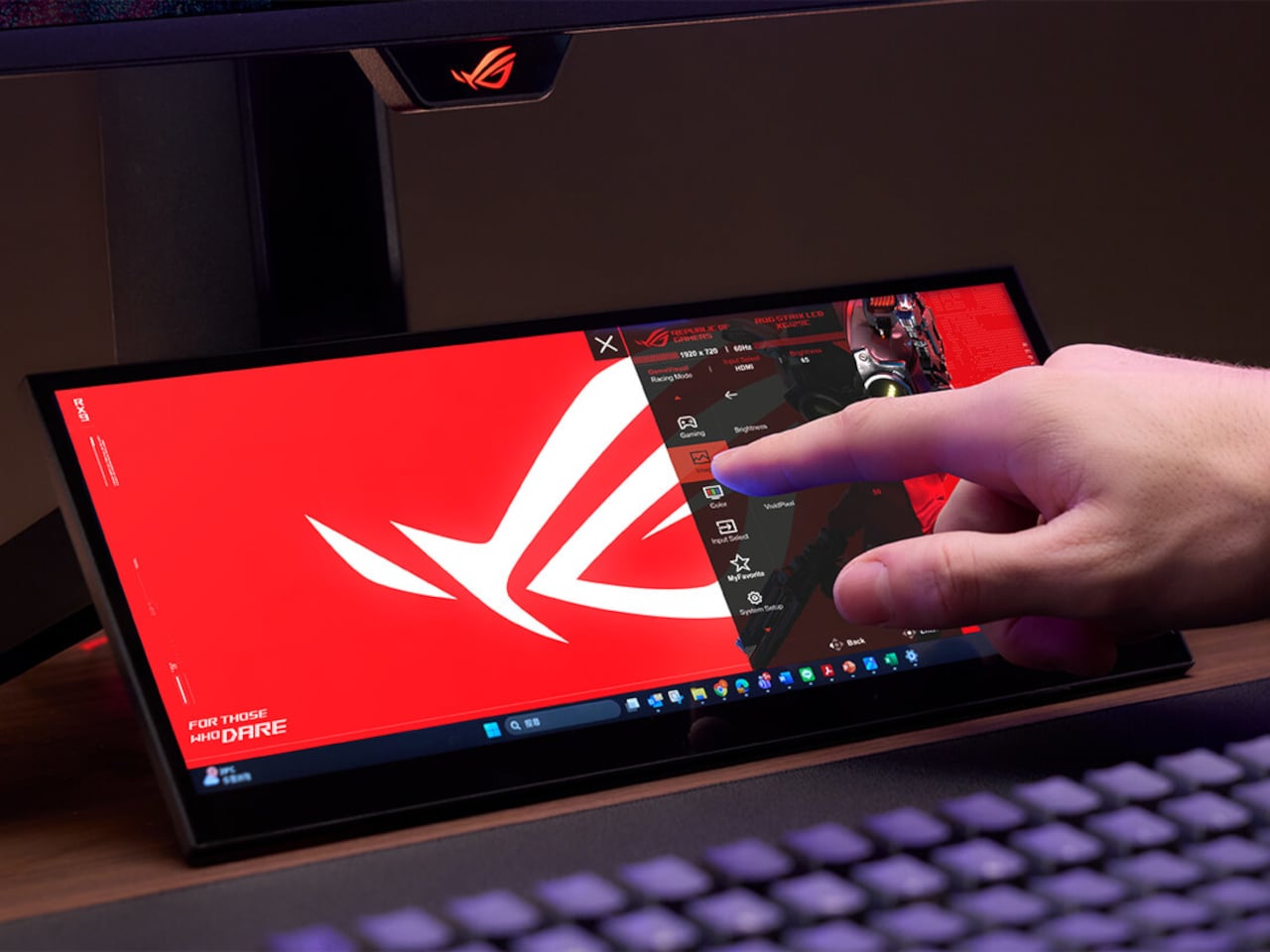
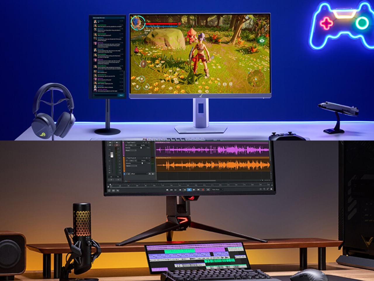
AR / VRTechnologyWearablesAR glassesAsusRepublic of Gamersrogsmart glasses
ASUS’ $849 XREAL R1 glasses deliver console-sized 3D gaming anywhere without bulky gearThe race to create the most practical AR glasses is still on, and Asus already showed its development curve with the collaborative Xreal One Pro....
Show full content
The race to create the most practical AR glasses is still on, and Asus already showed its development curve with the collaborative Xreal One Pro. Now, the VR gaming glasses get an exciting newer version, the Xreal R1. They are lighter than other options and less punishing on the eyes, offering a comforting viewing experience. First shown off at CES 2026, the glasses are finally up for preorder at a steep $849. Will they live up to the claims and compete with the much cheaper Meta Quest 3 VR glasses? Only time will tell.
The upgrade from the previous model is incremental, as the display now boasts a smoother 240Hz refresh rate and an ultra-fast 0.01 ms response time, and it comes with a dock to connect to gaming consoles or PCs for streaming content via DisplayPort 1.4, HDMI 2.0, or USB-C. While the control dock is a bit on the heavier side, weighing at 230 grams and measuring 215 x 100 x 25mm, the option of connecting compatible hardware is a big plus. Other things that stay the same include the 57-degree FOV that renders a 171-inch virtual screen from a perceived distance of four meters, and the 1080-pixel resolution Sony 0.55-inch micro-OLED display, which should have been preferably bumped up beyond HD at that price range.
According to Asus, the R1 smart glasses, weighing just 91 grams, are the logical extension of the ROG Ally gaming handheld as a result of the unified hardware and software integration, along with the XR technology. To make the users feel as if they’re using a handheld gaming console on their face, the highly responsive display has reduced motion blur and smoother visuals. The finer adjustments, like pumping up the display brightness to 300 nits, adjusting the aspect ratio based on the content, and other visual effects, can be toggled in real time, which is a great feature.
The glasses are equipped with “Electrochromic Lens” technology that automatically makes the screen transparent as soon as the vision focus shifts away. As soon as the wearer’s focus returns, the screen turns tint to black, which can be adjusted to three different dimming levels in settings. For a heightened level of spatial awareness, these AR glasses come with built-in Bose-tuned speakers. This comes in very handy in FPS games where identifying the source of enemy steps is vital to in-game survival. If you are willing to shell out another $100 on the XREAL EYE add-on, the glasses unlock 6DoF tracking capability, which deepens the level of realism in a virtual 3D world.
A Chair With a Drawer, a Calendar, and a Point of ViewThe first thing you notice about Massimiliano Malagò’s chairs is that the bottom half looks like it’s giving up. The ceramic bases appear to be...
Show full content
The first thing you notice about Massimiliano Malagò’s chairs is that the bottom half looks like it’s giving up. The ceramic bases appear to be softening, pooling, their surfaces undulating in slow waves as if the weight of everything sitting on top has finally gotten to them. The upper halves, either blond plywood cut with clean geometric precision or yellow foam dense as old mattress padding, hold their shape with complete indifference. The contrast is the whole conversation.
Malagò is an Italian architect based in New York who teaches at Columbia University’s Graduate School of Architecture and runs the practice HHMM with set designer Helene Helleu. His body of work has a recurring habit of using furniture as intellectual argument, treating each piece as a spatial essay. These chairs, created as part of On the Calculation of Volume for a Greenpoint apartment renovation he developed alongside client Kathleen Pongrace, are his most layered statement yet. Literally and figuratively.
Each chair is essentially two objects in a standoff. The bases are hand-sculpted ceramic glazed in a crackled off-white, decorated with small blue motifs that range from heraldic figures and crests to lunar phase calendars marked with numbers from one to thirty. Depending on which chair you’re looking at, the surface texture shifts too. Some bases have a wavy, rippled undulation. Others are pocked with circular voids, perforations from which actual small flowers grow, as if nature has decided to quietly move in through whatever gaps the city left open.
The upper chair structures sit on top of these organic, softened bases like they arrived from a different address entirely. The plywood versions are laminated and layered, their cut edges revealing the strata of material inside like a cross-section of something ancient, while the foam versions have a raw, utilitarian quality that reads somewhere between construction material and domestic comfort. Both feel deliberately unfinished in a way that is not careless but considered. Malagò is clearly not interested in making the perfect chair. He is interested in making a chair that has something to say about what living in New York actually costs you, in time, in money, and in compromises.
The storage element is where it gets genuinely clever. Pull open a drawer concealed within the ceramic base and you find a sliding metal mechanism holding books. The idea that a chair can house your library inside its own body, that seating and storage are so compressed in a small New York apartment that they must physically merge, is either a practical solution or a quiet diagnosis of how little room the city actually allows. I’d argue it’s both.
The lunar calendars printed across the ceramic surfaces in blue add another layer. Numbers arranged around moon phases suggest cycles, passing time, the rhythm of days that accumulate in a place where rent comes due whether you’re thriving or barely holding on. These aren’t decorative flourishes. They’re documentation. Malagò treats the surfaces of these chairs the way someone might treat the margins of a notebook, filling them with information that only makes full sense once you step back and read the whole thing together.
The material pairings are where the real honesty lives. Ceramic is permanent, archival, the kind of material you associate with objects meant to outlast the people who made them. Foam and plywood are impermanent, budget-conscious, the materials of first apartments and temporary solutions. Putting them together isn’t a design provocation for its own sake. It’s a portrait of how most people actually live, reaching for something lasting while working with whatever is available. The chair holds that tension without resolving it, which feels exactly right.
Design that tries to tell you something about city life usually does so at a comfortable, critical distance. These chairs plant themselves in the middle of it. They sit in a real apartment, used by a real person, and they carry the full weight of that reality in every surface.
Galaxy Z Fold 7 Hit 4.2mm by Killing the S Pen: Worth the Trade?Foldables have spent the last two years chasing a simpler goal: to feel less like category experiments and more like normal premium phones that happen...
Show full content
Foldables have spent the last two years chasing a simpler goal: to feel less like category experiments and more like normal premium phones that happen to open wider. Samsung pushed that idea hardest with the Galaxy Z Fold 7, officially measuring 4.2mm when unfolded and 215 grams in weight, making it the company’s slimmest and lightest book-style foldable yet, with thinness as the product’s defining promise.
That promise came with a quieter subtraction. Samsung removed S Pen support from the Galaxy Z Fold 7, cutting off a feature that had helped earlier Fold models feel connected to the company’s productivity-first identity. Nearly a year later, that choice carries more weight because the Fold 7 can now be judged as a finished design decision rather than a fresh flagship still riding its novelty.
Designer: Samsung
In practice, the Fold 7’s thinness changes behavior more than bragging rights. Reviews consistently described it as startlingly slim and easier to carry, suggesting Samsung had something more deliberate in mind than a good keynote number. The lighter frame, narrower pocket profile, and more usable 21:9 cover display all push toward the same goal: making the Fold feel less like a second device and more like your actual main one.
The missing stylus, though, changed the Fold 7’s identity as much as its feature list. On earlier Fold devices, pen support helped justify the large inner display as a workspace, somewhere to annotate documents, sketch ideas, and do precise work beyond just tapping through apps. The Galaxy Z Fold 7 doesn’t support S Pen in any form, which means the phone has let go of that precision-first promise entirely.
Outside reporting helps explain why Samsung made that call. T-Mobile’s comparison notes the company removed a layer from the inner display to help achieve the slimmer, lighter body, while others report Samsung cited low stylus adoption among Fold users to justify the cut. Even if that logic makes business sense, it still leaves the Fold 7 feeling like a foldable optimized for comfort over creative ambition.
Samsung also tried to reassure buyers that the thinner body wasn’t a weaker one. The Fold 7 uses a thicker Ultra-Thin Glass layer, a Grade 4 titanium lattice, new adhesive materials, and IP48 resistance, all meant to reinforce a slimmer chassis without making it feel fragile. Those details speak more clearly to Samsung’s engineering intent than to any definitive verdict on how the phone holds up over months of folding.
The rest of the hardware tells a similar story of selective advancement. Samsung paired the Fold 7 with Snapdragon 8 Elite for Galaxy and launched it on One UI 8 with Android 16, giving the device a solid performance base. The battery stayed at 4,400mAh, and the ultra-wide camera remained a 12MP unit alongside the more attention-grabbing 200MP main sensor. The phone moved forward, just not evenly.
That unevenness becomes more interesting when you consider where Samsung might be heading next. We’ve already covered early renders suggesting the Galaxy Z Fold 8 could bring back S Pen support and a bigger battery, at the cost of a thicker chassis. If those rumors hold, the Fold 7 starts to look less like the start of a permanent direction and more like a controlled experiment in subtraction.
Galaxy Z Fold8 Render
For buyers who want the most elegant Samsung foldable for everyday carry, the Fold 7 still makes a strong case. It’s the first Fold that genuinely reduced the physical friction of ownership without a compromise you’d notice daily. For former Note loyalists and pen-reliant users, though, the trade reads differently, because Samsung made the Fold 7 easier to live with by moving it away from the Fold line’s original ambition.
Product DesignToys5 best designsLEGOYD Design Storm
The 5 Best LEGO Designs of May 2026 for Collectors & Design LoversMay 2026 is one of the most eclectic and genuinely impressive months LEGO has assembled in recent memory. The lineup stretches across an almost improbable...
Show full content
May 2026 is one of the most eclectic and genuinely impressive months LEGO has assembled in recent memory. The lineup stretches across an almost improbable range of reference points, from Victorian astronomy and space photography fresh off the Artemis II mission to British absurdist comedy and Parisian haute couture, and in each case the people behind these builds have done something more ambitious than simply reproduce a recognizable subject. They’ve found a reason for it to exist in brick form specifically, and that distinction matters.
The five builds collected here sit at different points on the spectrum from official sets to community MOCs, but they share one defining quality. Each one earns its shelf space with a level of craft and intention that makes conventional display objects feel considerably less interesting by comparison. Whether you’re a collector, a casual admirer, or someone who simply appreciates when a design medium gets pushed somewhere unexpected, this month offers five compelling reasons to make room.
1. LEGO Ministry of Silly Walks
Few comedy performances have earned the kind of cultural permanence that John Cleese’s Silly Walk claimed in 1970. Fifty-six years later, the sketch remains the fastest and most widely understood shorthand for British absurdism in popular culture, and LEGO has finally given it the brick-built treatment it deserves. Mr. Teabag arrives in plastic form with exaggerated proportions that somehow capture every ridiculous knee-flinging motion from the original performance. The Technic joints embedded throughout are not decorative additions. They allow for a genuine range of articulation, letting you pose this figure mid-stride with a conviction that most articulated collectibles simply cannot match.
The facial expression is the detail that lifts this build above novelty status entirely. The sculptors working on Mr. Teabag captured his deadpan seriousness with a precision usually reserved for museum-quality reproductions, and the resulting silhouette reads as instantly recognizable from across any room. The bowler hat and umbrella complete the bureaucratic aesthetic with the restraint that good comedy has always required, nothing exaggerated beyond what the source material already provided. Display it alongside LEGO architecture, and it holds its ground completely, functioning as a standalone celebration of British wit that works whether you’ve seen the sketch fifty times or are encountering the joke for the very first time.
2. LEGO Hermès Birkin
The Hermès Birkin has one of the most theatrical purchasing rituals in luxury retail. You cannot simply walk into a boutique on Rue du Faubourg Saint-Honoré and ask for one. Hermès makes you earn it, cultivating a relationship with a sales associate over months and sometimes years, demonstrating cultural fluency with the house before they will even have the conversation about availability. LEGO Ideas builders BOI_Design and KittyJW have found a considerably more democratic workaround. Their MOC reimagines the Birkin 20 Faubourg, the special edition inspired by Hermès’s flagship Paris store, as approximately 1,400 bricks of deep navy, dark green, and gold that carry the mythology of the original without the waiting list.
What makes this MOC genuinely exceptional is its dual identity. The exterior facade doubles as a miniature rendering of 24 Rue du Faubourg Saint-Honoré itself, complete with arched boutique windows and the house’s signature orange awnings, a level of specificity that rewards anyone who knows the address on sight. And it opens. Inside, a secret runway scene transforms this from a luxury replica into a piece of interactive design with something worth discovering. For collectors who appreciate the gravity of the fashion world but not necessarily its access barriers, this build offers something rare: the cultural weight of the Birkin in a format that anyone can actually acquire.
3. LEGO Icons Road Bike
Cycling culture has always had a particular obsession with beautiful objects. The sport attracts a breed of enthusiast willing to spend hours debating titanium stem weights or the relative merits of ceramic bearing sets, and the objects at the center of that obsession tend to be genuinely elegant pieces of functional design. The LEGO Icons Road Bike (set 11380) understands this audience precisely. At 1,015 pieces and $129.99, it builds into a red road bike that stands 14.2 inches tall and stretches a full 23.6 inches in length on its stand, a genuinely substantial presence that captures the aerodynamic geometry of a road frame with an accuracy that will speak directly to anyone who has ever spent a lunch hour deep in a component forum.
The engineering choices go significantly further than surface accuracy. The set includes a fully functional drivetrain with a one-way gear chain drive mechanism, meaning the rear wheel pedals with genuine freewheel action. Brake calipers, derailleurs, and clipless pedals are rendered with the kind of specificity that separates a serious build from a shelf decoration. A removable water bottle and a wheel-lift bike stand complete the picture. Arriving ahead of the summer sporting season, the LEGO Icons Road Bike gives cycling enthusiasts an indoor companion that celebrates the object of their obsession in an entirely new medium, one that requires no maintenance schedule, no garage, and no chamois cream.
4. LEGO Artemis II Earthset Photo
On Christmas Eve 1968, astronaut Bill Anders looked out of Apollo 8’s window and took Earthrise, arguably the most reproduced environmental photograph in history, an image that reframed humanity’s relationship with the planet more profoundly than any scientific paper ever had. On April 6, 2026, the Artemis II crew performed a near-identical act, pointing their cameras backward as Orion swung behind the Moon and capturing Earth in the process of setting below the lunar limb. That photograph existed for barely nine days before LEGO builder BuildingDreams submitted an Ideas project to preserve it in brick form, a response time that says everything about how significant the moment felt to those watching from the ground.
The result is a 48 by 32 centimeter wall-art panel that translates the soft curves of Earth’s atmosphere, the brown and blue patchwork of continents and ocean, and the pale grey sweep of lunar regolith into a grid of plastic studs with a faithfulness that genuinely stops you mid-scroll. As a design object, it functions simultaneously as wall art, historical document, and conversation piece, a brick-built record of one of the most significant human achievements of 2026, rendered in a medium that will outlast any digital photograph on a phone screen. For space enthusiasts and design collectors with wall space to commit, this is a compelling reason to watch the LEGO Ideas voting page.
5. LEGO Functional Vintage Telescope
There is a specific category of object that makes a room feel more deliberately assembled: the brass sextant on the windowsill, the leather atlas propped open on a reading table, the tripod-mounted telescope angled toward a high window. Bricked1980’s LEGO Ideas submission belongs in that category without qualification. At around 600 pieces, the Functional Vintage Telescope stands 40 centimeters high and stretches 53 centimeters in length, with a color palette of deep reddish-brown and pearl gold that reads as genuinely antique from across any room. Modeled on a classic brass refractor telescope mounted on a fully articulated tripod, this is the kind of build that makes visitors assume you’ve spent considerably more than the actual price.
The period detail throughout is what elevates this from a visually striking model to something that feels genuinely researched. The barrel is rendered in warm dark brown with surface texture suggesting wrapped leather or lacquered wood, banded at intervals with pearl gold rings that evoke the ferrules of a real antique instrument. The tripod legs splay convincingly outward in reddish-brown, connected at the apex by Technic hardware functioning as an azimuth mount that allows the barrel to rotate and pivot in all directions. A small gold chain hangs from the objective end, terminating in what appears to be a lens cap. It is exactly the kind of fussy, historically accurate touch that separates a remarkable build from a merely good one.
Bricks Worth Believing In
May 2026 confirms something that LEGO enthusiasts and design writers have understood for years: the best builds are never just toys. They function as design objects, historical records, cultural statements, and engineering exercises, sometimes all four at once. The five designs collected here represent the full range of what brick-built creativity can achieve this month, from a 600-piece Victorian telescope with genuine period accuracy to a 1,400-brick homage to fashion’s most mythologized handbag.
What connects all five is a commitment to solving a real design problem. Each creator had to answer the same fundamental question: how do you translate physical comedy, haute couture, cycling precision, space photography, or Victorian craftsmanship into interlocking plastic bricks without losing what made the original worth caring about? These builds answer that question with conviction, and they are worth your attention whether you add one to your cart this month or simply appreciate the quality of thinking that went into making them.
Fosi’s $150 Headphone Amp Snaps to Your iPhone Instead of DanglingThe dongle DAC has become a familiar but awkward sight plugged into the bottom of a smartphone, a small reminder that the headphone jack didn’t...
Show full content
The dongle DAC has become a familiar but awkward sight plugged into the bottom of a smartphone, a small reminder that the headphone jack didn’t disappear quietly. Portable audio has come a long way in sound quality, but the form factor hasn’t kept pace. Most of these tiny dongles hang loose from the charging port, tugging at cables and generally getting in the way of an otherwise pleasant listening session.
Fosi Audio’s MD3 MagDac tries to solve this with a fundamentally different approach to portability. Instead of hanging from a charging port, it snaps magnetically to the back of a MagSafe-compatible smartphone using 16 N52 magnets, sitting flush against the device like a compact audio module. The result is a pocket-sized DAC and headphone amplifier that actually looks like it belongs there, not like an afterthought.
The design doesn’t stop at clever attachment. The MD3 is precision-machined from 6063 aluminum alloy with a sandblasted anodized finish, available in silver or black, both with orange leather on the magnetic back. At just 50g and 12m thick, it slides in and out of a pocket without protest. What you’ll notice first, though, is the 1.28-inch circular LCD display on the back.
That screen handles volume in 100 steps, shows audio information, and rotates its orientation depending on how you’re holding the device. There’s also a Vista Button that opens a personal photo album, a small but unexpectedly human touch for a piece of audio hardware. A dedicated Ease Button and physical navigation controls keep everything accessible without ever needing to tap your phone’s screen.
For the audio itself, Fosi didn’t compromise on components. The MD3 uses the ESS Sabre ES9039Q2M DAC chip paired with four ES9603Q amplifier chips in a true balanced circuit, supporting PCM up to 32-bit/384kHz and native DSD256. Total harmonic distortion and noise sit at just 0.00075%, and the noise floor drops to 1.7 μV. For most IEMs and portable headphones, those figures translate to noticeably cleaner, more resolving sound.
The MD3 offers both a 3.5mm single-ended output and a 4.4mm balanced output, delivering up to 180 mW through the latter, enough for headphones ranging from 16 to 300 ohms. An aluminum alloy shielding plate sits between the magnets and the audio circuitry to prevent interference from coloring the signal, a careful engineering detail that keeps the magnetic attachment trick from undermining the whole point of the device.
Dual USB-C ports handle both audio and charging simultaneously, so you’re not forced to choose between listening and keeping your phone powered. The top port handles audio decoding and charging, while the bottom manages audio decoding and firmware updates. There’s also a volume memory feature, so the MD3 picks up at the same level every time you connect it, without having to reset anything.
The wired audio revival has been building for a while, drawing listeners who want something more intentional than Bluetooth. A magnetic DAC that attaches to the back of your phone without cables or cases seems like a sensible next step in making that experience practical. Fosi has been laying the groundwork quietly, and at $149.99, the MD3 might just be the portable amp that finally stays out of the drawer.
The Orion PDA Runs on Sunlight and Ignores the Internet by DesignThe smartphone has become so dominant in daily life that it’s hard to remember what it felt like to carry a device that did only...
Show full content
The smartphone has become so dominant in daily life that it’s hard to remember what it felt like to carry a device that did only a handful of things. Every swipe, tap, and notification competes for your attention, turning what was once a communication tool into a cycle of endless distraction. The maker community, however, has quietly been building an alternative.
The Orion PDA is one of the more convincing results of that effort. Built by a YouTuber who goes by MVLab, it’s a compact clamshell computer designed specifically for people who’d rather write, listen, or record than scroll. There’s no internet connection out of the box, no cloud, no algorithms, and no push notifications. What it offers is a deliberately focused pocket machine that strips away the noise.
The design takes its cues from the Sharp Zaurus line of pocket computers popular in the early 2000s, and the resemblance is unmistakable. It folds open to reveal a small screen on top, and a full QWERTY keyboard with rubber dome switches below. Function keys run across the top row, letting you access common actions without digging through any menus. It’s compact enough to fit in a jacket pocket.
That screen is a 3.16-inch Sharp Memory LCD with a resolution of 536×336 pixels, rendered in 1-bit black and white. It might sound like a regression, but the display operates on the same basic principle as E Ink, drawing almost no power between refreshes and staying perfectly legible in direct sunlight. Take it out on a park bench or a café terrace, and it won’t let you down.
The custom operating system is built around doing a few things exceptionally well. You can pull up albums stored on an SD card, play them through an external speaker or headphones, and even record voice notes that go straight to removable storage. A lightweight calendar app handles basic scheduling. There’s also a text-scaling setting and a USB mass-storage mode for moving files to and from a desktop computer.
Powering everything is an STM32U575 microcontroller clocked at up to 160 MHz, an ultra-low-power chip that keeps the device running for long stretches between charges. The lid houses an integrated solar panel, which can supplement the battery enough to keep things topped up with occasional exposure to sunlight. A USB-C port also handles charging, firmware updates, and data transfers. An expansion port leaves room for future community-developed modules.
The Orion PDA also packs in a dedicated digital-to-analog converter for audio playback, putting it above the lo-fi output you’d expect from a device this small. A MEMS microphone handles voice recording with reasonable fidelity. It isn’t trying to replace your dedicated music player or studio recorder, but for capturing quick ideas or dictating notes on a long hike, it does what it needs to. For anyone tired of carrying a device that’s simultaneously a computer, a TV, a game console, and a social distraction, this one might be worth the wait.
24x Optical Zoom on an iPhone, Balanced Like a DSLR. REEFLEX’s 600mm Lens Is Brilliantly Absurd.Zoom has won. Of all the specs that used to dominate camera phone conversations, optical reach is the one that stuck because it is the...
Show full content
Zoom has won. Of all the specs that used to dominate camera phone conversations, optical reach is the one that stuck because it is the most visible and the most immediately felt. At any major live event, the phones come out and the zoom wars begin. Samsung loyalists will have their periscope lenses trained on the far end of the pitch. iPhone users will be framing tight, stable shots of the stage from the back row. FIFA 2026 is nearly here, and across dozens of stadiums and billions of shared clips, zoom will quietly be the deciding factor in whether those memories look spectacular or just… small.
REEFLEX built the Ultra Telephoto 300-600mm for people who refuse to settle for small. Attaching to the telephoto camera of iPhone 17 Pro, Pro Max, and the Samsung S26 Ultra series, the lens compounds the phone’s native optical strength and extends it into a focal range, up to 600mm and 24x magnification, that genuinely belongs to another category of photography entirely.
Most clip-on telephoto lenses grow forward in a long tube that looks great in renders but becomes a liability the moment you try to hold your phone steady. The weight pulls forward, the center of gravity shifts away from your grip, and at long focal lengths, that imbalance shows up as jitter in video and smeared detail in stills. REEFLEX went wide instead of long, packing everything into a compact cylinder that keeps the mass directly over your hand. Your wrist stays neutral, your grip stays firm, and the setup feels closer to holding a DSLR than balancing a makeshift telescope. That distinction matters enormously once you’re standing in a stadium trying to track a fast-moving subject.
Machined from aerospace-grade aluminum, the body weighs 308 grams and holds its optical tolerances without adding unnecessary bulk. The glass inside is lanthanum, a material chosen specifically for its high refractive index. In practical terms, that means sharper resolving power, richer contrast, and far less color fringing along edges than standard glass can manage at these focal lengths. The optical formula runs four elements, one doublet and three singlets, tuned to work with the tetraprism telephoto cameras in current flagship phones rather than fighting against their characteristics. The matte black finish, the green accent ring around the barrel, and the large front element all contribute to something that looks and feels like a deliberate optical instrument.
REEFLEX designed this lens specifically for the tetraprism telephoto systems introduced in the iPhone 17 Pro lineup and Samsung’s S26 Ultra series. Those cameras already deliver impressive native zoom performance, and the Ultra Telephoto 300-600mm takes that foundation and multiplies it. On iPhone 17 Pro and Pro Max, you get 24x magnification and a 600mm equivalent focal length. On Samsung S26, S25, and S24 Ultra, magnification reaches 30x with an equivalent focal length stretching to 660mm. For context, that is the kind of reach wildlife photographers use to capture birds without disturbing them, the kind of compression architectural photographers rely on to isolate distant details, and the kind of range that makes concerts and sports events feel immersive rather than distant.
The lens mounts via a standard 17mm threaded connection that attaches to REEFLEX’s dedicated phone cases, which feature an integrated camera bumper designed to align perfectly with your phone’s telephoto lens. The threading ensures a secure, wobble-free connection, and the whole assembly stays compact enough to slip into a jacket pocket or small camera bag. REEFLEX also built in compatibility with their ReeMag magnetic accessory system, so you can stack filters, attach lens caps, and expand your creative toolkit without needing adapters or workarounds.
FIFA 2026 will be the first time many people realize just how limiting their phone’s native zoom really is. Sitting in the stands, even a few rows back from the pitch, most phone cameras will reduce the action to distant, flat shapes. The Ultra Telephoto 300-600mm changes that equation completely. You can isolate a player’s expression during a penalty kick, compress the depth of the field into a cinematic frame, and capture moments with the kind of detail that looks deliberately composed rather than accidentally caught. The same logic applies to concerts, where the stage often sits 50 meters or more from general admission, and wildlife, where getting close means ruining the shot.
The focus range starts at 6.8 meters and extends to infinity, which means you can use this lens for everything from isolating architectural details across a plaza to capturing the moon with surprising clarity. The lanthanum glass keeps distortion minimal and sharpness high even at the edges of the frame, and the compact form factor means you can shoot handheld without needing a tripod or gimbal for stability.
The Standard tier comes with the Ultra Telephoto 300-600mm lens and a phone case for $302, against a retail price of $441. The Ultra Tele + Super Tele Bundle adds the Super Telephoto 240mm and both macro add-ons (200mm and 300mm) alongside a phone case for $568, down from $849. The full Reeflex Ultra Set at $1859 (retail $2883) covers ten lenses spanning fisheye to ultra telephoto, a complete filter collection including fixed NDs from ND8 to ND64, variable NDs, a polarizer, and a black mist filter, plus filter adapters, a waterproof impact-resistant hard case, and a phone case.
Case options vary by device. iPhone 17 Pro and Pro Max users choose between Tech-Woven MagSafe or Leather MagSafe. iPhone 16, 15, and 14 Pro and Pro Max receive the Leather MagSafe version. Samsung S26, S25, S24, and S23 Ultra users get a Carbon case. Shipping begins June 2026, completing by early July.
This $89 Retro Radio Made My Smart Speaker Feel Weirdly UselessThere was a time when the radio on the kitchen shelf meant something. Not just background noise – a presence. Something with weight and warmth,...
Show full content
There was a time when the radio on the kitchen shelf meant something. Not just background noise – a presence. Something with weight and warmth, a dial that clicked with intention, a speaker that made the morning feel like it had a score. Then it disappeared. We outsourced listening to our phones, our earbuds, our smart speakers that go silent the moment the Wi-Fi drops or the power cuts. Our devices got smarter, but also more fragile. More connected, but less self-sufficient.
The result is a strange kind of ambient helplessness. Beautiful, optimized, perpetually connected – until nothing works. That’s what makes the RetroWave 7-in-1 Radio so quietly compelling. It doesn’t just revive the visual language of a classic Japanese radio. It restores something modern gadgets gave up without asking: the reassurance of an object that works when conditions aren’t perfect and takes away the decision fatigue of ‘choosing’ every single music you play.
The Radio That Changed How I Think About “Essential”
At first, I thought the RetroWave Radio was mostly a design piece. A handsome retro object with a tactile tuning dial and enough character to earn a shelf. But after a few weeks, I realized it had rearranged things I hadn’t expected.
The Bluetooth stream replaced my phone speaker and sounded better. The FM dial came back into rotation, and tuning a signal by hand felt more deliberate than tapping a playlist. Then the power went out during a weekend storm. The radio kept going. The hand crank charged my phone enough to send a message. The LED flashlight handled the kitchen. The SOS alarm stayed ready in the background, doing nothing, which was exactly what I needed it to do.
It hadn’t added a function to my shelf. It had closed a gap I didn’t know I was living with.
Built Beautiful. Built Smart.
7-in-1 functionality: Works as a speaker, MP3 player, radio, flashlight, clock, power bank, and SOS siren in one compact form.
Bluetooth + MP3 playback: Stream from your phone or play directly from USB and microSD when you want to go offline.
FM/AM/SW radio: Tune into local broadcasts, international news, or analog stations without needing the internet.
Emergency-ready power: Recharge by hand-crank or solar panel when outlets are unavailable.
Built-in flashlight and SOS alarm: Designed for blackouts, storm prep, roadside stops, and unexpected moments.
Phone charging on the go: The 2000mAh battery gives your essentials a boost when you need it most.
Compact but capable: Lightweight enough to pack, yet powerful enough for up to 20 hours of radio time or 6 hours of emergency lighting.
This isn’t multi-functionality for the sake of a spec sheet. Each function earns its place.
Why Reliability Feels Like a Luxury Now
We tend to assume the future belongs to smarter devices. But smart has started to feel fragile. Speakers that go silent without internet. Phones that drain at the worst moment. Tools that work beautifully right up until they’re actually needed.
The RetroWave Radio offers a different kind of progress. Not rooted in constant connectivity, but in self-sufficiency. It gives you music when you want ambiance, information when you need updates, and power when everything else starts running low. The best emergency tool is the one that’s already out – living on your shelf, earning its place every day, so it’s there without thinking when things get difficult.
Design That Reflects Resilience
This isn’t a radio that begs for attention. The retro Japanese-inspired silhouette is balanced and resolved – compact without feeling cheap, characterful without demanding notice. The tuning dial has genuine tactile feedback, the kind touchscreens never replicate. The proportions feel considered. The soft glow of the interface gives it a quiet presence that works as naturally on a nightstand as it does in an emergency kit. It looks dependable before you even turn it on.
Who It’s For
Design Lovers
A functional object with enough character to live proudly on display.
For Users Who Are Always Prepared
A practical companion for blackouts, storms, travel, and emergency kits.
Minimalists on the Move
Seven useful functions in one compact device that actually earns the space it takes up.
The Quiet Power of Owning Fewer Things That Give You Freedom
You don’t realize how many modern tools depend on ideal conditions until the power cuts, the signal drops, or you simply want something that works without asking much in return. That’s what the RetroWave 7-in-1 Radio gets so right. It doesn’t just entertain. It reassures.
And maybe that’s why it feels so current. Not because it looks back, but because it solves for the kind of uncertainty modern gadgets tend to ignore. In a world full of devices that stop being useful the moment things go wrong, this one keeps earning its place. The RetroWave 7-in-1 Radio is available now for $89.
This Futuristic 3D-Printed Shoe Started as a Clay SculptureYanko Design’s Design Mindset podcast continues to carve out a thoughtful space for conversations around creativity, innovation, and the ideas shaping the future of design....
Show full content
Yanko Design’s Design Mindset podcast continues to carve out a thoughtful space for conversations around creativity, innovation, and the ideas shaping the future of design. Now at Episode 22, the weekly podcast is steadily building a strong voice of its own by focusing not just on finished products, but on the processes, philosophies, and experiments behind them. Powered by Zawa, this latest episode turns its attention to a fascinating tension in contemporary design: as AI becomes more embedded in creative workflows, where does human originality begin, and what happens when the most forward-looking idea starts with something as ancient as clay?
That question drives host Radhika Seth’s conversation with Ben Weiss, CEO of Syntilay, a company already known for pushing footwear into unfamiliar territory through AI, 3D printing, and custom-fit production. In this episode, Weiss unpacks the making of the Skin shoe, a project that began with artist Sebastian ErraZuriz sculpting directly around his foot before the form was scanned, translated, and turned into wearable footwear. The result is not just a new shoe, but a new argument for how design can begin, who gets to author it, and why technology may be most powerful when it supports human expression rather than replacing it.
The most striking part of the Skin shoe story is that it did not begin with a digital tool, a design brief, or a manufacturing constraint. It began with clay in the hands of an artist, and for Ben Weiss, that starting point changed everything about the outcome. As he explains, “People kept asking us, why start with clay? Why not just open a design software and begin, you know, kind of like the typical path for making shoes. And the answer is because a computer has an idea and some predetermined steps. But when you start with an art form, it’s entirely original.” That distinction becomes the foundation of the entire episode.
Weiss makes it clear that the goal was not simply to make a shoe in an unusual way. It was to let an artist enter footwear authentically, using his own medium and instincts instead of adapting to the usual industrial process. Sebastian ErraZuriz sculpted around his own foot in a w†ay that was, as Weiss describes it, “very free flowing,” with no predetermined expectations about what a shoe should look like. That is also why the final product feels less like a sneaker and more like something anatomical, intimate, and expressive, a piece of wearable sculpture rather than a conventional consumer product.
Turning Sculpture into a Wearable, Custom Fit Shoe
Once the clay sculpture was complete, Syntilay had to solve the difficult problem of turning a tactile, hand-made object into something that could actually be worn. Weiss acknowledges that some detail is always at risk in the translation from physical object to digital file, but preserving the original character of the sculpture was a key priority throughout. “Cause you lose some detailing, but you know you try to capture it as best as you can,” he says, before noting that the final printed shoe still retains much of the fine surface texture and hand-made quality of the original piece.
What makes the process especially interesting is that the artistic form is largely preserved on the outside, while most of the personalization happens on the inside. Using more than 5,000 data points captured from a phone scan or in-person fitting, Syntilay adjusts the internal geometry of the shoe to fit each customer’s foot without distorting the sculpture itself. Weiss explains, “The key is is not changing the outside structure that much so it distorts what the shoe looks like. In this case, what this piece of art looks like on your feet, um, and while also providing a good fit experience. So most of the changes are happening on the inside.” That balance between fidelity and function is what allows the shoe to remain art-led while still being wearable.
Ben Weiss on AI, Human Craft, and What Innovation Actually Means
Although the episode title sets up a contrast between clay and AI, Weiss is not arguing against technology. His view is more layered, and more useful, because he sees AI as a tool that can support creativity without becoming the sole source of it. “AI is going to be a great augmenter, um, maybe that’s not the best word, but a great kind of helper for humans,” he says. He goes on to describe a future in which designers sometimes use tools, sometimes choose not to, and build workflows based on what makes the most sense for the idea rather than on ideology alone.
That mindset also shapes how Syntilay positions itself as a brand. Weiss points out that the company has already explored highly automated footwear, but the Skin shoe takes the opposite route by placing the human hand at the very beginning of the process. For him, the bigger point is experimentation. Footwear, he argues, has become too comfortable with minor updates, surface-level collaborations, and familiar formulas. His response is blunt and memorable: “A lot of collaborations today are new embroidery on the shoe, different colors. It’s nice, But like when you can take an actual clay sculpture that somebody made around their foot and make it something you can wear. I mean that’s next level.” Innovation, in this framing, is not about choosing between AI and craft, but about creating conditions for truly new ideas to emerge.
Storytelling, Authorship, and Why the Human Element Still Matters
One of the strongest ideas in the conversation is that the Skin shoe is not just a design object, but a story that could only exist because of its human origin. Weiss sees that as increasingly important in a design landscape crowded with AI-generated outputs and endless visual sameness. “The story of the skin shoe is is a great story,” he says, pointing to the way Syntilay documents the journey from clay sculpture to 3D file to finished shoe. For him, storytelling is not decoration added after the fact, but a core part of how a product communicates meaning and builds resonance with people.
That same human-first logic also shapes how Weiss thinks about authorship. When asked who designed the shoe, he resists reducing it to one name, instead crediting both Sebastian, who created the sculpture, and Pablo, who translated the scan into a printable product. “So I would say it’s designed by two people,” he says, acknowledging that the future of artist-led footwear may depend on this kind of collaboration between conceptual creator and technical designer. He also notes that stories like these matter because they cannot simply be fabricated by a machine, adding that “storytelling is is a really significant moat because there are some stories that AI can just doesn’t have.” In other words, the human element is not just visible in the object, but embedded in the narrative around it.
Joe Foster’s Influence and Ben Weiss’s Bigger Design Philosophy
Another compelling layer in the episode is Weiss’s reflection on working with Joe Foster, Reebok’s cofounder, whose decades of experience have shaped the way Syntilay thinks about product. Weiss describes Foster as someone who still approaches design with energy, curiosity, and a strong belief that the work should remain enjoyable. But the deeper lesson comes from Foster’s idea of “vis tech,” or visible technology, the principle that innovation should not be hidden beneath the surface. Customers should be able to look at a product and immediately understand that it is doing something different. That philosophy clearly runs through Syntilay’s work, from the pod-based structure of other models to the unmistakably sculptural silhouette of Skin.
Weiss also shares a broader set of lessons that go beyond this one project. He admits that early on, he had not fully figured out how to optimize footwear for printing cost while balancing comfort, and that learning came through iteration rather than certainty. He is equally clear about what AI companies often get wrong when entering established creative fields, saying the most common mistake is “losing the authenticity and respecting the people that come before you.” Still, his most revealing line comes near the end of the episode, when he is asked to define the future of design. His answer is simple and sharp: “It’s about giving people more opportunities to design.” That may be the clearest summary of both the Skin shoe and Syntilay’s larger ambition, opening the category to artists, creators, and new forms of authorship that conventional design systems have historically left out.
Design Mindset drops every week on Yanko Design. Catch Episode 22 in full wherever you listen to podcasts.
Lofree Just Made the Most Eye-Candy Mechanical Keyboard of 2026 and It’s Inspired by LipstickYour desk says something about you before you ever open your mouth. The monitor, the mug, the little objects arranged around your keyboard, they all...
Show full content
Your desk says something about you before you ever open your mouth. The monitor, the mug, the little objects arranged around your keyboard, they all add up to a portrait. And the keyboard sits dead center in that portrait, the most touched, most visible, most personal object in the whole setup. So why do most of them look like they were designed by someone who has never once cared about how a workspace feels?
Lofree has been answering that question for years, building a catalog around the idea that a keyboard can carry genuine personality. The Lipstick is where that philosophy gets its boldest, most unapologetic expression yet. Five lipstick shades flowing across the keycaps in a deliberate ombre gradient, a sculptural lipstick-bullet ESC key rising from its cradle, and a gorgeous frosted transparent shell that puts the whole color story on display like jewelry in a glass case. It retails for $199 and is available now in Silver and Black directly from Lofree.
Never did I think the overlap between beauty and keyboards would exist so seamlessly. Lofree used dual-tone PBT keycaps to create that mystique that is each and every key, with a frosted outer shell revealing the hint of a hue underneath. Lofree didn’t scatter five themed shades arbitrarily across 84 keys. They sequenced them, running deep burgundy and wine tones from the left and right of the board through warm coral and brick red across the QWERTY row, then lightening into blush pink and dusty mauve as you move into the function row. The result reads like a makeup palette laid flat across your desk, a color story with a beginning, a middle, and an end. The keys on the extreme left and right (Tab, Caps Lock, Shift, Enter) are single-tone, giving you a direct look at the color while the rest of the row looks like actual samples of lipstick or nail paint that you’d feel like popping out to test. Pair this with the nail-job on your actual hands and you’ve got absolute art at work.
Lofree’s rounded, typewriter-inspired keycap profile has been a house signature since the original Block, and the Lipstick leans into it fully. That retro shape is clever because it mimics the cylindrical form of a lipstick tube at a miniature scale, which means the thematic reference lands in three dimensions rather than just through color. The ESC key pushes that logic to its natural conclusion, a fully sculpted lipstick bullet in matte red, sitting upright in a black cradle in the top left corner of the board. It physically protrudes above the surrounding keys, and when you see it in person, it has the quality of a very good joke told with a completely straight face. Clever without being loud about it.
Under all of that, Lofree built a proper enthusiast keyboard. The Lipstick runs Lofree x Gateron linear switches with a 40g actuation force, hot-swappable and compatible with both 3-pin and 5-pin configurations, so you can retune the typing feel whenever you want without touching a soldering iron. A gasket mount structure absorbs the hard edges out of each keystroke, softening the acoustics and adding a slight cushioned rebound that makes extended typing sessions noticeably more comfortable than a standard tray mount board. The 1000Hz polling rate over both 2.4GHz wireless and USB-C wired connections keeps response times sharp, and a 4000mAh battery delivers up to 14 days of use with the backlight off, or 30 hours with all seven lighting effects running. The keys aren’t individually backlit, which is what you’d expect with dual-tone PBT caps, but rather the space between the keys lights up, giving you a look at the keyboard’s outline. Bluetooth 5.3 handles up to three paired devices simultaneously, with seamless switching across macOS, Windows, iOS, and Android.
Lofree also makes a matching Lipstick Wireless Numpad that carries the same gradient keycaps and frosted shell, available separately for anyone who wants the full spread across their desk. It connects via the same tri-mode system, so the two sit together without any friction. At $199 for the keyboard, the Lipstick sits at a price point where the spec sheet fully justifies the ask, and the design justifies everything else.
BYD’s Boxy Off-Road Brand Just Built an ‘Anti-Minimalist’ 1,000-HP SupercarRest in peace, minimalism. You were hated with a vengeance by every car owner forced to jab at a touchscreen just to change the AC....
Show full content
Rest in peace, minimalism. You were hated with a vengeance by every car owner forced to jab at a touchscreen just to change the AC. After years of dashboards flattening into glossy digital panes, Fang Cheng Bao’s Formula X swings the pendulum back with a cockpit full of physical mechanical buttons, a retractable steering wheel, integrated sport seats, and four-point harnesses that make driving feel tactile again. The formula is not complicated. Give the driver something real to touch.
Fang Cheng Bao, a BYD marque introduced in 2023 with rugged body-on-frame SUVs like the Bao 5, unveiled the Formula X at the 2026 Beijing Auto Show as the centerpiece of a new Formula sub-range that also includes the brand’s first-ever sedans. The supercar’s wraparound “battle cockpit” suggests a fresh design appetite for interfaces with texture, theater, and presence. General Manager Xiong Tianbo described the interior direction as “an all-new sporty intelligent cabin,” which undersells it considerably. The Formula X positions itself as the halo above a family of Formula S sedans Fang Cheng Bao also revealed in Beijing. Where the Bao series asked what an off-road SUV could be, the Formula X asks what an EV cockpit should feel like, and it answers with buttons.
Designer: Fang Cheng Bao
“Fangchengbao” translates directly to “formula leopard,” a name loaded with speed and precision that spent its first three years attached to body-on-frame off-road SUVs built on a proprietary platform called the DMO, or Dual Mode Off-road. The Bao 5 launched in late 2023 as a premium PHEV SUV roughly the size of a Land Rover Defender, followed by the larger Bao 8. Both vehicles were credible, capable, and about as far from supercar territory as a product can get. Fang Cheng Bao’s monthly sales were already growing over 200% year-on-year in early 2026, which means the brand pivoted from momentum, not desperation. The Formula X is Fang Cheng Bao finally catching up to its own name.
Sitting ankle-low to the ground, the Formula X presents a roofless carbon-fiber body that looks like someone stretched a predator’s silhouette over a racing tub. Six airflow channels and 19 vent openings distribute active aerodynamics across the exterior, giving the bodywork a technical density that reads as sculpture before it reads as engineering. The “Fengbao Eye” headlights up front and the Infinity Ring taillights at the rear establish a lighting signature Fang Cheng Bao is clearly positioning as the visual cornerstone of its new Formula design language. Doors open in a gull-wing and scissor configuration, the kind of theatrical entry ritual that turns a parking lot into a performance. A tri-motor setup delivers a combined 1,000 hp and 1,000 Nm of torque, numbers that once defined hypercar territory and now apparently define a production-intent show car from Shenzhen.
The wraparound “battle cockpit” ditches the screen-centric serenity of most EV flagships in favor of physical mechanical buttons, a retractable steering wheel, integrated sports seats with four-point racing harnesses, and a grey and green color scheme that feels like someone took a Le Mans prototype and gave it a luxury fit-out. The retractable steering wheel transforms a static interior element into a kinetic ritual, revealing itself on demand and making the act of sitting down feel ceremonial. Physical controls here signal that the driver’s hands, not a menu tree buried behind glass, are the primary interface. The four-point harnesses make the cabin feel shaped around a body in motion rather than around a pair of eyes pointed at a screen. This is a cockpit that demands physical participation, and that distinction carries real weight in 2026.
Spotify’s 20th anniversary rebrand traded flat iconography for a more dimensional, texturally rich visual identity, and it landed as a cultural signal because it captured something design had been quietly renegotiating for years. Minimalism, in its strictest form, conflated sophistication with invisibility, training users to expect interfaces that disappear rather than engage. On the automotive side, Jony Ive’s work with Ferrari on its interior direction has pointed the same way, moving back toward tactile driver-focused experiences and away from touchscreen dominance. What these moves share is a rediscovery of depth, texture, and physical legibility as luxury signals rather than signs of technological regression. The Formula X’s cockpit belongs squarely in that conversation, and the fact that it arrives from a brand that was selling off-road SUVs three years ago makes it a sharper cultural data point.
BYD confirmed the Formula X carries approximately 80% of the show car’s design into production, with a market launch targeted for 2027. I’m inclined to believe the cockpit philosophy survives even if some of the carbon theater gets value-engineered on the way to the factory floor. Read the Formula X alongside the Formula S sedans Fang Cheng Bao also unveiled in Beijing, and a consistent brand identity emerges: tactile, expressive, and built on the premise that premium design should communicate through form rather than through its own disappearance. The brand spent three years perfecting the capable, rugged SUV, then used a single auto show to rewrite what “formula leopard” was always supposed to mean. Shenzhen now has a supercar, and it came loaded with buttons.
Oppo and Vivo Are Both Building Gimbal Cameras To Take On DJI’s Osmo Pocket SeriesSomewhere inside BBK Electronics, two product teams are independently building the same camera. Oppo has a pocket gimbal codenamed “Fuyao” in development. Vivo has the...
Show full content
Somewhere inside BBK Electronics, two product teams are independently building the same camera. Oppo has a pocket gimbal codenamed “Fuyao” in development. Vivo has the “Vivo Pocket,” reportedly fitted with a 200MP Sony sensor, headed for a late 2026 launch. Whether BBK’s leadership views this as healthy internal competition or an organizational blind spot depends entirely on your read of how the conglomerate actually operates. What’s undeniable is that both devices are aimed squarely at the same target: DJI’s Osmo Pocket series, the device that has owned the pocket gimbal category for years.
The timing, whether coordinated or coincidental, lands at a genuinely vulnerable moment for DJI. Regulatory pressure in the US has made retailers and creators skittish about long-term investment in the DJI ecosystem, and Insta360, the most credible challenger until now, is going aggressively upmarket with its Leica-partnered Luna Ultra. That leaves a real gap in the premium-but-accessible bracket, and BBK, intentionally or otherwise, has two horses racing toward exactly that gap simultaneously.
Designers: Oppo & Vivo
AI Representational Concept
Oppo’s Fuyao centers on a 3-axis stabilized gimbal in a compact form factor, with the brand leaning heavily on its AI-driven video computational technology to bridge the gap between high-end smartphone imaging and dedicated vlogging hardware. That’s a credible pitch. Oppo’s Find X9 Ultra stuffed two 200MP cameras and a sophisticated computational pipeline into a phone chassis, so the engineering muscle is demonstrably there. The question is whether that expertise translates cleanly when the form factor constraints change and the buyer’s expectations are shaped by years of DJI’s famously polished shooting experience.
Vivo is taking a more overtly spec-aggressive approach, with its prototype packing a 1/1.1-inch Sony LYT-901 sensor capable of 200MP stills, a significant departure from the current gimbal camera standard of 1-inch sensors with lower megapixel counts. That sensor is the same one powering Vivo’s current flagship phones, which means the lossless zoom headroom and low-light performance should be genuinely competitive. Vivo is targeting DJI-level hardware quality, suggesting a premium build rather than a budget-friendly entry point, and content creators are reportedly already getting early units for testing.
The deeper strategic story here is what BBK is actually betting on. DJI’s regulatory headaches in the US aren’t going away quietly, and Insta360’s Luna Ultra, co-developed with Leica and priced accordingly, is drifting toward a buyer profile that everyday creators can’t comfortably afford. That middle ground, premium imaging credentials at a price that doesn’t require a business justification, is exactly where Oppo and Vivo are parking. Whether BBK planned this pincer movement or stumbled into it, the instinct is sound. The execution is all that’s left to prove.
This Flat Textile Transforms Into a Sculptural Cap With SteamThe TYPE-O CAP by A-POC ABLE ISSEY MIYAKE is not just a cap; it is a small, wearable study in transformation. At first, it begins...
Show full content
The TYPE-O CAP by A-POC ABLE ISSEY MIYAKE is not just a cap; it is a small, wearable study in transformation. At first, it begins as something surprisingly simple: a flat woven textile. But through the application of heat and steam, the fabric contracts, expands, and reshapes itself into a sculptural three-dimensional form. What was once flat becomes structured. What looked quiet becomes expressive. The result is a cap that feels both technical and poetic, sitting somewhere between fashion, material research, and soft architecture.
At the center of the cap is Steam Stretch, an innovative textile technique developed by A-POC ABLE ISSEY MIYAKE. The fabric is woven using heat-reactive yarns that respond to steam by shrinking in specific areas. This contraction is not random. It is carefully planned through data-driven jacquard weaving, where thousands of threads are arranged to create a structure before the object even visibly takes shape. Once steam is applied, the hidden logic of the weave is activated, allowing the cap to rise from a flat surface into a dimensional form.
This is what makes the TYPE-O CAP so compelling. Its shape is not created by cutting multiple panels and stitching them together in a conventional way. Instead, the structure is embedded into the textile itself. The pleats, curves, and volume emerge from the behavior of the material. The fabric almost seems to remember what it is supposed to become.
Created in collaboration with Nature Architects, the cap is part of a larger exploration into how textiles can transform through programmed material behavior. Nature Architects studied the contraction properties of the Steam Stretch yarn and developed algorithmic methods to generate weave patterns that control how the fabric changes shape. In the case of the cap, this results in a geometric pleated structure that expands around the head, adapting to the wearer while maintaining its sculptural character.
Despite its experimental process, the cap remains thoughtfully functional. It is unisex, washable, adjustable, and flat-packable, making it as practical as it is innovative. A drawcord at the back allows the wearer to fine-tune the fit, while the pleated structure gives the cap a flexible, adaptive quality. It can also be dyed in various colors, giving the same material system different expressions depending on finish, tone, and styling.
What is especially interesting about the TYPE-O CAP is how it makes advanced material technology feel approachable. It is not a dramatic runway object that only exists as a concept. It is an everyday accessory, but one that quietly challenges how we think about clothing construction. The cap suggests a future where garments may not need to be assembled from many separate cut pieces. Instead, they could be woven flat, transported efficiently, and transformed into complex forms through heat, steam, or other triggers.
While the cap is the focus here, the possibilities of this material system extend far beyond headwear. The same Steam Stretch and data-driven weaving approach can be used to create other garments with complex pleats, adaptive silhouettes, and reduced sewing requirements. It also opens up possibilities beyond fashion, including furniture, lighting, interiors, and even architectural applications. A textile that can shift from flat to dimensional has enormous potential in a world increasingly interested in compact production, responsive materials, and more efficient design systems.
The TYPE-O CAP captures that potential in a beautifully contained form. It is small enough to be worn casually, but conceptually large enough to suggest a different way of making. It turns fabric into structure, steam into a design tool, and a cap into an object that feels almost alive.
Four Meters by Four Meters: How Tadao Ando Made Constraint BeautifulPerched on the coast of the Seto Inland Sea in Tarumi-ku, Kobe, the 4×4 House by Tadao Ando occupies a narrow coastal strip that Japanese...
Show full content
Perched on the coast of the Seto Inland Sea in Tarumi-ku, Kobe, the 4×4 House by Tadao Ando occupies a narrow coastal strip that Japanese authorities had not even considered constructible. That is exactly why Ando built there. Completed in 2003, the house rose in the shadow of the Great Hanshin earthquake, a catastrophe that reshaped the region and the consciousness of everyone who lived through it. Ando’s response was not to build bigger or safer in the conventional sense.
It was to build with precision — a four-story reinforced concrete tower with a footprint of just four meters by four meters. Sixteen square meters of floor area, multiplied upward toward the sky. The name is the blueprint.
At 13.4 meters tall, the structure reads less like a residence and more like a sentinel. Its silhouette evokes a watchtower — upright, deliberate, scanning the horizon. Ando sank the foundations deep into the ground to resist lateral forces, and at the base, a square concrete patio disappears beneath the waterline when the tide comes in. The boundary between architecture and ocean is intentionally blurred. Living here means accepting the sea as a roommate.
The interior climbs through a vertical sequence of rooms, each floor stacked with the discipline of a column. What makes the composition unusual is the top floor — a cube shifted slightly off-axis from the floors below, a geometric move that feels almost offhand but transforms the entire silhouette. Light enters in controlled bursts. Views are framed like paintings. Nothing is accidental.
Not long after the first house was finished, a second client commissioned Ando to build an identical tower on the neighboring plot. The result is a pair of concrete twins standing side by side on the coastline, same in form but different in material — a duality Ando had quietly envisioned from the beginning. The two buildings share no physical connection. They stand together, facing the sea, as if in silent conversation.
The 4×4 House is not a comfortable building in the traditional sense. It is a provocation — a proof that constraint, when embraced fully, becomes its own kind of freedom. Ando took a strip of coastline that the city had written off and turned it into one of the most discussed residential structures of the 21st century. Sixteen square meters at a time.
5 Desk Accessories So Cute They Make Work Feel Less Like WorkFor years, professional stationery stayed neutral and invisible. Desks were filled with black pens, muted folders, and purely functional organizers. Utility mattered, but visual pleasure...
Show full content
For years, professional stationery stayed neutral and invisible. Desks were filled with black pens, muted folders, and purely functional organizers. Utility mattered, but visual pleasure rarely did. That long-standing mindset is now beginning to change as designers rethink what belongs on a modern desk.
Let’s enter the era of playful stationery where cute meets carefully considered design. These pieces are not gimmicks but thoughtfully engineered essentials that elevate everyday work. By combining tactile satisfaction with visual charm, they turn routine tasks into moments of delight. The desk is no longer just a surface but a space for creativity, comfort, and self-expression.
1. Transparent Design Aesthetics
Transparency in stationery is no longer just a visual novelty. It reflects a deeper appreciation for clarity, precision, and the beauty of the machine. Clear materials such as acrylic and resin reveal springs, gears, and ink reservoirs, turning everyday tools into small design showcases. The user is invited to witness how the object functions, creating a stronger connection between form and mechanism.
Beyond aesthetics, transparent design reshapes the visual rhythm of a workspace. Its light presence reduces the sense of bulk and clutter, allowing the desk to feel open and breathable. The effect is subtle yet striking, blending minimalism with a futuristic edge while maintaining full functionality and tactile satisfaction.
Royi Stationery places transparency at the heart of its design philosophy, transforming ordinary office tools into visually honest objects. Their clear staplers, external hard drives, and coin banks expose every internal component, allowing you to witness the mechanics that usually remain concealed. The transparent casing is not simply an aesthetic decision; it symbolises openness and authenticity. When you press the stapler, you see the staple move through paper. When you hold the hard drive, you observe the intricate circuitry protecting your data. This visibility creates a deeper connection between the user and the object.
By removing the outer shell that typically hides complexity, Royi invites you to appreciate function rather than façade. The products celebrate engineering, structure, and process, reminding you that what lies beneath the surface often carries the greatest value.
2. Stationery as Sculptural Art
Stationery is evolving beyond utility, stepping confidently into sculptural art. Contemporary desk accessories are designed to captivate even at rest, with forms inspired by gallery objects rather than traditional office supplies. Tape dispensers resemble smooth metallic pebbles, while paperweights echo abstract statues, transforming ordinary tools into visual statements.
This shift reflects a growing desire for workspaces that feel curated and expressive. Form now holds equal importance to function, allowing these pieces to enhance the environment, whether in use or simply displayed. The desk transforms into a composition where practicality and artistry coexist, adding character, texture, and a sense of intentional design.
There are countless ways to organise a desk, but few solutions approach storage as a sculptural expression. Designed by Subin Song in collaboration with Fountain Studio, Cacty transforms the ordinary desk organiser into a vertical composition inspired by the organic growth of succulents. Rather than concealing clutter inside static compartments, the system rises upward in stacked forms, creating a silhouette that feels architectural and plant-like.
Each module functions as a container and a structural element, connecting through a slot-and-tab mechanism that allows the form to evolve endlessly. The base anchors the composition, while taller and shorter units interlock to create varied proportions, shadows, and depth. As modules accumulate, Cacty becomes a personalised sculptural tower which is an organizer and installation.
3. Architectural Desk Aesthetics
The structural edge in stationery draws heavily from architectural language and industrial design. Influenced by brutalism and modern drafting aesthetics, these pieces embrace sharp geometry, visible structure, and engineered balance. Materials such as concrete, steel, and solid brass introduce weight, texture, and a sense of durability that contrasts with conventional plastic desk tools.
Objects like pen holders shaped as miniature towers or cantilevered desk trays express stability and intention. They communicate permanence while maintaining full functionality. They transform the desktop into a composed landscape of lines and forms that exudes the quiet drama of structural design.
Industrial designer Jaekyoung Oh approaches desk organisation through the lens of product architecture rather than mere storage. The Small Town holder is conceived as a miniature built form, defined by a clear base structure and a pitched roof silhouette. The body functions like a compact architectural volume, solid, geometric, and carefully proportioned, while the slanted top incorporates linear grooves that transform pencils into structural elements.
When inserted, the writing instruments complete the roof plane, turning everyday objects into integral components of the design’s framework.
The architectural logic continues in its modular potential. Multiple units can be arranged side by side, forming a cohesive streetscape across the desk. The repetition of gabled forms creates rhythm, alignment, and spatial order, much like a row of townhouses. Even without the pencil roof, the hollow interior operates as a contained volume for smaller stationery, maintaining both structural clarity and functional efficiency.
4. The Zoomorphic Design Trend
Nature-inspired design is embracing a distinctly playful yet sophisticated direction through animal-influenced forms. Rather than producing overtly cute novelties, designers are crafting elegant silhouettes that subtly reference wildlife.
These zoomorphic objects introduce warmth, character, and a sense of gentle storytelling to the workspace. They soften the often sterile mood of digital environments, reconnecting the desk with organic shapes and emotional familiarity.
Shearing Magnetic Absorption, designed by Xin Se, is a compact magnetic paper clip organizer shaped like a simplified sheep. The product integrates a magnetic core within its sculpted body, allowing paper clips to attach directly to its surface. Rather than storing clips inside a container, the design uses them as a visible, textural layer that forms the sheep’s “wool.” This surface-based storage system keeps clips consolidated, accessible, and neatly displayed.
The form is minimal and carefully proportioned, avoiding excessive detailing while maintaining a clear and recognizable silhouette. Its small footprint makes it suitable for desks of any size, while the magnetic mechanism ensures functionality without mechanical complexity.
5. Modular Lego Design
Play has reemerged as a powerful design language through Lego-inspired stationery and desk tools. Functional rulers, organizers, and toolboxes now adopt the logic of interlocking systems, encouraging users to assemble and customize their workspace. What once belonged purely to childhood is being reinterpreted with precision, durability, and modern aesthetics.
This approach blends nostalgia with utility. Modular components offer flexibility, adaptability, and a deeply tactile experience. The act of rearranging pieces becomes productive and a satisfying experience.
Inspired by the classic minifigure accessory from LEGO, this upscaled toolbox by luc.afol transforms a miniature object into a fully functional builder’s kit. The product retains the recognizable toolbox silhouette but scales it to a practical size, complete with an opening lid and structured internal storage. Designed specifically for AFOLs and MOC creators, it serves as a dedicated toolkit tailored to the precise demands of brick construction.
Inside, the toolbox houses a curated set of brick-built instruments: a foldable color sampler with labeled LEGO solid colors for accurate selection, a stud-calibrated ruler for precise alignment, and hinged triangle rulers constructed with Technic elements for angular measurement. Each tool is engineered to work within LEGO’s grid system, prioritizing measurement accuracy, portability, and compact storage.
Playful stationery signals a new philosophy of work where function and emotion coexist. These thoughtfully designed objects transform desks into spaces of clarity, creativity, and personal identity. By embracing pieces that balance charm with engineering, productivity becomes more engaging and inspiring within everyday professional routines.
Lexon Turned Jeff Koons’ Most Famous Sculpture Into The Coolest Statement Lamp You Can Actually OwnTransforming Jeff Koons’ Balloon Dog into a fully functional lamp required more than good intentions and a licensing agreement. For French design/tech atelier Lexon, more...
Show full content
Transforming Jeff Koons’ Balloon Dog into a fully functional lamp required more than good intentions and a licensing agreement. For French design/tech atelier Lexon, more than 50,000 hours of development went into the project, working through the specific challenge of preserving the sculpture’s iconic silhouette while engineering a translucent polycarbonate body capable of housing 400 LEDs and diffusing light cleanly. The result respects the form with a fidelity that goes well beyond cosmetic homage. Lexon, a French brand with 35 years of design experience and more than 250 awards behind it, brought its full technical vocabulary to bear on a project that demanded something genuinely new. The Balloon Dog Lamp Chromatic is the 2026 edition of that effort.
Four colorways define the Chromatic lamp: Platinum, Gold, Blue, and Red, each built from optical-grade polycarbonate chosen for its crystal-clear transparency and the way light moves through it, and anodized metal components that add a pop of color. The colorway identity comes through tinted zones within that transparent body, giving each piece a distinct chromatic character that works even when the lamp’s off. Inside that shell, LEDs operate entirely independently of the body’s tint, cycling through 9 color modes and 9 lighting animations regardless of which colorway body they sit inside. The 2026 edition introduced an additional layer of technical complexity, requiring Lexon to match finishes, tones, and material specifications across both the lamp and speaker product lines while maintaining consistent visual identity throughout. Each piece features Jeff Koons’ engraved signature on the front feet of the sculpture, maintaining a direct physical connection to the artist across all four versions.
Designer: Lexon x Jeff Koons
Click Here to Buy Now: $800. Hurry, limited edition! Pre-orders capped at two pieces per color, per product, per collector.
Jeff Koons has received France’s Légion d’Honneur and the U.S. Department of State’s Medal of the Arts, and his work has been presented at MoMA, the Guggenheim, and the Tate. The Balloon Dog specifically has spent decades accumulating cultural meaning at a pace few contemporary artworks can match. Its form borrows from a children’s party toy, scaled to monumental proportions in mirror-polished stainless steel, yet the conceptual charge it carries never tips into pretension. Koons has always worked around the democratization of beauty and the conviction that joy deserves serious artistic attention. Lexon, whose design philosophy centers on making beautiful objects genuinely accessible, found a natural creative partner in that worldview, and the Balloon Dog Lamp is the physical record of that alignment.
The lighting system offers a wide range of atmospheres offer a behavioral range that goes considerably deeper than a standard color-cycling product. Nine animations, each with their own sub-animations, move from soft warm whites and cool daylight tones through vivid RGB cycles, rainbow sequences, flashing, and strobe, giving the piece a genuinely different character depending on the occasion and the room. Brightness is fully adjustable, and all controls live on the nose of the sculpture, handling color, intensity, and effect from a single tactile point of contact. That decision keeps the lamp’s silhouette completely uninterrupted while making the interaction feel native to the object rather than bolted on. Battery life sits at five hours at 75% brightness, recharging via USB-C, and the lamp’s 29 × 11 × 28 cm footprint and 1 kg weight give it enough physical presence to anchor a space without overwhelming it.
Lexon’s proprietary Easy Sync Bluetooth technology allows an unlimited number of Balloon Dog Lamps to connect and synchronize simultaneously across color, effect, and brightness. That feature transforms what is already a compelling standalone object into the foundation of something considerably more ambitious, particularly for collectors building across multiple colorways. Whether displayed across a room or grouped together, lamps running Easy Sync work in perfect unison, allowing collectors to create immersive multi-piece lighting compositions.
The first Lexon x Jeff Koons edition reached collectors and design enthusiasts across more than 90 countries, a number that speaks to Koons’ global cultural reach and Lexon’s ability to execute a collectible that resonates well beyond the design industry. The Chromatic Collection builds on that foundation with a firm no-reissue commitment across all four colorways and a purchase cap of two units per color per collector, keeping the experience personal and the supply genuinely controlled. Orders are fulfilled on a first-come, first-served basis through monthly shipping slots, with worldwide shipping beginning June 2026. Pre-orders are live now at lexon-design.com. At $800 per piece, the Balloon Dog Lamp Chromatic brings four decades of Koons’ cultural legacy off the gallery wall and onto your side table, where it lights your room, holds its own as a sculptural object, and reminds you every evening that great art and everyday life were never meant to be kept apart.
Click Here to Buy Now: $800. Hurry, limited edition! Pre-orders capped at two pieces per color, per product, per collector.
AutomotiveOutdoor5 best designscampercampingvansYD Design Storm
5 Camper Vans So Cleverly Designed They Replace Your Apartment, Office, and Hotel RoomThe idea that a van could replace your apartment, your office, and your hotel room used to sound like a compromise. It isn’t anymore. The...
Show full content
The idea that a van could replace your apartment, your office, and your hotel room used to sound like a compromise. It isn’t anymore. The best camper vans being built right now treat their interiors with the same spatial intelligence you’d expect from a thoughtful architect working a studio floor plan. Every surface earns its square footage, every wall hides something useful, and every night of sleep feels intentional.
What separates the best of these builds from the crowd isn’t the price tag or the vehicle underneath. It’s the thinking. A bathroom that travels on rail tracks. A bedroom reached by an internal staircase. A tailgate that becomes a suspended lounge over the landscape below. These five camper vans share one quality above everything else: they make you forget you’re in a van.
1. Vanspeed Album
California-based Vanspeed has built its reputation on Sprinter conversions that understand what full-time living actually demands, and the Album is the clearest expression of that thinking. Built on a Sprinter 144 AWD, its warm wood-paneled interior uses a floor plan that shifts between workstation, lounge, and bedroom without any of those transitions feeling forced. A hidden swivel table folds out from the cabinet opposite the L-shaped seating to serve as a dining surface, a desk, or whatever the day calls for.
At night, the Murphy bed folds down from the driver’s sidewall to create an 80-inch sleeping platform for two, resting on its own foundational sidewall supports without disturbing the cabinetry underneath. The kitchenette features a single-burner portable induction cooktop and a countertop that extends outside for outdoor cooking. A lithium battery system supports extended stays, and the wet bathroom doubles as storage when not in use. With the seating removed entirely, the center aisle clears for a surfboard, two bikes, or whatever the trip demands.
What We Like
The Murphy bed’s independent sidewall supports leave the lounge and cabinetry completely undisturbed at night
Fully removable seating transforms the van into a proper cargo hauler when adventure gear takes priority over comfort
What We Dislike
At $219,000, the Album sits at a price point that narrows its audience to serious, committed buyers
A single-burner induction cooktop may feel limiting for extended off-grid meal preparation
2. Sunlight Vanlife
Most camper vans treat their interior as a single convertible room that has to be everything at once. The Sunlight Vanlife takes a different approach entirely, building in a full wall partition that separates the cab from the living quarters. That private zone gives the space an architectural identity that feels closer to a studio apartment than a vehicle. Below the pop-up roof, the living area converts between a remote work setup, a dining table, and a double bed without any of those functions overlapping.
The pop-up roof is reached by an internal staircase built into the storage cabinetry, which changes the feeling of going to bed in a van more than any single feature could. The bathroom sits across from the staircase and features a folding sink, a bench toilet, and a shower that swings out through the window for outdoor use. A 64L fridge tucks underneath the staircase, and 100L of fresh water supports extended stays on the road.
What We Like
The internal staircase to the sleeping loft gives the van a genuinely residential, loft-apartment quality
A fully partitioned cab creates a private living zone that most compact vans simply cannot offer
What We Dislike
The partitioned cab limits daytime seating to two people while driving
Seating capacity doesn’t scale comfortably for groups larger than a couple
3. Bürstner Habiton
The Bürstner Habiton does something no other camper van in this roundup manages: it lets you physically rearrange the floor plan while you’re living in it. The wet bathroom sits on embedded rail tracks and slides forward toward the cab on demand, opening up the rear of the van for two full-length single beds. That single design decision unlocks a level of spatial flexibility that most vans at twice the price can’t replicate. It’s apartment-level thinking applied to a 5.93-meter Sprinter.
The modularity runs deeper than just the sliding bathroom. The sink drops down when needed, the toilet seat slides back into the wall beneath the bed platform, and when both fold away, the space opens entirely for the shower. A dual-burner stove, sink, and 69L compressor fridge make up the kitchen block on the opposite side. The collapsible dinette houses a 95Ah battery pack beneath its bench seat. The Habiton starts at €72,999, with an AWD Sprinter variant at €86,999 and an optional all-weather pop-up roof add-on from €6,990.
What We Like
The rail-mounted sliding bathroom is genuinely unlike anything else offered in the camper van segment right now
The AWD Sprinter variant makes this modular floor plan usable well beyond paved roads
What We Dislike
The base configuration uses a transverse bed layout that may feel restrictive for taller occupants
The all-weather pop-up roof is a paid add-on, starting at an additional €6,990 on top of the base price
4. Mercedes-Benz Marco Polo 2026
For the first time, Mercedes-Benz is building the Marco Polo entirely in-house, with the body assembled at the Vitoria plant in Spain and the conversion completed at the Ludwigsfelde plant in Germany. The result is a camper van that feels as considered as any V-Class interior. The 2026 update centers on the pop-up roof: a double-skinned aluminum lift-top that adds four inches of headroom, paired with an ambient LED system that transforms the upper sleeping area into something that genuinely resembles a boutique hotel room.
The MBAC infotainment touchscreen in the cockpit controls more than the navigation. From the driver’s seat, it manages the eight-speaker audio, the ambient LED lighting, and the pop-up roof, meaning you can raise the ceiling before you’ve even stepped inside. Downstairs, a double-burner gas stove, a mini fridge, and a convertible sofa-to-double-bed arrangement complete the layout. The Marco Polo doesn’t reinvent van living. It refines it to a point where the word “compromise” stops coming up.
What We Like
Full in-house Mercedes production means every detail, from the lift mechanism to the ambient lighting, functions as one cohesive system
MBAC infotainment control over the pop-up roof and interior lighting brings genuine smart-home behavior to a compact van
What We Dislike
The Marco Polo Horizon variant removes the built-in kitchen entirely, limiting it to weekend use only
Pricing for the 2026 model has not yet been confirmed, making direct value comparison difficult
5. Marylin Onroad
German shop Camper Schmiede built the Marylin Onroad as an exhibition vehicle for Caravan Salon Düsseldorf 2024, and it has since become available for purchase at €269,000. Built on a MAN TGE base, its defining feature hangs off the tailgate: the Soul Floater, a suspended lounger made from a metal frame, support straps, and waterproof fabric, rated to hold 200kg and engineered to fold away quickly when it’s time to move. There is nothing else like it in a van conversion.
The roof is a walkable deck of lightweight aluminum honeycomb panels and solar modules, reached through a glass hatch behind the cockpit. The main bed lowers from the ceiling at the push of a button, a secondary bed converts from the sitting area, and a rooftop tent sleeps two more. Up front, a portafilter espresso machine, a Smeg 130L refrigerator, and a bamboo dining table set the interior tone. Two 330Ah batteries, a 3000W inverter, and a 300W solar array keep everything running indefinitely.
What We Like
The Soul Floater tailgate lounger is an entirely original outdoor furniture concept that no other van conversion has thought to include
The walkable aluminum rooftop deck doubles as a solar platform and a genuine second outdoor living floor
What We Dislike
At €269,000, this is firmly aspirational territory rather than a practical van-life entry point
Deploying the full six-person sleeping configuration requires activating multiple systems simultaneously, which adds friction for solo or couple travel
The Van Won
What these five vans share isn’t a price bracket or a base vehicle. It’s a design intention. Each one has looked at the constraints of a van-sized floor plan and treated them as a creative brief rather than a limitation. The result, across all five, is an interior experience that stops feeling like camping and starts feeling like a considered way to live, one that happens to come with an engine.
The Vanspeed Album is the natural anchor for anyone serious about full-time van living, with its Murphy bed and modular lounge setting the template for what that life can look like. Scale up to the Marylin for a rooftop terrace and a suspended balcony, or scale down to the Sunlight Vanlife’s clean loft-style layout at €58,999. Wherever you land on this list, the question has shifted from whether a van can replace your home to which one does it best.
Someone Built a Clock With 60 Water Pumps and Zero RegretsWhen I first saw the Water Tower Clock by Strange Inventions, I genuinely had to watch it twice. Not because I didn’t understand it, but...
Show full content
When I first saw the Water Tower Clock by Strange Inventions, I genuinely had to watch it twice. Not because I didn’t understand it, but because I couldn’t quite believe that someone looked at a pile of 10-cent glass bottles and thought: yes, this is how I’m going to display the time.
The concept is deceptively simple. Each digit on the clock is made up of a fifteen-segment display, except instead of LEDs, each segment is a small glass bottle. When a bottle is filled with dyed water, the segment is active. Empty it, and it disappears. Put enough bottles together in the right configuration and you get numbers. Numbers that tell you it’s 4:37 in the afternoon, rendered entirely in colored water. It’s the kind of idea that sounds ridiculous until you see it running, and then it seems almost obvious.
I love this for a lot of reasons, but the biggest one is that Strange Inventions didn’t try to make something efficient. He made something worth looking at. That’s a design philosophy I respect more than I can easily put into words. There’s an entire industry dedicated to optimizing displays, making them thinner, brighter, more power-efficient. And then someone comes along and asks, what if we pumped water into tiny bottles instead? And somehow, it works.
Behind the scenes, the build is genuinely complex. The clock uses 60 pumps in total, a stepper-driven peristaltic pump paired with membrane-pump boosters, to route dyed water into the precise bottles needed for each digit. The water isn’t doing any actual timekeeping here. It’s purely the display medium. The electronics handle the time; the water handles the theater.
The mechanism for emptying the bottles is particularly clever. Rather than individually draining each one with a separate pump, Strange Inventions engineered a servo-driven linkage that flips all nine bottles in a single digit at once. It’s one motion, one satisfying dump, and the digit resets. Getting that 3D-printed mechanism to work took significant troubleshooting, but watching the finished result operate, you’d never guess it was anything other than effortless.
The tiny bottles, by the way, were found in a random shop for 10 cents apiece. Sounds affordable, right? Until you scale it up to a full clock and the total project cost lands somewhere around $580. That gap between cheap materials and expensive obsession is actually one of my favorite things about independent makers. The individual components are humble. The vision is not.
Visually, the Water Tower Clock sits in a category I struggle to name. It’s not exactly art, though it absolutely qualifies. It’s not just a gadget, though it functions as one. It has the patience of a kinetic sculpture and the practicality of something that actually tells you what time it is. The dyed water catching the light, the slow fill of each segment, the deliberate dump when a digit changes: all of it has a rhythm that most digital objects simply don’t have.
I think what makes projects like this matter to the broader design conversation is that they challenge our assumptions about what a display should look like. We’ve become so accustomed to LEDs and screens that we’ve stopped asking whether there might be a more interesting material to work with. Strange Inventions answered that question with dyed water and glass bottles from a random shop, and the result is one of the more memorable pieces of functional design I’ve come across this year.
It’s also, for what it’s worth, completely impractical in the best possible way. The water will need maintenance, the pumps add complexity, and the whole thing would be thoroughly confused by a power outage. None of that matters. The point isn’t that this is the future of clock displays. The point is that it makes you feel something when you look at it, which is more than most technology ever manages to do. Strange Inventions earns the name.
VIBRYX Is the Furniture Collection That Treats Sound as a MaterialI’ve looked at a lot of furniture collections over the years. Most of them ask the same question: how do you make a sofa or...
Show full content
I’ve looked at a lot of furniture collections over the years. Most of them ask the same question: how do you make a sofa or a coffee table feel special? Trueba Studio, the Madrid-based architecture and design firm founded by Marcos Trueba, decided to ask a completely different one: what if sound itself was a material you could actually build with?
VIBRYX, the studio’s latest furniture drop, is the answer. And it’s one of those releases that makes you stop scrolling and actually look. The name alone is doing a lot of work before you even see the pieces. Trueba Studio built it from vibr- for vibration, the physical origin of sound, and the letter X as a symbol of crossover: design meeting sound meeting the future of how we live at home. It reads like a new periodic element, or the codename for something that doesn’t exist yet but probably should. Precise. Energetic. Engineered. For a collection that treats vibration as a design material rather than an afterthought, the name earns its keep.
What the photographs reveal is a room that feels more like a score than a showroom. The collection spans sofas, seating, and tables, all rendered in brushed stainless steel with upholstery in deep black hair-on hide. The contrast is deliberate and sharp: the warmth and texture of the hide set against the cold, architectural precision of the metal. One sofa sits low to the floor with a stainless steel base that doubles as a speaker housing, a woofer set flush into the body as if it always belonged there. On top, a turntable rests in its own integrated cradle. The whole piece looks less like a living room setup and more like an instrument you happen to be able to sit on.
That is, I think, entirely the point. Trueba Studio isn’t positioning VIBRYX as “speaker furniture,” a phrase that tends to conjure images of branded Bluetooth boxes dressed up with upholstery. The language they use is more interesting than that. The collection is described as furniture with a sound presence, one that holds the room visually and activates it emotionally. It’s a quiet but confident distinction. The difference between a room that plays music and a room that is musical.
The aesthetic speaks to a very specific kind of person, and I mean that as a compliment. Someone who owns vinyl but also cares deeply about the chair they listen to it in. Someone whose living room is a curated environment, not just a set of furniture. The VIBRYX world is dark, focused, and deliberately stripped of decoration for decoration’s sake. There are no ornamental details here, no flourishes that don’t earn their place. The geometry is clean and the edges are softened just enough to keep the pieces from feeling cold. It walks a careful line between industrial and intimate, and it mostly lands on the right side of it.
Madrid has been producing some quietly compelling design work in recent years, and Trueba Studio is consistently one of the studios worth paying attention to. Their previous collectible pieces, including the Pol Ann sofa and the PL4 chair series, showed a consistent aesthetic vocabulary: architectural framing, considered proportions, materials chosen for character rather than trend. VIBRYX extends that vocabulary into new territory. It asks what happens when the room itself becomes the speaker, when the furniture isn’t staging a performance but is the performance.
My honest take? The collection is ambitious in the best way, and the execution looks like it matches the concept. Whether it translates into something that actually sounds as good as it looks is a question only a listening session could answer. But as a design statement, as a proposition about how we might live with music rather than just near it, VIBRYX makes a compelling case. Not every furniture collection needs to have something to say. This one does.
Art-ware Is the Dining Set That Never Has to Go in a CabinetTableware has always had a storage problem. A complete set of cups, bowls, and cutlery takes up a cabinet’s worth of space for the privilege...
Show full content
Tableware has always had a storage problem. A complete set of cups, bowls, and cutlery takes up a cabinet’s worth of space for the privilege of being used a few times a week. The rest of the time, it sits behind closed doors, out of sight and contributing nothing to the space around it. That’s a lot of material devoted to a fairly passive existence.
Michael Jantzen’s Art-ware prototype takes a different approach to the same set of objects. Rather than designing tableware that gets put away after a meal, he designed a system where the dishes, cups, and cutlery connect to each other and become something else entirely: freestanding abstract sculptures that live out in the open, doubling as décor when they’re not being used for eating and drinking.
The key to the whole system is a set of male and female connectors molded directly into each piece. These are simple protrusions that stick out from the surfaces of the bowls, cups, and cutlery handles, allowing any component to plug into or stack onto any other. A bowl can lock onto a cup, a cup onto another cup, cutlery can stand upright in an opening or connect through a handle, and the whole assembly stays together without any separate hardware.
The configurations that result don’t look accidental. Cups stacked and plugged together form vertical columns; bowls assembled at various orientations create clusters that read as organic, almost biomorphic forms. Slide cutlery upright through the assembled pieces, and the resulting structure starts to resemble a piece of abstract art you’d find mounted in a gallery, not something you’d normally find next to a kitchen sink.
That’s precisely what Jantzen is after. The Art-ware set doesn’t need to be stored in a cabinet because the assembled form is meant to sit on a shelf or table as a decorative object, a sculpture that also happens to be a dining set. You pull it apart before a meal and reassemble it afterward in whatever configuration suits you that day. No two arrangements have to be the same.
The material is recyclable plastic, and Jantzen frames the concept in straightforward sustainability terms: one product that performs multiple functions uses fewer resources than two separate products doing the same jobs independently. There’s no dedicated storage unit needed, no extra display piece required. The dining set is the décor, and the décor is the dining set.
Art-ware is a prototype and the first in a planned series of designs that expand the idea further. The concept is broad enough to go well beyond tableware, and Jantzen has spent decades applying this kind of thinking to furniture, architecture, and public installations. The dining set is a compact version of the same logic: objects that commit fully to their function while quietly doing something else on the side.
This Architect Built a 20m² Red Cabin on Her Family’s Greek Vineyard — and It’s the Antidote to Every Concrete Villa on the IslandSomewhere between the olive groves and vine rows of Zakynthos, a deep-red timber cabin sits quietly in the Greek countryside, and it’s one of the...
Show full content
Somewhere between the olive groves and vine rows of Zakynthos, a deep-red timber cabin sits quietly in the Greek countryside, and it’s one of the most considered small structures to come out of Europe this year. The Root Cabin, designed by London-based studio Kasawoo, is a 20-square-metre prefabricated retreat that challenges the very idea of what a holiday home in Greece should look like.
The project is personal. Co-founder Katie Kasabalis owns the land in the village of Vanato, a site that has been in her family for decades and still holds the ruins of her grandmother’s old stone house. Together with co-founder Darius Woo, she set out to build something that felt of the place rather than imposed on it. The result sits at just 2.5 by 8 metres, slipping gently between rows of vines without disrupting the agricultural and historical fabric of the land.
Built off-site in Romania and transported to Zakynthos fully prefabricated, the cabin is road-legal and designed to be relocatable, a detail that speaks directly to its low-intervention philosophy. “Nothing is superfluous,” the architects told Dezeen. “The project’s generosity lies in what it refuses to add.” In a part of Greece where sprawling concrete villas are accelerating across the countryside, that kind of restraint is quietly radical.
The exterior is wrapped in deep-red timber planks, a shade drawn from the historic villas of Zakynthos, and topped with a gently angled roofline that echoes the island’s mountainous horizon. It’s a structure that has absorbed its context rather than competed with it. Inside, the atmosphere shifts to something warmer and more immediate. Plywood lines the walls, ceilings, and all built-in furniture, creating a near-seamless, cocoon-like interior in which a bed, compact kitchen, sofa, and bookshelves are integrated into the structure.
The layout places the bedroom and bathroom at opposite ends, with a central living space defined by large sliding glass doors that open directly onto the landscape. Red details carry through from the exterior, while the bathroom shifts to soft blue tones, a quiet nod to the Ionian Sea nearby. Objects sourced from Greek makers, including ceramics and textiles, add another layer of local grounding to a space that already feels deeply rooted.
Passive ventilation and operable openings allow the cabin to function off-grid, reinforcing what Kasawoo describes as a “different kind of luxury,” one that measures itself not by square footage or spectacle, but by the quality of what’s been left out.
LUV1 modular bike replaces your car for daily errands with 120L storage and swappable batteriesMost electric motorcycles still behave like motorcycles first and utility machines second. They chase performance numbers, oversized displays, or aggressive styling while ignoring a simple...
Show full content
Most electric motorcycles still behave like motorcycles first and utility machines second. They chase performance numbers, oversized displays, or aggressive styling while ignoring a simple reality: most urban riders just want something practical enough to replace short car trips. The ANY LUV1 approaches the problem differently. Instead of behaving like a sportbike with batteries attached, it feels more like a compact urban tool designed around everyday life.
Created by Belgian startup ANY Mobility, LUV1 is sandwiched somewhere between an electric scooter, cargo bike, and lightweight motorcycle. The company calls it a “Life Utility Vehicle,” and the name makes sense once you look beyond the styling. Nearly every part of the vehicle revolves around usability, whether that means carrying groceries, office gear, camera equipment, or handling the kind of short-distance errands people usually default to using a car for.
That practicality starts with its packaging. The integrated cargo compartment offers 120 liters of storage, which is significantly more useful than the tiny under-seat compartments found on most scooters. It is large enough to carry shopping bags, delivery equipment, or a backpack and helmet without forcing riders to strap everything externally. Front and rear cargo racks expand that flexibility further, while configurable dividers allow owners to organize storage depending on the task at hand.
The modular approach is where the concept becomes genuinely interesting. Instead of locking owners into one fixed setup, the LUV1 can be customized with interchangeable body panels, seating layouts, storage accessories, and optional weather protection. One configuration can prioritize cargo hauling during the week while another leans toward casual commuting on weekends. It follows the same logic that made modular furniture and adaptable workspaces appealing: people increasingly want products that evolve with their routines rather than forcing routines around the product.
Visually, the bike avoids the exaggerated “future mobility” look many startups lean on. The clean bodywork and restrained surfacing come from Granstudio, the Italian design firm led by former Pininfarina design director Lowie Vermeersch. That design pedigree shows in the proportions and detailing. Even functional components like the storage compartments and structural frame feel integrated into the design rather than added as an afterthought.
Underneath the bodywork sits a modular aluminum chassis produced using high-pressure die-casting, a manufacturing method more commonly associated with larger automotive companies. The setup helps reduce complexity while providing the platform with enough flexibility to support various accessories and future configurations. Power comes from an 11 kW rear hub motor paired with dual swappable lithium-ion battery packs totaling 6.5 kWh. ANY Mobility claims a range of 68 to 87 miles, depending on use, while the top speed is rated at 62 mph, making the bike suitable for both dense city streets and suburban commuting. Charging the batteries through a standard 220V outlet reportedly takes under four hours.
The LUV1 also keeps accessibility in mind. It weighs around 352 pounds and features a relatively approachable 30.9-inch seat height, making low-speed maneuvering less intimidating for newer riders and shorter commuters alike. According to reports, the company expects pricing to fall between €7,000 and €10,000 (approximately $8,150 – $11,600) depending on configuration, and reservations have already opened ahead of production plans.
What makes the ANY LUV1 stand out is not raw performance or futuristic gimmicks, but how realistically it understands modern urban mobility. Most people are not looking for an electric motorcycle to replace weekend entertainment. They are looking for something convenient enough to replace unnecessary car usage, and the LUV1 feels designed precisely around that idea.
Objects With Opinions: Ronen Kadushin’s PiecesThere are designers who make beautiful things, and then there are designers who make things that make you think. Ronen Kadushin belongs firmly in the...
Show full content
There are designers who make beautiful things, and then there are designers who make things that make you think. Ronen Kadushin belongs firmly in the second camp, and his latest collection, Pieces, is proof that a home accessory can be both genuinely useful and quietly subversive.
The collection consists of three objects: a candle holder called Echoes, a tealight holder called Reality TV, and a Piggybank. On paper, that sounds like a fairly ordinary lineup for a home accessories range. In practice, it’s anything but. The Pieces collection is an elegantly formed, humorously thought-provoking group of home accessories that highlight the tension between function and cultural narrative.
Designer: Ronen Kadushin
Each piece starts life as a flat sheet of laser-cut stainless steel, executed with Kadushin’s signature Twist-Hinge detail, making them easy and intuitive to bend by hand. They invite you to engage with the designs and co-create pieces that are an aesthetic statement with an edgy commentary. It’s a deliberate choice, not a shortcut. By asking you to participate in the assembly, Kadushin is making a point about who gets to be part of the creative process. You’re not just buying a finished object; you’re completing it.
That philosophy runs through everything he does. Kadushin is a pioneer of Open Design, freely sharing his designs to promote creativity, personal expression, and a positive social and economic impact. He embraces a “from the machine to the customer” approach, where extra manual processes and finishes are minimal, with pieces self-produced in Berlin in small-batch runs from high-grade stainless steel. There’s no bloated supply chain, no mass-market compromise. Just precision fabrication and a designer who has thought very carefully about what he wants his objects to communicate.
And communicate they do. The Piggybank is perhaps the most pointed piece in the collection. A traditional object redesigned to reflect a reality where saving is an illusion, it wears its cynicism openly. The pig is rendered as a flat stainless steel silhouette with a coin slot at the top, but there’s no belly to hold anything. Your coins rest on the surface. It’s funny, and it’s bleak, and it manages to be both of those things at once in the way that only good design pulls off. At a time when most people are watching their savings get swallowed by inflation, putting this on your shelf feels less like irony and more like cathartic honesty.
The Reality TV tealight holder takes a different angle. Shaped like a boxy, retro television set, it frames a tealight where the screen should be. When the flame is lit, you’ve got a broadcast. “Reflecting reality live, 24/7.” The concept is sharp without being heavy-handed. It makes you smirk, and then, a moment later, makes you think about the fact that we genuinely do stare at glowing rectangles all day as a form of comfort. Having a warm, flickering version of that sitting on your dinner table feels like Kadushin winking at us all.
Echoes, the candle holder, is the most sculptural of the three. A nuanced sculptural object echoing iconic 60s and 70s aesthetics with a contemporary edge, it’s the kind of object that earns a second and third look. The stacked, interlocking forms feel almost architectural, like a detail pulled from a midcentury design catalogue and rebuilt in stainless steel. Placed on a shelf without a candle, it still looks like it belongs in a gallery. With one lit, it earns its keep.
What ties Pieces together is the refusal to be decorative for decoration’s sake. Kadushin’s work is sculptural and communicates clever wit and free expression, and he designs user-assembled pieces that are an invitation to enjoy and participate in the creative process. The objects are funny, but they’re not novelty items. They’re precise, considered, and built from high-grade stainless steel that will still look good long after the trend cycle has moved on.
If you’re the kind of person who thinks about what your home objects say about you, and more and more people are, then Pieces is a collection worth paying attention to. Good design doesn’t just fill space. At its best, it holds an opinion. Kadushin’s does both.
DealsEveryDayCarryOutdoorProduct DesignShop5 best designsessentialsSummerYD Design StormYD Select
Forget Your Old Loadout — 5 EDC Essentials Built for Summer 2026Summer 2026 is a different kind of season for EDC. The carry conversation has matured past keychain gimmicks and bulk-heavy multitools into something sharper; gear...
Show full content
Summer 2026 is a different kind of season for EDC. The carry conversation has matured past keychain gimmicks and bulk-heavy multitools into something sharper; gear that’s actually thought through, built from aerospace-grade materials, and designed with the same care as the objects that live on your desk. These five pieces represent the best of where that shift has landed: practical without being boring, minimal without being precious.
Whether you’re navigating festival crowds, weekend camping trips, or the daily urban grind, the right loadout isn’t about carrying more — it’s about carrying smarter. Each of the picks below earned its spot not through spec sheets alone, but through intentional design choices that make the experience of using them genuinely different. These are the five pieces worth making room for this summer.
1. Cubik Knife
Gravity-powered deployment sounds more cinematic than practical — until you hold the Cubik. Designed by IF and machined from aerospace-grade titanium, this pocket knife opens with a button-flick and the natural pull of gravity: no springs, no mechanisms to fail, no audible snap. At 2.6 inches long, 0.98 inches wide, and just 0.2 inches thick, it slips into a pocket and disappears. The Cubik looks more like a designer flash drive than a knife, which is exactly the point — and what makes it so easy to live with every single day.
The blade runs a standard trapezoid utility format — the same geometry used to slice linoleum, roofing materials, acrylic, and thin sheet metals. When one edge dulls, flip it; when both are spent, swap it. That interchangeable format turns a consumable item into something genuinely sustainable over time. A deep-carry titanium clip keeps it flush to the pocket edge, and a tungsten carbide glass-breaker on the rear makes it a legitimate lifesaver when it counts. At $59 with five replacement blades included, it’s one of the most sensibly priced titanium tools in the category.
What we like
Gravity-flick deployment is spring-free, meaning zero moving parts to fail over time
Swappable trapezoid blades make the Cubik cost-effective and sustainable for long-term carry
What we dislike
The utility blade format won’t appeal to collectors who prefer a dedicated knife steel
Gravity deployment requires a deliberate wrist flick that takes a brief learning curve
2. 8-in-1 EDC Scissors
Most EDC scissors ask you to accept a compromise — either you get a folding design that sacrifices cutting power, or you get a rigid tool that’s too bulky to pocket. The 8-in-1 EDC Scissors from Eiger Design, available through the Yanko Design Shop, sidesteps both problems. Made in Japan and compact enough to sit in a palm at just 13 centimeters (5.1 inches) closed, it packs scissors, a knife, a lid opener, a can opener, a cap opener, a bottle opener, a shell splitter, and a degasser into a single carry-ready object.
The scissors themselves are the real story — full-strength blades that don’t rely on a collapsible pivot to achieve their compact profile, which means they cut with conviction through materials that foldable scissors would snag or mangle. The remaining seven functions are genuine, not ornamental. For summer specifically — camping weekends, beach cookouts, farmers market errands, festival packing — this is the kind of tool that earns its weight early and keeps earning it. At $53 through the YD Shop, it’s the most versatile item on this list per dollar spent.
Eight independent tools in a 5.1-inch, palm-sized package that’s genuinely comfortable to carry daily
Made-in-Japan manufacturing brings real precision to both the scissors and every secondary tool
What we dislike
The scissors-first form factor means the secondary tools can feel secondary in actual day-to-day use
Not the right call if you’re shopping for a dedicated cutting tool rather than a multitool
3. NoxTi
NoxTi is the kind of object that makes you reassess what belongs on your keychain. Designed by Xedge and built from Grade 5 titanium, it measures just 45mm and weighs 10.7 grams. The core of the piece is a tritium vial — a sealed, self-luminous insert that glows continuously for 25 years without batteries, charging, or any external power source. Quartz glass protects the vial from impact, and the titanium housing supports interchangeable vial options alongside a glass-breaker tip at the rear, making it far more than a novelty.
In practical terms, NoxTi solves a problem most EDC setups don’t realize they have: passive orientation in the dark. When your keychain is at the bottom of a bag, buried in a jacket pocket, or left on a nightstand, the glow orients you without reaching for your phone. That always-on, zero-input utility is a design philosophy most gear claims but rarely delivers.
What we like
Tritium vial delivers 25 years of passive, battery-free illumination with no maintenance required
Grade 5 titanium housing and quartz vial protection make it exceptionally durable for keychain life
What we dislike
At 45mm, it’s compact but will add noticeable length to an already-loaded keychain setup
Tritium vials are radioactive (safely contained, but a consideration for buyers who prefer chemical-free carry)
4. HYZER
Exceed Designs doesn’t do anything conventionally, and the HYZER is the clearest proof of that. At its core, it’s a hatchet — but calling it that undersells the engineering. The handle is fully skeletonized and CNC-machined from a solid block of 6AL-4V Grade 5 titanium, available in two lengths: a full-size 9.75 inches or a compact 8.15 inches. The head runs on an infinitely modular nested system that lets you swap cutting formats without replacing the handle — a level of adaptability that no conventional hatchet even attempts.
For summer carry — backcountry hiking, basecamp setups, or serious van-life configurations — the HYZER changes the math on what a hatchet needs to be. The D2 steel axe head delivers serious chopping performance, while the titanium handle keeps the tool lighter than any steel-handled competitor in its class. The stonewashed finish gives it a visual identity that’s unmistakably premium without being precious about it.
What we like
The modular nested head system allows the HYZER to adapt to different cutting and splitting configurations
Full skeletonized Grade 5 titanium achieves meaningful weight savings without compromising structural integrity
What we dislike
The premium titanium and D2 material combination places this at a significantly higher price point than most seasonal carries
Two-handed hatchet operation demands dedicated pack space that the other four items on this list don’t require
5. BlackoutBeam Tactical Flashlight
A 2,300-lumen output in a tactical flashlight isn’t rare in 2026 — but a 2,300-lumen flashlight that looks like it belongs at a design exhibition rather than a military surplus store is still genuinely hard to find. The BlackoutBeam, available through the Yanko Design Shop at $90, pairs that blinding output with an industrial aesthetic that wears well whether it’s clipped to a backpack or sitting on a shelf. The 300-meter throw distance cuts through darkness with clinical precision, and the IP68 waterproof rating ensures it performs regardless of what summer throws at it.
Five operational modes — including strobe and pinpoint — give the BlackoutBeam tactical flexibility that goes well beyond on-off cycling. The 0.2-second instant-on response is the detail that separates tools built for designers from tools built for actual use: in a power outage, a trail emergency, or any situation where you need light immediately, that activation speed matters in a way that a spec sheet can’t fully communicate. With longer days turning into late evenings outdoors and camping season running hot, the case for a serious flashlight in your summer kit has never been more straightforward.
2,300-lumen output with a 300-meter throw distance puts it firmly in professional-grade territory
A 0.2-second instant-on response time makes it genuinely dependable when the situation demands it
What we dislike
The tactical aesthetic reads as aggressive for carry setups that lean toward minimalist or everyday styling
The Best Loadout Is the One You Actually Think About
What these five pieces share isn’t material or price point…it’s intention. Every one of them was designed by someone who cared enough to solve the actual problem rather than approximate a solution. That’s the standard worth holding EDC to in 2026, and it’s becoming a higher bar to clear as the category matures and the market fills with near-misses. The best loadout is never the one with the most gear. It’s the one with the right gear.
Summer tends to be the season when carry gets edited down; lighter layers mean fewer pockets, and heat means less patience for bulk. These five designs all pass that test. They’re compact enough to disappear when you want them to and capable enough to matter when you don’t. Whether you pick up one or all five, the upgrade from whatever you’re carrying now is real.
The Memdock G3 Is the 13-Port Dock You Don’t Have to Hide AnymoreModern desks have never looked better. Sit-stand tables, cable management trays, and ultra-thin laptops have turned the average workspace into something worth showing off. But...
Show full content
Modern desks have never looked better. Sit-stand tables, cable management trays, and ultra-thin laptops have turned the average workspace into something worth showing off. But for all the effort that goes into making a desk look clean and intentional, the accessories that actually power it are often still a mess, and docking stations, in particular, tend to be boxy, generic things that most people try to hide.
That habit of hiding docks makes sense, since most of them aren’t exactly something you’d want on display. The Memdock G3 takes a different approach. It’s a 13-in-1 docking station that doesn’t look the part in the way most docks do, and that’s a compliment. With a rounded aluminum body and a physical volume knob at one end, it’s designed to sit on the desk, not behind it.
The aluminum shell is both light and sturdy. Weighing just 175g and measuring 17cm in length, it won’t crowd any desk. The silver-white finish sits comfortably alongside a MacBook or a Surface without looking out of place. A one-touch power switch keeps things simple, while the knurled volume knob doubles as a status indicator with a blue ring glowing softly at its base.
Where the G3 separates itself from generic hubs is with its dual HDMI outputs, both capable of 4K at 60Hz. Whether you’re juggling two monitors or spreading your workspace across screens, the setup doesn’t need extra adapters or complicated display routing. It works across Windows and macOS without additional drivers, so plugging in is genuinely all you need to get a full dual-screen arrangement running.
Charging is another area where the G3 keeps things clean. The 100W PD port can keep a laptop topped up while everything else stays connected, which means you don’t need a separate charger taking up another outlet. Pass-through charging also stays active even when the dock is switched off, so your devices keep charging overnight without you having to think about it.
On the data side, the G3 carries multiple 10Gbps connections, including USB-C, which is meaningfully faster than the 5Gbps typical of most docks in its category. Moving a batch of raw photos or offloading footage from an external drive feels noticeably quicker, cutting the time you’d otherwise spend watching a progress bar crawl. Two USB-A ports handle the everyday stuff, from keyboards and mice to thumb drives.
Photographers and video shooters will appreciate having both an SD and a TF slot built in, which removes the hassle of hunting for a separate card reader every time they need to pull files off a camera. Pair that with a Gigabit Ethernet port for a steadier wired connection, and the G3 handles a range of workflows that most hubs can’t without reaching for yet another dongle.
The volume knob deserves a separate mention, not just as a feature, but as a design choice that says something about the G3’s priorities. Instead of digging through a settings panel every time you want to nudge the audio on a call, you just reach over and turn it. It’s a small thing, but it’s the kind of immediate, tactile control that feels obvious once you have it.
Docking stations rarely get treated like products worth designing with real care. They sit at the junction of display, power, data, and audio, making them genuinely central to how a desk functions, yet they’re almost always designed as if nobody will ever look at them. The Memdock G3 is a reminder that the things holding a workspace together can be just as thoughtfully considered as anything else on the desk.
GadgetsProduct DesignTelevisionLEGOLEGO IdeasRetro-inspired designsVHS Player
This LEGO VHS Player Actually Has Cassettes You Can Insert and RemoveBefore streaming queues and binge-watching algorithms rewired how we consume film and television, there was a ritual. You drove to the video store, walked the...
Show full content
Before streaming queues and binge-watching algorithms rewired how we consume film and television, there was a ritual. You drove to the video store, walked the aisles, made your pick, and came home to slide that chunky black cassette into a slot that swallowed it with a satisfying mechanical thunk. The VCR wasn’t just a piece of consumer electronics. It was the centerpiece of a whole cultural ceremony, the thing that turned an ordinary Tuesday night into a genuine event. Polar-Angel_UA, a LEGO builder and 10K Club Member from Ukraine, has captured exactly that feeling in brick form with the Video Home System.
The build recreates a classic VHS setup with the kind of specificity that only someone who actually lived through the era could pull off. The main unit nails the flat, utilitarian slab aesthetic of a proper 80s or 90s VCR deck, complete with a cassette slot, a row of playback controls, and a PAUSE indicator rendered in green. A top-loading lid flips open to reveal the tape mechanism inside, and the real delight here is in that interaction. The tapes go in. The tapes come out. For a build that’s ostensibly a static display piece, that single interactive element transforms the whole experience.
Designer: Polar-Angel_UA
Four items accompany the main unit: a movie cassette, a cartoon cassette, a remote control, and a VHS case. The distinction between the movie tape and the cartoon tape is a quietly brilliant design decision because if you grew up in that era, you absolutely had a dedicated shelf section for each. Saturday morning cartoons lived in their own plastic sleeve, carefully rewound and stacked away from the movie collection. Polar-Angel_UA understands the taxonomy of the VHS-era household intimately, and it shows.
The MOC’s inherently block-ish nature (thanks to the LEGO bricks) works well for this product. VCRs were not delicate objects. They were heavy, deliberately black, and looked like they meant business sitting under your television set, blinking 12:00 in perpetuity because nobody ever set the clock. This LEGO version carries that same hulking, I-mean-business energy, with the cassettes propped against it like they’re already queued up for a double feature. The remote control sitting casually beside the deck is a small touch that completes the tableau perfectly. You can almost feel the carpet under your feet and smell the takeaway boxes.
The Video Home System is currently gathering votes on the LEGO Ideas platform, where fan-created builds compete for the chance to become official retail sets. Cross the 10,000 vote threshold and LEGO’s internal team reviews the submission for potential production. With 688 supporters on the board right now and 422 days left on the clock, there is plenty of runway here. Head to the LEGO Ideas page and cast your vote!
This $35,000 Tiny Home Proves You Don’t Need More Than 161 Square Feet to Live WellAt 20 feet long and 8 feet wide, the Tulsi by Simplify Further Tiny Homes doesn’t try to be anything it isn’t. It has everything...
Show full content
At 20 feet long and 8 feet wide, the Tulsi by Simplify Further Tiny Homes doesn’t try to be anything it isn’t. It has everything you need, and nothing you don’t. That restraint is exactly what makes it work. While the tiny home market is crowded with builds that either sacrifice livability for aesthetics or pile on features that inflate the price tag, the Tulsi threads the needle — landing at a starting price of $35,000 for a fully functional, NOAH-certified home on wheels.
The Florida-based builder behind it, Simplify Further, has built a reputation around the idea that quality and simplicity aren’t mutually exclusive. Their motto — “Simple Living, High Thinking” — runs through every design decision in the Tulsi. The build carries a BBB Accredited A+ rating, and its certification as an RV through NOAH means it meets a recognized standard for workmanship and safety.
At 161 square feet, the Tulsi packs in a kitchenette, a full bathroom with a shower stall, a flush toilet, a mini sink, a built-in seating area, a main-level queen-sized bedroom, and a loft. The loft measures 7 by 4 feet with a 36-inch height at the low side, accessible by ladder with black metal railings — tight, but functional. The height under the loft sits at 6 feet 4 inches, which means the main living area never feels like you’re ducking through a crawl space.
What sets the Tulsi apart from its contemporaries is its genuine flexibility. The main level bedroom isn’t a compromise — it’s a feature. For guests who don’t mind the loft, you could designate the loft as the main sleeping area and convert the downstairs bedroom to a living room. That kind of adaptability is rare at this price point. In the kitchen, buyers can opt for open shelving or swap seating for additional cabinet storage — a small but meaningful decision that shapes how the space actually lives day to day.
Simplify Further positions the Tulsi primarily as a guest house or mother-in-law suite — a secondary structure that gives visitors full independence without removing them from the property entirely. But the build has proven versatile enough to serve as a short-term rental, a starter home, or a full-time residence for someone drawn to the economy of small living. The Tulsi by Simplify Further seamlessly blends convenience and comfort, making it a charming addition to any property.
For a 161 square foot box on wheels, the Tulsi has quietly earned its place as one of the more thoughtfully designed entry points into tiny living — and the numbers back it up.
Woven by Hand in the Philippines, Sold in MilanMost lamps just sit there. They do their job, emit their light, and fade into the background of a room. Mirei Monticelli’s lamps are the...
Show full content
Most lamps just sit there. They do their job, emit their light, and fade into the background of a room. Mirei Monticelli’s lamps are the kind you keep looking at.
The Milan-based Filipina designer has built her practice around a single material: banaca, a woven textile made from the fibers of the banana-abaca plant, harvested by hand on the island of Catanduanes in the Bicol region of the Philippines. It’s not exactly the kind of material you’d expect to find at the center of a glossy Milanese design studio, and that’s exactly the point.
Monticelli studied at Politecnico di Milano, earning her Masters in Design and Engineering, but her roots have always pulled her back to the Philippines. Her mother, celebrated fashion designer Ditta Sandico, actually pioneered the banaca textile itself, a blend of banana and abaca fibers that is both remarkably durable and incredibly malleable. Working with renowned rattan designer Kenneth Cobonpue also shaped her early understanding of how natural, traditional materials can carry enormous aesthetic power. In 2019, she founded Studiomirei, and by the end of that same year, her Nebula lamp had already won the Salone Satellite Award at Milan Design Week.
Since then, she has used banaca almost exclusively for her lighting pieces, and the results are genuinely hard to categorize. They hover somewhere between sculpture and utility, between craft object and fine art. When light passes through the woven fibers, the pieces seem to breathe. The way the material catches and filters illumination gives each lamp a softness you don’t usually expect from a functional object. The forms manage to feel both ancient and completely contemporary.
The newest work carries that same visual language forward. Biomorphic shapes, swells and folds that recall sea creatures, coral reefs, and natural formations, seem to suspend mid-motion. The organic quality of banaca lends itself to this perfectly. Unlike glass or metal, the material doesn’t impose rigidity; it holds form while still suggesting movement. Looking at them, you get the sense that if you turned the light off, the shape might slowly release and unfold.
The material story goes deeper than aesthetics, and it’s the part that tends to get overlooked in design coverage. Each lamp is the result of an entire chain of human hands. Farmers in Bicol harvest the banana-abaca trunks by hand when the plants reach maturity. The fibers are extracted, brought to the community, and woven by artisans using techniques passed down through generations. By the time a finished lamp reaches a room in Milan, it carries the labor and heritage of an entire province in the Philippines.
Monticelli has said explicitly that her studio works at the intersection of sustainable materials, craft, technology, and community empowerment. It sounds like a mission statement, and maybe it is, but the work itself proves it isn’t just positioning. The banaca lamps are not mass-produced. They are made to order, with lead times that reflect the reality of handcraft. Customizable in size and color, they are objects you commission with intention rather than objects you add to a cart.
A real tension exists in sustainable luxury design between the genuine and the performative, and it’s worth naming. Many brands talk about ethical sourcing while scaling in ways that hollow out what made the material meaningful in the first place. Monticelli’s studio, still rooted in direct relationships with the farmers and weavers of Bicol, has navigated that tension well. The limited production isn’t a constraint; it’s the whole point.
The design world loves a good material story, and banaca has a genuinely good one. A plant grown on a remote Philippine island, harvested by hand, woven by a community of artisans, shaped by a designer navigating two cultures, and ultimately glowing softly in rooms that could not be further from the landscape that produced it. That kind of distance, traveled with integrity, is what turns a lamp into something worth writing about.
Waymo’s Self-Driving Car Saw the Flood and Drove In Anyway. Here’s The Problem Plaguing Every Robotaxi.Every sensor on a Waymo robotaxi sees the world in layers. The LiDAR maps it in three dimensions, radar bounces through it, and cameras read...
Show full content
Every sensor on a Waymo robotaxi sees the world in layers. The LiDAR maps it in three dimensions, radar bounces through it, and cameras read it in color and contrast, building a composite picture of the road that no human retina could match at the same fidelity. So when a Waymo encountered a flooded section of a 40 mph road in San Antonio on April 20, the car absolutely saw the water. It slowed down for it. Then it drove in anyway, floated off the road surface, and came to rest in Salado Creek. The voluntary recall Waymo filed with NHTSA on April 30, covering 3,791 vehicles, was triggered not by a sensor that missed a hazard, but by a software stack that saw the hazard clearly and still chose the wrong response.
You might be sitting in one of those 3,791 recalled vehicles right now, somewhere in Phoenix, Los Angeles, Austin, or Atlanta, and Waymo has confirmed the permanent software fix is still in development. Tesla’s Cybercab, entering production at Giga Texas, runs a supervised robotaxi service in Austin, Dallas, and Houston on a pure-vision architecture with no LiDAR whatsoever. Uber’s platform in Dallas is dispatching Avride-operated Hyundai Ioniq 5s that are currently under NHTSA investigation for 16 crashes involving lane changes and failure to stop for traffic ahead. Amazon’s Zoox uses cameras, LiDAR, radar, and long-wave infrared on every vehicle, the most sensor-redundant consumer-facing stack in the industry, and is still in limited city testing. Each platform has a different answer to what a self-driving car should do when it encounters something it cannot traverse, and after the San Antonio creek, all of those answers deserve a much closer look.
The NHTSA recall notice characterizes the flaw precisely: the software “may allow the vehicle to slow and then drive into standing water on higher speed roadways.” That is a classification error buried in the decision stack, not a sensor failure, and the distinction matters more than the recall number suggests. Waymo’s 5th-gen Jaguar I-Pace and 6th-gen Zeekr RT both carry LiDAR, radar, and cameras in overlapping fields of view, and the San Antonio car processed the flooded road accurately as a hazard worth responding to. The decision architecture, however, had no hard-stop condition for water on a 40 mph road, only a caution flag that reduced speed and left proceeding as an available output. A separate Waymo had already been stranded near McCullough Avenue in San Antonio roughly two weeks before the April 20 incident, confirming this was a repeatable failure mode across a fleet that was still carrying passengers in nine other cities.
Tesla’s Cybercab carries no LiDAR, putting its supervised fleet in Austin, Dallas, and Houston in a fundamentally different position when floodwater appears than Waymo’s overlapping sensor stack would. The platform relies on eight cameras and 4D millimeter-wave radar, meaning no independent depth-sensing channel exists to assess water severity when camera visibility degrades in heavy rain. A real-world FSD 14.3.1 test in April 2026 ended in manual takeover when the front bumper camera submerged, a precise illustration of where the vision-only approach runs out of information. Avride, dispatching Hyundai Ioniq 5s through Uber’s Dallas app since December, is under concurrent NHTSA investigation for 16 crashes involving lane changes and failures to stop for road hazards, all 16 occurring with a trained safety monitor seated in the vehicle. Amazon’s Zoox sits at the opposite end of the sensor redundancy spectrum, combining cameras, LiDAR, radar, and long-wave infrared in a 360-degree array with a human TeleGuidance fallback for scenarios the stack cannot resolve, though its commercial footprint remains a fraction of Waymo’s.
The Waymo recall, the Avride probe, and a dashcam video of a Waymo rolling through a red light on Irving Boulevard in Dallas all surfaced in the same seven-day window, collectively mapping the same design gap across three platforms: a perception-to-action pipeline that detects a hazard but generates the wrong response to it. Waymo’s OTA patch is deploying now, but the permanent fix remains in development, meaning every current ride runs on interim constraints rather than a finished solution. The San Antonio incident involved an empty car, and that is the only reason this story ends with a recovery operation rather than a casualty report. Each platform carrying passengers today is still writing its edge-case rulebook, publishing each new chapter only after something breaks on a live road. Knowing which system you are riding in, what its sensor stack can assess in a sudden storm, and whether its flood-detection logic has been patched from an interim fix to an actual solution is, I’d argue, the most practical safety question a passenger can ask in 2026.
Ovrlnd’s new pop-up camper turns 1980s Mini truck into two-person adventure homeOvrland Campers may have dropped vowels from its name for clipped branding, but it does not drop a spec when it comes to creating pick-up...
Show full content
Ovrland Campers may have dropped vowels from its name for clipped branding, but it does not drop a spec when it comes to creating pick-up campers. The Flagstaff, scenic mountain city in Northern Arizona, based builder has a keen eye for detail, an example of which can be seen in the introductory video of the Mini Pop-up Camper, added above. In the video, Ovrlnd founder Jay Wellman can be seen elaborately (using a tape measure) detailing every single aspect of the company’s new build, which is an inspiration of its all-time favorite camper models, but is scaled down to the size of a retired 1980 Mini 95.
The Mini 95 was brought off an auction for $22,000. Now it forms the foundation of the new customized pick-up camper. The new version is a Mini-based customization of the Ovrland Chubby, a camper that protrudes slightly outside of the truck bed on the sides to create little additional living space inside.
Even though Ovrlnd has interesting truck camper options that fit snugly within the truck bed, they specifically chose the Chubby styling for the new pick-up camper so that the little space inside the Mini 95 bed can be better utilized. Rest is pretty much the same convenience and structural assurance that you get with each full pop-up camper shell that Ovrlnd builds. It is lightweight to radically reduce drag and maximize payload of one of the smallest pick-up trucks on the market.
Small pick-up trucks are not a rarity, but their build and consumption are pretty localized. Japan would be a good example of such consumption, but out in the US, of course, getting hands on one of these is really a task. The Mini 95 here gets its name from its gross weight of 0.95 tons. It has a payload capacity of about 550 lbs and was incredibly popular between 1965 and 1985, Ovrlnd founder informs.
The Chubby-style layout of the camper atop the Mini 95 provides a double bed width of 55 inches side to side. The pick-up bed ideally measures about 43 inches wide from rail to rail, so the additional 10 inches or so comes at a premium for living inside. The space is spacious enough for sleeping two people, and can pop up to create over 6 feet of head height from the front to back. When you slide out the bed from its platform, obviously, the head height is compromised, but with the windows on both sides, you are not cramped for room at any time.
Ovrlnd says the Mini Pick-up Camper has built weight of about 280 lb. With two people onboard, you are almost surpassing the payload capacity of the Mini 95. But if you’re solo, the company has fitted the aluminum roof with a bike rack to carry your ride along. Interestingly, this would be the only pop-up camper on the market where you can mount and dismount the cargo from the roof without a ladder or climbing onto the tailgate. That should give you an idea of how compact the entire creation is!
OPPO Find X9 Ultra Review: An Exceptional Camera Phone That Gets Everything Else Right TooThe OPPO Find X9 Ultra is a true flagship with a clear camera-first identity, but what makes it stand out is how little it sacrifices...
Show full content
PROS:
One of the best and most flexible camera systems on any phone today
Excellent battery life
Beautiful, camera-inspired design in the Tundra Umber
Feels like a complete flagship, not just a camera phone
CONS:
Heavy and not especially one-handed friendly
Lens switching in video could be smoother
RATINGS:
AESTHETICSERGONOMICSPERFORMANCESUSTAINABILITY / REPAIRABILITYVALUE FOR MONEYEDITOR'S QUOTE:
The OPPO Find X9 Ultra proves that a camera-first phone does not have to feel like a compromise. It is one of the most complete and compelling flagships of the year so far.
The OPPO Find X9 Ultra is a true flagship with a clear camera-first identity, but what makes it stand out is how little it sacrifices elsewhere. OPPO has built this phone around photography, yet the rest of the package feels just as considered. The design is distinctive, the battery is huge, the performance is top-tier, and the software experience is polished enough to make the Find X9 Ultra feel like a genuine all-rounder rather than a specialist device.
Many camera-focused phones excel in one area while asking users to accept compromises in others, but the Find X9 Ultra aims to do more than that. It wants to be one of the best camera phones on the market while still delivering the kind of complete flagship experience people expect at this level. And for the most part, it succeeds. The OPPO Find X9 Ultra is not just a phone for photography enthusiasts. It is a premium smartphone that happens to put photography first, without forgetting everything else that makes a flagship great.
Designer: OPPO
Aesthetics
The OPPO Find X9 Ultra makes a strong first impression, shaped by two clearly distinct colorways that carry different design languages. Rather than simply offering the same phone in different shades, OPPO gives the device two visual personalities. One leans into classic camera-inspired warmth and tactile richness, while the other takes on a sharper, more expressive character.
That broader design story is rooted in photography. Tundra Umber is the more classic of the two, drawing inspiration from the Hasselblad X2D 100C Earth Explorer Edition while refining the camera-led design language OPPO established with its Ultra series. Its finely textured, eco-friendly vegan leather back is divided into broad vertical panels, giving it a structured, almost camera-body-like feel. A deep bronze-toned matte surround traces those panel divisions and the oversized circular camera housing before continuing into the side frame, helping the whole design feel cohesive.
The camera influence is visible throughout, from the horizontally aligned OPPO and Hasselblad logos to the orange detailing around the camera ring and Quick Button, both nods to Hasselblad’s iconic orange dot. Tundra Umber feels warm, tactile, and understated, with a sense of luxury rooted more in texture and material depth than in visual flash. Canyon Orange takes the opposite approach. Its aircraft-grade fiber back is finished with a sculpted pattern inspired by canyon formations, adding movement and depth to the surface.
Taken together, the two finishes make the Find X9 Ultra feel more thoughtfully designed than most ultra-premium smartphones. Instead of relying on superficial color variation, OPPO uses material, texture, and framing details to create two genuinely different expressions of the same flagship. That gives the device more character, and more importantly, gives buyers a real choice in how they want that character to be expressed.
Ergonomics
The OPPO Find X9 Ultra is unmistakably a large flagship. Measuring 163.16 × 76.97 mm and weighing 236 grams in Tundra Amber or 235 grams in Canyon Orange, it is a phone that feels substantial from the moment you pick it up. The two finishes also differ slightly in thickness, with Tundra Amber at 9.10 mm and Canyon Orange at 8.65 mm, giving each version a subtly different physical character.
Even so, the difference between the two finishes is worth noting, as it subtly changes how the phone feels in daily use. Tundra Amber is both slightly thicker and slightly heavier, and its eco-friendly vegan leather back gives it the more tactile and forgiving grip of the two. Despite the large camera housing, both versions feel balanced rather than top-heavy, and the oversized module can even serve as a natural resting point for the index finger during use.
Performance
The OPPO Find X9 Ultra brings the kind of hardware expected of a true flagship, but what matters most is how that translates into everyday use. For most people, performance is not about benchmark numbers. It is about whether a phone feels fast, fluid, and dependable, and the Find X9 Ultra appears built with very few compromises.
Powered by Qualcomm’s Snapdragon 8 Elite Gen 5, it ranks among the fastest Android phones of its generation. That means quick app launches, smooth multitasking, fast photo processing, and strong gaming performance, all delivered with the kind of effortless responsiveness buyers expect at this level. Offered in 12GB + 512GB and China-only 16GB + 1TB configurations, it also has the memory and storage headroom to remain smooth over time while supporting its demanding camera system without strain.
The Find X9 Ultra’s 6.82-inch AMOLED display is every bit as flagship as the rest of the hardware. With a sharp 3168 x 1440 resolution, a 120Hz LTPO refresh rate, and peak brightness of up to 2500 nits, it feels bright, crisp, and fluid in daily use. Whether you are scrolling, watching a video, or reviewing photos, it delivers the kind of polished visual experience you would expect from a phone in this class.
Portrait Mode
Macro Mode
The camera system, developed in continued partnership with Hasselblad, is where the Find X9 Ultra becomes genuinely distinctive. OPPO has upgraded the entire imaging setup and expanded it into what it now calls a penta-camera system. The rear array includes a 200MP main camera, a 200MP telephoto camera with 3x optical zoom, a 50MP periscope telephoto with 10x optical zoom, a 50MP ultra-wide camera, and a dedicated white balance sensor.
Ultrawide
Main, 1x
The 200MP main camera, built around a 1/1.2-inch Sony LYT-901 sensor with an f/1.5 aperture and OIS, produces images that are crisp, detailed, and rich in dynamic range, with color reproduction that remains pleasingly natural. The 200MP 3x telephoto camera is just as impressive. Using a large 1/1.28-inch OmniVision OV52A sensor with an f/2.2 aperture and OIS, it delivers similarly detailed results with strong dynamic range and balanced color.
Telephoto, 3x
Telephoto, 10x
The 50MP 10x periscope telephoto is the most technically fascinating part of the setup. Long-range zoom in a smartphone is always constrained by space, and OPPO addresses that challenge with its Quintuple Prism Reflection Periscope Structure, which bends light five times before it reaches the sensor. The result is serious optical reach within the tight confines of a smartphone body, making it one of the device’s most ambitious engineering features. Crucially, it is not just impressive in theory. It also captures excellent 10x shots, giving the Find X9 Ultra a level of versatility that few flagships can match.
300mm, Teleconverter
OPPO also offers an optional Hasselblad Earth Explorer Kit, which includes a Bluetooth camera grip case and a dedicated lens mount. Its standout feature is a 300mm lens attachment that extends the system to 13x optical zoom and up to 200x hybrid zoom. The setup is undeniably bulky, but in situations where extra reach really matters, whether for sports, concerts, detailed architectural photography, or other distant subjects, it can be genuinely worthwhile. Results at the optical end are impressive, while pushing further into hybrid zoom brings the familiar decline in image quality.
13x, Normal
13x, With Teleconverter
The 50MP front-facing camera also performs well, capturing detailed selfies with natural-looking skin tones. The 50MP ultra-wide camera is useful and generally capable, but it is the least convincing part of the rear setup, with images that can look a little softer than those from the main and telephoto cameras.
200x, Normal
200x, With Teleconverter
That flexibility extends beyond the hardware. Portrait mode offers seven focal lengths ranging from 1x to 10x, giving users far more freedom in how they frame subjects than most phones allow. More importantly, the Find X9 Ultra generally processes images with a natural touch, avoiding some of the heavy-handed contrast and tone shaping that still affect many smartphone cameras. For those who want an even more photography-focused look, Master Mode uses a different imaging pipeline that steps away from the aggressive tone mapping common to traditional smartphone processing.
Normal
Hasselblad Master Mode
OPPO also equips the Find X9 Ultra with a very capable video system. All cameras support recording at up to 4K 60fps with Dolby Vision, while the main and 3x telephoto cameras can go as high as 4K 120fps or 8K 30fps. Video quality is generally very good, with strong detail, solid stabilization, and an overall polished look. For users who want a more advanced workflow, Pro mode includes Log recording and support for importing custom LUTs, making the phone more flexible for grading and post-production.
That said, the experience is not flawless. Panning at 3x zoom or beyond can sometimes introduce a touch of jitter, and transitions between lenses could be smoother. These are relatively minor complaints in the context of such a flexible video system, but they are worth noting all the same.
Main, 1x, Night Mode
Telephoto, 3x, Night Mode
Telephoto, 10x, Night Mode
Battery life may be just as important to mainstream buyers as the camera system, and the Find X9 Ultra looks especially strong on that front. It comes with a massive 7050mAh silicon-carbon battery, a capacity that should comfortably support heavy use without the low-battery anxiety that still shadows some premium phones.
Charging is impressive too. With OPPO’s proprietary charger, the Find X9 Ultra supports 100W wired and 50W wireless charging, while USB-PD support allows for up to 55W wired charging with compatible third-party adapters. Reverse wired and reverse wireless charging are both available as well, rounding out a battery setup that feels as flexible as it is powerful.
Sustainability
Sustainability in a premium smartphone should be approached from multiple angles, and in the case of the Find X9 Ultra, durability is clearly where OPPO has placed the greatest emphasis. That does not tell the whole sustainability story, but it does give the phone a solid foundation in the areas that most directly affect long-term ownership. In practical terms, OPPO seems more focused on helping the device last longer than on building a broader environmental narrative around it.
It carries IP66, IP68, and IP69 ratings for dust and water resistance, uses Corning Gorilla Glass Victus 2 on the front, and has earned an SGS Premium Performance 5-Star drop-resistance certification. OPPO also backs the phone with five major OS updates and six years of security patches, which strengthens the case for keeping the device longer rather than replacing it early. At the same time, OPPO says far less about the broader environmental side of sustainability, so the Find X9 Ultra feels more convincing as a durable long-term device than as a flagship making a wider green statement.
Value
The Find X9 Ultra is priced like a true flagship, and in global markets, it leaves no doubt about that. The 12GB + 512GB version comes in at €1,699.99, or roughly $1,940, while the same configuration in China is priced at CNY 7,999, or about $1,180. That makes the global version undeniably expensive, while the China pricing feels strikingly aggressive by comparison.
What makes the phone interesting is that even at its global price, it still has a real value argument. The camera system is among the very best available today, the battery is exceptionally large for a premium flagship, the design feels distinctive, and the software experience is smooth and pleasant to live with. It is not cheap by any measure, but it does feel like a phone that gives you something memorable in return.
The catch is that this value depends on how much you care about what OPPO is doing differently. If photography, endurance, and design identity sit high on your list, the Find X9 Ultra feels easier to justify. If not, it becomes harder to ignore just how expensive the global model really is.
Verdict
The OPPO Find X9 Ultra stands out by knowing exactly what it wants to be. It is a camera-first flagship with one of the best imaging systems available today, backed by excellent battery life, polished software, and a design that feels more distinctive than most ultra-premium rivals.
There are still compromises. The ultra-wide camera is not quite on the same level as the rest of the setup; some video behavior could be smoother, and the global price is undeniably steep. Even so, for buyers who value photography and want a flagship with real personality, the Find X9 Ultra is one of the most compelling choices on the market.
A 4D-Printed Cast You Can Actually Shower InMost medical devices evolve quietly over decades. Surgical tools get sharper, imaging machines get faster, drug delivery systems get smarter. But the orthopedic cast has...
Show full content
Most medical devices evolve quietly over decades. Surgical tools get sharper, imaging machines get faster, drug delivery systems get smarter. But the orthopedic cast has remained stubbornly unchanged for most of its existence. Plaster, fiberglass, a messy application process, and six to eight weeks of itching, sweating, and avoiding puddles. For something that millions of people wear every year, it has always felt like a design problem nobody wanted to solve.
Castomize, a startup out of Singapore, decided to solve it. Their cast, TessaCast, uses what the company calls 4D printing. The terminology is worth pausing on, because it’s easy to assume it’s just marketing language. It isn’t. The fourth dimension here is time. The cast is 3D printed in advance from smart thermoplastic materials, but the real transformation happens at the clinic, when heat is applied. Once warmed, the rigid lattice shell becomes pliable. A clinician wraps it around the patient’s wrist, forearm, elbow, or ankle, clips it into position, and lets it cool. As it hardens, it conforms to the exact shape of that particular limb.
No 3D scan. No casting tape. No plaster dust. The removal process is just as elegant. A simple pin releases the buckles, and the cast slides off. No cast saw, which anyone who has had one used near their skin can tell you is not a small thing. The anxiety of that vibrating blade hovering millimeters from your arm is its own minor trauma, even when you know it won’t cut skin.
Castomize’s design brief reads almost deceptively simple: a cast should hold the body securely while allowing skin to breathe, water to pass through, and clinicians to make adjustments without destroying the device. That sounds obvious when you read it out loud. And yet, until now, no cast on the market had actually delivered on all three at once.
The open lattice structure of TessaCast allows air to circulate continuously against the skin, addressing the itching and sweating that make the traditional cast experience so miserable for patients. It is also fully waterproof. Not water-resistant, waterproof. The team at Castomize notes that it can even be worn while swimming, though they sensibly leave specific medical guidance to clinicians. For anyone who has wrapped a limb in a plastic bag before a shower for weeks on end, this is not a minor feature.
One detail I keep returning to is how this design manages to skip the expensive, time-consuming step of individual 3D scanning. Competitors in the printed cast space often require a custom scan per patient, which raises both cost and complexity. Castomize uses pre-made standard sizes for adults and children that become personalized through the heating and molding process. It’s a smarter workflow, one that clinics can adopt without rebuilding their entire process from scratch.
The startup originated as a student project at the Singapore University of Technology and Design in 2017, which makes its trajectory fairly remarkable. Eleora Teo, Abel Teo, and Johannes Sunarko launched it as a proper company in 2022, and TessaCast reached the market in 2025. It currently holds regulatory approval in Singapore, Australia, South Korea, and Taiwan, with FDA and CE mark applications in progress.
The cost picture is nuanced. TessaCast costs about 30 to 50 percent more to manufacture than a traditional fiberglass cast. But one hospital trial in Singapore recorded average savings of 25 percent overall, because the cast can be reheated and adjusted as the patient heals rather than replaced. Fewer return visits, less material waste, and fewer complications from casts applied too tightly or too loosely all contribute.
The traditional casting process involves ten separate steps and multiple materials, and errors during application can lead to pressure injuries. That’s a significant design failure dressed up as standard practice for a very long time. Castomize has looked at all of it and built something better. The orthopedic cast has been waiting for this moment for a very long time.
A Tape Dispenser Concept Finally Worth Keeping in Plain SightThe standard tape dispenser holds one roll, cuts tape, and sits on a desk. It hasn’t changed much in decades, and it doesn’t need to...
Show full content
The standard tape dispenser holds one roll, cuts tape, and sits on a desk. It hasn’t changed much in decades, and it doesn’t need to because it does its job reliably. The problem is that it looks exactly as utilitarian as it sounds, and the design conversation around it has mostly been limited to making that single-function object look slightly more attractive without actually adding anything.
This concept takes a different approach. Instead of polishing the existing formula, the Dual Tape Dispenser starts from the premise that holding two rolls is more useful than holding one, and that a more sculptural form can make the whole interaction better. The result is an object built from flowing arches that feels different to use and looks different sitting on your desk when you’re not using it at all.
The design rests on its own curves, so it can sit in different orientations depending on what’s most convenient. Two circular tape housings connect through flowing arches that also serve as natural hand guides, directing the grip toward the tape without any conscious adjustment. The whole motion feels more intuitive than reaching over a rigid, weighted box, which is how most interactions with a standard dispenser tend to go.
The dual-roll format addresses something familiar in most working studios and offices. Having two different tapes in one object, whether clear and masking or two different widths, means one less thing to hunt for mid-task. It’s a modest improvement in isolation, but the kind of friction it removes adds up across a busy day, and a single compact form keeps the desk considerably tidier overall.
Getting to that form wasn’t straightforward. Early explorations of the concept were bulkier and more complex, with feedback pushing the design toward something stronger, less cumbersome, and more restrained. The final form emerges from that iterative process, minimal in part count and clean in its assembly logic, which also points toward something that could be manufactured without excessive complexity if the concept moved into production.
The dispenser can be made available in multiple colors, giving it a range that spans from understated neutrals to more vivid options, depending on how much you want it to stand out on a desk. The soft circular geometry and balanced proportions keep it from feeling imposing, which is a real consideration for something that might end up between a monitor and a coffee mug. It’s visible without being demanding.
That quality is something the design leans into deliberately. The brief treats the dispenser as an object that could be a conversation starter as much as a practical tool, and the sculptural arch form supports that without overclaiming. A tape dispenser doesn’t need to draw attention to itself, but there’s no rule saying it can’t, and this one makes a reasonable case that it could do both at once.
The $50 SHELL Treats Your Keys and Wallet as Things Worth DisplayingMost entryway organizers fall somewhere between two unsatisfying extremes: purely functional things that look like afterthoughts, or purely decorative objects that don’t actually hold anything....
Show full content
Most entryway organizers fall somewhere between two unsatisfying extremes: purely functional things that look like afterthoughts, or purely decorative objects that don’t actually hold anything. Dump trays accumulate more clutter than they resolve, adhesive hooks pull paint off walls, and floating shelves become flat surfaces for miscellaneous junk. The first thing you see walking in and the last thing you grab heading out rarely looks the way it should.
The SHELL is built around a different idea. Rather than hiding your keys and wallet in a tray or box, it treats them as things worth displaying, giving them an architectural home on the wall that’s as thoughtful to look at as it is to use. It sits at the intersection of furniture design and everyday storage, and it pulls off both.
The name and look share the same logic. An open, structural frame with angular side geometry gives SHELL a wall presence that reads more architectural than decorative, and more purposeful than either. The hooks can be repositioned to accommodate whatever needs hanging that day: a set of car keys, a lanyard, a bag strap, or a jacket on the way out the door. It adapts rather than dictates.
Below the hooks, a lower shelf provides a dedicated landing spot for the smaller things that tend to disappear into pockets until you need them most. A wallet sits there in the same spot every night, as does a watch or whatever else rounds out your daily carry. A phone stand is also built into the design, which means one less separate accessory cluttering the wall nearby.
The SHELL is 3D-printed, which explains how the frame manages to look structurally complex while staying so lightweight. The open profile is a natural outcome of how it’s made, layer by layer, without solid walls or closed surfaces. For those who’d rather print their own, Divito also offers a $9.99 digital download of the files, optimized for desktop 3D printers.
Color customization is settled at the point of purchase for the ready-made version, which starts at $49.99. The frame comes in black, white, or gray, while the hooks can be ordered in any of those finishes or in red, letting the movable parts stand out or blend in as you see fit. It’s a small but smart option for something that lives on a wall permanently.
Installation is handled through wall anchors and wall marking studs included in the package, keeping the setup straightforward even for those who don’t usually reach for a drill. Divito designed SHELL for the spaces you pass through most often, and entryways are the obvious fit, but the same qualities that make it work at the door also serve a studio wall, a home office, or anywhere else where a little order wouldn’t go amiss.
Most entryways get far less design attention than a coat closet, even though they’re the first and last space you interact with every single day. SHELL finds a neat way around that problem by being the kind of object you actually want on the wall rather than something you’re willing to tolerate there. That’s a harder thing to get right than it looks.
5 Memorial Day Outdoor Gadgets That Make Every Camping Trip Feel Engineered in JapanMemorial Day weekend is when the campsite gets its first real test of the year. The gear you pack either earns its place or takes...
Show full content
Memorial Day weekend is when the campsite gets its first real test of the year. The gear you pack either earns its place or takes up space. This year, a handful of outdoor gadgets are shifting the conversation, designs so considered, so precise in their logic, they feel lifted straight from a Tokyo design studio. Each one solves a familiar outdoor problem in a way you didn’t see coming.
What unites these five objects is a shared commitment to intentionality, the Japanese idea that a well-made thing should do its job beautifully, without fanfare or waste. Whether it’s a lantern that turns like a toy or a fire pit engineered around combustion science, these gadgets carry a point of view. Not here to impress on a spec sheet. Just here to make the long weekend feel properly planned.
1. RetroWave 7-in-1 Radio
There’s a radio sitting somewhere in Japanese design history that directly inspired this one. The RetroWave 7-in-1 Radio arrives with a tactile tuning dial, a warm housing drawn from mid-20th century aesthetics, and the kind of visual restraint that makes a thing look inevitable. Behind the retro face is a 7-in-1 device handling AM, FM, and shortwave reception, Bluetooth streaming, a built-in flashlight, SOS alarm, power bank charging, and a 2000mAh battery that tops up via hand-crank or solar panel.
The 8W speaker punches with enough warmth to soundtrack a campfire properly, and the 20-hour radio battery life means it runs through a full weekend without reaching for a cable. Two colorways — black and warm gray — make it look as good on a picnic blanket as it sounds in the open air. It’s the rare object that solves the problems you forgot to plan for: music, emergency signaling, phone power, and light, all from one compact, beautiful thing.
The 7-in-1 function set means it replaces multiple items in your pack — flashlight, emergency radio, portable charger, and speaker all collapse into a single carry-anywhere device with one well-resolved retro form that earns its weight every time.
The retro Japanese design with a tactile tuning dial doesn’t look like survival gear. It looks like a piece you’d buy for the living room, which means it earns a permanent spot in the gear bag rather than getting quietly left behind on the shelf.
What We Dislike
Bluetooth battery life tops out at approximately 5 hours at 75% volume, meaning a full camp day of wireless streaming will require a recharge — the solar panel helps, but cloud cover changes that math quickly.
The compact body keeps it packable, but the speaker volume has a ceiling that wide-open outdoor settings can expose, especially once the campfire gets going and conversation picks up.
2. Twist Camping Lantern
When designer iu Llong looked to Japanese gashapon vending machines for inspiration — those capsule toy dispensers that make cracking open a prize feel like a small ceremony — the result was a camping lantern that turns on exactly the way a gashapon opens: with a satisfying twist. Built for Havnby as two cones joined at the base, the single twist mechanism adjusts both brightness and color temperature, dialing from cool white all the way down to a warm red.
The Twist Lantern packs a 10,000mAh rechargeable lithium battery into a compact form that weighs around 410 grams and charges fully in under three hours via USB-C. Its runtime stretches from 3.8 hours at full brightness to an impressive 70 hours on its lowest setting — enough for an extended weekend. The waterproofing and built-in magnetic mount mean it handles rain and hangs wherever you need it. For a lantern, it’s remarkably thoughtful. For a design object, it’s immediately recognizable.
What We Like
The gashapon-inspired twist interaction makes operating this lantern something you’ll actually look forward to — the kind of satisfying physical gesture that cheap pushbutton camp lights have never managed to replicate across years of trying.
A 70-hour runtime on its lowest setting is exceptional for any rechargeable camping lantern, meaning you can leave home without calculating whether the battery will outlast the trip or quietly die at hour three.
What We Dislike
At 520 lumens, the Twist Lantern is optimized for ambiance and intimate spaces — it sets a tent mood beautifully but won’t flood a large group campsite the way a high-output utility lantern would.
The twin-cone form factor, while visually striking, is less stackable in a tightly packed gear bag than a more conventional cylindrical lantern design, which may require some creative packing on longer trips.
3. Iam Sauna
Iam Sauna is a portable sauna, genuinely made portable. The tent-style unit measures 220cm x 220cm x 185cm, accommodates up to six people, and is built from heat-insulating cotton material designed to trap steam and hold warmth in cold outdoor conditions. The included Tanzawa wood-burning stove is iron-built with folding legs, a heat-resistant glass window, and a removable guard plate where sauna stones stack neatly on top. Setup takes under a minute — one person, four pull tabs.
The panoramic windows along the upper section of the tent are a quiet design decision that separates this from any other portable sauna concept. Heat the stove, settle in, and you can watch stars or the tree canopy while your body does exactly what it came outdoors to do. Whether recovering after a full day of hiking or committing to a Saturday evening ritual by the lake, Iam Sauna delivers the restorative experience that used to require a fixed structure.
What We Like
A single person can collapse and set up the full tent structure in under 60 seconds, which means the sauna arrives at the campsite as a realistic option rather than a logistical project that gets quietly abandoned at the trailhead.
Panoramic windows at the top of the structure keep you visually connected to the outdoor environment while you’re inside — a design detail that makes the experience feel like it genuinely belongs in the wilderness, not in a hotel spa.
What We Dislike
The Tanzawa iron stove weighs approximately 18kg on its own, which adds meaningful carry weight to an otherwise packable system, effectively making Iam Sauna more of a car-camping or van-camping solution than a true backpacking option.
The wood-burning heat source requires sourcing fuel on-site or carrying it in, which introduces a variable that a gas or electric alternative would eliminate for weekend campers who prefer to pack light and plan less.
4. Airflow 8-Panel Fire Pit
Japanese company UM spent decades in metal processing before arriving at the Airflow 8-Panel Fire Pit, and that deep material knowledge shows clearly. Eight removable panels form an octagonal cylinder optimized for secondary combustion. Holes at the base of each panel channel fresh air directly to the wood for primary combustion. As that air heats up, it rises through the double-walled cavity and exits at the top, creating secondary combustion that burns wood more completely and produces significantly less smoke.
The exterior panels are removable, meaning fire intensity is adjustable — pull one or two off and the fire breathes differently. The interior uses corrosion-resistant stainless steel designed to age into a natural patina, while exterior panels take the punishment a campsite delivers. A grill grate attachment turns it into a cooking platform without altering the fire pit’s core logic. Ash falls and collects at the base. Cleanup is minimal. It’s a piece of engineering that makes fire feel considered.
The secondary combustion system is a genuine engineering achievement at this size — the smoke reduction is physics, not a marketing claim, and it makes extended campfire evenings significantly more comfortable for everyone sitting around it without constantly shifting to dodge the drift.
The modular panel system means the fire pit packs down smaller than its assembled footprint suggests, making it more portable than traditional bowl-style designs that share its output and heat radius.
What We Dislike
Assembling eight individual panels before the fire can be lit adds more steps to the startup process than a campfire usually demands — a minor friction, but one that registers in the dark or in rain when fumbling with separate components feels less intuitive.
The cooking grill grate is sold as an optional add-on rather than included in the base package, which feels like a missed opportunity given that cooking over fire is the most obvious secondary use case for every campsite fire pit.
5. Haori Cup
When designer Tomoya Nasuda set out to revive Hakata Magemono — the 400-year-old Japanese craft of hand-bending thin cedar into curved forms — he built the Haori Cup from a single piece of Japanese cedar. The result is a vessel that holds warmth from the inside and transfers almost none to your hands, because cedar insulates naturally. Available in several colorways, including the “Sakura” edition, every cup is handmade and shaped by grain patterns unique to that piece of wood.
The cedar lends a whisper of fragrance to each sip — a clean, forest quality that doesn’t compete with the coffee, just frames it. Bring the Haori Cup camping, and something specific happens. Holding warm coffee in a vessel bent from a single piece of Japanese cedar, sitting among trees not unlike the ones that made it, that’s the kind of moment you came outside for. It’s lightweight, it carries centuries of craft, and it makes the morning feel intentional.
What We Like
Reviving the 400-year-old Hakata Magemono craft means every Haori Cup is genuinely one of a kind — no two grain patterns are the same, and that individuality gives it a value that mass-produced camping vessels with identical stamped forms simply cannot offer.
Cedar’s natural thermal insulation keeps drinks warm without heating the exterior surface of the cup, meaning you can hold a freshly poured coffee comfortably without burning your hands — a straightforward material advantage with quietly elegant results in practice.
What We Dislike
Cedar is not dishwasher-safe and requires careful hand cleaning followed by thorough drying, which is a manageable routine at home but adds genuine friction when you’re washing up at a campsite with limited water and fading daylight.
As a handcrafted artisan object rooted in centuries-old technique, the Haori Cup carries a premium price that may be difficult to justify for a purpose as unpredictable as outdoor camping, where the risk of a dropped cup on river rock is never zero.
The Best Camping Gear Doesn’t Add More — It Gets Everything Right
Five products, five different problems, each solved with a rigor that feels less like product design and more like pure philosophy. That’s what Japanese design does at its best: it doesn’t add features to justify a price. It removes everything unnecessary, then makes whatever’s left feel like the only possible answer. That’s the standard these objects hold, and it makes everything else at the campsite feel slightly underdressed by comparison.
The best gear for Memorial Day isn’t the most technical. It’s the most considered. A radio that earns its campfire seat. A lantern that makes switching on a light feel like an occasion. A fire pit engineered so you don’t think about combustion. A sauna you carry in and a cup that turns coffee into a ceremony. Pack these five, and the weekend will be more than just a long one.
This Handheld Concept Swaps Between Gamepad, D-Pad, and KeyboardThe retro handheld market has rarely been this crowded or creative. Manufacturers are shipping devices with sliding screens, dual-display clamshells, and rotating form factors, all...
Show full content
The retro handheld market has rarely been this crowded or creative. Manufacturers are shipping devices with sliding screens, dual-display clamshells, and rotating form factors, all competing for a growing nostalgia-driven audience. Yet for all that variety in hardware, the controls themselves rarely change. You get what you get, and if the layout doesn’t suit how you like to play, that’s not the manufacturer’s concern.
That’s the gap one Reddit user set out to address with the RG Modular, a fan-made concept that came shortly after the release of Anbernic’s RG Rotate. Rather than locking players into a single control layout, the concept centers on a core screen unit with swappable modules that slot into side and bottom rails. The game dictates the controller, not the other way around.
At the center of the RG Modular is a 4-inch IPS display running at 1080×1080 pixels, a square format that works cleanly for both retro and modern titles. Android powers the device, offering full app access, proper sleep mode behavior, Wi-Fi 6, Bluetooth 5.4 for wireless streaming, and a 3.5 mm headphone jack for when you’d rather keep the audio to yourself.
Blast through a library of classic arcade titles or beat-’em-ups, and the D-pad module is all you’d need. It’s compact, locks cleanly into the bottom rail, and keeps the whole assembly slim enough to hold comfortably in portrait mode. The result feels close to something from the original Game Boy era, scaled up just enough to feel substantial but still pocket-friendly enough to bring along.
Pop on the horizontal configuration for something more demanding, and the RG Modular begins to feel like a contemporary gaming device. A left module with a D-pad and analog stick snaps to one side, a right module with face buttons and a second stick clicks onto the other, and suddenly the same screen unit that ran retro arcade titles now handles 3D games and wirelessly streamed content.
Perhaps the most unexpected addition in the lineup is the QWERTY keyboard module. Swapped in for the standard controls, it nudges the device toward productivity, text entry, or emulating handheld systems that relied on keyboards. It signals that the concept isn’t purely about gaming, and that a modular form factor can cover considerably more ground than any one fixed layout could manage.
The post drew enthusiastic praise, but the community did raise practical questions. Some users noted that a D-pad-only module might leave the device feeling top-heavy, and the broader modular concept raises fair concerns about cost, connection point durability, and whether the rail system can stay snug through regular use.
It’s not the first attempt at a shape-changing handheld console, either, with the likes of the GAMEMET E5 and ONEXSUGAR testing the waters first. It’s worth noting that the RG Modular is only a concept, but concepts like this one carry weight in the retro handheld community. Manufacturers have also occasionally taken cues from what enthusiasts build, turning fan ideas into products people didn’t know they needed.
Pininfarina’s Forever Pen Needs No Ink, EverI’ve spent a lot of time thinking about what makes an object truly worth keeping. Not just useful, but worth keeping. The kind of thing...
Show full content
I’ve spent a lot of time thinking about what makes an object truly worth keeping. Not just useful, but worth keeping. The kind of thing you’d take with you when you move, that earns its place on whatever desk you end up at next, without ever needing to explain itself. The Pininfarina Aero Ethergraf is one of those objects, and the reason it works so well has everything to do with how quietly it dismantles what we think a pen is supposed to be.
Let’s start with the most obvious thing: it has no ink. No cartridges, no refills, no cap to inevitably lose behind a couch cushion. The Aero Ethergraf writes through an Ethergraf® metal alloy tip that works via oxidation, leaving a graphite-like mark on paper through an ancient technique of letting metal trace itself across a surface. The result is a line that is light, precise, and smudge-proof. It doesn’t bleed through paper. It doesn’t dry out when left uncapped. And it never runs out, which is either deeply satisfying or slightly unnerving, depending on how much you’ve spent on fountain pen ink over the years.
Pininfarina, for the uninitiated, is the Italian design house responsible for some of the most iconic automotive silhouettes ever made, including decades of Ferrari and Maserati bodies. Their design language has always been about the line: a single, confident stroke that communicates both speed and restraint at once. You can see that same philosophy in the Aero. The body is aerodynamic in a way that feels earned rather than decorative. Crafted from aerospace-grade aluminum, it weighs 17 grams and measures 160mm in length, and it sits in the hand with a kind of quiet, intentional presence.
The pairing with the raw concrete stand is where the design story gets genuinely interesting to me. Concrete is heavy, permanent, and entirely unpretentious. It doesn’t try to impress you. Placed beside the precision-machined aluminum of the pen body, the contrast is deliberate and considered. One material is ancient and rough. The other is modern and precise. Together, they say something about the object’s relationship with time, and that feels like a very intentional editorial choice on Pininfarina’s part.
Most writing tools are built around the assumption of disposability. You use them, you lose them, you replace them. The Aero Ethergraf operates from an entirely different premise. It assumes you want to keep it. It assumes that the act of writing is not just a task to check off but a gesture with some weight behind it. Whether you’re signing something important, sketching an idea before it disappears, or just making a note to yourself at the end of a long day, the pen makes you feel like the action matters. That shift in expectation is subtle, but once you notice it, it’s hard to go back.
I’ll be honest about who this is for: there is a specific kind of person this appeals to, and I’m perfectly comfortable being that person. If you are deliberate about the objects around you, if the pen on your desk says something about how you approach your work, if you believe that design is never purely aesthetic but always also philosophical, then the Aero Ethergraf was made with you in mind.
It is also, genuinely, a beautiful thing to look at. The blue accent running along the aluminum body catches light the way a car door does at the right angle, which makes sense given the studio behind it. Sitting in its concrete cradle on a desk, it reads less like an office supply and more like a considered piece of sculpture.
Made in Italy, handcrafted, built to last without maintenance, and rooted in a technique far older than the ballpoint pen as we know it, the Pininfarina Aero Ethergraf is a quiet argument for choosing objects with intention. Not because they’re expensive or rare, but because some things genuinely deserve to stay.
Your Bench Vise Can’t Hold Round Parts, This One Grips AnythingMost workshop tools haven’t changed much in decades, and bench vises are a good example of that. They’re big and heavy, and they work well...
Show full content
Most workshop tools haven’t changed much in decades, and bench vises are a good example of that. They’re big and heavy, and they work well enough when you’re clamping flat stock between parallel jaws. But the moment you try to hold something round, irregular, or fragile, a standard vise quickly becomes more of a problem than a solution, and you’re left wishing for an extra hand.
The maker community has grown considerably over the past decade, pulling in everyone from miniature painters and watch tinkerers to 3D printing hobbyists and electronics enthusiasts. These people aren’t using industrial-grade machine tools; they’re working at a desk, dealing with small parts in odd shapes that standard vises simply weren’t designed for. MetMo’s Fractal Vise feels like it was built specifically with that reality in mind.
The idea behind the Fractal Vise isn’t entirely new. It traces its origins to a patent filed in 1913, though the original concept was built for heavy industrial machinery rather than desktop use. What MetMo has done is take that same engineering principle and scale it down into something compact enough to sit on a workbench or desk without taking over your entire workspace.
The magic is really in the jaws. Instead of two flat clamping surfaces moving in a straight line, the Fractal Vise uses jaws made up of independently articulating segments, six in total, that shift and pivot as they close around an object. That means it can grip round tubes, tapered forms, and irregular parts just as easily as flat ones.
What makes this even more compelling is how seriously MetMo has approached the construction. The body is machined from aerospace-grade anodized aluminum, the jaws from hardened martensitic stainless steel, and the whole assembly runs on precision-ground linear rails for a backlash-free feel. There’s also a fine-threaded adjuster and a hex drive point for when you need more torque than your fingers can deliver.
The Fractal Vise comes in two sizes, 32mm and 82mm clamping zones, and two material configurations. The Black version uses a hard-anodized aluminum body for a lighter, more portable build that’s ideal for detail-oriented work like model painting, watch repairs, or delicate 3D printing tasks. The aluminum construction keeps it light enough to reposition freely around your desk without feeling like you’re dragging a miniature anchor from one spot to another.
The Stainless Steel Fractal Vise takes a different approach. Made entirely from heavy-duty steel, it offers considerably more mass and stability for tasks that need a firmer base, whether that’s light metalwork, filing, or anything where cutting forces might otherwise shift a lighter tool out of position. It’s the version you’d reach for when the work itself gets a bit rougher.
Beyond straight clamping, the Fractal Vise has a few other tricks. Its jaws are reversible, letting you clamp the inside diameter of hollow objects like glassware or pottery for engraving and painting work. Each face of the body is also precision ground, so you can stand the vise on its end and access a held part from a different angle without disturbing what you’ve already set up.
There’s also a parallel design that lets you drop the Fractal Vise straight into any standard bench vise or machine tool, effectively adding fractal jaw capability to equipment you already own. It’s fully bolted together and serviceable, with removable and reconfigurable parts, all of which says a lot about how MetMo thinks about the long-term life of what it builds.
At its core, the Fractal Vise is what happens when someone decides to stop accepting that a category of tool hasn’t kept up. Not every maker needs one, but anyone who’s spent time trying to keep a round part from rolling away while working on it will understand immediately why this design exists, and why it took this long for something like it to land at desk scale.
EditorialFurnitureInteriorsProduct DesignMidcentury Modern
70 Years Later, Midcentury Modern Furniture Has Still Outlasted Every Single Trend That Came After ItSeventy years on, Midcentury Modern still holds the room. Few design languages have remained so instantly legible across generations, continents, and price brackets. A teak...
Show full content
Seventy years on, Midcentury Modern still holds the room. Few design languages have remained so instantly legible across generations, continents, and price brackets. A teak sideboard, a low lounge chair, a softly tapered leg, these forms keep resurfacing as if they belong to the present tense. Trends have come and gone, each promising a cleaner future, a stranger future, a smarter future. Yet when people picture a beautiful modern interior, they keep circling back here.
Part of that grip comes from how effortlessly the style moves through culture. It lives comfortably in architect homes, boutique hotels, prestige dramas, real estate listings, and algorithm-fed moodboards. It carries polish without stiffness and warmth without clutter. Midcentury Modern feels calm under the camera and persuasive in real life, which may be why it has outlasted both the severe ideals that came before it and the restless experimentation that followed.
Before Midcentury, Modernism Was Kind of a Lecture
Early modernism had strong opinions about how you should live. The Bauhaus movement, Le Corbusier’s machine-for-living philosophy, the International Style, all of them carried an ideological backbone that made the furniture feel like it was making a point. Admirable in a design school context. In an actual living room at seven in the evening, it gets exhausting fast.
Midcentury absorbed those ideas and quietly softened them. The clean lines stayed. The rejection of unnecessary ornament stayed. But warmth came back, through teak, walnut, and oak, through gently curved backrests and tapered legs that gave furniture a sense of posture rather than rigidity. Charles and Ray Eames captured this balance better than almost anyone. Their lounge chair, produced by Herman Miller, managed to feel both rigorously designed and deeply comfortable, which sounds obvious until you realise how rarely furniture achieves both at once. It kept the intelligence of modernism and dropped the sermon. That pivot sounds small. Culturally, it was enormous.
By the 1950s, the style had embedded itself into the everyday image of modern living in a way that earlier movements simply had not. Suburban homes, corporate lobbies, university campuses, and government buildings were all speaking the same visual language. Knoll helped make that language feel authoritative on the institutional side, supplying the clean, composed modernism that filled executive offices and architecture firm interiors. Herman Miller did the same for domestic and workplace culture, with the Eames studio and George Nelson shaping much of what the brand put into the world. These were not just furniture companies. They were the infrastructure through which a whole visual culture got distributed.
Unfairly Photogenic
Some styles are powerful in person and flat in images. Midcentury is the opposite. Its silhouettes are confident and legible at almost any scale. The materials, warm wood grains, moulded fiberglass, black hairpin metal, register beautifully on camera. Rooms furnished in this style look intentional without looking curated to the point of anxiety, which is a harder balance to achieve than it sounds.
That quality has given Midcentury Modern an extraordinary run through every era of image culture. It looked great in the shelter magazines of the 1950s and 60s. It looked great in prestige cinema. It looked great when Pinterest arrived and people started building moodboards obsessively. Arne Jacobsen’s Egg chair, originally designed for the SAS Royal Hotel in Copenhagen, became one of the most reproduced images in design media precisely because it photographs with such force. It looks great in today’s real estate listings, hotel photography, and the kind of Instagram interior accounts that collectively function as a global taste barometer. The style has never once struggled to reproduce well, and in a world where visual culture drives purchasing decisions and lifestyle aspirations, that is a staggering advantage.
What Came Next, and Why It Didn’t Stick
Midcentury’s successors have genuine merit. Minimalism has had deep, lasting influence on architecture, product design, fashion, and branding. Postmodern furniture produced some genuinely memorable objects. The blobject era, all soft digital curves and translucent plastics, captured a very specific early-internet optimism in physical form. High-tech design made functionality feel heroic. All of these movements mattered.
But none of them achieved the same spread across class, geography, and function. Minimalism in its purest form is a discipline, and most people cannot sustain it in a home where actual life happens. Postmodernism’s irony and visual noise made it polarising by design, which kept it from becoming a universal default. Blobject dated quickly because it was so tightly tied to a specific technological moment. The Y2K-era iMac is a fascinating cultural artifact. Nobody is furnishing their living room around that aesthetic today.
Midcentury, by contrast, stayed loose enough to absorb reinterpretation across decades. The Danish side of the movement, Hans Wegner’s chairs through Carl Hansen and PP Møbler, Jacobsen’s work through Fritz Hansen, gave the style a warmth and craft sensibility that kept it from ever feeling purely industrial. The American side, Herman Miller, Knoll, the Eames studio, gave it scale, authority, and mass-market reach. Together those two currents covered enormous stylistic ground. The result could lean warm and Scandinavian, or sharp and American corporate. It could feel bohemian or academic, casual or polished, urban or suburban. That range has made it one of the most resilient stylistic platforms in the history of designed objects, because it never got locked inside a single cultural context.
When a Trend turns into an Institution
Somewhere in the 1980s and 90s, Midcentury stopped being a style and became an institution. Museums started collecting it seriously. Design schools started teaching it as a benchmark. Auction houses started generating headlines around individual pieces. Publishers built entire catalogues around it. Manufacturers holding original licenses, Herman Miller, Knoll, Fritz Hansen, Vitra, started reissuing classic designs to meet a demand that showed no sign of cooling. Vitra in particular became a kind of European custodian of the canon, producing and circulating Eames designs across a global market that had no shortage of appetite for them.
Once a style enters that feedback loop, it gains a structural advantage over everything newer. It becomes the standard against which other furniture is implicitly measured. When a new lounge chair launches today and reviewers reach for comparisons, the Eames lounge comes up within the first paragraph. When a Scandinavian furniture brand wants to signal craft heritage, Wegner is the reference point. The style became the currency the whole conversation uses.
That canonisation also shapes how ordinary people absorb taste. Design journalism, interior styling, boutique hospitality, and eventually social media have all spent decades reinforcing the idea that this is what enduring design looks like. People often think they are discovering it for themselves. In many cases, they are responding to an incredibly sophisticated, decades-long process of cultural reinforcement working quietly in the background.
Still the Default Setting
Walk into a newly opened boutique hotel. Browse the staging on a premium real estate listing. Watch the set design in any prestige television drama set inside a contemporary home. The visual evidence keeps pointing in the same direction. Midcentury Modern remains the go-to shorthand for cultivated modern taste, deployed by professionals who understand exactly what these forms communicate without a single word of explanation.
That staying power is active, not passive. Herman Miller and Knoll still manufacture and market these designs because demand remains strong. Fritz Hansen still sells Jacobsen’s chairs to hotels, offices, and homes across the world, decades after they were drawn. Vitra’s design museum is still a pilgrimage spot for designers looking to revere icons and gather inspiration. The market for original vintage pieces has grown, not contracted, over time. Heck, some pieces even managed to wiggle their way into sci-fi series like Severance, showing how midcentury integrates well into a dystopian hellscape! These are not heritage brands coasting on legacy. They are active commercial operations sustained by genuine, continuing desire.
Seventy years is a long time for anything in design to hold cultural authority. To still be the dominant visual reference for modern living after seven decades, despite being succeeded by multiple complete aesthetic movements, suggests something beyond ordinary trend mechanics. Midcentury Modern found the frequency at which human beings broadly want their surroundings to feel. Clean without coldness. Modern without alienation. Beautiful without visible effort. Until another style finds that same frequency, the room still belongs to Midcentury Modern.
UNStudio’s Wasl Tower Is Dubai’s Most Sculptural Skyscraper YetThere’s a building rising on Sheikh Zayed Road that isn’t trying to be the tallest thing in the room — it’s trying to be the...
Show full content
There’s a building rising on Sheikh Zayed Road that isn’t trying to be the tallest thing in the room — it’s trying to be the most alive. The Wasl Tower, designed by UNStudio in collaboration with structural engineers Werner Sobek, stands 302 metres above Dubai and carries with it one of the most thoughtful design narratives in the city’s recent skyline story. Conceived as early as 2014 and nearing completion, the 64-storey supertall is a landmark in the truest sense, not just because of its height, but because of what it means to stand there.
The tower draws its form from classical sculpture. UNStudio looked to the ‘contrapposto’, a Renaissance-era pose in which a figure shifts weight and twists slightly at the torso, suggesting movement mid-stride, and scaled it to 302 metres. The result is a building that appears to rotate as you move around it, its geometry shifting with every vantage point. Structurally, this feat is achieved through three massive 300-metre shear walls linked by four strategic outriggers, a system that allows the building to twist gracefully while still supporting a fully flexible, mixed-use floorplate.
Positioned directly opposite the Burj Khalifa along Dubai’s main north-south artery, the Wasl Tower occupies a site that was previously untouched by high-rise development. A new pedestrian bridge now connects it to the Burj Khalifa metro station, threading the tower into the city’s movement infrastructure and making it a genuine civic node rather than an isolated object. Its programming reflects that ambition — the building houses residential apartments, offices, a hotel, restaurants, and entertainment spaces, with public programming deliberately elevated high above street level.
What gives the tower its visual texture is its facade, one of the tallest ceramic facades in the world. UNStudio and Werner Sobek clad the building in a lace-like grid of glazed clay fins, a material choice that is as low-tech as it is clever. The ceramic tiles diffuse and reflect the desert sun, reducing heat gain and eliminating the need for more energy-intensive shading systems. At night, the facade takes on an entirely different quality, illuminated in a way that makes the building appear to breathe.
For a city that has never been shy about spectacle, the Wasl Tower earns its place on the skyline by being something rarer: a building with a rigorous idea behind it. It references art history, responds to climate, and reshapes a stretch of one of the world’s most iconic roads, all at once.
The Insta360 Go 3S Retro Bundle Is a 4K Action Camera With A Viewfinder That Lets You Shoot Like It’s 1965The Kodak Charmera sold out repeatedly on the back of pure aesthetic energy, and Insta360 was clearly paying attention. The Go 3S Retro Bundle arrives...
Show full content
The Kodak Charmera sold out repeatedly on the back of pure aesthetic energy, and Insta360 was clearly paying attention. The Go 3S Retro Bundle arrives squarely in that same cultural moment, where younger creators are increasingly drawn to cameras that feel tactile and intentional rather than optimized and frictionless. The difference is that behind the retro stripe and optical viewfinder sits a legitimately capable action camera: 4K video, FlowState stabilization, 10-meter waterproofing, and a magnetic mounting system that lets you stick it to your jacket in under a second.
The bundle swaps the standard Action Pod for a new Retro Viewfinder, a simple optical accessory with a waist-level finder and a built-in selfie mirror. It adds no processing power and carries no battery, which is precisely the point. Insta360 is betting that some creators want to feel their way through a shot rather than preview it on a flip screen, and they’ve built an entire product around that instinct.
The visual language is an emphatic nod to retro. That Polaroid-stripe graphic running across the front face of the Canvas White body is not a subtle nod; it’s a full commitment to a specific cultural reference, one that lands immediately in the hand. The waist-level viewfinder on top directly recalls the twin-lens reflex cameras that street photographers used in the mid-20th century, the Rolleiflex era of composing from the hip with your eyes down instead of raised. It’s a deliberate posture shift, and it changes how people interact with you when you’re shooting. Nobody flags you down for pointing a GoPro at them; a waist-level retro camera with a Polaroid stripe is a conversation starter.
What’s worth understanding is what Insta360 gave up to get here, and why that trade makes design sense. The standard Action Pod is genuinely useful: it charges the camera module, provides a touchscreen for playback and settings, and functions as a remote monitor. The Retro Viewfinder does none of that. Settings changes require the Insta360 app on your phone, accessed quickly via the included NFC skin, and the optical finder offers only approximate framing rather than precise composition. For a camera this small, shooting 4K with FlowState absorbing the shake, approximate framing is usually enough. The 12-megapixel 1/2.3-inch sensor captures enough resolution that modest crops in post are painless, and the magnetic pendant means you can switch to pure POV mode the moment precise framing stops mattering.
A separate 393mAh battery pack clips on alongside the camera module’s built-in 310mAh, bringing total recording time to 76 minutes, because the Retro Viewfinder carries no internal power of its own. For a day of casual street shooting, 76 minutes covers more than enough ground. For a long travel day, you’ll want to know where your pack is. The two-piece power solution is a fair exchange for the form factor, though it’s a consideration worth making consciously before you head out the door.
We’ve covered Insta360’s ecosystem experiments before, from the X5’s replaceable lens architecture to the Ace Pro 2’s snap-on Polaroid printer, and the consistent thread is a company willing to bet that the camera module is a platform rather than a finished product. The Retro Bundle is that philosophy applied to a mood rather than a spec sheet. Three exclusive film filters, five new color profiles including Vintage Vacation and Mono, and the analog shooting posture the viewfinder enforces all push toward a coherent experience. The Canvas White and Classic Red colorways are available now at $279.99 for 64GB and $299.99 for 128GB, and if you already own a Go 3S, the Retro Viewfinder sells separately for $48.
MAD Just Opened a 46,000 sqm Silver Cloud Museum in ChinaWhen we covered the Hainan Science Museum back in 2024, it was still a promise on renderings. The images showed a billowing silver form rising...
Show full content
When we covered the Hainan Science Museum back in 2024, it was still a promise on renderings. The images showed a billowing silver form rising above a tropical wetland, and the honest reaction was: is this actually going to get built? It looked too cinematic, too untethered from the logic of real construction. It’s open now. And it looks almost exactly like the renders promised.
The museum sits on the edge of Wuyuan River National Wetland Park on the west coast of Haikou, in China’s Hainan Province, designed by Ma Yansong and MAD Architects. The shimmering silver exterior is made up of 843 individual pieces of fiberglass-reinforced plastic, fitted together to create a form that ripples and spirals upward like a thermal updraft. That is quite literally the design reference: the movement of warm air rising from the earth’s surface. From a distance, the structure reads as a cloud that materialized above the jungle. Up close, the seams and surface geometry become visible, but it doesn’t break the spell. It deepens it. The material choice matters too. The reflective quality of the panels shifts depending on light and weather, which means the building never quite looks the same twice.
The interior is where things get genuinely impressive. The main structure is column-free, which is a structural achievement worth acknowledging on its own. The total building area is approximately 46,528 square meters. Visitors move through the museum via a spiraling ramp that ascends from the central hall across five floors, with the exhibition experience beginning at the top level on a 360-degree viewing platform with open views of both the sea and the city below. A skylight dome floods the central atrium with natural light, and the whole space feels deliberately open and unhurried. That matches MAD’s stated philosophy around what a science museum should actually feel like. As Ma Yansong put it: “A science museum is about education and imagining the future; we want nature to be part of that vision as well.”
That quote is worth sitting with. Science institutions have historically been designed to feel authoritative. Imposing facades, grand columns, marble lobbies. The architecture announces itself as serious and expects visitors to match. MAD is proposing something different: that curiosity and wonder are better triggered by a space that already inspires both. The science content doesn’t need to be communicated through the building itself; the building just needs to make you feel open to receiving it. Whether you fully buy into that idea philosophically, you can’t argue that the Hainan Science Museum fails to create a mood before you’ve even stepped inside.
The building is also elevated off the ground, which allows the wetland landscape to continue flowing underneath it. That relationship between the structure and the site feels considered rather than incidental. It prevents the building from swallowing its environment whole, which matters here given that the natural setting is precisely what the whole project is in conversation with. Standing underneath it, the ground remains soft, green, and alive. For a structure this visually assertive, it sits lightly in a way that isn’t easy to pull off.
This is MAD’s second major public project in Hainan, following the Cloudscape of Haikou, which opened back in 2021. Together, they’re beginning to form a kind of visual language along the Haikou coastline, a series of dreamlike structures that feel more like environmental installations than civic buildings. For a city actively building its identity within China’s free-trade port framework, having work like this on the waterfront is a deliberate cultural statement about where Haikou wants to stand on the global stage.
Design began in 2020. Groundbreaking was in 2021. The main structure wrapped in 2023. Five years from concept to opening doors is a reasonable arc for a project of this ambition and scale. Seeing it finally receive visitors closes a loop that many who followed its construction had been waiting for. Sometimes the renders really do deliver. This is one of those times.
Ugreen AP16 Portable Monitor’s 500 nits 2.5K display promises smooth gaming, travel-friendly productivityExternal monitors have evolved far beyond the basic plug-and-play secondary screens they once were. Over the years, we’ve seen brands experiment with more flexible and...
Show full content
External monitors have evolved far beyond the basic plug-and-play secondary screens they once were. Over the years, we’ve seen brands experiment with more flexible and lifestyle-focused approaches to portable displays. Lenovo Yoga Pad Pro blurred the line between tablet and external monitor by integrating a built-in kickstand and HDMI input, and more recently, an ultra-premium foldable portable monitor challenged the traditional “rigid slab” design by introducing a folding form factor aimed at improving portability and multitasking.
Against this backdrop of innovation, Ugreen’s AP16 portable monitor debuts with the promise of delivering flagship-level display specs in a slim and travel-friendly package. It is designed for users who need a compact secondary screen for work, gaming, and entertainment on the go. The new model combines a high-resolution display, fast refresh rate, and slim construction, making it suited for power users.
The portable monitor features a 16-inch IPS panel manufactured by BOE with a 2560 x 1600 resolution and a 16:10 aspect ratio. Compared to traditional 16:9 portable monitors, the taller aspect ratio provides additional vertical workspace, which can be useful for productivity tasks such as document editing, coding, or web browsing. Ugreen has also equipped the monitor with a 165Hz refresh rate, making motion appear smoother during gaming sessions or while navigating through fast-moving content.
Brightness reaches up to 500 nits, a notable figure for a portable monitor and significantly higher than many mainstream models that typically stay around the 250-300 nit range. The screen also offers a 1200:1 contrast ratio and supports 100 percent of the sRGB color gamut, allowing it to deliver more vibrant and accurate colors. Ugreen says the panel supports 10-bit color through 8-bit plus FRC technology and comes factory calibrated with a Delta E value below 2, indicating improved color precision for creative workloads such as photo editing and content creation. TÜV Rheinland’s low blue light certification is also included to help reduce eye strain during extended use.
The monitor adopts a metal unibody construction with a thickness of just 6.5 mm and a weight of 928 grams. Its slim profile makes it easy to carry alongside a laptop in a backpack or travel bag. Rather than integrating a standard folding kickstand into the chassis, Ugreen bundles the AP16 with a magnetic stand that supports both landscape and portrait orientations while offering flexible tilt adjustments. This setup gives the monitor a more desktop-like appearance and improves ergonomics compared to many portable displays that rely on basic folio covers.
Connectivity options include two full-function USB-C ports and a Mini HDMI port. The USB-C inputs support pass-through charging, allowing connected devices to receive power while using the display. The monitor can charge connected laptops with up to 60W when connected to an external charger. The AP16 is compatible with a wide range of devices, including MacBooks, Windows laptops, iPads, recent iPhones, Nintendo Switch consoles, PlayStation systems, and handheld gaming devices from brands such as Asus and Lenovo. Ugreen has also included dual stereo speakers for basic multimedia playback.
The Ugreen AP16 portable monitor will debut in China with a retail price of 1,799 CNY (around $270). It is already listed on AliExpress for international buyers, though the imported price is significantly higher at approximately $490.
30 Years Later, Forrest Gump Gets the LEGO Set He Always DeservedThe bus bench scene in Forrest Gump was never supposed to be the heart of the film. It was a framing device, a structural trick...
Show full content
The bus bench scene in Forrest Gump was never supposed to be the heart of the film. It was a framing device, a structural trick borrowed from the original Winston Groom novel, a way to let Tom Hanks narrate three decades of American history to a rotating cast of strangers. And yet, somehow, that bench in Chippewa Square, Savannah, became the most iconic seat in 1990s cinema. The original bench now lives in the Savannah History Museum, behind a velvet rope, because apparently plastic and wood can become sacred objects when the right story happens around them.
Avid Builder, a LEGO Ideas community member, has now given that bench a second life in brick form. The 871-piece build seats a fully articulated, custom-scaled Forrest on the bench, complete with his tan suit, his chocolate box, his trusty suitcase, and the floating white feather that opens and closes the film’s entire emotional arc.
Designer: Avid Builder
At 871 pieces, this build operates at a scale well above your standard minifigure, and that choice pays off enormously. The figure of Forrest is brick-built from the ground up, with poseable arms, a rotating neck joint, and a custom-engineered head that Avid Builder describes as their first attempt at this scale. It shows the right kind of ambition. The face carries a gentle, open expression, eyes wide and slightly upward, a small smile that reads as the precise emotional register Tom Hanks spent two hours maintaining in 1994. The tan suit is rendered faithfully across the torso, with the checked shirt and striped socks accounted for in the color blocking. And then there are the shoes. Look closely and you’ll find white curved-slope sneakers with Technic cross-brace elements sitting on top, suggesting the laces on Forrest’s Nike Cortez runners, the ones Mama said were his magic shoes.
The accessories add some interactive whimsy to the MOC (My Own Creation). The red chocolate box opens, and inside sit individual rounded chocolate elements in a warm brown, arranged exactly as you’d expect a proper box of assorted chocolates to look. The lid carries a custom-printed tile with the famous quote. The brown brick-built suitcase beside Forrest uses a gold bar and handle assembly that catches the light beautifully, and the whole thing reads as a piece of luggage that has genuinely been somewhere. My favorite detail, though, is the feather, a white element suspended on a clear articulated bracket arm extending from the side of the scene, hovering at just the right height to feel like it caught a current of air and stopped there.
The build also offers two display configurations. Face it forward and you have the bus stop scene, Forrest waiting patiently for a ride that will take him somewhere extraordinary. Rotate it 180 degrees and the composition mirrors the film’s official poster, the bench receding into the frame, Forrest’s back to you, the world ahead of him.
The Forrest Gump bench MOC is currently gathering votes on LEGO Ideas, the community platform where fan submissions that cross the 10,000 vote threshold get reviewed by LEGO’s internal team for potential production as a retail set. With 855 supporters logged so far, it has runway ahead of it, and 362 days left on the clock. If you grew up quoting this film at the dinner table, or if you just appreciate a brick build that understands what it’s trying to say, head over and cast your vote here.
Loop Is the Marble Calendar That Never Runs Out of PagesDigital calendars have made keeping track of the date nearly frictionless, which sounds like a good thing until you realize how thoroughly that frictionlessness has...
Show full content
Digital calendars have made keeping track of the date nearly frictionless, which sounds like a good thing until you realize how thoroughly that frictionlessness has stripped the experience of any meaning. The date appears in a corner of your screen, on a lock screen, or in a quick glance at a smartwatch, but you don’t actually interact with it. You just absorb it, briefly, and move on.
Elif Karaca’s Loop, a finalist in both the fifth International Novel Natural Stone Design Competition and the Değişik Design Award 2023, pushes back against that passivity. Crafted from marble and structured around two concentric rotating rings in contrasting stone tones, it reframes the calendar as a physical object you’re meant to touch and adjust each day, not something to glance at and forget.
The mechanism draws from the orbital relationship between the Earth and the Moon. The inner ring, carved from dark marble, represents the months. The outer ring, in a lighter stone, tracks the days and rotates around the center as time passes. Advancing the date requires an intentional turn, which is exactly the point: the act of updating it becomes a small, grounding gesture built into the day.
Most people who keep a physical calendar treat it as a reference document rather than something they engage with. Loop approaches that differently. The marble surface carries natural veining and texture that make each piece distinct, and the weight and cool smoothness of the stone change the character of the interaction entirely. You don’t click a button or tap a screen; you rotate something solid.
The choice of marble is also a response to a wider problem in stone processing. Only about 25 to 30 percent of extracted natural stone ends up as usable product; the rest becomes dust and fragments, which generate both environmental and economic waste if left unaddressed. Karaca’s position is that good design can make the most of this material by turning it into something long-lasting and genuinely valued.
A calendar that lasts indefinitely doesn’t generate packaging waste or run out of pages. There’s no annual replacement, no recycling bin at the end of December. The marble rings carry the same numbers and months year after year; the owner simply rotates them back to the start. For a material already associated with permanence, that kind of continuity feels entirely appropriate.
Sitting on a desk, Loop occupies the same territory as a clock or a well-chosen paperweight, objects that do something quietly useful while also holding their own aesthetically in the space. The circular form keeps the footprint compact, and the contrast between the two marble tones, one dark and veined, one pale and matte, gives it enough visual weight to register without demanding attention. The idea that checking the date could become a ritual rather than an afterthought is less ambitious than it sounds when the object itself makes that ritual easy to want.
Sydney Just Opened a 42-Metre Steel Lookout Over a Former QuarryIf you told me a 42-metre platform made of weathering steel, suspended over a former rock quarry, would be one of the most compelling pieces...
Show full content
If you told me a 42-metre platform made of weathering steel, suspended over a former rock quarry, would be one of the most compelling pieces of public architecture right now, I’d say I believe you completely. The Southern Lookout at Hornsby Park in Sydney is exactly that. And it is worth every bit of attention it’s getting.
Designed by AJC Architects in collaboration with Clouston Associates, the structure sits on the northern edge of Sydney, overlooking the dramatic topography of Hornsby Quarry. The site itself has a remarkable backstory. For over a century, the quarry was completely inaccessible to the public. A place that had been carved out and worked, left to become something between ruin and wilderness, invisible to the city that had grown up around it. The Southern Lookout is the first completed architectural piece of a much larger 60-hectare landscape masterplan. It is, in the most literal sense, an opening.
The choice of weathering steel is the first thing that makes you stop and think. Cor-Ten, as it’s commonly known, is a material that rusts deliberately. It forms a stable oxidized layer on its surface that protects the steel beneath while giving it that signature warm, amber-brown tone. It is a material that ages visibly and honestly, and for a project like this one, placed on the edge of a quarry whose story is entirely about time and transformation, it feels less like a design decision and more like a point of view.
The platform runs 42 metres through the forest canopy, anchored into the embankment and balanced on four angled columns that converge on a single central footing below. That minimalism is intentional. The architects worked specifically to keep ground disturbance on the sensitive slope to a minimum. The result is a structure that feels both bold and careful, which is a hard balance to get right, and one AJC Architects manages convincingly.
Walking it is designed to be as much of an experience as looking at it. The rhythmic sound of footsteps on the metal, the glimpses of the falling topography beneath one’s feet, the steady build of height as you move further along the platform create a physical connection to the sheer scale of the man-made canyon. Every design choice is oriented toward making you feel exactly where you are. That kind of sensory engagement is something the best public infrastructure delivers and so rarely does. Most walkways just take you somewhere. This one makes you reckon with the place itself.
The entrance is framed by steel portals and gabion stone walls, the kind of raw structural language that references the quarry’s industrial character without cosplaying it. It doesn’t try to look cute or approachable. It looks like something that belongs to the site. That restraint is refreshing at a time when so many public design projects err on the side of spectacle for its own sake.
The broader context matters here too. The Southern Lookout is the inaugural phase of an ambitious plan to open Hornsby Quarry up as a 60-hectare public park. That kind of urban regeneration project usually moves at a pace that frustrates everyone involved, so the fact that this lookout is already open, already drawing visitors, already giving people a reason to show up, feels like a meaningful start rather than a placeholder.
AJC Architects, working in collaboration with Hornsby Shire Council, has delivered something that respects the complexity of the site without over-explaining it. The architecture doesn’t lecture you about the quarry’s history. It simply places you inside it. It gives you the height, the steel, the sound, the view, and leaves you to do the thinking.
Public architecture at its best creates a relationship between a person and a place they might not have noticed otherwise. The Southern Lookout does exactly that. Sydney has always had dramatic natural geography. Now, at the edge of a former quarry, it has something that finally lets you see it.
The colorful Audemars Piguet x Swatch Bioceramic Royal Pop watch can be worn in multiple waysSince 1875, Audemars Piguet has been at the core of Swiss watchmaking, relentlessly blending luxury with bold designs in the Royal Oak. The avant-garde craftsmanship...
Show full content
Since 1875, Audemars Piguet has been at the core of Swiss watchmaking, relentlessly blending luxury with bold designs in the Royal Oak. The avant-garde craftsmanship is now shared with Swatch to deliver a collaboration first Royal Pop in eight different models. The watch, designed to be worn in multiple ways, is not a traditional wristwatch, but a vision of an Instagram-worthy pocket watch. Don’t miss the pop of colors and the innovative audacity that underlie the ethos of this new collaborative timepiece when sharing a picture of it on your profile.
The eight colorful pocket watches by Audemars Piguet and Swatch are inspired by the former’s Royal Oak and the latter’s POP watches from the 1980s. This may be Swatch’s first partnership with AP, but the watchmaker has a history of making exciting collaborative models such as the Omega x Swatch MoonSwatch. While the new watches share the same Bioceramic case as the MoonSwatch, there are many differences, lets learn them in detail below.
The joyful collaborative Royal Pop makes a statement with its bold colorways and the intent to give a new vision to the traditional way of wearing a watch. The watch features Swatch’s patented Bioceramic (a composite material) case, but the larger distinction – or similarity, if you may – is its Royal Oak inspiration. It has an octagonal bezel slapped with eight hexagonal screws, ‘Petite Tapisserie’ pattern on the dial, and comes with three lanyard lengths to wear it in different ways.
The colorful Bioceramic Royal Pop pocket watch with Royal Oak pedigree measures 40mm in diameter, and it is only 8.4mm thick. The hour and minute hands under the sapphire crystal feature Super-LumiNova for readability in the dark. Other interesting aspects of the Royal Pop are its see-through caseback and its innovative SISTEM51 movement, designed by Swatch.
As noted, the Audemars Piguet x Swatch Royal Pop comes in eight different models. These are further divided into two distinct configurations: Lépine and Savonnette. The six Lépine-style pocket watches feature hour and minute hands and a crown at 12 o’clock. Two Savonnette-style watches, on the other hand, have a crown placed at a more recognizable 3 o’clock position, and in addition to the hour and minutes, also have a small second hand at 6 o’clock.
Bioceramic Royal Pop pocket watch, as mentioned, is powered by Swatch’s hand-wound SISTEM51 movement, which is reportedly the only mechanical movement with a “100% automated assembly.” The movement features an anti-magnetic Nivachron balance spring along with laser-based precision adjustment set directly at the factory. It will provide the pocket watch with up to 90 hours of power reserve. The Bioceramic Royal Pop Collection is now available for purchase through selected Swatch stores, starting at $400 for the hour-and-minute versions. The model with a small second hand will cost you $420 before taxes.
Su Yang Choi Made a Glowing Lamp From Seaweed, Paprika, and GardeniaSustainable design has spent years negotiating an awkward identity crisis. The moment a material gets labeled biodegradable or plant-based, it tends to be filed under...
Show full content
Sustainable design has spent years negotiating an awkward identity crisis. The moment a material gets labeled biodegradable or plant-based, it tends to be filed under “eco-alternative,” which is shorthand for “almost as good as the real thing, but greener.” That framing puts the worth of the material almost entirely on what it replaces, rather than what it can become as something genuinely new.
Designer Su Yang Choi has been pushing back against that assumption with the Slow Project series, an ongoing investigation into seaweed-derived agar as a material with its own aesthetic voice. Slow2, the series’ second work, was presented at Salone Satellite 2026 in Milan as a pair of glowing tubular light installations that don’t quite look like anything industrial design or nature has produced before.
The structural idea comes from baramgil, a spatial principle in traditional Korean hanok architecture where doors and windows line up along a single axis, letting the gaze pass through layered planes and create the impression of depth. Choi translates that logic into two vertically interlocking circular tubular structures, which build perceived depth through repetition and overlap rather than any physical expansion.
The tubes are built around a steel armature wrapped in layers of seaweed-derived agar, a biodegradable biopolymer Choi formulated independently without any synthetic additives. LED strips run through the core alongside insulating tubing, and the light passes outward through the semi-translucent material. The agar’s own surface texture, tight ridges spiraling along each curved section, reads as integral to the form rather than incidental.
Color comes entirely from natural pigments, specifically gardenia and paprika, which produce a gradient from warm amber and gold at the lower sections to a deeper red toward the top. The shift isn’t applied in flat bands but moves gradually across the form, and the LED light amplifies those variations differently through each layer of agar, so the coloration changes depending on where you look from.
Hung from the ceiling, the installation casts shadows on the wall behind it, the overlapping loops producing a secondary layer of visual information that extends the work beyond its physical boundaries. That doubling mirrors the baramgil idea at a different scale. Seen from the front, the structures read as a single unified form; shift to an angle and the depth between the interlocking sections opens up considerably.
What makes Slow2 compelling is what Choi is actually arguing through it. The Slow Project series isn’t about demonstrating what seaweed agar can replace; it’s an inquiry into whether the material can develop enough formal character to stand on its own. The baramgil reference, the natural pigments, the hand-wrapped tubes, none of it reads as sustainable messaging but as decisions the material itself invites. The concept, the form, and the substance aren’t three separate layers but one coherent thing, which is precisely where the Slow Project series seems to be heading.
Japan Just Built a Pokémon Footbath and It’s Genuinely MovingWhen you hear “Pokémon footbath,” your brain probably goes one of two places: either immediate delight or mild confusion. Both reactions are fair. But when...
Show full content
When you hear “Pokémon footbath,” your brain probably goes one of two places: either immediate delight or mild confusion. Both reactions are fair. But when you actually see what just opened in the small coastal town of Wakura Onsen in Nanao City, Japan, the response tends to land somewhere more unexpected than either. It lands in quiet, genuine warmth.
The Wakura Pokémon Footbath officially opened on May 12 inside Yuttari Park in Ishikawa Prefecture, and it is exactly what it sounds like: a public footbath surrounded by beloved Water-type Pokémon. Gyarados towers over the soaking pool, appearing to blast water in with its Hydro Pump. Psyduck perches nearby, looking stressed as always. Vaporeon, Pikachu, Poliwag, Poliwhirl, and Quaxly are scattered throughout the wooden structure, each one in character, each one impossibly charming. The facility is free to use and open daily from 7 AM to 7 PM, though it may close depending on weather conditions.
From a pure design standpoint, it works. The Pokémon figures feel integrated into the space rather than slapped onto it as an afterthought. The Gyarados placement especially is clever: positioning a creature historically associated with destruction as the one filling a community wellness space with warm water is a quietly subversive design choice. It takes a familiar icon and gives it a new job, and the whole thing is better for it. Good character-led design usually does this. It finds the emotional logic of the IP and builds something genuinely functional around it, instead of just stamping a logo on a wall and calling it a day. The wooden structure keeping everything together also helps ground the Pokémon elements in something tactile and traditionally Japanese, which keeps it from reading as pure merchandise and more as a genuine place to be.
But the design story here is only part of the picture. What elevates the Wakura Pokémon Footbath beyond a cute novelty is the context surrounding it. Wakura Onsen is still recovering from the 2024 Noto Peninsula earthquake, which caused major damage to local tourism infrastructure. The footbath was renovated and developed through a collaboration between Nanao City and the Pokémon With You Foundation, an organization that has long used Pokémon’s reach to support communities facing hardship. Local officials are hoping the new attraction will draw visitors back to a region that urgently needs them. On opening day, a dedication ceremony was held, and children from a local nursery school were among the first to try it out.
That detail matters. It reframes the entire project. A giant Gyarados shooting water into a hot spring pool is fun in isolation. A giant Gyarados shooting water into a hot spring pool in a community rebuilding after a disaster, inaugurated by children experiencing something joyful, is a different kind of story. It is design as care. It is pop culture as infrastructure.
I think we underestimate how much deliberate playfulness can do for a place in recovery. A footbath is not a hospital. It is not a new road or a rebuilt building. But public spaces designed to give people a reason to show up, to sit down, to stay a while, do real work. They signal that a place is worth visiting again. That it has something to offer. That life, in some form, is continuing. And sometimes the difference between a place that comes back and one that does not comes down to whether people believe it is worth returning to.
The footbath also ties into the newly installed Pokémon manhole covers placed around Nanao City, part of Japan’s Pokéfuta initiative, which uses collectible Pokémon-themed covers to encourage visitors to explore lesser-known regions. It is a broader ecosystem of soft infrastructure pointing in the same direction: come here, look around, stay awhile.
Wakura Onsen may not be the first destination that comes to mind for a travel itinerary. But a free footbath where a reformed Gyarados keeps your feet warm while Psyduck quietly spirals next to you? That is a genuinely compelling reason to make the trip. And right now, Nanao City could use a few more of those.
8 Best Pens and Writing Instruments That Make You Actually Want to Pick Up a Pen AgainThere is an argument happening on desks everywhere, and it is not about productivity systems or the right notebook grid. It is about whether the...
Show full content
There is an argument happening on desks everywhere, and it is not about productivity systems or the right notebook grid. It is about whether the thing you write with deserves the same design attention as everything else you choose to own. For most people, a pen is a pen. For a small and growing number, it is the one object that connects thought to surface, and that connection is worth getting right. The instruments on this list take that idea seriously.
What unites them is not price or prestige. It is that each one treats the act of writing as a design problem worth solving from the beginning — the weight, the mechanism, the material, the way it sits in the hand before the nib or tip ever touches paper. Some are concepts. Some are products you can order today. All of them make the case that the writing instrument is still one of the most interesting objects in design.
1. Yamaha Swing Scribe
Yamaha’s answer to the question nobody thought to ask — what if a pen had a heartbeat? Part of the brand’s Scribe Tool Design 2024 project, the Swing Scribe draws its logic from the quill: as a feather naturally wobbles under air resistance while writing, it gives the act a physical rhythm. Yamaha made that incidental quality intentional. A weighted tip attached to a metal bar swings as the pen moves, feeding a small, steady pulse back into the hand with every stroke. No batteries. No app. Just physics.
The weight slides along the bar, letting you dial in the arc of the swing to match how you’re writing at any given moment. Pull it close to the pivot for a tighter, faster beat. Let it run wide for slow, deliberate work. This is the kind of design thinking that earns the word Kando — the Japanese concept of emotional resonance that sits at the core of everything Yamaha builds, from concert grands to this pen. It doesn’t make writing faster. It makes it more felt.
What we like:
The pendulum mechanism works without any power source, making it completely self-contained
Adjustable weight position means it adapts to the writer rather than demanding the writer adapt to it
What we dislike:
The swinging arm adds visual complexity that won’t suit every context or desk aesthetic
The concept hasn’t been tested across extended, high-volume writing sessions yet
2. Inseparable Notebook Pen
The premise is embedded in the name. Most pens and notebooks exist in a state of constant near-separation — the pen migrates to a bag, a pocket, another room, and the notebook sits waiting and useless. The Inseparable concept addresses this directly, building pen and notebook as a single resolved object rather than two products that happen to be sold together. The pen lives within the notebook’s architecture rather than being clipped to it as an afterthought, and removing it feels deliberate rather than accidental.
What makes this design interesting isn’t just the integration — it’s that the integration is the premise, and everything else follows from it. The proportions of the pen are dictated by the notebook. The notebook’s form is shaped around the pen’s presence. Neither object is compromised to serve the other, which is harder to achieve than it sounds. When a design solves a problem this specific and this common, it has a right to exist.
Eliminates one of the most common and most irritating failures of the writing ritual entirely
The formal resolution between pen and notebook is tight — neither object feels like a concession
What we dislike:
Integration at this level commits you to one notebook format, limiting flexibility for writers who move between sizes
Writers who prefer their own paper choices will find the pairing restrictive
3. Da Vinci Pencil
Gabrilevich Design’s Da Vinci pencil concept earns its name not through ornamentation but through the kind of cross-disciplinary thinking that made Leonardo’s notebooks worth studying in the first place. The design draws from da Vinci’s own mechanical sketches — the geometry, the visible logic of moving parts, the sense that an object should reveal how it works rather than hide it. The result is a pencil that functions as a small piece of mechanical sculpture, beautiful precisely because nothing about its construction is concealed.
The concept challenges the pencil’s conventional muteness. Most pencils look like nothing in particular. The Da Vinci concept looks like something that was thought about — that has a position, a point of view about what a mark-making tool should communicate about the hand that uses it. Whether it writes better than a standard pencil is beside the point. It writes differently, and it makes you think about the act differently, which is often the more interesting design outcome.
What we like:
Treats a pencil as a vehicle for design philosophy rather than a commodity object
The exposed mechanical logic gives it a conceptual depth that most stationery completely lacks
What we dislike:
Concept-driven designs at this level of visual complexity often struggle in extended daily use
Visible mechanisms can introduce maintenance friction that disrupts the writing ritual
4. Levitating Pen 2.0 Cosmic Meteorite Edition
The levitating pen is a category that could easily slide into novelty, and the original versions of magnetic levitation pens leaned into that direction unapologetically. The 2.0 Cosmic Meteorite Edition changes the conversation by adding material seriousness to the spectacle. The pen itself incorporates genuine meteorite fragment material — iron-nickel alloy from outside the atmosphere — which gives the levitation a context it previously lacked. The object that hovers above its base is, in a measurable sense, from space.
That combination of astronomical material and magnetic suspension creates an object that earns its place on a desk in a way that pure spectacle cannot. It is a writing instrument that happens to be made partly from the oldest solid material you will ever hold, suspended above a surface by the same electromagnetic principles that govern planetary orbits. The writing experience is secondary to what the pen communicates as a resting object, and for a desk piece that doubles as a conversation anchor, that hierarchy is entirely appropriate.
The meteorite material elevates the concept from a gadget to a genuine collectible
The levitation serves the narrative of the material rather than competing with it
What we dislike:
The magnetic base required for levitation eliminates any possibility of portability
Its function as a writing instrument is always secondary to its function as a display object
5. Qui Magnetic Pencil System
Qui operates on the premise that the friction between a pencil and the surface it lives on — a desk, a notebook, a wall — should be designed rather than incidental. The magnetic system allows the pencil to attach and detach from its designated surface with a satisfying, calibrated resistance, making the act of picking it up and setting it down feel considered rather than casual. This is a small interaction, but it happens dozens of times a day, and designing it well changes the quality of the entire writing practice.
The system thinking extends beyond the magnetic connection. The pencil’s geometry is resolved with the mounting surface as part of the design problem, not as a separate accessory. The result is that Qui occupies space well even when not in use, which is most of the time. A pencil that looks intentional when it is sitting still is a harder design challenge than one that merely writes well, and Qui understands that the resting state is part of the design.
What we like:
The system approach treats the pencil and its environment as a single design problem
The resting interaction — picking up and setting down — is as considered as the writing experience itself
What we dislike:
The magnetic system creates a dependency: without its base, the pencil loses its defining characteristic
Committing to a fixed mounting point works against the natural portability of a pencil
6. PENTAPA
Konstantin Diehl’s PENTAPA takes its name and its logic from the pentagon — five sides, each one a resolved surface rather than a generic round barrel. The five-sided form is unusual enough to read as a design decision the moment you pick it up, and practical enough to hold well once you begin writing. Pentagons don’t roll off desks. They register against the fingers in a way that circular barrels don’t, giving you tactile information about the nib’s orientation before the tip reaches paper.
PENTAPA belongs to a tradition of geometric pen design that runs from the hexagonal tradition of rOtring and Kaweco through to contemporary CNC-machined objects, but it finds its own position in that tradition rather than merely referencing it. Five sides is not the expected answer. It is the interesting one — the number that offers enough symmetry to feel resolved and enough irregularity to feel considered. That balance between the expected and the surprising is where most good pen design lives.
What we like:
The pentagonal form solves the rolling problem with more formal interest than a standard hexagon
The five-sided barrel gives the pen a distinct tactile identity that rewards extended daily use
What we dislike:
The unconventional geometry won’t suit every grip style or hand size
Finding a compatible pen case or sleeve requires more effort than standard round or hexagonal barrels
7. Everlasting All-Metal Pencil
The all-metal pencil solves a problem that the pencil has had since its invention: it runs out. A graphite core depletes. A pencil shortens. Eventually, it disappears entirely and takes with it whatever patina or character it had developed through use. The everlasting all-metal pencil replaces graphite with a metal alloy tip — typically an aluminum or similar soft-metal formulation — that deposits a mark through controlled abrasion rather than core consumption. The pencil does not shorten. It does not run out.
The mark is different from graphite — lighter, slightly metallic in tone, with a distinctive quality that serious writers and sketchers tend to either embrace or reject immediately. The design interest is in what remains when the core is removed: a pure metal object whose entire form is determined by how it feels to hold, since there is no pencil-to-grip ratio to manage, no sharpener to carry, no length to account for. The result is one of the most resolved objects in everyday carry design.
Removes the pencil’s built-in obsolescence entirely, changing the object from consumable to permanent
With no core to deplete, the entire form is determined purely by how it feels to hold
What we dislike:
The mark quality is distinct enough from graphite to require genuine adjustment and won’t suit every application
Some writing and sketching tasks — particularly those requiring dense, dark marks — simply don’t translate well to a metal alloy deposit
8. The Bolen
The James Brand has built its reputation on EDC objects with no unnecessary elements — knives, tools, and pens that look like they were designed by someone who uses them. The Bolen is the brand’s pen, and it carries the same design logic as everything else in their catalogue: machined from quality materials, resolved in form, designed to be carried without thought and used with satisfaction. The clip works. The mechanism engages cleanly. The proportions sit right in the hand without adjustment.
What distinguishes the Bolen from most EDC pens is that the James Brand comes from a tool-making tradition rather than a stationery one, which means the pen is designed for carry first and desk presence second. That priority ordering produces a different object than you get from pen-first design — one that is slightly more aggressive in material and slightly more considered in how it lives in a pocket. It is the writing instrument for someone who doesn’t think of themselves as a pen person, and that is exactly who needs it most.
What we like:
The tool-making heritage produces genuine material integrity, with nothing present without a reason for being there
Carry-first design logic makes it the most naturally portable instrument on this list
What we dislike:
The EDC-first approach means it lacks the expressive personality of instruments designed for desk use
Writers who want the pen to feel special on the page rather than merely functional in the pocket may find it underwhelming
The Object in Your Hand Shapes the Thought on the Page
Eight instruments that represent eight different positions on what a writing tool should be. The Yamaha asks what happens when you give a pen a pulse. The Levitating Pen asks what happens when the material itself carries a story. The Bolen asks what happens when you design for the pocket before the page. None of these answers is the same, which is the point. The best design in any category is the kind that expands your sense of what the category can contain.
What they share is the conviction that the instrument matters — that the weight, the mechanism, the material, and the form of the thing in your hand have a real effect on what ends up on the page. That conviction used to belong only to serious writers and professional draughtsmen. The fact that you can now find it in a magnetic pencil system, a levitating desk object, and a pen designed by a motorcycle company suggests the rest of the world is catching up.
Most Portable Monitors Are Rigid Slabs, This $1,299 One FoldsPortable monitors have become a legitimate part of the modern mobile workspace, with countless options available across every price range. But almost all of them...
Show full content
Portable monitors have become a legitimate part of the modern mobile workspace, with countless options available across every price range. But almost all of them share one fundamental constraint: they’re flat, rigid panels in protective cases, indistinguishable from each other in form even when they vary in quality. The screen that travels in your bag looks exactly the same as it did before you packed it.
Foldable display technology has been reshaping the smartphone market for years, but making it work meaningfully for laptop accessories has proven far more complicated. Aura Displays’ Single Flex Pro Gen 1 is a portable monitor that does exactly that, introducing FlexMatrix technology that lets the screen bend, fold, and adapt to angles and surfaces that no rigid display can match.
Consider what it actually means to carry a second screen around all day. With conventional portable monitors, you’re always working with the same fixed rectangle, propped up at the same angle, regardless of the surface. A display that folds to just 6.1 by 9.3 inches and opens flat in seconds turns that into a fundamentally different proposition: the form factor adapts to the space, not the other way around.
The actual display is a 13.3-inch AMOLED panel with a 1536×2048 resolution at a 3:4 aspect ratio, meaning it’s portrait-oriented rather than the standard widescreen format. That’s a deliberate choice for someone editing a document, annotating a PDF, or reviewing design layouts in a vertical workflow. The screen covers 117% of the NTSC color gamut, with a 2ms response time and touch input support built in.
AMOLED as a panel technology brings practical advantages worth noting. Contrast is technically infinite since each pixel generates its own light and can switch off entirely, so blacks are genuinely black rather than a deep gray approximation. For anyone reviewing color-critical artwork or working on dark-themed interfaces for long stretches, those aren’t trivial differences; they affect how accurately you read what’s on screen throughout the day.
The physical construction is built around pro-grade hinges and a premium aluminum chassis, keeping the whole unit to 1.54lb despite the structural complexity of a panel that needs to flex repeatedly without degrading. Folded, the monitor is just about 0.63 inches thick; unfolded, it drops to 0.31 inches. Connectivity runs entirely through USB-C, plug-and-play, with no drivers or software installations needed before you can start using it.
There’s also a 17-inch version in the works, currently in pre-production and expected to arrive in June 2026. That suggests Aura isn’t treating this as a one-off experiment but as the beginning of a product line built around this flexible form factor. The Gen 1 name further implies future revisions, which is a reasonable expectation for a product type that genuinely hasn’t existed before now.
The Single Flex Pro Gen 1 is on sale at $1,299, down from its regular $1,499 price, available in Midnight Black. It ships with a USB-C to USB-C cable and a USB-C to USB-A adapter, backed by a one-year warranty. For something claiming a genuine category first, that price reflects both the novelty of the technology inside and the engineering required to keep a flexible AMOLED panel reliable through daily use.
SCUF Omega Adds 11 Buttons to the PS5 Controller and One Fewer ExcuseThe PlayStation 5’s DualSense controller is genuinely excellent for most kinds of gaming. Haptic feedback and adaptive triggers have added a new layer of immersion...
Show full content
The PlayStation 5’s DualSense controller is genuinely excellent for most kinds of gaming. Haptic feedback and adaptive triggers have added a new layer of immersion to mainstream titles, and the ergonomics are comfortable enough for long sessions. But competitive gaming operates by a different set of priorities, where fractions of a second matter more than vibrating triggers, and the standard pad wasn’t designed with that crowd in mind.
That’s the gap SCUF has been filling for 15 years across multiple platforms, and the Omega marks the first time it’s done so with an officially licensed PS5 controller. Built on feedback from professional players and championship-level esports teams, it doesn’t try to replicate the DualSense so much as rethink the PS5 controller from the ground up for a very specific type of player.
The most immediately striking feature is the sheer number of additional inputs. Beyond the standard button layout, the Omega adds four remappable rear paddles at the back, two SAX (Side Action) buttons on the sides of the grip, and five G-Keys near the bottom of the controller, all fully programmable. That’s 11 extra inputs, each of which can be mapped to any action through the SCUF Mobile App.
The rear paddles are the most critical of these for shooters. The whole point is to keep your thumbs planted on the thumbsticks while still executing jumps, crouches, or reloads through the paddles. In a close-range firefight, lifting a thumb to reach a face button even briefly can mean losing the engagement. The SAX buttons expand on this idea further, accessible without shifting your grip even slightly.
Adjustable Instant Triggers give the Omega another competitive edge. Each trigger toggles between a hair-trigger click mode designed for rapid FPS inputs and a full analog range for games that use throttle or feathered inputs. Swapping between those modes takes seconds and doesn’t require a tool. This alone makes the controller feel meaningfully different from the DualSense, not just cosmetically different.
There’s a notable tradeoff, though. The Omega drops adaptive triggers and haptic feedback entirely. Sony’s DualSense Edge made a similar call, only with the adaptive triggers. For SCUF, removing vibration also reduces weight and eliminates the buzz that can subtly disrupt stick control mid-game. The face plate is magnetic and swappable, and the controller connects wirelessly via Bluetooth or USB-A dongle, or wired via USB-C.
The SCUF Omega retails for $219.99 in the US and £209.99 in the UK. It works across PS5, PS5 Pro, PC, Mac, iOS, and Android, so the investment follows you across platforms. It costs more than the DualSense Edge’s closest equivalent, but the extra inputs, swappable face plate, and TMR sticks make a reasonable argument for the premium.
This Portable Keyboard Has a 13-Inch 4K Touchscreen Built In, and It Fits in Your Laptop SleeveClosed, the VitaLink looks like a very flat book, silver, about the footprint of a large paperback, with nothing to suggest it carries a 4K...
Show full content
Closed, the VitaLink looks like a very flat book, silver, about the footprint of a large paperback, with nothing to suggest it carries a 4K display inside. At 20mm thick with a CNC-machined aluminum shell, it weighs 1200 grams and travels the way a slim notebook does; it fits in a laptop sleeve, takes up a predictable corner of a bag, and requires no dedicated case beyond what you already carry. Then it unfolds at 180 degrees. The screen lifts above the keyboard, the whole unit settles into a 34 by 15 centimeter footprint, and what you have is a self-contained dual-screen workspace that happened to be a thin slab a moment ago.
The keyboard is the part that usually betrays products like this. Portable keyboards compress key spacing to save millimeters, shorten travel to save thickness, and leave you typing on something that feels like a shallow membrane rather than actual keys. VitaLink went in the opposite direction, widening key spacing to 3.27mm and setting travel at 0.8mm, with scissor switches tuned for speed and quiet actuation. The display above it runs at 3840×1600 with a 2.4:1 aspect ratio, a cinematic proportion that gives the screen an unusually wide horizontal span, well-suited to keeping a reference panel open alongside a working document without feeling like you’re squinting at either side.
The resolution translates to 298 pixels per inch, which puts it in the same territory as Apple’s Retina displays and well above the pixel density of most portable monitors in this category. Text holds sharp at native scaling, fine details in images stay crisp, and the 60Hz refresh rate keeps touch input feeling immediate. Ten-point multitouch means gestures respond the way they do on a tablet, with swipes, pinches, and drags registering without lag. The screen covers 100 percent of the sRGB color gamut, which makes it viable for color-sensitive work where you need confidence that what you see on the display matches what the final output will deliver. That 2.4:1 ratio keeps showing up as the design’s defining decision; it gives you enough horizontal real estate to run a code editor with a console window beside it, or a timeline with a preview panel, without either side feeling like it’s been compressed into a narrow strip.
Typing on the VitaLink is designed to feel deliberate in a way that most travel keyboards do not. The 0.8mm of key travel sits in a range where the keys actuate fast but still give tactile confirmation that you pressed them, a balance that makes a difference during long writing sessions where you need speed without sacrificing accuracy. The 3.27mm key spacing is wider than what most compact keyboards offer, eliminating that cramped sensation where your fingers feel like they’re hunting for keys in tight quarters. RGB backlighting runs through three modes, activated with function key shortcuts: a breathing gradient, a solid single-color backlight, and a rainbow wave that ripples across the keys as you type. The backlighting does actual work in low-light environments, but the rainbow mode leans more toward visual flair than strict utility.
CNC machining means the aluminum body starts as a solid block and gets precision-carved, producing the kind of structural rigidity that protects the screen during transit and prevents flex when you’re typing hard. The 180-degree hinge lets the unit lay completely flat, which matters both for stability on uneven surfaces and for low-angle use when you’re working on a cramped airplane tray table or a café counter. Dual USB-C ports handle video, data, and power delivery up to 65W, so a single cable from your laptop, tablet, or phone brings the display to life with no drivers to install. Compatibility spans Windows, macOS, Linux, and Android, with plug-and-play recognition across all of them. Connect a Steam Deck or a Nintendo Switch via USB-C, and the VitaLink becomes a 13-inch 4K external display for handheld gaming, turning a small console screen into something considerably more immersive.
VitaLink offers eight keyboard layout options, covering US Windows (the default), US Mac, German QWERTZ, Japanese JIS, UK, French AZERTY, Nordic, Italian, and Spanish. The standard US Windows layout ships at no extra cost; upgrading to US Mac adds ten dollars, German or Japanese layouts add twenty, and UK, French, Nordic, Italian, or Spanish layouts add thirty. The layouts require specific laser engraving and dedicated production runs, so they’re available as optional add-ons rather than default configurations. You select your preferred layout during checkout or in a post-campaign survey if you miss it the first time.
VitaLink is currently available on Kickstarter starting at $299, down from a retail price of $658. The package includes the VitaLink keyboard and display unit plus two USB-C cables. Eight keyboard layout options are available as add-ons, including US Mac, German QWERTZ, Japanese JIS, UK, French AZERTY, Nordic, Italian, and Spanish, with upgrade fees ranging from $10 to $30 depending on the layout. Shipping is scheduled for September 2026, with delivery fees ranging from approximately $18 to $33 depending on region. VitaLink covers all taxes and customs duties, so the listed shipping fee is the only additional cost beyond the pledge amount.
Remember When Rose Gold Took Over Everything? Apple Is Trying That Again With Dark CherryRose Gold did not just sell iPhones. It rewired the consumer electronics industry’s entire relationship with color, spawning a decade of blush-tinted Samsung flagships, Beats...
Show full content
Rose Gold did not just sell iPhones. It rewired the consumer electronics industry’s entire relationship with color, spawning a decade of blush-tinted Samsung flagships, Beats headphones, Dell XPS laptops, Dyson hairdryers, and KitchenAid stand mixers that are still arriving on shelves today. Apple introduced it in 2015 with the iPhone 6s, and within eighteen months every major manufacturer had a rose-gold SKU, not because the color was revolutionary but because the sales data was undeniable. Cosmic Orange pulled off a smaller version of that trick with the iPhone 17 Pro, becoming the de facto personality colorway of the lineup and reportedly outperforming expectations at retail. Apple noticed, and for the iPhone 18 Pro, they are reaching for lightning in a bottle again with a finish called Dark Cherry.
Dark Cherry is a deep, wine-red hue that leaked camera cover prototypes have now confirmed as the hero color of the 18 Pro and 18 Pro Max lineup, sitting alongside the more conservative Light Blue, Dark Gray, and Silver. The timing carries its own irony given that a segment of Cosmic Orange iPhone 17 Pro owners have been reporting their units gradually shifting toward a reddish cherry tone over time, which makes Apple’s new colorway feel less like a creative pivot and more like an accidental preview. Whether Dark Cherry becomes the next Rose Gold, something every Android manufacturer from Samsung to OnePlus rushes to clone by mid-2027, will depend entirely on how the color reads in the real world rather than in leaked silicone covers.
Designer: Apple
The same leaks that confirmed Dark Cherry also tell us that the rear camera layout holds steady from the 17 Pro generation, with a slightly thicker camera plateau accommodating the new primary sensor. That sensor is a 48MP variable aperture unit, a meaningful upgrade that gives the 18 Pro genuine optical flexibility rather than the fixed-aperture approach every iPhone before it has used. The thicker module is a reasonable trade-off for what variable aperture actually delivers in low light and in bright outdoor conditions, and the accompanying iOS 27 camera app, reportedly rebuilt from the ground up as a pro-grade tool, suggests Apple is treating the entire capture pipeline as a system rather than isolated hardware specs.
We’ve addressed the speculation around the changes on the front too. The Dynamic Island is allegedly shrinking by approximately 25 percent, a reduction that sounds modest until you factor in how much screen real estate that cutout currently consumes on the 17 Pro. Tighter bezels are also in the mix, pushing the display closer to the edges and giving the front face a density that the current generation does not quite achieve. These are the kinds of incremental refinements that read as minor in a spec comparison but register immediately when you pick the phone up.
Underneath all of it sits the 2nm A20 Pro chip, Apple’s first processor built on TSMC’s second-generation 2nm process node. The performance and efficiency gains from moving to 2nm are expected to be substantial, particularly for the on-device Apple Intelligence workloads that Siri’s expanded capabilities will demand. Apple has been positioning its silicon advantage as the reason to stay in the ecosystem, and the A20 Pro is the clearest expression of that argument yet.
The one narrative the iPhone 18 Pro cannot fully control is the company sharing a stage with the foldable iPhone Ultra at the same September event. A first-generation foldable from Apple will absorb the room’s attention regardless of what the Pro brings, which means Dark Cherry has real work to do as a visual hook. If the color lands the way Cosmic Orange did, and if the Rose Gold instinct proves correct, the 18 Pro will find its audience on color alone while the spec sheet closes the deal.
Mass Timber, Passive House, & a Curving Roof: This Canadian Community Centre Is the Civic Building Other Cities Should Be CopyingThere’s a version of a public building that checks all the sustainability boxes and still feels cold, institutional, and somehow indifferent to the people it’s...
Show full content
There’s a version of a public building that checks all the sustainability boxes and still feels cold, institutional, and somehow indifferent to the people it’s meant to serve. The new Marpole Community Centre is not that building. Designed by Diamond Schmitt for the City of Vancouver and the Vancouver Board of Parks and Recreation, it’s nearing completion in Oak Park. It quietly resets expectations for what a civic facility can be.
The project replaces a well-loved but outgrown facility with a two-storey structure nearly double its size, measuring 5,000 square metres. The program is generous: a gymnasium, fitness centre, field house, multi-purpose rooms for seniors and youth, and a 74-space childcare facility. Underground parking is tucked beneath the building to protect the surrounding natural vegetation, letting Oak Park remain exactly that — a park.
What makes the architecture worth paying attention to is the mass timber. Rather than limiting wood to the roof structure, as institutional buildings often do, the Marpole Community Centre uses a comprehensive mass timber frame — glulam columns and beams, a CLT floor system, and a long-span upper roof built from steel wide flange beams and a CLT deck. The result is a structure that reads as warm and considered, not engineered into submission. Exposed throughout the interior, the timber gives the building a human scale that concrete rarely allows.
The signature move is the gently curving roof. The doubly curved cantilever form, supported by long-span steel beams, required close coordination between the design team and contractors — but the payoff is an exterior that feels unified without being monotonous, and an interior where the ceiling becomes the experience. Strategic glazing pulls the landscape in, connecting occupants to Oak Park’s natural setting without sacrificing energy performance.
On the sustainability front, the numbers are serious. The building targets Passive House and LEED Gold certifications and has achieved a 41% reduction in embodied carbon. It’s also a pilot project for the City of Vancouver’s Embodied Carbon Guidelines, meaning lessons learned here will directly shape future civic buildings across the city. The project is also pursuing the CAGBC’s Zero Carbon Building Design Standard.
Beyond the technical performance, the centre was designed with inclusion, equity, and Indigenous cultural representation as core principles — not afterthoughts bolted on at the end. For a neighbourhood as diverse as Marpole, that intentionality matters. A community centre tends to be the most democratic building a city can build. This one makes a strong case that it can also be among its most thoughtful.
This Table Lets Four Woods Melt Into One Beautiful GradientThe Color Gradient Table is a piece that understands something very simple, but often overlooked: wood already has color. It does not need to be...
Show full content
The Color Gradient Table is a piece that understands something very simple, but often overlooked: wood already has color. It does not need to be overly treated, disguised, or forced into becoming something else. Instead, this design begins by paying attention to the natural tones already present in different wood species, arranging them into a subtle but intentional color scale. The result is a table that feels both designed and discovered, as if the material itself guided the form.
The idea is built around a gradual transition of woods, moving from beech to chestnut, European oak, and finally black-stained chestnut. The shift is quiet, but it gives the piece a strong visual rhythm. It moves from pale warmth to deeper, richer tones without feeling decorative or forced. The color is coming from the wood itself, which makes the gradient feel honest and grounded.
There is something incredibly satisfying about the way the different sections sit together. Each part has its own character, yet the full piece feels completely resolved. The joins and transitions create a sense of order that feels calm, precise, and almost meditative. It has that rare quality where the more you look, the more you notice: the change in tone, the grain, the weight of the form, the way one wood leads into the next.
Because of its size and weight, this is not a table meant to be moved around casually. It is designed to occupy a special place in the house. Once placed, it becomes part of the room’s identity. It feels grounded, almost architectural, like an object that was meant to live in one exact spot and quietly hold the space around it.
The soft edges make a big difference. They prevent the table from feeling too heavy or severe, even though it clearly has mass. That rounded form gives it the feeling of a modern, polished trunk in the room. It still carries a memory of the tree, but in a refined and contemporary way. It feels natural without leaning rustic, sculptural, without feeling dramatic.
What makes the Color Gradient Table so compelling is its restraint. It does not rely on ornament or visual noise. Its strength comes from material, proportion, and the careful relationship between each wooden element. It adds to a subtle natural aesthetic in a way that feels warm, permanent, and deeply considered. It is the kind of piece that does not need to announce itself loudly; it simply belongs.
This Designer’s Ferrari SC250 Concept Takes the Legendary 250 GTO to Its Logical ExtremeOnly 36 Ferrari 250 GTOs were ever built between 1962 and 1964, and one of them sold privately for $70 million in 2018. The body...
Show full content
Only 36 Ferrari 250 GTOs were ever built between 1962 and 1964, and one of them sold privately for $70 million in 2018. The body was shaped by Sergio Scaglietti working metal directly over the frame, piece by piece, without drawings, which means the most valuable car in the world was essentially hand-sculpted from instinct and aerodynamic necessity. Giotto Bizzarrini refined the GTO’s form through wind tunnel testing at the University of Pisa and extensive track sessions at Monza, chasing tenths through aluminum curvature at a time when the science of aerodynamics was barely a decade old. The result was a long, low nose, muscular flanks, and a Kamm-tail rear that looked inevitable rather than designed. That visual logic, equal parts science and poetry, is what makes the 250 GTO the single hardest car in automotive history to reimagine credibly.
India-based designer Krishnakanta Saikhom, a mechanical engineering graduate and National Institute of Design alumnus whose Lamborghini Massacre concept we covered on these pages, decided to try anyway. His Ferrari SC250 concept plants a provocative question at Maranello’s feet: what if the 250 GTO’s aerodynamic DNA had been allowed to keep evolving for sixty years, unconstrained by road regulations, homologation rules, or production economics? The SC250 answers by stretching the GTO’s proportional logic into Le Mans Hypercar territory, wrapping a dramatically low, wide body in Rosso Corsa and staging it directly alongside the original in the renders. The juxtaposition is deliberate and devastating. The ancestor looks delicate. The descendant looks like it wants to consume the atmosphere.
Designer: Krishnakanta Saikhom
From the side profile, the most direct visual conversation with the 250 GTO happens through proportion rather than surface decoration. Saikhom has preserved the long-nose, short-tail logic of the original, but stretched everything laterally and pushed the greenhouse rearward until it sits almost over the rear axle, compressing the visual mass of the cabin into something that reads more like a fighter jet canopy than a traditional coupe roof. The fastback line drops sharply into a truncated tail equipped with a pronounced multi-element rear wing, a detail that the original GTO gestured toward with its modest spoiler and that the SC250 takes to its aerodynamic conclusion. The flanks are clean and tumblehome is aggressive, with the body visibly wider at the rear haunches than at the shoulder line, generating the kind of planted visual stance that makes a car look fast even in a still image.
The front end is where Saikhom makes his boldest departure from GTO orthodoxy. Where the original wore a relatively narrow, rounded nose with small paired air intakes, the SC250 arrives with a full-width splitter assembly that consumes most of the front fascia, flanked by deep aerodynamic channels that feed air under and around the bodywork. A small prancing horse badge sits centered on the nose panel above the splitter, almost understated against the aggression of the aero package surrounding it. The twin vertical gill vents on the front quarter panels directly echo the 250 GTO’s signature side intakes, which is the most explicit heritage callout in the entire design and the one that ties the sixty-year conversation together most convincingly.
The rear is the SC250’s most purposeful face. Four circular exhaust outlets are stacked vertically in pairs on the rear panel, flanked by a carbon-fiber diffuser that rises aggressively from the undertray, and the “SC250” designation is stamped into the bodywork just above the lower valance. The multi-element rear wing sits on twin end plates and reads as a structural aero component rather than a styling accessory, consistent with the car’s overall refusal to treat aerodynamics as decoration. Michelin-shod five-spoke wheels in deep graphite fill the arches at all four corners, and their star-spoke geometry echoes, probably intentionally, the classic cross-spoke alloys that the period 250 GTO wore on its wire-spoked rims.
Saikhom stages the SC250 directly alongside a period 250 GTO in several of the key compositions, and it is a brave editorial choice that pays off completely. The original reads as something assembled from courage and aluminum by people making up the rules in real time. The SC250 reads as the logical destination of the journey those people started. Whether Ferrari would ever sanction something this uncompromising as an official concept is a separate question, and honestly an irrelevant one. What Saikhom has demonstrated is that the 250 GTO’s design language is durable enough to survive extrapolation into a completely different performance era without losing its identity, which is precisely what separates a genuinely great design language from one that only looks good frozen in its original context.
The Biggest Lord of the Rings LEGO Set Ever Just DroppedI’ve been a LEGO adult fan long enough to know that the announcement of a new flagship set usually lands with a mix of excitement...
Show full content
I’ve been a LEGO adult fan long enough to know that the announcement of a new flagship set usually lands with a mix of excitement and skepticism. Is it actually as good as it looks? Is the price justified? Will it sit beautifully on a shelf or just collect dust after a frustrating build? With the newly revealed LEGO Icons 11377, The Lord of the Rings: Minas Tirith, I think most of those questions answer themselves. And as a big Lord of the Rings fan, this has got me over the moon.
Let me set the scene. LEGO has been revisiting Middle-earth for a few years now, giving us stunning sets like Rivendell and Bag End. But Gondor, the seat of kings, the White City with its seven tiered levels built into the slopes of Mount Mindolluin, has been conspicuously absent. Fans noticed. They talked about it constantly. And now, LEGO has delivered not just a Gondor set, but the biggest Lord of the Rings set ever made, clocking in at 8,278 pieces.
Designer: LEGO
That number matters, but not just as a flex. It represents the sheer architectural complexity that Minas Tirith demands. The city isn’t a simple castle or a cozy hobbit hole. It’s a vertical metropolis layered with history and cinematic weight. To do it justice in brick form requires ambition, and LEGO clearly brought it.
The design approach is where this set separates itself from anything in the LEGO LOTR lineup before it. It’s a hybrid-scale model, meaning the exterior reads as a gorgeous microscale city with all seven rings of the White City rendered in sweeping, detailed stonework, while the interior opens up to minifigure scale, complete with the grand throne room of the citadel. That’s not a gimmick. That’s genuinely clever design thinking that solves a real creative problem: how do you capture both the epic scale of the city and the human drama that happens inside it? Apparently, you do both at once.
The minifigure lineup is also worth talking about. LEGO fans have had Frodo, Gandalf, and assorted Fellowship members for years. But characters tied specifically to Gondor, like Denethor, Faramir, and the Soldiers of Gondor, are appearing in LEGO form for the very first time. For collectors, that alone justifies serious attention. Aragorn as King Elessar, Arwen, Pippin, and even Shadowfax round out a roster that feels like a genuine celebration of the films’ later chapters rather than a rehash of the same familiar faces.
The no-sticker policy is a small detail that makes a big difference. Every decorated element on this set is printed. If you’ve ever wrestled with a sticker sheet at the end of a long build only to apply it slightly crooked and spend the next three years quietly furious about it, you’ll understand why this matters. It signals that LEGO treated this as a premium release, not just another box on the shelf.
At $649.99, this is clearly not an impulse buy. It’s a considered purchase, the kind you plan for and look forward to. But when you break it down to roughly 7.8 cents per piece for a set of this complexity and cultural weight, the value argument holds up better than you’d expect. It’s also the sort of build that rewards patience, with the LEGO Builder app offering 3D rotation, zoom, and step-by-step digital instructions to make the process feel guided rather than overwhelming.
LEGO Insiders get early access on June 1, 2026, with general availability following on June 4. Early buyers will also receive the exclusive Grond GWP, the massive battering ram from the Battle of Pelennor Fields, while supplies last. That’s a thoughtful bonus that adds real narrative context to the display.
Minas Tirith has always been one of cinema’s most iconic pieces of production design. The fact that you can now own a version of it, built brick by brick with your own hands and displayed at nearly 24 inches tall, feels like the kind of thing that would have seemed impossible not long ago. LEGO made it real, and it looks like they did it right.
Wilson Benesch’s $130,000 Greenwich turntable arrives at HIGH END Vienna this June for audiophiles seeking sonic perfectionFor more than four decades, the global high-end audio industry revolved around one annual ritual in Munich. Every May engineers, and audiophiles gathered at HIGH...
Show full content
For more than four decades, the global high-end audio industry revolved around one annual ritual in Munich. Every May engineers, and audiophiles gathered at HIGH END Munich to witness the future of analog playback. In 2026, that tradition changes dramatically as the show relocates to the Austria Center Vienna for its first-ever Austrian edition, running from June 4–7.
Among the most anticipated debuts at the event is the Greenwich Turntable, a carbon-composite flagship deck from British manufacturer Wilson Benesch. After an initial preview at Audio Show Deluxe in the UK and a showcase at AXPONA in April, Vienna will host the record player’s first major European public appearance.
HIGH END Vienna 2026 is more than a venue change; it is effectively a stress test for the future of ultra-premium audio. Munich had become synonymous with the global hi-fi industry, and moving the world’s most influential audio exhibition to Vienna introduces uncertainty about audience reach and the broader economics of high-end analog playback. Wilson Benesch appears ready to embrace that moment as the company has confirmed that the Greenwich Turntable will make its European debut during the exhibition, giving visitors their first opportunity to experience the new GMT platform in a live listening environment outside earlier preview events.
Rather than launching a retro-inspired belt-drive deck, Wilson Benesch is doubling down on advanced engineering and modular architecture. That approach aligns with the increasingly technical direction of ultra-high-end vinyl playback, where innovation now competes as aggressively as nostalgia.
Carbon-Composite Engineering Meets Modular Analog Design
Wilson Benesch has long been associated with carbon-fiber construction and advanced composite materials, and the Greenwich continues that philosophy. The turntable becomes the foundation model within the company’s GMT Collection, sitting below the Prime Meridian and GMT One systems while sharing the same ALPHA–OMEGA drive architecture.
At the center of the design is the patent-pending OMEGA Direct Drive motor, which is a massive 15-inch slotless synchronous motor developed in collaboration with academic engineering partners. Wilson Benesch claims the architecture minimizes torque ripple, eliminates cogging, and removes lateral bearing forces entirely. This allows the bearing to operate under purely axial conditions for lower vibration and quieter playback.
The ALPHA Drive control system manages speed stability using quartz-referenced Class A electronics and supports playback at 33, 45, and 78 RPM. A dedicated control app also allows fine-grained speed adjustments and optional vertical tracking-angle controls with nanometer-scale precision.
Visually, the Greenwich reflects the sculptural design language Wilson Benesch has developed across its high-end systems. The exposed motor architecture, glass upper surface, metallic accents, and carbon-fiber integration create a turntable that looks closer to industrial art than conventional hi-fi equipment.
Between Aspiration And Accessibility
Calling the Greenwich “entry-level” requires context, as the turntable alone is priced at approximately £82,000 ($130,000), placing it firmly in the ultra-luxury category. Yet within the GMT hierarchy, it serves as the gateway into Wilson Benesch’s modular analog ecosystem. Buyers can later upgrade to the Prime Meridian or GMT One while retaining the same core drive platform. That modular strategy differentiates the Greenwich from more traditional audiophile competitors such as Rega or Technics, whose turntables typically exist as standalone products rather than evolving systems.
The Vienna debut will also position the Greenwich in a broader industry conversation. While other brands are expected to reveal new analog products during the show, Wilson Benesch’s deck arrives as a symbolic centerpiece for HIGH END Vienna’s first chapter.
PLANK Made a Folding Chair You’d Never Want to Put AwayFolding chairs have a reputation problem. For most of us, they conjure up images of bare banquet halls, plastic legs scraping across gymnasium floors, or...
Show full content
Folding chairs have a reputation problem. For most of us, they conjure up images of bare banquet halls, plastic legs scraping across gymnasium floors, or that wobbly stack in the back of a relative’s garage. They are furniture by necessity, not by choice. So when a design studio manages to make one that you’d genuinely want to keep out in your living room, it’s worth paying attention.
That’s exactly what PLANK and designers Matteo Thun and Benedetto Fasciana have done with the Theo folding chair, quietly one of the most interesting pieces to come out of Salone del Mobile Milano 2026 this past April. Not because it does something shocking or avant-garde, but because it does something much harder: it makes the utilitarian feel considered.
PLANK has been at this since 1953, and that legacy shows in how Theo is built. The frame is solid oak, which already puts it in a different category from the folding chairs most of us know. The seat and backrest are made from molded plywood, shaped with a gentle curve that reads as both ergonomic and graceful. The folding mechanism uses natural or black oxidized stainless steel, and it integrates into the structure so cleanly that you almost forget it’s a functional joint and not just a detail. The chair opens and closes without any of the awkward fuss you’d expect. It simply works, and it looks good doing it.
I’ve always believed that the real test of a design isn’t how it performs in ideal conditions but how well it disappears into a life that isn’t perfectly curated. Most furniture is designed with a room in mind. Theo was designed with reality in mind. It’s built for contract spaces, meaning restaurants, event venues, conference rooms, places where chairs get used hard and stored constantly. But the visual language doesn’t give that away. If you didn’t know, you’d assume it was a permanent resident of whatever room it happened to be in.
The finish options only add to that versatility. You can get Theo in natural or stained oak veneer, or in a matte open-pore lacquer in Walnut, Brown Red, Olive Green, or Black. Each feels deliberate rather than decorative. The seat cushion options go even further: a 100% wool Moessmer Dolo Loden fabric in four colors, or Dani Florida leather in 96 colors. That last number sounds excessive until you realize it’s actually kind of brilliant. It’s the difference between a chair that fits into a space and one that was made for it.
There’s also a companion Transport Trolley that was developed alongside Theo, designed to stack and move up to eight chairs at once. It’s a practical addition that rounds out the system nicely, especially for the hospitality and event sectors where Theo will likely see the most use. But even outside those contexts, the Trolley signals something important about how PLANK approaches design: everything has to work together, not just look good in isolation.
Matteo Thun is no stranger to pieces that carry a quiet authority. He’s had a long career built on the idea that good design should be sustainable, functional, and beautiful in equal measure, and Theo reflects all three. The fact that PLANK uses solid wood and always-recyclable materials isn’t incidental. It’s the whole point. Longevity is designed in from the start, not marketed as an afterthought.
What makes Theo genuinely compelling is how little it asks of you. It doesn’t demand a particular aesthetic or a specially styled room. It doesn’t need to be the centerpiece. It can be stacked in a closet and brought out for dinner parties, or it can live at the head of a table year-round, and it holds up either way. That’s a rare quality in furniture, and it’s even rarer in a folding chair.
The best designs tend to solve problems you didn’t realize had elegant solutions. Theo is a folding chair that looks like it was never trying to be anything else, and that, more than any other detail, is the thing that makes it worth talking about.
A Pencil Sharpener Inspired This Brilliant Camping Cutlery ToolThere are probably times when you’re in desperate need of chopsticks when you’re camping out or somewhere where you don’t have access to it. Well...
Show full content
There are probably times when you’re in desperate need of chopsticks when you’re camping out or somewhere where you don’t have access to it. Well apparently now you’ll be able to make your own, as long as there are pieces of wood around you. I’ve seen a lot of clever camping gear over the years, but the Chopsticks Maker by Mario Tsai stopped me mid-scroll in a way most design objects don’t. It’s such a simple idea that you almost feel embarrassed for not thinking of it yourself.
The concept is exactly what it sounds like. The Chopsticks Maker is a miniature portable tool that lets you carve chopsticks out of twigs found at a campsite. You feed a stick into the device, turn it, and out comes a pair of chopsticks, shaped and ready to use. You eat your meal, leave the utensils on the ground, and they biodegrade. No waste, no washing up, no plastic rattling around at the bottom of your pack. Just a tiny tool, the forest floor, and dinner.
What makes the design particularly satisfying is where Tsai found his inspiration. The Chopsticks Maker is a direct reinterpretation of the humble pencil sharpener. That’s a beautiful design move. The pencil sharpener is one of those objects so ordinary it’s practically invisible, and yet its mechanics are perfectly suited to transforming a raw stick into something shaped and functional. Tsai took that overlooked tool and asked what else it could do. The answer turned out to be surprisingly elegant.
Tsai is a Shanghai-based industrial designer known for work that tends to be thoughtful rather than flashy. The Chopsticks Maker was presented at Milan Design Week 2026, where it appeared as part of a broader project exploring chopsticks as cultural objects. The project borrowed its guiding philosophy from the old proverb: give a man a fish and you feed him for a day, teach a man to fish and you feed him for a lifetime. The Chopsticks Maker reframes that idea around something as basic as cutlery. You don’t need to pack utensils. You just need to know how to make them.
That principle, self-reliance through tools rather than stuff, is quietly radical in a market flooded with gear that promises to solve every outdoor problem by adding more weight to your bag. The best camping products I’ve come across are the ones that give you a skill or a method, not just a gadget. The Chopsticks Maker fits that description well. It’s lightweight, it requires nothing except whatever the ground around you offers, and the byproduct, the wood shavings, can even double as kindling for starting a fire. Someone spotted that in the comments when the project was shared online, and it’s the kind of observation that makes a well-considered object feel even more complete.
I’ll admit there’s a practical question hanging over it. Not every campsite offers the right kind of wood. Hardwood twigs will produce sturdier chopsticks; softer, pithy stems might not hold up mid-meal. And chopsticks do require some coordination. I can imagine plenty of people trying this out for the first time around a campfire and spending more time chasing noodles than eating them. But that’s also kind of the point, isn’t it? Part of what makes outdoor cooking memorable is the improvisation, the slight inconvenience, the small triumph of a meal made with whatever you had on hand.
The Chopsticks Maker doesn’t pretend to replace your fork. It offers a different relationship with the tools you eat with, one that’s rooted in resourcefulness rather than convenience. And at a moment when the outdoor industry keeps defaulting to titanium and synthetic and ultra-engineered everything, a device that points you back toward a tree branch feels like a genuine statement.
It also says something interesting about design itself. The best ideas don’t always come from inventing something new. Sometimes they come from looking at an object that’s been sitting on your desk since primary school and asking what it might become. Mario Tsai looked at a pencil sharpener and saw cutlery. That’s the kind of thinking that tends to produce work worth paying attention to.
Unitree’s transforming mecha robot is the closest thing yet to owning a real TransformerFlying solo tied to a jetpack is a dream we have been savoring for quite some time now. And since movies like the Transformers, the...
Show full content
Flying solo tied to a jetpack is a dream we have been savoring for quite some time now. And since movies like the Transformers, the idea of transforming Autobots has been another craze humanity is chasing for various applications. In China, robotics company Unitree has made the idea of humans piloting transforming ‘mecha’ robots a reality. The first glimpse of this is making rounds on the internet and has had netizens hailing this engineering breakthrough, which makes science fiction a reality.
Meet the Unitree GD01, the world’s first ‘production-ready manned mecha built for industrial use. It measures roughly 2.7 meters tall and weighs over 500 kg. The GD01 is the successor to Unitree robots such as the dog companion, but Unitree does not reveal many details about the robot.
Designer: Unitree
What we have as the source is a video doing the rounds on the internet, which shows how the GD01 can transform from a two-legged humanoid into a four-legged crawler. The machine with human-like legs and arms with hands is remotely controlled, but can also accommodate a person in its torso, who can control the transforming humanoid in the style of a mecha. Mecha is different from an autonomous robot as they are piloted from a cockpit inside. They have been popularized in Japanese anime, but it’s in China that they’re getting a realization for real-world applications.
The durable alloy robot is designed to transport a person and to be used in high-risk and harsh environments. It can walk like a humanoid robot in its red and gray avatar. The demonstration video shows Wang Xingxing, founder and CEO of Unitree Robotics, climbing into the torso-mounted cockpit of the GD01 mecha to maneuver it. We can also see the robot knocking down a brick wall with its hand before transitioning into a four-legged robot.
According to initial information, the Unitree Robotics GD01 will start at $650,000, which easily makes it the most expensive humanoid in the competition. For comparison, the previous Unitree models like R1 only cost about $6,000. Of course, the price tag is owing to the functionality of the GD01, which can be used for various applications, “mainly aimed at changing the way we work,” the company notes.
In the video, we can see the GD01 walking on flat surfaces, but it can be assumed that it will be able to maneuver different terrains in the near future. China and Unitree are leading the way in the production of capable humanoids, which prompts us to make such assumptions. According to a report from research firm Omdia, China accounts for nearly 90 percent of global humanoid sales in 2025.’ Amid those sales, it is worth noting that Unitree alone has shipped upward of 5,500 humanoid robots in 2025, the South China Morning Post reports.
Stop Chasing Shade: Sony REON Pocket Plus Brings the Cold to Your NeckStaying comfortable outdoors during a heatwave has always been a matter of seeking shade, chasing air-conditioned spaces, or resigning yourself to a slow, sweaty defeat....
Show full content
Staying comfortable outdoors during a heatwave has always been a matter of seeking shade, chasing air-conditioned spaces, or resigning yourself to a slow, sweaty defeat. Portable fans help somewhat, but they cool the air around you rather than you directly. As wearable technology continues to push into everyday life, the idea of a personal climate device that goes wherever you go no longer feels like science fiction.
Sony has been quietly building exactly that kind of device since 2017, and the REON Pocket Pro Plus is its latest and most capable version. Rather than blowing cold air, it absorbs heat from the base of your neck using the Peltier effect to chill a metal plate against your skin at precisely the spot where blood vessels run closest to the surface.
The headline upgrade this generation is a pair of independent thermo-modules that alternate in intensity rather than running together at a fixed output. One ramps up as the other scales back, sustaining cooling without burning out quickly. The result is an advertised 20% improvement over the previous model, amounting to about a two-degree Celsius reduction at the point of contact, a modest number that feels surprisingly significant in practice.
Supporting that is an updated algorithm that reads both skin temperature and environmental conditions in real time. In Smart Cool mode, the REON Pocket Pro Plus reacts on its own as you step from an air-conditioned office into the afternoon sun, or vice versa. A quiet internal fan keeps heat dissipating efficiently, and an automatic shutoff steps in before the device gets too warm.
Fit has also been rethought. Sony’s Adaptive Hold Design uses new neckband fins to press the cooling surface consistently against your skin even as you walk or shift position, reducing the contact interruptions that were a known weak point of earlier models. The air vent that pokes above your shirt collar is now tiltable too, so it doesn’t snag on tighter or thicker fabrics.
The kit includes a second-generation Pocket Tag, a compact sensor clip that monitors ambient temperature and humidity separately from the main unit. That extra layer of environmental data helps the device make smarter adjustments than it could by reading the skin alone. A companion app lets you dial in personal preferences manually, though the REON Pocket Pro Plus doesn’t depend on your phone to function.
It isn’t strictly a hot-weather gadget. Smart Warm mode provides four adjustable heating levels, making the device a reasonable companion tucked under a winter coat as well. Battery life holds up to 10 hours on the second-highest cooling setting, which comfortably covers a full day of outdoor commitments. For longer stretches, the lower cooling levels push that figure considerably further.
The REON Pocket Pro Plus retails for £199 in the UK and around €220 across Europe, with a US launch expected in summer 2026 through Sony’s online store. It’s the sort of gadget that sounds impractical until you’re stuck on a packed commute in July with no airflow. At that point, a small metal plate on the back of your neck starts to sound rather genius.
Most Phone Cameras Flatter Your Shots, Sony Xperia 1 VIII Doesn’tSmartphone photography has come a long way, but there’s always been a tension between what these cameras can do and what serious photographers actually want...
Show full content
Smartphone photography has come a long way, but there’s always been a tension between what these cameras can do and what serious photographers actually want from them. Most flagships rely on heavy computational processing that smooths, brightens, and sharpens images into something generically appealing. For photographers who value accuracy over flattery and real control over automated guesswork, the gap between phone cameras and dedicated hardware hasn’t entirely closed.
Sony’s Xperia lineup has always tried to bridge that gap, offering manual controls and ZEISS optics where others defaulted to automation. The Xperia 1 VIII continues that approach while adding an AI Camera Assistant that draws on the company’s Alpha mirrorless camera heritage. It doesn’t take over the shooting process; it reads the scene and offers Creative Look suggestions, which the photographer can accept or ignore entirely.
The most significant hardware change is the telephoto camera, now carrying a 48MP sensor measuring 1/1.56 inches, four times larger than the Xperia 1 VII’s. A bigger sensor catches more light, which translates to sharper, cleaner shots when zooming in at dusk or across a crowded room, the kind of situations where previous phone telephoto cameras would typically struggle.
Picture trying to photograph a performer on a dimly lit stage from the back of the venue. On most phones, that means noise, blur, and a lot of guessing about which lens to reach for. The AI Camera Assistant analyzes the scene in real time and recommends the right telephoto setting, a tone profile that suits the mood, and the ideal bokeh depth. You just compose and shoot.
Under the hood, the Qualcomm Snapdragon 8 Elite Gen 5 advertises a roughly 20% performance boost over the previous generation, helping the phone stay responsive under demanding workloads. Paired with up to 16GB of RAM, storage options reaching 1TB, and a rare microSD slot supporting up to 2TB more, there’s no shortage of headroom for anyone accumulating large RAW files and 4K video footage.
The 6.5-inch LTPO OLED display uses Sony’s BRAVIA processing alongside both front and rear ambient light sensors to calibrate color for wherever you happen to be. It’s a feature borrowed from Sony’s television lineup, and it makes a real difference when reviewing footage outdoors. The 3.5mm headphone jack stays, and a Walkman-tuned circuit design improves wired audio quality noticeably beyond what most flagships manage.
Battery life is rated at two days, backed by a 5,000 mAh cell and a Processing Optimization mode that dials back power use during intensive tasks like navigation. Sony also commits to four years of battery health, a meaningful promise for a device at this price. Charging maxes out at 30 W wired and 15W wireless, with three color options: Graphite Black, Iolite Silver, and Garnet Red.
At £1,399 in the UK (roughly US$1,890), the Xperia 1 VIII isn’t an impulse buy, and Sony isn’t pitching it as one. It’s built for people who shoot deliberately, edit with intention, and want a phone that keeps pace with that mindset rather than working against it. For those who fit that profile, there aren’t many phones currently offering this level of thoughtful integration across camera, display, and audio.
10 Best Kitchen Tools and Appliances Designed to Live on Your Counter, Not in Your CupboardThe kitchen counter is prime real estate. Most appliances waste it, sitting there looking generic and visually forgettable until they get pushed to the back...
Show full content
The kitchen counter is prime real estate. Most appliances waste it, sitting there looking generic and visually forgettable until they get pushed to the back and eventually into a box. A smaller category of kitchen objects earns that space differently. They are worth looking at, whether in use or not. The ten products here belong to that category, and each one makes a quiet but convincing case for staying exactly where it is.
The question has never really been about function alone. It is about form meeting function so completely that putting the object away would feel like a loss. A Dutch oven with architectural presence. A kettle that handles like nothing you have owned before. A grater shaped like a curled sheet of paper. These are not kitchen tools that happen to look good. They are objects that happened to end up in the kitchen and have no intention of leaving.
1. Smeg Air Fryer + Steam
Smeg’s origins are in enamel technology, not the candy-colored kitchen appliances the brand became famous for. At Milan Design Week 2026, the Italian company debuted a concept air fryer that brings genuine cooking innovation to a form that could hold its own in any design-forward kitchen. The fryer opens from the top rather than the front, its lid ejecting at the press of a button to reveal a 7-liter basket, an exposed heating coil, and a tinted black visor that lets you see inside while it works.
What separates it from the broader category is a built-in steam function. A removable water cartridge feeds moisture into the basket via a top-mounted nozzle, creating an environment where food crisps on the outside while retaining moisture within. Chicken wings come out with a fried texture and no oil. Bread develops the kind of crust usually reserved for a professional oven. Currently a concept with no confirmed launch before 2027, it already sets the benchmark for where the category is heading.
What we like
The steam function produces results that no standard air fryer can replicate
The top-opening form and enameled body make it worthy of permanent counter placement
What we dislike
Not available to purchase, with no confirmed launch before 2027
Bold color options lean maximalist, which won’t suit every kitchen aesthetic
2. Playful Palm Grater
Most kitchen tools that try to be playful end up decorative and useless. The Playful Palm Grater avoids that completely. Designed to look like a sheet of paper curled at one corner, its form solves the ergonomic problem that plagues standard graters: it sits inside the palm of your hand, keeps knuckles clear of the surface, and contains what you are grating rather than scattering it across the counter. The object makes a strong aesthetic case while being entirely serious about its purpose.
At $25, it is the price anchor of this list and arguably its sharpest surprise. Guests who pick it up typically ask what it is before they realise it is a grater, which is the clearest signal that the design is working at the level it intends to. Hard cheese, citrus zest, ginger, chocolate: it handles all of it without protest. It also stores flat, so the playfulness does not come at the cost of practicality.
Palm-hold grip makes grating more controlled than any flat or box grater alternative
A genuine design achievement delivered at a $25 price point
What we dislike
Compact surface area limits it to small-quantity grating tasks
Not suited for bulk preparation, where a larger, fixed grater would serve better
3. Mitsubishi Bread Oven
The Mitsubishi Bread Oven exists at the opposite end of the appliance spectrum from multi-function, multi-mode, multi-button. It does one thing: toast a single slice of bread to a standard that no conventional toaster approaches. It’s a sealed, thermally insulated chamber that locks moisture in during the process, producing a slice that is crisp at the edges and genuinely fluffy at the center. The boxy silhouette and matte finish make it look less like a toaster and more like an object recovered from a mid-century Japanese archive.
For anyone serious about morning rituals, it rewires the relationship between bread and appliance entirely. One slice goes in, and a considered, unhurried result comes out. Its compact footprint occupies less counter space than most four-slice toasters while commanding considerably more visual presence. The Bread Oven is the kind of appliance that prompts questions from anyone who enters your kitchen, not because it looks complicated, but because it looks so deliberately, confidently simple.
What we like
A sealed thermal chamber produces toast that no pop-up toaster can replicate
Minimal Japanese form earns counter presence through restraint rather than spectacle
What we dislike
Limited to a single slice at a time, which doesn’t suit households cooking for multiple people
4. BØYD Espresso Machine
The BØYD Espresso Machine is a coffee machine that reads as modern sculpture before it reads as equipment. Its smooth curves and pure lines result from stripping the object back to what the design actually requires. No panel clutter, no unnecessary controls. Just form shaped around the daily ritual of pulling a shot, and a counter presence that justifies every centimeter it occupies.
It belongs to a growing movement of coffee equipment that treats the counter as an extension of living space rather than a working surface. BØYD understands that an espresso machine is often the first thing reached for in the morning and the last object you look at before leaving the kitchen. Making that object worth looking at is not superficial. It is the point. For a home barista who cares as much about the counter as the cup, BØYD answers both without compromise.
What we like
Sculptural form elevates the morning coffee ritual beyond the purely functional
Minimal interface keeps the countertop visually clean and uncluttered
What we dislike
The stripped-back aesthetic works best in kitchens that can match its visual confidence
Design restraint offers little warmth for kitchens that lean more traditional in character
5. FineLine Aluminum Chopsticks
Chopsticks are rarely considered as design objects in Western kitchens, which is precisely the space the FineLine Aluminum Chopsticks occupy. Machined from aluminum with a finish that sits somewhere between tool and instrument, they bring the same material confidence to the table that a well-made knife brings to the counter. For everyday use, the grip is secure and the balance calibrated enough that switching from wooden chopsticks feels immediately like a step worth taking.
Left beside the matching chopstick rest, they form a composition rather than a cutlery arrangement. That distinction makes them worth the counter space: they are objects you would display even without daily use. Aluminum resists staining and absorbs minimal heat, so hot dishes do not require the caution that some metal utensils demand. The design is one of those cases where the material logic and the aesthetic argument arrive at the same answer.
Machined aluminum delivers a material precision and weight that wooden chopsticks cannot match
The finish reads as a considered object rather than a utensil, earning a counter display
What we dislike
Aluminum conducts heat, which can be uncomfortable with very hot food over an extended period of contact
The refined finish requires careful washing to maintain its quality over time
6. Kenwood Go Compact Stand Mixer
The stand mixer has always been a counter occupant by necessity rather than by design. They are large, heavy, and most look like they belong in a professional bakery. Kenwood’s Go Compact reframes the category. It packages the performance of a full stand mixer into a footprint small enough to coexist with everything else on a compact counter without requiring the kitchen to reorganize itself around one machine.
Its value is in the everyday bake rather than the occasional showpiece production. It handles the mechanical work of mixing dough, whipping cream, or folding batter without demanding that the kitchen dedicate itself to the task. That restraint in form, paired with Kenwood’s track record for motor reliability, makes it a counter object rather than a stored appliance. Compact proportions mean it stays where it sits, ready for the next session, without becoming a visual intrusion between uses.
What we like
Compact footprint genuinely rethinks the stand mixer for smaller kitchens without sacrificing performance
Kenwood’s motor reliability means the scaled-down size doesn’t compromise on results
What we dislike
Smaller bowl capacity limits batch sizes for high-volume or professional-scale baking sessions
Can feel less stable than full-size alternatives when working with particularly stiff doughs
7. JIA Inc. Rolling Mortar
The mortar and pestle have been functionally unchanged for roughly 35,000 years, which is either a testament to the design or an invitation to rethink it. JIA Inc., a Taiwan-based design brand, chose the second view. Their Rolling Mortar replaces the vertical pounding motion with a rolling action: a stone sphere moves across a curved ceramic base, grinding herbs and spices through rotation rather than force. The gesture is more intuitive, considerably less tiring, and far more interesting to watch.
On a counter, it reads as a sculptural object long before it reads as a kitchen tool. The sphere and base form a self-contained composition that earns its space whether in use or not. Fresh pesto, ground spices, crushed garlic: the results are consistent, and the process is more enjoyable than the traditional method. It also cleans easily, which is the practical detail that tends to close the case for anyone still on the fence.
What we like
The rolling mechanism reduces the physical effort of traditional pounding significantly
The sphere-and-base composition is sculptural enough to justify permanent counter display
What we dislike
Slower than traditional methods for particularly coarse or hard spices, requiring significant force
The sphere needs adequate clearance to move freely, demanding more counter space during active use
8. Toru Kettle
Nendo’s design work is consistent in one quality: it takes a familiar object, finds the assumption buried inside it, and quietly dissolves it. With the Toru kettle for Alessi, that assumption is how a kettle is held. Rather than a handle attached to the side, a black tube runs through the body of the stainless-steel vessel, becoming the grip itself. Toru means “through” in Japanese, and the name describes the design principle with complete accuracy.
Alessi’s metalworking precision is evident in the finish, and the contrast between the brushed steel body and the matte black tube creates a tonal balance that reads as sculpture before it reads as kitchen equipment. On the counter, it occupies the same visual register as a considered ceramic object or a well-made vase. Boiling water in it feels slightly ceremonial, which is not incidental to the design. Nendo and Alessi intended the daily ritual to feel like one.
What we like
The through-handle design transforms a routine gesture into something worth noticing every morning
Alessi’s metalworking gives it a material quality that mass-market kettles cannot replicate
What we dislike
The unconventional grip takes some adjustment, particularly when pouring with precision
The stainless and matte-black palette, while refined, can feel cool in warmer-toned kitchens
9. Hesslebach Dutch Oven
The Dutch oven is the kitchen’s most honest piece of cookware. It travels from stovetop to oven to table without changing character, and the finest examples improve with use rather than degrade with it. HK Kim’s Hesslebach takes that functional lineage and applies a design sensibility that treats the vessel as an object worth placing rather than simply setting down. Its counter presence communicates something deliberate about the kitchen it occupies, a quality very few pieces of cookware achieve.
A well-made Dutch oven retains and distributes heat in a way that makes slow-cooked dishes genuinely superior in result. Braises develop deeper flavor, bread develops a crust that rivals a professional deck oven, and soups reach a depth of reduction that stovetop-only pots rarely match. The Hesslebach is built to that standard, and its form carries the confidence of its material. Left on the counter between sessions, it functions as an aesthetic anchor for the kitchen space around it.
What we like
Heat retention and distribution deliver cooking results that lighter cookware simply cannot match
A form confident enough to remain on the counter between uses without apology
What we dislike
Weight and material density demand more deliberate handling than lighter everyday cookware
The investment required places it well above casual kitchen upgrade territory
10. FineLine Chopstick Rest
The chopstick rest is the punctuation mark of a table setting: small enough to be overlooked, significant enough to shift the character of everything around it. The FineLine Chopstick Rest is machined from the same aluminum as the chopsticks it accompanies, creating a material consistency across the table that reads as intentional rather than assembled. Its form is architecturally proportioned, a precisely angled piece that holds the chopsticks cleanly off any surface.
What it does for the FineLine chopsticks is what any well-designed accessory does for its counterpart: it completes the object. Chopsticks left flat on a table look forgotten. Placed on a form machined to hold them, they look arranged. That distinction carries through to the counter, where rest and chopsticks together become the kind of small arrangement that makes a kitchen feel curated rather than accumulated. Very few objects at this price point deliver that quality of visual return.
Machined aluminum matches the FineLine chopsticks precisely, creating a coherent tabletop object
The angled form elevates the chopsticks from a utensil to a display piece between uses
What we dislike
Designed specifically around the FineLine chopsticks, which limits pairing with other styles
The minimal form is unforgiving if placed on a visually cluttered or busy surface
The Objects That Stay
A kitchen that looks considered doesn’t happen through a single purchase. It accumulates through a sequence of decisions, each one small enough to seem insignificant until the room starts to reflect them. The ten objects here span different categories, different price points, and different materials. What they share is a refusal to be hidden away. Each one earns its counter space not through function alone but through the integrity of its form.
The Smeg fryer shows where cooking technology is heading. The Mitsubishi Bread Oven shows what happens when a brand stops trying to do everything. The Toru Kettle shows that the most familiar object in a kitchen can still be entirely rethought. The rest follow the same logic: that good design and daily use are not competing priorities. They are, at their very best, the same thing.
The Lightest ThinkPad Ever Also Scored 9/10 for RepairabilityBusiness laptops have gotten remarkably thin over the years, but the tradeoffs are hard to ignore. Repairability has taken a back seat to aesthetics, battery...
Show full content
Business laptops have gotten remarkably thin over the years, but the tradeoffs are hard to ignore. Repairability has taken a back seat to aesthetics, battery life has been sacrificed for slim profiles, and enterprise users often end up with devices that look great on paper but wear out faster than they should. Balancing portability with long-term practicality remains one of the harder problems in professional laptop design.
The Lenovo ThinkPad X13 Gen 7 takes on that challenge with an ultra-mobile form factor that doesn’t cut corners on durability or serviceability. Starting at under 1kg, it’s currently the lightest device in the ThinkPad lineup, designed for professionals who move between offices, client sites, and travel without wanting to think too hard about whether their laptop can keep up.
Designer: Lenovo
At a Z-height of less than 18 mm, the ThinkPad X13 Gen 7 manages an 87.8% screen-to-body ratio on its 13-inch FHD+ IPS display. The panel hits 400 nits of brightness and covers 100% of the sRGB color gamut, useful in well-lit conference rooms and outdoors. The single-bar hinge lets the lid open with one hand, a small convenience that adds up considerably over a long workday.
Processor options include Intel Core Ultra Series 3 and AMD Ryzen AI PRO 400 Series chips, both supporting Copilot+ PC features through an NPU capable of up to 50 TOPS. Up to 64GB of LPDDR5x memory at 8,533 MT/s keeps multitasking fluid, and AI-assisted workflows run on-device rather than relying on the cloud for every query. The performance sits well above what the chassis suggests.
Collaboration gets a dedicated push through a 5MP IR camera with a physical shutter and Lenovo Clear Voice audio, which uses AI-driven noise suppression to clean up background interference on calls. The camera handles Windows Hello facial recognition for quick, password-free logins. For a device that lives in hybrid meetings, having the camera and microphone hardware match the processor’s capabilities makes a noticeable difference.
The port selection covers daily needs without a dongle, with two Thunderbolt 4 ports, one USB-A, HDMI 2.1, and a 3.5mm audio jack. Wireless connectivity includes Wi-Fi 7 and optional 5G LTE with eSIM support. The battery comes in 41Wh and 54.7Wh options, both rated for all-day productivity away from an outlet, and the optional NFC keeps field teams connected when cellular service falls short.
One of the X13 Gen 7’s more distinctive qualities is its repairability, earning an iFixit score of 9 out of 10 through five customer-replaceable units, including the battery, SSD, WWAN module, RTC battery, and D cover. The battery itself uses 100% recycled cobalt, and most structural components incorporate post-consumer recycled materials. Packaging is plastic-free, and the device carries ENERGY STAR 9.0, EPEAT Gold, and TCO 10.0 certifications.
Security runs through ThinkShield, Lenovo’s layered protection platform covering supply chain assurance, firmware defense, and AI-powered threat prevention. Hardware-side security includes a fingerprint reader built into the power button, an IR camera for facial authentication, and an optional Privacy Guard display. The ThinkPad X13 Gen 7 starts at $1,499 and is available starting May 2026, putting it squarely in the premium ultraportable business laptop segment.
Wacom Art Pen 2 Adds the One Input Every Digital Pen Has IgnoredDigital art tools have gotten remarkably good at reading pressure and tilt, two of the three physical inputs that define how traditional artists handle a...
Show full content
Digital art tools have gotten remarkably good at reading pressure and tilt, two of the three physical inputs that define how traditional artists handle a pen or brush. What’s remained elusive is the third one. The way a calligrapher twists a brush mid-stroke, or how a flat marker rotates to shift from wide edge to fine tip, hasn’t had a reliable digital equivalent for most current drawing hardware until now.
Wacom’s new Art Pen 2 addresses that directly. It’s the successor to the original Art Pen (KP701E) from 2010, a pen that already had a devoted following specifically for its 360° barrel rotation. The Art Pen 2 brings that same capability into Wacom’s current pen technology, combining rotation sensing with modern pressure and tilt detection in a tool built for serious digital drawing.
Designer: Wacom
Rotating the pen in your hand, a motion letterers and calligraphers rely on instinctively, now translates into the software canvas when used with compatible applications. The Art Pen 2 reads that rotational angle and adjusts brush behavior accordingly, so thickening a stroke or softening an edge becomes a matter of how the pen sits in your grip, not which menu you reached for last.
The technical foundation behind all that expressiveness is solid. The Art Pen 2 runs on Wacom’s battery-free EMR technology, so there’s no charge to manage mid-session. Three pen buttons handle workflow shortcuts, and up to 8,192 levels of pressure sensitivity cover everything from whisper-light gesture lines to heavy, decisive marks. A nib holder built into the barrel stores three spare tips for quick swaps.
Nib choice is also part of the picture. The pen ships with a Carbon Shaft POM (Polyoxymethylene) nib installed, a denser option suited to detailed, controlled work. Two additional types, standard POM Nibs and Felt Nibs, are available separately, each offering a different surface response that can shift the drawing experience considerably. All three nib types are exclusive to the Art Pen 2 and aren’t interchangeable with Pro Pen 3 nibs.
The Art Pen 2 sits alongside the Wacom Pro Pen 3 rather than replacing it. Where the Pro Pen 3 caters to artists who want physical customization, with interchangeable button plates, grips, and balance weights to fine-tune grip feel and center of gravity, the Art Pen 2 is built around expressive, rotation-sensitive drawing first. It’s a deliberately focused tool for a different kind of creative priority.
Compatibility covers a healthy range of current Wacom hardware. The Art Pen 2 works with the Wacom MovinkPad Pro 14, Wacom Intuos Pro (PTK470, PTK670, and PTK870), Wacom Cintiq 16 (DTK168), Wacom Cintiq 24 (DTK246), and Wacom Cintiq 24 touch (DTH246), with support for the Wacom Cintiq Pro lineup (DTH172, DTH227, and DTH271) arriving later this year.
Artists who’ve been using the original Art Pen for its rotation capability and waiting for it to work with current-generation Wacom devices finally have that option. The jump from the older KP701E to the Art Pen 2 also brings the full pressure sensitivity and EMR advances of today’s lineup, giving longtime fans of that rotation-based workflow a genuinely modern upgrade without giving up the expressiveness they’ve relied on.
Your Old Film Camera Can Now Shoot 4K Video and 26MP RAW Files Without Any Modifications. Here’s How.Somewhere in your home, there’s likely a camera that used to mean something. A Nikon FM2 inherited from a parent, a Canon AE-1 found at...
Show full content
Somewhere in your home, there’s likely a camera that used to mean something. A Nikon FM2 inherited from a parent, a Canon AE-1 found at a flea market, a Pentax K1000 that still smells faintly of old leather. These bodies were built with a precision and intention that most modern cameras rarely replicate. The feel of a metal shutter, the resistance of a manual aperture ring, the satisfying click of the film advance lever. None of that ever became obsolete. What became obsolete was the film inside.
Samuel Mello Medeiros decided to use that space where the film cartridge would go, and create a retrofittable module that turns any analog camera into a digital one. Medeiros’ module slides into the film chamber of any compatible 35mm film camera, and packs a Sony IMX571, a 26.1-megapixel back-illuminated APS-C sensor along with up to 256FB of internal storage, Wi-Fi, Bluetooth, and a rechargeable battery. Dubbed the “I’m Back Roll APS-C”, it’s designed to be compatible with cameras from Canon, Nikon, Leica, Pentax, Olympus, Minolta, and dozens of others. Just put the module into the film canister and you’re ready to shoot. The camera goes untouched. The shutter fires the same way it always did. Images accumulate on internal storage and transfer wirelessly once the shoot wraps. Nothing hangs off the body. Nothing changes on the outside. Future-proofing at its finest.
At the heart of I’m Back Roll is the Sony IMX571, a professional APS-C sensor used in astronomy cameras, where image quality is pushed to its absolute limits. Astrophotography demands sensors that extract clean signal from vanishingly faint sources, which requires exactly the qualities that make a sensor excellent for general photography: low noise, wide dynamic range, and clean performance at elevated ISO. The IMX571 is a back-illuminated design, meaning the photodiodes are exposed to light before the wiring layer rather than behind it, collecting more photons per pixel and delivering measurably better high-ISO output than front-illuminated sensors of equivalent resolution. At 26.1 megapixels, it is designed to preserve the optical character of classic cameras. The APS-C plane measures 23.4 x 15.6mm, producing a 1.5x crop factor, so a 50mm Nikkor on an F3 behaves as a 75mm equivalent, worth accounting for if your collection runs heavy on wide primes.
There is no rear display, making for pure, distraction-free photography. You use the camera as you normally would, setting focus, aperture, and shutter speed just like with film. When ready to shoot, you press the remote control button to activate the digital sensor, then immediately press the camera shutter release. You have roughly one to two seconds after activating the sensor to trigger the shutter. After a few shots, this movement becomes natural and intuitive. For those who prefer a cleaner approach, the new sync button lets you take photos with a single click, just like a normal analog camera, screwing onto the shutter if available, or fixing on top of the button. One press activates the system and triggers the camera instantly. No remote. No extra step. Think of it as just you retrofitting an electric motor on your existing analog bicycle – everything stays the same, but you get a remarkable performance bump.
The structure is CNC-machined aluminum, built for durability, heat dissipation, and full internal integration. Running a 26-megapixel sensor inside a sealed metal body with no active airflow is a genuine thermal engineering problem, and aluminum’s conductivity is doing real work here. The battery is compact, stable in power delivery, safe, and easy to replace, enclosed in a protective housing and connecting to the PCBA through a sliding rail system that allows easy and secure replacement. The battery itself takes the exact form factor of a 35mm film canister, sitting in the chamber exactly where your Kodak Ultramax would load, swapping out the same way. The module works like a film roll, approximately 4mm thick. I find the replaceable battery design to be the most quietly clever decision in the entire product. It asks nothing new of the photographer.
The I’m Back Roll is compatible with most 35mm film cameras, including Nikon (F, F2, F3, F4, F5, FM, FM2, FE, FE2), Canon (AE-1, A-1, AT-1, F-1, EOS series), Minolta (X-700, X-500, XG series), Pentax (K1000, LX, ME Super, Spotmatic), Olympus (OM-1, OM-2, OM-3, OM-4), Contax (139, RTS, G1, G2), Yashica, Leica M and R series, Fujica, Konica, Ricoh, Chinon, and Praktica. A dedicated solution was designed for Leica M cameras specifically, featuring a custom back with integrated sensor, no change to camera feel, and the full mechanical experience preserved. Your Leica stays analog, but becomes digital. A semi-transparent frame overlay shows the exact sensor area, using a very light adhesive that is non-permanent and easily removable, placed directly on the viewfinder window so you always know what is inside the final image. Cameras with vertically opening backs, including the Nikon F, Contax II, and Alpa, may require a dedicated back cover produced via 3D printing, though based on previous experience, only three models out of hundreds tested required this.
The I’m Back Roll captures RAW and JPEG, 4K video, and film-inspired color profiles. The fact that it captures 4K video is impressive, since shooting video on a Contax RTS through a Zeiss Planar T* 50mm f/1.4 is a creative proposition nobody had access to when that camera was in production. The unlocked stretch goal brings extra color profiles and film-inspired looks, plus a clean digital mode. The profile lineup covers Kodacolor, Kodak Portra, Tri-X 400, Fujifilm, Ilford HP5, Agfa Vista 200, Cinestill 800T, and Kodak Ektachrome E100, each tuned to the color science and tonal character of its namesake stock. Cinestill 800T carries its signature tungsten-halation glow, Tri-X delivers the high-contrast grain that defined a generation of photojournalism, and Portra’s skin-tone-saturated warmth translates faithfully. The optional external touchscreen display runs 2.5 inches at 400 x 712 pixels on an OLED panel, with up to 1000 nits of peak brightness, connected to the I’m Back Roll via a flexible flat cable.
Storage tiers run 64GB for everyday use, 128GB for creators who shoot more, and 256GB for maximum freedom, with Leica M versions for dedicated rangefinder users. Every reward includes the I’m Back Roll APS-C, remote control, USB-C cable, and a 2-year warranty. The $499 Discovery Kit saves 29% off the MSRP of $699 (with 64GB storage). Concretely, that puts the the Creator Kit with 128GB between $499 and $549 (for the Leica M edition), and the Master Kit with 256GB at $599. All backers also receive a 3-year warranty, with global shipping starting August 2027.
This Marc Newson designed Jaeger-LeCoultre clock tracks Earth, Moon and seasons with cosmic precisionLike Jaeger-LeCoultre doesn’t need an introduction, neither does the Australian design icon, Marc Newson. If you want to know what the two in collaboration can...
Show full content
Like Jaeger-LeCoultre doesn’t need an introduction, neither does the Australian design icon, Marc Newson. If you want to know what the two in collaboration can create, look no further than the Atmos Hybris Artistica Tellurium. Powered by the in-house caliber 590, it is one of the most enticing horological marvels I have seen. Trust me when I say this, because I have actually seen some fascinating timepieces in the last decade, and I have spent time writing about watches and clocks.
The new Atmos Hybris Artistica Tellurium is ‘inspired by the beauty and the mystery of the cosmos.’ Not the solar system we are a part of, but the ‘cosmos beyond the Earth’s solar system,’ the company notes. It is the result of over 18-years of partnership between Jaeger-LeCoultre and the design genius, which has been designed to run on the most advanced and complex Atmos movements from the watchmaker that is respected for its expertise in mechanical movements.
The clock has been through a great deal of iterations to arrive at the current version, which features a new cabinet for the Atmos Tellurium designed by Newson. The glass features 64 constellations that are visible in the Northern Hemisphere, engraved on it, while 539 cabochon-cut sapphires here represent the principal stars.
A pinnacle of haute horlogerie, the Jaeger-LeCoultre Atmos Tellurium is a limited-edition piece (strictly limited to three units) featuring a meteorite dial with hand-painted, 3-dimensional earth inside the glass globe. The clock is created to precisely track Earth’s rotation alongside the lunar phases as the moon rotates around the Earth. The clock recreates the cycles of the sun, earth, and moon with great precision in 3D.
Measuring 188mm thick, the clock’s miniature earth rotates on its axis (like the real thing) in 24 hours, providing the day and night indication. While the Earth rotates, the Moon is seen orbiting it in a complete moon phase (averaging 29 days, 12 hours, 44 minutes and 2 seconds). This allows the moon, revolving on its own axis, to display its phases accurately. According to the watchmaker, the moon phase has complete accuracy with a discrepancy of only one day every 5,770 years.
The sun resides in the center of the Atmos Tellurium and the earth, and the moon is designed to orbit around it in one complete year, indicating the seasons (listed on the parameter of the clock) as it turns. In addition to displaying corresponding months and seasons, the clock also displays the zodiacal calendar. The Atmos Tellurium clock is powered by an in-house caliber 590 perpetual movement that operates without human intervention. Yes, as with all Atmos clocks, the Atmos Hybris Artistica Tellurium also winds itself by the expansion and contraction of a gas mixture within an airtight capsule.
This 1.5mm Japanese Chopstick Might Ruin Ordinary Ones for YouMost chopsticks are never designed. They’re just made. Wide enough to produce cheaply. Consistent enough to ship by the millions. Familiar enough that nobody questions...
Show full content
Most chopsticks are never designed. They’re just made. Wide enough to produce cheaply. Consistent enough to ship by the millions. Familiar enough that nobody questions them.
Until someone finally did.
The FineLine Aluminum Chopsticks are the result of more than 40 rounds of refinements in Tsubame-Sanjo, Japan—adjusting the tip diameter, taper angle, grip texture, and balance in increments as small as 0.1mm.
Not to reinvent chopsticks. Just to remove the small frustrations people stopped noticing years ago. And surprisingly, most of those frustrations start with rotation.
The Chopsticks That Changed How Dinner Felt
At first, the difference felt almost too small to explain. Then I noticed I wasn’t squeezing sashimi as hard. I wasn’t correcting the tips halfway through a bite. I wasn’t adjusting my grip every few minutes without realizing it.
The chopsticks stayed aligned. The tips held cleanly. Long meals felt calmer somehow. And once I noticed that, ordinary chopsticks started feeling strangely unfinished.
Designed for the Details
1.5mm precision tip: Roughly half the diameter of most standard chopsticks, creating cleaner contact and more precise control.
Faceted anti-rotation body: Prevents the constant drifting and micro-corrections caused by round chopsticks.
Machined anti-slip texture: Built directly into the tip instead of added as a coating that eventually wears away.
40 rounds of refinements: Tip diameter, taper angle, grip texture, and balance were adjusted repeatedly in increments as small as 0.1mm.
14.5g balanced weight: Controlled enough for precision without becoming tiring across a full meal.
Anodized aluminum construction: Resists moisture, warping, stains, and dimensional drift over time.
Available in ten satin anodized tones, the finish adds grip without roughness while maintaining the same feel years later as it did on day one.
The Friction You Stop Noticing
Standard chopsticks taper to around 3–4mm at the tip. That’s not really a design decision—it’s a manufacturing default. It works, but it quietly asks something of you every time you eat. A little extra pressure to hold slippery food. A slight grip adjustment. A constant realignment of the tips.
Round profiles make it worse. They rotate in your fingers constantly. Subtly, continuously—your hand is always correcting them, always bringing the tips back into alignment. It’s the kind of friction that never rises to the level of complaint but accumulates quietly across every meal.
Most people never notice it because they’ve adapted to it for years.
The FineLine was designed to remove that friction entirely. Not through dramatic reinvention, but through refinement precise enough that the tool eventually disappears from your awareness altogether.
Design That Disappears
The workshop behind the FineLine was founded in Tsubame-Sanjo in 1907, a region known for precision metalworking where tolerances measured in fractions of a millimeter completely change how a tool feels in use.
That same philosophy shaped these chopsticks.
Metal chopsticks done poorly feel clinical and slippery because aluminum hides nothing. Wood and bamboo naturally absorb small inconsistencies in manufacturing. Aluminum doesn’t. Every imbalance in taper, texture, and weight becomes immediately obvious in the hand.
That’s precisely why this level of precision mattered here. The same discipline required to hold 0.1mm tolerances across professional tools is what allows a 1.5mm aluminum tip to feel stable instead of precarious.
The matching FineLine Chopstick Rest completes the system, carrying the same anodized finish, color language, and quiet restraint. Together they create a table setting that feels considered without asking for attention.
Who It’s For
Daily Chopstick Users
Once you’ve used a 1.5mm tip on a properly balanced stick, ordinary chopsticks start feeling strangely unfinished.
Japanese Craft Enthusiasts
This isn’t craft as decoration. It’s a century of metalworking precision applied to one of the most ordinary tools on a Japanese table.
Gift Givers with Taste
Not displayed. Not saved for guests. Just quietly reached for without thinking—which is exactly the point.
Where The Meal Takes Over
You don’t think about chopsticks when they work. You think about the food, the conversation, the rhythm of the meal. That’s the quiet achievement of the FineLine Aluminum Chopsticks. The grip stays aligned. The tip holds cleanly. The weight never asks for attention.
Not just chopsticks. A better way to feel every meal. The FineLine Chopsticks are available now for $30.
Google just announced a laptop with the worst possible name… and it’s filled with AIGoogle just announced Googlebook. Not to be confused with Google Books, which is a separate Google service (even though if you search for Googlebook in...
Show full content
Google just announced Googlebook. Not to be confused with Google Books, which is a separate Google service (even though if you search for Googlebook in Google, it autocorrects you to Google Books instead). This might just be the most frustratingly flawed naming strategy Google’s ever employed, especially after the company’s already had Chromebooks and Pixelbooks under their portfolio. It’s like Google launching a smart photo frame and calling it Googlephotos. Not the wisest idea, but once you look past the name, the laptop itself starts shaping up to raise even more questions.
Think of a laptop, but it’s just entirely AI. You know how most lower-end phones are filled with bloatware? Imagine if that bloatware was just AI everything. The OS has Gemini baked in, heck, even the cursor has AI injected into it like botox. It just feels puzzling considering not one single person I know has ever looked at a Windows laptop and gone – I need more of that CoPilot. Google somehow decided to double down on the AI aspect of the laptop experience, and I’m about to coin a word that I’d like the world to acknowledge henceforth. Google’s Googlebook might just be the world’s first ‘Sloptop’.
Designer: Google
A Sloptop (combining the words Slop and Laptop) is a laptop where the selling point has nothing to do with the laptop. The hardware becomes secondary to whatever AI layer has been plastered over it, and the entire pitch is essentially “trust us, the AI makes it better.” Google describes Googlebook as laptops built with Gemini’s helpfulness at their core, designed to work seamlessly with your devices and powered by premium hardware. Premium hardware listed last, by the way. The star of the show is the Magic Pointer, a feature built with the Google DeepMind team that brings Gemini right to your cursor, offering contextual suggestions every time you point at something on your screen. You wiggle your mouse and Gemini wakes up. Which sounds exciting until you realize your Android phone has been doing exactly this for years. Google Lens already analyzes whatever is on your screen. Gemini is already in your notification bar. The Magic Pointer is functionally Google Lens wearing a blazer and billing itself as revolutionary. The jump from your phone to your laptop desktop does not constitute a new feature, it constitutes a port. Not to mention how annoyed most people will probably be while gaming or generally browsing the internet when they accidentally wiggle their cursors to only be interrupted by Gemini. If you own a mouse-jiggler for dodging workplace productivity rules, the Googlebook might just end up being your worst enemy.
The redundancy runs deeper than just the cursor. Googlebook’s Quick Access lets you view, search, or insert your phone’s files on your laptop with no transfers needed, and you can tap a phone app directly on your laptop screen without ever leaving your workflow. Android mirroring is genuinely useful, and that part of the pitch makes sense. But Google is leading with Gemini widgets, AI-generated desktops, and a cursor that thinks for you, and all of that is already sitting in your pocket. The honest question is: if your phone handles all of this already, what problem is the Googlebook actually solving? A quick observation worth making here too, particularly for parents shopping back-to-school hardware: Google is essentially marketing a laptop that will summarize, suggest, write, and generate on demand. That’s a complicated value proposition when your kid has a history essay due Monday.
Meanwhile, the $599 MacBook Neo continues to have Windows laptop makers falling over themselves trying to build a competitor that matches its price and build quality. People are not lining up for the Neo because Apple Intelligence rewrites their emails. They’re buying it because it is a beautiful, fast, well-built machine at a price point that feels almost unfair. The lesson sitting right there on the table, waiting to be learned, is that consumers want great hardware first. The AI can come along for the ride, but it cannot be the destination.
Google seems to have missed that memo entirely, which brings up the uncomfortable question of whether Googlebook is a laptop at all, or a Gemini distribution strategy with a keyboard attached. Google hasn’t even confirmed what operating system Googlebooks actually run, though the company describes it as a modern OS designed for Intelligence that combines Android and ChromeOS. That vagueness is telling. The Pixelbook was quietly killed off. Chromebooks spent years in an identity crisis, perpetually caught between being a real laptop and a browser window with hinges. Google has a well-documented pattern of entering the laptop space with genuine ambition and then quietly losing interest, and nothing about the Googlebook announcement suggests that pattern is breaking.
And then there’s the name. After everything above, the name somehow still deserves its own moment. Google is working with Acer, Asus, Dell, HP, and Lenovo on the first Googlebooks, which means this name is going on products from some of the most established hardware brands in the industry. Executives at those companies approved the word “Googlebook” on their machines. That’s a thing that happened. The Chromebook, for all its limitations, had a clean and descriptive name. The Pixelbook sounded premium. Googlebook sounds like what a five-year-old would name a laptop if you told them Google made it. However, I want to be proved wrong. Desperately. Google’s had such a stronghold over the Android space that it really did seem like Chromebooks would be their next magnum opus. I guess we’ll have to wait till Google I/O to get more information on this new endeavor – and hope it doesn’t hit the graveyard too soon like its predecessors.
MIT Turned 12 Labubu Heads Into a Robot and It’s Watching YouNobody told MIT grad students to build a rolling sphere covered in twelve Labubu faces. They did it anyway, and now the rest of us...
Show full content
Nobody told MIT grad students to build a rolling sphere covered in twelve Labubu faces. They did it anyway, and now the rest of us have to sit with that. The project is called Labububot, and it comes from three graduate students at the MIT Media Lab: Miranda Li from the Personal Robots group, and Jake Read and Dimitar Dimitrov from the What’s Taking Form group. Together, they took the internet’s favorite ugly-cute collectible, multiplied it by twelve, and fused everything into a single spherical body that rolls around following people through hallways. The official description calls it “one of the rarest monsters on Earth,” and that phrasing alone tells you everything about the tone the team was going for.
The design is not subtle. Twelve identical Labubu faces stare outward from every angle simultaneously. When the thing moves, it does so with that particular brand of slow, deliberate motion that robots somehow always use when they want to feel unsettling. The MIT team leans into every bit of that discomfort, which is exactly what separates Labububot from most social robotics research you’ll come across.
Social robots usually chase approachability. They get rounded edges, pastel palettes, and soft digital expressions designed to lower your guard on contact. The whole field runs on the logic that comfort builds connection, and most research in this space reinforces that assumption without questioning it much. Labububot rejects that premise entirely. It is meant to provoke a reaction before it earns one, and the reaction it tends to get first is somewhere between amusement and mild dread. That’s a deliberately chosen emotional space, and it works.
The Labubu connection makes this sharper than it might otherwise be. The original toy built its following on a very specific kind of ugly-cute tension. It’s not conventionally adorable. It has sharp teeth, wide eyes, and a design that sits right at the border of charming and unsettling. That’s precisely why it resonated. The blind-box format added a layer of collector obsession on top, and after BLACKPINK’s Lisa was seen collecting them, the whole thing escalated into cultural phenomenon territory fast. The fact that it already carried that complicated emotional charge before MIT ever touched it makes the robot version feel like the natural next step, even if nobody saw it coming.
Scaling that same energy up to twelve faces on a rolling robot body is not an accident. The MIT team is clearly aware of what they’re working with. The official framing pitches Labububot as a “playful critique of social robots” and poses a question worth taking seriously: what do the monsters we make reveal about the monsters we are? For a project built around a pop culture collectible, that’s a surprisingly direct line of inquiry. It doesn’t answer the question so much as roll it directly toward you and wait.
The timing adds another dimension. Labubu started as a toy, became a fashion accessory, turned into a resale market, and has now arrived at experimental robotics research inside one of the most prestigious institutions on the planet. That arc is completely absurd and also perfectly logical if you’ve been watching how internet culture compresses timelines. Trends don’t climb ladders sequentially anymore. They collide with things that have no business intersecting, and occasionally the collision produces something genuinely interesting. The path from blind-box collectible to MIT thesis statement is ridiculous, and also makes complete sense.
Labububot will make its public debut this summer as a Grand Challenge finalist at the 2026 International Conference on Social Robotics in London. Moving from the controlled environment of an MIT hallway to a public conference floor is a meaningful shift. Real audiences bring expectations about what robots should look and feel like, and a twelve-faced Labubu sphere is going to challenge most of those expectations immediately.
Some people will read it as satire. Some will find it genuinely unnerving. A few will want to know if they can buy one. I’m not entirely outside that last group, which tells me the project landed exactly where it was supposed to. Labububot doesn’t ask you to like it. It just follows you down the hall until you decide how you feel.
Tame Impala’s Kevin Parker Co-Designed a Synth So Good It’s Now a Collector’s ItemTransparency in tech has followed the classic arc of any design trend: radical, then referential, then mainstream, then meaningful. Nothing made it radical. Dozens of...
Show full content
Transparency in tech has followed the classic arc of any design trend: radical, then referential, then mainstream, then meaningful. Nothing made it radical. Dozens of imitators made it referential. Beats and Casetify brought it mainstream. The interesting question now is which products use it meaningfully, where the visible internals are genuinely worth seeing, and the form of the object actually benefits from the revelation. A cheap Bluetooth speaker with a clear shell is just a clear shell. An instrument with carefully designed internal geometry, a speaker assembly, a green PCB, and ribbon cables threading between custom-designed synth hardware is something else.
That distinction is what makes the Clear Orchid: Arctic worth drooling over. Telepathic Instruments, the company Kevin Parker of Tame Impala co-founded with Ignacio Germade and a small team of music technology obsessives, has announced the fifth drop in its Orchid hardware line: a fully transparent, teal-based limited edition capped at 3,000 units worldwide, available May 11. The Orchid earned its place on TIME’s Best Inventions of 2025 list on the back of a chord-first synthesis system that separates root note, chord type, and voicing into independent controls. The Arctic edition puts all of that hardware on display and makes a visual argument that the guts of a well-designed instrument are as compelling as its sound.
Designer: Telepathic Instruments
If you haven’t encountered the Orchid before, the short version is this: where every other synthesizer on the market is built around individual notes, Orchid is built around chords. Press a key and you trigger a full harmonic voicing. Your left hand works a matrix of chord-type buttons, labeled Dim, Min, Maj, Sus, M7, 9, and a few others, while your right hand handles the keys and a large Chord Voicing encoder adjusts how those chords sit across the register. A patent-pending voicing system repositions harmonies across the equivalent of a full piano keyboard’s worth of range, far beyond what the compact one-octave keybed physically suggests. Three synthesis engines, a virtual analogue subtractive, FM, and a vintage reed piano emulation modeled on 1960s electric pianos by renowned German developer Stefan Stenzel, give the harmonic system genuine sonic depth rather than the thin, preset-cycling feel that plagues most beginner-friendly instruments. When we first covered the Orchid at launch, we described it as an “ideas machine,” a device for capturing musical intuition without requiring the theory background to justify it. That description still holds, and the Arctic edition makes it literal: you can see exactly where the ideas come from.
The transparent shell pulls double duty as both aesthetic statement and honest product communication. Look through the Arctic’s polycarbonate top and you see a green PCB laid out with visible intention, speaker grilles framed by the internal chassis, ribbon cables routed with the kind of care that only matters if someone will eventually see them. The teal-tinted base, slightly darker than the clear top, creates a subtle two-tone layering that stops the whole thing from reading as a prototype or an engineering sample. The yellow Sound, Perform, and FX knobs pop hard against the dark control surface above, the single red Bass button reads like a deliberate punctuation mark, and the OLED display at the center of the panel glows with Orchid’s skull mascot logo in a way that feels genuinely characterful rather than decorative. Telepathic Instruments clearly understood that a transparent enclosure raises the design bar: every component becomes load-bearing visually, and the Arctic clears that bar without much visible effort.
The Drop 5 release pairs the Arctic with the full launch of Pistil, Orchid’s companion VST plugin, now available on both Mac and Windows. Pistil brings Orchid’s three synthesis engines directly into any DAW, with ten new sounds in the full release, a rebuilt delay engine, and expanded fine parameter control. Existing Orchid owners get it at a discount, and standalone buyers can purchase it for $99 without the hardware. The practical implication is that the Orchid ecosystem has matured considerably since its initial 1,000-unit beta run: 12,000 units across 60 countries, placements at Abbey Road and Rue Boyer, and a featured role on Don Toliver’s Octane. Lewis Capaldi, Janelle Monáe, Fred Durst, Kid Cudi, and Diplo are all documented users. Josh Homme narrates the drop’s accompanying short film, a deadpan skewering of the creativity-guru industrial complex that is, frankly, funnier than most instrument launch content has any right to be.
The Arctic is limited to 3,000 units worldwide, with waitlist members getting priority access at 9 AM PDT for North America and 10 AM CEST for Europe on May 11, and the general public window opening an hour later. The classic Orchid colorway and the orange carry case are back alongside it. Join the waitlist at telepathicinstruments.com.
SHARPAL’s Credit Card Knife Sharpener Is the EDC Accessory You Didn’t Know You Were MissingThe most carried EDC is also, statistically, the most neglected one. Pocket knives get used daily and sharpened almost never, because the sharpening step requires...
Show full content
The most carried EDC is also, statistically, the most neglected one. Pocket knives get used daily and sharpened almost never, because the sharpening step requires a separate tool that most people don’t carry. Bench stones are too large. Pocket rods are awkward. Folding sharpeners add bulk and usually deliver mediocre results on any blade worth maintaining. The gap between “I should sharpen this” and “I have what I need to sharpen this, right now” stays wide for most knife carriers, and a dull edge is the tax they pay for it.
SHARPAL’s answer to that gap is the 113N, a sharpening stone built to credit-card dimensions so it lives wherever your cards live. The stainless steel base measures 3.5 by 2.12 inches and runs just 0.13 inches thick, making it genuinely wallet-compatible rather than merely wallet-adjacent. Industrial monocrystalline diamond abrasive is electroplated across the working face at 325 grit, a coarse cut that restores real edges rather than just polishing ones that don’t need it. A folding ring grip on the back keeps your fingers clear, and a mirror-polished reverse doubles as a signal reflector when the situation calls for it.
Using the 113N in the field is a straightforwardly satisfying experience. The ring grip deploys with a simple fold, slipping over your middle finger and holding the card firmly against your palm while you work the blade across the surface. The contact feels authoritative in a way that smaller pocket sharpeners simply cannot replicate, because the working surface is large enough to take full strokes on a 3 or 4 inch blade without having to reposition mid-pass. The dry sharpening design means no oil, no mess, no preparation ritual, which matters enormously when you’re using it at a campsite, on a trail, or standing over a cutting board somewhere inconvenient. Steel swarf wipes off with a cloth, and the surface stays flat because there’s no hollow ceramic or soft bonded matrix to wear unevenly.
The abrasive choice separates the 113N from the pile of cheap credit-card sharpeners that populate the lower end of this category. Monocrystalline diamond means each abrasive particle is a single uninterrupted crystal structure, harder and more consistent than the polycrystalline alternatives found in bargain products. SHARPAL electroplates those crystals in nickel directly onto the stainless steel substrate, which keeps the surface flat and bonded over repeated use. The 325 grit rating places this firmly in coarse territory, 45 microns per particle, suited to reestablishing a proper edge bevel on a blade that’s gone genuinely dull. For finishing work or touch-ups on a maintained edge, SHARPAL also offers the same card format in 600 grit (114N) and 1200 grit (115N), and the three-pack of all three grits is one of the better value propositions in the entire sharpening category.
That’s just one side of the 113N, on the flip side of the abrasive knife-sharpener is a mirror-finish that has a unique feature. Any polished metal surface can redirect sunlight for emergency signaling, making it incredibly useful in a pinch. Sure, it’s not the primary reason to buy the 113N, but it’s a well-considered detail that fits the ethos of a tool designed to be carried rather than stored. The tan leather pouch included with the card completes the package in a way that feels considered rather than obligatory, protecting the abrasive face and giving the card a home inside a jacket or bag pocket.
The 113N lists for around $10 on Amazon for a single card, or $27 for a 3-pack that includes all three grits. Carrying the 113N alongside a decent folder like the Civivi Elementum or the Vosteed Vombat turns a passive carry into an active one, meaning the blade you grab in a pinch is actually sharp enough to matter. The one thing I’d love to see in a future revision is a dual-grit version with 325 on one face and 600 on the other, eliminating the need to carry two cards for a complete field sharpening session. Until then, the three-pack remains the obvious answer.
10 Modular Sofas That Rearrange Like Furniture-Grade LegoThe sofa has always been the most consequential decision in a living room. It’s the largest piece, the one that dictates traffic flow, color direction,...
Show full content
The sofa has always been the most consequential decision in a living room. It’s the largest piece, the one that dictates traffic flow, color direction, and whether guests feel welcome or squeezed. For a long time, it also came with a kind of finality: once it was in the room, that was that. One shape, one configuration, and very little room for second thoughts.
That’s changed considerably. The best modular sofas today don’t ask you to commit to a single layout. They expand, split apart, hide extra surfaces, wrap around awkward corners, or grow alongside a family over the years. Curved modular sectionals are tracking as one of the clearest furniture directions of 2026, and this list pulls together ten designs that show just how far the category has come.
Aura Sofa
Most modular sofas make their flexibility obvious, which isn’t always a compliment. The Aura Matrix Sofa by King Living is the exception, a curved modular sectional that looks less like a configurable system and more like a single, sculpted object. The pieces flow into each other so naturally that the seating arrangement feels designed rather than assembled, which is a harder thing to pull off than it sounds.
What makes it genuinely useful is that the same fluidity works in your favor when the room changes. The modules can follow a bay window, open up for a larger gathering, or pull inward for something more intimate, without ever looking like you just rearranged the furniture. For a room where aesthetics and flexibility both matter, this is the kind of modular sofa that doesn’t force a compromise.
Modular Sofa for Small Spaces, and Small Pets
Apartment living comes with constraints that most furniture brands still treat as the buyer’s problem. This modular sofa takes the opposite approach, designed specifically with compact floor plans and the reality of pet ownership in mind. The sections are scaled to fit tighter rooms without making the space feel overrun, and the layout includes thoughtful allowances for small animals that usually end up on the furniture anyway.
In a small apartment, furniture that serves more than one purpose without looking like it’s trying too hard earns its keep quickly. This modular sectional sofa manages that by being genuinely comfortable for people while still carving out a spot that a small dog or cat can claim. It’s a small distinction, but one that changes the dynamic of sharing a compact space with a pet considerably.
Silky
A modular sofa that brings its own coffee table along sounds like the kind of feature that gets mentioned once and forgotten in production. The Silky sofa takes it seriously, integrating the table directly into the sectional layout so it becomes part of the arrangement rather than an afterthought. The result is a modular sectional that does the work of two pieces without doubling the footprint.
What that means in practice is a room that feels more composed and less cluttered with competing furniture. Drinks, books, remotes, and phones have somewhere to go without requiring a separate surface to be dragged over and moved again. For smaller living rooms, especially, reducing the number of objects you need to manage without sacrificing comfort is a quietly valuable thing.
Twiny
The Twiny sofa carries a similar idea but takes a more playful approach to hidden utility. Instead of making the table a visible part of the sectional layout, it tucks a surface away inside the sofa that can be pulled out when needed, including by kids who tend to find that kind of reveal irresistible. It’s furniture that has a little surprise built into it.
It matters more than it might seem in homes where the living room doubles as a play space, snack zone, and homework corner within the same afternoon. A modular couch that can quietly produce an extra surface without requiring anyone to drag something over from another room changes the flow of those moments in a small but meaningful way. The hidden table isn’t a novelty; it genuinely earns its place.
The Lounge Chair That Becomes a Sofa When Paired
Not everything on this list started out as a modular sofa. This particular design begins as a lounge chair, and it’s only when you put two of them together that they form a convincing two-seater. The premise is clever, not because it’s a novel trick but because it reframes modularity as a compositional question, asking what furniture should look like when you’re not ready to commit to a full sectional.
The option to split the seating into two independent chairs when you need floor space is genuinely useful in a studio or single-bedroom apartment. You can open the room for a workout, a gathering, or a change of scenery, then push them back together when you want more casual seating. It’s a flexible arrangement that doesn’t even look like a modular system.
The Crocs-Meets-Lego Modular Seating System
If Lego and Crocs had a furniture design meeting and somehow settled on Japanese minimalism as the shared aesthetic, the result might look something like this modular seating concept. The system is built around interlocking units that snap together in a way that makes rearranging the layout feel low-effort, treating configuration as part of the experience rather than a one-time decision you eventually regret.
Furniture that invites rearrangement has a way of making a space feel more alive, especially for renters still figuring out how they want a room to work. The clean lines keep the system from looking like a children’s toy, but the assembly logic is approachable enough that adjusting the layout on a weekend doesn’t feel like a major undertaking. It changes with your mood.
The Accordion Sofa
Modularity usually describes what a sofa can do once it’s in the room. This design moves the conversation earlier, to the part that most furniture brands still treat as the buyer’s problem: getting it through the door. The accordion-compression mechanism lets the sofa collapse into a much smaller form for delivery, which sounds like a technical footnote until you’ve tried maneuvering a full sectional through a narrow hallway.
For renters and frequent movers, a large sofa that can compress for transport removes one of the most consistent headaches that comes with furnished apartment living. There’s no need to wait for a professional delivery team or spend an afternoon dismantling something that wasn’t designed to be taken apart. Once it’s in the room, it opens back up and behaves like a normal sofa, which is the whole point.
Modular Couch for Waiting Spaces
Not every modular sofa belongs in a living room. This design was built for waiting areas, the kind of shared spaces that usually default to rigid rows of institutional seating and very little else. The modular system makes it possible to arrange the furniture into natural clusters, creating smaller pockets of space that feel more considered than the typical lineup of chairs bolted to a wall.
The emotional dimension matters as much as the spatial one here. Waiting rooms are rarely designed with comfort in mind, and the furniture usually makes that obvious. A modular seating system that allows for softer arrangements, varied orientations, and a more human scale changes the experience without requiring a full overhaul. It’s a quiet reminder that shared spaces don’t have to feel punishing to be in.
The Work-from-Home Modular Lounge System
Working from home still means managing the fact that the sofa tends to be many things in the same room: a desk-adjacent perch in the morning, a lunch spot at noon, and a proper lounge space by evening. This modular lounge system was designed around that reality, with sections that support upright sitting for work-mode postures and reconfigure into something more relaxed when the day winds down.
The flexibility here doesn’t require the room to look like an office. The modular sections shift without dismantling anything, so moving between a work posture and a full lounge is quick enough to actually happen. For anyone whose living room has to serve double duty on a daily basis, that kind of seating system starts to feel less like an option and more like a given.
The Crib That Eventually Becomes a Couch
The most dramatic transformation on this list doesn’t involve flipping a sectional into a new shape or pulling a hidden surface out of a compartment. This design changes category entirely, starting as a crib and converting into a couch as the child grows out of it. It’s a long-game approach to furniture that most brands aren’t interested in, largely because selling two separate pieces is the easier model.
Children outgrow nursery furniture fast, and most of it ends up in storage or a garage sale before it’s had much chance to earn its keep. A piece that moves from one stage of family life to another sidesteps that cycle almost entirely, which makes it more sustainable, more economical, and a smarter way to think about what furniture should actually do over the long run.
This Ceramic Vase Is Actually a Phone Speaker That Needs No PowerThe home has become increasingly cluttered with gadgets that need charging, pairing, and their own dedicated spaces. Even something as simple as playing music from...
Show full content
The home has become increasingly cluttered with gadgets that need charging, pairing, and their own dedicated spaces. Even something as simple as playing music from a smartphone often involves a Bluetooth speaker sitting on a shelf, waiting for its battery to drain. There’s been a quiet counter-movement in product design, where objects do their jobs without power and sit in a room the way a vase or a mug would.
Kenji Abe’s ECHO is exactly that kind of object. It’s an analog speaker that amplifies smartphone audio simply by being set on top of the phone, requiring no power, no pairing, and no setup beyond placing it down. The concept takes its cues from wind instruments and seashells, two forms that have been shaping and projecting sound for centuries without the help of electricity.
The inside of ECHO works like a chamber, built to catch the phone’s audio and carry it outward in soft, diffused waves rather than projecting it directly. The geometry draws from the same logic as a cupped hand, but with more control over how sound travels. The result isn’t a dramatic volume boost so much as a room-filling quality that feels warmer than a powered speaker on a desk.
The choice of material makes as much of a statement as the form. Abe uses glazed ceramic, the same material found in vases, mugs, and tableware, giving ECHO a texture and presence that belongs in a home rather than on a tech shelf. It doesn’t look like an accessory. It looks like something that was always there, something that simply happened to be placed near a phone.
That quality matters when the phone is on the kitchen counter and you want music while cooking, or on a desk where you’d rather not have a speaker taking up permanent residence. ECHO doesn’t need to live next to a charging cable or be put away between uses. It sits on the table and becomes part of the room, as unobtrusive as any other ceramic piece nearby.
A guest walking in wouldn’t necessarily clock it as a tech product. That’s partly the point. The glazed surface catches light the way pottery does, and the form is quiet enough to sit beside books or plants without demanding attention. When a phone is slid underneath it, it starts doing its job. When the phone is gone, it just stays there, still looking like it belongs. The same underlying principle runs through the Battery-free Amplifying iSpeakers, where a Duralumin metal enclosure amplifies a smartphone’s audio without any power.
Abe designed ECHO to exist comfortably in a room even when it isn’t doing anything, a goal most speakers never consider. Most audio accessories announce themselves. This one quietly waits, and when a phone is close enough to fill the cavity with sound, the room gets a little warmer and a little fuller without anyone having to reach for a power button.
This pocket-sized cyberdesk built inside Altoids Tin is a portable workstation for geeksWhat do you do with your Altoids tins after devouring the mints? Maybe for keeping your coins, hand it over to your mom for storing...
Show full content
What do you do with your Altoids tins after devouring the mints? Maybe for keeping your coins, hand it over to your mom for storing the sewing accessories, for keeping handy a first aid, or perhaps keep the watercolor paint for your little niece. DIYer “Exercising Ingenuity,” however, has a very unique use for the aluminium container.
The inventive YouTuber wanted to build a fully functional Cyberdesk inside of the Altoids tin. Sounds bizarre? Surely it is, given the size of the thing. In his video, he asked himself, “That looks like a tiny computer?” It was clear from the outset that the assembly would require the utmost level of detail and sourcing all the hardware inside the tiny housing. While it might not be the most powerful machine you can own, it surely is ultra-portable and quite nice nonetheless.
Normally, Cyberdesks are built inside ammo cans, rugged Pelican cases, or anything that has a boxy form factor. The machines piqued in popularity during the 1980s after the science fiction novel Neuromancer. Altoid tins have all these attributes, just the smaller size makes them a very odd proposition in the Cyberdesk world. That said, he set out anyway on putting together the hardware. For the CPU, he used the Raspberry Pi Zero W he had lying around, and a 2-inch LCD from another unfinished project. The power comes from a 750mAh lithium-ion polymer battery.
The real challenge was to find the tiny mechanical keyboard and fit it inside the small space. According to him, this was the most enjoyable part of the project, even though the video suggests it was a difficult one. It required learning how to construct the diode matrix for configuring the input, along with the assembling and soldering methodology of each of the keys. The final step here involved painting the keys with a white ink pen. Once this bit was taken care of, the DIY headed into the moderate level difficulty (at least for us). The next step was to create a 3D-printed frame to keep all the components inside the tin in place.
Wiring had to be kept to a minimum, and soldering of other components had to be done efficiently, as space was a premium. As a last step to make more room for components like the UPS HAT board and the display, the original hinge was extended with another Altoids tin hinge for a makeshift, slightly bigger replacement. Once all the hardware components were secured properly inside the tin, it was just a matter of running the system using the software. To make the thing look and feel like a vintage desktop computer, the DIYer painted the front panel beige.
Alberto Essesi Just Designed the Lamp That Celebrates MistakesIf you’ve ever assembled furniture, built a shelf, or wired anything with your own two hands, you know the feeling. You step back, you look...
Show full content
If you’ve ever assembled furniture, built a shelf, or wired anything with your own two hands, you know the feeling. You step back, you look at your work, and then you see it. That one thing. The screw facing the wrong way. The panel installed backwards. The “how did I miss that?” moment that you either have to fix or quietly learn to live with. Alberto Essesi, an L.A.-based industrial designer, decided to immortalize exactly that feeling, and then turned it into a lamp.
The Oops lamp is precisely what it sounds like. A hanging fixture that, at first glance, looks like something went sideways during installation. The design inverts the expected, which is Essesi’s own phrasing, and it delivers on that premise with clean, understated confidence. It doesn’t shout. It doesn’t over-explain itself. It just makes you look twice, register the joke, and then probably smile.
Look at it long enough and the concept becomes delightfully clear. A slender, glowing rod descends from a ceiling mount, warm light running its full length like a lit fuse. At the very bottom sits a polished chrome globe, round and reflective, the universal shape of a light bulb. Except the globe isn’t glowing. The rod is. The light is coming from exactly where you wouldn’t expect it, and the bulb, the part that’s supposed to be the whole point, is just sitting there at the bottom looking beautiful and slightly confused. That’s the joke. That’s also, somehow, the most elegant part of the entire object.
The chrome finish on the globe isn’t incidental. It picks up the amber warmth of the glowing rod above it and bounces it softly into the room, so the globe contributes light without technically being a light source. It’s a small design decision that could have easily been an afterthought, but it ends up being one of the most considered details in the whole piece. The lamp works as a room object even before you process the humor in it.
Essesi has said this idea has been rattling around in his head for years. “This has been an idea I’ve had for a few years and always laugh when I think about it,” he shared when unveiling the design. That kind of creative patience is rare, and it shows in the final execution. The Oops lamp doesn’t feel rushed or gimmicky. It feels like exactly the right amount of thought went into it, no more, no less. Sometimes a concept just needs time to ripen before it’s ready to exist in the world.
Design humor is genuinely hard to pull off. Most attempts either try too hard or land too soft. The joke gets buried under layers of irony, or it gets explained to death until any charm it originally had is long gone. The Oops lamp sidesteps all of that. The humor is baked into the form itself. You don’t need a placard or a press release to get it. You just get it. That’s the mark of a strong design concept: the idea communicates itself without any assistance.
Essesi didn’t reach for something ornate or architecturally complex to subvert. He took the most ordinary object and made one small, deliberate deviation from it. That restraint is what makes the whole thing work. The joke only lands because the rest of the design plays it completely straight. The rod is precise. The globe is perfectly spherical. The ceiling mount is minimal and clean. Every element is serious, which makes the absurdity of the overall form land even harder.
A large version has also been added to the mix, which tells me Essesi is taking this seriously as a product concept and not just a portfolio piece. No production plans have been officially confirmed yet, but that feels like a matter of when rather than if. A design this instantly readable and this universally relatable has a built-in audience. People are genuinely tired of objects that require context. They want things that communicate the moment they enter a room.
That’s the real conversation the Oops lamp is opening. It’s a small but clear reminder that good design doesn’t have to be earnest all the time. It can have a point of view. It can be a little funny. A lamp named Oops, made by a designer who let the idea sit for years until it was truly ready, might be the most quietly optimistic object to come out of this year.
Hario’s V60 Gets Its First Real Upgrade in 20 Years for $23The original Hario V60 is the kind of object that earns its own mythology. Released in 2004, it became the face of the third-wave coffee...
Show full content
The original Hario V60 is the kind of object that earns its own mythology. Released in 2004, it became the face of the third-wave coffee movement: a simple cone of heat-resistant glass (or ceramic, or plastic, depending on how serious you are) that turned the morning cup into a ritual of patience and precision. Baristas loved it. Coffee nerds obsessed over it. And somewhere along the way, it became as recognizable as a kitchen object can get without appearing on a museum shelf.
That legacy makes the V60 Dripper NEO an interesting proposition. Hario could have left well enough alone. Instead, they spent two years quietly engineering a redesign that touches the one part of the V60 nobody talks about but everyone deals with: the ribs.
The original V60’s spiral ribs are the reason it works the way it does. They create space between the paper filter and the cone wall, allowing air to escape as water flows through. The result is a controlled extraction, but one that demands attention. Get your grind wrong, pour too fast, let your focus wander, and the brew either stalls or races past the point of no return. The V60 has always been a beautiful, slightly unforgiving thing.
The NEO changes that equation with a genuinely clever structural update. Instead of a single spiral rib pattern, it introduces 72 ultra-fine vertical ribs along the upper walls of the cone, which then converge into 9 deeper ribs near the base. This dual-zone design guides water evenly down the entire wall before accelerating it through the outlet. The effect is a faster, more uniform extraction that minimizes bitterness from water lingering too long in contact with the grounds. The cup you get out the other end is cleaner, sweeter, and more vibrant, with a balanced acidity that doesn’t tip into sourness.
Two years of testing went into getting this right. Hario’s engineers ran exhaustive trials on rib counts, angles, and flow dynamics before landing on this configuration. The fact that they filed a utility model patent on the structure suggests they believe it is genuinely novel, not just cosmetically different.
The material choice is also worth noting. The NEO is made from Tritan resin, a lightweight, high-clarity plastic that handles heat retention better than standard plastic alternatives. It keeps the brewing temperature more stable from the first pour to the last, which matters more than people think. Temperature consistency is one of those variables that separates a good cup from a great one, and the NEO addresses it without requiring you to do anything differently.
For anyone already embedded in the V60 ecosystem, the compatibility factor is a quiet win. The NEO works with all existing V60 switch bases, so you don’t have to rebuild your setup from scratch. It comes in two sizes, both made in Japan, and retails for around $23.50, which is an accessible price point for a piece of equipment that functions this thoughtfully.
Not everyone is convinced, though. Since hitting the market, the NEO has sparked a genuinely divided response from the coffee community. Users describe the brew as cleaner and more tea-like, which sounds appealing until you realize that some people loved the original V60 precisely for its acidic punch and intensity. One Reddit user put it plainly: the NEO presents coffee “differently,” not necessarily better. For experienced brewers who spent years dialing in their pour technique to coax specific flavors from the classic cone, the NEO’s smoother, more forgiving nature feels less like an upgrade and more like a personality change. That’s a fair criticism. Hario didn’t make a bad V60. They made a different one, and that distinction is exactly what has the coffee internet divided.
Pour-over coffee has always had a slight gatekeeping problem. The ritual appeals to people who love it precisely because it requires care, but that same learning curve turns off anyone who just wants a good cup without turning their kitchen into a science experiment. The V60 NEO doesn’t eliminate that ritual. It just makes the margin for error a little more forgiving, which means more people get to enjoy the result without years of practice behind them.
The original V60 deserved its legacy. The NEO earns its own, just a slightly different one.
DealsGadgetsProduct DesignShopTechnology5 best designsYD Design StormYD Select
The 5 Best Tech Gadgets of May 2026May 2026 is a good time to be paying attention. Gadgets aren’t just getting faster or thinner; the best ones this month are getting more...
Show full content
May 2026 is a good time to be paying attention. Gadgets aren’t just getting faster or thinner; the best ones this month are getting more intentional. There’s a shared thread running through every standout: each was built around a real constraint, a real behavior, or a real cultural moment, rather than a spec sheet searching for an audience. Five products rose above the rest, and each earns its spot for a distinctly different reason.
From a foldable phone that demolishes the category’s $800 price floor to a Nintendo Switch add-on that turns a gaming console into a live production rig, the range here is unusually wide. What connects them is the quality of thinking underneath. These aren’t renders looking for investment. They’re real objects designed to change how you work, listen, create, and move through a day. That’s the only brief that actually matters.
1. NASA Artemis Watch 2.0
NASA’s Artemis II lifted off from Kennedy Space Center on April 1, 2026, carrying four astronauts on humanity’s first crewed lunar journey in over 50 years. CircuitMess timed the NASA Artemis Watch 2.0 directly into that cultural gravity. At $129, it’s a fully assembled, ready-to-use programmable smartwatch built around a dual-core ESP32 microcontroller, with a full-color LCD screen, accelerometer, gyroscope, compass, and temperature sensor packed into a wristband designed for anyone aged nine and up who wants more than a fitness tracker strapped to their wrist.
What makes it worth your attention is the depth it offers without demanding anything upfront. Out of the box, it pairs with iOS and Android over Bluetooth for activity tracking and notifications. When curiosity takes over, the firmware is fully open-source and reprogrammable in Python, CircuitBlocks, or the Arduino IDE. Build custom watch faces, write your own apps, and modify sensor behavior as far down as you want to go. The Artemis Watch 2.0 is one of the rarer gadgets at this price: it genuinely grows with the person wearing it.
What we like
Fully open-source firmware supports Python, CircuitBlocks, and Arduino, giving both beginners and experienced coders meaningful room to explore and build
Ships fully assembled and ready to use straight out of the box, lowering the barrier to entry without removing any of the technical depth underneath
What we dislike
At $129, it asks for more commitment than most impulse purchases in the kids’ tech category allow for
Screen performance in direct sunlight hasn’t been addressed in any available documentation
2. OrigamiSwift Mouse
Every frequent traveler has made the same quiet compromise: leave the proper mouse at home or carry something too small to work with comfortably for more than an hour. OrigamiSwift was built precisely around that problem. It’s a Bluetooth mouse that folds flat when not in use, weighs just 40 grams, and opens into full working position in under half a second. The origami-inspired form isn’t a styling exercise. It’s a structural answer to the oldest tension in portable peripherals: comfort has always cost you size.
The ergonomic shaping holds up across extended work sessions, which matters more than most product pages acknowledge. Whether you’re finalizing a presentation at an airport gate or editing documents in a co-working space, OrigamiSwift stays comfortable in your hand and disappears into a bag when you’re done. The ultra-thin profile and minimal build weight mean it never adds anything meaningful to your load. For anyone who genuinely works from wherever they happen to be, this is the mouse that finally makes sense to own.
40-gram weight and flat-fold profile make it practically invisible in any bag, disappearing entirely until you actually need it
Sub-0.5-second activation means there’s no friction at all between being packed and being productive
What we dislike
Available listings don’t confirm DPI range or scroll wheel responsiveness for anyone doing precision work
Bluetooth-only connectivity may create compatibility friction with older desktop setups that lack wireless support
3. Ai+ Nova Flip
The foldable phone category has spent five years convincing itself that the flip experience carries a natural premium of $800 or more. Ai+ is testing that assumption head-on with the Nova Flip, launched in India at Rs 29,999, roughly $320, making it the most accessible foldable phone on the market. The inner display is a 6.9-inch AMOLED panel resolving at 2790 x 1188 pixels, complemented by a 3.1-inch AMOLED cover screen. MediaTek’s Dimensity 7300 handles processing, paired with 8GB of LPDDR4X RAM and 256GB of internal storage.
The spec list doesn’t read like a budget compromise. A 50-megapixel primary camera, a 32-megapixel front shooter, and a 4325mAh battery with 33W wired charging all hold credibly against devices at double the price. 5G, NFC, and an IP64 dust and splash rating close out a package that would feel serious in any category. The Nova Flip doesn’t just undercut the competition on price. It quietly forces a harder conversation about what the flip form factor has genuinely been worth at $1,000 all along.
What we like
$320 pricing opens the foldable phone experience to an entirely new audience that the category has ignored since its beginning
The 4325mAh battery is a genuinely surprising capacity for the flip form factor at any price point, let alone this one
What we dislike
The 2-megapixel depth lens reads as the weakest component in an otherwise strong and well-considered camera array
Long-term hinge durability at this price tier is unproven and worth tracking carefully over time
4. Akai MPC Switch
Alquemy’s Akai MPC Switch concept asks a question that feels obvious the moment someone finally puts it to you: if laptop-grade software can run on portable hardware, why can’t a capable gaming console handle serious music production? The MPC Switch is a pair of controller units designed to snap directly onto the sides of a Nintendo Switch, replacing the Joy-Cons with MIDI inputs, outputs, and a full DAW running on the console’s own screen. The control layout reflects real production workflows rather than a stylized render built for social media.
The appeal runs deeper than the novelty of the form. The concept treats the Switch as a legitimate interface surface: something you game on when you need to and produce or perform on when the moment calls for it. Swap the Joy-Cons for the MIDI setup, and you’re there. Whether Nintendo or Akai ever moves this into production is a separate question entirely, but Alquemy has made a persuasive case that the idea deserves a real answer. The best concepts don’t just look good. They make you wonder why nobody shipped it first.
What we like
MIDI integration and a credible DAW interface position the Switch as a serious production platform rather than a novelty peripheral
The Joy-Con snap mechanism makes the transition between gaming and music production genuinely seamless in concept
What we dislike
No confirmed production timeline means this remains aspirational, with no clear path in your hands
The Switch’s processing ceiling may be a real constraint for complex, multi-layer production sessions
5. StillFrame Headphones
Most headphone designs land at one of two poles: the over-ear build that announces itself before you even put it on, and the in-ear solution that disappears but gives nothing back in soundstage. StillFrame lands somewhere more considered than either. At 103 grams, it sits closer to weightless than wearable. The 40mm drivers are tuned for a wide, open soundstage that pulls spatial detail and melodic texture out of tracks that most headphones flatten into undifferentiated background noise.
Active noise cancellation closes you off when focus demands it. Transparency mode reconnects you to the room when the world around you matters more. Battery holds at 24 hours, covering a full workday, an overnight flight, and the morning after with no cable required. Switching between modes takes a single tap. StillFrame was designed around the premise that how you listen should adapt to where you are, not the other way around. That’s a harder brief to execute cleanly than it sounds, and the weight alone suggests it’s been taken seriously.
103 grams is a genuinely rare achievement for an over-ear headphone carrying both ANC and full-size 40mm drivers
24-hour battery life covers the kind of all-day, real-world use that most headphones in this category only claim to handle
What we dislike
No published information on codec support, like LDAC or aptX, for listeners who prioritize wireless audio fidelity
Colorway and finish options appear limited in current listings, which may be a sticking point for buyers who care about visual identity
The Only Standard That Matters Is the One You Can Feel
May 2026’s strongest gadgets share something harder to write into a spec sheet than battery life or pixel count. Each was designed around a specific friction point and resolved it with a precision that feels purposeful rather than accidental. The Artemis Watch converts a cultural moment into a learning platform. The Nova Flip resets the floor of an entire category. The OrigamiSwift solves a portability problem that dozens of mice before it never genuinely addressed.
StillFrame and the Akai MPC Switch represent opposite ends of the development spectrum, one shipping and one conceptual, but both make the same underlying argument: that considered design changes the terms of what a product is allowed to be. Whether you’re optimizing a travel bag or rethinking a music studio from a gaming console, the standard these five set is worth taking seriously. The best gadgets this month aren’t the loudest ones in the room. They’re the most resolved.
d64 Just Packed an Entire Dice Collection Into a Tiny 1980s ComputerTabletop roleplaying games have an accessory problem. The dice alone can take over a corner of any gaming table, each one representing a different die...
Show full content
Tabletop roleplaying games have an accessory problem. The dice alone can take over a corner of any gaming table, each one representing a different die type that the rules will inevitably call for at the least convenient moment. Tracking down the right d10 mid-session, or explaining to a new player why there are two different ten-sided dice in the bag, is just one of those small but reliable annoyances that experienced players have long since stopped questioning.
The Console’88 from d64Computing is a compact digital dice roller that handles the entire set from d4 through d100 in a single device, the size of a pocket calculator. What makes it genuinely interesting, though, isn’t just the function; it’s that the designer chose to dress it up as a miniature 1980s computer, complete with a CGA color display, vector graphics, boot-screen text, and the kind of visual language that looks like it was pulled straight out of a 1984 computer catalog.
Selecting a die type is done through a rotary dial and a button underneath the faux keyboard, which fits the era aesthetically and keeps the interaction simple. Spin it to the die you want, and get your result. The randomness runs at microsecond precision, so the results are genuinely unpredictable rather than cycling through a predictable sequence. For anyone who’s ever side-eyed an app-based roller and wondered about its actual randomness, that’s a meaningful detail.
The sounds are what push it over from clever gadget into something with real personality. The Console’88 plays 1980s video game audio when you roll, and it apparently has dedicated sound effects for critical successes and critical failures, which is the kind of contextually appropriate design decision that’s easy to appreciate at an actual gaming table. A crit that’s announced by a triumphant eight-bit jingle lands differently than a number quietly appearing on a phone screen.
There’s an argument to be made for physical dice that has nothing to do with practicality. Rolling actual dice is tactile, dramatic, and central to the experience for a lot of players. But for anyone who travels frequently to gaming sessions, runs games for beginners without their own dice, or simply wants something that takes up less space on an already crowded table, a single device covering every die type is a reasonable swap to make.
The design commitment here is what separates the Console’88 from a generic electronic dice app. This thing looks like it belongs on a desk next to a Commodore 64, and reviews consistently call out the visual quality of the vector graphics and the charm of the retro computer case. It’s a product that clearly started from an aesthetic vision rather than pure function, and the function turned out to be genuinely good on top of it.
This 4-in-1 Hands-free Flashlight Clips To Clothes, Snaps to Your Phone, and Stands on Its OwnA Red Dot Design Award and a $210,000 Kickstarter campaign are two very different kinds of validation. One comes from a jury of design professionals...
Show full content
A Red Dot Design Award and a $210,000 Kickstarter campaign are two very different kinds of validation. One comes from a jury of design professionals evaluating form, function, and coherence. The other comes from tens of thousands of people who looked at a product and handed over money before it shipped. SparkO, the compact wearable EDC flashlight from California’s ScoutLite, earned both. That combination suggests something specific about the object: it reads clearly to designers and solves something real for everyday people. At $45.99 and 40 grams, the barrier to entry is low enough that hesitation becomes difficult to justify.
Two photos of SparkO are enough to grasp the concept: a disc-shaped body, a silicone loop that clips and doubles as a kickstand arm, and a circular LED array wrapped in a fine prismatic lens ring. The anodized metal bezel is color-matched to whichever of the four options you pick, Forest Moss, Basalt Black, Glacier Blue, or Canyon Clay. It clips to a bag strap or jacket, snaps magnetically to a MagSafe iPhone, props upright on the optional ring stand, or rides on clothing as a hands-free wearable. That range of deployment is the whole argument for SparkO, and ScoutLite backs it with 300 lumens, three color temperatures, four brightness levels, a red light mode, CRI 95+ rendering, a 14.5-hour runtime, and USB-C charging. At a campsite, a workbench, or a dim restaurant table, the light adapts to the situation rather than demanding you adapt to it.
The disc form is a real departure from the cylindrical tube that has defined flashlight design for over a century. A cylinder forces you to hold it; a disc invites you to wear it, clip it, or set it down facing wherever light needs to go. The silicone loop is soft enough to flex over thick fabric and structured enough to hold position once seated, its geometry doubling as the kickstand arm when the magnetic ring base enters the picture. The circular LED face is surrounded by a concentric prismatic lens ring that distributes light broadly and evenly, borrowing visual language from photography ring lights rather than from tactical torches. That framing signals the breadth of SparkO’s intended audience: the tradesperson and the camper, but equally the commuter, the hobbyist, and the photographer working in low light.
Clipped to a chest pocket or jacket collar, SparkO illuminates whatever your hands are working on without requiring you to hold anything, which is the core use case that conventional EDC lights have historically fumbled. Snapped to the back of an iPhone Pro via the magnetic base, it becomes a fill light for close-up photography, turning a phone into something resembling a professional lighting rig for the cost of a decent lunch. The ring stand converts the same unit into a bedside reading lamp or a compact task light with a footprint smaller than a drink coaster. Each scenario calls for a different mounting method, and the transitions between them take seconds rather than a setup ritual. Four modes sounds like a marketing stretch right up until you’ve run through all of them in a single day, and then it starts to feel like the accurate count.
Three hundred lumens is the right range for a light this size: capable outdoors, tolerable at close range, and not so aggressive that it becomes a problem in tight spaces. The three color temperature options matter more than the lumen figure in daily use, covering the gap between a warm amber reading mode and a cooler beam suited to detailed work. CRI 95+ color rendering is what sets SparkO apart from most of the EDC lighting field, reproducing colors accurately enough that the light reads close to natural daylight, which makes a genuine difference for craftspeople and photographers. The red mode preserves night-adapted vision on a trail or at a campsite, a small but real addition for outdoor use. Runtime at 14.5 hours and USB-C charging put SparkO on a weekly recharge cycle with a cable it shares with everything else in a modern carry kit.
ScoutLite has built a product that lands on the right side of the three virtues the EDC community consistently responds to: compact, accessibly priced, and solving a problem the existing field handles poorly. The Red Dot Award carries credibility for an audience that pays attention to such things, while the $210,000 Kickstarter result is a harder signal to argue with, because crowdfunding backers are betting on a design that communicates its own value clearly enough that waiting feels unnecessary. At $45.99, the decision practically makes itself, especially given that the clip, the magnet, the stand, and the wearable mode collectively cover more scenarios than most EDC kits manage with multiple dedicated tools. Whether ScoutLite follows this up with accessories or a higher-output variant, SparkO sets a credible benchmark for what a wearable EDC light should cost, weigh, and do. The category has needed something this considered for a while.
Sony’s PS6 Could Triple the PS5’s Power. It Could Also Cost $800 and Land in 2029Seven years is a strange unit of time. Long enough to finish a PhD, short enough to remember an event vividly, and apparently, exactly long...
Show full content
Seven years is a strange unit of time. Long enough to finish a PhD, short enough to remember an event vividly, and apparently, exactly long enough for Sony to build, test, manufacture, and ship a new generation of PlayStation hardware. PS3 to PS4, PS4 to PS5: seven years, twice, with the precision of a Swiss movement. The console industry built its entire release calendar ecosystem around that cadence. Publishers scheduled their biggest titles around it. Retailers planned inventory cycles for it. Analysts forecast revenue curves based on it. So the news that Sony has not yet decided when the PS6 will launch, with Bloomberg and MST International both pointing toward 2028 at the earliest (if not 2029), carries weight well beyond a single product launch.
The culprit is DDR7 memory, or more precisely, the catastrophic shortage of it, as AI data centers absorb the global supply of high-bandwidth RAM faster than Samsung, SK Hynix, and Micron can produce it. One year of delay sounds manageable until you zoom out. GTA6, announced in December 2023 for a 2025 launch, has been publicly delayed three separate times and is currently targeting November 2026, with bettors still skeptical. Beyond the Spider-Verse slipped from March 2024 to June 2027, a three-year crater in the release calendar of one of the most acclaimed animated franchises in history. Apple is formally retiring the single annual iPhone event in favor of a split premium-then-standard cadence. The PS6 delay is a symptom of something structural, and the structure is bending.
Image Credits: Latif Ghouali
The memory crisis at the root of Sony’s problem is unlike previous supply chain disruptions in one important way: it is being driven by a competitor class that simply outclasses consumer electronics on every financial dimension. Samsung, SK Hynix, and Micron have made a calculated pivot toward high-bandwidth memory for AI accelerators, with demand expected to grow 70 percent year-over-year in 2026 alone. Meanwhile, Alphabet and Amazon have announced capital expenditure plans of roughly $185 billion and $200 billion respectively this year, among the largest in corporate history, further intensifying competition for advanced memory. Sony is not losing a bidding war. It is sitting in a market that has structurally reorganized around different priorities, and the PS6 is waiting at the back of a very long, very expensive queue.
Sony President and CEO Hiroki Totoki addressed the uncertainty directly at the FY2025 earnings briefing, saying through a translator: “We have not yet decided on at what timing we will launch the new console, or at what prices. So we would like to really observe and follow the situation.” That is an extraordinary statement from the head of one of the most strategically disciplined hardware companies on the planet. Sony does not typically observe and follow. It plans, announces, and executes. The fact that Totoki’s language sounds more like a macroeconomist reading a volatile market than a product chief managing a launch calendar tells you everything about how abnormal this moment is.
The hardware itself, when it arrives, looks genuinely transformative. Leakers and supply chain sources indicate Sony awarded the PS6 chip contract to AMD back in 2022, with the console expected to feature a custom Zen 6 CPU and RDNA 5 GPU architecture, targeting roughly triple the PS5’s rasterization performance with 4K gaming at 120 frames per second and advanced ray tracing. A companion handheld codenamed Project Canis is reportedly riding alongside the main console as part of a unified two-device platform strategy, which would represent the most significant structural shift in PlayStation’s hardware philosophy since the PS3’s disastrous Cell processor gamble. The specs, in other words, are not the problem. The atoms are.
The delay also arrives at a peculiar competitive moment. If supply chains stabilize by 2027, Sony could target a late 2028 launch with multiple SKUs and the handheld companion. If shortages persist, the PS6 could slip to 2029 or beyond, risking market momentum loss to rivals. Microsoft has been conspicuously quiet about its own next-generation plans, and a scenario where Xbox gets to market first, even with a smaller install base, would hand the competition a narrative advantage that Sony has not faced since the PS3 era. As of early April 2026, prediction markets showed only about 25 percent probability that Sony would announce the PS6 before 2027. The crowd is not optimistic.
What the PS6 situation actually exposes is the fragility of product cycles that have been treated as laws of nature rather than engineered outcomes. GTA6 has been delayed not once or twice but three times since its December 2023 reveal, bouncing from a 2025 window to May 2026, then to its current November 19, 2026 target, with Take-Two CEO Strauss Zelnick deploying identical “we feel really good about it” language each time a new date was announced. Beyond the Spider-Verse, a sequel to a film that grossed $690 million and earned a near-universal critical consensus as a generational achievement in animation, has been pushed from March 2024 to June 2027, a three-year gap that would have been unthinkable for a franchise at that level of commercial and artistic momentum. And Apple, the company that arguably invented the modern product launch as cultural event, is now formally splitting its iPhone releases across a fall premium window and a spring standard window, with Mark Gurman reporting the expectation that this pattern continues for years to come. Clockwork, everywhere, is slipping.
Sony will ship the PS6. The hardware is real, the AMD partnership is locked, and the performance targets are serious enough to make the wait feel justified when the box finally lands on a shelf. But the seven-year cycle, that beautiful, reliable, industry-organizing drumbeat, is not coming back on its original terms. The PS6 will arrive when the memory market allows it, which is to say when AI infrastructure spending pauses long enough for consumer electronics to get a turn. That is a sentence that would have read like science fiction in 2020, when the PS5 launched on schedule into a pandemic and sold out globally within minutes. The world has reorganized itself around different priorities. The PlayStation, for the first time in a long time, has to wait in line like everyone else.
This Stationary Tiny Home Has More Room Than Most City ApartmentsMost tiny houses ask you to make a trade-off. You get the romance of compact living, but sacrifice the one thing that makes a home...
Show full content
Most tiny houses ask you to make a trade-off. You get the romance of compact living, but sacrifice the one thing that makes a home feel like a home — space. Craft House, a modular builder operating across Poland, Austria, and Ireland, decided to flip that script entirely with the Samuel, a non-towable module house that prioritizes spacious full-time living over the freedom to hitch and go.
The Samuel sits at 10 meters (32 ft) long and an unusually generous 3.2 meters (10.6 ft) wide, measurements that push well beyond the European tiny home average. That extra width is deliberate. It’s what allows the interior to breathe in a way that most towable models simply can’t, opening up a layout that reads less like a cleverly compressed box and more like a well-considered apartment. The structure wears a single-pitched roof, topping out at 4.1 meters at the ridge, and is finished in engineered wood and metal, a clean pairing that reads industrial without feeling cold.
Inside, the ground floor spans 26 square meters, with a 13-square-meter mezzanine sitting above and a 4.3-square-meter bathroom rounding out the floor plan. The layout makes room for two distinct sleeping areas, and the volume created by the sloped ceiling gives the mezzanine level a loft-like quality that larger homes often fail to capture. Optional off-grid upgrades are also on the table, making the Samuel a realistic candidate for plots far beyond urban infrastructure.
What Craft House understood when designing the Samuel is that the tiny home market has two very different buyers. There’s the nomad, always ready to hitch the trailer and head somewhere new. Then there’s the person who simply wants a well-designed, right-sized home that doesn’t carry the financial weight of a conventional build. Samuel is clearly built for the latter. By dropping the wheels and leaning into a fixed footprint, Craft House was able to allocate width and volume in ways that towable structures prohibit by law and logistics.
Priced at around US$72,000, the Samuel lands in a range that makes it a genuinely viable alternative to traditional housing in several European markets. It isn’t trying to be everything. You won’t be parking it in a new location every season. What it offers instead is something arguably more valuable: a permanent, considered space that proves small doesn’t have to mean cramped, and that the best tiny homes aren’t always the ones with the biggest adventures, but the ones that make staying put feel worth it.
This Sculptural Glass Object Makes Flowers Feel Like a Van Gogh PaintingThere is something instantly familiar about patterned glass. We have seen it in old windows, cabinet doors, bathroom partitions, and quiet corners of homes where...
Show full content
There is something instantly familiar about patterned glass. We have seen it in old windows, cabinet doors, bathroom partitions, and quiet corners of homes where privacy and light needed to exist together. It is a material that usually stays in the background, doing its job quietly. With Violet Frosted, designer Marius Boekhorst brings that overlooked material forward and turns it into something sculptural, expressive, and quietly poetic.
At its heart, Violet Frosted is a geometric glass object that plays with flowers, light, color, and texture. What makes it interesting is the way it changes how we see what is placed behind it. The frosted, patterned glass softens the flowers, turning bright petals and stems into blurred fields of color. A flower becomes a shadow, a brushstroke, a violet glow, or a faded green line depending on where you stand.
That is where the charm of the piece begins. Instead of presenting flowers directly, Violet Frosted filters them. It creates a gentle distance between the viewer and the arrangement. That distance makes you look closer. It asks you to slow down and notice how color shifts through glass, how a shape becomes unclear, and how something ordinary can feel painterly when it is partly hidden.
In many ways, Violet Frosted feels like a still life painting brought into the real world. Traditional still lifes capture flowers in one fixed composition, frozen in paint and time. This piece lets the still life move. The flowers change as they bloom and fade. The light changes throughout the day. The view changes as you move around it. From one angle, the arrangement may feel bold and graphic. From another, it becomes soft, quiet, and almost dreamlike.
The design feels especially beautiful because it does not try too hard. It avoids excess decoration. The form is clean and almost architectural, while the patterned glass gives it warmth and character. It feels contemporary without losing the memory of where the material comes from. That balance between old and new gives the piece its quiet confidence.
Violet Frosted also carries a museum-like feeling, though it never feels precious or untouchable. It brings the mood of a gallery into everyday space. A table, shelf, or windowsill suddenly feels more considered. A simple floral arrangement becomes an experience. You are looking at flowers through atmosphere, texture, and light.
Violet Frosted reminds us that design does not need to shout to stay with us. Sometimes, the most memorable objects are the ones that shift how we see familiar things. By turning patterned glass into a living frame, Marius Boekhorst creates a piece that sits between a vase, a sculpture, and a painting. It is functional, emotional, and deeply visual. It holds flowers, and it holds a moment.
BathroomsProduct DesignSustainable DesignKohlerShower System
Kohler’s Smart Shower Purifies and Recirculates up to 80% of Water per ShowerFor a decade, the smart shower category was essentially a thermostatic valve with an app stapled to it. Not particularly useful unless you consider “Hey...
Show full content
For a decade, the smart shower category was essentially a thermostatic valve with an app stapled to it. Not particularly useful unless you consider “Hey Alexa, switch on my shower” to be the pinnacle of smart home automation. Essentially, the water itself still ran the same path it always had: supply line, showerhead, drain, gone. Kohler’s Anthem EvoCycle, announced February 2026 and shown live at KBIS, is the first product from a major fixture brand that questions what a smart bathroom should be. The answer? Something more than a voice-activated or app-controlled shower. Something more like a shower that recycles 80% of its water every time you bathe.
The magic lies in your bathroom’s subfloor. The EvoCycle’s recirculation loop lives 4.5 inches below your shower base in a purpose-built receptor sump, paired with a pump, an ozone sanitation system, and a closed filtration loop that processes your shower water and sends it back through the showerhead mixed with 0.5 gallons of fresh water per cycle. Kohler’s claim is 80% water savings at full flow pressure, and the design work required to make that claim feel like a regular shower experience instead of a sustainability-driven compromise is perhaps the most interesting part about this entire product’s UX.
The system runs in two modes. Standard Mode is exactly what it sounds like: fresh water, normal shower, nothing unusual happening. Cycle Mode is where the engineering earns its keep. Once activated, the system fills the subfloor reservoir, then begins running that water through a closed filtration loop while continuously mixing in fresh input. The result hits the showerhead at full pressure, which matters enormously because the biggest psychological hurdle any recirculating system faces is the moment the flow drops and you suddenly become very aware that something unconventional is happening beneath your feet. Kohler clearly stress-tested that experience, because maintaining full pressure wasn’t a given. Orbital Systems, the Swedish company that pioneered residential recirculation technology from aerospace-derived origins, solved the same problem at roughly $3,995. Kohler’s full system comes in at $5,625 for the smart shower hardware alone, with the receptor base and installation on top of that. The price delta is smaller than you’d expect, but Kohler brings something Orbital never had: contractor relationships, showroom presence, and a brand name that appears on spec sheets without requiring an explanation.
The sanitation story is where the hidden complexity really accumulates. Recirculated shower water is only as good as what’s been done to it between uses, and Kohler’s answer is ozone. The system runs an automated Rapid Clean ozone cycle after every single shower, no pods, no chemicals, no user action required. A monthly Deep Clean cycle goes deeper, and the receptor filter pulls out for a dishwasher run. That maintenance architecture was clearly designed for the person who will never read a manual, which is essentially everyone. The Kohler Konnect app handles remote start, temperature control, water usage tracking, and cleaning cycle management, so the whole system is accessible without ever touching the wall-mounted digital control panel.
There are five receptor size options ranging from 48 by 32 inches up to 60 by 42 inches, left and right drain configurations, and four finish choices: Vibrant Brushed Moderne Brass, Polished Chrome, Matte Black, and Vibrant Brushed Nickel. The system is also compatible with any Kohler showerhead or rainhead, so you’re not locked into a specific spray experience. What you are locked into is the construction timeline. The subfloor cutout has to happen during the building or renovation phase, which means this is a conversation you have with your contractor before the concrete goes down, not after. For luxury new builds and serious bathroom renovations, that’s a manageable constraint. For anyone hoping to retrofit an existing shower over a weekend, it isn’t.
That construction dependency is also, in a strange way, the product’s strongest design statement. Kohler built something that requires genuine commitment, a system that can’t be undone with a screwdriver and an afternoon. The smart shower category spent a decade adding features you could turn off. The EvoCycle is a feature you build your bathroom around.
This NYC Restaurant Was Built From Materials Other Designers Threw Away – And It Looks StunningInterior design has a quiet problem that rarely makes it into glossy magazine spreads. Behind the polished renders and immaculate finishes lies an uncomfortable truth....
Show full content
Interior design has a quiet problem that rarely makes it into glossy magazine spreads. Behind the polished renders and immaculate finishes lies an uncomfortable truth. Enormous amounts of material are discarded in the pursuit of perfection. Samples are ordered and then rejected. Finishes are replaced for being slightly off. Entire surfaces are redone for the sake of visual consistency. Waste is not a byproduct. It is often built into the process.
Gourmega in Manhattan offers a different way of thinking. The restaurant does not attempt to hide imperfections. It leans into it. It reframes it. And in doing so, it turns restraint into a form of luxury.
The space is described as a zero-waste restaurant, but that label only scratches the surface. The design is not just about reducing waste. It is about redefining what is considered valuable in the first place. The black lime-washed walls hold uneven textures that catch light differently across the room. The black-stained cork floor carries a softness and irregularity that feels lived in rather than manufactured. Walnut chairs with black vegan leather sit quietly within this palette, never demanding attention but always belonging.
Founder Mariam Issoufou grounds this material honesty in history. The site was once known as the Land of the Blacks, a place where African-owned farms and early Black social spaces existed in New York. Rather than translating this into literal symbols, the design holds it in the atmosphere. The darkness is not emptiness. It is density. It is memory. It is a way of anchoring the present within a layered past.
Then, just when the room settles into its depth, a moment of contrast appears. A translucent yellow circular pivot door marks the transition to the kitchen. It glows. It moves. It reveals silhouettes of chefs at work. What could have been a simple divider becomes a performance. The act of cooking is no longer hidden. It becomes part of the dining experience, flickering in and out of view like a living backdrop.
At the center of the space sits the most radical decision. A circular communal table made of alabaster and travertine. It can be split into seven smaller tables, allowing the restaurant to shift from a daytime cafe to a nighttime supper club. But its real impact is social. Circular seating removes hierarchy. There is no head of the table. No privileged position. Every diner shares the same spatial status. In a city defined by speed and stratification, this simple gesture feels quietly revolutionary.
The project extends beyond its walls through its collaboration with Rethink Food. Gourmega contributes to a system that provides free meals across New York, linking fine dining to food access in a way that feels integrated rather than performative. Sustainability here is not just about materials. It is about relationships and responsibility.
Even the walls resist finality. They are treated as exhibition surfaces for local African American artists, including bronze panels by Nifemi Marcus-Bello. The space is designed to change, to hold new stories over time, rather than remain frozen as a finished object.
Gourmega does something that many interiors avoid. It accepts that making something meaningful does not require making it perfect. It suggests that beauty can come from constraint, that history can be carried through material choices, and that design can hold both dignity and imperfection at once. In a discipline obsessed with control, this restaurant offers something far more compelling. It lets go.
Fully working computer the size of a credit card is just 1mm thickIn the past few decades, we’ve moved from computers the size of a room to ones that sit pretty on your desk. Apple Mac mini...
Show full content
In the past few decades, we’ve moved from computers the size of a room to ones that sit pretty on your desk. Apple Mac mini takes all the praise for being a powerful machine without the bulk. The low-cost single-board Raspberry Pi can be categorized as a mini PC, but all the DIYers pretty well know it can do basic tasks for DIY projects.
A developer wants to hit the sweet spot in the middle, having developed a mini PC the size of a credit card. Developed by GitHub user krauseler, the fully working computer dubbed Muxcard. Unlike other single-board computers, this one factors in the thickness as well, being just 1mm thick at any point on the whole make. For the chassis of this amazingly tiny CPU, the maker uses an old plastic NFC card. Understandably, the micro-computer (as I like to denote the build) is in the prototype stage, and the ultimate goal is to make it more durable and powerful.
At the time of making, the credit card-sized computer packs a RISC-V CPU architecture, and a Wi-Fi-capable microcontroller with 320KB of usable SRAM and 384KB ROM. The next version of the mini PC could feature the ESP32‑S3 or nRF52/53, which are more powerful than the currently installed ESP32‑C3 CPU. The display on this thing is a 1.54-inch 200×200-pixel flex ePaper screen that consumes minimal power, which is vital. There’s an LIS2DW12 accelerometer for motion-sensing applications. The thing is powered by a 1mm thick 30mAh rechargeable LiPo battery, but krauseler plans to swap this one with an even slimmer battery cell in the future.
In the plans is the scope for touch button control configuration, a USB Type-C, and a microSD card slot. Since everything is so exposed right now, it’ll take quite an effort to reinforce Muxcard’s design to make it more practical, even if the DIY community has to consider using this for their projects. According to the maker, the prototype “still feels slightly absurd every time the display updates while holding what basically feels like a normal card.” Pondering over the possible applications that I can think of with the card-sized computer could be smart home controls, security systems, or a potent upgrade to the Raspberry Pi for more flexibility in use case scenarios.
The DIY is already an open source project as the hardware files and firmware are already online for non-commercial use. That means, if you are interested, the option to make further improvements is also there, keeping in mind the project cannot be commercially used without the maker’s consent.
Galaxy S26 Ultra Buried the Note’s Boxy Soul, and Fans Are SplitThe race to make flagship phones thinner, smoother, and more visually unified has become one of the defining stories in premium smartphone design. Hard angles...
Show full content
The race to make flagship phones thinner, smoother, and more visually unified has become one of the defining stories in premium smartphone design. Hard angles and bold silhouettes that once gave each model its own character have been quietly traded for softer frames and tighter lineup coherence. It’s a direction that makes these phones easier to hold and sell, but not always easier to tell apart.
The Samsung Galaxy S26 Ultra, which hit shelves on March 11, 2026, fits squarely into that movement. Samsung pushed the chassis below 8mm for the first time on any Ultra, trimming it down to 7.9mm. Add to that a softer corner radius, an Armor Aluminum frame, and an anti-reflective Privacy Display, and it starts to feel like something more deliberate than a routine generational update.
Designer: Samsung
To understand why that matters, it helps to remember where the Ultra came from. When Samsung discontinued the Galaxy Note in 2021, it didn’t retire the design language that defined it. The Note’s boxy corners, flat sides, and upright proportions migrated into the Ultra line, giving those phones a distinctly tool-like character. The Ultra felt like a device built for serious use, and its shape made that clear.
Galaxy S25 Ultra
Galaxy S26 Ultra
The Galaxy S26 Ultra leaves most of that behind. Samsung rounded the corners, softened the edges, and made the phone look far more like the standard Galaxy S26 and S26+ than any Ultra model before it. That visual coherence is good design management, but it’s also the moment the Ultra stops looking distinctly like its own thing. It’s harder to spot in a lineup now.
Galaxy S25 Ultra
Those softer edges do make a real difference in how the phone sits in the hand over a long day. When you’re scrolling through a document or holding the device on a commute, the rounded frame distributes pressure more evenly across the palm. The 7.9mm chassis also disappears into a pocket more gracefully than its predecessor, which sounds minor until you realize how often you actually notice it.
Galaxy S26 Ultra
With the silhouette doing less visual heavy lifting, Samsung shifted the premium story into the surface itself. The Armor Aluminum frame carries the finish more evenly from back to edge, giving the phone a cleaner look that doesn’t need dramatic geometry to feel expensive. The anti-reflective Privacy Display adds a different kind of thoughtfulness, letting you check sensitive messages or browse in public without worrying about prying eyes.
What really puts the 7.9mm figure in perspective is the competition. The iPhone 17 Pro Max measures 8.75mm thick, and while a 0.85mm difference might not sound dramatic on its own, the context here matters quite a bit. Samsung is fitting a built-in S Pen into a phone that still comes in thinner than Apple’s stylus-free flagship, which is an engineering tradeoff worth acknowledging.
iPhone 17 Pro Max
What makes this shift more significant is what it says about Samsung’s intentions for the lineup as a whole. The Galaxy S26, S26+, and S26 Ultra now share the same curvature and visual language for the first time. That’s Samsung quietly admitting that the Ultra doesn’t need to look like a separate category; it’s a flagship, not a relic from a discontinued line.
Two months after launch, the Galaxy S26 Ultra’s design verdict has had time to settle, and the conversation is genuinely split. There’s something complete about how it all comes together now, smoother, thinner, and more coherent. The S Pen remains, but the body no longer insists on its Galaxy Note roots. Whether that reads as maturity or loss probably depends on how long you’ve been following the Ultra.
What Happens When You Let 90 Kids Design a BirdhouseMost of us have a pretty fixed idea of what a birdhouse looks like. A small wooden box, a round hole, maybe a little perch....
Show full content
Most of us have a pretty fixed idea of what a birdhouse looks like. A small wooden box, a round hole, maybe a little perch. It’s one of those objects so familiar it barely registers anymore. Designer Taekhan Yun decided to blow that idea up entirely, and he handed the job over to the last people anyone in the design industry would think to consult: ninety children in Siem Reap, Cambodia.
The project is called “Birdhouse by Kids,” and it is exactly what it sounds like, though the execution is far more considered than the name lets on. Yun, a Korean designer currently based in Cambodia, started the process by introducing the children to local bird species and basic birdhouse typologies. Not to teach them the “right” answer, but to give them just enough context before letting them loose with pencils and paper. The drawings that came out of that session were, predictably, wonderfully unruly. Rooftops that curve like waves, doors shaped more like portals, proportions that make zero structural sense and all the visual sense in the world.
What Yun did next is the part that elevates this from a cute community project to something genuinely worth talking about. He didn’t correct the drawings. He translated them. There’s a massive difference between those two things, and most professional designers, trained to optimize and problem-solve, would have instinctively done the former. Yun chose the harder path, which was to honor the original intention of each design while figuring out how to make it stand upright, hold together, and actually function as a home for a bird.
The children then made clay prototypes of their own designs, turning two-dimensional sketches into three-dimensional objects with their own hands. Eight of those designs were ultimately selected and built into full-scale birdhouses, with the children participating in the finishing process alongside Yun. The completed birdhouses now live at the school, sitting in the kind of spaces where children play and gather, and they look like nothing you’ve ever seen in a garden center or a hardware store. They look like imagination made solid, which, technically, is exactly what they are.
I keep thinking about how rarely the design world genuinely invites this kind of collaboration. There’s plenty of design “for” children, but design “by” children is a different conversation altogether. Yun has been exploring this territory for a while now. His earlier project, “Chair for Kids,” followed a similar participatory model, where children at the English School of Siem Reap drew their own chair designs, measured their bodies, and helped build the final pieces. His philosophy seems rooted in the idea that design is not just a skill for making objects but a way of thinking, and that children, unburdened by convention, are actually very good at it.
The birdhouse project also does something quietly radical in terms of concept. It shifts the design brief away from humans entirely. The end user isn’t a child or an adult. It’s a bird. Yun has described this as moving from human-centered design toward designing for other species, using children’s perspectives as the starting point. That framing might sound academic, but the result is tangible and a little poetic: a group of kids in Cambodia drawing houses for birds, without a single preconception about what a birdhouse is “supposed” to look like.
Good design often works this way. It finds a new angle by removing the assumptions. Yun removed two at once: the assumption that designers must be trained professionals, and the assumption that form should follow function in the most literal, efficient way possible. The forms these kids invented follow something else, something closer to feeling or instinct, and the objects are richer for it. They are also, somehow, more honest.
We talk a lot about innovation in design, about breaking from convention and thinking outside the box. It turns out one very reliable way to do that is to ask someone who has never been in the box to begin with.
This $107K Trailer Hides 400W Solar in Its Fiberglass ShellFiberglass travel trailers with off-grid capability are an undeniable combination. There are a few perks that make such travel trailers worth every adventurer seeking a...
Show full content
Fiberglass travel trailers with off-grid capability are an undeniable combination. There are a few perks that make such travel trailers worth every adventurer seeking a longer and happier stay away from home on the road. Fiberglass campers such as those perfected by the Tennessee-based Oliver Travel Trailers are lightweight to tow, all-season compatible, easy to maintain, and built to last.
Oliver currently has two trailer models in its lineup. The Legacy Elite, built on an 18.5-foot (5.6-m) single-axle trailer, and the dual-axle Legacy Elite II, which measures 23 feet (7 meters). To extend its portfolio for 2027, the company has revealed the new Apex X23. Built to put the pace of trips back into your hands, the X23 comes fully packed with a lounge, sleeping area, kitchen, and bathroom, well within the confines of a 23-foot, all-season fiberglass body.
Oliver Apex X23 is off-grid ready. Powered by a 48-volt system, the trailer is customized from the factory for adventures that take you beyond the organized campgrounds. Oliver is secretive about their new travel trailer and hasn’t revealed a lot of information about it, but they recently showed it off for the first time in a public debut at the Lone Star Overland Adventure & Powersports Show. “The response was everything we hoped for,” the company informs.
The X23 shares a very similar exterior to its predecessors; what actually differentiates it is the interior, which is now built around off-grid capabilities. The exterior is the same durable dual-hull construction. An insulation layer is sandwiched between the separate inner and outer fiberglass shells, which make the body completely airtight and stable for year-round use. The X23’s zero-wood construction body and interior are mold and corrosion-resistant, and the interior packs everything you need for a comfortable stay in the wild.
The travel trailer is aerodynamically designed for easy towing and increased fuel efficiency. The double-hull construction ensures that Oliver can easily hide away the water tank, plumbing, and many mechanical components within it. The interior is laid out with a twin bed or a choice of a king bed. The quilted leather dinette that converts into a third bed can seat up to seven people; however, it only has the capacity to sleep one additional person. The trailer fits almost a complete kitchen with an induction cooktop, a refrigerator, and a microwave with an air fryer.
The 23-foot space reimagined for off-grid travel is also provided with a bathroom with a shower. The cabinetry inside the trailer is part of the mold and is integrated into the fiberglass body. This ensures the structural integrity of the X23, which is powered by a 48V system. It features a 1,360W solar panel paired with a 3,000W inverter, and the power system is controlled by a central touchscreen control panel. The Apex X23 with a 400W rooftop solar panel starts at $107,000, while the cost may shoot up for the top-of-the-line 1,360W solar capacity trailer.
The Table Clock Isn’t Dead, This Folded Steel One Proves ItThe tabletop clock has been one of the quieter casualties of the smartphone era. Most people stopped owning them the moment a phone took over...
Show full content
The tabletop clock has been one of the quieter casualties of the smartphone era. Most people stopped owning them the moment a phone took over nightstand duty, and those that survived tend to be either nostalgic holdovers or objects that lean so hard into decoration that the time-telling part becomes secondary. The ones that actually last tend to be the ones that got the balance exactly right from the start.
Braun managed that balance better than anyone with the AB 20, a 1975 travel clock by Dieter Rams and Dietrich Lubs that reduced the concept of a clock to almost nothing unnecessary. Argentina-based industrial designer Agustin Papadopulos had that same spirit in mind when he designed TYME, a conceptual table clock that pushes minimalism further by starting from a literal flat sheet of steel.
The process starts with a single laser-cut steel sheet, pre-scored along fold lines. Fold the sides inward, interlock the tabs, and a rigid three-dimensional case takes shape without a single screw or adhesive. There are no separate structural components. The entire chassis emerges from one piece of material, with nothing added and nothing wasted, just the geometry of the fold doing all the work.
Once the body is formed, the clock mechanism drops in from behind. A standard quartz movement fits inside the folded cavity, with the shaft passing through the circular dial on the face. The hands, two muted gray blades for hours and minutes and a thin red sweep for seconds, slip onto the shaft. A brass hex nut anchors everything with a deliberately exposed, industrial touch.
The face itself is a direct nod to the Braun AB 20’s design language. Four pill-shaped markers at the cardinal positions stand in for numerals, and the circular dial is etched lightly into the face rather than applied as a separate element. It’s been stripped to its most essential logic, which is exactly what Dieter Rams and Dietrich Lubs were doing with the AB 20 back in 1975.
Using a single sheet for both the structure and the visible surfaces makes good sense from a production standpoint. Laser cutting eliminates the need for molds or complex tooling. The fold lines that hold the body together are the same cuts that shape the overall form, so each incision does double duty. Less material, fewer components, and a simpler process all follow from that one decision.
There’s a quieter idea at work in TYME that goes well beyond material efficiency. Papadopulos frames folding not as a simple assembly step, but as the moment you bring the clock into existence. You’re not receiving a finished object. You’re closing the form, installing the hands, dropping in the battery, and starting the mechanism. The first second it ticks is genuinely yours to claim.
ArchitectureHomes5 best designstiny homesYD Design Storm
5 Best Tiny Homes of May 2026 Prove Tiny House Design Stopped Being Cute — It Became a CategoryTiny homes had a moment. Then they had another. Then, somewhere between the Instagram hashtags and the weekend specials, they quietly became something more serious....
Show full content
Tiny homes had a moment. Then they had another. Then, somewhere between the Instagram hashtags and the weekend specials, they quietly became something more serious. The designs releasing in 2026 aren’t pitching a lifestyle fantasy — they’re solving real problems: family space, year-round comfort, material quality, and genuine mobility. The builders showing up this year aren’t compensating for square footage. They’re rethinking what square footage is even supposed to accomplish.
What’s changed is the thinking behind the build. Reverse floor plans. Apartment-scale dimensions on trailer frames. Japanese material sensibility packed into a 130-square-foot shell. Choices that match what you’d find in a well-funded apartment remodel, not a budget cabin kit. These five tiny homes, all surfacing this spring, represent what the category looks like when builders stop apologizing for the format and start designing with full conviction.
1. Onda
The Tiny Home That Put Bedrooms on the Bottom and Changed the Entire Conversation
The Onda doesn’t tweak the tiny home formula — it inverts it entirely. Australian builder Removed Tiny Homes placed all three bedrooms on the ground floor and pushed the kitchen, living room, and bathroom to the elevated upper level, a reverse loft plan that nobody had executed quite like this before. Built on a double-axle trailer and finished in steel with warm wooden accents, it measures 10 meters long, 3.4 meters wide, and 4.5 meters tall, pushing it firmly into apartment territory.
What the upside-down layout gives you is privacy on your own terms. Bedrooms stay quiet, dark, and grounded — actual breathing room away from the communal noise above. A full-height hallway with 200cm of standing clearance connects each room below, so moving through the home never feels cramped. An optional deck spills the upper-level living space into the open air. For a family that wants to downsize without shrinking their sense of home, this is the most coherent answer currently on the market.
What We Like
The reverse loft layout is genuinely original — private spaces below, communal life above — and the spatial logic holds up completely once you see it in practice
At 70 square meters across a double-axle trailer, the scale rivals a proper apartment without surrendering mobility or road-legal status
What We Dislike
The 4.5-meter height may face clearance restrictions in some regions, limiting where the Onda can realistically be parked or towed permanently
2. Audrey
The Single-Level Build That Makes Efficient Living Look Effortless
There’s a certain confidence in keeping things flat. CozyCo’s Audrey is a single-level build, 7.2 meters long and mounted on a triple-axle trailer, and its restraint is exactly what makes it work. The exterior pairs corrugated aluminium with timber-look panels — a combination that slots into a bush property, a coastal block, or a suburban backyard without missing a beat — while a neatly tucked propane storage box keeps the silhouette clean. It looks like a home that knows precisely what it wants to be.
Inside, the open studio layout does what smart single-level design does best: it makes the space feel larger by refusing to fight itself. Sliding glass doors bring in light and dissolve the boundary between inside and out. R2.5 insulation, double-glazed windows, gas, hot water, and air conditioning mean you can live in the Audrey year-round without a second thought. A storage bed removes the need for bulky furniture. Whether you’re running it as a guest suite, a short-stay rental, or a granny flat, it earns its position effortlessly.
What We Like
The combined thermal package — R2.5 insulation, double-glazed windows, and full air conditioning — makes it genuinely livable across every season without requiring expensive upgrades after purchase
Single-level circulation eliminates the ladder-and-loft compromise that makes most tiny homes feel like clever camping rather than actual living
What We Dislike
Sleeping comfortably up to two people limits the Audrey’s appeal — it isn’t a family home and doesn’t pretend to be, but that’s a real ceiling on its long-term versatility
At 7.2 meters, the footprint sits on the smaller end, even for a tiny house, meaning storage and layout flexibility have a defined and non-negotiable limit
3. Harmony
The Family Tiny Home That Proves Four People Don’t Need Four Thousand Square Feet
The Harmony was originally commissioned by a family of four in Southern Alberta who were done with the time and financial weight of conventional living. What emerged from that brief is one of the most thoughtfully designed family tiny homes on the market right now. Built by Alberta-based Teacup Tiny Homes on a triple-axle trailer and clad in metal and wood, it measures 34 feet long and 8.5 feet wide — road-legal across North America, towable without a special permit — with 423 square feet of considered interior space.
That floor plan matters because it holds the things families actually use. A sofa, a fireplace, and a dedicated TV wall mean family evenings don’t have to be compressed into a bench seat. What the Harmony gives you specifically is the freedom to move — across provinces, across states — without putting your life into storage. Mobility and stability, sharing the same triple-axle frame. For a family that wants flexibility without surrendering the feeling of a real home, this is one of the most convincing arguments the tiny home world has produced.
What We Like
Standard 8.5-foot road-legal width means the Harmony can be towed anywhere across North America without a special permit — genuine mobility, not just the promise of it
423 square feet with a sofa, fireplace, and dedicated TV wall means family life doesn’t get flattened into efficiency mode the moment you walk through the front door
What We Dislike
The metal-and-wood cladding combination, while durable and practical, is familiar territory — the Harmony doesn’t push any aesthetic boundaries and looks exactly like you’d expect it to
At 34 feet long, site placement requires real planning, and not every property has the physical footprint to accommodate it without trade-offs
4. Shoji
The 130-Square-Foot Home That Makes the Case for Japanese Minimalism on Wheels
At 130 square feet and just 5.5 meters long, the Shoji is a study in not flinching. Completed in November 2022 and sited in Brittany, France, it was designed by Koleliba alongside architect Hristina Hristova as the brand’s S Tiny model. The name points directly to its influence: clean lines, natural materials, and a deep respect for negative space. Vertical timber siding, a metal roof, and expansive sliding glass doors give it an exterior that reads equally well in a forest clearing or an open countryside field.
Inside, the birch plywood interior does what Koleliba does best — furniture becomes a seamless continuation of the architecture. A U-shaped couch converts into a queen-size bed. There’s a dedicated home office desk, essential kitchen appliances, a washing machine, and a roomy shower, all packed into a footprint that defies logic. Electric floor heating and solid winter insulation make it genuinely year-round livable. What the Shoji gives you is proof that living with intention — rather than abundance — isn’t a lesser version of home. It’s a stronger argument for what home can be.
What We Like
The furniture-as-architecture approach means nothing feels crammed in or improvised — every element is a deliberate continuation of the interior, not an afterthought placed inside it
Electric floor heating and serious winter insulation make this a genuine four-season home, not a warm-weather retreat built for photography
What We Dislike
130 square feet is a real constraint — there’s no graceful way to accommodate guests, and solitude becomes a structural feature of the design, whether you planned for it or not
As a completed, commissioned project, the Shoji isn’t a ready-to-buy model — interested buyers would need to engage Koleliba directly, with no standard production line to order from
5. Urban Gable Park
The Park Model That Stopped Making Compromises and Started Making a Statement
The Urban Gable Park is what happens when a builder decides to stop apologizing for comfort. At 30 feet long and 11 feet wide — significantly beyond the standard 8.5-foot width that most trailer-based homes are constrained to — it’s a single-level park model that gives rooms actual space to breathe. The bedroom has real headroom. The living area fits a proper sofa. That extra width isn’t just a number on a spec sheet; it fundamentally restructures how the interior feels and how you move through it on an ordinary Tuesday.
The material choices confirm the intent. The kitchen comes fitted with maple slab cabinets, an induction cooktop, a full-size fridge, and a dishwasher, all set within a striking limewash alcove. In the bathroom: a concrete vessel sink, terrazzo tile floors, matte black fixtures, a walk-in shower, and a stacked washer/dryer. These aren’t budget finishes dressed up to photograph well — they’re material decisions made by people who know exactly what they’re doing. The Urban Gable Park gives you apartment-grade quality in a format that doesn’t ask you to keep justifying the choice to everyone you meet.
What We Like
The 11-foot width fundamentally changes how the interior reads — rooms have breathing room, and daily living stops being an exercise in constant spatial problem-solving
Kitchen and bathroom material quality — limewash alcoves, terrazzo tile, maple slab cabinets — matches what you’d find in a thoughtful urban apartment remodel, not a prefab compromise
What We Dislike
The 11-foot width requires a road permit for towing on public roads, which meaningfully limits relocation flexibility compared to any standard road-legal tiny home
Built as a park model designed to stay in place, the Urban Gable Park won’t suit buyers expecting the full mobility and spontaneity of a traditional tiny home on wheels
The Cute Phase Is Over — What Replaced It Is Far Harder to Dismiss
What these five homes share isn’t a size or a price point — it’s a standard. None of them asks you to romanticize the limitations of small living. They ask whether those limitations are even real. The Onda inverts the entire floor plan. The Shoji strips everything down to what actually matters. The Urban Gable Park adds width and lets the rooms speak for themselves. Each one represents a distinct position on the same argument: that less space is not, by definition, a lesser life.
The category has grown up. The builders who matter right now aren’t chasing aesthetics for a mood board feature — they’re engineering real precision into formats that serve families, couples, remote workers, and anyone tired of paying for rooms they never enter. If May 2026 is a signal of where tiny home design is heading, the message reads clearly: the cute phase is over. What’s replaced it is something far more interesting, and far harder to dismiss.
AccessoriesGamingTechnologyAsusMonitorsRepublic of GamersrogSecond Screen
PC Gamers Have Too Many Windows, ROG’s $199 Screen Fixes ThatGaming setups have grown considerably more complex, and the demands on screen real estate have grown right along with them. A serious session today might...
Show full content
Gaming setups have grown considerably more complex, and the demands on screen real estate have grown right along with them. A serious session today might involve a game running on the main display, a chat window competing for space, system performance stats tucked into a corner, and a streaming interface sharing the same screen. Managing all of it in one place means cluttered desktops and tab-switching at exactly the wrong moments.
ROG’s answer to this is the Strix XG129C, a 12.3-inch secondary touchscreen designed to sit beneath a primary monitor and take over all those support duties. Rather than competing for real estate on the main screen, it gives peripheral information its own dedicated space, keeping the game in full focus without losing sight of everything running alongside it. It’s a small display with a very specific job in mind.
The screen uses a 24:9 aspect ratio with a 1920 x 720 resolution, a less common format that works decidedly in its favor here. Unlike typical 32:9 companion displays, this configuration provides more vertical viewing area, which means less scrolling through chat threads, fewer black bars on 16:9 content, and a layout that reads more naturally at a glance. A slim profile and adjustable kickstand let it slide neatly under most primary monitors.
The XG129C comes bundled with a one-year AIDA64 Extreme subscription, a hardware monitoring tool that turns the screen into a live readout of CPU temperatures, GPU load, fan speeds, memory usage, and more. For anyone running demanding games or keeping an eye on thermals, having that data on a separate screen rather than overlaid onto the game changes the experience considerably. It stays visible without ever getting in the way.
Live streamers and content creators get a different kind of value from the XG129C. Discord conversations, OBS controls, viewer chat, and music playback can all live on this screen while the main display stays dedicated to whatever’s being recorded or played. Tapping the screen to adjust a streaming setting or mute a channel doesn’t require switching windows or minimizing anything, keeping the workflow moving without interruption.
The 10-point multi-touch IPS panel handles that kind of interaction with enough precision for hotkeys, app shortcuts, and quick swipe inputs. Reaching over to pull up a game guide, tap a lighting shortcut, or adjust a fan profile doesn’t require a mouse or keyboard, which matters when both hands are on a controller or tied up on the main display. It responds the way a well-built touchscreen should.
A single hybrid USB-C cable handles power, video, and touch data simultaneously, keeping the desk clean and the cable run minimal. There’s also a second USB-C port with 20W Power Delivery and an HDMI 1.2 port for broader device compatibility. For setups where desk placement isn’t straightforward, a built-in 1/4-inch tripod socket makes it possible to mount the display on an arm or stand instead.
The IPS panel covers 90% of the DCI-P3 color gamut and 125% of sRGB, notably strong for a display that isn’t the main event. Colors hold up alongside most primary monitors without the visual mismatch that cheaper companion screens tend to produce. It earned a Red Dot Award in the gaming and streaming design category, and at around $199, it’s a focused solution for setups that have simply outgrown a single screen.
AccessoriesGadgetsTechnologyAmazonBluetoothBooxE-InkKindleremote control
Amazon Won’t Build This Kindle Remote, So BOOX Did It for $26E Ink readers have steadily become better at mimicking the feel of paper, but getting through a book with one still requires the same thing...
Show full content
E Ink readers have steadily become better at mimicking the feel of paper, but getting through a book with one still requires the same thing it always has: tapping the screen to flip a page. It’s a minor interruption that adds up over a long reading session, and while third-party ring-style page-turners have tried to address it, they haven’t exactly been the most reliable solution.
BOOX, the brand behind a well-regarded lineup of E Ink readers and tablets, now has its own take on the problem. The Tappy is a compact two-button Bluetooth remote that lets you control your device without touching the screen. It’s the kind of accessory that BOOX fans have quietly wanted, and one that Kindle users have been asking Amazon to make for years.
The Tappy’s appearance takes some cues from a miniature typewriter, with two large, round keys on a compact body that fits comfortably in one hand. A small indicator light on the left side doesn’t leave you guessing about pairing status, mode changes, or battery level, while a level-style power switch keeps accidental presses from being a nuisance. Two spare keycaps are also included in the box.
Those two buttons do quite a lot, actually. The Tappy operates in three distinct modes, each built for a different type of content. Reading Mode handles page-by-page navigation, Browsing Mode lets the buttons scroll vertically through web content or documents, and Multimedia Mode turns them into playback controls for audio. You won’t need more than a five-second hold of both buttons to switch between them.
Picture settling in for a late-night read with your e-reader propped on a stand, flipping through pages without reaching out. Or standing in the kitchen with your hands full, scrolling through a recipe without getting the screen dirty. The Tappy adapts naturally to these situations, and it doesn’t break the immersion of the moment by demanding you reach over and interact with the screen.
Multimedia Mode adds another layer to what the Tappy can do. An audiobook listener lying back can skip chapters or pause playback without sitting up. A commuter with a bag in one hand and coffee in the other can get through content without fumbling. The same two buttons handle all of it, which is part of why the Tappy doesn’t feel like a niche gadget.
A 95mAh rechargeable battery keeps the Tappy running for weeks before it needs a charge, and there’s a USB-C port for fast charging when that time comes. The Bluetooth connection reaches up to 33 feet, well beyond what most reading setups require. That extra range, however, means it can double as a basic media remote for a smartphone, laptop, or even a sound system.
The Tappy pairs with any Bluetooth-enabled device, not just BOOX hardware, which makes the $26 price feel reasonable for what it delivers. It’s a focused little tool that doesn’t try to be more than it needs to be. For anyone who reads regularly on an E Ink device, it quietly removes one of the last remaining physical interruptions that keeps the experience from feeling truly seamless.
7-in-1 Titanium Ruler That Draws Perfect Circles, Measures Angles, and Works as a Caliper. Yes, Really.EDC and stationery have been moving closer together for years. Pens became precision objects. Rulers became desk jewelry. Pocket tools started borrowing the language of...
Show full content
EDC and stationery have been moving closer together for years. Pens became precision objects. Rulers became desk jewelry. Pocket tools started borrowing the language of industrial design, while analog work tools picked up the portability and finish standards of everyday carry. Somewhere in that overlap, products began chasing a sharper balance between usefulness and desire.
UnioArc feels tailored for that exact overlap. It carries the visual language of titanium EDC, but its purpose lives firmly in the world of measurement, drawing, and layout. That combination gives it an immediate hook. It speaks to the person who keeps a notebook close, notices edge quality, values compact gear, and wants a tool that can move from workbench to sketchbook to shirt pocket without feeling out of place.
Seven measurement and drawing functions collapse into a single folding titanium ruler. Closed, it measures 145mm, roughly smartphone length. One motion releases the magnetic lock, the sleeve joint clicks straight, and it extends to 295mm for full A4 coverage. No sliding mechanisms. No multi-step deployment. The transformation happens edge to edge, from zero to full length in a single click. Three scales cover metric, imperial, and a dedicated millimeter track. All markings are laser-engraved into the titanium surface, which means they will never fade, peel, or rub off. The zero point starts right at the tip, eliminating offset math when measuring depth or inserting the edge into tight spaces.
A 0.5mm recessed groove runs along the bottom edge. It catches a pen tip, holds it stable, and lets you mark immediately after measuring. That same groove improves grip when you’re holding the ruler at an angle or cutting against it. The flat middle edge guides craft knife blades flush against the surface for clean cuts without wobble. The top edge carries a 25-degree bevel to reduce glare and improve readability under direct light. Three edge profiles, three distinct jobs, one continuous form. This kind of multi-layer thinking shows up throughout the design, where individual features earn their place by doing multiple things well instead of one thing adequately.
Precision compass holes span 140mm in 10mm increments. Insert one pen through a hole near the pivot (the sleeve joint), insert another at the desired radius, and draw smooth circles from 10mm to 140mm diameter. No center puncture. No damaged paper or leather. Swap the stylus pen for a craft knife and you can cut perfect circles in paper, thin materials, or vinyl without leaving a center mark. For woodworkers and leather crafters, this solves a persistent workflow annoyance. A full 180-degree protractor sits engraved at 5-degree increments. Need to mark 35 degrees? 55 degrees? Read it directly, no interpolation required. A 90-degree quick-check corner handles faster right-angle verification. A small arrow indicator simplifies complementary angle reading: subtract the arrow-aligned angle from 180 degrees and you have the answer without rotating the tool or doing mental math.
Fold the ruler to 90 degrees, align the reference line with your scale, and set any spacing you want for parallel lines. The arms lock into a true right angle with no wobble or drift as you move across the page. For architectural sketches, textile patterns, or technical drawings, this turns a multi-tool task into a single-ruler operation. The locking mechanism holds firm enough for consistent spacing across long runs. The same two arms that handle linear measurement also slide apart while staying parallel, clamping around boards, straps, or stock to give direct thickness readings. It functions like a simplified caliper without requiring a separate tool. In workshops or on job sites where you need quick material checks, this compresses another measurement step into the same instrument you’re already holding.
No screws hold the sleeve joint together. No washers. Nothing to tighten or maintain. Resistance comes from precision fit between machined titanium surfaces. The two arms slide into each other and lock at 180 degrees with zero gap, zero step, zero play. That interlocking geometry prevents the common folding ruler problem where pen tips drop into gaps or lines skip at the hinge. The transition from one arm to the next reads as seamless. This is critical because any interruption in the edge breaks the flow when you’re drawing continuous lines or cutting long paths. TiBang solved it by making the joint itself part of the measurement surface instead of treating it as a hinge that happens to sit between two rulers.
Grade 5 Titanium throughout, CNC-machined from solid stock rather than stamped or cast. That process ensures consistent dimensional accuracy across every unit and allows for fine detail work in the compass holes, protractor markings, and edge profiles. Sandblasted titanium gives a raw, matte appearance that develops micro-patina over time. PVD Black applies a deep black coating with increased surface hardness for a technical, permanent look. Both finishes share identical machining tolerances and functional geometry. Weight sits at 66.5 grams, just over two ounces. Light enough to carry all day without noticing, heavy enough to feel substantial when you pick it up. The 5mm thickness keeps it shirt-pocket slim, fits inside notebook sleeves, slides into small tool rolls. Fold it shut and magnets snap the arms together with a tactile click. No rubber bands. No retention clips. It stays closed in your pocket and opens when you want it to.
Architects, product designers, woodworkers, leather crafters, engineers, and EDC enthusiasts will recognize the workflow this tool targets. Anyone who moves between sketching, prototyping, and layout work carries some version of this measurement kit already. UnioArc compresses that kit into a single pocketable object, which is exactly the kind of consolidation that makes sense for people who work across locations or keep minimal setups. TiBang has two previous Kickstarter campaigns behind them, both shipped with 100% fulfillment and zero missed deliveries. Mass production and backer surveys are scheduled for May and June 2026, with quality inspection and packaging slated for July and August 2026. The timeline accounts for buffer periods around international shipping and customs clearance, which suggests they’ve learned from previous campaigns how to build realistic delivery windows.
UnioArc is live on Kickstarter with a Launch Day pricing of approximately $55 USD (42% off MSRP of $95) and Super Early Bird pricing climbing to $60. The ruler works standalone, but optional add-ons include a leather sheath in two colors for $12, a PVD Black finish upgrade for $15, and a Pocket Titanium Everlasting Mini Pen for $9. Shipping begins in July and August 2026 following quality inspection. All reward tiers include free worldwide shipping with no additional fees. TiBang manufactures, ships globally, and communicates throughout the process.
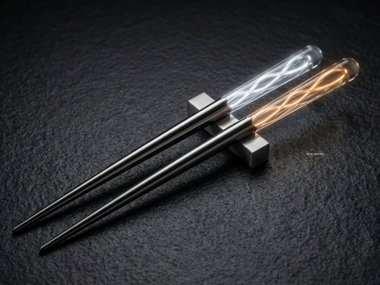
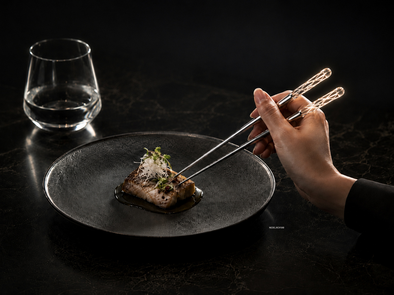
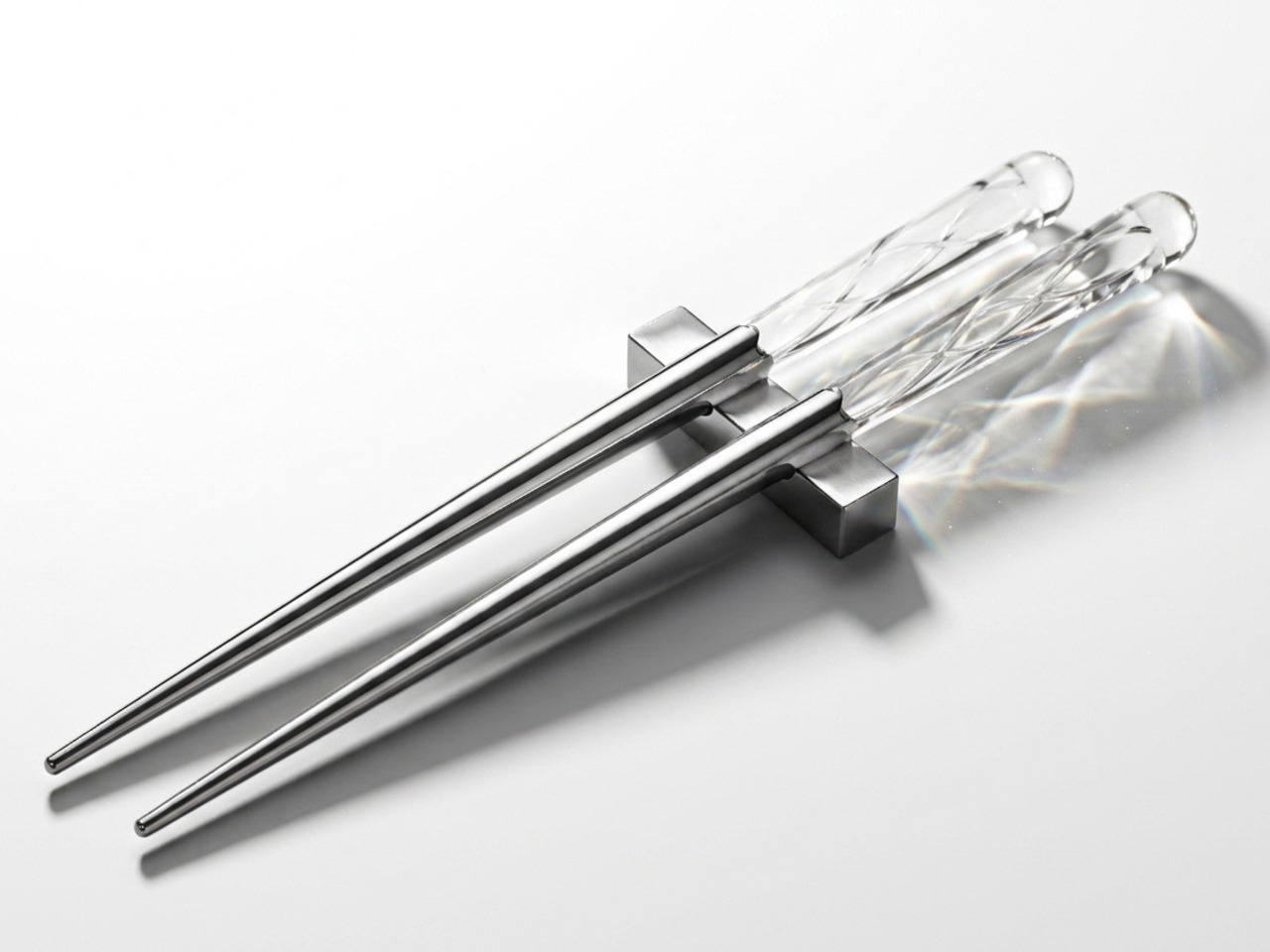
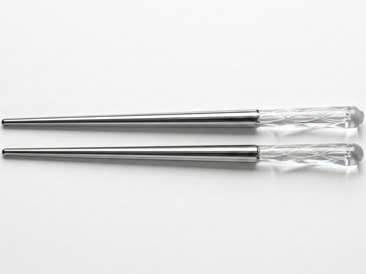
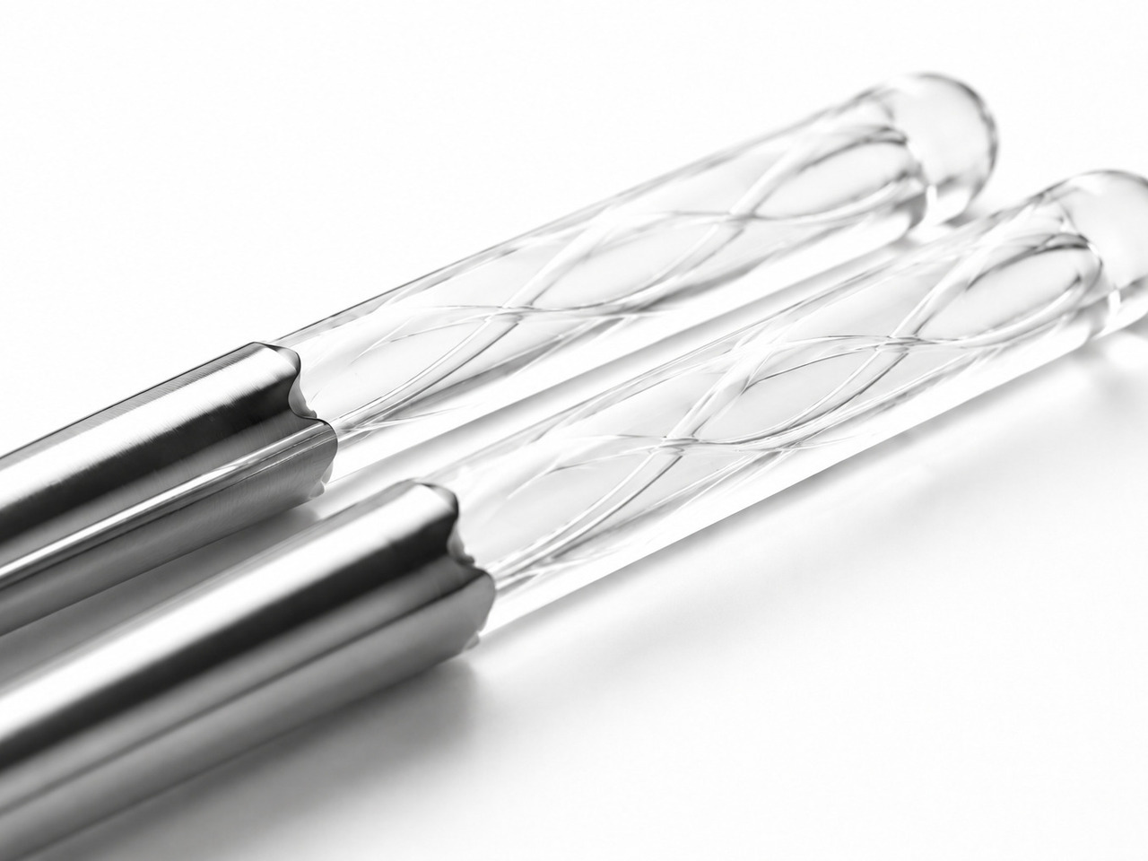

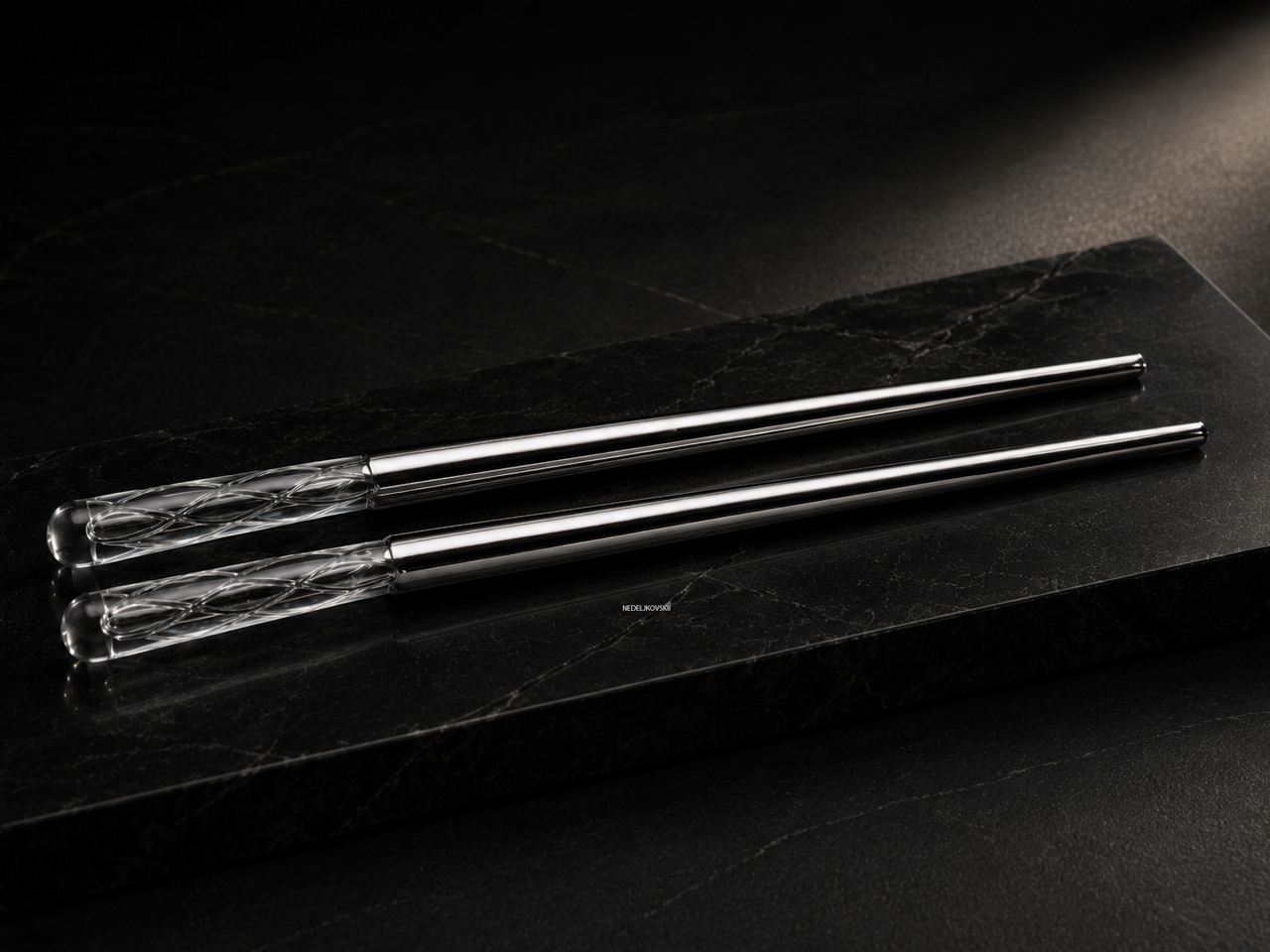
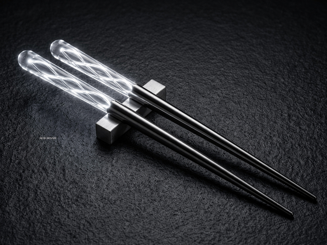

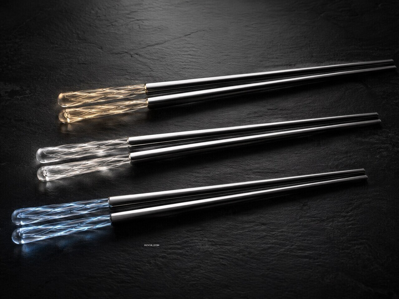
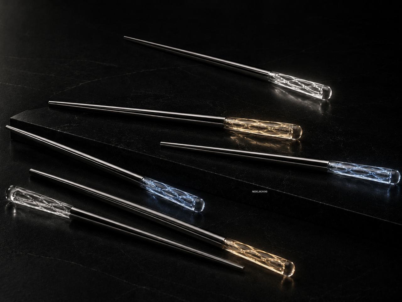


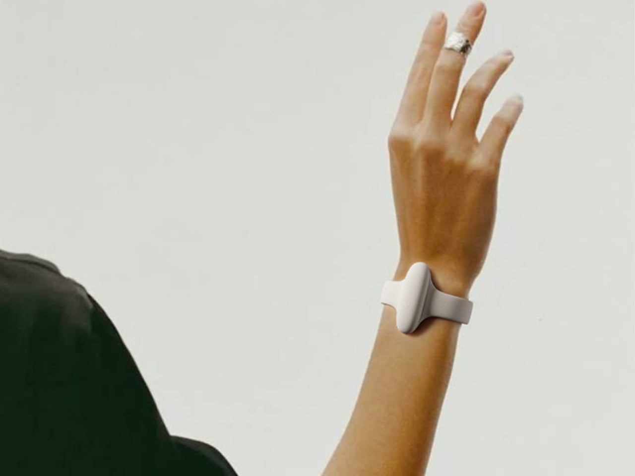
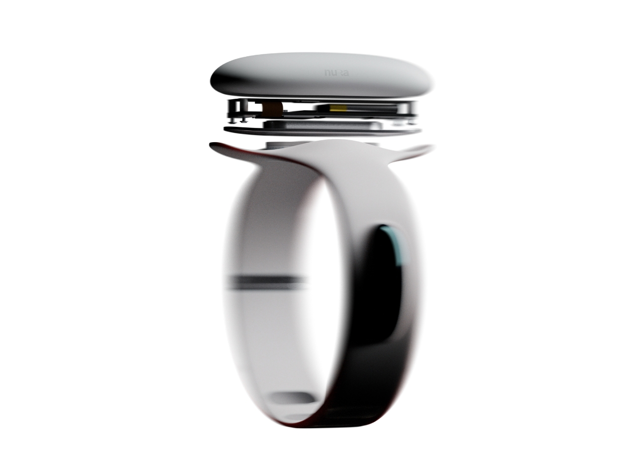
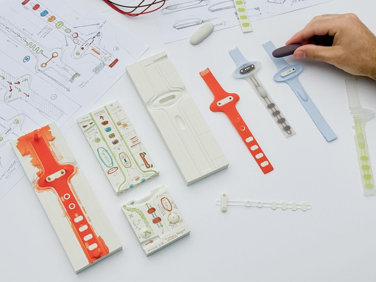
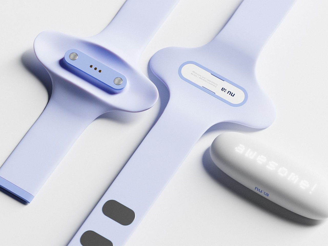
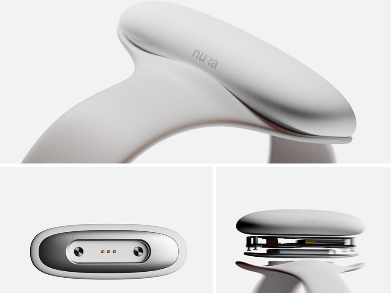
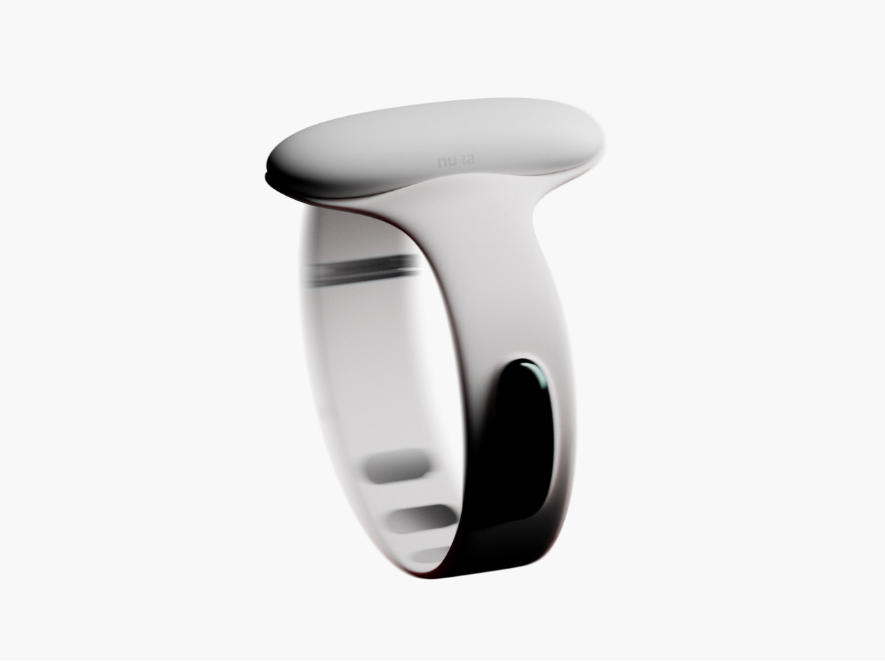
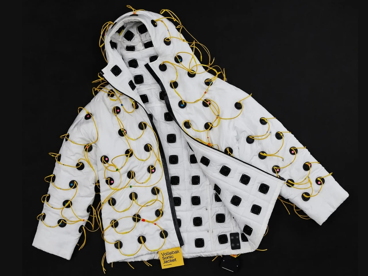


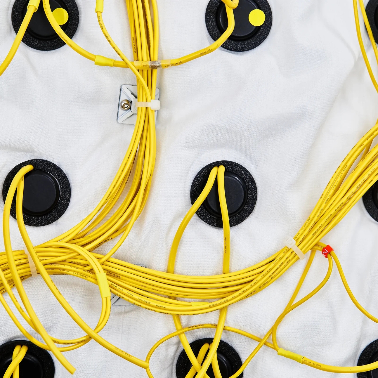
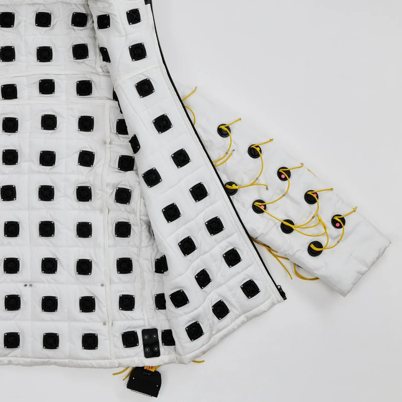
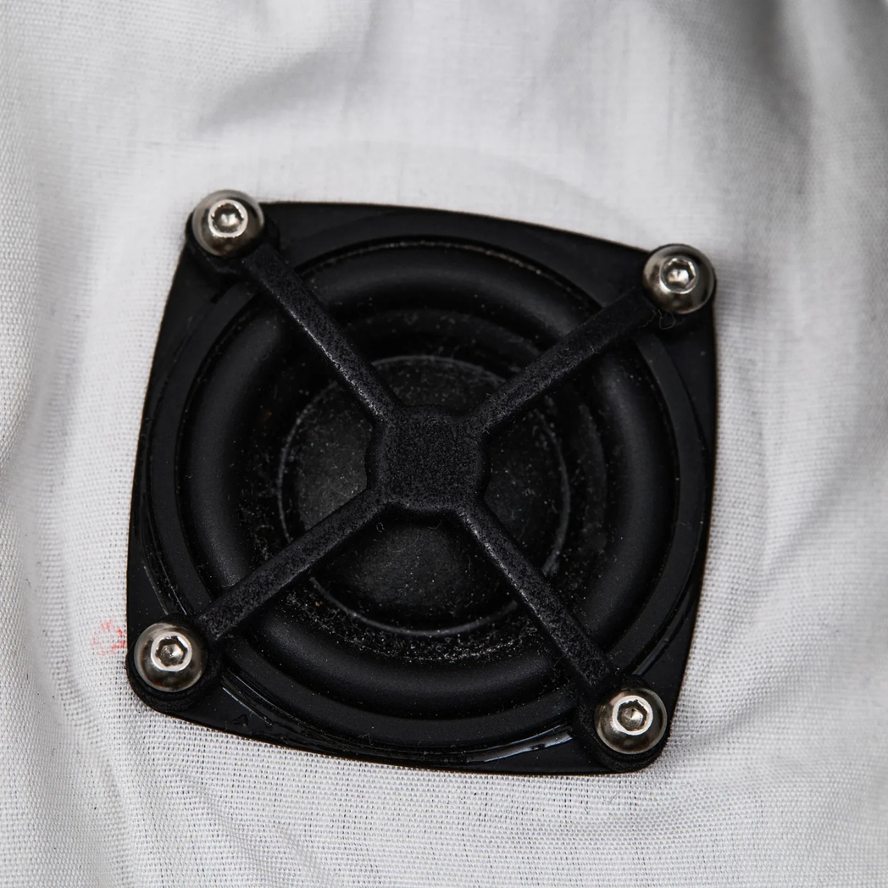
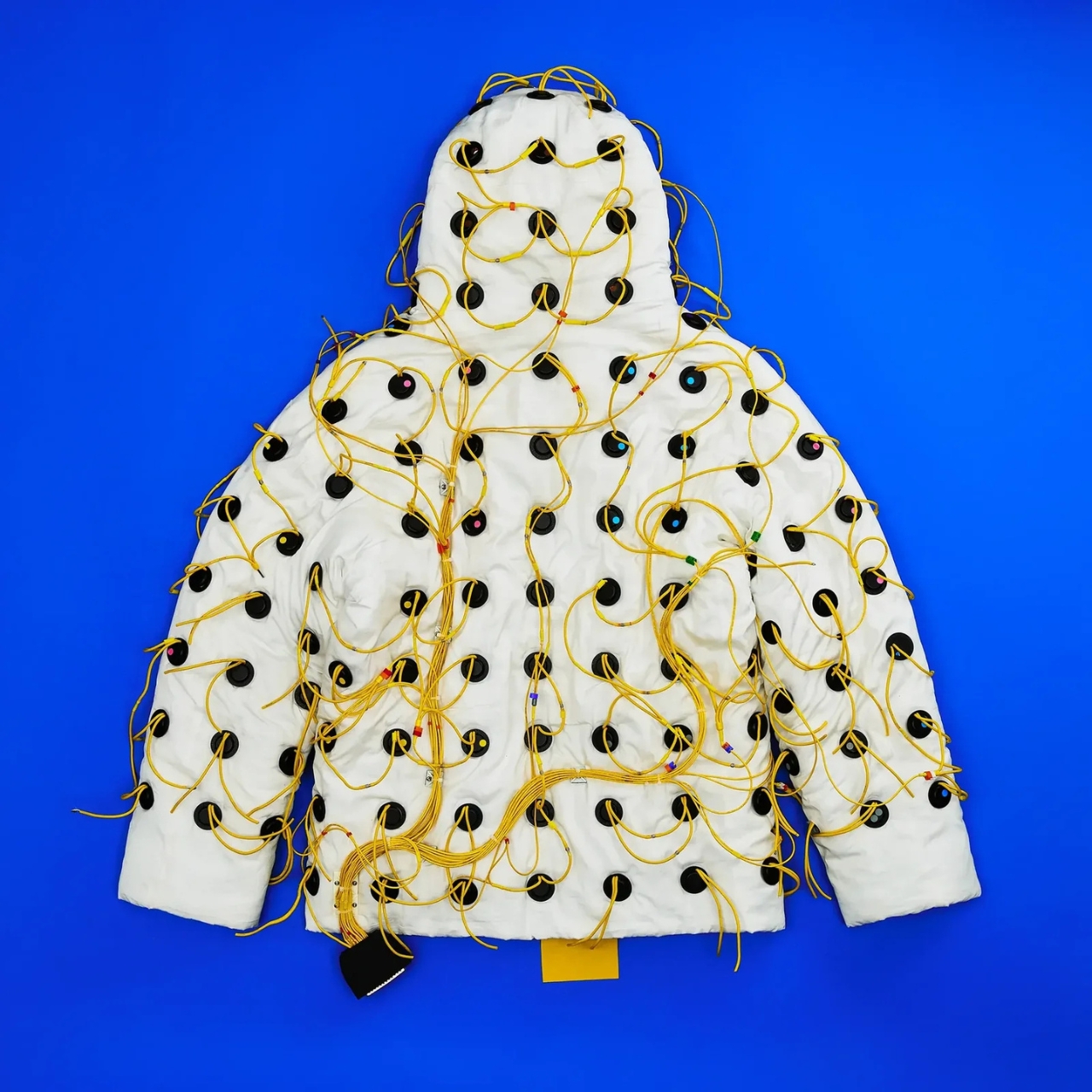


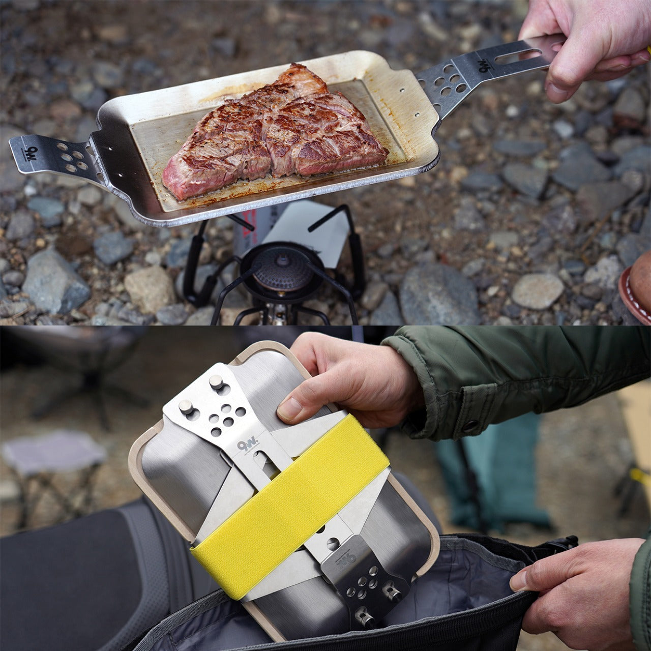
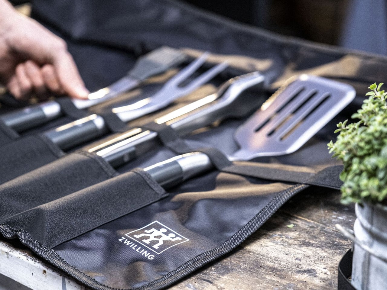
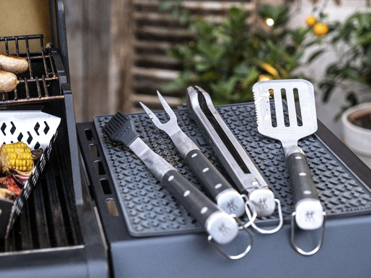

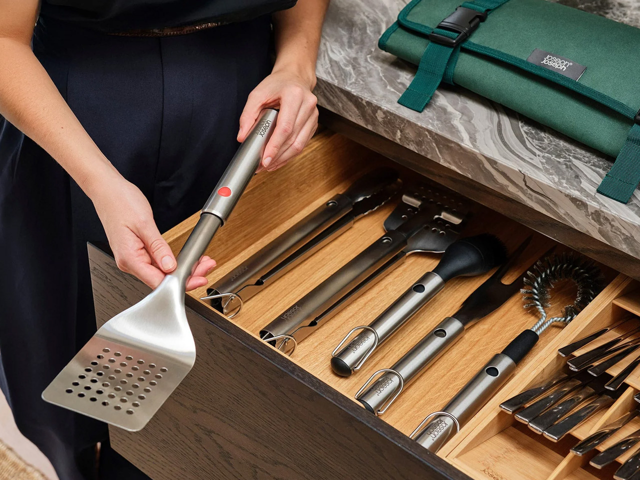
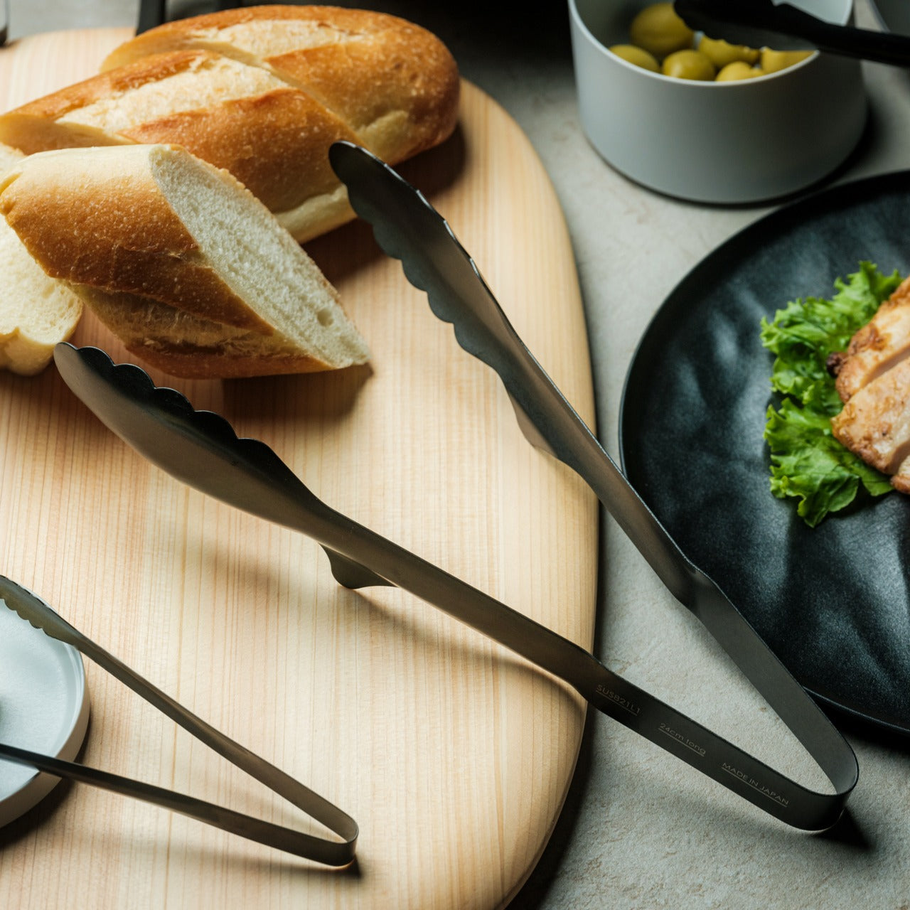


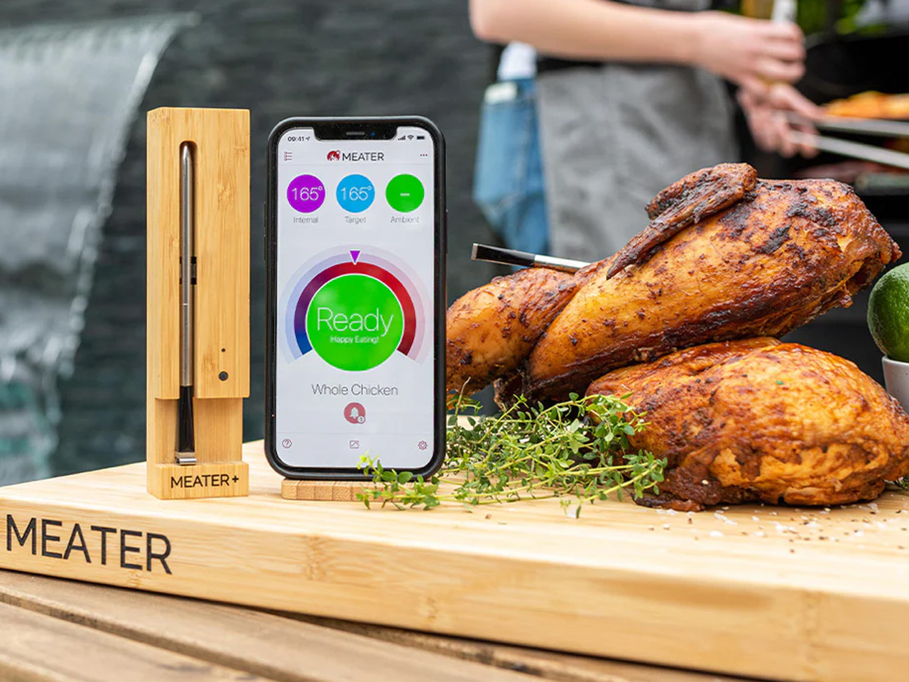


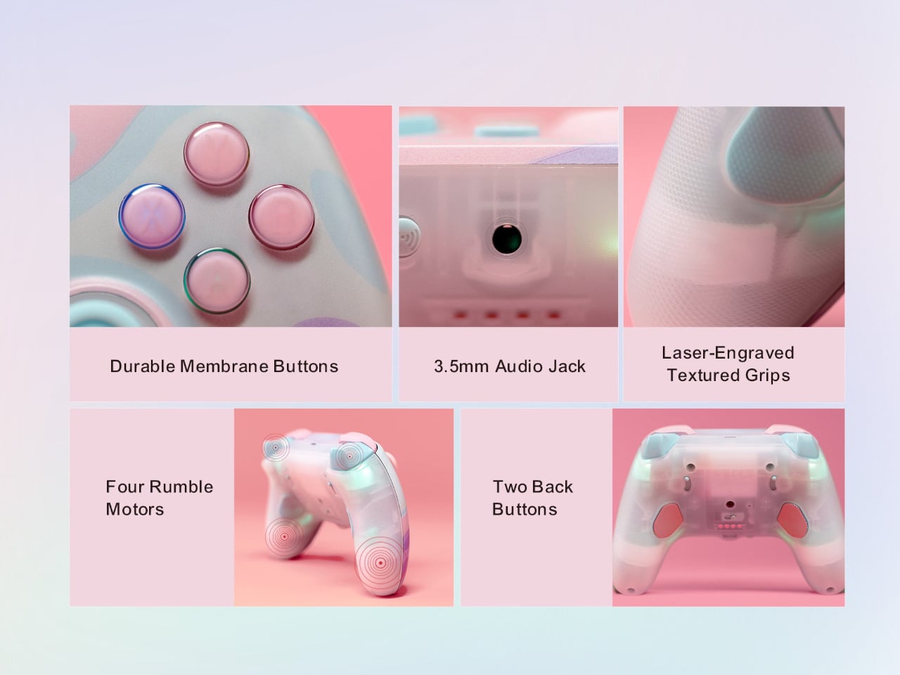


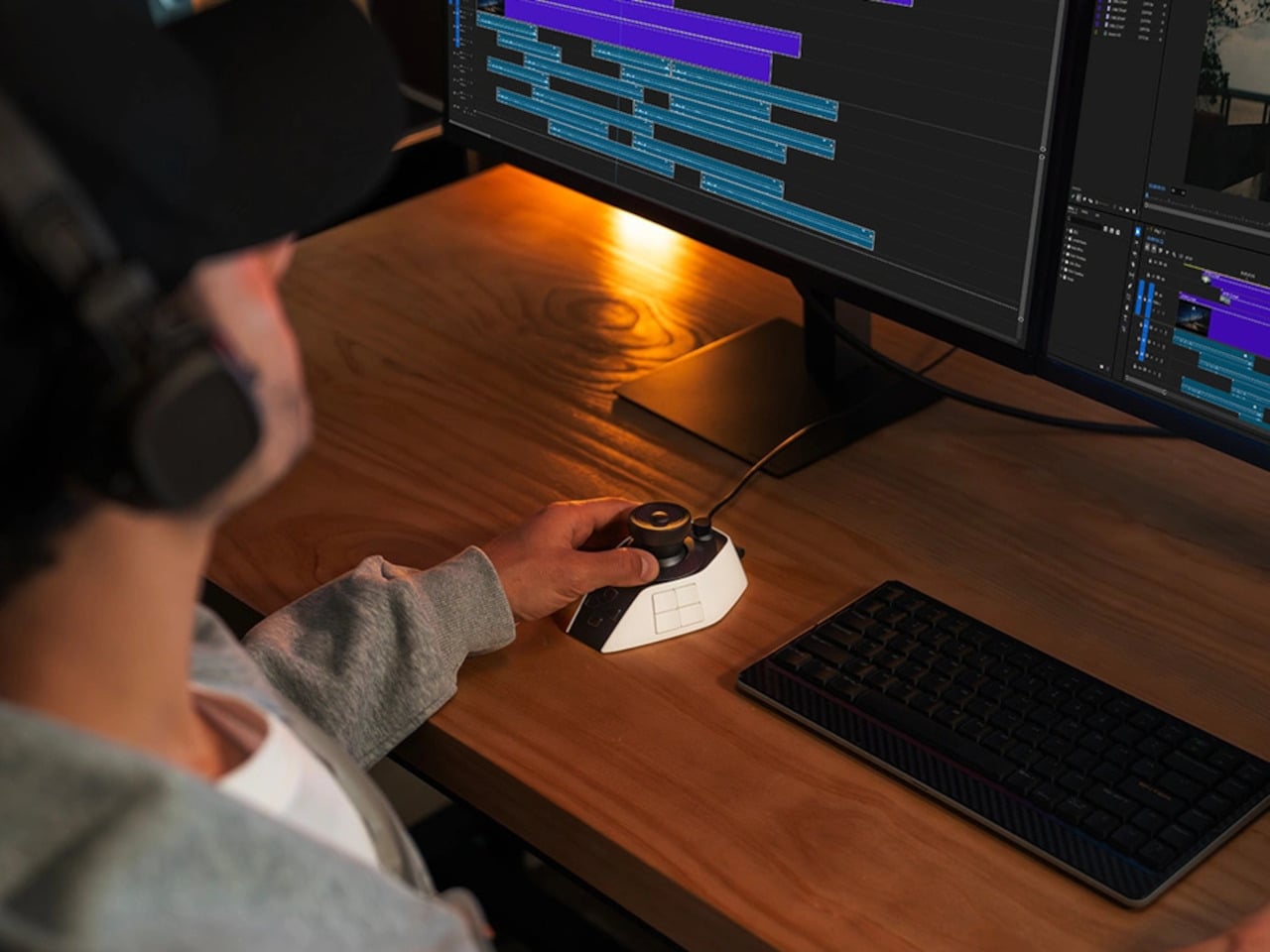

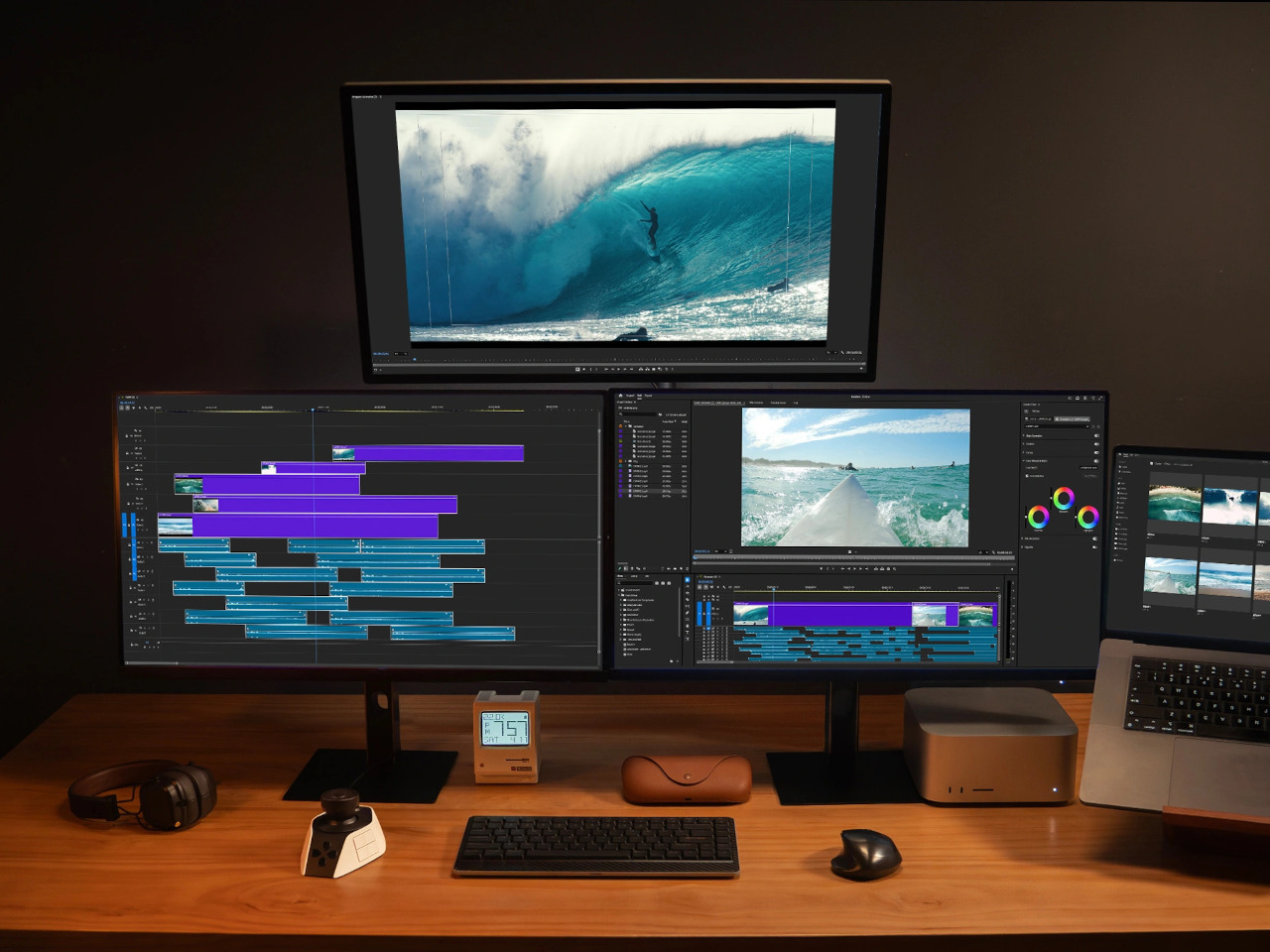


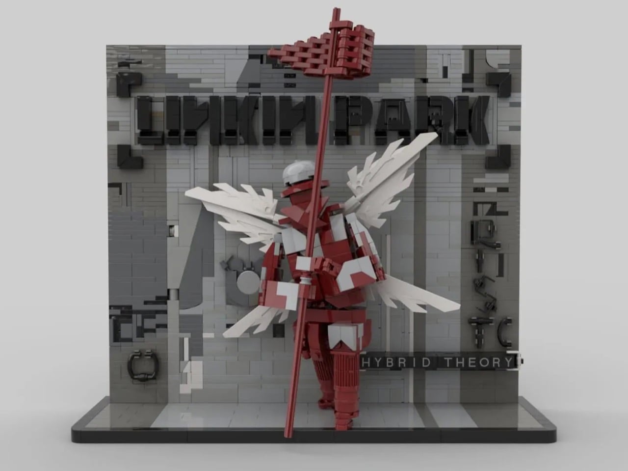
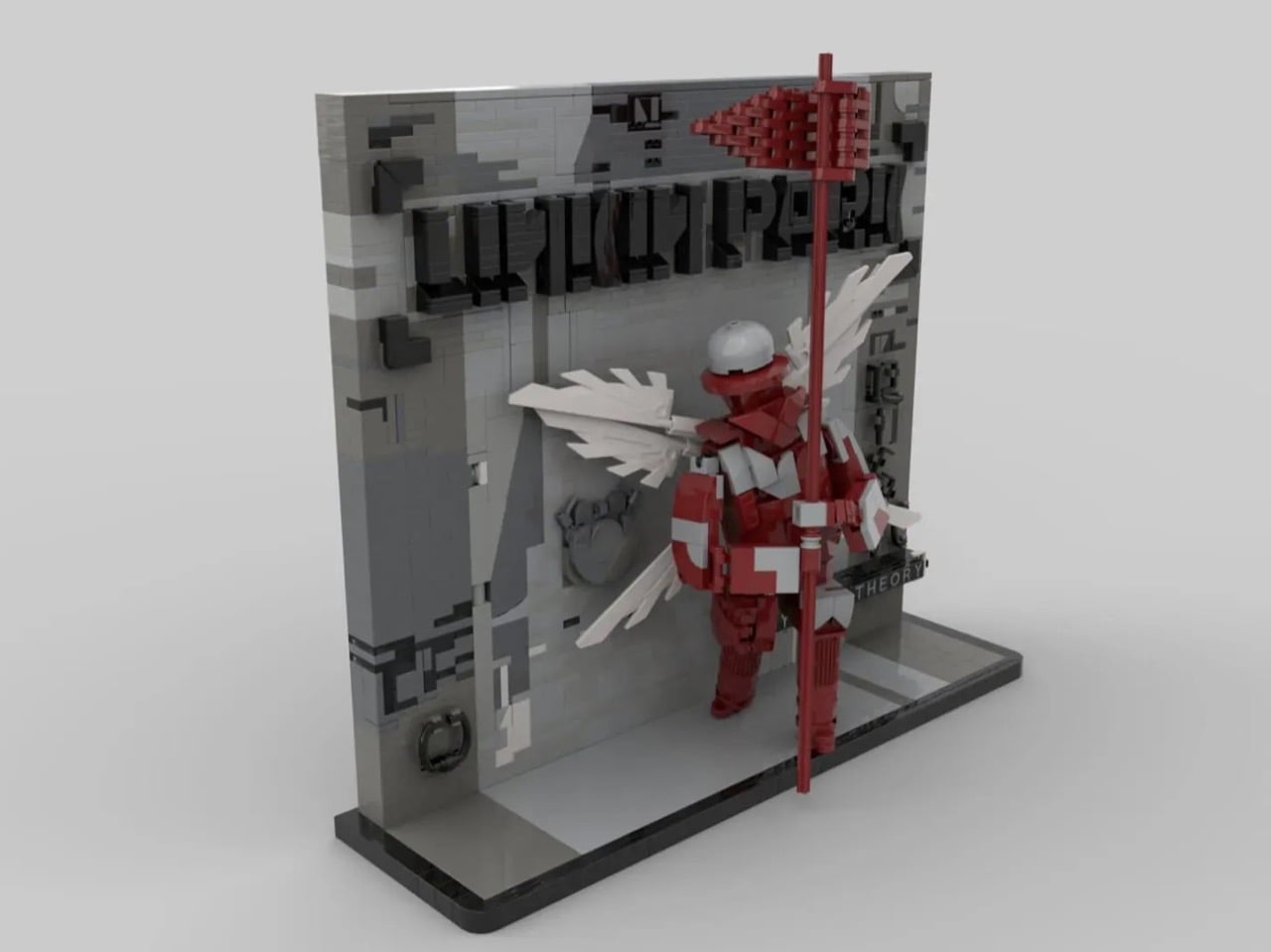

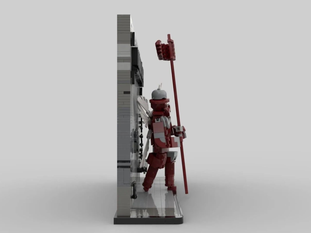
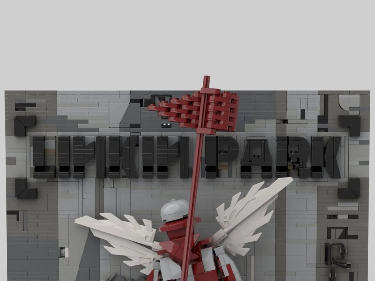
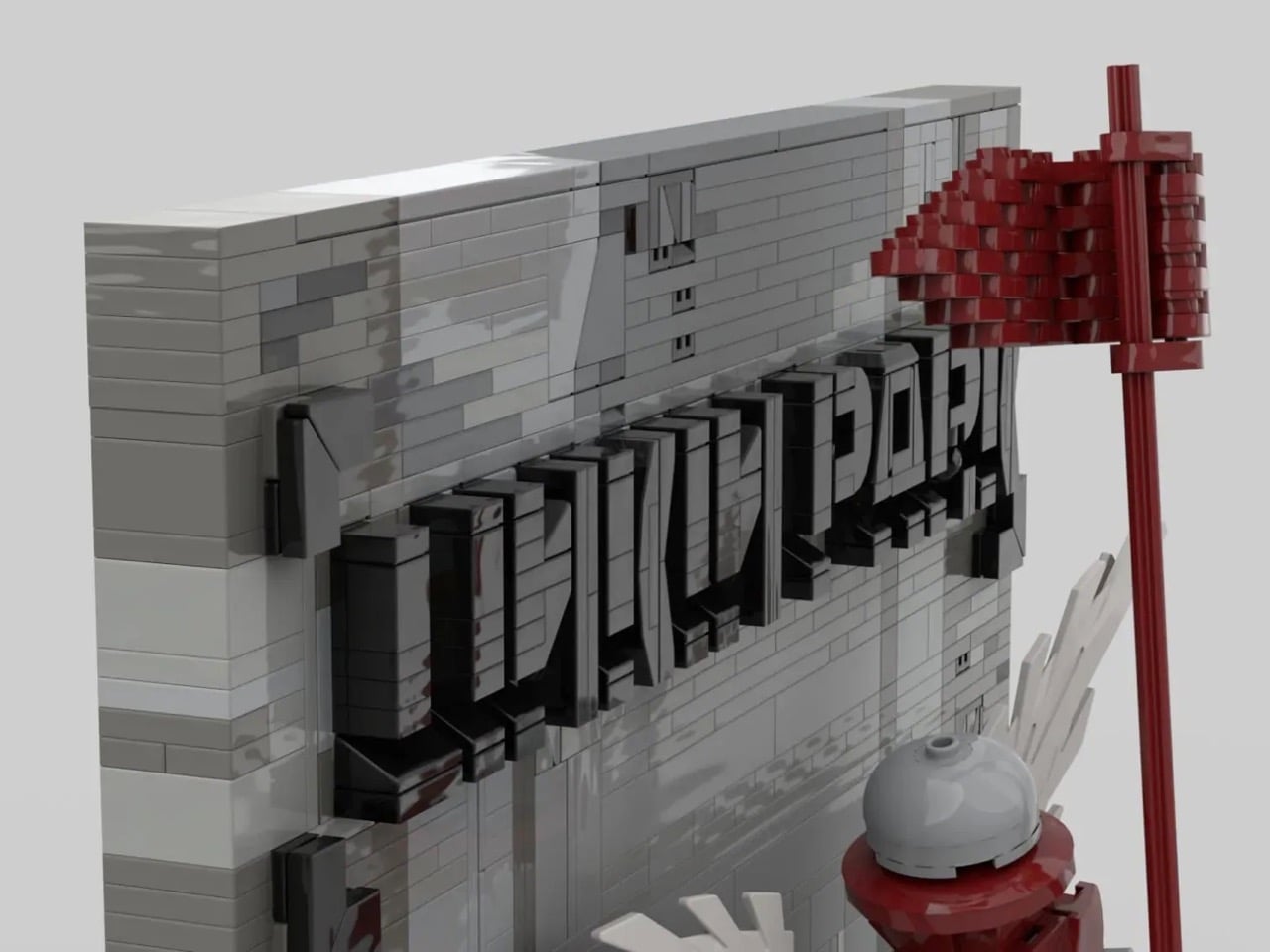
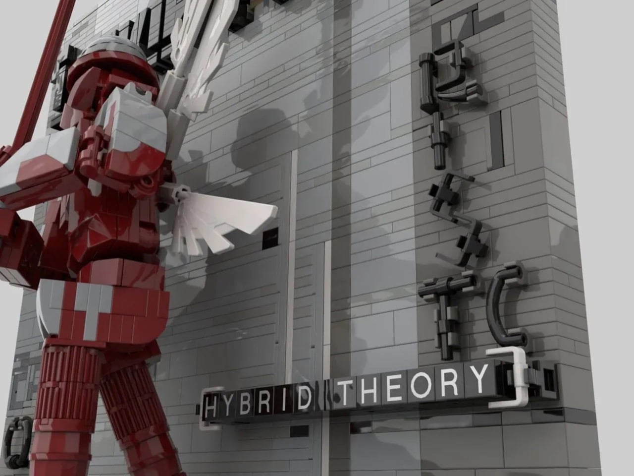
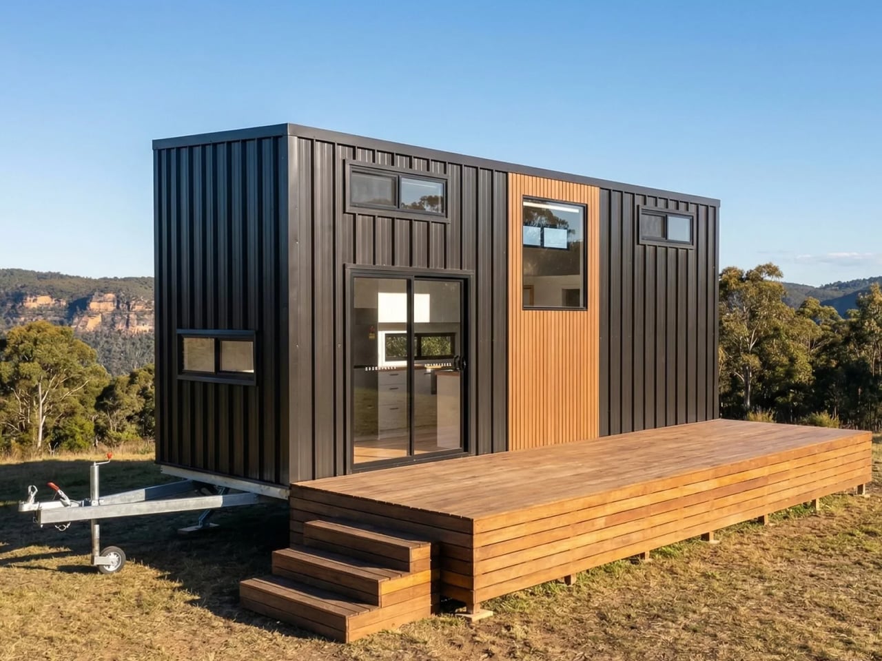
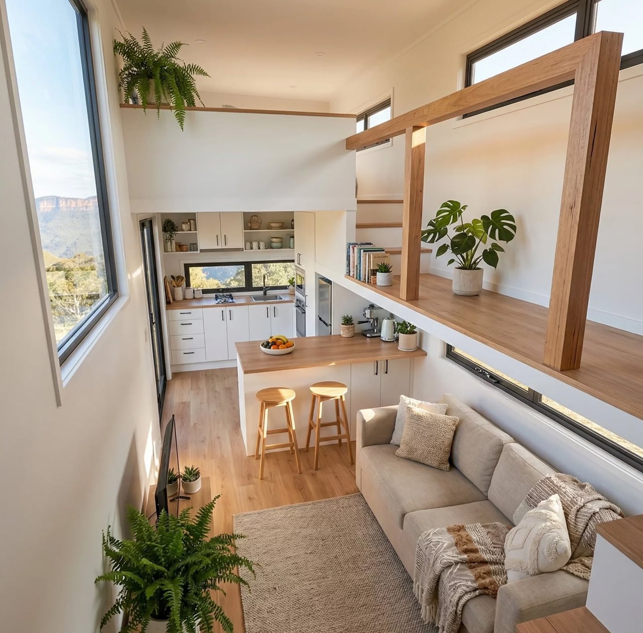


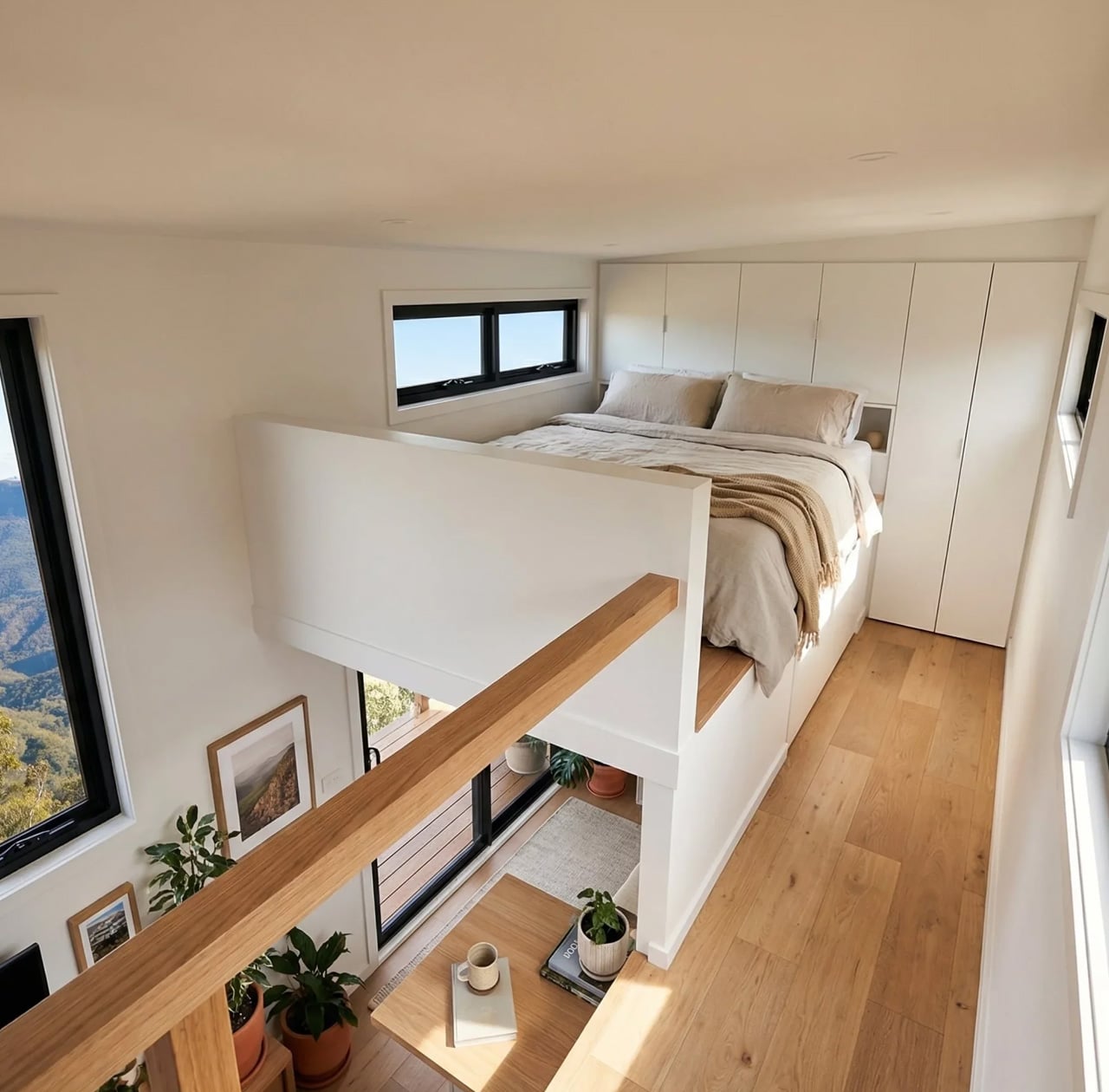
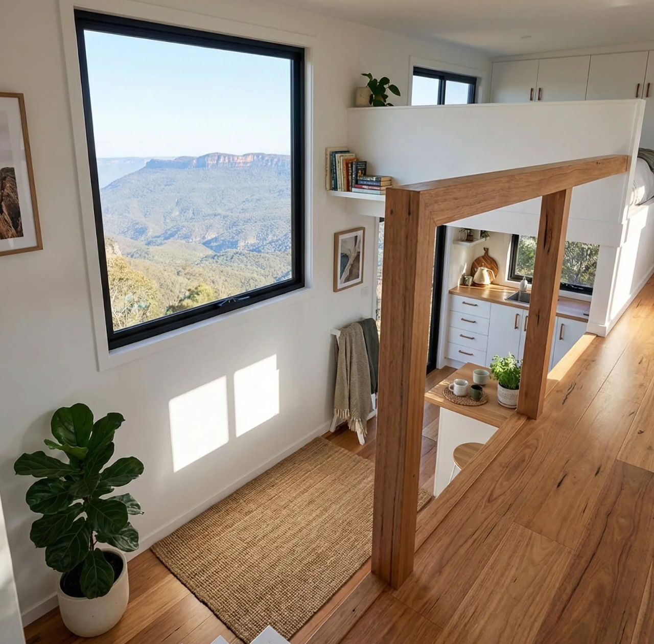
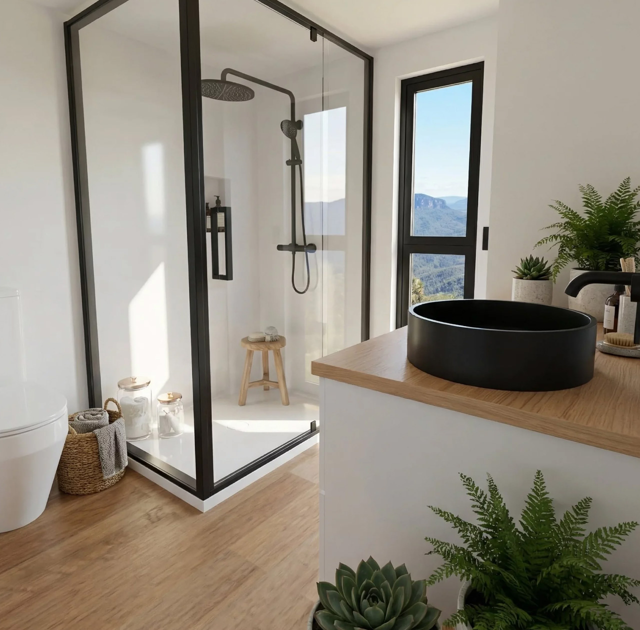
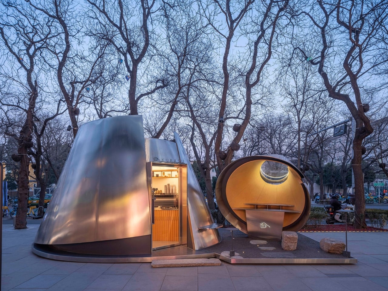
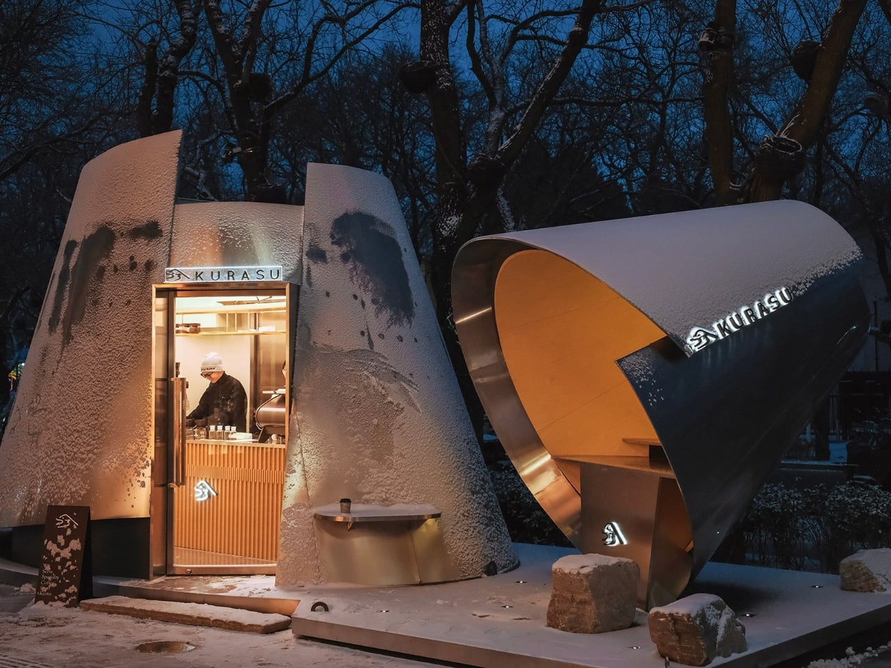

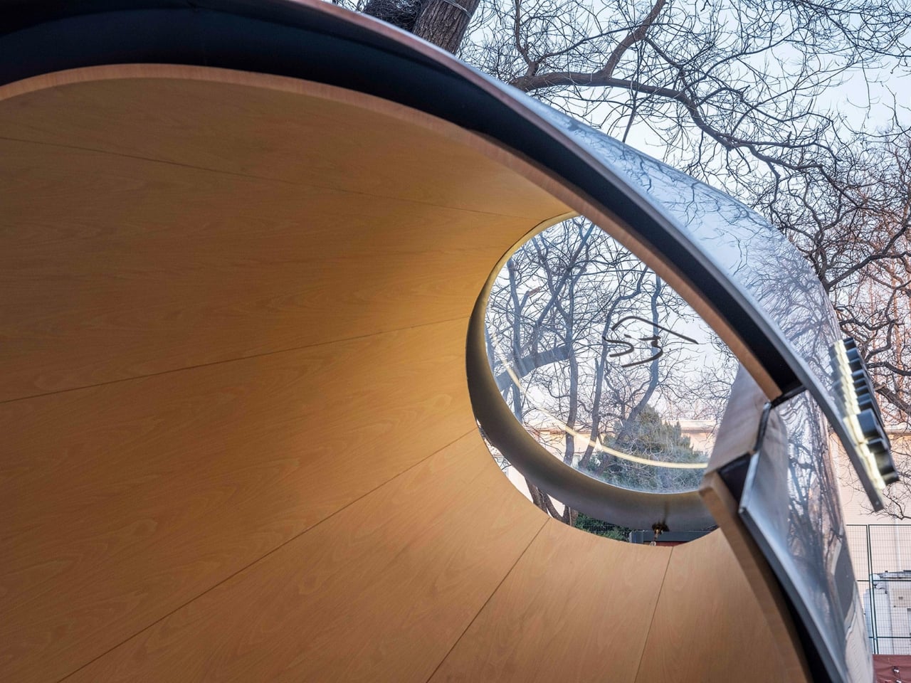

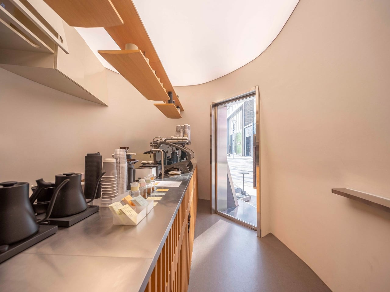
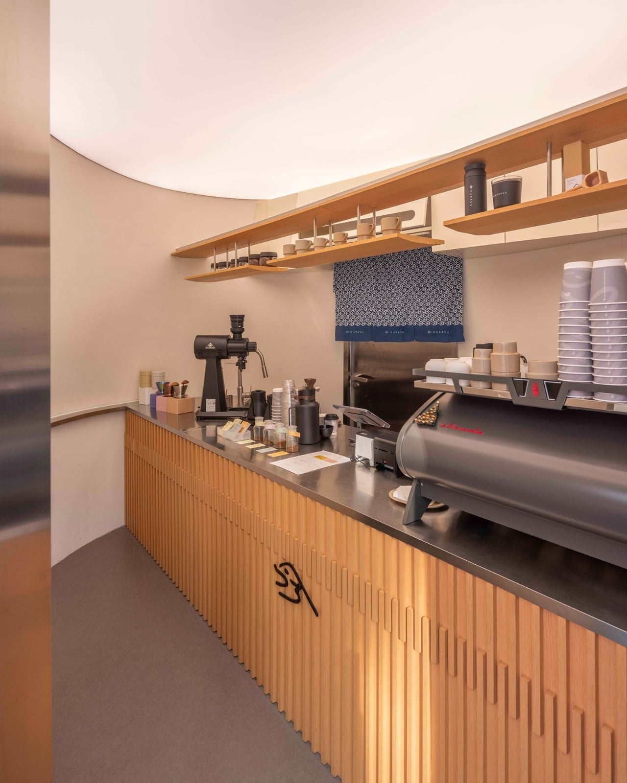


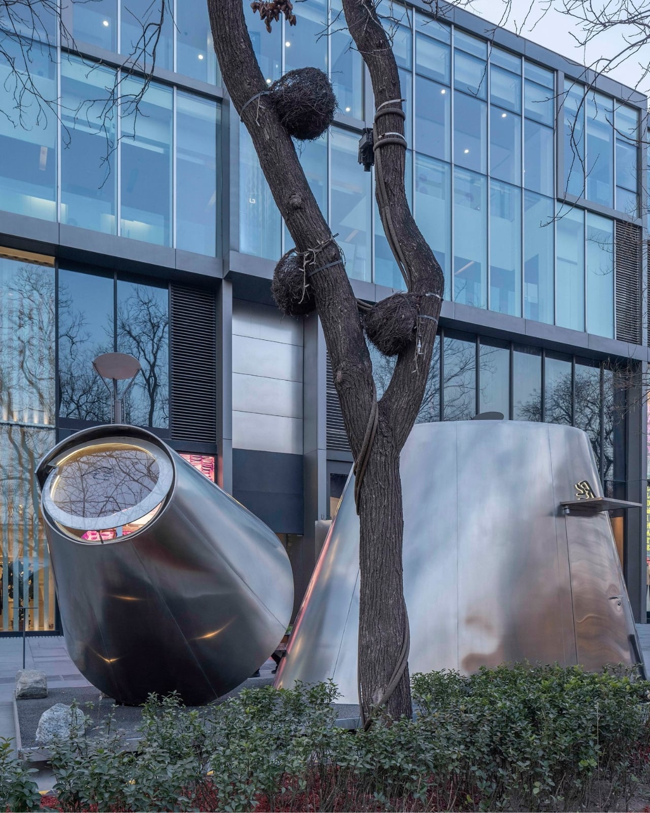
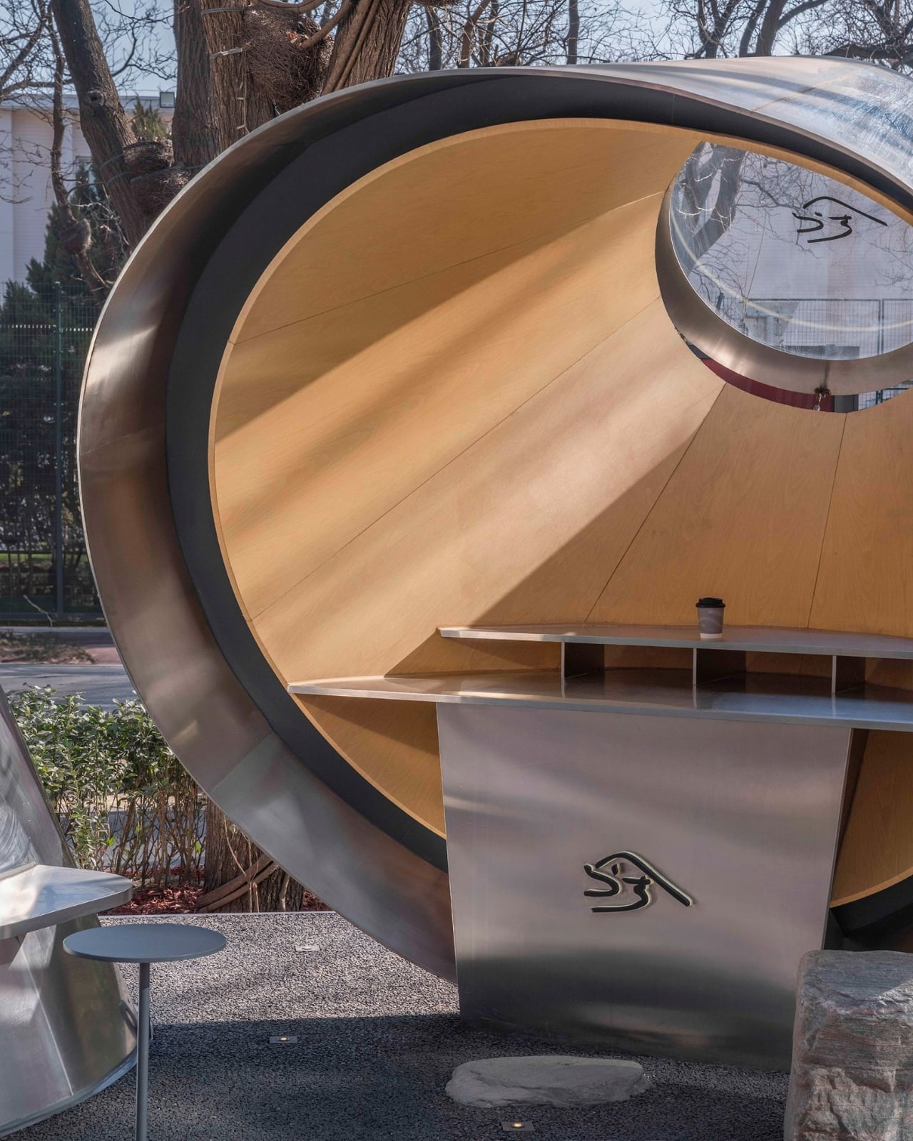

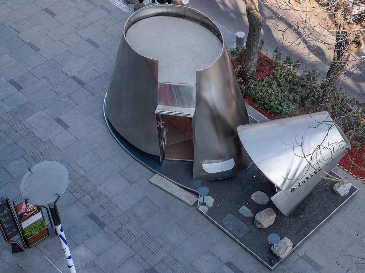
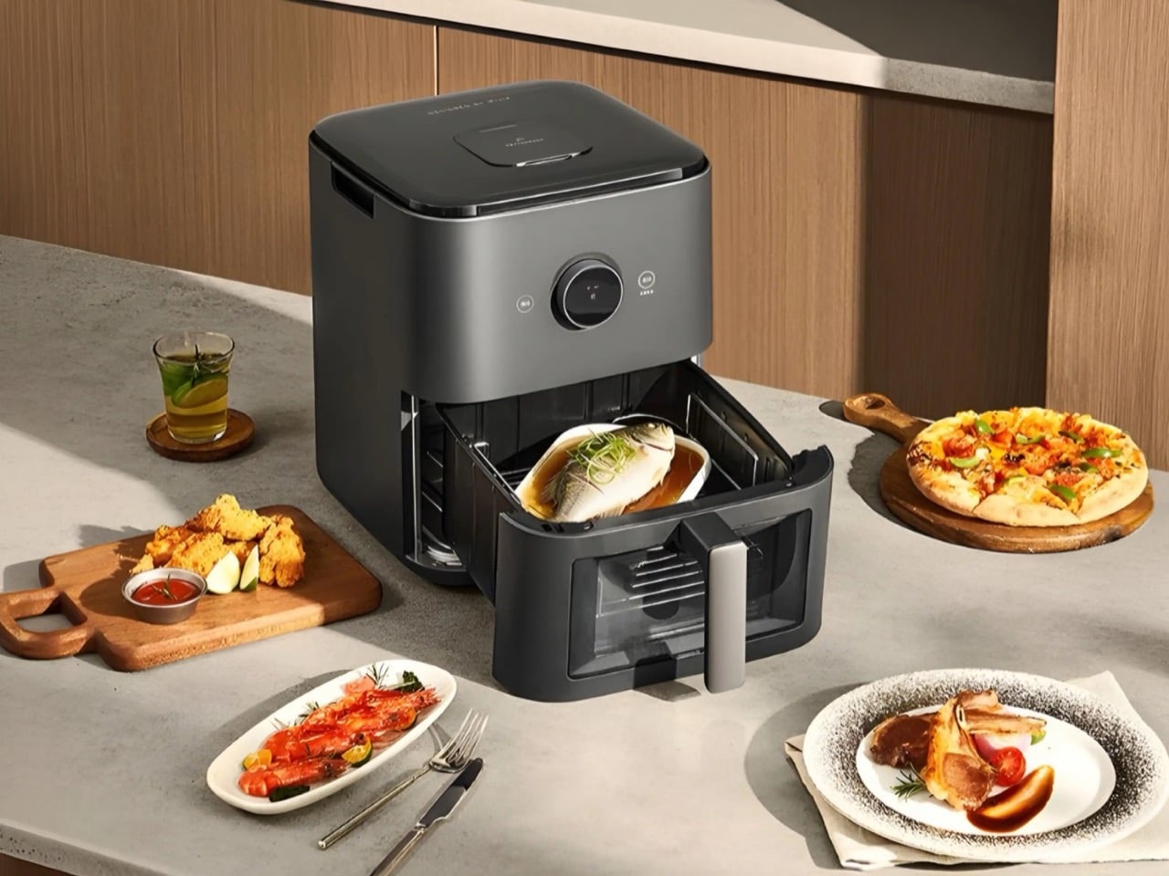
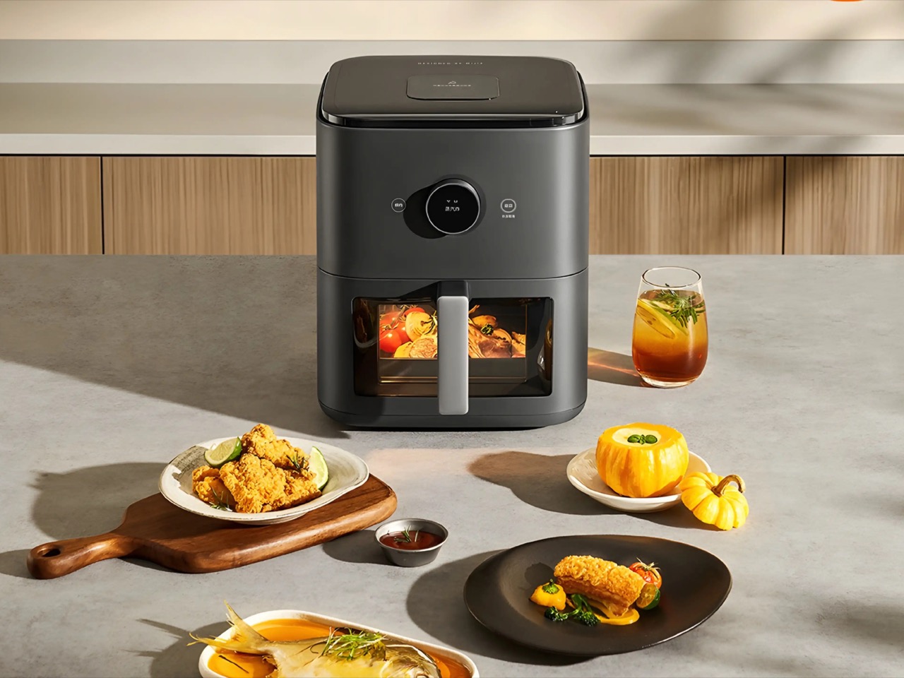
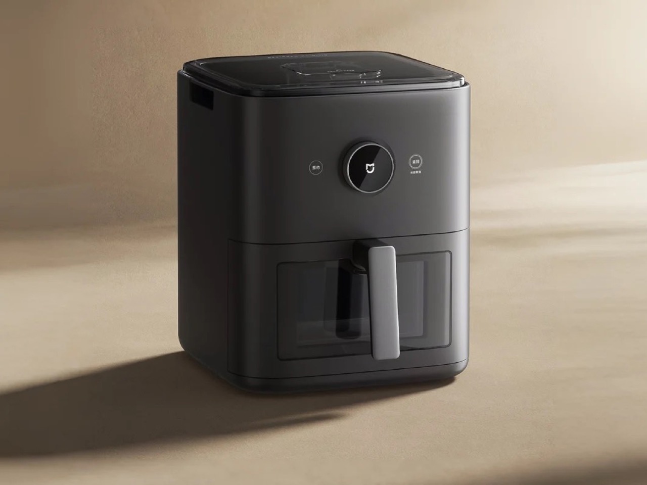


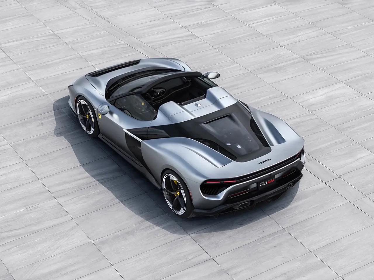
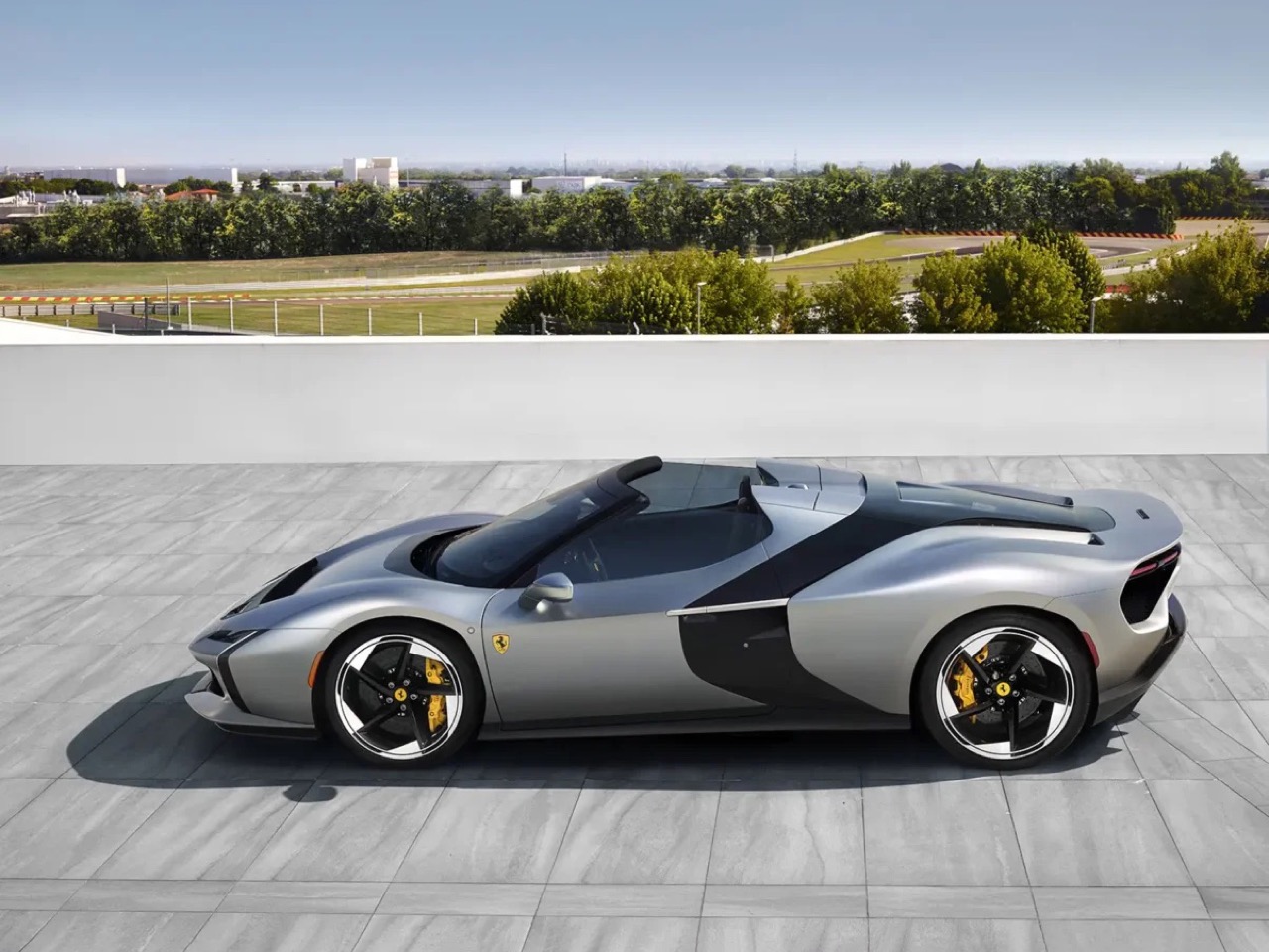


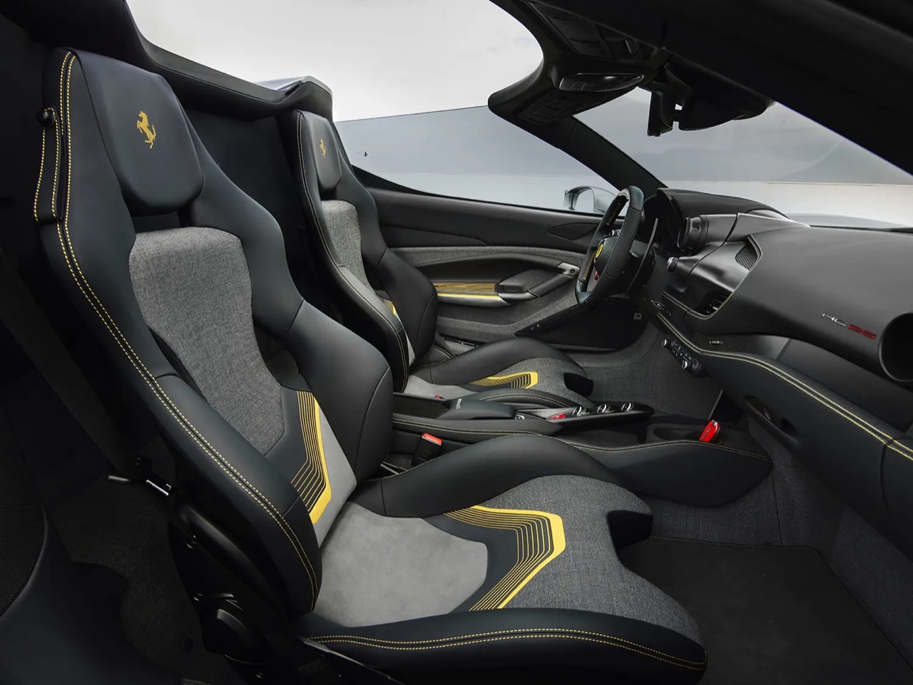
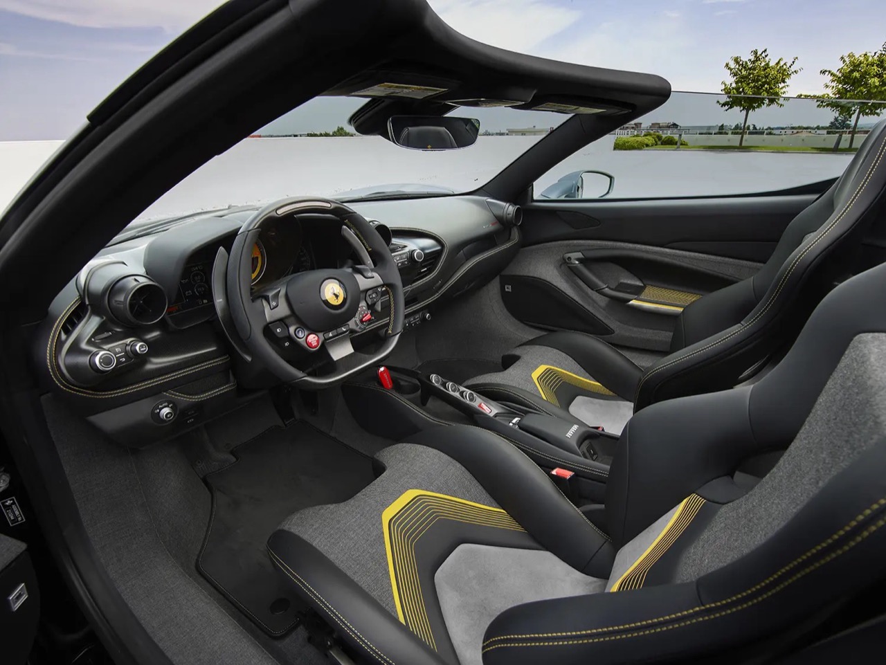
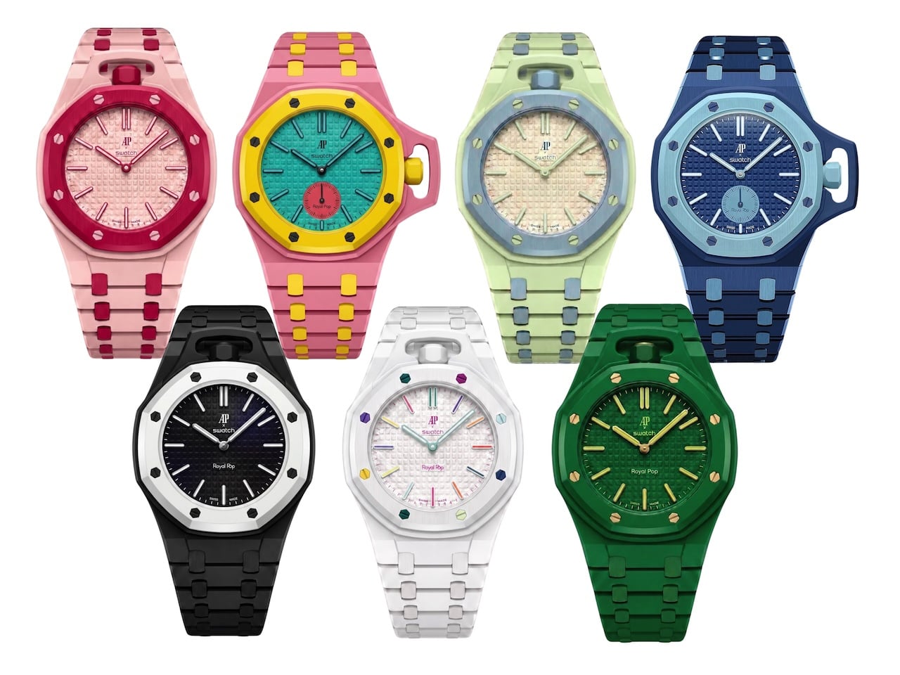
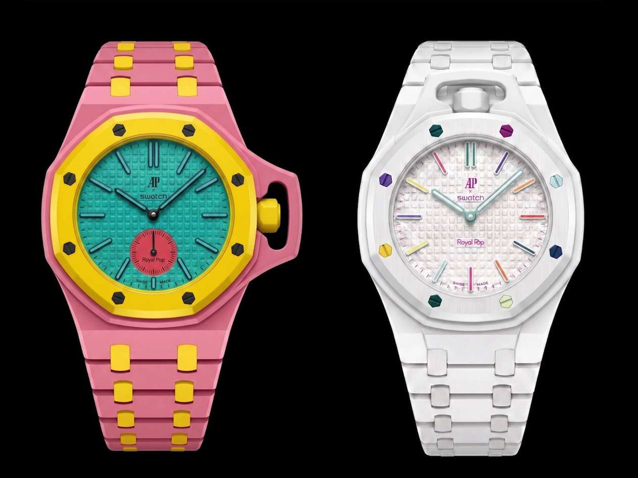
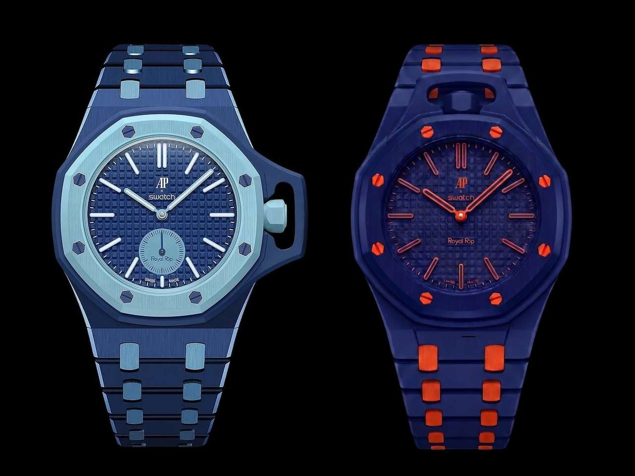
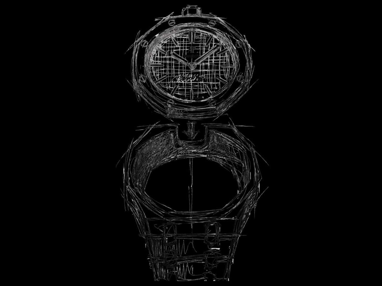
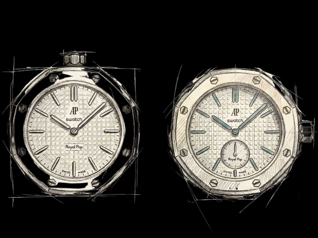


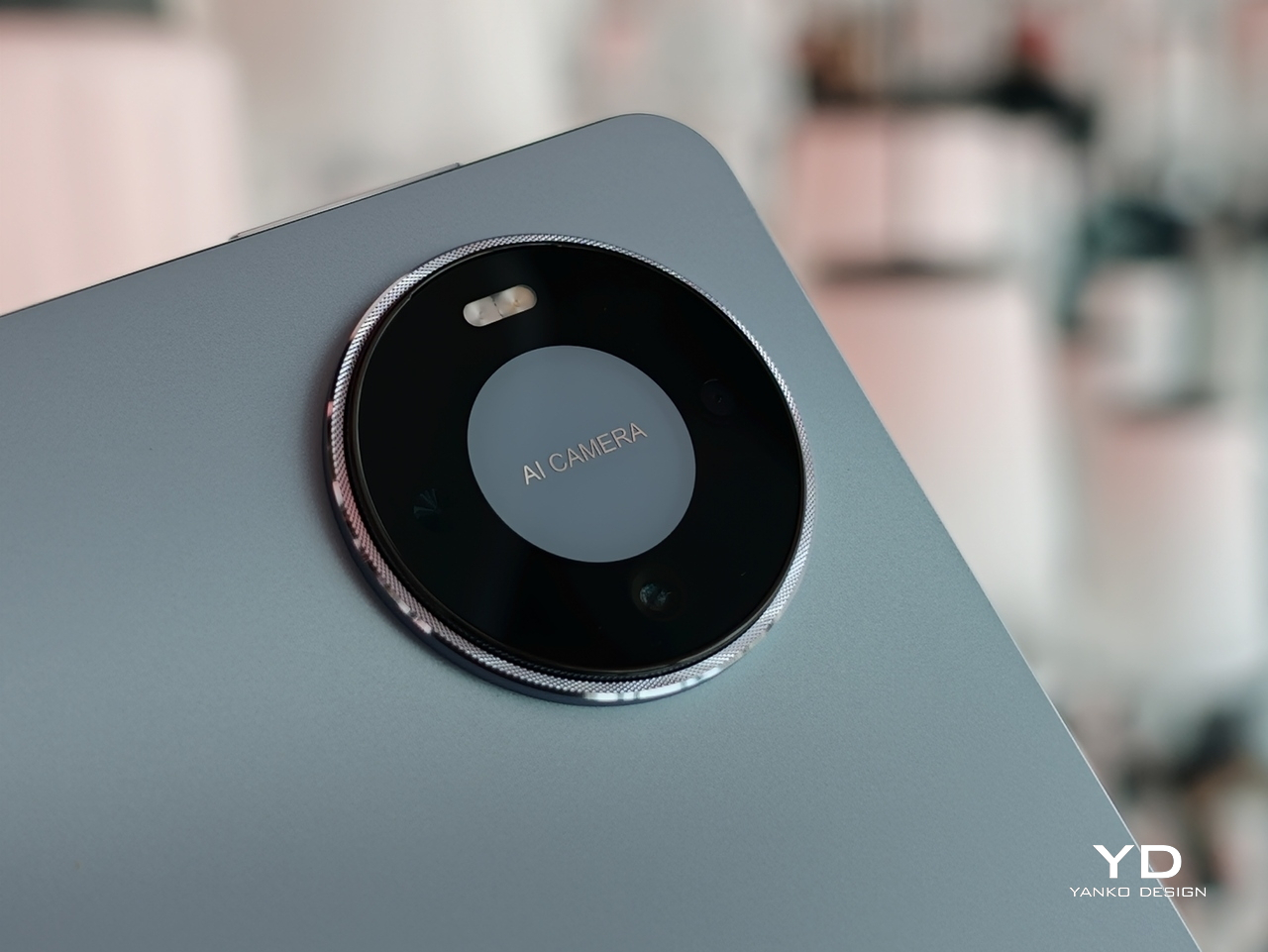
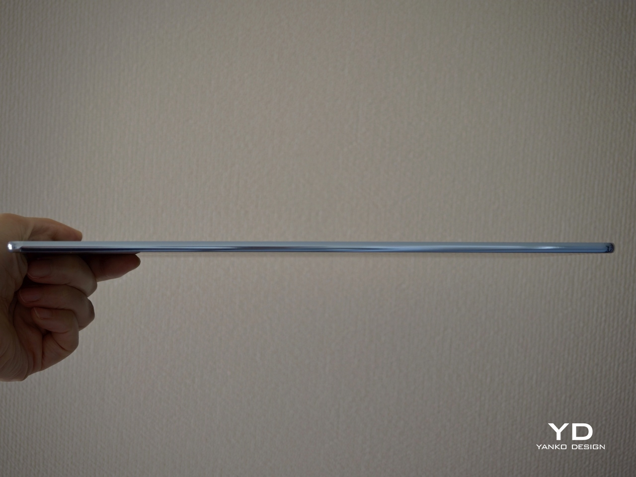
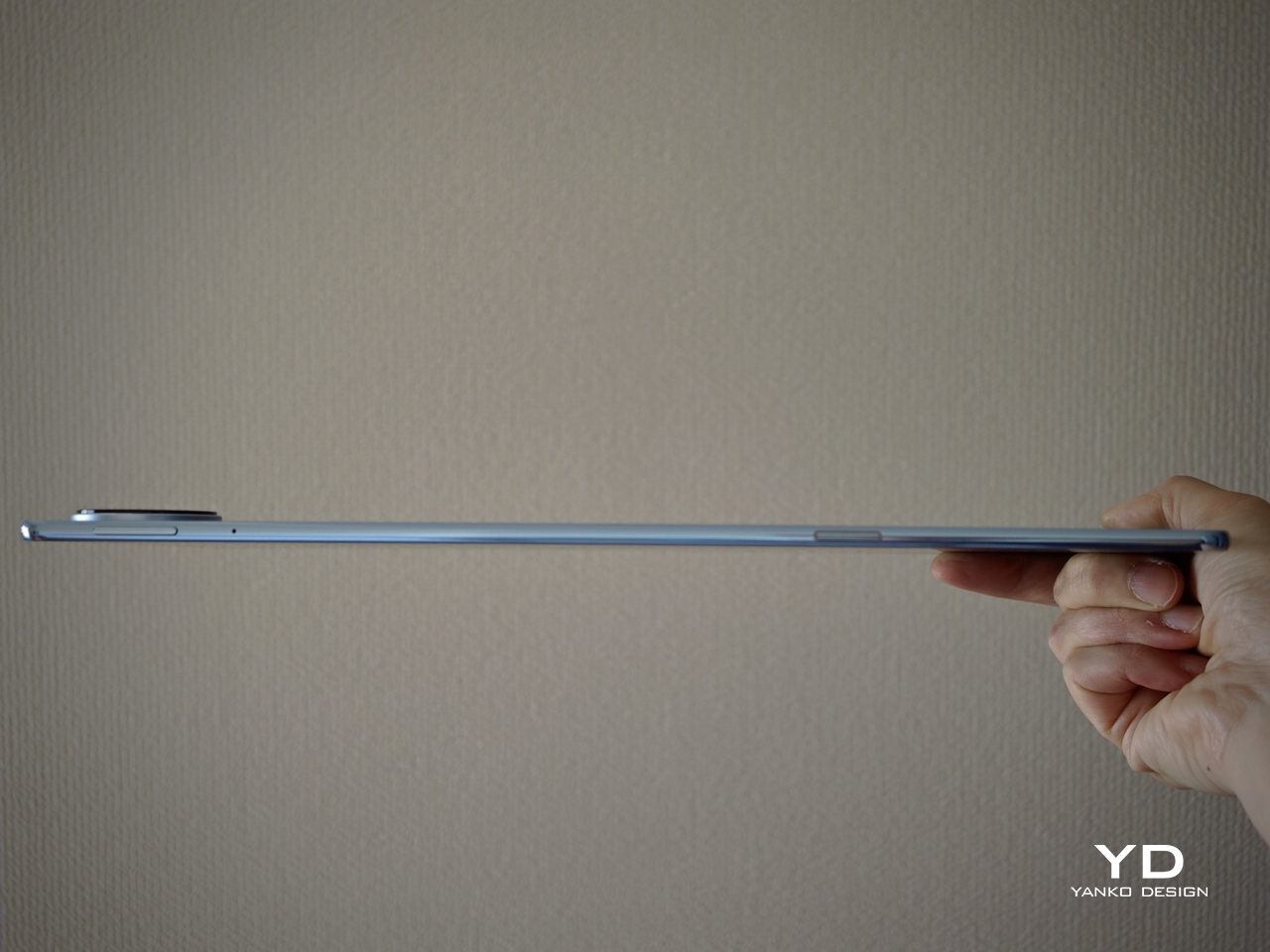
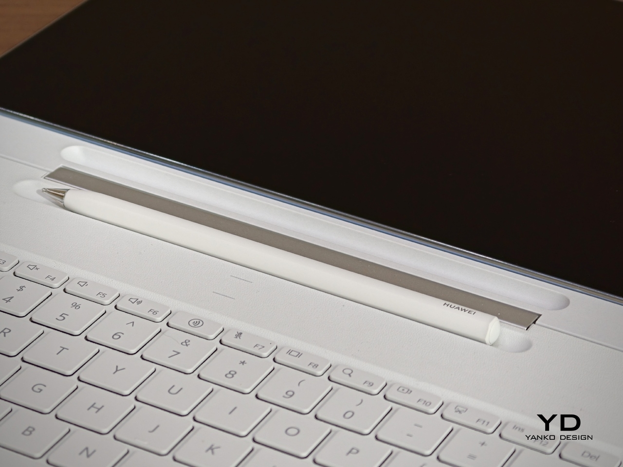
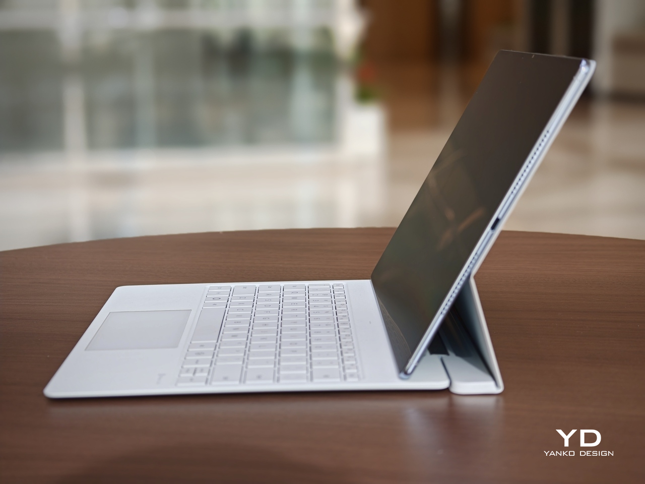
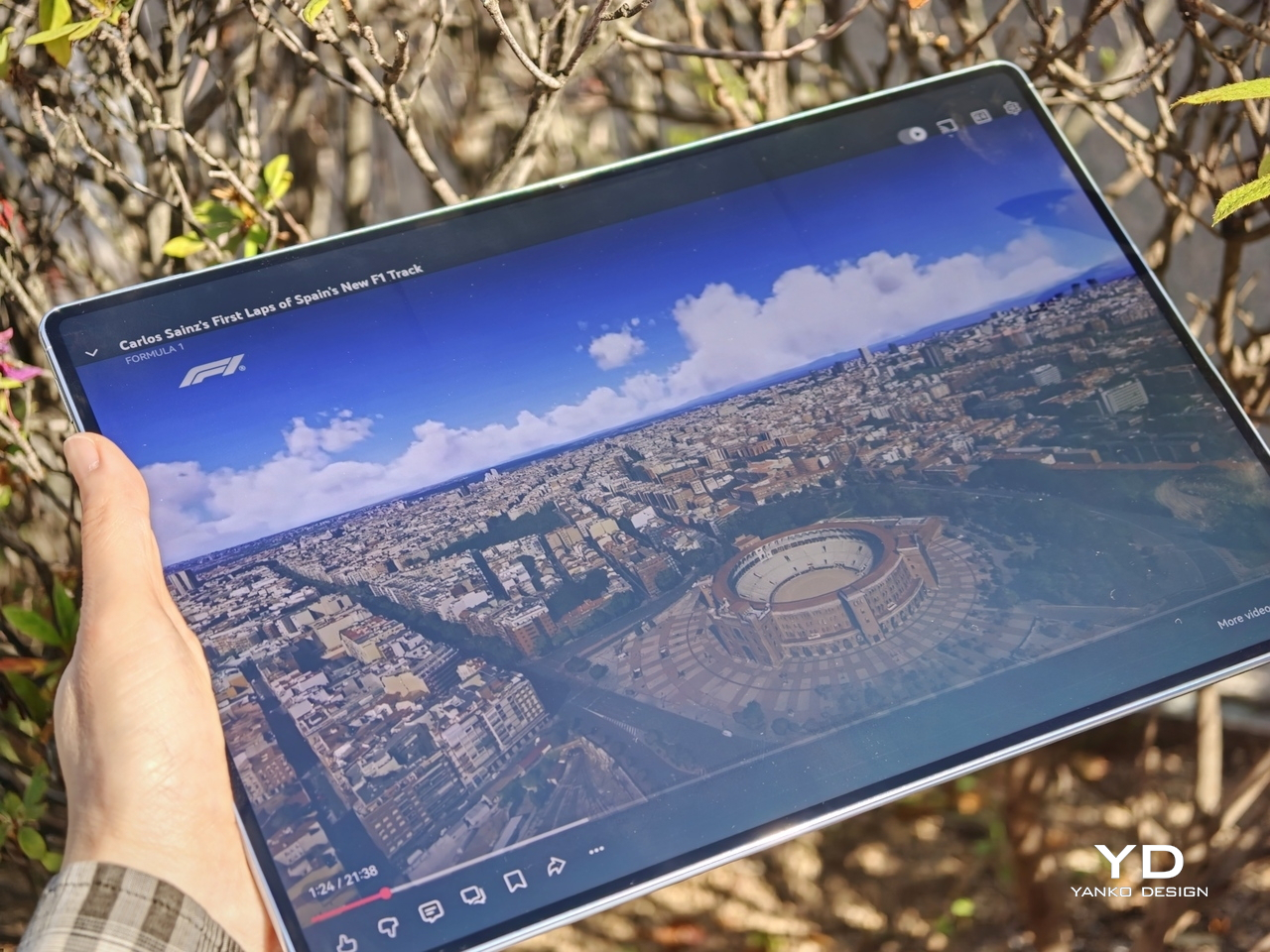
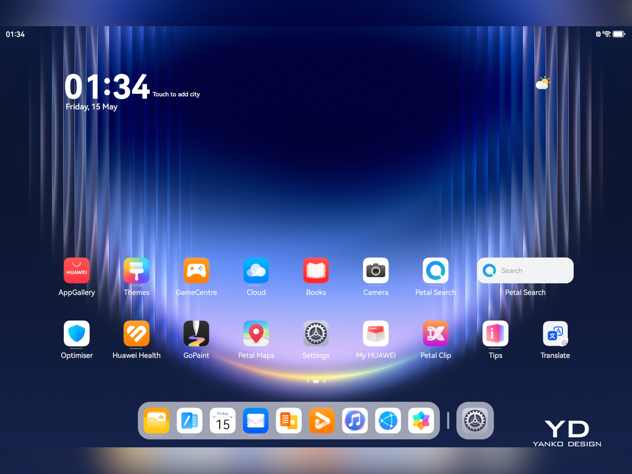
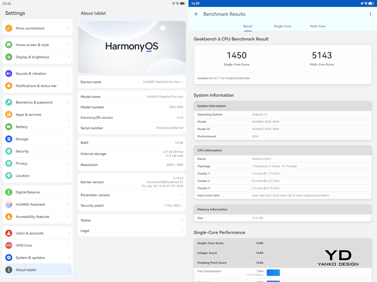
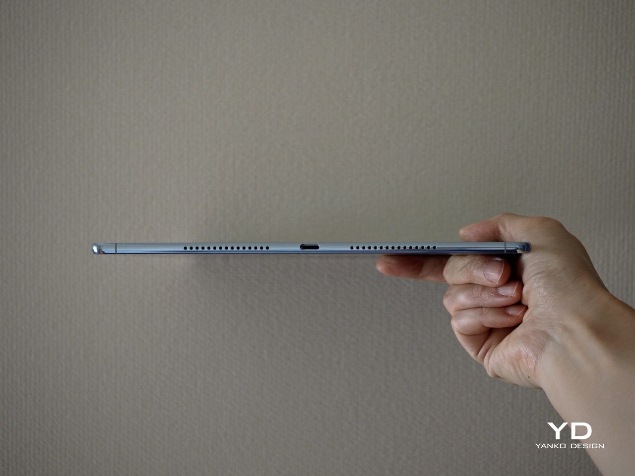

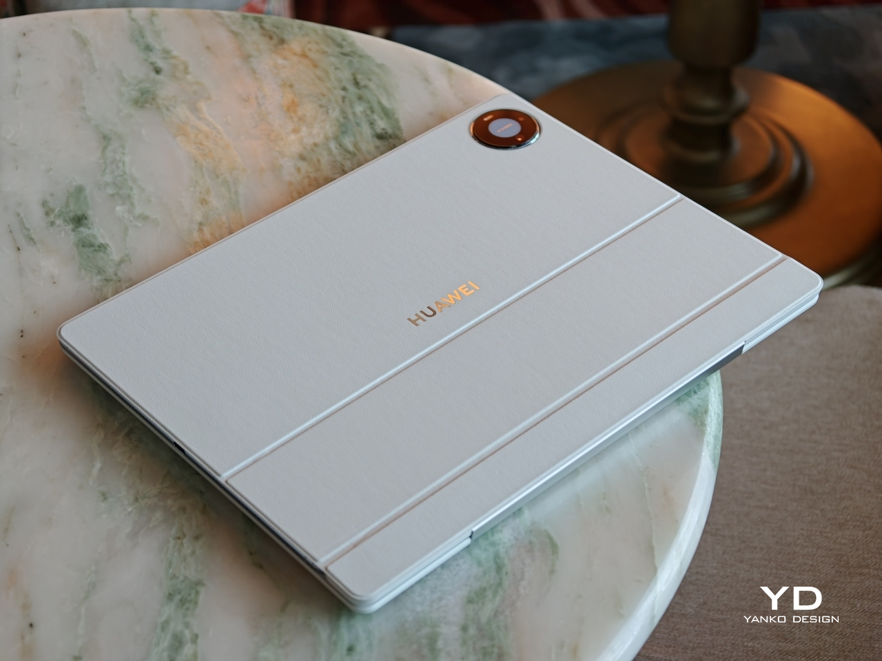
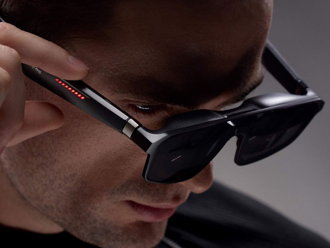
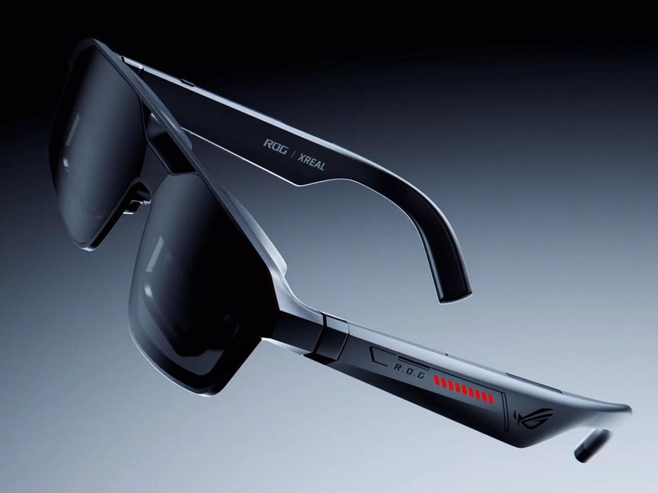

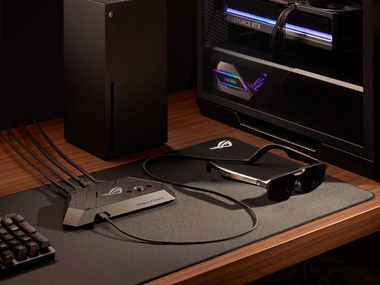

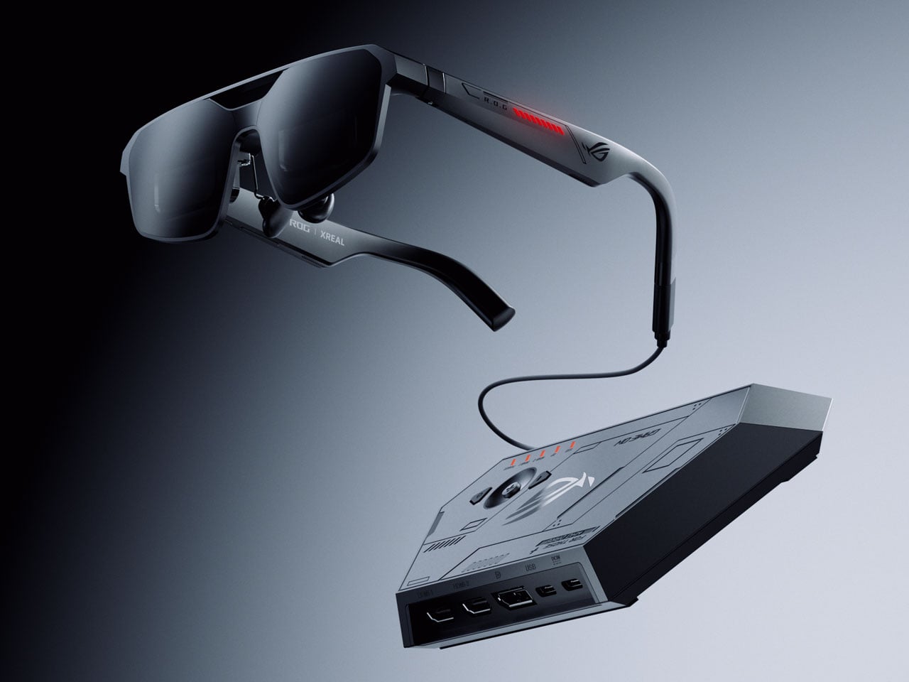
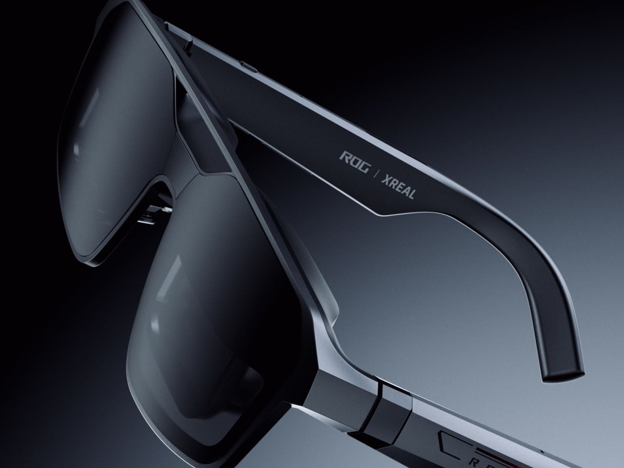
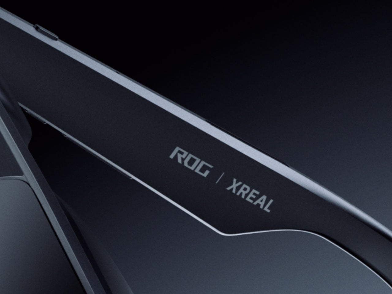
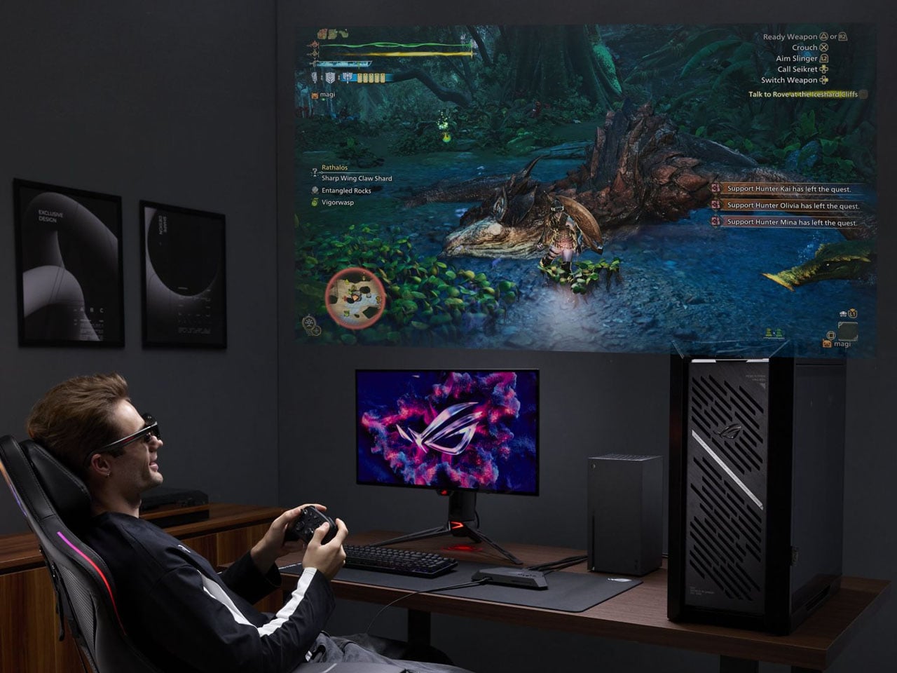

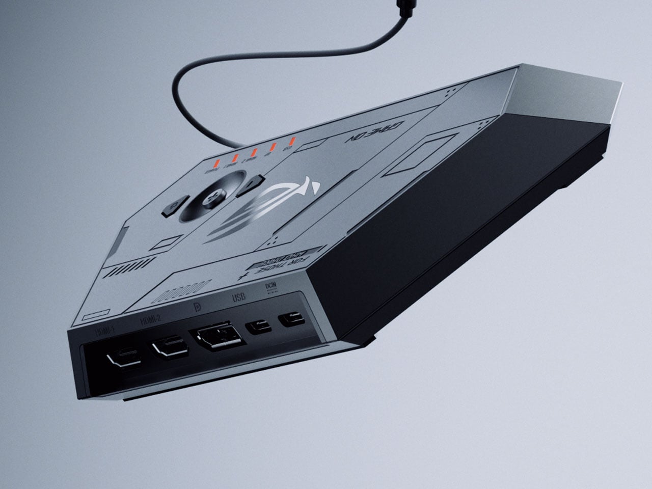
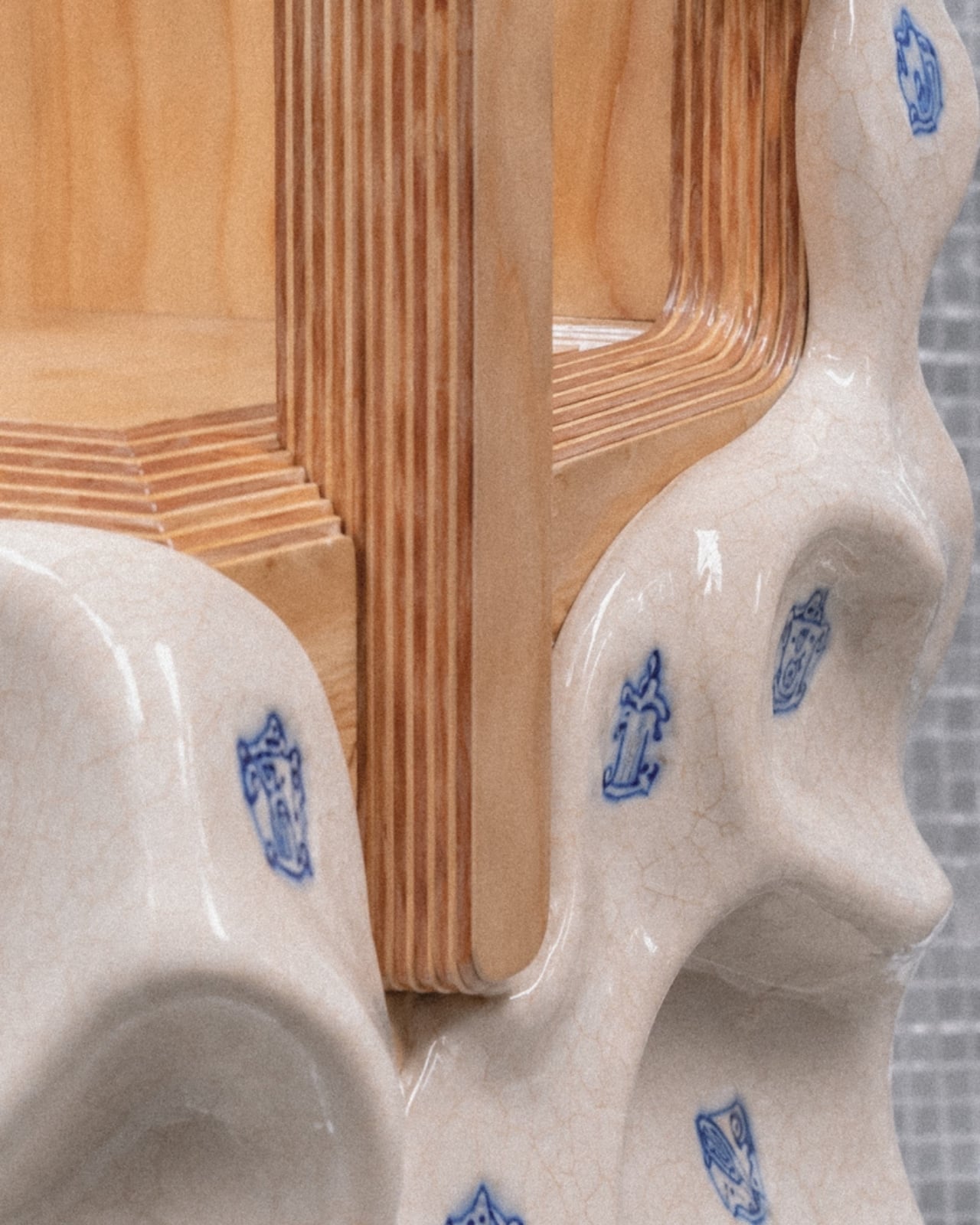
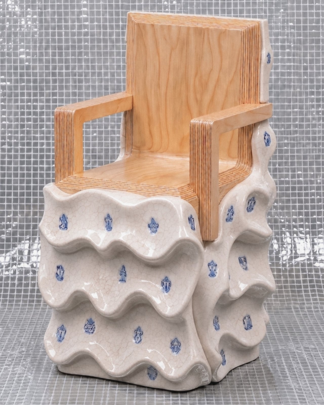

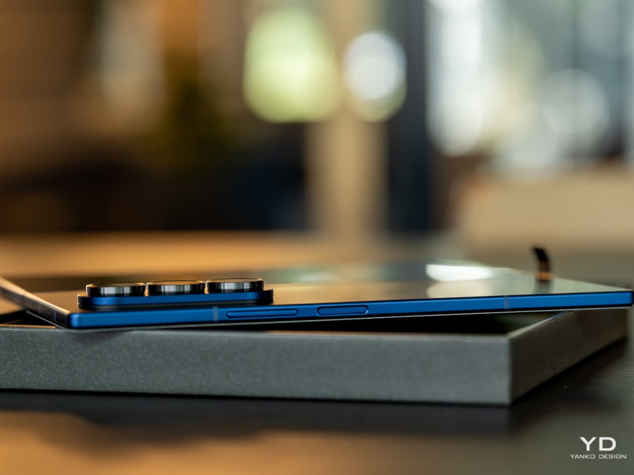

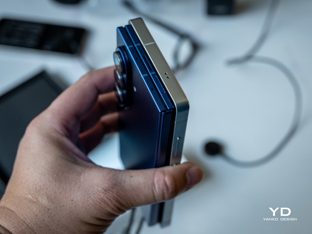
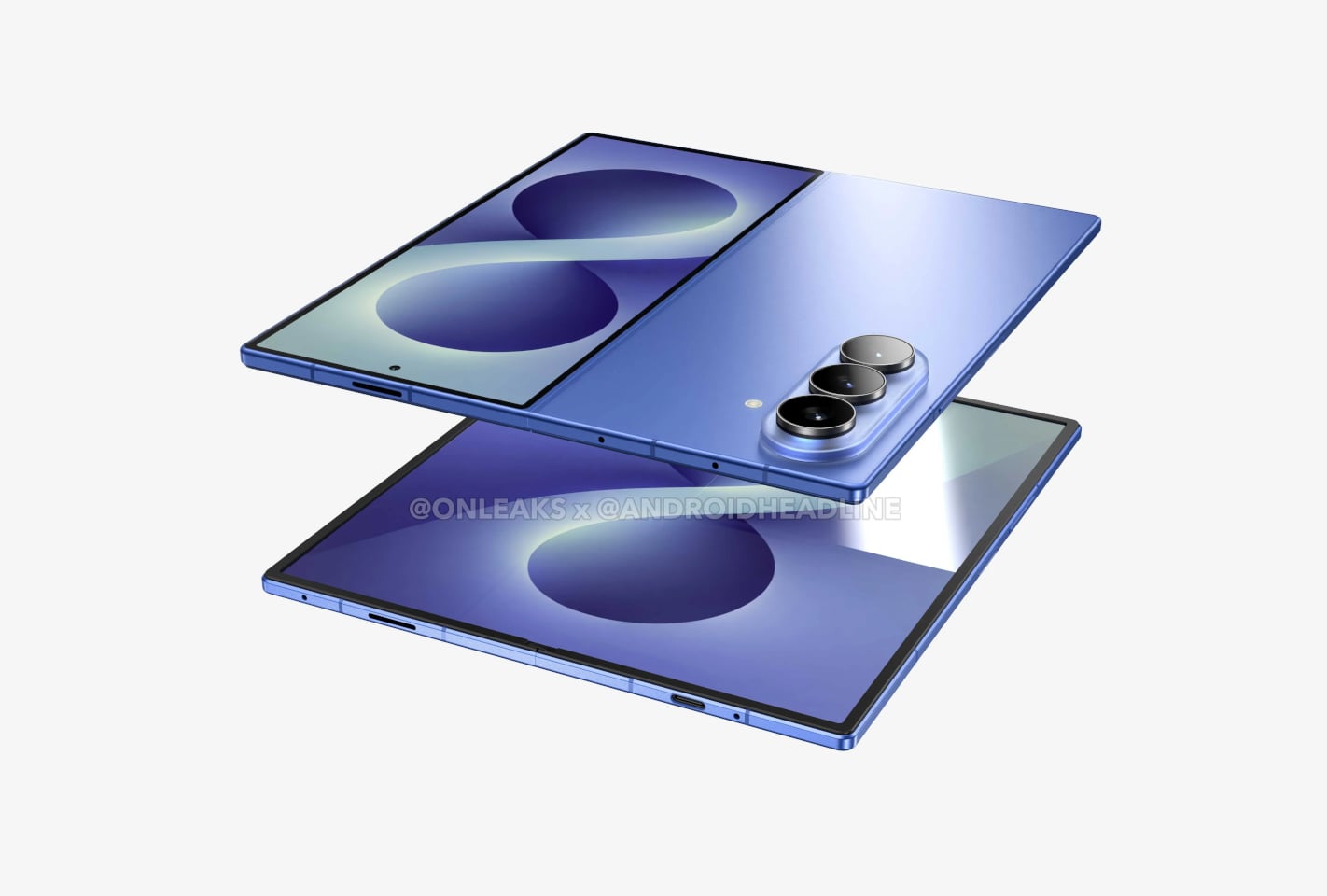


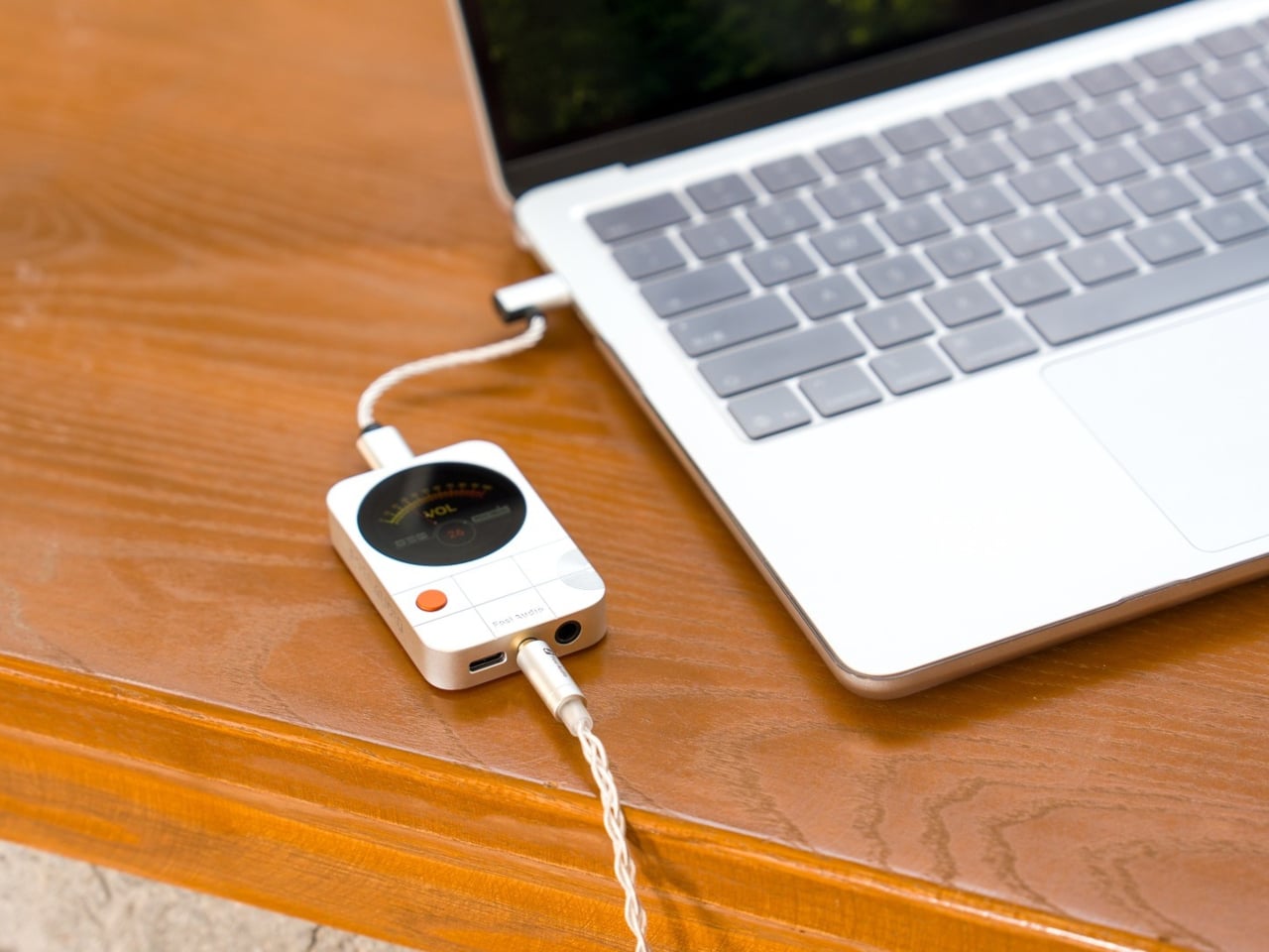


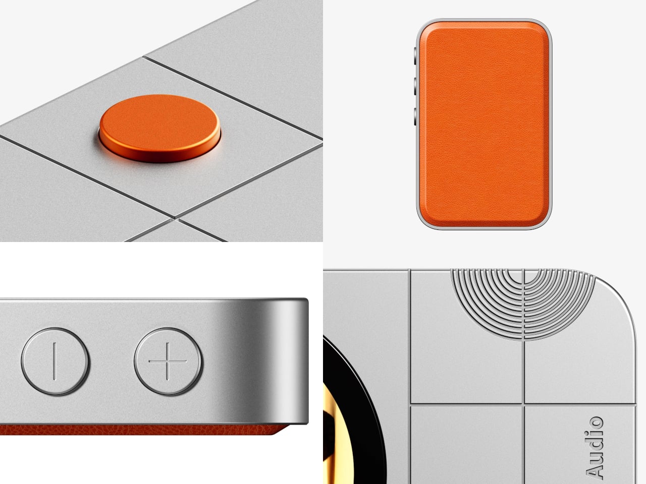
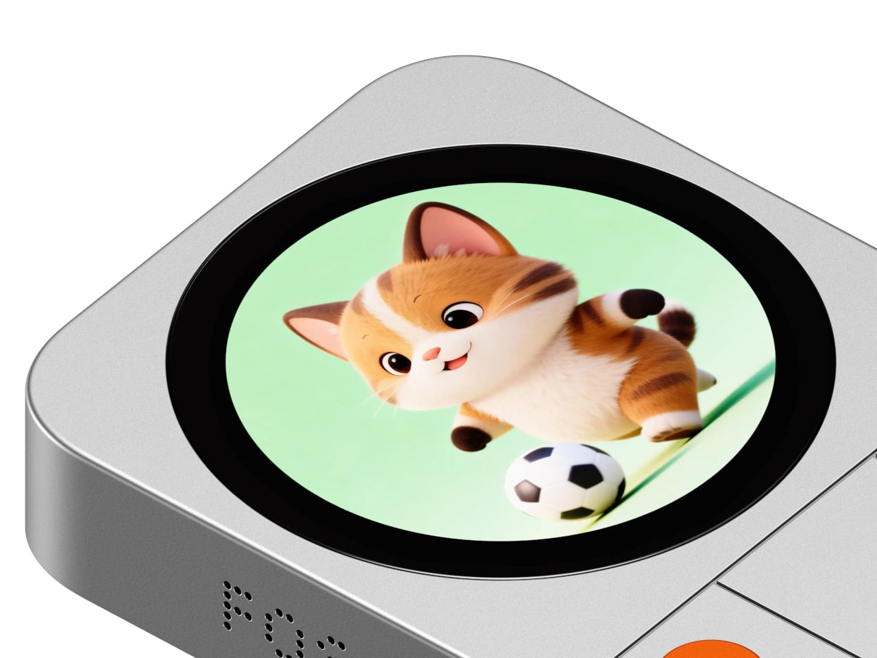
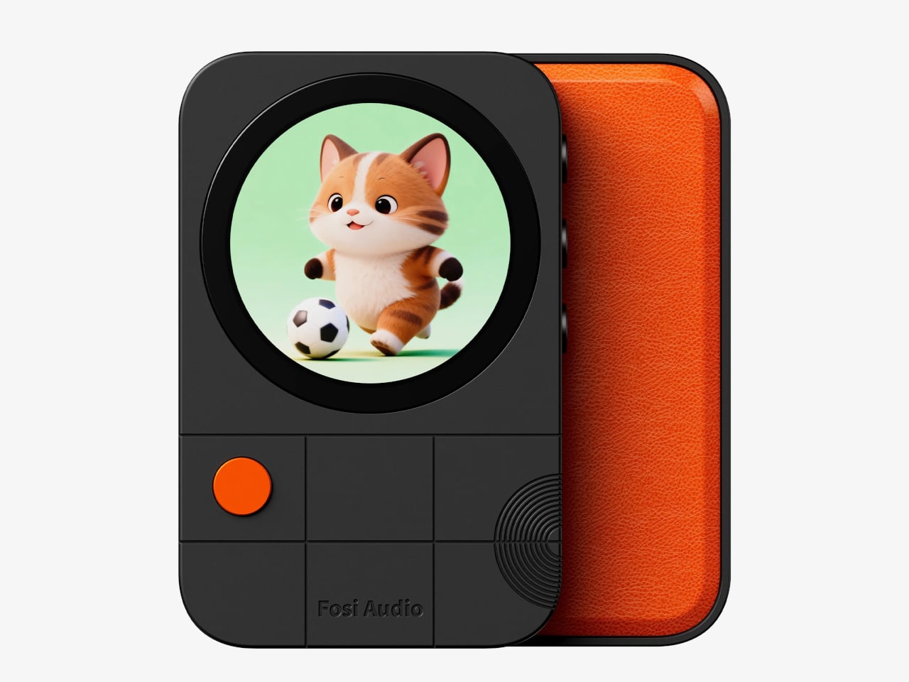


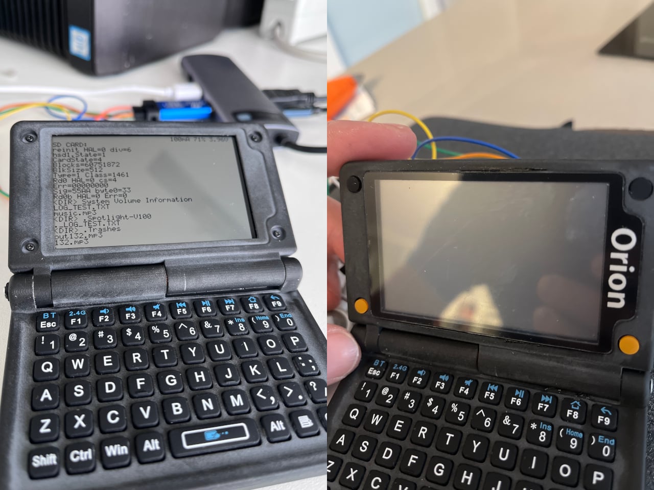
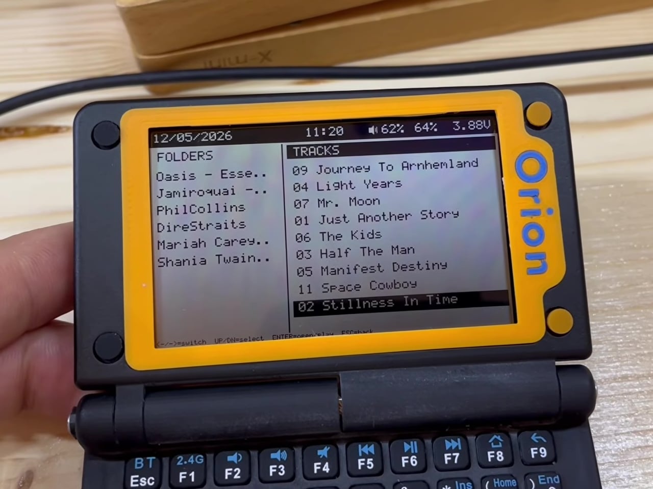


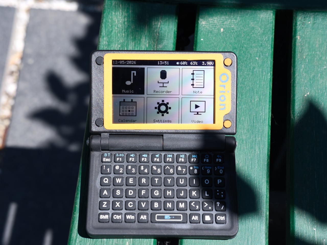
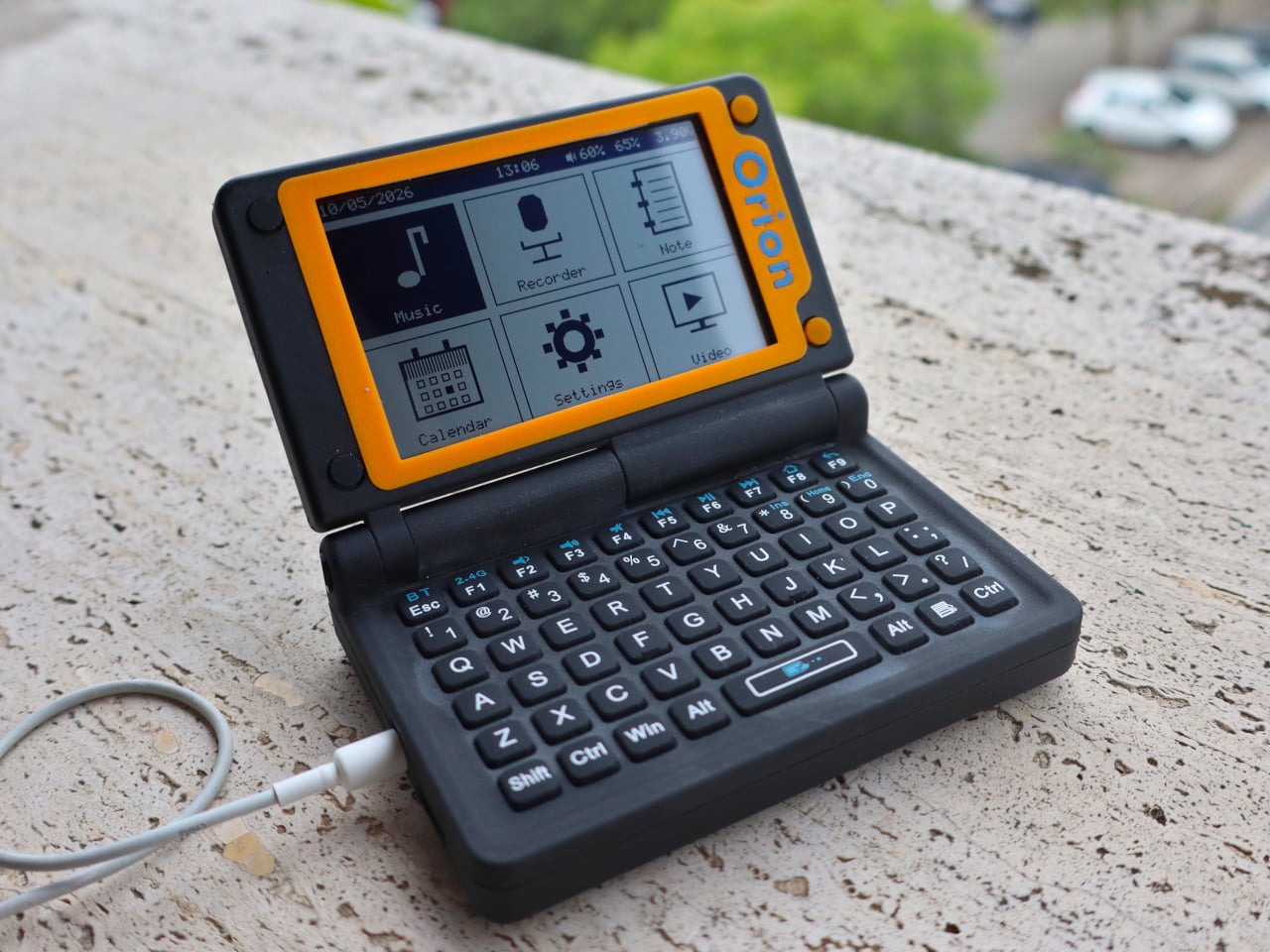
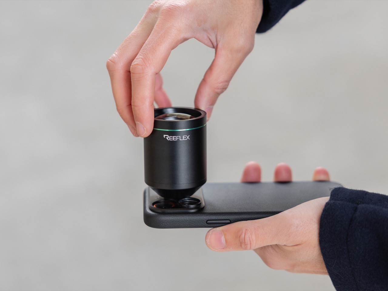
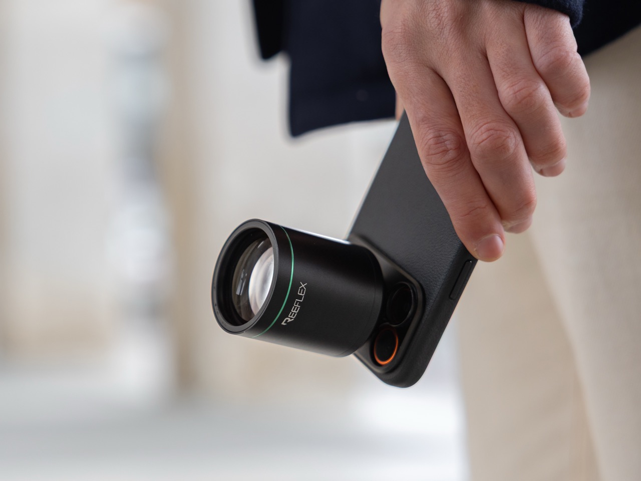
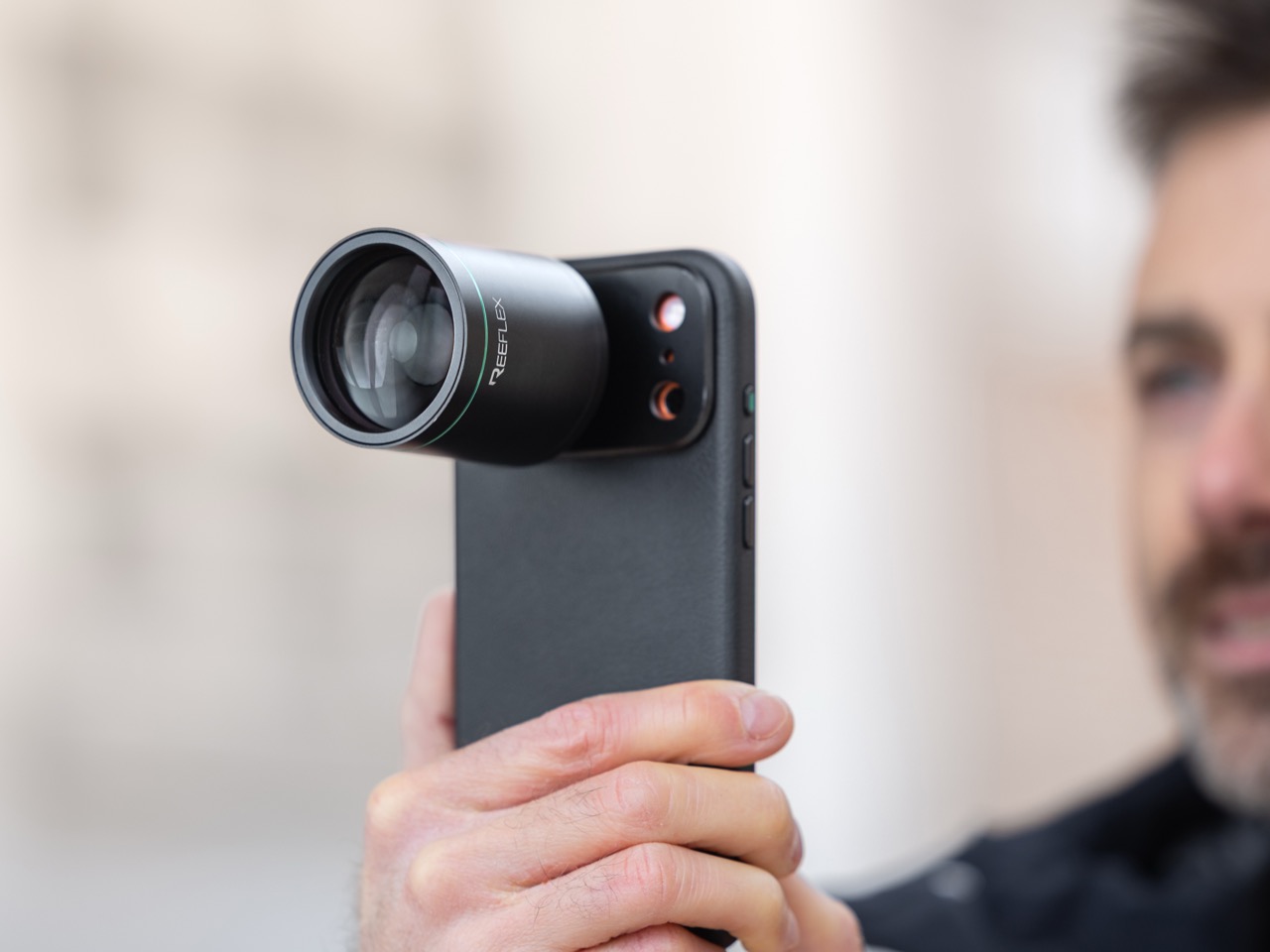
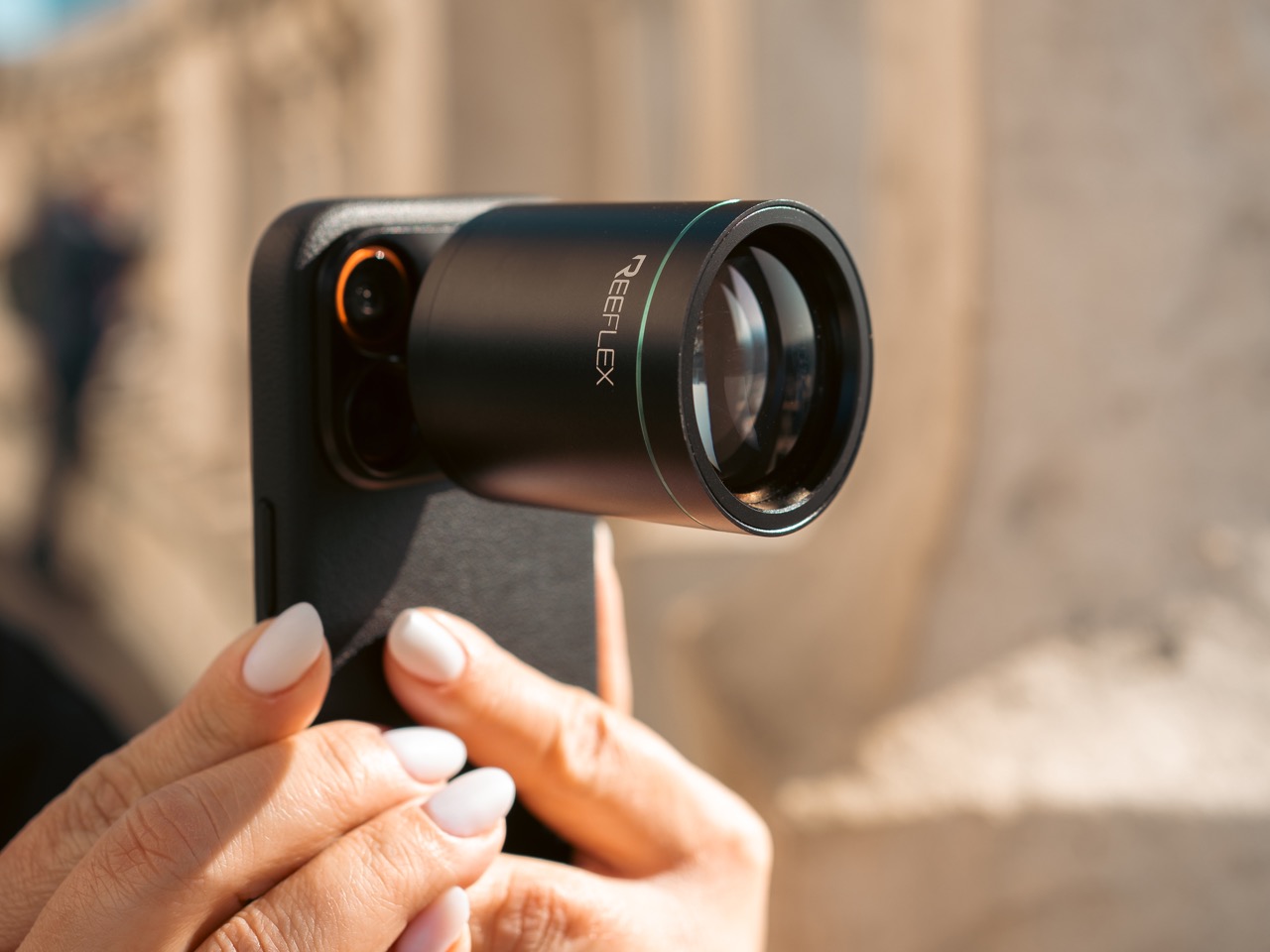

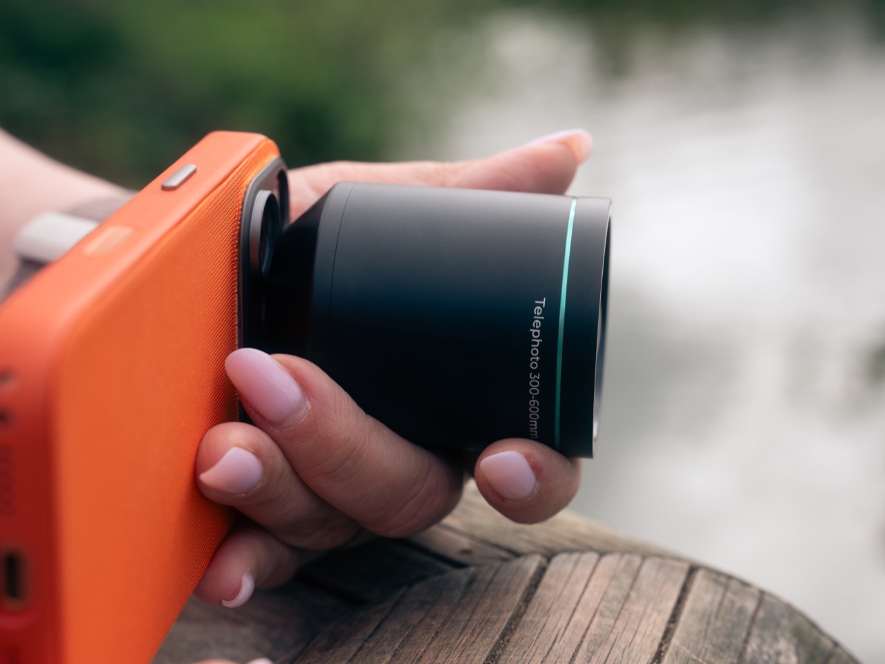
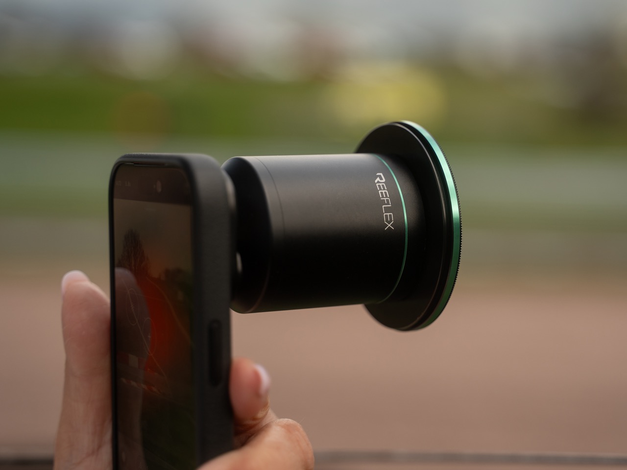


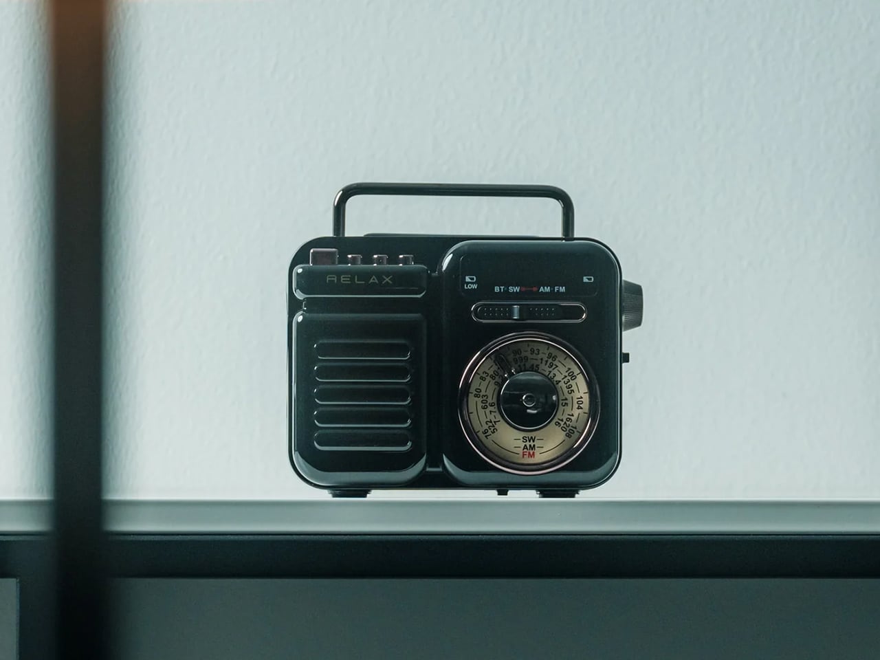
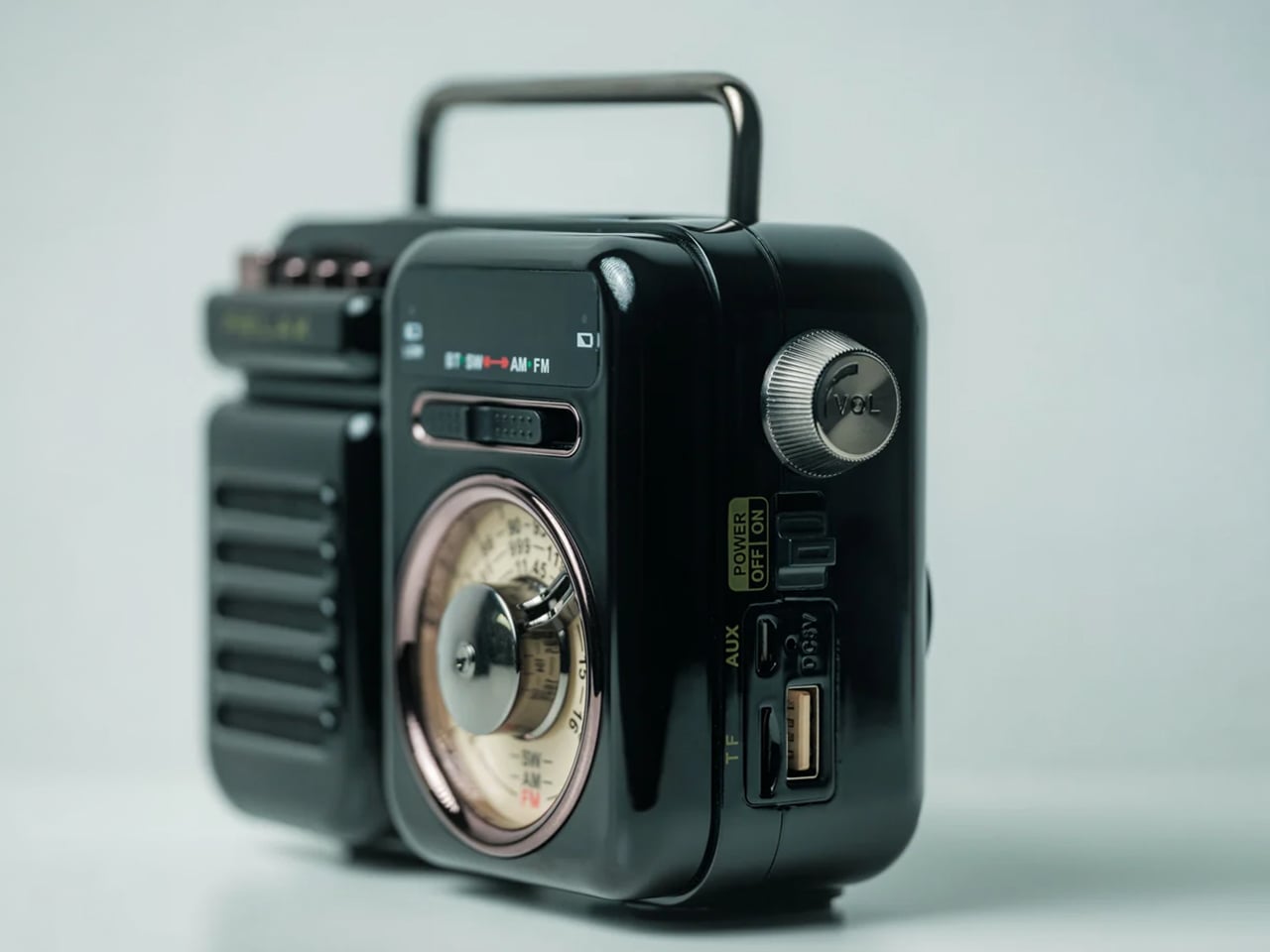


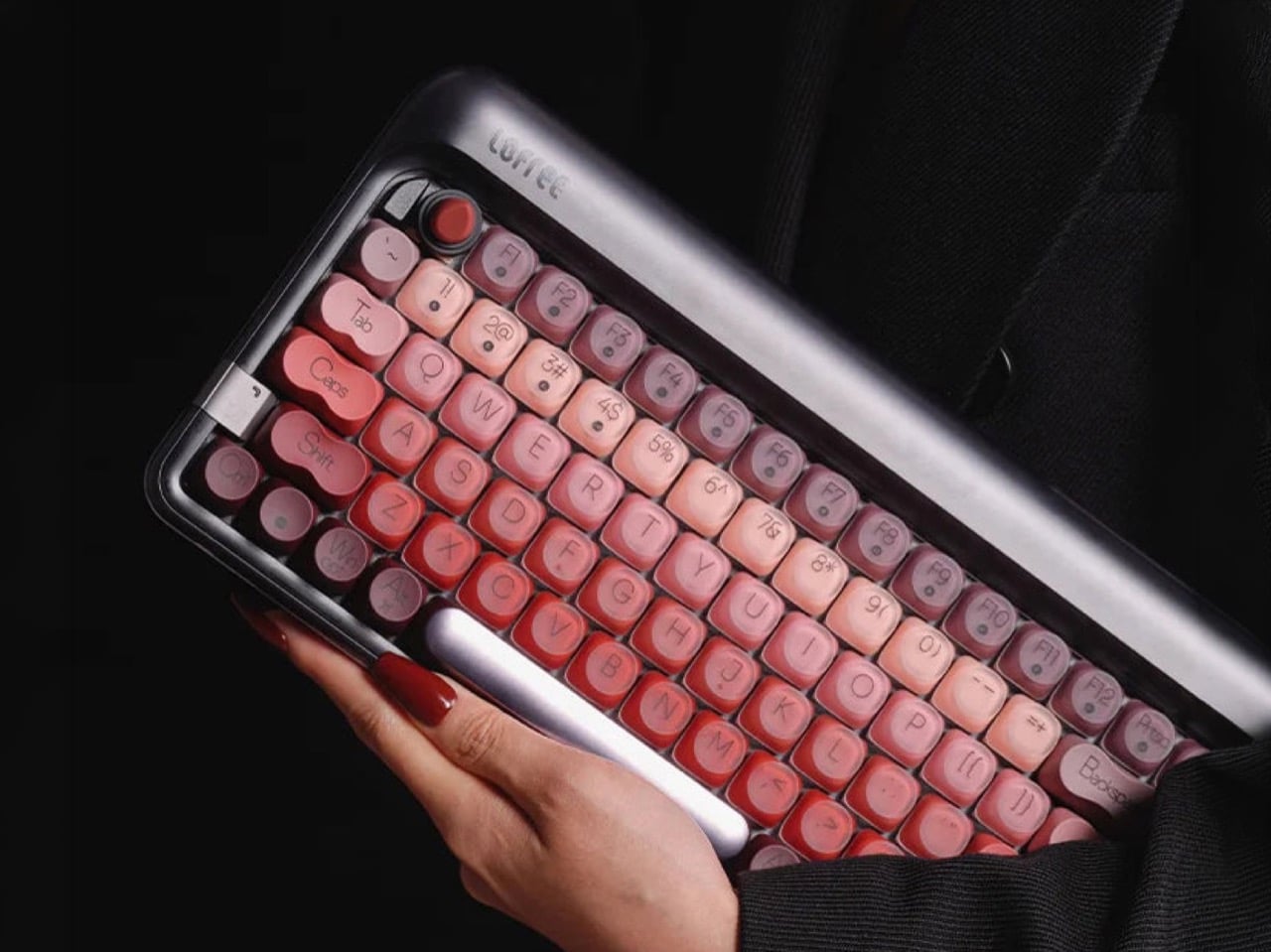


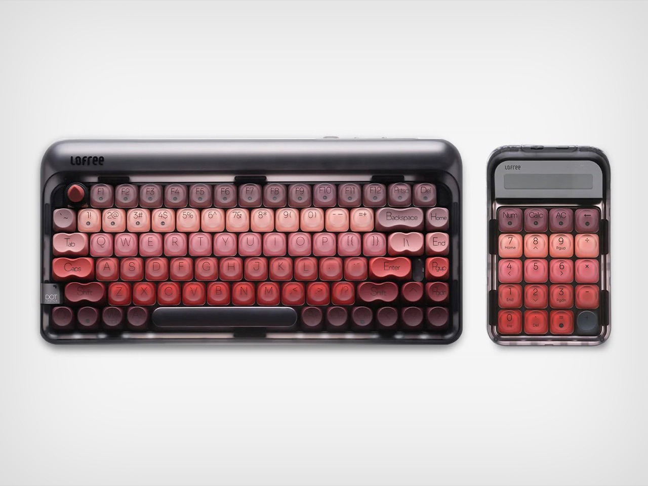
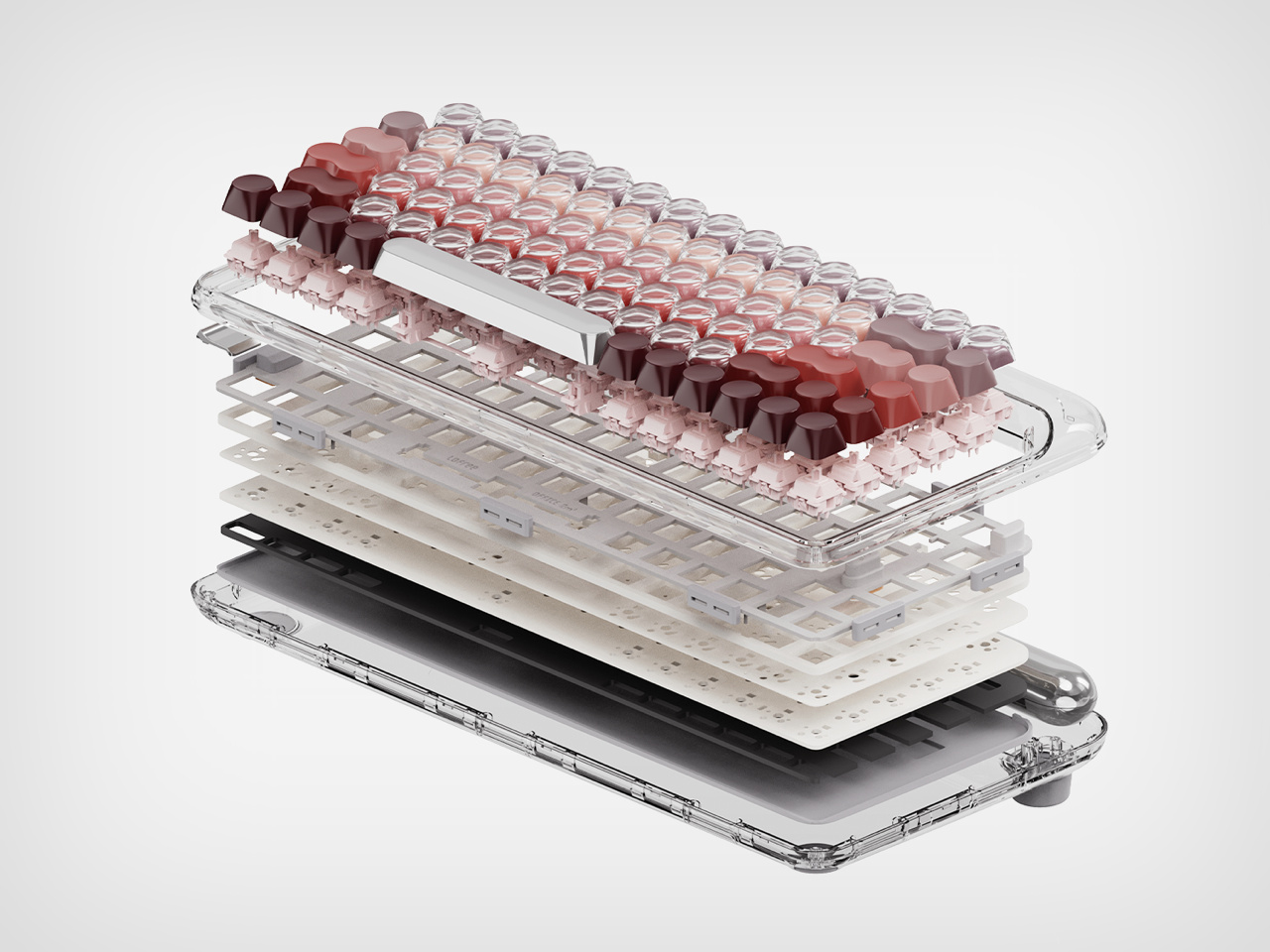


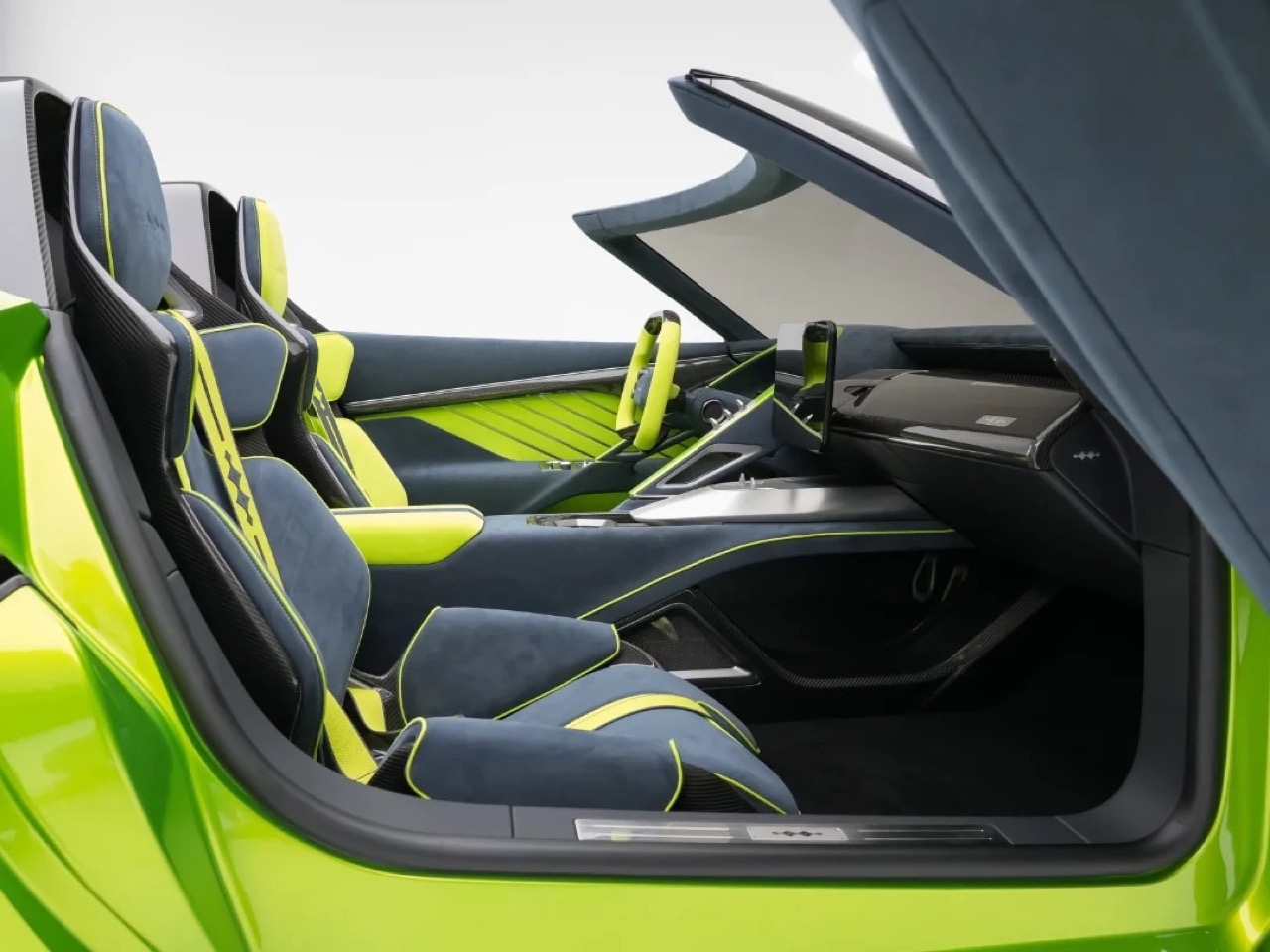
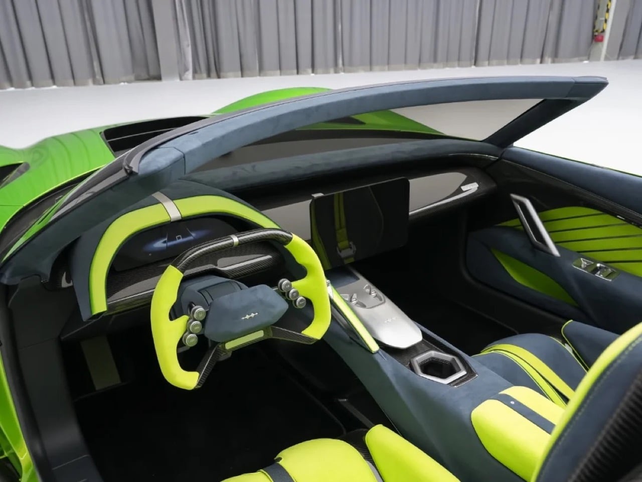


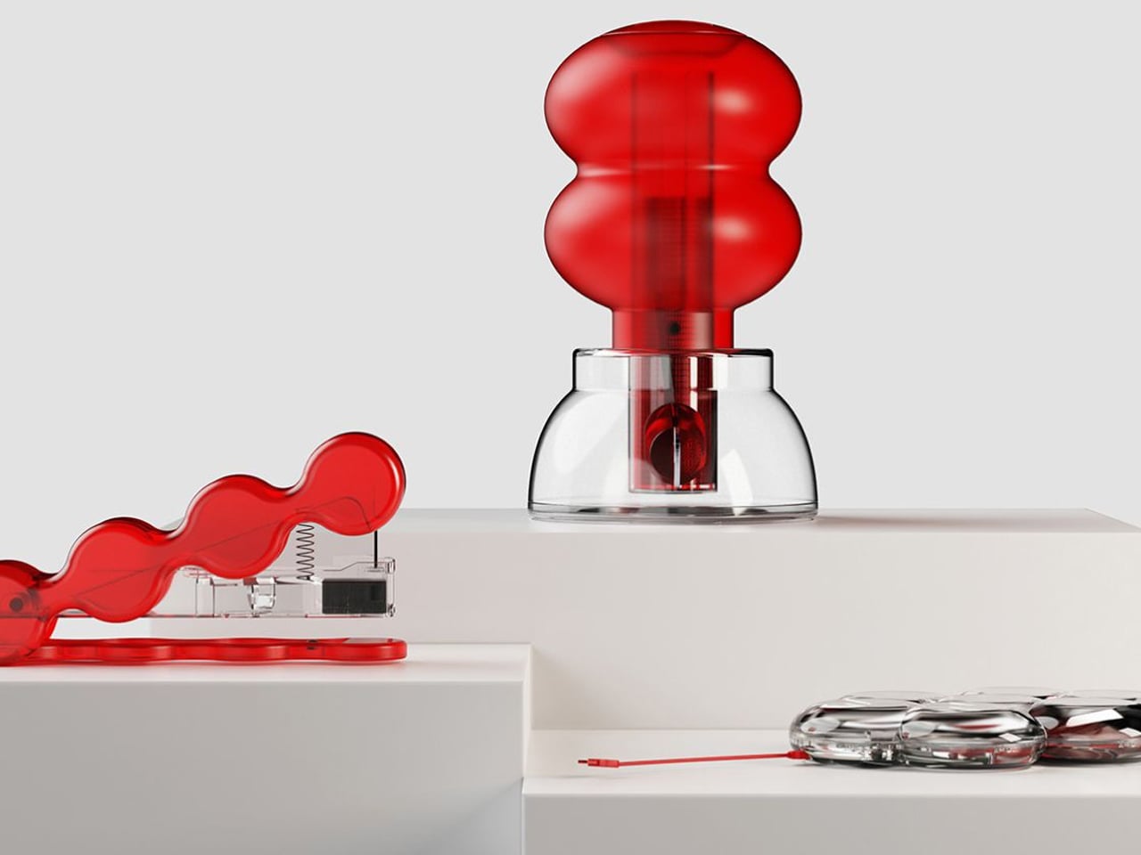
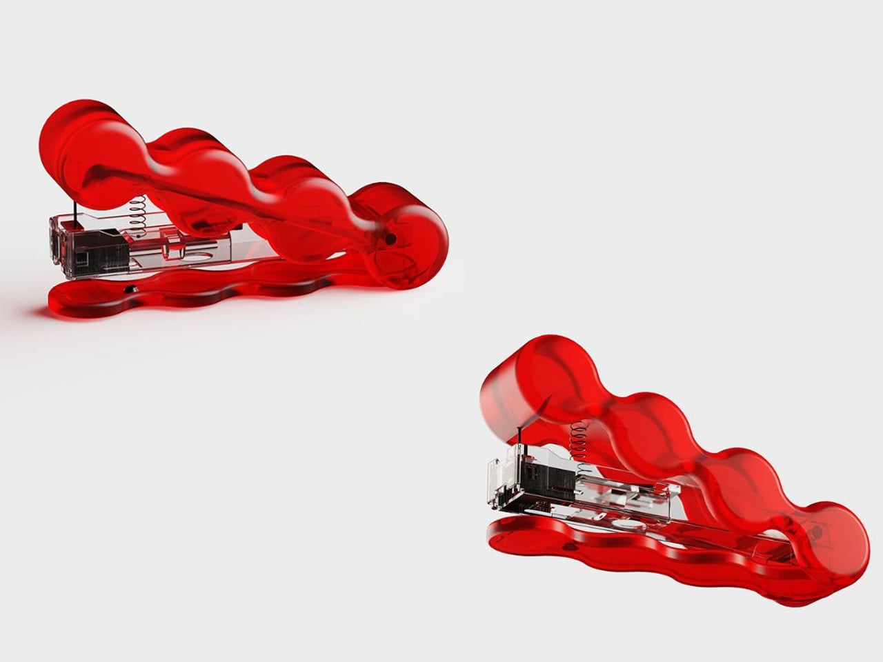
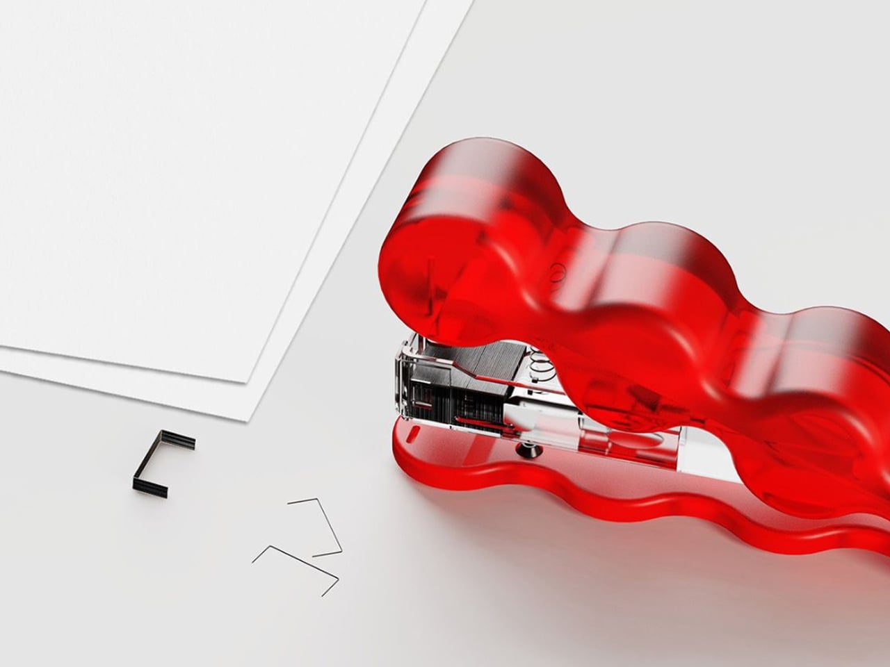


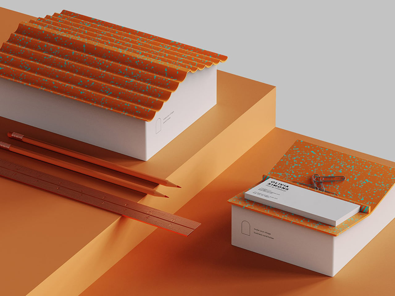
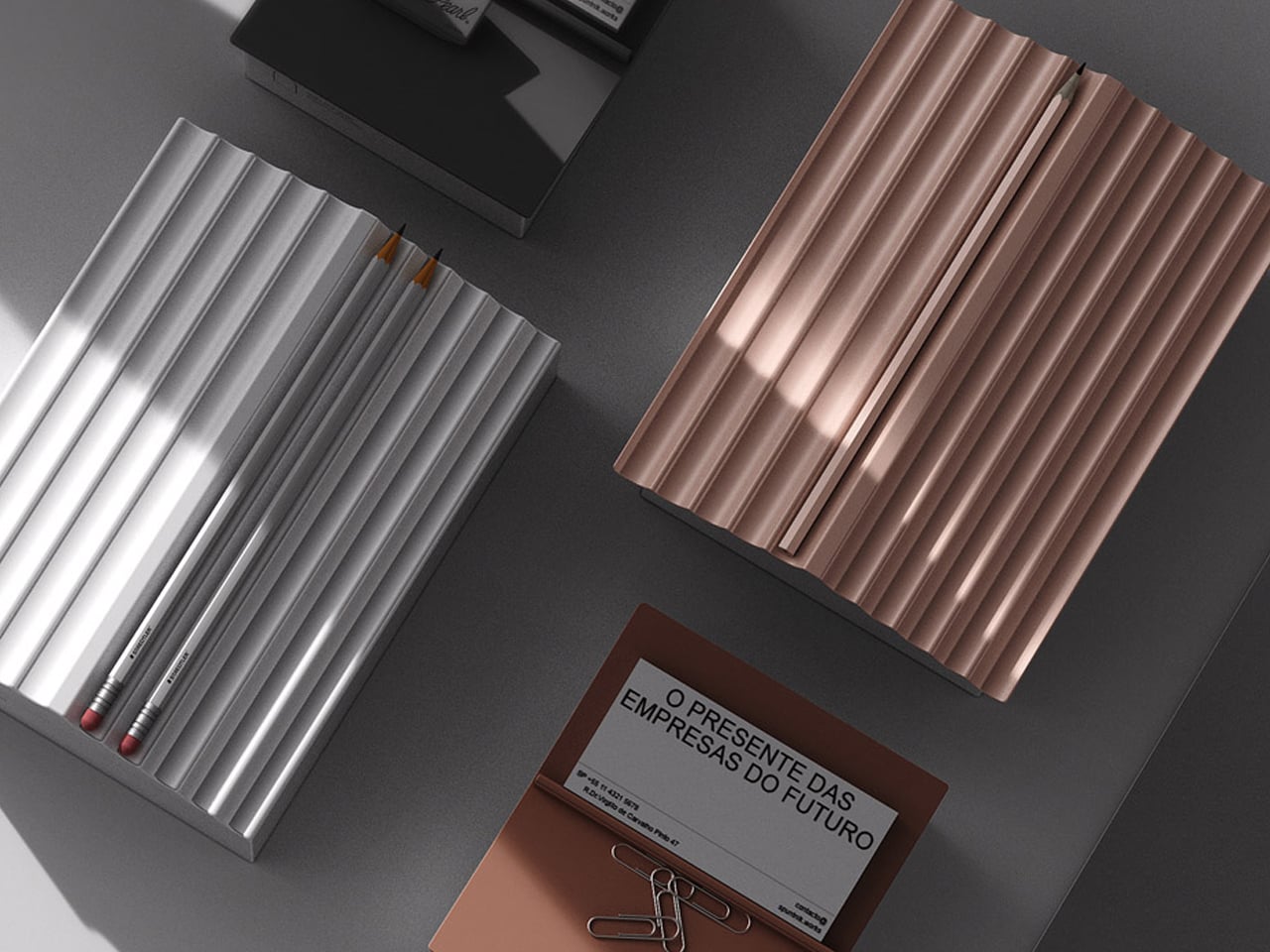

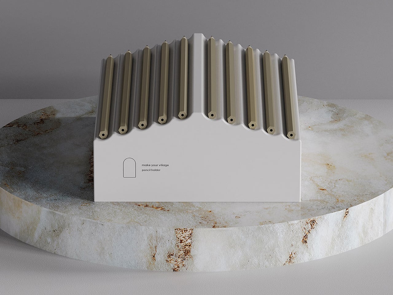
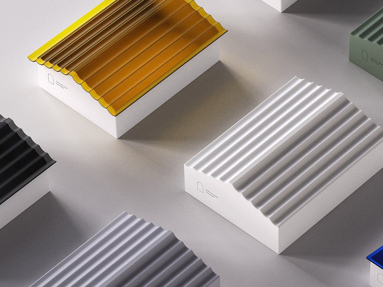


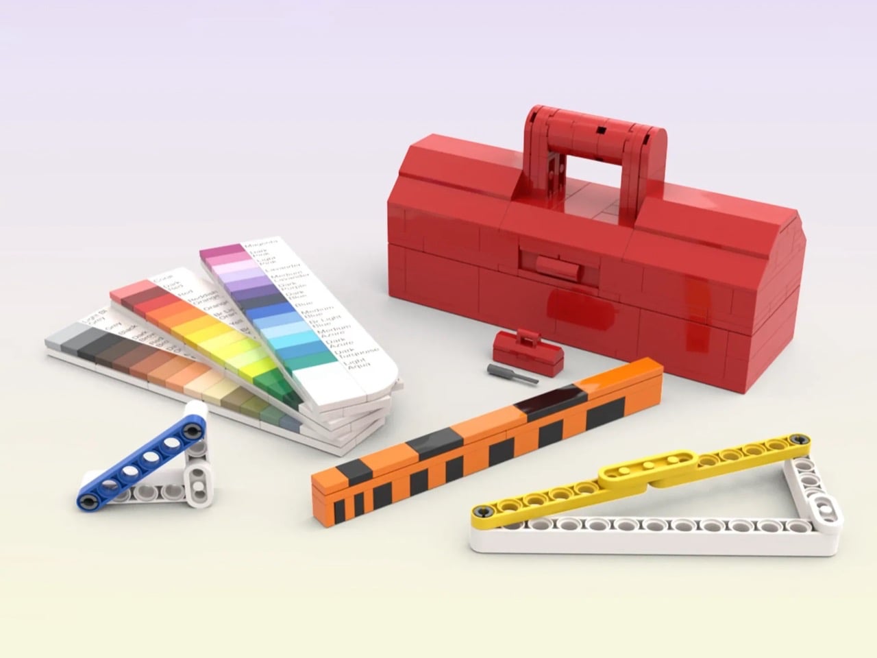
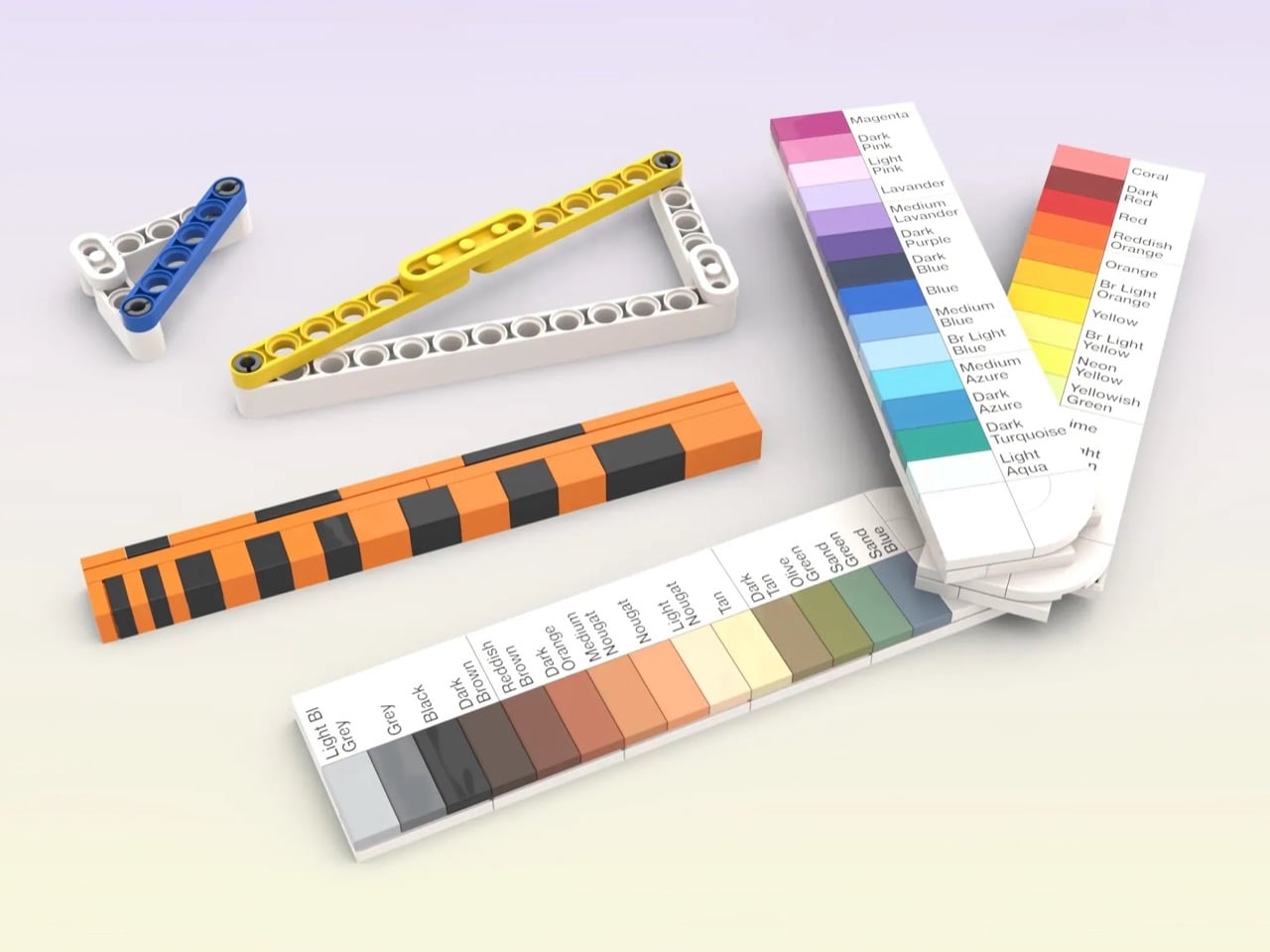
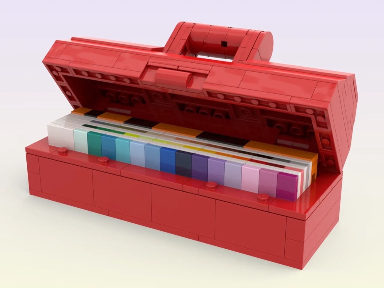
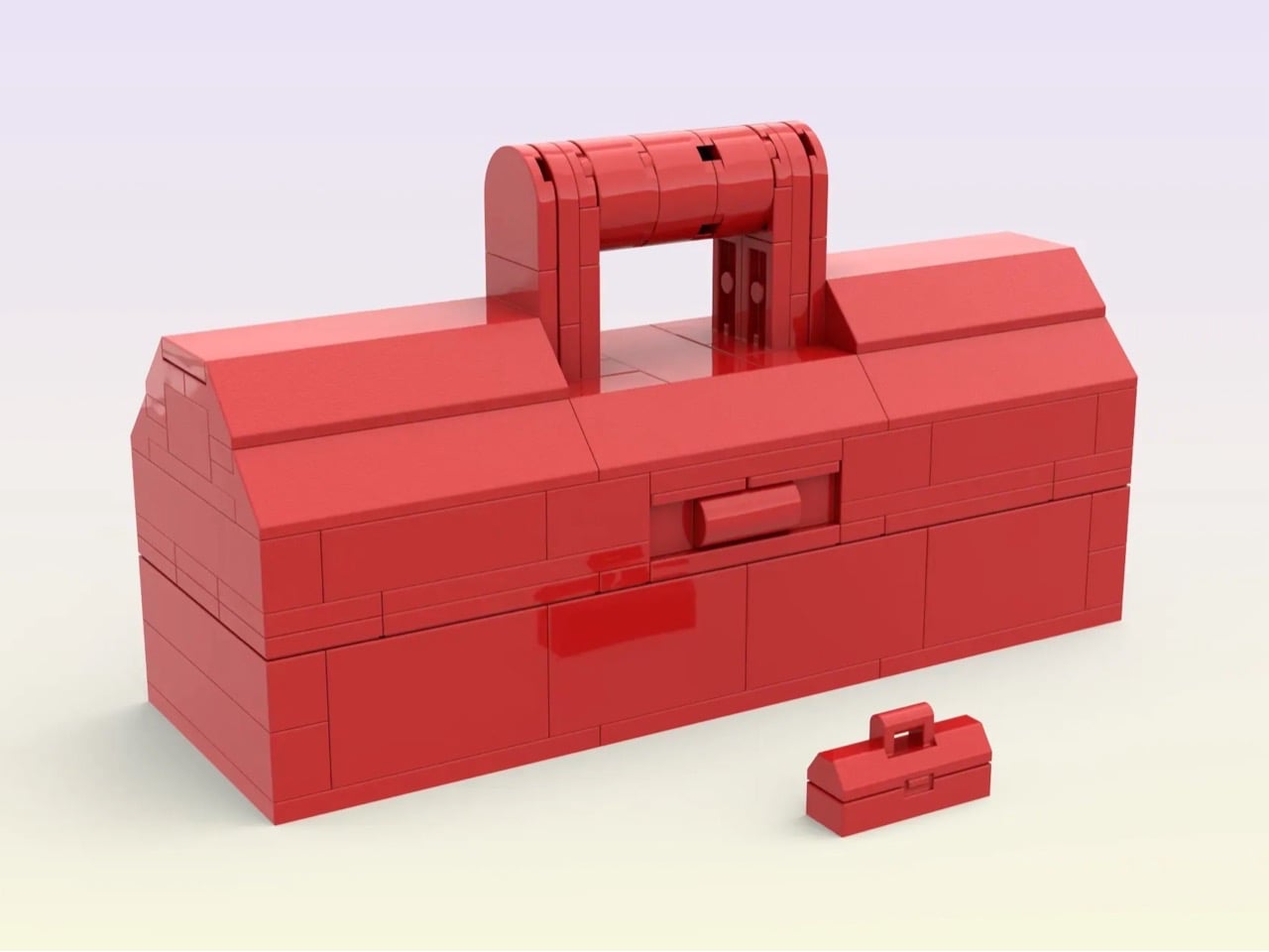


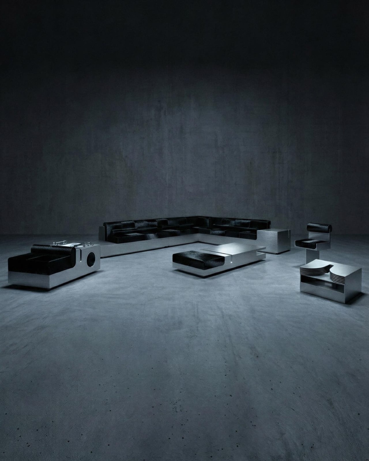

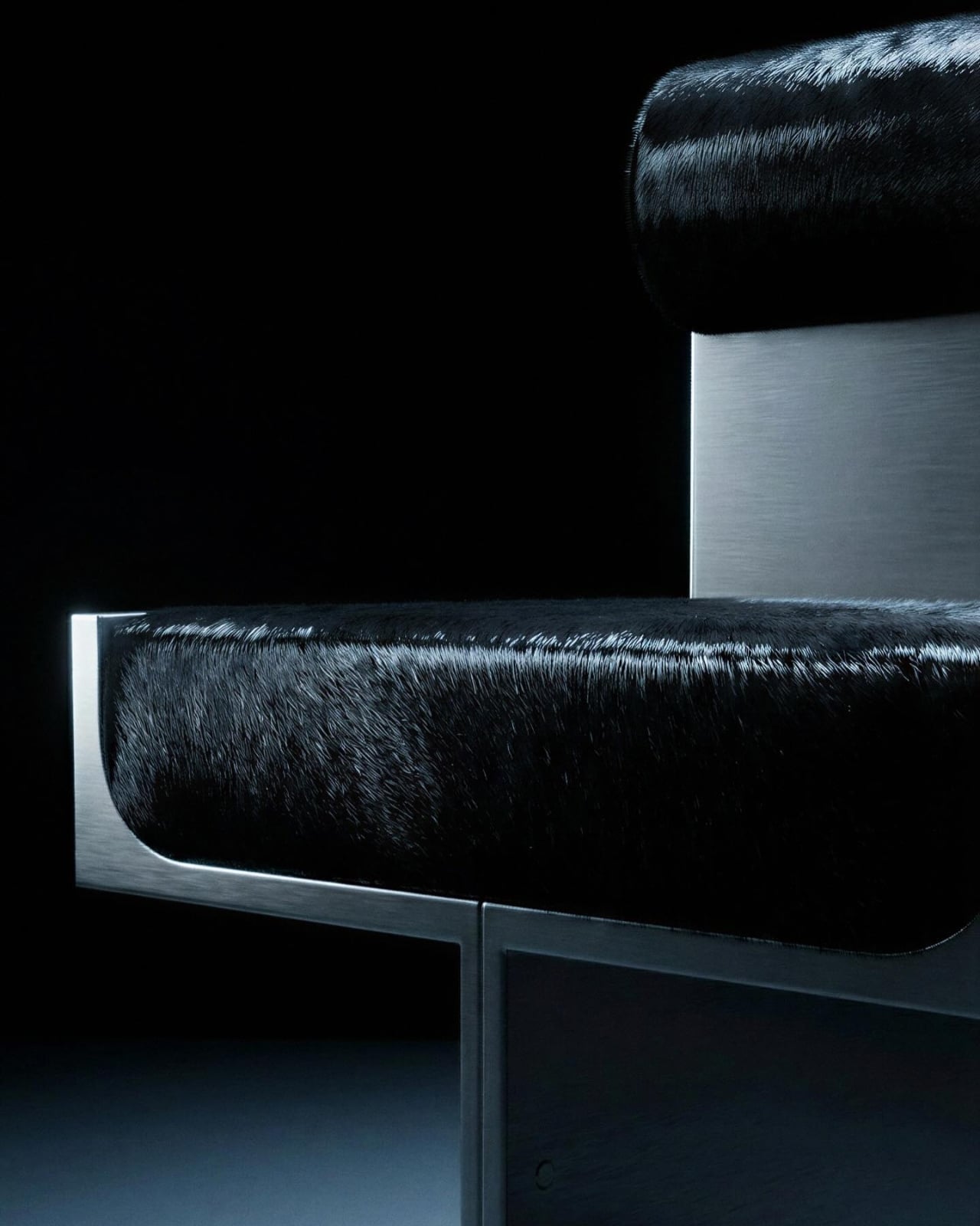
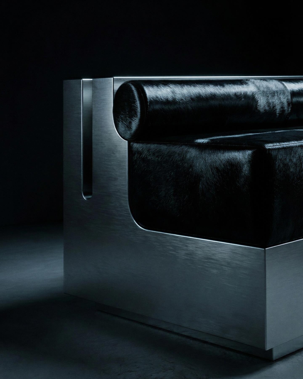
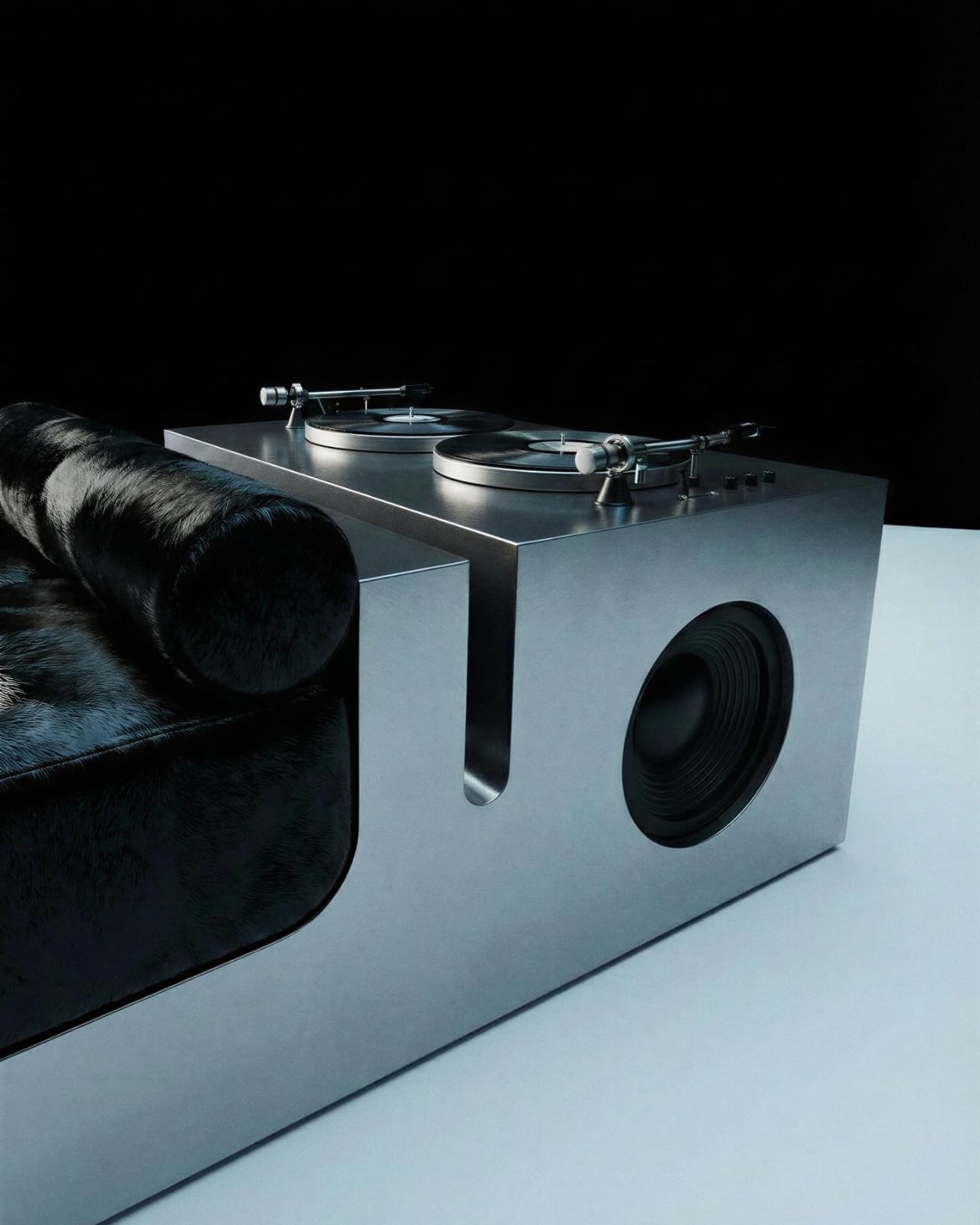


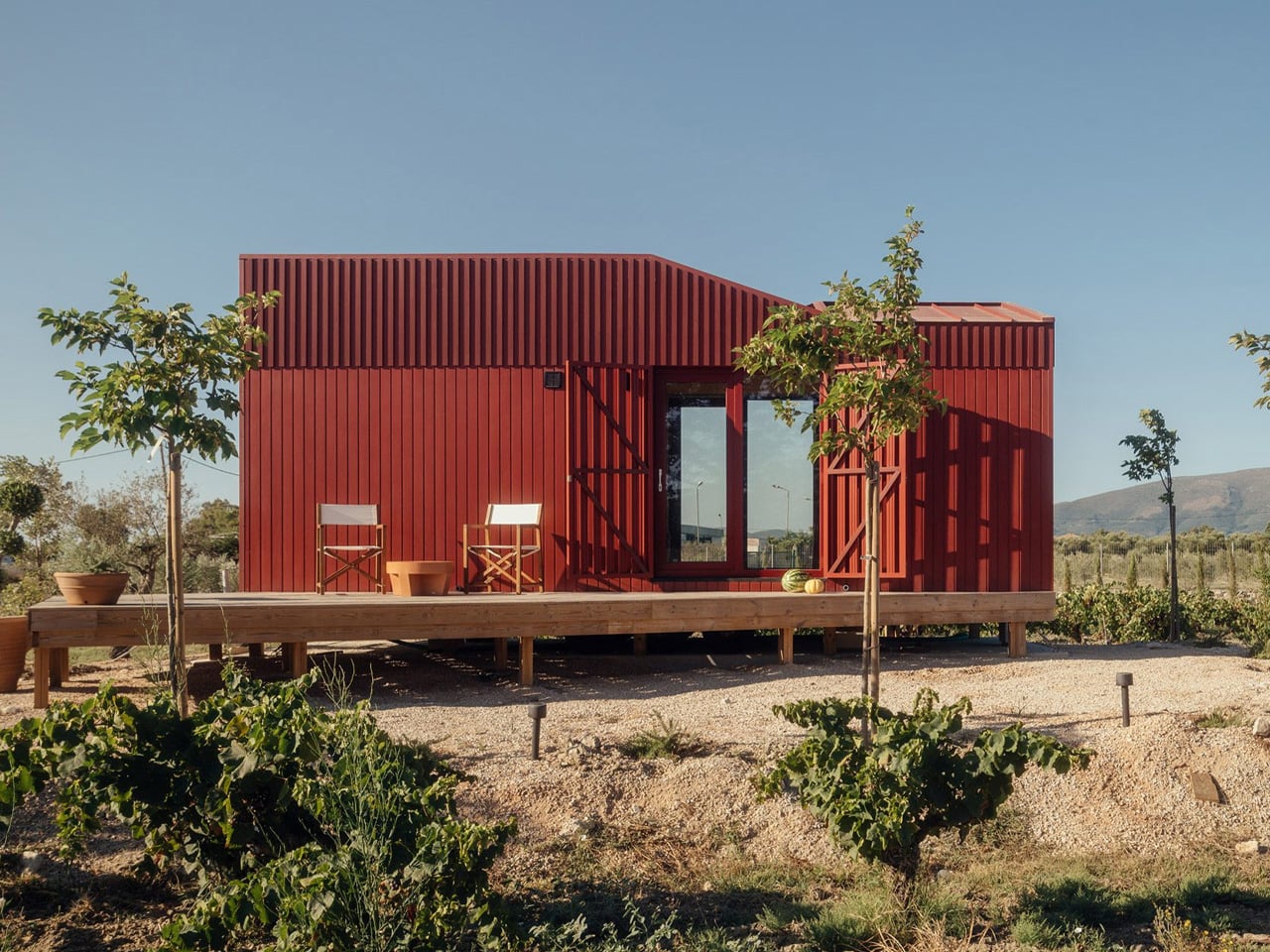
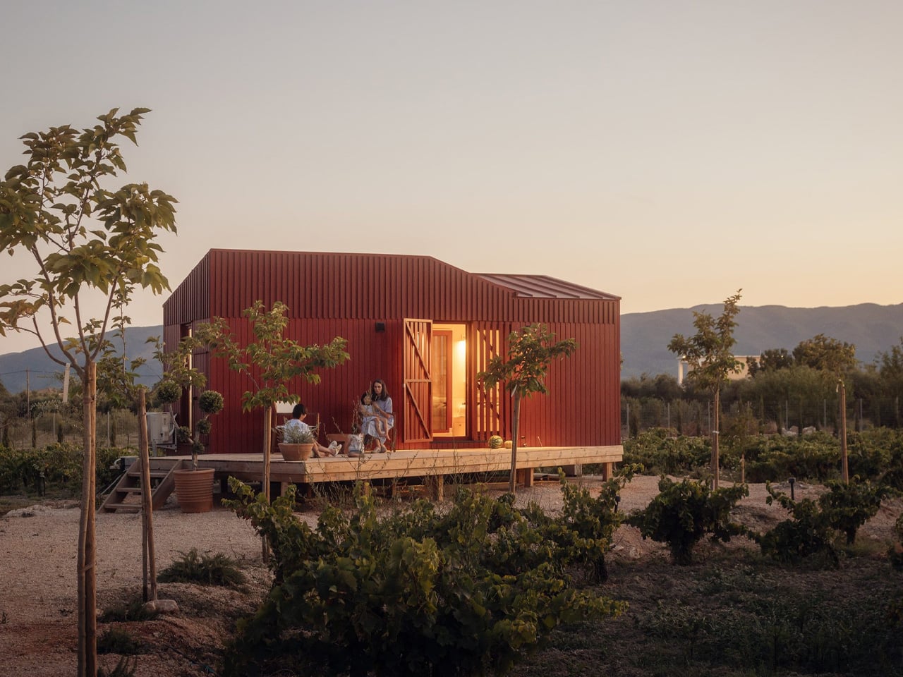


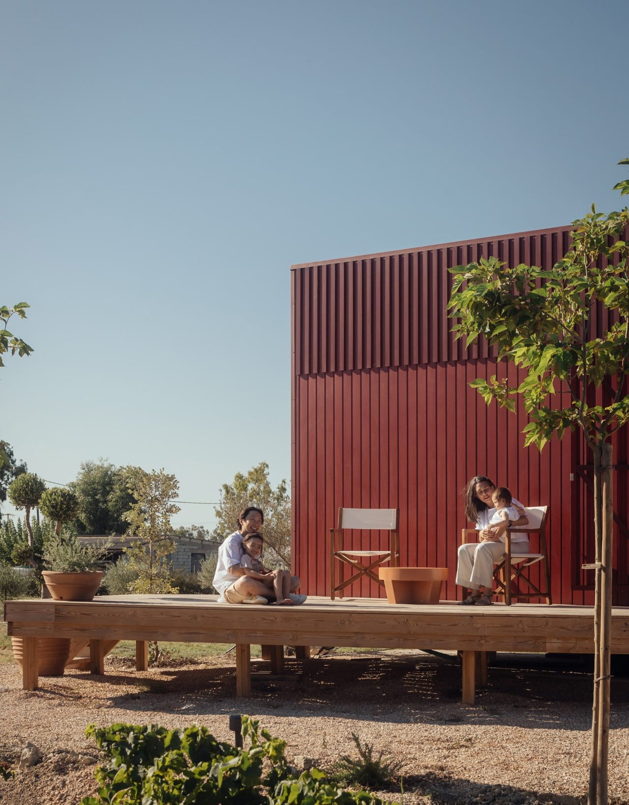


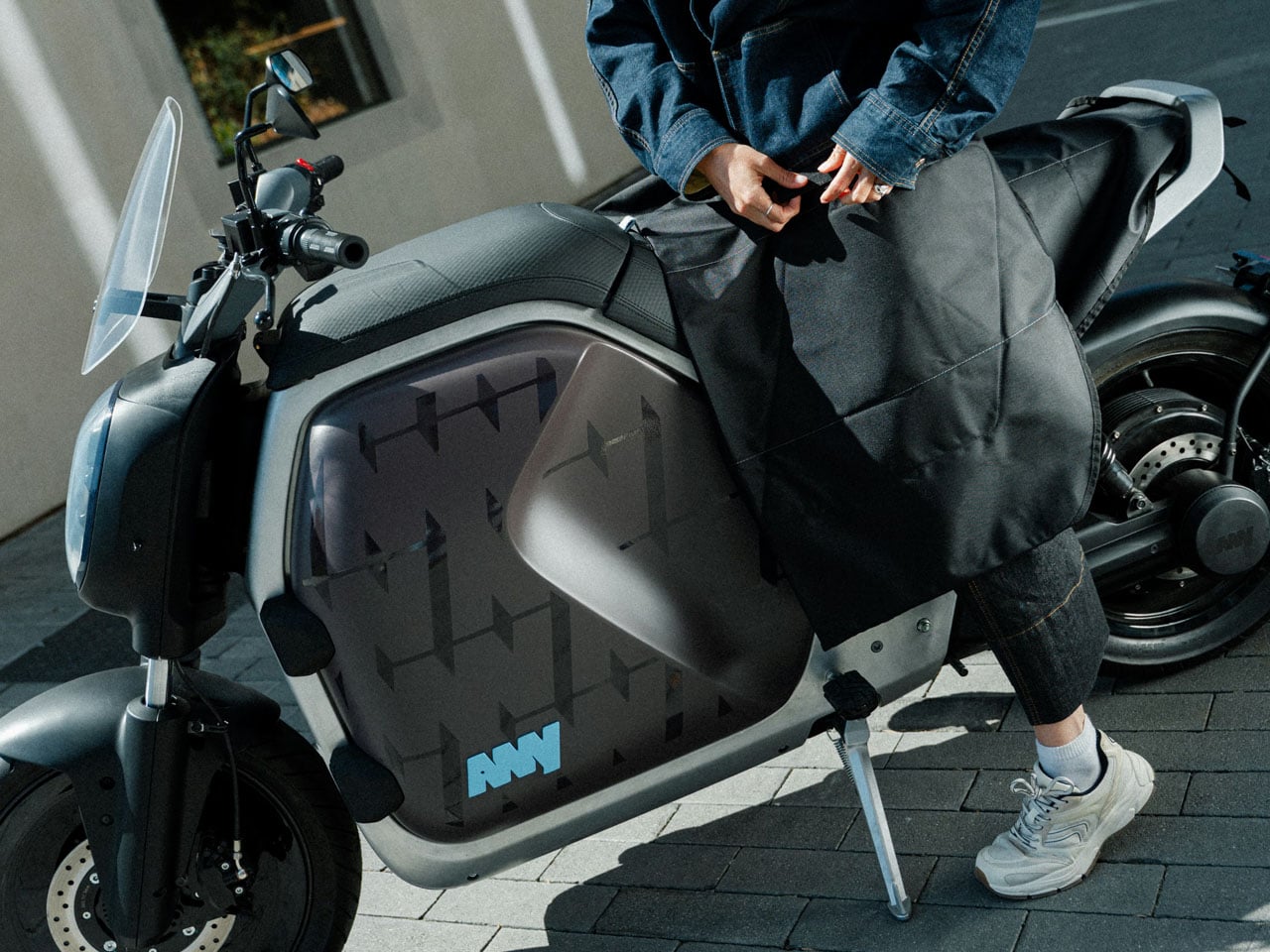


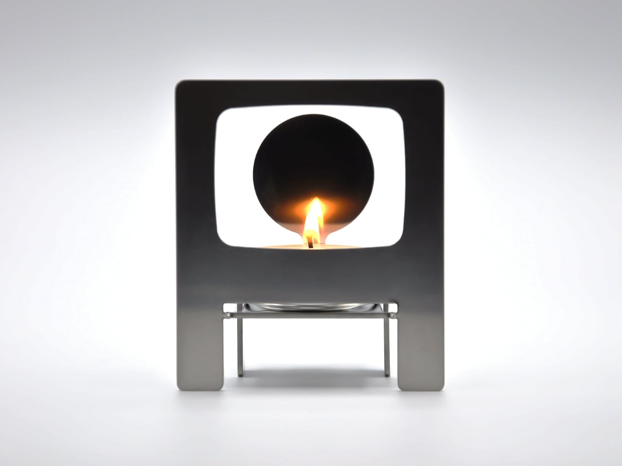
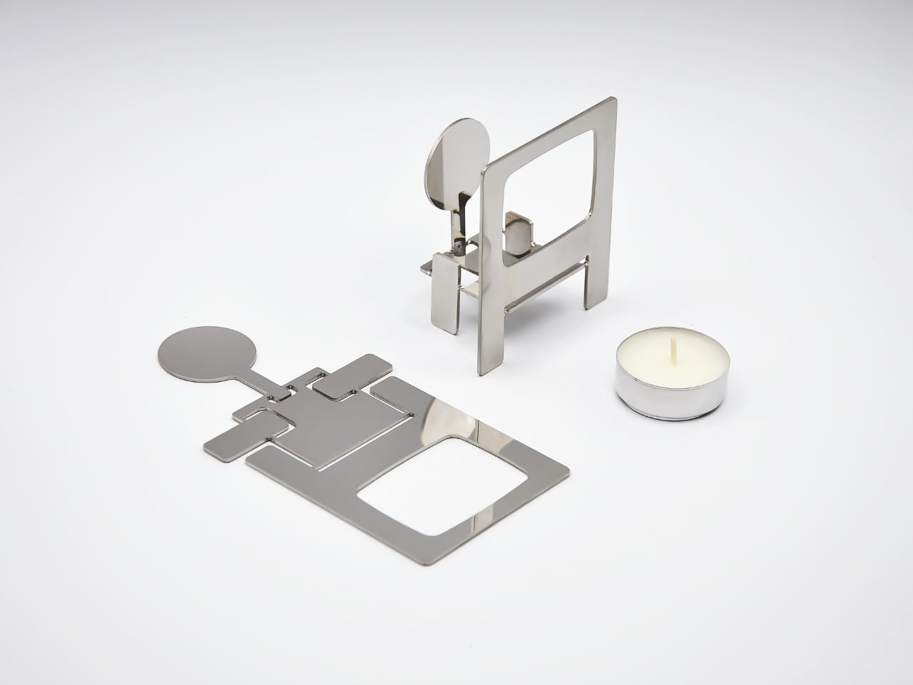
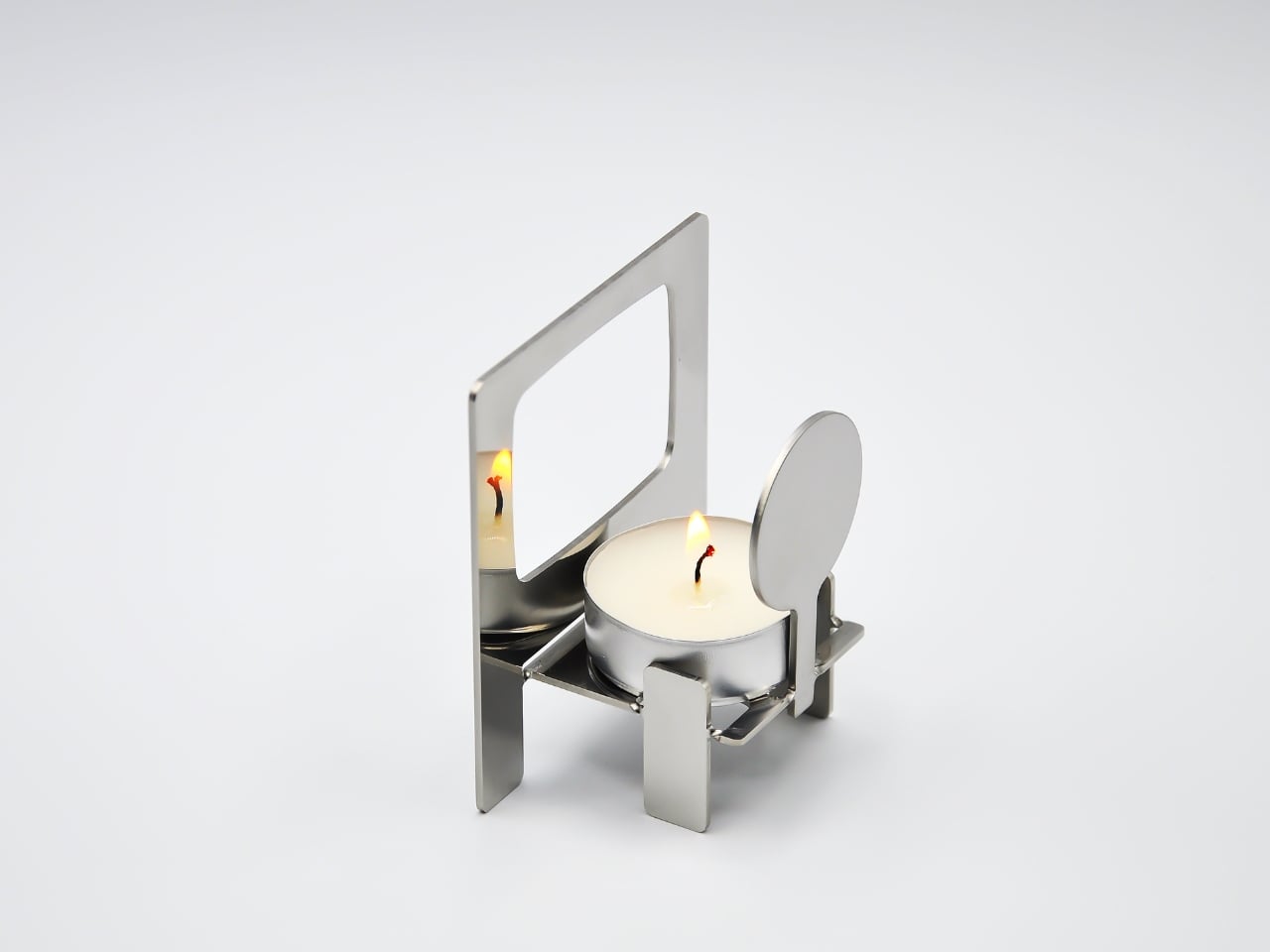
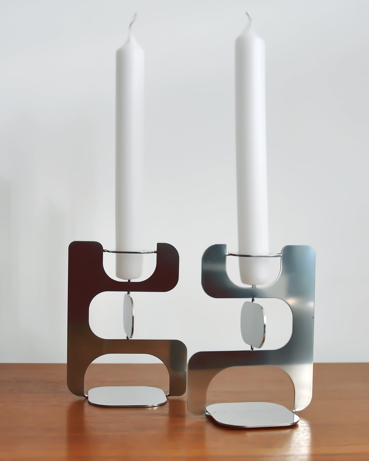
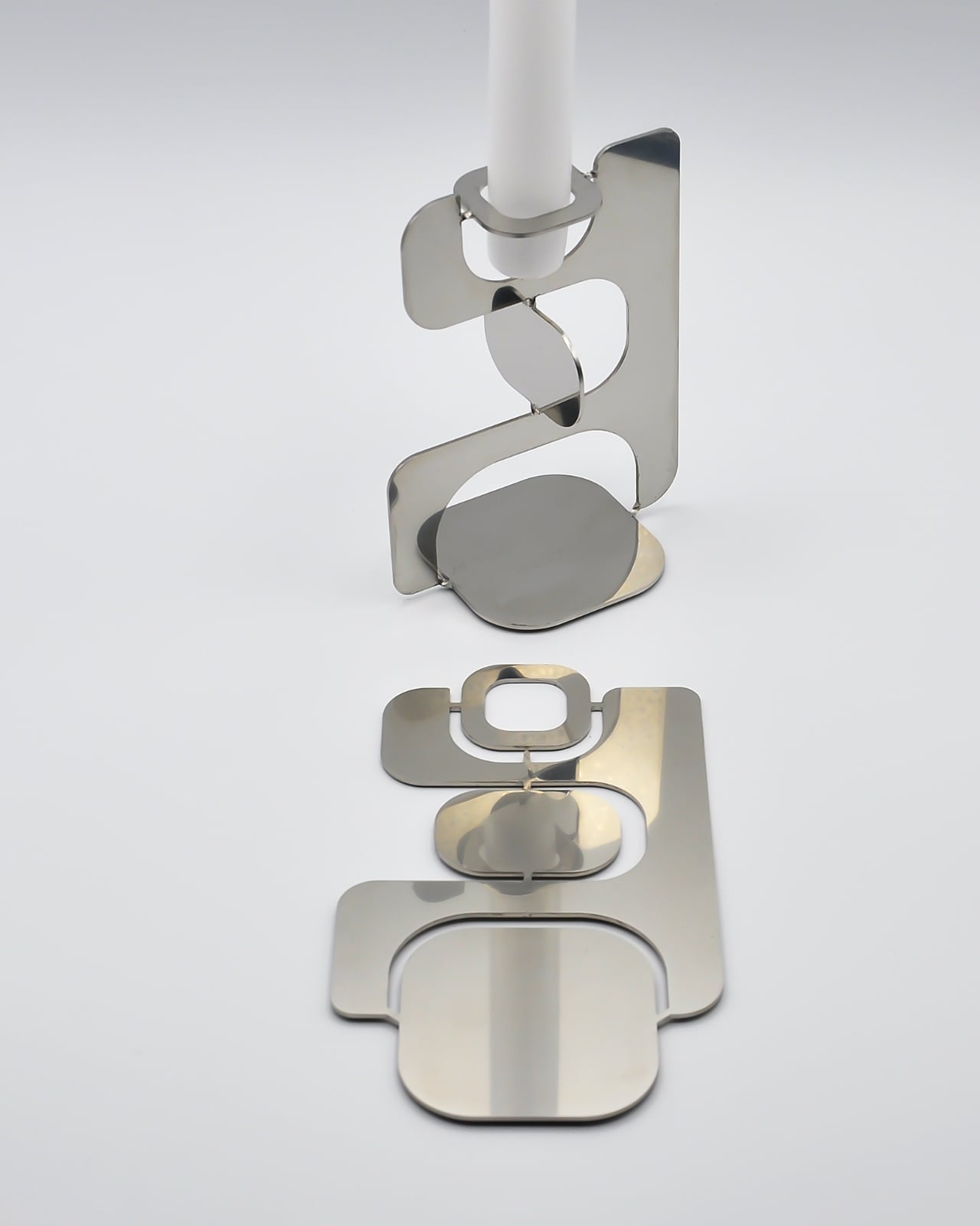
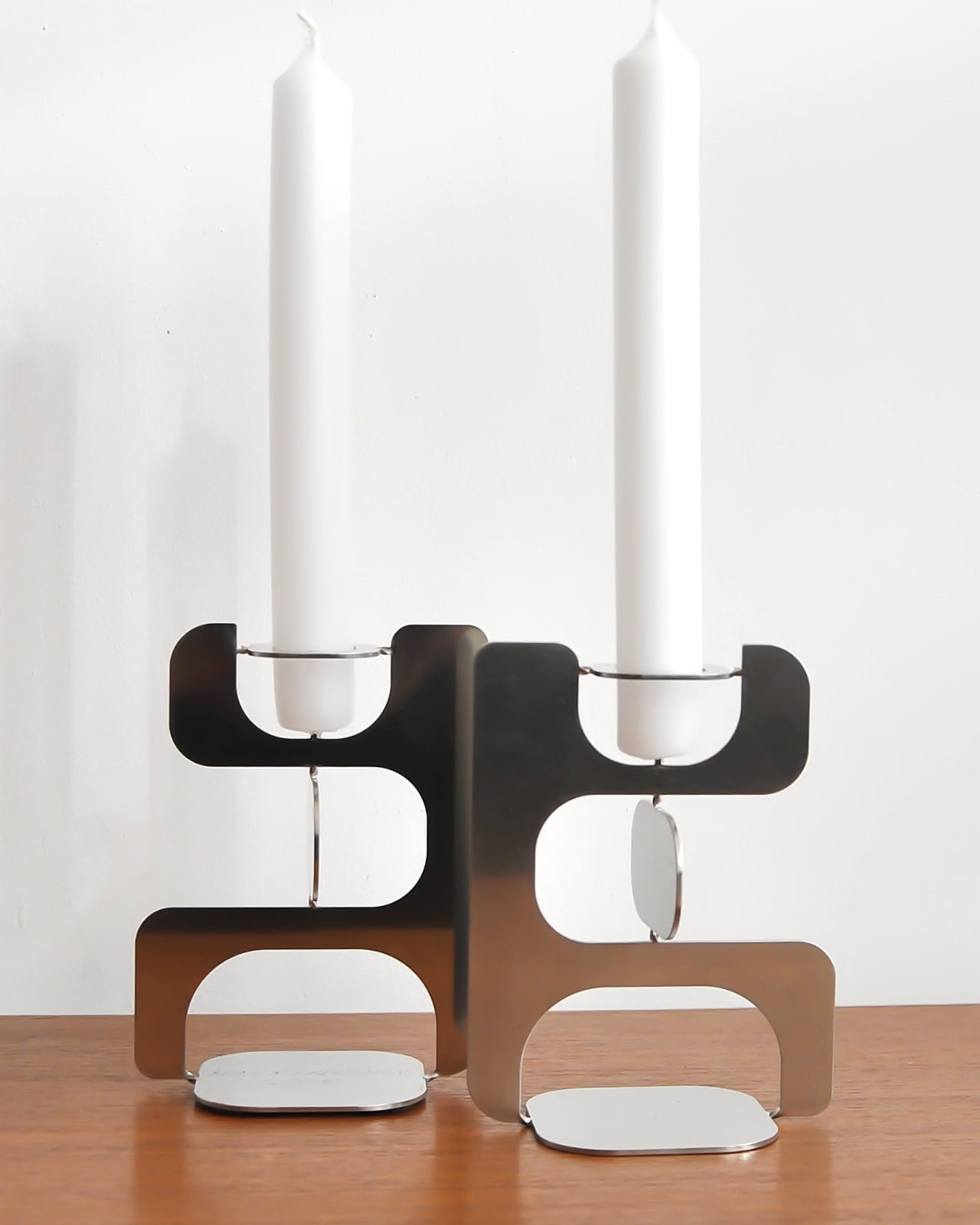

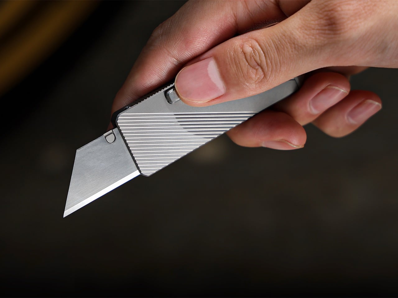
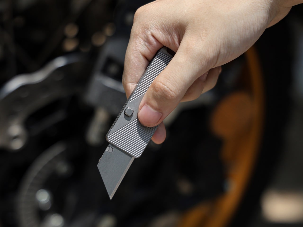


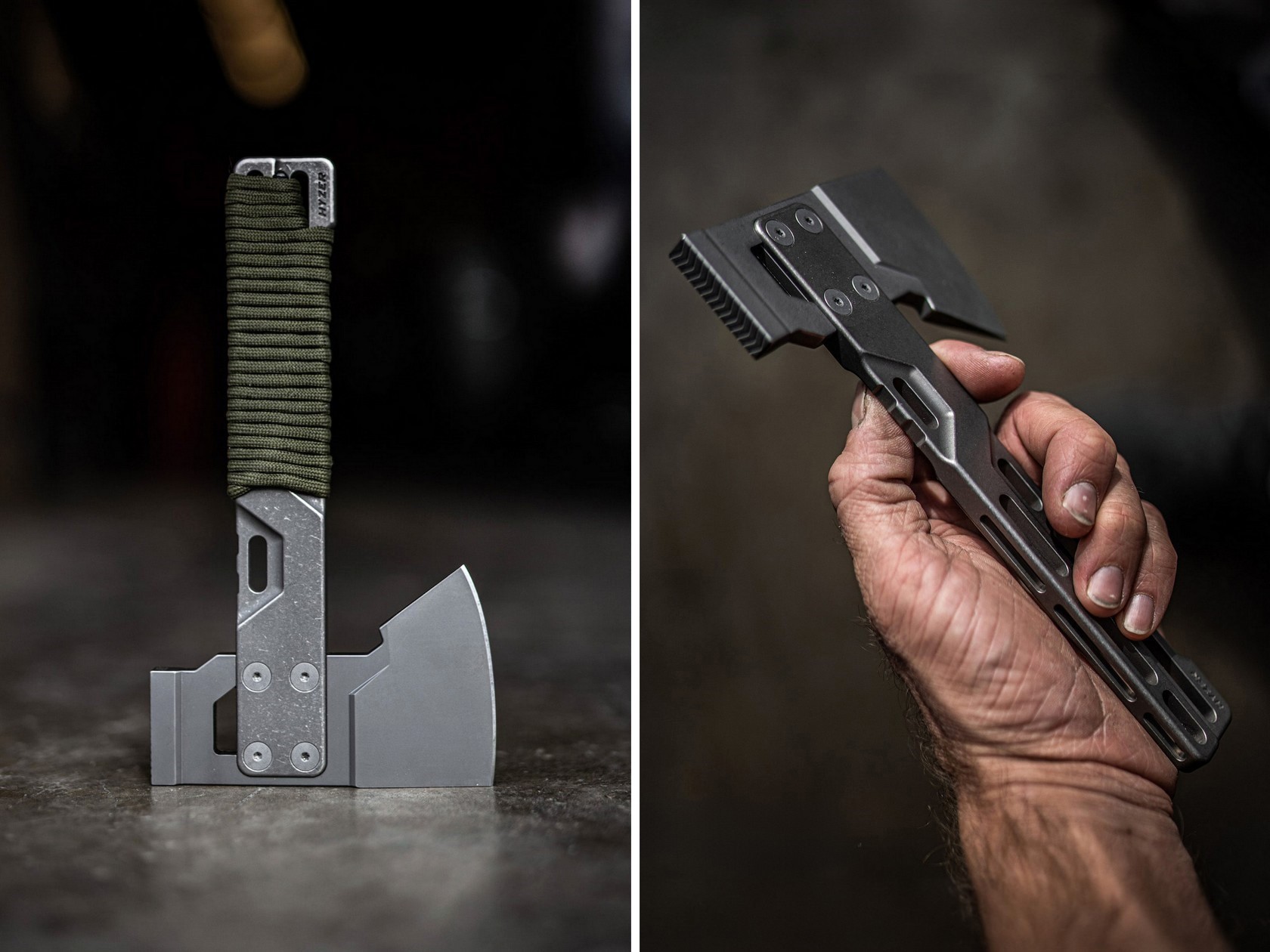


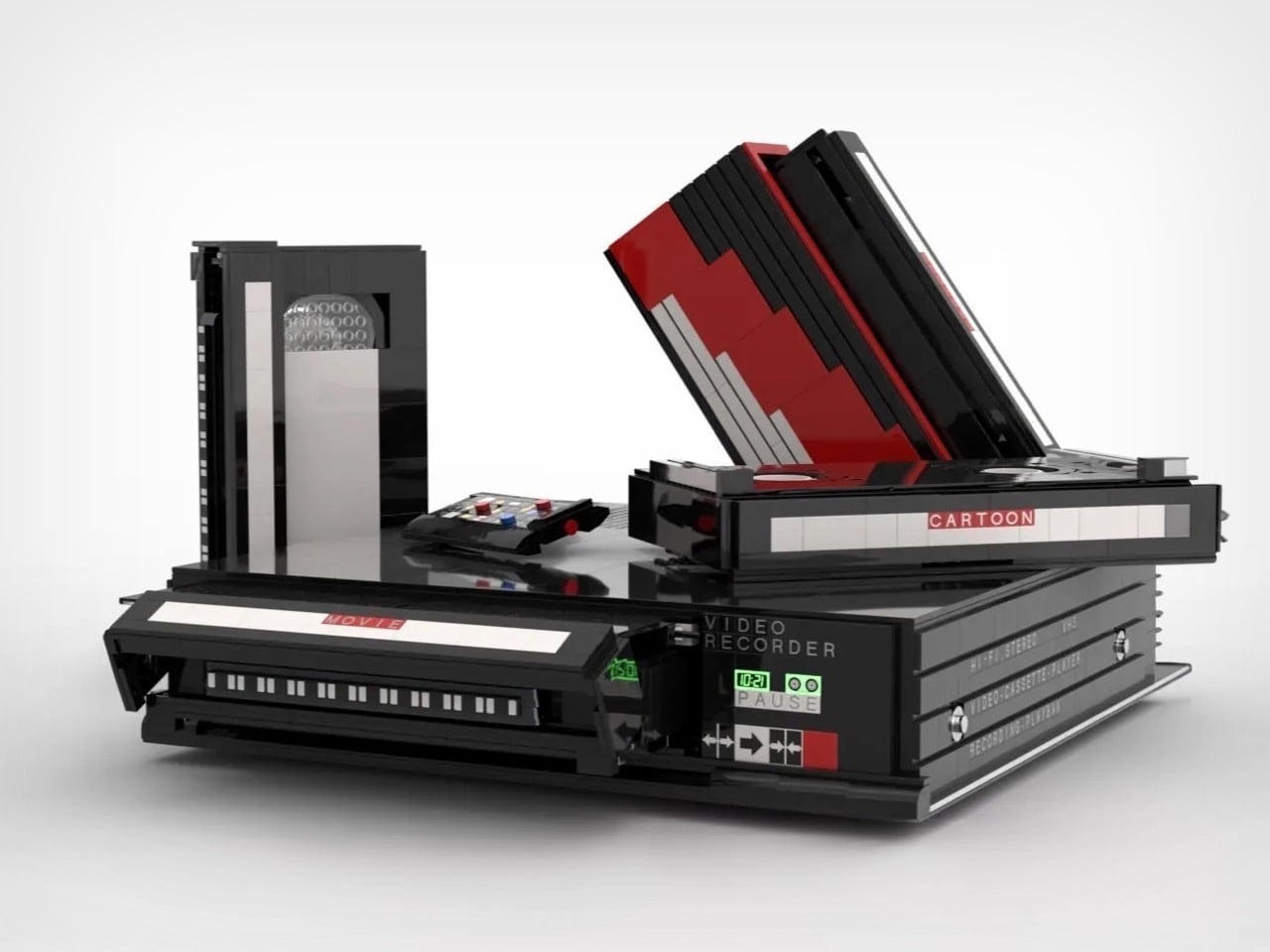

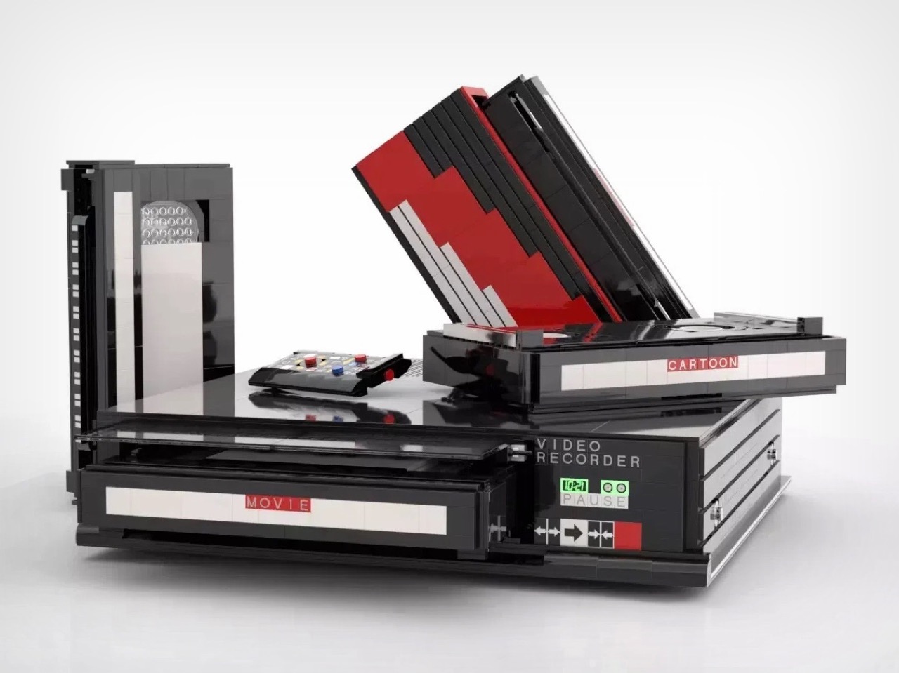


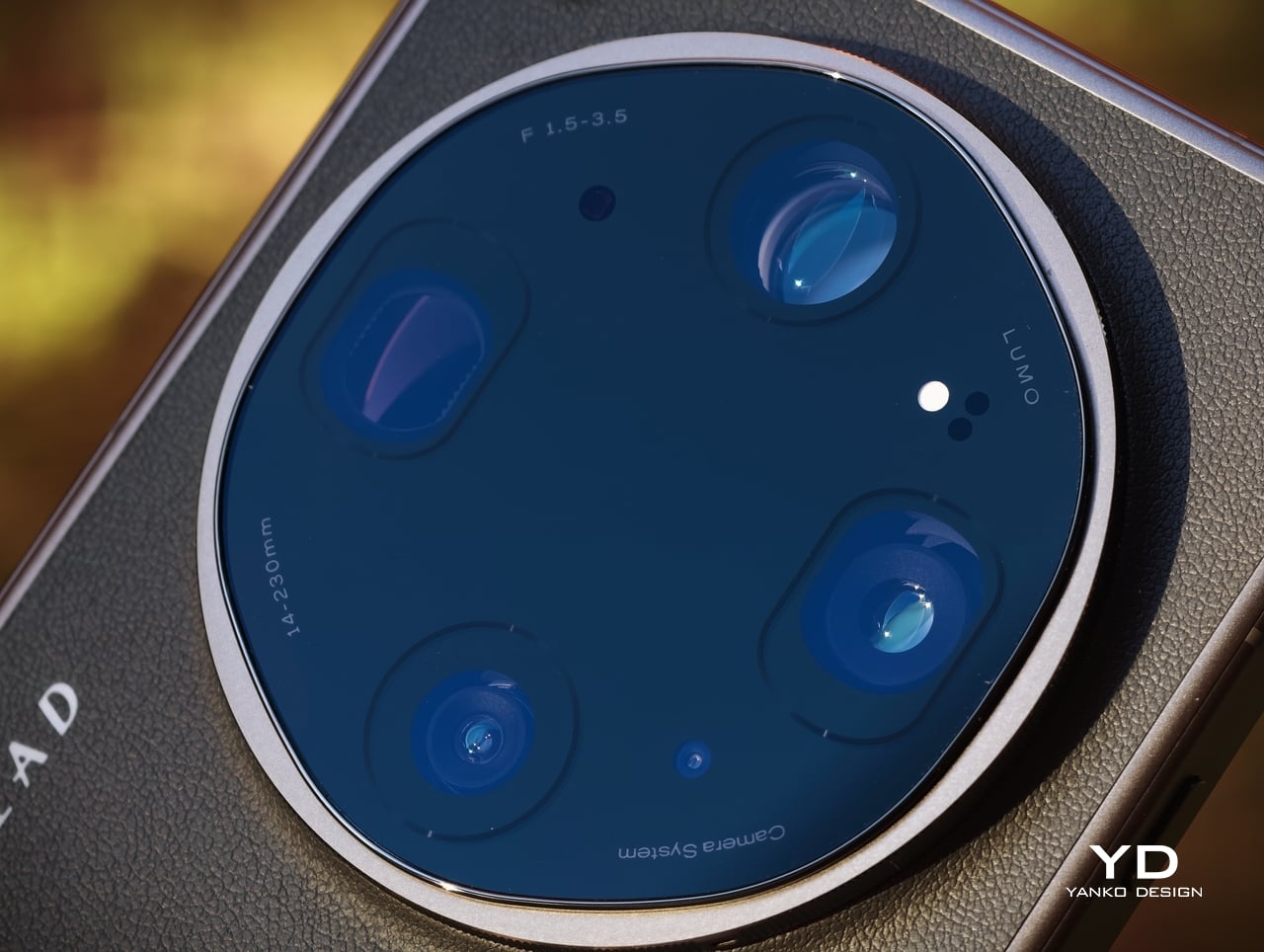
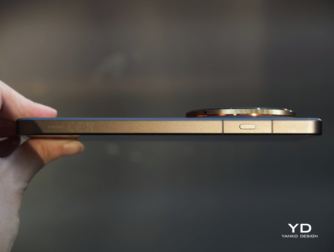
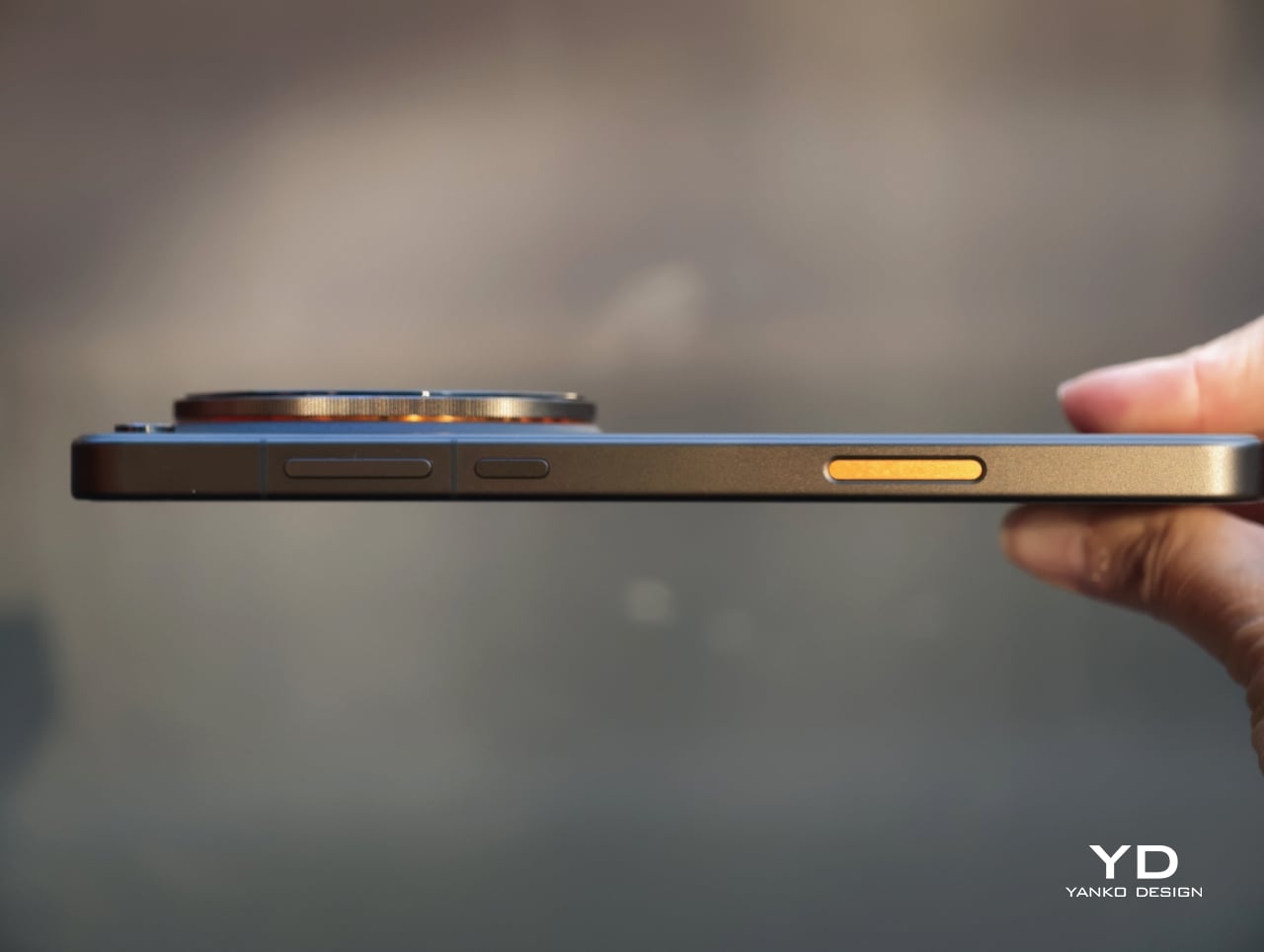


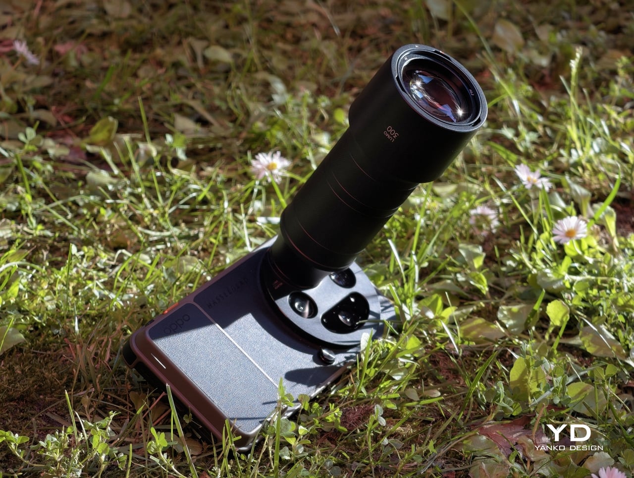


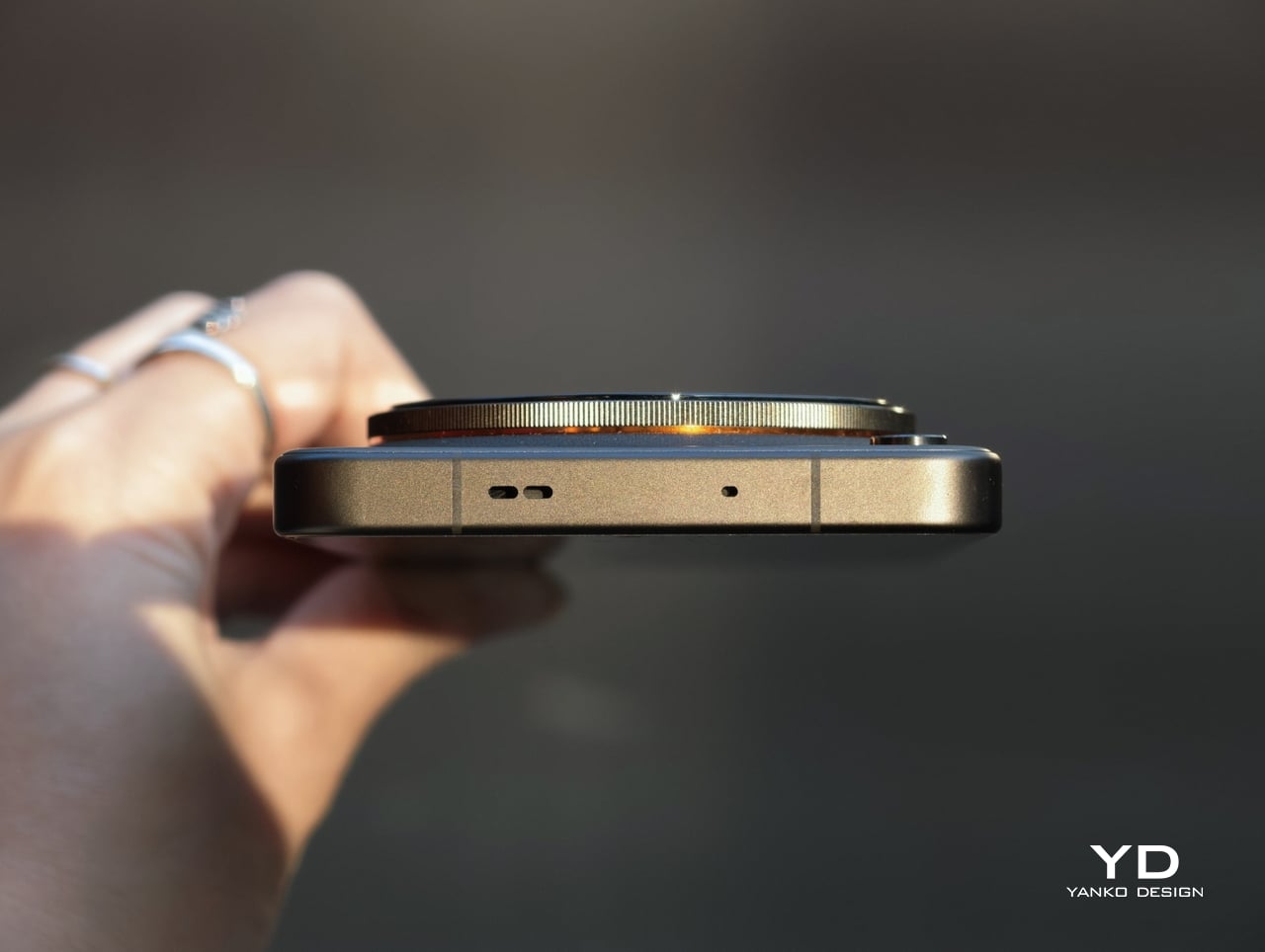

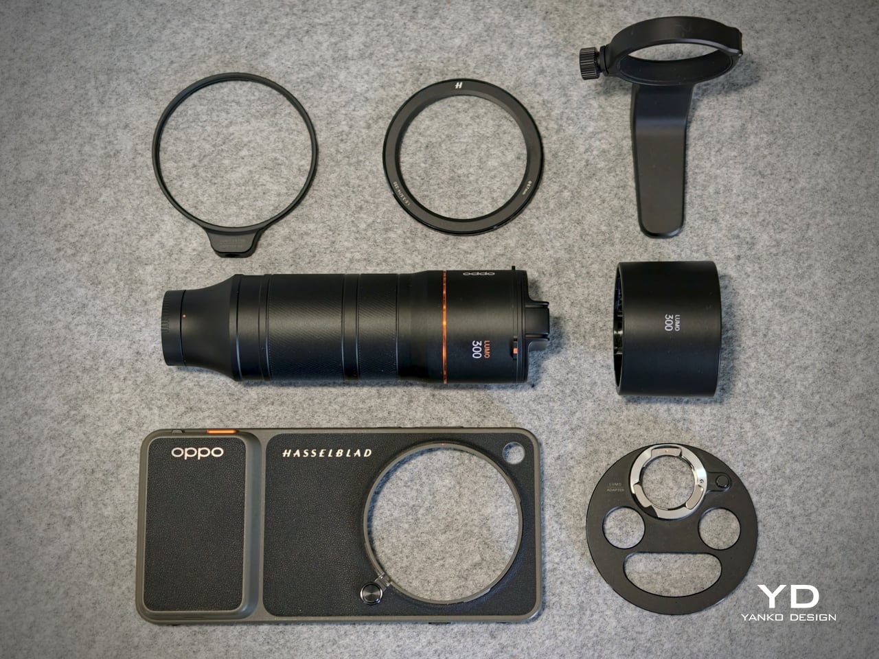
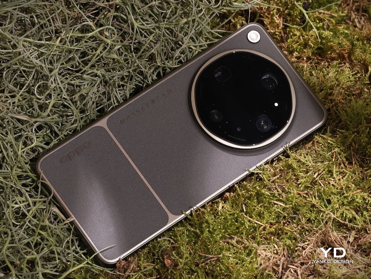


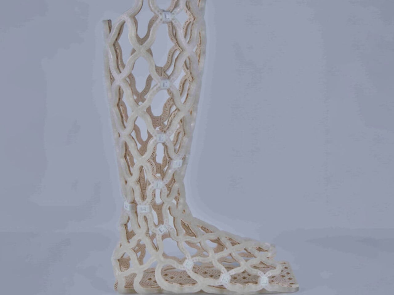


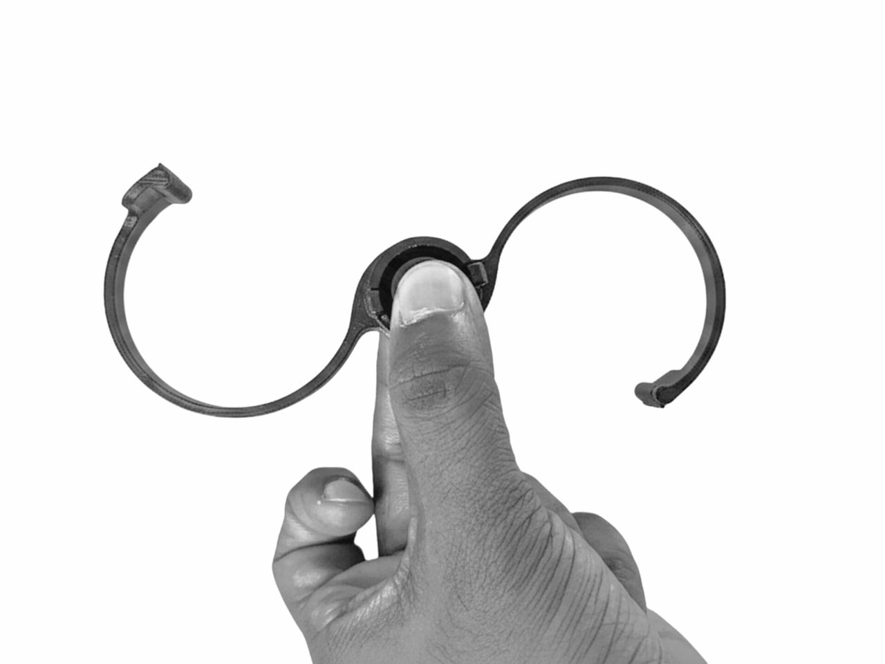
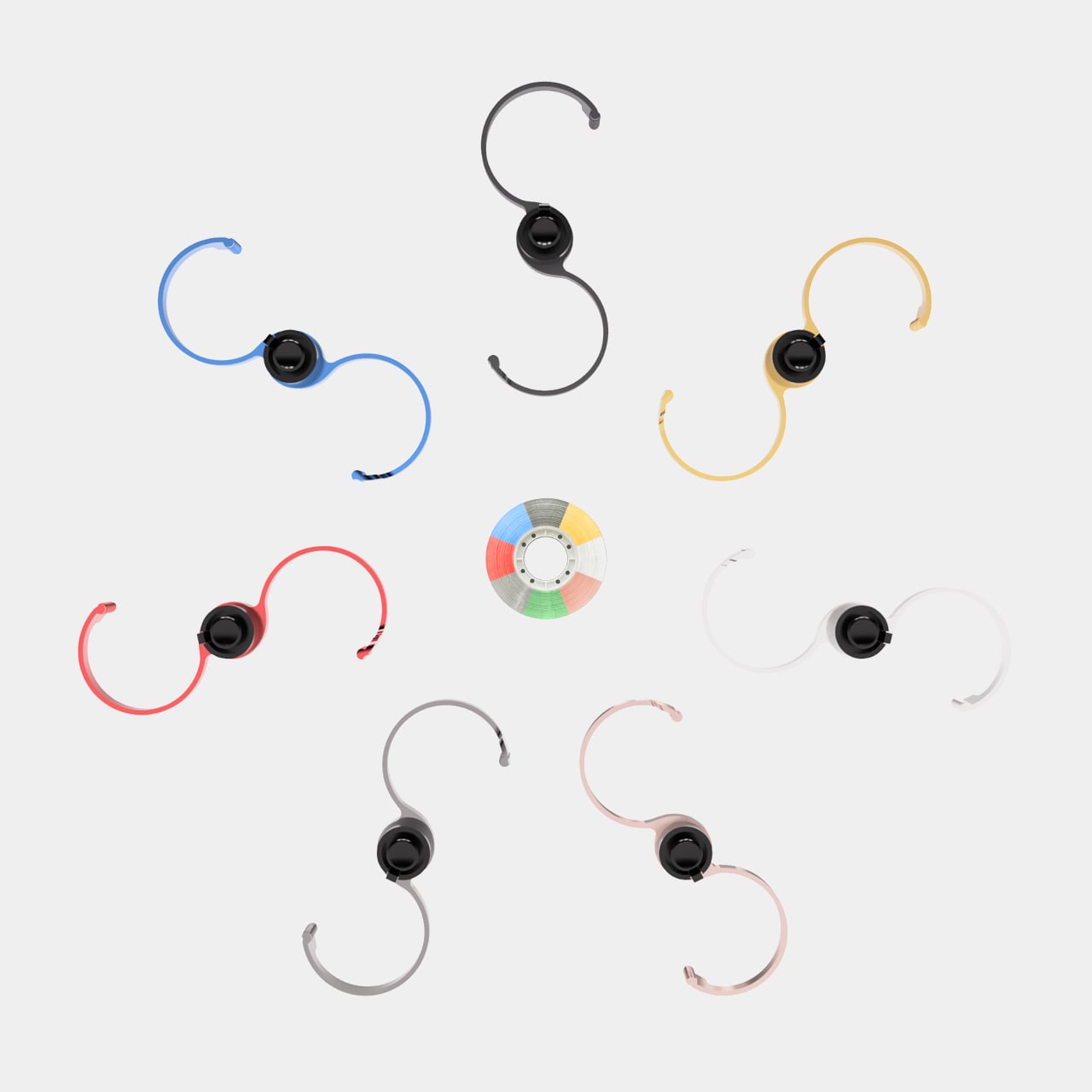
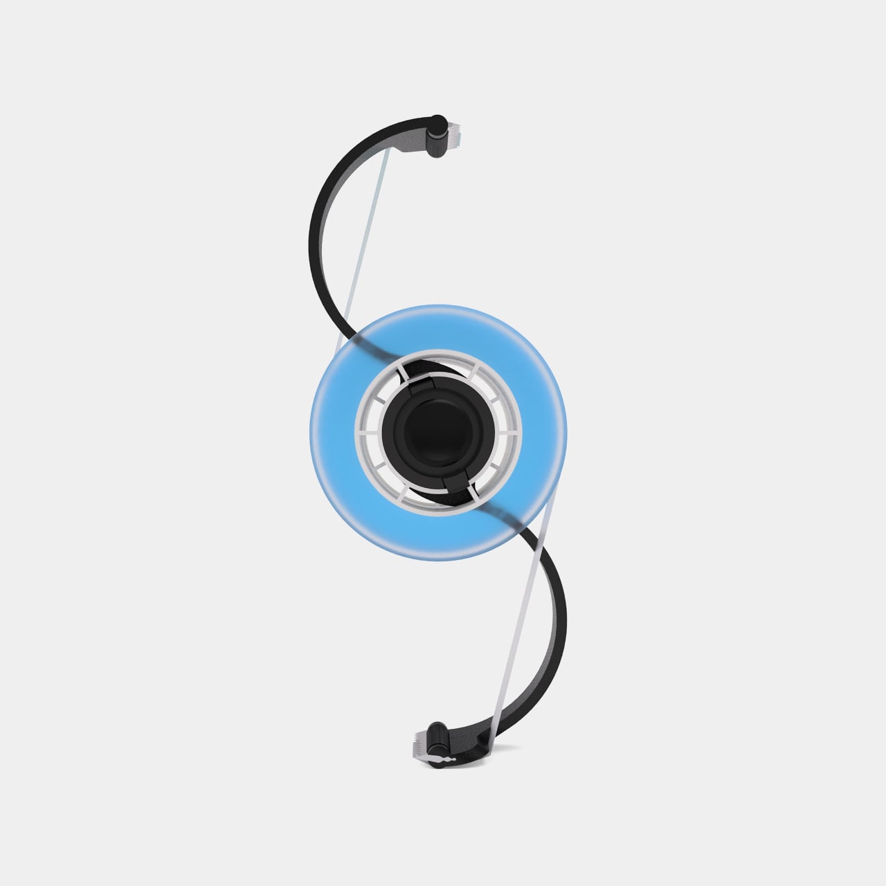
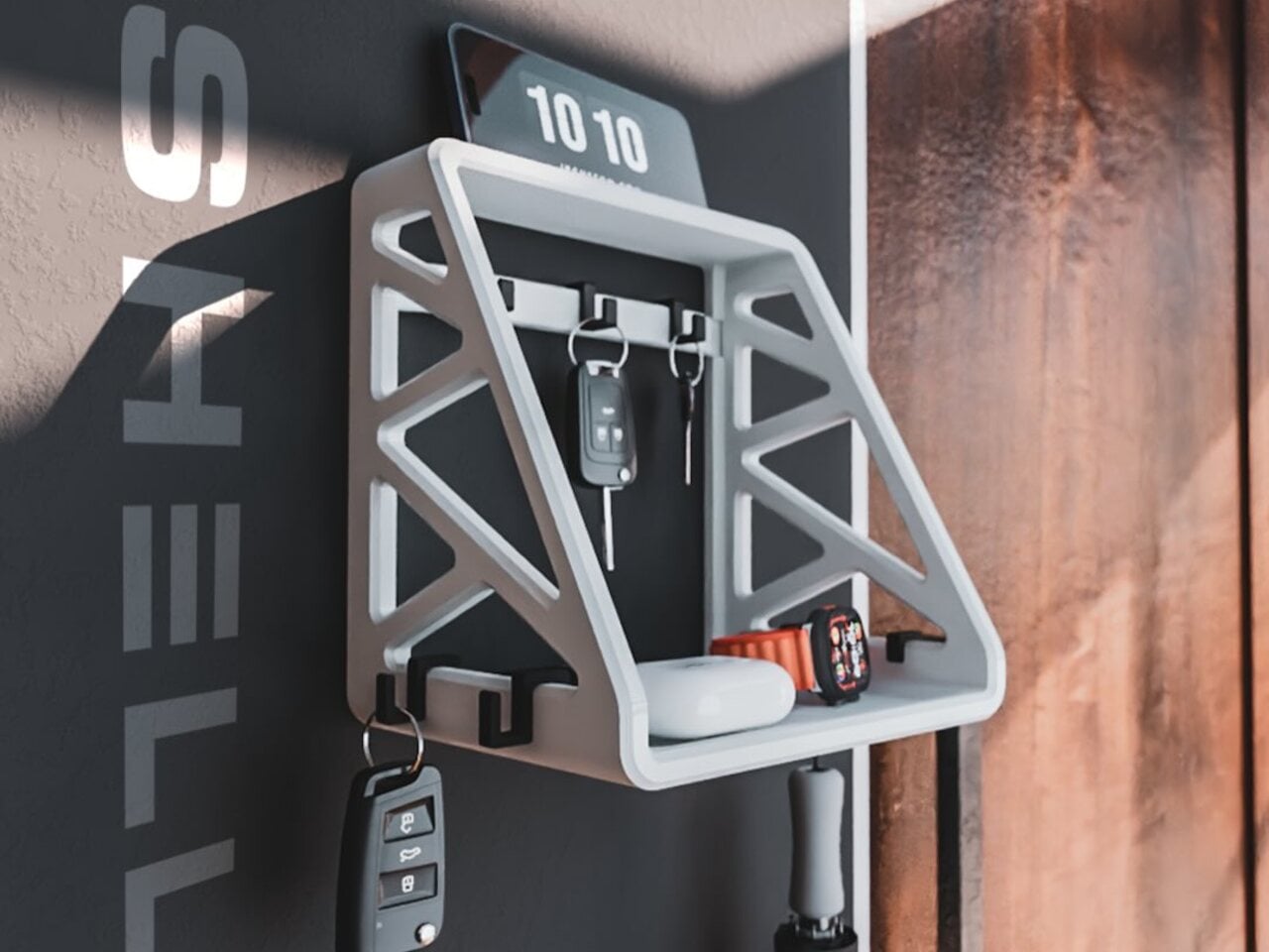

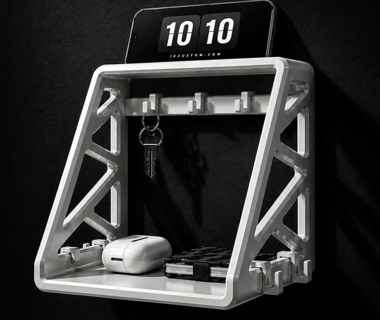
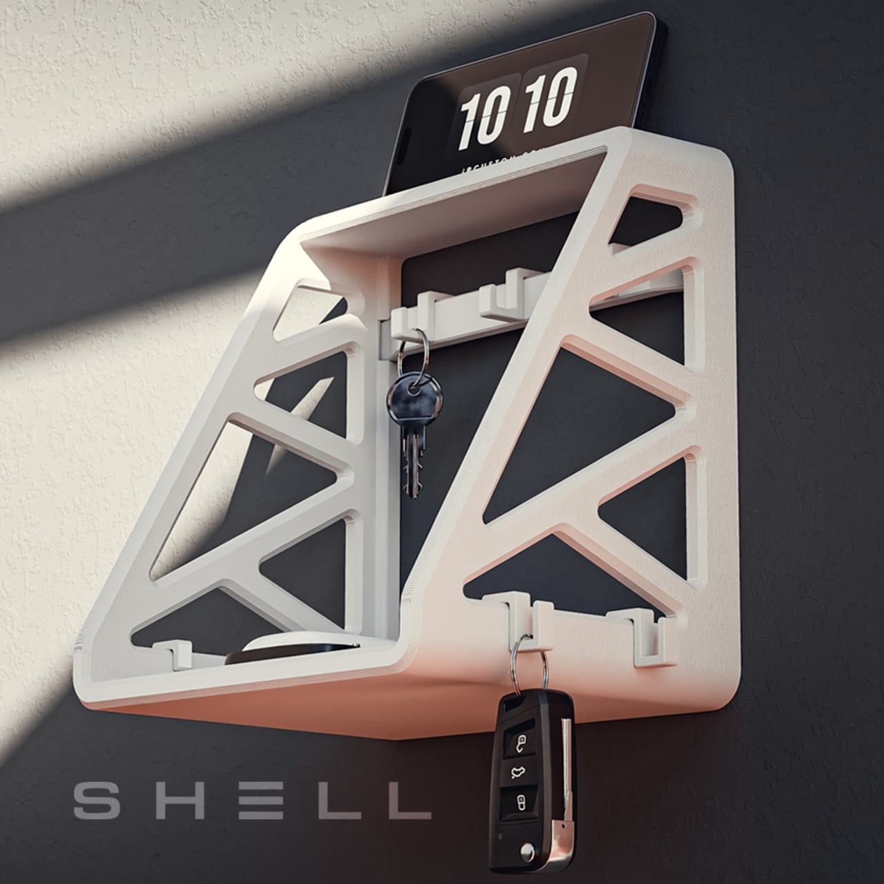

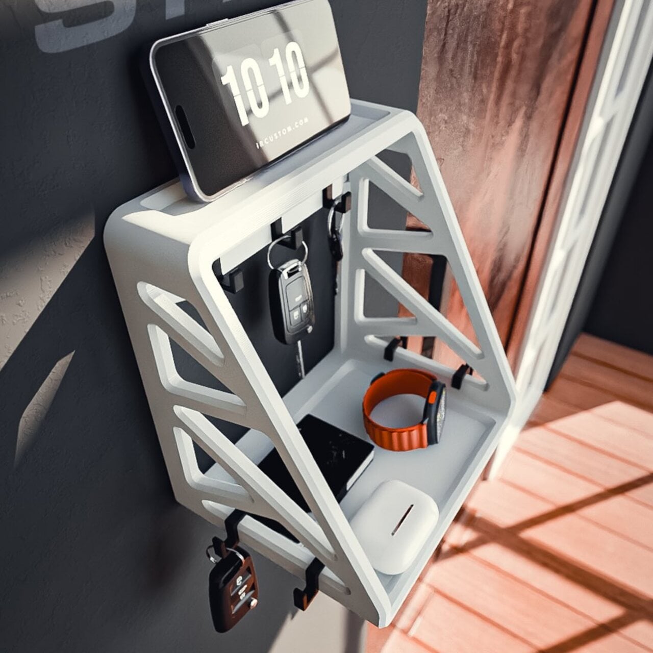


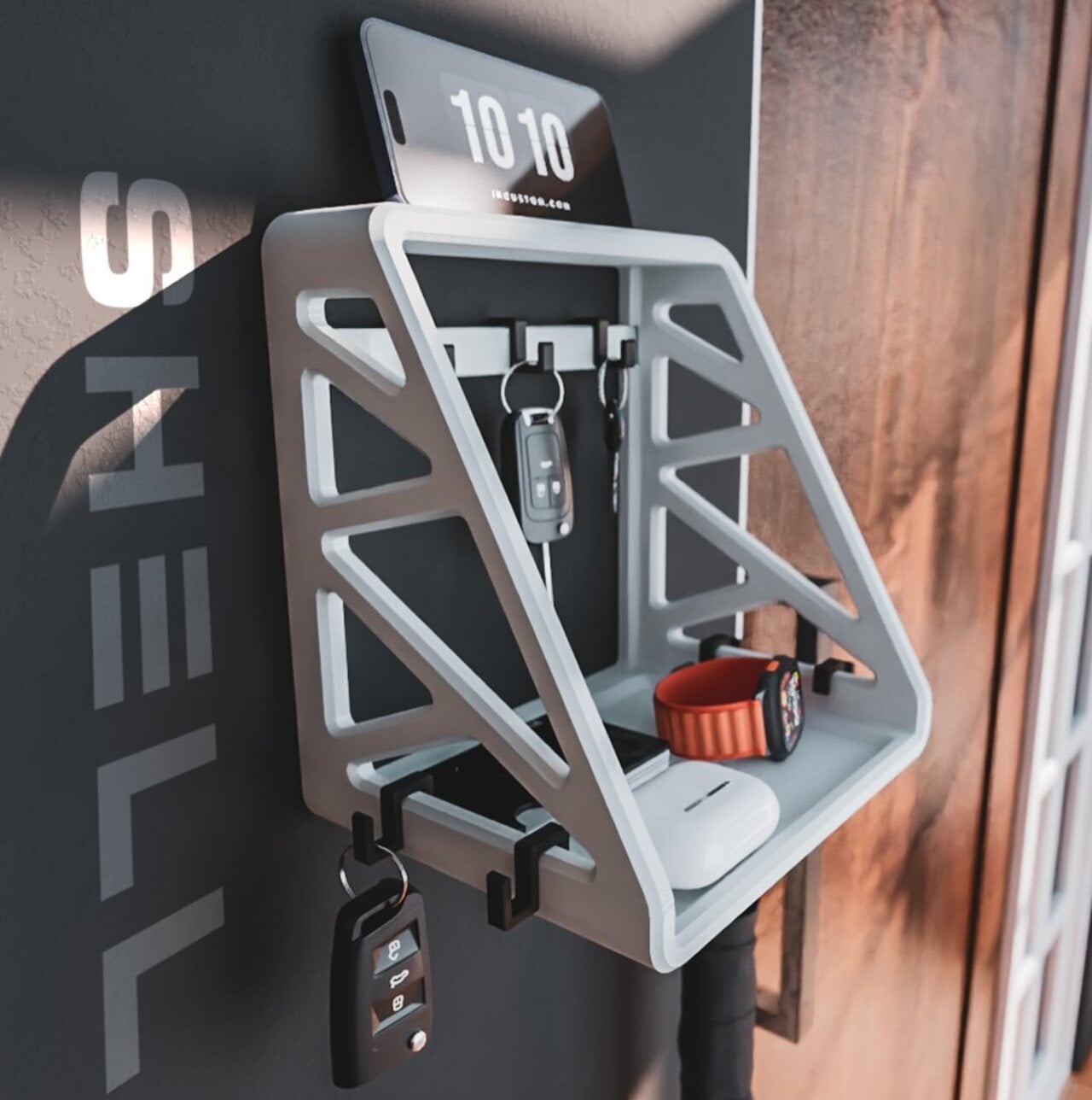


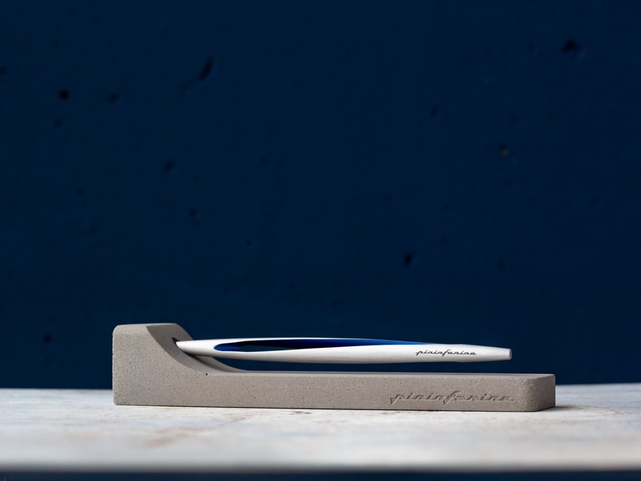
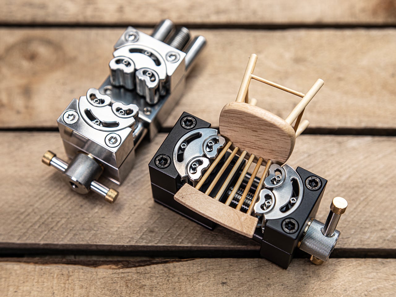


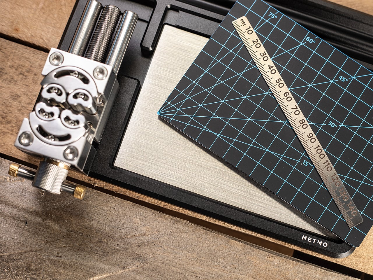
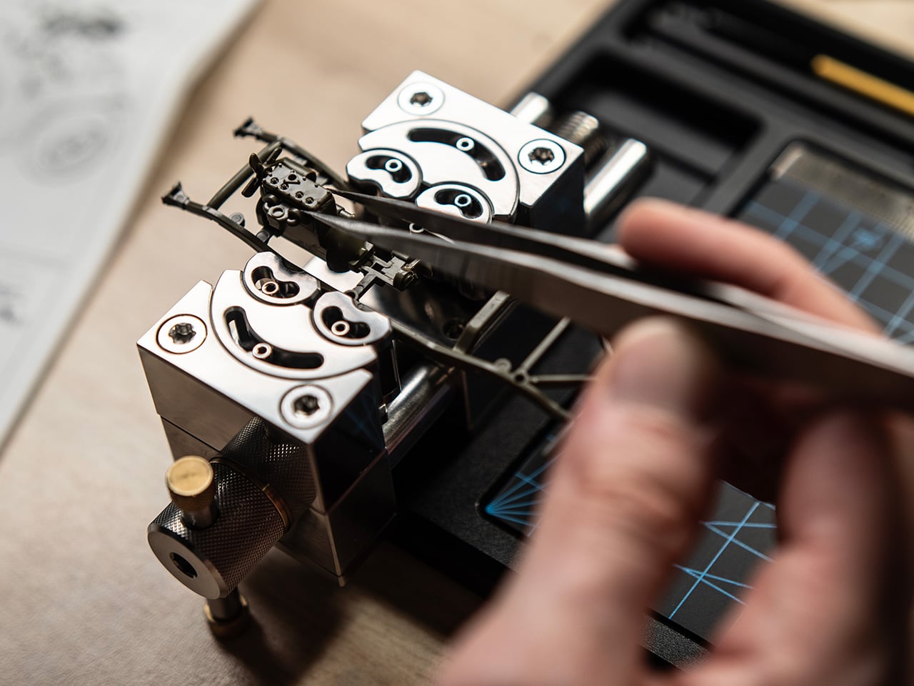
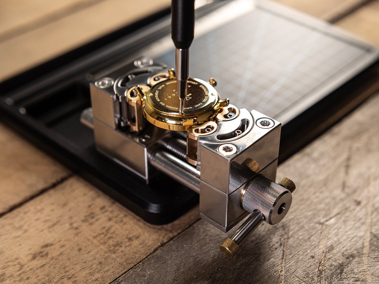
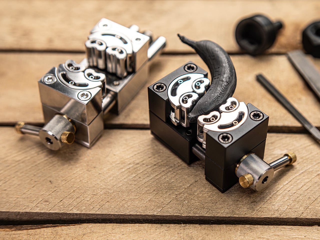


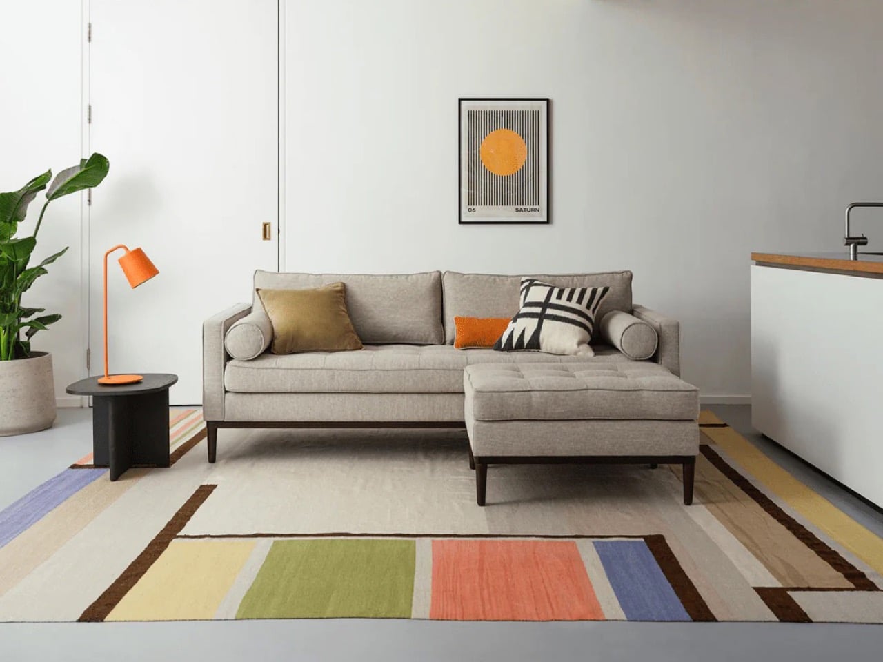


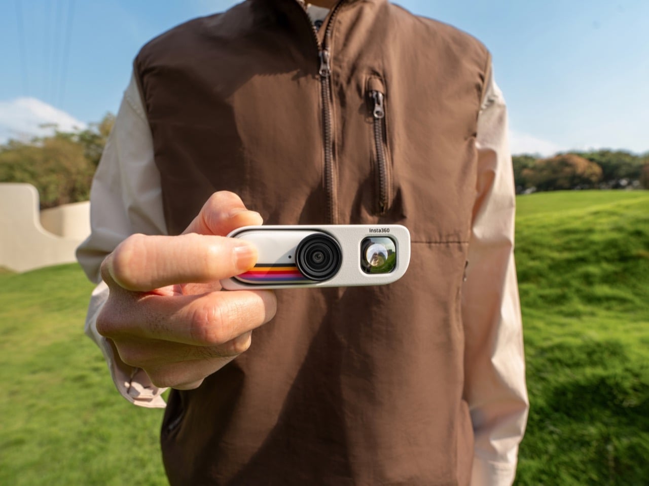
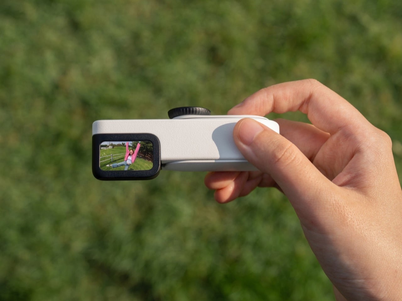
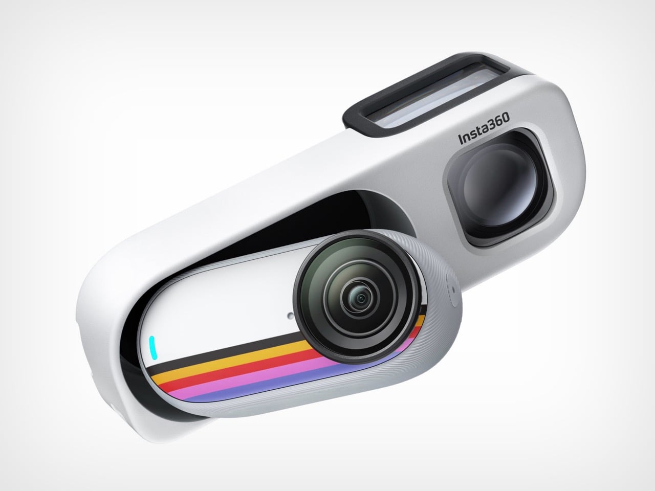
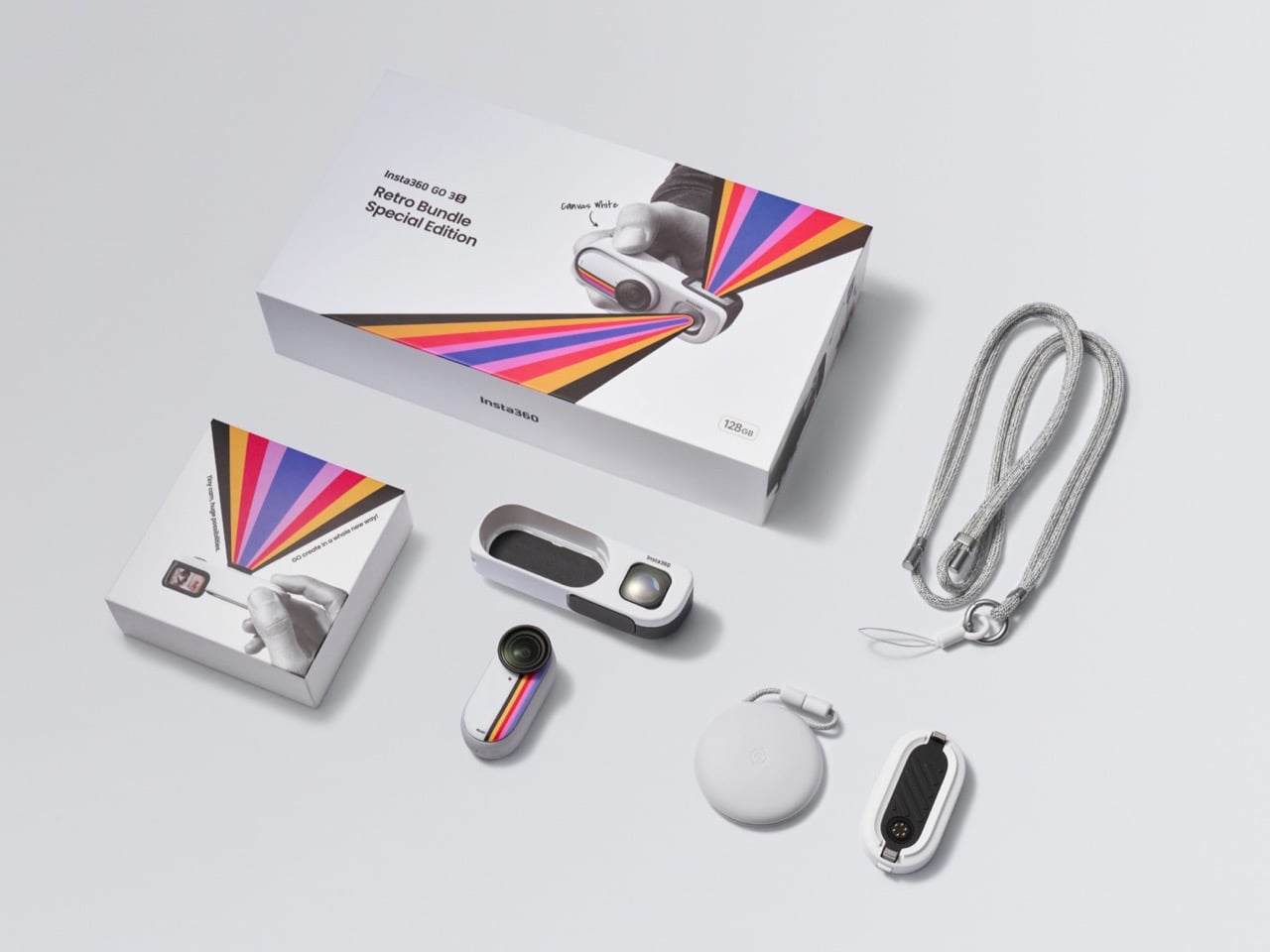


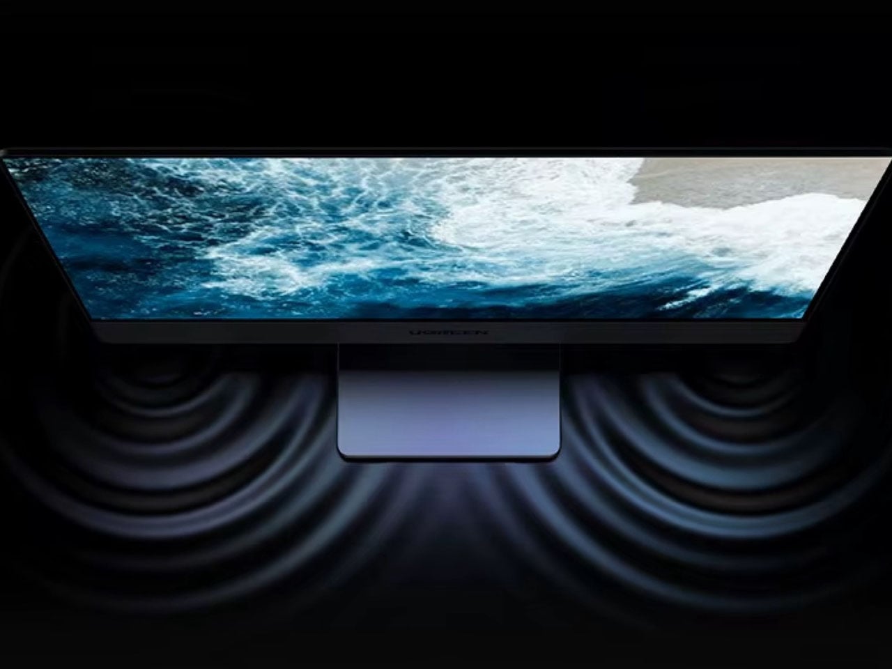


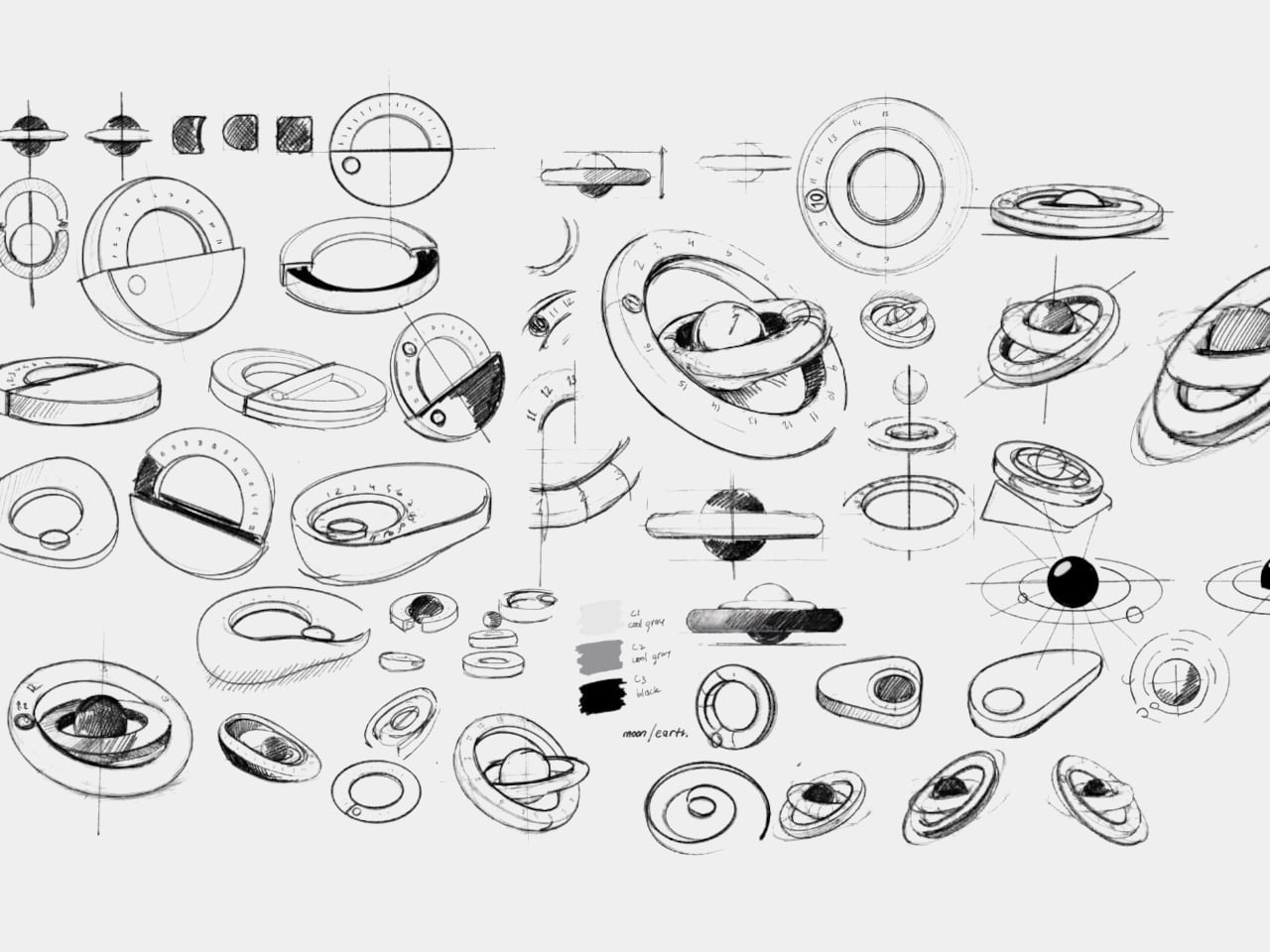
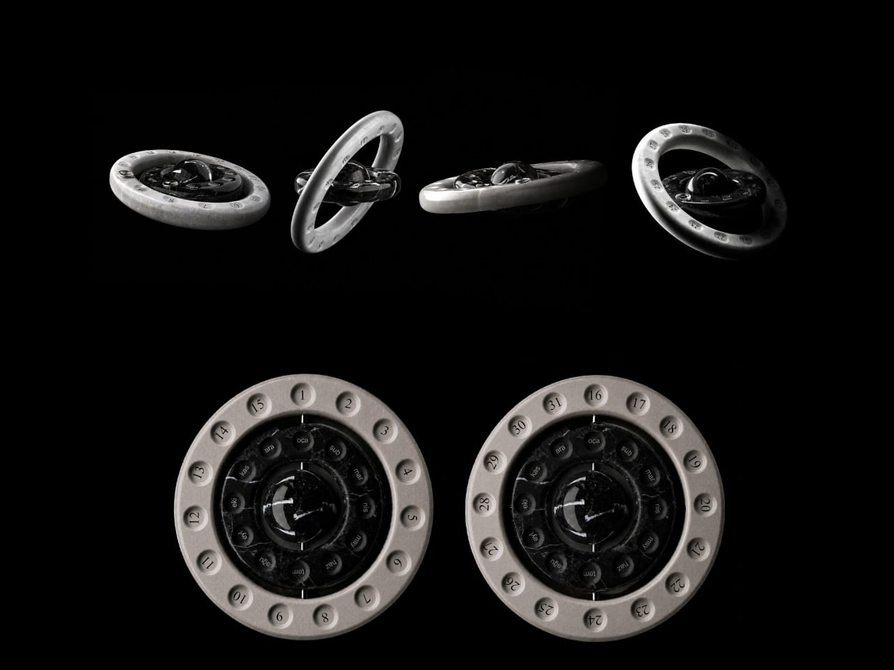

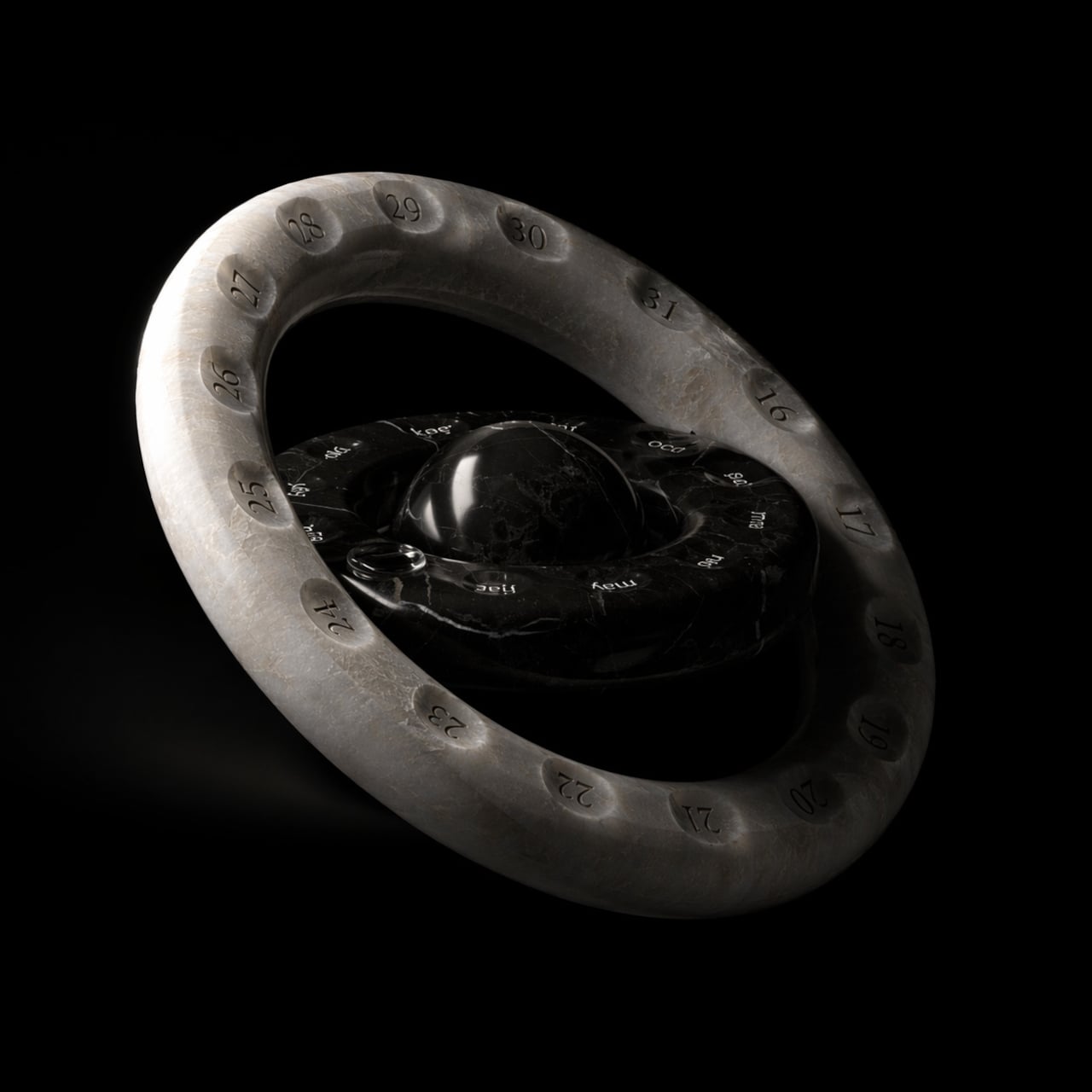


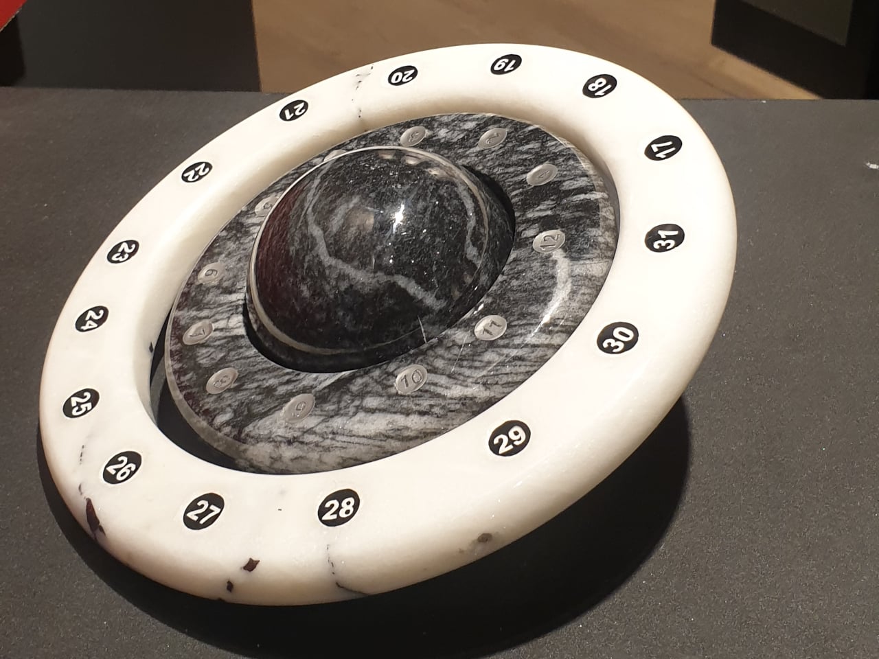


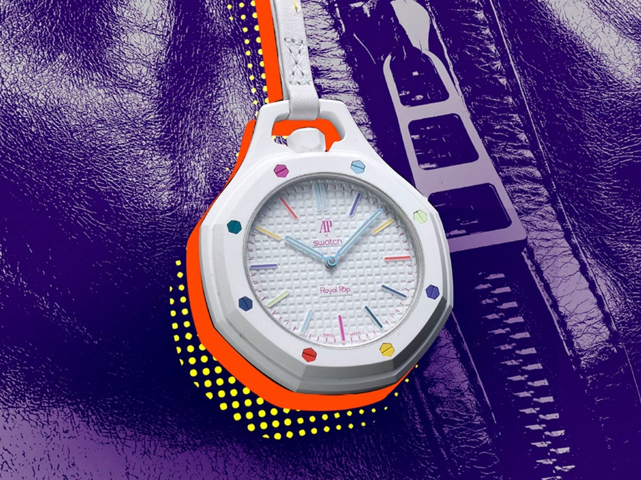
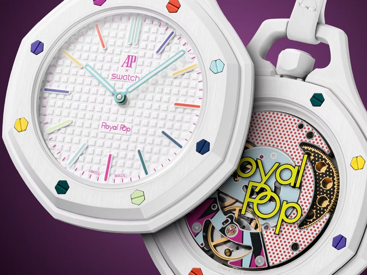
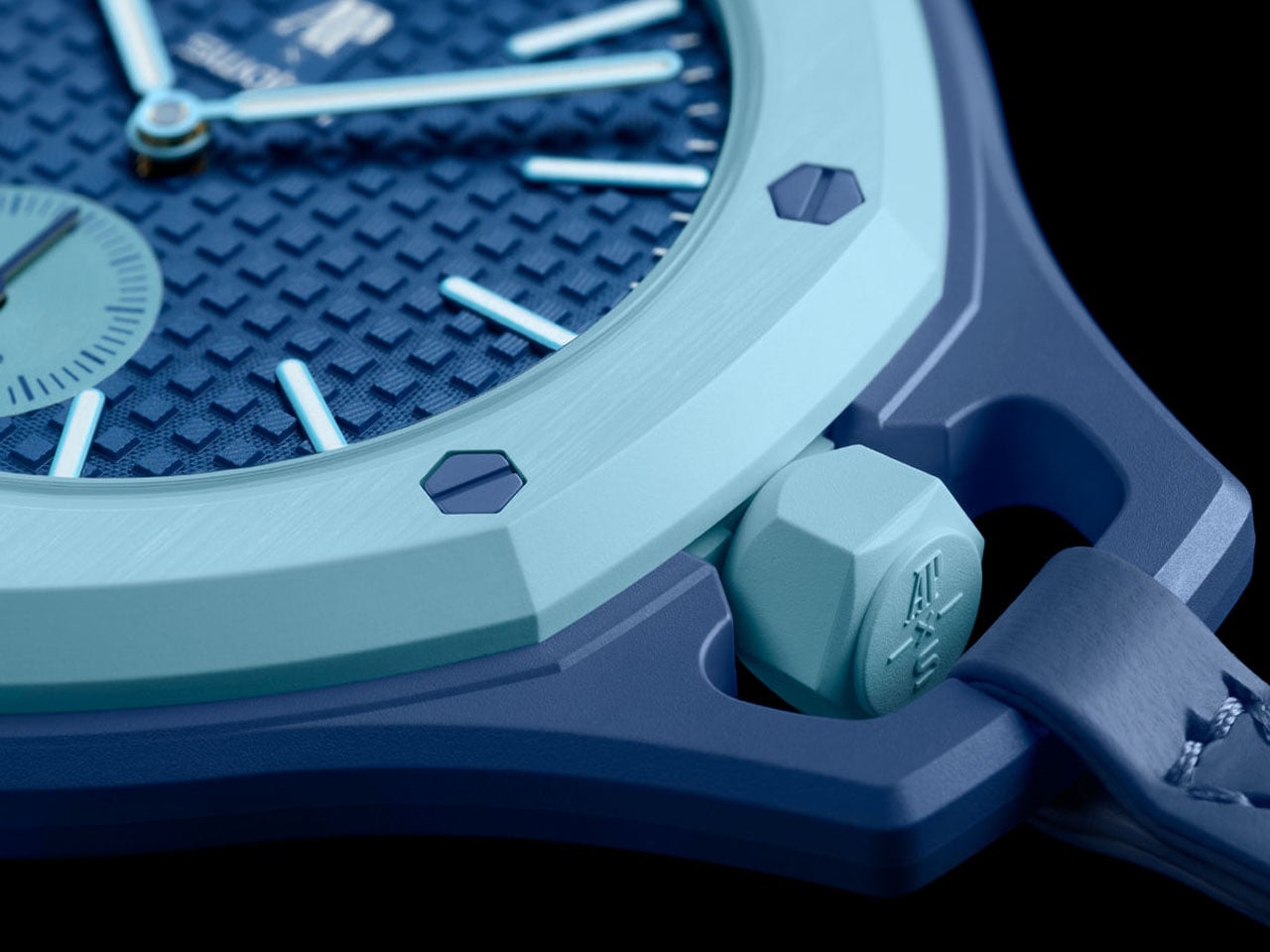
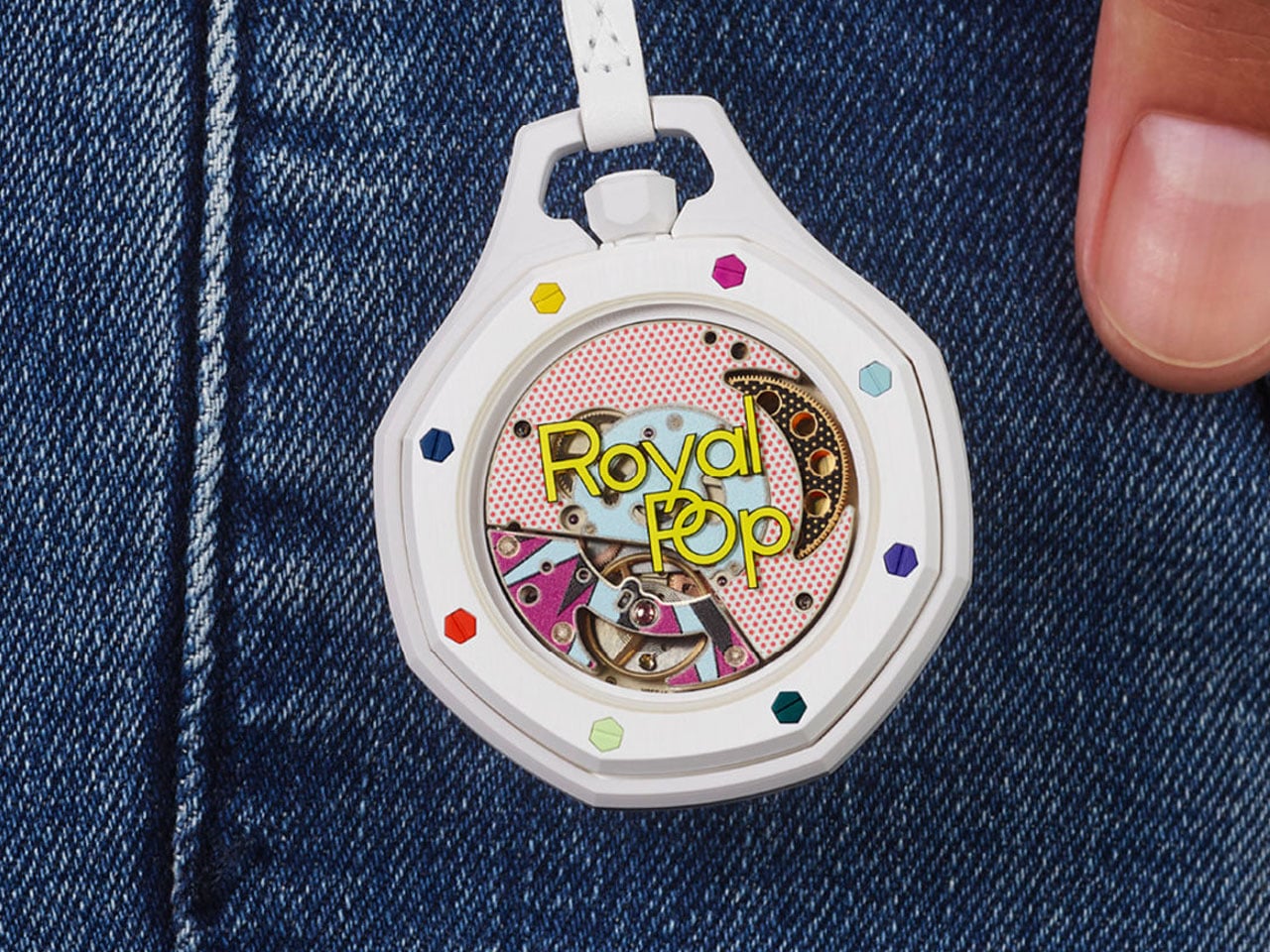
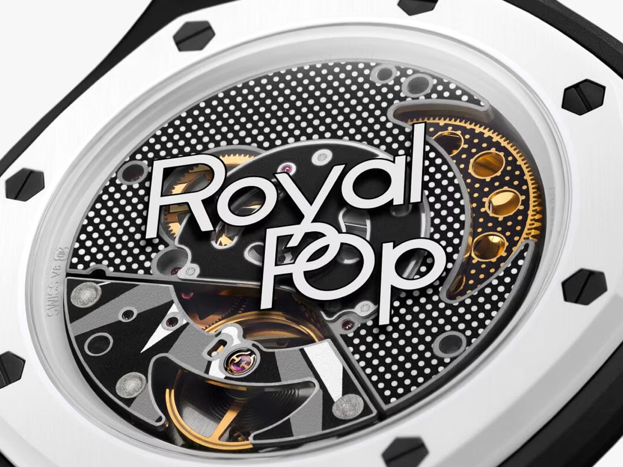
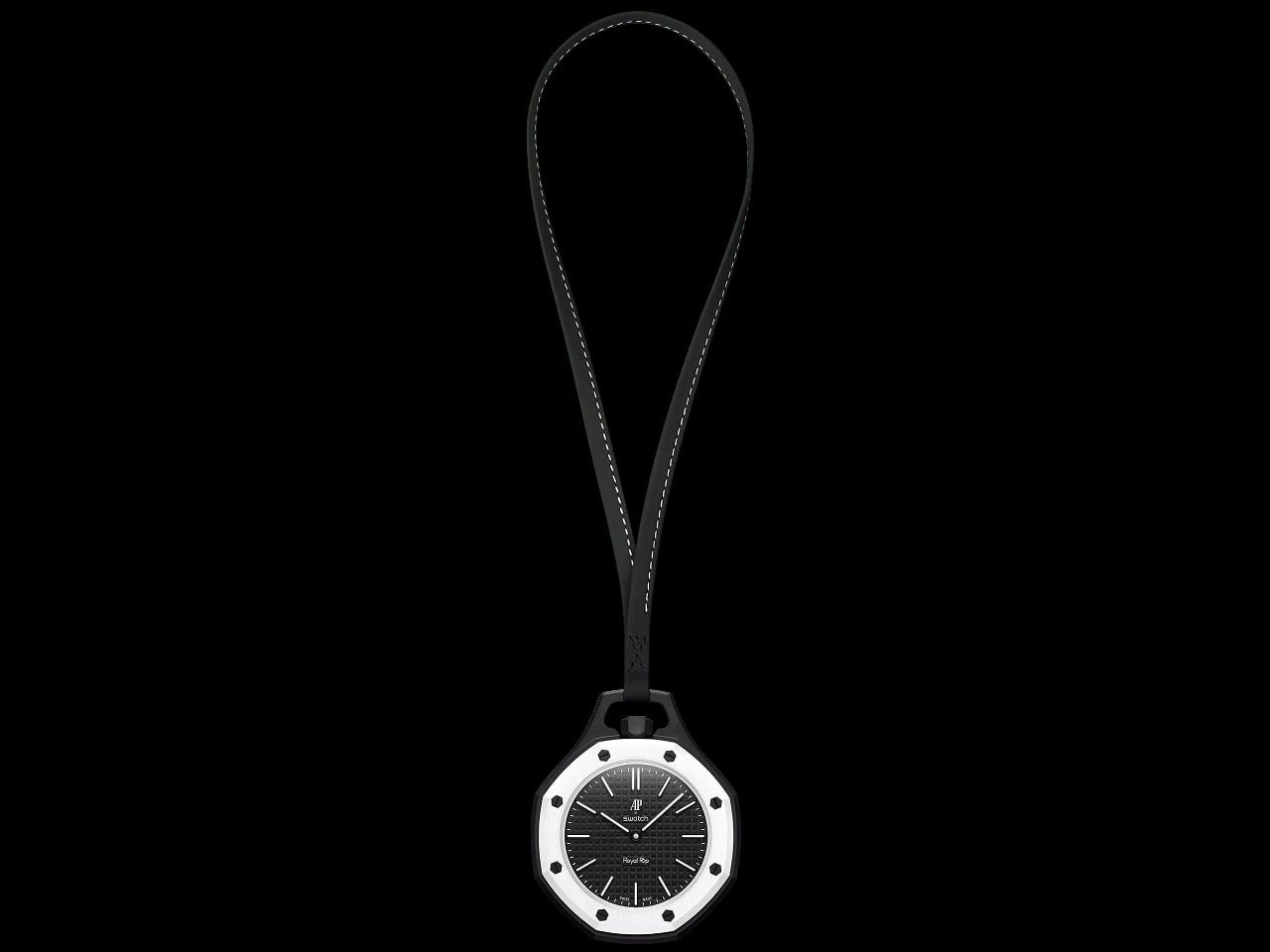
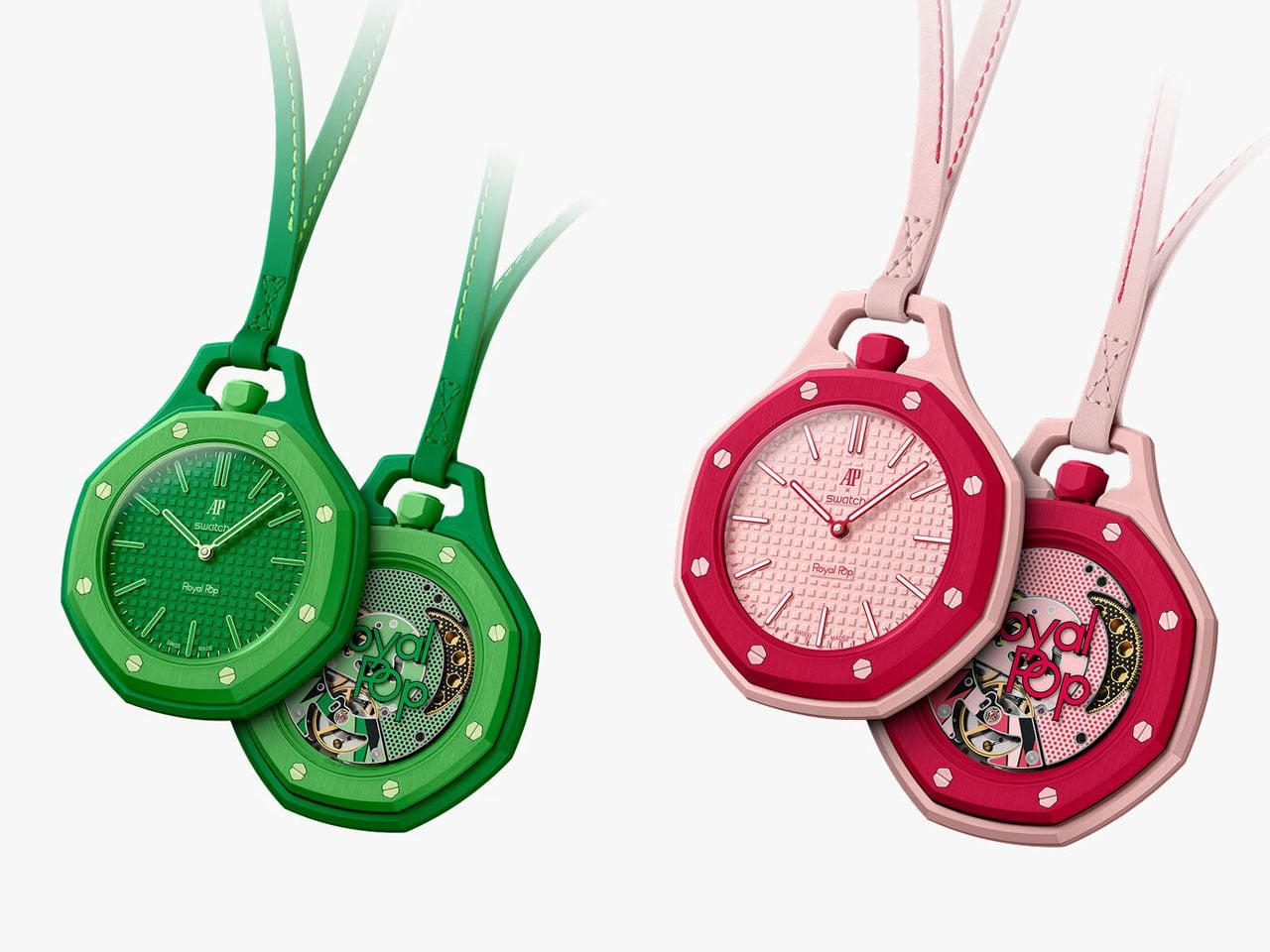
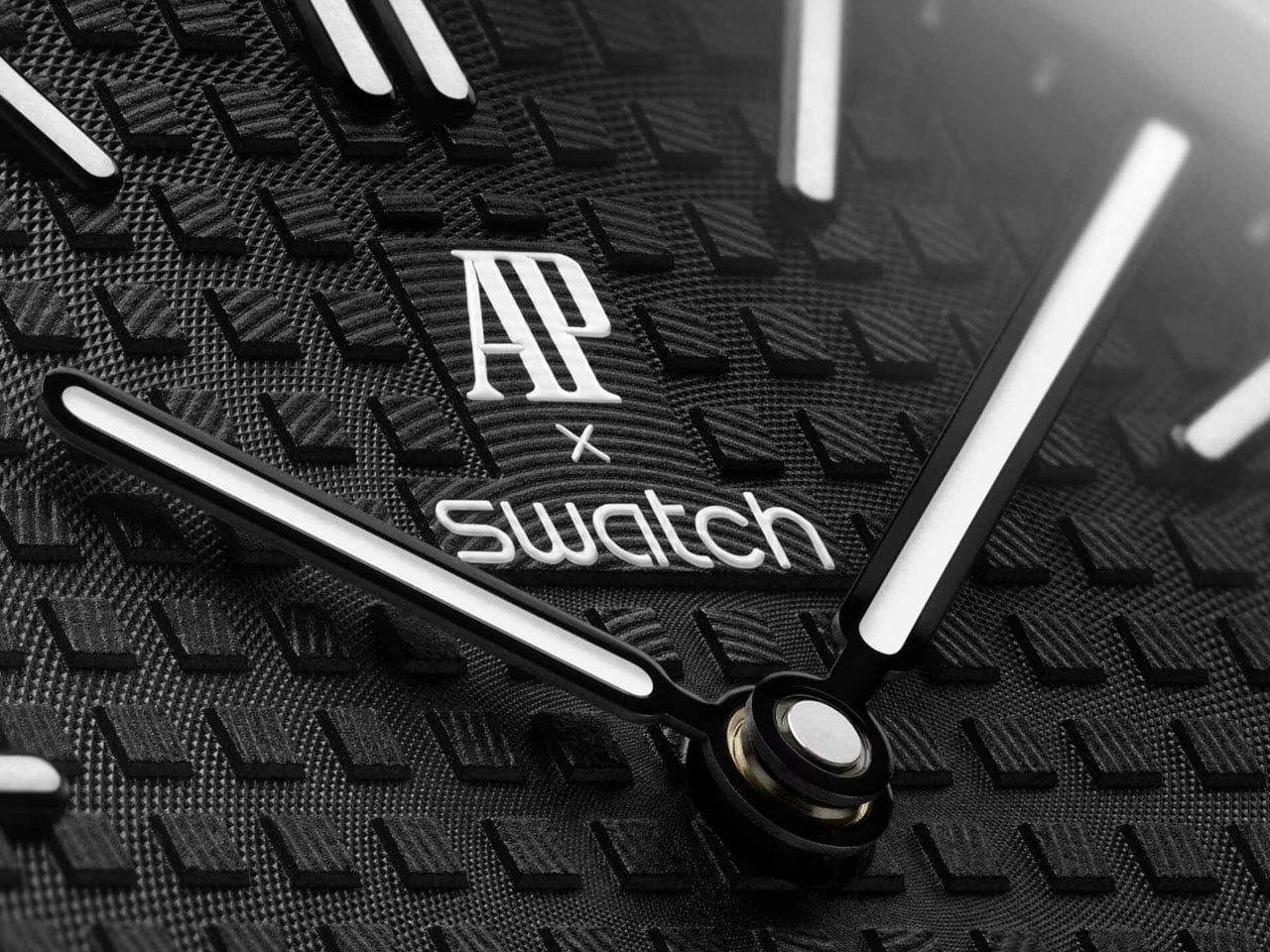


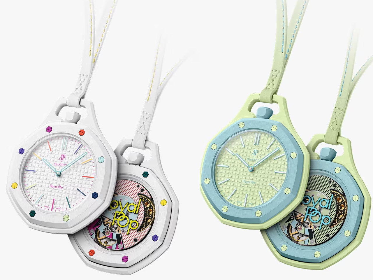
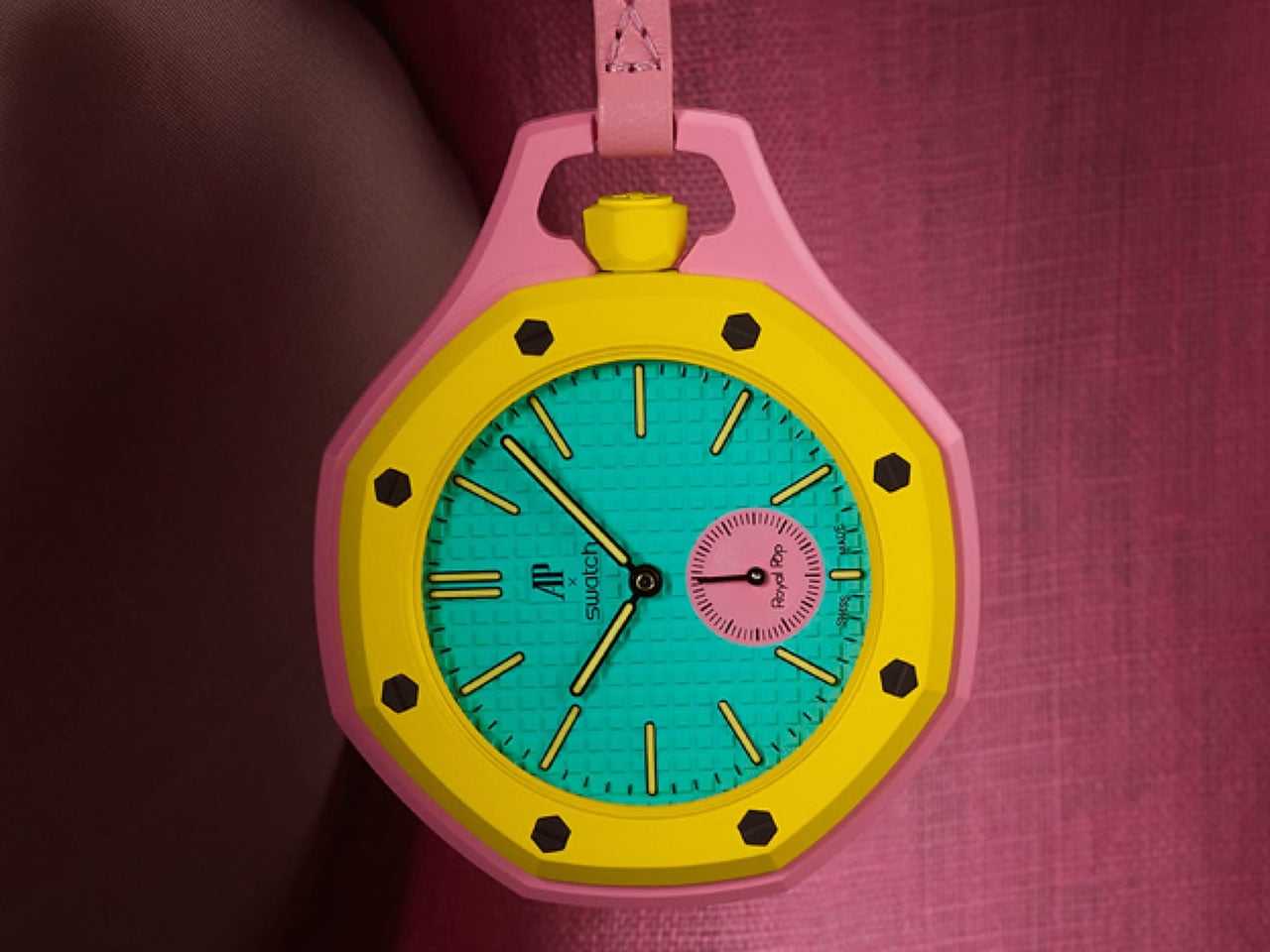


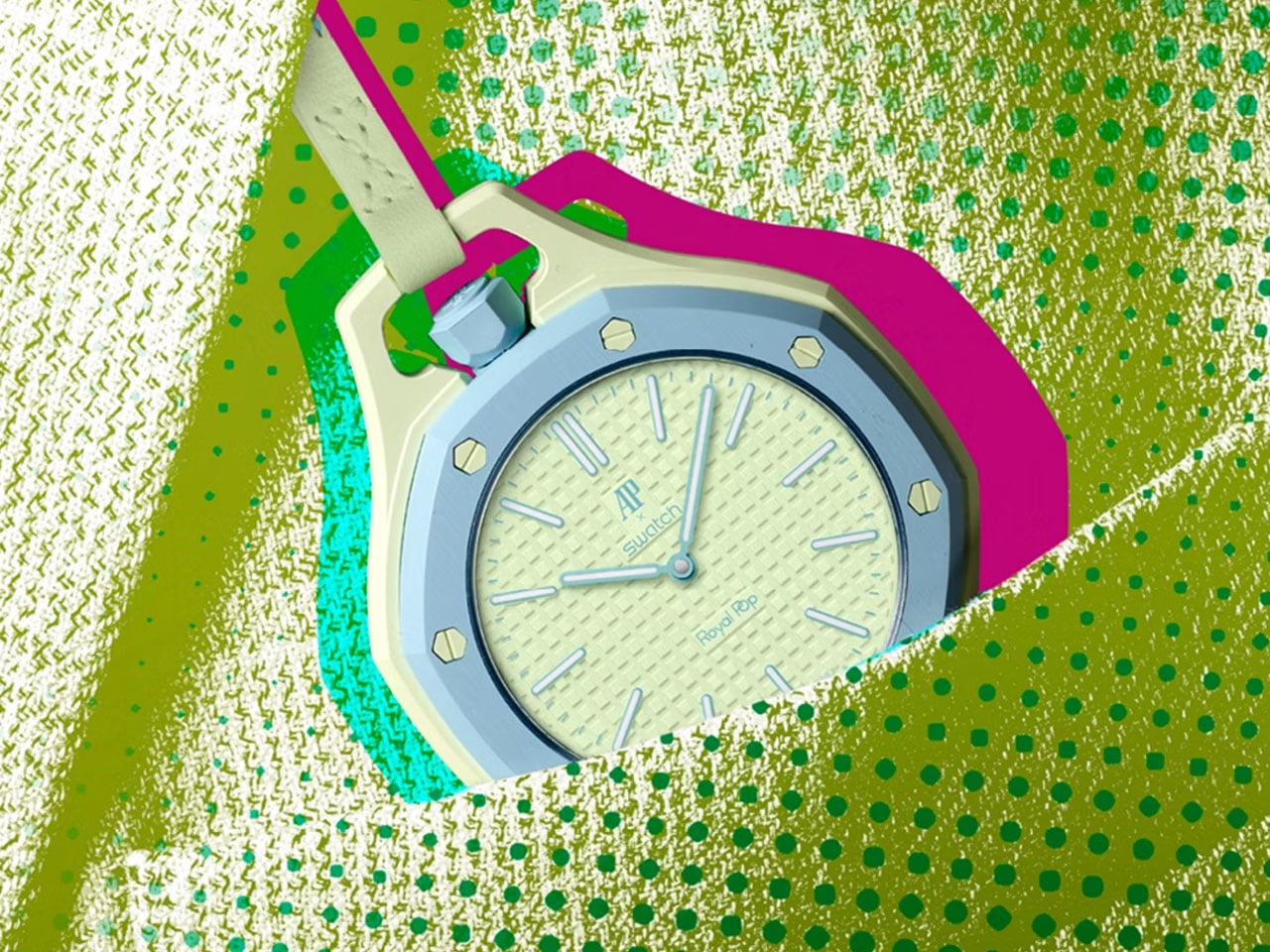
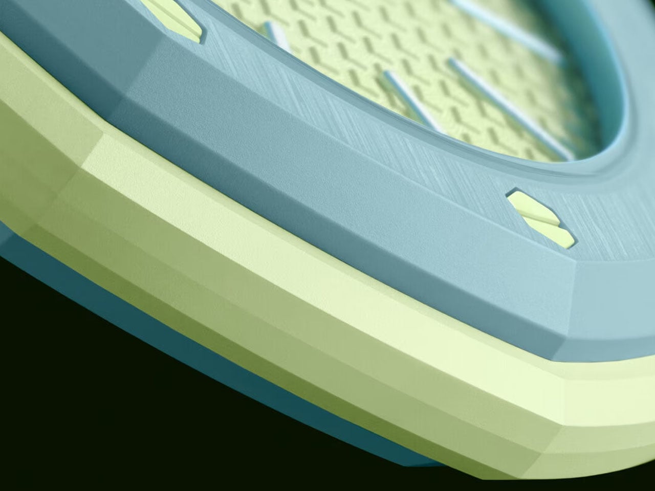
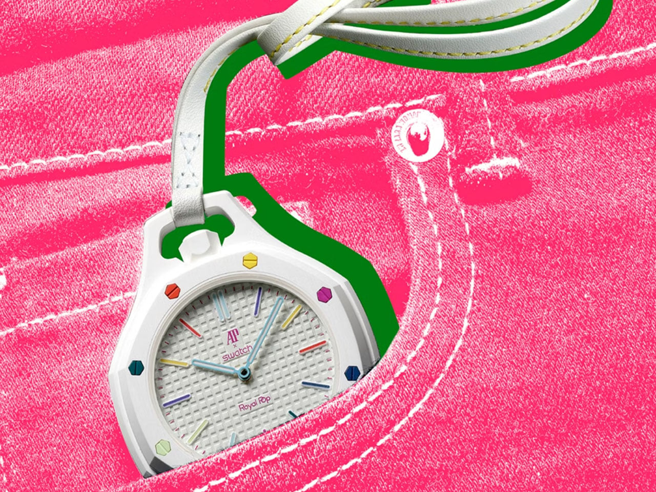
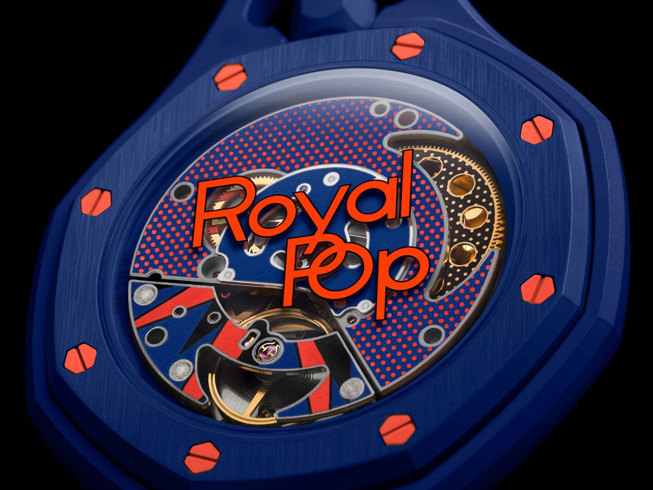
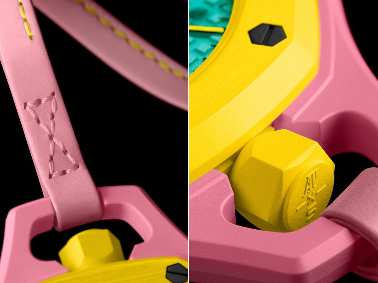
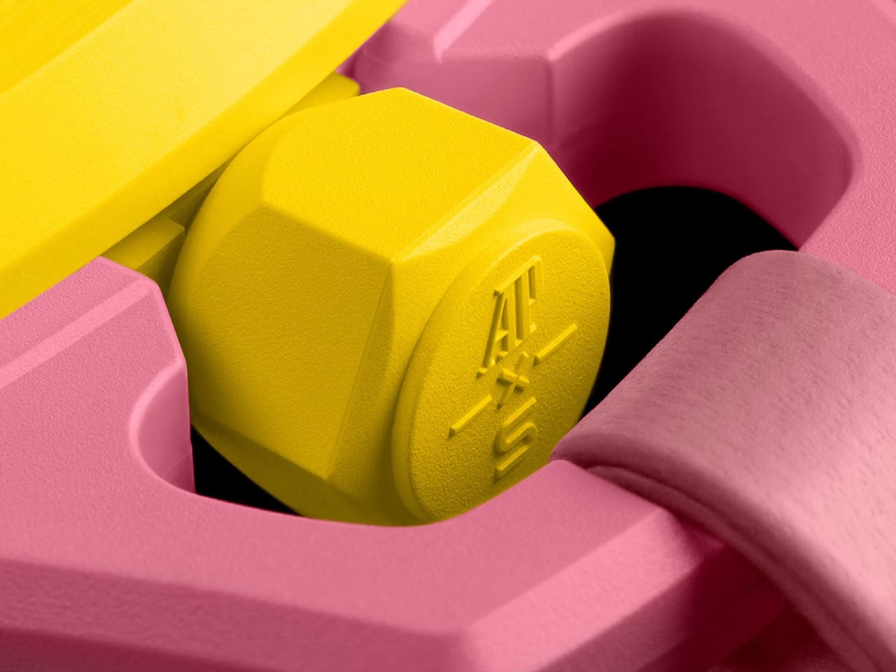
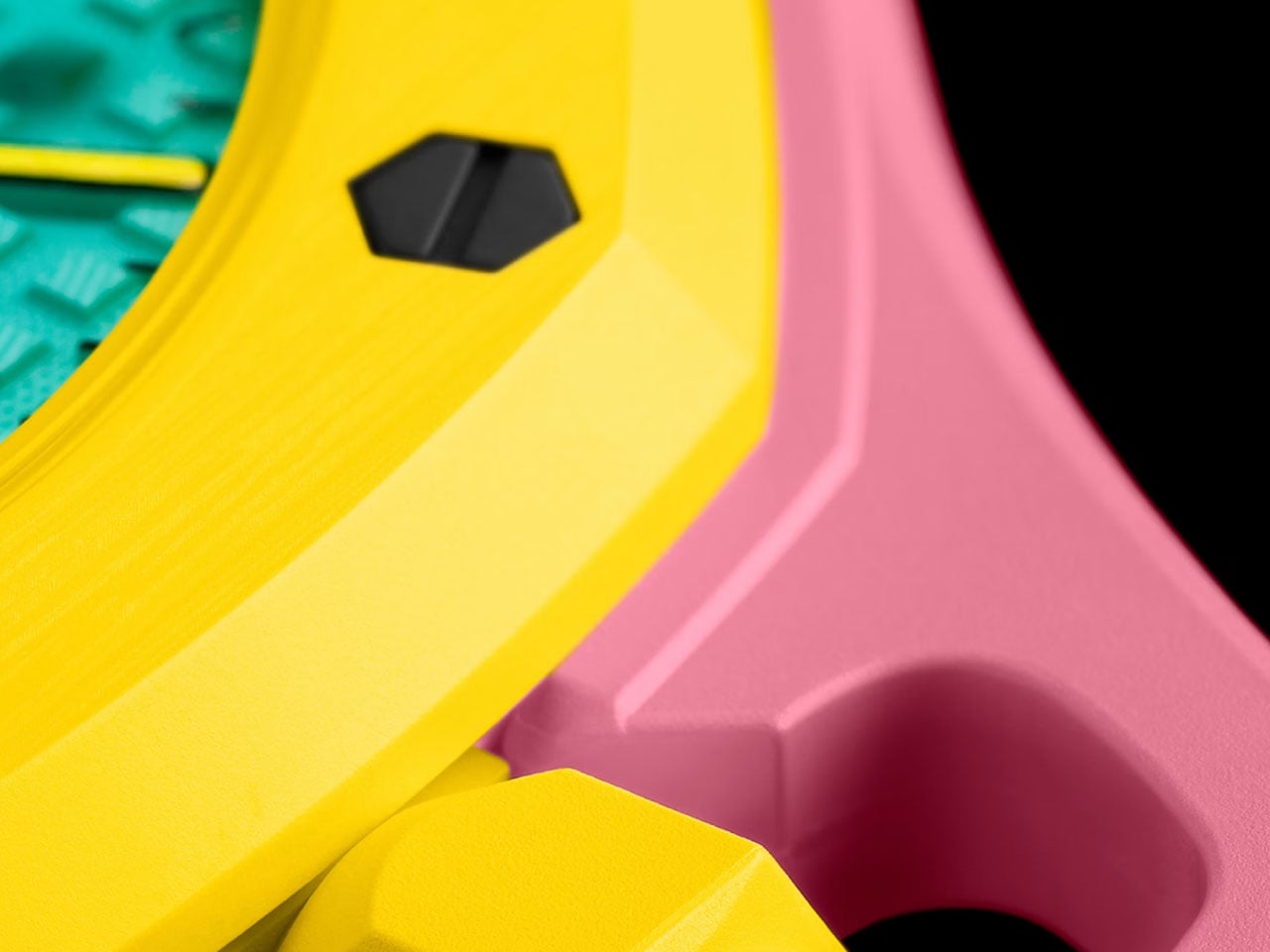
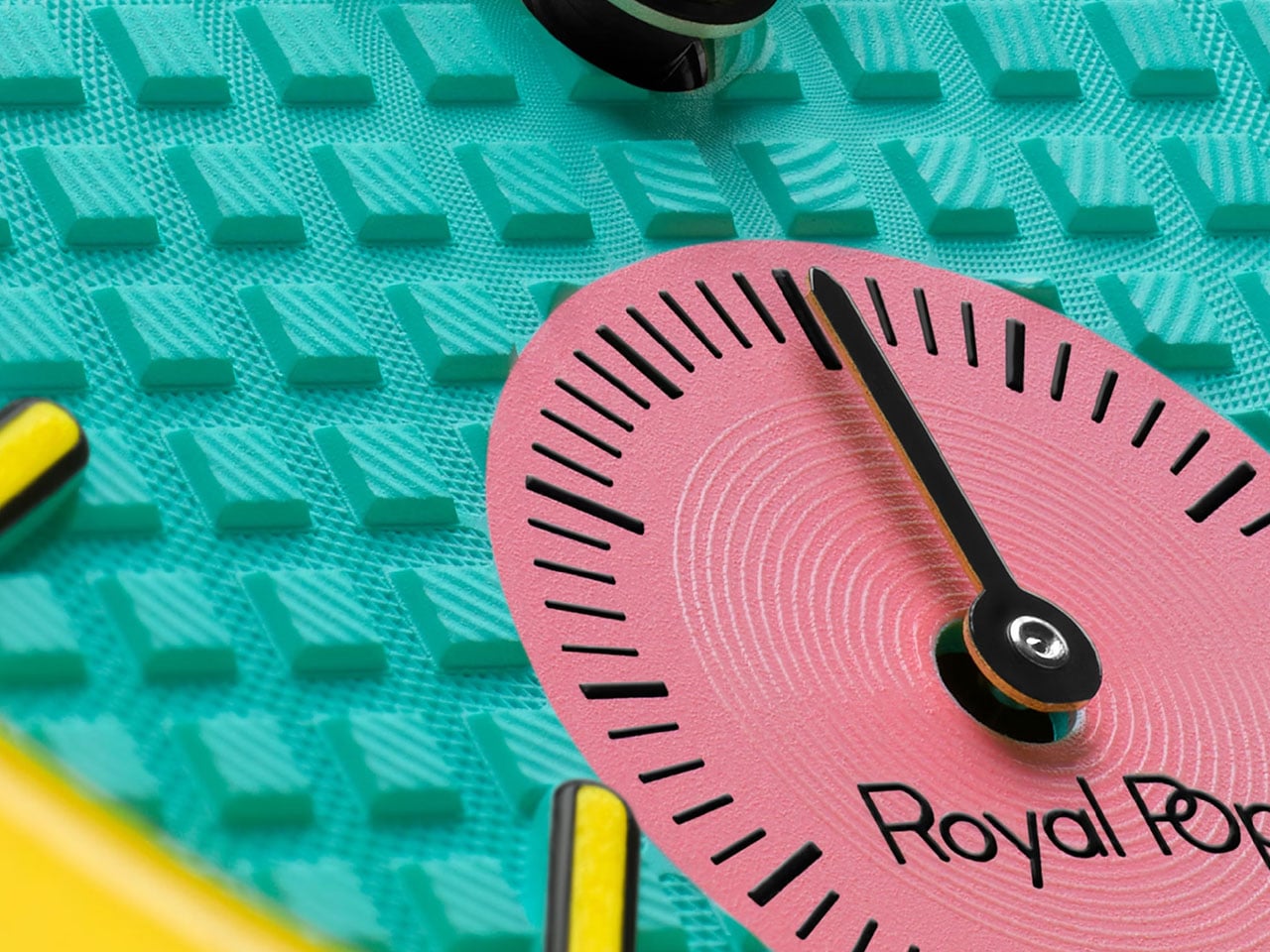
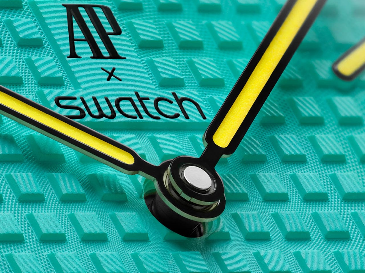
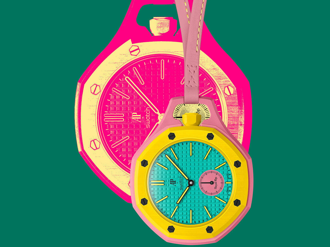

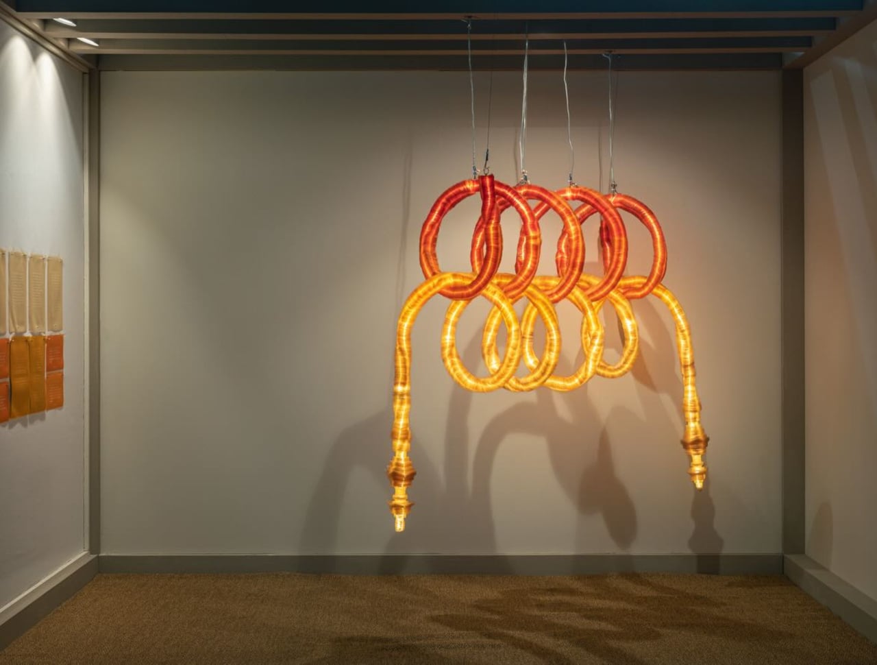
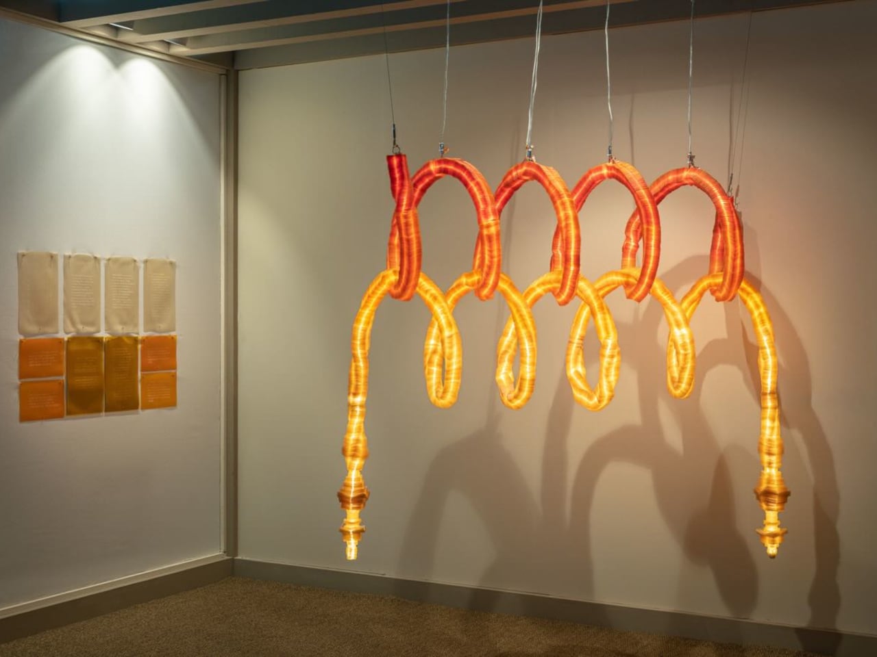

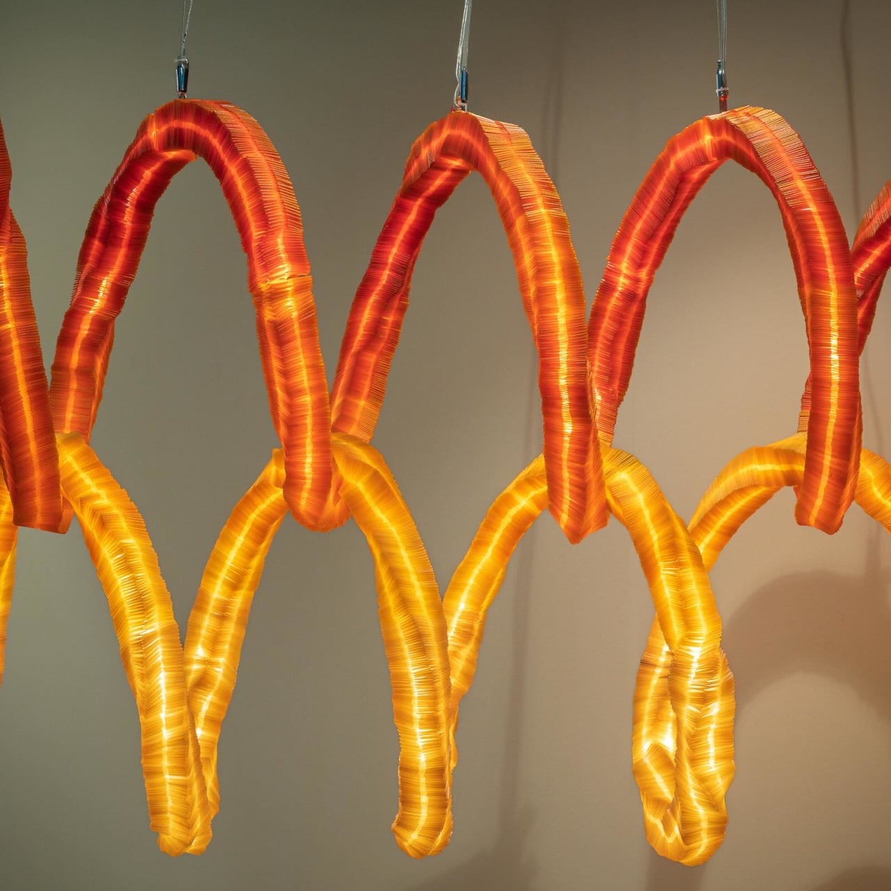


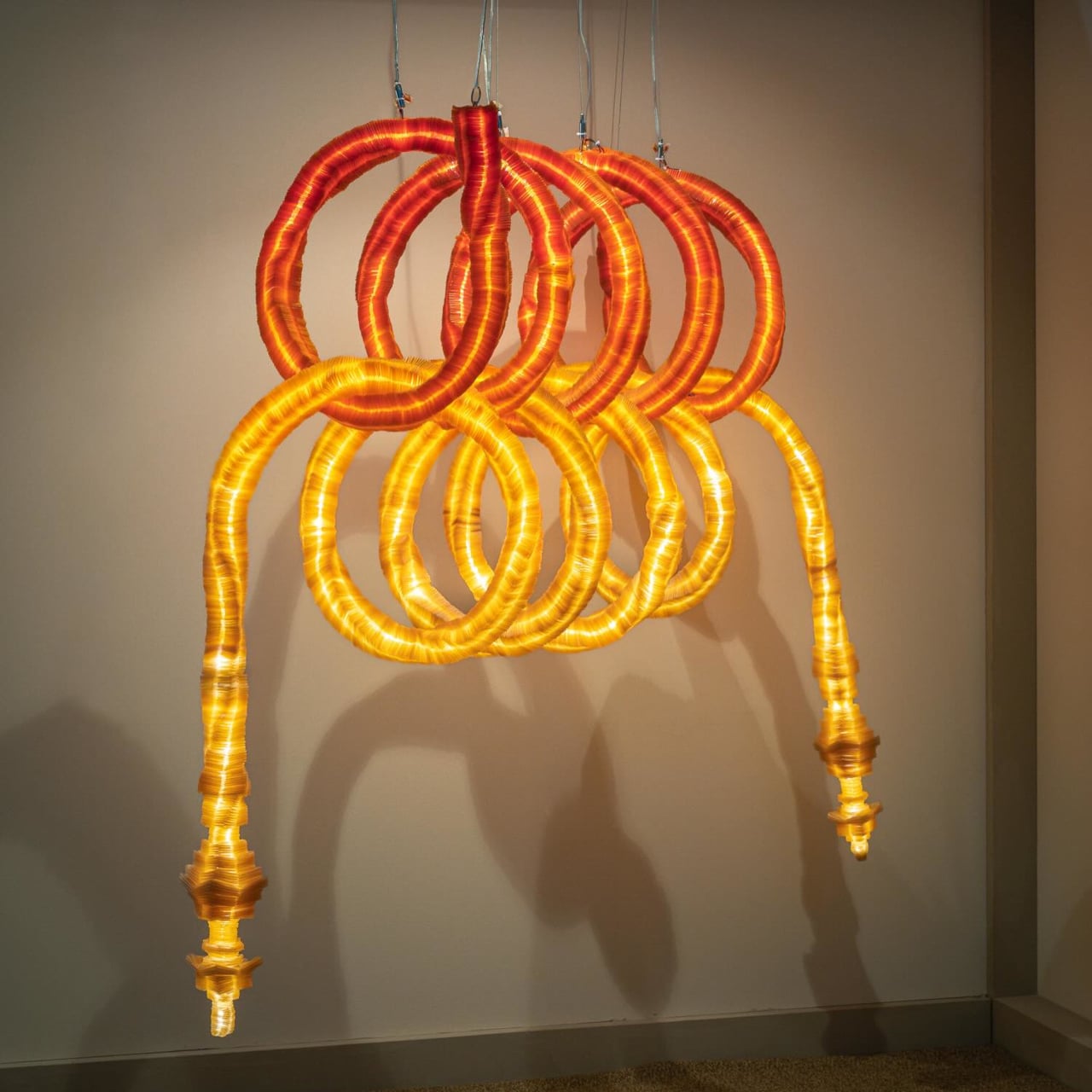


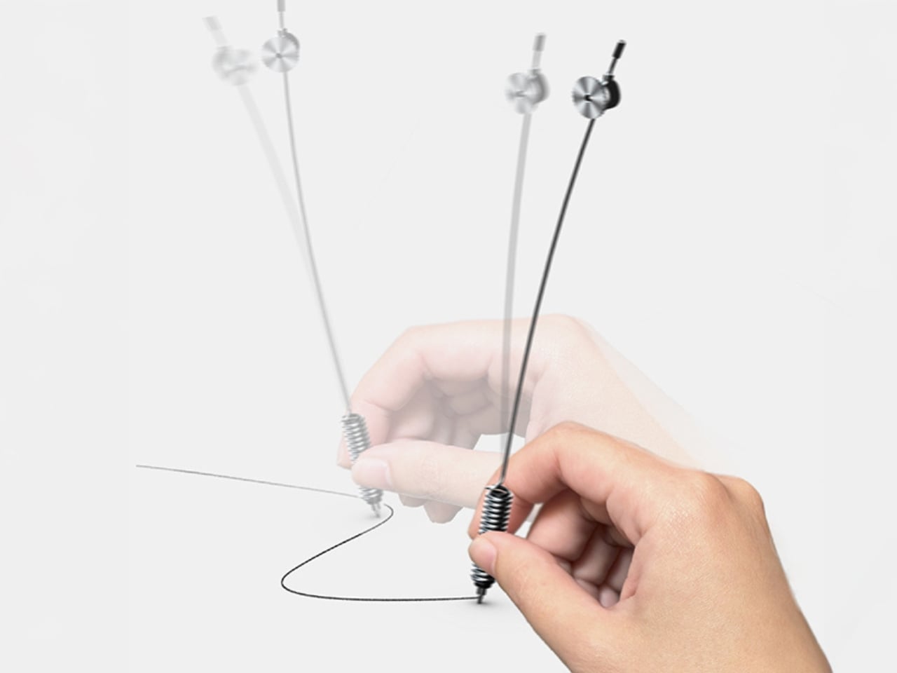
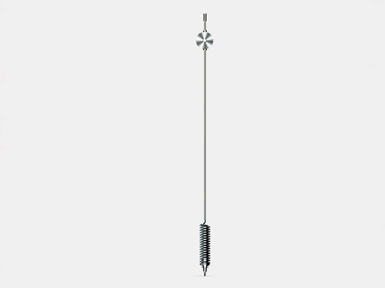
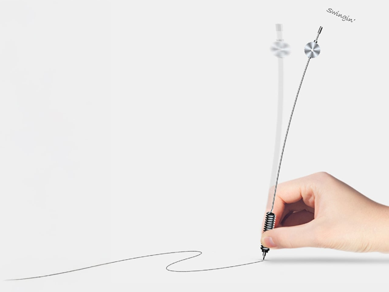
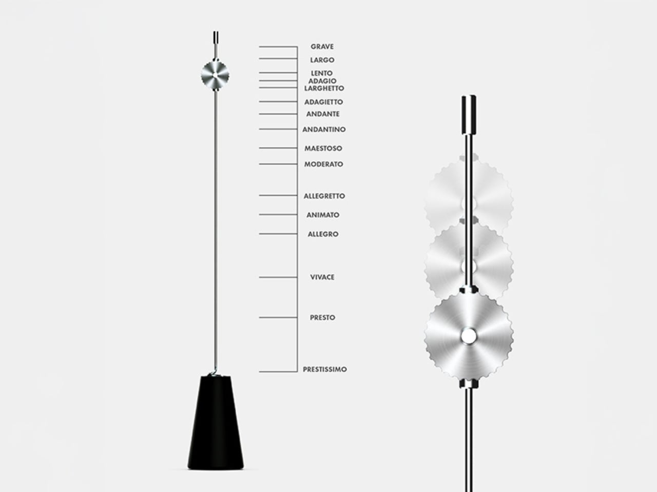

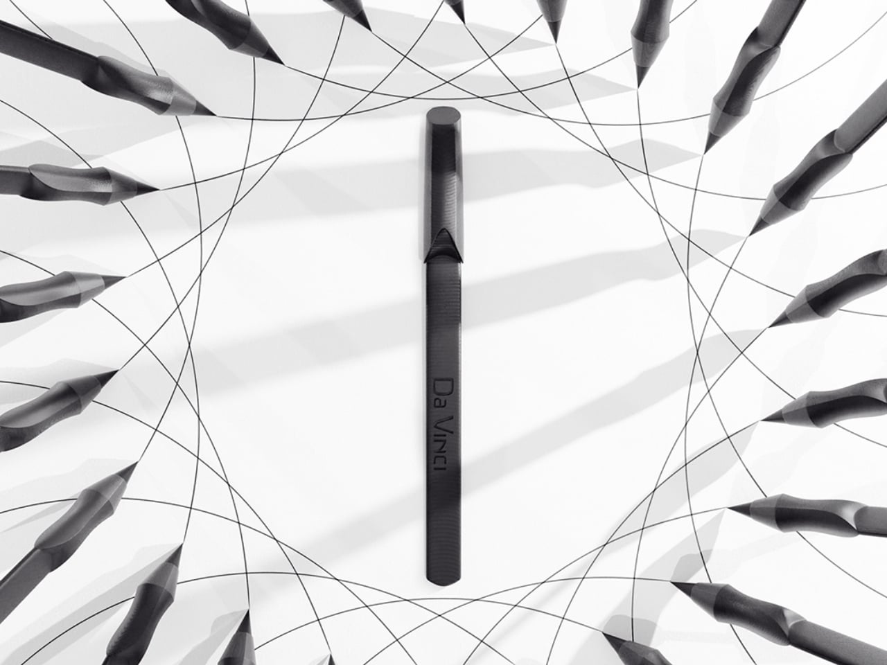
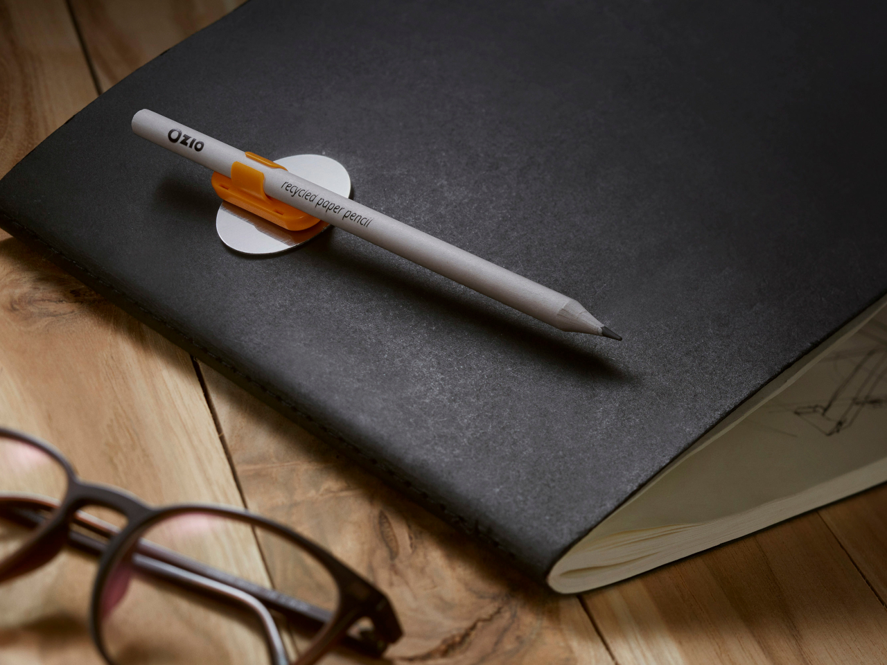
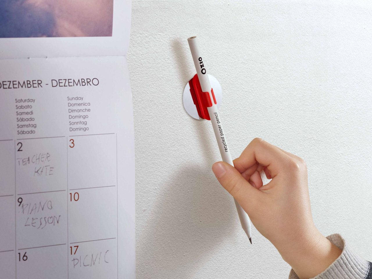
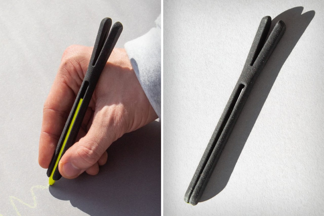
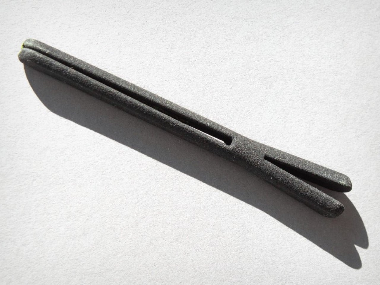


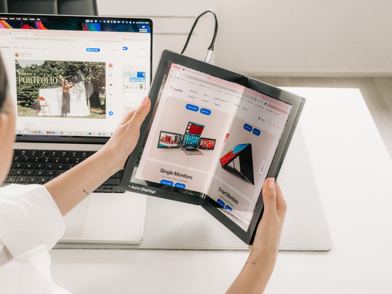
 technology that lets the screen bend, fold, and adapt to angles and surfaces that no rigid display can match.
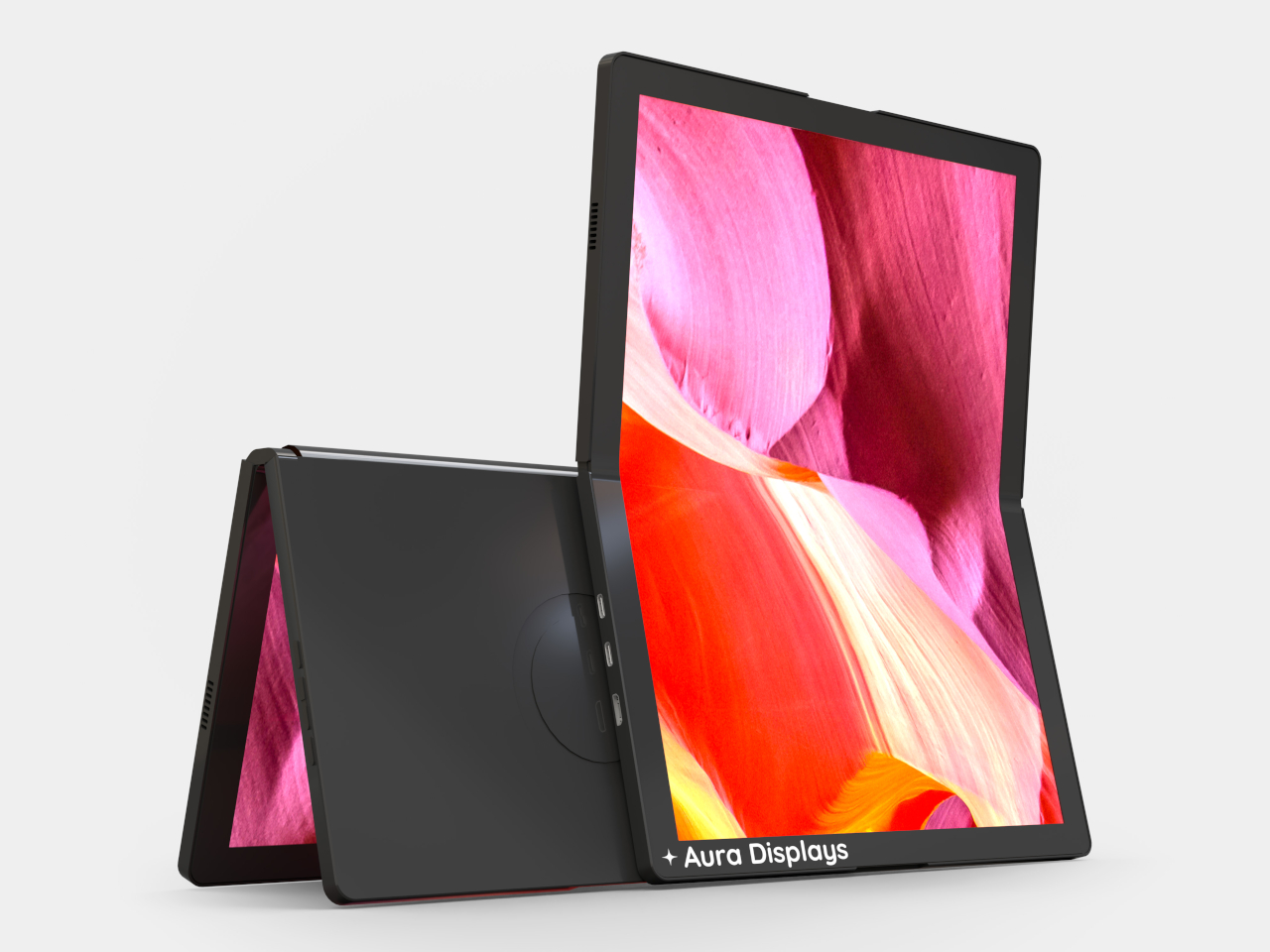

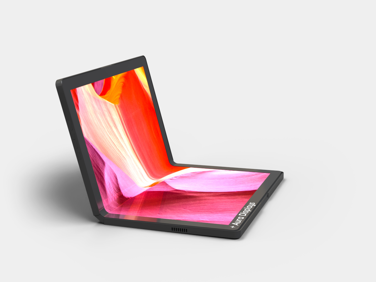


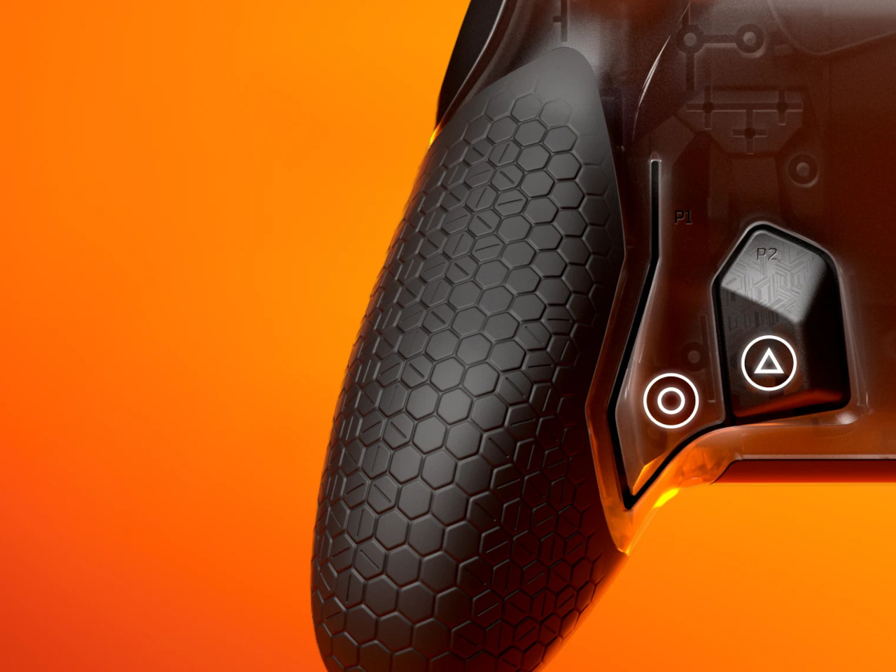

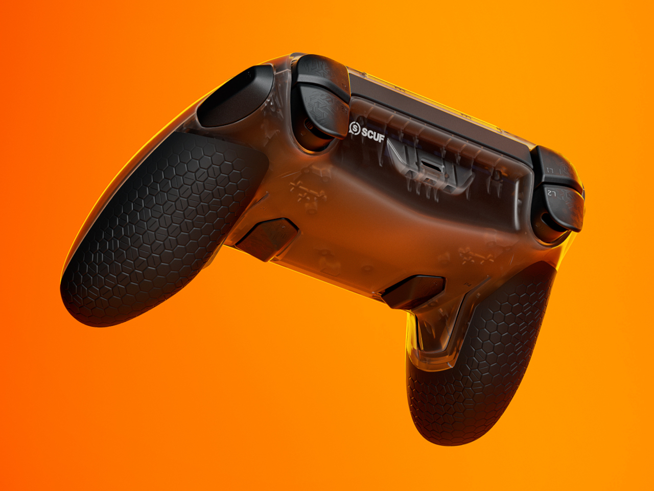
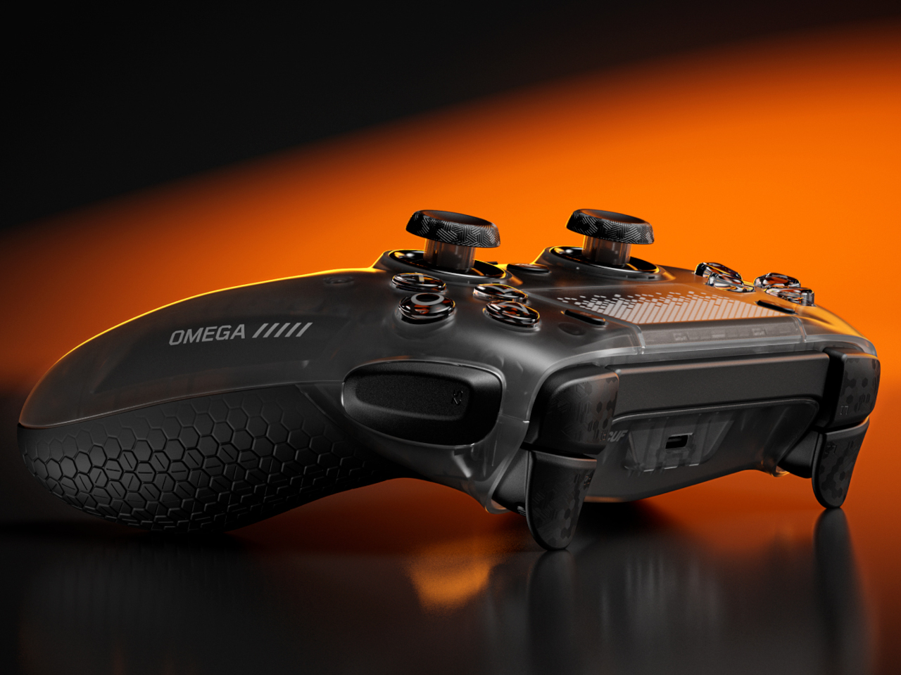
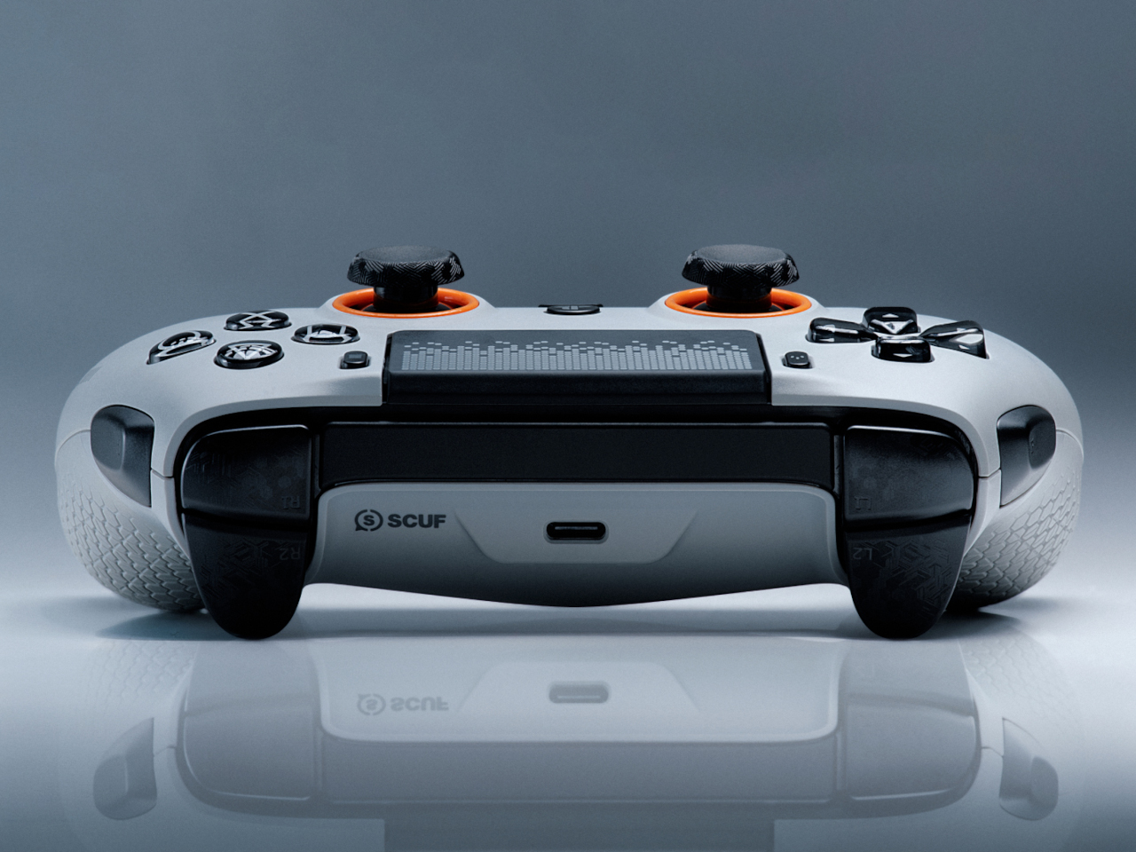
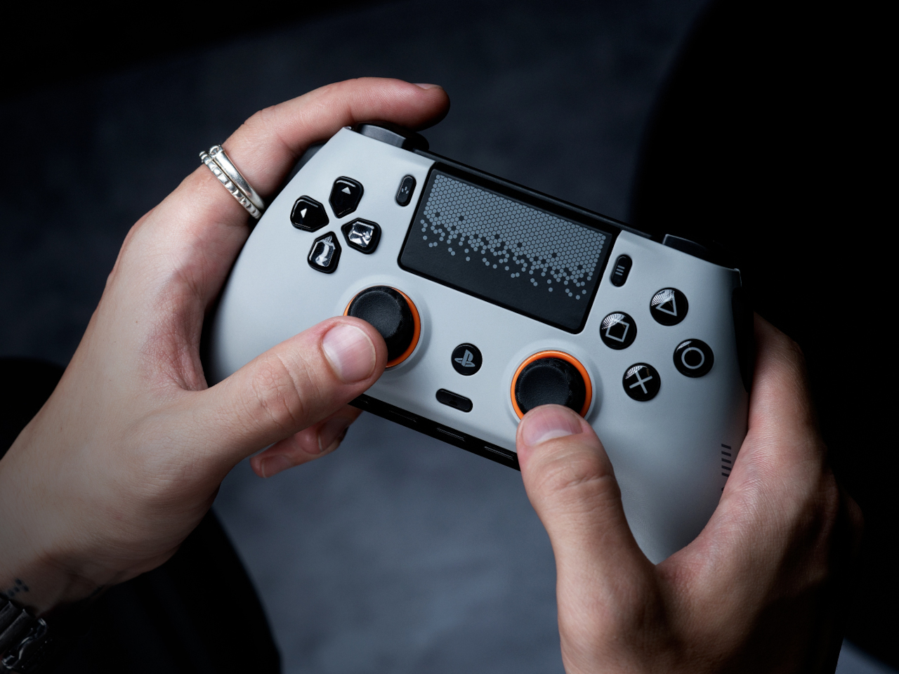


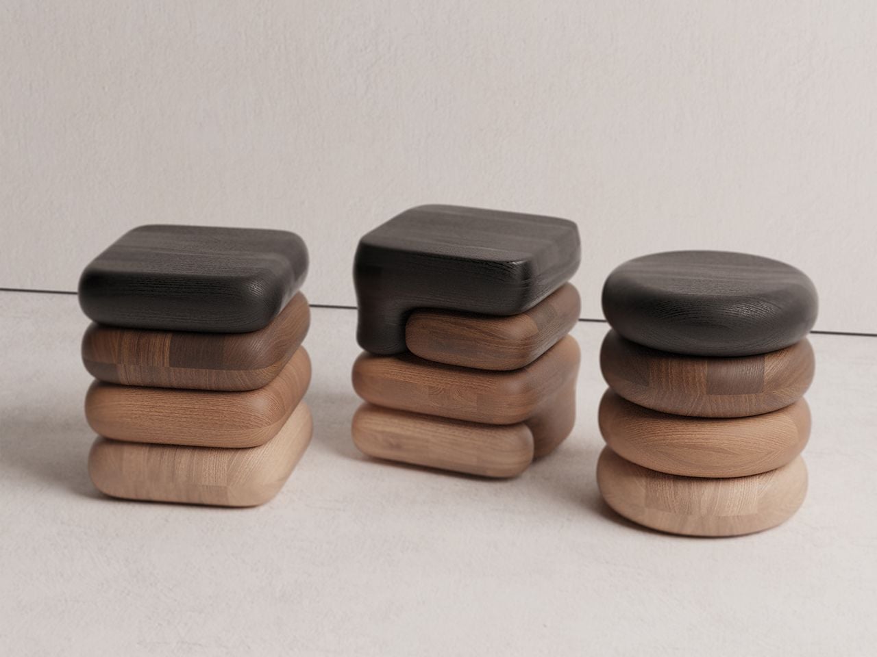
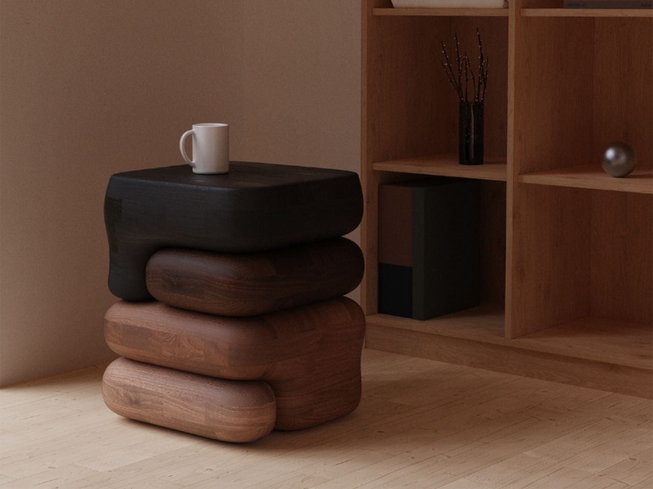
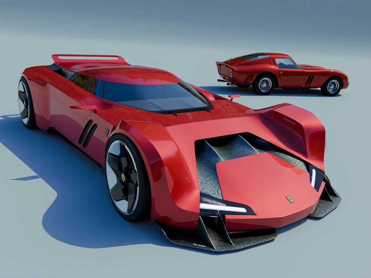
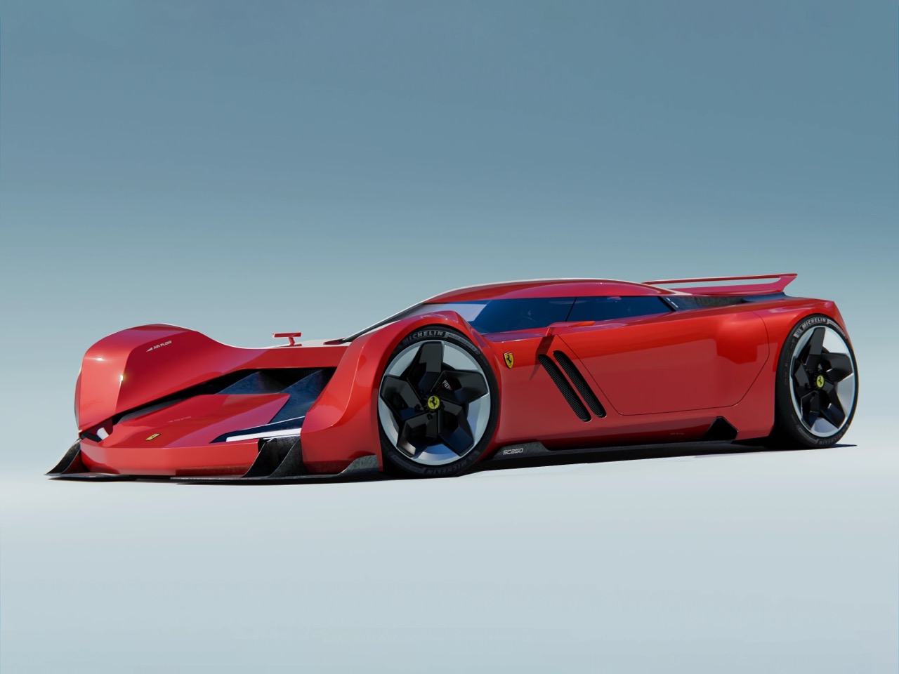

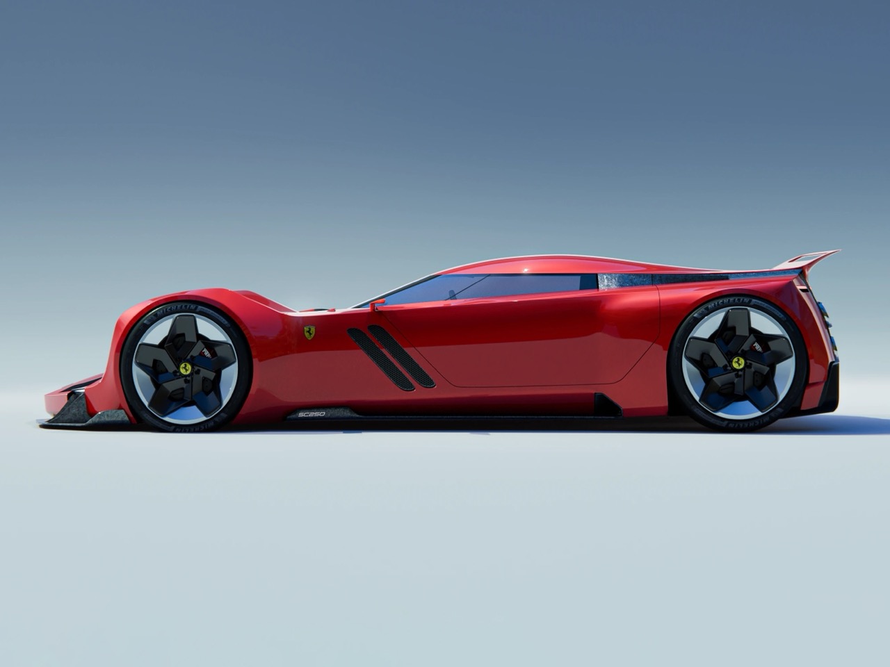
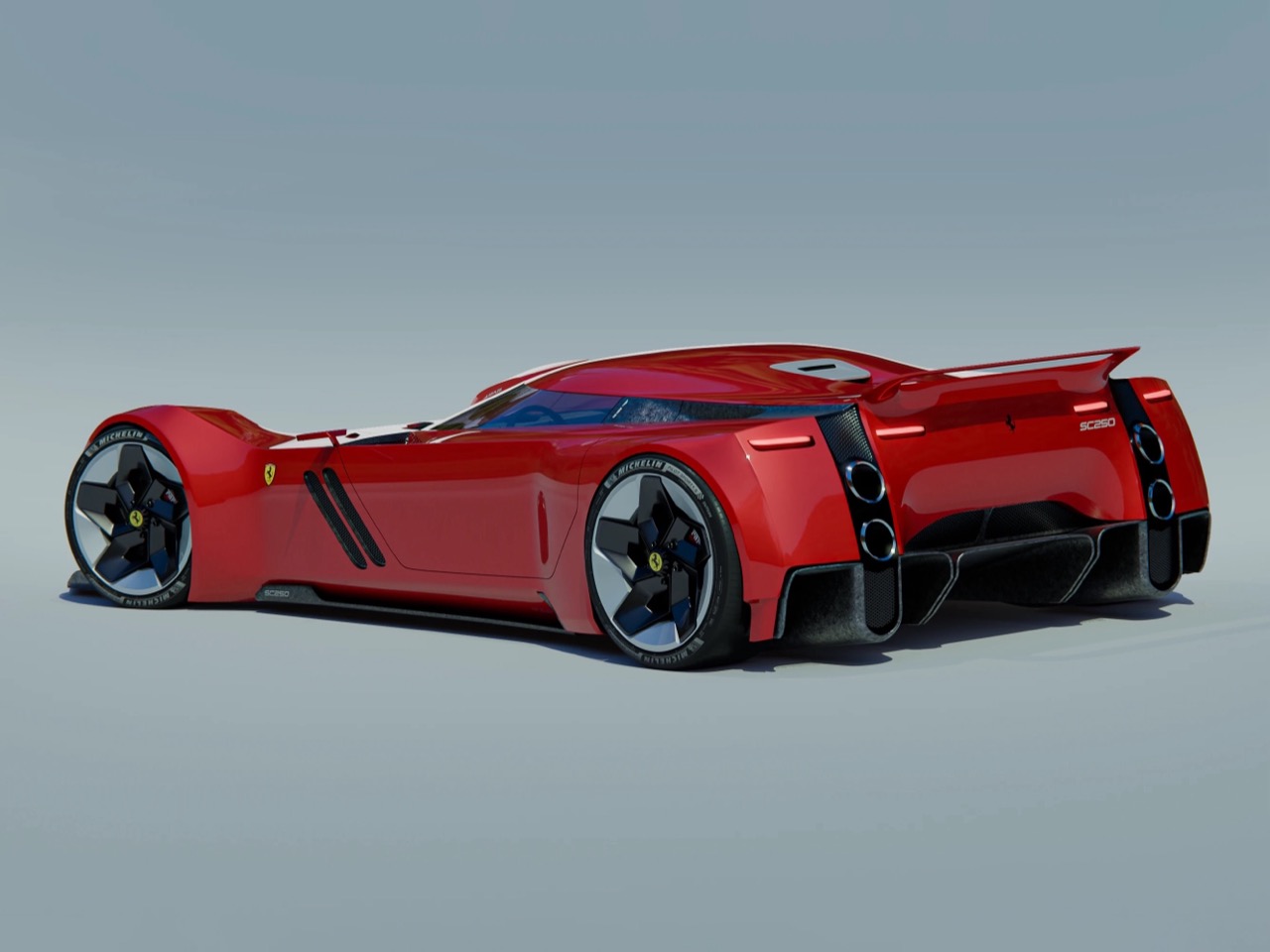


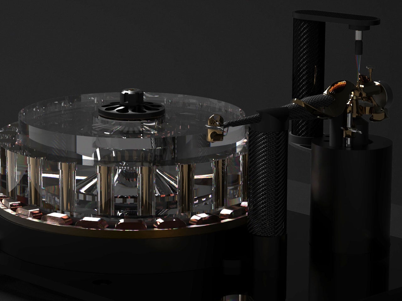
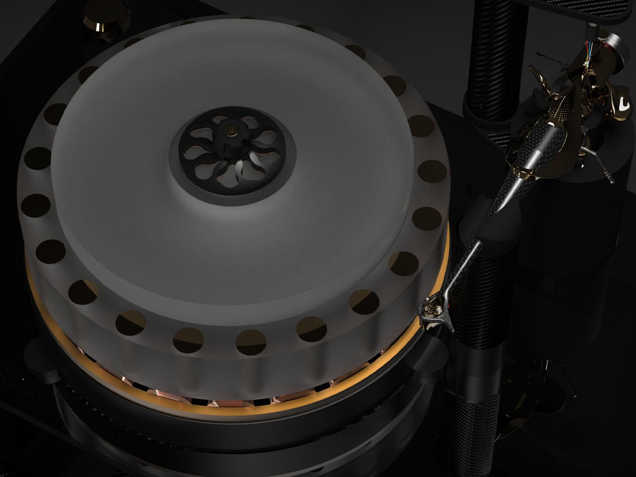
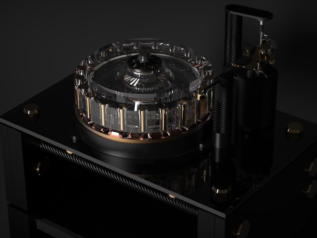

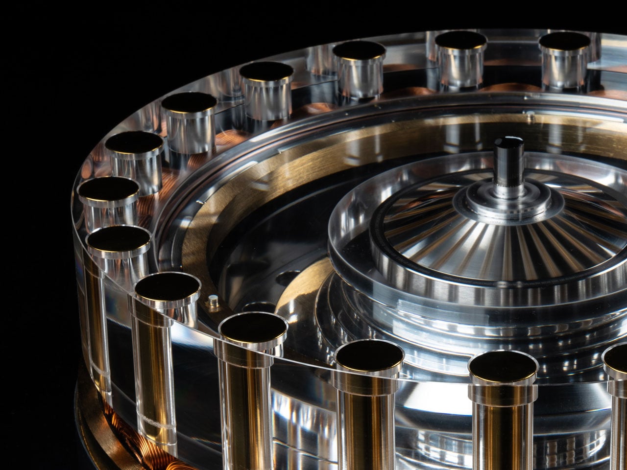

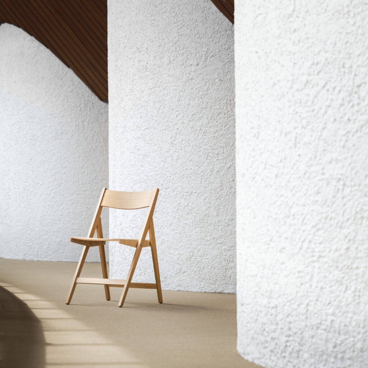


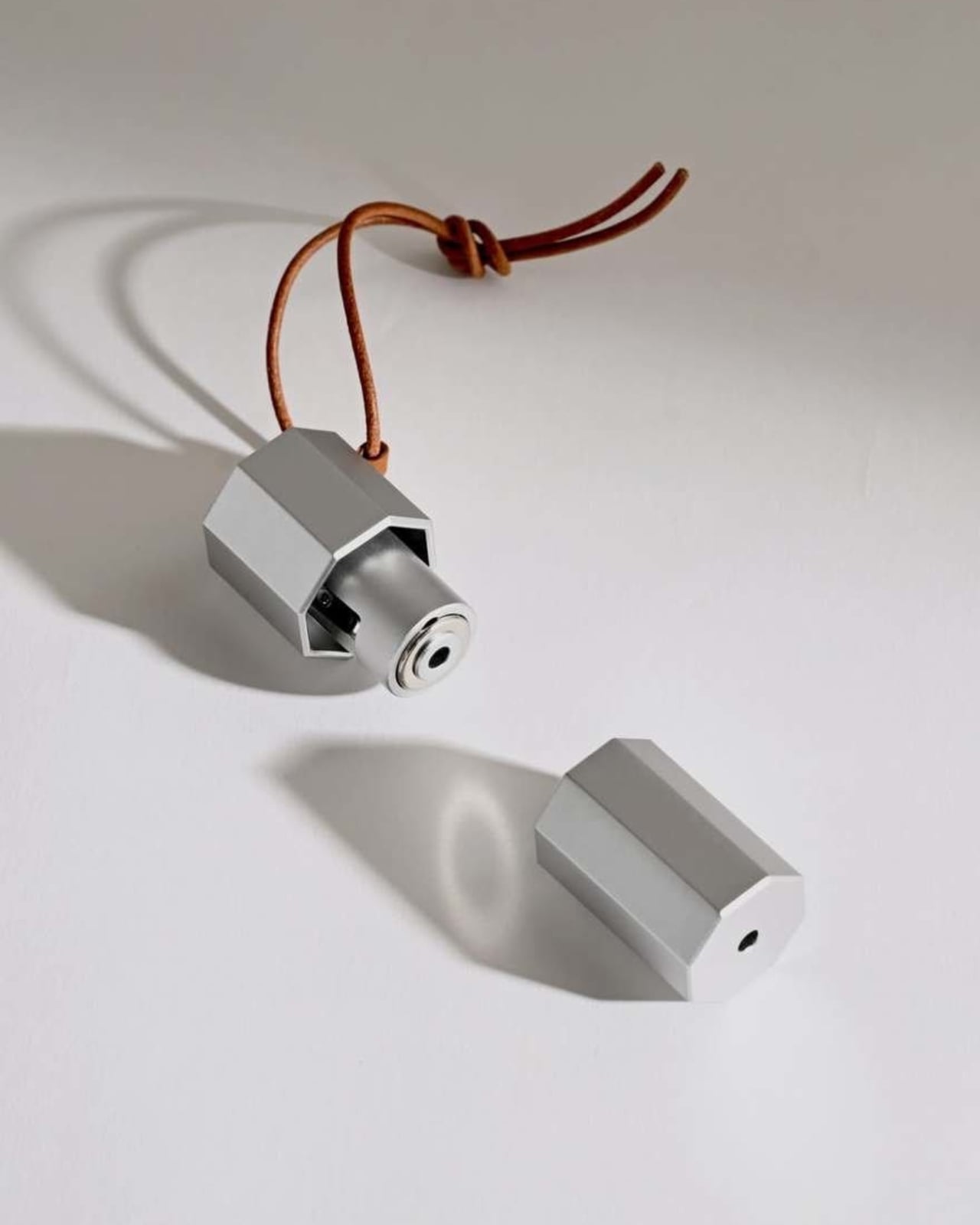


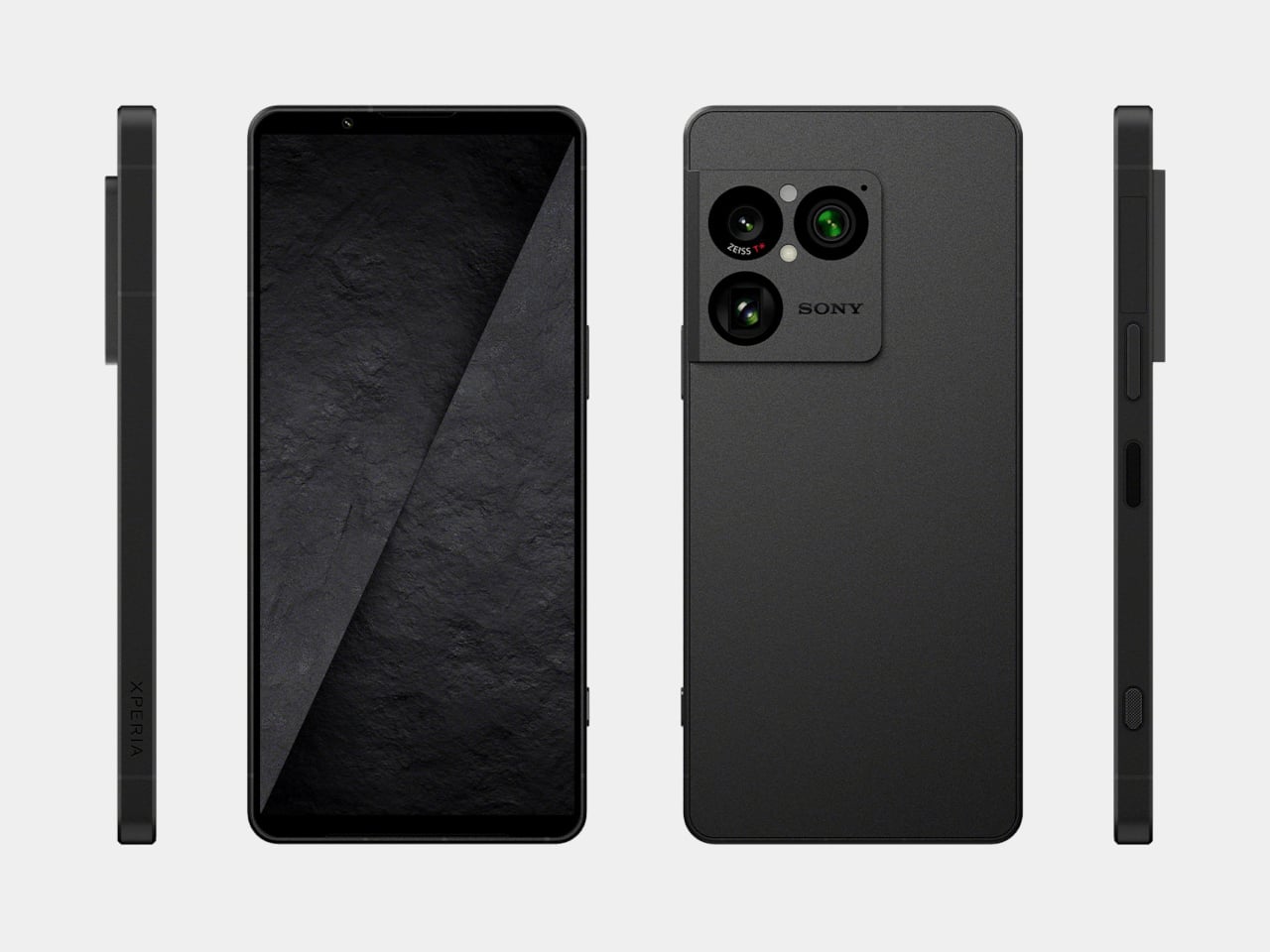
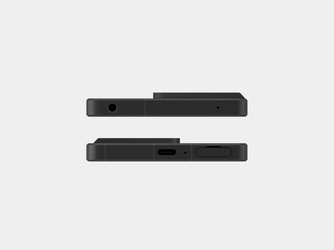

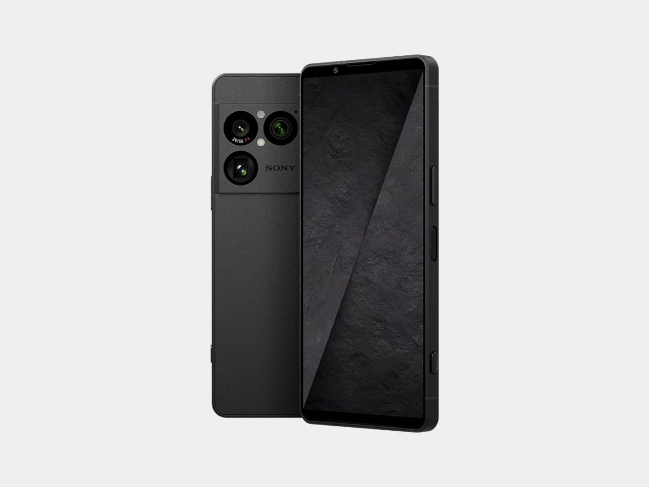
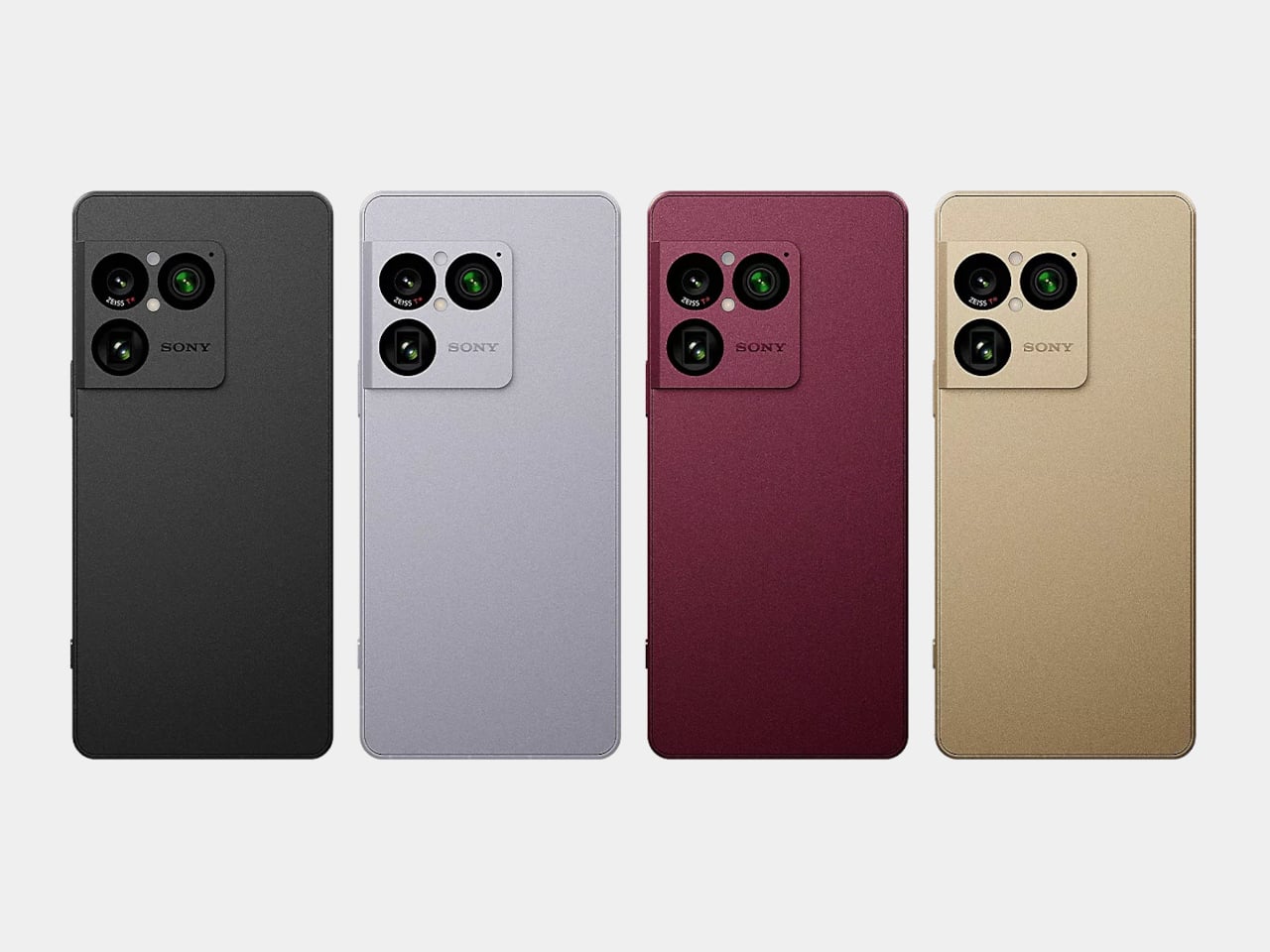


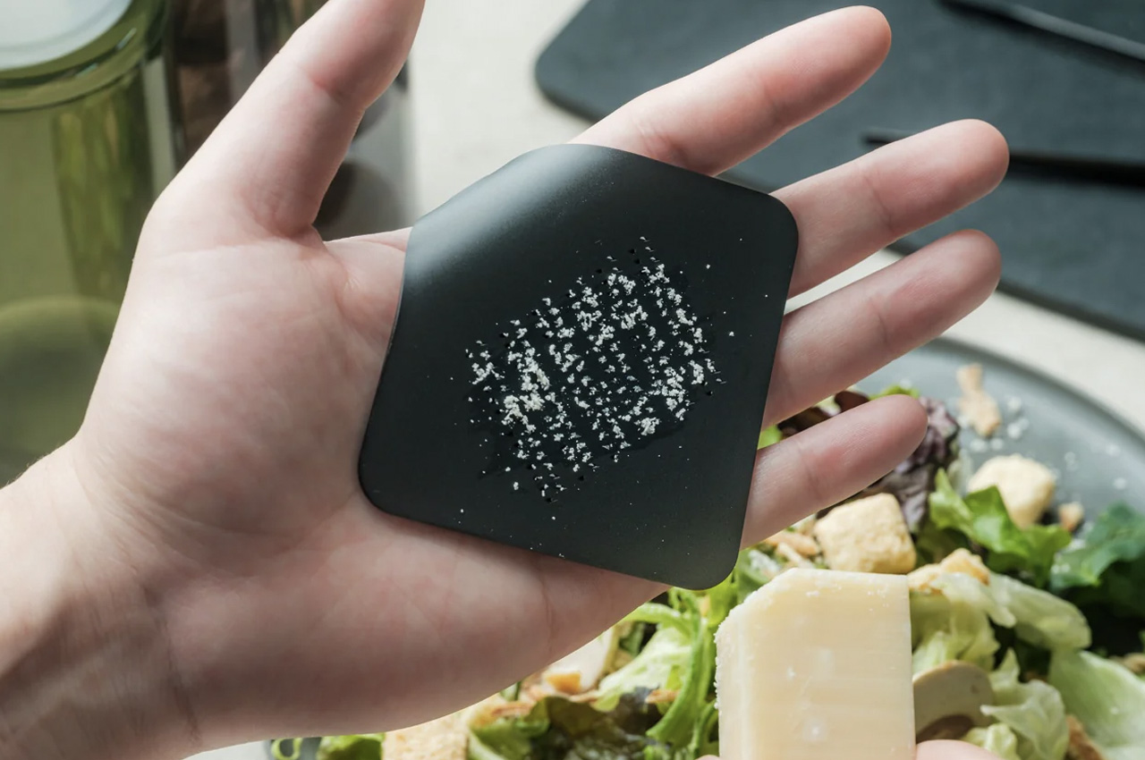
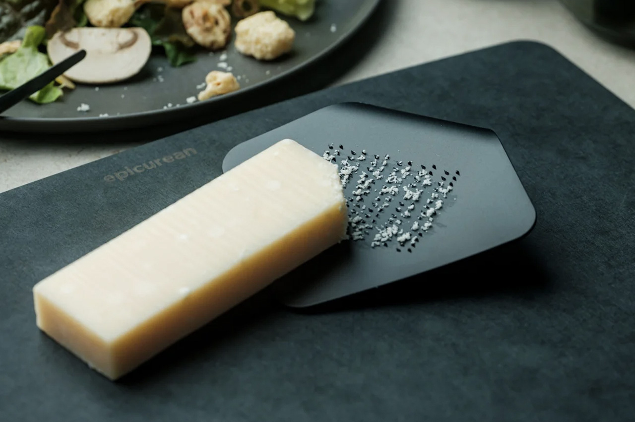


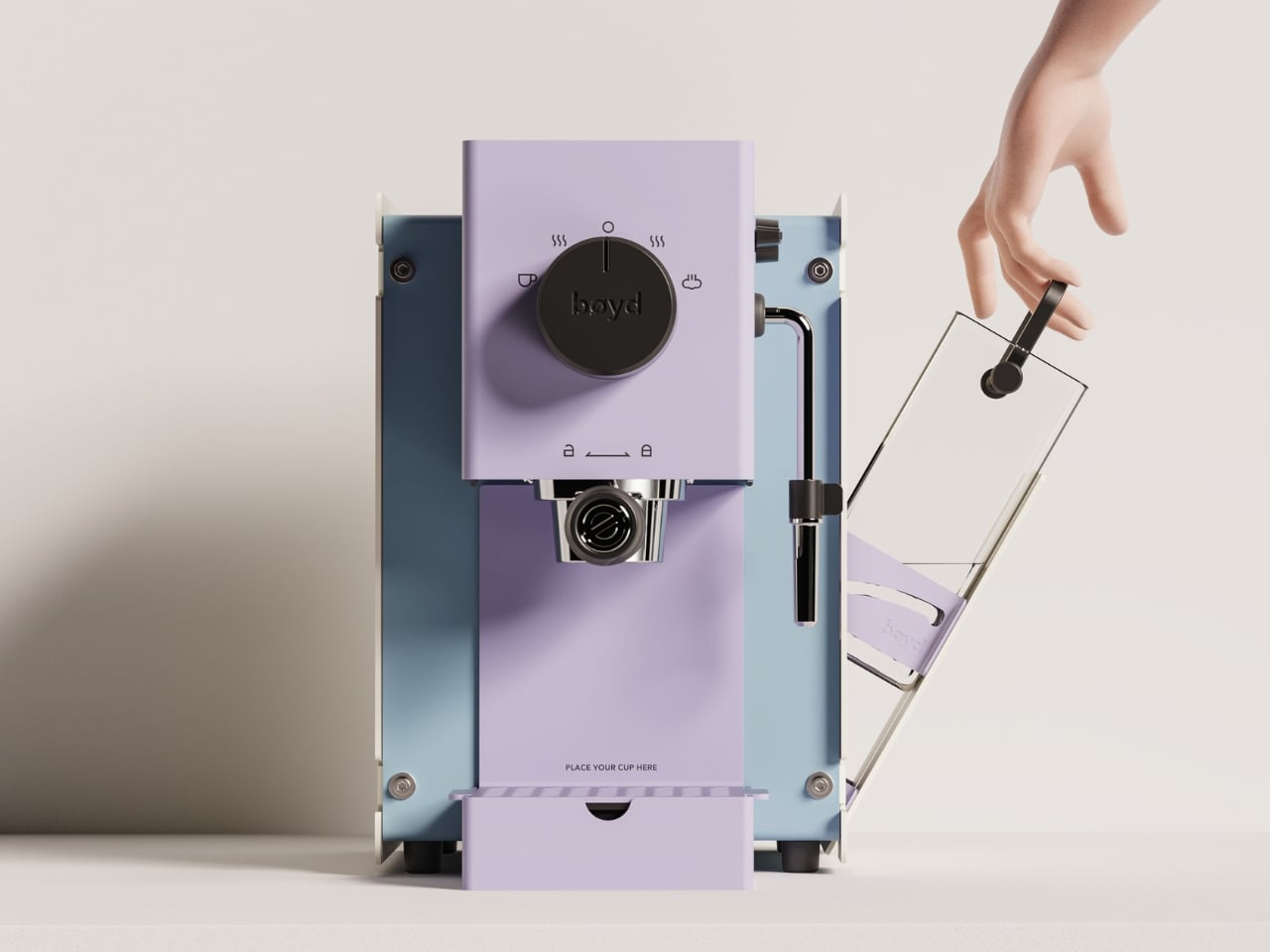
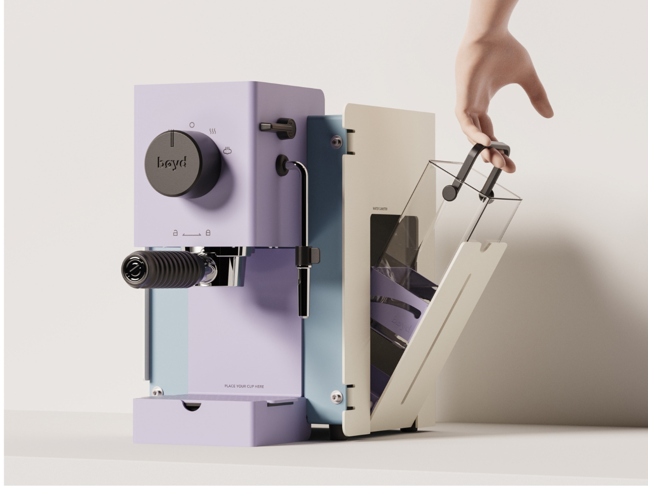


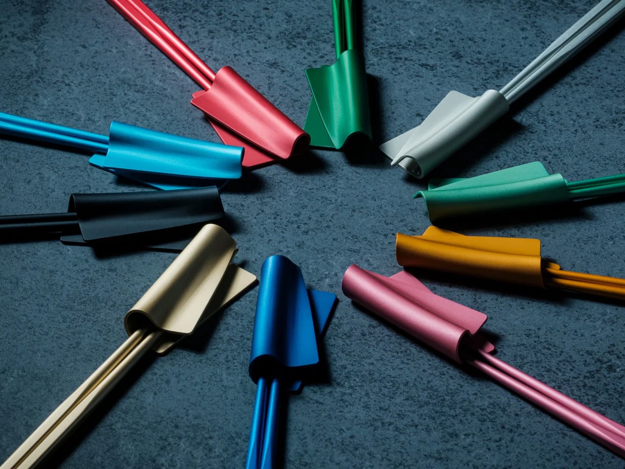


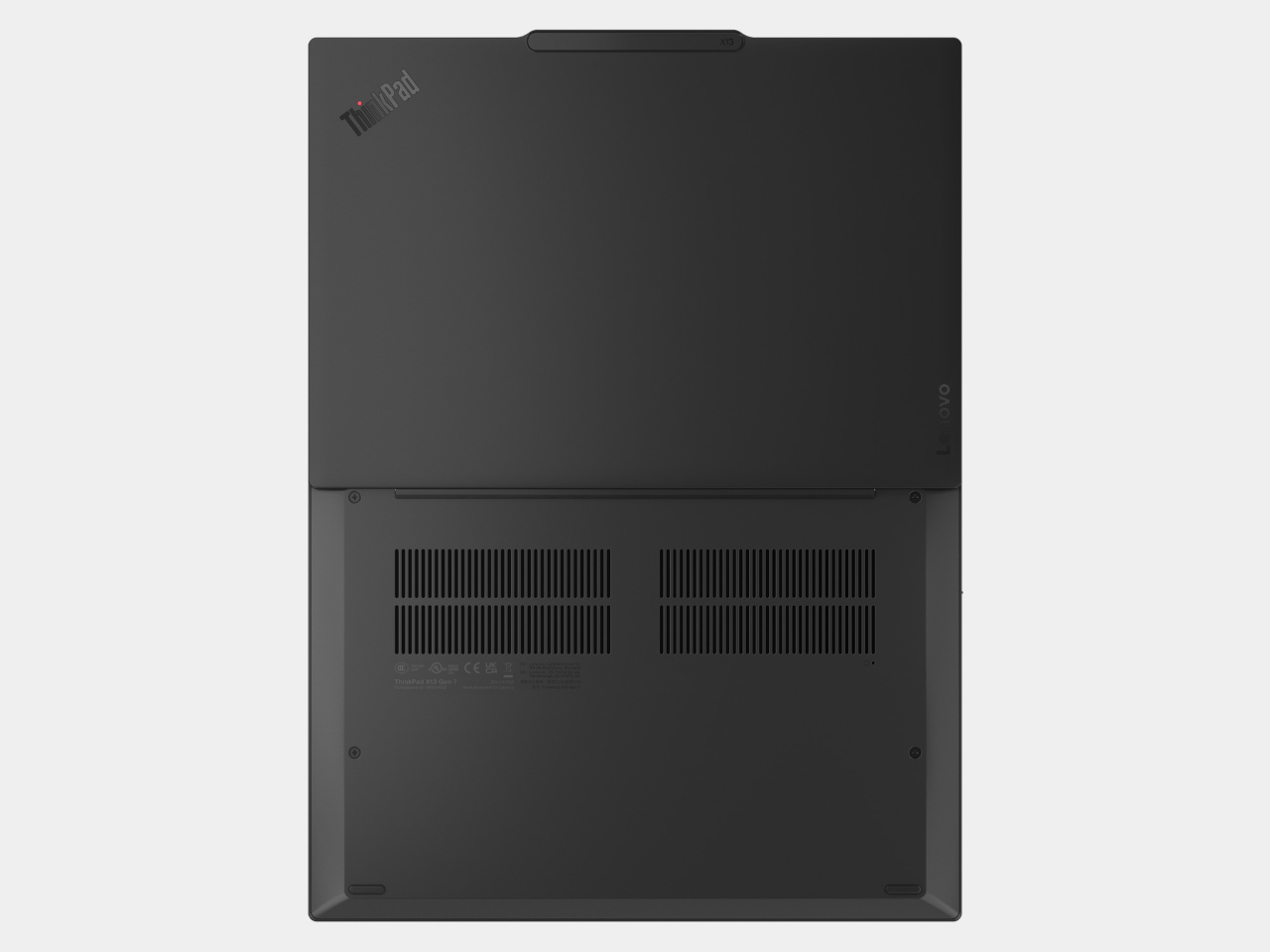
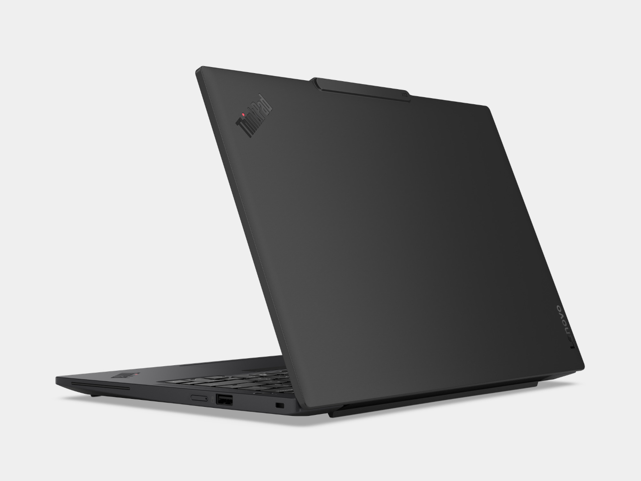
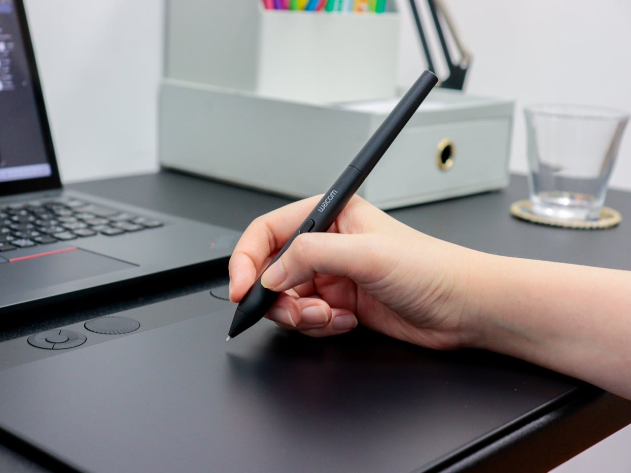
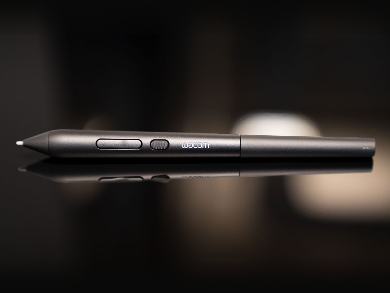
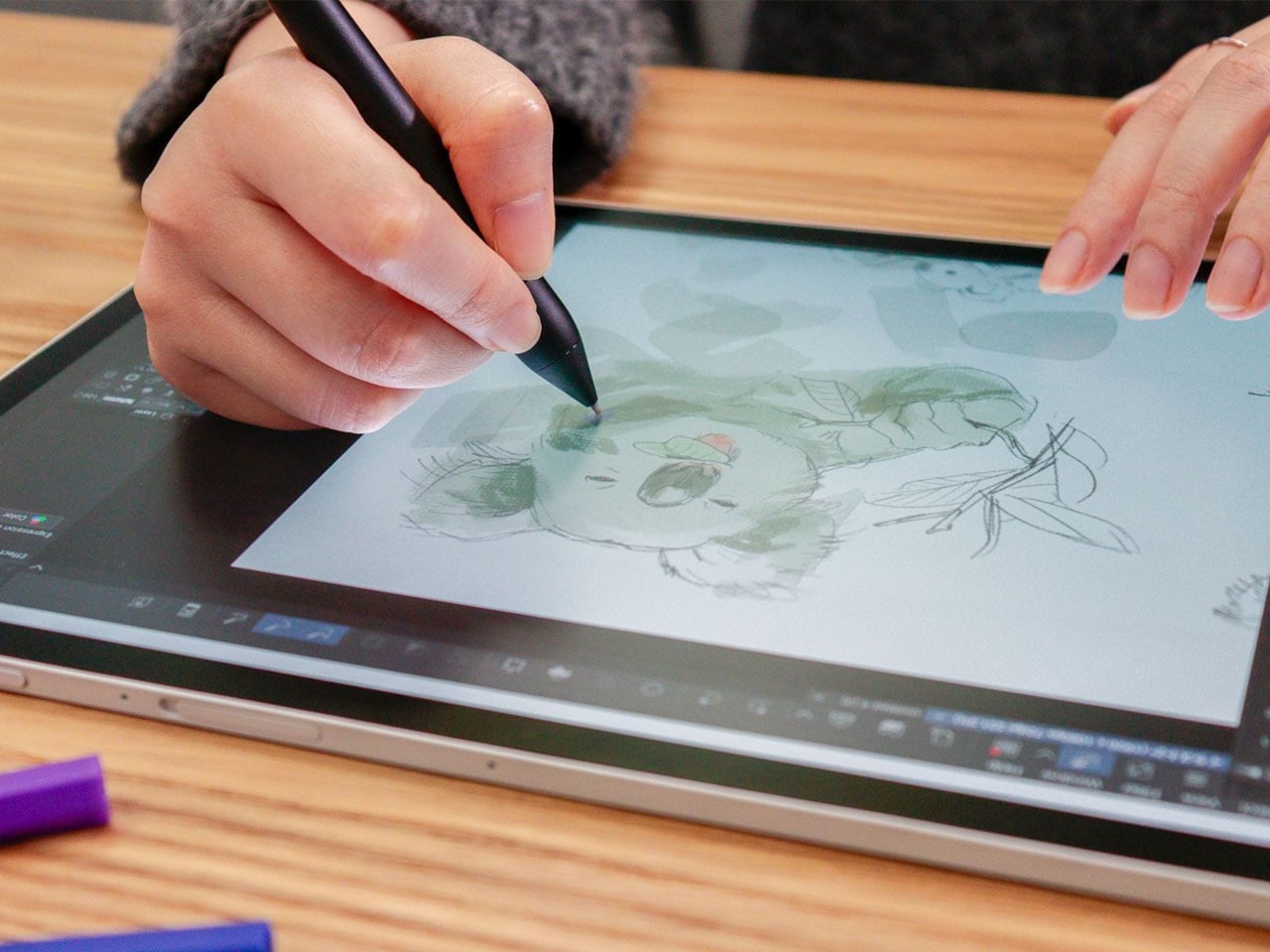
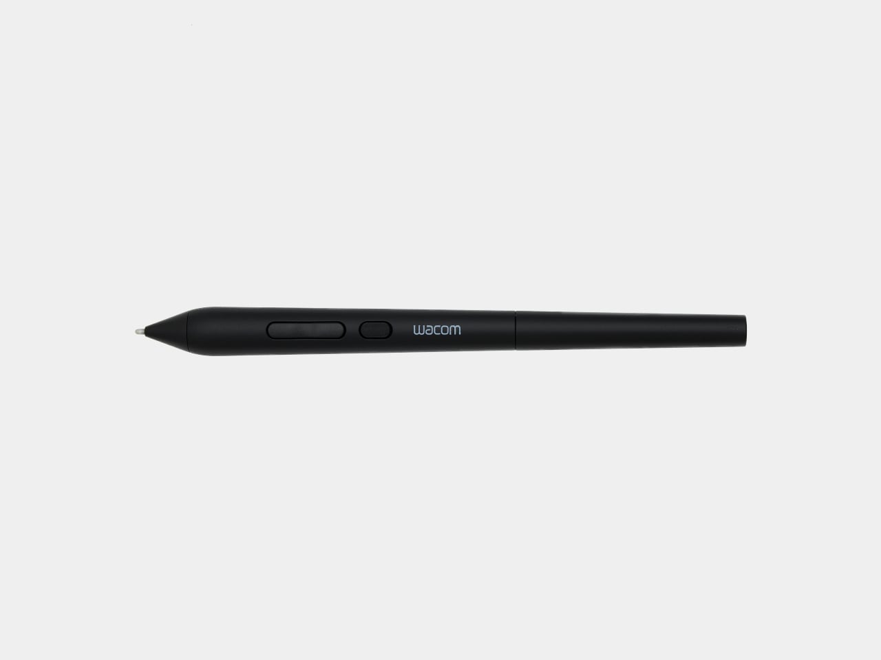
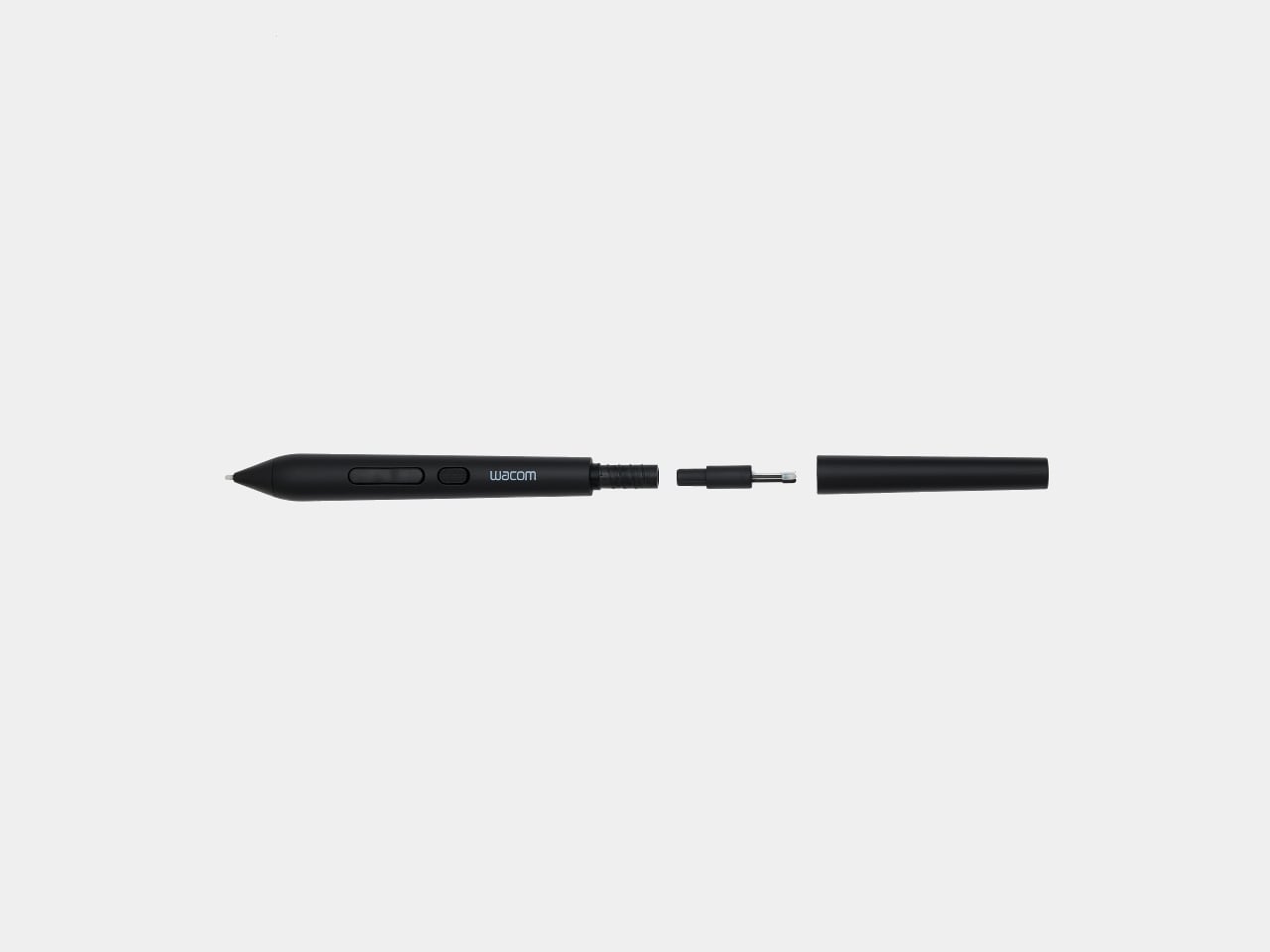
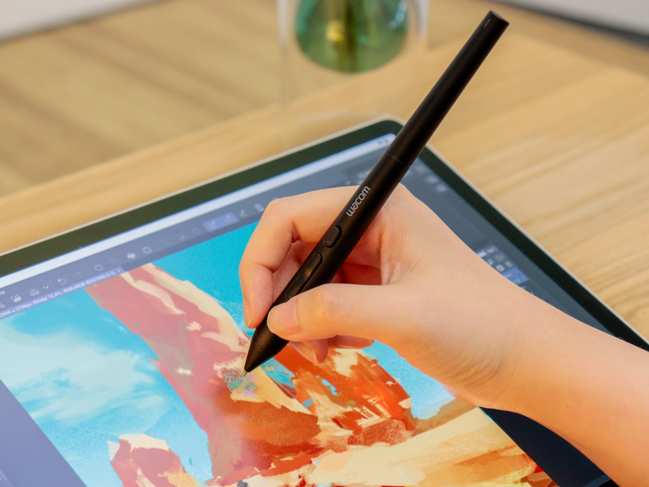
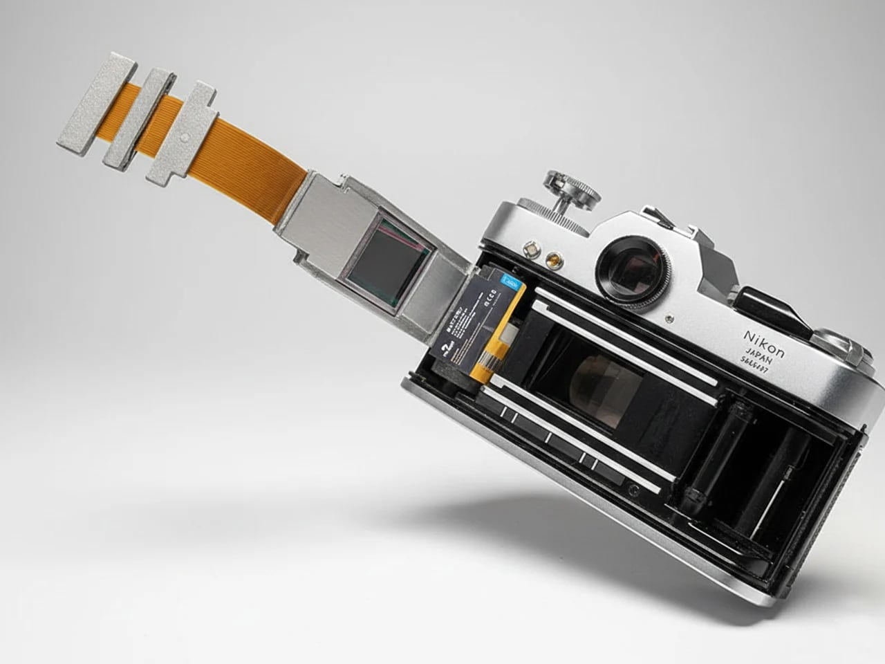

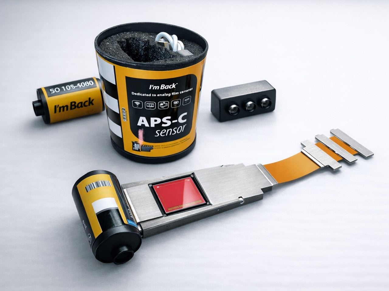
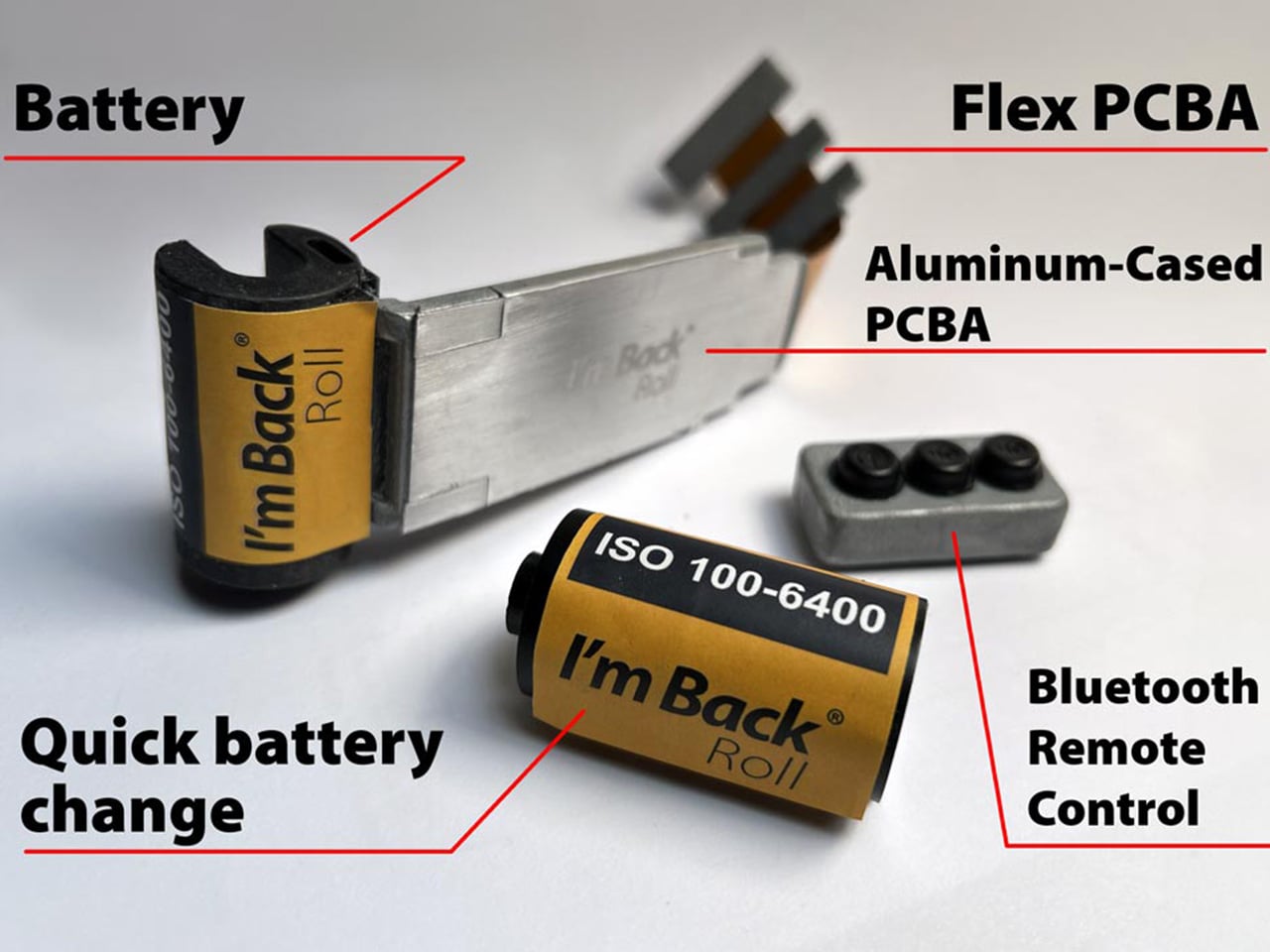


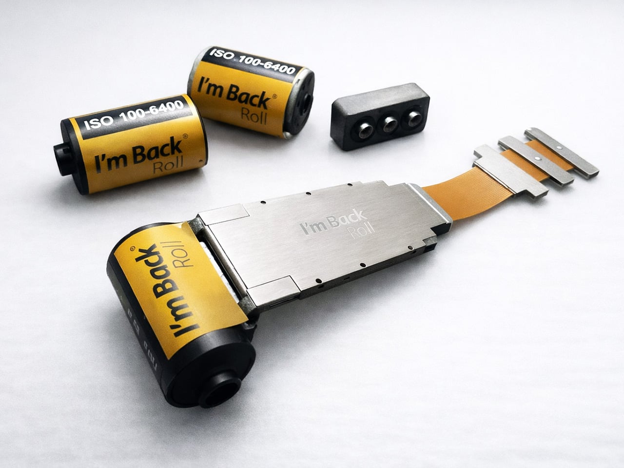

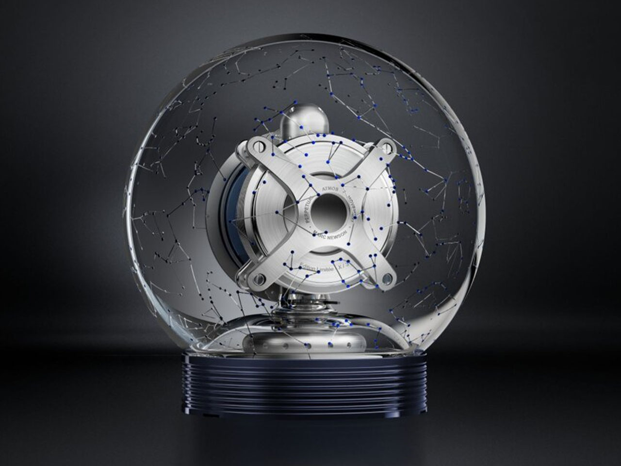

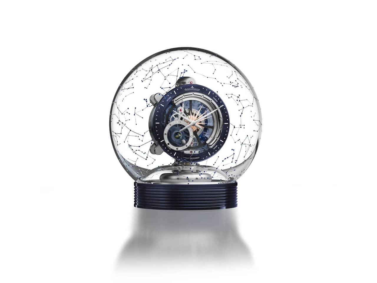


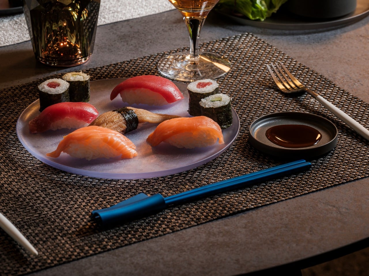


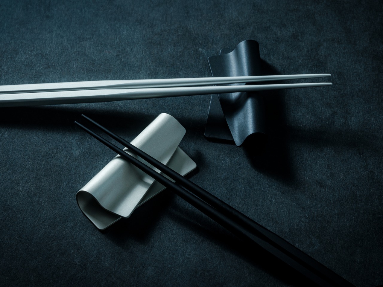
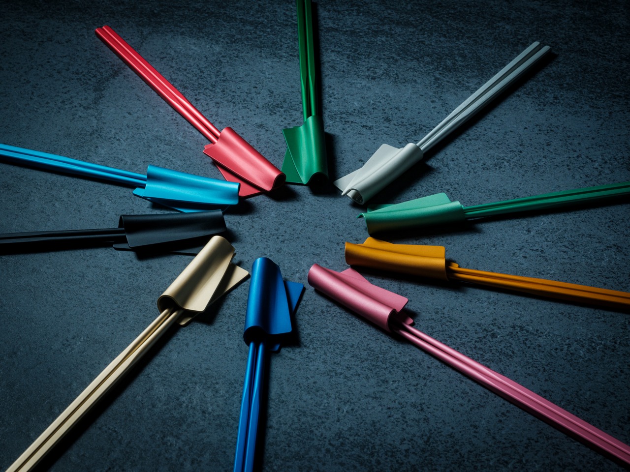
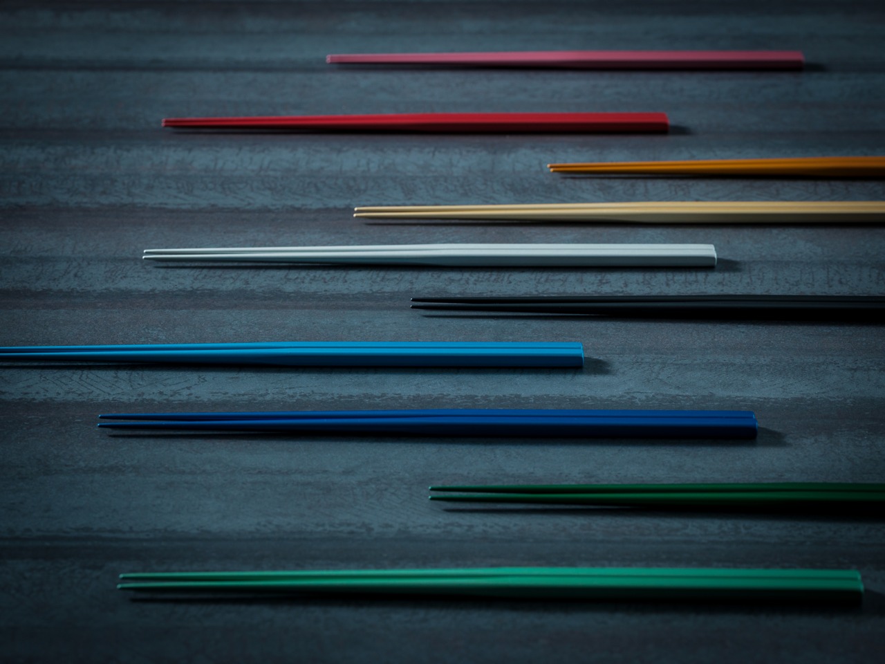
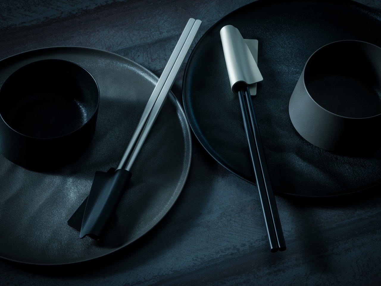 Where The Meal Takes Over