Show full content
(from my tinyletter)
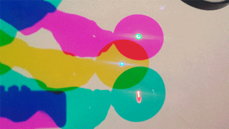
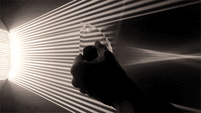
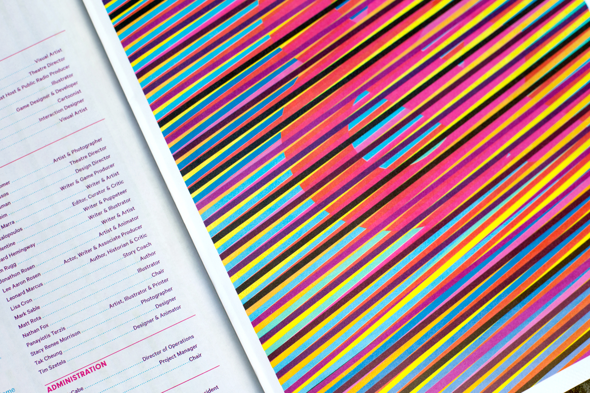
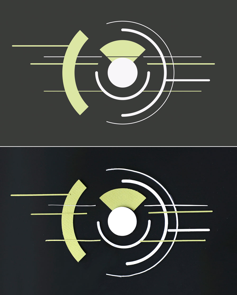
I just finished the stop-motion opening title sequence (and social media branding) for New_ Public, a conference about the future of online public spaces happening this week.
How can we make open public space on the internet impervious to being coopted by white hate groups? Can these spaces be assembled in a way that facilitates safety/shared cultural values as a foundational value? How can we build digital worlds that resist replicating the world’s racist/sexist/ableist power structures? What guardrail-rules does “free speech” require to preserve itself—to ensure that we don’t fall again so quickly into authoritanarism?
Way back in 2014, one of the speakers, Astra Taylor, anticipated much of how the Internet (on autopilot with the blinkered values of its libertarian roots) would end up going wrong:
“They speak about openness, transparency, and participation, and these terms now define our highest ideals, our conception of what is good and desirable, for the future of media in a networked age. But these ideals are not sufficient if we want to build a more democratic and durable digital culture. Openness, in particular, is not necessarily progressive. While the Internet creates space for many voices, the openness of the Web amplifies real-world inequities as often as it ameliorates them.”
― The People’s Platform: Taking Back Power and Culture in the Digital Age
This online discussion runs the 12-14, is free, and features a wide variety of vantage points—whose minds have invariably been racing to solve these problems. If you’re feeling the sober imperative that we learn something actionable in this moment and feeling the energy about how to get “the future” right this time—> this might feel good.
* * * *
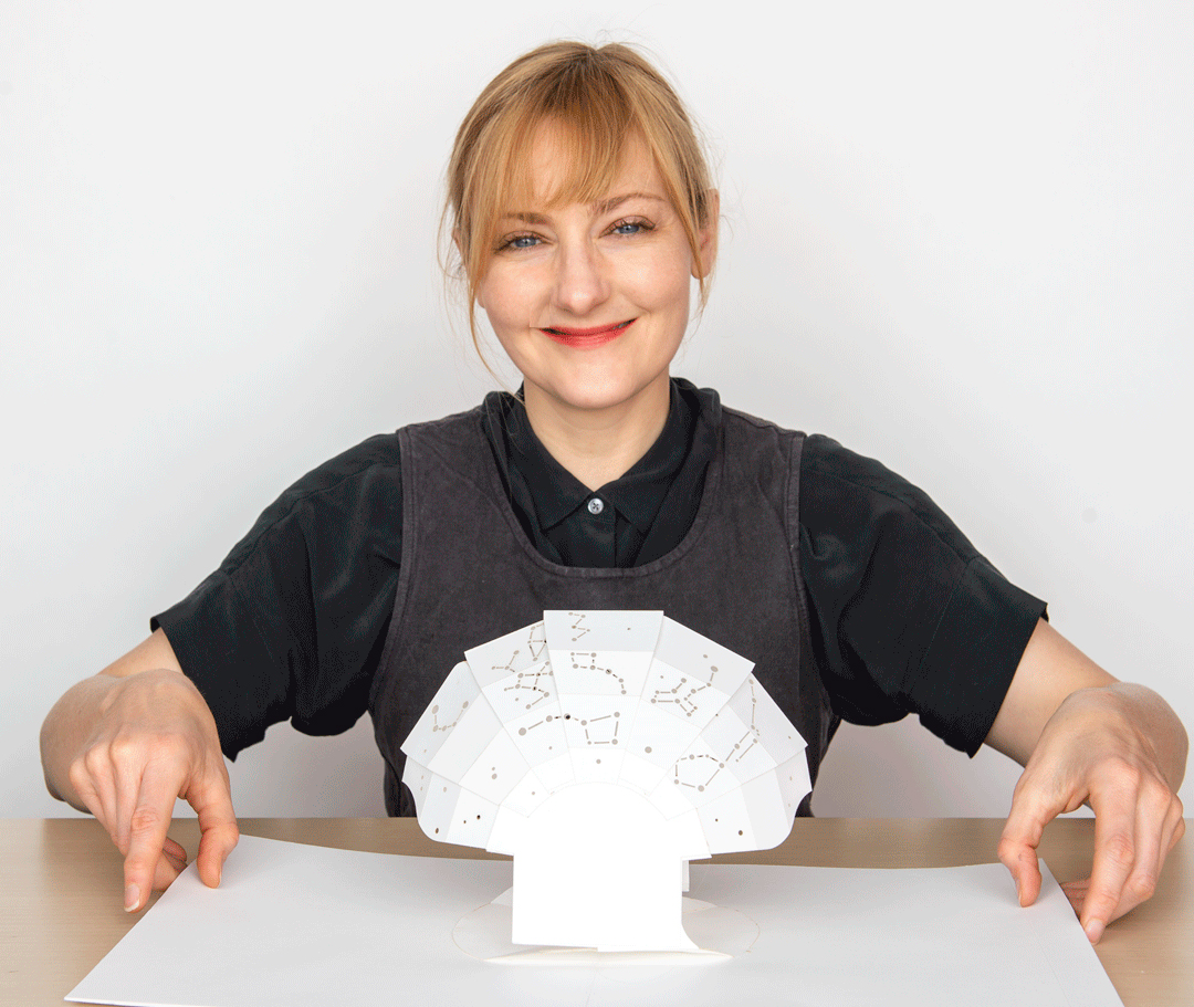
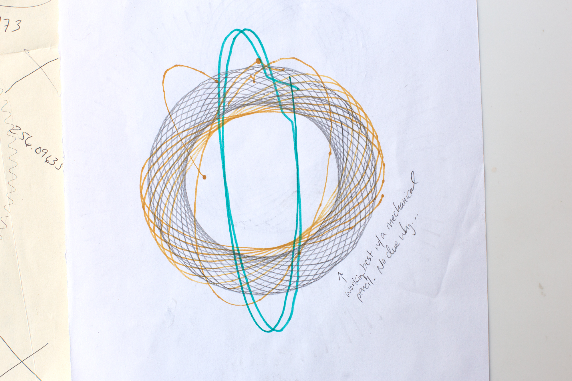
It feels weird to talk about design-process right now, but hopefully some of this nerd-joy is contagious:
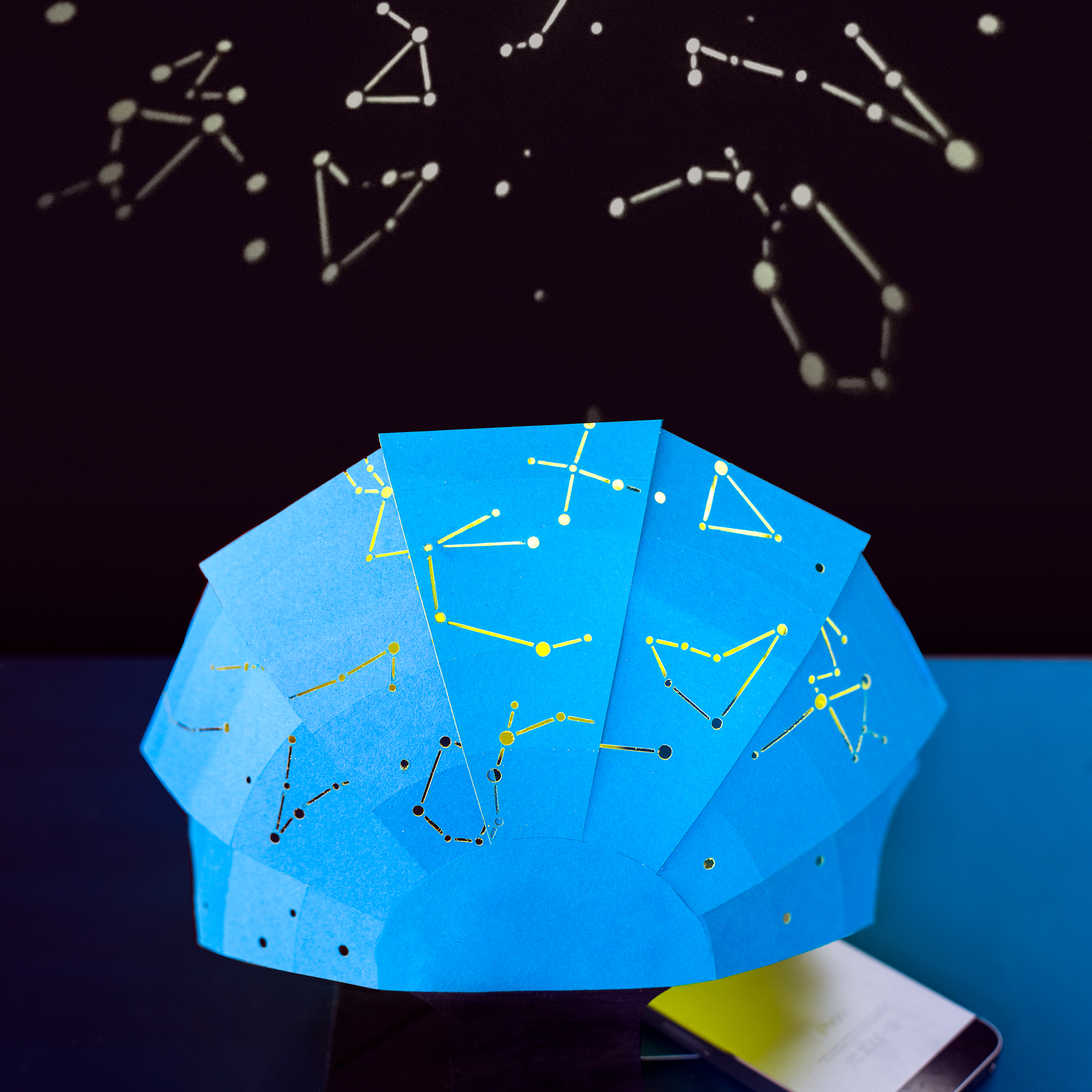
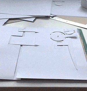
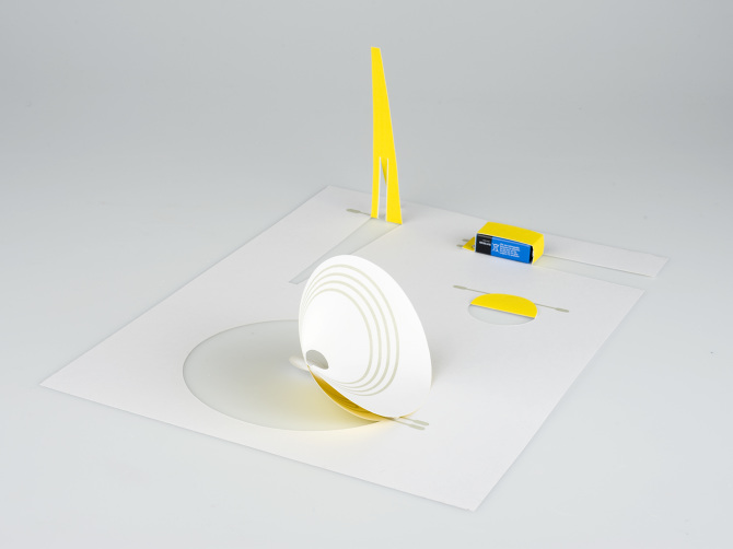
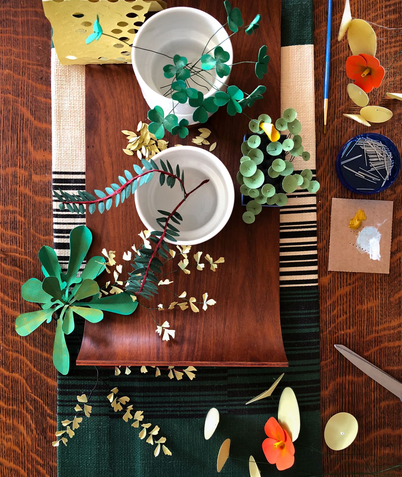
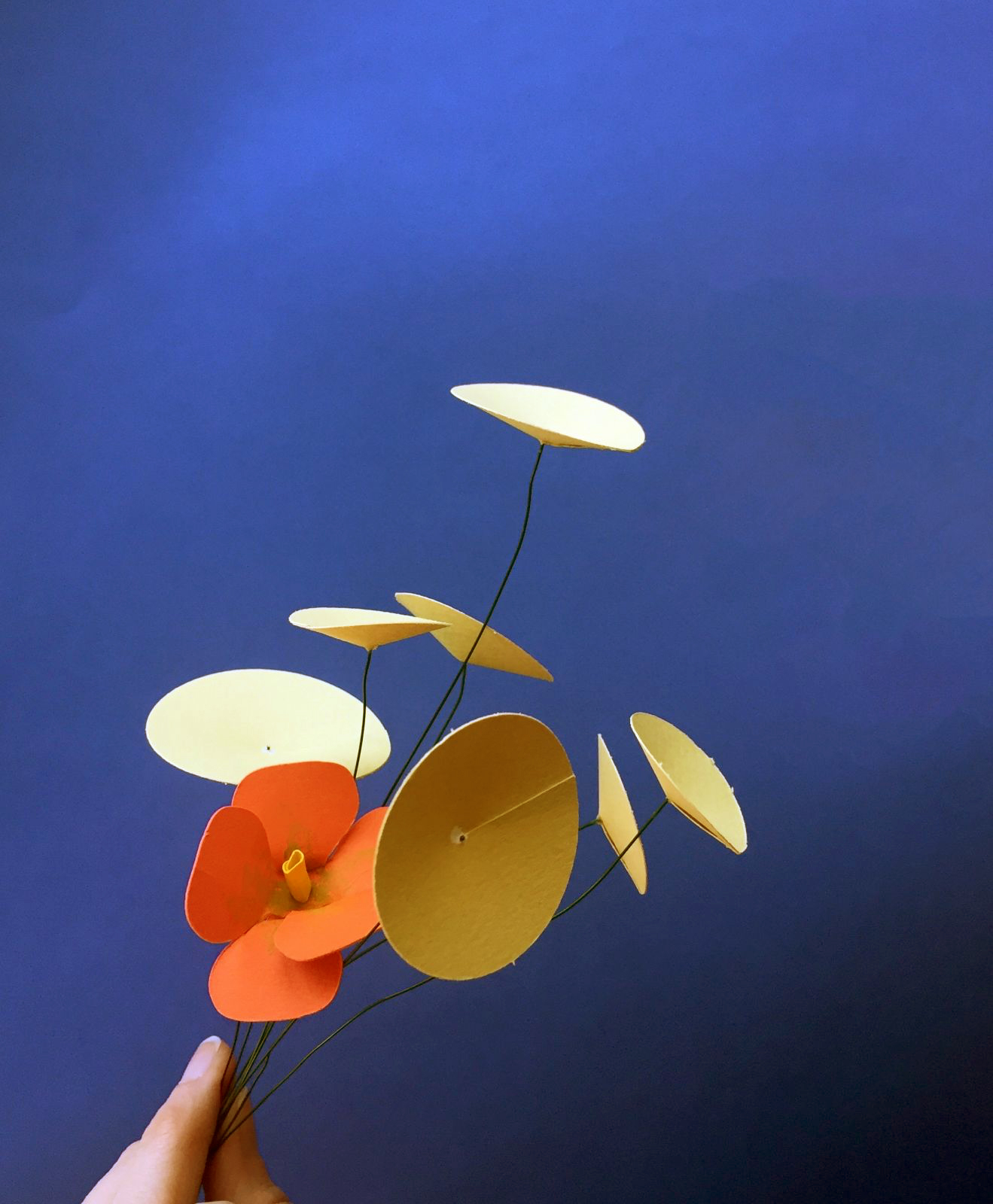
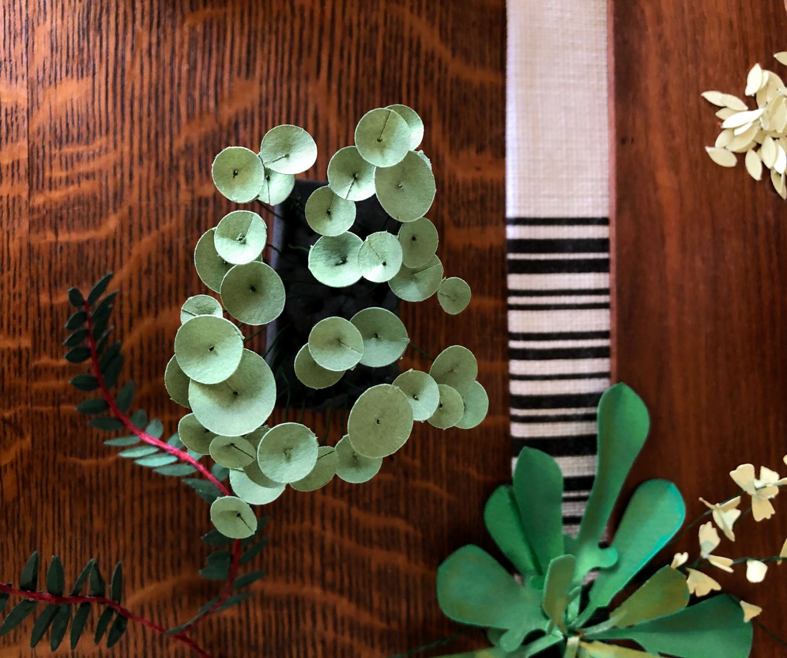
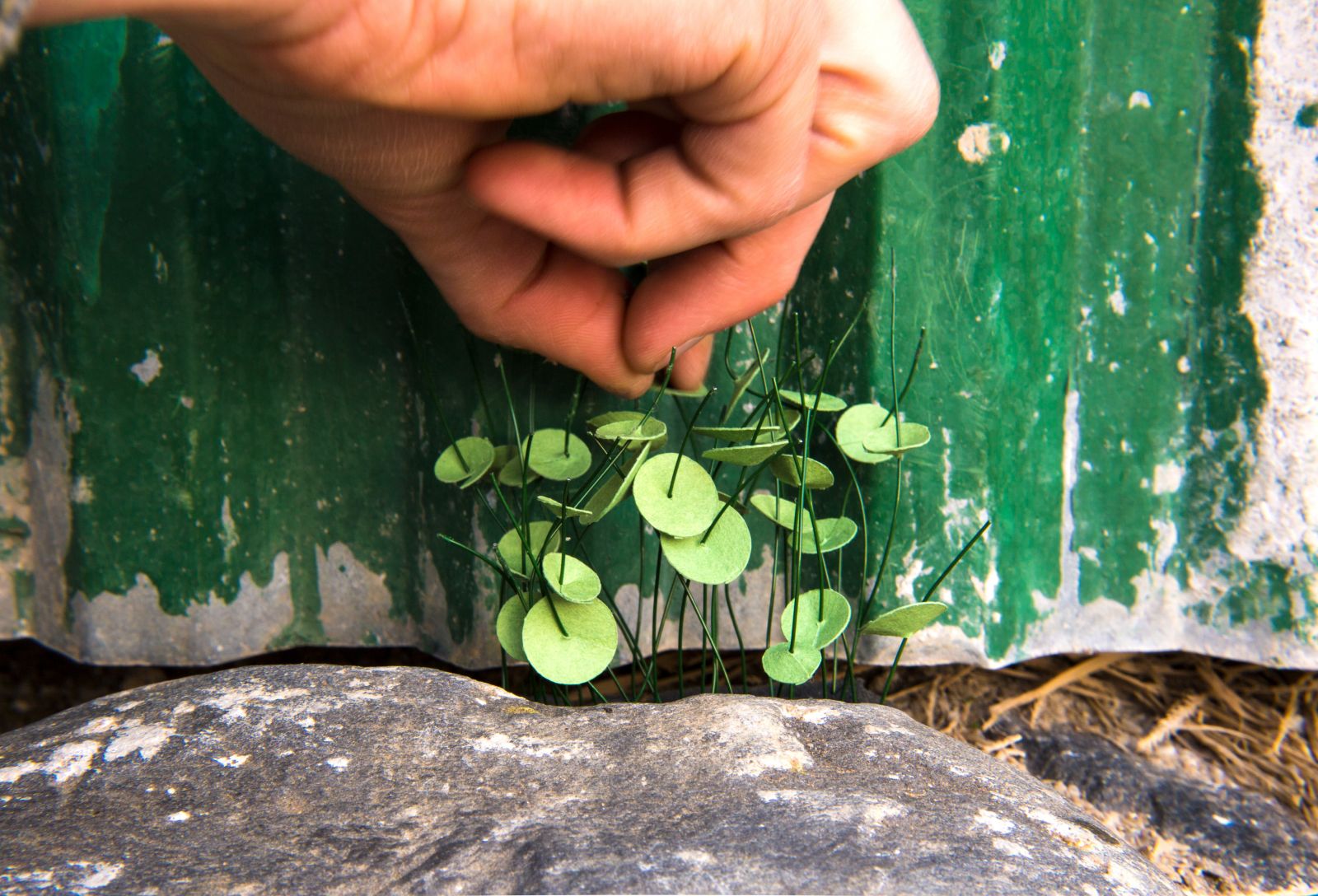
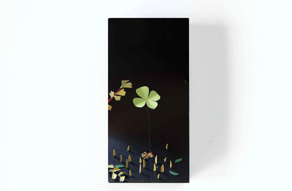
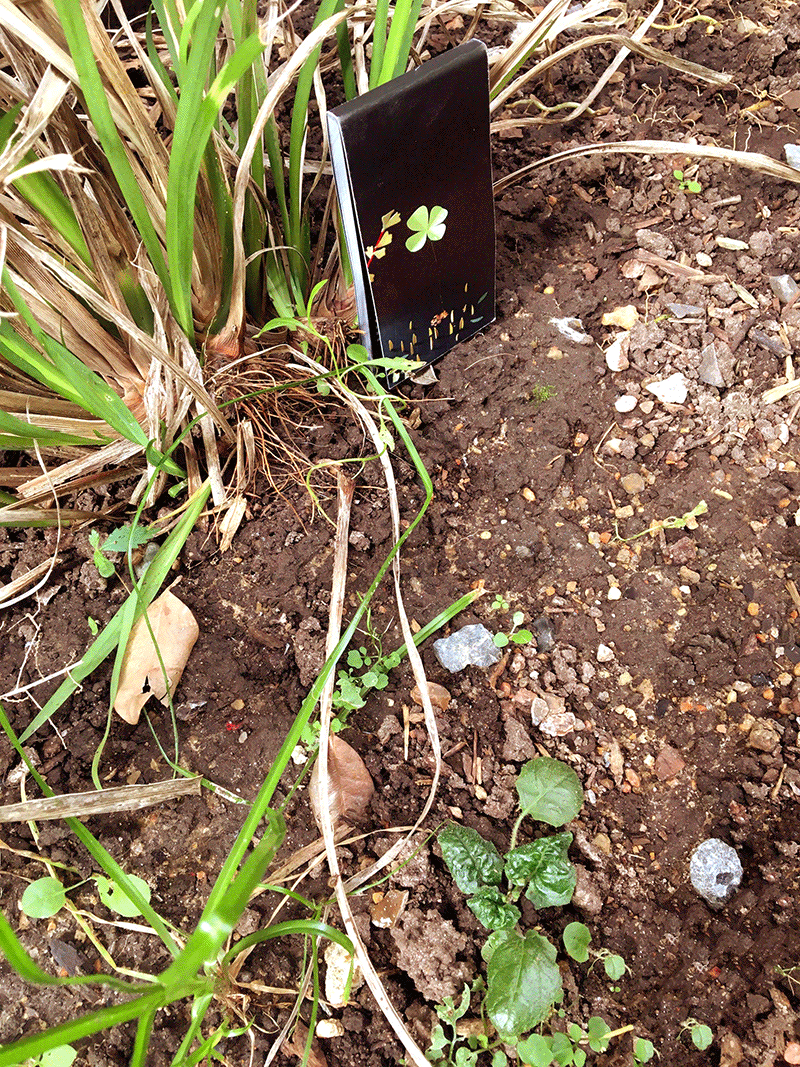
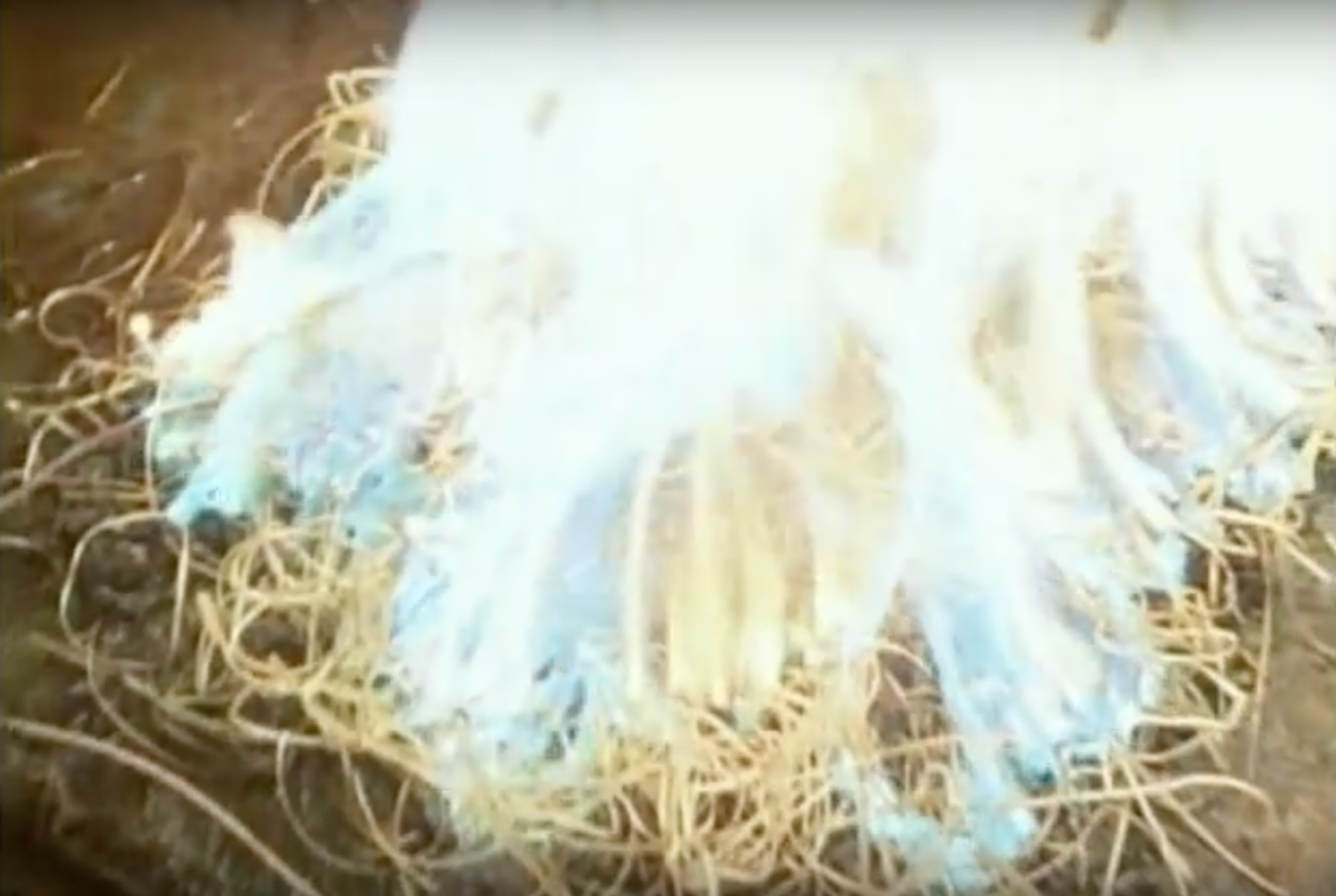
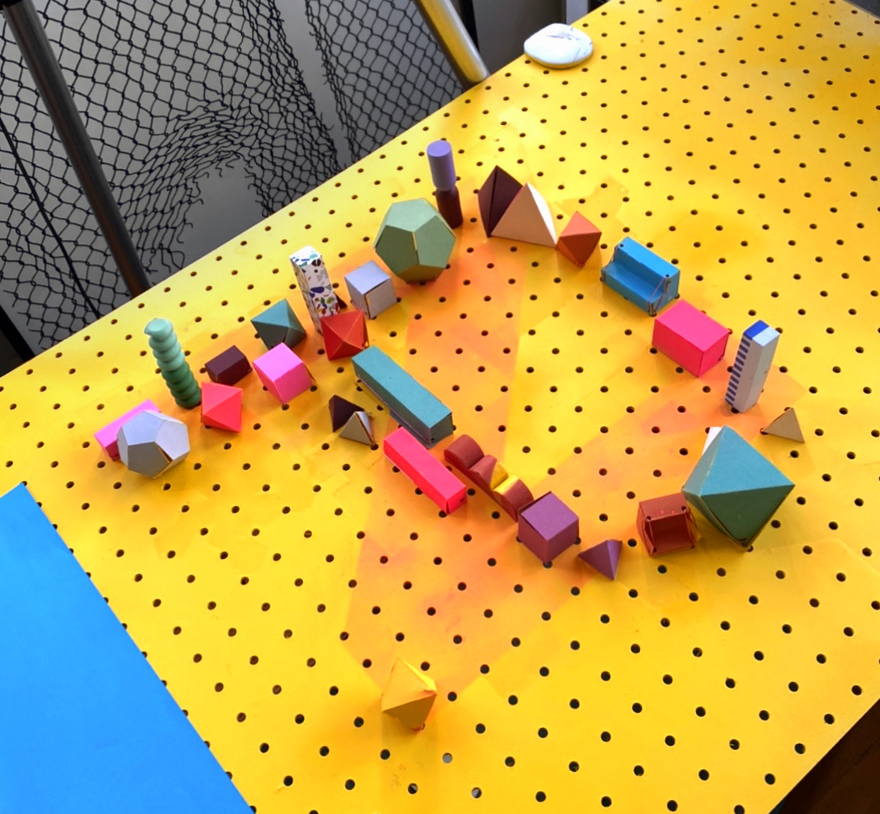
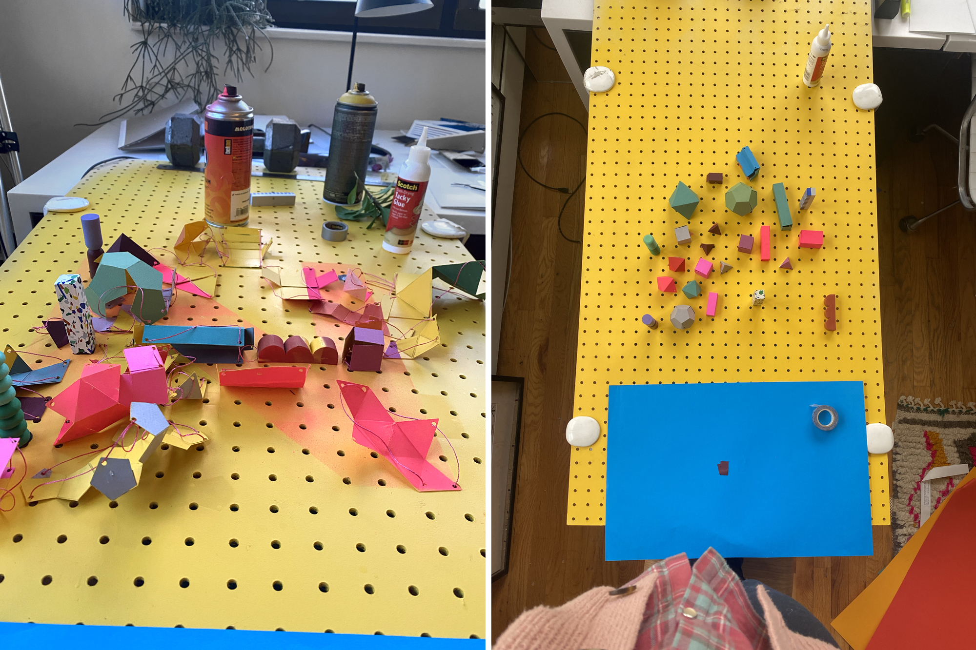
All of my favorite art supply stores are closed. The spray paint supply chain is currently pretty lacking. I can’t find the exact colors of papers that I want. So I got really scrappy and foraged all of the materials for this set from within my apartment. I had pegboard, string, paper, and a [dangerously] limited amount of the correct yellow color of spray paint.
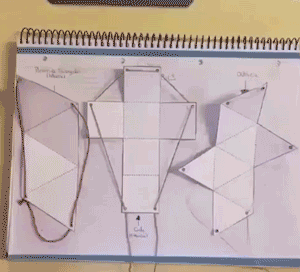
My idea was to transition from N to P using a technique I had seen in a fleeting animated gif, whose original source was lost, like a vision from a dream. In it, in a middle school geometry lesson, a student pulled a string to animate a 2-D shape into a 3-D geometric volume. I’ve since learned that these forms are called pull-up nets, I’m *obsessed*!
With almost no materials: the rules of geometry and the laws of physics were allowed to play out in physical space—choreographing a flat schematic into a concrete volume. (organic, like a flower blooming, but along the rigid demarcations of Platonic solids.)
From 2-D space to 3-D volume, from screen-public-life to the physicality-of-an-outdoor-park these are all places that we, humans, purpose-build to reflect our values. The handmade final piece reminds that the internet we know today was also largely built by hand.
As I write this, the Internet is still a malleable place that we can shape and touch. (This will grow decreasingly true in the AI-led future.)
BIPOC Design History
Silas Munro has brought-together a group of historians specializing in African and African-American design and they are piecing-together a collective history, together, in real time, over Zoom. (And it is a pleasure to observe!) I caught the first three classes and my world has expanded. There are entire continents-worth (civilizations-worth) of art and design awaiting your enjoyment, and people with knowledge of the secret histories of the world who are eager to share their passion. (Running through the end of January.)
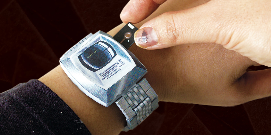
Paper recreation of BYTE magazine by Imin Yeh
Art&&CodeFriends Golan Levin, Claire Hentschker, and others at The Studio for Creative Inquiry at CMU have put-together Art&&Code—a free, online conference that asks: “What does homemade mean in the digital age?” It is about art and tech, but also about gift-making and -giving, and about what connecting through art means right now.
Golan stated that he wants the conference to be a reminder that we should all feel empowered to make, do, and learn whatever we want, in as cross-disciplinary way as we wish. That, in this time when so much of society has fallen apart, that there is opportunity in structurelessness. Young designers believe they need 5 years at Apple, a functioning supply chain, and a couple years at an agency to do groundbreaking work… when really, all they actually need to radically experiment is sitting on their desk.
In that spirit, we are collectively making a downloadable zine of DIY paper projects for all attendees. Everyone is working so hard on this one and I think it will probably be wonderful.
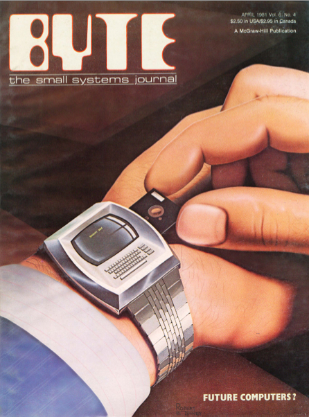
The original BYTE cover. And a funny article about what it represents: https://time.com/60505/this-1981-computer-magazine-cover-explains-why-were-so-bad-at-tech-predictions/
Upcoming workshops
Many, many of you have bought This Book is a Camera this year (jeez, thank you so much!)
Are you using it? (I want you to love using it! or at least have that possibility)
If you’re a little bit intimidated by the idea of doing photography in your bathroom, fear not! It’s fun and easy, I promise. Let’s do it together. On Saturday, January 23rd, Ill run two workshops. One at 9am EST and another at 9pm EST. Sign up here and I’ll email a zoom link.
I’m going to be running two RISO animation workshops in the coming months. While we can’t gather together in a print shop, Keegan at the Arm and I have worked out a system where we’ll print, scan, and mail the frames to participants. We also have a webcam, so we can all go over the function of the RISO machine’s inner-workings… the next best thing to touching the beige beast. If this sounds at all interesting, sign up here and I’ll email you when we set a definite date. It will be fun and fun will always be important.
Max Fenton recently shared this gorgeous poem, which I had forgotten about, but that feels like the perfect now. Stay safe, friends and keep going.
Good Bones by Maggie Smith
Life is short, though I keep this from my children.
Life is short, and I’ve shortened mine
in a thousand delicious, ill-advised ways,
a thousand deliciously ill-advised ways
I’ll keep from my children. The world is at least
fifty percent terrible, and that’s a conservative
estimate, though I keep this from my children.
For every bird there is a stone thrown at a bird.
For every loved child, a child broken, bagged,
sunk in a lake. Life is short and the world
is at least half terrible, and for every kind
stranger, there is one who would break you,
though I keep this from my children. I am trying
to sell them the world. Any decent realtor,
walking you through a real shithole, chirps on
about good bones: This place could be beautiful,
right? You could make this place beautiful.