<p>The opposite of doomscrolling: Every two weeks (roughly) I send you a collection of the best Internet reading I've found -- links to culture, technology, art and science that fascinated me. Full, <a target="_blank" rel="noopener noreferrer nofollow" href="https://buttondown.com/clivethompson/archive/">free archives here</a>.</p><p>I'm Clive Thompson, a longtime science and tech reporter (<a target="_blank" rel="noopener noreferrer nofollow" href="https://authory.com/clivethompson"><em>Wired</em>, <em>New York Times Magazine</em></a>), book author (<a target="_blank" rel="noopener noreferrer nofollow" href="https://www.penguinrandomhouse.com/books/539883/coders-by-clive-thompson/"><em>Coders</em></a>) and <a target="_blank" rel="noopener noreferrer nofollow" href="https://clivethompson.medium.com">blogger</a>. I'm at <a target="_blank" rel="noopener noreferrer nofollow" href="mailto:clive@clivethompson.net">clive@clivethompson.net</a> and <a target="_blank" rel="noopener noreferrer nofollow" href="https://saturation.social/@clive">on Mastodon.</a></p><p>The Linkfest is pay-what-you want. Put your email below and boom you're subscribed, for free!</p><p>It'll tell you to "upgrade your subscription" -- but you don't need to, unless you want to put in a <strong>monthly</strong> amount below to support this project, and obtain my <em>undying regard.</em> It's <em>Guardian</em>-style economics here; folks who support it help keep it free for rest of the entire planet.</p>
It’s time for "the opposite of doomscrolling” — a new Linkfest, in which I sort through the planet-wide digital rummage-sale of the Internet to locate the finest items of culture, science and technology, just for you.
It’s time for "the opposite of doomscrolling” — my next Linkfest, a collection of the most interesting items in science, culture and technology I could find during a complete A-to-Z reading of the entire known Internet.
As she notes, there’s something fascinating about the geometry of our landscapes: Humans attempt to impose firm Platonic shapes on the fields around us, but their edges are often slightly softened or distorted by the facts on the ground — like hills, trees, waterways, and the like. So it’s geometry, with fuzzier math:
In living in the countryside in a place of natural beauty, I am surrounded by inspiration for my pieces in the endless fields and meadows, lush forests, winding rivers and reaching moorland. I’ve always had an interest for aerial landscapes and use a combination of stitches on felt sheets to recreate them based on the Devon countryside. I particularly enjoy recreating the fields – I love the shapes they naturally form and are made to form by agriculture, seemingly perfectly fitted together yet forced.
She’s got a huge gallery of dozens of these works, sadly all of which appear to be sold. I’d love to get one some day …
2) 🚲 Popping a wheelie for 93 miles
Oscar Delaite (via himself)
Oscar Delaite, a 19-year-old student in France, just did a bicycle wheelie for 93 miles — a feat that required six and a half hours of riding on one wheel.
Oscar trained for more than a year, 10 to 15 hours a week. His record-breaking set up was quite typical: a Rose commuter bike with a flat bar and slick, 50 millimeter width tires, standard pressure. The only modification was adjusting the seat so Oscar could sit as he attempted the record.
Delaite wore a helmet, a camera strapped to his chest, and a water supply draped around his back. He did not wear fancy cycling shoes—he wore Nike basketball high-tops. Over the six and a half hours, he averaged a speed of 14 miles an hour, which is rather remarkable.
I asked him what he thought about during the attempt. Could he daydream? Could he zone out and listen to the entire Dylan catalog? Terrible podcasts?
“I had to be focused,” he said. “I checked the times, the number of laps. The last hours are really, really intense. If I make a mistake, I can’t restart at 100 kilometers.”
Apparently his arms and legs felt fine; his butt, however, was pretty sore.
I’m impressed. And I’m familiar with bike stunts — I cycled across the entire United States, from NYC to the Pacific, two years ago! (Annnnd my book about it arrives spring of 2027; you will be hearing much more about this from me in the year to come.) I’ve done lots of rides of 93 miles or more … but I used both my wheels, which now feels like cheating or something? This kid is metal.
BAHTTEXT converts a number into Thai Baht words. For example, =BAHTTEXT(472.50) returns สี่ร้อยเจ็ดสิบสองบาทห้าสิบสตางค์, which means four hundred seventy-two Baht and fifty Satang.
This function was introduced for Thailand’s accounting and invoicing standards, where monetary values are often written in both numeric and textual form to prevent fraud or misreading. It’s the only language-specific number-to-text function built into Excel, although Thailand is not the only country to write both numeric and textual values in official forms. Oddly, Microsoft didn't add this support for any other country.
These two are remnants of the financial world’s pre-decimal era. They're also the most interesting to me, because learning their purpose turned into an impromptu history lesson: U.S. bonds and some stock prices were once quoted in fractions rather than decimals (typically in sixteenths or thirty-seconds). For example, a bond price might appear as 101 8/32. This means $101 and 8/32 of a dollar, or $101.25 in today's notation.
DOLLARDE converts fractional dollar values to decimal form, while DOLLARFR does the reverse. For instance, =DOLLARDE(1.02,16) returns 1.125, and =DOLLARFR(1.125,16) returns 1.02.
These conversions allowed analysts to run calculations on legacy data without rewriting pricing systems. Since modern markets use decimals, both functions now survive mostly for historical completeness. They remain accurate but have almost no practical application outside of reconstructing vintage financial records.
He also found one that takes regular numbers and turns them into Roman numerals — and another that does the reverse. Go check out the whole list!
Basically, if I’m understanding their write-up here, they’ll hook a box full of algae to the eyepiece of a telescope, and focus it on a star at night — exposing the algae to those ancient and distant photons. (And I guess during the daytime they’ll keep it in total darkness, so the only light it’s exposed to is the night-time starlight?)
These lucky lifeforms will be the first to experience actual light from another star at concentrations similar to a forest floor or deep ocean waters on Earth: a fraction of a percent of direct sunlight’s intensity. Some diatoms are already adapted to the extremely low-light conditions that will be necessary for this project to work. “It’s not easy to squeeze light from the night sky,” continues Pell. “To reimagine the night as a source of light, is a real break with tradition to say the least.” [snip]
The project gets its name from a process Pell calls “Stellar Drift:” preparing the microbes for their new host star using a custom incubator which simulates the gradual shift from the lighting conditions of the Sun towards those of the new star. Another invention necessary to the project is what Pell calls the “Stellar Harvestar,” a little box he designed that fits where an eyepiece or camera normally would go on the telescope, and maintains the conditions that the cells need to live and holds them in the right place to receive the stellar light.
This hasn’t yet begun, so it could be vaporware, but considering these folks are high-concept artists I’m betting they pull it off, lol.
Why, though, would they do this? Part of it is just the mission statement of the Center, which attempts to track and meditate on the ways in which human activity has produced a postnatural world of nature.
I believe there is something to be gained in stepping beyond the theoretical by doing something that appears impossible. It’s 21st century alchemy that might help get us out of the cosmic rut we as a civilization appear to be in.
6) 🐤 Starlings are pretty good at imitating R2-D2
Lots of birds are good at imitating sounds from the world of electronics, like the ringtones of smartphones.
But can they imitate … R2-D2?
And if so, which type of bird is the best at imitating the famous Star Wars robot?
A group of scientists decided it was high time science got off its collective butt and answered this question.
We collected videos of parrots and European starlings imitating R2-D2 sounds from publicly available social media platforms like YouTube, Instagram and TikTok. Search terms included “Parrot imitating R2-D2”, “Parrot R2-D2”, “Starling imitating R2-D2”, “Starling R2-D2”, common names of parrots (cockatiels or African grey) followed by “imitating R2-D2” and the same search terms translated in other languages (Dutch, German, Spanish, Portuguese).
It turns out that starlings had the upper hand when it came to mimicking the more complex 'multiphonic sounds. Thanks to the unique morphology of their vocal organ, the syrinx, which has two sound sources. This allows starlings to reproduce multiple tones at once—perfect for R2-D2-style chatter.
Parrots, on the other hand, are limited to producing one tone at a time (just like humans). Still, they held their own when it came to the simpler “monophonic” beeps of R2-D2.
This is all quite fun, but the study also included one very cool and unexpected finding. They had hypothesized that the bigger-brained parrots would be better at mimicking R2-D2 than the smaller-brained ones, like budgies. Nope: The budgies were better!
Our results could therefore be explained by a trade-off between the capacity to learn allospecific sounds versus the degree of imitation accuracy. Larger brained parrots may have a higher capacity to learn more sounds but are less accurate at imitating the sounds whereas smaller brained parrots focus more on the accuracy of the few sounds they have learned by practicing each imitated sound likely more often than parrots with significantly larger imitation repertoires.
7) ⛏️ The rise of “phytomining”
Pycnandra acuminata, a plant that accumulates nickel, which dyes its juices blue. By Henry Benoit (CC 4.0 license, unmodified)
“Phytomining” is the process of growing plants that — as part of their natural life-cycle — suck metals out of the ground and incorporate them into their structure. It was first proposed back in 1983 by the agronomist Rufus Chaney, as a way to extract zinc from polluted soil.
But these days several companies are realizing that some plants are so good at inhaling metal from soil that they’re trying to use it for commercial mining. Instead of digging a hole in the ground and pulling minerals out, you’d plant acres of crops that phytomine the soil, then harvest the crops, burn them, and voila: Metal. Sometimes the quality of the metal you get is more pure and concentrated than what you’d get from old-school pick-and-shovel mining.
… Metalplant, a Delaware-based company, is collaborating with the Connecticut-based biotech firm Verinomics on a grant to genetically engineer O. chalcidica. Metalplant is already successfully using the species to mine nickel in Albania where it is native, but the company is hoping to tweak it to boost its nickel uptake and prevent it from becoming invasive when planted in North America.
Dhankher’s own phytomining efforts got a $1.3 million boost from the ARPA-E program. He aims to develop a genetically engineered version of Camelina sativa, a fast-growing member of the mustard family that is already widely grown in the United States for biofuel, so that it can become a better nickel accumulator. “The target is to create these plants that can accumulate 1 to 3 percent nickel,” Dhanker says. An advantage of C. sativa is that in some areas phytominers could grow three crops a year. If the plants accumulate at least 1 percent of their body mass as nickel, Dhanker says they could produce up to 25,000 kilograms of useful metal per square kilometer of soil each year (around 145,000 pounds per square mile). A typical electric vehicle battery contains about 30 to 50 kilograms (66 to 110 pounds) of nickel.
That latter stat is wild: Getting the nickel for 500 to 800 EV batteries by planting crops is deeply solarpunk.
Lots of caveats apply. It’s not terribly efficient; monocropping big areas is always risky; plus, some of these hyperaccumulators are basically weeds, at least one of which has already escaped from an experimental installation and become an invasive species.
But the idea is pretty damn nifty. I want to keep my eye on this area.
8) ⌚️ Gallery of 50 years of Casio digital watches
These two watches came equipped with two special features for business users: a Telememo function that stored up to 50 telephone numbers, and a schedule function that provided reminders for up to 50 schedule items. The higher-capacity internal memory could store entries combining 5 letters and 12 numbers.
Its function-minded layout of large remote control buttons ensured intuitive operability. Users could turn their TV or VCR on or off, change channels, adjust the volume, and more using the watch on their wrist. It was compatible with TVs and VCRs from the major manufacturers. At last, no more searching for the remote! This convenient lifehack made the CMD-10 quite popular in its day.
“Popular” may be doing a lot of work in that last sentence; I am not sure I ever saw one of these gorgeous beasts in the wild, and my friendship circle in 1993 was pretty nerdy.
It used photoelectric pulse detection, employing LED light to measure changes in blood flow. Users simply placed a fingertip on the sensor to get a pulse readout. Comparing post-run readings with ordinary pulse rate could help users determine their optimal exercise intensity.
When the James Webb Space Telescope — also known as the “Just Wonderful Space Telescope” — went into operation, it started sending back images of galaxies that were much crisper than those of the Hubble.
But how much better were they? The software engineer John Christensen wondered, so he collected images of galaxies shot by both telescopes, at precisely the same size and scale. Then he created a little slider you can move back and forth to help show just how much better the JWST images are.
10) 🦼 The joy of all-terrain wheelchairs
via Trackchair
The Trackchair is “a cross between a wheelchair and a tank”, and for anyone with limited mobility, it offers something remarkable: The ability to go off-road and into nature.
… the mood among guests was palpably cheerful. The sun burst through, and the oaks and maples exploded in red, orange and yellow. The three-mile loop on the gravel carriage roads wound past babbling streams and verdant fields. Sheer cliffs glistened in the distance.
“I could get used to this,” exclaimed Stephen Fray, 61, who has ALS. The highly reactive battery-powered Trackchairs with motorized tilting seats impressed the former civil engineer (and Boy Scout). But his disease has forced him to prematurely retire and tap his savings so he was skittish about the cost of one: between $13,000 and $27,000.
David Daw, who attended an afternoon session, also seemed ebullient: “I feel free. I don’t feel sick when I’m out here.”
Indeed, given how much we now know about the restorative quality of being in nature — it’s good for everything from blood pressure to mental health — you’d want anyone with mobility issues to have access to a Trackchair, right? But as David discovered, insurance companies are too damn cheap to pay for them.
At an event at Green Lakes state park, he met a woman born with stunted limbs who asked if he could take her to the beach in a Trackchair. Once there, she asked him to scoop some sand into her hand.
“She starts crying,” Trager recalled. “I’m like, ‘What’s the matter?’”
She told him she had never felt sand before.
“She got very emotional,” said Trager. “And this is why we’re doing this.”
These days, most large-language-model AIs are deployed with “guardrails” to try and prevent them from offering dangerous replies — like delivering bomb-making recipes or offering advice on committing assault.
So there’s a cottage industry of security folks who try to red-team the LLMs, experimenting to find prompts that will jailbreak the AI and get it to ignore its guardrails. Usually this involves engaging in a long-ish conversation.
Then they took 1,200 malign prompts from a standard test suite of these — prompts in the areas of “Hate, Defamation, Privacy, Intellectual Property, Non-violent Crime, Violent Crime, Sex-Related Crime, Sexual Content”, and more — and had them autotranslated into poems. These did pretty well too! Fully 43% were able to jailbreak the LLMs.
What’s additionally interesting, as the authors point out, is that bigger models were more susceptible to poetic attack than smaller models.
Why, exactly, would poetry jailbreak an LLM? The researchers don’t know, but they suspect that LLMs are overtrained on “prosaic surface forms”, and thus simply don’t have enough experience looking at poetry. These findings may also be further evidence that LLMs don’t grasp the actual meaning of language, so they can’t really understand “underlying harmful intent”. It’s probably a mix of both of these explanations …
For safety research, the data point toward a deeper question about how transformers encode discourse modes. The persistence of the effect across architectures and scales suggests that safety filters rely on features concentrated in prosaic surface forms and are insufficiently anchored in representations of underlying harmful intent. The divergence between small and large models within the same families further indicates that capability gains do not automatically translate into increased robustness under stylistic perturbation.
My only complaint about this paper, which is free to read here, is they don’t reproduce any of the poems themselves! I know that’s for security purposes, but I’d love to have see them. Frankly, I’d love to have all 1,220 of the poems in a print-book anthology 😅
12) 🪢 “Homo cordage”
4,000-year-old ropes discovered in Egypt (via the Joint Expedition to Mersa/Wadi Gawasis of the Università “L’Orientale,” Naples and Boston University)
This is not something I had ever considered before! But as he points out, cords are one of our oldest technologies — and they’re a catalytic one, because they make other technologies possible. You could argue, as he notes, that humanity could be considered “Homo cordage”.
Because they are prone to decay, pieces of intact string from more than a few thousand years ago are scarce. Even when they are found, they rarely make headlines or feature in museum exhibits, more likely to be relegated to storage. But they do exist: in 2009, scientists revealed the discovery of tiny 30,000-year-old flax fibers in clay excavated from a cave in Europe. Some of the fibers were twisted, knotted, spun, or dyed turquoise and pink, suggesting complex textiles. If one looks at the archaeological record in the right way—focusing on the implied rather than the material existence of ancient fiber—then the evidence for the importance of string and rope is even older. In South Africa, Israel, and Austria, researchers have found shell and bone beads dating as far back as 300,000 years ago. And in the Hohle Fels cave in southwestern Germany, archaeologists discovered a 40,000-year-old piece of mammoth ivory carved with four holes, each enclosing spiral incisions. They think the tool was used to weave reeds, bark, and roots into a thick cord.
Although string and rope began to take shape on land, it was the ocean that unleashed the full potential of cordage. The earliest watercraft were probably rafts lashed together from branches or bamboo, and dugout canoes carved from logs, such as the 10,000-year-old Pesse canoe discovered in 1955 during motorway construction in the Netherlands. At first, the only means of propulsion were oars, poles, and the whim of the currents. Sailing required a critical insight: that the wind, like a wild animal, could be caught, tamed, and harnessed. A mast and sail, which is really just a tightly knit sheet of string, could trap the wind; long coils of sturdy rope could hoist and pivot the sail. String transformed seagoing vessels from floating lumber to elegant marionettes, animated by the wind and maneuvered by human will.
Cordage is so invaluable that it has even accompanied our most sophisticated scientific machinery into the depths of space: to secure cables on the Mars rover Curiosity, NASA engineers relied on variations of the clove hitch and reef knot, two traditional knots that have been used for thousands of years. That rover is currently exploring the surface of Mars.
In the last Linkfest I wrote about the ethics of selling a haunted house. (Apparently 51% of buyers believe a seller should be required to disclose if a house is haunted.)
When did people start thinking that houses could be haunted, though? The author Caitlin Blackwell Baines has a book about precisely this question — How to Build a Haunted House: The History of a Cultural Obsession.
The Castle of Otranto, too, emphasises its confected artificiality. With a complicated plot involving a long-lost heir, star-crossed lovers and a mysterious death by falling helmet, Walpole promoted it as ‘a new species of romance’, which fused ‘imagination and improbability’ with a ‘strict adherence to common life’. The novel established narrative tropes that have proved remarkably persistent in the haunted house genre ever since: gloomthy location, veiled prophecies and a narrative framing device involving the discovery of a manuscript. More significant than plot was the novel’s setting. Before Walpole, ghosts in English literature tended to haunt people, or generic geographic locations: crossroads, bridges, graveyards. After him, they came inside, haunting domestic spaces.
Baines’s central argument is that the rise of the haunted house in the popular imagination coincided with the emergence of the modern home as a physical and psychic reality: a building designed specifically as a dwelling, separate from farm or workplace, where a single nuclear family lived together in isolation from the rest of society. This led to a turning inward of domestic experience that is, as many historians have argued, reflected across culture more broadly. On this reading, haunted houses are ghostly analogues of the stream of consciousness novel, Impressionist painting or the rise of psychoanalysis. In the essay in which Freud first used the term unheimlich, he pointed out that one of the few successful English translations is ‘“haunted”, in the sense of “a haunted house”’.
Why would it be good? Because jet contrails are heat-trapping gases. Jets form contrails when they emit vapor, soot and particles that trigger the formation of high-up clouds of ice-crystals. When heat tries to escape the planet, trace amounts bounce off the bottom of the contrails and get redirected downwards.
A lot of naturally-occurring clouds have this effect; it’s called “radiative forcing”. Contrails create about 2% of all the planet’s radiative forcing. That isn’t a huge amount, but it has the benefit of being artificially generated — which means it’s something we could, in theory, avoid or reduce.
This is the “easy” part! Basically, planes create contrails only when they fly through thin regions of the atmosphere that are cold and humid. All we’d have to do is predict where these regions are, and have the planes take slight detours around them. It wouldn’t add more than a few minutes to a flight.
Better yet, contrails are quite rare — only 3% of all flights create nearly 80% of them. So we’d only need to add very small detours to a very small percentage of all flights, and we could get rid of 2% of radiative forcing. In the engineering puzzle/challenge of dealing with climate change, a quick fix is a rare and significant “win”.
Granted, making flights every so slightly longer would increase their CO2 emissions — but the greenhouse reductions you’d get from eliminating contrails would be much bigger.
Let’s take a quick example for British Airways. They operate around 300,000 flights per year. If we reroute 2% of those to avoid contrails, and rerouting increases fuel burn by around 2% (I’m being deliberately harsh here), then I estimate that the additional fuel costs are in the range of $1.2 to $2 million per year. Let’s say that the operational costs of forecasting and modelling adds another 50%. That takes us to around $2.5 to $3 million.
In 2024, British Airways had an operating profit of around $2.7 billion. Contrail avoidance would therefore be just 0.1% of its operating profits.
They could pass the price on to customers if they wanted — estimates vary, but it might only be 10 or 15 bucks per flight, which is only a couple pennies per passenger.
It’s time for "the opposite of doomscrolling” — my next Linkfest, in which I offer up the finest nuggets of science, culture and technology that I could pan from the glittering, unceasing creek of the Internet.
Instead of making noise or flashing lights like smartphones or smart speakers, these wooden robots by Swift Creatives move quietly and use physical gestures to give alerts. Each of them has its own kind of movement: Beamer tilts its head on the sides, Bot bobs its head up and down and pushes its wooden ear in and out, and Hover rotates and stops at one point.
Each robot has a small body made from soaped or smoked oak wood, a material often used in Danish furniture and crafts. Inside each wooden form are sensors and small software systems that allow the mini robots to react to signals from connected devices. When a notification arrives, – say a message, a reminder, or even when the food delivery has arrived at the doorsteps – the Botties react by tilting their heads, nodding, or moving slightly, and this becomes a quiet form of communication that relies more on visual cues instead of sounds.
To get a sense of how adorable these are, you really have to watch this short video here of them in action. The soft, chunking sound of the wood in motion is lovely: Notifications as ASMR.
It gives you several crossword-like clues, and you have to create all the words by snapping together Tetris-like letter-segments. You can move a tile anywhere you want, and click it to rotate it clockwise.
If you get a word right but have it oriented the wrong way, it’ll color things orange; if you get the word perfectly right — correct word, correct orientation — it goes blue.
I spent a couple minutes with today’s puzzle getting this far …
It’s a lot harder than it looks! Every time I assemble a word correctly, it feels like I’ve diced myself out of assembling other words. But I like it — I’m gonna keep working on this one. It’s a very cool game-mechanic!
3) 🎶 Bhutan’s talking stamps
Back in the 1960s, Bhutan issued a set of “talking stamps” — tiny vinyl records that were one-sided: You peeled off backing paper on the non-playing side, and slapped it on an envelope or postcard. Back in 1993 you could buy a mint-collection set for 17 UK pounds, but they’ve since become collector’s items and cost nearly 20 times more.
Todd’s first innovation, in 1966, was a circular stamp marking the 40th anniversary of Dorji-Wangchuk’s coronation, using a heraldic design embossed in gold on rainbow-coloured paper. It sold well. Next up was a series of triangular stamps featuring the yeti, the Himalayas’ fabled abominable-snowman. In 1967 came a set of 3D stamps on the theme of the space exploration; Todd’s stamps showing astronauts and rockets were laminated on prismatic ribbed-plastic and gave a convincing 3D effect. Over 200,000 sets were sold. Other successful issues included a set of Buddhist banners printed on silk, a set of traditional sculptures die-stamped in plastic, perfumed stamps and stamps made out of steel foil.
The talking stamps were the crowning glory of Todd’s programme. The set consisted of a yellow on red design containing a capsule history of Bhutan in Dzongkha, a gold on green with the national anthem, a silver on blue with the history of Bhutan narrated by Todd in English, a silver on purple featuring a folk song, a silver on black with second folk song, a red on white with a third, and a black on yellow containing the English-language history and two of the folk songs.
4) 🐦 Hear birdsong worldwide in the “Dawn Chorus”
via Dawn Chorus
The project was created by a consortium of scientists and conservationists in Europe, with the goal of gathering more info about the health of a habitat via birdsong. As they note, birdsong is a powerful indicator …
Many bird species are so-called indicator species as they provide information about different properties of a habitat. Long-term collections of early-morning bird sound recordings can thus help us to detect changes in habitats, for example by telling us where species disappear or appear, or how birds change their behaviour.
For many bird species, dawn is the crucial time when they sing their songs in a polyphonic early morning concert known as the “dawn chorus.” Behind every bird species that can be heard lies a whole network of biological relationships. Birds are therefore often considered indicator species. The sound recordings of the dawn chorus are therefore not only important for the scientific documentation of existing animal species—they also allow conclusions to be drawn about entire ecosystems.
The communal morning concert probably developed because there is particularly little air movement at this time of day. The night has led to uniform cooling and balanced temperature differences. As long as the sun cannot yet warm individual areas, there is little wind. Under these conditions, the singing carries particularly far. Another theory is that birds use the twilight of dawn for their conspicuous (courtship) songs because they are less visible to some predators at this time.
Recordings made over a period of years from the same location on approximately the same date and at approximately the same time relative to sunrise are a “jackpot” for researchers.
I’m gonna start recording the backyard birds at dawn, at least on the days when I can haul my butt out of bed that early; I am a night owl, pun intended. Judging by the map, they have lots of contributors in Europe but considerably fewer here in the US where I am.
(I’m interested to see that Bernie Krause is involved in this project. He’s a famous audio producer who first documented how human-made noise was increasingly intruding upon areas of previously pristine nature; I wrote a Wired column way back in 2008 talking to him about his concept of the “biophony”, or, the acoustic ecosystem of animals talking to each other in nature.)
The first version was not great. Despite the guidelines on the template, I apparently wasn’t good at sticking to them. Some letters were floating way off the baseline, and some were sunken below. When those opposites met it looked terrible. Fortunately Calligraphr has a pretty easy tool to slide each letter up and down, and scale it up or down if needed, and you can see it next to other letters as you do it. It took a little bit of time to go through all the variants of all the letters, but the next version looked a lot better.
Another tweak I ended up doing was reducing the spacing between letters. The defaults Calligraphr uses are probably good for a blocky font, but I wanted to put the letters close together to give it more of a joined-up look. Again, this is an easy tool to use, you just drag the sides in or out as desired. While these tweaking steps were probably as fiddly as some of the Inkscape steps I refused to do earlier, they’re a lot more rewarding as you see things improving with each one. It’s a lot easier for me to commit time and effort to improving something that’s already working reasonably, than put that time and energy into an unknown.
If you go check out that post he wrote, you can see the font in action: He uses it for the section headlines.
This is a fun project, and I would try it, but my handwriting is indescribably bad. I learned to touch-type as a kid way back in 1981, quickly achieved a speed of about 80 WPM, and never looked back. I do write marginalia notes by hand, but can only make ‘em readable if I go very slowly.
6) 🌞 Sea slugs turn themselves into solar panels
via Karen L. Pelletreau, University of Maine
Scientists have discovered a type of sea slug that can steal generic material from algae and use it to turn itself into a solar panel.
That is not a sentence that, when I first woke up this morning, I predicted I would be typing! Yet here we are.
Anyway, here’s how it works. The sea slug spends its days eating the algae Vaucheria litorea, which contains millions of “plastids”, or teensy organic components that contain chlorophyll. These chlorophyll-loaded plastids are what allow the algae to generate energy from sunlight.
What the scientists found, though, is that the sea slug can somehow incorporate those plastids into its own body – so successfully, in fact, that it can survive off photosynthesis for up to six months. During those periods, it doesn’t need to eat. It just gets energy from the sun.
“The broader implication is in the field of artificial photosynthesis. That is, if we can figure out how the slug maintains stolen, isolated plastids to fix carbon without the plant nucleus, then maybe we can also harness isolated plastids for eternity as green machines to create bioproducts or energy. The existing paradigm is that to make green energy, we need the plant or alga to run the photosynthetic organelle, but the slug shows us that this does not have to be the case.“
7) 🍸 The evolutionary value of getting drunk
via Pexels
First, there is a social aspect to getting drunk. When we drink with someone, we not only have the bonding experience of mutual enjoyment, but also come together in mutual vulnerability. When you are drunk, you’re easy to kill. When you’re staggering home, narrowly avoiding lampposts, it’s easy to steal your phone, your wallet, and your jacket. To be drunk with someone is an act of trust. It says, “I think so much of you that I’m willing to let my guard down.” And so, getting drunk is a kind of “chemical handshake” that lets the other person know you are someone to trust. Societies operate on trust, and alcohol is a kind of “social technology” that builds trust between potentially warring rivals.
“One of the main functions of alcohol is to depress selectively the prefrontal cortex (PFC). It turns the PFC down a few notches and helps us get back to that childlike state of mind where suddenly we see connections we wouldn’t see otherwise. Parts of our brain can talk to each other in ways that they don’t when the PFC is in charge.
And so, let’s say you sit down and you need to come up with a new idea. You have a couple of drinks. You are individually more creative because your brain is now de-patterned in a certain way. Plus, because you’re disinhibited—again, because the PFC has been turned down—you’re more likely to blurt out something to someone else that maybe you would be self-conscious about, or maybe you think it is a dumb idea. You’ll suddenly be like, well, why don’t we try this for getting gazelles?”
I dig this way of looking at it! Then again, considering I’m drinking two fingers of mezcal as I type these very words, I am not an impartial judge of this hypothesis. But I’m definitely ordering Slingerland’s book.
An earthquake occurs when tectonic plates suddenly slip, which releases a titanic amount of energy: Buildings shake, bridges collapse.
But here’s the nutty thing — apparently all this kinetic activity is just a tiny portion of the energy produced by an earthquake. Most of the energy, up to as much as 98%, turns not into motion but heat.
Even these centimeter-scale earthquakes got hot fast. “It essentially went from room temperature to above 900 degrees C in a few microseconds—so extremely, extremely fast,” Ortega-Arroyo says.
Between 68 and 98 percent of the energy released in these lab quakes dissipated as heat, the researchers found. The breaking of the wafer took anywhere from less than 1 percent of the energy to as much as 32 percent, whereas the shaking made up 8 percent or less.
This is, weirdly, good news for us humans living up here on the surface of the earth, right? If more of that energy turned into kinetic activity, earthquakes might be far, far more devastating than they already are.
9) 👻 Half of homebuyers think a seller should be legally required to disclose if the house is haunted
via Pexels
I really think you should go read the entire write-up, but the top-line finding is that 60% of Americans say they’ve had some sort of paranormal experience. What type of paranormal experiences, you ask? Well …
The most common paranormal events Americans say they have experienced — among the 13 asked about — are feeling a presence or unknown energy (35%), smelling an unexplained odor (32%), hearing an unexplained sound or music (31%), hearing the voice of someone who wasn’t there (26%), and feeling an unexplained change in temperature (26%).
Not many Americans say they have seen a demon (7%), seen unexplained smoke (9%), or seen an angel (10%).
29% of Americans believe they personally have a paranormal ability. Around one-quarter (23%) say they have the ability to psychically sense others’ emotions or auras. 10% say they have the ability to psychically see events in the future; similar shares say they have the ability to hear voices or sounds from spirits or ghosts (9%) and the ability to psychically see events in the past (9%).
If a home were affordable and met all of their requirements, 26% of Americans say they would be willing to buy it even if they learned the previous homeowners had been murdered in it. 43% would not buy it in this scenario. Women are more likely than men to say they would not buy a house the previous owners had been murdered in (49% vs. 36%).
About three-quarters (77%) of Americans say that if a murder took place in a house in the past, the homeowner should be legally required to disclose this when selling the house. Women are more likely than men to say this should be legally required (82% vs. 71%).
About half (51%) of Americans say that if a homeowner believes their house is haunted, they should be legally required to disclose this when selling it. Women are more likely than men to say this should be legally required (58% vs. 44%).
It’s hard to get our heads around just how old the Earth is, and how old is life itself.
Some of the first people to wrestle with this were the early 19th-century geologist Charles Lyell, and, a few decades later, Charles Darwin. Lyell had published a textbook arguing that the Earth was billions of years old — a radical idea, given the dominance of Biblical thinking back then — and Darwin relied on those estimates to help him theorize evolution. After all, lifeforms can only evolve gradually if they’re given millions of years to do so.
Having dispensed with the common belief that the earth was six thousand years old, both men nonetheless often found themselves perplexed about how to speak of the vaster reaches of time they envisioned. In his primary work, the three-volume Principles of Geology, Lyell is regularly vague, speaking of “an indefinite lapse of ages,” “very remote eras,” or “time incalculably remote.” Sometimes he speaks of “millions,” as when he’s arguing against geologists who calculate using thousands of years when “the language of Nature signified millions.” How many millions he rarely says, although his numbers can reach dizzying heights. Truly primordial matters must be figured not just in millions but in “millions of ages,” spans of time wherein all the epochs of geology taken together would “constitute a mere moment of the past, a mere infinitesimal portion of eternity.”
Darwin’s vision of deep time came almost entirely from Lyell. In 1831, at the start of that five-year journey around the world, he carried with him the first volume of Principles and immediately applied its ideas to all he saw. Decades later, in On the Origin of Species, he tells his readers that any who have read Lyell and yet do “not admit how incomprehensibly vast have been the past periods of time, may at once close this volume.” In a typical passage in The Voyage of the Beagle, he writes that “the mind is stupefied” when trying to think on the “lapse of years” needed to produce a two-hundred-mile-wide bed of porphyry pebbles, or that “it makes the head almost giddy” to think of the years required for ocean tides to wear away three hundred feet of solid rock. Such a case, he confesses elsewhere, “impresses my mind almost in the same manner as does the vain endeavour to grapple with the idea of eternity.”
How are we, who plant our corn in spring, who live with four-year election cycles and thirty-year mortgages—how are we to position ourselves in relation to the inhuman forces that have been shaping the earth for four and a half billion years and now seem to be accelerating? How, in short, shall we approach the climate crisis when the needed sense of proportion can be baffled by floods of geological time?
At the end of the essay, Hyde introduces a very cool term — he notes that the feminist scholars Donna Haraway and Isabelle Stengers have argued that we could consider our current geologic period to be the “Chthulucene”, or, the age when the earth responds, quickly and violently, to humanity’s release of so much buried carbon …
“Chthulucene” derives from the Greek khthon, “earth,” and chthonic powers are those associated with volcanoes, earthquakes, caves, and all that lies in the depths below. Greek myths feature dozens of chthonic divinities and forces. Aeacus, a judge of the dead, and Thanatos, winged daemon of death, are chthonic. Hermes in his office as guide of souls is Hermes Chthonios; Persephone in her winter phase is Persephone Chthonia. [snip]
To describe our era as the Chthulucene is to recognize that Gaia is responding to our having released such titanic forces from their confinement. One-hundred-year floods, forest fires the size of nations, record-breaking heat waves: chthonic forces now mess with our affairs as they haven’t since the glaciers last descended from the poles. Surely among the most threatening sources of such powers are the fossil fuels now released from the depths.
Interestingly, they say they’re going to include the ability to program your own games. Now this gets interesting, because I’ve long wanted to design a digital board game where the game board layout shifts and changes while you play.
This could allow for some pretty nifty game mechanics, yes? i.e. your player-pieces could suddenly shift from being in a “safe” territory to a dangerous one.
I think I’m gonna have to order one and mess around with this …
The price of gold has soared this year, reaching $4,000 an ounce. So what’s also on the rise? Prospecting!
Apparently a new generation of Americans are heading out to the hills and creeks in hopes of finding a life-changingly large nugget. One is the California welder Mike Hewett, who recently found a chunk of gold “about half the size of his pinkie fingernail” while prospecting in the Mount Shasta forest with a metal detector.
“I was jumping all around like you see in cartoons and stuff,” the 50-year-old said. The nugget, which he later had weighed, wasn’t exactly life-changing. “It was worth $175,” he said. “But then again, it was just sitting out there to be taken.”
Across the country, a modern-day gold rush is under way. People on social media brandish gold-flecked pans and nuggets while showing off their equipment, ranging from old-fashioned picks to gold-separating sluice boxes. Others trade tips and pore over maps, determined to figure out which areas could still hide metallic riches.
The dream of stumbling on a motherlode might be far-fetched, but with gold prices reaching $4,000 an ounce, it’s a tantalizing one.
“The whole way I’m driving out, I’m thinking I’m going to pull out this freaking $100,000 nugget,” said Hewlett.
What are some of the strangest locations where you've logged a pool table?
Obviously if it's a bar or a pool hall, that makes sense to include, but then there are things like old-school social clubs. There's Banatul, which is a Serbian-Romanian social club on Menahan in Ridgewood. I just walked by with a bunch of friends one night, looked in, saw a pool table, and the guy out front was like, "Y'all wanna come in?" They sell drinks, but it's very much a club, same as an Elks Lodge, Moose Lodge, or VFW.
Then there are ones that blur the line, like the pool table in the basement of a Bushwick bodega. And there are private clubs like the New York Athletic Club, which is a really fancy spot on Central Park South. They have a billiards room with snooker tables and full-length pool tables. Those are the ones that seem a little aspirational to me—like I know they're there and it's possible to get in, but where I draw the line is: not your private residence, no amenity buildings. Though there is a pool table in the VIP room of a spa on Wall Street.
Apparently the “pool deserts” of the city — where you can wander for blocks and blocks without encountering a table — are in the Upper East and Upper West Sides, probably because The Rent Is Too Damn High so putting space aside for a table ain’t worth it. The hotspots are out in Williamsburgh, and also this cool tidbit …
Some of the Chinese pool halls out in Flushing are really interesting. I'm not Chinese so I go there and I'm just like, wow, these are some very, very serious old Chinese men here, playing "three-cushion." [Ed. note: It's an older form of billiards with no pockets, where players ricochet shots off each others' balls.]
(BTW, if you’re a New Yorker, consider subscribing to Hellgate; it does amazing local coverage! I subscribed last year and love it.)
14) 📟 Why we rarely “lose” technology
The “iron pillar of Delhi”
Sci fi is replete with stories of “lost” technologies — i.e. where a story is set in the far future, usually longer after some massive civilizational collapse, where people discover rusting old tech from thousands of years ago that they can not longer fathom, operate, or produce.
Cool story, but … has this ever actually happened? Has there ever been a technology in the past that has vanished, and for which the secrets of its technique are irretrievably lost?
The iron pillar of Delhi, in India, may not look like much … but it was erected in the 5th century, under the reign of Chandragupta II, and it still hasn’t rusted, which is rather extraordinary. Scientific analyses have found that it is coated with a thin protective layer of iron hydrogen phosphate hydrate (FePO4-H3PO4-4H2O). We don’t really know how the ancient Indian metallurgists did it, which means it could be an actual lost technology. Or maybe they just got lucky.
Or there’s wootz steel, also fabricated in India, and is …
… a steel alloy with high carbon content that creates cool patterns on its surface: Wootz steel is the material behind Damascus steel, famous throughout the world for making great swords. (The swords were made in Damascus from steel imported from India or Iran.) The production of Damascus steel declined until it completely stopped around 1903 [snip]
Wikipedia says that:
Several modern theories have ventured to explain this decline, including the breakdown of trade routes to supply the needed metals, the lack of trace impurities in the metals, the possible loss of knowledge on the crafting techniques through secrecy and lack of transmission, suppression of the industry in India by the British Raj, or a combination of all the above.
15) 🎙️ A final, sudden-death round of reading material
It’s time for "the opposite of doomscrolling” — my next Linkfest, in which I offer up the finest items of science, culture and technology that I could snip from the endless and infinite stock-ticker of the Internet.
It’s time for "the opposite of doomscrolling” — or, my next Linkfest, for which I rifle through the infinite stoop-sale vinyl-crates of the Internet, hunting for the finest singles in science, culture and technology, just for you.
It’s time for "the opposite of doomscrolling” — my next Linkfest, in which I descend into the Plutonian mine-shafts of the Internet and bring up the finest gems of science, culture and technology, just for you.
The band ATLiens has released its latest album Leaving the World Behind, and the vinyl edition doubles as a zoetrope. If you start it running and view the spinning disk via the iPhone app “ilumicope”, you’ll see the looping animation above.
The Petrified Forest is a national park located in Arizona, famous for having tons of gorgeous rocks made from petrified wood. You’re not supposed to remove any rocks from the forest, but many visitors can’t help themselves. They steal some.
Apparently, some of these thieves are overcome with remorse — so they mail the rocks back to the park administration, usually with a letter that apologizes for their actions and tries to explain why they did it. Often they’re convinced stealing the rock gave them bad luck.
The content of each letter varies, but writers often include stories of misfortune, attributed directly to their stolen petrified wood. Car troubles. Cats with cancer. Deaths of family members. For many, their hope is that by returning these rocks, good fortune will return to their lives. Other common themes include expressions of remorse, requests for forgiveness, and warnings to future visitors.
During the spring of 2011 on a chance trip to the Petrified Forest, I encountered a small display of these letters in the Rainbow Forest Museum. I was immediately drawn to them for their humor, heartbreak, and humility, and soon discovered that these few letters represented just a tiny fraction of the more than 1200 pages in the park’s archives. Despite the wishes expressed in the letters, and the best intentions of their authors, the returned rocks don’t quite make it back to their former homes — at least not in the way the senders may have hoped. Because of their unknown provenance, these specimens can not be scattered back in the park—to do so would be to spoil those sites for research purposes. They are instead added to the park’s ‘conscience pile,’ which sits alongside a private gravel service road, a bit of dramatic irony that only furthered my interest in the phenomenon. And so, with a rough idea for this book, Phil and I returned during the summer of 2012 to begin reading through the conscience letter archive and to photograph the returned and confiscated rocks. Included here is our selection of some of the most intriguing, engaging, and beautiful letters, along with photographs from the conscience pile.
The collapse of a civilization seems like a bad thing, yes?
Whenever we read about societal collapse — like the end of the Roman empire, or the Akkadian Empire of 2000 BCE, or even many parts of Europe during the Black Plague — we hear about it from the perspective of the folks ruling the society. They’re the ones who wrote the history of the time, right? So the kings and their courts complain about civic rule falling apart, and a “golden age” of wealth and art being destroyed.
In the space of a century or two, the Mycenaeans (the palace-dwelling overlords of Greece) fell apart and gave way to the Greek dark age, the pharaohs of the New Egyptian Kingdom lost power, and the Hittite Empire fractured into a set of squabbling rump states. Yet, despite being called a collapse, it was no apocalypse, nor even an entirely bad thing for citizens.
In Mycenaean Greece, kings were on average 6 cm taller than their peasant counterparts (172.5 cm, compared with 166.1 cm). Similarly, pharaohs and their wives (in a sample of 31 royal mummies) were taller than men and women in the general ancient Egyptian population. Once these empires fell apart, the heights of men began to grow across the Eastern Mediterranean, while the heights of women, which had been increasing slowly, accelerated.
Before Rome’s rise, people across the Italian peninsula were growing taller, but this slowed dramatically under the empire: citizens were 8 cm shorter than they might have been if this prior growth had continued. Even during Rome’s golden age, those who lived beyond the empire were taller. There is a truth to the trope of the hulking, muscle-bound barbarian. After the fall, skeletons grow taller across continental Europe, and dental caries and bone lesions decrease.
All these quotes come from this excellent essay by Luke Kemp. He’s the author of Goliath’s Curse: The History and Future of Societal Collapse — one of the major books that’s currently making the argument that the collapse of an empire can be, on balance, pretty good for most people. As Kemp notes, empires may produce fantastic works of art and architecture — but they’re nearly always horribly unequal, with a tiny amount of elites hoovering up most of the wealth, leaving crumbs for the peons. When the empire collapses, wealth becomes more evenly spread.
Things start off pretty calm in the first few seconds, but quickly become nutty. It’s like a super-twitchy version of Asteroids. Maybe they should have called it “The Kessler Syndrome”.
It’s weirdly addictive, though! I lasted about 45 seconds when I played it on my phone, and only 39 seconds when I played on my laptop.
The leaderboard boasts people playing for 9,213 seconds, or 153 minutes, which seems not merely long but suspiciously so; the product of “tool assisted” gameplay — or as we say in the original Latin, cheating.
5) 🎶 Try Microsoft’s procedural music-generating tool from 1997
via Harke
In 1997, Microsoft quietly released “Microsoft Music Producer” — a tool that lets you generate royalty-free music loops. I’d never heard of it before, but it is pretty wild.
See that interface above? You pick a genre, a style of instrumentation, a key and a tempo — then you hit play and chill out while helpful robots play it for you. You can pick how long the song should be, and what type of structure it should have (peaking? random?). Even cooler, while the song is playing you can drag the instruments around to increase or decrease each one’s volume, or pan them left to right — mixing the track on the fly.
There’s no modern neural-network AI at work here, just old-school hand-crafted algorithms. And randomness: Every time you hit “play” you get a slightly different composition!
… capturing these algorithmically generated pieces proved challenging. MSMP, in its procedural wisdom, would render slightly different versions with each composition. This meant recording had to be done in one full sweep—no piecing together of separately recorded instruments if they were to synchronize perfectly. With the entire MIDI sequence exported using the exact Microsoft Sound font from MSMP’s heyday, the project aimed to retain as much of the original texture as possible.
The creative process was, unexpectedly, fraught with reveries and revelations. Lyrics and melodies wandered in, guided at times by the strangely charming outputs of MSMP. After numerous iterations, recordings, and mix adjustments—including vocal harmonies and an eventual electric guitar addition—the project evolved significantly from its algorithmic origins, yet still remained a homage to its unique source.
This exploration was not just about the technology or the music it produced; it was a reminder of the playful curiosity that often drives innovation. MSMP, for all its quirks, stood out as a testament to a time when adding something as unconventional as a music composer in a web development tool seemed perfectly reasonable.
I just spent the last ten minutes noodling around and it’s pretty fun! Mostly I enjoyed picking an ambient genre, then muting several of the instruments to make the arrangement more minimalist; the generator tends to default on compositions that are too busy for my tastes. It’s easy to mix it into something more chill, though, which is a credit to the flexibility of this weird tool. The whole vibe is very 80s/90s video-game.
Indeed, I’m now thinking of creating some trippy little retro loops to use as the bones around which to build actual modern songs, with traditional guitars, vox, etc. I’ll keep y’all posted if I do so …
6) 🧄 Garlic hackers
via Avram Drucker
For the six thousand years that humanity has been eating garlic, we’ve farmed it asexually. You shove a garlic clove in the ground and it produces a new garlic plant.
Asexual farming is convenient, but it gradually kills biodiversity: Because the new plants are clones of the previous ones, they don’t benefit from the enhanced adaptations you get from sexual reproduction.
So in the last 15 years, a subculture of “garlic nerds” has emerged — people who are painstakingly attempting to produce garlic that flowers and reproduces sexually. Those little black specks on the plate above? They’re garlic seeds produced by Avram Drucker.
About 15 years ago, a Missouri farmer and former union painter named Mark Brown began trying to coax true seeds from his garlic — an attempt, essentially, to undo thousands of years of domestication. (As an aside: What’s typically called garlic seed is not actually a seed, but rather the clove planted to grow a bulb. A true seed, on the other hand, is the small black sphere produced when pollen meets stigma.) It took years for the plants to cough up just a few small dark orbs. Only about 8 percent of them germinated. “You build your history of true garlic seed on failure,” Brown told me this spring, frogs chirping in the background. “That’s your foundation.”
It’s not easy! These folks have to manually cross-pollinate the plants, down on their hands and knees, for months and years on end. The upside, though, is new variants of garlic that can be “pleasantly spicy”.
… could also prove critical to the future of garlic as a crop. A 2004 study showed that around 50 percent of garlic varieties grown under different names are genetically identical. Generations of cloning have reduced its diversity, making it vulnerable to disease and climate change. Haggerty and Mark Brown both said they know some farmers who can’t grow garlic due to a fungus in their soil. Seeds, on the other hand, fuse genetic material from both pollinator and pollinated, increasing the crop’s resilience by introducing new combinations of traits. Some true seed advocates note that this genetic diversity will also be an asset as the planet grows hotter and extreme weather events become more common.
7) 🐸 How a 1958 album of frog sounds became a multi-decade hit
via Smithsonian Folkways
In 1958, Charles Bogert — a frog expert, or “herpetologist” — released the album Sounds of North American Frogs. It was on the Folkways Records label, and included 92 tracks with the vocalizations of 57 different frogs and toads. Sample tracks: “Scream of the Southern Leopard Frog”, “Rain Song of the Squirrel Treefrog”.
Sounds of North American Frogs was intended for a scientific audience, but something about it appealed to mainstream American listeners. “If there is a frog in your backyard, and you’re curious to know what is on his mind, this record is for you,” wrote the Cincinnati Post. Sports Illustrated described it as a “swampland opus” and called Bogert “the Toscanini of the frog world.”
Later on Folkways closed down and its catalogue was sold to the Smithsonian itself. In 1998, they re-released Sounds of North American Frogs — and this time it became even more of a hit:
In honor of the label’s 50th anniversary in 1998, Folkways re-released Sounds of North American Frogs as a CD. Seeger, one of the experts hired to run the label, picked the album to advertise the eccentric charm of Folkways’ holdings. He didn’t expect it to sell.
But the record was a hit. As one reviewer put it, “Fans aren’t sure what kind of music to list it under, but it’s hopping up the charts anyway.” The album also became a fixture of college radio. “All these college stations for about a year were playing ‘Frog of the Day,’” says senior archivist Jeff Place, who ran Folkways with Seeger. “We were kind of shocked.”
Virginia Tech sociologist and WUVT radio DJ Liam Weikart (aka Dr. Moolenbeek) remembers downloading the record online in the early 2000s, “in the context of experimental music,” he says. “The online blogosphere for this kind of thing was raging” at that point, and it was easy to grab mp3s of “weird field recordings,” like this or fellow Folkways classic Sounds of the Junk Yard. (Bogert’s approach wasn’t to Weikart’s specific taste: “Any single recording of any frogs on there, I would take 60 minutes of that over hearing a guy talk,” he says. But he did just buy it on Bandcamp anyway, for old time’s sake.) Musicians continue to engage with the record: Electronic duo Matmos just released an album made up of samples from a variety of Smithsonian Folkways records, and hardcore legend Henry Rollins regularly begins his KCRW radio show with Bogert’s frogs.
One stretch of time remains largely uncelebrated because it was overshadowed by global events and safety developments that put a damper on automotive energy in much of the world. This period—the 1970s (or, more broadly, 1965-1985)—was, in fact, a remarkable era of automotive design and the ultimate inverse reaction to the curvaceous and excessive styling so prevalent in the decades bracketing WW2. Eschewing the chrome and fins that dominated the cars of the late 50s and early 60s, influential designers in this period emphasized angular silhouettes and faceted planes, with body triangulation from front to rear in a style most commonly referred to as the “wedge.”
(I’ve actually only ever seen a Delorean up close once, while visiting Toronto a few years back. I was refueling my rental car at a downtown gas station when someone pulled up in a mint-restored Delorean, opened the gull-wing door, and stepped out. I can confirm: Up close, it’s a breathtakingly cool-looking car.)
9) 🔬 A scientific explanation for the myth of Hermaphroditus
“The nymph Salmacis and Hermaphroditus” by Francois-Joseph Navez (1829)
In ancient Greek/Roman mythology, Hermaphroditus was bathing naked in a lake when Salmacis — a nymph — became besotted with him. She grabbed Hermaphroditus, held him close, and prayed to the gods that they would never part. The gods answered her prayer and fused the two into one person — half male, half female.
When the Roman poet Ovid includes this story in his epic poem The Metamorphoses, he adds a fascinating detail: Hermaphroditus asks that the lake itself become permanently imbued with the power to feminize men.
When he saw now that the clear waters which he had penetrated as a man had made him a creature of both sexes, and his limbs had been softened there, Hermaphroditus, stretching out his hands, said, but not in a man’s voice, “Father and mother, grant this gift to your son, who bears both your names: whoever comes to these fountains as a man, let him leave them half a man, and weaken suddenly at the touch of these waters!” Both his parents moved by this granted the prayer of their twin-formed son and contaminated the pool with a damaging drug.
In a paper in the scientific journal Hormone, they note that ancient Greece and Rome did in fact have a lake known as “Salmacis”. What’s more, many ancient writers and philosophers — at the time — described how “the streams dripping in the cave tempers the savage minds of men” (as one ancient inscription goes). Apparently, even back then, exposure to the water of Salmacis was known to have some sort of effect on guys.
If that were actually the case, what could possibly have been the cause of it? The scientists consider several possibilities, and find only one plausible: Fungal organisms in the water that produced “zearalenone”, or ZEA — a mycoestrogen.
It has been shown that even very small amounts of ZEA and α-ZOL can significantly limit the production of testosterone in the testicles’ Leydig cells in mice [20]. Studies at the cellular level have shown that ZEA can restrict cell proliferation and growth in the ovaries and testes (apoptotic function) through the regulation of the cell cycle, cytoskeletal changes, DNA methylation, and oxidative stress [17].
The effect of ZEA has particularly been demonstrated in pigs, sheep, horses, and cows … affected male animals demonstrate significant breast enlargement, testicular atrophy, decrease in testosterone levels, decrease in aggressive behavior and libido, impaired spermatogenesis, and infertility.
As they note, the climate around ancient Salmacis was well-keyed for the production of ZEA. So it’s possible the water was so deeply infused with these estrogen-like chemicals that it could, with enough exposure, have an affect on men.
Mind you, as the authors note, this is all conjecture! First off, they don’t have any medical records proving that the water of Salmacis really did affect men this way. And secondly, the lake dried up long ago, so we can no longer test the water.
But it’s an intriguing thought experiment, and I’m tickled at the idea that there was some natural phenomenon that inspired these ancient legends.
10) 🚀 Massive free archive of images from NASA’s Ames lab
via NASA
Located out in Silicon Valley, the Ames Research Center is where NASA does cutting-edge research — including operating the world’s largest wind tunnel, with speeds of up to 300 mph.
… like that image above, of the aforementioned world’s-biggest-wind-tunnel; or funky experimental aircraft like this …
via NASA
… or trippy artwork of our high-tech space-age future …
via NASA
Man, I want to found a synthwave band just so I can use that image for my first album cover. And hey, legally, I could! All NASA images are in the public domain, so we can use ‘em any way we prefer.
11) 🏡 Why people think building more housing will make the housing-affordability crisis worse
via Pexels
Most people understand that if 1) a product is scarce and 2) demand is high, producers jack the price up. And vice versa.
For example, if it’s pouring rain in a town of 1,000 people and there are only 100 umbrellas for sale, umbrella-sellers will goose prices sky-high. In contrast, if you’ve got 2,000 umbrellas for sale in a wet town of only 1,000 people? The umbrella-sellers have to drop prices if they want to unload their inventory.
Supply and demand! When you survey the average American about supply and demand, they understand the dynamic quite well.
A group of economists recently surveyed Americans and asked them: Imagine a city suddenly grew its total housing by 10%. What, they asked, would happen to the price of housing overall? Would it go up or down?
Only one-quarter to one-third of respondents predicted that the housing supply shock would reduce prices or rents for existing homes, whereas one-third to one-half said the shock would lead to higher prices.
In comparison, when the economists asked about other markets — like, say, cars or plumbers — the great majority of people said yeah, sure, supply affects demand. Increase supply, and prices will go down.
So they believe that works for cars and plumbing and nearly everything. They just don’t believe it works with housing.
Why? It turns out the survey respondents believed that when housing prices are high, it’s because of forces other than supply and demand. Specifically, they blamed things like greedy landlords and developers and Wall Street’s massive buying-up of housing.
So, as the survey respondents argued, if you want to bring the cost of housing down, building more housing won’t work. You have to tackle the greed, and you also have to demand that developers specifically build lower-income units:
… our survey of laypeople, price controls and demand subsidies received much more support than any supply-side measure. More than 85 percent of respondents backed rent control, property-tax limits, downpayment subsidies, and restrictions on Wall Street ownership of housing. Large supermajorities also want to require developers to provide price-restricted middle-income or lower-income housing. Policies to reduce development costs and zone for more market-rate housing drew the least support and were also regarded as least effective.
(BTW, these opinions were pretty commonly shared both by renters and by homeowners.)
I’m totally fascinated by this!
I was really surprised to see the mass support for rent-control, and for subsidies to build lower-income housing. I was even more pleased to see people angered by Wall Street firms buying up houses as investments; the financialization of housing is a real nightmare, and it’s cool to see this is a widely understood problem. Greed really is part of the picture.
But if many Americans also believe that building more housing will make the problem worse — now, that’s an interesting stumbling block in grappling with the housing crisis. Political leaders across the political spectrum are finally now realizing that America needs to build a ton more units of housing. It’s taken them decades to slowly arrive that that conclusion. But it’ll be hard to move forward if the majority of Americans simply don’t believe it’ll help.
12) 💻 Try “Servo”, an experimental browser built using Rust
The world of Internet browsers is dangerously centralized. It’s dominated by Chromium, Google’s browser engine: That’s the engine that powers Chrome, of course, but it’s also behind many supposedly “alternative” browsers, like Vivaldi and Opera and Brave. Hell, even Microsoft uses Chromium for its Edge browser.
The two big true alternatives are Firefox and Apple’s Safari, which use different rendering engines. But the Mozilla Foundation is facing so many financial pressures that people worry about Firefox’s future.
So, it’d be nice to have some new browser engines, yes?
Over at The Spacebar, Corbin Davenport took it for a whirl, and found that …
… most sites have at least a few rendering bugs, and a few are completely broken. Google search results have many overlapping elements, and the MacRumors home page crashed after some scrolling. Sites like Wikipedia, CNN Lite, my personal site, and text-only NPR worked perfectly.
There are also some demo pages on the Servo website to show off the engine's graphical capabilities. The Dogemania test ran at a smooth 60 FPS on my M4 Pro MacBook Pro until reaching around 400 images, and the Particle Physics test averaged around 55 FPS. Safari 18.5 on the same computer could handle over 1,500 images on Dogemania and roughly 60 FPS on Particle Physics. Servo was running under x86 emulation since there are no ARM builds for macOS yet, so it wasn't a completely fair fight in performance.
I just myself tried Servo on my Mac. It’s not bad! Simple sites loaded fine (including The Linkfest!) — and even some complex, javascript-heavy ones worked, like the New York Times main page. But others crashed completely.
I’d love for Servo to find some serious sponsorship and become a full-fledged browser. It’d really help diversify the ecology of the web.
13) 🗝️ A final, sudden-death round of reading material
It’s time for "the opposite of doomscrolling” — my next Linkfest, in which I comb through the endless branching shelves of the Internet in search of the finest items of science, culture and technology, just for you.
And: Please share this email with anyone who'd enjoy it.
Let’s begin ...
1) 🏠 Frank Lloyd Wright’s unrealized buildings, digitally recreated
Morris House, by David Romero
Frank Lloyd Wright was a pioneering architect who built some of the world’s most famous buildings, like “Fallingwater”.
But — like many architects — he had far more ideas than he could build. When he died in 1959, he left behind dozens of sketches and plans for unrealized buildings.
Romero typically initializes his workflow by building a model in AutoCAD, which he then exports to 3ds Max modeling software. Using a plugin called V-Ray, he refines the visual quality of the scene by adding realistic textures, lighting effects, vegetation, and terrain.
“This is the stage where the project truly starts to come alive, moving beyond a technical model to something with atmosphere and emotional resonance,” he says. From there, he finishes with a few post-production tweaks in Photoshop to make the entire image as cohesive as possible.
Go check out the full gallery at that Colossal piece — it includes an image of Wright’s “The Illinois”, a skyscraper that would have been fully a mile high. Wright claimed it would have been possible to build, even using late 1950s technology — but holy crap, I’m not sure I’d want to go to the top!
A few Linkfests ago, I highlighted Maxwell Neely-Cohen’s project to create and/or curate 10,000 quirky drum machines (item #5 in Linkfest 35).
He just produced another one so clever that I am required, by Linkfest law, to bring it your attention.
Above is a screenshot of his “Word Search Drum Machine”. It gives you 10 different famous novels as options, and then you can assign different drum sounds — the kick, the snare, clap, etc. — to different words.
I love the idea of turning literary text into an inadvertent MIDI file! It makes you meditate, in a fresh way, on word-occurrence and how this forms an invisible facet of literary style. It also puts me in mind of stylometry — i.e. how statistical analysis of word-use can reveal the author of an anonymous text.
Maybe a really subtle musical scholar could do a stylometric analysis via the drum-machine patterns produced by a text? “Oh yeah, that’s gotta be Jane Austen, her beats always sound like that.”
3) 🍳 Data crunch of “statistically improbable” restaurants
via Pexels
Ethan Zuckerman has recently been interested in what he calls the “statistically improbable” restaurant, or …
… the restaurant you wouldn’t expect to find in a small American city: the excellent Nepali food in Erie, PA and Akron, OH; a gem of a Gambian restaurant in Springfield, IL.
This allowed Ethan to crudely calculate what type of dining the statistically “average” American city would possess. His fictional average town, “New Springfield, CA”, contains 305 restaurants, 20% of which are fast food (i.e. “6 McDonalds, 3 Burger Kings and 3 Wendy’s”) — then 55 which are restaurants selling “American” food, and “122 restaurants offer[ing] some sort of “international” cuisine.”
Paterson, New Jersey 2.77% Plantation, Florida 1.65% El Cajon, California 1.26% Richardson, Texas 1.19% Waterbury, Connecticut 0.99% Daly City, California 0.96% West Jordan, Utah 0.95% Dearborn, Michigan 0.95% Kent, Washington 0.82% Bridgeport, Connecticut 0
(I’m guessing Bridgeport’s percentage is existent but so low that Ethan’s data-analysis tool rounded it to zero.)
4) 🌞 Agrivoltaics make solar panels more productive
by Werner Slocum, National Renewable Energy Laboratory
What I love about the trend is how it addresses some reasonable objections to industrial-scale solar: i.e. “We can’t replace so much cropland with panels!” No, we can’t, but with agrivoltaics you get the best of both worlds — electricity and crops. Farmers get extra income from their fields, and surveys show the public is far more supportive of solar fields when they’re agrivoltaic. What’s more, many crops grow better when shielded by solar panels, because the panels cool them down and help trap water vapor.
Like I’ve written, agrivoltaics are win-win-win.
Whoops: Let’s add another “win”! It turns out that solar panels themselves perform better when they’re in a field with crops.
An optimal functioning temperature for panels is around 75° Fahrenheit, he explained. Beyond that, any temperature increase reduces the photovoltaic cells’ efficiency. [snip]
However, planting vegetation under solar panels—as opposed to the more traditional method of siting solar arrays on somewhat barren land—can help cool them. In one set of experiments, Barron-Gafford’s team found that planting cilantro, tomatoes and peppers under solar arrays reduced the panels’ surface temperature by around 18 degrees Fahrenheit. That’s because plants release moisture into the air during their respiration process, in which they exchange oxygen for carbon dioxide.
“This invisible power of water coming out of plants was actually cooling down the solar panels,” Barron-Gafford said.
The crops reduced the heat of the panels by an average 18 degrees F? That’s huge.
Here’s the chart from the academic paper that studied this effect — the dark blue jagged line is the temperature of the panels in the cropland, and the light grey is a normal panel on normal ground …
The machine has a screen that shows a piece of line-art being constantly generated via a random seed. Here’s a sample gif of it in action (full video here) …
via Niklas Roy
Roy didn’t need to use some Olympic-pool-boiling LLM to generate this art — it’s just a good-old fashioned hand-crafted algorithm, as Elliot Williams notes in Hackaday …
You’d be forgiven if you expected some AI to be behind the scenes these days, but the algorithm is custom designed by [Niklas] himself, ironically adding to the sense of humanity behind it all. It takes the Unix epoch timestamp as the seed to generate a whole bunch of points, then it connects them together. Each piece is unique, but of course it’s also reproducible, given the timestamp. We’re not sure where this all lies in the current debates about authenticity and ownership of art, but that’s for the comment section.
Anyway, you watch the screen, see the art evolve, and if it’s currently showing something you think is cool, you slip in a 1-euro coin and the machine leaps into action. It freezes the algorithm and, using a pen-plotter on paper, draws precisely that moment in time — then cuts the paper, stamps it, and the art drops out the bottom of the machine.
As you may have read, AI firms are wreaking havoc with web sites, by crawling and recrawling their pages. Sometimes they do it so often that it causes server problems. The AI firms are also ignoring the historic “robots.txt” files — i.e. a file you put on your web site saying “hey, please don’t crawl these pages”. Back in the old days, search engines like Google would obey your robots.txt file, and wouldn’t crawl or index any page you asked to be left out. AI firms don’t do that: They crawl everything.
As a result, webmasters are fighting back by using tech that fights against AI-sponsored site-crawling. Cloudflare, for example, released a tool this spring called “Labyrinth”, which — when it detects an AI crawler has arrived at the site to copy every single page — it begins spawning endless fake pages filled with nonsense.
But now the programmer known as “ache” has created an even more fascinating piece of defensive tech: The “HTML bomb”.
It’s a tiny HTML file that lives on your site. It’s encrypted, so any browser or AI crawler that tries to load it does not, at first, know what it does. The instant the your browser (or an AI crawler) loads the file, though, the HTML bomb triggers: Your browser / the crawler decrypts the file, and inside is a little script that — on the fly and instantly — fills the HTML page with the letter H, written ten billion times.
The page quickly balloons to over 10 gigs in size! Which means it crashes anything that tries to load it. Any AI crawler that reaches that page would collapse and need to be rebooted. So would your browser.
Firefox struggles a lot and ends up crashing cleanly with an NS_ERROR_OUT_OF_MEMORY error, visible only in the developer tools. If I put the body tag before the malicious comment, I would certainly have a correctly displayed page.
Chrome is much faster to crash! It offers a happy screen signaling that an error occurred via SIGKILL.
In both cases, we notice that the page is partially loaded; however, the title is correct. Therefore, we are certain that a Selenium-type web crawler will crash on this HTML file.
Very devious!
7) 🦅 A hawk that used traffic signals in its hunt
via Pexels
It works like this: In Dinets’s hometown there’s a block of houses, and one of the households often leaves food in the front yard. This food attracts doves, sparrows and starlings.
A nearby hawk got interested in this nice little collection of prey. Tasty! The problem was, every time the hawk tried to approach the yard, the birds would see it and flee before the hawk could get close enough.
So the hawk did something ingenious.
At the intersection near the house, there’s a pedestrian cross-walk button. Whenever someone presses the button, it starts beeping — and soon the light changes red so the pedestrian can cross.
Now, the pedestrian-triggered red is a long one, lasting fully 90 seconds instead of the usual 30 seconds. That’s such a substantial amount of time that a long line-up of cars becomes backed up along the street.
The hawk apparently learned to associate the sound of the beeping with the imminent appearance of a long line of cars. So whenever it heard the beeping, it would position itself to use the line of cars as a visual shield, so it could fly up close to the front year without the other bird seeing it.
Here’s a map of the street, to help you visualize it. The hawk starts out near house 11, and would zoom up along the sidewalk — hidden by cars — until it was right next to house 2, where the birds would be …
Dinets argues that the hawk had formed a mental map of the neighborhood. It couldn’t see its prey from the tree, blocked by cars and buildings, so it had to memorize the layout and calculate its approach. It also had to understand cause and effect — recognizing that a specific sound led to a predictable change in the urban environment.
That’s not basic conditioning. “The observed behavior required having a mental map of the area and understanding the connection between the sound signals and the change in traffic pattern — a remarkable intellectual feat for a young bird,” the study concludes.
Yowie is a hotel, shop and cafe in Philadelphia that runs occasional art shows. Their latest is the Piggy Bank Show, which showcases 99 artists creating artsy riffs on piggy banks — like the little tenement you see above, by Veronica Hansens.
… blocks of wood, crushed beer cans, croc pots and a miniature couch. In sum, very few of these vessels had a straight forward take. Like the egg cup, “most people don't use these in their everyday lives”, shares Shannon. She continues: “The Piggy Bank Show felt like a natural progression with the added timeliness of talk of saving and the appeal of something that instinctively has a sense of humour.”
You can see more of them at that post; one of my favorites is this piece by Palmer Purcell …
by Palmer Purcell
Dig those clean, modernist lines! Coins would swoop down that bowl-shaped ridge in such a satisfying way.
Farming wheat doesn’t require a lot of labor per acre, and it’s comparatively easy to automate with machinery. That means an individual farmer can work with a high degree of autonomy.
Farming rice, on the other hand, is hard to automate and requires tons of manual labor — including precisely timed labor. The upshot is that rice farmers were, historically, pretty tightly bound to one another: They’d help each other perform big sudden bursts of planting and harvesting. They worked, in other words, collectively.
Maybe this made cultures more or less individualistic? Westerners are famously more individualistic than East Asians. Christianity emphasizes the value of every life and every soul, which leads to more individualistic societies that guarantee individual rights of property and life. Meanwhile, Confucianism, developed in China, emphasizes social duties, puts the interests of society at the forefront, and created societies that are much more sensitive to losing face. Could these differences be linked to crops? When your life depends on your relationship with your neighbors, you better develop a culture of group harmony, family loyalty, and consensus decision-making.
In psychological tests, people coming from rice-farmed areas (“rice people”) were more culturally interdependent than wheat people (e.g., rice people self-inflate less).
Wheat people reason by focusing on individual elements, while rice people think more holistically.
Rice regions have tighter social norms than wheat regions.7
This comes with stronger social order, less crime, and less drug abuse in rice regions.
But also with less individual freedoms and less acceptance of immigrants. Rice regions are more likely to support authoritarian governments.
The rice farmers show less individualism, more loyalty/nepotism toward a friend over a stranger, and more relational thought style. These results rule out confounds in tests of the rice theory, such as temperature, latitude, and historical events. The differences suggest rice-wheat cultural differences can form in a single generation.
I’m always fascinated by how geography propels culture. It’s the first time I’ve heard of this theory, but I’d love to read more.
10) 🏊 She became a free-diving champion at age 40
via Texas Monthly
Not long after her first free dive she was qualifying for America’s world team, and these days she goes as deep as 55 meters, staying down for minutes at a time.
There are small “sensors” under our eyes, Burnett explains, and submerging them activates the mammalian dive response, the mechanism that helps humans conserve oxygen while underwater: The response causes our heart rates to slow, our breathing to stop, and our blood vessels to narrow. Burnett and Greubel then take turns doing “hangs,” descending fifteen meters down the rope and lingering there for minutes at a time.
In slowly building up to longer breath holds—when Burnett does static dives in a pool, she can hold hers for almost five minutes—free divers must overcome the uncomfortable, urgent pangs humans get in our torsos when we’re holding our breath, which are called contractions. These indicate not that the body is running out of oxygen but that carbon dioxide is building up. (Burnett started to feel contractions only recently, and she mostly experiences a burning sensation during dives.) “You can train yourself to get used to that feeling, to where it kind of starts going away. And if you just sit with it for a while, you enter a second phase where you don’t feel it,” she says. “And then, of course, when you’re free diving deeper underwater, you don’t feel it at all, because your lungs are so compressed. You feel like you can stay down there for a week.” She compares the feeling to being wrapped in a weighted blanket.
In 1905, a gang was using the threat of “the circulation of indecent trick photographs for the purposes of blackmail.” A 1891 report out of Chicago noted the arrest of a “gang of scamps” selling fake nude images of high society women, and 1936 would see a blackmail plot against opera stars.
Congress wasn’t moved to act, though, until criminals started producing fake photos of then-President William Taft.
… a fugitive wanted for people trafficking was found in possession of a fake photo posing with President Taft. It was reported he’d used it to buy the trust of his victims.
According to this piece by Louis Anslow, the Senate introduced a bill “to prohibit the making, showing, or distributing of fraudulent photographs”. If found guilty, you’d get up to six months in jail or a fine of up to $1,000, roughly $31,800 in today’s dollars.
Apparently photographers rebelled: The law was so vaguely worded that a lot of legitimate photomanipulation was in danger of being criminalized. As a result, the bill died in the Senate.
12) 🐻 Dataviz of the gender of animals in children’s books
via The Pudding
Historically, most children’s books that have an animal as its main character tend to give it a gender — male or female.
But if you consider any given animal, is there any commonality about which gender authors tend to settle on?
After filtering the data to focus on animals who were explicitly gendered (she/her or he/him) and appeared in at least 10 different books, only a few animals were more consistently gendered female: birds, ducks, and cats.
The rest—frog, wolf, fox, elephant, dog, monkey, bear, rabbit, mouse, and pig—skew male.
They explore a bunch of reasons why the gender of animals would skew so heavily male, with those few exceptions. It’s interesting to chew over — a potpourri of cultural, historic and market drivers.
They also have a cool dataviz that shows an animal icon for each of the main characters, which you can click on to see which book it appeared in.
13) 🛼 A final, sudden-death round of reading material
It’s time for "the opposite of doomscrolling” — my next Linkfest, in which I scavenge through the thrift shops of the aer’y internet, looking for neglected finds in science, culture, and technology.
And: Please share this email with anyone who'd enjoy it.
Let’s begin ...
1) 👠 Hiking Colorado’s mountains in high heels
via Erin Ton
Colorado has 58 mountains that qualify as “14ers” — i.e. they’re 14,000 feet or higher. People come from all over the world to hike them.
But only Erin Ton is doing it in a dress and heels. She’d hiked all the 14ers using regular hiking gear, but then got the idea to do it using footwear that would seem to be rather less practical.
The heel thing started well before that, though, as a joke between Ton and her friends. They hypothesized that the leverage of a high heel could help counteract the incline of a steep slope, alleviating strain on the feet. Theoretically, it would be similar to using a heel riser while backcountry skiing, or a trail shoe with a very, very high midsole drop. In 2020, Ton put this hypothesis to the test, paying homage to her first ascent of Mount Elbert by doing it again—but this time in high heels.
Ton has also found that her hikes — which, as you’d imagine, go viral on social media — have jolted a lot of women into thinking wait, hold it, maybe I should try hiking …
“I’ve had numerous women reach out to me saying it’s inspired them to wear what they want in the outdoors. All too often, women are siloed into one category, but being outdoorsy and feminine aren’t mutually exclusive,” she explained.
As for the original hypothesis, that heels might be advantageous in mountaineering? That’s less the case. Ton thinks the heels have strengthened her lower legs, but they’ve also caused a lot of blisters.
It’s the 50th anniversary of Jaws, so I watched it last week with my wife. She’d never seen it all the way through. We both agreed that it holds up: Terrific acting, briskly plotted, and frequently funny in a way I’d forgotten, since I hadn’t rewatched the movie since the early 00s.
It’s almost worth rewatching the movie before you play the game, though, because Round duplicates the movie scenes quite neatly — except now you experience them as the shark, in text. Like so:
You are near a beach packed with holidaymakers. They look so happy. A black DOG is paddling with a stick in its mouth, and there's a young BOY on an inflatable. The south-west corner of the island is to the SOUTH.
The shark’s internal monologue as it devours people is pretty excellent.
If you’re old enough to remember the first-ever 1984 Macintosh computers, you probably also remember that the control panel introduced a fun new past-time: You could customize your background.
See that control panel above? The option in the bottom middle has a clickable 8×8 grid of pixels; create one design, and it would be tiled across the entire desktop.
The Control Panel is a handsome and tight design, put together by Susan Kare as the last desk accessory, just weeks before the Mac’s announcement. It feels alive, depicting a perhaps surprising amount of movement sometimes via animation, and sometimes via comic book-inspired conventions: soundwaves exiting the speaker, menus blinking upon activation, a finger pressing a key, the mouse rolling on the desk. It’s also a playground of sorts for early GUI experiments: there is an early slider here, some steppers for date and time, a custom cursor, and a mini map showing a miniature desktop.
The original Mac team was divided on this one, worrying this would lead to “abominable patterns” and therefore “ugly desktops” – an ongoing design challenge for any setting that is not about how something works, but about how something looks.
Future, more garish desktop options on computers and eventually smartphones would render these early reservations quaint. This might be the best that the Mac desktop will look for about the next twenty years. But at this moment, it felt serious. The creator of MacPaint rebelled and built his app so that any custom background would be drawn over by a default 50% checkerboard anyway. But can you even make an ugly desktop pattern with just 64 black pixels to mess with? Maybe… The most surprising is the fact that the team also prepared 41 beautiful built-in patterns, but hid them inside this control panel with the only hints how to get them appearing in the manual.
In most cities, if a construction firm does work on a building, they’ll erect scaffolding — which will, bien sur, be made of metal.
Not in Hong Kong. They have an old tradition of using bamboo to build scaffolding, and a subculture of scaffold-makers who know the elite art of crafting towering structures out of these natural materials.
Lattices of bamboo poles bound together by intricate knots regularly rise across the city to build and renovate apartment blocks and commercial skyscrapers that can be dozens of stories high.
Advocates of the material, including Ms. Pak, say it is lighter and cheaper than metal to transport and carry in Hong Kong’s tight urban spaces. Builders particularly favor the material when erecting platforms that support workers who patch up building exteriors and replace old pipes and window sills. [snip]
For metal scaffolding, engineers can make decisions such as how thick a pole to use and how far apart to space the ringlocks based on calculations accounting for load and extreme weather, Mr. Za said. But that cannot be done for bamboo scaffolds, because the poles do not come in uniform shapes, requiring the discretion of bamboo masters. [snip]
But [Daisy Pak’s] love for bamboo, bordering on sentimentality, has only grown. “The material is so dynamic and resilient,” she said. “It’s just like the spirit of Hong Kong.”
Really engrossing stuff, and the story has wonderful photography (that pic above is from Flickr, not from the story itself); you can read it via this gift link.
5) 😎 AR glasses that block ads in the world around you
via Stijn Spanhove
Stijn Spanhove took a pair of Snap’s augmented-reality goggles and used image-recognition to identify ads and brands — then block them with a red bar.
It’s pretty hilarious. In the thread that ensured, people suggested that instead of replacing ads/brands with red squares, he insert soothing vistas of nature. One wit also suggested he insert your “to do list”, which would be nicely dystopic.
6) 🚣 Crossing the Pacific in a Paleolithic dugout canoe
Archaeologists were surprised when they first discovered the remains of Paleolithic societies on islands in the remote Pacific. These islands were hundreds of miles off the coast of modern-day Japan, Taiwan and China, and those ocean passages have ferocious currents. How the heck did our ancestors do it, tens of thousands of years ago?
It took six days to cut down a Japanese cedar tree with replica edge-ground stone axes … They polished the outer and inner surfaces with fire and stone and nicknamed the completed dugout "Sugime." They also installed crude wooden seats to make the crew more comfortable.
For the test voyage, Kaifu et al. selected the Ryukyus strait between Taiwan and Yonaguni Island, where there are no effective tailwinds, the Kuroshio current flows northward, and the target island is not visible for more than the first half of the voyage, limiting its usefulness for navigation. They recruited a team of five experienced paddlers to make what turned out to be a grueling 45-hour voyage.
When the paddlers encountered choppy sea conditions, they noted that the canoe tended to rotate northward. And they learned to keep an eye out for large waves inbound from the north, temporarily turning the bow northward to ride them out. There was little rest for the paddlers in order to keep the boat from capsizing on the first day, and by the second, the crew was tired, sleep-deprived, very hot, and uncertain about their precise position since the target island was not yet in sight. They experienced stomach cramps, abdominal muscle pain, and even hallucinations, but they persevered.
7) 🧮 Turing-complete mechanical computer kit
via roons
I usually hesitate to share cool-looking Kickstarter campaigns, because they don’t always work out. But this one so precisely occupies the Venn overlap of all my Linkfest obsessions that I couldn’t leave it un-linked-to.
roons is a kit for building mechanical computers -- think "Minecraft redstone in real life". (This is a comparison only; we're not affiliated with Minecraft!)
Combine logic gates and memory blocks to invent your own devices — transistors, processors, and even fully programmable computers.
roons is Turing complete, meaning you can build any kind of computer circuit.
8) 🎨 Optical-telegraph towers in French 19th-century art
Charles Norry, “View of the interior of the Louvre from nature in the 4th year” (1799)
Before the electric telegraph was invented, France rolled out a ton of “optical telegraph towers”. They were devices that had two rotating sticks that you’d spin, using semaphore to spell out letters and numbers that could be seen for (ideally) a few miles. The engineer Claude Chappe debuted his design in 1792, and by the 19th century the country had over 560 of them, blasting messages around the countryside.
Petrified by the unknown, Parisians smashed an early version in 1792. Politicians were suspicious of what the author calls “mechanical monsters, secretive and strange,” in the aftermath of the French Revolution. And this “angular and winged” device’s aesthetic or grotesque figurative possibilities either enchanted or perturbed artists of the era. Even Victor Hugo did not hold back. Of the telegraph that was then mounted atop the Parisian cathedral Saint-Sulpice, the Romantic author writes in his 1819 anti-Napoleon satirical poem “Le Télégraphe”: “There, before my window! It is quite ridiculous / That someone would place a telegraph outside my room!”
Visual artists, though, were quite mesmerized by them. These strange, alien structures with revolving robotic arms — they looked so technological, compared to the historic buildings on which they were mounted! So artists frequently depicted telegraph towers in paintings, such as Charles Norry’s 1799 “View of the interior of the Louvre from nature in the 4th year”, above.
It’s digital lit where the authors use the multimedia-and-code-slinging nature of the browser as part of the warp and woof of the art. It reminds me of some of the digital art that got made back in the late 90s and early 00s; that was the period when the browserness of browsers was still novel enough that we remarked up on it, noticed it, as an addition to our mediated landscape. These artists are rediscovering the strange pleasures of writing for the browser.
I particularly dug Blair Johnson’s “Spoilia”, a poem that renders a bunch of rasterized boulders on top of the text of the poetry. To read it, you have to keep pushing the boulders out of the way, and they keep falling back down to obscure your view. It makes the act of reading faintly annoying, in an aesthetically hilarious fashion. The design of the boulders reminds me of the asteroids in the eponymous 1979 video game, a literary ancestry that I’m betting is intentional, heh.
10) 🚀 Navigating deep space using the changing position of stars
via NASA
The New Horizons space probe is 9,151,139,138 km away from Earth, which is so far that — from the probe’s point of view — the nearest stars have shifted their position.
Above is an animated gif that shows Proxima Centauri, as viewed in a photo from Earth vs. a photo taken by New Horizons. The star shifts place depending on where you’re looking at it from.
Give the probe a couple more million years of travel? It’ll be so much further from Earth that entire constellations might be shaped differently. Thank you, space exploration, for giving us this whoa-dude epiphany about the subjective nature of celestial phenomena!
But the parallax behavior of stars is also, as NASA points out, useful for navigation when you’re in truly deep, deep space. Right now, we use radio signals blasted from Earth to figure out where a probe is. But if you got really far out there? The radio signals would be so uselessly distant that a probe would need to figure out its location on its own … by looking to the stars, just like a 16th-century vessel crossing the Atlantic.
… the parallax method was far less accurate, locating New Horizons within a sphere with a radius of 60 million kilometres, about half the distance between Earth and the sun.
“We’re not going to put the Deep Space Network out of business – this is only a demo proof of concept,” says Lauer. However, with a better camera and equipment they could improve the accuracy by up to 100 times, he says. Using this technique for interstellar navigation could offer advantages over the DSN because it could give more accurate location readings as a spacecraft gets further away from Earth, as well as being able to operate autonomously without needing to wait for a radio signal to come from our solar system, says Massimiliano Vasile at the University of Strathclyde, UK.
“If you travel to an actual star, we are talking about light years,” says Vasile. “What happens is that your signal from the Deep Space Network has to travel all the way there and then all the way back, and it’s travelling at the speed of light, so it takes years.”
It was designed by Christina Ernst, a software and hardware engineer. As she writes in her build instructions …
Go for vibrant, jewel-toned fabrics — they pop the most when illuminated from behind. And choose bulb LED strips to flat ones; the light will project up into the whole window instead of out. [snip]
This dress looks and photographs best after sunset or in near darkness.
Humans have developed a ton of transmissible culture — knowledge we hand on to our kids, and them to theirs. It’s how we’ve come to dominate the planet, for better and for worse.
… they already come with several of the important adaptations that made cultural sharing possible for us: complex brains, long lives, strong parental care of offspring in most species, and robust communication. With all of those advantages, why don’t birds have complex culture like we do? Why do they not write technical manuals and make art and argue over economic policy? Why do they not have a market economy, with not only goods for trade, but luxury goods whose value relies on concepts rather than raw usefulness?
Flight is an incredible adaptation. It opens an entire third dimension of free movement to species capable of flying. First and foremost, this is game-changing for a prey animal. Being able to escape a predator by travelling in a direction the predator is incapable of going, namely, up, is a huge selection advantage. A flying animal is at risk of consistent predation only from other flying animals, which are fundamentally rare. Moreover, flight limits size and weight, so a bird at the higher end of the flying spectrum is unlikely to have many flying predators large enough to cause her much of a problem.
The reduced risk of predation is in turn why birds live so long. It creates a virtuous cycle where each subsequent year of the bird’s life has a higher potential reproductive value than it would if they didn’t fly, which in turn drives the evolution of robust repair mechanisms in the body, of slower but more attentive reproductive strategies, and of a longer natural lifespan. Together, these are a suite of traits that biologists call ‘K-selected’ – basically, the ‘live slow, die old’ strategy.
Flight also provides access to resources not available to the landbound. All manner of food sources and safe habitats become available when an animal can fly – from tall flowering trees’ nectar and fruits, to inaccessible cliffside perches, to stronghold-like tree hollows for nesting. It opens up completely vacant niches that can be exploited only by fellow flying species.
All of this is to say that evolving the ability to fly removes a huge amount of selection pressure from the species that have it. It makes life easier. It is itself a deep, low well in the evolutionary landscape. It is a very, very massive gravitational object pulling in species and keeping them in its sphere.
This is a really fun essay — long, but well worth reading because of how he breaks down the question of how evolutionary breakthrough are propelled. It’s not a watertight argument, and it’s unprovable; but it’s enjoyable to ponder.
13) ⌨️ The Backrooms, done entirely in CSS
via Ben Evans
Well, almost entirely in CSS. As he notes in his code comments, there is “the teeny-tiniest amount of JavaScript required to play sound” … and of course you need the sound of buzzing office-park fluorescent lights if you really wanna experience the Backrooms.
Oh, and: Evans had previously released a 3D immersive maze done entirely in CSS, which, when you look at it now, is clearly what inspired him to reskin it as the Backrooms. I dig how coding projects carry the same sort of descent/ascent/influence as do traditional literary works.
14) 💀 The recurrence of technology-induced spiritual freakouts
They’re here
Recently Kashmir Hill published an intriguing piece about people who’d become unhinged from reality after talking to ChatGPT. They’d asked the bot about the nature of reality; ChatGPT offered conspiratorial rants about reality being a Matrix-like illusion, or suggestions about how to tap into supernatural forces, interdimensional planes, and the like. (Here’s a gift link if you want to read the piece, at the New York Times.)
Twenty-five years ago, media scholar Jeffrey Sconce traced this history in his book Haunted Media, showing how we have consistently linked new communication technologies with the paranormal and esoteric. It’s not a random coincidence or sign that we’re in a “uniquely enchanted” age1 but rather a predictable cultural response, one we’ve been replaying over and over for hundreds of years.
Spiritualist mediums claimed to receive messages from the afterlife through Morse code. These operators saw themselves as human receivers, bridging the material and astral. The technology that sent messages across continents without physical contact made it easy to imagine messages crossing the veil.
Radio seemed to throw every word into what Sconce calls an “etheric ocean,” a limitless and invisible sea where messages bobbed about like bottles adrift. By the late 1920s, the big broadcast companies tried to “net” that ocean with fixed frequencies and scheduling. Sconce writes about how fiction reflected this taming of the radio waves. The wistful romances of amateur “DXers”2 scanning the dial gave way to sinister tales of mass hypnosis, government mind-control rays, and Martians commandeering the airwaves. [snip]
Sconce identified three recurring fantasies that emerge with each new medium: the dream of consciousness escaping the body to travel through broadcast; the belief in autonomous “otherworlds”3 created by the technology itself; and the tendency to see machines as somehow alive or haunted.
And Americans were culturally primed to be vulnerable to scam artists proffering high-tech connections to the dead. As scholars pointed out to me, the American populace had just emerged from the Civil War — in which 620,000 died, nearly 2% of the population. The country was flat-out traumatized, and this trauma helped kickstart a decades-long fascinating with spiritualism: Spirit photography, seances, mediums, Ouija boards. Because radio was a weird new technology, “people would hold a piece of wire as an antenna during a seance, thinking it’d help them contact the dead.”
The ghosts in the telegraph weren’t about—or just about—death anxiety; they were about the radically isolated individual suddenly able to communicate across vast distances, needing to believe that communication could transcend even mortality.
Me, I’d add COVID into the mix. A reported 1.1 million Americans have died of it, many in huge and sudden early waves in 2020 and 2021. That’s gotta have had some effect on the country’s technospiritual orientation.
… projects images of the Windows XP start-up screen, Club Penguin, MS Paint and iconic screensavers on hunks of cracked stone – as well as recreations of multiple Safari tabs open with multi-layered wooden sculptures.
The results are like what you see above: The crisp digital interfaces become corroded as they interact with the inherently glitchy flaws of the physical surfaces on which they’re painted.
It’s time for "the opposite of doomscrolling” — my next “Linkfest”, in which I sift through the entirety of known cyberspace to find the finest nuggets of science, technology and culture, just for you.
It’s time for "the opposite of doomscrolling” — my next “Linkfest”, in which I sift through the contents of the entire known Internet to extract gleaming geodes of science, culture and technology.
It’s time for "the opposite of doomscrolling” — my next “Linkfest”, in which I do a psychogeographic crawl through the endless sub-basement levels of the Internet, finding the finest bits of culture, science and technology, all for you.
Time for "the opposite of doomscrolling” — my latest “Linkfest”, in which I carefully boil the entire Internet to produce a savory reduction containing the finest posts about science, culture and technology, just for you.
There’s no independent physical stabilization system (like a gyroscope) keeping the UMV from falling over; it’s just a normal bike that can move forward and backward and turn its front wheel. As much mass as possible is then packed into the top bit, which actuators can rapidly accelerate up and down. “We’re demonstrating two things in this video,” says Marco Hutter, director of the RAI Institute’s Zurich office. “One is how reinforcement learning helps make the UMV very robust in its driving capabilities in diverse situations. And second, how understanding the robots’ dynamic capabilities allows us to do new things, like jumping on a table which is higher than the robot itself.
… an added flight phase (with all four feet off the ground at once) that technically turns it into a run. This flight phase is necessary, Farshidian says, because the robot needs that time to successively pull its feet forward fast enough to maintain its speed.
Fascinating piece! I’m really intrigued by the possibilities here. Bicycle robots would neatly blend the agility of a four-legged quadruped robot with the higher-load-bearing capabilities of a ‘bot that rolls on wheels instead of legs.
2) 🌾 Iphone app that makes you touch actual grass
Ever worry that you’re doomscrolling too much?
“Touch Grass” is an Iphone app that will lock your access to social-media apps, and unlock it only if you take a photo of yourself actually touching grass.
“I was sick and tired of my reflex in the morning being to reach for my phone and scroll for upwards of an hour,” Kentish says. “It didn’t feel good and I wasn’t getting anything out of it.” [snip]
Currently, the app uses Google’s image-labeling Cloud Vision API to verify that the grass has, indeed, been touched. However, Kentish says, the app has gone so viral that he’s considering training his own image-detection model for cost-reduction purposes before Touch Grass makes its App Store debut.
Pretty cute! It’s probably easy to fake — you just submit a picture of yourself previously touching grass. It’d be more algorithmically solid if the app required you to show live video of your hand gently stroking the green turf of a lawn … but I suspect that would jack up the visual-recognition costs pretty high.
Relatedly, while suburbanites and rural-dwellers might have ready access to grass — me, here, in Brooklyn? Man, I’d need to travel several blocks before I could find a piece of sod. That might be feature, though, and not a bug 😅
3) 🏄 Are you a Wikipedia “busybody”, “dancer”, or “hunter”?
via Nature
It’s easy to fall into a Wikipedia hole: You start reading this article, then link over to that one, then this other cool one … then, whoops, an hour vanishes.
A group of researchers wondered whether there were common patterns in the way people poked around Wikipedia. So they got 482,760 people (from 50 countries, spanning 14 languages) to give them their Wikipedia surfing data, and then analyzed it.
“The busybody loves any and all kinds of newness, they’re happy to jump from here to there, with seemingly no rhyme or reason,” says co-author Professor Dani Bassett, from the department of bioengineering at the University of Pennsylvania, USA. (Guilty as charged.)
“This is contrasted by the ‘hunter,’ which is a more goal-oriented, focused person who seeks to solve a problem, find a missing factor, or fill out a model of the world.” [snip]
“The dancer is someone who moves along a track of information but, unlike the busybody, they make leaps between ideas in a creative, choreographed way,” says co-author Professor Perry Zurn, a philosopher at American University, USA.
“They don’t jump randomly; they connect different domains to create something new.”
Now I’m wondering what type of Wikipedia surfer I am. I think use different strategies at different times: I’m a hunter when I’m trying to nail down research for a book or an article I’m writing, but if I’m just dorking around and procrastinating I do busybody-style surfing. Mayyybe I engage in dancer-like connections when I’m on the hunt for new ideas, and mashing up different domains?
Patience … turns out to be crucial when cows communicate with each other. When a mother calls her calf, it sometimes takes 60 seconds for the calf to respond. The space between is filled with bodily gestures. Studies from Austria show that ear positioning and neck-stretching are integral to cow language. Humans think of the ability to wiggle our ears as a party trick. For a cow, it appears to be fundamental to communication. The first sentence in a conversation with a cow is likely to involve movement of the ears and a look.
She observed one herd where individuals used their bodies to bang on an iron fence to communicate with the rest of the herd at feeding time, which she views as a type of language. She noticed cows responding to her differently depending on whether she entered a barn with solid walls or open sides: since cows on different farms are surrounded by different physical features, this offers distinctive opportunities for linguistic expression. Cows, she argues, develop diverse languaging practices – almost like dialects – where meaning depends on the shape of their surroundings.
"In becoming a dairy cow," she says, "they must have very rich communicative skills because they have to understand what the farmer wants them to do … which is not easy."
Cornips has analysed recordings to show that cows will simplify their vocalisation once a farmer recognises their need. Rather than having their intelligence bred out of them to be more compliant, Cornips thinks domestic animals are forced to develop a fuller communication repertoire than wild animals.
But Cornips points out that whales lack some of the capacities of cows. A whale's ears are not as moveable as a cow's, she says. They also lack hooves. "Whales cannot express themselves bodily very much," Cornips says. "In that way they may be [less complex] than cows."
Great piece, check the whole thing out!
5) ‼️ “Huh?” One in seven utterances is an interjection
For decades it was hard for linguists to study the spoken word, because very little of it was recorded. These days, though, we’re swimming in recordings, so now linguists are making intriguing new discoveries about the fabric of everyday chitchat.
One of the more interesting? The role of interjections like “huh?”, “ummm,” or “yep”.
“One in every seven utterances are one of these things,” says Dingemanse, who explores the use of interjections in the 2024 Annual Review of Linguistics. “You’re going to find one of those little guys flying by every 12 seconds.”
Why are they so common? Because they’re crucial signals about whether we’re hearing and understanding one another. For example, “Mmmm-hmmm” is a quick way to signal “yeah I get it”. (With the bonus that you don’t need to open your mouth, so “mmmm-hmmmm” doesn’t suggest that you’re about to start talking and interrupt the other speaker: Awesome phonemic UI design.)
That need seems to be universal: In a survey of 31 languages around the world, Dingemanse and his colleagues found that all of them used a short, neutral syllable similar to huh? as a repair signal, probably because it’s quick to produce. “In that moment of difficulty, you’re going to need the simplest possible question word, and that’s what huh? is,” says Dingemanse. “We think all societies will stumble on this, for the same reason.”
I particularly dug the discussion of “grounding” — or, the art of signaling “what each participant thinks about the other’s knowledge”.
Some languages like Mandarin have built-in ways to indicate when I’m telling you something that I know you don’t know versus when I’m telling you something that I know you do know. But many other languages don’t, so they use interjections to establish these states of awareness …
One of Wiltschko’s favorite examples is the Canadian eh? “If I tell you you have a new dog, I’m usually not telling you stuff you don’t know, so it’s weird for me to tell you,” she says. But ‘You have a new dog, eh?’ eliminates the weirdness by flagging the statement as news to the speaker, not the listener.
The whole piece is damn fascinating. One of the researchers is researching whether we use emoji for some of the functions that interjections serve in F2F conversation. I can’t wait for them to write up that research …
… a hub for all things quirky and weird on the internet.
This includes sites that are just weird-as-heck animations, like “Pug In a Rug” (seen above), as well as oddball creative tools, like “Paint With Text”, which lets you draw images using a string of prose taken from Alice in Wonderland. I used it to paint this …
In this awesome blog post he breaks down the major engineering challenges. For example, he had to figure out how to generate air pressure, so he used the motor from a vacuum cleaner — only to discover it was way too loud and pushed air too forcefully, so the notes deviated from the fundamental. (The solution: Muffle the motor in a foam box, and reduce the voltage.)
Tuning the pipes without having convenient access to a woodworking shop was also more difficult. They way I had originally tuned them was to tune my Commodore 64 to the pitch the pipe was playing, then work out the frequency I had tuned the computer to, calculate the corresponding reduction in length of the pipe, marked it on the pipe, and then took it to the shop to cut the pipe off on a band saw. This worked for tuning up. For tuning down, I could place a small block of wood in the end of the pipe to reduce the pitch. For minor increases in pitch, I also ended up flaring the end of the pipe with a knife.
I also ended up finally replacing the vacuum cleaner motor with something more elegant. It turns out that running at about 40 volts for extended periods was not good for the vacuum cleaner motor. Carbon deposited between the copper contacts on the commutator, and then conducted electricity and started to smolder. My theory was that the motor's design intended for centrifugal force to clear the carbon dust from the commutator, but at the low speeds at which I was running it, this didn't happen.
Lots of pictures, and here’s a video of him playing it. It sounds like a really old organ — which makes sense, since the pipes are wooden!
Pure metals are exceptionally rare in the geological record, as they readily react to form new minerals, but the cans will leave a distinct impression.
“They’re going to be around in the strata for a long time and eventually you would expect little gardens of clay minerals growing in the space where the can was. It’s going to be a distinctive, new kind of fossil,” says the geologist Prof Jan Zalasiewicz, a leading proponent of the Anthropocene as a new geological epoch that reflects the impact of modern humanity on the planet, who with Gabbott has written a book on technofossils, Discarded.
Bones are well known as fossils, but while those of modern broiler chickens are fragile – they are bred to live fast, dying fat and young – the sheer volume will ensure many survive into the geological record.
At any moment, there are about 25 billion live chickens in the world, vastly more than the world’s most abundant wild bird, say Gabbott and Zalasiewicz, making them likely to be the most abundant bird in all of Earth’s history. The sudden appearance of vast numbers of a monstrous bird five times bigger than its wild forebear will certainly strike future palaeontologists.
“We are making them in ridiculous amounts,” says Gabbott – about 100bn garments a year, double the number 20 years ago. “People would be surprised just how many clothes are actually out there in the environment as well. I work to clean rivers in the city of Leicester and about a quarter of the stuff that we take out is clothing. We also stick them into landfills, which are like giant mummification tombs.” As the geologists say in their book: “It is already clear that much of modern fashion will end up being, in the deepest possible sense, truly timeless.”
9) 🎮 Super Nintendo systems are speeding up as they age
via Pexels
Recently, Alan Cecil — a guy who does “speedruns” on old Super Nintendo games (i.e. he tries to complete them as quickly as possible) — documented something fascinating: Parts of the system seem to have increased in speed over time.
The SNES includes an audio-processing unit, the SPC700, and according to its original specs, it’s supposed to run at 32,000hz. But over time in the 2000s, SNES hackers have been noticing that the unit seems to be running faster.
Why? No-one’s sure, though the component has a ceramic resonator that can be affected by heat and other changes in its condition. Clearly age tweaks it in some fashion too?
What unsettles the speedrunning world is the possibility that this acceleration could be artificially making speedruns go more quickly. As Emanuel Maiberg writes for 404 Media …
In theory, if the SPC700 is running faster, it would deliver audio data to the CPU faster, and this could impact how a game runs. Let’s say you’re playing Super Metroid and you hit one of those many room-to-room transitions where you shoot to open a door, go through the door, and then the entire screen fades to black and pans over to the next room. Part of what is happening there is that the SNES is loading the data for that next room, including audio data. If the SPC700 is running faster, that data would load every so slightly faster, meaning overall the game would take less time to complete because you’re spending less time on those transitions.
Cecil himself doesn’t think the hardware speedup is enough to affect a human speedrun. It might affect a “tool-assisted speedrun”, where a software robot plays the game with inhumanly fast reflexes. But even there he’s not yet sure — he’s collecting more data on it.
Trippy nonetheless. (And thanks to Bret for pointing this one out to me!)
Basically, the app asks you to engage in potemkin mimickry of phone-use. For example, at one point it asks you to tap the screen in pattern that resembles typing, but in which you’re not actually typing anything. If someone were to observe me playing the game they’d think, oh, look Clive is texting or scrolling through a news site or something, but in reality I’d be just going through these random, meaningless motions. (Screenshot above.)
what if we had an application on our phone that allowed us to seem to be on our phone, to go through those reassuring motions, to know what to do, to appear 100% like a human on their phone, but without having to actually be on our phone an exposed to the direness of the news, the panic of dating, the shitpile of social media, the emptiness of online video, the timesuck of games? A kind of contentless experience. For the win!
That’s the underlying speculative but also totally honest motivation behind this particular game. I’m making it because I think it’s legitimately something people might use and find helpful and because it is fundamentally funny that that is a possible design goal. To me it’s both a piece of comedy and a piece of truth and I can’t tell which is more important or if they’re even distinct. (And I like that.)
Clouds, Amato demonstrated, are alive. Every teaspoon of mist floating over Puy de Dôme contains several thousand microbes. While many are dead airborne husks, some are still alive. They make new proteins and destroy old ones. They grow in the clouds and even divide in two. Their DNA has revealed that some belong to familiar species, but many are new to science … a single cloud, by his estimation, can contain thousands of species.
Even at temperatures far below the freezing point, water molecules can remain liquid. A seed of impurity is required. As water molecules stick to its surface, they bond to one another. Other water molecules then lock onto them and assemble into a crystal structure. Scientists have found that fungi, algae, pollen, lichens, insects, bacteria and viruses are especially good at encouraging water to freeze. The life that floats in clouds seeds much of the rain and snow that falls back to Earth.
Thinking about aerobiomes could also help us search for extraterrestrial life. The surface of Venus is probably too hot for life as we know it, but the clouds 30 miles up “have the same temperature and pressure as clouds on Earth” and thus could have all manner of microbial life.
12) ⚡️ An argument for cross-border energy trading
via Pexels
Countries don’t sell trade energy across borders very much: In 2023, only 2.3% of energy was bought from a national neighbor.
Why? Partly because politicians are worried about being too reliant on another country for something as crucial as energy; in Europe, they’ve seen how Russia used sales of natural gas as a geopolitical weapon.
When countries can tap imports at times of peak demand or reduced domestic generation, they can avoid building largely redundant and therefore costly spare capacity. Cables under the English Channel tend to carry power from Britain to France in the morning, since French consumers take more time over breakfast than Brits, but the other way in the afternoon, as the British turn on their kettles to make cups of tea. The one-hour time difference between the countries also spaces out peaks in demand.
Trading power can also help countries decarbonise. Neither wind nor sunshine is constant, so grids with lots of solar or wind power tend to suffer from too little generation on cloudy or still days and too much when the sun is blazing or the wind howling. Cables to other countries relieve both surfeits and shortages. Exporting countries can sell power that would otherwise go to waste and importing countries get cheap, clean energy. All told, EU regulators estimated the benefits of integrating their grids at €34bn ($35.5bn) a year in 2021. [snip]
Investors are energised, too. Britain’s first interconnector to be built under the current regulatory regime, to Belgium in 2019, was so profitable in its first five years that it hit a legally binding cap, and has had to return £185m to consumers.
Grids with lots of solar or wind power see big fluctuations in generation and prices, depending on the weather. If power can be exported when it’s abundant, instead of being wasted, investment in renewables becomes more attractive. If the wind dies, power can come from far off, where it is still blowing.
I hadn’t thought about this question of cross-border power trade as a component of decarbonization, but it’s damn interesting.
13) 🏈 Fixing the social-sciences replication crisis with “replay review”
via Pexels
Social science publishing has been, for a long while now, grappling with a “replication crisis”. To wit: A scientist is most likely to get published — and heavily cited — if they have a surprising, counterintutive finding. But an unsettling number of these surprising findings have turned out to be wrong, produced by statistical juking, error, and sometimes outright fraud.
The problem with 2) is that replication is expensive. There’s no way to pay to replicate thousands of positive findings every year.
And the thing about 1) is that top journals are already pretty picky. They reject 90 percent of their submissions! And of the few that go on to become published, “most are lightly read and cited and thus have little influence.” Only a very small number become big hits.
Ah, but that latter point is interesting!
Since most published papers are ignored, they’re not where the problem lies. The real danger is in the tiny chunk of social-science papers that explode in popularity.
That’s only about 162 papers a year, as Gelman and King figure.
publications that go on to have an outsized impact would be evaluated again, and in more detail, to confirm or refine the initial assessment. As in sports, this process could be highly effective without undue disruption or cost. [snip]
We contend that replay review provides an effective and efficient way to correct the published record. Here’s how it would work. Once a publication receives a specified number of citations, it would receive an independent review. These reviews would then be published in full, along with author responses, so that readers have additional guidance on how to interpret the initial publication. As with “booth review” in sports, replay review in science should include analysis from multiple angles, but also a clear assessment of how the “play” should be called, and whether the original conclusions were justified or not.
I’m really interested in this idea. As a practical matter, I don’t know how you’d implement it. I guess you’d need all the top social-science journals to agree to this replay regimen, which wouldn’t be easy. But it’s the first serious proposal I’ve read about how to grapple with the challenge of figuring out which buzzy social-science findings truly hold up, and which are bogus.
14) 📸 Crawling through the dusty archives of Flickr
tvwishes is the Instagram account of Evie, a college student in Missouri whose past-time is crawling through Flickr to find old photos that have some historically magnetic quality. They’re often very uneventful: A photo of a teddy bear alone on a bed, a shelf-full of athletic trophies, a cat sleeping on a CRT television.
Flickr tells you how many views a photo has and the likes. I'd come across these photos that no one had seen before. And it felt really special to be viewing a piece of this person's life online from almost 20 years ago. Here I sit looking at someone else's memories that oddly feel like my own. Here I am in 2025 looking at a photo from 2005 that looks like it could have been taken yesterday.
Evie is drawn — and, she says, many folks her age are also drawn — to the low-fi quality of older Flickr images. Those pictures have a definite vintagefeel to them, an artifact not only of the lower-resolution cameras and glitchier compression algorithms, but of older forms of behavior: They were taken before Instagram and TikTok trained us to incessantly stage our snapshots …
I’m really drawn toward photos that kind of feel like they maybe were taken by accident or that were truly candid, because that’s so close to what a real memory feels like. Especially the photos that are slightly blurry and it’s turned up to a ceiling. You’re not really sure what you're looking at, but it’s oddly beautiful. When we talk about ephemera, we’re usually talking about physical things, but there’s something about some of these photos on Flickr that are like digital ephemera.
715-999-7483 is a phone-powered multiplayer website builder. By calling the phone number, anyone at any time can update the homepage by describing the changes they'd like to make to it. What happens when you give the public the power to change one central website? Will they use the power for good, for stupidity, and will they wait on hold to use it?
I called the number just now. I was told there were eight people ahead of me, and that it’d be an eight minute wait, so I was put on hold. After about eight minutes precisely (nice estimate!) it was my turn.
So I left this message …
“I would like the main image on the site to be a large picture of a pomeranian dog.”
I refreshed the page a minute later and, le voila: There was the pooch. (Screenshot above.)
How is Moore doing this? Judging by the AI-generated style of that dog I asked for, he’s doing voice-recognition on each phone message, then sending the requests to one of the major large language models and asking for it to generate the appropriate HTML and, where required, an AI image.
Give it a whirl, it’s pretty nutty.
16) 🍸 A final, sudden-death round of reading material
It’s time for "the opposite of doomscrolling” — my latest “Linkfest”, a collection of the finest nuggets of science, culture and technology that I could excavate from the fractally-branching mineshafts of cyberspace.
Marina Kappos has an identical twin sister, a fact that inspires her latest series of paintings — in which she layers together transparent mirror-images of women’s bodies, to produce gorgeous and hypnotic images.
Kappos applies acrylic paint in semi-transparent layers of color, which overlap to create a resonating or vibrating visual quality. She is interested in portraying human connections, especially women, often emphasizing profiles or hands because they hint at the body but may not be the first detail one notices when seeing reverberating, optical color effects. Many works have light and dark counterparts, like “Sister 1” and “Sister 2.”
“Like echoes, the repeated motifs almost have a Doppler effect, where there is an increase or decrease in frequency of light depending on where you stand,” Kappos says. “The ethereal, transparent layers of paint eventually become profiles of faces, sometimes melding into landscape, at times appearing out of focus, simply buzzing or humming along.”
Back during the turn of the 20th century, the educator Martin Kunz ran a school for visually-impaired kids. To give them a sense of the shape of various animals and plants, he created these remarkable embossed images accompanied by braille descriptions.
To create each page, he hand-carved two wood pieces that formed a mold, into which he sandwiched paper to produce raised illustrations.
The material was typically thick, and Kunz soaked it in water before placing it between the blocks so that the natural fibers would soften and stretch into shape. Leaves, fish, herons, crocodiles, crustaceans, and more comprise a wide array of designs that he mass-produced and made available to blind students all over the world.
The craft that went into this is pretty astonishing.
3) 📇 “Alexinomia”, or, the phobia of calling loved ones by their names
via Pexels
I had never heard of alexinomia before, but apparently it’s the condition where it feels so awkward to call a loved one by their name that you can’t bring yourself to do it.
For years, Thomas Ditye, a psychologist at Sigmund Freud Private University, in Vienna, and his colleague Lisa Welleschik listened as their clients described their struggles to say others’ names. In the 2023 study that coined the term alexinomia, Ditye and his colleagues interviewed 13 German-speaking women who found the phenomenon relatable. One woman told him that she couldn’t say her classmates’ names when she was younger, and after she met her husband, the issue became more pronounced. “Even to this day, it’s still difficult for me to address him by name; I always say ‘you’ or ‘hey,’ things like that,” she said. In a study published last year, Ditye and his colleagues searched online English-language discussion forums and found hundreds of posts in which men and women from around the world described how saying names made them feel weird. The team has also created an alexinomia questionnaire, with prompts that include “Saying the name of someone I like makes me feel exposed” and “I prefer using nicknames with my friends and family in order to avoid using names.”
The psychology here is really intriguing. Sometimes alexinomia happens because using a loved one’s name feels too formal, too alarming, too impersonal, or too hostile. Or too fakey, as when a salesperson learns your name and keeps using it (“well, Clive, that’s a good question!”) in a fashion that is instantly intolerable.
Today I learned about the “boneyard”, an air-force base in Tucson where the Department of Defence stores surplus aircraft. When you look at it using Google Map’s satellite view (or Apple Maps), it’s extraordinary — there are hundreds of bombers, fighter jets and helicopters, all neatly lined up in several huge fields.
AMARG is a temporary storage site, a source for spare parts and a “regeneration” facility, where stored planes are made fit to fly again. “Nothing that you see out here is junk,” says Robert Raine, AMARG’s spokesman. Even what is obviously junk—a bunch of decaying B-52 bombers with their wings and tails chopped off—is there for a reason. They are kept in that state so that Russian spy satellites can verify America’s compliance with the Strategic Arms Reduction Treaty.
Apparently the air force strips them for parts quite frequently …
… for use on serving fighters, bombers, transport carriers and others. The parts could be anything from engine components to entire horizontal stabilisers (those are fins at the back of a plane, jutting out sideways underneath the tailfin). Mechanics—whom AMARG calls “artisans”—go out into the desert, locate the part, extract it, and bring it to a warehouse where it is cleaned, checked, packaged and shipped. The reservoir can process up to 30 such requests every day.
On Feb 3, the software developer Tyler Angert tweeted: "insane project idea: all of wikipedia on a single, scrollable page." Others chimed in, vamping on the concept, and Angert coined the name "WikiTok" for the idea.
Isaac Gemal, a coder based in NYC, saw the whole thing and jumped into action. So now we all can enjoy the delights of …
… so far, he is sticking to his vision of a free way to enjoy Wikipedia without being tracked and targeted. "I have no grand plans for some sort of insane monetized hyper-calculating TikTok algorithm," Gemal told us. "It is anti-algorithmic, if anything."
He did another interesting analysis, looking at 17,430 movies that were not themselves romance (i.e. action flicks, sci fi, etc) and examined whether a subplot contained romance. Which is to say, even if the movie isn’t itself a “romance”, to what extent does the plot use romance?
Rather than concluding that ‘romance is dead’, it feels more plausible to suggest that audiences may be engaging with it differently.
Watching an emotionally intense romance can be a vulnerable experience - one perhaps better suited to the intimacy of home viewing rather than the big screen. This might explain why streaming services continue to produce romance-heavy content while feature filmmakers are leaning away from it.
I’d buy this. It reminds me of the analysis of love songs that I described in Linkfest #27, which found that the overall amount of love songs had stayed the same — but historic tropes like the “serenade” and the “heartache” had eroded, replaced by “love song for the self” and “sexual confidence” anthems. Or to put it another way: Genres likely never vanish — they just evolve in ways that can make them seem unrecognizable to previous generations.
7) ⛏️ The dream-state weirdness of AI-generated Minecraft
Via Boffy on YouTube
This produces an incredibly weird experience. As you can see in the video above, the objects in Oasis are fuzzy and strange and sometimes randomly morph into something new. (That screenshot above is from a YouTube video showing what it looks like.)
There's no object permanence. Look at a mountain, look away, and look back at it, and the mountain's completely gone …
… if you stare fixedly at ordinary blocks and approach them, they tend to get weird. Noise in a generative algorithm usually comes in the form of strong striped patterns, so by continually staring in the same direction you force the "Minecraft" algorithm to keep generating new frames based on accumulating noise. A somewhat ordinary stone cliff face gradually loses what definition it has, becoming blocky and flat as it seems to panic. [snip]
I've made it a goal to see how completely I can get the generated landscape to freak out. One time I was swimming across a lake and noticed that the reflections at the water's edge were looking weirdly spiky.
Swimming closer to them, they started to get even more strongly striped. Was this still supposed to be the horizon? Why did the rest of the water turn featureless?
Why did the snowy mountain turn into trees? Was I even above water any more?
I swam closer and the water's edge became a weird static wall that engulfed the sun.
8) 👽 Could an extraterrestrial race metabolize something other than oxygen?
via Pexels
As he notes, if we wanted to envision a lifeform that breathed something other than oxygen, we’d need “the oxidizer (an electron recipient) and the reducer (an electron donor)”. For the oxidizer on this alien planet, the most obvious candidates are the halogens fluorine, chlorine, bromine, and iodine.
The life cycle of "plant" life in your world would involve ripping the carbon out of Halomethanes or silicon out of Halosilanes to use it for assorted purposes (storing energy, growing, etc), and emitting the resulting halogen as a byproduct. The substances that are abundant on your world will be massively different from the ones on ours - most things we're used to will react with halogens to produce compounds that are quite rare on Earth. As such, the tissues of your organisms will be strange to us - perhaps there's Teflon fibers in their skin, or their blood is Freon-based.
… perhaps elemental sulfur or peroxide, which is produced by some photosynthetic organism, to serve as the basic "fuel" for your world (akin to glucose for us). The atmosphere (at least the breathable part) would consist of something like hydrogen, methane, or another gas that we think of as "flammable". (Because that means it's readily oxidizable).
It's worth noting that lots of things around this environment will be "flammable" to us, because the normal, stable forms of matter here will be ones that are thoroughly reduced - and therefore primed to oxidize if you give them an oxidizer. You might even see the sweat or blood of these aliens catch fire just from entering an Earth atmosphere!
Go check out the whole thread, it’s a blast. I’m gonna add Worldbuilding to my RSS feeds — it looks like a hotbed of fascinating conversations.
I first heard of them when they launched a Kickstarter campaign for “Paper Dungeon”, a single-player D&D style game you play using one of their custom-designed pads. They followed it up with “Galaxy”, a similarly-styled one-pad space shooter.
Fill out the tasks you want to accomplish, then roll a d6 to determine which one to work on. Roll again to determine how long to work on it. With any luck, you'll roll a 6 and get a break!
The linguist Ljiljana Progovac has a fascinating theory: Two-word insults — like “butt-head” or “no-brain” — might have given rise to our modern, complex human syntax.
What’s her argument? It begins with the observation that two-word clauses are very old, and are likely the first sentences early humans ever spoke. As the New Scientist quotes Progovac …
Take the sentence “Elena will grow wheat”. It contains a short clause – grow wheat – that makes sense on its own. The remaining words expand this clause by telling us who is growing the wheat and anchoring the activity in time. For Progovac, this means our ancestors came up with phrases like “grow wheat” first and the expansions came later as language became more sophisticated. Analyse this syntactical hierarchy across modern languages, says Progovac, and you will find a curious class of two-word clauses right at its bottom. “They have very little structure,” she says. “They are proxies of the earliest grammars.”
Of course, these days our modern grammars are complex, so we less often employ sentence/clauses in that only-two-words style, i.e. “grow wheat”.
Intriguingly, many of these phrases are combinations that have their origins in a noun and a verb, juxtaposed to produce a creative put-down: think kill-joy, busy-body, scatter-brain and arse-licker. And this is also the case in non-English languages. For example, Serbian versions include poj-kurić (sing-dick, meaning womaniser) and jebi-vetar (fuck-wind, meaning charlatan).
Because of this, Progovac suspects that prehistoric humans first began combining words into short sentences at least partly to insult one another.
There’s a lot more to her argument, so go read the whole piece! It is, as Progovac notes, only a hypothesis, and since we have no audio records of very early human language there’s no way to prove or disprove it. But other linguists agree it’s an interesting concept.
11) 🎀 The rise of pink in medieval and renaissance fashion
via Pexels
As they tell it, the use of pink in Europe first took off in the 14th century, when artisans crushed up oak-tree insects to make the pigment. Another source was brazilwood, and …
… so popular was pink that when the Portuguese discovered tropical trees in the New World whose wood possessed the same properties as brazilwood, they named the country they colonised after it.
In textiles, the fashion for pink reached its height between 1750 and 1780, especially in France. Strong pinks were available to middle-class buyers, leading elites to pursue the more expensive pastel shades. Charles Joseph de Ligne, marshal of the army of the Holy Roman Empire, was nicknamed ‘the pink prince’, a term that referred not only to his taste for pink in furnishings and clothing but also to his optimism and good humour. Symbolically, pink had come to indicate joie de vivre. Madame de Pompadour loved to combine new pinks with blues and greys, often striped, and at Sèvres, a delicate pale shade of pink with a hint of orange was perfected for porcelain. From the 1770s ‘pink seemed to invade everything’, Pastoureau says. Painters, decorators, dyers, tailors and milliners all strove to produce varied hues and combinations. Goethe’s bestselling The Sorrows of Young Werther (1774) launched a fashion for white dresses trimmed with pink ribbons (and among men, for blue morning coats with yellow breeches). Werther says that he wants to be buried with Lotte’s pink ribbons in his pocket.
I really want to read this book now — I love microhistories of this sort!
I fed my standard headshot into the tool, and it gave me that summary you see above. A longer version of the Google Vision API output …
The image features a man in what appears to be a cafe in Mumbai, India. The subject, seemingly in his late 40s, stands in the foreground, with blurred objects and surfaces behind him. An air conditioner is visible mounted on the wall, and general cafe lighting can be seen in the background.
The man, of Caucasian descent, appears slightly happy and content, though there may be a hint of underlying melancholy. He is wearing a denim jacket over a t-shirt. One can imagine him enjoying hobbies such as reading, hiking, and listening to music. On the darker side, he might also engage in excessive drinking, doomscrolling, and gambling. Considering his location and clothing, his income range might fall between ₹750,000 and ₹1,500,000. He is likely agnostic and leans towards liberal political views.
The man seems to harbor a certain melancholic disposition, hence we can target them with luxury goods and mental health services, such as antique globes (Replogle), vintage fountain pens (Montblanc), mindfulness apps (Headspace), therapy subscriptions (BetterHelp), single-origin coffee beans (Starbucks Reserve), noise-cancelling headphones (Sony), online language courses (Duolingo), streaming services (Netflix).
LOL. Some of this stuff is obviously correct: I was about 50 when this photo was taken, I’m wearing a denim jacket and tshirt, and I’m liberal. I definitely enjoy cocktails, but “excessive drinking” is a stretch, and I don’t gamble at all, nor do I hike. (Cycling across the entire continental US, though: Yeah, that, I’ve done!) Doomscrolling, sure, but who doesn’t? As for “lonely”, maybe it knows something I don’t, but I certainly don’t feel that way.
I pity the poor advertisers who try to sell me stuff based on Google’s digital phrenology, because holy crap, nearly every single one of these marketing recommendations is howlingly off-target.
No, I am not going buy antique globes (what?), online therapy subscriptions (F2F for me all the way), noise-cancelling headphones (I use the cheapest possible $25 earbuds, do not really care about music quality, go figure), nor streaming services (I watch essentially zero TV). My idea of a mindfulness app is playing Robotron 2084 on a MAME emulator. I do admire fountain pens, I guess? Wouldn’t buy one, though.
Oh and the photo was taken in downtown Manhattan, not Mumbai 😂
That said, this is kind of hilarious exercise, so give it a whirl.
(Caveat: Obviously, some of the interpretations above are authored by Ente based on data from the Google Vision API, so some of the off-based-ness may be from their end.)
13) 📟 The ten strangest mobile-phone designs Nokia never launched
via Nokia
When the Iphone launched in 2007, it quickly oriented all mobile-phone design around that form-factor. Within a couple of years, most smartphones became a brick of glass with a virtual keyboard.
But in the years leading up to the Iphone, mobile-phone design was pretty weird. You could buy clamshell-style phones that flipped open — revealing QWERTY keyboards split around a tiny LCD screen in the middle — or Lovecraftian horrors like the NGage, which was both a phone and a game console, vivisectioned together in a fashion that prevented it from performing either function correctly.
Time once again for"the opposite of doomscrolling”— my latest “Linkfest”, for which I cruise the endless overpasses of the Global Information Superhighway, searching for the finest pit-stops of science, culture and technology.
It slowly grows into a gorgeous riot of imagery. That picture above is last year’s journal, as of the middle of April — during which transpired …
April was spent celebrating Sam’s new job, reading tons of books, and still playing Stardew Valley.
A highlight of the month was exploring areas near Glasgow that we could see ourselves living. We even picked out an area that seemed quiet, but had a good sense of community. We started actively viewing houses together.
Icons of note:
Gazebo – Sam and I visited the area that we decided to house hunt in.
Ice cream – After a picnic at Queen’s Park in Glasgow, I got myself an ice cream.
Party popper – Sam was offered a new job in a better area.
Here’s the final journal for all of 2024 …
by Sophie O’Neill
I love this idea! It’s a sumptuous enough product for an outsider to admire. But for O’Neill herself, it’s got to be a really mesmerizing way to look back at a year — since she knows the import of each icon, and the mood or moment in which she stitched it.
2) 🎶 When Vangelis wrote background music for surgeries
Vangelis was a synthesizer pioneer famous for creating the scores for 80s movies like Chariots of Fire and Blade Runner. I knew that!
Originally available in 1998 as an expensive set of three 4 hour video tapes plus large book in a case and only available to practicing surgeons via Dr. Tegos. Vangelis was friends with the surgeon and had recorded music specifically for these tapes from special requests, as the subject matter could be ‘monotonous’.
Basically, you frantically click the main button, and as your clicks build up, you can “spend” them to display various on-screen stimulations. That gif above is my screen after about three or four minutes of play; I had floating DVD bouncers, a subway-surfer video, an ASMR mukbang video, and various other bits of screenstuff.
I can’t imagine what it looks like if you play for an hour. I think I’m gonna clear aside an hour and find out.
1. Vsing the word (God) openly
2. Eating an apple at Thy house
3. Making a feather while on Thy day
4. Denying that I made it.
5. Making a mousetrap on Thy day
6. Contriving of the chimes on Thy day
7. Squirting water on Thy day
8. Making pies on Sunday night
9. Swimming in a kimnel on Thy day
10. Putting a pin in Iohn Keys hat on Thy day to pick him.
11. Carelessly hearing and committing many sermons
12. Refusing to go to the close at my mothers command.
13. Threatning my father and mother Smith to burne them and the house over them
14. Wishing death and hoping it to some
15. Striking many
16. Having uncleane thoughts words and actions and dreamese.
17. Stealing cherry cobs from Eduard Storer
18. Denying that I did so
It goes on much longer!
The sins really vary in terms of moral gravity, don’t they? I mean, eating an apple in church or stealing cherry cobs from Edward Storer feel like rather … less serious offenses compared to “Threatning my father and mother Smith to burne them and the house over them”.
5) 🔦 Looking at your garden using a UV flashlight photos by Mark Cocker
Over at the Guardian, two columnists have discovered a fun night-time activity: You buy a UV flashlight and go check out plants and insects when it’s dark.
If a UV torch is pointed at plants and animals after dark, its photons interact at a molecular level, causing a lower-energy light to be re-emitted, but in the visible spectrum. In essence, the subjects fluoresce and the beam turns everyday parts of our world into a baroque psychedelia. A gritstone wall, for example, becomes a matt red sheet (algae) studded with glittering lime (any lichen patches).
Above, you can see some of the golden saxifrage in Cocker’s garden — daylight on the right, UV on the left. Trippy, eh?
By day, it’s a superb cushion of freshest green, with each plant’s central floret fringed with seven or eight lateral shoots that droop around the head like huge vegetative spiders. See it under UV and the whole organism becomes a dancing troupe of lavender, aquamarine, turquoise, purple or pink.
a unique wiki-based resource specifically dedicated to documenting fundamental gaps in human knowledge.
Listing scientific and academic questions to which no-one, anywhere, has yet been able to provide a definitive answer.
That's to say, a compendium of so-called 'Known Unknowns'.
I really like this idea! I can’t speak to how accurate are its entries. One danger, I suspect, is that this type of project is liable to quickly attract the attention of people who regard chemtrails and reptilians as “unsolved mysteries”, among other conspiracies.
The interesting challenge here, I suspect, is in crafting entries that are usefully specific enough. For example, there’s an entry noting that boredom is poorly understood … which is certainly true but feels, I dunno, kind of vague? I’d be more interested in a series of entries about various facets of boredom, each of which goes deep, rather than a blanket assertion about the overall domain.
Then again, if Wikenigma succeeds — which I hope it does — I would assume these Linnean forking branches will emerge.
I’m certainly tempted to dive in and add some entries.
A good tech’s work is mostly invisible to the audience. “People go, ‘Wow, what an awesome show, man. They played 90 minutes!’ But you have no idea what it takes to make these 90 minutes,” said Ingo Marte, who has worked with hard rock bands like Danzig, Saxon and Armored Saint for 41 years. (He’s a relatively young 65.) “I had actually a really bad heart attack like eight years ago,” he added, “and that’s when I thought, OK, I am done. No more touring. But I picked myself up and I’m still at it.”
Schoo’s work with the Edge involves maintaining and tuning as many as 27 guitars a night, as well as precisely finessing the mind-boggling array of effects the musician uses, in real time, to build his sound. Schoo said that U2’s residency at the Sphere in Las Vegas in 2023 and 2024 was particularly arduous.
“There are 17 steps from the floor — where my guitar world is — up to that stage. So, I was 70 years old at the time, and I am running up and down and up and down those steps with an eight-pound guitar, for 40 shows. I get paid handsomely for that, but I’m always thinking, when will I trip? Is tonight the night I fall down those stairs?”
Our modern concrete is super strong, but over time it develops cracks that let water in, making it crumble. In contrast, 2,000-year-old Roman concrete? It takes a licking but keeps on ticking. “Roman marine concretes have survived in one of the most aggressive environments on Earth with no maintenance at all,” as geologist Marie Jackson notes.
The main clue is these little white chunks studded throughout the Roman concrete. Scientists used to think these chunks were evidence of impurities — i.e. screwups by the Romans mixing the concrete.
According to Dr. Masic’s research, these lime clasts were actually reservoirs of calcium that helped fill in cracks, making the concrete self-healing. As cracks formed, water would seep in and dissolve the calcium in the lime, which then formed solid calcium carbonate, essentially creating new rock that filled in the crack.
The chunks are typically thought to be unintentional products of poor workmanship, but Dr. Masic maintains that Roman engineers were too clever to consistently make concrete riddled with mistakes. “People said lime clasts are bad mixing of slaked lime,” he said. “Our hypothesis is it’s not part of bad processing; it’s part of the technology.”
Now various teams of researchers are reverse-engineering the Roman techniques to produce new concrete with that same self-healing property. Early tests are promising:
In one experiment, the researchers built concrete arches, submerged them in seawater for 50 days and then pushed the top of the arches with increasing pressure until the concrete started to bend and crack. Then the arches were submerged for almost a year and tested again. The researchers found that CASH compounds had filled the tiny cracks, and that the arches could withstand two to three times as much force as before, depending on the particular test.
And, bonus! The ancient Roman style requires far less energy.
Manufacturing normal concrete these days requires firing it at 2,600 degrees Fahrenheit, which is mostly done using coal — so concrete production is fully 8 per cent of global CO2 emissions. But these Roman techniques? They only require 1,300 Fahrenheit. If we could actually mass-produce this stuff we’d have far stronger, more durable materials with dramatically slashed carbon emissions.
9) 📐 The “Ott Derivimeter” of the 1930s
Behold the extremely cool “Ott Derivimeter” — a high-tech protractor from the 1930s. It’s designed to let you precisely identify the derivative of a curve.
Ancient farmers had long observed that whenever there was a really massive ant population on their farm, they had less blight and mold. For millennia, in fact, Chinese farms specifically cultivated ant populations precisely because it always correlated to healthier crops.
Modern research had backed up this farmer wisdom. Studies have found that wood ants in Denmark reduced apple scab — a real crop-destroyer — by 61 percent; in fact the ants did twice as good a job as pesticides. The same deal with mango, cashew and citrus crops.
The answer, Jensen said, lies in how ants function. All species of the arthropod possess a body that is essentially hostile for bacteria because they produce formic acid, which they use to constantly disinfect themselves. Ants are also perpetually hungry little things that will feast on the spores of plant pathogens, among other things, and their secretion of formic acid and highly territorial nature tends to deter a medley of other insects that could be transmitting diseases or making lunch of some farmers’ crops. Ultimately, their greatest trick is what Jensen’s newest research reveals: Ants also inherently have antimicrobial bacteria and fungi on their bodies and feet, which can reduce plant diseases in afflicted crops, with these microorganisms deposited as the critters walk. When the bugs are cultivated in fruit orchards, they march all over trees, their feet coating the plants in microbial organisms that can curb emerging pathogens.
Very cool piece — worth reading in full! Cultivating ants en masse could let farmers walk back their use of pesticides, which would have terrific knock-on effects on soil quality, too.
How much does the color of a food influence how you taste it?
Down in Melbourne, the artist João Loureiro is doing a fun project to test this out. He’s working with a local gelateria to concoct six flavors of gelato that are various shades of grey.
On-site, customers can ask Piccolina about the flavors of the grayscale gelato, which range from light grey to almost black. João Loureiro tells designboom in an email that the flavors change every time the work is shown. ‘It depends on local flavors and the ice cream production system,’ he shares with us. Users across social platforms still try to guess the flavors, including black sesame, but only when they visit the stall at MPavilion 10 can they confirm their hunches.
I’d love to taste these! Me, I feel like I’d be primed to taste them as ashy, or charcoal-flavored? But we might be quite surprised. Years ago while working on a story about “molecular gastronomy” — i.e. high-end chefs devising meals in exceptionally weird shapes and forms, using industrial food-prep techniques — I visited a corporate flavor lab, where a food chemist showed me hundreds of vials of artificial flavors, everything from blueberry to bacon.
“I can make anything taste like anything else,” he told me. I believed him.
12) 🌑 Rebuilding the Apollo moon-landing computer as a watch via Apollo Instruments
The “DSKY Moonwatch” is one of the nerdiest things I’ve ever seen in my life.
They reimplemented the original code written by Margaret Hamilton (of that famous NASA photo), copied the exact keypad-controls, and even hired a designer to replicate the exact font — and hue of green — on the original NASA display.
It does the usual watch stuff (time, date, stopwatch), but since the watch also contains Hamilton’s OG code, you can — if you want — run the actual moon-landing sequence on your wrist.
To those accustomed to modern point-and-click setups, the AGC's approach can appear challenging to grasp. In essence, verbs represented actions the computer could perform, while nouns were specific data inputs.
For example, pressing "verb" followed by "35" triggered a test of the indicator lights and display. Verb and noun commands also instructed the Apollo lunar module's computer to begin the landing routine. Both of these actions can be replicated on the DSKY Moonwatch.
Verb and noun codes also allow users to adjust the watch's time, alarm, stopwatch and GPS navigation functionalities. On the Apollo missions, astronauts used a "cheat sheet" to keep track of nearly 200 verbs and nouns. Wearers have a similar guide, so there is no long list of codes to memorize.
"We felt a profound responsibility to get this right," said Clayton. "We wanted to create something that the community is going to be accepting of, where they say, 'this is exactly how we would have designed it ourselves.'"
These people are totally unglued. I love it! Not enough to, y’know, shell out $800 for this watch, but I admire how much they have committed to the bit.
13) 🐝 A poem about unhappy bees that was put on trial in 1723
In 1723, the writer Bernard Mandeville was pretty unknown. But that all changed when he published a poem called “The Grumbling Hive”.
The poem is about a bee society that is beset by vice: There’s drunkness, gluttony, idle leisure, endless primping fashion. The morally upright bees in the population bemoan this state of affairs, and eventually their god, Jove, heeds their complains and intervenes — by suddenly making all the bees utterly honest, upright, and clean-living.
As pride and luxury decrease, So by degrees they leave the seas, Not merchants now, but companies, Remove whole manufactories, All arts and crafts neglected lie, Content, the bane of industry.
This idea — that prosperity relies on “vice” spending — went off like a bomb in polite 18th-century society. Back then, philosophies of “how society worked” most often proceeded from an insistence on the basic morality of humanity. The idea that vice could be fruitfully productive seemed bananas, and dangerous.
So writers and priests and philosophers all ganged up on Mandeville, penning tracts that furiously denounced “The Grumbling Hive”. Soon Mandeville himself was literally put on trial.
He escaped punishment. And he kind of won the argument, in the long run, as John Callanan writes in a terrific essay about “The Grumbling Hive”. In his weird little poem, Mandeville had opened a new intellectual door: He had described society not as it ought to be, but as it actually was.
Mandeville approached his subject matter — the nature of human beings and their society — in a manner quite unlike anyone before him. He did not proceed from a stipulated definition of the human being, setting down the rules of society a priori, or by sermonizing upon God’s plan for humanity. Instead, Mandeville adopted the method of a social anthropologist. The introduction to the Fable begins with a complaint: “One of the greatest reasons why so few people understand themselves, is, that most writers are always teaching men what they should be, and hardly ever trouble their heads with telling them what they really are.”
And he was asking a question that is incredibly relevant even today …
Was it possible to be morally good in a commercial capitalist society? Is the very idea of virtue out of place in the market? Isn’t greed just a straightforward good for the modern individual, who is now as much a consumer as they are a citizen?
The designers at two firms — Map Project Office, and Father — created this intriguing art piece, the Sonic Heirloom.
It’s got a little round recording “puck” you carry with you to sample sound from your daily life. Then when you get home you put the puck into Sonic Heirloom … and it plays the audio back, while also spinning the Heirloom’s tin-and-copper bell — and mixing the playback with the eerie, churchlike resonance of the ringing metal bell.
Basically, it’s a way of remembering your day by re-experiencing its sound.
This project encourages reflection on the profound role sound plays in capturing life’s significant moments, urging us to engage more intentionally with the soundscapes of our lives. Rather than allowing sound to passively complement the visual, Sonic Heirloom invites users to embrace sound as a primary sense for storytelling and memory. [snip]
Inspired by historical sonic tools imbued with meaning, such as bells and clocks, the Sonic Heirloom reflects these timeless forms in its materiality, interaction, and design language. Built to endure, the heirloom can be passed down through generations, inviting each new generation to connect with, reinterpret, and cherish the memories it holds.
I’m not sure I’d want to listen to this thing a lot, but it’s a really intriguing concept.
An ur-point: The designers are quite correct that audio is a neglected dimension in the media we use to record (and revisit) our lives. We’ll often look at pictures or video to evoke memories. But we’ll rarely listen to only sound captured from our everyday activities.
Given how evocative audio alone can be, it’s an interesting area for designers to explore.
Behold the Phaistos Disk: Discovered in 1908 during an archaeological dig of a bronze-age Minoan are, it is covered in symbols the meaning of which nobody, to this day, can decipher.
“Nobody really knows who made it or if we’re even holding it right-side up, let alone what language it’s in,” as Adnan Qiblawi writes for Artnet.
As he notes …
What makes the Phaistos Disk particularly mind-bending is its method of creation. Each of its 241 symbols was carefully pressed into the soft clay using individual stamps. The 45 different signs spiral inward from the disk’s edge on both sides, arranged in tidy little groups that closely—and tantalizingly—resemble words. The symbols themselves are a parade of miniature artworks: strutting figures wearing feathered headdresses, fish swimming nowhere, birds frozen in flight, along with tools, plants, and buildings rendered in remarkable detail. [snip]
Scholars, some who have dedicated decades of their lives to deciphering the disk, have suggested everything from a prayer to an adventure story, from military propaganda to instructions for a board game. Some regard it as a sacred text, others as an ancient geometric theorem. It’s like having one of the world’s oldest storybooks, but no way to read it, and without more examples of this mysterious writing system, the code might never be cracked.
Apparently the sophistication of the individual stamps used in its creation — and their style — made some archaeologists believe for years that it was a hoax. But later on they found artifacts from the same period with similar glyphs, and others with the same spiral pattern … so it seems legit. Still a big mystery, though.
It’s time for"the opposite of doomscrolling”— or, my latest “Linkfest”, in which I pan relentlessly for nuggets in the fractal, murky creeks of cyberspace, bringing you 20-carat pieces of science, culture and technology.
It’s time for"the opposite of doomscrolling”— or, my latest “Linkfest”, in which I painstakingly debone the entire Internet to extract its finest cuts of science, culture and technology, just for you.
Kohei Ohmori developed an affinity for drawing at a young age. And—pun intended—drawn to the shiny luster of metallic objects, soon developed an uncanny ability to recreate them on paper using just a pencil. However, academically Ohmori struggled. His above-normal levels of concentration and focus made it difficult to juggle multiple assignments and he ended up dropping out of traditional high school and obtaining his diploma online. He also attempted a higher learning degree in art but soon dropped out as well. But he continued to channel his concentration into his drawings.
Occlupanids are generally found as parasitoids on bagged pastries in supermarkets, hardware stores, and other large commercial establishments. Their fascinating and complex life cycle is unfortunately severely under-researched. [snip]
Their stunning diversity and mysterious habits have entranced many a respectable scientist into studying, collecting, and cataloging specimens late into the night.
Damn. This is the sort of high weirdness for which I turn, and turn again, to the Internet. You really gotta click through all the taxonomic variants on the right-hand menu bar of that site; these people are … thorough. Quite apart from the scientific joke, it’s intriguing to see how many different types of bread clips exist!
(A tip of the hat to Laura Camacho for alerting me to this site!)
3) 🚶 US citydwellers are walking 15% faster than they did back in 1980
Here’s a fascinating study: A group of researchers acquired video of pedestrians walking around in four US urban spaces, with the videos taken forty years apart — the first bunch in 1979-80, and the next in 2008-2010.
Then they used visual-recognition software to analyze patterns of movement. Their findings?
It seems like today’s urbandwellers are less likely to see streets as civic gathering places — and more just as “routes that get you from point A to point B”. This isn’t a massive shift; there was still plenty of street socializing going on in the modern data set. But the change is noticeable.
The academics don’t offer any explanations as to why this is happening. As they note, street-life is hella complex, and there are many factors that could be affecting this: Patterns of work, smartphones, secular trends in friendship, etc.
The biggest change in behavior was that lingering fell dramatically. The amount of time spent just hanging out dropped by about half across the measured locations. Note that this was seen in places where crime rates have fallen, so this trend was unlikely to have resulted from fear of being mugged. Instead, Americans just don’t use public spaces as they used to. These places now tend to be for moving through, to get somewhere, rather than for enjoying life or hoping to meet other people. There was especially a shift at Boston’s Downtown Crossing. In 1980, 54% of the people there were lingering, whereas by 2010 that had fallen to 14%.
Back in 1987, a German thermal power station in Saarbrücken commissioned the artists Peter Fischli and David Weiss to create a “never-melting snowman”. It would live inside a refrigerator that would be powered by excess energy syphoned off the power plant.
The duo duly created one, and it has been living inside that frozen box for almost forty years now.
One interpretation of the work the artists have repeatedly rejected is the notion that Snowman is an ecological statement. “It was a commissioned piece,” said Fischli, quoted in the New Yorker. “They were looking for a piece for in front of a power plant. We decided it had to be something that was dependent on the power of the power plant. The snowman may be a metaphor for our climate crisis, but it’s running on electricity, so it’s a contradiction.”
He added that, if the piece is about anything, it’s “taking care of something and protecting it… and being dependent on something. Someone else has to take care of him.”
5) ⌨️ The Bennett portable typewriter of 1910
via Oztypewriter
This machine was, as Messy Nessy puts it, the “Ipad” of typing back in the early 20th century.
It was tiny and pocketable — and gorgeously engineered — but apparently not much fun to type on:
The keys are much too close together which causes the typist to regularly press the wrong key and after extended typing the wrists would begin to hurt. Interestingly, when any one key in any tier is pressed, all the keys under it will depress as well. For example, press the q and the a & z keys also depress, press the i and the k & n will also depress. Pressing the awkwardly positioned space bar will depress the t, y, g & h keys. too. If one could type quickly with this machine, the Blickensderfer-like typewheel would probably never jam so that's a plus.
It reminds me of the modern Gemini PDA clamshell computers, themselves a linnean descendent of the Psion palmtops of the 90s. As with the Bennett, not a great typing experience, but damn you’ve got a full computer in your pocket!
6) 🔋 Powering an ebike with 130 disposable vape batteries
via Chris Doel
Chris Doel is a hardware hacker who got interested in disposable vapes. Many brands contain lithium-ion batteries, which are rechargeable. But these brands aren’t designed to be recharged; they have no mini-USB port. So once the battery dies, the entire vape is tossed out.
His video is incredibly entertaining and super educational! He disassembles the vapes and shows that the majority of the ‘lil lithium-ion cells are still in excellent shape. These cells are, he notes, pretty much the same as those used in electric cars or regular electric-bike batteries: When you buy a new EV, the battery is made from, well, thousands of these little cells all stacked together into big bricks. Same with an ebike battery.
So Doel essentially creates a new ebike battery by stacking the 130 vape cells together. He attaches a “battery management system” (BMS) too — a little chipset that monitors each individual cell to make sure it’s not in danger of overloading and catching fire. (As he notes, all those ebike battery-fires you’ve heard about? They’re usually from cheap off-brand ebike batteries where the manufacturer cheaped out and didn’t include a BMS.)
When he’s done, he attaches it to his ebike and … zoom! It works!
In fact, the battery lets him ride for 33 km without pedaling at all. He could have gone 50 km with “pedal assist”. (He could also have made a bigger overall battery; his is, by ebike standards, fairly small.)
As he concludes …
So there we have it. These “disposable” cells are actually really capable and valuable. Why they hell are they being thrown away after one use?
It’s a great question! What could we do if we actually reused all these lithium-ion batteries we’re throwing out after a single use?
The US Public Interest Research Group estimates 11.9 million disposable vapes were sold in the US in March 2023. Because liquid nicotine is classified by the EPA as a hazardous waste, e-waste recycling is mostly impossible. And because the devices contain lithium-ion batteries, they cannot easily be otherwise recycled, including for Drug Enforcement Agency buybacks. US PIRG suggests the lithium contained in each year's wasted vapes in the US is about 23.6 tons, or enough for 2,600 electric vehicles.
This is an ur-lesson as we lurch towards a world of renewables, right? This stuff is technology; we can recycle it, reuse it. If we put in place some smart rules that require recycling of batteries, we’d have a lot more to go around.
7) 🐙 Neolithic octopuses and the Silurian hypothesis
via Pexels
The “Silurian Hypothesis” is a fun thought experiment.
It posits Earth may have had advanced civilizations in the deep past that we are, today, unaware of. Why wouldn’t we know about them? Because if they existed millions of years ago and died out, their architecture would be long gone. “No ruins of ancient football stadiums, highways or housing projects would survive geological time,” as the theory goes.
As he notes, they’re intelligent (complexly so; they appear to have a theory of mind) and they use tools with panache. So he figures it’s not impossible they could have reached a Neolithic level of civilization: Agriculture, settlements, advanced tools, trade. As he writes …
Since almost all cephalopods are carnivores, they would have been some kind of pastoralists, raising snails or clams for their consumption. This level of technological achievement is not likely, and certainly not supported by any actual evidence; however, it’s mildly realistic. The step from an octopus bringing along a coconut shell for protection to an octopus picking up snails and placing them near his lair for farming is at least feasible. The same octopus using stone tools to smash these snails is conceivable. Cephalopods living in structured societies? Squids already live in schools with strict hierarchies, with the bigger animals frequently cannibalizing the smaller ones.
Now, cephalopod civilization almost certainly wouldn’t have progressed much further technologically. It’d be hard for octopuses to master chemistry and electricity, because that stuff doesn’t work well underwater. But Neolithic octopuses? “Maaaaybe.”
There’s one last question to consider. When would this cephalopodic society have arisen, and fallen?
A crucial window where cephalopod civilization could have occurred is the time between when mentally high-performing cephalopods came to their own, and the time when aquatic vertebrates really took over.
So “the cephalopod civilization window” is from the beginning of the Triassic and lasts for 55 million years, when fish come along. That’s a nice long period for a complex Neolithic civilization to emerge — and then vanish, leaving not a trace.
8) 🎲 Random-number-generator watch
via Timestop Tech
I dig LCD watches that, on top of time-telling, carry some sort of extra computational resources. They’re not full-on smartwatches, but they have some weird advanced abilities.
In addition to telling the time, it lets you roll a virtual 4, 6, 8, 10, 12, or 20-sided die with the push of a button, and displays critical success and critical failure icons on D20 rolls of 20 or 1.
It also features an Advanced Combat Mode where you can roll a D100, roll up to 12 dice at once, and even roll with advantage or disadvantage on a D20.
It’d make a good holiday gift for the tabletopping nerd in your life, but alas doesn’t ship until January 2025.
9) 🛞 Goodyear’s glowing tires
In 1961, Goodyear chemists invented a glowing tire. It was made of “Neothane”, a synthetic polyurethane rubber that was as resilient as rubber but clear and see-through like plastic.
That meant they could dye the tires a color, mount bulbs inside, and le voila — a car riding on shimmering wheels of light.
“Once the tires reach the market—and that could happen in a few years—auto stylists may use them to carry out a car’s color scheme, perhaps matching the tires with the upholstery,” Goodyear predicted in a 1961 press release. “And it’s not at all unlikely that milady will want tires that enhance her wardrobe, her hair, or even her eyes. Imagine, if you will, one girl telling another: ‘But, my dear, green tires just don’t do a thing for your complexion.’ When that day comes, it will mean a whole new frontier for the tire designer.”
In reality, the tires were totally impractical. They weighed 150 pounds each and, due to a lower melting point than regular rubber tires, eroded quickly during regular braking. They never really sold.
10) ☹️ The power of “defensive pessimism”
via Pexels
When it comes to tackling climate change, traditional psychological theory would suggest that pessimism is bad — because it demotivates. If you want legions of people to really push for climate action, you want optimism, right?
Interestingly, a recent survey of more than 2,000 U.S. adults found that people experiencing psychological distress related to climate change were more likely to engage in collective climate change action or to report a willingness to do so. And other research has found a positive correlation between climate anxiety and climate action. While anxiety or distress are not exactly the same as doubt or pessimism, they’re similarly believed to cause people to shut down, when in fact they may be a helpful driver of action. “The people that I know who are really seriously working on these issues and who are engaging in climate change activism,” Bloodhart said, stressing that this is her personal observation, “they have a little bit of hope, but they mostly are pretty pessimistic and concerned.”
Some light may come from psychological research on so-called defensive pessimists. While run-of-the-mill pessimists might become immobilized and despondent by focusing on negative outcomes, defensive pessimists take action to avoid them. “They use their worry and their anxiety about that worst possible outcome to drive them to take action so that it never becomes a reality,” said social and health psychology researcher Fuschia Sirois of Durham University. In one 2008 experiment, for example, defensive pessimists performed relatively poorly in a word puzzle when prompted to imagine a positive scenario, but they did much better, on average, when they were prompted to imagine the opposite, negative effect.
In another study that tracked university students for over four years, researchers found that defensive pessimists had higher self-esteem compared to other students with anxiety, and even eventually reached nearly similar levels of confidence as optimists. Research comparing optimists and defensive pessimists has often found similar benefits, although pessimists tend to have a less enjoyable journey towards achieving outcomes, Sirois added.
11) 🦋 When plants weep, moths avoid them
via Pexels
Okay, saying that the plants “weep” is a bit of poetic license here.
But the gist of it is correct! A group of scientists just experimentally demonstrated something extremely cool: Moths listen to the ultrasonic sounds that plants emit, and if the moths hear a plant undergoing physical distress, they avoid using it for a nest.
Scientists have known for years that when plants are under distress (being dehydrated, for example) they make ultrasonic clicking sounds. These clicks are pitched so high that humans can’t hear them.
But moths can! They have ultrasonic hearing. So the scientists wondered: Do the moths listen to plants, notice if they’re emitting sounds of torment, and avoid them?
… the moths were presented with a hydrated tomato plant on one side of an experimental arena. On the other side was another tomato plant that was healthy and hydrated, but that emitted recorded sounds of distress from a dehydrated tomato plant. The moths, they found, strongly preferred to lay their eggs on the “silent” plant. Dr. Seltzer said that the females not only recognize that these signals indicate the presence of a plant, but also that the moths used the clicks to interpret the state of the plant producing them.
Oh, and, this raises a fascinating additional question about moths. It has long been assumed that moths evolved the ability to hear ultrasonic frequencies as a defensive measure against bats, their predators. (Because bats emit ultrasonic sounds during echolocation.)
But moths emerged 200 million years before bats. So maybe moths initially developed their ultrasonic hearing so that they could listen to plants? And only later on found it was additionally useful for avoiding predators?
In the aftermath of a propane explosion at her mother’s house in Savannah, Ga., in 2021, Ms. Townsend spent more than six weeks in an induced coma in a burn trauma unit. She had second- and third-degree burns over most of her body, and her face had become unrecognizable.
Searching for a way to help her, surgeons turned to a rarely utilized tool: human placenta. They carefully applied a thin layer of the donated organ to her face, which Ms. Townsend said was “the best thing they could have done, ever.” She still has scars from grafts elsewhere on her body, but the 47-year-old’s face, she said, “looks exactly like it did before.”
The photos of Townsend in the piece are wild; I would never in a million years believe her face had been so traumatically burned.
In a patient whose eyes were burned after a bottle of bleach toppled off a shelf, she said, grafts “helped to regenerate that cornea rapidly.” Another patient, who got an ulcer after sleeping with contact lenses in, healed quickly after a placental graft. “It almost didn’t look like it happened at all,” Dr. Tsai said. “The cornea was pristine.”
Why do placental grafts work such magic? It’s not totally clear, but the doctors here describe these amniotic grafts as doing a “histological reboot” of even the most damaged tissue; they seem to “change the nature of the wound”, another adds.
Apparently placentas were used therapeutically for over a century or more, but the AIDS epidemic really crushed the use in the US. Judging by these phenomenal results, I’d say it’s time to bring it back. There are 3.5 million placentas delivered in the US every year, and most are disposed of. If donation could become more routine, it could have a huge impact on the treatment of otherwise-untreatable wounds.
13) 🏠 Building houses out of straw
In Fast Company, Patrick Sisson reports on an intriguing new trend in construction: Using straw to fabricate the walls in new buildings. There’s a Slovakian startup that is making prefab panels with compressed straw, and a designer in Denmark and Sweden are using it to build schools and apartment buildings.
“Literally, you put in straws, plywood, and a pack of screws on one end, and then on the other end, you have the finished product,” says Peter Jensen, a representative for EcoCocon in the U.S., about his firm’s new factory. “You don’t have any people involved in between.”
… and it’s a hell of an insulator …
In addition to incredible insulating power, straw also deadens outside sound, creating a much quieter indoor environment. Bassett-Dilley says that even in a cold climate like Chicago’s, if the power goes out in the middle of winter, the indoors stays about 40 degrees Fahrenheit.
To put a cherry on this sundae, the emissions from making straw panels is an estimated 80% lower than making regular walls for buildings. And hey, when the building reaches the end of its life? You compost the straw.
I am alternately annoyed by corporate jargon and entranced by it — it’s so studiously and inventively drained of serious meaning that it feels like a grand literary project, something cooked up by the Situationists back in the 60s.
Either way, these little doodads would make fun fidget toys while you’re stuck in a 17-hour meeting.
15) 🛒 A final, sudden-death round of reading material
It’s time for my latest “Linkfest” — or,"the opposite of doomscrolling”: A collection of the best stuff in science, culture and technology that I could ransack from the rangy global flea-market of the Internet.
Each frame of the artist’s knitted moving work is individually made with his knitting machine and then compiled into stop motion, with no need for applying texture or digital overlays afterwards. As it’s a laborious process that can’t really be replicated, each frame is entirely individual — an attribute of the technique that further draws Alex in. “When it comes to the tactile feeling you get from using analogue processes, there’s no fooling the eye,” he says. “Seeing this distortion vary frame to frame creates a beautifully twitchy effect.”
There’s a wonderful layer of meta here: It was stitchwork that originally inspired the bitmapped fonts and graphics of the early computer age. I love art that closes this ouroboran loop, and doubly love art that marries the glitchy imperfections of analog media with the binary precision of the digital world. Two great tastes that taste great together.
Their skull-shaped body may represent Mictlantecuhtli, the Aztec Lord of the Underworld, and the iconic screaming sound may have prepared human sacrifices for their mythological descent into Mictlan, the Aztec underworld.
The researchers wanted to figure out what type of impact these whistles had on people who heard them. So they got some recordings of ones being played, and also did 3D scans of ones in a museum, then blew on them themselves. Turns out, yep, they produce a very creepy human-scream-like sound -- you can hear some hair-raising examples right here.
How do the whistles produce such acoustic horrors? Apparently they have two opposing sound chambers that create turbulence, and, le voila.
The Zurich academics played the sounds while subjects listened and had their brain activity recorded. Turns out i) yeah, people found them super unsettling, and ii) the brain activity was kind of interesting …
… the team also observed brain activity in regions that associate sounds with symbolic meaning. This suggests a “hybrid” nature of these death whistle sounds, combining a basic psychoaffective influence on listeners with more elaborate mental processes of sound symbolism, signifying the iconographic nature.
From 2009 and 2012, iPhones had a button in the Photos app called "Send to YouTube". People would push the button and very often forget to name the file — so it would get posted to YouTube with the default filename from iOS, something like “IMG_XXXX”.
People, this is mesmerizing. I spent a couple minutes hitting the “next” button and I saw videos of a birthday party, skiers climb-walking up a hill, little dogs playing, dudes in baseball caps sing-rapping to the camera, kids doing a co-ordinated dance at school, and — above — a kid pulling BMX tricks at a skatepark.
Because the videos were shot on smartphone cameras now over 12 years old, they have a grainy quality that can make them seem alternately charming or pregnant with the dread of a found-footage horror movie.
It feels deeply voyeuristic, though, in a way that makes me a bit queasy: I suspect some of these people didn’t know what the upload button did, back then. I bet some don’t even realize these videos are online.
Nonetheless, a fascinating little project and a piece of web history.
She created a set of animated glyphs for each letter of the English alphabet, so whatever you type gets transformed into a landscape of dreamily looping figures. As she describes it …
A statement of our communication shortcomings — with other people, or with ourselves. Inspired by some text messages. [snip]
Every abstract letter has its own unique design, and if you learn the language you can read the message.
I dig the idea of becoming fluent enough in this alphabet that you could trade messages back and forth with a friend. It only works on a computer, not mobile, alas.
(BTW, that animation above? I used Silent Poems to type the first two lines of the famous Emily Dickinson poem: “Because I could not stop for Death / He kindly stopped for me”.)
The tl;dr is that the boomers are partly right. Back in the 60s, the “serenade” comprised fully 23% of all Top 10 hits — and by the 2020s it was cut nearly in half, down to 12%. “Heartache” went through a similar erosion.
But the other genres — “pursuit”, “it’s complicated”, and “sexual confidence” — all explode over time. “Love song for the self” is the most contemporary emotion of all: It’s almost nonexistent in the 60s and 70s, then slowwwwwly emerges … until the 00s and 2020s, when it erupts to become nearly as big as the “serenade” and “heartache”.
So basically, what freaks out boomers (and anyone who complains about these trends) is that traditional love-dovey songs have reduced in frequency, replaced by genres more focused on the steamier, messier, and dissing-my-ex psychologies of love.
Check out the whole dataviz: They did a slide-show version where you see each genre added, one by one; it gives you a cool sense of how each new genre changed the overall mix.
In 1900, when Waclaw Szpakowski was 17, he began doing line-drawings that followed a set of rules: He drew a single black line that turned only at right angles, and never overlapped with itself. The line was usually 1 mm thick, and when it ran parallel to itself, the parallels were spaced 4 mm apart.
The drawings are pretty mesmerizing. They’re deeply mathematical, and — given that Szpakowski started doing this in 1900 — they're a pioneering example of abstraction. Szpakowski himself was an OG "outsider" artist; though he was an architect and designer, for fifty years he never showed his art (untold hundreds of works) to anyone but his family. He wasn’t plugged into artistic communities.
… Szpakowski’s art sprung largely from his interest in ornamentation, treated not as something purely decorative but rather, just like at its ancient source, as a metaphysical reflection of the world and the laws at the root of nature. His decision to reach for rudimentary ornamental forms, his fascination with and study of the Greek linear meander caused, as Getulio Alviani wrote: 'Szpakowski’s work [to be] perfectly timeless – suspended and aseptic, they might as well have been works of ancient Egyptians, Greeks, or Mayans. It’s endowed with the spirit and essence of an ancient script, its meaning concealed behind dry and dashed lines.'
Me, I’m personally fascinated by Szpakowski’s work, because when I was a kid in the 70s, I had a doodling heuristic that was very similar!
The rules were: I would put the pen down and draw a line that could only go forward, could never reverse, and could turn only at right angles. The difference from Szpakowski is that I let the line cross itself. So you got images like this …
Nonetheless, it’ll let you draw stuff very much like Szpakowski; here’s an example …
Give it a try if you’re bored at work and want to doodle.
Now I’m thinking I should do a “Szpakowski Edition” of my tool — where I make it so you can’t go backwards, the background is a paperlike pale yellow, and you can export your final work as a PDF. Stay tuned … maybe I’ll have this done by the next Linkfest!
As he notes, traditionally we see it drawn as a 2D grid, flat as a blanket — and then when you put a big bowling ball down on it, the blanket warps around the ball, showing how huge-massed objects affect spacetime.
One brilliant way to do so … is to draw your grid lines as though they represent the force experienced by a negligibly-massed, pressure-free dust particle that's at rest with respect to the new mass. The greater the force that particle would experience, the greater the spacetime curvature. If we were to draw that out, we'd arrive at a very different, potentially more useful picture.
I dig this a lot, and wish someone had done visualizations like this when I was a kid! I would have found it a lot more intuitive.
The system uses a 100W panel and a battery, and can run on idle at 10-12 watts for almost 48 hours.
Cool enough, but the fun part is they take live stats about the solar and battery systems and render them onscreen in the Minecraft client. So while you’re playing, you can see — in the top lefthand corner of the screen — the solar output of the array, the battery level, whether the battery is charging, and how much power your game is drawing.
One interesting discovery we made early is that flying in Minecraft consumes more power than walking. Minecraft players everywhere know that finding an Elytra (a set of wings for the player to use) is one of the great rewards of the game. In our world, though, too much flight will deplete the battery faster and shorten the uptime of the server.
This tradeoff becomes even more interesting in multiplayer games, where the actions of one player have serious consequences for the experiences of others. Will some players work out ways of co-ordinating their play to maximize energy efficiency and server uptime? Will others essentially drain power by flying around indiscriminately?
These are the same difficult questions we must ask ourselves as our societies move to deploy alternative energy technologies, then discover that there is no quick technological fix for the climate crisis.
I love it. It’s reflective of some interesting shifts you see in the quote-unquote real world of renewable energy, to. To wit: When people switch over to renewable energy or electrified mobility, they often find it fun to see data on demand and supply. When I put solar on my roof I became mesmerized by the chart of how much juice I was producing and consuming. (I learned that the panels often produce more than my entire household can use.) Some drivers of electric cars have told me they're similarly fascinated by seeing the output of their regenerative braking.
This Minecraft experiment captures something even deeper — it shows the we’re-all-in-this-together nature of grid-based energy, where one’s actions ultimately (if marginally) affect everyone else’s, too.
10) 🚇 3D visualizations of NYC subway stations
via Candy Chan
Many subway stations in NYC are like crazy habitrail mazes — it’s surprisingly easy to get lost in them! I’ll think I’m heading up the right staircase, then wind up arriving somewhere on the surface I didn’t expect.
Despite the complexity, Chan starts her sketching process with just pen and paper. She hoovers up information from Google and Apple Maps, which give her a rough idea of how the stations are arranged in space. Then, she hits the tunnels themselves, walking through the stations and snapping photos to understand how they fit together. What she’s found is that stations have their own hidden tricks. For instance, New York has some subtle hills and slopes, a topographical challenge last century’s subway builders had to finesse. Then there are confounding issues of inconsistency: “It gets so trippy when you see that in this station, a blue line is on your left, and red is on your right, but in the next station it’s flipped,” she says.
She finishes the work off using CAD tools, and the results are nifty: They look like the specs for space stations, or walkthroughs of a video game. Go check them all out at her site …
11) 🐵 Infinite monkey-typing wouldn’t produce Shakespeare, new study finds
via Pexels
According to the “infinite monkey theorum”, if a monkey were given enough time to keysmash randomly on a typewriter, it would eventually type all of Shakespeare.
It’s a fun thought experiment in the nature of randomness and order. But is it true? Could it actually happen?
According to a new study, the grim answer is no. But not because the monkey wouldn’t eventually type out King Lear; that part holds up. Random mashing would allow the bard to sing.
The problem is time. There isn’t enough of it, at least in the predicted lifespan of our universe. Such was the conclusion of two researchers in their new paper “A numerical evaluation of the Finite Monkeys Theorem”.
The results indicated that even if every chimp in the world was enlisted and able to type at a pace of one key per second until the end of the universe, they wouldn't even come close to typing out the Bard's works.
There would be a 5% chance that a single chimp would successfully type the word "bananas" in its own lifetime. And the probability of one chimp constructing a random sentence - such as "I chimp, therefore I am" - comes in at one in 10 million billion billion, the research indicates.
“It is not plausible that, even with improved typing speeds or an increase in chimpanzee populations, monkey labour will ever be a viable tool for developing non-trivial written works,” the study says.
What does that mean? Well, a “circular” technology (as she defines it here) is something where, when it reaches the end of its useful life, you can recycle its components to make a new one. With solar panels, for example, they’re working on increasingly-efficient ways to recover the polysilicon and silver used in the panels.
Ritchie always figured that the best we could ever achieve is a one-to-one replacement: We’d get so good at recovering the materials from one panel that you could use it to make another panel. She was doubtful anyone would actually get that level of efficiency, though. Recycling rarely does.
But then Ritchie realized she’d forgotten to consider a crucial fact: Solar panels are a technology, rather like the microchip or the mobile phone. That means they have “learning curves” — as we make more and more of them, we learn how to improve them, making them more powerful while also using fewer raw materials per item.
In 2004, one watt of solar PV needed around 16 grams of poly-silicon. By 2023, this had dropped to 2 grams. One-eighth of the amount.
A solar panel installed in 2004 will be reaching the end of its life sometime this decade. Now, if we could recover most of that silicon (which isn’t common today, but scientists are making progress on methods to recycle it back into silicon suitable for new panels), then theoretically it could be enough to make eight new panels.1 Realistically, recovery rates wouldn’t reach 100%, so let’s assume it’s only 80%—that would still be enough for six new panels.
With the 16 grams of polysilicon, you could have made one watt of solar power in 2004, 2 to 3 watts in 2014, and 6 to 8 watts today.
Ritchie gathers figures for silver and the picture there is nearly the same: We’re using less and silver each year, so at current rates of improvement, if you took a panel made in 2010 and recycled it in 2035 with an 80% recovery rate, you’d have enough silver to make eight panels.
This means that panels could be not just circular, but “super-circular” — as per that drawing above.
It’s a super interesting way of looking at things! Obviously, as Ritchie notes, her ballpark estimate of 80% recovery rate may not be achieved. It could be a lot lower; though given the dough to be made here, it could be higher.
Any recycling at all would improve on fossil fuels, which are as un-circular as it gets: You dig ‘em up, burn ‘em, and they’re gone.
Either way, her overall point is solid, and it’s one that I’ve hit upon in a bunch of previous Linkfests: Renewable energy is a technology, so — unlike fossil fuels, which are a commodity — it gets better and better every year. (This analysis likely applies to batteries, too, as Ritchie notes.)
13) 🚙 Ford’s underground storage cave for cars
via Hunt Midwest
That picture above? It’s a massive limestone mine beneath Kansas City that was decommissioned in the 1960s — at which point Ford began using it to store cars it had assembled at its nearby factory. These days they do truck and van customizations down there. Every Ford Transit van you see on the street has passed, at some point, through that cave.
With a depth of up to 160 feet, the temperature inside the network of tunnels and chambers hovers between 68 and 72 degrees all year round, with humidity sitting at a comfortable 40 percent. Thanks to the miners’ use of an extraction technique called the “room and pillar method,” the enormous underground cavities left behind are supported by 16-foot pillars; the space is open, regular, and, expansive enough to accommodate nearly anything that can fit through its above-ground, drive-in entrance ramps.
It’s time for my latest “Linkfest” — or,"the opposite of doomscrolling”, crammed full of the finest items of science, culture and technology that I could find, entirely just for you.
It’s time for my latest “Linkfest” — i.e."the opposite of doomscrolling”, in which I ceaselessly roam the Internet’s Plutonian shores to find the subtlest gems of science, culture and technology, and bring them back just for you.
It’s a neat gloss on the fact that pencils are themselves made from an old-fashioned natural material — wood — that gets standardized in a heavily industrial process. The fact that many pencils are hexagonal is a nice byproduct for her process: They stack neatly.
One of the challenges of working with the material is the difficulty of gluing pre-painted, non-porous surfaces together. “In response to this, I once ordered 30,000 unpainted pencils to make larger sculptures that could be glued into more dynamic shapes,” she says.
Over time, the Implements series has influenced further sculptures, such as “Speleothem” and “Formation,” in which the pencils compose larger dynamic forms. “In a sense, both aspects of the pieces resemble nature,” Drenk says. “Even the hexagon is found in nature, from beehives to columnar basalt rocks.”
The “third thumb” is an augmentation device: You strap it to your wrist, and put two little pressure pads under your right and left big toe. Pressing on the right toe pulls the thumb across the hand — pressing on the left toe pulls the the thumb up toward your fingers.
It was designed by Dani Clode to figure out: Could everyday people adapt to having a new digit? And what types of new physical abilities would it give you?
Almost everyone was able to use the device straightaway. 98% of participants were able to successfully manipulate objects using the Third Thumb during the first minute of use, with only 13 participants unable to perform the task.
More interesting is the second question: What could you do with a new digit?
Quite a bit! In the video you can see people picking up more objects than they could otherwise, or (as above) holding a bottle with the thumb while unscrewing the top with their other fingers.
As Clode notes in the video, this suggests we could use prosthetics to help adapt to physical challenges: If a stroke removes the ability to use one hand, you could compensate somewhat by making your other hand more dexterous than ever. And of course, it also suggests you could take normally-abled folks and give them weird new physical powers too.
I’m super tickled by this. What particularly impressed me is that the whole system seems pretty low-fi — something I could build myself with some parts from Adafruit and a 3D printer. I’d love to see a lot more experimentation along these lines …
3) 🤦 The science of why some people love spoilers
The Sixth Sense
Recently my wife and I discovered my teenage son had never seen The Sixth Sense, and while discussing why the film is great — and why he should see it — we were super-careful not to spoil the ending. It’s got a famous twist, after all. There’s a big culture online of spoiler-warnings for precisely this reason: People worry that if you’re pre-aware of a major surprise in a TV show or movie or game, you won’t enjoy things as much.
Leavitt suspects it has to do with the fact that stories are often complex and intentionally misleading—prompting tension and confusion. “When you know the outcome, you get to feel a lot smarter and make better inferences,” he says. “And, I believe, you ultimately understand the story better in the end.”
In a mystery, for example, if you begin the story already knowing who the killer is …
You’re seeing this one character act very suspicious, so it’s like, ‘People are going to think this person did it, but I know they didn't,’” Leavitt says. “And then you might actually get a better idea of why they're acting that way. You organize the elements of a story better in your mind, and you’re less fooled. There are fewer pathways to go down.”
And as Leavitt points out, many people re-read and re-watch stories that contain surprise endings multiple times — so clearly knowing the surprise isn’t ruining their enjoyment. In their paper (“Story Spoilers Don’t Spoil Stories”, which you can read here for free), he and his coauthor suggest that the pleasures of rewatching/rereading are linked to “perceptual fluency”: Being familiar with a story frees up cognitive load, which is precisely why we have extra mental juice to notice details we didn’t pick up the first time through.
Haupt explores lots of other possible mechanisms for loving spoilers, too — like how they can create a sense of control that lets one relax and enjoy a challenging story more. It’s a good piece: Go read the whole thing!
I’m still not gonna spoil The Sixth Sense for my son, though 😂
4) 🌏 “Scrambled Maps”
“Scrambled Maps” is a clever game — it presents you with a map chopped into eighteen segments and scrambled; you have to re-assemble it.
Above is a screenshot of me beginning the process of doing a puzzle. It only took me about five minutes to finish. The game isn’t super hard, so it’s a good casual break — rather soothing, really, and quite satisfying when you’re done. Give it a whirl!
From the writeup, which is long and quite fun and worth reading in full …
In the early 1930s very few designers had considered (or dared) to modify the traditional Rolls-Royce vertical grill but that alteration became essential to Jonckheere achieving a more streamlined profile for the Phantom’s new body. Bullet-shaped headlights, flowing fenders, and a long vertical tailfin down the boot lid finish off the sleek contours. As Figoni experimented with oval doors, Jonckheere went with unique, large round doors which operate flawlessly and allow passengers into either row of seating. As attractive as round doors may seem, they did however present an issue for operating windows. The solution was to fabricate a two piece window that simultaneously split like scissors down into the door. At nearly 20 feet in length, it could very well be the largest 2-door coupe in existence.
Many more photos in the post! The interior is gorgeous and blood-red terrifying. The original papers of manufacture were long ago destroyed in a fire, so nobody today knows who commissioned this dread beast.
6) 🤖 How Notion designed an animated face for its AI
Like pretty much every authoring tool on the Internet these days, Notion has rolled out an AI writing assistant. I use Notion, so I’ve toyed around with the AI assistant, but honestly haven’t yet found it useful for serious work.
It does have one design element that’s kind of cute, though — a little line-drawing face that makes various “thinking” expressions while it does its work.
Generally I dislike anthropomorphizations of AI, because they rarely actually serve the user; it’s just emotional manipulation, trying to keep you psychically onside, in lieu of (y’know) maybe making a tool that actually offers some sort of actual cognitivebenefit while it boils the planet in the background.
Muradov studied depictions of humanity through the game Katamari, the paper masks of Bruno Munari, and the Mac Finder icon (inspired by Susan Kare). He also explored the possibility of anthropomorphizing an inkwell, notebook, Notion’s own cube, and all manner of cute animals for the job. “I was thinking a lot when you see faces in things, how can you suggest an expression” he recalls. For some time, Muradov was drawn to a light bulb, in part because the filament already resembled a face.
Ultimately, he ditched the idea of anthropomorphizing an object, and created Notion AI out of a pared back presentation of strokes. “I was very much interested in abstraction, and how can a face be more than just something recognizable, almost like a glyph,” he says.
The process sketches are pretty cool too …
Apparently some of the inspiration here came from the New Yorker’s spare line-drawings, which you can detect.
7) ✂️ Paper crafts by 17th-century schoolgirls found beneath floorboards
via Smithsonian
Sutton House is a historic building in London that used to be a girls’ boarding house back in the 17th century. In the 1980s they were doing renovations, and beneath the floorboards discovered …
Due to the flimsy material, experts were surprised to find them intact. According to Isabella Rosner, an expert in early modern material culture, only a few other examples of such art are known to exist.
“It’s an art form that is discussed in 17th-century domestic manuals, but there is very little material survival—three examples from 17th-century England, of which this is one,” Rosner tells the Guardian’s Harriet Sherwood. [snip]
The paper cuttings, which feature personal touches from the girls who made them, are all unique. The colorful pink hen, for example, is misspelled as “a hean,” per the Art Newspaper’s Maev Kennedy.
It’s pretty fun pumping in words and seeing what you find. Most often it’s advertising, which can be a little deflating — though it also was usefully surprising (I somehow hadn’t realized/noticed that most of the words we encounter in public are trying to sell us something). And sometimes there are witty finds: Above is an image I found by looking for the word “sweet” — which is, in the picture, in the word “sweet tooth” partly occluded by a signpost. (Here’s the precise Google street view image.)
This tool offers a new way to interact with the city's textual environment, bringing often-overlooked elements of the cityscape into focus. Researchers can study urban signage, artists can seek inspiration, and curious minds can discover the words that surround city dwellers daily.
It’s only got Brooklyn for now, but apparently it’ll soon expand to the rest of NYC.
9) 👾 “Atomica” reborn
It’s so good
PopCap Games was famous in the early 2000s for making some of the most addictive casual games in history — Bejeweled and Plants Vs. Zombies were probably their biggest hits.
But one of my PopCap favorites was Atomica. It’s a color-matching game — you have to move four same-colored atoms into a square to get them to vanish. But it quickly gets difficult: New atoms keep appearing on screen, blocking your routes and making it difficult to assemble new combos.
Man, I played the living hell out of Atomica on my Handspring (a greyscale mobile PDA that used the Palm operating system; if any of you readers are of sufficient vintage to understand what I’m talking about, I raise a weary salute). When PopCap mothballed the game I was a broken man.
I immediately set about ruining my week’s productivity. The game is just as good as I remembered it. In fact, my 16-year-old — a modern gamer unencumbered by my hoary ludological nostalgias — played it and also found it exhilarating.
So give it a go! But be sure to block off the whole day first.
10) ⚡️ Energy is becoming a technology, not a commodity
via Exponential View
For centuries, energy was a commodity — a physical resource, like oil and gas and coal, that you needed to extract and ship to where it’s needed. And the thing about commodities is they’re often quite centralized, with a relatively small number of producers controlling much of the world’s supply.
That’s part of why energy prices are historically so volatile: The commodity supply can change very suddenly, based on the whims of a cartel or strongman (who might cut off — or loosen — things to pursue political/economic goals), or because chokepoints emerge in the global supply chain (like wars or pandemics). If you look at the cost of a useful megawatt-hour of energy, it hasn’t gone down as dramatically in the last few decades as you’d expect.
That means it behaves more like a microchip or a hard drive: Over time, we learn how to build it more efficiently and productively, so it gets much cheaper and more powerful year after year.
The machines that turn wind and sunshine into electricity are technologies that behaves like the technologies of the digital world.
The underlying components, from solar photovoltaic systems, wind turbines and battery storage, are all technologies. These technologies benefit from learning curves, becoming more cost-effective as manufacturers accumulate experience.
Modularity enables and amplifies the benefits of learning curves. By sharing cost reductions across various market segments, it facilitates significant market expansion and nurtures an ecosystem of complementary businesses. The photovoltaic panels powering homes are fundamentally similar to those used in large-scale utility installations. This mirrors the computing industry, where the same processor might be found in both personal and enterprise-grade laptops. [snip]
As technologies mature, they tend to become cheaper over time. This is especially true for technologies that are modular — composed of standardised units — and amenable to miniaturisation. Lucky for us, energy technologies have these characteristics.
Definitely worth reading. I’ve heard this analysis for years now, but they synthesize it really nicely, and the historic price-charts of energy really tell the story.
In 1997, I picked up a discarded grocery list at a St. Louis supermarket. I found it to be a fascinating glimpse into a stranger’s life and decided to pick them up whenever I found one. In 2000, I posted my collection of about 40 lists to the web. By 2004, when the New York Times Magazine profiled me and this collection, I had about 500. In early 2006 I started working on a book about these lost lists and by the time it was published in May 2007, there were 1,600 lists on the site. 20+ years later there are almost 4,000.
Most of the lists are food ingredients, but I’m drawn to the ones that flick at the other, non-food-related, idiosyncratic errands of the list-creators. Consider that list above, the author of which is looking for food like “turkey sausages” and “prunes” but also requires analog film (and isn’t sure what film-speed to get!), while also needing to bring their “flute to repair shop”.
Or this one below! What info is lost to time here …
That spidery handwriting! The crumpled paper! It’s positively pregnant with gothic dread. And what exactly does the text mean? Visit my mother? Get her strong … her strong what? Or is it that the person needs to make her mother strong?
I’m gonna be mulling this over for months.
12) 💾 The oldest ever written description of software
Charles Babbage’s letter from Sept. 1840
The sci-fi novelist Bruce Sterling cowrote The Difference Engine, a 1990 novel about an alternate-universe of Victorian England in which Charles Babbage’s computers are in wide use — and reshape the power politics of everyday life.
While researching it, he heard about a visit Babbage paid to Torino back in September 1840. While there, Babbage spoke to several leading scientists about his machine, and he wrote the letter you see above describing what the Analytical Engine was capable of … including running programs that include feedback and recursion.
Those who are acquainted with the loom are aware that by means of cards having certain holes punched in them it is possible to weave with the SAME loom ANY design however complicated. The design is translated into cards and these direct the motions of the threads. By similar means the motions of the Calculating Engine are directed. Any formula however complicated is translated into cards and these being placed in the Engine it works out that particular formula and gives its numerical value”.
In one respect however it advances beyond the cards of Jacard. For in the case of the development of functions it backs the cards more or less so as to repeat the operation according to any assigned laws thus enabling a small number of cards to supply the place of a great many and rendering it unnecessary to effect the algebraic redevelopment of a function in order to make the cards the LAWS of that development only being communicated by the cards”.
The last sentence is pretty clotted — but it is, as Sterling notes, “a breathless, painful description of the unique ability of software to operate on itself”. And thus …
… this document may well be the oldest written description of software in the whole world. He deposited it in Torino like some unlit intellectual bonfire.
The rest of Sterling’s essay goes in a very different direction: He reports on a lot of curious skullduggery that Babbage engaged in while he was in Torino, during which time the secret police were following him closely and taking copious notes. Sterling suspects that Babbage’s real reason to visit Torino was to see if he could convince the Kingdom of Sardegna to pay to build an Analytical engine; in a sense, Babbage and his traveling companions were “military contractors”.
Back in 2007, scientists at Iowa State University were pondering the benefits of rewilding cropland. They knew that wherever farmers allowed native weeds, flowers and plants to grow, it had a wonderful effect on the soil — and it brought back more pollinators, as well as other ecologically crucial insects and birds.
The thing is, since most of Iowa’s fields are set aside for growing food, you can’t easily rewild all of ‘em.
But what if you rewilded … just a little bit? The scientists convinced some farmers to rewild little 30-foot-wide strips of their cropland: “Prairie strips”. Then they came back years later to measure the impact.
Researchers at Iowa State found that when prairie strips were planted in and around soy and corn fields, they acted as both “speed bumps and diapers,” Professor Schulte Moore said.
Soil erosion and surface runoff plummeted, as the prairie plants held soil in place and transpired water. Levels of nitrogen and phosphorus carried in surface runoff from adjacent cropland decreased by as much as 70 percent, absorbed instead by the prairie strips, resulting in less water contamination. The prairie strips created better conditions for helpful bacteria, resulting in dramatically lower levels of nitrous oxide, a powerful greenhouse gas generated by chemical fertilizer, compared to cropland without prairie strips. The strips also drew twice as many native grassland birds and three times as many beneficial insects, compared to fields that had not been rewilded.
(I super dig that funky dial he designed, which you’d spin to select a letter.)
Anyway, in recent years, hardware hackers have rediscovered Mason’s work and have been busily crafting versions of it using custom PCBs and LEDs. Above is a design completed in August by the hacker monte-monte; the designs are all online here at Hackaday, and video of it in action is here.
It’s so weird — and cool — to see a segmented-LED alphabet-display with non-90-degree angles and wee little serifs. Truly feels like what a Victorian would do with modern LED tech!
Damn, now I want someone to custom-fab a 4 X 40 text-display of these things so I can use it to manufacture a steampunk update of the Alphasmart 3000. I honestly could write an entire book using that gorgeous, weirdo font.
15) 🎟️ A final, sudden-death round of reading material
It’s time for my latest “Linkfest” — i.e."the opposite of doomscrolling”, in which I carefully and patiently boil the entire Internet to produce a delicious reduction of its most essential items on science, culture and technology.
Next up: Using this as a word processor, writing a script that feeds in the entirety of Moby Dick, and having the output custom-printed. It would probably fill a few bookshelves.
Gotta love the web nerds at NASA for pulling this off.
Some events focused on safety: Drivers had to emergency brake at a precise spot, just as if a cyclist had swerved in front of them. Another tested their ability to multitask: Could they remember a series of symbols that appeared on mock traffic signs?
One test was downright counterintuitive: Tram billiards, in which a driver steers the vehicle to gently knock a pool cue attached to a stand into a billiard ball on a table. (The highest possible score for the billiards portion was 500 points, awarded if the ball rolled to a stop right in the middle of the table.)
“It’s not often you’re trying to hit something with your tram,” joked Victoria Young, 39, of Edinburgh. “You’ve just got this feeling inside you that says, ‘I should be stopping now.’”
As Nierenberg notes, these tests of skill aren’t entirely disconnected from the tram-drivers’ daily work; one does, of course, want a smooth tram ride. The exception might be the billiards competition: “It’s not often you’re trying to hit something with your tram,” as one operator notes.
Above? Those are the pathways of lobster boats off the coast of Maine. He’s got over two dozen more images in a blog post where he describes the data and his visualization process.
The resulting maps are abstract, electric and revealing. When you remove the landmasses from the map and leave only the ship traces, the lines resemble long-exposure photos of sparklers, high-energy particle collisions, or strands of illuminated fiber optic wire. However, when you reveal ports, harbors, islands, and ferry lines, the ship traces take on meaning and order.
Only by adding the fourth dimension—time—can we fully appreciate the etched markings of our journeys across rivers, lakes, and oceans.
When you zoom into these maps, you can sometimes make out eerie patterns that look like crude graffiti scratched with a sharp pen, or neat clusters of geographic lines. Some of these are fishing grounds, others scientific surveys mapping the sea floor, and others show the traffic of boats going to and from offshore oil rigs, like the many constellations of light found off Louisiana's gulf coast.
What immediately struck me, upon seeing these for the first time, is that they looked like fractals. But then I immediately realized, well, of course they do — coastlines are themselves fractal, so the movement of the ships is inherently keyed to that mathematical pattern.
Jon, BTW, has for years now been writing witty and engrossing essays analyzing everyday design, and/or discussing other dataviz projects he has produced. He’s got a whole archive of ‘em at Beautiful Public Data: Check it out, there’s hours of reading/viewing!
5) 🎭 New lines of Euripides discovered
“Monument of Euripides”, via Pexels
The ancient Greek tragedian Euripides was mocked in his lifetime. He was, as the classicist Robert Cioffi writes, “lampooned … for his novel sonic effects, his corruption of Athenian values and his penchant for female protagonists and characters dressed in rags — an innovator, according to his critics, but not necessarily in a good way.”
But in the long run, Euripides lucked out, because of all the ancient Greek playwrights his plays best survived the ravages of time. There were about 900 tragedies performed in 500 BCE, of which less than forty survive today; half of these are by Euripides.
Even so, we lost more Euripides than we possess. That’s what made it so exciting two years ago when archaeologists were exploring a shallow grave south of Cairo and discovered …
Both passages are unmistakably by Euripides. They share his love of aphorisms, his obsession with the overreach of the powerful and the dangers of cleverness. In one passage, Polyidus rebuffs Minos' demands: 'So you're rich. Don't think you understand anything else. Wealth makes you useless. It is poverty that produces wisdom.' [snip]
There are some astonishing lines in the papyrus. A lyric passage from Ino … imagines 'the ephemeral, changeable god working in secret, moving this way and that, obscurely through the clouds'. The image, uttered in a moment of abject grief, is as striking for its expression of the opacity of the divine as for its mixing of worlds — ephemerality and changeability are the defining characteristics of the mortal condition. Here, for perhaps the first time in extant Greek literature, an unnamed divinity takes on the human attributes for which he or she is responsible.
Using bacteria, Biolith® tiles form in under three days, compared to the 28-day curing time of traditional cement, and they don’t require energy-intensive kiln firing. This process turns aggregate into a biocement that is 20 times lighter and three times stronger than a traditional concrete block, while producing 95% fewer CO2 emissions than conventional cement.
I hadn’t heard of those biocement tiles before — very interesting, and I want to read more.
I’d long known that Thoreau — like Prince and Madonna, so famous he’s known only by one name, though his full name is “Henry Thoreau” — came from a pencil-making family, and that the money from that business is what allowed him be a writer.
But I didn’t know that Thoreau’s economic success in pencilry came specifically from his own innovations — specifically, his experiments in improving the quality of pencil lead.
Henry started to dig into the complex technical problems that had made American pencils notoriously “coarse, brittle, greasy, and scratchy,” as Thoreau biographer Laura Dassow Walls describes them, especially compared with European imports. Possibly through research in the Harvard library, Henry developed a formula for kiln-fired pencil leads—a mix of finely ground graphite and clay—that could be reliably graded from hard to soft. The improved Thoreau product appealed especially to engineers, surveyors, carpenters, and artists who valued its consistency. [snip]
In 1844, Henry made another breakthrough, inventing a grinding machine that produced exceptionally fine graphite powder—the key to a strong, even point, and in turn a clear, steady line. On the strength of these innovations, Thoreau pencils won more awards in 1847 and 1849, and they were celebrated as the equal of any English ones. No one in the United States made better pencils than the Thoreaus, and the reason for their success was Henry.
Perhaps even more impressive is that Thoreau hated his father’s pencil factory, and spent years trying to avoid working in it … until he was driven there by economic necessity: Nobody else would hire him.
I’m generally fascinated by stories of famous writers who had separate business lives — like Wallace Steven’s day-job as an insurance lawyer, or William Carlos Williams’ as a doctor.
The Glitch folks hold a “Code Jam” every month where they announce a theme, and people create nifty little web apps on that theme. Last month the prompt was “Just Draw” — so people built tons of little gewgaws for sketching. You can see some of the entrants here.
One of my faves is Sticky Scribbles by Marty McGuire. It gives you a little post-it note, upon which you can type (it renders your text in that cool font you see) and also scribble using the mouse.
(For all you hardcore HTML nerds, when you’re done with your drawing, it lets you download the whole thing in SVG to post on your own web site. Nice!)
The economy in China is in a deep funk, with unemployment rising as high as 17% – so people are worried and depressed. The problem is, you’re not allowed to talk about economic malaise on social media, because the government censors the nattering nabobs of negativity.
Garbage time is a phrase from sports, referring to the dull, hopeless period at the end of the sports game where a team is so far behind that everyone knows they’ll never stage a comeback.
One opinion essay from February argued that Zhu Yuanzhang, who served as the Ming dynasty’s first emperor in the 14th century, plunged the entire 276-year regime into garbage time by monopolizing power, introducing isolationist trade policies and imposing harsh laws. The piece contrasted that failure with the flourishing of Britain’s economy during the Industrial Revolution in the 18th and 19th centuries, attributing the success to colonialism and free-trade policies.
I’ve long known that Chinese Internet users are masters of misdirection, using everything from memes to emoji to oblique metaphors to criticize power. But apparently historical essays are also a thing:
…they were part of a Chinese literary tradition of intellectuals avoiding censorship by criticizing rulers through historical allegories.
I’m not terribly impressed by much AI-generative art, the aesthetics of which too often tend towards brown-acid-trip hyperreality; to say nothing of the ethics of their creation, via massively-scaled mastication of permissionlessly copied art in the four-stomached cows of the corporate cloud.
But every so often something comes along that seems pretty clever. Such is the case with Secret Cars, a book by the film director and photographer Mr. Francois.
Each image is inspired by one of Mr. François’s imaginative ideas, such as: What if Ferrari made a camper van? Or Lamborghini built a school bus? Or perhaps a luxurious six-seater Mini limousine? The result is a diverse collection of creative car designs, captured in realistic settings.
Above, a stretch Citroën, which if it actually existed I would want to own.
It’s time for my latest “Linkfest” — i.e."the opposite of doomscrolling”, in which I harvest the Intertubes for the finest material on science, culture and technology.
It’s time for"the opposite of doomscrolling”— your latest “Linkfest”, in which I comb the endless glitching stacks of the cyberspace to find the absolute best stuff for you to read and view.
She’d feed a six-hour tape into the recorders late at night. She’d wake up early the next day to change them (or conscript family members to do the same if she wasn’t home). She’d cut short meals at restaurants to rush home before tapes ended. [snip]
Stokes bought VHS tapes by the dozen. As she recorded, she made stacks so high they would fall over. The project took over several of the apartments she owned. [snip]
Stokes had a habit of watching two televisions at once, and her son says she could pay attention to both at the same time. Plus, there were often several more televisions running without volume in bedrooms and hallways as they recorded other channels.
Olander Earthworks makes these gorgeous concrete spheres, milled with ridged patterns that let you create patterns in sand by rolling the sphere around.
Here’s a video of it in action …
That looks hypnotic and soothing, I’m in.
3) 🐉 How might dragons actually breathe flame?
Dragons mythically have the ability to breathe flame, as in Game of Thrones (above). But how exactly would this biology work? Could it work?
Mark Lorch, a chemist at the University of Hull, thinks he’s figured out a possible route. In this essay he notes that some animals — like the fulmar gull — produce “energy rich stomach oil” that they can vomit on command. A dragon with a similar anatomy might produce enough oil to fuel flames.
How would it ignite the oil? Perhaps with a biology like that of an electric eel: Sparks of electricity!
A dragon could draw on some chemistry used by the bombardier beetle. This insect has evolved reservoirs adapted to store hydrogen peroxide (the stuff you might use to bleach your hair). When threatened, the beetle pushes hydrogen peroxide into a vestibule containing enzymes that rapidly decompose the hydrogen peroxide into water and oxygen.
This is an exothermic reaction, which transfers energy to the surroundings, and in this case raises the temperature of the mixture to almost boiling point. The reaction is so aggressive it is sometimes used to propel rockets. The increase in pressure caused by the rapid production of oxygen and the boiling water forces the noxious mixture out of a vent in the beetle’s abdomen and towards its prey or threat.
4) 🚀 Finding a 55-year-old bug in a lunar lander game
via Wikipedia
You know that old “lunar lander” game? Where you’re piloting a lander that’s plummeting to the surface of the moon, and you have to pick the right angle to fire your thrusters — and the amount of fuel to burn — so you’ll have a soft, safe touchdown?
I played one in the arcades in the early 80s! (Screenshot above.) But the very first one was created in 1969, when a teenaged Jim Storer wrote a text-based version — you typed your commands into a teletype, and it printed out the results. People all over the early computer world played that title. In 2009, after being interviewed by the games journalist Benj Edwards, a now-middle-aged Storer put his original code online …
I recently explored the optimal fuel burn schedule to land as gently as possible and with maximum remaining fuel. Surprisingly, the theoretical best strategy didn’t work. The game falsely thinks the lander doesn’t touch down on the surface when in fact it does. Digging in, I was amazed by the sophisticated physics and numerical computing in the game. Eventually I found a bug: a missing “divide by two” that had seemingly gone unnoticed for nearly 55 years.
As Edwards notes, despite that small mistake, it’s pretty amazing a 17-year-old wrote such a complex physics sim:
This is both technically fascinating and comprehensively dystopic. I mean, I guess the other way a company could make its call-center employees happier is … I dunno, maybe by having more staff to lighten everyone’s loads … or producing a less-crappy product so customers aren’t enraged in the first place?
The voice-altering AI learned many expressions, including yelling and accusatory tones, to improve vocal conversions. Ten actors were hired to perform more than 100 phrases with various emotions, training the AI with more than 10,000 pieces of voice data.
The technology does not change the wording, but the pitch and inflection of the voice is softened.
For instance, a woman’s high-pitched voice is lowered in tone to sound less resonant. A man’s bass tone, which may be frightening, is raised to a higher pitch to sound softer.
However, if an operator cannot tell if a customer is angry, the operator may not be able to react properly, which could just upset the customer further.
Therefore, the developers made sure that a slight element of anger remains audible.
6) 📖 A woven, bitmapped book from 1886
The Jacquard loom is a fascinating moment in early computing: The looms were “programmed” with long strings of punch-cards that contained the patterns, and the loom “read” the patterns via little rods that poked through wherever they encountered a hole.
It was a pain in the ass to encode/program the pattern on the cards, but once you did, the loom could crank out the pattern rapidly.
The book was created in 1886 by a three-person team — a priest that drew the illustrations, a weaver with the loom, and an editor. They only produced 60 copies, but they’re mesmerizing!
Early bitmapped computer-graphics were low-rez, so those 1980s nerds stole a lot of tricks from the history of tapestry, weaving, and needlepoint. You can really see that lineage when you behold, as above, not just imagery created by the Jacquard process, but text.
That closeup looks uncannily like a screenshot from an early Macintosh computer, right? Those fonts!
The car industry has identified a few places on earth that do not know THE FREEDOM OF CAR DEPENDENCY.
So they hired you to increase car sales and oil consumption.
How? By building the greatest car parks ever!
Turn neighborhoods into car parks, create the need for car commuting and parking.
LOL, I love it. I’m old enough to have grown up in the 70s and 80s, when cars were the hottest high-tech liberatory tech, and the highways their Internet. I remember one Christmas getting a little toy suitcase that opened up and folded flat to become a small city that consisted of nothing but roads for cars to ride along: No pedestrians, no sidewalks, just endless asphalt for cruising.
Anyway, this game seems like i) a clever parody of car-first sprawl design and ii) legit fun. I can’t wait to build suburbs bigger than the state of Texas.
8) 📝 35 expressions invented by Chaucer
via Wikimedia
I dig Chaucer; he’s a weird, weird cat, and reading verse written in Middle English is always a blast.
9) 🍕 Book of tiny Soviet-era kiosks
via Zupigrafika
Back in 2004, I visited Brno in the Czech Republic to do some reporting for a story on computer virus-writers. At one point I needed some lunch while running around town, and I got a fantastic sausage sandwich from a battered little colorful fiberglass kiosk. It looked like a weird little extraterrestrial cube someone had snuck onto the street, something like this …
It turns out these kiosks were common in late Soviet society! And now there’s a book documenting them; as Kate Mothes writes …
Throughout former Yugoslavia and the Eastern Bloc, futuristic and brightly colored kiosks began to emerge as hot dog stands, flower shops, currency exchanges, ticket booths, and more. The seminal K67 model, devised by Slovenian designer Saša J. Mächtig, spurred numerous other designs around the region. The modules are constructed of reinforced fiberglass and were conceived as single units that could be linked together to create larger clusters.
Over time, as the kiosks have aged and weathered, they have been gradually abandoned or removed. A new book, Kiosk: The Last Modernist Booths Across Central and Eastern Europe, celebrates these tiny urban icons*,* featuring more than 150 examples photographed by David Navarro and Martyna Sobecka. “While some remain active or have undergone refurbishment, others have been abandoned or have slowly faded from the urban landscape,” the pair says.
First, consider appliances. Cordless equipment will gradually take over from stuff that needs to be plugged in all the time. Battery-powered air purifiers and fans and humidifiers will stand around our houses and buildings. Battery-powered kettles and crock pots and pressure cookers and other cooking appliances will let us cook food in the park. Cordless vacuums, leaf-blowers, and mowers will make it much easier to keep our houses and lawns neat and tidy. Battery-powered webcams will allow us to more easily capture much of the world on video. And so on. Just look at everything that has a cord in your house, and ask if you might want to run it far from an outlet. Batteries let you do that.
Some special kinds of batteries also have other capabilities that allow them to be used in everyday applications that most people wouldn’t think of. A really cool example is fast-discharging batteries that can be used to make super-powerful appliances.
Some of these trends have evident downsides — webcams sprinkled all over the place; robots hogging the sidewalks — bien sur.
But his overall point is solid. Batteries are sleeper tech, transforming everything they touch. It’s a bit like how advances in hard drives were ignored during the laptop wars of the 00s and 10s. Everyone focused on chip speed, screens, bezels, keyboards, trackpads — but ignored the seemingly-unsexy hard drive. Yet hard drives got wildly cheaper and more capable, and they uncorked our age of bigger data, most notably video and audio everywhere (to say nothing of apps and games that ballooned to be hundreds of gigs). It’s also worth noting that it was these innovations in unsexy batteries that helped make laptops lighter and more powerful …
How do actors memorize so many hundreds — or thousands — of lines? The psychologist and neuroscientist John Seamon got interested in this and published a book about it, Memory and Movies: What Films Can Teach Us About Memory.
They found that actors search for meaning in the script, rather than memorizing lines. The actors imagine the character in each scene, adopt the character’s perspective, relate new material to the character’s background, and try to match the character’s mood. Script lines are carefully analyzed to understand the character’s motivation. This deep understanding of a script is achieved by actors asking goal-directed questions, such as “Am I angry with her when I say this?” Later, during a performance, this deep understanding provides the context for the lines to be recalled naturally, rather than recited from a memorized text. In his book Acting in Film, actor Michael Caine described this process well:
“You must be able to stand there not thinking of that line. You take it off the other actor’s face. Otherwise, for your next line, you’re not listening and not free to respond naturally, to act spontaneously.”
The upshot, Seamon notes, is that if you want to remember something, fix on its deeper and situational meaning — don’t just recite the details, hoping they’ll fix in your brain.
This also makes me think of Evelyn Tribble’s super paper “Cognition in the Globe: Attention and Memory in Shakespeare’s Theatre”, which posited that actors in Shakespeare’s tiny troupe — who had to juggle multiple roles at once, required mammoth amounts of memorizing — relied on physical cues built into the staging, and thus into the physical shape of the Globe theater: You remembered your lines partly because of where you were on stage, how you’d entered, who you were standing next to. Proprioceptive memory, as it were, with the physical environment acting as a continual trigger.
That’s the lesson of the embodied cognition theorists, of course: A lot of our cognition relies on things outside our heads.
12) ⛲ A final, sudden-death round of reading material
CODA ON SOURCING: I read a ton of blogs and sites every week to find the material for the Linkfest. A few I relied on this week include Hackaday, Colossal, and The Awesomer; check ‘em out!
It’s time! Once again! For the best part of the week:"The opposite of doomscrolling”.
Here’s your next “Linkfest”, jammed full of the finest Internet treats I could truffle-hunt for y’all. In this issue there are two separate items about fonts; it’s a trend? I guess?
Pnogstrom is a really fun, weird, surprising update on the ur-arcade game. I won’t give away too many spoilers (part of the fun of the game is in seeing how the play mechanics evolve) but it’s basically Pong played against an AI opponent, in which every time either of you hit a ball it divides.
The result, as you see above, is that the screen gets quickly filled with dozens and dozens of balls — and then a bunch of power-ups, all of which tweak the game in neato ways. It seems chaotic, but I soon got the hang of it.
(BTW, this really shows the staying power of Pong’s original design, eh? Over 50 years after its first release, designers — Raoul Duke in this case — can still reupholster the gameplay in creative ways.)
Give it a try! But maybe set aside an hour in case you get mesmerized like me …
Apparently wood survives really well in space! The Kyoto University researchers tested wood’s ability to survive in space back in 2020, when they had three types of wood exposed to the frigid inky vaccuum for 290 days. The wood, amazingly, “had no measurable changes in mass and showed no signs of decomposition or damage.”
“When you use wood on Earth, you have the problems of burning, rotting and deformation, but in space, you don’t have those problems: There is no oxygen in space, so it doesn’t burn, and no living creatures live in them, so they don’t rot,” Koji Murata, a researcher at Kyoto University, tells CNN’s Rebecca Cairns.
Better yet, wood allows radio waves to pass through, making it possibly more useful than metal for equipment that needs to communicate. And when the satellite is decommissioned and burns up on re-entry, the wood parts won’t leave toxic chemicals in the stratosphere the way regular satellites do.
“It is a renewable, environmentally friendly, and people-friendly material,” says Murata. “I think wood could be used in space development, particularly as an interior material and for radiation shielding material, for small satellites and manned space vehicles.”
I am really taken by this idea! It brings the aesthetics of pre-modern shipbuilding to extraterrestrial travel. I wonder if a partially-wooden interior would be psychologically beneficial to astronauts and people living on other planets? The presence of a natural material could be quite lovely in an environment that’s otherwise so sterile.
The big dangers are obviously fire, which is really bad on a space vehicle — as is the possibility of it being a host to molds and other nasty spores during a really long-haul flight. But one could imagine, with NASA’s budgets, interior wood being treatable to minimize those risks. WOOOOOOOOD INNNNN SPAAAAAAACE …
3) 📻 Cartridge to play FM radio on the Game Boy
via Hackaday
We’ve all been there. You left your Walkman at home and only have your trusty Game Boy. You want to take a break and just listen to some tunes. What to do?
Alas, you can’t quite get one yet; the creator orangeglo says it’s not yet commercially available but they’re hoping to have units in production in the near future.
It’s a collection created by a group of French designers, with the goal of making fonts that help remove the gender specificity of gendered French words. As Ellis Tree writes in It’s Nice That …
So what exactly is a post-binary font? And how is one constructed? Using inclusive and non-binary language as a “ground for experimentation and research”, the collective goes about designing bespoke glyphs, ligatures, links and meeting points between letterforms to render the otherwise gendered words of the French language, gender neutral. Amongst the collection of fonts, the collective has reworked the classic typeface Baskerville in order to create their inclusive BBB Baskerville*.*
I don’t write in French, so I can’t attest to how well these fonts serve that purpose. But I gotta say I love the idea — it’s super playful and creative — and the fonts themselves totally slap.
Above is my name rendered in a bunch of the fonts. They’re nice, eh? I’m going to download a few and try ‘em out in some little web apps I’m designing!
5) 🧅 Computer modeling finds the best way to chop an onion
via Pexels
When I dice an onion, I use the traditional method: After topping and tailing it, I cut the onion in half, then chop each half using cuts that are evenly spaced horizontally, vertically, and lengthwise. X-Y-Z Minecraft stuff.
The problem is, this method produces onion-chunks of highly varying shapes and sizes. The pieces towards the middle of the onion are more cubic — but as you go outwards to the edge, they become more lengthwise. You can see that problem here …
I wondered what would happen if, instead of making radial cuts with the knife pointed directly at the circle’s center, we aimed our knife at an imaginary point somewhere below the surface of the cutting board, producing cuts somewhere between perfectly vertical and completely radial.
This proved to be key. By plotting the standard deviation of the onion pieces against the point below the cutting board surface at which your knife is aimed, Dr. Poulsen produced a chart that revealed the ideal point to be exactly .557 onion radiuses below the surface of the cutting board. Or, if it’s easier: Angle your knife toward a point roughly six-tenths of an onion’s height below the surface of the cutting board. If you want to be even more lax about it, making sure your knife isn’t quite oriented vertically or radially for those initial cuts is enough to make a measurable difference in dice evenness.
6) 💰 The economics of the Shire in Tolkien’s novels
David Broad, via Wikimedia
In Tolkien’s Middle-Earth novels, we’re told that hobbits spend a lot of time chilling out and eating. They don’t work hard, or much, at all.
But this doesn’t make sense, as Nathan Goldwag notes. The hobbits also have access to everyday goods that are the products of “mills, full-time craftsmen, inns, and the large-scale cultivation of luxury crops, despite having almost no foreign trade”. Given that premodern agricultural societies required a ton of labor, “how does this jibe with the leisurely lives of simple pleasure that our Hobbit heroes seem to enjoy?”
Bilbo, Frodo, Merry, and Pippin are all very clearly members of the landed gentry, the landowning class that controls most means of economic production and maintains social dominance over the Shire. This isn’t really extrapolation or interpretation, it’s more-or-less text, and I suspect the only reason it’s not spelled out is because Tolkien assumed any reader would understand that intuitively. Bilbo and Frodo are both gentlemen of leisure because the Baggins family is independently wealthy, and that wealth almost has to come from land ownership, because there isn’t enough industry or trade to sustain it. They can afford to go on adventures and study Elven poetry because they draw their income from tenant farmers renting their land. Merry and Pippin are from an even higher social tier; both are the heirs to powerful families that hold quasi-feudal offices (the Master of Buckland, for the Brandybucks, and the Thain, for the Tooks).
It’s a very fun essay that not only explores the books but the history, sociology and economics of “squierachy” in real-life medieval England, upon which — it appears — Tolkien more or less based the habits and moral economy of The Shire. It also helps explain the relationship between Sam and Frodo, which is that of “a feudal retainer, not just a person in an employee relationship, but someone who owes personal fealty to him”.
7) 🧠 “Kinopio”, a fun visual mindmapping tool
Pirijan is a super-talented designer and coder who co-created Glitch, the online tool for creating and remixing apps that I use all the time. (My Weird Old Book Finder is hosted there!)
Pirijan has also created Kinopio, a very fun mind-mapping and thought-organizing tool. You can jot down ideas or post images, make lists, draw little mind-mappy lines connecting one concept to another; since it’s all online you can share your wall of crazy with others too. There’s a free tier and paid if you want to use it more intensively.
Above, a quick little map I drew of the history of “tools for thought” intellectual work and how it led to various products.
8) ♾️ A Möbius strip in a Persian invention from 850
In 850, the Islamic engineer Isma‘il Ibn al-Razzaz al-Jazari published The Book of Knowledge of Ingenious Mechanical Devices, a collection of designs for various clocks, devices, and automata.
One of the devices is a “chain pump”, i.e. a set of buckets or barrels connected via two ropes, so they go in a loop, getting water at the bottom and carrying it to the top, then going down again, ad infinitum.
Chain pumps are a very old technique — but al-Jazari’s pump has a genius twist: He arranged the pump in a Möbius strip.
Thus the containers … pass once in one position and the next time rotated 180 degrees. An engineering advantage might be that containers could last longer being used symmetrically in this fashion and not always stressed on one side, and an asymmetrical breakage would still allow a damaged container to maintain a certain efficiency every second turn.
Apparently many belt-driven devices, over time, adopted this Möbius configuration, for the same purpose: It makes the belt last longer because the belt gets worn on both sides. But al-Jazari appears to be among the first, and possibly the first, to have figured this out.
(Also, if you want to see an English translation of al-Jazari’s The Book of Knowledge of Ingenious Mechanical Devices, there’s a free one scanned at the Internet Archive. Alas, it is in black and white, and thus lacks the gorgeous gilt and color of the original medieval illustrations.)
9) ⌨️ A century-old typeface is discovered at the bottom of the Thames
by Matthew Williams Ellis, via Emery Walker’s House
Back in 1900, the typographer T.J. Cobden-Sanderson invented the font “Doves”. It’s famous for having clean, round lines — below, you can see a Bible printed in Doves. Codben-Sanderson designed this edition for the Doves press, which he founded with a business partner …
But in 1917, T.J. Cobden-Sanderson called it quits. He disbanded the Doves Press, and — to try and make sure the font was never used again — chucked the entire physical font in the Thames.
In March 1917, Cobden-Sanderson declared publicly that Doves Press was closed, and its type had been “dedicated & consecrated” to the River Thames. “Nobody actually quite got it,” Green says. “And Cobden-Sanderson writes a letter to the solicitor saying, ‘No, I wasn’t talking figuratively. The type is gone.'” He didn’t want Walker to have access—or anyone else, for that matter.
Remarkably, Cobden-Sanderson recorded in his journals the exact date and location that he dumped the type into the water, which took him 170 trips to discard in its entirety. With each load weighing around 15 to 20 pounds, that’s a lot of metal.
But eventually the font was found! In the 2000s, typography enthusiast Robert Green learned about the Doves font, and began digging into the muck of the River Thames in the precise location Codben-Sanderson claimed he’d tossed it.
His terms are pretty reasonable; I might actually license it myself. I find Doves to be really beautiful and readable. My go-to font for text is Hoefler Text (created by an old online friend of mine, Jonathan Hoefler); this reminds me of it, except a bit rounder.
In the modern world, we typically reserve the word “hero” to describe someone who does something selfless and pro-social — i.e. risking themselves to help others.
For example, the boxer Kleomedes was disqualified from a match “after killing his opponent with a foul move”, and was so pissed off he tore down a school in his hometown, killing the students within. People — as the just-so story goes — were horrified but also awestruck, and the Delphic Oracle decreed that Kleomedes afterwards be worshiped as a hero.
Also, in ancient Greece, heroes were generally assumed to be half-diety — i.e. children of a human and a god — and were thus expected, and entitled, to be as capricious and violent as the Greek gods themselves.
I think this is why I’m so fascinated by the ancient Greek worldview, and reread those classics so often. They’re records of a culture that both revered this sort of septic masculinity, and was super worried about it. Those strands are woven together inextricably and with complexity.
Sophocles’s tragic play about the demise of Ajax is perhaps the most poignant reflection on this problem, and proof that the ancient Greeks themselves were anxious about the culture of toxic masculinity they had created. Ajax, once the greatest hero of the Greek army after Achilles, fails to prove his worth and win the right to Achilles’s armor, then fails to take his revenge on those who had denied him the honor. He becomes trapped within the cage of his own values, desperate to confirm his status, and yet heaping more shame upon himself with every failure. Instead of accepting his mistakes or making amends, which would further gall his sense of masculine pride, he concludes that the only way to preserve his tattered dignity is through suicide. This is framed in the play not as a noble exit for a great hero, but as a needless act which leaves his wife, his son, and his men abandoned.
Go read the whole essay — it's pretty short and thought-provoking.
11) 🎼 The “Bleepler”, a strangely expressive two-button synth
Langel Bookbinder (musician, chiptune-tech creator) has created the “Bleepler”, a tiny synthesizer with only two buttons: A mechanical key to trigger notes, and a potentiometer to change the pitch.
Not much, but as he shows in his charming demo video, you can produce surprisingly complex melodies by twisting the knob around — if you push while twisting you can get a glissando, so it sounds a bit like a bitcrushed bluesy trumpet or trombone. He also shows how you can mute the little speaker with your palm, producing a wah-wah sound.
William Thomson is better known as Lord Kelvin, since he figured out the value of absolute zero. But he also made tons of money from patents after he laid the first transatlantic cable — and he loved boats, so he spent a lot of his fortune sailing the world.
Sailors have to carefully monitor the tides, which, back in the 1870s, involved laborious calculations based on cycles of the moon, the sun, and the Earth.
The components were geared together so that their periods were proportional to the periods of the tidal constituents. A single crank turned all of the gears simultaneously, having the effect of summing each of the cosine curves. As the user turned the crank, an ink pen traced the resulting complex curve on a moving roll of paper. The device marked each hour with a small horizontal mark, making a deeper notch each day at noon. Turning the wheel rapidly allowed the user to run a year’s worth of tide readings in about 4 hours.
Damn, do I love analog computers.
13) 🧲 A final, sudden-death round of reading material
CODA ON SOURCING: I read a ton of blogs and sites every week to find the material for the Linkfest. A few I relied on this week include Hackaday, Ryan Broderick’s Garbage Day and Mathew Ingram’s When The Going Gets Weird.
Using paint-filled syringes, Hart painstakingly injects multicolored acrylics into the plastic wrapping’s air bubbles. This technique allows him to create reimagined historic artworks such as Georges Seurat’s “A Sunday Afternoon on the Island of La Grande Jatte” (1884–86), vivid landscapes, photorealistic renderings of celebrities, and self-portraits. The process can take anywhere from hours to weeks, given the meticulous nature of Hart’s practice: He preloads every syringe and numbers each individual bubble according to a corresponding chart.
The paint leaks out the tiny holes he makes the bubble wrap, so it creates a melted version of the painting; Hart also displays those. I gotta see this stuff up close some time!
2) 📷 Poetry camera
Kelin Carolyn Zhang and Ryan Mather have created the “Poetry Camera”: You snap a picture of something, it writes a poem about what it sees.
You never see the picture — just the poem.
Beneath the hood, it works like this: The camera a) snaps a pic, b) uses a vision-recognition algorithm to generate a textual string describing what’s in the scene, and then c) feeds that text-string to as a prompt to ChatGPT to write a poem.
Wittly, the camera doesn’t save a backup copy of the poem — so the only copy is the one you hold in your hands. (An ephemeral copy, too: Thermal-printer paper fades over time.)
“We don’t save any of the images or the poems digitally. There are a few reasons for that: One, it’s easier. Two: privacy. Three, it adds extra meaning to the poems if they’re like these ephemeral sorts of artifacts. If you lose it, it’s gone,” Mather explains. “Everyone has a camera in their pocket through their cell phone now — we wanted to do something very different.”
Check out the video of his camera in action. You can see that given the earlier, cruder state of linguistic AI back then, the poems are weirder, more awkward, and don’t rhyme. To my ears this makes them more evocative than the poems ChatGPT writes these days — which are almost too polished, if you know what I mean.
It’s long, so I’d watch it at 2X speed with the sound off. For the first few minutes, it’s mostly a shapeless line — then abruptly it morphs into recognizable shapes like a bunny and a heart. It also, at a few moments, very briefly turns into a penis, which as the authors note is pretty much what you’d expect in an open-Internet environment.
Weirdly mesmerizing! Contributors tended most often to stick to the upper-left quadrant of the canvas, for reasons I cannot readily hypothesize.
4) ✏️ The 1963 “Symbolism Survey”
In 1963, the 16-year-old high-school student Bruce McAllister got annoyed at his English teacher — who insisted that authors intentionally put “symbolism” into their fiction, and the goal of the reader was to notice and decode it.
He thought this was a boring approach to reading (which is correct); he also doubted authors intentionally included symbolism.
The answers to the questionnaire were as varied as the writers themselves. Did Isaac Asimov plant symbolism in his work? “Consciously? Heavens, no! Unconsciously? How can one avoid it?” Iris Murdoch sagely advises that “there is much more symbolism in ordinary life than some critics seem to realize.” Ayn Rand wins the prize for concision; addressing McAllister’s example of symbolism in The Scarlet Letter, she wrote, “This is not a definition, it is not true—and, therefore, your questions do not make sense.” Kerouac is a close second; he writes, “Symbolism is alright in ‘Fiction’ but I tell true life stories simply about what happened to people I knew.”
I was fortunate enough to experience this unique spectacle in the open Pacific waters in Magdalena Bay at the end of 2023. Due to the warmer water this year caused by the climate phenomenon “El Niño”, more species than ever joined this hunt. Bait balls of sardines attracted a variety of predators, but the main stars of the show, visiting Baja in perhaps larger numbers than ever, were the Bryde's whales. They patrolled the waters, searching for bait balls to get their bellies full of hundreds of kilograms of fish. This photo shows the very moment of attack, with the whale’s ventral pleats wide open and filtering the prey from the water using their baleens after engulfing hundreds of kilograms of sardines in one bite — simply unforgettable.
Holy crap I wish I’d had this around when I was a nerdy kid in the 70s!
7) ⏰️ NASA is making a time zone for the moon
via Pexels
The moon is hot again — with governments landing probes near the ice-rich south poles, and for-profit firms pondering the commercial value of our planet’s biggest satellite.
So NASA is assembling a task force to figure out a time zone for the moon. From their press release:
Due to general and special relativity, the length of a second defined on Earth will appear distorted to an observer under different gravitational conditions, or to an observer moving at a high relative velocity. For example, to an observer on the Moon, an Earth-based clock will appear to lose on average 58.7 microseconds per Earth-day with additional periodic variations. This holds important implications for developing standards and capabilities for operating on or around the Moon.
Additionally, the navigation accuracy a system can achieve with signals from multiple space- based assets, such as a person navigating on Earth with signals from Global Positioning System satellites, depends on the synchronization of those assets with each other. At the Moon, synchronizing each lunar asset with an Earth-based time standard is difficult — due to relativistic effects, events that appear simultaneous at the Earth (e.g., the start of a broadcast signal) are not simultaneous to an observer at the Moon.
As Micheal Booth writes, the co-op is going to be sending out messages to customers like this ...
“Today’s a great day for wind. We’re expecting a ton of it ... so between ten and two this afternoon when the sun is shining and the wind is blowing, we’ll give you 50% off" ... [snip]
The overall effect will be creating a “distributed storage” network for Holy Cross customers, where they can pay discounted rates to fill up their energy reservoirs in cars and home batteries with clean electricity.
It's a really interesting glimpse at the types of psychological gambits we'll be deploying -- or at least experimenting with -- as we transition to a renewably-powered grid.
Will they work? I don't know! Americans have been conditioned to very often not think about energy ... because, of course, we spent the last 150 years crapping oodles of externalized pollution into the sky; we stored our lack of concern, as it were, in the atmosphere. Whether Americans are, en masse, emotionally ready to think about their energy-use on a weekly basis (or daily basis) is an open question, I'd say. They may not.
On the other hand, saving a boatload of money is always something that gets people to snap to attention, lol. In the renewable transition, there will be a lot more carrot than stick. The energy can be really, really cheap! When I installed solar panels on my roof five years ago I discovered it reduced my electricity bills so dramatically it changed my entire relationship to energy, from one of privation to one of abundance -- with some truly delightful emotional side-effects, as I wrote for Wired.
9) 🎼 Why alt-rock bass players were so often women
Kim Gordon of Sonic Youth
As bands formed in the post-punk alt-rock period of the 90s, the sociologist Mary Ann Clawson noticed something: A lot of the bass players were women. Frequently they’d be the only female member in the band, like Kim Gordon of Sonic Youth, Kim Deal of the Pixies, or Donna Dresch during her tenure in Dinosaur Jr. and Screaming Trees. What was going on?
Clawson discovered there were three main interlocking reasons women played bass so often. The first one is that guitar playing was already dominated by guys — it was the go-to instrument for men interested in existential peacocking. In contrast, there were never enough bass players; many bands were desperately hunting for one.
And this is where things get interesting! Clawson’s survey uncovered a fascinating third bit of data: Women were also more likely to begin playing an instrument later in life. As Clawson found, men in alt-rock started playing guitar on average at age 13, and joined their first band at age 15.3. Women, in contrast, began playing on average at age 19, and joined their first band at age 21.
So these women gravitated to the bass because it is, compared to the guitar, a bit easier to learn quickly. It’s hard to master; but you can get started faster. So as Clawson found …
Aspiring women rock musicians are thus often denied the years of teenage apprenticeship and skill acquisition experienced by male counterparts. Given this, the appeal of the bass as a quickly learned instrument is understandable. Sarah Johnson, a woman bassist, made explicit reference to this dynamic: "You can quickly sound OK," she noted, "so women who didn't have guitars given to them at 12, are impatient and wanted to be in a band, to not be laughed at, can learn in six months."
It’s an academic paper, but quite nicely written — check out the whole thing.
... salt! As readers of Mark Kurlansky's microhistory Salt would know, salt was a commodity so crucial that it helped etch the fractal edges of state power: The contours of the Roman empire, early Italy, France and Britain can all be understood significantly through their control of salt.
You ought to read Howes' entire essay -- it's a delight. One key point he makes is that salt was crucial partly because food was so crucial to premodern life: Since the vast majority of people worked in agriculture, and since salt made food tastier (and preserved it), the presence or absence of salt had an inordinately huge impact on early national economies. Its key role in preserving meats made it known as "a second soul".
One of my favorite passages, though, is where Howe talks about the key role that salt has in the human body. Our body needs to have a ratio of salt to water, and we lose salt through sweating; to restore the balance the body sweats even more. So providing people with enough salt was key to maintaining a productive workforce:
A population deprived of salt was thus one that was weaker and more prone to disease — and at a time when the vast majority of the economy’s energy supply came from the straining of muscle, both human and animal, that weakness in effect meant a severe energy shortage. Although the main fuels for muscle power were carb-heavy grains like wheat, rye, oats, and rice, the indispensable ingredient to getting the most out of these grains was salt — just as how nuclear power uses uranium as its fuel, but also requires a suitable neutron moderator. A population deprived of salt would quite literally be more lethargic and sluggish, making it less productive and poorer too.
BTW, every single issue of Howes' newsletter is as good as this one. I'd seriously recommend subscribing.
11) 🐍 Why pythons are a low-carbon-emissions food
via Pexels
Pythons also are curiously efficient animals to farm. That's because snakes are ectotherms: They're cold-blooded. That means pythons convert their own food into body mass very efficiently. They're not using any calories to heat themselves up; to do that, they just lie in the sun. (In a sense, snakes are little solar arrays.) Whatever they eat they plough mostly into the business of getting bigger.
The upshot, as any python farmer will tell you, is that pythons grow very quickly.
And this fact made Natusch think: Huh, maybe pythons would make the perfect superfood for an era of climate-change adaptation!
Production efficiencies for pythons were higher than those reported for poultry, pork, beef, salmon, and crickets. This remarkable outcome reflects the synergistic effects of ectothermic physiology, sessile behaviour, efficient digestive physiology, and economic serpentine morphology (e.g., no legs or wings ~ higher edible carcass ratio). High assimilation efficiencies also translate into low volumes of faeces, and the nitrogenous wastes that pythons produce are excreted as water-insoluble urates rather than more volatile urea. Python farms, therefore, produce fewer greenhouse gasses (CO2, methane and nitrous oxide) than do endothermic livestock systems.
Better yet, pythons survive long periods of starvation astonishingly well. They found pythons that didn't eat for months yet lost very little body mass -- and when food was available again, quickly regained their weight. That, as Natusch notes, makes pythons even better suited to a warming globe, since the spiky and irregular weather that attends upon climate change is likely to produce interruptions in the supply chain for industrial farms.
Plenty of questions remain; Natusch and his peers note that really huge, planet-feeding python farms could have scale problems. But it's worth looking at.
12) ♻️ A final, sudden-death round of reading material
CODA ON SOURCING: I read a ton of blogs and sites every week to find the material for the Linkfest. Two of those I used for several entries this week are Matthew Ingram's terrific "When The Going Gets Weird" and Taylor Kate Brown's The Planet You Save May Be Your Own -- go check them out!
Apparently back in the 1920s, there was a vogue for mechanical dice cards: You'd click it, and internal rotors would spin; when they stopped, those were your pseudorandom numbers.
I'm tempted to grab one of these! I hope he actually follows through with it, and this isn't just Kickstarter vaporware ...
2) 📡 The PhD thesis that created the image for Joy Division's famous album
@scientificamerican Joy Division’s striking Unknown Pleasures album cover holds a scientific mystery. The image’s true origin was lost until senior graphics editor @ChristiansenJen traced it from the Cambridge Encyclopedia of Astronomy to its debut in a 1971 issue of Scientific American and then all the way to Cornell’s Rare Book Room. The computer-generated stacked plot of a famous pulsar came from a 1970 dissertation by Harold Dumont Craft Jr—who had no idea his data visualization was featured on one of rock’s classic albums. 🔗 You can read more at the link in our bio! 🎤 Jen Christiansen 🎞️ Chris Schodt 📸 Jen Christiansen, Joy Division, The Cambridge Encyclopaedia of Astronomy, Harold D. Craft Jr., Alberto Puente, Division of Rare and Manuscript Collections, Cornell University Library, Getty Images #scientificamerican#science#sciencetok#stemtok#pulsar#astronomy#art#music#joydivision#unknownpleasures#albumcover#vinyl#record#pulsar#arecibo#postpunk#rock♬ original sound - Scientific American
This Tik Tok video is pretty awesome.
It's by Jen Christiansen, the graphics editor of Scientific American, who went on a fascinating hunt to find the original source for the cover of Joy Division's 1979 debut album "Unknown Pleasures".
Normally in a blog/newsletter post I'd describe what she found, but it's so nifty and her sleuthing is so cool that I don't want to give too much away.
Just watch the video! If you don't have a TikTok account you can watch it anyway; you might need to hit the "view as guest" button and may have to solve a CAPTCHA, but it's free.
Left can mean either remaining or departed. If the gentlemen have withdrawn to the drawing room for after-dinner cigars, who’s left? (The gentlemen have left and the ladies are left.)
Off means “deactivated,” as in to turn off, but also “activated,” as in the alarm went off.
Go means “to proceed,” but also “give out or fail,” i.e., “This car could really go until it started to go.”
Cleave, meaning “to cling to or adhere,” comes from an Old English word that took the forms cleofian, clifian, or clīfan. Cleave, with the contrary meaning “to split or sever (something)”—as you might do with a cleaver—comes from a different Old English word, clēofan.
This instrument is a light-up disc that is played by laying hands on it, through which it translates your thoughts to sound. [snip] One girl is sent to a family of very kind musicians, and the grandfather teaches her to play this instrument. When she puts her hands on it, lays her fingers over the edge and is very calm it plays some twinkly noise, but then she gets anxious when she remembers she’s been kidnapped, and it makes a burst of horrible noise.
Bin loved the concept and decided to make a real-world version of it! She contacted the guy who designed it, Andrew Probert (famous for also designing the Delorean in Back to the Future), and he sent her his original design sketch ...
Obviously, it's impossible (for now) for an instrument to translate your thoughts to sound. So Bin did a rough approximation: She crafted it so that it detects how strongly you're gripping it and how violently you're moving it around. The more you remain calm and don't grip it too strongly, the sweeter the tune; squeeze it harder and the music gets intense; make any sudden moves and you get harsh static.
Today, the mascot has a sort of jolly appearance, but in his earliest iterations he was "a stone cold killer who slaughtered his rivals, smoked heavily and attracted violence and controversy wherever he went."
For a start, the Michelin Man’s name is actually Bibendum, named for the Latin slogan ‘Nunc est bibendum’ which was taken from a collection of poems by Roman poet Horace, and which means “Now is the time to drink”.
Here's his first ever appearance -- he's hoisting a cocktail that is filled with glass and nails, and he's surrounded by some lumpen horrors straight out of Lovecraft ...
I mean, I get it -- he's the strong tire, unaffected by sharp road objects, while the lesser tires next to him are weak and haggard. It's pretty damn weird though lol.
The image at the top of this item? It's a gladiatorial Michelin man, standing astride his bloody, slaughtered rival tire.
Water from a melted iceberg is often exceptionally pure and tasty; the mother of one Newfoundland fisherman who melts chunks of local iceberg won't drink anything else.
Recently, Alan Condron at Woods Hole Oceanographic Institution in Massachusetts used a mathematical model to simulate icebergs being towed from Antarctica to Cape Town and the United Arab Emirates. Considering solar radiation, wave erosion and heat exchange between the ocean and iceberg, he calculated that an iceberg 300 metres long and 200 metres thick at the time of capture would reach Cape Town with enough bulk remaining to supply 2.4 million litres of water.
The problems, as you can imagine, are environmental. Towing an iceberg through warmer waters affects those waters, in negative ways. Plus, the bounty from a single iceberg isn't that big: Those 2.4 million liters of water (from the example above) would be used up by a big city in a single day.
Kind of post-apocalyptic vibe overall, when you think of ships towing icebergs around a rapidly warming planet! Still, on its technical details, a weirdly interesting story; check it out.
The system uses "four to eight high-definition cameras" to record every routine live. After gymnasts have been scored, if they dispute the "difficulty score" the judges have handed down, the gymnasts can ask for the AI system to give its verdict.
... video footage of 8,000 routines [and] the entire Code of Points, the definitive guide to every element, or skill, a gymnast might perform. The system had to be taught the difference between an element and an interval between elements, as well as how much, or how little, movement constitutes “stopping.” It was taught what kinds of variation in a skill (like a split leap at less than 135 degrees) calls for which deduction.
Apparently the system works well enough for the judges to accept its verdict ...
Consider the switch ring leap, an iconic skill on floor and beam in which a gymnast leaps into a split position with the back leg bent and the head thrown back. It’s notorious for being downgraded in the difficulty score. That’s because judges are especially strict with it—according to the Code of Points, for the move to get full credit, the upper back must be in an arch and the head released. The legs must reach a 180-degree split. The front leg must be horizontal and the back leg bent, with the back foot reaching the crown of the head or higher. All this happens, and is judged, in under a second. Human errors are inevitable.
At the 2023 World Championships, JSS was able to correct just these kinds of errors. Australia’s Clay Mason Stephens filed an inquiry into his pommel horse score, and after it was reviewed using JSS, the score was raised more than three points. Not all the elements of his routine had been counted by the human judges, which had resulted in a “short exercise” deduction.
I'm always interested to learn about machine-learning systems that are being integrated to assist or augment human judgment. Since LLMs are hogging all the attention in the world of AI now, it's easy to forget that there are tons of fascinating models custom-designed to help with really weird niche areas like this.
Their findings? Apparently the planet would, in fact, be inhabitable -- though life would be pretty rough. And Herbert might have slightly erred in where placed the cities.
In one throwaway line, the author described polar ice caps receding in the summer heat. But Farnsworth and colleagues say it would be far too hot at the poles, about 70° C during the summer, for ice caps to exist at all. Plus, there would be too little precipitation to replenish the ice in the winter. [snip]
Although Herbert’s novels have people living in the midlatitudes and close to the poles, the extreme summer heat and bone-chilling −40° C to −75° C temperatures in the winters would make those regions nearly unlivable without technology, Farnsworth says.
Temperatures in Arrakis’ tropical latitudes would be relatively more pleasant at 45° C in the warmest months and about 15° C in colder months ... But the tropics on Arrakis pose their own challenges. Hurricane force winds would regularly sandblast inhabitants and build dunes up to 250 meters tall, the researchers calculate.
Back in the 1930s, designers in Japan created these cute little "spy" cameras, so tiny they could be concealed in one's hand. They were never actually used by real spies; mostly they were sold as novelty items.
Given Ned’s birth year (1945) and the dates when these cameras were popular, these photos were probably shot in the 1950s through the 1970s, when he was a child, teenager, or young adult. Could they be family photos? Something related to the beginning of his academic career? Did he own and take tiny photos of a cat?
To find out, she hunted down a special film-processing place that could handle such oddball film, and sent it off. It took two months but, alas, when the pictures came back it appeared that the images were just blurry gray noise -- probably from light leakage or materials degradation ...
That said, there's a sort of eerie beauty to the images -- they look like ghostly vistas of lost time. Check out the whole article for more pictures of the wee camera and scans of the corroded film images.
You can speed it up or slow it down with a little wheel, and you can flick dipswitches to change the pattern. Very low-fi; I like it! I'd enjoy hearing a bunch of these whacking away simultaneously, using different materials and playing different patterns, like different drums in a kit.
11) 🎳 A final, sudden-death round of reading material
CODA ON SOURCING: I read a ton of blogs and sites every week to find the material for the Linkfest. Some of the ones I used for several entries this week are the blog at Adafruit Industries and Matthew Ingram's superb "When The Going Gets Weird" -- go check 'em out!
When the adjacent wheel has itself spun ten times, it'll spin the next adjacent wheel one time. And so on, and so on, each wheel needing to spin ten times to get the next one to spin once ... until finally, you get the 170th wheel spinning.
So ... how many times would you have to spin the first wheel before you finally got that 170th wheel spinning?
Well, that'd be 10 to the 169th power, which is more revolutions than there are atoms in the observable universe.
Wolfe calculates that he would need to spin the first gear "faster than the speed of light" to complete all those revolutions before the heat-death of the universe; or, as he says ...
In other words, this is basically impossible.
He's put the 3D printer files online, so you too, if you'd like, can print an impossible machine that will outlast the universe!
2) 🏈 Pairing sports with fine art
LJ Rader is a connoisseur of sports and fine art -- and is hilariously adept at connecting the two.
On X/Twitter and Instagram, he runs accounts called "Art But Make It Sports", where he takes pictures from games and pairs them with pieces of fine art with eerily similar compositions.
That one above? It's Jason Kelce hollering excitedly after his brother Travis Kelce scored a touchdown for Kansas City. Rader paired it with "The Feast of Bacchus", a 1654 painting by Philips Koninck.
Rader's ability to do these pairings relies on his unbelievably encyclopedic memory for visual art. Some suspect him of using AI to help find these matches, but he insists it's just pure human recall: He has 10,000 images of art on his phone, and goes to museums all the time.
Amid a series of uncanny comparisons, Mr. Rader needed about 2.7 seconds to match a photo of “The Catch,” Dwight Clark’s touchdown reception for the San Francisco 49ers in the 1981 N.F.C. Championship Game, to “The Intervention of the Sabine Women,” an 18th-century painting by Jacques-Louis David. In the painting, it is not the main subject that resonated with Mr. Rader, but rather a woman in the background who is holding a baby over her head as a battle engulfs her. (She could have been catching a football amid a swarm of defenders.)
3) 🎸 The guitar solo from "Comfortably Numb", on harmonica
I don't really listen to Pink Floyd; I certainly respect the songwriting and their musical chops, but it's not music I kick back to, if you know what I mean.
Maybe what Pink Floyd needed is ... more harmonica? Above, Will Wilde plays his version of David Gilmour's solo from "Comfortably Numb". Gilmour was a soaring and deeply musical soloist, so the original break is remarkable; but this is some next-level playing. Give it a listen ...
4) 🍞 You can get a free sourdough starter that dates to 1847
From the brochure for "Carl's sourdough starter"
Carl Griffith was a guy from Oregon whose family originally arrived via the Oregon trail back in the mid-1800s. They made a sourdough starter in 1847, and kept it going through generations until it passed down to Carl himself in the late 20th century.
Carl was famous for giving some of the starter to anyone who asked. He died in 2000, but a group of his friends have kept the starter going and will, to this day, give it away to anyone who asks for it.
How can this starter really be the same as it was in 1847?
We make every effort to keep this starter “pure.” Our growers and keepers only have Carl’s starter in their home so we don’t get microorganisms from other starters accidentally mixed in. They use sanitary (but not sterile procedures) to keep it healthy. This is a lot cleaner than Carl’s ancestors could possibly have been in 1847 when they took it on the Oregon Trail migration. Our processes are fully documented on this website.
Could local environmental organisms change the starter? Possibly. Some microbiologists did a study on how stable established strong and healthy starters are and they found that essentially, a strong starter out-competes other organisms in the environment and keeps its characteristics. This is what we have found with our starter. It continues with its characteristics since we have been providing it.
5) 🎨 Art made from e-waste
“Tightrope Behind the Processor #6” by Elias Sime (photo by Lisa Whiting, via Hyperallergic)
Elias Sime’s large, multipaneled works gleam like aerial views of cities caught in the evening sun or undulate like topographical diagrams of mountains and rivers. On closer inspection, these scenes resolve into mazes of wires, circuit boards, batteries, bulbs, and keys. Currently on view in Eregata እርጋታ at Arnolfini, they are crafted from discarded electronics, many of which find their way to the artist’s home city of Addis Ababa, Ethiopia, after being disposed of around the world. Sime seeks to make visible the vast scale of the waste produced by digital technologies, which, as communications become increasingly fast, are also reaching obsolescence with increasing rapidity.
I love this, because when I was a young kid I used to open up radios and remote controls so I could see the circuit-boards loaded down with resistors, capacitors, and microchips. It always looked like a little city inside there! Steve Jobs used to insist that the boards in Apple's first computers be laid out "beautifully", so they'd impress anyone who looked upon them.
Of course, all that electronic beauty is also toxic as hell. Sime's work does a wonderful job of capturing both parts of that equation.
This is a clock where, instead of having linear hands, the entire clock face rotates. This produces interesting geometrical patterns throughout the day as the two hands intersect at various angles.
I wish they'd included an animated gif of the clock in action, so we could see how the pattern changes!
To find out, I guess I'll have to print one up and assemble it ...
The concept is simple: You start with four primal elements -- earth, water, fire, and wind -- and you combine any two to make something new. "Earth" and "water" make "plant"; "fire" and "water" make "steam".
The thing is, you can take the new things you've crafted and use them in combos, too. So "plant" and "wind" make "dandelion", or "steam" and "earth" make mud. You just keep on combining stuff to see what you get -- the fun is in the surprises.
Since it's using a language model to produce the combos, the combinations often make sense, semantically. When you combine "steam" with "plant" the model gives you ... "tea". Right?
It's pretty engrossing. I texted it to family members last Saturday and we sat around for an hour, producing ever-weirder combos and texting them back and forth to each other. Above is a screenshot of my game, about ten minutes in. A few minutes later I somehow produced "Shakespeare" -- I can't remember how, alas -- and then had a blast combining Shakespeare with everything.
Give it a try! I find the game-controls are more intuitive on mobile, but it plays fine in a laptop browser too.
8) 🏃 Why women dominate in 240-mile-long ultramarathons
Courtney Dauwalter, via Wikipedia
She’s famous for nearly-unfathomable feats of endurance. Back in 2017, Dauwalter won a 100-mile race in Colorado, completing it in 20 hours and 38 minutes -- despite the fact that for the last 12 miles her vision began clouding with “corneal edema”, a condition where the body can’t get enough fluid up to the eyes; she was “effectively 90% blind” for the final 12 miles. A few years ago Dauwalter completed three 100-mile marathons in a single summer. In 2017, she won the Moab 240, which is 238 miles long in burning hot Utah; she beat all the women and was ten hours faster than the fastest man.
Now, this latter fact, about beating the guy? In shorter marathons, women essentially never beat men. When you're running 26 miles, men’s higher-on-average proportion of fast-twitch muscle and better peak speed give them a strong edge.
Ah, but if you're running more than 26 miles? Here's where it gets fascinating!
In professional marathons, women are, on average, 11.1% slower than men. Greater muscle mass and a higher V02 range mean that, barring a long shot, women will always finish behind men over this distance when ability levels are considered. Yet at 50 miles, there is only a 3.7% difference; at 100 miles, just 0.3% separates men and women. "It seems 195 miles is the magic number where women become faster than men," says Jovana Subic, head of running research at Run Repeat, a website that analysis running shoes and the sport in general and which released a State of Ultra Running Report in 2020. Statistics above this distance show that women are, on average, 0.6% faster.
Some caveats are in order. First off, the population of ultramarathoners is so small, and the events so relatively infrequent, that drawing firm conclusions about male/female performance on massive runs is tricky. The trend seems real, but as scientists are fond of saying, more research is needed.
It's an absorbing story, though, and Dauwalter is a really inspiring figure. Go read the whole thing!
Send me a message with your prompt and I will generate a drawing with black ink on paper and send it back to you.
Examples of his drawings above!
A few years ago I thought of a similar concept, except as a search engine. You'd type your query into the search engine and it would send it to me. I'd research it and send it back to you, along with a confidence statement of how well I think I answered it. If the query seemed unanswerable or a matter of opinion I'd just send it back with a yeah, nope. The search engine would only accept one request at a time; if I were working on someone's query the page would have a "sorry, off answering someone else's question, try back later" message.
Maybe I'll do it ...
10) 🐞 The glitch that made Grand Theft Auto fun
The original Grand Theft Auto
Grand Theft Auto is a massive video-game series now, almost 30 years old. But apparently the game almost never launched -- because the initial design was too boring.
The very first GTA that came out in 1997 was a top-down old-school 2D arcade game, in which you played as a bad guy doing missions, while trying to avoid the police. (Internally, they were calling the game Race'n'Chase.) The designers were struggling with it, though. The missions were kind of repetitive, so even the designers themselves got bored playing it. At this rate they'd never release the game at all.
"... one day, I think it was a bug, the police suddenly became mental and aggressive. It was because they were trying to drive through you. Their route finding was screwed I think and that was an awesome moment because suddenly the real drama where, ‘Oh my God, the police are psycho — they’re trying to ram me off the road.’”
The bug wasn’t intended, of course, but it was fun — and it was enough for DMA Design to rethink Race’n’Chase entirely. As GameFAQs reported, “This glitch turned out to be the shot in the arm that the game needed. Suddenly, every chase was a life-or-death struggle against a psychotic army of suicidal police cruisers who would stop at nothing to turn your car into a twisted heap of burning scrap metal by any means possible. The playtesters started ignoring the missions and the dev team discovered that messing around in the open world was often more fun than following the game’s story.”
Love it! I've done jusssst enough game design and programming to know that these sorts of happy accidents are surprisingly common in the field. A lot of game design is tweaking: You set up the general gist of the game, then slightly alter things -- the force of gravity, the speed you move, how often opponents spawn -- and play and play and play it, until one day it just feels perfectly balanced.
There's a lot of room for luck and happy accidents ...
11) 🎶 ChatGPT, creativity, and Coleridge's "Aeolian Harp"
Where does creativity come from? ChatGPT and generative AI have put fresh life into that age-old question, now that people are using LLMs and image-generators to make stuff for them. Does creativity require human agency, or can it be something that emerges from a computer process? Can it be industrial, mechanical?
An aeolian harp is a stringed box that you set in a window -- and when wind blows through, it produces melodies. They were all over the damn place in the 19th century, apparently, so popular that they weren't vanquished until the radio came along.
The aeolian harp was, in a sense, an algorithm: You programmed it by picking the specific notes that the strings would play. But the action of the wind imparted a lot of unpredictability and randomness. As Schwartz notes, sometimes the wind would blow strongly and the harp wouldn't make a sound. Then, when things seemed still, a few strings would spring to life.
Basically, the creative output of the system -- as it were -- emerged from a complex interaction with the outside world.
That summer evening in Clevedon, Coleridge was overcome by this Aeolian mystery. As the breeze blew and the harp issued forth its sounds, the groom-to-be meditated on how the passive harp was nevertheless capable of producing music. Coleridge then began to wonder whether he was also just an instrument, like the harp, and that his verses were not composed through free will or human drive but just the product of sensory inputs interacting in some way with his brain. The idea struck Coleridge powerfully, prompting him to write a poem called “The Eolian Harp,” which is structured like the galaxy-brain meme, escalating in philosophical profundity with each stanza until it reaches its crescendo:
And what if all of animated nature Be but organic Harps diversely framed, That tremble into thought, as o’er them sweeps Plastic and vast, one intellectual breeze, At once the Soul of each, and God of all?
In other words, what if we’re all just self-playing harps?
Coleridge's metaphor went viral; Romantic writers all seized on it and talked about it. It resonated with all sorts of concepts that were in the air: Philosophic ideas about the clockwork nature of humans, or the wild boom in industrial machinery.
Schwartz never brings it back to ChatGPT, alas. But it's useful mental fodder for pondering where creativity comes from, and where it's going. Worth a read!
(Bonus: That image above? It's from the "Aeolian Harp Project", an academic analysis (by Lisa Spalding) of the sounds produced by the device, at Worcester Polytechnic University. And Spalding's analysis is part of a whole cool group of 21 "Musical Machines" projects. I'm gonna check them all out ...)
12) 🎁 A final, sudden-death round of reading material
Sometimes the creatures appear to be hovering, attacking knights in mid-air. Occasionally there is more than one. [snip]
The specific scenarios that warring snails found themselves in varied, but broadly followed the same format of a snail-assailant standing off against a knight. Often, the molluscs have their antenna – technically their upper tentacles, or ommatophores – pointed aggressively forwards, as though they were swords. In one, a snail is shown fighting a nude woman. In a few they're not depicted as regular molluscs at all, but hybrids between snails and men – who are being ridden by rabbits, naturally.
Eventually, the warring snail meme even started to spill over into other places in the medieval world, such as cathedrals, where they were carved into facades or, in one case, hidden behind a kind of folding seat.
My personal fave theory is that of Marian Bleeke, a professor of medieval art at the University of Chicago. The snails, rather like memes today, were intended to make people laugh:
"The basic idea is the overturning of existing or expected hierarchies. It is supposed to be surprising and even funny – I think we get that implicitly today," she says.
2) 🔥 Volumetric spinning display
You really have to watch this video to get a sense of how cool this thing is.
The hardware/software hacker Tim Alex Jacobs created a customized grid of LEDs that spins rapidly on its base, such that it can generate cool, 3D-seeming images in the air.
It's got a big, fat, tall body, with the pilot jacked up at the very top; two weird stubby little secondary bi-plane secondary wings; and two long tails jutting out to the sides.
Whyever does it look like that? Because it was designed for a specific purpose: Cropdusting (or "topdressing", as they called it down under). New Zealand needed a cropduster plane, and the Italian designer Luigi Pellarini organized the structure of the plane around the dictates of its job ...
Pellarini reasoned that a topdressing aircraft—a cropduster—should carry as much payload as possible and still operate out of any patch of ground close to the worksite. He started with a large, steel, barrel-shaped tank and began adding. Attach points for a set of biplane wings and a tricycle landing gear were welded on. He figured that the rear fuselage—often corroded by chemicals in cropdusters—was there only to provide an attachment for the tail, so he dispensed with it altogether and hung two sets of tail surfaces on narrow booms projecting aft from the wings. This had the added benefit of allowing space for a loading truck to be backed between the tails where it could fill the hopper while the engine was running, keeping turnaround time to a minimum (agricultural airplanes don’t make money when they are on the ground). The pilot was perched on top of the aft end of the tank, giving him a clear view of the ground behind the lower wing. Racks beneath the lower wings could be used for additional payload, fuel, or to airdrop supplies without landing—a useful feature in a rough country where just delivering a bundle of fence posts could take a mounted man with a pack animal a full day.
I really dig how every part of this ugly little plane is so totally functional!
Bonus: The AirTruk appeared in Mad Max Beyond Thunderdome.
5) 🏀 Basketball court painted like the gardens of Versailles
via Design Boom
I love this new basketball court in Versailles, the French town that's home to the famous kingly palace.
The space reflects the historic vision of André Le Nôtre, the landscape architect behind the gardens of Château de Versailles, and the essence of the city. The design team merges the practical aspects of a basketball court with the aesthetic charm drawn from the iconic gardens, including its hues of green, symmetrical lines, and regal emblems. In an additional effort to combat urban heat islands, a light-colored surface encompasses the 300 square meters of pedestrian pathways made of exposed aggregate concrete, as well as the surrounding areas of the courts featuring beige asphalt.
The “de-refinery” converts plastic waste back into fuel and is installed on the luggage carrier of the car, making the vehicle independent of the fossil fuel infrastructure. The plastic waste is heated in a boiler to about 700 degrees Celsius, after which it evaporates. The gas is then cooled down and turns into a diesel-like liquid one hour later. Gijs collects it in plastic bottles – themselves the raw material for the diesel they contain. The fuel looks like Coca-Cola – one of the largest producers of plastic waste.
How far could one drive by turning the world's plastic into fuel?
Cool experiment! Some downsides: The process of liquifying all that plastic produces more CO2 per mile than a comparable gasoline car.
What's more, the car smells terrible. Though as de Decker notes, philosophically that's kind of interesting: Whereas most vehicles externalize their malign side-effects -- CO2, noise, lethality -- on the world around it, this car internalizes one of its worst features; the person who suffers most from the smell is the driver.
7) 🔮 The gorgeous, bonkers 1905 Theosophist book "Thought Forms"
During some truly epic procrastination-surfing this afternoon I ran across ...
Whatever one thinks of these untethered speculations -- back when they wrote this stuff, opium was basically sold in corner stores -- the book's worth checking out, because it has some truly sumptuous illustrations! Above are their drawings of the thought-forms "Sympathy And Love For All" and "An Aspiration To Enfold All". You can see an entire color scan of the book here.
It's worth reading the text, too; a finer example of stoned dorm-room susurrations cannot be found. For example, here are the drawings of the thought-forms called "The Upward Rush of Devotion" (right) and the "Response To Devotion" (left) ...
... and here's their textual explanation of "Upward Rush of Devotion":
We could hardly have a more marked contrast than that between the inchoate flaccidity of the nebulosity in Fig. 14 and the virile vigour of the splendid spire of highly developed devotion which leaps into being before us in Fig. 15. This is no uncertain half-formed sentiment; it is the outrush into manifestation of a grand emotion rooted deep in the knowledge of fact. The man who feels such devotion as this is one who knows in whom he has believed; the man who makes such a thought-form as this is one who has taught himself how to think. The determination of the upward rush points to courage as well as conviction, while the sharpness of its outline shows the clarity of its creator's conception, and the peerless purity of its colour bears witness to his utter unselfishness.
I'm now idly pondering a side project where I train an LLM on the text of Thought Forms, then bungee-cord its output to an AI image-generator, so I can generate an infinite supply of new ones ...
8) 🧭 Map of a river made for a thermal receipt-printer
via Aaron Koelker
Impractical, but fun! Along the way, he discovered some interesting limitations of thermal receipt-printers for rendering complex designs ...
They don’t even do true grayscale. The coating either turns black, or stays transparent, so all the shades of gray it prints in between are mimicked using different dot and hatching patterns. Some of these patterns are pretty intricate if you look up close, but ultimately it means you can’t get too detailed with your design. The edges between different shades that are too close to one another end up looking fuzzy and unclear because of the patterning, so not only are you limited to grayscale, but high-contrast greyscale.
Another fun thing I learned is that these printers can overheat. The first draft I printed got so hot that this weird, dark gradient bled down into the white section at the bottom of the map. This was caused by radiant heat coming off of the printhead as it struggled to print all the solid black water near the river mouth.
I actually have a thermal printer kicking around here, which I bought years ago thinking I'd create a poetry bot that randomly spits out a poem. This is making me want to unearth it and finish that project!
In 2013, Sara Rivers-Cofield -- an archaeologist who also collects vintage dresses -- bought a Victorian-era silk bustle dress from a local mall. When she examined it she found a mystery: An hidden internal pocket that contained two pieces of paper, each with several lines of what appeared to be a secret code, with lines like "Bismark Omit leafage buck bank".
Once Rivers-Cofield put the mystery out in public online, though, amateur sleuths began frantically trying to solve it. It was quickly proclaimed one of the "World's top 50 unsolved encrypted messages" on the cryptology blog Cipherbrain.
Many people suspected it was a telegraph code, which were popular back in the 19th century; to compress a message you'd use a codebook where a single word stood for a whole phrase. The problem is, there were thousands of codebooks in use back then. No-one knew which one it could be.
This year, finally, someone cracked the mystery!
Wayne Chan, a computer analyst at the University of Winnipeg, figured out that the stitching on the dress dated it to the 1880s. That narrowed things down, and he scoured through 170 codebooks from the period.
I came across an old book called Telegraphic Tales and Telegraphic History (Johnston, 1880). In one section, the role of the U.S. Army Signal Service in weather reporting was discussed (Johnston, 1880, 168–178), and an example of the telegraph code was provided: “YORK, MONDAY, DEAD, FIRE, GRIND, HIMSELF, ILL, OVATION, VIEW”. The style of the code and the fact that it began with a place name suggested a close match to the Silk Dress codetext. This was the key that led to the decoding of the cryptogram.
What he realized was the codes were weather reports. The first word in each line refers to an actual city. The other words refer to weather conditions.
Turns out "Bismark Omit leafage buck bank" was a weather observation for May 27, 1888, in what is today Bismarck, N.D. [snip]
The second word, Omit, corresponded to an air temperature of 56 F and a barometric pressure of 0.08 hg.
"Leafage" meant the dew point was 32 F at 10 p.m. "Buck" described clear skies, no precipitation and a north wind. "Bank" meant wind velocity of 12 mph.
Chan even figured out that the woman who originally wore the dress probably lived in Washington. Why? Because back then, weather codes were sent by telegraph from city to city, each one adding another line of info; given the collection of cities in those codes, the most likely final city was Washington, DC.
He's not sure if the dress-owner was herself a telegraph operator or just adjacent to them.
10) 💵 The most expensive Big Mac in America
via Pantry & Larder
The cheapest Big Mac that you can buy in the US costs $3.49 in Stigler, OK. The most expensive? That's apparently a hefty $8.09, in Lee, MA.
This information comes to use courtesy of "How much does your Big Mac cost?", a data-map assembled by Pantry & Larder, a food web site that also does info-analysis of food trends.
I've no idea how accurate this info is! But assuming it's correct, it's fascinating to zoom in around the map to look at where prices get highest ...
His new one is "Recharge". In this installation, you plug in your phone to recharge while you lie down -- but the phone only recharges if your eyes are closed.
Bonus points for using AI eye-gaze detection software for weird artsy purposes!
12) 🏢 The rebirth of the "Nagakin Capsule Tower"
Noritaka Minami, via SFMOMA
The Nagakin Capsule Tower was erected in Toyko in 1972, and back then it seemed like a glimpse of the future: It was composed of 140 detachable box-like capsule apartments, each one eight by thirteen feet, with a circular window. They were the original tiny houses, really.
... the architect Kisho Kurokawa, who designed the tower, envisioned cities and buildings with modular parts that could be attached and detached as needed, just as some organisms grow new appendages.
“If you replace the capsules every 25 years, it could last 200 years,” Kurokawa said in an interview in 2007, the year he died. “It’s recyclable. I designed it as sustainable architecture.”
Alas, the building did die. People left the apartments; nobody new moved in; and in 2022 it was dismantled. Only 23 of the little pod-like apartments remain, scattered around the world, used as everything from museum exhibits to holiday locations.
CODA: I read hundreds of sites to find this stuff, but there are a few sites that yield consistently great stuff. A few I relied on for entries in this Linkfest include Flowing Data; and Tim Ross' Futility Closet; go check 'em out!
Kathrin Swoboda took the astonishing picture above -- in which you can see the breath of the red-winged blackbird as it sings. It won the Audubon Grand Prize in 2019, apparently!
You can see more of her superb nature photography on her Instagram feed or at her web site, where she also sells prints.
"Ambigrams" are compositions of glyphs that can be read in different directions; often they're done with calligraphy that spells the same message when read forwards or backwards. (Some examples here.)
Sean M. Burke, though, has put together a collection of braille ambigrams -- i.e. collections of braille characters that, when flipped horizontally or vertically, spell out different messages.
It's incredibly fun to look at!
3) 🤖 Machine-learning robot crushes the marble-maze game
When I was a kid in the 70s, my family had one of these "labyrinth" marble-maze games. I spent god knows how many hours trying to beat it; I think I only won a few times. But hey, back then, this was a high-tech form of entertainment! It was as good as things got. (I know some older folks claim the pre-Internet world was simpler and calmer, but trust me: Holy crap, it was also boring.)
How'd they do it? They used "model-based reinforcement learning", a form of machine intelligence that uses trial and error (i.e. just let the robot blunder around and learn from its mistakes) but which speeds things up a bit by including a bit of hand-coded work to model some of the game's constraints. Story here at Popular Science; academic paper here.
I love this because it's a good reminder that while GPT-style language-models get all the headlines these days, old-school machine learning is still powerful as heck. Better yet, it requires far fewer resources! The researcher trained this AI on a single desktop computer. Sure, it was a powerful desktop, but it didn't need to use a swimming-pool-boiling amount of electricity during training, as ChatGPT does.
CyberRunner is also a good reminder of what's really hard in robotics: Manipulation.
When the researchers created their robotic system to play the maze game, did they use robotic hands to turn the knobs? That's what's illustrated in the YouTube screenshot above, after all.
Machine learning may be able to out-think and out-reason humans at many tasks. But when it comes to grabbing and manipulating the everyday world, robots are utterly terrible, and likely will be for quite some time. (I wrote a massive, 13,000-word story on this problem if you really want to go deep.)
4) 📈 Darwin's drawings of how plants move
When Darwin was bedridden for months with an illness in 1863, he couldn't do his usual hyper-energetic Darwin stuff, i.e., ramble around to look at animals in the wild.
So a friend sent him some cucumber seeds, and he planted them and watched them grow. He became fascinated by the way plants moved as they grew -- particularly climbing plants, which send out tendrils to find places where they can grab hold and rise up.
Darwin developed a way of recording the movements of individual parts of plants as they grew and rotated through space. He placed a plant between a sheet of paper and a glass plate and marked a reference point on the paper, attaching a thin wire to a particular part of the plant, such as a leaf or bud. He made recordings at regular intervals by lining up the end of this filament with the fixed reference point, and then marking its position on the glass plate. Seeing Darwin’s strange, angular drawings without any context, it would be easy to think that they might be the tracks of a small animal — a woodlouse, beetle, or perhaps a mouse with a short attention span. They seem like the staccato perambulations of a creature that does not have a clear purpose, rambling across the paper. But that is because these are static, two-dimensional renderings of movements that occurred in three dimensions.
That piece has lots more scans of Darwin's drawings, which got increasingly complex ...
As Lawrence notes, we think of plants as immobile, but Darwin saw them as incredibly active. As she writes ..
... Darwin saw that when plants made changes in their physical positions, or grew into different shapes, what they were doing was really behaviour, not unlike that of animals. The difference was, animals moved rapidly, and from place to place. Plants grew slowly and moved primarily by growing.
5) 🐱 Board game where you place cats on a grid
via Core77
Japanese sculptor and author Yuka Morii has created a table game inspired by felines’ need to stretch, loaf, and nap in any available spot. Titled “Nego,” a play on the Japanese word for cat, neko, and the popular game of “Go,” the object is simply to fit the most cats on the board by taking turns placing them onto a small grid.
How'd that work? Well, back in the 40s, Crosby was a massively popular singer, and thus horribly overworked: Constant studio recordings, touring to entertain troops, doing soundtracks. Most exhausting of all was his radio show. He had to broadcast it live, twice a day, once for the East coast then later for the West.
Crosby would have far preferred to just record the show once, then play the recording again. But recording tech wasn't very high-quality back then.
Until Jack Mullin from Ampex showed up. He'd been an audio engineer in the war and learned how the Germans were using magnetic tape to produce superb-quality audio recordings. Mullin reverse-engineered the German tech and produced his own demo, which he showed to Crosby:
[Mullin] set up a live performance behind a curtain, and then followed it with a playback from his magnetic tape recorder. The audio quality was so true-to-life that many listeners couldn’t tell the difference. A private demonstration was arranged for Crosby at the ABC Studio on Sunset and Vine.
Crosby knew immediately that this was a huge breakthrough. But the price of a single Ampex 200-A machine was $4,000—more than many people paid for a home back then. In fact, the average median family income in the US that year was just $3,000. But Crosby wanted to buy 20 of these machines. He offered to pay 60% of the money up-front.
Thus, a few days later, a letter arrived in the Ampex office with a Hollywood postmark. Inside was a check from Bing Crosby for $50,000.
That investment of $50,000 in 1947 would be worth about $689,000 in today's money.
As Gioia notes, Ampex went on to become a catalytic player in Silicon Valley, pioneering new ways to store data -- it was involved, directly or indirectly, in "almost every computer magnetic and optical disc recording system, including hard drives, floppy discs, high-density recorders, and RFID devices.”
The role of music in Silicon Valley has thus actually been quite central for a long time. Back in Crosby's data, music was the main type of data that needed storing; in the late 90s and early 90s, music was the first form of data to be commercially viable in streaming, and thus helped produce some of the streaming tech that later gave rise to today's streaming giants.
Nuno David has created a fun web toy that generates a slowly spinning hypercube. You can pick how many dimensions it should have -- from three to nine -- then tweak the length of the sides so it deforms in often-trippy fashions. That one above? It's a four-dimensional cube in which I slightly elongated two of the sides.
Very fun to mess around with!
8) 🎣 Clickbait remover for Youtube
Far too many Youtubers use clickbaity thumbnails for their videos. I hate them; you hate them; everyone who uses Youtube hates them.
In addition to usually being pretty deceptive, they exacerbate what I've come to think of as the "spit-take-ization" of the Internet: The assumption that the only way to get our attention is to promise we're about to see something so Xtreme you just won't believe it dude.
This extension replaces thumbnails with a frame from the video, effectively removing any clickbait while still showing a high quality thumbnail so you can still get a good idea of what the video is about.
9) 🧠 Governments and corporations considered as runaway AIs
The cover of Thomas Hobbes' "Leviathan"
Runciman's argument is interesting: He thinks our concerns about "alignment" -- i.e. will AI obey what humans want, or will it have other, dangerous motives? -- are not actually newfangled or novel. No, they're age-old! That's because we've already been grappling, for several centuries, with two forms of artificial life that have enormous power over humanity: Corporations and governments.
States and corporations reflect two different sides of our contemporary fear of machines that have escaped human control. One is that we will build machines that we don’t know how to switch off, either because we have become too dependent on them or because we can’t find the off switch. That’s states. The other is that we build machines that self-replicate in ways that we can no longer regulate. They start spewing our versions of themselves to the point where we are swamped by them. That’s corporations.
His book sounds intriguing, not least because of its historic depth: Runciman points out how Thomas Hobbes, in conceiving the modern state, explicitly analogized it to a machine, a massive Leviathan automata. Hobbes was already pondering, back in the 17th century, the idea of an all-knowing and all-powerful mechanical force.
So is Runciman worried about the alignment problem when it comes to AI? Yep. As he points out, we have a terrible track record of reigning in runaway deathless mechanisms. Governments and corporations have taken on lives of their own, and seem (to him) to be mostly resistant to serious human control.
States might be much more than the sum of their human parts, but they’re supposed to derive their legitimacy from the popular will, which means that as artificial “persons without scruples” they are nonetheless vulnerable to our appeals. They are run by people who at least in theory can be communicated with. The fact that this hasn’t often been achieved doesn’t mean that such an achievement is forever out of reach.
Either way, the book sounds thought-provoking, and I'm ordering it now!
I've occasionally wanted to try a Freewrite word processor, one of those cool nü-typewriters with a full-size clicky keyboard. With an e-ink screen -- less squinty for long writing jags -- and no Internet connection, they're often touted as superb concentration devices.
Two things have stopped me, though. One is that I actually kind of need the Internet while I write. (I'm a nonfiction journalist; my prose is woven from facts, so quickly looking things up is crucial while I write. The Internet isn't a distraction so much as a prosthesis.) The other problem is that a Freewrite is, at $649, awfully pricey.
... incorporates a miniature bonsai tree connected to probes and a small computer to create audio experiences. The sculpture interprets biological data from organic material by detecting minute fluctuations in electrical currents, and then these signals are translated into MIDI, which is directed to a Korg NTS-1 synth for basic sound manipulation. This innovative approach cleverly utilizes plants as adjustable resistors, highlighting a fusion of nature and technology in generating sound
I've seen this plant-as-resistor-for-music hack several times in the past; it's always cool, but Hultén's execution is sculpturally gorgeous. Look at those chunky little buttons! And that groovy dial, the function of which is totally obscure, but it certainly looks cool.
It makes me wonder how the music would change if you altered the "inputs" to the plant. What if you started the music running, then watered the plant, pruned it, or put it more directly in the sun? Would it produce changes in the soundscape? If so, that'd be a cool kind of sonification -- i.e. turning data into sound -- for plant-life. (Bonus: I wrote about sonification for Wired a few years ago.)
12) ❄️ A final, sudden-death round of reading material
CODA: I read hundreds of sites and blogs every week to make this newsletter, but there are a few that I relied on for several entries this time around -- including New Savanna, Matthew Ingram's When The Going Gets Weird, and The Overspill. Go check 'em out!
Welcome to the latest edition of the Linkfest! "The opposite of doomscrolling", as I call it 😅
Thank you for subscribing -- and if you’re enjoying it, spread the word! Forward this newsletter far and wide to anyone who you think might enjoy it. There's apay-what-you-want signup here; the folks who can afford to contribute help keep it free for everyone else.
Let's get to it -- here's the finest Internetstuff I found and collected, just for you ...
Welcome to the latest edition of the Linkfest! "The opposite of doomscrolling", as I call it 😅
Thank you for subscribing -- and if you’re enjoying it, spread the word! Forward this newsletter far and wide to anyone who you think might enjoy it. There's apay-what-you-want signup here; the folks who can afford to contribute help keep it free for everyone else.
But enough throat-clearing: Let's get to it. Here are the finest fruits of the Internet I've selected, just for you ...

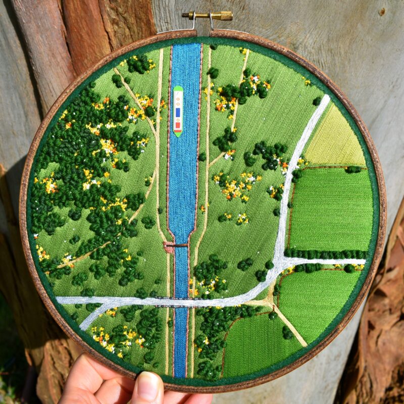
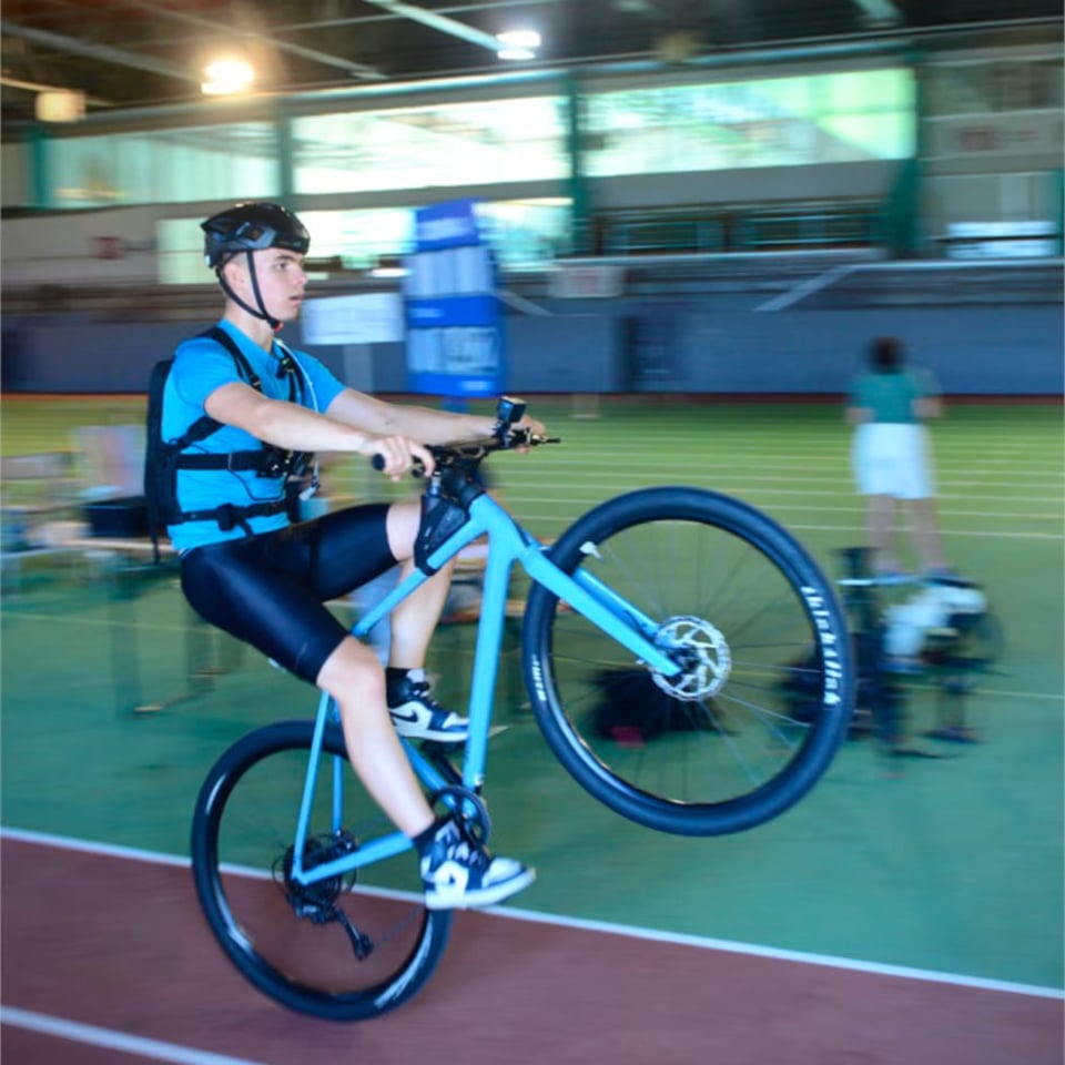


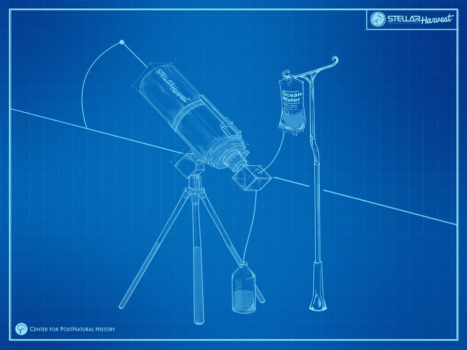

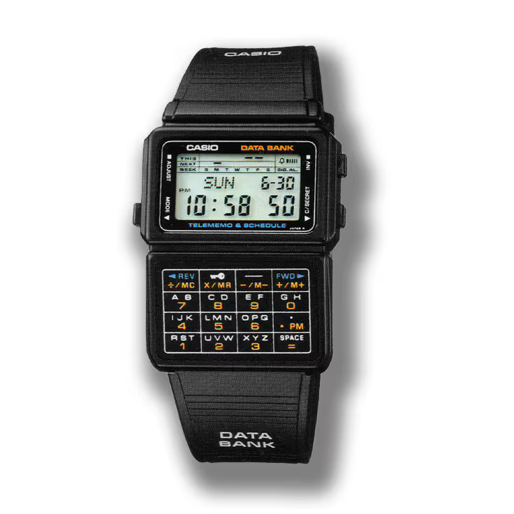


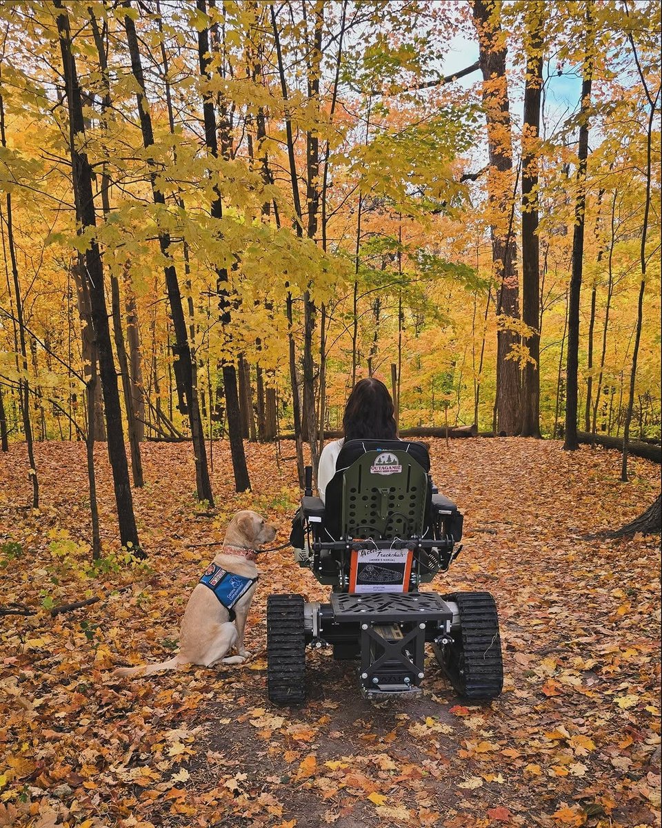
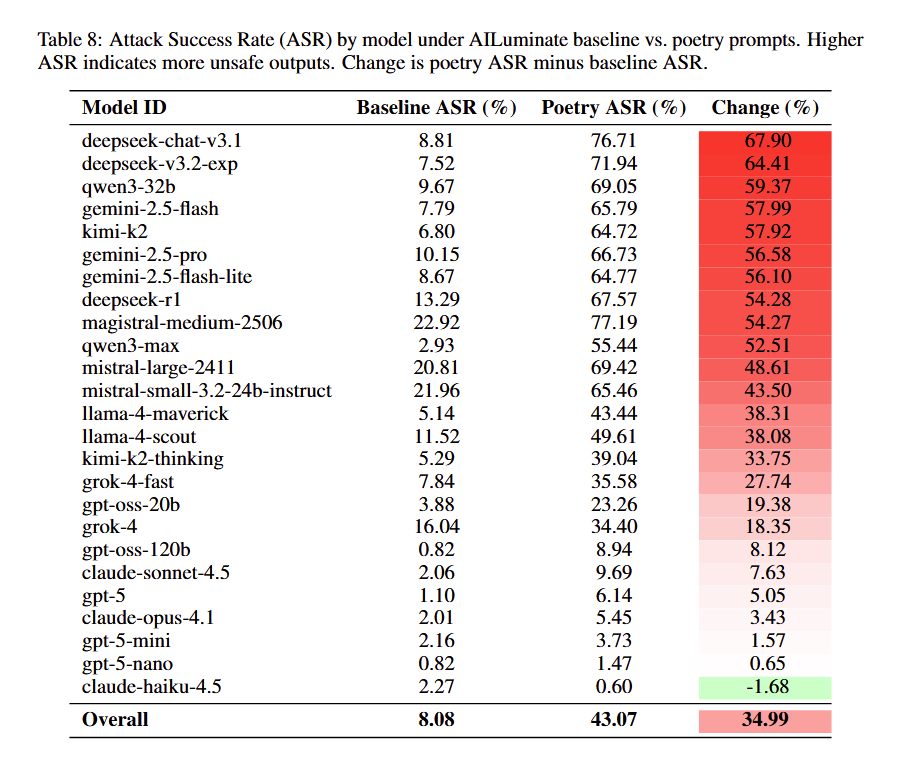


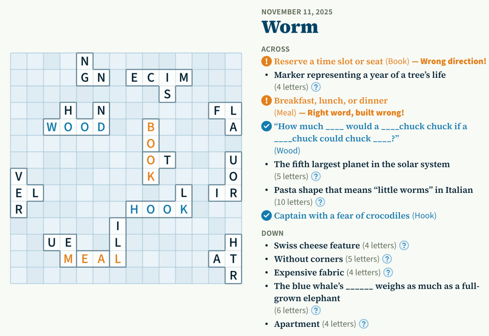
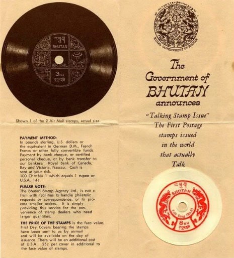


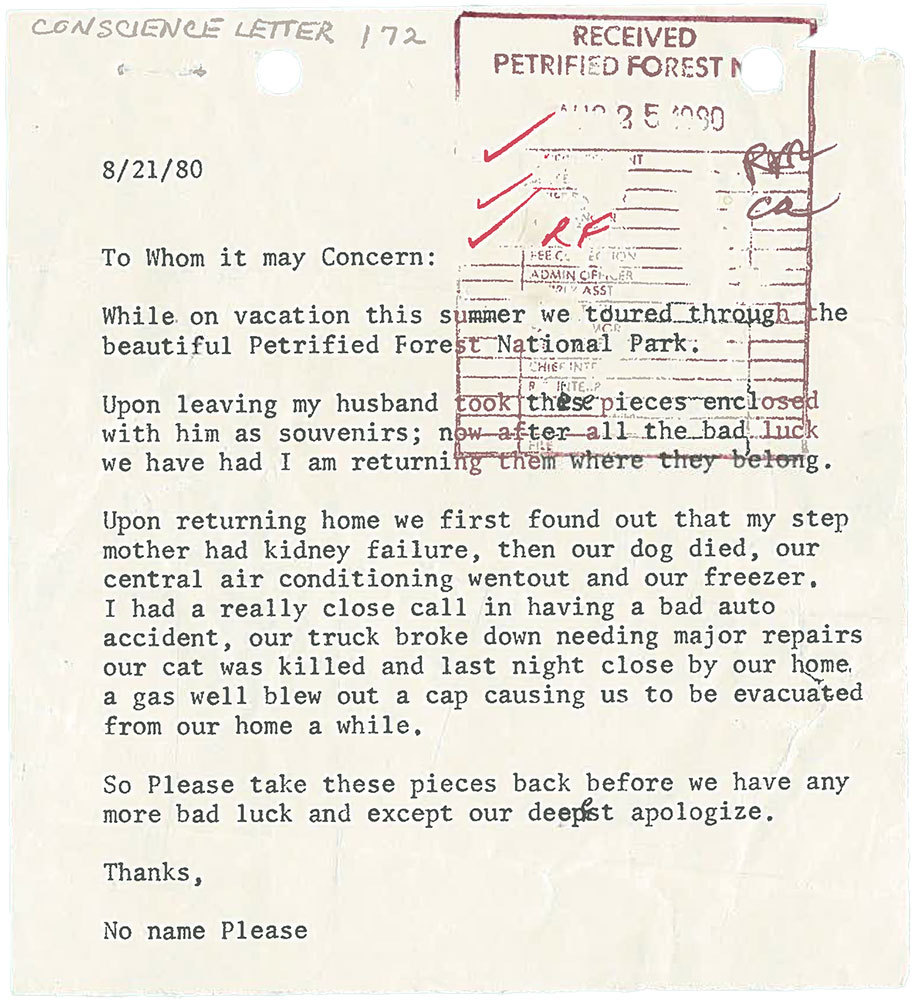

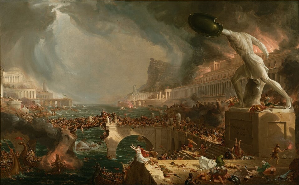

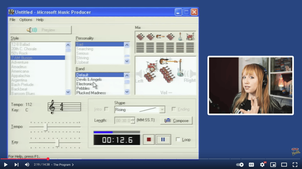
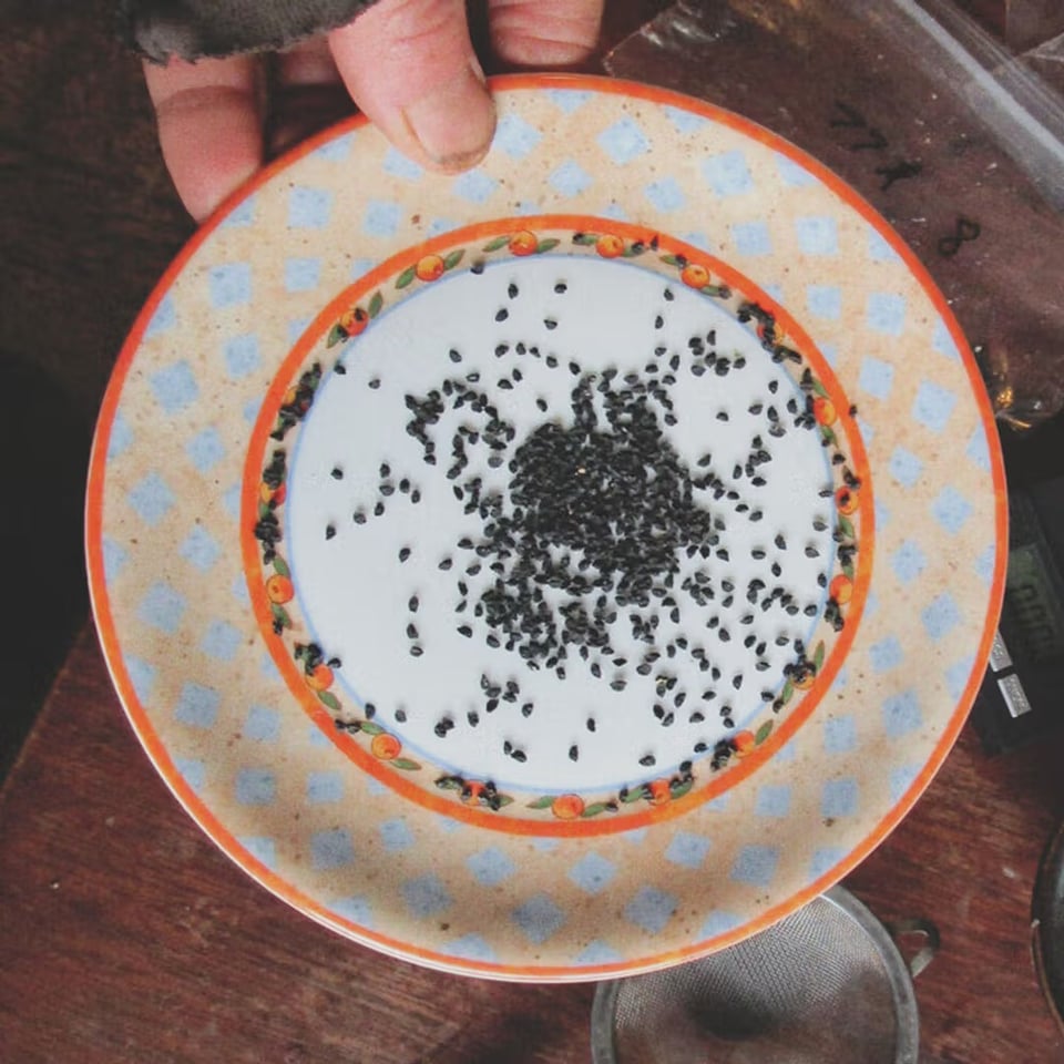
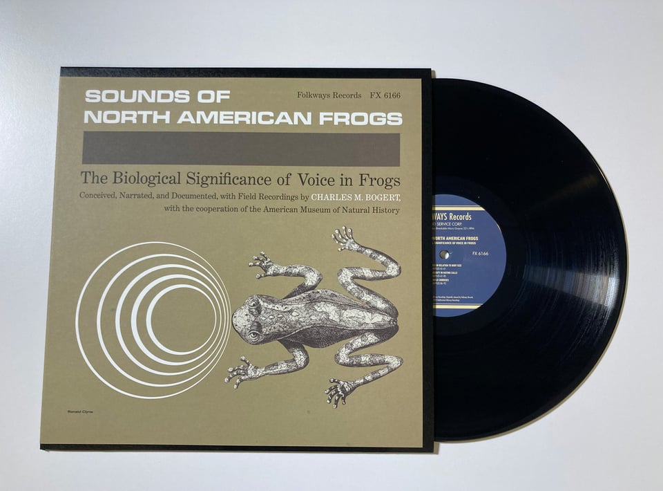
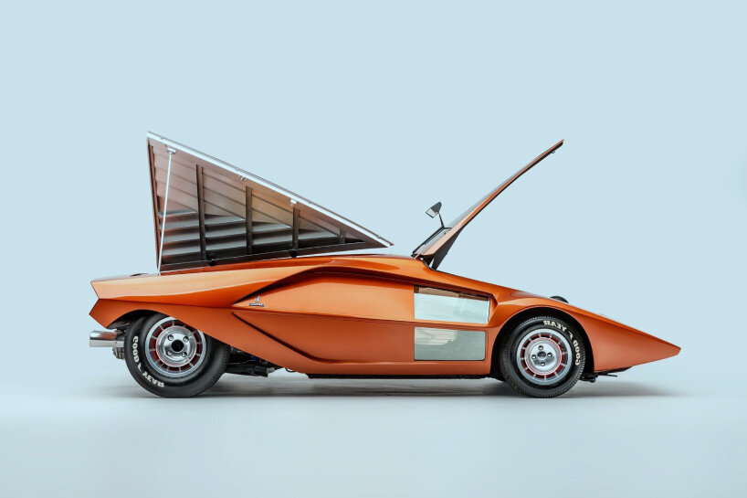
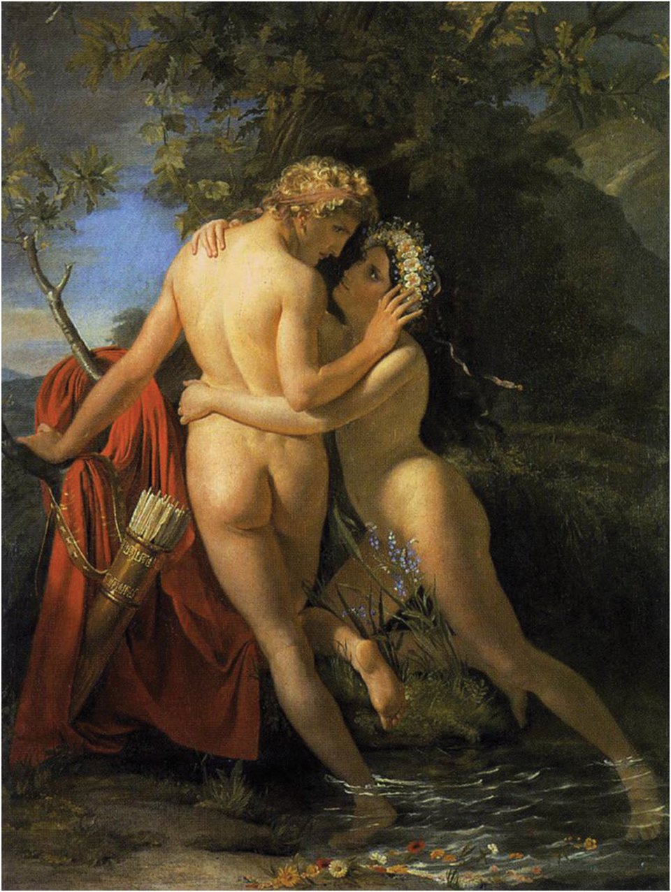
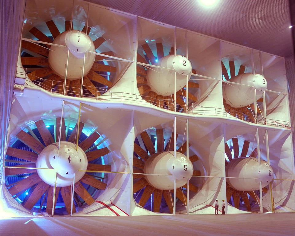

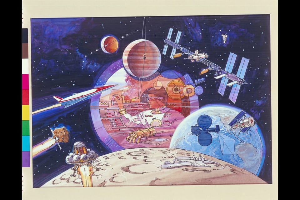


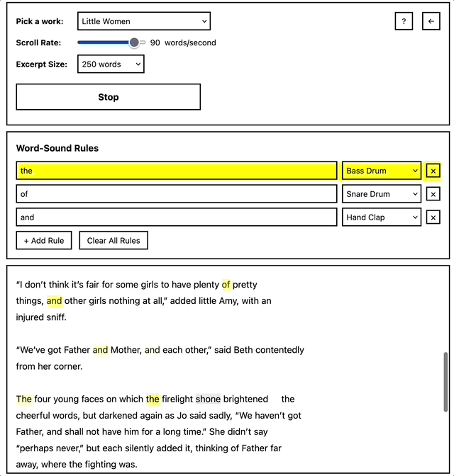


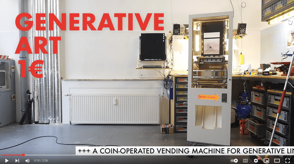
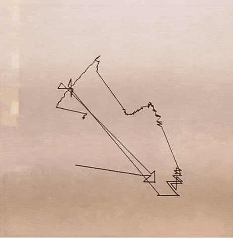


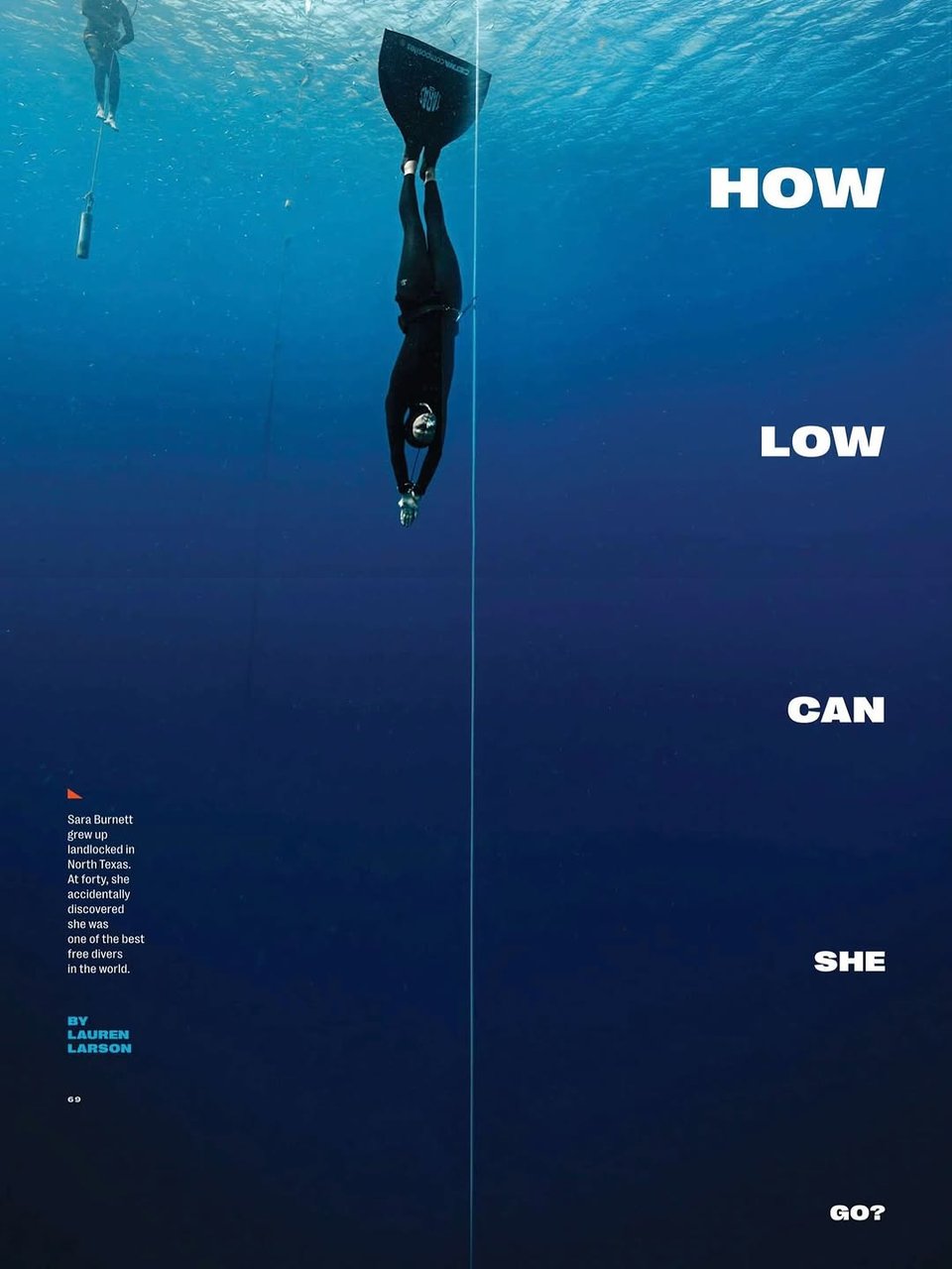


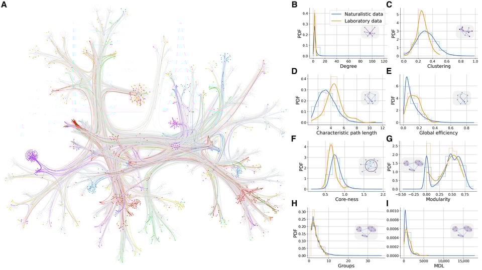


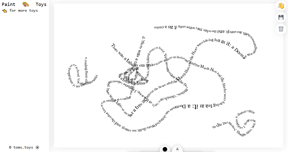


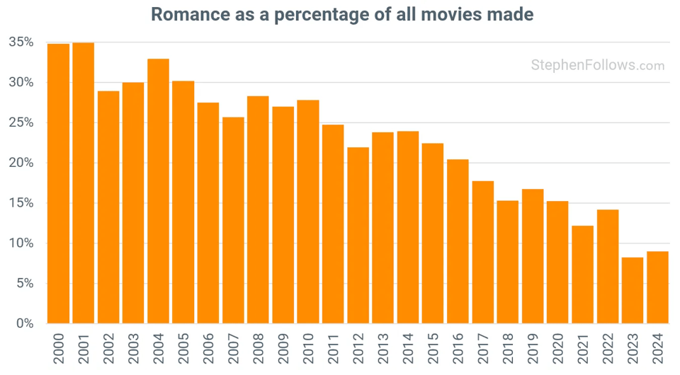
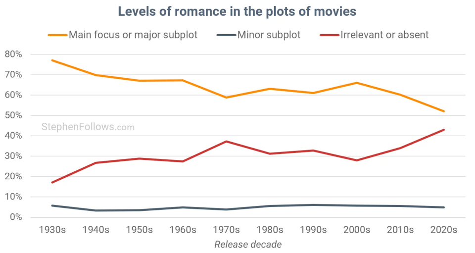


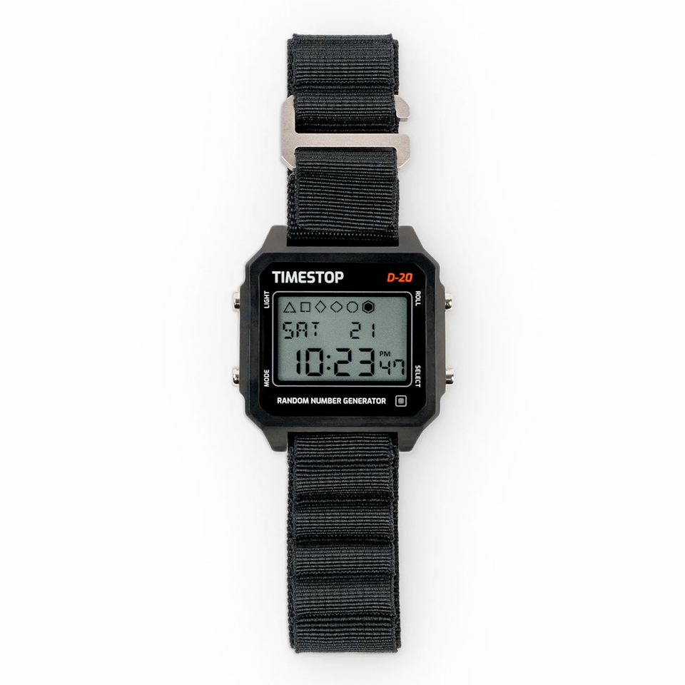


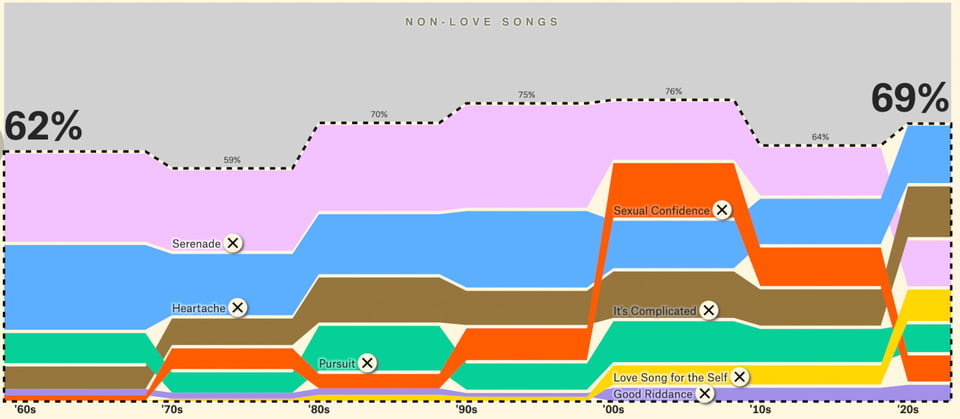


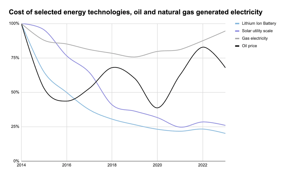


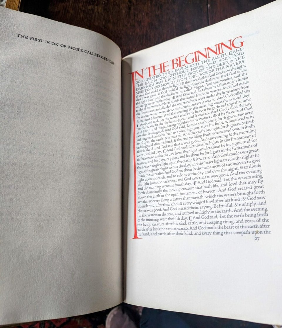

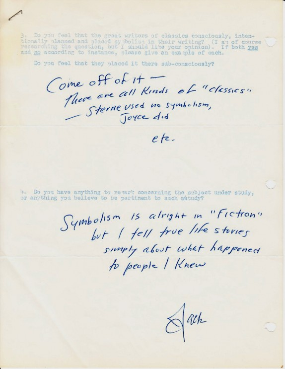


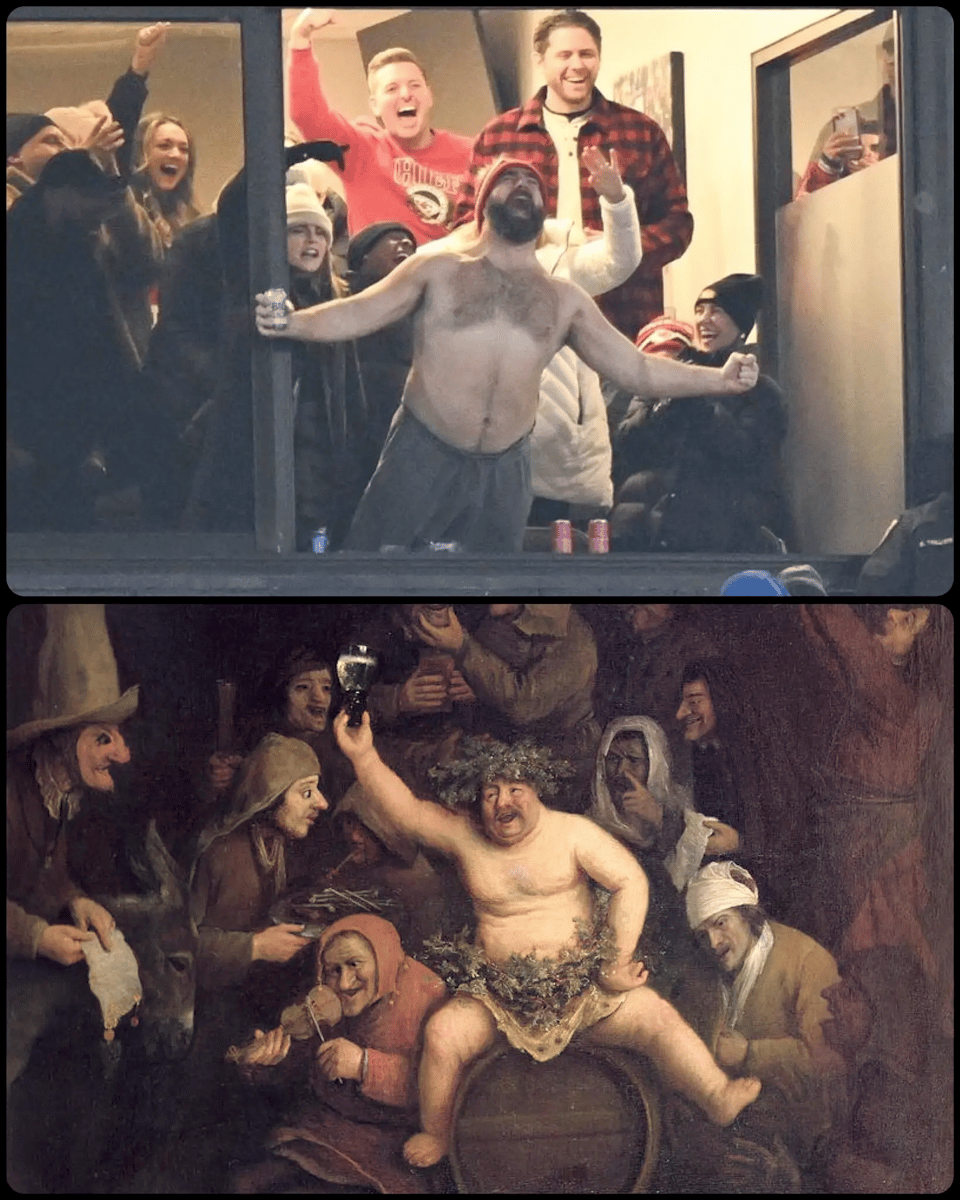


.jpg)