GeistHaus
log in · sign up

FXRant

A blogtacular blog filled with words, images, and whipped cream on top. Written by Todd Vaziri.

atom
visual effectsfilmAcademy AwardsILMTransformerspredicting the oscarpredictinatorVES Awardspodcastcamera movementStephen ColbertTransformers ReviewOscar BallotcinematographyThe Colbert Reportfavorite interviewsmovie marketing is hardRandomizerStar TrekStar Trek 2009J.J. AbramsAvatarJames CameronMichael Bay87th Academy AwardsAppleStar WarsThe VFX Showmi3Box Office Average Per Academy Award CategoryHalloweenPresident BushRogue Oneheromedia88th Academy Awards89th Academy AwardsBrad BirdRaiders of the Lost Arkadvertisingratatouille90th Academy AwardsBack To The FutureChristopher NolanIndiana JonesRobert ZemeckisTransformers 2anamorphicmi4AdaptDouglas SlocombeInceptionJohn CarpenterMacPirates 2Rob ZombieStar Trek Into DarknessSteven SpielbergTerminator 2The OnionTransformers 3always awesomelens flaremovie poster5by591st Academy AwardsAfter EffectsApple TVBTTF podcastBrett RatnerChicagoCinefexDigital DomainHuluIron Man 2John KnollLighter DarkerPixarSkeleton CrewSpeed RacerThanklessThe Daily ShowThe Dark KnightThe Force AwakensThe ShiningVES Awards 2008VES Awards 2010Van HelsingWally Pfisterjawsmisinformationsuperman returnstelevision1-18-0820013DAvengersCloverfieldDan BenjaminDefamerDungeons & Dragons: Honor Among ThievesFake Movie PosterJohn GruberJon FavreauJon StewartLet The Right One InMarketplaceMicrosoftNPRNew York TimesPitch BlackRangoRoger GuyettRon FrickeSam ElliottShakeStanley KubrickThe Talk ShowVES Awards 2009VES Awards 2011VES Awards 2013VES Awards 2014VES Awards 2015VES Awards 2016VES Awards 2017VES Awards 2018Visual Effects Hall of FameWeta Digitalcamera shake citationclip showdr. weileditingiraqlostmaura tierneyradiorecap montagesequelssplit diopterterminatortomorrowlandtwitter30092nd Academy Awards93rdAcademy Awards94th Academy Awards95th Academy Awards96th Academy Awards97th Academy Awards98th Academy AwardsA Fish Called WandaAV ClubAmerican PieAndrew StantonAnt-Man 3BarakaBarbieBarry BondsBatmanBenjamin ButtonBeowulfBetter Call SaulBox Office vs. TomatometerCGLiesCarl KasellCarlos MenciaChildren of MenCybertruckDC ComicsDanny DeVitoDarth Vader Being a JerkDavid BordwellDexterDisneyDisney PlusDistrict 9Double NegativeForrest GumpFoxFox NewsFuturamaGame of ThronesGeorge CarlinGran TurismoHBOHalloween EndsHalloween IIHalloween KillsHans ZimmerHarry PotterHeatHypercriticalIMAXIt (2017)James BondJoe RoganJohn AlcottJohn McTiernanJudd ApatowJurassic ParkKQEDKevin SmithKnocked UpM*A*S*HMad MenMarvel ComicsMen in BlackMichael GiacchinoMission ImpossibleMitt RomneyNoises OffPOVPat TubachPaul FranklinPeacockPeggy Sue Got MarriedPredatorR-RatedRainSchindler's ListSevenSpider-ManStan WinstonStar Trek First ContactStephen SommersTarkinThe ExorcistThe IncrediblesThe OfficeThe SopranosThe StudioTitanicTom MartinekToy StoryTranTrue LiesVES Awards 2012VES Awards 2019VFXHQVanity FairVisual Effects HeadquartersVisual Effects SocietyWall•EWar of the Rosesaction choreographyart vs. technologyas himselfbake-offbaseballblockingcasino royalecolor timingcorrecting the recordcreditsdedioptereddolly zoomdronedumb product alertempire strikes backflying spaghetti monstergodzilla 2014goodfellasgrown ups 2hal hickelhulkiPodiTunesinspirational quotesintertubesiphonelong takemotion smoothingnew termnicolas cagepoliticspositive acknowledgmentprofessional screenplay filmerrandratingsshouldabeensound designspider-man into the spider-versespinoffstorifystuntsthe frametorturevexationwaterworldwritingzune
Todd Vaziri (noreply@blogger.com)
25 posts · 4 narratives
Feed metadata
Generator Blogger v7.00 http://www.blogger.com
Status active
Last polled Apr 29, 2026 01:38 UTC
Next poll Apr 30, 2026 01:38 UTC
Poll interval 86400s
ETag W/"717f7e2f74ca8982e3898f3743b1c9b097359ffe74bfdc7d2cdba3dc9a1576d5"
Last-Modified Sat, 25 Apr 2026 18:58:09 GMT

Posts

What Does “IMAX” Mean?
IMAX
Show full content

We’ve all heard about movies filmed in IMAX, or heard in movie trailers “see it in IMAX” and then looked at a series of confusing diagrams depicting various aspect ratios and theater screen sizes (typically made by fans). But do you know exactly what “IMAX” means? 


IMAX means:

  • large format film cameras
  • but it also can means large format film
  • but it also can mean a big digital camera


But IMAX also means:


  • a very big theater screen
  • but it also can mean a regular-sized theater screen (a.k.a. “LieMAX”)
  • but it also can mean a movie on a home streaming platform that has the exact same pixel dimensions, data rate, file format, and encoding specs as non-IMAX content (“IMAX Enhanced”)


But IMAX also means:

  • film projection
  • but it can also mean digital projection


But IMAX also means:

  • a tall aspect ratio (1.90)
  • but it also can mean a different tall aspect ratio (1.43)
  • but It also can mean a mixture of aspect ratios in a single movie (alternating between 1.90 and 2.35, 1.9 and 1.85, 1.43 and 2.35, 1.43 and 1.78, for example)


But IMAX also means:

  • a movie that was shot with non-IMAX cameras (sometimes 2K, almost always digital cameras) that alternates between aspect ratios that plays in big or regular theaters) (“Filmed for IMAX™, most Marvel movies, the first two “Dune” movies, etc.)
  • but it can also mean a movie that was partially shot with IMAX cameras and 2K digital or 35mm that alternates between aspect ratios that plays in big or regular theaters (“Oppenheimer”, “Mission: Impossible - Ghost Protocol”, “Sinners”, etc.) 
  • but it can also mean a movie that was fully shot with IMAX cameras that has a consistent aspect ratio* that plays in big theaters or regular theaters (“The Odyssey” is the first feature film ever to claim this, and *we don’t yet know if it will have a consistent aspect ratio or even what aspect ratio will be shown in regular theaters or home video)

But today, “IMAX” most frequently means a movie shot on digital cameras and mastered in 2K (and potentially uprezzed to 4K for certain shots) that sometimes has a taller aspect ratio, seen in a regular-sized theater.

So, it’s super clear what “IMAX” means. 


tag:blogger.com,1999:blog-37846398.post-3931959977239796291
Extensions
Oscar Pool Ballot, 98th Academy Awards
98th Academy AwardsAcademy AwardsOscar Ballot
Show full content

It's time for the Awesomest Oscar Pool Ballot In The History Of Oscar Pool Ballots.

Every year I create a special ballot based on a typical Academy Awards printable ballot -- but on my ballot, each category has a different point value. The highest valued category is "Best Picture," while the mainstream films' categories are valued at two points. The non-mainstream categories (like the documentary and short film categories) are valued at one point.

With this system, in a tight race for the winner of the pool, the winner most likely would not be determined by the non-mainstream films (in other words, blind guesses).
Special note: with the addition of the new Casting award, the total point value is now 45 points. 

Download the ballot here for the 98th Academy Awards and use it at your Oscar party.

click here for larger

And if you're wondering why Tom Cruise is on my ballot... he's been on every one of my Oscar ballots. Because he's soooooooooo cool.


tag:blogger.com,1999:blog-37846398.post-8185606723102284089
Extensions
Why Didn’t They “Just” Film on Location?
Show full content
From the "After The Hunt" VFX Breakdown, by Frame by Frameview full breakdown on YouTube

When people see a relatively innocuous shot from a movie of a city street, then see that it was an elaborate visual effects shot (either shot against a greenscreen or at a studio backlot), sometimes they wonder “Why didn’t they just film that at a real location? Wouldn't that have been easier and cheaper? Why resort to camera tricks?

Generally speaking, film crews need levels of control over the environment to a degree that is difficult for non-industry people to understand, which makes shooting on location sometimes not the best idea for a film production.


Here's a basic list of some of the reasons they didn’t “just shoot it at a real location” (there are plenty more):

  • ultimate control for lighting and sun position, time of year
  • location weather unsuitable for the film, either narratively or logistically
  • repeatable action for multiple setups
  • permissions and permits unreasonable or impossible
  • disruption of a community (closed businesses, car and pedestrian traffic) for days or weeks at a time
  • safety of crew
  • location accessibility for countless trucks and gear and dozens of crew members
  • availability of actors and crew
  • no location fits the storytelling needs of the production, or the location would require massive structural modification to fit the storytelling needs (period picture, science fiction, alternate reality, etc.)
  • additional photography (“re-shoots”) required but location no longer available or weather/season is totally different
  • location shooting is much more complicated and time consuming than studio shooting


view full breakdown on YouTube

update 2/1/2026: Look at the progress we're making with the discourse!

Update: Here's a terrific video from Olivier Servieres and Bastien Reynal discussing the challenges of filming outrageous stunts on location and with actors on an LED wall stage, called "The Hard Truth about Shooting Car Chases", and gets into the reasons why you would have two separate shoots. Really well done.
Watch on YouTube


tag:blogger.com,1999:blog-37846398.post-1842930737609482755
Extensions
The "Mad Men" in 4K on HBO Max Debacle
Mad Men
Show full content

Reader warning: there's gonna be a lot of pretend puke photos in this post.

If you've fired up HBO Max recently, you've probably seen that one of the most influential and prestigious television series of all time was to premiere in 4K on the streaming service. The show's first four seasons were shot on film, and the final three were shot digitally on the Alexa, but the run of the series was mastered in 1080p HD. HBO Max has been touting this 4K "restoration" of the series, produced by Lionsgate TV. 

The highly anticipated 4K debut of the show was to be one of HBO Max' crown jewels of television history. It looks like it might initially serve as a cautionary tale of quality control when it comes to restorations and the technical process of bringing shows to streaming.


As far as I can tell, Paul Haine was the first to notice something weird going on with HBO Max' presentation. In one of season one's most memorable moments, Roger Sterling barfs in front of clients after climbing many flights of stairs. As a surprise to Paul, you can clearly see the pretend puke hose (that is ultimately strapped to the back side of John Slattery's face) in the background, along with two techs who are modulating the flow. Yeah, you're not supposed to see that.
It appears that the HBO Max episodes represent the original photography, unaltered before digital visual effects got involved. Somehow, this episode (along with many others) do not include all the digital visual effects that were in the original broadcasts and home video releases. It's a bizarro mistake for Lionsgate and HBO Max to make and not discover until after the show was streaming to customers.

•   •   •   •   •

I want to be clear that this is a separate issue than the "reframed original film negative for 16:9" issue that has plagued many restorations that have left viewers scratching their heads. In those cases, the shows were originally shot on film and presented in 1.33-to-1 aspect ratio, but for their HD restorations the studio decided that their shows should fill the HD frame at the 16:9 aspect ratio, so portions of the negative, previously unseen and NOT intended for broadcast, were now suddenly visible, sometimes leading to ridiculous images that were never meant to be seen by audiences...
example from "Friends" in HD, look at screen right
...or cropping out vital visual information in order to avoid black bands on the left and right side of frame.
example from "Seinfeld" in HD
Reframing old shows to fit a new aspect ratio is antithetical to the spirit of media restoration, and cheapens the future of our shared culture. The folks at the studios who insist on hobbling their most classic television shows are really bad at their jobs.
But that's NOT what is going on with "Mad Men", since the show was mastered in 16:9 to begin with. 

•   •   •   •   •

I decided to help illustrate the changes by diving in and creating images that might do better than words. The first thing I noticed is that, at least for season one, the episode titles and order were totally jumbled. The puke episode is "Red in the Face", not "Babylon".

update 12/2/25: The season one episodes are being updated live on HBO Max to their correct positions and titles. The corrected title:

I lined up the Blu-ray edition of the episode with the current HBO Max episode:


The fun thing about this restoration mistake is that now we, the audience, get to see exactly how many digital visual effects were actually used in a show like "Mad Men", which most would assume did not have any digital effects component. In this shot, not only were the techs and hose removed, but the spot where the pretend puke meets Slattery's face has some clever digital warping to make it seem like the flow is truly coming from his mouth (as opposed to it appearing through a tube inches from his mouth, on the other side of his face).
A Twitter user noticed that the post-production screwups are not exclusive to season one, so I fired up my comparison machine to illustrate it.


In this case, visual effects was used to obscure the fact that the show was filmed in 2000's era Los Angeles, not in 1960's New York City. Every sign was altered, and period-appropriate garbage NYC garbage cans were also added to each side of the frame.
Eric Vilas-Boas has been covering the behind-the-scenes issues that may have cause this screwup over at Vulture.
This post will be updated as warranted. My original Bluesky thread is here.


update 12/3/25: Another comparison below. When you fire up the first episode of the first season on HBO Max, right after the now-iconic opening titles, you might wonder why the music plays against black for a few beats. Well, that's because you're missing some titles that should appear on screen.


You should be seeing the text: "Mad Men: A term coined int he late 1950's to describe the advertising executives of Madison Avenue. They coined it." However, like the visual effects examples above, these graphics do not appear in the HBO Max version.
update 12/3/25: I just started randomly looking for season two wide shots of locations... and found another one.


Looks like in s02e01, they filmed in a hotel lobby (probably The Biltmore in Los Angeles), which features modern signage for a west coast hotel... which were digitally removed for the real episode, but the HBO Max version is the raw, unedited photography.

•   •   •   •   •

As an aside, I've seen a lot of speculation as to how something like this could happen. I've been crafting my words carefully because I don't want to speculate or lay blame on any one process or group - I've been focusing on the results of the oopsie-doopsie. Usually, mistakes like this happen because even if only one goof was made, several steps of quality control missed the goof.
update 12/4/25: A Twitter user pointed out to me that some visual effects actually remain intact in the HBO Max presentation.

This is the final shot of s01e04, with Pete looking out over the skyline of New York City, a digital composite of the actor performing against a screen, and an animated matte painting of footage and digital paint work to create the period-appropriate skyline. 
What does this mean? The visual effects omissions in the HBO Max presentation are sporadic, and not consistent throughout the series. Only certain episodes or certain shots have been somehow affected by this odd situation. 

update 12/4/25, 1:00pm PT: Looks like the puke shot has been cleaned up. This is how s01e07 looks right now on HBO Max:

I did a quick check on every other example in this blog post, and the raw photography is still being displayed on HBO Max. 
update 12/7/25: The s02e04 goof-em-up has now been corrected.


update 12/9/25: The pilot episode's graphics have now been restored.

update 12/22/25: The s02e01 restaurant signs are still on HBO Max, and the final visual effects shots have not been swapped out yet.
update 1/30/26: The s02e01 restaurant signs are still on HBO Max, and the final visual effects shots have not been swapped out yet.


tag:blogger.com,1999:blog-37846398.post-1411229260288501430
Extensions
"Halloween: The Night of Terror Ends", A Seamless Edit
HalloweenHalloween Kills
Show full content

One of the best features of “Halloween Kills” (2021) is the collection of flashback sequences which show the rest of the night Michael Myers came home to terrify Haddonfield, a continuation of the events from the original “Halloween” (1978). “Kills” depicts a completely different course of events that were shown in “Halloween II” (1981).
In “Halloween II”, Michael continued his rampage on that night in 1978. In “Halloween Kills”, Michael is captured after a brief encounter with police, and with Lonnie, a Haddonfield kid. Michael retreats to the old Myers house, thereby setting up the alternate timeline.

"Halloween: The Night of Terror Ends"
watch on Vimeo - direct link
I thought it would be fun to edit together a seamless version of that night into a re-edit called “Halloween: The Night of Terror Ends”, a short film that respects the alternate timeline of the latest trilogy. It turned out to be a very exciting editing exercise that took up far more time than I originally thought it might. And because I wanted to make it seamless, I spent a great deal of time with music and sound effects editing, including recording some of my own sound effects.
Some observations and facts about this silly project:
  • Footage comes from “Halloween”, “Halloween II” and “Halloween Kills: Unrated”.
  • Music is from those three films, and also extensively from “Halloween” (2018).
  • There are some fun hookups with early Michael POV scenes from “Halloween II”, which help set the geography and timeline, and I thought it was fun to include more of Dr. Loomis and even a POV shot of trick-or-treaters that tied into the Lonnie scene from “Kills”!
  • I had to add a ton of music tracks and sound effects to help blend abrupt cuts between movies (and erase any remnants of the “Halloween II” score. I recorded some sound effects with my 14-year-old son, who “played” Michael Myers in a few takes, of him breathing, grunting (reacting to punches) and having a mask ripped off his face, with my iPhone and Voice Memos.
  • The most extensive sound design challenge was the capture of Michael, his beating, and attempted execution. Those scenes from “Kills” were all over the place with audio (including voiceover!), so the soundtrack in this area is almost entirely reconstructed by me.
  • I generously peppered in Michael Myers breathing sound effects throughout the piece because it was fun. I found some nice nighttime soundscapes that helped blend together shots, as well.
  • The opening titles are from “Kills” which I extracted and recolored. Just like they did in the 2018 trilogy, I added pretend gate-weave to the titles.
  • I’ve come to admire the flashbacks in “Kills” even more after embarking on this editing exercise (notice that Dr. Loomis’ car is still parked across the street from the Myers’ house!). The way Haddonfield was lit was dramatically different than the original film - there is a TON more atmosphere in “Kills”’ version of 1978, plus Haddonfield streets that were pitch black in the original and “II” now are fully lit as opposed to being bathed in complete darkness.
  • To help blend the three movies together, I had to do some color grading. The original film is pale and green, “II” is very warm and contrasty, and “Kills” is bright and blue. I settled on a warm, slightly desaturated look, and did my best to match the contrast of all three films.
  • Picture, music and sound editing all done in Final Cut Pro.
  • Graphics created in Pixelmator Pro and Adobe After Effects, and color grading was finished in After Effects.

These types of editing exercises invigorate my love of picture editing and sound effects editing. When I was a kid, I would lug our second VHS VCR near our first VCR and hook them together after I realized I could cut together shots of a movie in a different order! At that time, I couldn't possibly imagine how advanced the tools would get so that I could do something like this fun "Halloween" video at home on my personal Mac.

tag:blogger.com,1999:blog-37846398.post-6775229138349751914
Extensions
Todd Vaziri on Vanity Fair VFX
Dungeons & Dragons: Honor Among Thievesfavorite interviewsRogue OneSkeleton CrewStar Trek Into DarknessThe Force AwakensTransformersVanity Fair
Show full content

Vanity Fair asked me if I wanted to talk about visual effects in a video, and it was my great honor to show off some of ILM’s terrific work over the years.

watch Todd Vaziri on "ILM's VFX Secrets Behind Star Wars, Transformers & More" on YouTube

My goal was to highlight the artistic process of visual effects. Movies like the ones I highlight in the video are crafted by hundreds of artists, technicians and production folks, all working together to achieve the vision of the director. I’m so proud to have worked with such amazing crews over the years.

In the video, I wanted to emphasize the teamwork aspect of the work that we do. To support that, here are the full credit lists of everyone at ILM who worked on the projects I discuss in the video:


“Rogue One” (2016), All ILM credits


“Dungeons & Dragons” (2023), All ILM credits

“Skeleton Crew” (2024), All ILM credits

“Star Trek: Into Darkness” (2013), All ILM credits

“Transformers” (2007), All ILM credits

“The Force Awakens” (2015), All ILM credits


I want to thank everyone at Vanity Fair for making me feel so welcome and comfortable, especially director Adam Lance Garcia, editor Matthew Colby and everyone at ILM PR for this opportunity.

In the visual effects world, we frequently gripe about the prevalence of misinformation in the public discourse about “CGI” and the role of visual effects in Hollywood, but rarely do any of us tell our own stories about innovation, creativity, problem solving and teamwork to the general public. I’m very grateful for the opportunity to tell some of our stories about what we do.

I'm really proud of my final few words in the video:

Digital visual effects is just like any other step in the filmmaking process. There's really not a lot of fundamental difference between, say, what the costume designer does, what the editors do, what the set designers do. We're all trying to work together to solve problems and tell the story using light and images the best we can within the time that we have. It takes a lot of coordination to get all of this stuff done and sometimes hundreds and hundreds of digital artists working behind the scenes.

There's a perception out there that digital effects are a black box, that it just gets shipped off and the directors are just handed this work. [That] couldn't be further from the truth. We work directly with filmmakers to achieve their vision.


Todd Vaziri on Vanity Fair Visual Effects:

https://youtu.be/ERKEsIzTFas?si=3SE9Fw_GsYS5sZMY


tag:blogger.com,1999:blog-37846398.post-4972551052582799534
Extensions
Lens Flares Don't Always Scale
Halloween IIlens flare
Show full content

I've been telling artists for decades that it's not always the best idea to scale up a synthetic lens flare when the light source is moving closer to camera, which is typically met with resistance from the artist. "Of course it scales when the source moves closer!" is the usual response.
My white whale has been to find the perfect photographic reference for this phenomenon to back up my accurate claim, one that clearly illustrates my point. And I finally found it in the 1981 horror sequel, "Halloween II", photographed by Dean Cundey. In the in-camera shot, a police car with its headlights directly aimed at camera races toward the camera, and you can clearly see the iconic Panavision red ring flare element remains a consistent screen size while the lightbulb is racing toward camera.
click for larger GIF
To help convey this further, I stabilized the headlamp in screen space and made a fixed box around the red ring, illustrating the fact that even though the light source is hurtling toward camera and gets large in screen space, the lens flare elements do NOT scale commensurately. 

tag:blogger.com,1999:blog-37846398.post-6018967721221796643
Extensions
Fun Detail in "The Terminator"
terminator
Show full content
"There's a storm coming in!"


tag:blogger.com,1999:blog-37846398.post-4455969093762444073
Extensions
Podcast: I Was On Reconcilable Differences Again
favorite interviewspodcast
Show full content


It was back in 2018 when I was a guest on a member special for Reconcilable Differences... and seven years later they asked me back! RecDiffs is one of my favorite podcasts, and it was again an honor to talk to my two friends John Siracusa and Merlin Mann about movies, parenting, podcasting, Letterboxd and a whole bunch of other stuff.

To hear this episode, you need to become a Relay member. Please consider joining the Relay community by signing up for a Relay membership.

Here's a clip from the episode where I ask John to stop referring to the movie tracking app as "Letterbox D":

Watch on YouTube


tag:blogger.com,1999:blog-37846398.post-6744427824871935161
Extensions
The "Predator" Opening Titles, Re-Imagined
Predator
Show full content

I recently had the pleasure of re-watching John McTiernan’s “Predator” (1987) for the umpteenth time with someone who had never seen the movie before. Watching movies with first-timers is a wonderful experience (I highly recommend doing it!) — it's the closest you'll ever get to seeing a beloved movie again for the first time, and it reminded me of a fascinating thought experiment when it comes to the movie’s construction. 

I’ll quote from Priscilla Page’s brilliant essay on the movie: “‘Predator’ combines the actioner, the western, the war film, horror, and science fiction. People seeing it for the very first time might’ve thought they were watching something in the vein of ‘Apocalypse Now’, ‘Deer Hunter’, or ‘First Blood’ — until an alien appears and starts ripping out spines and skulls.”

Although the audience catches glimpses of a mysterious thermal point-of-view throughout the first hour, we really aren’t given many clues as to what on earth is stalking our heroes in the jungle. The first time we really get a good look at the alien’s camouflage is at 42 minutes into the movie. The alien finally uncloaks (to the audience) at 53 minutes. At 55 minutes Mac tells Dillon “nothing on this earth could have lived” through a barrage of bullets they just served the hunter.

Of course, in order for the audience to be completely in the dark and fully empathize with our heroes, we would have had to forget the opening title sequence of the movie, which shows a spaceship flying past the camera, launching a smaller craft that is headed toward earth, removing all doubt as to the hunter's origin.

I always wondered how the movie would play WITHOUT that first glimpse of the alien spacecraft. Would it add more suspense and mystery to the movie if we are coldly introduced to our movie without it? I wanted to visualize what the opening titles would look like.

Watch on YouTube

At minimum, I wanted to “simply” remove the spaceship flyby and craft launch. But that meant totally reorganizing the gorgeous music by Alan Silvestri so the new cut could make sense. It also meant completely rebuilding the helicopter landing audio from scratch, using stock sound elements. I also removed the starfield from the three opening title cards. It was a lot of fun, albiet much more work than what I was expecting.

It's a fun to imagine how audiences would have reacted to the movie had it opened this way. As one "Predator" superfan remarked to me: "that spaceship flyby seems like a studio note" added to the screenplay to reduce 'audience confusion'.

Here's a comparison of the original titles and my re-imagined titles:

Watch on YouTube


tag:blogger.com,1999:blog-37846398.post-6712835843841384342
Extensions
Mega Show Notes from Lighter Darker: Lens Flare Extravaganza
favorite interviewsLighter Darkerpodcast
Show full content

 Lighter Darker, EP20 and Show Notes

Lighter Darker, The ILM Podcast’s first season comes to a close with Episode 20, our Lens Flare Extravaganza! Rob, Jenny and I are joined by John Knoll and Shannon Tindle to talk all about lens flares, those fun aberrations that occur within a lens when light rays shine at JUST the right angle. John talks all about the creation of Knoll Light Factory, the innovative and industry-changing software that allowed digital artists to create their own lens flares in Adobe Photoshop. Shannon talks about his flares in “Kubo” and “Lost Ollie” and we all talk about our favorite lens flares from movies we’re fans of, and flares that we’ve created.

The official show notes are ILM.com, but I wanted to add more visually-oriented show notes, and include clips from the shots that we discuss on the show.

Oh, and if you want to see our podcast, a full video "talking heads" version of the podcast is on YouTube:


Watch on YouTube


•  •  •  •


I made a compilation of the clips below for YouTube:

Watch on YouTube

“Hook” (1991)


This shot was created with John Knoll's motion control animation rig, with the flares shot with a 50-300mm Nikon Nikkor zoom lens.

“Poltergeist” (1982)


“Visions of Light” (1992) documentary

Shannon makes mention of “Visions of Light”, the documentary directed by Arnold Glassman, Todd McCarthy and Stuart Samuels about cinematography that was deeply influential to me and how I look at movies. At some point, internet hero “Deus Ex Film Prof “ re-edited the entire documentary and swapped out old standard definition clips with much clearer and brighter high definition clips, which makes for a much more pleasant viewing experience.


“Cool Hand Luke” (1967)


“The Good, The Bad and the Ugly” (1966)


“Rango” (2011)


I didn't mention it on the show, but this flare from "Raiders of the Lost Ark" was also an inspiration for the "Rango" lens flare that I designed.

“Blade Runner” (1982)


“Close Encounters of the Third Kind” (1977)


“Star Trek” (2009)

Relevant article: Millimeter Magazine: Back on Trek, where director JJ Abrams, cinematographer Dan Mindel and VFX supervisor Roger Guyett talk about the lens flares of the movie, and even mention my lens flare work on the film. ILM Sequence Supervisor Todd Vaziri was responsible for developing the artificial lens-flare software system, which the company dubbed SunSpot. The system essentially combines off-the-shelf software, certain proprietary ILM tools, photographed elements, and several custom paint elements to painstakingly match the flares captured on the negative.

Relevant article: Post Magazine: “Star Trek” Returns, where Guyett and others discuss the visual effects lens flare work on the film. ILM's Todd Vaziri analyzed what anamorphic lenses do and all their different properties so they could be used in simulated shots and they call the resulting program "Sunspot." Vaziri was a sequence supervisor whose job was to overlook all the sequences and make sure that ILM's shots were "correct to the film" — that they matched. "He takes great, great pains and it shows," says [compositing supervisor Eddie] Pasquarello. "That was one of our compositing coups that I feel made a difference here — finishing touches that help our shots blend with the live action that J.J. gave us."

I also talked extensively about our "Star Trek" lens flares on Corridor Crew: VFX Artists React to Bad & Great CGi 112 ft. Todd Vaziri from ILM.

Watch on YouTube

The first shot of the movie, composited by Greg Salter, lens flare design by Todd Vaziri

The last shot of the movie, composited by Todd Vaziri

The Vulcan Sun, shot composited by Francois Lambert, lens flares by Todd Vaziri

"2001: A Space Odyssey" (1968)


"Pirates of the Caribbean: Dead Man's Chest" (2006)


Two shots from "Pirates 2" that featured John Knoll's photographed flares.

“Kubo and the Two Strings” (2016)


Shannon's original storyboard frame for this shot.

"Lost Ollie" (2022)


"Raiders of the Lost Ark" (1981)


“Die Hard” (1988)


“Star Wars” (1977)

This is the shot that John and I roasted, indicating not only the two disparate light directions in the shot, but the fact that the foreground element (the Falcon) has been comped on top of lens flare elements which are being created inside the lens.


I hope everyone enjoys the episode. 


tag:blogger.com,1999:blog-37846398.post-6206610972319944544
Extensions
From the Future "Peggy Sue Got Married" (2050) Remake
CybertruckPeggy Sue Got Married
Show full content

 From the future "Peggy Sue Got Married" (2050) remake:

view larger
This is a very good joke. Please clap.


tag:blogger.com,1999:blog-37846398.post-1919622636058112500
Extensions
"The Studio" Weighs in on Film vs. Digital
The Studio
Show full content

I'm really enjoying "The Studio" on Apple TV+, and I just had to make a graphic of the dialogue that opens season one, episode four, with studio head Matt Remick (Seth Rogen) weighing in on the film versus digital debate:


tag:blogger.com,1999:blog-37846398.post-4120326048046135063
Extensions
More About Our Visual Effects for "Skeleton Crew"
favorite interviewsLighter DarkerpodcastSkeleton Crew
Show full content
watch on YouTube

In March 2025, Jenny Ely and I interviewed John Knoll, the visual effects supervisor of "Star Wars: Skeleton Crew for Lighter Darker: The ILM Podcast. Listen to the show here — we also have extensive show notes and photos for that episode at the same link.  Lighter Darker: The ILM Podcast, episode 14 

In the episode, John refers to a shot that he's really proud of in our segment "One Final, One CBB" from "Pirates of the Caribbean: Dead Man's Chest", and a shot from the original "Pirates of the Caribbean" that he wished he could have approached differently for his CBB, so I've put those two shots on YouTube so you can see them with your eyeballs instead of imagining it with your ears and brain:

watch on YouTube

We talked about several shots that I personally composited on the show, so here are a few of those.

First, the big neighborhood reveal shot:


And a quick breakdown of some of the elements that it took to assemble the shot:


We talked about my "E.T." homage shot, which was this one of Neel and Wim walking back home. I also wrote a little bit about this shot in the blog post, "Skeleton Crew", Neel and Misinformation.

Finally, we discussed one of my KB visor shots:

John talks extensively about his motion control unit he developed to film the miniature spaceship in "Skeleton Crew", and we added a lot of photos to the show notes. But you know what's better than photographs? An entire video, hosted by Adam Savage! It's really good!

watch "How ILM Films Star Wars Motion Control Spaceships!" on YouTube


tag:blogger.com,1999:blog-37846398.post-5694566978252733211
Extensions
The Movie Mistake Mystery from "Revenge of the Sith"
Show full content


Movies are handmade, and just like any other art form, sometimes the seams that hold movies together become visible to the audience. For movie fans, these moments are very exciting. Catching a glimpse behind the scenes is an exhilarating experience. My favorite kind of “movie mistake” is the kind that is hiding in plain sight... but the casual viewer missed it upon first viewing. Or perhaps even the second viewing, or even the third. 

I’m particularly obsessed with moments that reveal the craft and artistry of the magic trick of a shot that slightly shatters the illusion of cinema. These revealing moments have been in movies since the dawn of cinema, and are everywhere (if you know exactly where to look).

•  •  •  •


One of my favorite films of all time also has one of the funniest revealing mistakes I've seen. Edward Zwick's "Glory" (1989) takes place during the American Civil War, and this scene has a blink-and-you'll-miss-it reminder of the film's very modern production:
"Glory" (1989)
Because the audiences' eyes are firmly fixed on Morgan Freeman's character in the center of frame, very few will ever pick up the little kid with the extremely modern wristwatch that enters frame on far screen right. Sometimes the on-set teams that work with featured extras—as well as the costume department that dress the extras—will occasionally miss a modern piece of jewelry on an actor.
update, 4/21/25: Many have pointed out that while I was looking at the boy's wristwatch there appear to be what look like POWER LINES in the background of these shots! Unless these are meant to be early telegraph lines in rural South Carolina, there's another fun movie mistake hiding in plain sight.

Here's a fun one from Martin Scorsese's masterpiece "Goodfellas" (1990), in one of the closing shots of a nail-bitingly tense scene where Karen nearly walks into a (potential) ambush:
"Goodfellas" (1990)
The period-appropriate "movie" license plate dramatically dangles then completely falls off the car in the middle of the take, revealing the actual 1990-era license plate of the car used for the scene. This is an accidental and hilarious glimpse into the extremely specialized and detailed hard work that goes into making a Hollywood period piece (this portion of the film takes place in 1980), where every license plate of every car in the movie needed period-appropriate plates. 

The finale of James Cameron's epic "Aliens" (1986) features the android Bishop (Lance Henriksen) getting severed in half, but still functioning enough to save Newt (Carrie Henn) from getting sucked into the vacuum of space. The action-packed scene features an absolutely wonderful accidental reveal of how the cut-in-half android was accomplished on the set:

"Aliens" (1986)
The amazing makeup effects applied to Henriksen's body covers the bottom half of his body which is hidden through a hole in the set. But in order to get that little bit of extra athletic stretch to grab Newt, Henriksen popped his body out of the hole a little too far, revealing the classic stage trick. However, I'd gather that 99% of the audience has never noticed this little reveal of stagecraft since our eyes are fixed on Newt on screen right, sliding toward the airlock, and not on the ground contact of Bishop's half-body, which had already been firmly established in the scene.

Avoiding reflections of the crew appearing to camera is a constant struggle for filmmakers. In Steven Spielberg's first masterpiece "Duel" (1971), David (Dennis Weaver) gets into a phone booth to make a call, with the front glass face of the booth aimed directly at the camera, and if the audience's gaze drifted off of Weaver's face, they could catch a glimpse of the crew:
"Duel" (1971)
In the reflection, we see a few crew members on screen left, the camera itself, and director Spielberg on the right (he's the one shuffling left and right, who lowers his head in the middle of the take). Again, like all the examples I'm providing in this article, hardly anyone would ever notice these moments. When a viewer catches these brief moments, the illusion of the movie is briefly broken, but for fans of the filmmaking process, it's a joyful reminder of the overall magic trick. The most intimate movie scene with only two characters in a desolate, isolated environment actually was created by dozens and dozens of crew members standing slightly out of frame.
Look for another accidental 'crew caught on camera' moment in the reflection in a car window in the 'leave the gun, take the cannoli' scene from "The Godfather" (1972), one that very few people ever notice.

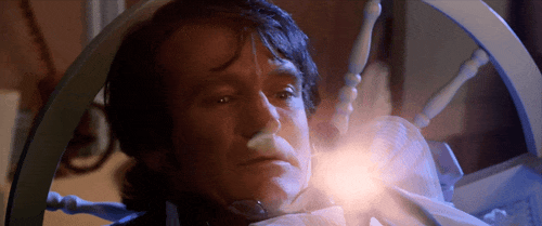
Here's a super quick revealing mistake from "The Dark Knight" (2008) that is a true "you'll never see this in real time" moment:
"The Dark Knight" (2008)
Although "The Dark Knight" example gives the audience a much clearer look at the camera operator, the focus puller(?) and the camera itself reflected in the interrogation room’s mirrors, the shot is a lot harder to see the crew members and equipment in real time due to the chaotic and energetic camera movement, as opposed to the locked off nature of the "Duel" example.


But probably my favorite revealing moment of filmmaking in plain sight that very very very few audience members noticed is this one from "The Abyss" (1989), which I wrote about here.
"The Abyss" (1989)watch the whole clip here
Amazingly, many folks who watch that clip from the dramatic drowning sequence cannot consciously see the bit of filmmaking that literally blocks the actors in an intimate moment. This is my favorite example of a movie's incredible emotional power — the scene is so dramatic and intense that most viewers cannot consciously see a giant cloth wiping away water from the lens of the camera in the middle of a shot.
Incidentally, some of these revealing mistakes are being erased from cinema history due to overzealous restoration projects — the process of “cleaning up” a film for newer formats like Blu-ray and 4K — which is deeply wrong. This is a much bigger topic on which I have very strong thoughts and the hottest of takes. Just look at what modern restorations have done to two of these revealing mistakes from "Goodfellas" and "Aliens":


Painting out these movie mistakes as part of a restoration is wrong. What's in the movie is in the movie, and altering the movie to this extent is a form of revisionist history. Cinema is worse off when over-aggressive restorations alter the action within the frame. To me, this is equivalent to swapping out an actor's performance with a different take, or changing the music score during an action sequence, or replacing a puppet creature with a computer graphics version of the same creature decades after release.  Movies are a moment in time. But I digress.

•  •  •  •

Like I said at the start, movies are handmade, and that's true even in today's landscape where digital visual effects are a prominent part of filmmaking. In the same way that physical crews use physical tools to build sets, construct costumes and craft props, visual effects artists use digital tools to craft an image. And with the hand-made nature of any art form, the lack of clinical accuracy lends to its charm and sometimes offers an accidental peek behind the scenes of how the art was constructed.
Every few years, a "Star Wars" revealing mistake bubbles up on the internet, one from the Mustafar sequence from Episode III, "Revenge of the Sith" (2005). But the bizarre moment in the single shot was not as easily explainable as the examples I've shown above.
Being in the privileged position of currently working at Industrial Light & Magic, the visual effects company that made the visual effects for the movie (and having worked on that movie [and that sequence!]), I took it upon myself to try and solve the mystery.
Please enjoy the story, written by Ian Kintzle, of how I investigated the mystery of the "Force Ghost" in "Revenge of the Sith", as it originally appeared in the Star Wars Celebration Program for Japan 2025.

•  •  •  •  •  •  •  •


THE FORCE GHOST IN THE MACHINEBy Ian KintzleApril 2025, for Star Wars Celebration Japan
It was spring 2005, and Industrial Light & Magic (ILM)— George Lucas’ dream factory—had just completed two years of work on one of its most ambitious projects yet: "Star Wars: Revenge of the Sith". A massive undertaking, "Sith" required a herculean effort from hundreds of artists and technicians at ILM, crafting 367 computer- generated models, hundreds of 3D and 2D environments, 47 practical miniature setups, and 13,000,000 renders and composites across 2,151 effects shots.
Out of all of the effects sequences in the picture, perhaps none was more challenging than the operatic duel between Darth Vader (Hayden Christensen) and Obi-Wan Kenobi (Ewan McGregor) on the volcanic planet of Mustafar. The battle starts within the Klegger Corp Mining Facility situated high on the rocky banks of a vast lava river, and progresses through the facility onto a heat-collection arm stretching over a fast- moving river of boiling magma, and then onto a pair of lava skiffs and panning droids. The battle finally ends on a bank with Vader severely burned and maimed.
For the Mustafar sequence, ILM’s team of compositors, led by Compositing Supervisor Pat Tubach and Sequence Supervisor Michael Conte, were faced with the daunting challenge of seamlessly blending all of these live-action plates, computer-generated imagery, and miniature effects, into one cohesive sequence. But with so many individual elements, mistakes happen, and in the case of Revenge of the Sith, a peculiar anomaly slipped through the cracks at precisely 1 hour, 59 minutes, and 2 seconds into the film.

The internet, ever vigilant, began to take notice of this curious artifact around 2015 – a blink-and-you’ll-miss- it moment of a ghostly-robed figure with dark hair that appears behind Anakin Skywalker for only a frame or two just as he leaps from the panning droid to meet Obi-Wan on the lava skiff. The strange figure sparked countless theories and speculation. Was it a “Force ghost”? An easter egg from a mischievous ILM artist?
Todd Vaziri, a seasoned veteran at ILM who also worked on the film as a compositor, was intrigued by the mystery. “Just before the release of The Force Awakens, I started to see this ‘easter egg’ bubble up on social media from time to time of what appears to be a Force ghost on Mustafar,” Vaziri says. “The discourse would really get going. Somebody would spot the artifact and go, ‘What the heck was this?’ And another would say, ‘What do you mean? I don’t see anything.’ And only when you step through the scene, frame-by-frame, do you see what looks like a ghostly face behind Anakin in the shot where he jumps up from the panning droid to continue the lightsaber duel on the lava skiff. And honestly, in-motion, nobody can spot this.”

Getting to the bottom of the mystery would prove difficult. ILM works on dozens of motion pictures and television shows per year, and as older projects are moved offline into their archives, the steps to bring them back to the servers are involved. Revenge of the Sith was no exception. It would require scavenging through terabytes of unaltered greenscreen photography that hasn’t been touched in years. So Vaziri put it behind him – for a time. But in 2024 when the discourse regarding the “Force ghost” roared alive again on social media, Vaziri decided that enough was enough. But in order to locate the anomaly, he would need to spelunk into the film’s digital archives at ILM which had since gone dark.
“I think it took 24 hours to unearth the footage and put it back on our servers. I was so excited, my heart was pounding out of my chest. No one had seen the original greenscreen footage for nearly twenty years,” Vaziri says. “The problem was I didn’t remember exactly what these plates looked like, both because it wasn’t my shot, and it was two decades prior. So I dug, and I dug, and finally I found the plate photography. I couldn’t believe it. There on set was a man—likely a stunt rigger—wearing not a robe, but a peculiar shirt that resembled one, standing behind Hayden, manually puppeteering the greenscreen lava skiff that he and Ewan were fighting on. His face and the “Force ghost” matched up frame-for-frame.” During this excavation process, Vaziri was also able to uncover a variety of in-progress versions of the shot composited with very basic layering. In those early takes, the robed man was not present. This meant one thing: the compositor had done some articulates to remove the mystery man, but the green screen extraction wasn’t quite done yet.

“We have to do frame-by-frame tweaking by hand, which means creating new garbage mattes in order to paint details into the motion- blurred edges,” Vaziri explains. “At some point during the process of refining the edges of the green screen extraction—which required new garbage mattes—the stunt rigger’s head was inadvertently revealed again in that paint process—but because you can’t see it unless you are stepping through it frame-by-frame— it was deemed finished by the artist, by the compositing supervisor, by the visual effects supervisor, by the editors, and by George Lucas himself. Nobody that was part of this process ever caught that and that’s how it made it in the movie. But in a way, I think it’s really wonderful. Plenty of my shots have mistakes in them, and as the saying goes: perfect is the enemy of good. We want our shots to be as perfect as they can be, but we can’t hit everything. In the last 20 years, we have evolved what we call the “Final Check” process, which is our way of scrutinizing shots before they leave ILM. An extra step of quality control, if you will. The bottom line is that we put human hands on every single one of the thousands of shots that you see in Star Wars. This world is handmade, and little things like this become part of ILM history.”
detail of the original greenscreen footage
the final shot as it appears in the film
So there you have it, readers. Another Star Wars mystery solved. In this case it wasn’t a Force ghost, but a stunt rigger who slipped into the shot during the compositing process, providing a wonderful look at the technical seams and handmade nature of the world of visual effects. Star Wars: Revenge of the Sith is streaming now on Disney+.


tag:blogger.com,1999:blog-37846398.post-4048176562678007982
Extensions
The Keys, Locks and Doors of "Terminator 2"
James CameronTerminator 2
Show full content

There are a LOT of keys, locks and doors in "Terminator 2: Judgment Day" (1991), so I made a video in 2022 highlighting every major key, lock and door in the movie. It's fun. You should watch it.

watch on YouTube

Turns out, it's a really fun study not only of the importance that Jim Cameron's script placed on keys, locks and doors in defining the physical spaces of the movie, but also it's a study of the incredible sound design of the film, headed up by sound designer Gary Rydstrom.


tag:blogger.com,1999:blog-37846398.post-5880163928841832045
Extensions
"A Different World" Upscaling is Not Good
Show full content

 “A Different World” (1987 NBC) is now on Netflix, and the HD upscale is... not good.

The show was shot and mastered on video in 4:3. The version on Netflix is cropped to 16:9, and has significant ML sharpening and odd softening. The show looks both over-crisp and gauzy/dreamy.


Many shots have a flicker, too. And, this is the fun one - any shot with text gets really garbled.


These screengrabs are all from "A Different World" on Netflix, s01e01.

Contrast this with the classic MTV Unplugged (1989) that just dropped on Paramount+. Like "A Different World", the show was shot and mastered on video in 4:3. And they're presented on Paramount+ in the proper aspect ratio, without excessive sharpening. The upscaling did a terrific job of eliminating any scanline artifacts (if there were any!). To my eyes, this is the proper way to show 4:3 video content on a modern streaming service.


tag:blogger.com,1999:blog-37846398.post-4350547698742275029
Extensions
This Goofy iPhone Bug Could Really Mess You Up
Show full content

Having just migrated two new iPhones, Apple needs to address this specific issue, because it can really really mess you up. 

After migrating from an older phone using iCloud backup, any Apple apps that use an account other than the primary iCloud account requires an extra step of authentication — but the user is never prompted for this, and until you authenticate the app just doesn’t work. 

This affects Apple apps Mail.app and Contacts, but I suspect it also affects Calendar. 

Mail.app - I use a Gmail email address and the first time I opened Mail.app on iPhone after migration it displayed zero emails. That was a huge indicator that something was wrong. I knew to go to Settings>Mail and re-authenticate Gmail from Mail.app. After authenticating, I saw all my email.

Seeing ZERO emails in Mail.app certainly indicated that there was a problem, but there was no indication of what to do next, so that's not great. Most regular users are going to get stuck here and simply think their iPhone is broken.

Contacts - My wife and I use a completely separate third iCloud account for Contacts because we want to share all of our contacts, and there's no built-in way to do this. (As an aside, it’s utterly ridiculous that Apple still doesn’t support sharing Contacts.) After migrating, I opened Contacts and it appeared as though my contacts were there. But because I’m paranoid I always do additional tests to ensure that syncing between devices is working properly. I created a brand new contact on the new iPhone named Krusty The Clown and sure enough, Krusty was not syncing to my other devices, and vice versa. 

All I needed to do was re-authenticate in Settings>Contacts but this was far more insidious situation because there was no clear indication that the new iPhone wouldn’t sync its contacts. A customer could go for weeks without realizing their contacts are not syncing properly.

And this wasn’t just a “me” thing. This happened with my wife’s iPhone (she also used iCloud backup to migrate to the new phone) and my mom (who also used iCloud to migrate), who spent an hour on the phone with AppleCare in order to figure out that she needed to re-authenticate Gmail for Mail.app.


A Feedback has been sent to Apple.


tag:blogger.com,1999:blog-37846398.post-699771385483421151
Extensions
Oscar Pool Ballot, 97th Academy Awards
97th Academy AwardsAcademy AwardsOscar Ballot
Show full content

 It's time for the Awesomest Oscar Pool Ballot In The History Of Oscar Pool Ballots.

Every year I create a special ballot based on a typical Academy Awards printable ballot -- but on my ballot, each category has a different point value. The highest valued category is "Best Picture," while the mainstream films' categories are valued at two points. The non-mainstream categories (like the documentary and short film categories) are valued at one point.

This way, in a tight race for the winner of the pool, the winner most likely would not be determined by the non-mainstream films (in other words, blind guesses).

Download the ballot here for the 97th Academy Awards and use it at your Oscar party.


click here for larger

And if you're wondering why Tom Cruise is on my ballot... he's been on every one of my Oscar ballots. Because he's soooooooooo cool.


tag:blogger.com,1999:blog-37846398.post-4969205384735784350
Extensions
The Directors of Visual Effects Oscar Winning Films, 1977-2024
James CameronRobert ZemeckisSteven Spielberg
Show full content
James Cameron, directing "Titanic" (1997)
updated 3/4/25 for the 97th Academy Awards, with Denis Villeneuve snagging another VFX Oscar.
I've compiled a list of the directors of Academy Award-winning films for the visual effects trophy. Do with this as you will.
For me, when looking at this list of nearly fifty years of visual effects Oscar wins, I think one can see trends of the types of films (and directors) that make films that win the ultimate VFX award.


The Directors of Visual Effects Oscar Winning Films, 1977-2024

  • 1977 - George Lucas, “Star Wars”
  • 1978 - Richard Donner, “Superman”
  • 1979 - Ridley Scott, “Alien”
  • 1980 - Irvin Kershner, “The Empire Strikes Back”
  • 1981 - Steven Spielberg, “Raiders of the Lost Ark”
  • 1982 - Steven Spielberg, “E.T. the Extra-Terrestrial”
  • 1983 - Richard Marquand, “Return of the Jedi”
  • 1984 - Steven Spielberg, “Indiana Jones and the Temple of Doom”
  • 1985 - Ron Howard, “Cocoon”
  • 1986 - James Cameron, “Aliens”
  • 1987 - Joe Dante, “Innerspace”
  • 1988 - Robert Zemeckis, “Who Framed Roger Rabbit”
  • 1989 - James Cameron, “The Abyss”
  • 1990 - Paul Verhoeven, “Total Recall”
  • 1991 - James Cameron, “Terminator 2: Judgment Day”
  • 1992 - Robert Zemeckis, “Death Becomes Her”
  • 1993 - Steven Spielberg, “Jurassic Park”
  • 1994 - Robert Zemeckis, “Forrest Gump”
  • 1995 - Chris Noonan, “Babe”
  • 1996 - Roland Emmerich, “Independence Day”
  • 1997 - James Cameron, “Titanic”
  • 1998 - Vincent Ward, “What Dreams May Come”
  • 1999 - The Wachowskis, “The Matrix”
  • 2000 - Ridley Scott, “Gladiator”
  • 2001 - Peter Jackson, “The Fellowship of the Ring”
  • 2002 - Peter Jackson, “The Two Towers”
  • 2003 - Peter Jackson, “The Return of the King”
  • 2004 - Sam Raimi, “Spider-Man 2”
  • 2005 - Peter Jackson, “King Kong”
  • 2006 - Gore Verbinski, “Pirates of the Caribbean: Dead Man’s Chest”
  • 2007 - Chris Weitz, “The Golden Compass”
  • 2008 - David Fincher, “The Curious Case of Benjamin Button”
  • 2009 - James Cameron, “Avatar”
  • 2010 - Christopher Nolan, “Inception”
  • 2011 - Martin Scorsese, “Hugo”
  • 2012 - Ang Lee, “Life of Pi”
  • 2013 - Alfonso Cuaron, “Gravity”
  • 2014 - Christopher Nolan, “Interstellar”
  • 2015 - Alex Garland, “Ex Machina”
  • 2016 - Jon Favreau, “The Jungle Book”
  • 2017 - Denis Villeneuve, “Blade Runner 2049”
  • 2018 - Damien Chazelle, “First Man”
  • 2019 - Sam Mendes, “1917”
  • 2020 - Christopher Nolan, “Tenet”
  • 2021 - Denis Villeneuve, “Dune”
  • 2022 - James Cameron, “Avatar: The Way of Water”
  • 2023 - Takashi Yamazaki, “Godzilla Minus One”
  • 2024 - Denis Villeneuve, “Dune: Part Two”


Steven Spielberg, directing "Raiders of the Lost Ark" (1981)

Directors with Multiple Wins

  • 6 - James Cameron
  • 4 - Steven Spielberg
  • 4 - Peter Jackson
  • 
3 - Christopher Nolan
  • 3 - Robert Zemeckis
  • 3 - Denis Villeneuve
  • 2 - Ridley Scott

Peter Jackson, directing "The Return of the King" (2003)

Directors with Visual Effects Experience

  • 6 - James Cameron (artist, models, founded VFX company)
  • 4 - Peter Jackson (founded VFX company)
  • 1 - David Fincher (VFX artist)
  • 1 - Gore Verbinski (VFX artist)
  • 1 - Takashi Yamazaki (VFX supervisor)
  • 1 - George Lucas (founded VFX company)
  • 1 - Roland Emmerich (founded VFX company)


tag:blogger.com,1999:blog-37846398.post-2285071038257664255
Extensions
A "Terminator 2" Callback
terminatorTerminator 2
Show full content
larger
Modern franchise pictures frequently utilize easter eggs, references and callbacks as meaningful cinematic nutrition. But it doesn't have to be this way.
Here's an understated, unassuming, blink-and-you'll-miss it callback in "Terminator 2" (1991) to "The Terminator" (1984) which repeats a motif yet uses the callback in a completely different manner.
Image description: In "The Terminator" (1984), Sarah Connor (Linda Hamilton) destroys a T-800 robot using a giant, four-button industrial activator. In "Terminator 2" (1991), Connor again destroys a T-800 robot using a giant, two-button industrial activator, but this time in a completely different context.

tag:blogger.com,1999:blog-37846398.post-3146618122308961085
Extensions
"Why Does OLD MOVIE's Visual Effects Still Hold Up?"
Jurassic ParkTransformers
Show full content

This question comes up a lot, usually in regards to films like "Jurassic Park" (1993) and "Transformers" (2007), especially when referring to franchise films. Some folks feel that the visual effects of a successful movie's sequels are "worse" than the original film's, even though the "technology is better". The problem with the premise of this question is that it disregards the human and creative aspects of filmmaking, instead defaulting to "technology is better, why aren't the images better?"... which is a deeply reductive and silly way of looking at the artistic process.

I wrote this tweet in 2023 as a quick attempt to answer the rhetorical question. I think my answer still holds up pretty well. Heh.


•  •  •  •


"Why does OLD MOVIE's visual effects still hold up?"

  • shot design
  • planning and organization
  • taste
  • sticking to a plan
  • appropriate timeline
  • small volume of work
  • appropriate budget

These principles are timeless. If you think a visual effects shot looks like crap, the people involved with the movie can point to one or more of these bullet points to indicate the reason.

Please note how none of these bullet points are about technique because making good art is technique-agnostic.


•  •  •  •


I really hope readers don't gloss over that last sentence, because it's fairly important.


tag:blogger.com,1999:blog-37846398.post-5109129210146155404
Extensions
Battling Misinformation: "Transformers"
misinformationTransformers
Show full content

Our visual effects work for "Transformers" (2007) is still being lauded to this day, which is a testament to the amazing talents of the visual effects teams at Industrial Light & Magic under the supervision of Scott Farrar, Russell Earl and Scott Benza.

I frequently see myths about the production timeline of our film, and in the spirit of squashing misinformation, I'd like to address it here.


In a quote tweet responding to someone complimenting our work on the movie, a social media post reads:
The reason the VFX looks so stellar is because ILM began animating for the film in early 2005. They had Two Entire Years to complete the CGI. The industry standard now is a couple months if they're feeling generous.

I've seen a variation of "Two Entire Years" myth several times over the years. This is not true.
Very roughly, ILM's first animation tests took place in May 2006, while director Michael Bay, Farrar, Earl and Benza were still shooting the movie. I started compositing the first transformation shots in the movie in June 2006. Our ILM crew was modest at the start, and grew by September 2006. The movie wrapped filming in October 2006. The movie was released in theaters July 2007. So, roughly speaking, the lion's share of visual effects production took place in less than one year.
Please stop repeating this "two years" business. Yes, generally speaking, we had more time to work on this type of movie than we do these days, but let's not be hyperbolic and repeat the lie that we had more than double the time to complete our visual effects shots than what was true.


tag:blogger.com,1999:blog-37846398.post-8714197454263227935
Extensions
Battling Misinformation: "Severance"
misinformation
Show full content

A Twitter account with a verified blue checkmark and over 1 million followers regularly peddles misinformation about how movies are made. Here's how they described the making of the first shot from "Severance" (Apple TV+) season two, episode one:

"The opening scene of 'SEVERANCE' Season 2 took 5 months to film."
Any reasonable person that is not a filmmaking professional would have no reason to believe anything other than this: "the production spent five months straight filming the elements for this single shot." Of course, what this crummy account wrote is a gross simplification of a nuanced point. The production did not spend five months straight filming elements for this shot.
As indicated in the show's official podcast hosted by director Ben Stiller and actor Adam Scott, they couldn't be more clear about the complexities they face in gathering the photography for this shot.
view on YouTube
Scott: "We shot those ten difference pieces [of photography] over a period of, what would you say, five months?"
Stiller: "Yeah."
Pretty clear. In fact, the dumb account that posted this misinformation included the link to the podcast as its source in a reply. Either they are intentionally being deceptive, or they're grossly incompetent at reporting "Film Updates".
There are far too many accounts out there that spit misinformation, muddying the waters of how the general public understands how art is created, and it's quite frustrating. Just read some of the replies and quote tweets of this stupid post.


tag:blogger.com,1999:blog-37846398.post-5933483177238349528
Extensions
"Indiana Jones and the Last Crusade" Mini-Oner
Indiana JonesSteven Spielberg
Show full content

Much has been said about Steven Spielberg’s uncanny ability to tell a story within a frame and set up geography, and usually folks use his long oners as examples of this talent. In fact, we break down a "Raiders of the Lost Ark" (1981) oner on the Lighter Darker: The ILM Podcast, in Episode 3 (starting around 27:35).

But here’s a relatively innocuous, non-flashy 26-second-long shot from “Indiana Jones and the Last Crusade” (1989) that does all those things.

With this blocking, Spielberg quickly sets up the geography of the scene, the physical goals of the characters, and even allows for full-body physical comedy to happen within the frame. Other directors would shoot this scene as a wide+closeups, then intercut “to increase tension”.

The same angle repeats later in the sequence, again to clearly establish the geography and the relationships between the characters. This is how directors like Spielberg help the audience understand the action and never get spatially confused.
Now, you might be asking yourself “How did Indy and his dad get in the box? How did they close the box? Why did they close the box instead if just driving away? Why didn’t they wait until the bad guys were cruising down the river?” Because it’s a movie, that’s why.

OH AND ALL THIS TIME YOU NEVER SAW THE CREW MEMBER’S HAND CREEPING OUT FROM UNDERNEATH A TARP, PUTTING THEIR HAND ON THE MOTOR SO IT CAN BE "STEERED", something that you will now never be able to unsee. Ha.
And here's some speculation on my part - maybe this was designed as one big long shot, with Indy and his dad emerging/running off camera/bad guys emerge/camera reveals the box/Indy drives out. (Which would also qualify as a Texas Switch, since Harrison Ford and Sean Connery would not have been the driver and passenger of the motorcycle). Perhaps the timing/choreography didn't work out, and the middle shot was required to complete the sequence.
Original, abbreviated Bluesky post.

tag:blogger.com,1999:blog-37846398.post-2306408712069593987
Extensions

Related Narratives

← Back to feeds