Decades ago, I used to work for a videogame magazine, but those days are long gone, and any videogame I play is a rare and intentional event.
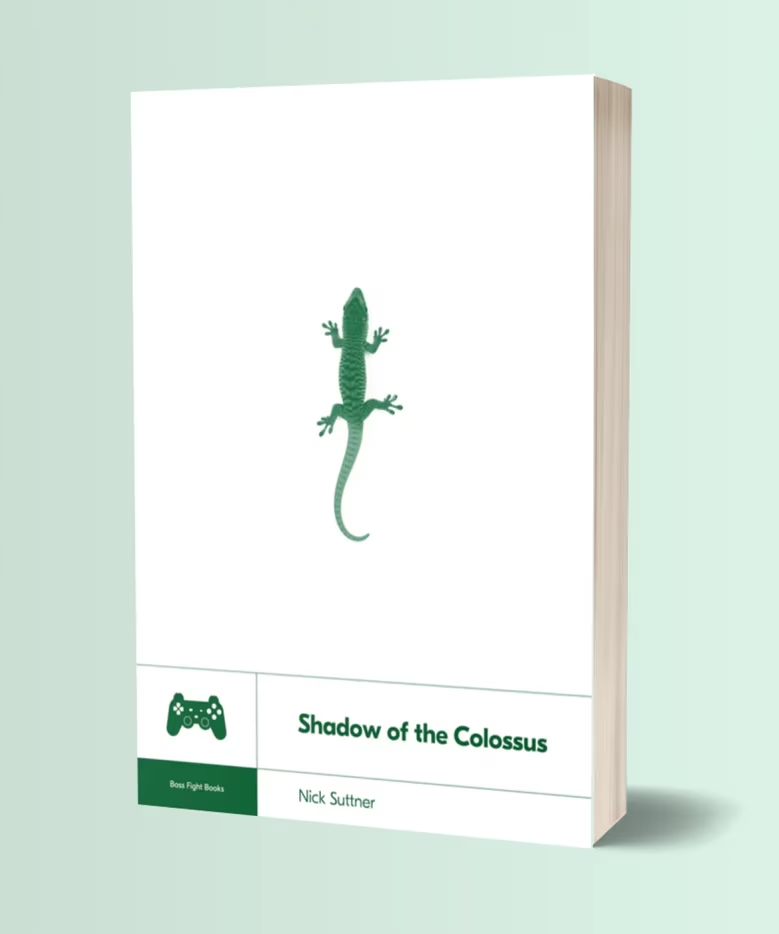
Shadow Of The Colossus, the 2005 title directed by Fumito Ueda, felt so important to get to know that I had to borrow a PlayStation in order to play it, instead of waiting for a conversion (which never came; the game remains a PlayStation exclusive even today).
If you are not familiar with the title, I’m going to say little – the approach taken by the game, as well – and just point you toward the trailer for its remastered edition:
Boss Fight Books has been publishing books about videogames since the early 2010s, and “Shadow of the Colossus” by Nick Suttner is a book number 10 out of 40+.
The rather small and short volume is divided into chapters talking about each level of the game, one by one. But don’t let this discourage you – after all, recaps can be a literary art form. Here, every chapter goes on a side quest to talk about a larger component of the game or its backstory.
Having said that, the writing didn’t fully connect with me. Some of the tangents do not flow well, and the author’s choice to put himself in the book yields mixed results. In good moments, it’s wonderful to see someone’s passion for the game, but at times we’re also subjected to tenuous anecdotes about, for example, author’s beard, or his walks in San Francisco.
But the game! The game is definitely worth knowing more. It’s widely considered a masterpiece, a testament to choosing only a few things and doing them exceedingly well, a celebration of minimalism and deliberation, with so much – from world design to nuances of haptics – intently focused on creating the right ambiance to tell a story.
This might be strange to say, but I have this belief the rules of world building and care about atmosphere apply even to boring enterprise apps with stock UI elements. You’re still creating a universe and its set of principles, figuring out how to walk the user through it all via certain narrative beats, and – ideally! – thinking about all the small design decisions that will contribute – ideally! – to a consistent overarching tone.
The book occasionally peeks under the curtain to reveal design choices and details that could be inspiring to more than game designers: the control scheme, the fluid camera movement, intentional repetition of themes just to have them subverted, or the fascinating concept of “futile interactivity” (giving the player control even if the outcome is predetermined). What is interesting in particular are paths not taken: the initial idea of 48 monsters pared down to 16, or the multiplayer roots abandoned to focus on a linear, single-player experience.
(In a particularly brilliant decision, the creators took some of the unfinished levels and still put them in the game… as ruins.)
Is it a perfect book? No. But I’m glad I read it, and that writing about videogames in this form still exists – for a while, this was called “new games journalism” – and one way or another, it’s good to get closer to this strange beast of an AAA game with an indie game’s soul.
Before dark mode became mainstream in the late 2010s, there were two main customers of dark UI themes: programming and photo/video production. But, to the best of my knowledge, they arrived at that preference from two very different angles.
Programmers’ fondness for dark mode was a result of decades of bad display technologies. The early CRTs were so awful, the burn-in risks so real, and the pixels so fuzzy and headache-inducing, that you wanted to see as little screen light up as possible – hence, defaulting to black background for everything computers did.
These challenges were there all the way through the 1980s, really, teaching generations of coders that computers meant light letters on dark backgrounds. Games moved away from being “in space” or “at night” as quickly as they could, text editing and spreadsheets went for paper-like livery soon after that, but programming never meaningfully existed on paper, and so the skeuomorphic pull wasn’t really there.
(Have you ever heard of a term “reverse video”? What’s kind of confusing about it is that its meaning was reversed around that time.)
AV professionals took a different route. They already had CRT calibration, gray walls, and monitor hoods so that light from outside wouldn’t contaminate content colors – and when computer UI started appearing on those CRTs, it was likewise best to keep it as dark and as neutral as possible.
Today, things are more flexible. Many people prefer one theme over the other for any of many legitimate reasons, most leave dark theming synced to daylight, and display technology can handle all themes so well that it jumped ahead of our brains, which still have some interesting asymmetries in processing light shapes next to dark ones.
As users celebrated dark mode appearing in popular apps and services in the 2010s, some had to catch up the other way: Apple TV added light mode (for some reason) in 2017, and Affinity apps celebrated new light UI option just earlier this year.
Most programming text editors still default to dark, but allow you to switch; as a software category they were probably the first to fully embrace color theming.
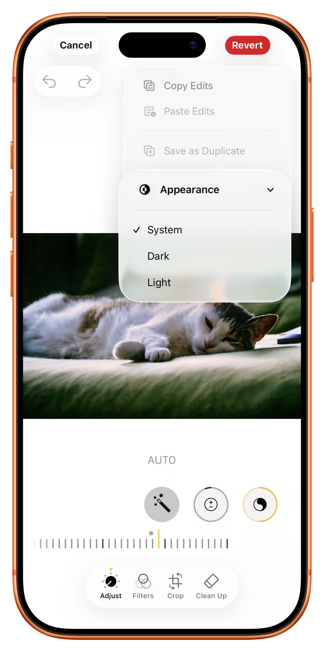
But what led me to writing this post was a delightful discovery today of this setting:
Why, of all apps, would iOS Photos allow you to switch to dark mode, and only while editing to boot?
I think this might be because of the above tradition of pro AV apps, where we learned it’s good for visuals to be surrounded by black; a little nod to its earlier professional roots – similar, perhaps, to the story of the Clear button in calculators.
But I had two more thoughts. First, for all the reasons above, to me at least dark mode still has connotations of “professionalism” and toggling the option makes me feel I’m a bad-ass pro whenever I’m editing a photo. I wonder if others also feel that way, too.
Second, dark mode looksdifferent. Dark UI only when editing means it’s easier to spot whether I’m editing or just browsing, and be ever so slightly better oriented.
(In general, apps today are much more similar-looking, and I’m surprised neither iOS nor Android doesn’t allow you to switch the theme per app, just so it’s easier to know where you are as you move around quickly.)
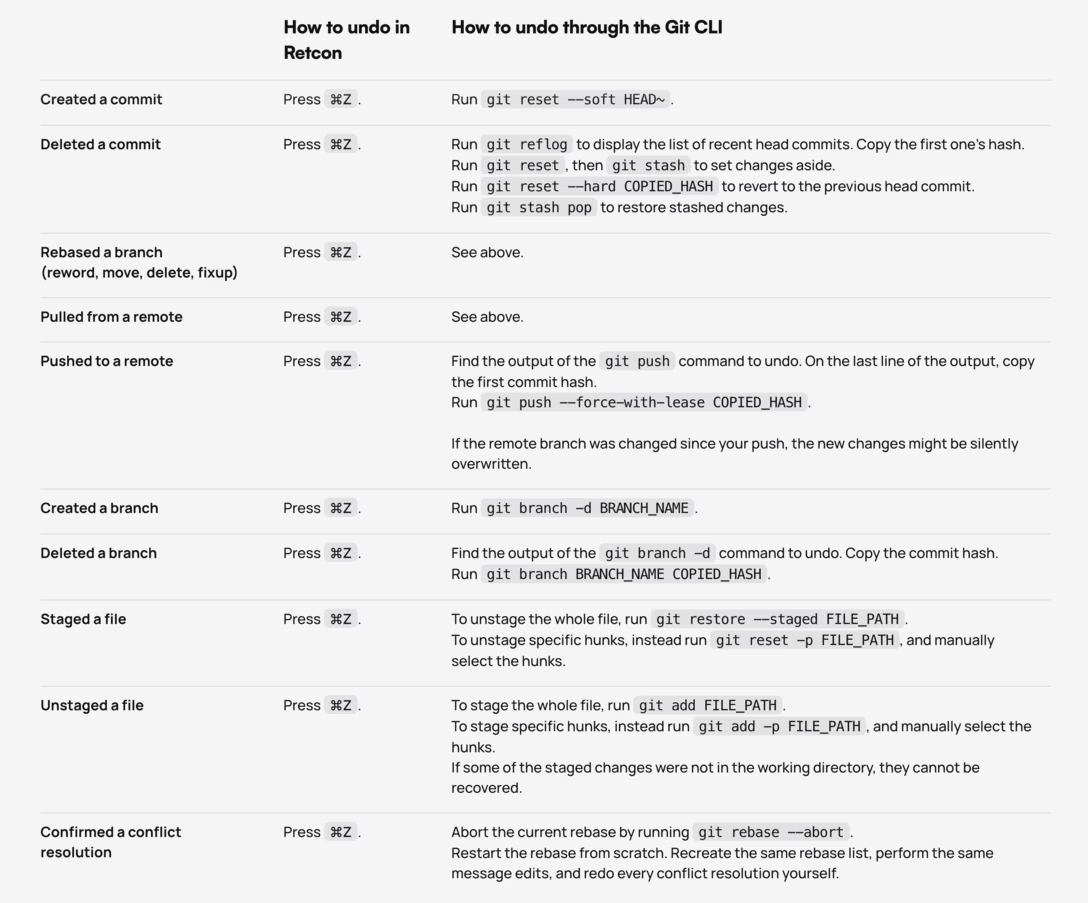
To follow up from yesterday’s post, in Figma, object selection actually goes onto the undo stack. This is because in a professional tool with objects in multiple levels of hierarchy, it might take a while to construct a selection to work on – and since selection is always just one accidental click away from being completely cleared, undoable selection is extra protection.
However, at the same time renaming a file – or changing settings like file access – is not undoable. This is in part because we didn’t feel people would understand they could cancel out their rename this way (Safari too used to have “reopen last tab” under ⌘Z, until it reverted to Chrome’s ⌘⇧T), but mostly because you could accidentally undo through a file rename during regular work if you were not careful, without noticing, and that felt like it’d have more profound consequences.
In some ways, it helped me to think of these not as “ineligible for undo” but rather “living outside of time.” The moment a file is renamed, it will always have been named that way. (For the purposes of undo, at least. You can acknowledge anything you want on the version history screen.)
I’m not saying these are universally correct choices – as a matter of fact, some users find undoable selection (at least initially) pretty confusing! – but mostly sharing these as examples of intentional thinking about what deserves undo, and what should be exempt from it and taken care of elsewhere.
A fun bit of storytelling on the website for a git client Retcon:
I don’t have personal experience with Retcon. I definitely struggled a lot with git’s syntax over the years, and have my own cheatsheet that looks similar to this.
But what I really liked from this page was the elevation of undo to be the North Star. I think it’s very, very well deserved.
To the best of my knowledge, undo in its modern form arrived in 1983 with Apple Lisa – Byte magazine called it a “tremendous security blanket” – and then over the next decade or so blossomed into its current state: an infinite, multi-level, lightning-fast safety hatch that works pretty much everywhere, always there in the bottom-left corner of your keyboard, so second-nature you might not even realize you’re invoking it.
In early apps, before undo arrived, you had to be very careful about what you did and when you saved your work. Later on, undo worked on just one level, so you had to think a lot about how to spend it before things became irreversible.
Today, undo just works. It truly became Back Space: The Next Generation.
But any user-facing “just works” hand wave means a lot of people’s hard and invisible work behind the scenes. So if you’re reading this, and at some point in your career you worked on making undo better, my tip of the hat to you (and send me a message!).
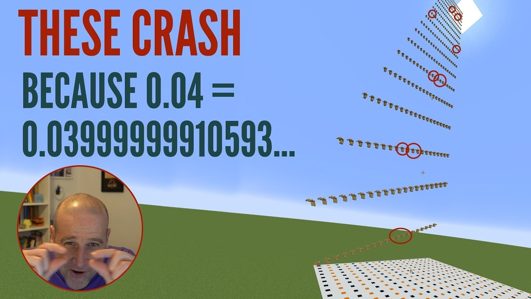
Minecraft is so complex that it’s sometimes hard to know what is a bug and what is not.
Here’s the logic of the game:
If you fall from height, you receive fall damage.
If you fall from height but you’re in a boat, there’s no fall damage.
If you fall from height and you’re in a boat, but you fall from a distance of 12, 13, 49, 51, 111, 114, 198, 202, 310 or 315 blocks, there is fall damage and you die.
The first is common in games.
The second is – I believe! – a former bug that was grandfathered in as a design decision: people got used to it, started relying on it, and it became “too big to fix.” The retroactive explanation became that the boat is your shield and takes all the fall damage, which is a very Hollywood action movie way of looking at the world.
It’s an interesting video because it’s lighter on bug causes discussion, but heavier on math – and the moment you realize those numbers above are not random at all and coalesce into a nice formula, is genuinely a pretty fun moment.
I thought this was interesting, and a little contribution to a larger debate about how hard it is to even agree what a bug really is (which I previously briefly talked about).
I believe these are used by people who prefer intentionally limited visual choices, for low-key diagramming to put in source code, and – increasingly – as an entry point to gen AI.
They’re so interesting from the standpoint of this blog:
Fun to see a contemporary take on something that peaked between 1970s–1980s – you can look up TUIs and Turbo Vision if you want – but (just like Mario the other day) now with modern sensibilities, performance, web access, mouse and trackpad affordances, and so on.
It’s interesting simply as an exercise in constraint. I believe constraint practice will become more and more important as computers become more and more capable. It’s already useful to constrain yourself in order to make things easier for you. With the rise of AI, self-constraint will become important to make things harder, as well.
There is a certain power and longevity of monospace plain text that’s worth celebrating – not just because the file format is portable, but because text editing as interface is so well-known and potent.
Also, ASCII spray in Mockdown is just really fun:
(Caveat: These tools are “ASCII” in a colloquial sense, the same way people use “GIF” to refer to a certain category of looping animations.)
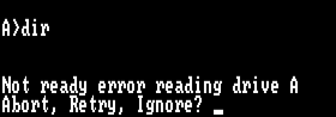
If there was one go-to example of an impenetrable error message in the 1980s, it must have been this – popping up, for example, if your disk drive was dirty:
On some technical level, the options made sense: “Abort” would stop whatever you were doing, “Retry” would try to repeat the action, and “Ignore” would proceed as if there was no error. But in the heat of a moment, or seeing it for the first time, this was a puzzling choice to be asked to make. Not only were the words weighted improperly (the seemingly most innocuous action here, “Ignore,” was actually the only one that could do actual lasting damage), but it also wasn’t entirely clear what’s the safe thing to do to get out of the situation.
(The redesign of “Abort, Retry, Ignore” was “Abort, Retry, Fail,” and it wasn’t really a huge improvement.)
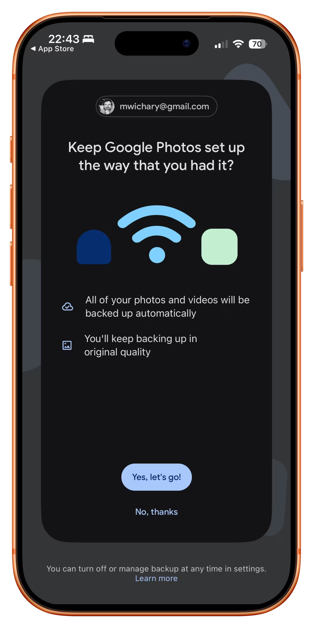
Last night, I installed Google Photos on my iPhone, and the first message that greeted me was this:
This is really a matryoshka doll of bad dialog presentation.
First: any buttons in a dialog should be labeled with enough information to keep me going. Here, both have generic labels, so now I need to pay attention.
Second: Even after reading, I have no idea what is the choice I’m making. I see the pathway marked “yes, keep it the way I had it” and, sure – this would be generally what I want from any given computer on any given Sunday. But what’s the actual alternative?
But the third, and most important one, is this: this dialog has no safe escape hatch. By now, in UX design, we established quite a few canonical escape hatches:
a Cancel button,
a × close box,
a “No, thanks” link,
a press of an Escape key.
But you can’t × this dialog out. The main button seems positive, but it also feels like I’m taking an action with consequences, and I don’t want to deal with that. There is a “No, thanks,” but it doesn’t feel like the other “No, thankses” I have seen – it’s juxtaposed with copy that makes it seem… a dangerous thing to choose.
And this last bit makes it a pretty serious design offense, because you are now messing with foundational stuff. You need to protect those escape hatches for the future; the moment you introduce hesitation into the mix and taint “No, thanks” as a concept, really bad things will start happening all across your product.
In real life, fire doors have to open outwards when pushed with body weight, aircraft stick shakers are impossible to ignore, and anti-lock braking systems do smart things even after your brain turns off its smart parts.
I know seeing a dialog like this would never happen in a moment of true panic, but sometimes I think of the user in their most absent-minded moment: trying to get their kids to hurry up for school, on hold with an annoying cable provider, with a cat looking like it’s about to jump up directly into a running toaster. A dialog on their phone pops up. If that dialog absolutely has to happen, what is the escape hatch it can offer so they can dismiss it safely if they cannot think about it at all?
This Google Photos screen needs a lot more rethinking and rewriting, but in its current incarnation, it desparately needs a clear and trustworthy escape hatch I can tap absentmindedly, just so I can get to my photos.
What I liked about it is that it’s wrestling with the idea “How do you improve on something considered perfect?” and touches upon the important area we cover occasionally here on this blog: when is software finished?
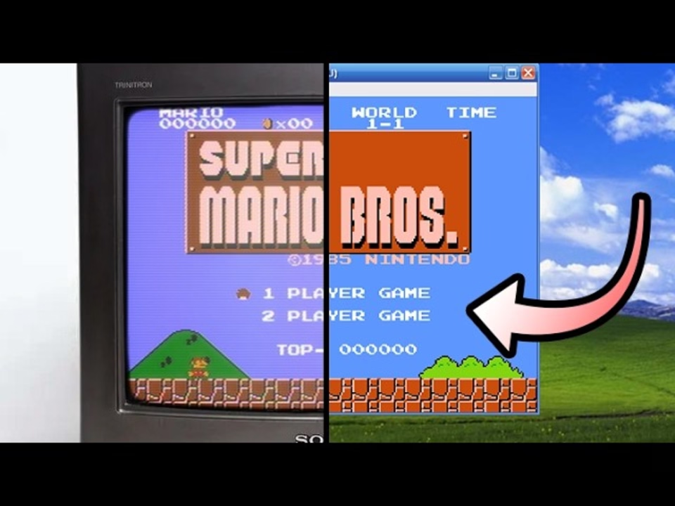
There is also another interesting angle. Even though the game requires original game ROMs to work, it’s still in a very, very gray area:
[…] Once you strip it down, this thing is built around Nintendo’s world: the Super Mario Bros. name, the characters, the visual identity, the level concepts, the branding, the whole presentation. And the more ambitious it gets, the riskier it feels. Once a fan project starts offering not just a remake, but extra modes, editor tools, custom-level browsing, ratings, and a growing user-generated content scene, it stops looking like a small tribute and starts looking like something operating in Nintendo’s lane.
(I didn’t expect to see the original Super Mario game to come up so often on this blog – I just added a tag for it – especially since I don’t have any personal reverence for it. But it seems it’s Super Mario and Doom specifically that became timeless pieces of software that keep being resurrected, revisited, and remixed, over and over again.)
An interesting flavour of a molly guard that can only happen in onscreen interfaces is “occasionally moving things out of the way to mess with the user.”
The messing-with-the-user part is, ostensibly, for their benefit. Making something not appear in the usual position, or not behave the usual way, becomes a speed bump, cancels out motor memory, and forces a conscious reaction rather than flying through the interface on autopilot.
The simplest example is dialogs that ask about dangerous actions suspending the “default action happens when you press Enter” behaviour:
(There is a way to continue the dialog on the right using the keyboard alone – but it’s only via ⌘R and not the default, breezy Enter.)
Another version is swapping buttons or showing them in an otherwise unusual order:
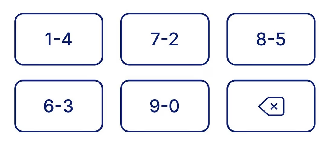
But remember when I said “can only happen in onscreen interfaces?” Well. The apotheosis of this very idea, spotted in a New York alley, proves otherwise:
It’s a Hirsch ScramblePad, inconsistent very much by design, a login mechanism where every time the digits get put in a different place.
The idea is meant to help with two problems:
It makes it harder for someone standing behind to learn your code from just watching your movements, as it abstracts the movements to be one step away. (The strange visual filter is meant to make the viewing angle as narrow as possible, too.)
It prevents uneven wear and tear of the buttons, which people could use to guess your code:
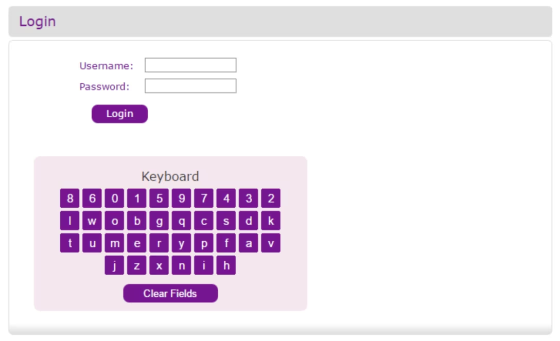
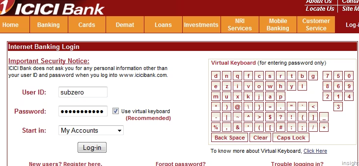
I understand “ScramblePad” was the original product (here’s the patent with some nice illustrations), and the name got genericized since. Here’s competition, MIWA Random Tenkey – once probably so much more futuristic, today equally quaint:
One can occasionally see more modern versions today:
But back to our beloved screens, where some banking web apps copied the idea:
I’m not a security expert, so I won’t try to opine how effective those things are. I tried to research whether forcing a password out of motor memory – which these will accomplish – is ultimately better or worse, but a lot of the papers I found were inconclusive. (As always, some of the theoretically good ideas for security bounce off of human limitations and convenience: Forcing someone to remember a password might mean they will write it down somewhere, effectively making things worse.)
I am a huge fan of all sorts of “recent” features in software; I think they’re extremely helpful in removing tedium, and thoroughly undervalued. A lot of our work is repetitive, even if it’s sad to admit.
1.
My bank’s website not only shows me the last payment I made, but also allows me to click to use the same number again:
2.
The app Transit has a nice list of recent destinations just below the main options:
3.
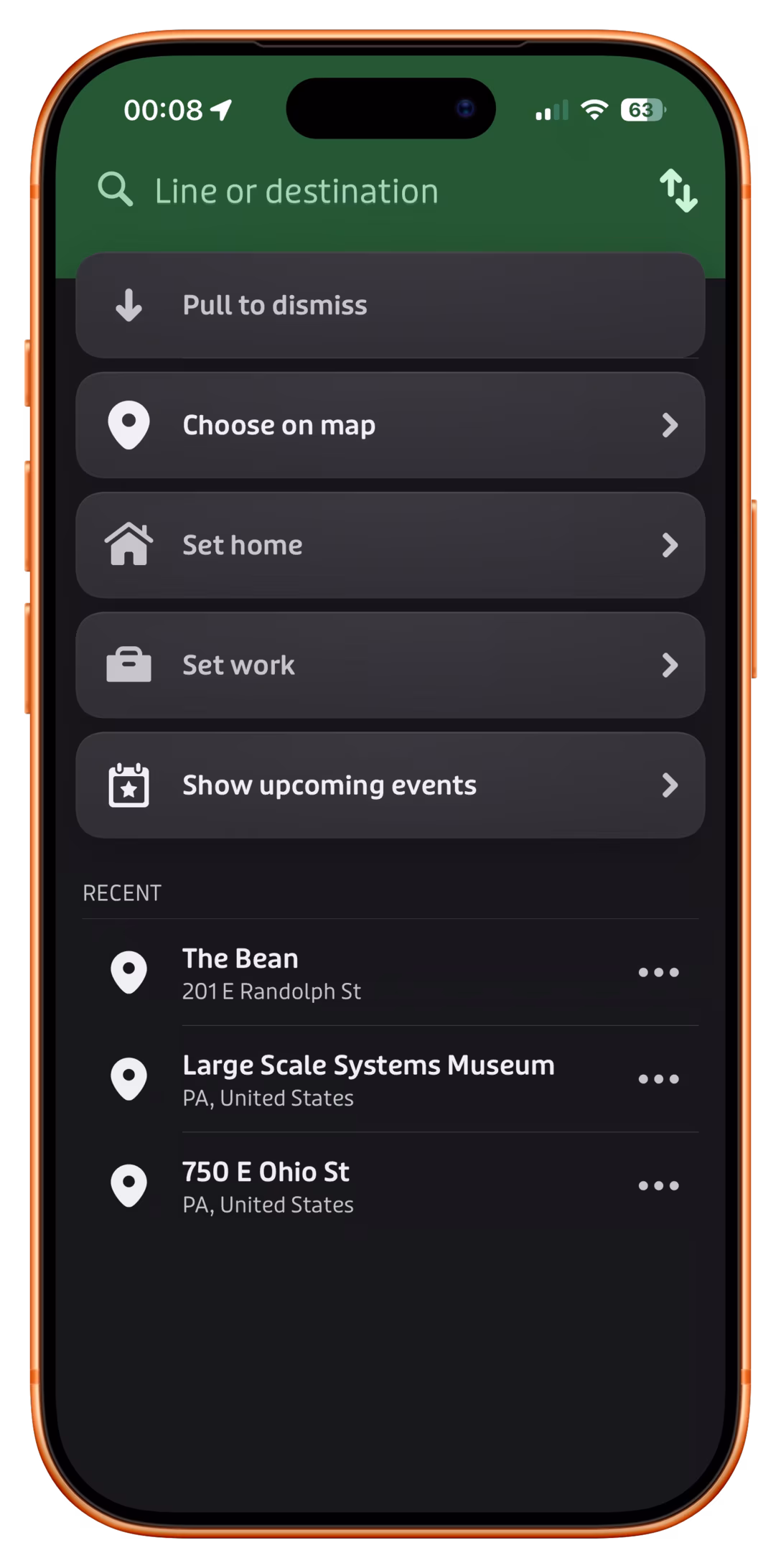
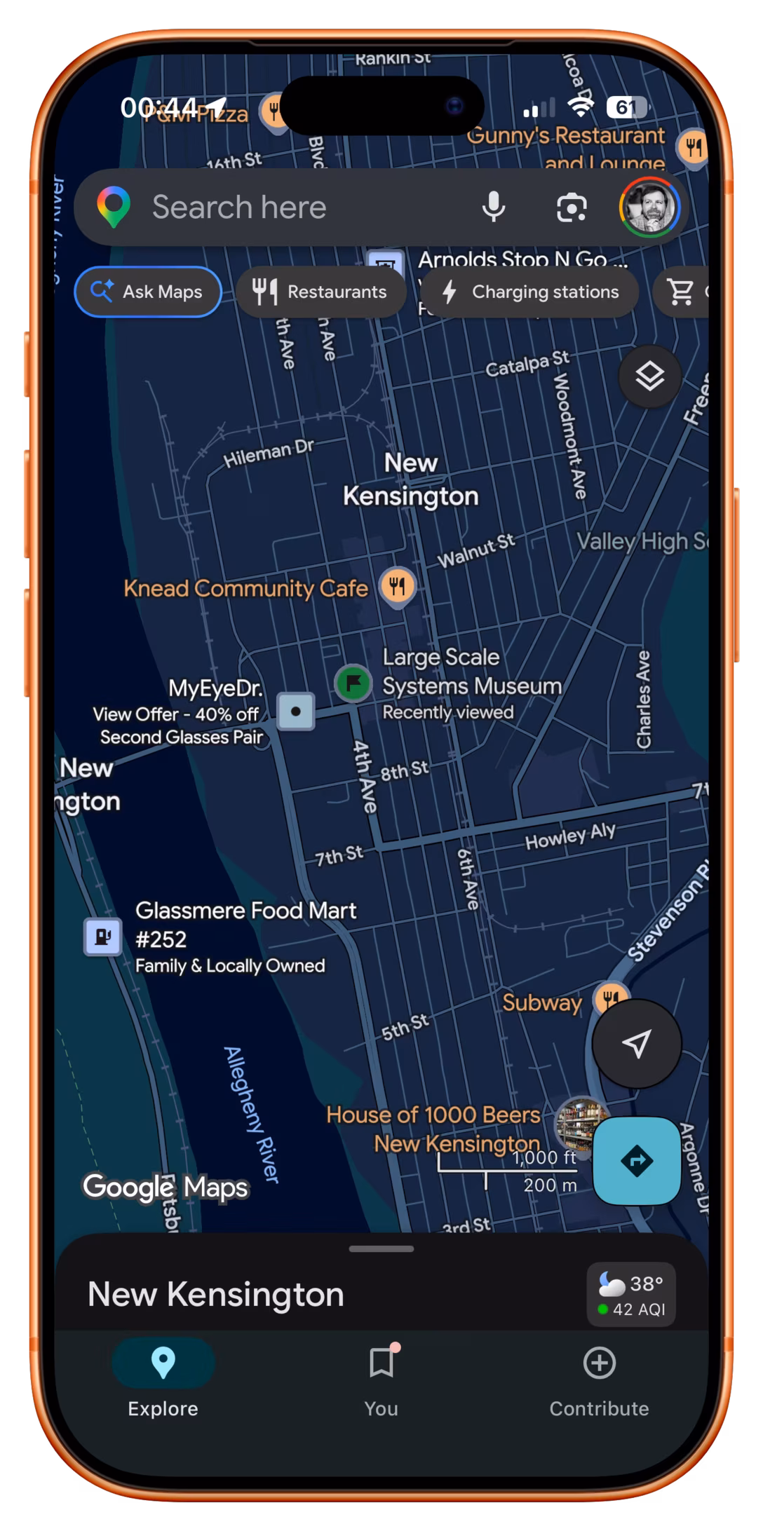
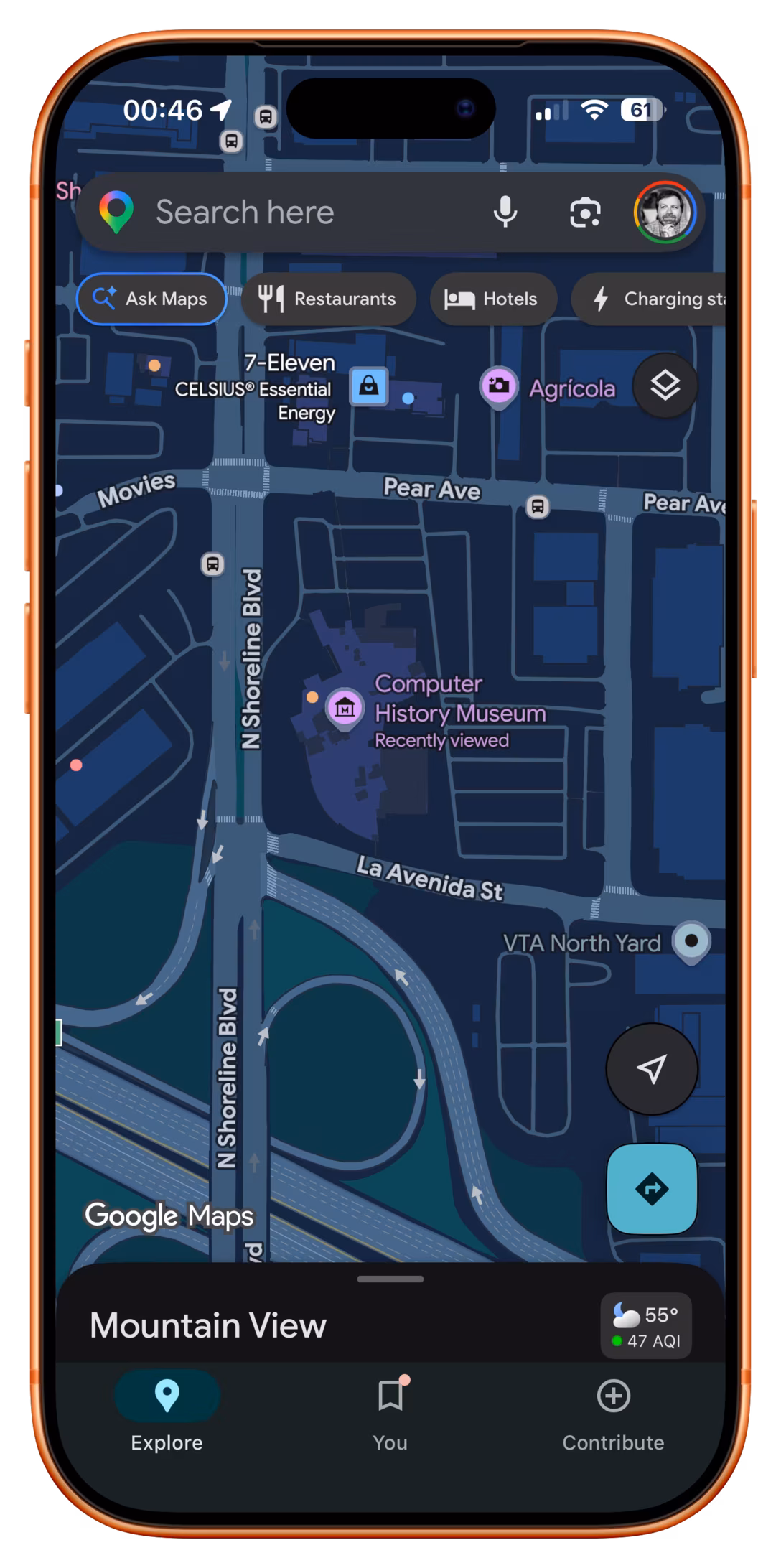
Google Maps promotes recently tapped-on items to be more visible than they would normally be:
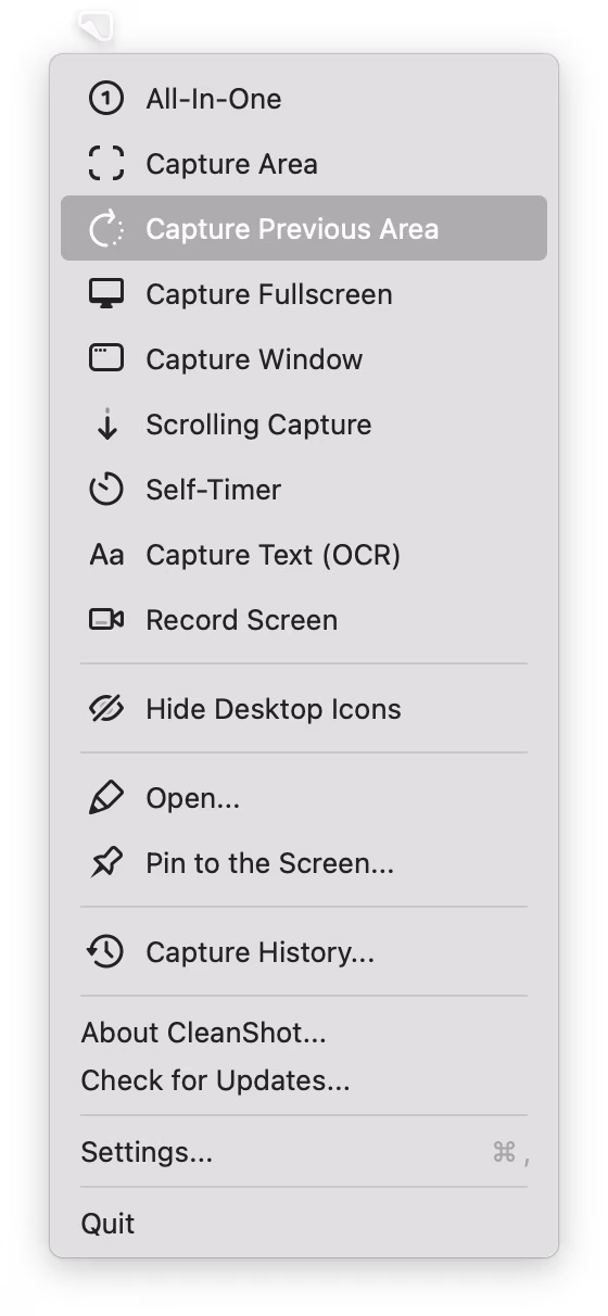
4. CleanShot X offers something I have always wanted from built-in macOS screenshotting – being able to capture with one keystroke the same area as I delineated last time:
5.
Google Pixel allows you to swap the current wallpaper and three previously chosen wallpapers easily:
What unifies all of these is that “recent” doesn’t live in a submenu somewhere, treated as a second-tier pathway. No, in all of these “recent” is embedded in the fabric of normal interactions, side by side with forward-facing options. I believe this is necessary for any sort of feature like this to be truly successful.
That last Google Pixel example also shows that “recent” isn’t only for repeating something faster – here, it becomes more of a “soft setting,” without introducing a lot more complex UI and interactions that a “real” setting might require.
I can finally update my ancient WarGames reference – turns out the computers on the TV show The Pitt are also preprogrammed to show the right things on the screen regardless of what the actors are actually typing.
But you still need to flail your fingers in vaguely realistic ways, so the actors in this (spoiler-free) TikTok share their strategies:
I want to tell you about something that might seem oddly specific and perhaps too technical, but a) at the end of it you will have a useful phrase somewhere in your brain that will pay off one day, and b) I swear I will make it worth your while.
Have you ever seen this problem?
The screenshot on the left is fine. But there is something wrong with the one on the right. In light mode, the shadow is wispy and weird. In dark mode, things are even stranger, and the shadow is almost… a glow?
I stumbled upon this problem occasionally for years now – there are a few screenshots on the blog with this weird problem, even – but it was never feeling like a deal breaker. However, I finally sat down to figure it out today.
Turns out, there are two kinds of approaches to alpha channel/transparency. The normal one we all know well is called “straight alpha.” But on the right, we were looking at “premultiplied alpha” – something entirely more complicated, where the background is baked into transparency for… reasons. Premultiplied alpha is conceptually – and often literally – dirtier, but it also has benefits: more flexibility, better filtering, sometimes better performance. As far as I understand, premultiplied alpha exists primarily in the world of video and vfx, but occasionally it rears its unconventionally attractive head in our boring static 2D world of screenshots, too.
In my case, I finally figured out this was happening whenever I’ve pasted the screenshot from the clipboard to Photoshop instead of Preview – for some reason, a screenshot then got an alpha channel premultiplied against white background. But I wouldn’t be surprised if it happens to some of you under other conditions, too.
So, “premultiplied alpha.” That’s the useful phrase. What was the other thing?
Captain Disillusion (or, Alan Melikdjanian) is one of my favourite YouTube educators. His work is mostly debunking fake videos – his most well-known one is about the Cricet bracelet, although my personal fav is one about laminar flow – and they’re just constantly interesting and hilarious at the same time.
Disillusion also occasionally does a more straightforward “let’s talk about some technical aspects of video production” episode which he bundles under a “CD/” umbrella. Here’s a handy list of all of them:
I am sharing this list because you should watch them all. Most are <10minutes, they are consistently entertaining, and even though none of them are about UX design, there is enough overlap between the two universes that you will come out of it all a lot smarter.
Pragmatically, in my case, I searched for [premultiplied alpha] + [Photoshop] and quickly learned of a new-to-me menu option: Layer > Matting > Remove White Matte. It turns premultiplied alpha back to straight alpha, and fixes the screenshot.
Non-pragmatically? If you want to really understand premultiplied alpha, the last thing I can do is suggest another great internet educator, Bartosz Ciechanowski, who has a more comprehensive interactive web explainer. There will be math. There will also be sliders. You decide.
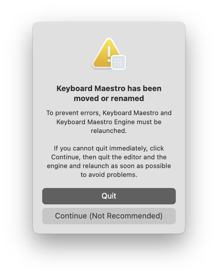
I moved Keyboard Maestro app to a different folder as it was running. I gather there must be some technical reason for the app to have to be power cycled, so I appreciated this warning, and the thoughtful bit of copywriting: “Continue” is caveated with “not recommended” so that you feel more comfortable choosing “Quit,” usually the less safe choice. I thought it was a good attempt to add the right scent to the strange options at a strange moment.
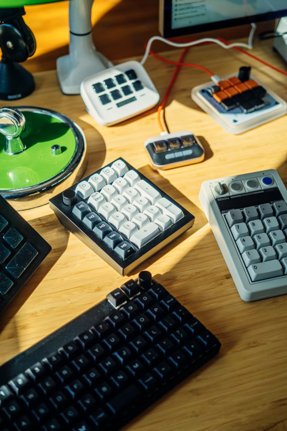
I have been working on an essay about how to gently get started and have fun with keyboard customization. I am finding myself surrounded by programmable keypads…
…and I am going out of my way to try various new shortcuts and automations, big and small, just so I can write a helpful article.
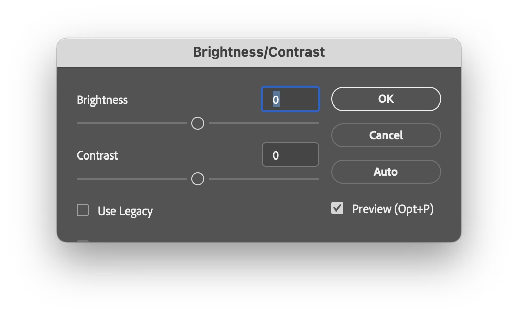
In Photoshop, one of the classic dialogs I use a lot when scanning things is brightness + contrast:
It doesn’t come with a keyboard shortcut, so I mnemonically assigned ⌘B (for Brightness) to it. ⌘B is easier than using your mouse to select a menu option, but still tedious in the long run; every time I have to input brightness and contrast numbers, then click on Use Legacy which is not sticky, then realize that enabling Use Legacy inexplicably resets the values I just typed so I have to input them again…
…which really isn’t as much fun 20th time in a row, 20th year in a row.
So imagine my surprise when one day I invoked the dialog, and it came up looking this out of the box:
It somehow remembered the previous settings. How? Why? Was that a new thing? Was that a bug? Did the stars align or did they misalign? Figuring out how to make it do this every time would have save me so much trouble.
I dug deeper and figured it out. On the way to ⌘B, my fingers grazed the ⌥ key. This invoked a “use same settings as last time” option I never knew existed. This option would have been a lifesaver, has been there for god knows how long, and I just discovered it by accident. Moreover, it wasn’t just a feature of this dialog. One can hold ⌥ for many more Photoshop dialogs – a thoughtful system to make repeated tasks faster.
Damn.
This reminds me of something. I am curious if you’ve seen what I’ve witnessed probably ten times by now: once in a while my corner of the internet overflowing with awe when someone shares that on the iPhone, you can hold the spacebar and it functions as cursor control:
Inevitably, tons of people are always amazed and excited, proclaiming this is the best thing since sliced silicon wafers…
…and that always make me a little sad inside. Both this and my ⌥ story feel like failures of onboarding, of software growing with you and sharing its motor-memory nooks and power-usery crannies. If a helpful thing exists, but people don’t know about it, it feels worse than it not existing. Imagine all these interactions made more pleasant, all these hours saved, all these flow states undisturbed.
I want to spend more time on this blog highlighting onboarding and conveyance done well – I just shared a tiny example a few days ago – particularly since this feels to me like an area underinvested in. If you have a story of an app or a service doing this well, I’d love if you could share it with me so I can highlight it and we can learn from it.
A good post by John Gruber on Daring Fireball investigating why apps pester you with the annoying “enjoying this app?” windows and attendant semi-shady practices (choose 5 stars and you get sent to App Store, but choose anything less, and your review will get redirected to Mr. Dev Null).
The answer? They don’t really have a choice:
“[Steven Troughton-Smith:] Review prompts are the difference between a great app getting five positive reviews, and thousands of positive reviews. […]”
You have to play the game as the game stands, and Apple controls the game. And in the game as it stands, apps need 5-star reviews to gain traction in the App Store, perhaps especially so for apps in crowded categories. And for most apps, the only way to achieve that is through prompting. But the right thing to do, for the user experience in the app, is never to prompt for reviews.
I think it’s worth knowing about stuff like this for another reason. Absent understanding or institutional memory, any exception gets normalized and ceases being an exception. If specifically iOS apps have to do this for reasons explained in the post, this is still not an excuse for web apps or websites to indiscriminately pester people with prompts like these, too.
Among many genuinely useful deeplinks you can use to control Raycast from afar in a simple way, I just spotted an interesting one:
raycast://confetti
This is what it does:
Despite it being a confetti cannon and nothing more, I think it goes deeper than stuff like e.g. Asana’s “celebration creatures”, and it deserves recognition for three actually kinda serious reasons:
You can use it to quickly test whether you’re wiring deeplinks correctly. It’s clever the Raycast team put it at the beginning of the doc page; I think every API or a complex connection method should have a simple and delightful “success scenario” for two reasons: to celebrate you establishing that connection, and to have something so simple it cannot itself be misbehaving (this way you know that if you can’t get confetti to work, you for sure messed up something elsewhere).
Once you know how to invoke it from far away, it’s also great for testing other things. Sounds can be muted. In JavaScript, console.log() can be too buried if you don’t have a console open or visible, and alert(“Test”) is kind of depressingly old-school and steals focus. This HUD-like thing feels like a modern way of approaching this: You know you’ll notice it when it fires away, and it will leave no lasting damage. (Okay, fair, it does steal focus too, so that’d be one thing to improve.)
It has great production value. I hate perhaps all of Google’s search easter eggs because they’re built so extremely cheaply – try searching for “do a barrel roll” or “askew” (and no, I’m not going to dignify them with links because links are my love language). It’s rare and worth celebrating when something that could very well be an internal joke or a test feature for nerds is actually something you want to use because it’s so well-made. (See also: Linear’s internal testing UI.)
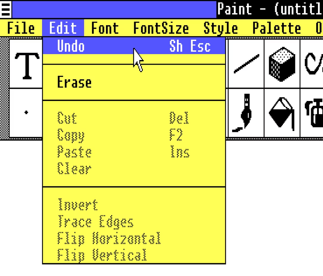
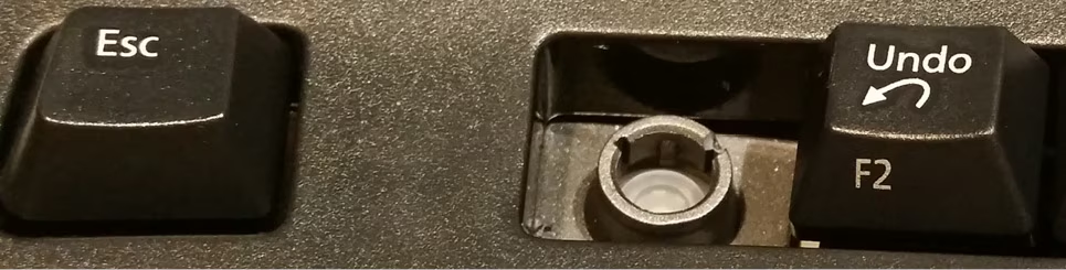
Did you catch one interesting bit in the last post? The undo shortcut in Paint and other apps in Windows 1.0 used to be Shift+Esc:
This reminded me that the classic Ctrl+Alt+Del shortcut was initially Ctrl+Alt+Esc. Except, people apparently invoked it a bit too often by accident, so it was split to require two hands for extra safety.
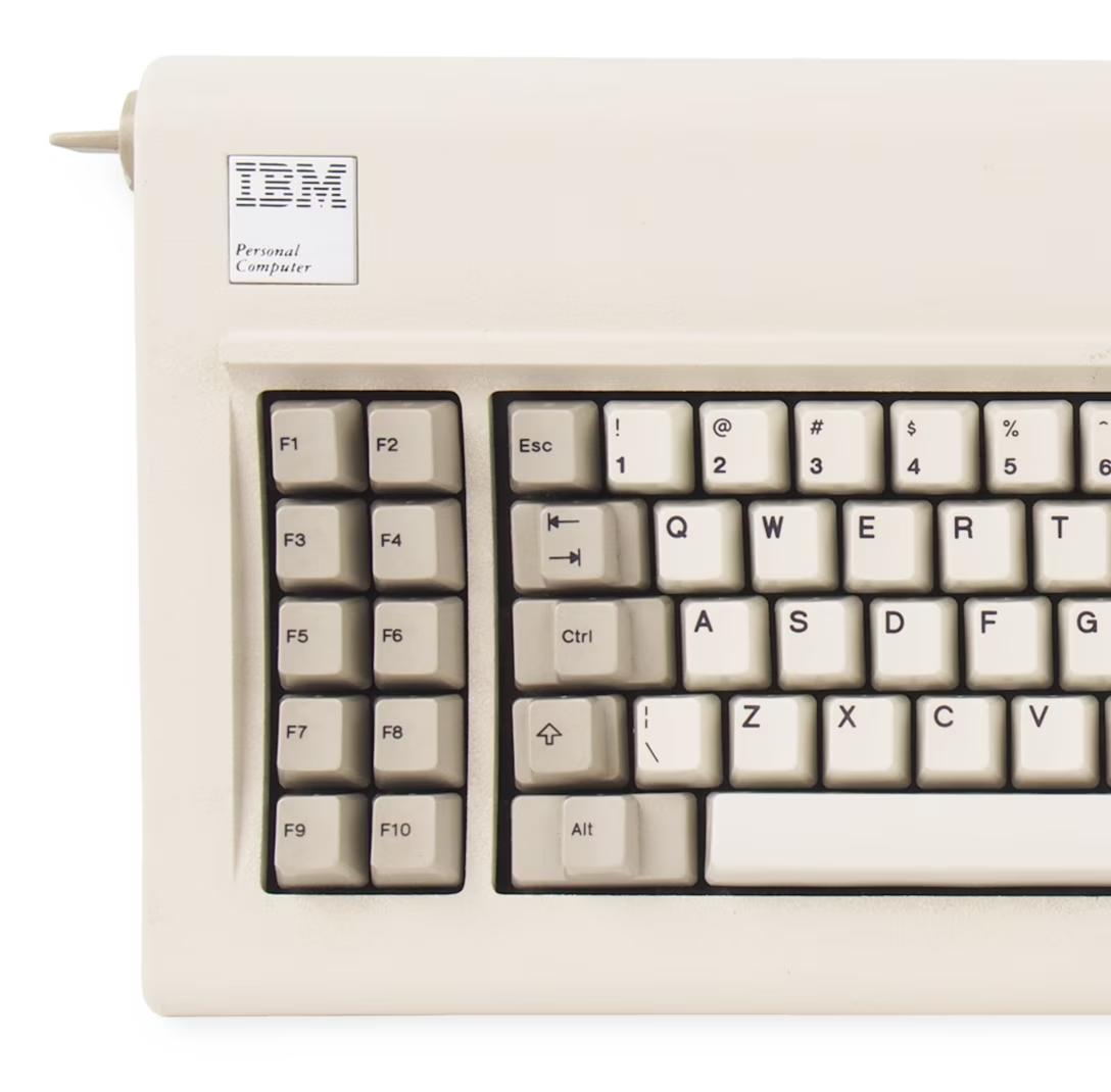
When you look at the keyboard for the original PC, it all makes sense. Esc is at the edge of the main typing block, and in line with all the modifier keys. It would make sense to build a system around this, and it’s interesting to imagine the Esc Kinematic Universe that never happened.
Don’t get me wrong: I think it’s good that it didn’t. ⌘Z or Ctrl+Z are much easier to get to than Shift+Esc, especially in concert with cut/copy/paste next door – that system introduced by Apple Lisa and Mac teams deserves endless trophies and infinite accolades. (In case you are curious, Windows 1.0 used Delete for Cut, Insert for Paste, and… F2 for Copy.)
But it has always been peculiar to me that Esc isn’t seeing more use. I see Backspace tasked with all sorts of modifier key combinations in various apps, but Esc – equally available on the other side, and even easier to target on some keyboards – is often left alone.
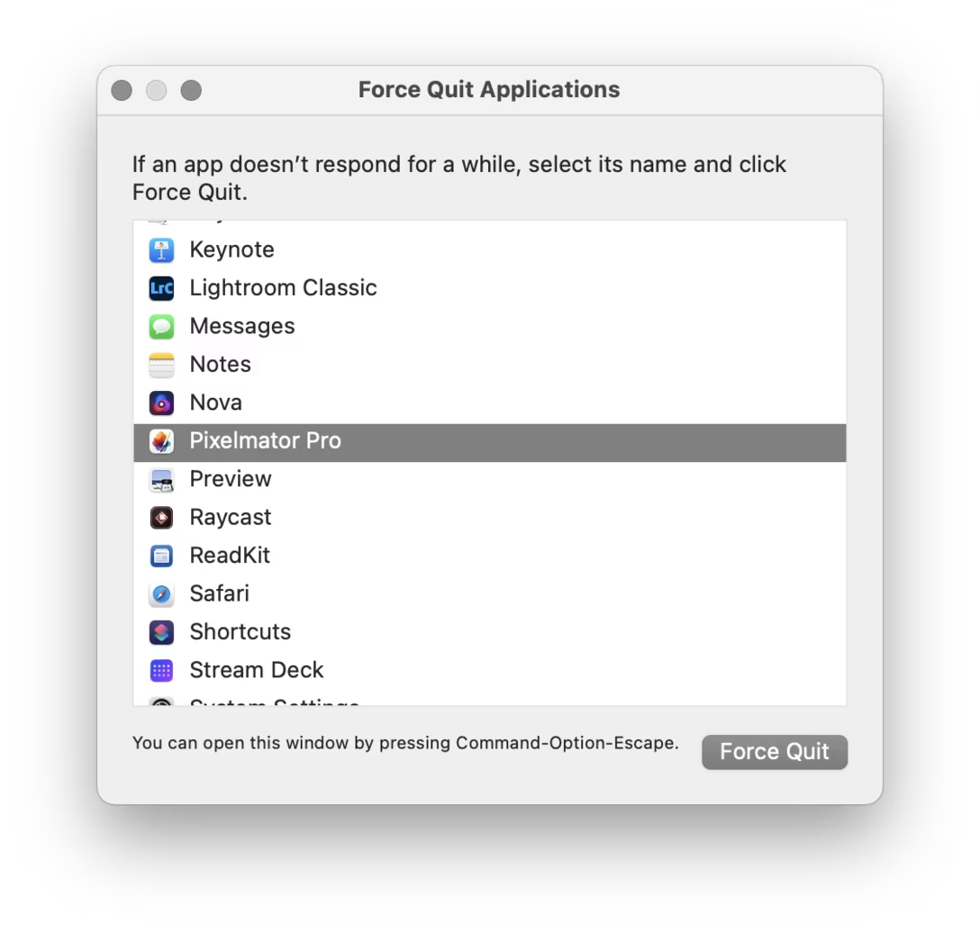
Poetically, given the beginning of this story, it was Mac that grabbed ⌘⌥Esc for force quit:
There is a nice thoughtful design element in that window that’s worth calling out: the hint line the bottom.
Why, of all places, would this window go out of its way to announce its own shortcut after you already figured out how to open it? I think this might be for a similar reason airlines repeat the safety announcements before every takeoff. If your computer goes haywire, if one of your apps starts hogging resources, if the UI slows down so much any action takes forever, it might benefit you if somewhere in the back of your head exists one small bit of information: “ah yeah, I don’t know how I know this, but I think I’m supposed to press ⌘⌥Esc now.”
Anyone using old computers for graphics remembers the strangeness of “flood fill”:
The 1950s and 1960s computers were so sluggish that their consoles with blinking lights were not just for show; the operations were slow enough that you could still follow the lights in real time.
This ceased to be true soon afterwards. The microcomputer revolution temporarily reset some computing progress, but by the 1980s and 1990s more and more things were happening too fast for us to keep up.
But here (this above is Paint in Windows 1.0, and you can try for yourself in a browser!) was one example where you could still see an algorithm working hard. It was mesmerizing and educational, and it was a rare example where perhaps you didn’t mind the computer taking its sweet time. Even messing up like I did above – maybe especially messing up – ended up fascinating to watch.
Wikipedia has examples of a few different flood fill algorithms, which are even more interesting:
But by now Minesweeper retired from sweeping mines, and today computers are so fast that it’s hard for me to imagine any flood fill being anything else but flash flood…
…except this is what I just saw in Pixelmator on my Mac:
I don’t know if this is a nod toward a classic flood fill, or just a nice unrelated transition. But I found it genuinely delightful, and it’s fast enough that I would imagine it doesn’t bother pros who need to do it often.
Sometimes it’s nice to see a computer working when there’s a good reason; some apps like banking apps even insert artificial, visible delays after crucial operations, just so that the users feel comfortable knowing their important transaction went through.
But sometimes it’s nice to see a computer working for no reason at all.
The gist of it is simple: the mechanics of following a link are not important, and should be replaced by something that can make the link stand on its own. This is important for screen readers, but also for basic scannability: a “click here” label has a lousy scent and requires you to take in the surroundings to understand what it really does. The rule is, in effect, a variant of “show, don’t tell.”
(In modern days, you can also add another transgression: on touch devices one cannot click, but only tap.)
There is a similar rule about button copy design. Button labels, too, should be self-sustainable. Below is a good example (just reading the button lets me understand what I’ll achieve by clicking it), juxtaposed with the bad one (“OK” is so generic you have to read the rest of the window).
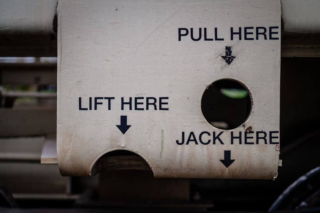
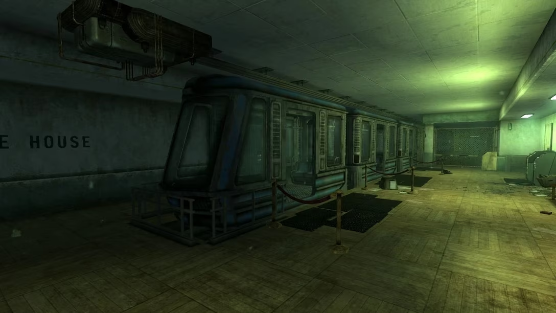
Earlier this week, I was passing some train cars on my coffee walk, and saw this bit of UI:
Why are these okay, and “click here” is not? Here’s why, I think: Yes, the ultimate goal is to move a train car, or empty it, or send it on its way. But here, the mechanics matter, too. They’re dangerous. They require preparations. No one says “I’m going to open my laptop and start clicking on links,” but I imagine people say “we have to jack this car” or “we need to lift it.” Even “here” has depth: these are specific tool mounting points. Choosing the wrong “here” will have consequences.
But, going back to the web, avoiding “click here” in strings isn’t always easy. Imagine trying to put a link in the sentence “To change your avatar, visit the profile page.” I’m personally never sure how to linkify it well:
To change your avatar, visit the profile page.
To change your avatar, visit the profile page. To change your avatar, visit the profile page.
Linking “change your avatar” seems correct since it points to the eventual outcome, but then it leaves the actual destination dangling and unlinked – like putting an accent on a wrong syllable. “Visit the profile page” is better than “click here,” but it’s still not scannable. Linking the entire sentence seems strange and complicated to me, and I also disagree with Tim Berners-Lee, who on the page I liked to above seems to suggest this should be…
To change your avatar, visit the profile page.
…just because this might make a user think there are two separate destinations and actions, and contribute a wrong mental model.
You could, of course, simplify this to “Change your avatar,” but while that would work in a UI string, it wouldn’t within a larger paragraph of text, or a blog post.
If the very idea stresses you out, I want to give you permission to send me just your bit of feedback without any greetings, or small talk, or “compliment sandwiching.”
(This is one of the meta posts about this very blog. If that’s not interesting to you, skip to the next one!)
I thought I’d share a few of the small design details I am proud of for this small blog!
1.
After years of being annoyed at Slack for mishandling image sizes, it was important for me to show the screenshots (at least the desktop UI) at their 100% precise size, if possible. I think that helps to get a better sense of a scale and feel of things. This was harder than I expected (since I still want images not to grow too wide or too tall), but hopefully works well now.
2.
I wrote some extra code so that if an image has edge transparency or even soft shadows, it will be aligned accounting for all that. I think that feels elegant – especially on a blog that practices asymmetry probably to a fault.
3.
If the images or videos blend too much into the background, they get a lil border to separate them – but only in light or dark mode as needed. This is so that the whole page rhythm holds better together. (Manually assigned so far. Would be curious if one can make this automatic.)
4.
Speaking of dark mode, I almost figured out how to make videos with transparent pixels so that they look good in both dark and light mode. (Chrome only. Still working on it for Safari.)
5
I want autoplay videos (without sound!) so that it’s easier to see interaction design – basically, a modern version of what GIFs used to provide. This has been challenging and required adding some JavaScript, and is still not done! But it’s starting to feel nice.
6.
Given all the quotations I do, I added hanging quotes to text. Wildly, they are still not really supported by CSS (Safari is a sole exception), so that required some manual intervention.
7.
Short lists are (automatically) spaced differently than long lists. I’ve always wanted to try that.
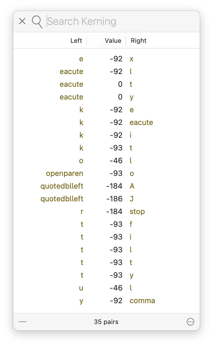
8.
I’m having a blast with the pixel fonts I recreated from PC/GEOS. I keep adjusting the glyphs, adding kerning pairs, etc. It’s fun to keep improving a font as you’re improving its surroundings; I just redrew the @ glyph you can see above!
(This is one of the meta posts about this very blog. If that’s not interesting to you, skip to the next one!)
At Unsung’s 250-postiversary, if I reflect on where this blog has been, and where it might be going, this is what comes to my mind. I didn’t start the project by writing all this down, but I held a lot of this in my head. This feels like a nice moment to capture all this more deliberately, and perhaps some of you might find it interesting.
Goals of Unsung:
Highlight hard, good, invisible design work that makes things better, but doesn’t often get spotlight.
Find deeper meaning in craft, past the pretentious platitudes and surface-level delight. (Details matter not just in some abstract “craftsmanship” sense.)
Help expand what craft means: highlight relations between things, show connections between history and present, talk about things that are hard to describe and impossible to measure.
Revel in being pragmatic. Share useful things, not just hollow inspiration.
Be fun to read.
DIRECTIVE 6: CLASSIFIED_
Higher-level principles for this blog:
Don’t ever share boring stuff, even if the concepts are good, or out of completeness. If you’re not enjoying reading or watching something, assume the audience won’t either. (You can occasionally salvage something boring by providing a non-boring commentary, but try to use this sparingly.)
When you share something, always try to add your perspective or connections. At the very least, excerpt the most useful thing. This blog is QT, not RT.
Find a good balance between positive and negative examples.
In general, offer variety. The weekly digest should have both depth and breadth. (For the last two points, I made a little dashboard to give me some insight, although the sentiment analysis there right now is pretty worthless.)
Be opinionated, but also humble and curious. You don’t know everything.
Be candid, but not cruel. Punch up, not down.
Avoid ridiculing, “walls of shame,” and so on. Even if the work you share is horrible, turn it into a lesson or two.
This is not about people, but about work – except in some occasions it might be about people, so be candid when that happens.
More links is better than fewer. Good linking rewards curiosity and is a form of curation (example 1, 2, 3). However, the post should stand on its own even if one doesn’t follow any of the links.
Make an effort to showcase work by women, people of color, underrepresented minorities, and so on.
Visuals are engaging and helpful. Think about them, but do not add gratuitous, irrelevant photos just to meet the quota (example 1, 2, 3).
The best way to teach something general is to show something specific.
Lower-level principles:
Credit people by full name.
For longer videos, offer their duration to make it easy for people to make decisions about when they want to watch them.
Avoid linking to X and Substack. (It really breaks my heart how much of the design community still supports particularly the former, given all the damage we know X inflicts on society.)
Don’t use this blog as an example (e.g. by screenshots of itself), as this is generally confusing.
Personal goals:
Practice writing things that do count in less than thousands of words.
Do things differently – this blog is authored in Apple Notes, for example, which is kinda weird to a person like me who always writes straight in HTML.
Have fun and learn working on this (completely custom) blog platform on the side.
Give back some of what I learned in my career over the years.
Practice stating my opinions and standing by them.
Learn new things (about what I’m writing and about publishing on the web); the only way to teach something is to understand it yourself first.
What Version History, a YouTube show from The Verge, does really well is revisiting older tech products from today’s perspective without allowing nostalgia to take over.
This episode about the Western Electric 500 – the canonical American landline rotary phone – is worth watching by all UX designers. There is no software here, as the phone is entirely electromechanical. But there are a whole lot of details to admire and be inspired by: the shape of the handset, the interface to change the volume, the iconic ring, the balanced and improved rotary dial, the behaviour of the cable, even the weight and balance of the whole device.
It’s not only that phone calls should all sound as good as they did in the 1950s – in my experience FaceTime Audio comes close, sometimes, but it’s so unreliable – it’s that you should try to play with a Western Electric 500 because you want your modern interface to feel like that.
The hosts – David Pierce and Nilay Patel, helped by Tim Wu, author of the excellent The Master Switch – also weave into it an entirely different angle, of how that phone fit into (and reflected) a specific period of American tech history, and how it related to AT&T’s then monopoly, including the phone jack and third-party access we just discussed re: John Deere. Even the discussion whether this is or isn’t a “hall of fame” object is good fodder for thought.
The episode – and the entire show – is also just a really enjoyable watch. If you like this ep, it pairs nicely with the one about the iPhone 4, another phone that transcended its origins through good industrial design, exactly sixty years later.
The 2021 revision of the Mini Cooper ramped up its Britishness by introducing Union Jack flag-inspired turn signals. They looked okay when stationary:
But when actually indicating an intention to turn, people started realizing what happens when you have two types of mapping fight each other:
On one hand, the left-turn indicator was on the customary left side. On the other, the light looked like an arrow – and the arrow was pointing to the right.
I don’t know how many people were actually confused by it, but it made for a few spicy pieces with “stupidest turn signal ever” and “most annoying thing” in their titles. The company’s official response was:
Mini has chosen the Union Jack lights to highlight Mini’s British heritage, and has been using them for a while. With regard to the turn indicator light pattern, there should be no trouble at all for a driver to understand, when seeing the full rear of the car, which direction is being indicated.
Mini has not heard any concerns from customers regarding the rear turn indicators, and has in fact received positive feedback about the taillight design.
It didn’t help that one of the worst cars this side of the Cybertruck did something similar in the 1950s:
Drama aside, I did agree with this commenter (emphasis mine):
It doesn’t cause massive confusion, but taillights should cause no confusion for anyone.
I can think of one modern version of a similar issue. If you use the iPad in landscape mode, the volume buttons seem to go “the wrong way”:
Is this anything? Probably not. I imagine it’s better to be consistent and allow motor memory to develop between all the iPad orientations, and throw in the iPhones, too. But if you only ever use your iPad in landscape, this might feel, perhaps, like “the stupidest volume controls ever.”
Oh, and the subsequent Mini revamp in 2024 solved the issue by making the turn signals less like arrows:
Wakamaifondue is a web tool to inspect font contents, and it starts by you dropping a font file (.ttf, .otf, or .woff) into a browser.
It handles file dropping so thoughtfully, it’s worth pausing and recognizing it:
Here’s what’s great about it:
You can drop the file anywhere. There is no designated small drop area like in some other apps; every last pixel of the window is ready to receive your file, so you can drop without worrying.
You get a hover state confirming you are safe to drop.
You can drop the file on other screens, too!
Why is all this important? Because dropping a file into a browser is a notoriously frustrating experience. If the tab doesn’t claim the file, left to its own devices the browser will do anything from replacing the current tab with the contents of the file, through opening a new tab, to… starting to download the file you just dropped and ask you for its new location!
It is frustrating when a failure mode of an action is not just that action failing – already here, repeating a drag is more work than e.g. repeating a keystroke – but also you having to do extra clean-up steps.
Wakamaifondue gets this right, and allowing to drop a file on any screen in particular is very thoughtful. Your cursor holding a file indicates your intentions rather strongly – when you see a person wearing a wedding dress, you don’t think “I wonder what they’re up to today?” – so there should be no need to switch to a certain mode or to navigate to an “import screen” beforehand.
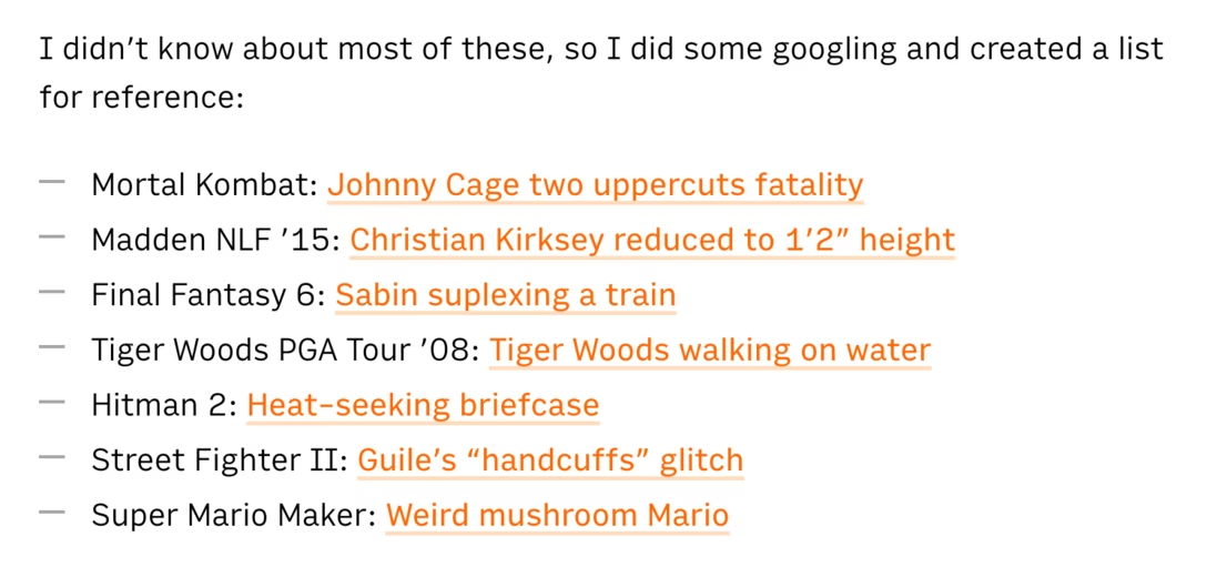
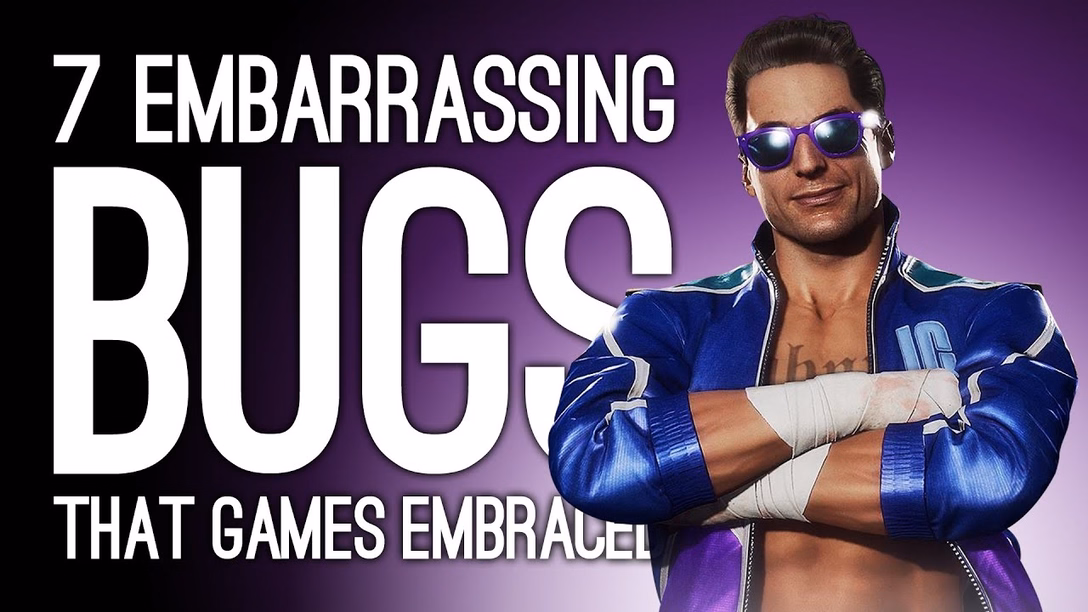
A fun 16-minute video from outsidexbox with 7 examples of videogame bugs where the game creators not only owned up to their mistakes, but creatively acknowledged or remixed those bugs in subsequent versions:
I didn’t know about most of these, so I did some googling and created a list for reference:
Off the top of my head, I cannot think of any non-videogame software that received a similar “bugs as lore” treatment from people responsible for the bug in the first place.
Microsoft made a blue-screen-of-death screensaver, but it was originally third-party, and kind of a prank? A mean-spirited one? I didn’t find this particularly good.
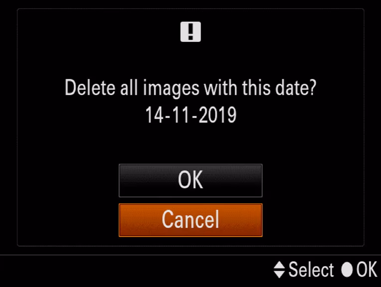
Right next to the generic function to delete photos by going through them one by one, my camera has a specific version – Delete All With This Date:
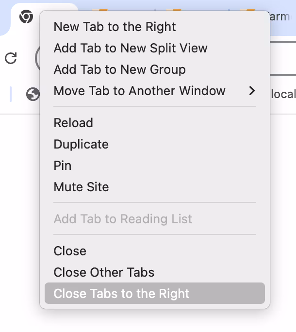
Below the actions to close the tab, and close all other tabs, Chrome has a specific version called Close Tabs To The Right:
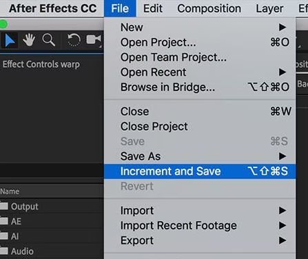
In After Effects, next to typical save options, there is this – Increment And Save – which saves a file and changes the number at the end to be one notch higher (Project 2 → Project 3, and so on):
I’m mildly fascinated by these strangely specific accelerators.
The one in the camera is genuinely useful. Photo projects are often day-long affairs where you download the photos at the end of workday, but might still keep them on the card just in case. Allowing to quickly delete a day’s worth of photos makes a lot of sense, saving you from having to go through them one by one in an interface not suited for that kind of operation.
Chrome’s “Close Tabs to the Right” takes a bit of figuring out, but I believe it’s meant to make it easy to clean up after a fruitful research session where you kept ⌘-clicking and opening tabs to learn more, and those tabs now fulfilled their purpose. (Curiously, Firefox also has “Close Tabs To Left” which I don’t understand.)
After Effects’s “Increment and Save” is… I don’t know. Maybe it’s cheap? Maybe it’s honest? A proper version history would be nicer, but that’s a tall order. This is simple and, most importantly, reliable. I still often do the “poor man’s version control” elsewhere…
…so this works for me.
It’s always interesting to me to think whether these kinds of oddly-specific examples are nice gestures toward the user, or treating symptoms in lieu of fixing actual problems. Either way, I don’t think an interface can survive too many of these, as their obscurity and weirdness add up and can contaminate the entire UI.
Would love if you sent me more of these kinds of commands from the apps you use!
While I am sympathetic to the notion that sound pollution is a thing we need to be concerned with, the choice between silence and sound pollution is a false choice. There’s a lot of those happening these days, probably because we’re so stuck in binary thinking. But as airplanes show us, we can design sounds which aren’t obtrusive, but which are helpful. And when you get yourself out of binary thinking, you can do things like make your most obnoxious apps be silent while your important ones make themselves known, and in ways which are meaningful to you and pleasant to everyone else.
It is an interesting parallel to the post about syntax highlighting from a while back, and one of the posts about cartography design I shared recently; they all explore how you can create a richer space capable of conveying more information without overwhelming people, by being intentional about the design.
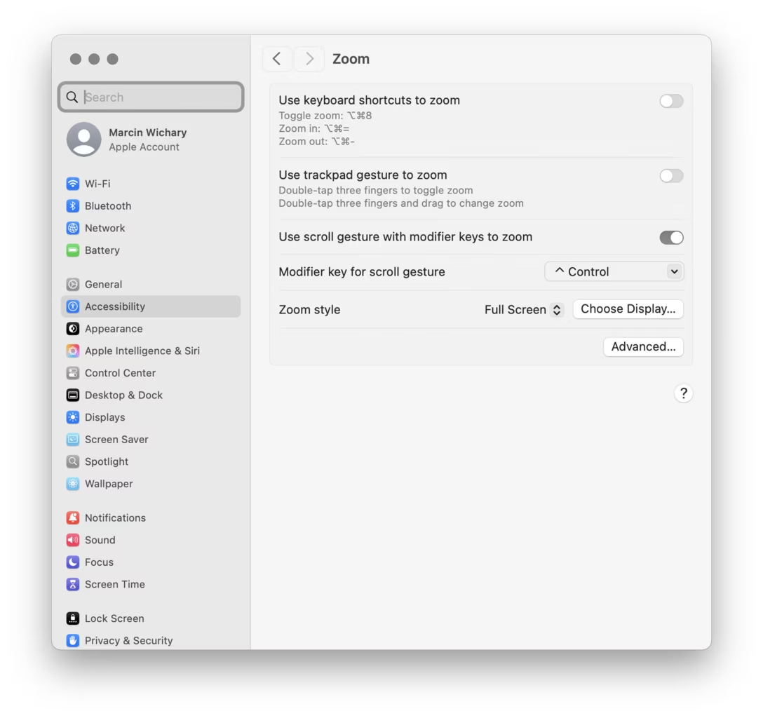
One of the casualties of Apple’s otherwise brilliantly executed transition to retina pixels has been the mouse pointer, which remains aligned to what “traditional pixels” used to be, rather than the retina/physical/smaller pixels.
Turn on the zoom gesture from a few weeks ago, and you can see the challenge. The gridlines are ½ logical pixel and 1 physical pixel wide:
This limitation is inherited by most tools: Photoshop, Affinity, xScope, even the built-in Digital Color Meter. It’s not the end of the world, of course, but it can be maddening if you are trying to sample a color from a “half pixel” and the cursor stubbornly skips it no matter how delicately you move. Here it is in Figma:
Of the few tools I tested, only Pixelmator allows to sample at the correct, precise level:
I was curious how would a truly precise cursor feel in general – would there be any disadvantages? – so I built a little simulator that allows a regular arrow cursor to be aligned to “half pixels” or “retina pixels.”
In the process, I discovered that both Chrome and Firefox already receive sub-traditional-pixel measurements for mousing events, so this was even easier to build than I expected. Now, precise targeting in Chrome and Firefox becomes possible:
I don’t personally see any big difference in terms of either upsides or downsides, and I’m curious if you do. iPadOS and its Safari already seem to support the precise mouse pointer, too. That makes me curious: why isn’t it available in macOS? I imagine you could even turn it on by default for apps – or, if you want to be more conservative, make it opt-in.
Pixelmator also shows that the apps can do it without waiting for macOS as the data is already there; they would just need to render the cursor on their own with more precision.
Deere is one of many companies that practice “VIN-locking,” a practice that comes from the automotive industry (“VIN” stands for “vehicle identification number,” the unique serial number that every automotive manufacturer stamps onto the engine block and, these days, encodes in the car’s onboard computers).
VIN locks began in car-engines. Auto manufacturers started to put cheap microcontrollers into engine components and subcomponents. A mechanic could swap in a new part, but the engine wouldn’t recognize it — and the car wouldn’t drive — until an authorized technician entered an unlock code into a special tool connected to the car’s internal network.
Big Car sold this as a safety measure, to prevent unscrupulous mechanics from installing inferior refurbished or third-party parts in unsuspecting drivers’ cars. But the real goal was eliminating the independent car repair sector, and the third-party parts industry, allowing car manufacturers to monopolize the repair and parts revenues, charging whatever the traffic would bear (literally).
In a decision that bolsters right-to-repair movement, John Deere and farmers reached a settlement that has the company pay $99 million to repay prior inflated repair costs, and requires it to share software required for maintenance and repair with farmers.
Just because I was curious and you might be also, here’s an example of a modern tractor interface:
The story reminded me of an ongoing battle in Poland where a train manufacturer Newag used VIN locking and coupled it with GPS hardcoding in an even more brazen attempt to prevent third-party repair: if a train spent too much time at a location of another train repair company, it’d simply stop running – not by some hardware fault, but by a simple if condition in code.
“This is quite a peculiar part of the story—when SPS was unable to start the trains and almost gave up on their servicing, someone from the workshop typed “polscy hakerzy” (“Polish hackers”) into Google,” the team from Dragon Sector, made up of Jakub Stępniewicz, Sergiusz Bazański, and Michał Kowalczyk, told me in an email. “Dragon Sector popped up and soon after we received an email asking for help.”
The (white-hat) hackers helped unbrick the train, but since European law is stricter on DRM, the case gets murkier. The article above is from 2023, and contains this quote:
Newag said that they will sue us, but we doubt they will - their defense line is really poor and they would have no chance defending it, they probably just want to sound scary in the media.
The three hackers explained their work in this 45-minute conference talk. It’s honestly not the most polished presentation, but it goes into a lot of engrossing details and if the intersection of hacking and trains hardware interests you, check it out! I had fun looking double checking this presented code by punching in the lat/long coordinates into Google Maps and verifying they’re exactly the locations of competitive repair shops:
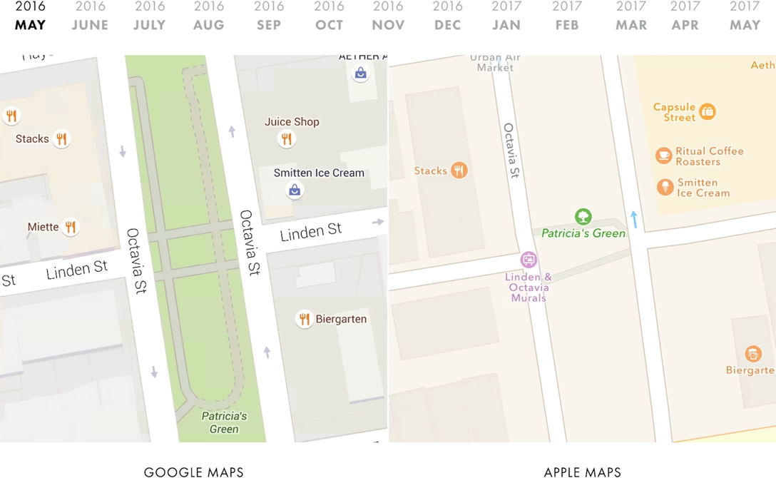
While both of these services changed a lot since the essays, they are still worth reading. They might be the closest to modern reviews of software as I can think of, and the way the essays are done also teaches us storytelling lessons – from nice visualizations and comparisons, to rich footnotes. There is also a great balance of high-level overview, and then jumping into specifics that reinforce it.
Here’s one example of cool tooling O’Beirne used to make his points more sticky:
I wrote a script that takes monthly screenshots of Google and Apple Maps. And thirteen months later, we now have a year’s worth of images:
The result is informative and mesmerizing:
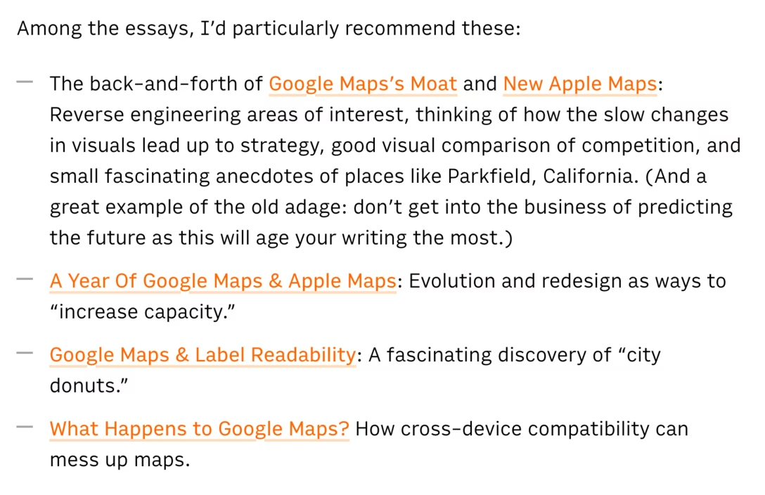
Among the essays, I’d particularly recommend these:
The back-and-forth of Google Maps’s Moat and New Apple Maps: Reverse engineering areas of interest, thinking of how the slow changes in visuals lead up to strategy, good visual comparison of competition, and small fascinating anecdotes of places like Parkfield, California. (And a great example of the old adage: don’t get into the business of predicting the future as this will age your writing the most.)
Why is there a short wait if you press a button on your headphone remote or your AirPods to pause the music? Because the interface has to let a bit of time pass to figure out if you’re going to press the button again, making it a double press (advance to next track) instead of a single press.
This kind of disambiguation delay is everywhere for simple gestures.
Why is there a short wait if you press a button twice in that situation? The double press processing also has to be delayed, because there is a chance it might become a triple press (go to previous track).
Why is there a short wait if you press a button to go to the next track on your car’s steering wheel? It’s a delay of a different kind, but the same principle: the function cannot kick in on press down, because press down and hold mean “fast forward.” So, software has to wait for button up event to go to the next track (which feels a bit slower than button down), or for enough time to pass so we’re certain it’s a button-down hold rather than a slow press. Here, both interactions experience a penalty for coexisting.
The most infamous of those disambiguation delays exists in mobile browsers. Since every double tap can zoom into the page ever since that famous 2007 iPhone presentation, every single tap on a link or elsewhere has to be delayed by about 300ms. This has been a source of contention since it does make the web feel a bit slower, and today browsers suspend double tapping on sites designed for mobile, trading zooming affordances for higher interaction speed – after all, you can still zoom in by pinching. But if you always wondered why older websites tend to be a bit sluggish to interact with, now you know.
Different tradeoffs are possible. In the Finder, clicking on icons isn’t slowed down even though double clicking exists, because selecting an icon is compatible with opening it! So in effect it’s not a choice between a faster A and a slower B – it’s A or A+B.
Even in the iPhone presentation above, you can see the interface highlights the link on double tap, to at least make it feel snappier, at the expense of the highlight being “wrong” and potentially distracting – or even confusing – when you end up double tapping. (You can imagine smartphones pausing on the first remote/headset button press, too. It feels like it would be compatible with advancing to the next track, but I think it might also feel too “choppy,” too chaotic, in practice.)
Lastly, why is there a short wait if you press a button on your hotel TV to increase the volume? Oh, I think that one is just sluggish for no good reason.
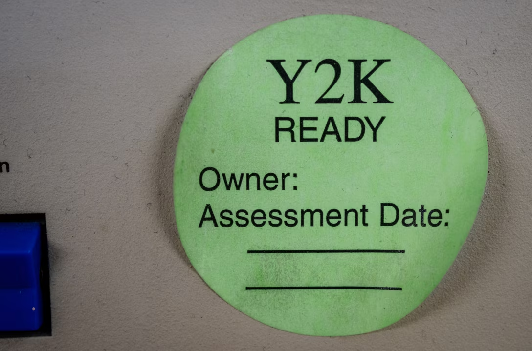
A few years ago, some sort of a bug at my work caused all of the timestamps appear as “54 years ago,” a seemingly arbitrary date. It took me a bit to realize: “Wait, you know what year was 54 years ago? 1970!” “Why is 1970 important?” asked another designer. I explained that by convention, Linux time counts up from Jan 1, 1970 – and so if the time “value” is zero or unavailable, as it was because of the bug, it would be rendered not as an error, but as that specific day long ago.
Computing is filled with all sorts of arbitrary numbers like these. The most famous one was Y2K (99 + 1 = 00 if you only allocate two digits), Pac-Man’s kill screen was number 256, people still bring up the infamous and likely non-existent “640 kilobytes should be enough for everybody” quote, and the Deep Impact space probe died a lonely and undignified death after its timers overflowed the two pairs of bytes given to them.
Here’s a new magic number to remember: macOS Tahoe has, for a while at least, a kill screen of its own – after 49 days, 17 hours, 2 minutes, and 47 seconds (or, 4,294,967,295 milliseconds), one of its time counters overflows and no new network connections can be made, rendering the machine rather useless. The only solution is a reboot. Talk about a deadline!
Wikipedia has a nice list of other time storage bugs. The next big one? The problem of the year 2038. The technical fix, as always, is to give the numbers a bit more room to breathe. This is, in a way, kicking the can down the road, but that might be okay since the road is rather long:
Modern systems and software updates address this problem by using signed 64-bit integers, which will take 292 billion years to overflow—approximately 21 times the estimated age of the universe.
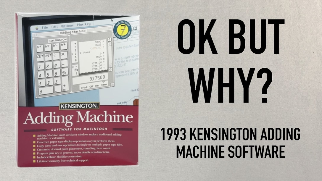
It’s a fun (as always) watch, but as a UX designer, it’s also interesting to try to figure out what are the underpinnings of the things Staecker lists as strange from today’s perspective.
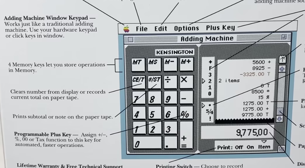
I believe that “CE/T” (clearing and totaling) coexisting on one key is a nod to professional accounting use of adding machines where you wouldn’t want to accidentally enter something into the record twice – so totaling also automatically resets the value and prevents you from making a mistake.
I also believe the strange [+=] rule is only because the keypad has to look forward at the same time it is looking back: it needs to serve as a universal computer keypad where [+] and [=] are separate key, but it also needs to pretend to be an adding machine where one key served both purposes.
(You can spot that the back of the box just allows you to swap the [+] key to be something else.)
Overall, the video is a fascinating tale of an “in-betweener” product that was stuck not just in the middle of a transition from physical devices into apps, but also at the intersection of calculators and adding machines (once two very different lines of products), themselves trying to learn from each other. It also serves as a great reminder that skeuomorphism is not just about visuals and sounds, but also behaviours: tearing off the tape, details of specific keys, nuances of rounding.
It’s not a thing of the past, either. In my post about determinism I linked to Apple’s recent travails with the deterministic Clear button (part one, two, and three). A few years ago, Apple also changed the built-in iPhone calculator from its “desktop calculator” roots to a more modern model where you get to input the entire equation before you see the result. But that change had bigger consequences; for example the [=] key could no longer repeat an addition. People complained, and Apple added it back – but the change feels incompatible with the new system and potentially confusing:
Elsewhere, the entire iPhone is an in-betweener, as the keypad coming from calculators is incompatible with the keypad coming from phones.
At this point it seems the calculator keypad will win, but transition has been over a century in the making. Staecker’s video is a good reminder how important, but also hard it is when you try to make these transitions happen faster.
As far as I can tell, no truly huge world-shifting software product has ever existed in only one version (even Flappy Bird had updates). Just about every global software product of longevity grows, changes, adapts, and reacts to other software over time.
So I set myself the task of picking five great works of software. The criteria were simple: How long had it been around? Did people directly interact with it every day? Did people use it to do something meaningful?
I came up with:
the office suite Microsoft Office,
the image editor Photoshop,
the videogame Pac-Man,
the operating system Unix,
and the text editor Emacs.
Ford’s criteria felt more interesting than those of the other similar lists:
I propose a different kind of software canon: Not about specific moments in time, or about a specific product, but rather about works of technology that transcend the upgrade cycle, adapting to changing rhythms and new ideas, often over decades.
This – about Unix – also caught my attention:
There’s a sad tendency in most manuals and programming guides to congratulate people simply for thinking. Not here; you’re expected to think. That can be very exciting when you’re used to being patronized, and it’s one of the best things about Unix.
One of the readers (thank you, Peter!) reminded me that there is a version of a blink comparator that all of us are exposed to perhaps every day: many photo editing apps – Apple Photos, Darkroom, Aphera, I imagine others – allow you to quickly compare the photo as-shot and with your edits. Sometimes it’s a tap, sometimes an onscreen button, and in the case of Lightroom it is a backslash key. Here’s that feature on a color graded photo with some dust removed:
But these blink comparators are smart. If you e.g. rotate the photo, the comparison will be with the original also rotated so the pixels still map to each other 1:1 – even if you rotated the photo as the last step in your editing process:
I think this is a brilliant example of understanding the spirit of a feature rather than its letter. A naïve blink comparator would show an unrotated photo, but in this way it would cease being a blink comparator.
The 2016 launch of No Man’s Sky and the 2020 launch of Cyberpunk 2077 were catastrophes. No Man’s Sky fell so incredibly short of the promises the founder shared over the years – from smaller ones like rivers on the surface of planets, to huge ones like seeing other players – that some people felt it must have been a scam all along.
The other game was a simpler case study: Cyberpunk was buggy as hell. Not just the abysmal performance, but also the overall quality. People called it “the Hindenburg of videogames” and made YouTube compilations and listicles of its often hilarious bugs: cars exploding for no reason with perfect comedic timing, intimate body parts protruding through the clothes, and the infamous T poses.
In an unprecedented move, Microsoft slapped a big warning atop Cyberpunk’s app store listing, and Sony pulled it from their store altogether.
Over a decade on from its initial reveal, No Man’s Sky both manages to remain the same game it was at launch while also bringing almost every single missing feature (and dozens of new surprise ones) into the title – implementing them intelligently and with great consideration for how it will affect the core of the game. They achieved their redemption years ago, yet continue diligently with massive update after massive update.
No other title has done what Hello Games have managed to achieve. And the best part? Every single update, patch and addition to the game was and is 100% free, with no falsified hype or build-up to each update.
Cyberpunk 2077 had a redemptive arc of its own, too, highlighted and contextualized in this 17-minute video from gameranx. Today, both games are rated “very positive” on Steam, and are actually still gaining daily players.
So, wonderful comeback stories, right? Depends on how you look at it. It’s great that both these games ended up being good products, but perhaps not as great that it was all happening in the open.
The videogame industry tried to get creative about it and established an idea of “early access”: being able to purchase an incomplete game earlier, and watch it get better while the publisher receives funding to keep going. But for every Minecraft there is Godus, and for every Kerbal Space Program there is The Day Before. Plus, neither No Man’s Sky nor Cyberpunk launched in early access with attendant caveats and discounts. (By the way, Wikipedia’s entry for early access is worth checking out – it’s so eloquent I’m surprised not to see any warning boxes.)
There seems to be ongoing and perhaps rising frustration with companies releasing software products too early and fixing them in flight, if at all. Already in 1996, Geoff Duncan wrote about his annoyances with that:
What Beta Means Now: […] In many cases – particularly with Mac Internet software – “beta” doesn’t mean anything close to what it used to. We’ve seen programs in public beta that not only contain innumerable known bugs the developers are aware of and plan to fix, but also accumulate major new features through subsequent releases. Similarly, we’ve seen products that change fundamental system and technology requirements during beta – details which should have been etched in stone long before. Beta often means what “alpha” or even “development build” used to mean.
Subsequently, Google and other web-first companies diluted the meaning of beta labels even more.
The trend of premature launches extended to devices, too. About two years ago, AI assistant gizmos from Humane and Rabbit were pilloried by audiences for launching in an effectively unfinished form. Both devices failed in the market; MKBHD’s video reviews of Humane AI Pin and Rabbit R1 remain both entertaining and informative watches.
Reading between the lines, Mehotra’s interview paints a picture that I think many tech workers will find familiar: features are conceived, coded, and shipped as quickly as possible. He is happy to admit that the feature was a mistake… in retrospect. But in the moment it actually mattered, critical thinking was swept away by the false urgency of pushing things out.
It is worth reading in full and following the links, too; I watched the mentioned (tense) interview, and was similarly frustrated with the CEO’s lack of accountability or even a hint of an explanation of why the feature was launched to begin with. Key line from Samsonov’s post:
If you don’t know what are you trying to learn when you ship a prototype, do not ship a prototype.
This becomes even more important as the difference between a prototype and a final product is now thinner than a retina pixel. Both No Man’s Sky and Cyberpunk had, at least, well thought through foundations.
I understand that for some people gen AI software building tools is a discovery – perhaps for the first time – of a genuine joy of creation. But there’s also the other, newish side, a sort of “cult of velocity” where people show screens filled with agents coding things as if the world needed every possible app right this second.
Velocity and urgency can be important, but it’s hard to be careful and thoughtful when you’re going really fast; unsurprisingly, some don’t know what to do with that newfound AI-powered speed or realize the importance of thinking about crucial aspects other than time to market. (When digital cameras came around, the barrier to entry for photography was drastically lowered – it was possible to take a lot of photos without worrying about cost or quality. Tons of people took tons of objectively subpar photos; some were the end goal, some were a stepping stone toward more photographic mastery. However, I am not sure I remember people on either side ever bragging “I took over 1,200 photos today!”)
All this could be contrasted with movement of slow software (the name is part of a bigger slow movement although has unfortunate connotations in tech – it’s slow as in “speech,” not slow as in “beer”). Jared White in 2023 defined it as:
Sustainable software. Architecting and writing code in ways which are easily understandable and maintainable over time, requiring few dependencies and a rate of change that is healthy for the underlying ecosystem.
Thoughtful software. Working through feature development and making decisions based on what will benefit the userbase over the long term, placing mental and social health as priority over immediate gains or selfish interests.
Careful software. Seeking to understand the ways software might be used for harm, or itself be harmful by taking attention away from more important concerns in the broader culture.
Humanist software. Recognizing that most software—at least in application development—is primarily written for humans to understand and reason about with ease across a wide array of skill levels, and that relying on complex code generators or “generative AI” tooling to resolve complexity instead of simply building simpler human-scale tools is an industry dead-end.
Open software. Looking to established collaborative software movements like open source and the standards bodies responsible for open protocols to inspire how we build and maintain software (regardless of licensing).
I don’t really have a conclusion for this meandering post, as I am not sure a snappy conclusion is possible. Perhaps some of the links above can provide inspiration or food for thought about urgency, reputation, and doing things in the open.
Some patterns I’m noticing are:
Velocity is never an end goal.
Velocity is only one of many ingredients of software building.
It is necessary to think of people who will experience your work-in-progress as it is, not as it might one day be.
Colín is not “in tech,” and the video is of “the king is naked” variety which is very, very refreshing.
Among many good observations, this caught my attention as relating to this blog’s topic:
It’s a little weird to have this almost adversarial relationship with your customer base. They’re not trying to solve a problem customers have. They’re trying to convince people that the product on offer is something more than it clearly is.
What VR is, is a fun parlor trick. What they want VR to be is literal reality.
It does indeed feel Meta’s version of VR/metaverse has always been cargo-culting real world in a particularly awkward fashion, which Colín analyzes deeper.
Too many quotable laugh-out-loud moments, so maybe just this one more:
Down here in the real world, there are really only two things a media technology can be. It can be a solution to a specific discrete informational problem, or it can be an artistic medium. These two things are not mutually exclusive. There is crossover here – like, radio was a military tool before radio plays were ever a thing.
But by the former, I mean you’re literally just making information go faster. You’re reducing the amount of noise between a message and its receiver. Any kind of metaverse is going to be really, really bad at this because you don’t need to look at a weird Pixar version of your coworker in order for them to convey what a deadline is.
It’s a fun listen (perhaps if you skip a bit of a bummer 9-minute beginning), covering four listed things in more details:
generous mouse paths (especially in menus)
coyote time for modifier keys
optical alignments
tooltip timing details
There were a few interesting things that caught my attention:
Figma does have “coyote time” in the very interaction the hosts are talking about, perhaps showcasing that the details of the details can make or break them.
“Should modifier keys be reversible” and “should modifier keys be consistent with one another” are interesting challenges; some more recent graphic tools have changed the long-standing behaviour here, malking modifier keys more “sticky.”
Wholeheartedly agree with how frustrating it feels that the menu interactions are not yet baked into browsers as primitives. “The fact that the companies keep having to implement it themselves manually is maddening.” It is.
Good observation that some people associate animations with “feeling premium” (see also: the quote I put in the title).
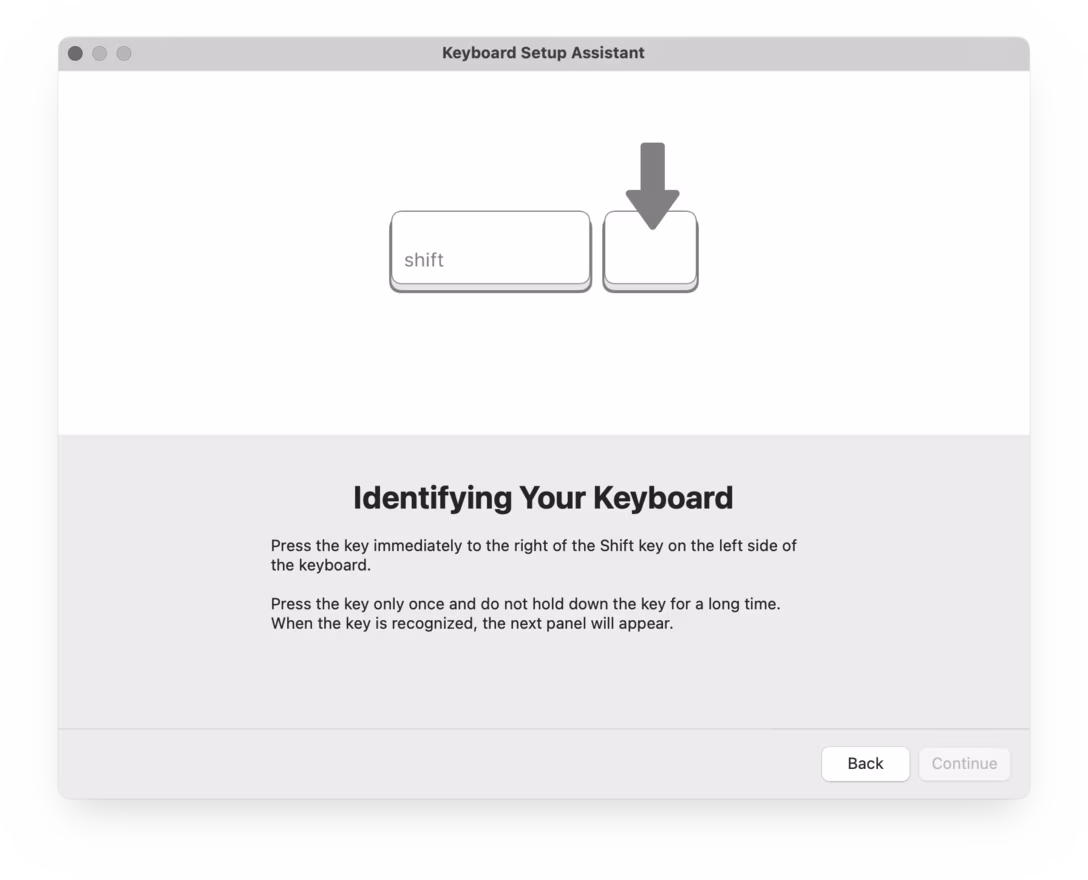
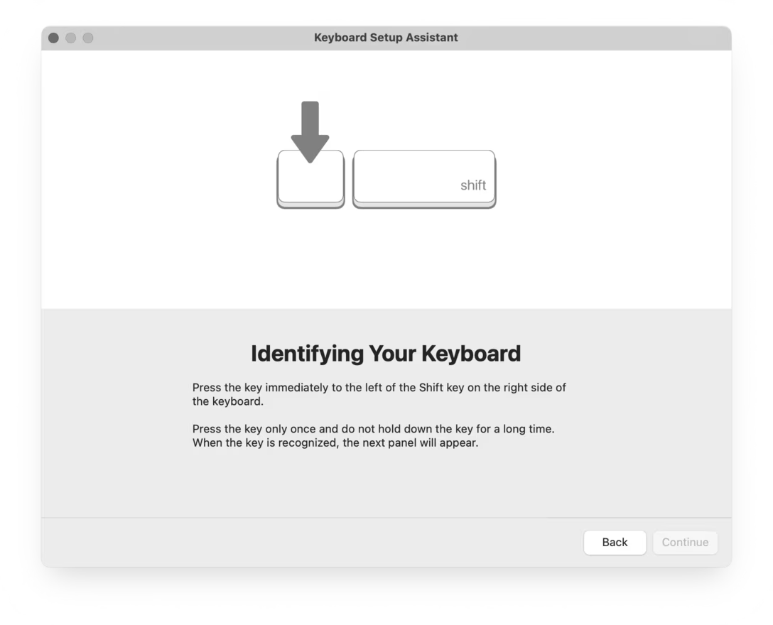
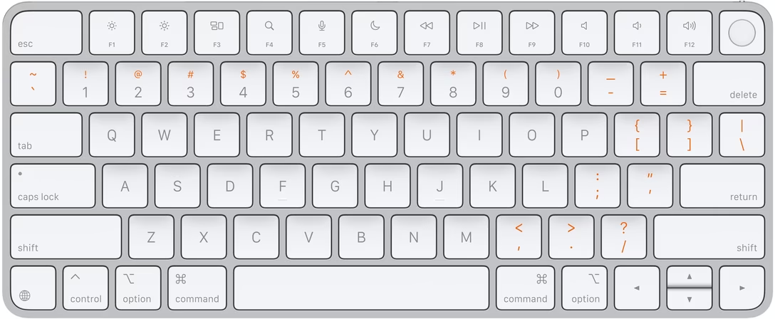
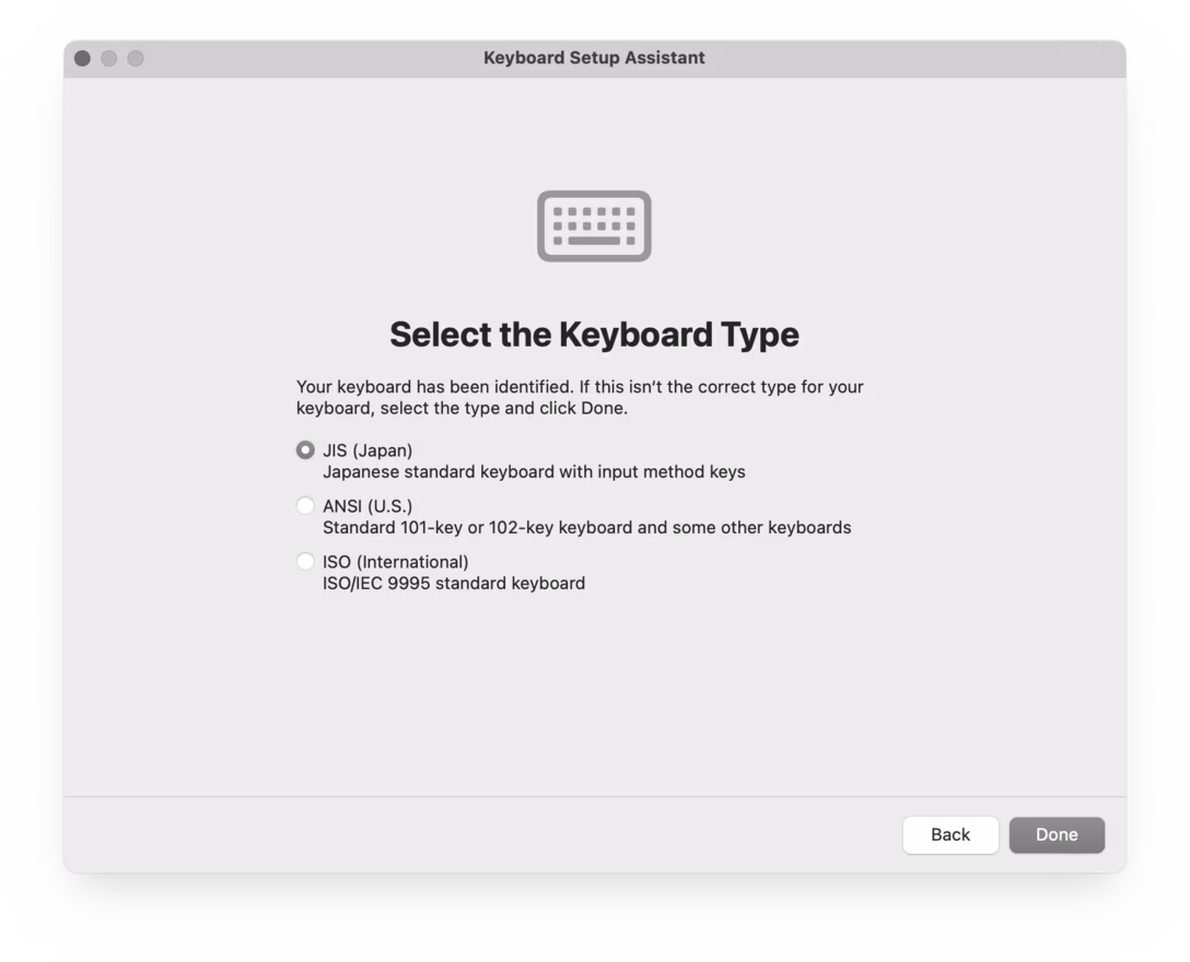
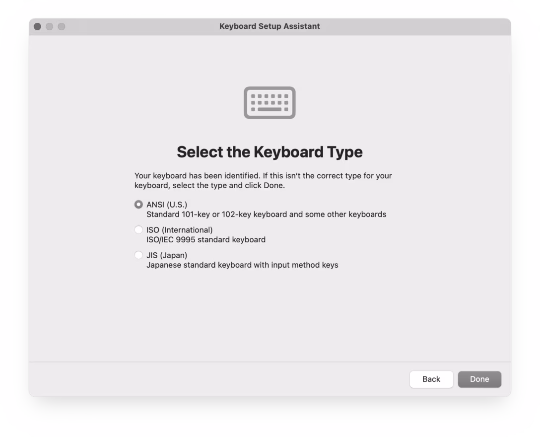
You might have seen this, one of the strangest and most primitive experiences in macOS, where you’re asked to press keys next to left Shift and right Shift, whatever they might be.
Perhaps I can explain.
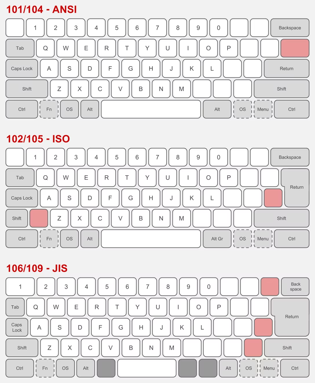
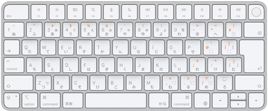
There are three main international keyboard layout variants in common use: American (ANSI, with a horizontal Enter), European (ISO, with a vertical Enter), and Japanese (JIS, with a square-ish Enter).
The shape of Enter and the shuffling of the surrounding keys is not the only difference. It’s also that the European layout has historically always had one more key – shoved in between Shift and Z – and the Japanese layout a few more.
But the main challenge is that a keyboard doesn’t have a way to tell the host computer what are its exact keys and where they’re located.
So, pressing the thing next to the left Shift can help Apple understand whether the keyboard is American or Japanese (always Z) or European (something else, but never Z). And pressing the thing next to the right Shift differentiates JIS (where it’s the _ key) from another keyboard (always /).
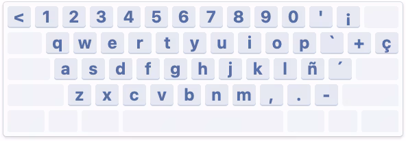
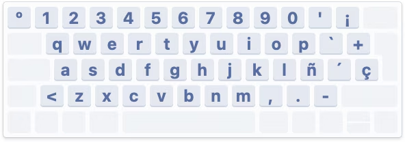
What I called “primitive” just above is actually clever in its approach. The legend of the key next to left Shift varies per locale (you can compare here), so the system can’t just tell you to press the < > key – and besides, asking the user to find a key that might not exist is a lot more stressful. And, identifying the keyboard by choosing a layout visually wouldn’t work either, since there are a million of layout variations – imagine having a split or a compact keyboard!
But it still is primitive, because it will still open up even if the keyboard you connect isn’t really a typing keyboard…
…or even if it doesn’t have any keys at all. (Some peripherals like credit card readers and two-factor dongles identify as keyboards as they transfer information by sending keystrokes.)
But: Why does it matter? What happens if you select the wrong layout or ignore the dialog?
If you mix up America and Europe, the difference should be largely cosmetic. After all, you still have to choose the keyboard language. People in, say, Germany will likely choose the appropriate locale, and the keys will do the right thing. However, also selecting the correct physical layout will properly display it in a few places, which can be helpful:
Japanese keyboards are more interesting, because they still have an English “mode” and the legends on a lot of the keys in that mode are different than on those on American and European keyboards – yet, the keys when pressed appear exactly the same (have the same “scan codes”) to the connected computer:
So knowing whether the keyboard is “US in the US” or “US in Japan” is important not just to place keys in the right position visually in a few places in macOS, but also for those keys to output what they actually show:
By the way, Apple’s own keyboards do not pop up this dialog. This is because while a keyboard can not do much when connected, it can at least send a vendor and model identification numbers, and Apple knows which of its keyboards sport what physical layout.
Why doesn’t macOS do that for third-party keyboards? They might, for some well-behaving ones; I don’t actually know. Unfortunately, the vendor/model identification is a wild west and a lot of the keyboards I have identify simply as “unknown,” so building up an all-encompassing keyboard layout database is not really possible.
Either way, I mostly wanted to share why the dialog exists. Mind you, I don’t love it in that its language could be better and at one point it breaks a cardinal rule of reorienting options, which makes it hard to remember “oh yeah, it was the first scary setting that worked before.”
But overall, I thought it is a clever solution to a surprisingly hard problem. Sometimes primitive is better than nothing.
In short: One of the professional teams in the FPS game Squad built a sophisticated set of scripts that made it easier to use the game for esports tournaments by adding additional UI, useful stats, a floating camera, an extra over-the-shoulder view, and so on. The community embraced the scripts as they genuinely made the spectating much better.
Months later, it turned out that the creators not only hardcoded easier rules for their own team, but even added a pretty comprehensive set of cheating keyboard shortcuts.
The useful esports spectating scripts were, in effect, a trojan horse. A fascinating story, plus an interesting case of psychology of cheating.
Two great posts about interaction latency on the hardware and software side. First is from Ink & Switch:
There is a deep stack of technology that makes a modern computer interface respond to a user’s requests. Even something as simple as pressing a key on a keyboard and having the corresponding character appear in a text input box traverses a lengthy, complex gauntlet of steps, from the scan rate of the keyboard, through the OS and framework processing layers, through the graphics card rendering and display refresh rate.
There is reason for this complexity, and yet we feel sad that computer users trying to be productive with these devices are so often left waiting, watching spinners, or even just with the slight but still perceptible sense that their devices simply can’t keep up with them.
We believe fast software empowers users and makes them more productive. We know today’s software often lets users down by being slow, and we want to do better. We hope this material is helpful for you as you work on your own software.
I loved the slow-motion videos comparing what is normally impossible to notice:
I’ve had this nagging feeling that the computers I use today feel slower than the computers I used as a kid. As a rule, I don’t trust this kind of feeling because human perception has been shown to be unreliable in empirical studies, so I carried around a high-speed camera and measured the response latency of devices I’ve run into in the past few months.
I feel both of these essays are fantastic, and important to develop some sense of what are specific numeric thresholds separating fast and slow, also in the context of being able to have an informed conversation with a front-end engineer. (Luu subsequently links to even more articles in the “Other posts on latency measurement” section, if you are curious.)
Otherwise, from my observation, the two most quoted laws of user-facing latency are still Jakob Nielsen’s response time limits, and the Doherty Threshold. But the Jakob Nielsen 100/1000/10000ms rule is from 1993 and as far as I understand is concerned primarily with UX flows: reactions to clicking a button, responses to typing a command, and so on. And the Doherty Threshold is even older. Both are simply not enough, especially not for things related to typing, multitouch, or mousing, where for a great experience you have to go way below 100ms, occasionally even down to single-digit milliseconds.
(My internal yardstick is “10 for touch, 30 for mousing, 50 for typing.” Milliseconds, of course.)
At the end of his essay, Luu writes:
It’s not clear what force could cause a significant improvement in the default experience most users see.
Perhaps one challenge is that these posts are dense and informative, but only appeal to people who care? Maybe latency eradication needs a PR strategy, with a few memorable rules and – perhaps arbitrary, but well-informed – numbers that come with some great names attached? I know in the context of web loading some of the metric names like FCP (First Contentful Paint) broke through at least to some extent, but those still feel more on the nerdy side. Even Nielsen’s otherwise fun 2019 video about response time limits didn’t stick the landing – why focus on slowing down an arbitrary label appearing above the glass when the ping sound was right there for the taking?!
I can’t help but dream of interaction speed’s “enshittification” moment.
I understand that the best way to compare two things visually is to switch between them promptly in situ; our visual system is really good at spotting even small changes when aided this way.
I thought it would be fun to talk about it briefly, because it gives me a chance to show you a really fun device:
This is a blink comparator, an apparatus built for astronomers to easily flip between two images of the night sky, taken at the exact same position some time apart.
It makes it easy to spot a moving asteroid, like in this set of two photos:
(Pluto is the blinking dot a bit to the top and to the right from to the center – that dot moves to the left in the other frame. The fact that it moved at all made it an object of interest, but it didn’t traverse the sky like an asteroid or space debris would.)
This is why the “spot 10 differences” puzzles are always shown side by side…
…otherwise everything would be much, much easier to spot:
Today, this kind of stuff doesn’t require complex devices, but it’s useful to know the principle.
If you’re comparing a reference design with its implementation, instead of measuring things on both sides it can help to align them in two windows, and then switch between them using ⌘Tab.
If you’re working on an interface for users to see differences between two images – don’t (just) show them side by side, but also allow your users to flip between them this way. And, resist the very natural urge to add any transitions that would seem to be nicer and friendlier; it is sharply switching between images that is the most effective.
The dev toolbar exists directly inside the app and allows us to easily toggle feature flags on and off. When something didn’t look right in the refreshed UI, it took us just one click to compare it with the previous version. That made it easier to determine whether the refresh had broken something or whether it had behaved that way before. Having the updates live behind feature flags also meant that instead of developing the redesign in isolation and shipping all the changes at once, we could integrate incremental changes to the platform.
I also cut it out here so it’s easier to see:
Here’s what I like about it:
It’s a separate UI surface: Rather than being awkwardly integrated alongside production UI and adding jank to it, it is a clearly delineated toolbar you know users won’t ever see, allowing the rest of the interface to always feel like production.
The feature flag toggling is easy: You don’t have to go anywhere else and possibly log in to toggle a flag, and you don’t have to wait for it to take effect. This will mean more people than just the core team members will be using it.
Toggling this particular feature flag is as easy as clicking on a tile: I don’t know if anyone can promote others flags their care about to be easily toggle’able tiles, but I can imagine this really beneficial, too.
The feature flag toggling is instantaneous without any visual jank: I understand that the best way to compare two things visually is to switch between them promptly in situ; our visual system is really good at spotting even small changes when aided this way.
Each one of the above bullet points is individually a small point of friction and easy to renege on, especially when it comes to internal-only interfaces. However, a combination of all of them results in great compounded interest, and I bet makes this interface effective – in addition to just feeling like fun to use.
Appreciate Linear sharing this internal detail; if you are using an interesting internal tool or UI that you are allowed to share, please consider it and let me know!
This 25-minute segment on MKBHD’s Waveform podcast (video or audio, segment starts at 40:21) is from November 2024, and is a nice counterpart to the post about favourite well-made apps and sites.
The original theme is “what is an app that you use all the time, and like to use, but is actually a bad app?” but it quickly moves to a more general conversation about good and bad mobile apps.
It’s always interesting to me to see what themes emerge and what other people think is important. Here’s the list where I linked to relevant apps as long as I could find them:
Bad apps:
Google Messages – dinged for unreliable spam and lack of organization/filtering
Notion (on mobile) – hard to orient yourself and some direct manipulation is wonky
many smart home accessory apps – bad and redundant with Google Home, but have to keep for emergencies
Netgear Orbi (network router) – specific functionality and bad password recovery
Hatch (white noise machine for babies) – simple things are hard to discover
A few years ago, I suggested adding a new interaction to Figma. If your text cursor was on a misspelled word (anywhere inside, or the edges), you could press Tab to quickly accept the suggested correction, without even seeing it:
Independently, Google Docs approached it from a slightly different angle, but landing on a similar interaction – in their version there’s a small visual callout, although you can still press Tab (and then Enter) to accept the suggestion:
I know the Tab key has a lot of jobs – from indenting bullet points to jumping through GUI elements – but in this context this new addition doesn’t seem to be in conflict.
(Should I write a long photoessay about the Tab key, similar to the ones I wrote for Return/Enter and Fn keys?)
Since we added it, I’ve really loved how it feels. From various typeaheads and autocompletes elsewhere, Tab has a strong “forward movement” energy so it makes conceptual sense, and it’s just really fun to go around and quickly fix your writing this way.
I think a lot about how to make keyboard interactions feel superpower-y: a good keyboard shortcut on a large key, a tight interaction, a blink-of-an-eye velocity – something that’s eminently designed to lodge itself in your motor memory as quickly as possible, as it builds on top of prior motor memory. I’m biased, of course, but I like the “no scope” Figma version more, and it has that feeling to me.
Go to Settings > Accessibility > Zoom, and then turn on “Use scroll gesture with modifier keys to zoom.”
Then, at any moment, you can hold Control and swipe with two fingers (or use a scroll wheel) up or down to zoom the entire screen.
I’d also recommend turning off “Smooth images” under “Advanced…” so you see individual pixels better:
Over the years, I found this feature very useful to inspect various misalignments, to check visual details, and occasionally simply to read text that’s too small.
Compared to other ways of zooming, this one has three benefits:
it’s extremely motor-memory friendly and so my fingers do it without me even thinking
it’s a system-wide thing, so it will work everywhere
it’s safe, because it’s something that I call a peek gesture
Peek gestures are fast, but the main benefit is that they’re safe. In some apps, pressing ⌘+ a few times and then ⌘– the matching amount of times doesn’t guarantee you will end up back in the same situation. The window size might change, the scroll position might move, the cursor might end up in a different place. In contrast, the Ctrl gesture is 100% deterministic and reversible; it will always work the same and never mess anything up.
I treasure peek gestures in general. Here are a few other useful (and/or inspiring?) ones:
previewing things in Finder by pressing (or, for power users, holding) the spacebar
using ⌘⇧4 with the intention not to take a screenshot, but just to (roughly) measure a distance between two objects, and then pressing Esc to abort
in tools like Figma and Sketch, using Ctrl+C just to quickly verify the color, and pressing Esc to cancel (rather than clicking to put the color into the clipboard or apply it elsewhere)
The apparent paradox is profound: Maintenance is absolutely necessary and maintenance is optional. It is easy to put off, yet it has to be done. Defer now, regret later. Neglect kills.
What to do? Here’s a suggestion: Soften the paradox, and the misbehavior it encourages, by expanding the term “maintenance” beyond referring only to preventive maintenance to stave off the trauma of repair—brushing the damn teeth, etc. Let “maintenance” mean the whole grand process of keeping a thing going.
Ultimately, alas, the book doesn’t really expand on this suggestion. While the volume feels rich and dense in some ways – illustrations, extra commentary, highlights – its surface area ultimately appears to be rather shallow. Ironically, given the subject matter, it feels like Brand fell prey to a bunch of “sexy” stories, some of them only tangentially related to maintenance.
I will just say it: I wish the author was more woke. The book is very male-coded. The main chosen areas of investigation are: motorcycles! tanks! guns! wars! There are moments towards the end where Elon Musk and Bill Gates are talked about as if it was still 15 years ago and we haven’t actually learned anything since. (No word of Cybertruck, either.)
We know maintenance tends to be unrewarded and forgotten come promotion time. We know that tedious tasks are often assigned to women and people of color while white men go around doing “genius things.” It’s hard to imagine women not being present in a book about maintenance, and yet – and I wish I was joking – the only woman of any significance in the entire book is… The Statue Of Liberty.
That aside, before opening the book, I hoped it would provide me some vocabulary and evolved thinking about maintenance that I could put to use, and there are some moments where it almost approaches what I wanted from it. Here’s a passage:
Powell credits the Israeli military with a mindset that naturally viewed damaged tanks as soon-to-be-repaired tanks, rather than the irredeemable flotsam of battle. The fact that [Israeli] commanders thought in these terms gave purpose and direction to the maintenance-related technical and tactical skill their crews possessed.
This is fascinating. Tell me how? Tell me what was needed to make it happen? But, unfortunately, outside of some basic tenets of “give the rank and file more freedom to do things” and “embrace improvisation,” the book doesn’t seem to offer more.
Elsewhere, there is this quote:
In almost every plant I worked at, QA was seen as a hindrance to hitting productivity metrics. We never got credit for a well-maintained manufacturing capability, but QA almost always got blamed when things went wrong.
…which, again, felt like a fascinating thread to pull on. But instead of digging deeper, this is left hanging without investigation.
The book doesn’t really have a proper ending with synthesis of what came before, and generally meanders a lot – to a point that the table of contents has more “digressions” than actual subjects. It also feels occasionally rambling and occasionally showing off (name-dropping people like Kevin Kelly and Freeman Dyson, or quotes from “beta-tester” readers that mostly serve to paint Brand in a positive light), which takes away from otherwise brisk writing and at times truly excellent storytelling. (The first chapter in particular is fantastic.)
If you want an easy-to-read, breezy, well-typeset book filled with historical anecdotes, and the above caveats do not bother you, this might be a fun read! But I expected more from it.
The one place where the book shines is pointing people toward other books – there are pages that feel more like literature review (done really well!), and the end matter has bibliography and recommended reading with notes. So in that way, while disappointing in and of itself, it could also become an interesting starting off point for more research.
I liked the details both within the implementation – for example, making sure the kerning is preserved! – but also in the presentation. I particularly enjoyed Schulz making the component demo itself, rather than using prerecorded videos. (I was delighted to discover that even the first large “picture” of the component is actually interactive!)
A small comment to this bit:
Unfortunately, not all browsers expose the selection or accent color of an operating system. For example, if a user would set the accent color in macOS to pink, the special CSS keyword color “Highlight” will still result in a light blue color in Safari. In other browsers like Chrome, the color will match the user preference. But since this is an attack vector for user tracking / fingerprinting, Apple made the right choice to hide the user preference from developers.
From my understanding, this is not necessarily correct. For example, in theory, the purple visited link color can be used for fingerprinting, by building a profile of whether or not I visited one of the hundreds of popular websites, quietly in the background.
The way browsers solve this is to never expose the color programmatically back to JavaScript – if your code asks for a link color, it will be blue regardless of whether the link was visited or not. It seems to me that the Highlight color could be used the same way here. Given that CSS now supports things like color-mix(in srgb, Highlight 20%, white), it would even allow a designer to riff on the color without ever knowing what it is.
Multibowl is one of my favourite emulation projects because it’s a rare example of using emulators creatively, rather than for nostalgia or research.
It’s a 2016 game by Bennett Foddy and AP Thompson that reimagines older existing games as smaller pieces of a new, Super Mario Party-like experience. Two players randomly join one of 300 games – sometimes in medias res – with a small explicit goal that can be accomplished in about ~30 seconds, after which a point is awarded, another game is loaded, and so on.
All of this is done through actual emulation and fast switching of games’s original code:
Regarding the game choices, at the outset, I wanted to curate a list of moments of gameplay that would be meaningful if played for just a short period of time. Sometimes it’s obvious – you can take a moment from a fighting game where both players are low on health, or play a sports game from the start until the first point is scored. So that’s where I started. Over time, I figured out that you could make exciting moments in games that are not otherwise interesting for a competitive duel. For example, in Dodonpachi (a bullet hell game) we take away the player’s guns and challenge them to stay alive in a huge hail of bullets.
For games that were designed as cooperative experiences, I eventually gravitated toward the structure ‘score more points but do not die’, which forces the players to calibrate how much risk they take relative to the other player.
This excerpt is from a 2017 interview of Foddy by Seb Chan from ACMI. There are many interesting moments in that interview, such as the issue of curation:
Multibowl is not a very precise historical curation like you might make for a museum exhibition, where you can only show a couple of dozen things at most. It’s a huge driftnet of games. There is no quality or historical significance standard, and no attempt to balance out the games in terms of nationality or gender. The only curatorial instinct that it follows is to find the most diverse set of game ideas. With each piece distilled down to a randomly-selected 30-second slice, there’s room for an infinite number of them.
In fact, contrary to a museum curation, the point of Multibowl is to have too many games for a single player to see. It’s best when it feels too big to grasp. I think, now that there are 300 games in there, it’s starting to feel that way.
Unfortunately, it is not possible to actually play Multibowl outside of special events, given copyright issues. In addition to general emulation copyright murkiness, Foddy adds, “I don’t think the actual bits of actual games have ever been used as the fabric of a larger game before.”
However, a really fun introduction to Multibowl is another art project from a now-defunct comedy duo Auralnauts, who actually played Multibowl pretending to be Kylo Ren and Bane, to hilarious results:
The first Macintosh font was designed to be a bold system font with no jagged diagonals, and was originally called “Elefont”. There were going to be lots of fonts, so we were looking for a set of attractive, related names. Andy Hertzfeld and I had met in high school in suburban Philadelphia, so we started naming the other fonts after stops on the Paoli Local commuter train: Overbrook, Merion, Ardmore, and Rosemont. (Ransom was the only one that broke that convention; it was a font of mismatched letters intended to evoke messages from kidnapers made from cut-out letters).
One day Steve Jobs stopped by the software group, as he often did at the end of the day. He frowned as he looked at the font names on a menu. “What are those names?”, he asked, and we explained about the Paoli Local.
“Well”, he said, “cities are OK, but not little cities that nobody’s ever heard of. They ought to be WORLD CLASS cities!”
So that is how Chicago (Elefont), New York, Geneva, London, San Francisco (Ransom), Toronto, and Venice […] got their names.
If you check out the actual Philly stops and witness all their provinciality, you can understand what Jobs was after:
Go to first Macintosh via Infinite Mac, open Infinite HD and MacWrite within, and you can examine the nine eventual fonts in their pixellated, cosmopolitan glory:
The list goes in this order: New York, Geneva, Toronto, Monaco, Chicago, Venice, London, Athens, San Francisco.
But: How about some hard evidence for the original anecdote? Turns out, the March 1984 issue of Popular Computing used pre-release Mac software and printed a screenshot of the names rejected by Jobs:
Since on the facing page we see the output in the same order, coming up with the correct mapping is not hard:
Cursive → Venice
Old English → London
City → Athens
Ransom → San Francisco
Overbrook → Toronto
System → Chicago
Rosemont → New York
Ardmore → Geneva
Merion → Monaco
One has to admire the final order of the Mac fonts that went from dependable and utilitarian at the top, to progressively more weird; this earlier list is all over the place.
In later releases of Mac OS, three other world-city fonts – Boston, Los Angeles, and Cairo – joined the party, so let’s show them here for completeness’s sake:
(Cairo is the classic icon font and in a way a predecessor of modern emoji, with inside jokes like Clarus The Dogcow.)
But that’s not the end of the story of the original Mac fonts. Let’s get back to 1983. On yet another page of the magazine, we see this list from MacPaint:
You can tell this screenshot is even older than the previous one, because it is itself set in an earlier version of Chicago, with a single-storey lowercase “a,” and many letterforms being works in progress. (I talked about the history of Chicago in my 2024 talk about pixel fonts.)
And it is old enough that this isn’t just interim names for surviving fonts – it’s actually quite a few old fonts that didn’t make it to the release day.
Unfortunately, this particular version of Macintosh software remains unknown, but one similar pre-release version of the first Mac software leaked, and so we can take a look at some of these fonts, too:
(You can download a lot of these fonts thanks to the hard work of John Duncan. They are still bitmap fonts and might not work in all the places in modern macOS, but they seem to work in TextEdit at least.)
Here’s what I learned from looking at this list:
You can definitely see how unpolished some of these fonts are in terms of spacing, letterforms, and available sizes – kudos to the team for holding a high quality bar even though there was little precedent for proportional fonts on home computers at that time.
Even the fonts that shipped – London (née Old English), Venice (née Cursive), and Chicago (née System) – have had their letterforms tweaked and improved.
Chicago is not named Elefont, but simply System. Had the System name persisted, this Medium snafu from 2015 would have been even more hilarious.
Cream came all the way from Xerox’s Smalltalk and was the original system font for Macintosh-in-progress, before Susan Kare created Elefont/Chicago.
PaintFont was a symbol/icon font, but distinct from Cairo and emoji in that it seems it was meant to be used only by the app to draw its interface. (Today, SF Symbols serve a similar purpose.)
Apple originally planned to use Times Roman and Helvetica, but this hasn’t happened presumably because of licensing issues. Only years later, the proper Times and Helvetica fonts were introduced. Here’s a comparison:
But the most interesting thing I haven’t noticed before are two fonts called “Marie Osmond” and “Patti.”
I am reaching outside of my well of knowledge here, but from context clues I’ll assume the latter means Patti LaBelle. And so, pulling on that thread, it’s kind of cool to imagine an alternate universe where the original Mac fonts are neither suburban Philly stations, nor well known cities, but something like this:
In the Fallout 3: Broken Steel addition, the team wanted to introduce a moving subway train under Washington, D.C.:
However, the engine did not have any moving vehicles. Instead of adding a new kind of primitive into the game engine, the creators… made the player character itself become the subway car when in motion:
This was done by removing freedom of movement from the player, forcing the character to slide on the floor, and equipping him with… a “metro hat.”
The visuals of people hacking this to use it outside of the subway area are really funny:
Technically, it was not a hat, but a right-arm armor, as you can see from the right hand missing in the above picture.
The FPS genre is filled with all sorts of hacks for hand-held weapons, to compensate for the challenges of depicting things accurately not feeling as great…
…but I have never heard of someone “wearing a train.”
A thoughtful 26-minute talk by Imani Joy, the solitary full-time designer on Mastodon, reflecting on her nine months there:
It’s an interesting peek behind the curtain at designing for this particular space, and the many unenviable constraints: lack of data, care for privacy, tension between Mastodon’s power-user early adopters (“they are values-driven, they want control, they’ll tolerate a lot of the clunkiness of the Fediverse”) and “mainstream audience [that] expects polish.”
At some point, design needs to be authoritative, but how do you combine that with wanting the process to be as inclusive as possible? The product itself is a federation of various servers that can exert their own control – so how do you bring it all together under one neat umbrella for the user? (Also a challenge for Android in comparison with iOS.) The mainstream design has certain fashion-y tendencies. How to make sure you don’t lose yourself while chasing them, but also not to stay ossified out of fear of making changes? (Wikipedia, Internet Archive, and other similar places look and behave a certain way, after all, and it’s not usually because of lack of talent to “modernize” them.)
The most interesting thing to me was this:
It’s easy to talk in terms of who to optimize for. Things get harder when you start to articulate who you won’t optimize for, what trade-offs you must make in pursuit of your goal, and who you’re going to risk letting down along the way. What the team needed from me more than anything was not the probabilities, not the usability findings, not the story of who we’re making happy. They needed to hear who will choose to disappoint and why. And I told them that building the best experience on Mastodon means that we’ll solve for the extremes, but we won’t center them. And sure, we do risk frustrating some power users who want absolute control over their profiles, but that risk is necessary to optimize the experience also for browsing users.
When we were working at Figma in 2019 shipping an update to text line height algorithms (moving them from the way print does things to the way web does things), I started an internal document called “The new line height and its discontents,” where myself and the team deliberately wrote out who will be most annoyed about the changes, and why. We listed our arguments, workarounds, even “deal sweeteners” (“but look at this other thing that will get better as a result!”), but we also tried very hard to be candid with ourselves. Some people were not going to be happy no matter what we do or say. Do we know precisely who these people are and are we okay with that? I’d recommend that approach for any change-management project, rather than keeping fingers crossed or toxic positivity.
Joy so far worked on quote posts and new profiles, and I appreciated her ending the talk on a note of recognition for these kinds of projects in these kinds of settings:
I know that we’re building something that will continue to be imperfect, but it doesn’t have to be perfect to make a positive difference in the world.
…but where I thought it really shone was the first iPods:
This was perhaps the most fun you could ever have navigating a hierarchy of things; it made sense what left/right/up/down meant in this universe, to a point you could easily build a mental model of what goes where, even if your viewport was smaller than ever.
It was also a close-to-ideal union of software and hardware, admirable in its simplicity and attention to detail. This is where Apple practiced momentum curves, haptics (via a tiny speaker, doing haptic-like clicks), and handling touch programmatically (only the first iPod had a physically rotating wheel, later replaced by stationary touch-sensitive surfaces) – all necessary to make iPhone’s eventual multi-touch so successful. And, iPhone embraced column views wholesale, for everything from the Music app (obvi), through Notes, to Settings.
Well, sometimes you don’t appreciate something until it’s taken away. Here are settings in the iOS version of Google Maps:
I am not sure why the designers chose to deviate from the standard, replacing a clear Y/X relationship with a more confusing Y/Z-that-looks-very-much-like-Y. They kept the chevrons hinting at the original orientation – and they probably had to, as vertical chevrons have a different connotation, but perhaps this was the warning sign right here not to change things.
I think the principle is, in general: if you’re reinventing something well-established, both of your reasoning and your execution have to be really, really solid. I don’t think this has happened here. (Other Google apps seem to use standard column view model.)
What I liked about it is that the author goes beyond cheap shots and deeper into both storytelling aspects (drawing from his experience)…
Now, as you can tell, the big problem with the design and execution of this video is that the producers failed to recognize the importance of point of view in telling this story. Now, perspective is already very important in any film, but it’s doubly important in a film for which one’s point of view in reality is also the subject. But this failure is present even in some of the more mundane parts of the film like the interviews that Mark does with various meta staff members. Now, as it’s plain to see, these are not real interviews. They’re fully scripted and staged – again, a classic mistake in corporate film. You can even tell that they’re not looking at each other. They’re clearly reading from a teleprompter. Yikes.
Of course, the entire premise of an interview is that two people are speaking candidly. So watching an obviously fake interview can be deeply unsettling as the speakers try to act out natural conversation and inevitably fail. This is why so many people in this video, including Mark, seem to not know what to do with their hands while speaking. It’s because they’ve been told to act naturally in a social situation that does not normally exist.
…and the meaning of these kinds of propaganda-esque announcements:
They are joined by some friends who are calling from Soho to tell them about some cool augmented reality street art that they’ve just discovered. […] And with a wave of his hand, Mark teleports the artwork into his spaceship so that he can appreciate it for himself, thus extracting this street art from any sense of place and context, which is the point of street art. I know this might sound like a nitpick, but I think it’s just worth lingering on the fact that, you know, in this high concept tech demo about how this technology will empower people to appreciate art in new ways. Nobody paused to ask what the social and cultural function of street art actually is.
The entire introduction video comes across as thoughtless and careless – “It’s not a product launch or even a demo. It’s just a cartoon about the world Mark Zuckerberg is telling you that you will one day live in.” – and some of the observations here will be relevant to other things, even in other mediums: UI redesign minisites, the font announcements articles, rebrand unveils, and so on.
I would love similar analyses of Apple’s stuff – not just the most obvious parallel which would be the 1987 Knowledge Navigator vision video, but some of the more recent scripted virtual keynotes, too.
Connecting to public wi-fi networks with their captive portals is always a bit of a wonky proposition, and nothing makes public wi-fi wonkier than using it on a plane.
I believe that the resurgence of https made things harder – if the captive portal doesn’t kick in, no secure traffic can happen – and over time I just started remembering that “captive.apple.com” is a reliable HTTP-only destination to visit.
But I noticed this week that United’s onboard wi-fi network is called “Unitedwifi.com” as a reminder where to go once you are connected, to avoid that problem. I thought this was a nice touch.
Not long ago, a blog I otherwise like a lot included this passage:
Designers have been saying this for years. Cameras don’t take pictures, photographers do. Tools don’t make you a better designer. Now the PM world is arriving at the same conclusion.
I am not linking to the post because I hear this argument from time to time, and I want to comment on the general notion.
I think I understand the sentiment behind it: You’re not a designer because you know all the Figma shortcuts. You’re not a perfect typewriter away from The Next Great American Novel. Mastery of a tool is not mastery of the subject matter. And there is definitely a certain amount of performative pretense of an insta photo of a meticulously arranged desk with a bougie keyboard, going at length about the only correct set of presets and plugins, or an idea that “if only you do this one creative habit, a firehose of creativity will follow.”
But I also disagree. Good tools do make you a better designer.
A good tool can make you go faster and, as a result, let you spend more time doing revs and trying new things. A good tool can make you go slower when needed, practicing a connection with the material underneath.
A good tool will prevent you from shooting yourself in a foot, will teach you new things about what you’re doing – and perhaps even about yourself.
A good tool will value your growth, make you reflect on your growing body of work, and push you to try harder.
A good tool can inspire you. A great tool can make you fall in love. A bad tool can make you walk away, and a horrible tool will make you never want to come back.
A good tool will make you seek out more good tools.
Sure, people wrote books on a BlackBerry. Would you want to? Sure, the best camera is the one you have on you. But wouldn’t you prefer that camera to also be the best camera for whatever it is that makes you tick – a great sensor or glass, an amazing build quality, a friendly user interface, a logo that makes you want to step up, or some particular quirk or sentiment that you can’t even explain, but matters a whole lot to you?
I’m told I should be annoyed if someone’s first reaction to seeing a nice photo I made is “what kind of camera do you use?”, as it diminishes my accomplishments as a photographer. But: I chose the camera, and bolted on the appropriate lens, and realized over the years the aperture priority mode and very precise focus area is what makes my brain happy. I went through other cameras before, and learned I didn’t like them and I liked this one. At some point in my life I even ventured out into the frightening underworld of the settings menu, opened a new browser window, and decided “I will now try to understand all of these terms.” It took years, but I did.
The reason I enjoy scanning and processing old documents is because I invested in my tools. I have a little keypad, a bunch of hard-earned Photoshop actions, and some bespoke Keyboard Maestro combos that boss Photoshop around. This little tool universe doesn’t just make me more efficient, but it also makes me have fun.
I’d go even further. The mastery of the subject matter and the mastery of the tool are both important – but they also have to be joined by fluency with tool choices, and deep understanding of the relationships you have with your tools.
No single writing advice book will give you a perfect recipe, but read ten of them and scan twenty more, and you might compile the right mixtape of practical tidbits for your brain, and inspiration for your soul. Likewise, you have to try out a bunch of tools – some bad ones, a few great ones – to understand what you need. Not just for efficiency, but also for enjoyment, and ambition, and flexibility or maybe rigidity, and this sort of unmeasurable feeling of a tool getting you, or a tool madeby someone like you.
Maybe it’s the 1960s typewriter you need, or a newfangled e-ink-based writing implement, or maybe you just have to open TextEdit and close everything else. I’m not going to tell you the novel comes out then. But the novel might never come out if you don’t figure out what tool can help get it out of you.
You also have to recognize the telltale signs when you outgrow the tool, or when the tool starts disappointing you. Over the years, I learned that I hate InDesign, but that I hate LaTeX even more. I switched from Apple Notes to SimpleNote in 2012, went back to Notes in 2017, and just this year moved over to Bear. I once cargo-culted Scrivener for writing and ran away screaming, but I also once cargo-culted DevonThink and still use it today, in awe of its clunkiness and old-fashionedness that match my own.
AI tools are still tools. And generative AI will allow you to build more tools for the solitary audience of just you – but, like elsewhere, it will require some understanding what makes for a good tool and what makes for a good tool for you.
Craig Mod wrote recently about using AI to build his own custom tools:
My situation is pretty unique. I’m dealing with multiple bank accounts in multiple countries. Constantly juggling currencies. Money moves between accounts locally and internationally. I freelance as a writer for clients around the world. I do media work — TV and radio. I make money from book sales paid by Random House via my New York agent, and I make money from book sales sold directly from my Shopify store. […] Simply put: It’s a big mess, and no off-the-shelf accounting software does what I need. So after years of pain, I finally sat down last week and started to build my own.
But I bet Mod knew what tool he needed to build based on his experience with tools that didn’t work for him – and software and design in general.
He is going to go through System Settings, panel by panel, and adjust everything he can adjust just to see how he likes it. He is going to make a folder called “Projects” with nothing in it. He is going to download Blender because someone on Reddit said it was free, and then stare at the interface for forty-five minutes. He is going to open GarageBand and make something that is not a song. He is going to take screenshots of fonts he likes and put them in a folder called “cool fonts” and not know why. Then he is going to have Blender and GarageBand and Safari and Xcode all open at once, not because he’s working in all of them but because he doesn’t know you’re not supposed to do that, and the machine is going to get hot and slow and he is going to learn what the spinning beachball cursor means. None of this will look, from the outside, like the beginning of anything. But one of those things is going to stick longer than the others. He won’t know which one until later. He’ll just know he keeps opening it.
I am bothered by black-and-white, LinkedIn-ready statements. “Tools don’t make you a better designer” feels like another version of the abused and misunderstood “less is more.”
My camera taught me to be a better photographer. DevonThink told me how to better organize my thoughts. Norton Utilities showed me how to have fun when doing serious things, and Autodesk Animator how to be serious about having fun.
I’m a toolmaker, so perhaps I arrive at this biased. I endured some crappy tools, wrote some okay ones, benefitted from some great ones. I don’t think I would have become a designer without them.
Software engineering has long had a concept of “premature optimization” – overbuilding things too early in anticipation of future that might or might not come.
I feel design has a version of that, too. Here’s viewer menu hierarchy in Google Drive:
One should always feel very uneasy about a menu with just one item, like Insert here. Even within the View menu, one could imagine streamlining all the commands to be in one main menu, rather than two tiny submenus (coupled with pretty excessive width that makes for an interaction that feels like walking a tightrope).
These are the menus for a PNG image. It’s entirely possible other file types offer more options and this menu structure earns its keep then, paying off in consistency over a long run – but I tried a few file formats, and the menus all looked similarly sparse.
As a counterpoint, here’s an example I just spotted in the context/right-click menu in Apple’s Notes:
When you have one device, the three options get appended to the ground floor of the menu. But if you have more than one, they all get ejected into a submenu.
I like this soft consistency of introducing hierarchy only when it’s needed – or in reverse, flattening/streamlining it as necessary.
I have mixed feelings about this one particular use, however. This menu is already very long (and seemingly abandoned – look at table and checklist and link options), so in this case perhaps a consistent submenu would be overall better. Also, the “Insert from iPhone and iPad” label is long and makes the entire menu slightly wider.
But as a pattern, it’s worth considering. (Just for completeness’s sake, you could also half-streamline by adding a submenu for the iPhone and another one for the iPad. But in this particular case, it’d also likely be a bad idea.)
Some of the technical details inside are obsolete, but the story might still be fun. (Plus, it seems like at every job I have, I eventually stumble upon a bug that brings back something from the annals of history. Here’s one from 2019.)
…and I wanted to share a response by Nikita Prokopov, because he had a great point about those Dropbox Paper placeholders that I didn’t consider:
For me it’s […] confusing placement. Like if somebody writes “Have a nice day” on a door instead of “Push” or “Pull”. I don’t mind seeing “Have a nice day” message somewhere neutral, in a place not occupied by any other function, but not where I expect very specific help.
I was reminded of Prokopov’s comment when I saw this at the airport yesterday:
I remember, eons ago, how impressed I was when one of the Chrome designers was telling me how all of these error pages were specifically designed to feel like liminal spaces and notlike destinations. These were, in a way, placeholder content.
But “Press space to play” feels like a strange thing to put in here. (Previously, the message said “No internet” or “There is no Internet connection.”) I understand that this is Chrome’s popular mascot, but this is still an error page whose purpose is to tell me what’s wrong, rather than serve as an entry point to a minigame.
Also, just a few days ago, I just stumbled upon this fun example of a placeholder collapse – where a temporary text becomes permanent:
If you are curious, this is what it looks like if you don’t forget to set the message. And funnily enough, given where we started, it says “Have a nice day”:
I went to the New York Times to glimpse at four headlines and was greeted with 422 network requests and 49 megabytes of data. […]
Almost all modern news websites are guilty of some variation of anti-user patterns. As a reminder, the NNgroup defines interaction cost as the sum of mental and physical efforts a user must exert to reach their goal. In the physical world, hostile architecture refers to a park bench with spikes that prevent people from sleeping. In the digital world, we can call it a system carefully engineered to extract metrics at the expense of human cognitive load. Let’s also cover some popular user-hostile design choices that have gone mainstream.
Bose has a knack for naming some of these hostile patterns: The Pre-Read Ambush stands for distracting you even before you start reading, Z-Index Warfare is about multiple pop-ups competing with each other, and Viewport Suffocation is about covering so much screen with crap you can barely see the content. You can almost see those names fly by on the massive screens in the final scenes of WarGames:
By the way, I didn’t know that the ad bidding is actually happening on my computer, using my CPU, and clobbering my interface speed:
Before the user finishes reading the headline, the browser is forced to process dozens of concurrent bidding requests to exchanges like Rubicon Project […] and Amazon Ad Systems. While these requests are asynchronous over the network, their payloads are incredibly hostile to the browser’s main thread. To facilitate this, the browser must download, parse and compile megabytes of JS. As a publisher, you shouldn’t run compute cycles to calculate ad yields before rendering the actual journalism.
The essay ends on a call to action:
No individual engineer at the Times decided to make reading miserable. This architecture emerged from a thousand small incentive decisions, each locally rational yet collectively catastrophic.
They built a system that treats your attention as an extractable resource. The most radical thing you can do is refuse to be extracted. Close the tab. Use RSS. Let the bounce rate speak for itself.
Funny you should say that. There is another user-hostile pattern not mentioned in the article, as it happens on the other side; the swiping back gesture on the mobile phone is hijacked to insert a frustrating “Keep on reading” page, rather than getting you where you came from:
It’s there on many sites, from Slate to Ars Technica.
It usually shows cheap, attention-grabbing headlines (in the case of Ars Technica, the Linus Torvalds article was over a decade old!). I originally thought this was just a last-ditch attempt to keep me on the site, but when I asked on social, a reader suggested there is another reason:
It’s an SEO play. If you land on a site because of a Google search and swipe back to Google, it sends a signal to Google that it wasn’t the result you were looking for. So by forcing users to click a link on the page to read more than two paragraphs, it means the user is unable to swipe back to Google and send that negative SEO signal.
Even the bounce rate is not allowed to speak for itself.
I feel like social media and recently the slate of AI-powered “tell me what’s here” features continue to show us the power and longevity of screenshots. After all, nothing beats a more or less approachable shortcut and a file format that works literally everywhere.
But screenshots have issues, and I liked how Bear (a note-taking app) brilliantly integrated OCR inside images into its flows. This just worked for regular ⌘F finding without me having to do anything:
The recognized text also appears when you search through notes, and so on. It’s just a great peace of mind that you’re not going to miss on text just because you happened to screenshot it.
Apple operating systems have had detection of text inside images for a while – I know on iOS in particular it sometimes gets in a way of normal gestures – so I thought it was just that, but curiously this doesn’t work as nicely in Apple’s own Notes.
To be fair, I am traveling and haven’t looked for solid evidence or citation that this works for people, but I personally like this approach: in lieu of a separate language selector button, each option here itself is both a language selector and a commit button.
The labels themselves are not the name of the language, but a call to action; I imagine recognizing the one label that means something to you should be easy if the other nine look like gibberish.
And, a thoughtful moment by one exhibit: Not only showing you where you are in the sequence of three videos, but even within the currently-playing video.
Speaking of fly-by-wire… William Langewiesche is one of my favourite technical writers. He finds a way to explain complex aviation aspects really well, and then add a certain amount of beauty and poetry on top of that. His style was a big influence on my book, and I like him so much I once compiled links to his writing so that others could find it more easily.
Here’s Langewiesche’s essay from 2014 about the 2009 Air France Flight 447, where an implementation of fly-by-wire – which means disconnecting the flight stick and attendant levers from immediately controlling flight surfaces via physical linkage, and instead putting motors and software in between – caused a fatal accident, as the pilots’ mental model of the system diverged too far from what was happening:
The [Airbus] A330 is a masterpiece of design, and one of the most foolproof airplanes ever built. How could a brief airspeed indication failure in an uncritical phase of the flight have caused these Air France pilots to get so tangled up? And how could they not have understood that the airplane had stalled? The roots of the problem seem to lie paradoxically in the very same cockpit designs that have helped to make the last few generations of airliners extraordinarily safe and easy to fly.
It’s an interesting read today in the context of robotaxis and self-driving, but also AI changing software writing:
This is another unintended consequence of designing airplanes that anyone can fly: anyone can take you up on the offer. Beyond the degradation of basic skills of people who may once have been competent pilots, the fourth-generation jets have enabled people who probably never had the skills to begin with and should not have been in the cockpit. As a result, the mental makeup of airline pilots has changed. On this there is nearly universal agreement—at Boeing and Airbus, and among accident investigators, regulators, flight-operations managers, instructors, and academics. A different crowd is flying now, and though excellent pilots still work the job, on average the knowledge base has become very thin.
It seems that we are locked into a spiral in which poor human performance begets automation, which worsens human performance, which begets increasing automation.
I was devastated to discover, while writing this post, that Langewiesche died last year. Rest in peace.
This 9-minute video from PetaPixel probably won’t make much sense for non-photographers, but there is something refreshing about this idea that there are still places where adding software is seen as positive:
The video talks about Tamron’s lenses which have their own software (independent of the camera), and even their own USB-C port.
In a camera lens equivalent of fly-by-wire, the software allows to fine-tune the behaviour of hardware: what should soft buttons do, should the focus ring be responding in a linear or not, or even in which direction should it rotate. However, there are also more complex behaviours – like time lapses with focus pulls – with an interesting interface that’s definitely not beautiful, but I think still worth checking out for how it uses skeuomorphism.
It is common knowledge that Luigi is just a palette-swapped Mario, and that the characters facing left are the same characters as those facing right, only rendered mirrored.
Suddenly, a character with a claw on one hand, or a patch on one eye, becomes a more complex situation – without redrawing, the claw or the patch move from one side of the body to another. Then there’s the issue of open stance toward the player, turning left-handed characters into right-handed ones just when they switch to the other side.
3D fighting games can, in theory, fix all of this with more ease, as instead of redrawing hundreds of sprites they can just introduce one change to a model… but they often choose not to. Enter the issues of 2.5D fighters vs. 3D fighters, 2D characters in 3D spaces, and lateralized control schemes.
It’s a small thing that quickly becomes a huge thing.
Here’s an object in Figma with one rounded corner. Notice how the UI always tries to match the rounded corner value based on where it is physically on the screen…
…which makes for a fun demo and feels smart, but: why don’t width and height do the same?
Turns (heh) out that this is a similar set of considerations as those in fighting games: both thinking deep about what is an intrinsic vs. derived property of an object, and what is the least confounding thing to present to the user. Since objects usually have noticeable orientation – text inside, or another visual property – width still feels like width and height like height even if they’re rotated. The same, however, isn’t necessarily true for four rounded corners. Or, perhaps, the remapping of four “physical” corners to four “logical” corners can be more error-prone.
Then, of course, there’s a question of what to do when the object doesn’t have a noticeable orientation. Like with many of the things on this blog, there are no “correct” answers. This too is a small thing that quickly becomes a huge thing.
This is a typical iOS Gmail dialog that allows you to snooze an email so it resurfaces later:
If you invoke that function on an email that’s an order receipt, a new option appears:
It’s great to see this clever and thoughtful button which is likely the best option here. But:
It reshuffles everything else, preventing motor memory from building. At this point, you can no longer rely on “bottom left” to always be “custom date,” and so on with other buttons. (One idea would be to put it at the back but draw attention to it visually, or at least make it span the entire row.)
It doesn’t show you the inferred date, even though there already is a precedent for doing that – especially important here as the feature seems to be powered by AI, which can get things wrong.
The icon heavily promotes the AI association, which is not that useful. It would probably be better to show a truck or some other visual signifier of “delivery.”
The search for the strangest Adobe setting continues in Lightroom, where the first option in the Interface section is… end marks:
Presently, only one option is there…
…but at least back in 2012 there were many more:
What does it do? It adds an old-time’y glyph at the end of either left or right panel.
The internet is rife with people perplexed by this option and I cannot deny – I’m one of them. (The title of this post is a reaction of one of the users.) It feels like such a peculiar way to add delight.
You are not limited to the pre-existing (one) flourish, as you can upload your own. Some people add a logo of their production studio, but John Beardsworth found a more creative use:
Alternatively, with a tiny bit of imagination you can exploit an often-forgotten detail of Lightroom’s interface – the “panel end marks”. These decorations at the bottom of Lightroom’s panels have often been derided as a waste of programming time, but in fact they can be made to serve more than their somewhat-trivial purpose. And as you can see in the examples on this page, they can serve as a reminder of star ratings, colour labels and even keyboard shortcuts for flags.
This is a fascinating hack, and an example of William Gibson’s famous “the street finds its own uses for things.” It made me curious why didn’t onscreen interfaces ever evolve to allow you to annotate them easily? You see stuff like this a lot in real life…
…but the Lightroom end mark hack is the only thing that comes to my mind where an onscreen UI got this kind of a treatment – and the feature wasn’t even intended for that use.
It follows that every design presentation is inevitably, at least in part, an exercise in bullshit. The design process always combines the pursuit of functional goals with countless intuitive, even irrational decisions. The functional requirements — the house needs a bathroom, the headlines have to be legible, the toothbrush has to fit in your mouth — are concrete and often measurable. The intuitive decisions, on the other hand, are more or less beyond honest explanation. These might be: I just like to set my headlines in Bodoni, or I just like to make my products blobby, or I just like to cover my buildings in gridded white porcelain panels. In discussing design work with their clients, designers are direct about the functional parts of their solutions and obfuscate like mad about the intuitive parts, having learned early on that telling the simple truth — “I don’t know, I just like it that way” — simply won’t do.
So into this vacuum rushes the bullshit: theories about the symbolic qualities of colors or typefaces; unprovable claims about the historical inevitability of certain shapes, fanciful forced marriages of arbitrary design elements to hard-headed business goals. As [Harry G.] Frankfurt points out, it’s beside the point whether bullshit is true or false: “It is impossible for someone to lie unless he thinks he knows the truth. Producing bullshit requires no such conviction.” There must only be the desire to conceal one’s private intentions in the service of a larger goal: getting your client it to do it the way you like it.
“I don’t know, I just like it that way” is such a tricky part of craft.
During my first year at Figma, I designed and printed a run of posters for the office titled “Design is more.” The idea was to highlight that UX design is more than people expect, and connected in interesting ways to other domains. Today, they feel like a spiritual predecessor to this blog.
The first series was three posters:
I still (mostly) like them. I do believe that software can learn more about conveyance from video games; a lot of first-run experiences and particularly new feature onboarding still feel like a series of random pop-ups floating around the screen without much understanding of me as a user.
I would rewrite these posters, however, and particularly the Fitts’s Law examples: they’re generic and probably not as relevant to today’s applications.
After series one, we also collaboratively started working on series two, but the pandemic put a halt to the effort, and these posters were never finished/printed. But the two below were perhaps closest to ready, and they seem fun today; I particularly liked the joke on the Hick’s Law one.
Jon Yablonski, the author of “Laws of UX,” made some posters in a similar vein and they’re available for purchase. His are slightly more on the visual side, but I was delighted to discover today that we both chose a rather similar approach to visualizing the Zeigarnik Effect.
The Parc mouse cursor appearance was done (actually by me) because in a 16x16 grid of one-bit pixels (what the Alto at Parc used for a cursor) this gives you a nice arrowhead if you have one side of the arrow vertical and the other angled (along with other things there, I designed and made many of the initial bitmap fonts).
Then it stuck, as so many things in computing do.
And boy, did it stick.
But let’s rewind slightly. The first mouse pointer during the Doug Engelbart’s 1968 Mother Of All Demos was an arrow faced straight up, which was the obvious symmetrical choice:
(You can see two of them, because Engelbart didn’t just invent a mouse – he also thought of a few steps after that, including multiple people collaborating via mice.)
But Kay’s argument was that on a pixelated screen, it’s impossible to do this shape justice, as both slopes of the arrow will be jagged and imprecise. (A second unvoiced argument is that the tip of the arrow needs to be a sharp solitary pixel, but that makes it hard to design a matching tail of the cursor since it limits your options to 1 or 3 or 5 pixels, and the number you want is probably 2.)
Kay’s solution was straightening the left edge rather than the tail, and that shape landed in Xerox Alto in the 1970s:
Interestingly enough, the top facing cursor returned as one of the variants in Xerox Star, the 1981 commercialized version of Alto…
…but Star failed, and Apple’s Lisa in 1983 and Mac in 1984 followed in Alto’s footsteps instead. Then, 1985’s Windows 1.0 grabbed a similar shape – only with inverted colors – and the cursor has looked the same ever since.
That’s not to say there weren’t innovations since (mouse trails useful on slow LCD displays of the 1990s, shake to locate that Apple added in 2015), or the more recent battles with the hand mouse pointer popularized by the web.
But the only substantial attempt at redesigning the mouse pointer that I am aware of came from Apple in 2020, during the introduction of trackpad and mousing to the iPad. The mouse pointer a) was now a circle, b) morphed into other shapes, and c) occasionally morphed into the hovered objects themselves, too:
The 40-minute deep dive video is, today, a fascinating artifact. On one hand, it’s genuinely exciting to see someone take a stab at something that’s been around forever. Evolving some of the physics first tried in Apple TV’s interface feels smart, and the new inertia and magnetism mechanics are fun to think about.
But the high production value and Apple’s detached style robs the video of some authenticity. This is “Capital D Design” and one always has to remain slightly suspicious of highly polished design videos and the inherent propensity for bullshit that comes with the territory. Strip away the budget and the arguments don’t fully coalesce (why would the same principles that made text pointer snap vertically not extend to its horizontal movement?), and one has to wonder about things left unsaid (wouldn’t the pointer transitions be distracting and slow people down?).
Yet, I am speaking with the immense benefit of hindsight. Actually using that edition of the mouse pointer on my iPad didn’t feel like the revolution suggested, and barely even like an evolution. (Seeing Apple TV’s tilting buttons for the first time was a lot more enthralling.) And, Apple ended up undoing a bunch of the changes five years later anyway. The pointer went back to a familiar Alan Kay-esque shape…
We looked at just bringing the traditional arrow pointer over from the Mac, but that didn’t feel quite right on iPadOS. […] There’s an inconsistency between the precision of the pointer and the precision required by the app. So, while people generally think about the pointer in terms of giving you increased precision compared to touch, in this case, it’s helpful to actually reduce the precision of the pointer to match the user interface.
2025:
Everything on iPad was designed for touch. So the original pointer was circular in shape, to best approximate your finger in both size and accuracy. But under the hood, the pointer is actually capable of being much more precise than your finger. So in iPadOS 26, the pointer is getting a new shape, unlocking its true potential. The new pointer somehow feels more precise and responsive because it always tracks your input directly 1 to 1.
(That “somehow” in the second video is an interesting slip up.)
I hope this doesn’t come across as making fun of the presenters, or even of the to-me-overdesigned 2020 approach. We try things, sometimes they don’t work, and we go back to what worked before.
I just wish Apple opened itself up a bit more; there are limits to the “we’ve always been at war with Eastasia” PR approach they practice in these moments, and I would genuinely be curious what happened here: Did people hate the circular pointer? Was it hard to adopt by app developers? Was it just a random casualty of Liquid Glass’s visual style, or perhaps the person who was the biggest proponent of it simply left Apple? We could all learn from this.
But the most interesting part to me is the resilience of the slanted mouse pointer shape. In a post-retina world, one could imagine a sharp edge at any angle, and yet we’re stuck with Kay’s original sketch – refined to be sure, but still sporting its slightly uncomfortable asymmetry.
But specifically one comment under that video caught my attention:
Honestly, I’ve never thought of the mouse cursor as an arrow, but rather its own shape. My mind was blown when I realized that it was just an arrow the whole time.
…because maybe this is actually the answer. Maybe the mouse pointer went on the same journey floppy disk icon did, and transcended its origins. It’s not an arrow shape anymore. It’s the mouse pointer shape,and it forever will be.
I think about some aspects of interface design as sugar.
This is how you adjust the photo in Photos app in the previous version of iOS:
And this is the same view in the current version:
The difference is in the delayed/animated falling of the notches.
I don’t think it’s great. It’s “delightful” in a rudimentary and naïve sense, but like sugar, you cannot just add it to your daily diet without consequences. This extra animation serves no functional purpose, and the sugar high wears off quickly. What remains is constant distraction and overstimulation, the feeling of inherent slowness, and maybe even a bit of confusion.
It pairs nicely with the previous post about avoiding complexity and rewarding simplicity. I often see this kind of stuff as related to designer’s experience. Earlier on in your career, you are proud you’ve thought about this extra detail, you’ve figured out how to make this animation work and how to fine-tune the curves, and you’ve learned how to implement it or convince an engineer to get excited about it.
Later in your experience, you are proud you resisted it.
What you just learned is that complexity impresses people. The simple answer wasn’t wrong. It just wasn’t interesting enough. And you might carry that lesson with you into your career. […]
It also shows up in design reviews. An engineer proposes a clean, simple approach and gets hit with “shouldn’t we future-proof this?” So they go back and add layers they don’t need yet, abstractions for problems that might never materialize, flexibility for requirements nobody has asked for. Not because the problem demanded it, but because the room expected it.
I nodded to a lot of it. There’s some parallels to design, too. Perhaps in design, “future-proofed” gets replaced by “bespoke” – everyone wants a custom interface with a novel thing that doesn’t exist anywhere else in the app. That feels better. Tailor-made. Special. It’s hard to resist that, and go back to making your UI out of reusable parts, consistent, and boring in all the best possible ways.
This advice about how to talk about simplicity feels eminently universal:
If you’re an engineer, learn that simplicity needs to be made visible. The work doesn’t speak for itself; not because it’s not good, but because most systems aren’t designed to hear it. […] The decision not to build something is a decision, an important one! Document it accordingly. […]
If you’re an engineering leader, this one’s on you more than anyone else. You set the incentives, whether you realize it or not. And the problem is that most promotion criteria are basically designed to reward complexity, even when they don’t intend to. “Impact” gets measured by the size and scope of what someone built, which more often than not matters! But what they avoided should also matter.
One more thing: pay attention to what you celebrate publicly. If every shout-out in your team channel is for the big, complex project, that’s what people will optimize for. Start recognizing the engineer who deleted code. The one who said “we don’t need this yet” and was right.
It was fun to see one of the most well-crafted of early arcade games, Tempest, in this kind of a view, with the stud reimagined as a paddle controller:
The M2x2 is a functional homage to the classic Lego computer brick, upscaled and re-imagined as a high-performance workstation. […]
If our tools could look as playful as the things we built as kids, would we approach our work with more joy? The M2x2 is just the beginning of a workspace that feels less like an office and more like a laboratory for breakthroughs.
But both of these are enlarged Lego bricks. Three years ago, James Brown a.k.a. Ancient made an effort to embed an LCD screen in a regular-size Lego brick. It’s a fun 12-minute video of the construction process:
But the most amazing to me outcome was this video, called “Busy little screens”:
A lot of diversity of the original bricks is gone, but it’s hard to expect Brown to recreate and animate them all. It’s a mesmerizing thing to watch nonetheless; one can almost taste a future where the technology will allow for Lego bricks to be animated, but look exactly as they originally did.
Night mode is a mode inside the iOS camera app where the app takes a longer-exposure photo in low-light conditions, but “stabilizes” it programmatically, to achieve something similar to holding a camera on a tripod for the same amount of time.
I noticed a little detail that might be new to iOS 26: the night mode icon will now show you how many seconds it expects you’ll have to hold it, ahead of pressing the shutter button.
This is me turning the light on and off in the hotel room. The icon is in the upper right corner:
It’s hard for me to know how useful this is in practice, but the gesture seems nice. What I like about it, too, is density. By my calculation, this is 10-point type, smaller even than the battery percentage at about 12. (The standard interface elements usually go for 15–17.) Retina displays allow you to add text this small and have it still be legible.
Recently, spelunking in the preferences of Photoshop 2025, I found this extremely curious thing:
To transcribe:
Focus mode limits the appearance of certain optional user interface messages so that you can use Photoshop with fewer interruptions.
With this option enabled:
The Welcome screen will not include “what’s new” feature descriptions
Blue in-product alerts promoting discovery and use of certain features will be suppressed
What’s New will not auto start when Photoshop is launched
The color mode preference will be auto set to “Neutral Color Mode”
The three first options should be self explanatory. Neutral Color Mode is sort of the “graphite” option of Photoshop’s UI where the (already rare?) accented blue elements become white instead.
As much as I’ll always applaud a piece of software working on annoying you less, this is all so very strange. I don’t mean that the last option seems unrelated, and the first and third one kind of mutually exclusive… but just the very idea of shoving it in as an opt-in in the last tab of settings, under “technology previews”, and asking people for feedback feels peculiar to me.
Not to spoil the outcome, but even this “technology preview” is completely gone in the updated Photoshop 2026. I wonder if this is fallout from a mangled launch (even for those few who I imagined turned it on, the option didn’t live up to its promise), but also perhaps a political fight inside Adobe between product and growth teams? I bet we’ll never know.
I do not personally have a grand unified theory of how to explain things or announce features in products because it’s so situational, and I understand that especially Photoshop given its age might be the hardest difficulty level. I’d personally prefer to receive announcements of new features over email so I can read them at my leisure, and with each new thing or change linked to a playground that would allow me to experience it in the best way – but I can’t say with any certainty that this would work for everyone.
But I would expect people on the Photoshop team to have more experience here, and this focus mode approach just feels a bit… naïve to me. My two warm takes: 1. People aren’t generally as frustrated with how features are announced, but with what features are. 2. Why wouldn’t everyone deserve the gift of focus?
I mentioned before how the old-fashioned pixels on CRT screens have little in common with pixels of today. The old pixels were huge, imprecise, blending with each other, and requiring a very different design approach.
Some years ago, the always-excellent Tech Connections also had a great video about how in the era of analog television, pixels didn’t even exist.
But earlier this month, MattKC published a fun 8-minute video arguing that for early video games it wasn’t just pixels that were imprecise. It was also colors.
What was Mario’s original reference palette? Which shade of blue is the correct one? Turns out… there isn’t one.
Come to learn some details about how the American NTSC TV standard (“Never The Same Color”) worked, stay for a cruel twist about PAL, its European equivalent.
In the video linked in the previous post, one of the hosts mentions at one point:
The biggest rebuttal is that the greatest audio engine of all time, the one baked into all Apple products, has 16 volume steps. And no one has ever been like, “My iPhone doesn’t have enough granularity to the volume.”
But of course they have. And the solution is easy: on both the iPhone and Mac you can grab one of the many volume sliders and immediately get a lot more precision:
(Can’t help but notice this volume control has a nice set of notches, too!)
But if I told you that you can actually also increase the precision from 16 to 64 stops using the volume up/down keys, would you know how to do it?
Occam’s Razor: it must be a modifier key. So let’s go through them all.
Pressing ⌥ and brightness up/down opens the Displays settings pane, and consequently, pressing ⌥ and any of the three volume keys gives you the Sound settings pane. (This convention, however, isn’t followed for other keys. ⌥ and Mission Control only opens top level of Settings, and ⌥ and other function keys like Spotlight, Dictation, or media transport doesn’t do anything. My guess is that someone simply forgot about this over time which is a pity, because one of the best ways to teach people about a power-user shortcut is to make it as transferrable as possible, to allow motor memory to blossom.)
So ⌥ is out. ⌃ and brightness keys changes the brightness on the external display, and even though that doesn’t really apply to volume, it’s safe to stay away.
⇧ + volume keys reverses the meaning of this toggle below, making ping sounds if the toggle is off, or suppressing them if the toggle is on. This is nice.
That only leaves Fn/Globe which already reverses top-row keys into function keys, and ⌘. But ⌘ is inert. Instead, the combination to add precision is ⌥ + ⇧ + volume keys. (Same with brightness, which can be useful e.g. on a very dark plane.)
I don’t understand this, and I wonder what is the reason it got this way. Modifier keys are generally tricky, but this doesn’t follow any of the go-to rules I would try in this situation:
Reuse an existing convention for consistency: I don’t think anywhere else ⌥⇧ means “precision.”
Follow naturally from existing UI building blocks: ⌥ and ⇧ do different things and this is not an intuitive combination of what they do independently.
Use mnemonics: This doesn’t feel like it’s doing that at all.
Failing everything else, make it pleasant to press: ⌥ and ⇧ is possibly the least ergonomic two-modifier-key combination.
This shortcut has another problem, which is that it is the only two-modifier-key option here. If you don’t use it often, you might only remember it as “two modifier keys” without further detail, which actually ends up being 10 possible combinations of keys! So if you’re like me, you always awkwardly button mash a bunch of them before rediscovering ⌥⇧.
My recommendation for a small tweak here?
⇧ and brightness/volume: Secondary display/Add pings (both are most important; Shift is nice to press and the “default” modifier key).
⌃ and brightness/volume: Add extra precision (as that gives you more control).
⌥ and brightness/volume/other keys: Open the relevant Settings pane.
Obviously, I might not have all the information that led to the current situation (and it’s possible I don’t even understand it fully), plus changing any long-existing shortcuts is hard. But as above, ⌥⇧ is so peculiar, and it also misses out on the last important consideration: I don’t think anyone would ever discover it by mistake or out of curiosity.
MKBHD’s Waveform podcast (audio or video) sometimes has a fun “Did they even test this?” section. This week, for the first 12 minutes, the team was ranting about various volume controls – a meandering conversation that I also found just very enjoyable.
But then some research revealed that about 20 years ago, Chrysler decided to try to find the perfect volume interval, one that would result in meaningful difference in sound level without going too far. After much experimentation, they decided that 38 discrete volume settings provided the perfect amount of adjustability—not too fine, not too coarse. So the decree went out across the company that all stereos should go to 38.
However, no citation is given, and I couldn’t find any more information about it.
The one thing the group missed in their discussion is “why even show a number”? I think it helps people in remembering their preference, especially if they share a car with someone else. Remembering that “my volume number is 17” can be helpful, even if it feels a bit clunky.
When volume controls were physical, I believe if they didn’t have a number, they at least had a certain amount of notches so you could remember the nearest notch you liked:
Keynote is an app that could use something like that. At this very moment, I am trying to unify the volume of various clips across slides for an upcoming presentation, and having to use environmental cues like “between Edit Movie below and the rewind button above”:
I have been at times frustrated by cute placeholder text in places, most notably Dropbox Paper, which still puts them in a just-created doc…
…and in new to-do items:
This bothered me for two reasons.
First was a potential tone mismatch. What if you are writing a layoffs announcement, a project cancellation doc, or something personal and heartfelt? At Medium back in the day, at some point we added a fun celebratory dialog after publishing that said something like “Now, shout it out from the rooftops!” We took it down very quickly as people made us realize Medium is used to write many kinds of things we didn’t anticipate, and in those situations the cutesy message really failed to read the room.
But the other half of my frustration with Paper was that it felt like the app was making itself too comfortable in my space, in effect shouting all over my inner voice and distracting me. I felt like any app giving you a creative canvas should back off of that canvas unless it’s explicitly invited to participate.
The researchers asked participants to fill in an online survey with questions about hot-button social and political issues. Some were prompted with an AI autocomplete answer that was deliberately biased toward one side of the issue. For example, participants who were asked whether they agreed that the death penalty should be legal might receive an AI suggestion that disagreed.
Across all the different topics in the survey, participants who saw the AI autocomplete prompts reported attitudes that were more in line with the AI’s position—including people who didn’t use the AI’s suggested text at all. Overall, the study participants who saw the biased AI text shifted their positions toward those espoused by the AI.
Interestingly, the people in the study didn’t tend to think the AI autocomplete suggestions were biased or to notice that they had changed their own thinking on an issue in the course of the study.
…and elaborates on how adding warnings didn’t really help:
The Warning and Debrief messages failed to significantly reduce the attitude shift, which is concerning because they were also inspired by those used in real AI applications. AI tools such as ChatGPT show brief and general statements about AI’s propensity to hallucinate false information (e.g., “ChatGPT is AI and can make mistakes. Check important info.”), similar to the messages used in our interventions.
I know on this blog I often focus on the mechanics of interactions, but the job of every designer is to think of more than that. I keep coming back to both pull-to-refresh and infinite scroll mechanics. Both can be put to good use and feel “delightful,” but both started being abused so much that it led to their respective creators disowningthem.
Nice, clear, simple copy in ClarisWorks from 1997:
No “Maybe later.” No “Not now.” Thirteen characters. Now, Later, Never.
(Can’t help but notice that Esc and ⌘. – the classic Mac’s equivalent of Esc – still map to Later, however. Also, this breaks the rule of button copy being fully comprehensible without having to read the surrounding strings first, perhaps most well-known as the “avoid «click here»” rule. Never Register/Register Later/Register Now would solve that problem, but wouldn’t look so neat.)
One of my favorite bits of trivia about the 1983 movie WarGames is that all the computer typing scenes have been faked in a clever way: The actors (many of whom might have never typed before, as home computers were only slowly becoming popular) were allowed to press any key they wanted, but the interface would still proceed as if the correct letter was typed.
This allowed the computer to respond to keystrokes, making it all feel real, but also reduced the burden on actors to type things properly – and also make it easier for proper sight lines to happen, as the actors didn’t have to constantly look at the keyboard.
WarGames used it really well, showing all sorts of face reflections in the CRT screens, as if people literally talked to the machines, which must have been hell to film:
I have never seen this demoed or mentioned outside of the anecdote. However, yesterday, Cathode Ray Dude released an excellent video about the challenges of filming computer screens. The whole video is worth watching, although at this point mostly off-topic for this blog. But starting at 1:32 and ending around 1:37, there’s an actual demo of a similar piece of auto-typing software used in the 1996 movie Scream:
You might think this is just a piece of old-computer trivia, but I’ve actually used that in at least two of my talks, for some of the similar reasons! I run most of my talks from HTML/CSS/JS; it’s nice for the audience to see things being typed and responding properly to (audible, and occasionally visible) key presses – but it’s also nice as a speaker not to worry about messing things up under pressure.
For extra realism, make sure Backspace goes back in the script – you might occasionally press it instinctively – and for extra extra verisimilitude, actually bake in a typo or two into the predefined sequence. (And an escape hatch if you actually change your mind and want to go manual.)
Then, of course, there’s a classic 2011 piece of software called HackerTyper. Did someone already marry this idea with an LLM? Seems like a logical next step.
I know some of you are all whispering “he’s posting all of these hour-long YouTube videos, when am I supposed to find time to watch them”? I hear you loud and clear and I’m going to make it better…
Seriously, though, this is an extremely enjoyable deep dive into Disney’s failed Galactic Starcruiser hotel.
I don’t know much about Disney, but it was engrossing as half of the failures were actually software-related: from the flawed UI in various spaces in the hotel and screen-laden space windows in the rooms, to poor integration with physical elements of the scenery, an “immersive” interactive game that felt untested plus gave you poor feedback, and the general trends of laziness and cheapness that could never fully be remedied by the performers going above and beyond.
What Nicholson does a lot is trying to debug what actually happened to make her experience so miserable, and it’s really refreshing to see debugging in a different context than I usually see it.
There are fun things you can do in software when it is aware of the dimensions and features of its hardware.
iPhone does a cute Siri animation that emanates precisely from the side button:
A bunch of Android phones visualize the charge flowing to the phone from the USB port…
…and even the whole concept of iPhone’s Dynamic Island is software cleverly camouflaging missing pixels as a background of a carefully designed, ever morphing pill.
But this idea has value beyond fun visuals. iPhone telling you where exactly to tap twice for confirming payment helps you do that without fumbling with your phone to locate the side button:
Same with the iPad pointing to the otherwise invisible camera when it cannot see you:
Even the maligned Touch Bar also did something similar for its fingerprint reader:
The rule here would be, perhaps, a version of “show, don’t tell.” We could call it “point to, don’t describe.” (Describing what to do means cognitive effort to read the words and understand them. An arrow pointing to something should be easier to process.)
You could even argue the cute MagSafe animation is not entirely superfluous, as over time it helps you internalize the position of the otherwise invisible magnets on the other side of your phone:
In a similar way, as it moved away from the home button, iPhone X introduced light bars at two edges of the screen – one very aware of the notch – as swiping affordances:
And under-the-screen fingerprint readers basically need asoftware/hardware collab to function:
One of my favourite versions of this kind of integration is from much earlier, where various computers helped you map the “soft” function keys to their actual functions, which varied per app…
…and the famous Model M keyboard moving its keys to the top row helped PC software do stuff like this more easily:
(And now I’m going to ruin this magical moment by telling you the cheap ATM machine that you hate does the same thing.)
The last example I can think of (but please send me your nominations!) is the much more sophisticated and subtle way Apple’s device simulator incorporates awareness of the screen’s physical size and awareness of the dimensions of the simulated device. Here’s me using the iPhone Simulator on my 27″ Apple display. If I choose the Physical Size zoom option, it matches the dimensions of my phone precisely. The way I know this is not an accident is that it remains perfectly sized if I change the density of the whole UI in the settings.
Why am I thinking about it all this week?
The new MacBook Neo was released with two USB-C ports. Only one of the ports is USB 3, suitable for connecting a display, an SSD, and so on. The other port’s speeds are lower, appropriate only for low-throughput devices like keyboards and mice.
To Apple’s credit, macOS helps you understand the limitations – since the ports look the same and the USB-C cables are a hot mess, I think it is correct and welcome to try to remedy this in software. It looks like this, appearing in the upper right corner like all the other notifications:
I think this is nice! But it’s also just words. It feels a bit cheap. macOS knows exactly where the ports are, and could have thrown a little warning in the lower left corner of the screen, complete with an onscreen animation of swapping the plug to the other port – similar to what “double clicking to pay” does, so you wouldn’t have to look to the side to locate the socket first.
“Point to, don’t describe” – this feels like a perfect opportunity for it.
I enjoy little lists like these, and the presentation here is also delightful. From a design engineer Jakub Krehel, Details that make interfaces feel better. A few of these stood out to me:
Make your animations interruptible. […] Users often change their intent mid-interaction. For example, a user may open a dropdown menu and decide they want to do something else before the animation finishes.
Yes. Never make the user wait for your animation to finish, unless the animation itself is meant to cause friction and slow the user down (which is very rare).
Make exit animations subtle. Exit animations usually work better when they’re more subtle than enter animations.
I love asymmetric transitions. My go-to analogy for this is “in real life, you don’t open the door the same way you close it.”
Add outline to images. A visual tweak I use a lot is adding a 1px black or white (depending on the mode) outline with 10% opacity to images.
This is very nice and (both literally and figuratively) sharp. In some contexts, I bet you could even try to go for 0.5px.
In my head, some bugs belong to categories that feel important, and yet remain hard to define and quantify: embarrassing bugs, dumb bugs, flow killers.
Somewhere in the hard-to-explain space is another tricky category: UI decisions that feel cheap.
The examples of cheapness that come to my mind readily will, I bet, be different for each one of you reading this:
using emoji instead of iconography
using text and typography instead of graphic design elements as UI (except in terminal/text-based interfaces)
excessive centering
obvious misalignments and overflows
accidentally mismatched fonts and unspecified fallback fonts
reflow and bad loading states that do not match the eventual UI
selectable user interface element that betray “bad webiness” of the UI
typos
But my absolute #1 go-to example is definitely this:
Computers could pluralize nouns basically for free already in the 1970s, and sure, there are objective arguments of why this is bad, but there’s also this: I wince so hard every time I see something like this.
I think it’s important for every designer to notice when they wince, and teach others how to wince and notice, too.
(I stole the brilliant title from this short post by Joe Leech in 2018, in which Leech uses the word “lazy” rather than “cheap” – they’re related!)
Many of you have probably heard the repeated story of the first Moon landing in 1969 almost getting undone by a bunch of onboard computer glitches:
There could not be a worse time in the flight to have computer problems. At, the time the press gleefully reported how Armstrong seized manual control from a crippled and failing onboard computer and managed to heroically and single-handedly land the spaceship on the surface of the Moon against all odds.
Robert Wills argues against this narrative in this 2020 talk, wanting to shine a spotlight away from Neil Armstrong and toward people who designed the software (among them Margaret Hamilton), and the mission control’s Steve Bales, who made a decision not to abort the launch as the 1201 and 1202 errors were piling up.
The argument: the computer was working as intended, it fixed itself over and over again owing to its clever software, and it actually helped Buzz Aldrin understand (at least subconsciously) what led to the seemingly random and distracting computer errors.
The above is more of a traditional talk than the videos I usually share – a bit more technical, taking up an entire hour, and with generic slides – but it’s buoyed by Wills’s enthusiasm and knowledge.
Besides, it’s lunar landing! Did you know about DSKY and its fascinating keyboard and UI? Did you know the spacecraft’s window was part of the interface, too? Or that its software was woven into the hardware? Or that the Apollo 11 had a… guillotine in it?
An unsung hero of the decision not to abort the landing is Richard Koos, a NASA simulation supervisor who […] 11 days before the launch of Apollo 11, put the team of controllers including Bales […] through a simulation that intentionally triggered a 1201 alarm. […] Unable to figure out what the 1201 was, Bales aborted that simulated landing. He and Flight Director Gene Kranz were dressed down for it by Koos, who put the team through four more hours of training the next day specifically on program alarms. When the 1202 and 1201 alarms occurred during the actual landing, Garman, Bales, and even Duke recognized them immediately.
This iPhone UI for dark/light theme is doing something clever:
Ostensibly, there are two modes here:
automatic, for when you want the theme to match the time of day
manual, for when you want to keep one of the themes forever
But check out what happens when I am in automatic mode, but toggle the theme by hand anyway:
More rigid or less thoughtful interfaces would either disable manual changes when you’re in automatic mode, or understand a manual theme switch to mean “I want to turn off automatic.”
But here, iOS is quietly putting me in a temporary hybrid mode: a manual theme override until the theme catches up with what automatic mode would do, at which point it snaps back (I’m resisting very hard calling this rubber banding) to automatic mode.
What I think is clever is that this isn’t presented as a third mode – which could be more confusing than helpful – but the design simply reuses the existing Options field to set the expectations.
One has to be careful designing in shades of gray; once you enter the space you really have to commit to it and see it through. My go-to analogy is symmetry vs. asymmetry. Symmetry in visual design is usually easier and safer. If you venture into asymmetry you have to make an effort to make it work. The highs of asymmetry will be higher than anything symmetry can provide, but getting to those highs can be arduous and sometimes might even be impossible.
I thought this particular example was really nicely done and the team found a great balance. (I think Apple’s previous shade of gray – “Disconnecting Nearby Wi-Fi Until Tomorrow” – ended up slightly less successful.)
Do we need yet another person crashing out about Apple’s design decisions? Am I doing it only because it’s fashionable to be on Apple Design Hate Train these days? I’ll be honest: I don’t know.
But I have been bothered by Apple’s approach to this aspect of its keyboard design for a while, because it starts breaking what I think is really important in using a computer well: keyboard shortcuts.
I hope it’s also a fun visual history of the most tricky of modern modifier keys.
(And if you like it, I linked to a few of my other keyboard essays in the footer.)
RuneScape is a popular MMORPG that reached its peak popularity in the late 2000s.
In the game, combat – colloquially known as PvP, or player vs. player – is limited to a specific map area (called the Wilderness) and otherwise people’s houses.
On 6/6/6 (sic!) a bug in RuneScape made it possible for a few players to start killing others outside of designated areas, without them being able to defend themselves. One of these players, Durial321, gained a lot of notoriety:
A player called Cursed You had invited some friends to his in-game house once he had maxed his construction skill, but decided to eject them all from the premises. Things turned sour, however, as a group of players marked as PvP in the house didn’t lose this PvP flag when ejected, allowing them to storm through Falador and massacre whoever they pleased. The most notorious of these players was named Durial321.
This event went down in internet infamy and meant that many players lost their items when killed as well as the banning of those involved.
I don’t have any context of RuneScape and I found it really funny to learn about this event from different retellings of the story.
Several others were able to use this glitch, but Durial321 abused it the most. His rampage lasted for about an hour, starting at Rimmington, where the house party was, then proceeding to Falador and subsequently Edgeville. At Edgeville, he gave Voodoolegion the green partyhat, who never gave it back to him. Soon after, he finally encountered a Jagex Moderator, Mod Murdoch, who disconnected him and locked his account. Durial321 was later permanently banned from RuneScape. In a 2006 interview, he said that player killing outside of the Wilderness was exciting, although he felt bad for the players who lost their belongings.
The 2006 incident later became known as the Falador Massacre.
There is also this more modern retelling that feels like scary story time by the campfire:
Reactions from players were initially kind of incredulous. Plenty of people were shocked and found the whole incident quite funny. Durial had essentially broken the game, after all. Some players wanted to be like him, whipping strangers to death and taking their items. But soon, as more players started hearing about what had happened and seeing the video, the mood shifted. Players wanted Durial321 hung, drawn and quartered, with his head displayed on a pike outside Lumbridge Castle.
Without spoiling too much, the bug was a classic Swiss cheese situation involving a new untested item, a race condition, peculiar timing, and a player with an unusually high uptime and a whole lotta luck.
I’ve learned recently that “rubber banding” can mean at least three different things in the context of UI/UX design:
whatever happens at the edges of your scroll container when you’re using elastic scrolling, which started on the first iPhone and have spread more widely since
in videogames, balancing the difficulty in real-time so that inexperienced players stand a chance and good players are not bored (a classic example in any racing game is computer-controlled cars slowing down if they are running too far ahead, as if held by a rubber band, to give you a chance to catch up)
in multiplayer experiences (mostly videogames, too), the experience of snapping back and forth (example) during gameplay when your connection speed is low and the game has to reconcile your predicted position with your real one
Each one is interesting in its own way. (Each one is also controversial, although for a different reason!) But what I understand they all have in common is – well, obviously – the specific mechanics of rubber banding.
I imagine many reading this are familiar with basic interpolation between A and B using curves like ease in, ease out, and so on. But in gaming and I think increasingly in UI design, that’s not enough. When coding stuff related to movement – imagine dragging an elastic scrolling view near its edge – the challenges compound:
the object might already be in motion
its destination might also be in motion
the load or framerate can vary, so calculations have to take that into account
With that in mind, I found these two videos helpful and informative:
The videos together start with basic lerp (linear interpolation), then move to lerp smoothing, and then arrive at frame-independent lerp smoothing. There’s light math/physics here, but that’s to be expected, as all these experiences are meant to feel like real-life objects would.
I found especially lerp smoothing where you feed a lerp into itself particularly conceptually beautiful.
I mentioned VisiCalc not long ago and Lotus 1-2-3 just this week. Yesterday, a new issue of Stone Tools came out, nicely tying the story together.
Stone Tools is a project by Christopher Drum where he grabs old productivityapps, spools up the correct emulator, and writes a review from today’s perspective. I like the emulation part – Drum even provides specific instructions so you could do it, too – and the fact he’s actually putting the tools through their paces.
The reviews can probably be a bit intense if you are unfamiliar with the territory, but you will be rewarded with a lot more detail than just casual understanding of these apps. Reading about VisiCalc first and 1-2-3 second really drives home how “VisiCalc walked so 1-2-3 could run” and it’s fun to see the beginnings of spreadsheet conventions that we take for granted today, for example $ absolute addressing:
In VisiCalcI’m prompted for a “relative or fixed?” decision for every cell reference in every target cell. Replicate a formula with 5 cell references across a column of 100 cells and be ready to answer 5 x 100 prompts. Unfortunate and unavoidable.
Like always, one can find inspiration in surprising places. In the review of Lotus 1-2-3, there’s this interesting tidbit:
The more I encounter [the horizontal menu-bar], the more I wonder if we gave up on it too soon. This could be “blogger overly immersed in their subject matter” brain, but I’m growing to oftentimes prefer two-line horizontal menus over modern GUI menus. […]
It also provides something GUI menus don’t: an immediate explanation of a menu item before committing its action to the document. If a menu item is not a sub-menu, line two describes it. It’s easy to audit features in an unknown program.
I have just been pondering that maybe we moved away from status bars and question mark (Windows)/balloon (Mac) help too soon – pretty much everything these days relies on tooltips – and this slotted right into that.
Anyway. Drum seems to be having fun with the project, and I appreciate that. There are little custom visuals and jokes in every post. Also, as an example, you can download an absolutely delightful recreation of VisiCalc called PicoCalc and run it on your Mac. I have never expected a spreadsheet to be so cute:
And it’s not just most well-known tools. What astonished me in the review of Scala Multimedia in January is how absolutely gorgeous the software (which I’ve never seen before) looked:
⌘T is a very important shortcut in Slack. It allows you to quickly talk to someone just by typing in their name. I use it probably dozens, if not hundreds of times a day.
⌘T is right next to ⌘R, which reloads Slack. Occasionally, on the way to ⌘T, my fingers graze ⌘R. Fingers being fingers, I immediately realize something went wrong and wince, and within a second or two I witness Slack completely reloading. It’s not a big deal – no data is lost, and the reload is only 5 to 10 seconds, but when you move fast, it feels like eternity.
⌘O is a very important shortcut in Finder. It opens the selected file in the correct app. I use it probably dozens, if not hundreds of times a day.
⌘O is right next to ⌘P, which prints the file I’m pointing to. Curiously, and in contrast with most apps, the print function is not gated in any way by a confirmation dialog box, or an intermediate print settings window.
So, occasionally, on the way to ⌘O, my fingers graze ⌘P. Fingers being fingers, I immediately realize something went wrong and wince, and within a few seconds, the lights in my old apartment dim for a second. Then, far away, I hear the recognizable sound of my laser printer spitting out a page.
Gamers used to deride Windows key for automatically ejecting them from the game to the desktop, before an option to disable it started appearing in gaming keyboards. (Some of the professional gaming leagues were very strict about how a player could use their keyboard.)
Similarly, professional Excel champions and players started physically removing keys: In Excel, F1 (right next to an often-used F2) opens the help dialog and slows you down.
I served as a judge for the ModelOff Financial Modeling Championships in NYC twice. On my first visit, I was watching contestant Martijn Reekers work in Excel. He was constantly pressing F2 and Esc with his left hand. His right hand was on the arrow keys, swiftly moving from cell to cell. F2 puts the cell in Edit mode so you can see the formula in the cell. Esc exits Edit mode and shows you the number. Martijn would press F2 and Esc at least three times every second.
But here is the funny part: What dangerous key is between F2 and Esc? F1.
If you accidentally press F1, you will have a 10-second delay while Excel loads online Help. If you are analyzing three cells a second, a 10-second delay would be a disaster. You might as well go to lunch. So, Martijn had pried the F1 key from his keyboard so he would never accidentally press it.
I enjoyed this essay that presents prying off the key as a rite of passage:
Removing the F1 key from the equation is just the beginning. By embracing the keyboard-centric approach, you have the opportunity to become an Excel Wizard!! Okay, maybe that’s not a technical term, but it perfectly captures the essence of those who navigate Excel solely using the keyboard.
And I particularly liked this tongue-in-cheek answer telling people they could construct their own homemade molly guard to protect against “fat-fingering”:
Here’s an alternative snippet that can be used:
Use bits of plastic or cardboard to make a tiny box that fits around your F1 key.
Affix this box with duct tape, so that the F1 key is guarded.
Fool-proof, works on any key, and can easily be reversed if needed!
Obviously, none of this can help me with my ⌘R and ⌘P woes, so, two final thoughts:
If your app has a well-trafficked shortcut, it’s worth thinking of the shortcuts immediately adjacent to that one. Could they cause any inadvertent damage or confusion?
Apps and operating systems should very easily allow you to unset a keyboard shortcut, in addition to setting or changing it. (Unfortunately, this is not as common as it should be.)
This video from Marblr about adding fall damage to Overwatch is really intense – 45 minutes of length and a lot of footage of frantic gameplay – but really informative, too.
It’s a great case study of how something seemingly really simple – deducting health from the player as they fall from height – can be a complicated thing to figure out in all the detail.
I never played Overwatch and rarely play videogames anymore, but many of the lessons here more universal for any sort of UI and system design:
You will have to introduce tactical inconsistencies for the system to feel consistent, but be careful as there might be a point those inconsistencies start to outweigh the whole thing.
Wanna learn how you and others feel about something? Overcrank it to make the feelings come out more easily. (And to find bugs.)
There will always be tensions between what the data says and how you feel about something. (I was surprised how often the word “intuitive” entered the picture.)
Also, it’s just a really well-made video, filled with little presentation and storytelling details that elevate it. I wish more videos like this existed for UI mechanics.
But maybe the most important takeway? You don’t have to choose between rigor and fun. You can have both.
It’s hard to imagine it now, but during iPhone’s first year, no emoji were available at all. It took four years until 2011’s iOS 5 gave everyone an emoji keyboard.
But in between 2008 and 2011, there existed a peculiar interregnum where emoji were only available on Japanese iPhones. The situation had to be carefully explained and caveated:
Eventually, an enterprising developer realized that emoji outside Japan was as easy as toggling a UI-less preference with a great name KeyboardEmojiEverywhere, hiding inside the innards of the iPhone:
Except, “easy” is in the eye of the beholder. This was still a few too many hoops to jump for an average iPhone user. So, developers figured out that there could be an app for that: the above preference incantation wrapped inside an application with an easy UI, and put in the burgeoning App Store.
The interesting part is that Apple initially fought some of these efforts, by rejecting a Freemoji app and likely a few others. (Not sure if this was about emoji specifically, or more principally about losing control.)
The developers had to get sneaky, and started hiding emoji enablers inside other apps. A $0.99 “RSS reader for a Chinese Macintosh news site” called FrostyPlace unlocked emoji by “simply pok[ing] around in it for a minute or so by tapping in and out of an article and playing with the two buttons at the bottom of its screen. That part is important, so be sure to do some genuine tapping.”
The author called it an “easter egg” and even wrote candidly at the end of instructions that “you can also delete Spell Number if you don’t want it, the setting will still be here.” (The number also had to change from 9876543.21 to 91929394.59 at some point, perhaps to evade… something?)
Eventually, Apple seemingly gave up – Ars Technica has a fun interview from 2009 from someone who renamed their app from Typing Genius to “Typing Genius – Get Emoji” and got away with it:
Ars: As the screenshot at the start of this post shows, you haven’t been shy about advertising the Emoji support over at App Store. Are you worried that adding Emoji to your application might have negative consequences? Are you worried about Apple pulling it from App Store?
Fung: I’m obviously taking a risk here by advertising Emoji directly on iTunes. That being said, I’m not the first. Worst case scenario, I’ll update the application with Emoji support removed. I’m hoping that Apple will turn a blind eye to this because I can’t see any harm done in allowing users to use Emoji.
Not quite “I am ready to do some time for the good cause,” but close enough.
Yet, it still took until 2011 for emoji support to be universally available with iOS 5, and even then you had to enable the keyboard in settings.
I like this little story of a mysterious latent cool new thing hiding inside your device, a thing that you could unlock only if you followed some seemingly nefarious instructions that never fully made sense but that actually worked.
An interesting tidbit: At least early on in 2008, for emoji to work both the sender and the recipient had to follow the instructions. So the toggle wasn’t just about adding a keyboard, but also enabling the decoding and rendering. (And complicating things further, iPhone’s Japanese keyboard had emoticons, and that keyboard was widely available without any hacks. The difference between emoji and emoticons was not obvious to many people, leading to a lot of extra confusion.)
Lastly, a fun sidebar: I asked about all this an old internet buddy, Steven Troughton-Smith, whom I remembered back from my GUIdebook days, and who still routinely posts fun hacks and discoveries about Apple platforms on Mastodon. I thought “Steven might remember that story; he seems like the kind of person who’d at least know how to find an answer.” Turns out, my hunch was better than I thought: Steven was the enterprising developer who actually discovered how to give emoji to any iPhone, all the way back in 2008.